A robot could eventually conduct your blood draw at the doctor’s office
The FDA has approved a first-of-its-kind automated blood draw device for outpatient settings.
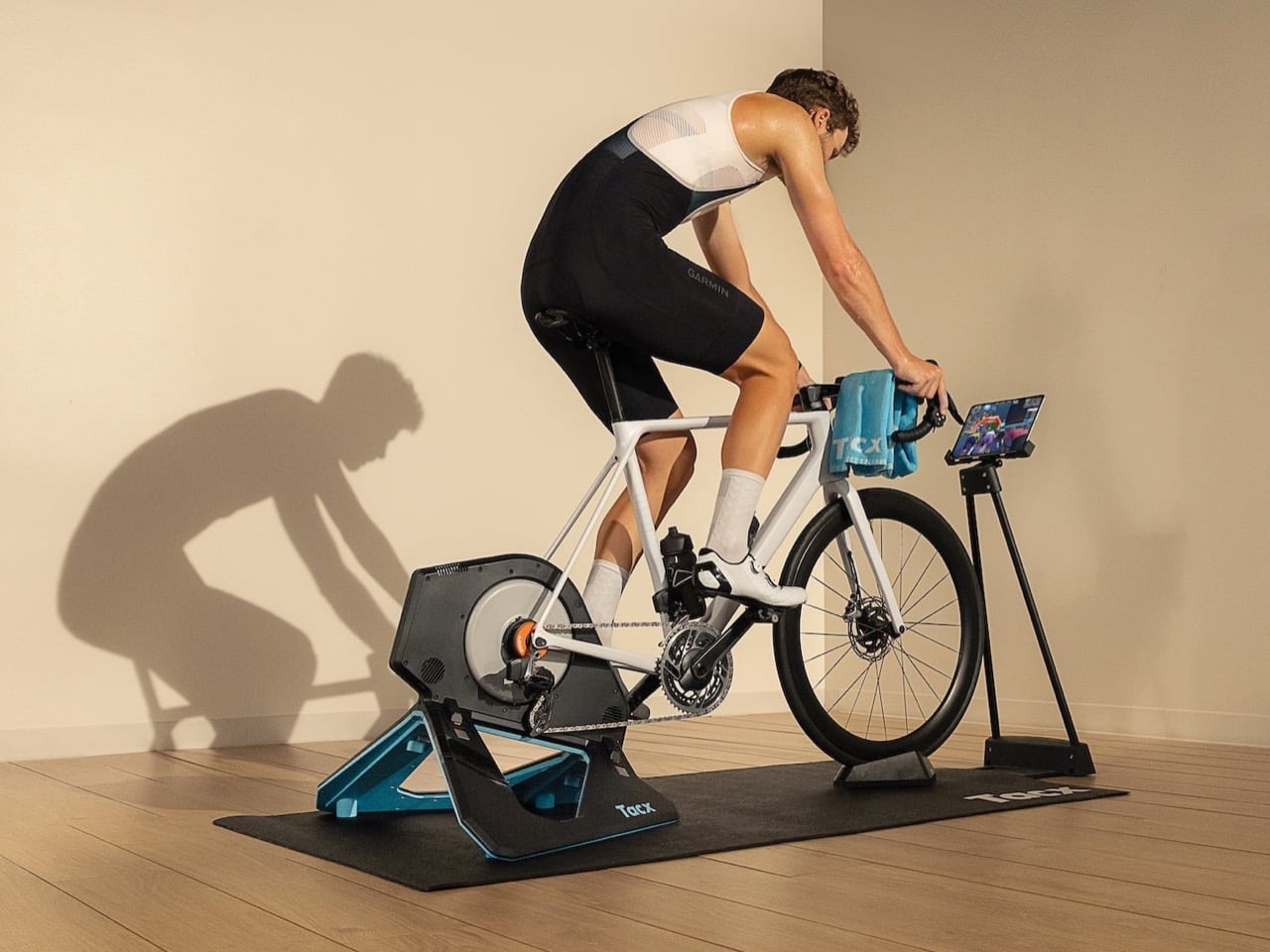
You know that bike sitting in your garage, judged by cobwebs, wondering when you’ll finally take it out again. Garmin just gave it a second career. The Tacx Neo 2T with Zwift Cog and Click, out August 21 for $1,099, clips onto pretty much any bike with 8 to 13 gears and turns it into a full smart trainer, complete with power tracking, cadence data, and a straight line into Zwift and Rouvy. No cassette swap, no calibration ritual, no YouTube tutorial at 11pm trying to figure out why your bike won’t pair.
Basically, Garmin looked at the whole “buy a $2,000 smart bike” trend and said, why not just use the one you already own. You bolt the trainer on, plug in the included remote for virtual shifting, and you’re pedaling through a Zwift climb before your coffee gets cold. It is less a new machine and more a software upgrade for your legs.
Designer: Garmin
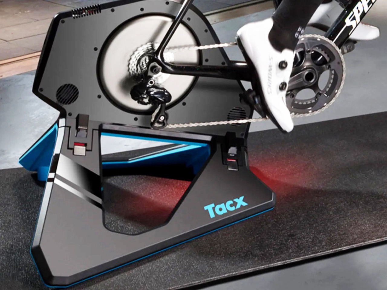
The actual hardware here is not new, and Garmin is not pretending otherwise. The NEO 2T shell, that angular black and blue wedge with the vent slots, has been around since 2019. What changed is what sits inside the flywheel. A bright orange Zwift Cog now stands in for your entire cassette, and it is compatible with almost any 8 to 13 speed bike, no tools required beyond whatever it takes to bolt your bike onto the trainer itself. Pair it with the Zwift Click, a small handlebar remote that handles shifting, steering, and menu navigation, and the whole “getting started” phase collapses into about ten minutes.
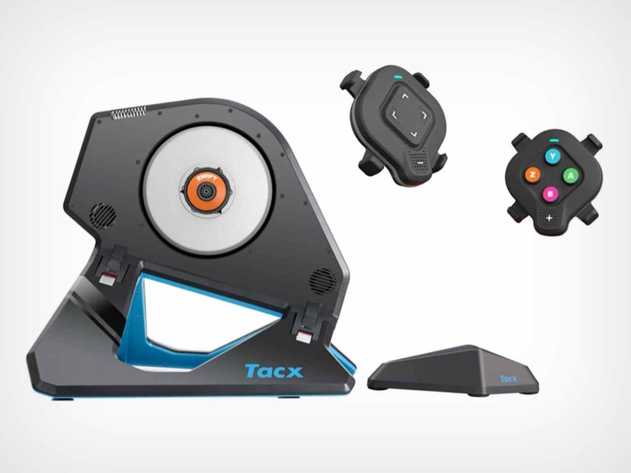
What you actually get for your money is the boring but important stuff. Power and cadence accuracy within 1 percent, dynamic resistance that adjusts for weight, speed, and incline, and enough quietness that you will not wake up the rest of the house doing intervals at 6am. Buyers who are new to Zwift also get a free membership offer, though Garmin has not said how long that lasts.
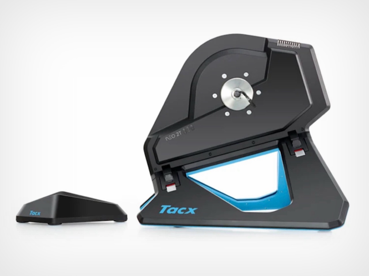
For years, the trend was building bikes that look like sculptures, cabinets that hide a Peloton, frames designed to disappear into a living room. Garmin is taking the opposite route. Instead of hiding the machine, it is shrinking the amount of machine you need in the first place. Your actual bike stays your actual bike. The only thing that changes is what happens once you clip it in.
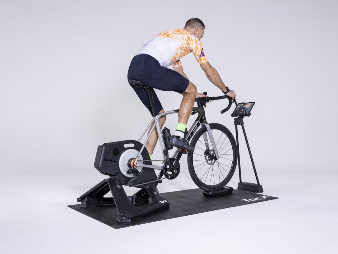
You do not need a second bike, a dedicated smart frame, or a spare room that quietly becomes “the cycling room.” You need the bike you already own and about ten minutes on a Wednesday afternoon.
The post Garmin’s Tacx Neo 2T Turns Your Existing Bike Into a Connected Gym, No Extra Setup first appeared on Yanko Design.



Expanded foam or polystyrene has had a good run as the default packaging filler, mostly because it’s cheap, light, and nobody was really committed to sustainability for the last half century so the industry is pretty set in its ways now. Expanded foam does not decompose, it does not do anything useful once you rip it out of the box, and it has spent decades sitting quietly in landfills being extremely unbothered by the concept of consequences. Designers have been chipping away at its throne for years, swapping in mushroom mycelium, seaweed film, pressed pulp, whatever grows fast and decomposes faster. Scentra joins that lineup with a twist nobody else has really tried. Rosemary.
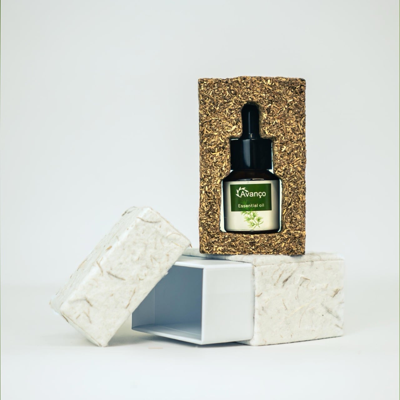
Instead of growing a material or pulping something into a smooth foam substitute, this one compresses actual rosemary waste, stems and all, into a block held together with a seaweed binder. The result looks rustic rather than manufactured, and it carries the plant’s natural scent right there in the fibers. Crack the box open and rosemary hits you before the product does. Foam never managed that trick, and honestly, it never tried.
Designers: Zhixi Dai, Zhou Yun, Wang Zhan
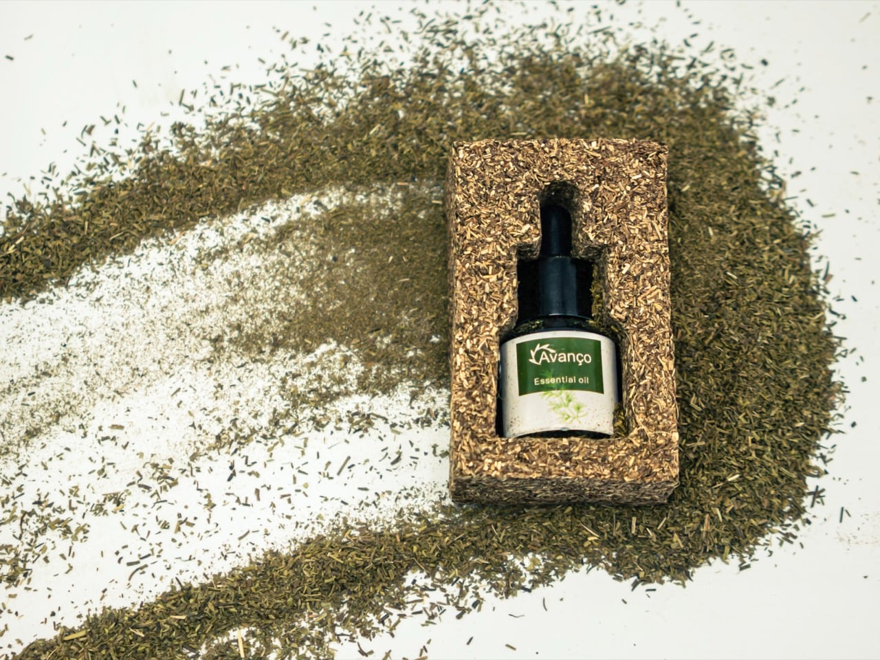
The rosemary itself comes from an organic farm in Guizhou, China, run under Omni Biotech’s AOLUX line, where trimmings that would normally get swept up and discarded are collected instead. The farm also employs local workers from low income families as part of a rural revitalization push, so the sourcing story has a human angle sitting quietly underneath the material one. Designer Zhixi Dai led the project with Zhou Yun and Wang Zhan rounding out the team, and between them they turned a farming byproduct into something structural enough to actually protect glass.

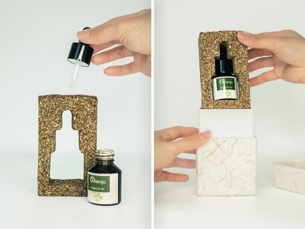
The block is cut with a cavity shaped exactly like the essential oil bottle it holds, silhouette and all, so the packaging reads almost like a little doorway with the product framed inside it. Pull the bottle out and you are left holding a chunk of compressed herb that still smells like the plant it came from. Set it on a shelf, add a few more drops of oil when the scent fades, and it keeps working as a passive diffuser. No batteries, no wiring, no porcelain filter to keep clean. Just plant matter doing what plant matter does.

We have seen versions of this waste to material pipeline before. Beer mash has been pressed into leather, spent grain has been molded into stools, rice husk has been packed into furniture. What usually happens in those stories is the waste becomes inert once it is shaped, useful for its structure and nothing else. Scentra skips that step. The rosemary does not stop being rosemary just because it got compressed into a block. It keeps its oils, its texture, its smell, all the things that made it worth growing in the first place.
That is really the whole pitch here, and it is a good one. Most eco packaging asks you to feel good about something you cannot see or verify, a recycling percentage or a compostability claim buried in fine print. This one just smells like rosemary. You do not need a certificate for that, though it has one anyway, having picked up the Best Eco Design win at the European Product Design Awards.
The post This Foam-Free Eco Packaging Is Made From Compressed Rosemary Waste, And It Carries The Aroma Too first appeared on Yanko Design.

Most desk design still treats the flat surface as a given. Monitor, keyboard, notepad, and coffee all land on the same plane, and we adjust our posture around that rather than the other way around. That convention has held even as ergonomic research has consistently noted that the ideal height for viewing a screen and the ideal height for typing with relaxed arms aren’t the same, and that bridging the gap usually falls to accessories rather than to the furniture itself.
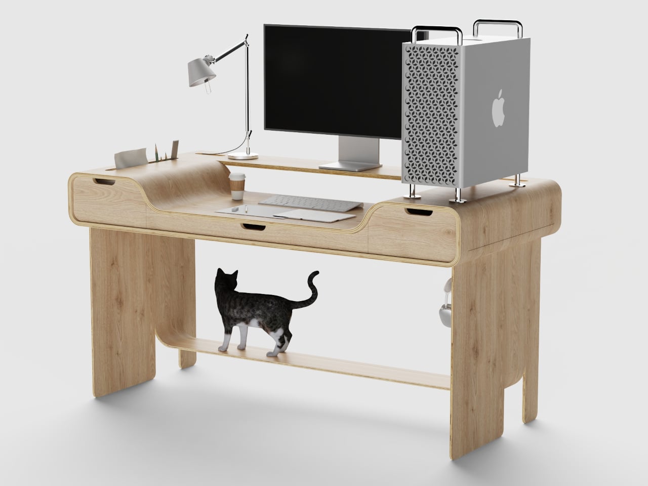
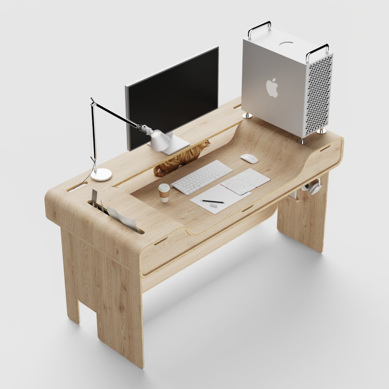
The Hollow Desk takes that problem seriously and solves it through the desk’s own structure. A “cut and bend” plywood technique creates two distinct surface levels in a single continuous form. The raised rear section supports the monitor and anything that lives near eye level. The front curves downward into a sunken working zone where the keyboard, mouse, notepad, and sketchbook sit at a lower, more natural arm height, keeping hands in a position the flat desk never quite manages.
Designer: SUNRIU Design
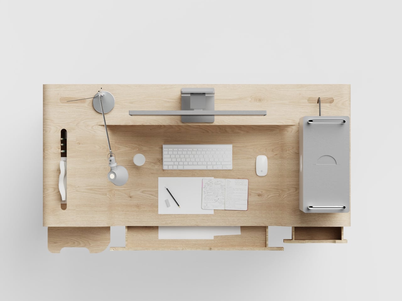
Framing it that way makes the change sound incremental, but the accumulated strain of typing at the wrong height over a full workday is measurable. The usual solutions are accessories: keyboard trays, wrist rests, monitor risers, each one a correction applied after the fact to furniture that wasn’t designed with this in mind. Most get purchased with good intentions and used inconsistently. The Hollow Desk puts the correction into the desk’s own geometry, and it stays there.
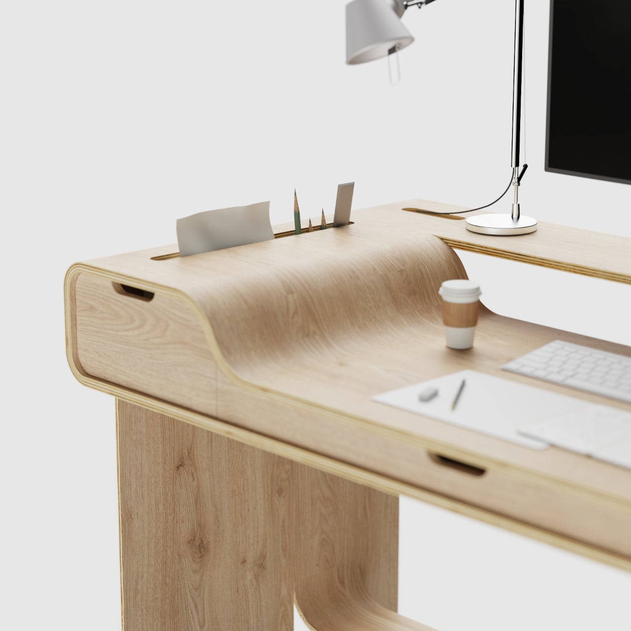
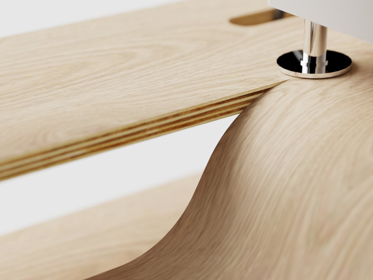
The plywood construction makes that organic form possible without complicated joinery. The bent curve that transitions from the raised rear surface down into the working zone exposes the layered plywood edge, and the design doesn’t try to conceal it. Those laminate layers become part of the visual identity, making the structural logic of the form visible at the transition rather than hiding it under a veneer that would smooth over the method entirely.
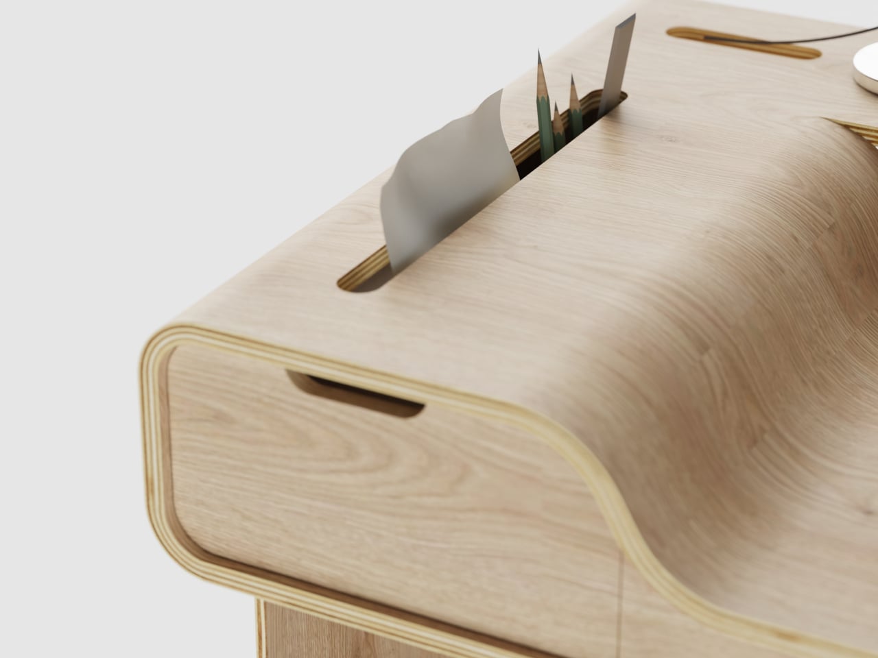
Storage is woven into the raised rear section without claiming any working surface. Vertical slots cut into the back panel keep pens, pencils, and cards upright within reach. A slim drawer with a finger-pull cutout sits flush under the front face of the raised section, invisible from above and accessible from the front. On the right side panel, a hook holds headphones off the desk, and a small ledge keeps a book at hand level without requiring a separate shelf.
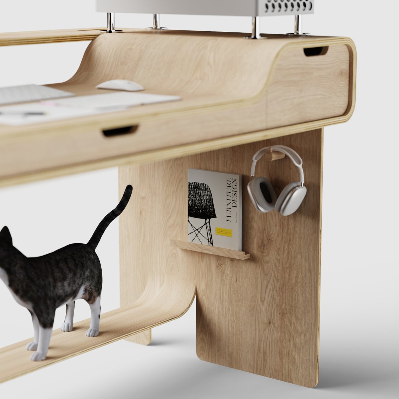
Cable management runs through pass-through holes in the raised rear platform, routing monitor cables out of view rather than leaving them to cross the working surface. A lower shelf at the base runs the full width and handles items that don’t need to stay immediately at hand. Both details are quiet, but on a desk this deliberate about surface hierarchy, leaving cables and secondary storage as afterthoughts would undercut the whole logic of the design.
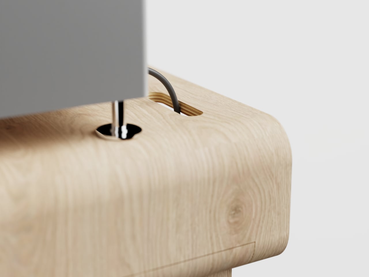
The Hollow Desk is still a concept rendered in plywood. The raised rear platform works with whatever monitor or tower you already own, and the sunken working zone doesn’t favor any particular keyboard or input device. It isn’t trying to reorganize your workflow. It’s making a more fundamental intervention: changing where your hands sit while you work, which turns out to matter considerably more than any accessory applied on top of a flat surface ever does.
The post Someone Finally Bent a Desk to Put Your Monitor Higher and Hands Low first appeared on Yanko Design.