Marc Newson reimagines Ressence Type 3 into most intriguing $54k conversation starter ever

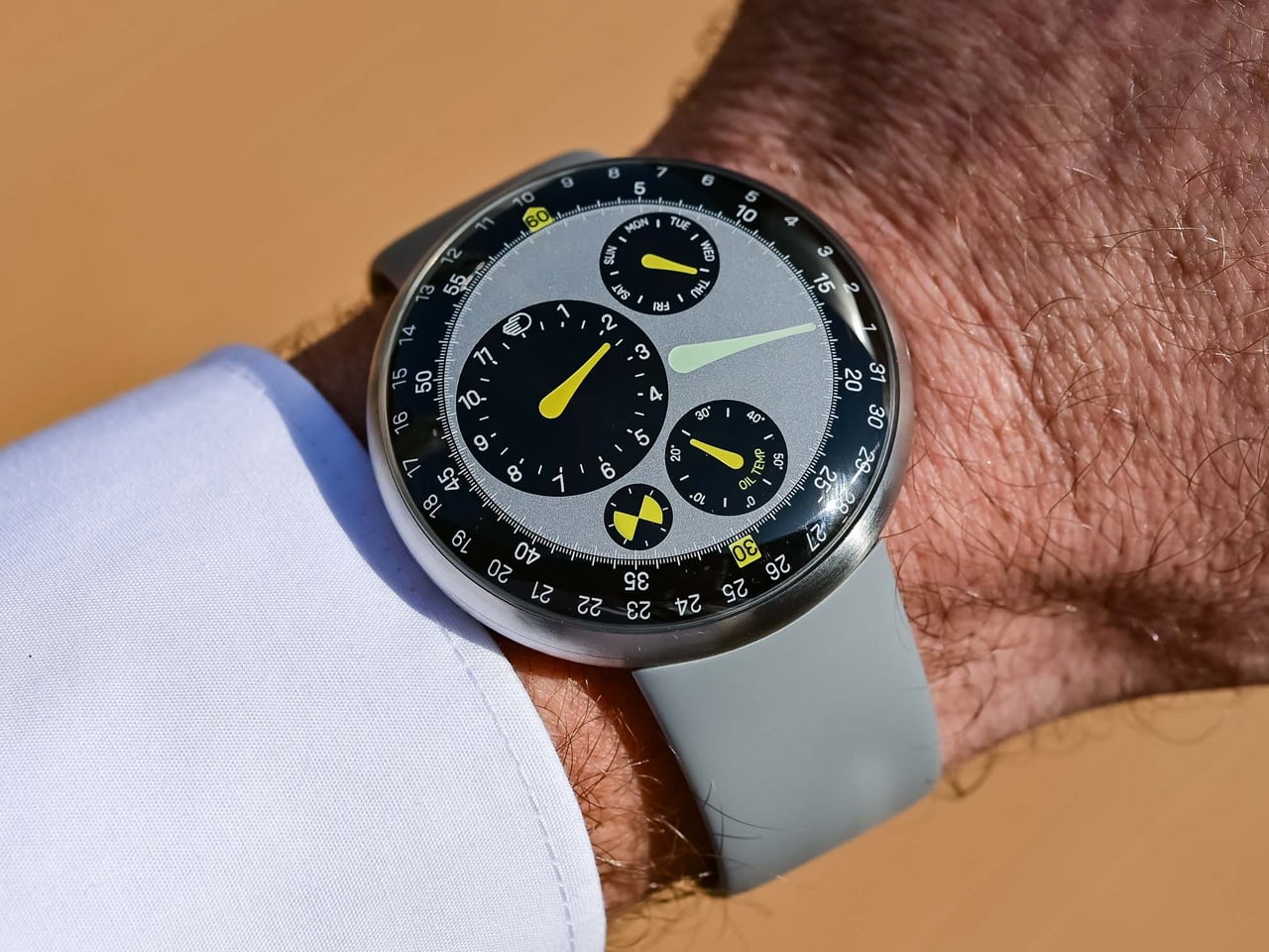
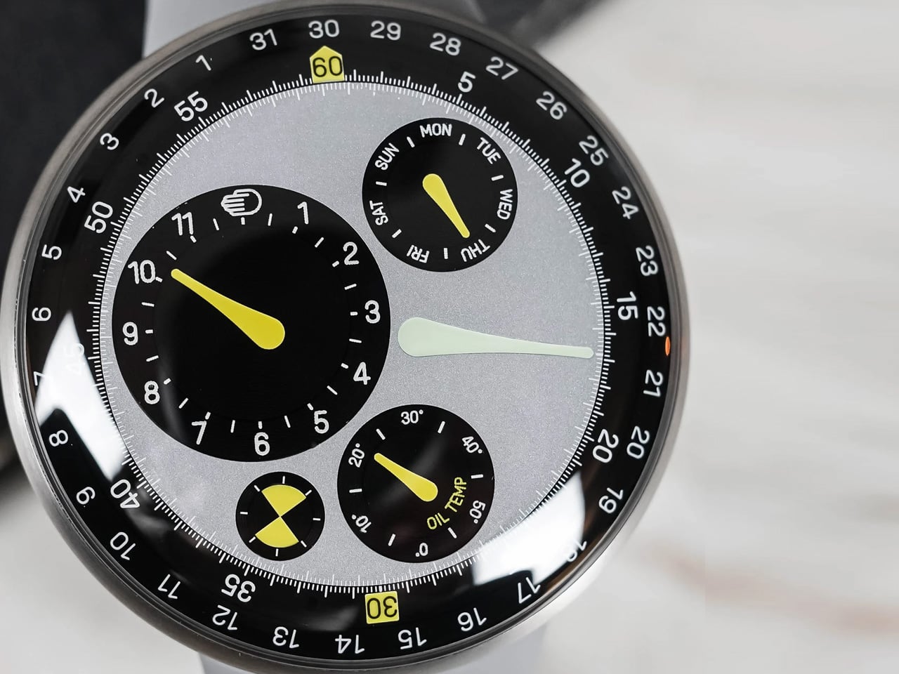
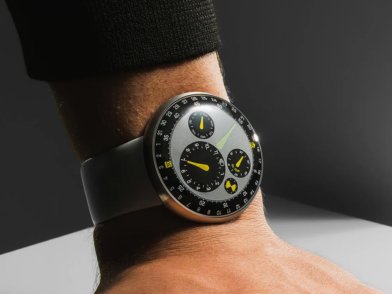
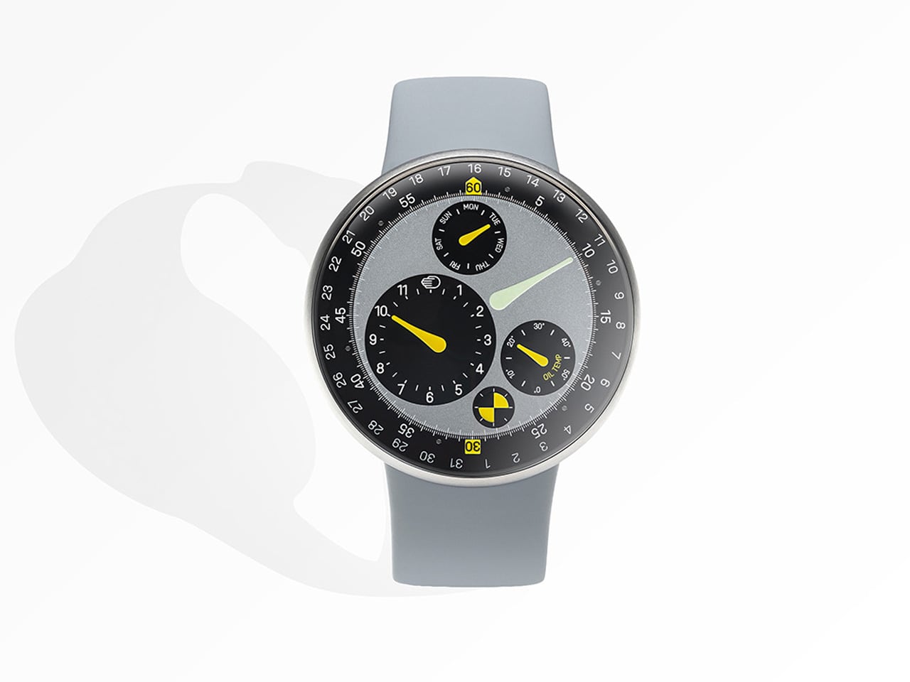
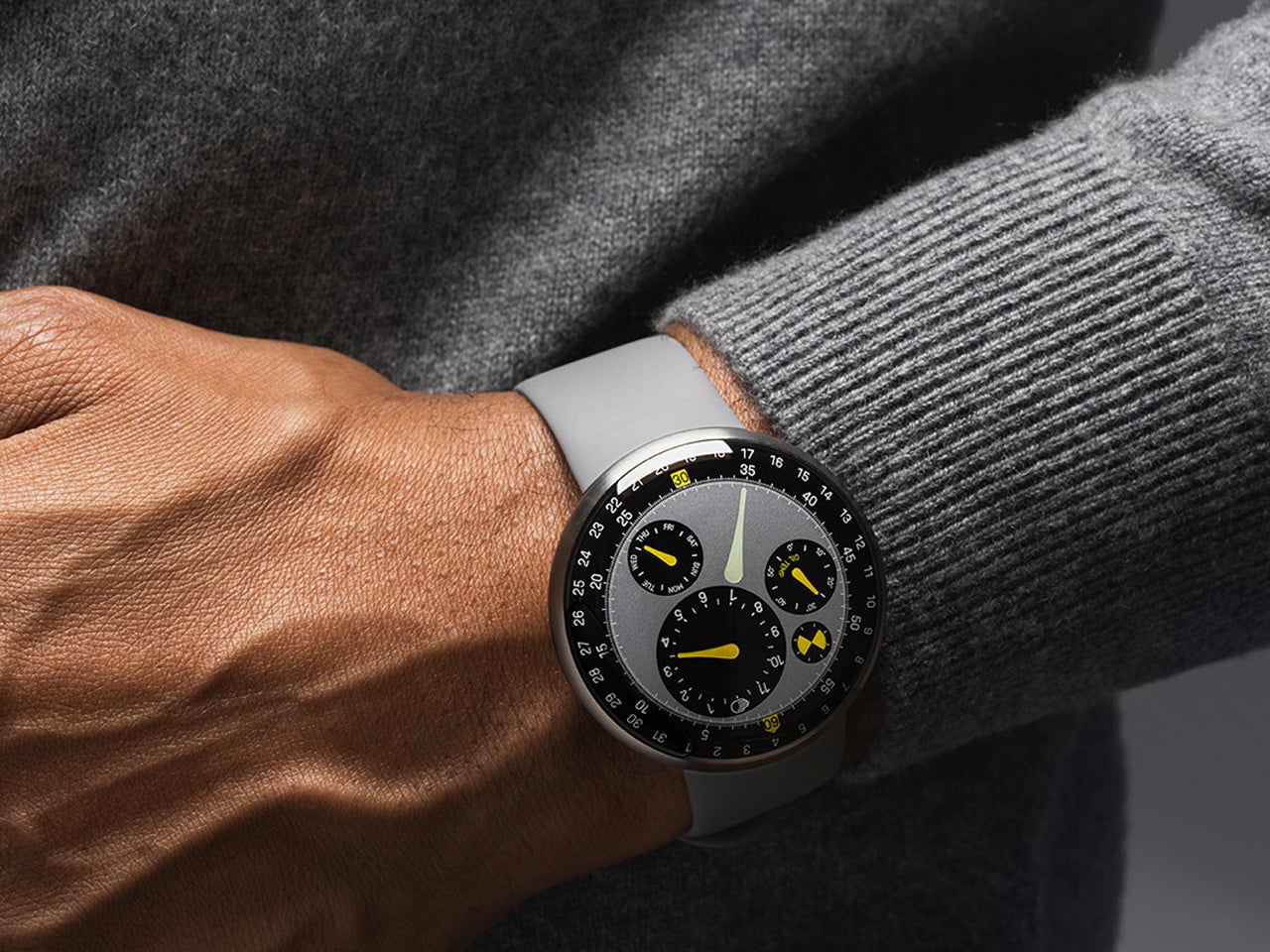
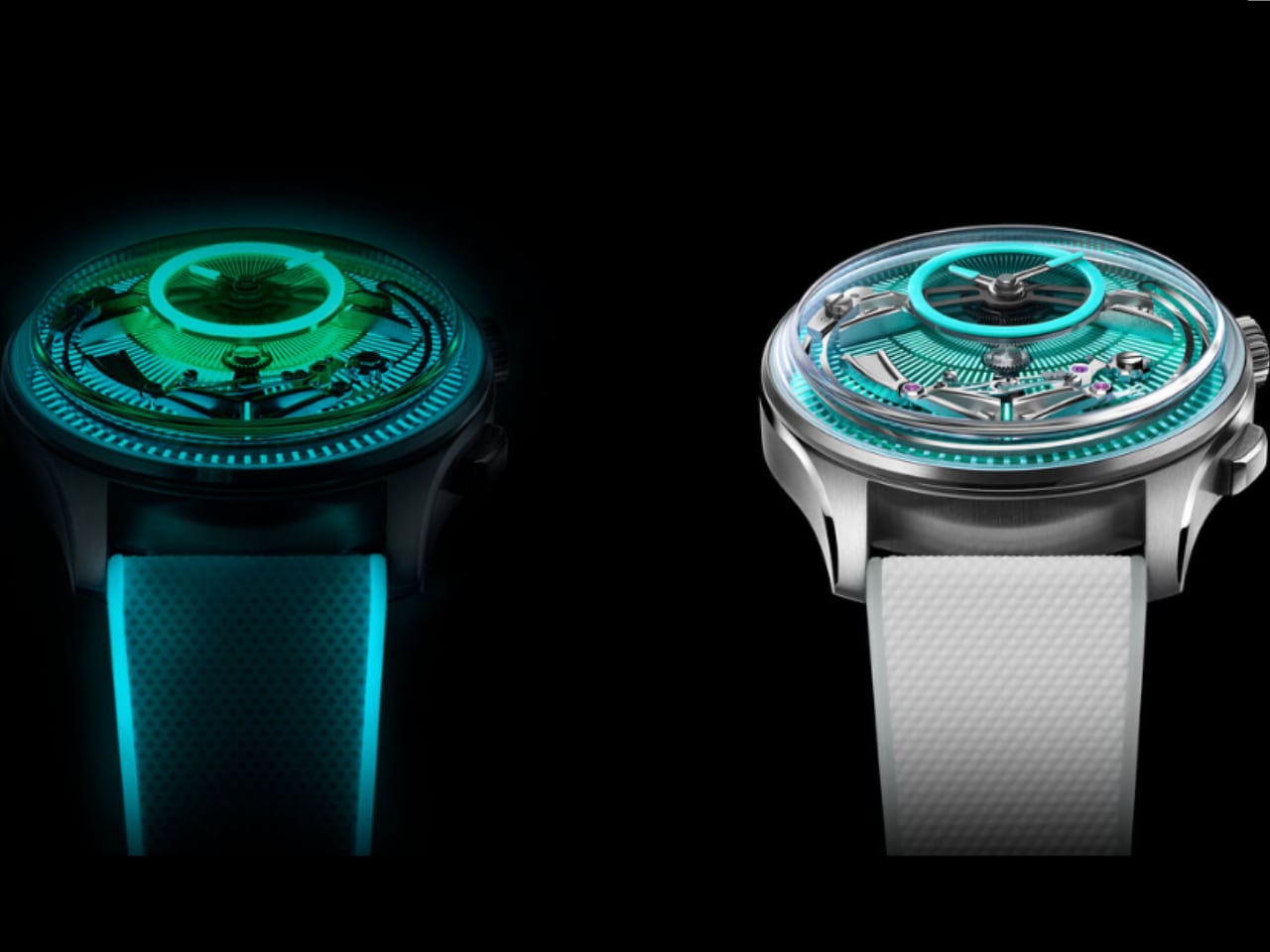
You can easily recognize Ressence, an independent watchmaker, from the crowd with its uncanny watches that make time telling unique, detailed, and exceptionally designed. For its latest iteration, the Type 3 MN, Ressence founder Benoît Mintiens has collaborated with Australian design genius, Marc Newson (a name we know from the first Apple Watch), and the result is easily the most intriguing watch in the industry.

The Type 3 MN is referenced as a result of “meeting of two design icons.” It’s a rare collective where two designers choose “to work together on one product.” Mintiens notes, “In my eyes, one plus one can become more than the sum of its parts.” And that reflects in the Type 3 Marc Newson edition, which is a true representation of the original Type 3 with nuances to behold.

Designer: Ressence

The Apple reflection

Of course, Type 3 MN is a Ressence, but unlike the Type 8 with handwoven Indigo-dyed silk dial or its sibling with geometric display and a joyful palette, it has Newson’s design approach reflected in it. Marc Newson was inducted into Apple by the good old Jony Ive. Both are known for their amazing projects at the Cupertino company, including the first Apple Watch. The duo has now co-founded a creative collective called LoveFrom.

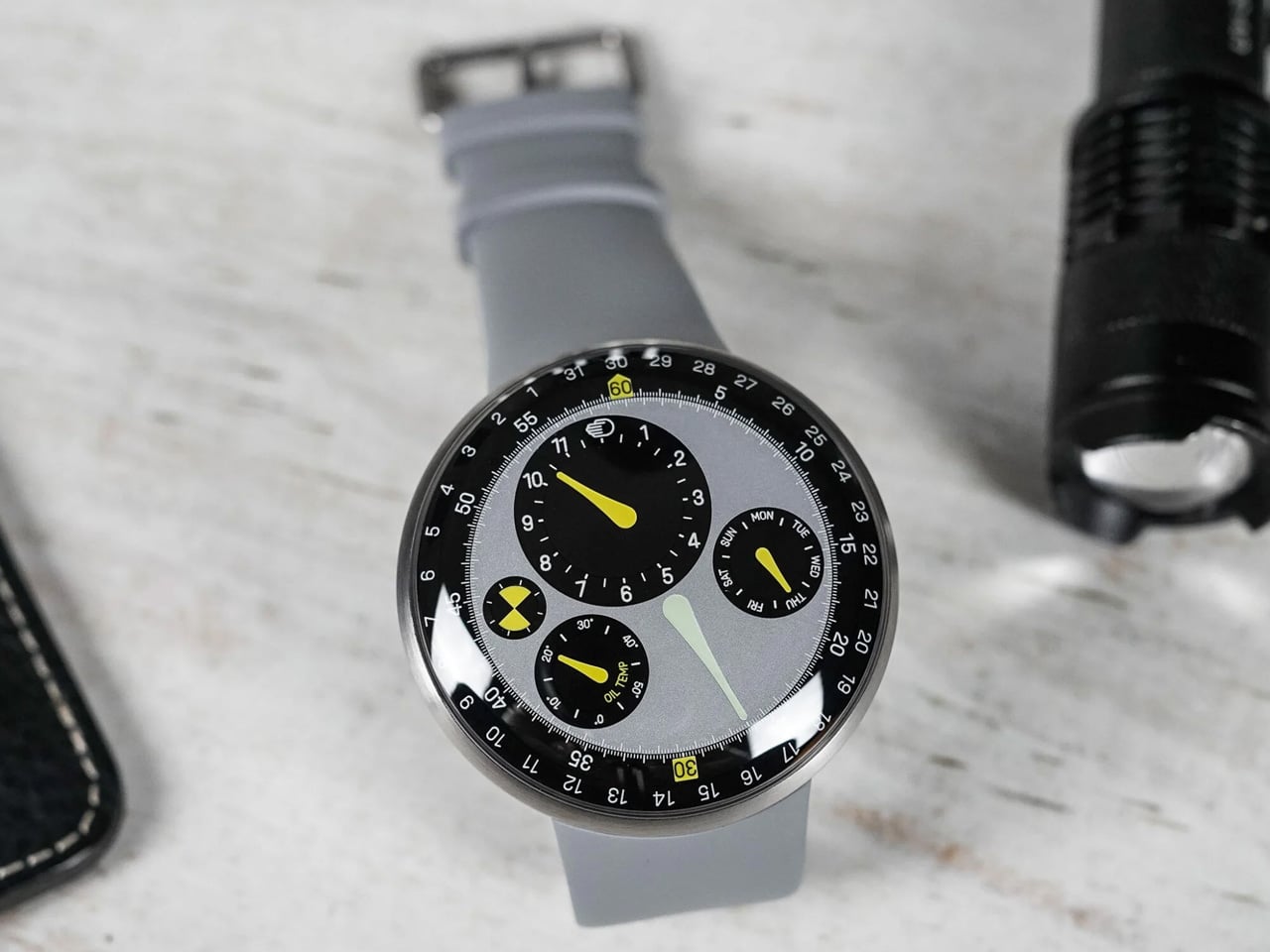
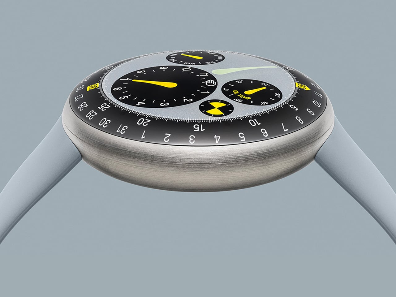
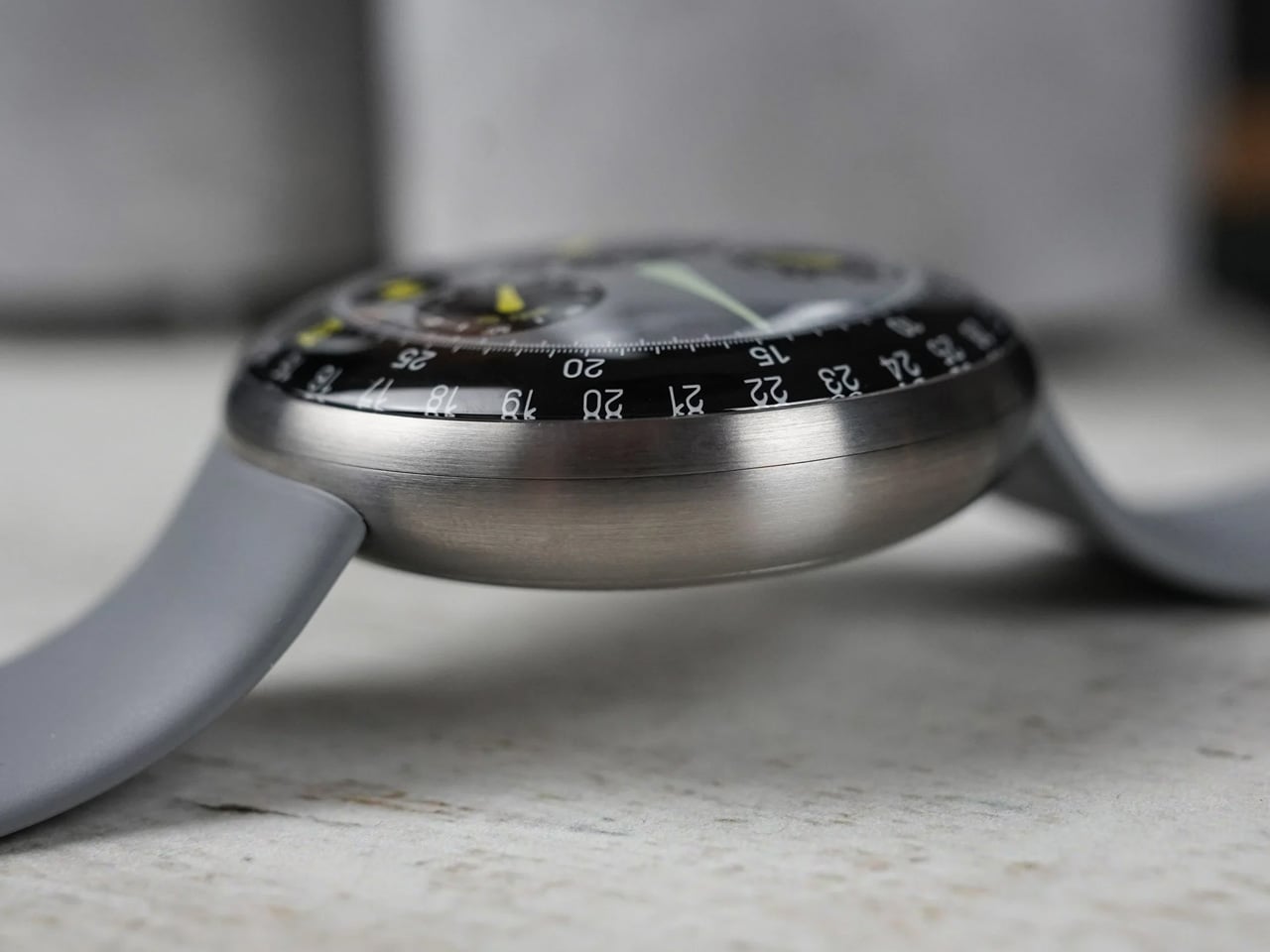
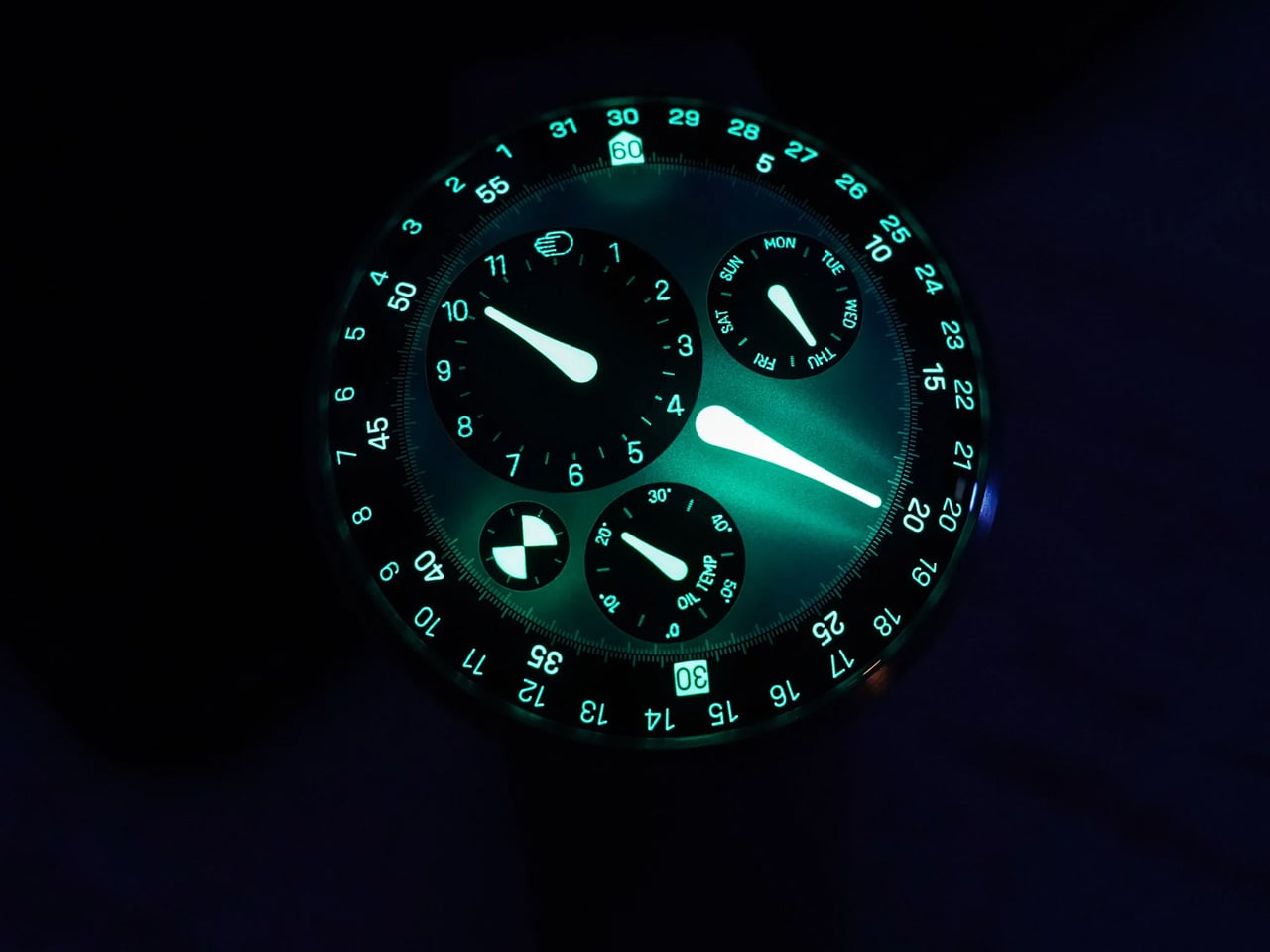
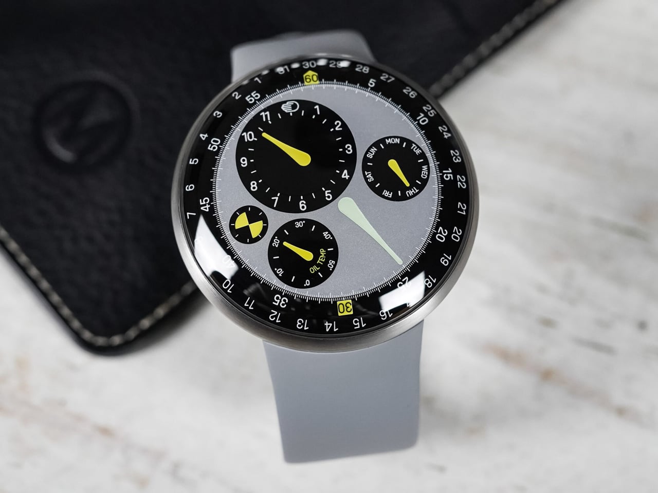
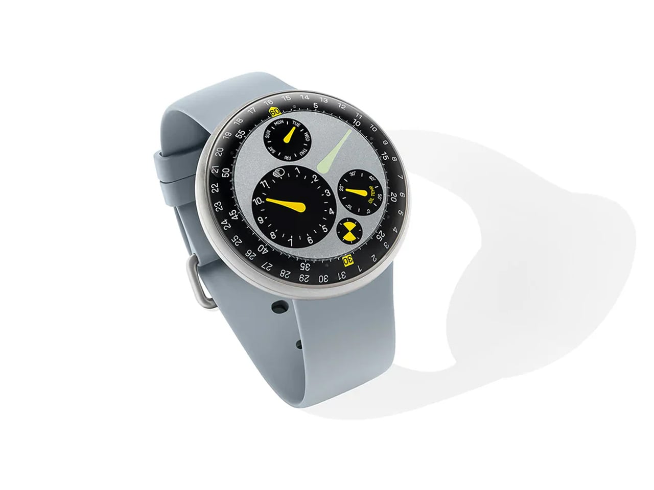
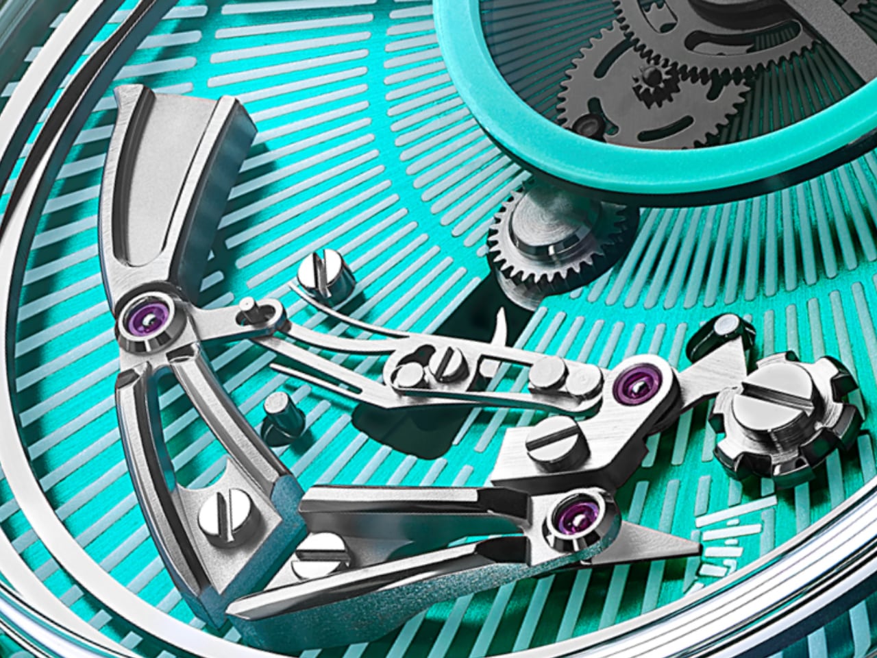
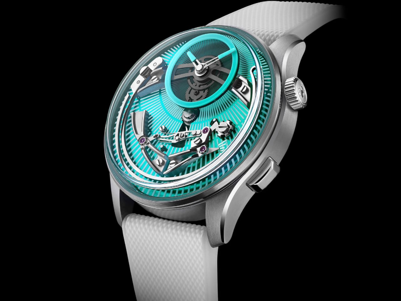
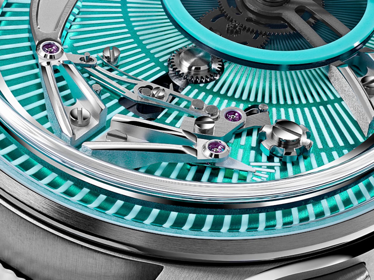
The Newson-design Type 3 has an elliptical design, a striking color palette, domed sapphire, and graphic hands all echoing Apple’s design language, which is paired with Ressence’s own oil-filled chamber dial and the ROCS-driven rotating Grade 5 titanium discs. It has a unique time-telling experience: the mechanism allows the accessory discs to revolve around the dial on multiple axis, instead of the usual hand movement.

The floating time

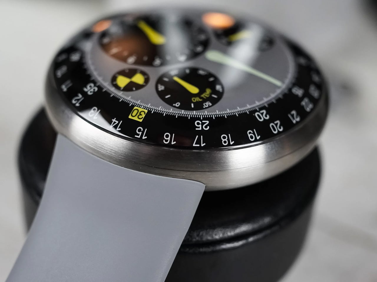
According to Ressence, the Type 3 MN features magnets to drive the movement of the discs. The watch separates the dial and the movement chambers, with the upper one filled with 3.57 ml of silicone oil, and the lower chamber (that holds the movement) is filled with air. Owing to oil’s capability to remove the refraction of light inside the watch, the time on the rotating disc appears closer to the domed sapphire glass, making the time appear to be floating on the dial.

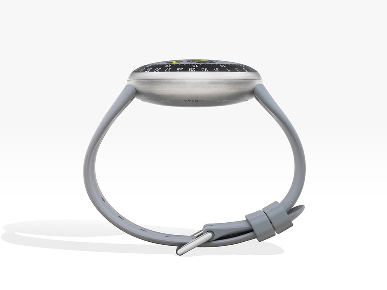
The crown-less watch, Mintiens say’s is designed to connect with “those for whom purity of form, quality of material, and complex engineering” are a priority. The watch display depicts a celadon green and vibrant yellow accents under its soft elliptical silhouette, which highlights this combination watch that’s a reflection of Newson’s industrial design approach and Ressence unique time display. The Type 3 MN comes paired to a light grey silicone strap to match its dial and is limited to strictly 80 examples, going for $54,500 each.


The post Marc Newson reimagines Ressence Type 3 into most intriguing $54k conversation starter ever first appeared on Yanko Design.

Hiroshi Fujiwara’s TAG Heuer Carrera Chronograph Is Minimalism With Purpose

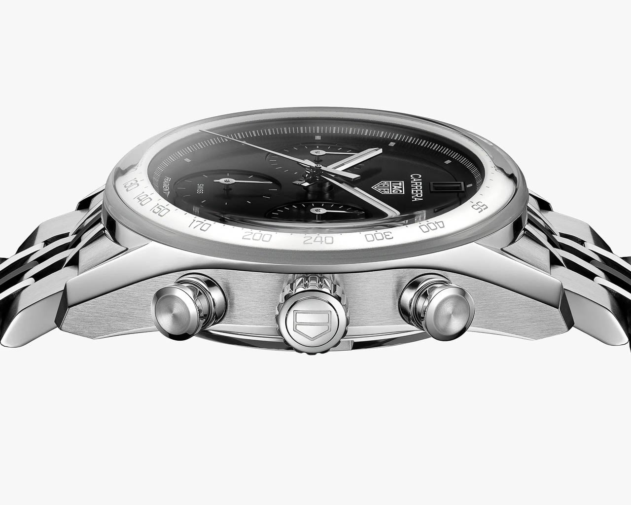
What happens when a Swiss racing watch is redesigned by the godfather of Japanese street culture? TAG Heuer answers that question with the Carrera Chronograph x Fragment Limited Edition, a collaboration with Hiroshi Fujiwara that transforms the brand’s flagship racing chronograph into something that looks more at home paired with Japanese selvedge denim and minimalist sneakers than pit-lane timing equipment.

Designer: TAG Heuer + Hiroshi Fujiwara

This is TAG Heuer’s third partnership with Fujiwara’s Fragment label, following earlier Carrera and Autavia projects, and it represents the most thorough application of his design philosophy to date. Fujiwara built Fragment into a cult streetwear imprint over decades of work in Tokyo’s fashion underground, and his aesthetic has always favored reduction over addition. The result is a chronograph that reads as much like a gallery piece as a timing instrument.

From Tool Watch to Tuxedo

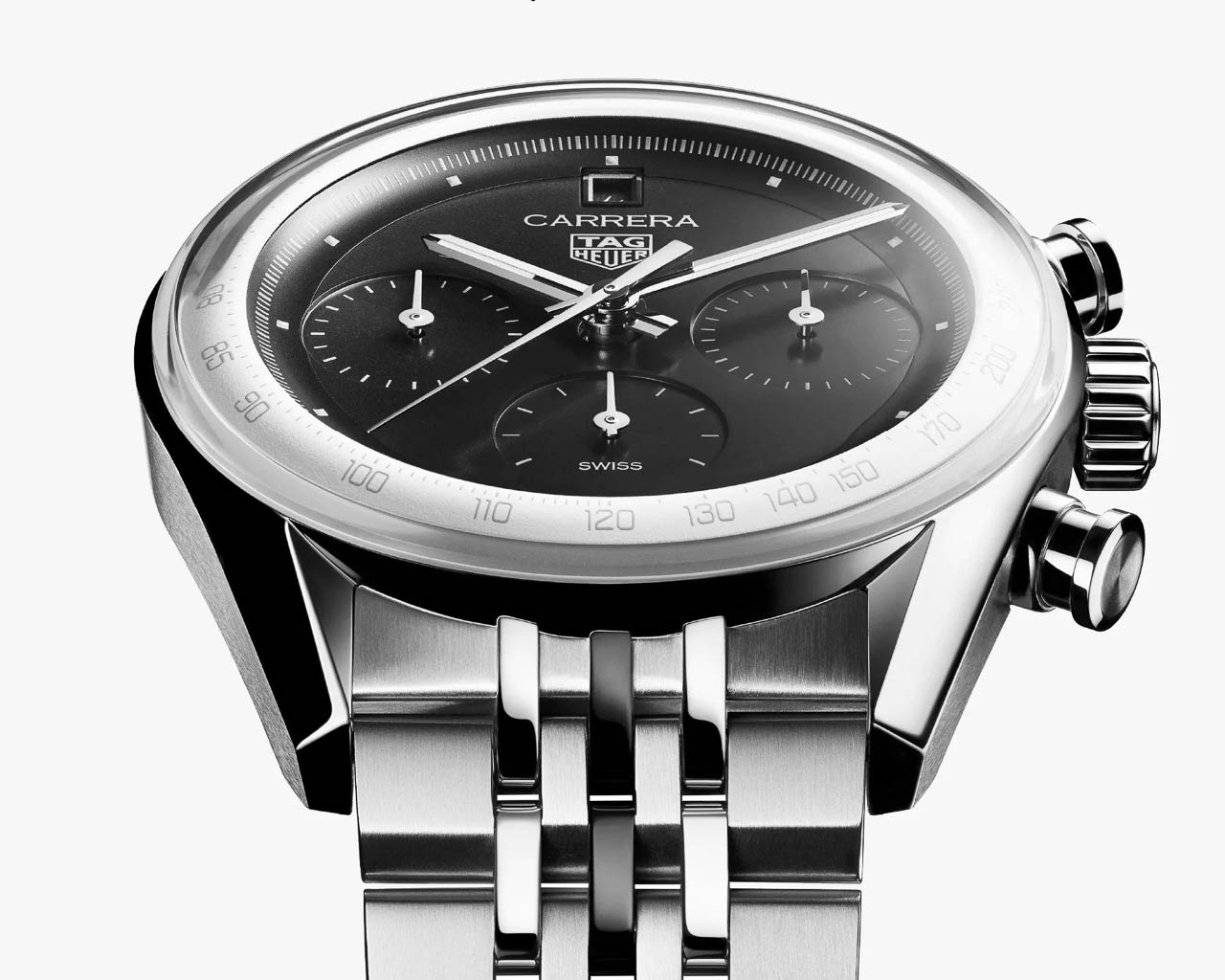
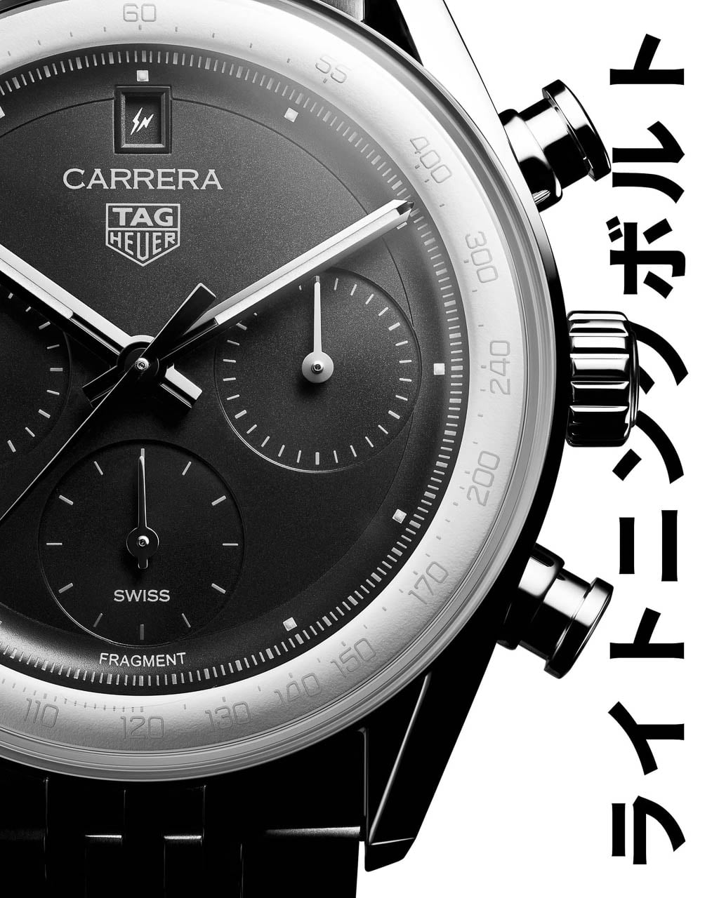
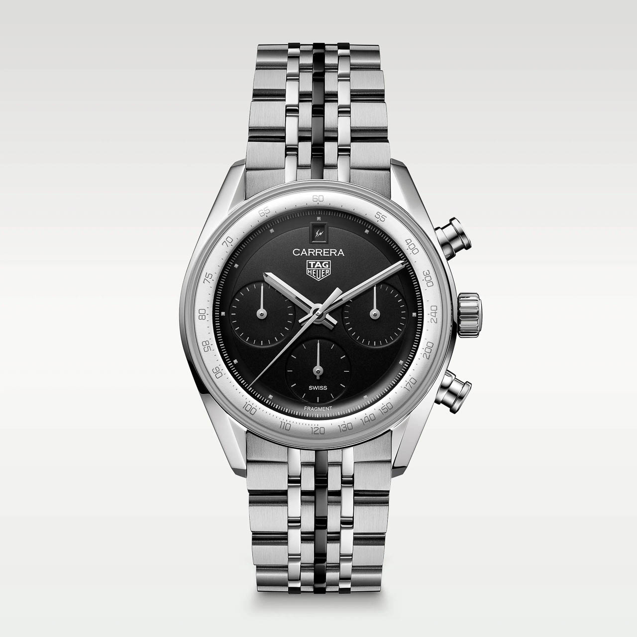
The visual transformation begins with the glassbox crystal, a boxed sapphire design that gives the watch a more polished, architectural presence than traditional tool-watch bezels allow. Underneath sits a matte black opaline dial paired with a chalk-white raised flange carrying a silver tachymeter scale. The combination is loosely reminiscent of a tuxedo dial, formal and restrained where most chronographs lean into busy, information-dense layouts.

Fujiwara’s most striking intervention is the near-total elimination of numerals. The subdials lose their snailing texture and numeric markers entirely, replaced by pure graphic dashes: 12 on the small seconds, 30 on the minute counter, 24 on the hour totalizer. These read as abstract timing scales rather than conventional registers, turning functional displays into visual rhythm.

The standard baton hour markers disappear as well, replaced by tiny raised white pyramidal dots finished with gray Super-LumiNova. Even the lume dots that typically run along the seconds track are gone, leaving the dial remarkably clean.

Where the standard glassbox Carrera reads as a refined sports watch, the Fragment edition presents itself as something closer to wearable industrial design. The dial still reads unmistakably as a Carrera: the proportions, the subdial layout, the tachymeter flange all telegraph the model’s identity. But the calm, logo-light execution feels gallery-ready in a way few limited editions achieve. This is minimalism with purpose, not minimalism as marketing shorthand.

Hidden Graphics: The Fragment Easter Eggs

Fragment collaborations have always rewarded close looking, and this watch continues that tradition through subtle logo placement. Previous Fragment x TAG pieces positioned the double-bolt Fragment logo at 12 o’clock, but the glassbox Carrera places its date window at that position. Rather than abandon the signature branding, Fujiwara moves it into the date wheel itself: on the first of each month, a single lightning bolt appears in the date window, and on the 11th, the full Fragment double-bolt logo takes its place. The calendar becomes a hidden Easter egg, a detail that only reveals itself twice monthly and rewards those who know to look.

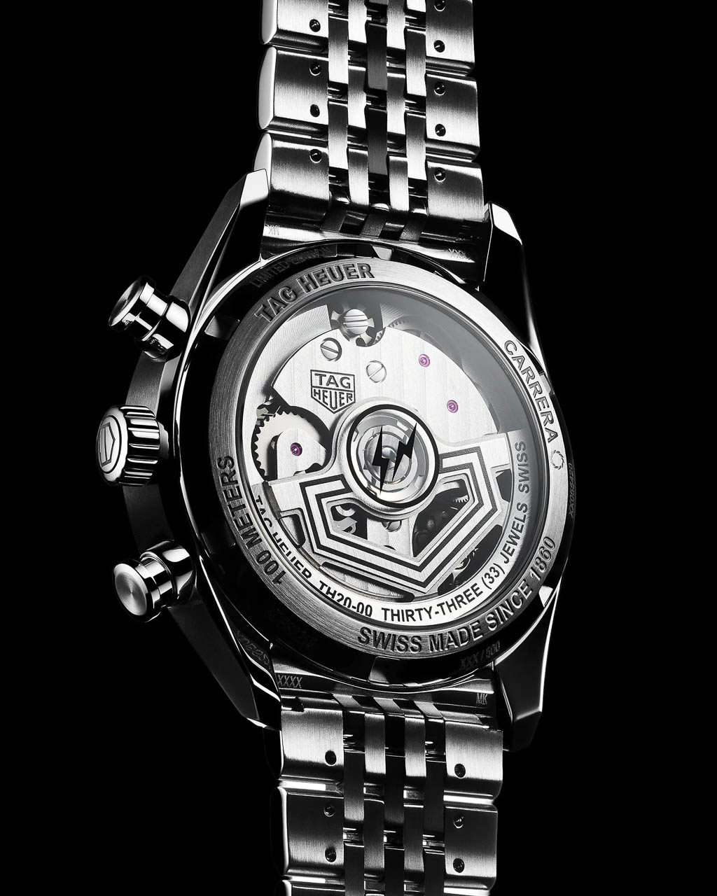
Fragment’s name appears as printed text at 6 o’clock on the dial, while the full double-bolt-in-circle logo occupies the sapphire exhibition caseback. The center links of the seven-link steel bracelet receive black PVD coating, echoing the blacked-out aesthetic that Fragment fans recognize from countless sneaker and apparel collaborations.

The fun here is not in loud colors or obvious branding but in discovering these almost-secret cues over time. Wearing the watch becomes an ongoing conversation with its design, a quality that aligns perfectly with Fragment’s approach to product collaborations across fashion, footwear, and now horology.

Serious Watch, Playful Surface

Beneath the minimalist aesthetic sits genuine horological engineering. The TH20-00 automatic movement features a column wheel and vertical clutch, representing TAG Heuer’s modern approach to chronograph mechanics. The 4 Hz beat rate enables smooth seconds-hand sweep, while the 80-hour power reserve means the watch can sit unworn over a long weekend and still keep time when picked up Monday morning. The 39 mm stainless steel case hits a sweet spot for contemporary tastes: large enough to read clearly but compact enough to slide under a shirt cuff. Water resistance reaches 100 meters, positioning this as a genuine daily-wear chronograph rather than a display-only collectible.

The engineering backbone matters because it anchors the aesthetic story. This is not a fashion watch with movement as afterthought, but a serious chronograph that happens to wear a limited-edition design collaboration on its surface.

Context for Design Enthusiasts

Compared to past Fragment x TAG pieces, this edition pushes furthest into reduction. Earlier collaborations applied Fragment’s aesthetic to vintage-inspired designs, but the glassbox Carrera is already a contemporary reinterpretation, and Fujiwara’s work here strips it even further. Where other Japanese-inspired limited editions in watchmaking have experimented with color, texture, or material contrasts, this one commits to graphic restraint as its central idea.

Limited to 500 pieces at $9,050, with pre-orders opening December 3 at 6:00 AM, the Carrera Chronograph x Fragment Limited Edition arrives individually numbered on the caseback ring. Each comes on the steel seven-link bracelet with butterfly clasp, no strap alternatives offered.

The watch poses a question worth considering: Is this the future of high-end collaborations? Fashion designers have traditionally brought color palettes and material experiments to watch partnerships. Fujiwara instead quietly rewrites the visual language of an iconic object, keeping its proportions, its engineering, and its heritage while fundamentally shifting how it communicates.

The post Hiroshi Fujiwara’s TAG Heuer Carrera Chronograph Is Minimalism With Purpose first appeared on Yanko Design.

Every MoonSwatch Cold Moon Has a One-of-a-Kind Laser-Engraved Snowflake

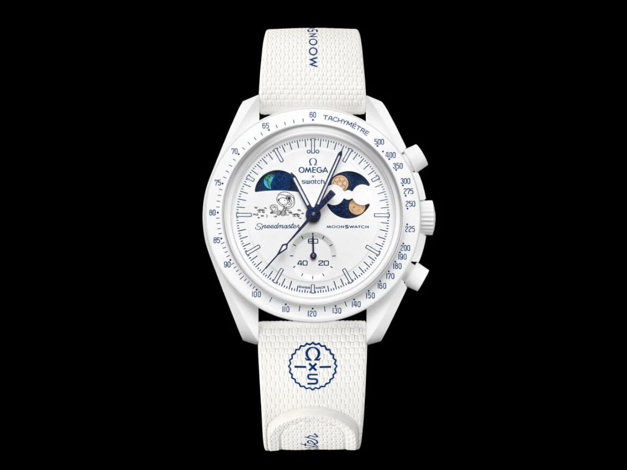
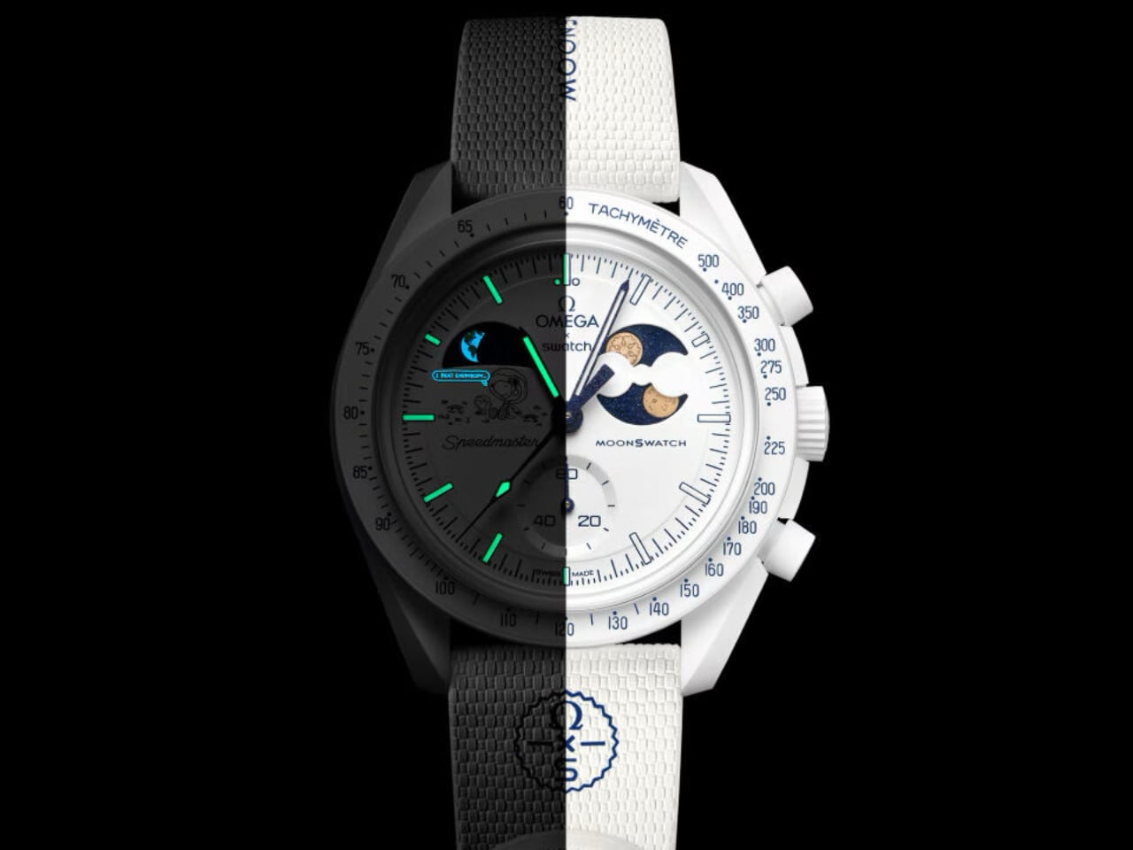
Swatch looked at December and thought: what if a watch could feel like the quiet before snowfall? The MoonSwatch Mission to Earthphase Moonshine Gold “Cold Moon” drops the navy-and-white palette of its predecessor for something bolder in its restraint. Pure white Bioceramic. White crown. White pushers. White strap. The effect is startling, almost clinical, until you notice the blue hands catching light like ice crystals at dawn.

Designer: Swatch

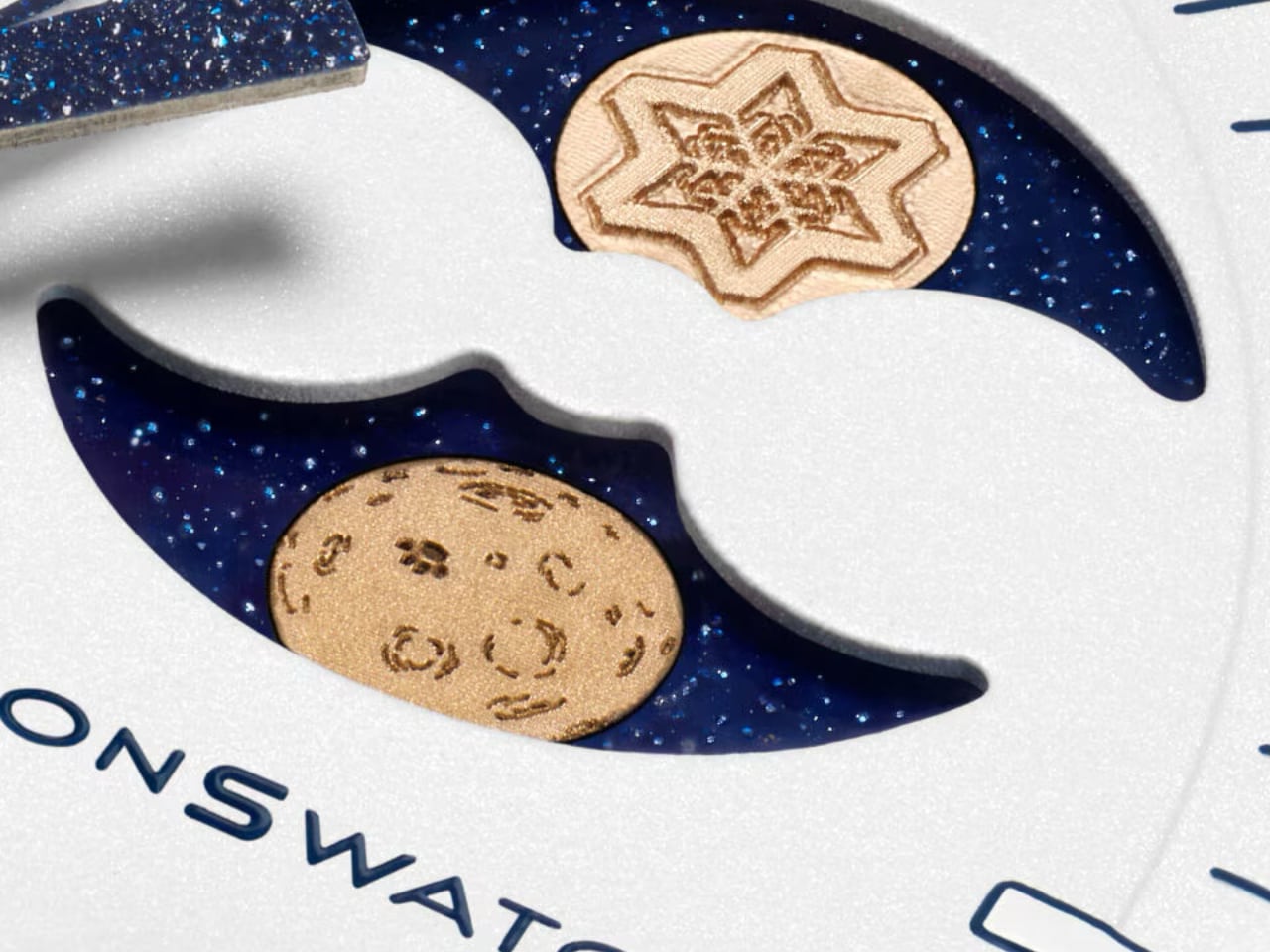
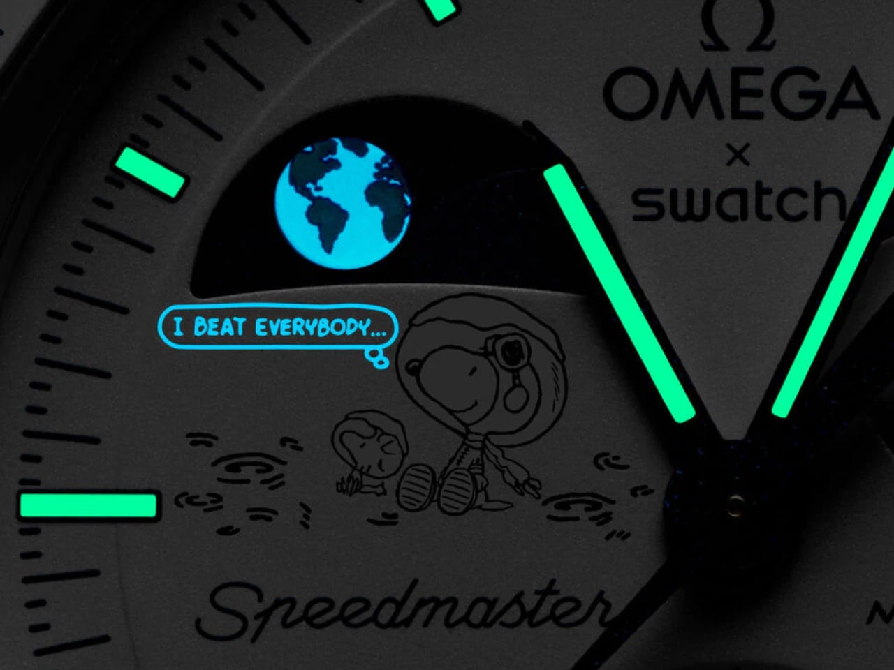
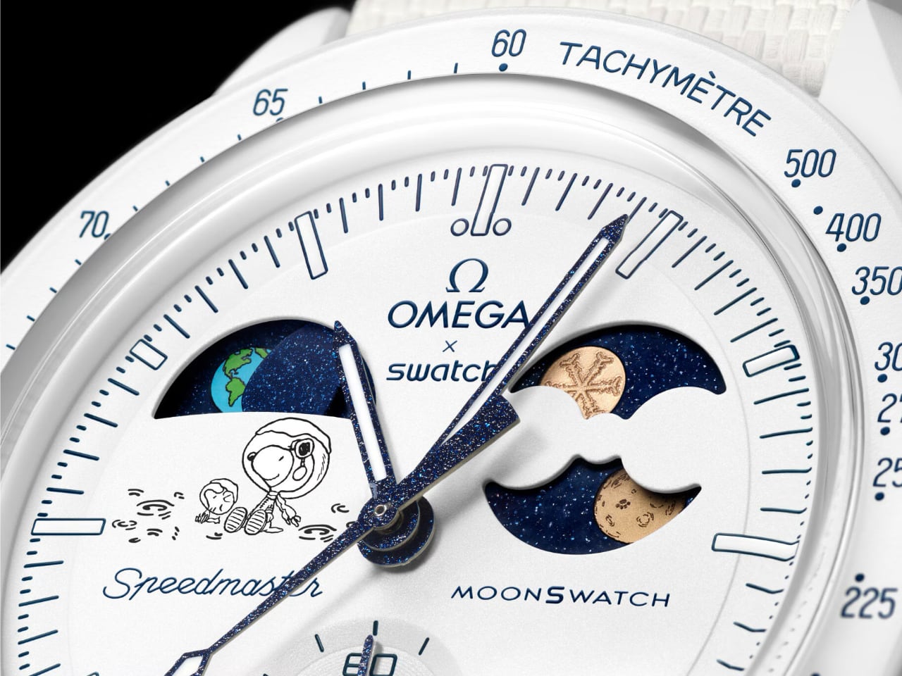
The moonphase disc carries two Moonshine Gold moons, and this is where the Cold Moon earns its place in the MoonSwatch lineup. One wears Snoopy’s face (the beagle’s NASA credentials run deep). The other? A laser-engraved snowflake. And here is the trick: every single snowflake pattern is unique. Swatch somehow turned quartz mass-production into something resembling one-of-a-kind craft. Your Cold Moon is literally not like anyone else’s.

The earth phase complication at 9 o’clock shows our planet as seen from the lunar surface. It cycles backward compared to a traditional moonphase, which is the kind of detail that rewards the people who actually think about what they’re wearing. Below it, Snoopy and Woodstock in winter gear watch Earth spin. Playful? Yes. But also weirdly poetic for a $450 watch.

Blue printing appears throughout the design: tachymeter text, dial markings, the “dot over ninety” detail Speedmaster collectors obsess over. Against all that white, the blue reads like ink on fresh paper. Grade A Super-LumiNova on the hour markers glows green in darkness, adding functional contrast to the monochromatic scheme.

There is also a UV-reactive hidden detail somewhere on the dial. Swatch is not saying what or where, which is exactly the kind of Easter egg that turns casual owners into obsessive hunters. You will need a black light and some curiosity.

The theatrics extend to availability. It launches December 4, 2025 (the actual Cold Full Moon) and stays in stores until the last day of winter. But after launch day, it only goes on sale when snow is falling in Switzerland. Social media will absolutely lose its mind tracking Swiss weather forecasts. Swatch knows exactly what it is doing.

The Design Read

Seasonal watch releases usually fail because they treat “theme” as decoration. Slap some snowflakes on the dial, call it winter, move on. The Cold Moon succeeds because the design team inverted an entire color system. The white Bioceramic case (a plant-derived ceramic-plastic composite with a matte, almost powdery texture) becomes the dominant material story. Everything else, the blue accents, the gold moons, the starry moonphase backdrop, exists in service to that white.

The 42mm case at 13.75mm thick carries the familiar Speedmaster asymmetry. The biosourced crystal has a box shape with an etched “S” at center. None of this is new to MoonSwatch. What is new is how different these familiar elements feel when the entire palette shifts to winter.

It is still a quartz chronograph. It still costs a fraction of the Omega original. But this one might actually be the most considered design the collaboration has produced.

Spec Detail
Case 42mm x 13.75mm, white Bioceramic
Lug-to-lug 47.30mm
Movement Quartz chronograph, earth phase, moon phase
Crystal Biosourced plastic, box-shaped
Water resistance 3 bar
Strap White rubber, Velcro closure

The post Every MoonSwatch Cold Moon Has a One-of-a-Kind Laser-Engraved Snowflake first appeared on Yanko Design.

The Vanguart Black Hole Tourbillon Replaces the Crown with a Joystick


Most luxury watches treat time adjustment like an afterthought. You twist a tiny crown, feel the mechanical resistance, and hope you land on the right minute. Vanguart looked at this centuries-old interface and asked a simple question: what if setting time could be as engaging as reading it?

Designer: Vanguart

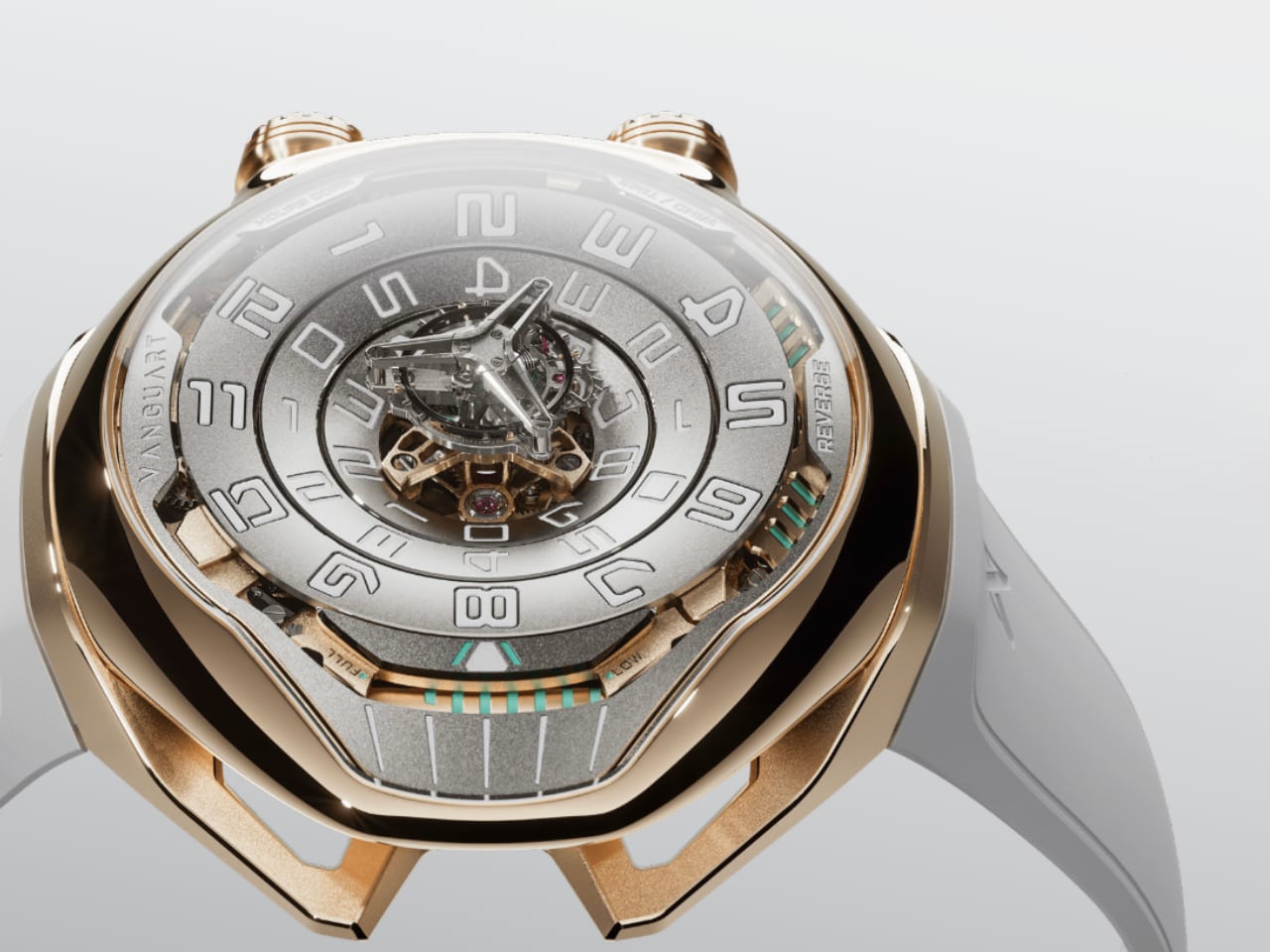
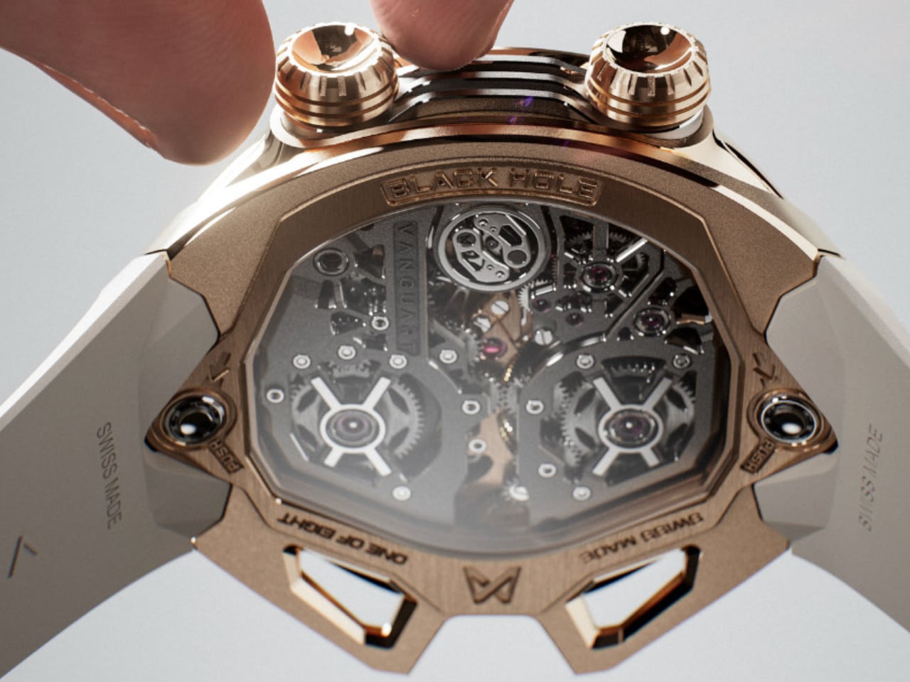
The Black Hole Tourbillon answers with a joystick. Not a crown dressed up to look modern, but an actual ergonomic joystick system that lets you push time forward or pull it backward with the slightest pressure. It’s the kind of design choice that makes you wonder why every other watchmaker is still using miniature knobs.

The Levitating Tourbillon That Defines the Dial

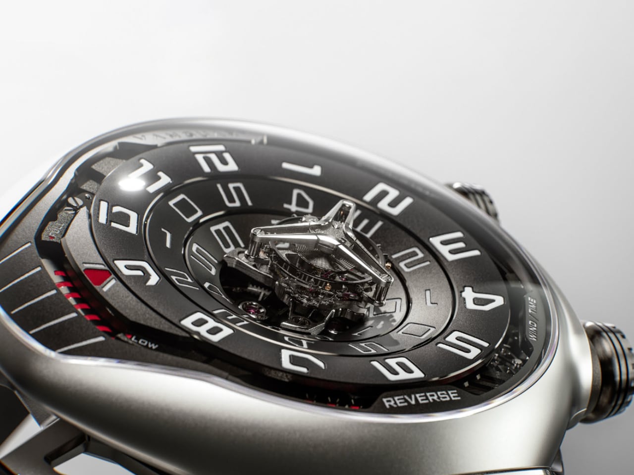
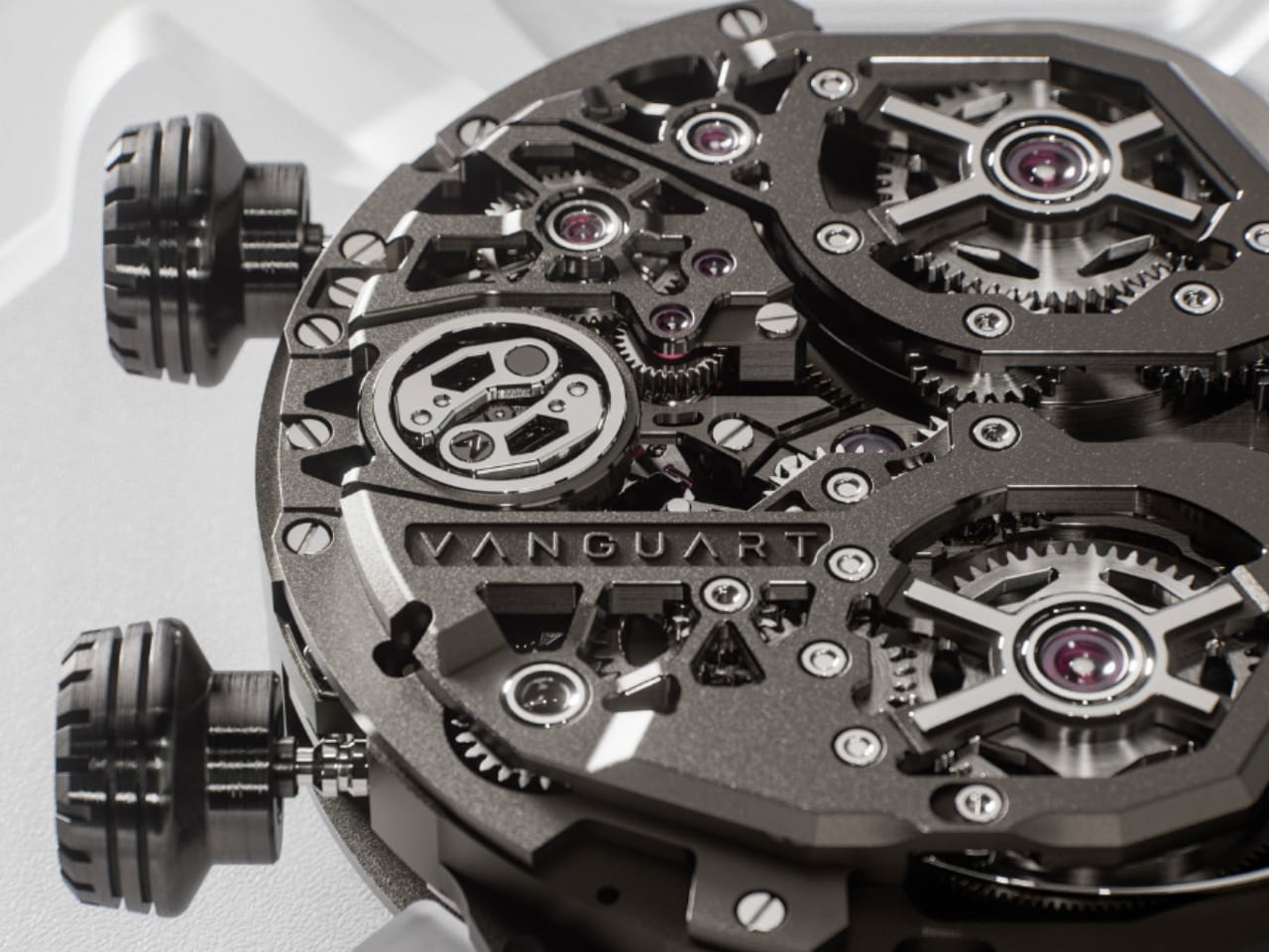
The center of the Black Hole dial presents what appears to be a floating tourbillon, hovering above three concentric tiers of titanium. Vanguart calls it a “levitating flying tourbillon,” and the visual effect lives up to that description. The caliber T-1701 mechanism creates the illusion of weightlessness while maintaining the precision you’d expect from 775 hand-assembled components.

Time displays through a linear system where hours and minutes each occupy their own concentric ring, bordering the tourbillon rather than competing with it. The dial doesn’t just show time. It orchestrates a three-tier mechanical ballet where every element serves both function and visual narrative.

What makes this approach work is the restraint. Instead of packing the dial with complications and sub-dials, Vanguart gave the tourbillon space to breathe. The titanium tiers create depth without clutter, and the hand-painted indications provide just enough contrast to remain legible without disrupting the futuristic aesthetic.

Design Without Visible Fasteners

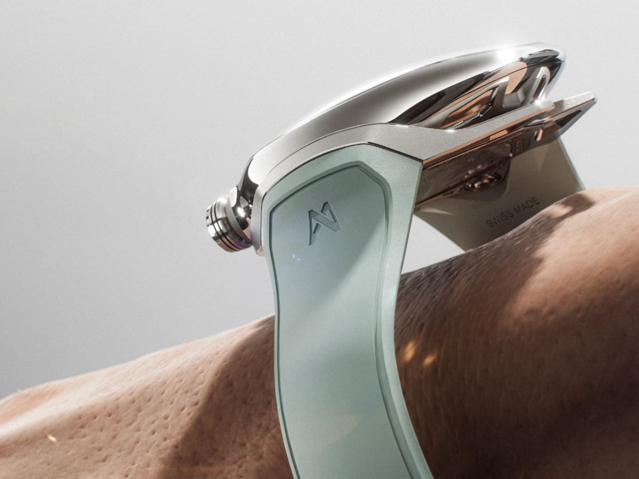
The case architecture follows a principle rarely executed this cleanly: no visible screws, no exposed pins, nothing that breaks the flowing geometry. The exoskeleton and fuselage are microblasted with polished bevels that catch light across complex curves. Grade 5 titanium in the base model keeps the weight at 80 grams. The rose and white gold versions climb to 173 grams, but the visual language remains identical across all three limited editions.

This seamless approach extends to how the case integrates with the joystick system. Traditional crown guards would have interrupted the organic lines. Instead, the joystick emerges as part of the case architecture, positioned where your fingers naturally rest. The design team coordinated every surface element with the mechanical layout inside, treating the case as an extension of the movement rather than a container for it.

The Interaction Design Philosophy

Vanguart positions this as “emotional engineering,” which sounds like marketing speak until you consider what they’re actually doing. The joystick time-setting system changes how you physically interact with the watch. Push forward to advance time, pull back to reverse it. The resistance feels deliberate, the feedback immediate. It transforms a functional task into something tactile and engaging.

This matters because luxury watchmaking often prioritizes technical complexity over user experience. You get incredible movements trapped behind interfaces designed 300 years ago. The Black Hole Tourbillon rethinks that equation. The 42-hour power reserve indicator runs vertically along the case, giving you an instant visual gauge without adding dial clutter. Every interaction point receives the same consideration.

The result is a watch that respects your time while asking you to slow down and appreciate the mechanics. You’re not just checking the hour. You’re engaging with 775 components working in coordination, visible through the architectural dial design.

Limited Production and Material Choices

Eight pieces per material configuration. Titanium for the weight-conscious, rose gold for warmth, white gold for understated luxury. Each version uses the same titanium dial with silver or anthracite PVD coating, maintaining visual consistency across the collection. The movements receive gold or silver PVD treatment depending on the case material, creating subtle coordination between exterior and interior finishes.

The rubber straps make sense for watches this technically focused. Leather would feel too traditional, metal bracelets would add weight and cost. The anthracite strap on titanium and white versions on gold cases complement without competing. These are considered design decisions, not default choices.

What This Watch Represents for Independent Watchmaking

Vanguart launched in 2017 with serious credentials. CEO Axel Leuenberger came from APRP’s R&D department, Chief Technical Officer Jeremy Frelechox spent 15 years at APRP, Chief Creative Officer Thierry Fischer designed for major established brands. They’re not outsiders disrupting tradition. They’re insiders asking what tradition might look like if you started fresh.

The Black Hole Tourbillon demonstrates this approach. It uses high-complication watchmaking techniques in service of an interface philosophy borrowed from product design and user experience. The joystick isn’t a gimmick. It’s a genuine rethinking of how we interact with mechanical time.

Whether this approach influences broader watchmaking remains to be seen. But for now, the Black Hole Tourbillon stands as evidence that even centuries-old categories can evolve when designers ask fundamental questions about form, function, and human interaction.

Limited to 8 pieces per configuration (titanium, rose gold, white gold). Available through Vanguart at info@vanguart.com.

The post The Vanguart Black Hole Tourbillon Replaces the Crown with a Joystick first appeared on Yanko Design.

No Hour Hand, No Minute Hand: The $299 Triarch Watch Tells Time With Magnets

Time is usually measured in straight lines and sweeping hands, but Triarch bends that rule into a triangle. Instead of conventional hands, its custom movement drives a rotating minute dial while a tiny ball traces a precise triangular path. Every glance becomes a small discovery, as the orbiting ball and shifting dial transform timekeeping into a kinetic sculpture on the wrist.

The design leans fully into the symbolism of the triangle, a shape long associated with stability, harmony, and eternity. From ancient pyramids to sacred geometry, the triangle has stood for structure and balance, and Triarch pulls that mythology straight onto the dial. The result is a watch that does not just show the time; it frames time inside a geometric icon that feels both timeless and futuristic.

Designer: Ken

Click Here to Buy Now: $299 Hurry! Only limited units left.

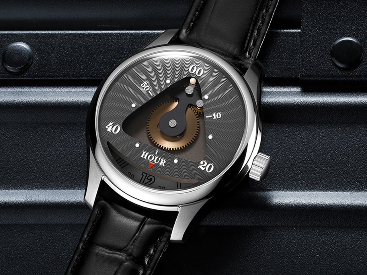
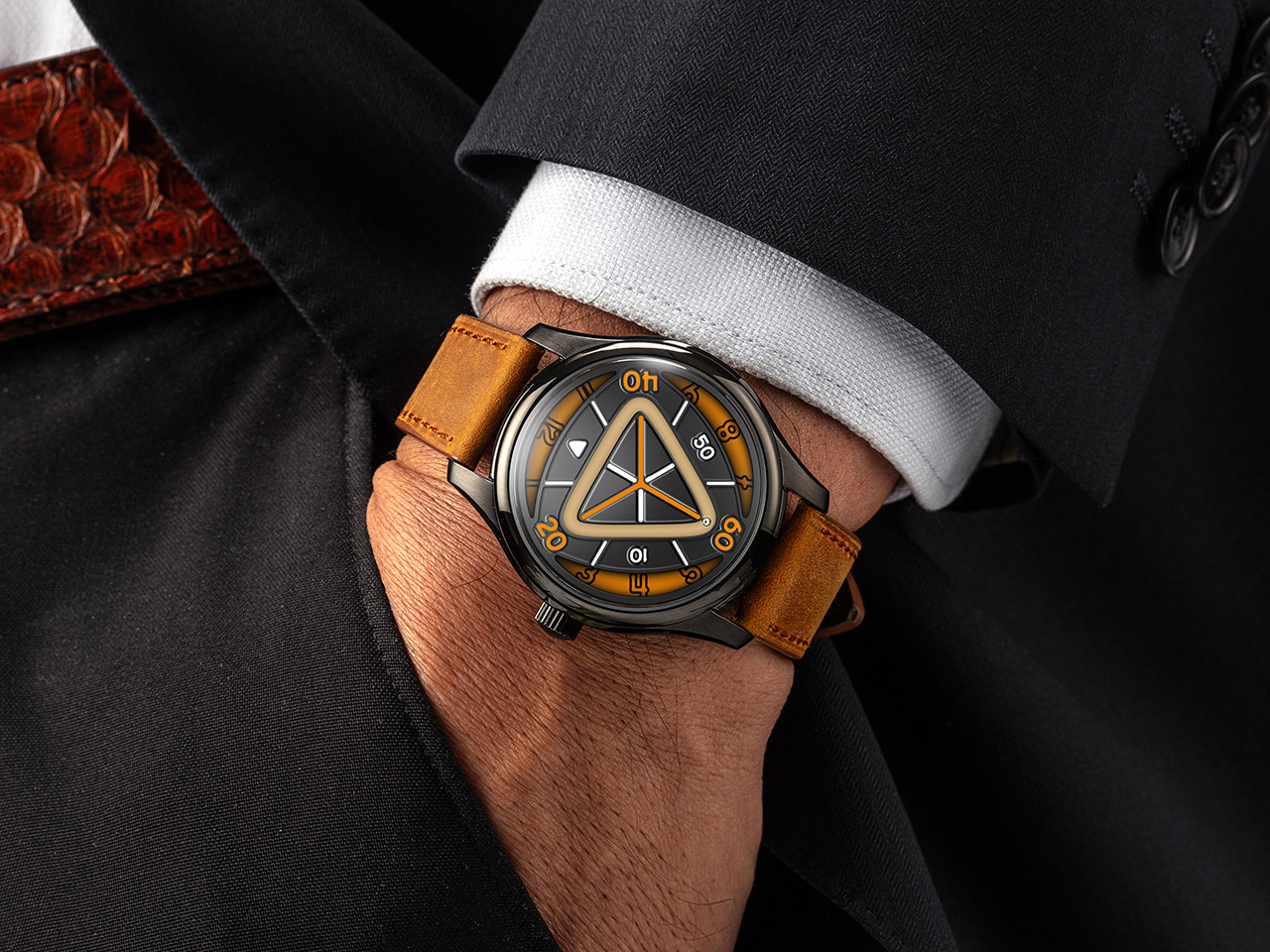
Reading the Triarch takes a second to learn but makes sense quickly. Hours are tracked on a rotating outer dial marked from 1 to 12, spinning continuously beneath a fixed reference point. Meanwhile, the minutes are indicated by a small ball that travels along a triangular track, moving in sync with the passage of time. At the center sits an exposed golden gear, visible through a triangular window, acting as the mechanical heart that drives the entire system. This gear does not just function; it performs, turning the dial into a stage where mechanics and motion are always on display.

Triarch exists in two distinct variants, each interpreting the core concept differently. Triarch I is the more refined, dress-oriented expression. It features the original mechanical rotating dial with the triangle window prominently framing the golden gear and the hour module. The dial designs lean toward classical watchmaking aesthetics, with radiating guilloché-style patterns that catch light beautifully. Available in three colors, including teal, grey-black, and blue, Triarch I pairs its mechanical theater with a premium Italian leather strap and a polished stainless steel case. It is aimed at collectors who appreciate mechanical artistry wrapped in a quieter, more sophisticated package.

Triarch II takes the same foundation and pushes it into bolder, more experimental territory. This upgraded version adds an extra layer to the dial structure, creating more visual depth and making the internal architecture more visible. The most significant upgrade is the magnetic minute hand innovation. Instead of a traditional pointer, the minute indication on Triarch II jumps with magnetic force, creating a floating, almost sci-fi effect that sets it apart from conventional watches and even from Triarch I. Lume coverage is significantly expanded on Triarch II, with larger areas of Swiss Super-LumiNova applied across the dial, making it far brighter and more legible in the dark. Available in six colorways, including black with orange accents, teal, lime green, and others, Triarch II leans hard into a modern, almost cyberpunk vibe. It ships with a rugged Crazy Horse leather strap, a material known for its matte finish and ability to develop character over time.

Both models share the same mechanical platform and case architecture. The movement is a Miyota 9039 automatic, a 24-jewel Japanese caliber running at 28,800 beats per hour with a 36-hour power reserve and accuracy rated to around plus or minus 10 seconds per day. Mounted on top is the in-house rotating hour module, the complication that makes the entire display possible. The case is 316L stainless steel, measuring 42mm wide and 14.16mm thick, with a double-domed sapphire crystal up front treated with multi-layer anti-reflective coating. The caseback is also sapphire, offering a view of the Miyota movement and parts of the custom module. Water resistance is rated to 5 ATM, or 50 meters, suitable for daily wear but not serious water sports. Both versions use 20mm lugs with quick-release spring bars, making strap swaps effortless.

Triarch positions itself somewhere between horology and wearable art, offering a genuinely different way to interact with time. The $299 Triarch I appeals to those who want mechanical poetry in a relatively subdued form, while the $359 Triarch II targets enthusiasts chasing visual boldness and technical novelty. Either way, the triangle is not just decoration here; it is the entire logic of the watch. Both the Triarch I and Triarch II ship free globally, with an extra strap included in the box.

Click Here to Buy Now: $299 Hurry! Only limited units left.

The post No Hour Hand, No Minute Hand: The $299 Triarch Watch Tells Time With Magnets first appeared on Yanko Design.

Audemars Piguet AI-powered watch box simplifies one of watchmaking’s most intricate complications

Beating calibers and the perpetually ticking hands of a watch have been symbols of fine craftsmanship and engineering, two dimensions that artificial intelligence is inching to chime with. If you were, like me, watching from the sidelines, believing there was time before a bigger name delved into AI, you wouldn’t have seen this coming.

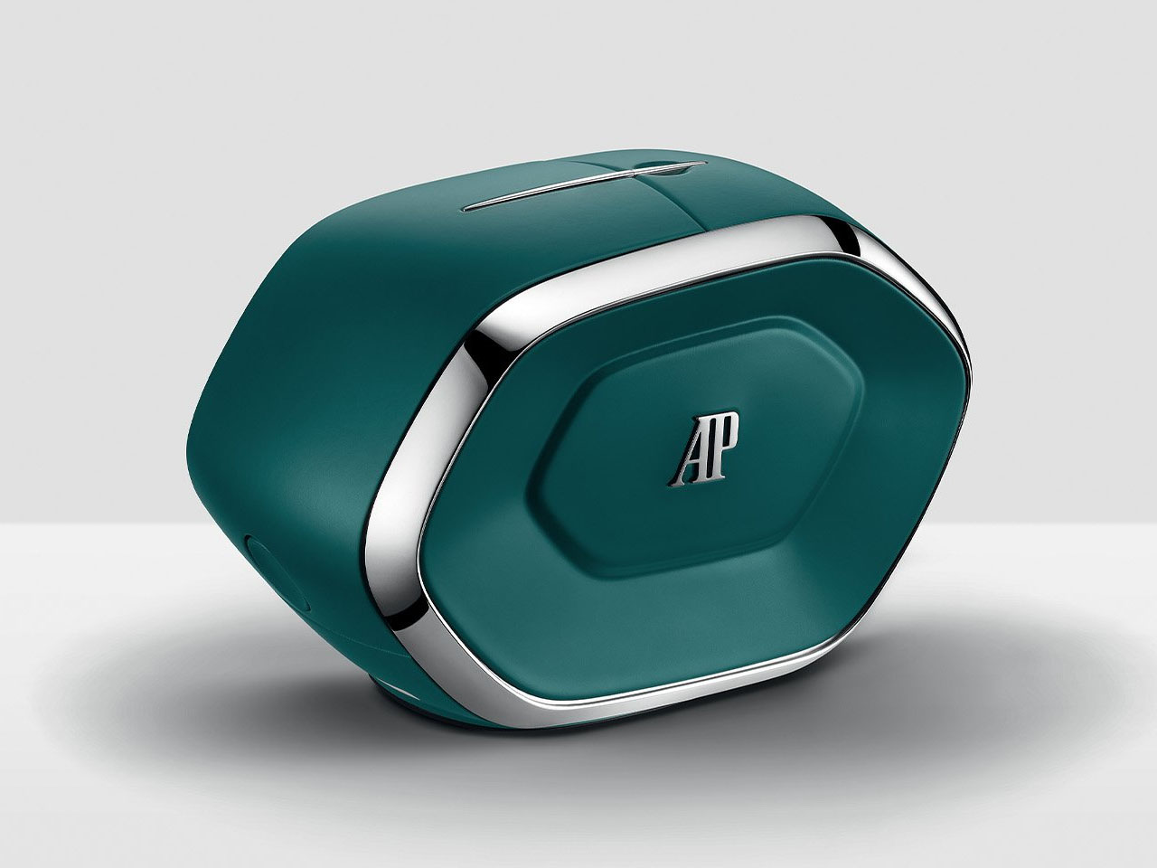
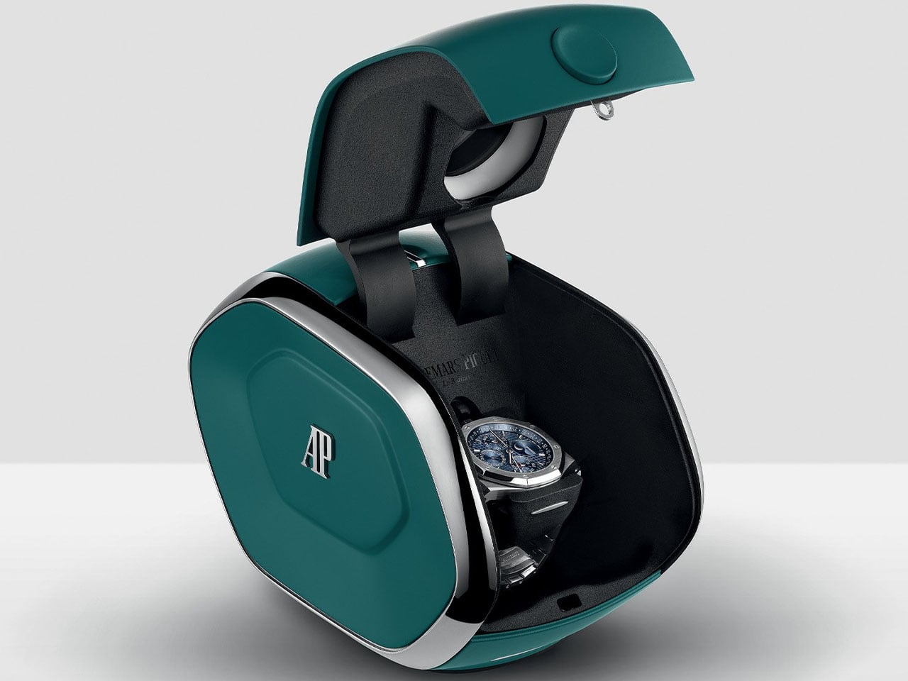
On the flip side, those who believe Audemars Piguet (AP) has the mettle to give us remarkable timepieces and accessories ahead of their time: this is the moment to savor. The watchmaker has raised the bar for watch boxes with its concept that’s more than a winder. The new Audemars Piguet AI-powered watch box is a setting device that tunes a perpetual calendar in just five minutes.

Designer: Audemars Piguet

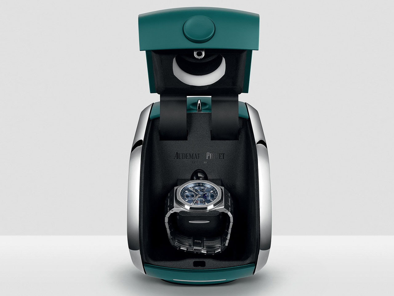
After the amazing Marvel-themed Royal Oak Concept and the Royal Oak Concept Tourbillon “Companion”, AP is now changing the watchmaking industry with the latest innovation that goes beyond the wrist. The setting box designed to adjust the company’s 41mm Royal Oak Perpetual Calendar is a robotic system, which uses AI to read and interpret the watch and set its functions like a human, without actually using human intervention.

Perpetual Calendar watches are fascinating to say the least. But their complicated mechanism, which automatically sets the date right throughout the year, taking into account the varying lengths of the month is more complicated to set right if it faulters, than the word complicated itself. Instead of the special corrections that this precise adjustment requires, the AP box can set it right in minutes automatically. Box upon placing the perpetual calendar timepiece in it uses a “camera to capture the dial configuration and analyse which calendar indications require adjustment.” And then using a combination of “robotics, computer vision, and AI” completes the setting operation in approximately five minutes.

The exciting watch box offers a quick and effective solution to the long-time barrier that has kept perpetual calendars from becoming collectors’ favorites. The AP’s intelligent setting device is a fruit of two years of partnership between the watchmaker and Dubai Future Foundation (DFF). The device meant to automatically set and wind its latest 41 mm Royal Oak Perpetual Calendar wristwatches was presented recently, for the first time, during the Dubai Watch Week.

The box is powered by a rechargeable lithium-ion battery, and has a clean design packed in a 20 x 12 x 15 cm dimensions, weighing only two kgs. It has been specially created to automatically adjust and wind 41mm Audemars Piguet perpetual calendar powered by the caliber 7138. The box is currently available to Ref. 26674ST.OO.1320ST.01 and 26674SG.OO.1320SG.01 owners, which are the two 2025 Royal Oak Perpetual Calendars, can auto-correct via the “all-in-one” crown and now benefit from the setting box, offering services to automate one of watchmaking’s most intricate complications.

The post Audemars Piguet AI-powered watch box simplifies one of watchmaking’s most intricate complications first appeared on Yanko Design.

Urwerk and Ulysse Nardin’s $122K UR-Freak Watch Might Be The Most Interesting Collab Of 2025

The Ulysse Nardin Freak has always been more of a horological platform than a static model. Since its debut, it has served as a canvas for the brand’s most forward-thinking ideas, from pioneering silicon components to its signature “movement as the hand” display. It was the watch that proved a piece of high watchmaking could look and function like nothing that came before it. Now, for the first time, Ulysse Nardin has opened that platform to an outside collaborator.

It is fitting that the partner is Urwerk, another independent force that has consistently challenged the conventions of time display. Instead of a simple cosmetic update, the two brands co-developed a new caliber that integrates Urwerk’s wandering hour satellites into the Freak’s rotating carousel. The watch is still fundamentally a Freak, using its entire movement to indicate the time, but the language it speaks is now filtered through Urwerk’s sci-fi, dashboard-inspired lens.

Designers: Urwerk & Ulysse Nardin

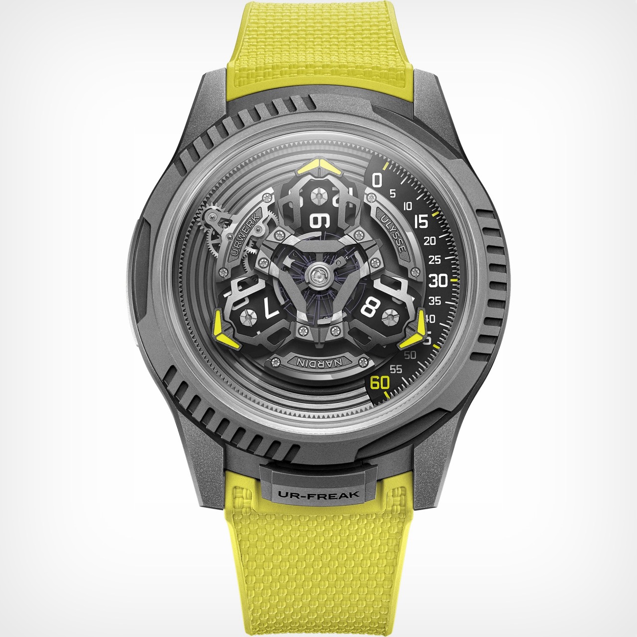
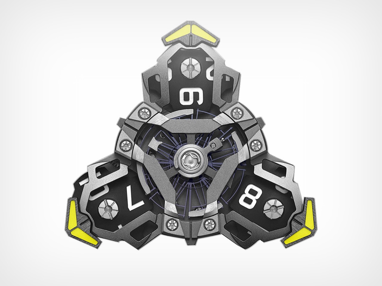
What makes this partnership click is the deep mechanical fusion they achieved. The purpose-built UN-241 caliber is proof of this, a movement born from over 150 new components designed to get these two very different systems to play nice. You can see Ulysse Nardin’s massive silicon oscillator beating right in the middle, the technical heart of the machine. But orbiting around it is an assembly that is pure Urwerk. The three satellite arms, each carrying a rotating hour block, are mounted directly onto the Freak’s carousel, creating a layered, kinetic sculpture. You are looking at a Ulysse Nardin movement carrying an Urwerk complication like a backpack, all rotating as one cohesive unit.

Even with all that movement, reading the time is surprisingly straightforward. Your eye is drawn to the right side of the watch, where a single active satellite points a bright yellow arrow toward a linear minute track. The number on the corresponding hour block gives you the hour. It is an intuitive system, a classic Urwerk touch, but it’s made more dynamic by the constant, slow rotation of the Freak platform underneath. It feels like Urwerk’s dashboard display has been mounted on a revolving space station.

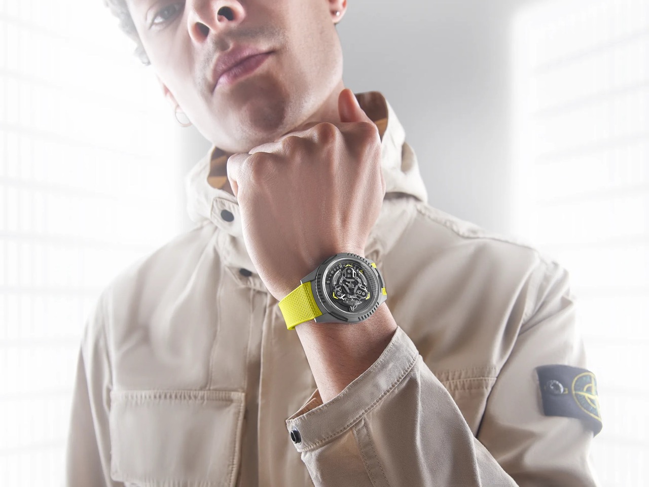
The 44 mm silhouette is clearly from the Freak ONE, with its crownless architecture and smooth, sandblasted titanium. But you can see Urwerk’s influence in the fluted, notched sections of the bezel, which add an industrial texture that feels different from the Freak’s usually sleek profile. You still set the time by rotating this bezel, secured by a locking tab at six o’clock that now reads “UR-FREAK.” It is a clear signal that this is a Freak that has been properly Urwerk-ified. The electric yellow strap, Urwerk’s calling card, drives the point home, a splash of aggressive color against the muted gray case.

Getting one will not be easy, or cheap. The UR-Freak is a limited run of just 100 pieces, and with a price tag of around 122,200 USD, it is aimed squarely at serious collectors in the independent scene. For those looking to acquire one, inquiries will have to be made directly to either brand. The UR-Freak is the kind of watch that makes you wonder why it did not happen sooner, and at the same time, be amazed that it happened at all.

The post Urwerk and Ulysse Nardin’s $122K UR-Freak Watch Might Be The Most Interesting Collab Of 2025 first appeared on Yanko Design.

OMEGA’s Ceramic Gambit: How the Seamaster Planet Ocean Challenges Rolex’s Design Dominance

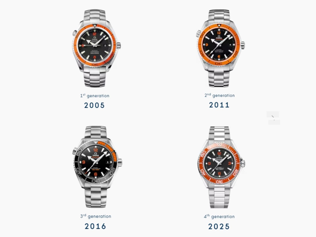
Twenty years after launching the Planet Ocean, OMEGA just made the boldest design move in luxury dive watches: bringing back orange ceramic at full production scale. Not as a limited edition. Not as a boutique exclusive. As a core offering that positions this collection directly alongside Rolex’s Submariner in the everyday luxury category.

Designer: OMEGA

This is the design story of how OMEGA spent years perfecting a single color, reworked an entire case architecture, and created three distinct visual personalities that finally give the Planet Ocean the design refinement it always deserved.

The Orange Ceramic Challenge

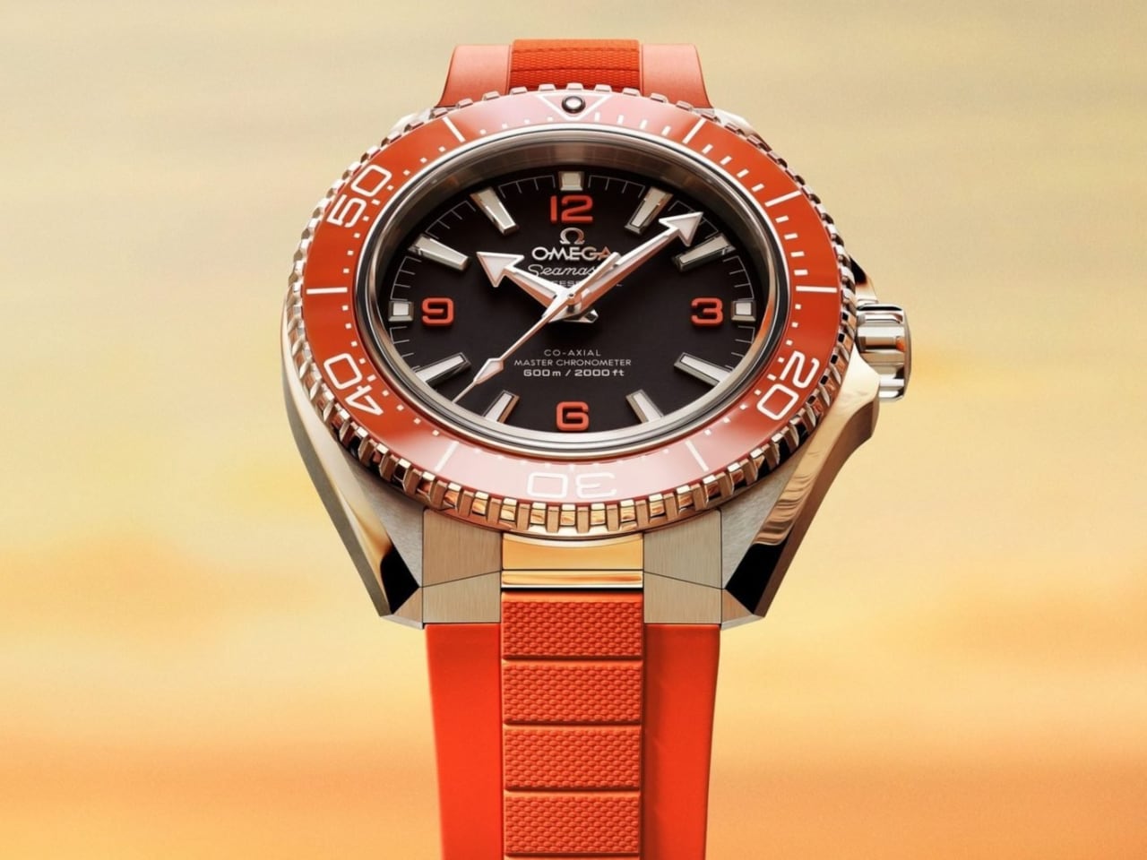
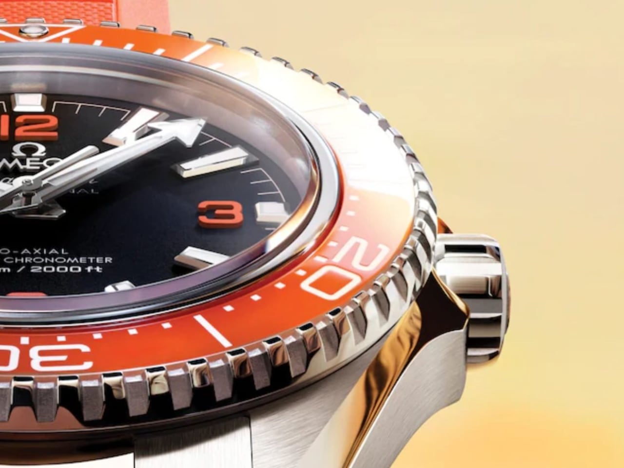
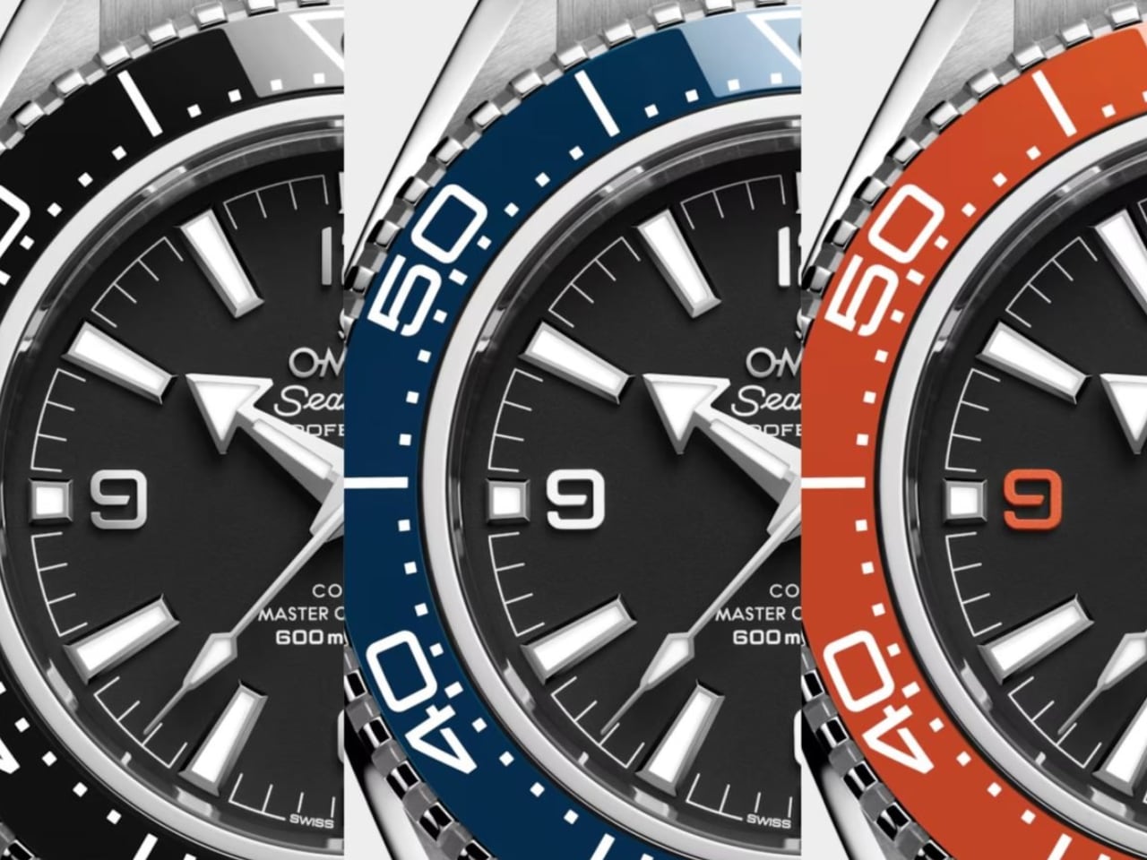
Let’s address the headline design achievement first. OMEGA’s new orange ceramic bezel represents years of Swiss atelier development to perfect a hue that most brands avoid entirely. The reason? Orange ceramic is notoriously difficult to execute without looking like cheap plastic film.

The chemistry of ceramic materials resists certain wavelengths. Getting that specific orange tone, the one that references the 1957 Seamaster 300 heritage pieces, requires precise control over sintering temperatures and material composition. OMEGA clearly cracked the formula. The result hits like a flare on the wrist: bold, bright, and unmistakably intentional.

The orange accents aren’t arbitrary nostalgia. The 1957 Seamaster 300 pieces carried orange through the hands, indices, and bezel. Those cues resurfaced in the very first Planet Ocean models in 2005, giving the watch its early cult status. Twenty years later, OMEGA had the confidence to bring that color back at impressive scale.

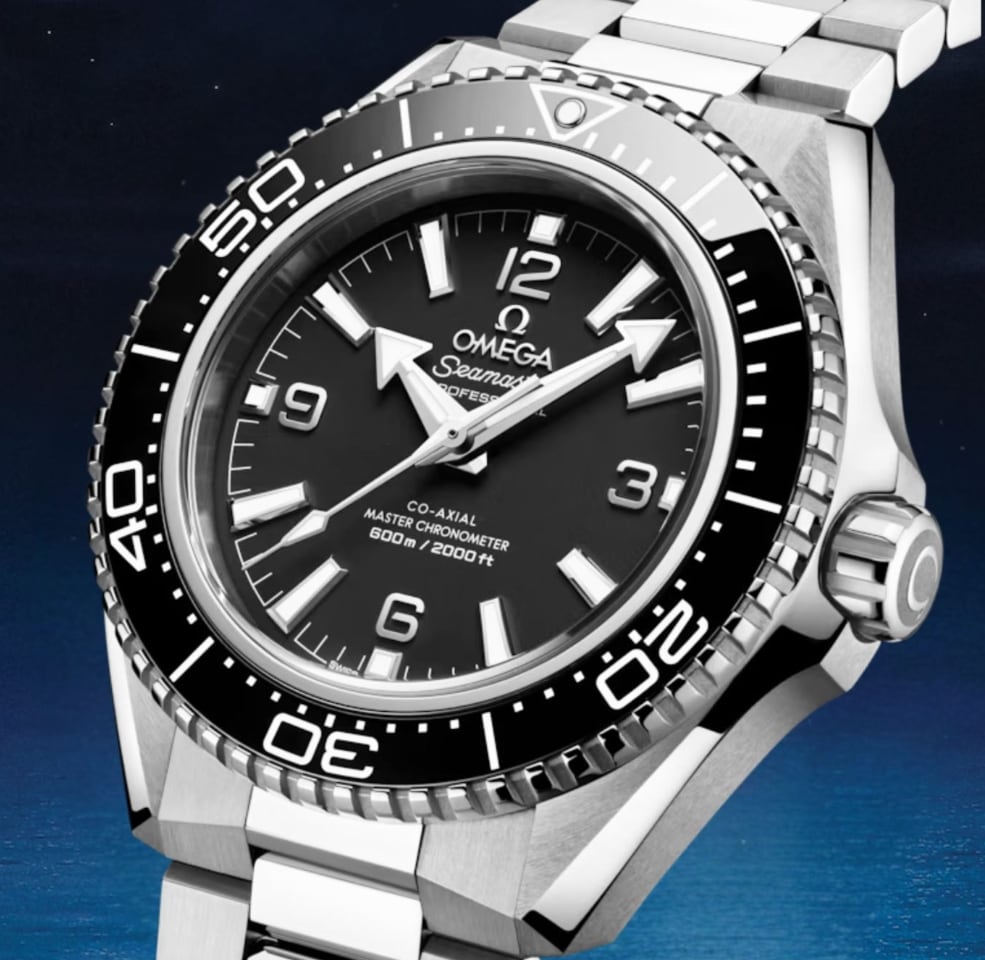
This represents thoughtful heritage integration. Rather than creating a vintage reissue or limited anniversary piece, OMEGA wove that 1957 DNA into a thoroughly modern design. The matte dial finish, the arrowhead hands, the white enamel bezel scales: these are pure Planet Ocean signatures, simply executed with contemporary precision.

What makes this move significant isn’t just the technical achievement. It’s the scale. Bringing this level of material complexity to a core production model, not a limited run, signals confidence in the design direction. OMEGA is betting that luxury watch buyers want personality and heritage, not just another black bezel diver.

Three Personalities, One Refined Architecture

The collection splits into three distinct visual identities, each serving different aesthetic preferences while sharing the same dramatically reworked case.

The black variant is the purist’s pick. Matte black dial, rhodium-plated numerals, white enamel bezel scale. This feels closest to the original professional dive watch brief, the option for someone who thinks color belongs in galleries rather than on expensive timepieces. It’s the no-nonsense tool watch executed with Swiss precision.

The blue edition becomes the everyday option, what I’d call The Bond Watch. That ceramic bezel catches light differently than the matte black version, creating visual interest that works equally well at Bondi brunch or a business dinner. Paired with the steel bracelet, it has that elevated everyday look. Swap to the blue rubber strap, and it transforms into something more pragmatic yet still effortlessly appealing.

Then there’s the orange variant, designed for people who want their Planet Ocean to make a statement while keeping it classy. This is where that years-long ceramic development pays off aesthetically. The bezel doesn’t just add color; it fundamentally changes the watch’s visual weight and presence. Doxa pioneered orange bezels in the 20th century for pure underwater legibility. OMEGA’s move here is for aesthetics, and it’s paid off completely.

The Case Evolution

Beneath those three color personalities sits a more subtle but equally important design refinement: the case architecture itself.

The new Planet Ocean case is sharper and more angular than the outgoing generation. You can see it in the lug transitions and the crown guard geometry. But here’s where OMEGA’s design team showed restraint: they made the watch sit flatter on the wrist by reworking the sapphire crystal profile.

That’s a crucial detail. Dive watches often suffer from excessive height, creating awkward wrist presence and limited shirt-cuff clearance. By addressing the crystal geometry, OMEGA created the most refined Planet Ocean silhouette to date. The 42mm diameter stays manageable, but the flatter profile changes how the watch wears entirely.

The Grade 5 titanium caseback contributes to this refinement. Titanium is NASA’s preferred material for a reason: exceptional strength-to-weight ratio and resistance to environmental extremes. For a watch rated to 600 meters, that caseback choice represents functional design thinking, not just material showcase.

Why This Design Matters

Glen Powell wearing the orange variant and Aaron Taylor-Johnson stepping into the blue and black references signals OMEGA’s positioning strategy. These aren’t just ambassador choices; they’re design communication. Powell can sell a high-visibility ceramic bezel with charm. Taylor-Johnson, as a 007 frontrunner, anchors the collection with leading-man polish.

The message? This Planet Ocean generation positions directly against Rolex’s Submariner in design sophistication, material innovation, and everyday luxury appeal. Not through imitation, but through distinct visual personality. Where the Submariner trades on timeless restraint, the Planet Ocean offers choice. Three distinct design directions, bold material decisions, and heritage integration that feels earned rather than borrowed.

For a brand of OMEGA’s scale to bring back orange ceramic as a core offering, not a boutique exclusive or limited run, reveals where luxury dive watch design is heading. Buyers want options beyond black and blue. They want material innovation that’s visible and meaningful. They want heritage that informs design rather than constraining it.

This Planet Ocean looks tougher. It wears better. It feels more resolved. The sharper case, the flatter profile, the perfected orange ceramic: these represent two decades of learning what worked and what needed refinement.

OMEGA didn’t just update the Planet Ocean. They gave it three distinct personalities, perfected a notoriously difficult material, and created the design refinement this collection always deserved. Twenty years after launch, this is the Planet Ocean that challenges Rolex’s design dominance with confidence and craft.

The post OMEGA’s Ceramic Gambit: How the Seamaster Planet Ocean Challenges Rolex’s Design Dominance first appeared on Yanko Design.

Christopher Ward C1 Bel Canto Lumière: When Luminescence Meets Acoustic Engineering

When a watch chimes on the hour, the sound should resonate with purpose. When it glows in the dark, the luminescence should tell a story. Christopher Ward’s C1 Bel Canto Lumière delivers both with a level of technical execution that transforms timekeeping into a multisensory experience.

Designer: Christopher Ward

The $5,205 timepiece combines three distinct engineering disciplines: advanced photoluminescence, acoustic amplification, and visual depth. It’s a watch designed for those who appreciate horological complexity and aren’t afraid to wear something that looks like it belongs in a sci-fi film.

At a Glance

Movement: In-house FS01 module (60+ components) on Sellita SW200-1 base, 29 jewels, 38-hour power reserve
Case: 41mm Grade 5 titanium Light-catcher™, brushed and polished
Crystal: Box sapphire with anti-reflective coating
Luminescence: Globolight ceramic ring, multi-layered Super-LumiNova (blue/green), luminescent strap option
Acoustic: Songbird striking mechanism, D note chime on the hour
Price: $5,205 (pre-order)
Guarantee: 60-day returns, 60-month movement warranty

Luminescent Architecture That Redefines the Category

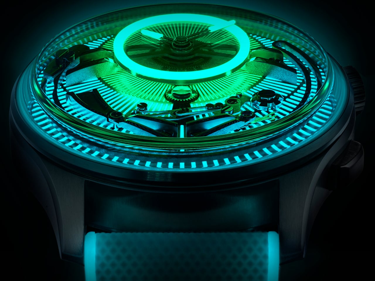
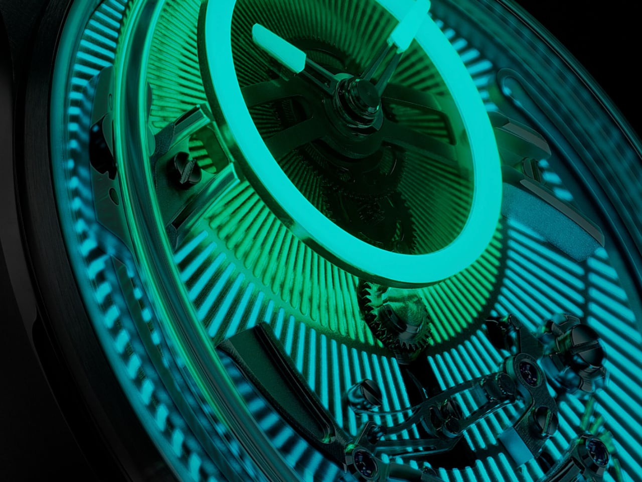
Unlike most makers who settle for glowing hands and markers, Christopher Ward treats photoluminescence as a holistic design system. A Globolight ceramic ring floats above the dial while the base platine uses multi-layered Super-LumiNova that shifts from blue to vivid green depending on light exposure. The hands and dial circumference carry Globolight for intense neon-green luminescence, and the on/off indicator switches from white to luminous emerald in darkness.

The optional white rubber strap infused with Super-LumiNova extends the glow across your entire wrist, creating an “all-wrist” luminescent system. The smoked sapphire dial floats above the platine, amplifying the sunray pattern beneath through box sapphire crystal that enhances light play while providing scratch resistance.

In practical terms, expect visibility that exceeds standard dive watch lume by a significant margin. The multi-layer system charges quickly under ambient light and maintains legibility through extended darkness periods, while the blue-to-green shift creates visual interest that standard single-compound applications cannot match.

The Songbird Mechanism: Acoustic Engineering in 41mm

The C1 Bel Canto Lumière includes Christopher Ward’s signature “songbird” striking mechanism that chimes on the hour. The brand developed a custom FS01 module comprising over 60 components built atop a Sellita SW200-1 base movement. The striking hammer, visible through the dial, hits a steel spring to produce what the brand describes as “the beautiful singing of the D note.”

The Grade 5 titanium case functions as a sound amplifier, turning the entire watch into a resonance chamber. This material choice matters: Grade 5 titanium offers superior strength and hardness compared to the Grade 2 titanium used in the bracelet options, creating a rigid structure that amplifies vibration more effectively. At 41mm, the Light-catcher™ case is brushed and polished to create tactile contrast while maintaining structural integrity for acoustic performance.

Daily Wear Consideration: The chime operates automatically at each hour with no option to silence or adjust the mechanism. This commitment to acoustic performance means the watch announces time audibly throughout the day. Consider your typical environments before purchasing if you spend significant time in meetings, libraries, or other silence-required settings

The acoustic output sits between a subtle resonance and an assertive chime. In quiet rooms, the D note carries clearly without being intrusive. In noisier environments, you’ll feel the vibration through your wrist even when the sound doesn’t carry. The 29-jewel automatic movement provides 38 hours of power reserve, ensuring the hourly chime performs reliably through a full day and overnight.

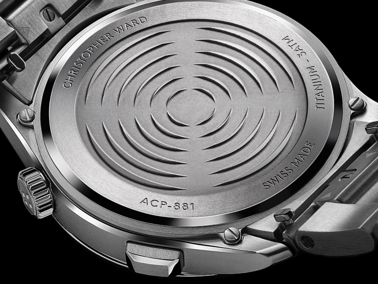
Christopher Ward applied anti-reflective coating to the domed sapphire and deep-stamped the caseback with circular patterns. The push-down crown features the brand’s twin flag motif, and the Super-LumiNova strap carries a “Clous de Paris” hobnail pattern.

Technical Integration and Material Choices

The movement combines traditional Swiss watchmaking with Christopher Ward’s in-house engineering. The FS01 module adds chiming complications to the reliable Sellita base, creating a hybrid caliber that balances innovation with proven performance. Grade 2 titanium Bader or Consort bracelets are available as alternatives to the rubber strap. The softer Grade 2 titanium offers comfortable flex against skin compared to the rigid Grade 5 case material, making these bracelet options better suited for extended daily wear.

The floating Globolight X1 GL Blue ring serves as the watch’s visual anchor. The neon dial beneath creates contrast against titanium accents, and the visible striking mechanism adds mechanical intrigue. Every component works toward the same goal: making timekeeping feel less like utility and more like theater.

Christopher Ward’s Design Philosophy in Practice

This watch represents Christopher Ward’s commitment to delivering complications typically reserved for luxury segments at accessible price points. The brand has built its reputation on in-house innovation that challenges traditional watchmaking hierarchies. The C1 Bel Canto Lumière extends this philosophy into hybrid territory, where visual artistry meets acoustic engineering meets advanced materials science.

The sci-fi aesthetic positions Christopher Ward in conversation with avant-garde independents while maintaining the technical credibility that comes from genuine horological development. Where some microbrands rely on external module suppliers, Christopher Ward engineered the FS01 striking mechanism in-house, demonstrating a vertical integration approach more common in brands charging triple this price.

This approach signals where hybrid watches might evolve next. As traditional complications become more accessible through advanced manufacturing, the competitive edge shifts toward multi-sensory integration. The C1 Bel Canto Lumière doesn’t just tell time or chime or glow. It orchestrates all three into a unified experience.

Why This Watch Matters

Christopher Ward built the C1 Bel Canto Lumière for people who want their timepiece to do more than mark hours. The combination of advanced luminescence, acoustic engineering, and depth-creating visual design creates a watch that performs differently depending on lighting conditions and time of day. It chimes when the hour turns. It glows when darkness falls. It reveals mechanical complexity through transparency.

The $5,205 pre-order price positions this watch in the accessible luxury segment, competing with pieces that often deliver only one or two of these technical features. Christopher Ward integrated all three into a 41mm case with 60/60 guarantees: 60 days of free returns worldwide and a 60-month movement guarantee.

The C1 Bel Canto Lumière isn’t trying to be subtle. It’s designed for wrists that appreciate technical achievement and aren’t concerned with blending into boardrooms. This is a watch that announces its presence through light and sound, and does so with engineering that justifies the spectacle.

The post Christopher Ward C1 Bel Canto Lumière: When Luminescence Meets Acoustic Engineering first appeared on Yanko Design.

Bamford Mayfair 2.0: Playful Modularity Meets Swiss Precision

Bamford Watch Department has built its reputation on one compelling principle: watches should reflect personal style, not just manufacturer decisions. Since launching in 2014, the British brand has made waves by customizing luxury timepieces for clients who wanted something beyond off-the-shelf offerings. Now, with the Mayfair 2.0 chronograph, Bamford shifts from customization service to original design house, and the result challenges conventional thinking about what affordable innovation can deliver.

Designer: Bamford

The Mayfair 2.0 promises a blend of playful modularity and serious functionality, wrapped in a package that costs £495 (approximately $652 USD). That price point positions it squarely in entry-level mechanical territory, except this isn’t a mechanical watch. It’s a quartz chronograph with a split-second complication, housed in a modular bioceramic and titanium case that transforms into eight distinct watches. The question isn’t whether Bamford can deliver customization at this price. The question is whether the watch industry is ready for this level of user-controlled design flexibility.

Visual Impact and Modularity: Eight Watches in One

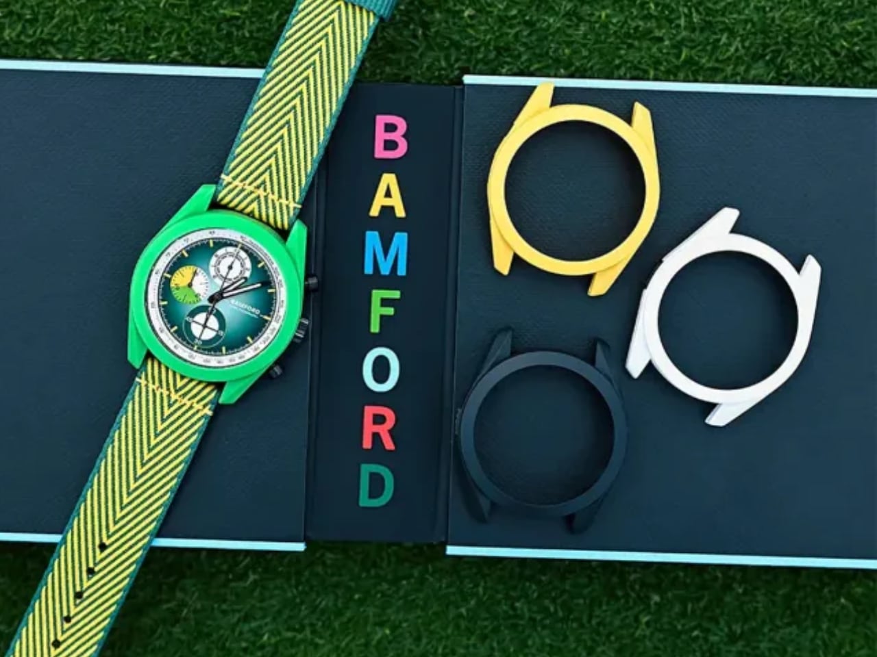
The Mayfair 2.0’s core proposition sounds almost too good: four interchangeable bioceramic outer casings slip over a titanium inner case, paired with two strap options per set, creating eight distinct color and style combinations. The modular system works through a simple black button release mechanism that pops the bioceramic shell off the titanium core in seconds.
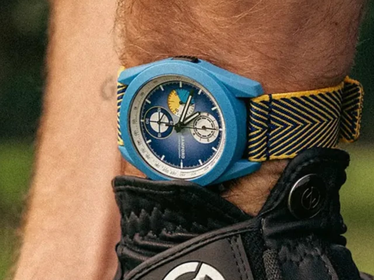
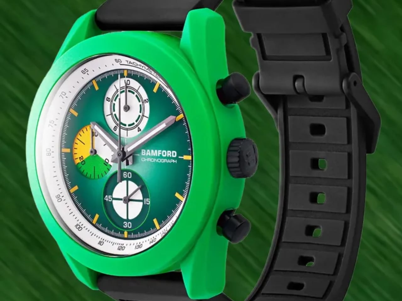
Each colorway tells a different story. The Green set delivers pure sports energy with its forest green dial, vibrant yellow and black chevron NATO-style strap, and matching green bioceramic case. The white chronograph subdials pop against the saturated green, creating the kind of legibility you want when timing laps or tracking intervals. This combination screams weekend adventure, outdoor activity, casual confidence.

The Blue set  shifts the mood entirely. The bright blue bioceramic case paired with the same yellow-black chevron strap creates a nautical aesthetic that feels both playful and purposeful. On the wrist, the 40mm case diameter shows its versatility. It’s substantial enough to make a statement but restrained enough for everyday wear under a shirt cuff. Bamford also offers White and Pink sets, expanding the personality range from patriotic (white case with red-blue straps) to bold fashion statement (pink everything).

The genius here isn’t just the variety. It’s the experiential element. Switching cases and straps takes seconds, but it fundamentally changes how the watch feels on your wrist and how it presents to the world. You’re not buying a watch. You’re buying eight different expressions of time.

It’s soft to the touch and more resistant to surface scratches than plastic, though not as impact-durable as metal casings. The signature black button that secures each casing adds a functional design detail that becomes part of the watch’s visual identity.

Core Construction and Engineering: Titanium Meets Bioceramic

Beneath the colorful bioceramic exterior lives a Grade 5 titanium inner case that handles the serious engineering work. This dual-case architecture solves multiple design challenges simultaneously. Titanium provides structural integrity, water resistance, and long-term durability while keeping weight minimal. The bioceramic outer shells deliver aesthetic flexibility without compromising the core construction. The dimensions hit that sweet spot of modern versatility: 40mm diameter, 13.8mm case height. That height includes the domed crystal, so the watch wears thinner than the number suggests. More importantly, the 40mm diameter works across different wrist sizes. It’s large enough to carry visual presence but compact enough that smaller wrists won’t feel overwhelmed.

100-meter water resistance might not sound impressive until you consider the modular design. Maintaining waterproof integrity with removable outer casings requires precision engineering of the sealing system. Bamford clearly prioritized real-world usability over maximum depth rating. This watch can handle rain, swimming, and daily wear without anxiety. The bioceramic choice connects Bamford to broader industry trends. Swatch popularized bioceramic through high-profile collaborations (notably the Omega MoonSwatch series), proving the material could deliver luxury aesthetics at accessible prices. Bamford takes this concept further by making bioceramic the customization vehicle itself. Where Swatch used bioceramic for one-off collaborations, Bamford built an entire user-driven ecosystem around it.

Design Detailing and Dial Play: Color Harmony Meets Functionality

The dial layout reveals Bamford’s attention to both aesthetics and chronograph functionality. Each colorway maintains dial color harmony between the outer casing, subdial accents, and strap patterns. The green set pairs its forest green dial with white subdials and yellow strap accents. The blue set echoes the case color throughout the watch face. This isn’t accidental. Bamford understood that modular design only works if each configuration feels intentionally designed, not randomly assembled.
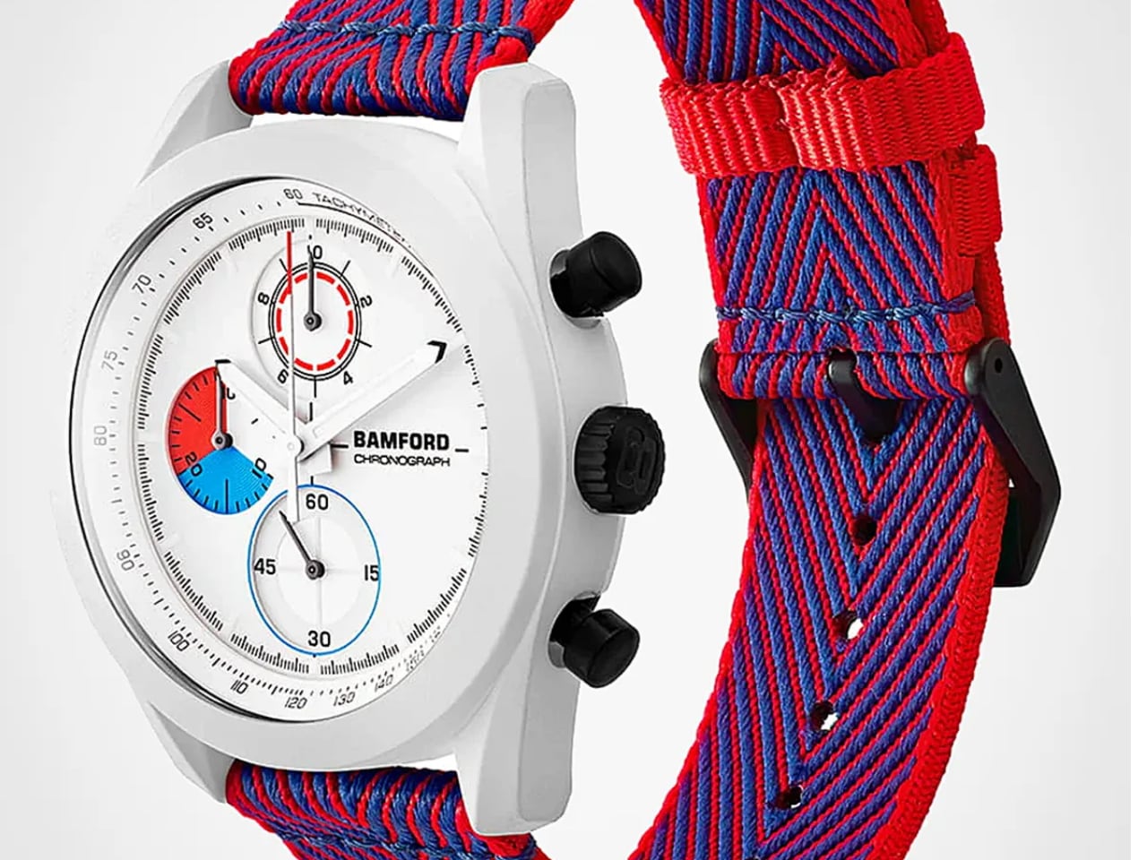
The chronograph layout packs genuine utility into the 40mm canvas. At 12 o’clock sits a 1/10-second counter that converts into a 10-hour totalizer, an unusual complication that gives the dial asymmetric visual interest while serving split-second timing needs. The 30-minute totalizer at 3 o’clock features color segments matching the four casing options, creating a subtle design link between form and function. Small seconds live at 6 o’clock, balanced by the date window at 4:30.

A tachymeter scale wraps the rehaut (the angled ring between dial and crystal), offering speed calculation capabilities that most owners will never use but enthusiasts absolutely appreciate. Lume-treated hands and markers ensure nighttime legibility, a detail that separates serious tool watches from pure fashion pieces.

These details accentuate both fun and utility. The colorful 30-minute totalizer adds playfulness. The tachymeter scale and 1/10-second precision add legitimacy. The combination suggests Bamford designed for watch enthusiasts who don’t take themselves too seriously but still care about proper horology.

The Movement: Swiss Quartz Meets Split-Second Complication

Inside beats a Swiss Ronda caliber 3540.D quartz movement with split-second chronograph functionality. This is where Bamford made its most controversial and arguably most intelligent decision. In an industry that worships mechanical movements, choosing quartz feels almost heretical. But this specific quartz movement delivers a complication rarely found under $1,000: split-second chronograph timing. Split-second chronographs can time two events simultaneously, with one hand stopping while the other continues running. In mechanical watches, this complication typically adds thousands to the price due to engineering complexity. The Ronda 3540.D delivers this functionality with quartz accuracy (typically within 10 seconds per year) and minimal maintenance requirements.

Bamford balances serious horology and accessibility by choosing precision over prestige. The watch community might debate the quartz versus mechanical merit, but the functional reality favors quartz at this price point. You get better accuracy, split-second complications, and zero maintenance for years. The titanium and bioceramic case construction absorbs the cost savings from the movement choice, delivering material quality where it impacts daily wear experience.

Wearability and User Experience: Lightweight Comfort, Everyday Ruggedness

The strap system offers two distinct wearing experiences. The rubber strap (available in black or white) delivers traditional sports watch comfort with easy cleaning and water resistance. The woven recycled plastic strap with chevron pattern (shown in both images) brings texture and visual interest while advancing Bamford’s sustainability positioning. That chevron pattern isn’t just decoration. The high-contrast yellow and black (or other color combinations depending on set) creates visual energy that complements the colorful bioceramic cases.
The weave provides breathability and flexibility while the recycled plastic construction checks environmental consciousness boxes without sacrificing durability. Both strap options use pin-buckle closures instead of deployant clasps, keeping the design straightforward and the cost controlled. Pin buckles are more time-consuming to fasten but they’re infinitely adjustable and nearly indestructible. The combined weight of titanium case and bioceramic shell keeps the watch surprisingly light on the wrist.

This isn’t a timepiece you notice after the first hour. It’s comfortable enough for all-day wear, rugged enough for weekend adventures, and modular enough to match different contexts throughout the week.

Packaging and Value Proposition: Full Set Access

Bamford delivers the complete modularity experience in the box: four bioceramic outer casings, two strap options per set, and the titanium core chronograph. That’s eight distinct watch configurations before you consider mixing and matching across sets. Want the green case with the white strap? Done. Blue case with pink strap? Your call. At £495 (approximately $652 USD), the Mayfair 2.0 undercuts traditional entry-level Swiss chronographs by hundreds of dollars while offering Swiss movement provenance and split-second functionality.
The value calculation extends beyond initial purchase price. One Mayfair 2.0 set provides the variety of eight watches, eliminating the collector impulse to buy multiple timepieces for different occasions. The bioceramic and titanium construction suggests durability that justifies the investment. The Swiss quartz movement means minimal servicing costs for years. Compared to similar modular systems (rare in watchmaking) or entry-level chronographs (common but usually singular in design), the Mayfair 2.0 occupies unique territory. It’s not the cheapest chronograph you can buy. It’s potentially the most versatile chronograph you can buy at this price.

Big Picture: Design Significance and Industry Implications

Bamford’s playful modularity philosophy could influence how the industry thinks about personalization at accessible price points. Luxury watch brands have long offered customization through special orders and limited editions, but these options typically add cost and require commitment to a single configuration. Bamford flips this model by building flexibility into the core product architecture. This approach democratizes creative ownership in watch fashion.
You’re not selecting from manufacturer-determined options and living with that choice forever. You’re actively participating in the design process every time you swap a case or strap. The watch becomes a creative tool for self-expression rather than a static accessory.

The broader implications for sustainable materials in consumer design run deeper than the recycled plastic straps. Bioceramic production requires less energy than traditional metal case manufacturing. The modular system extends product lifespan by preventing boredom-driven replacement purchases. One watch doing the work of eight watches reduces overall consumption.

If Bamford’s experiment succeeds, expect competitors to explore similar modular architectures across product categories. The challenge will be replicating the thoughtful execution. Modularity only works when each configuration feels intentionally designed rather than randomly assembled, and when the swapping mechanism is genuinely convenient rather than technically possible.

The post Bamford Mayfair 2.0: Playful Modularity Meets Swiss Precision first appeared on Yanko Design.