The Erica by Craft House Is the Tiny Home That Thinks Vertically

Tiny living has always been a negotiation. You trade square footage for freedom, density for mobility, and somewhere in that exchange, comfort usually takes the first hit. The Erica by Craft House is a direct response to that tradeoff, a 24-foot towable tiny home that refuses to accept the ceiling as a ceiling. Craft House, a builder with roots across Poland, Austria, and Ireland, designed the Erica around a simple but underused idea: when you can’t build out, build up.

The rooftop terrace is the home’s defining move — an accessible outdoor space that extends livable square footage without touching the home’s road-legal width. It’s the kind of solution that makes you wonder why more tiny home builders haven’t gone there. The home sits on a double-axle trailer and can be fitted with an optional ground-level deck, shifting it from purely mobile to something closer to semi-permanent. That flexibility is part of the appeal; Erica doesn’t force you to choose between a life on wheels and a home that actually feels settled.

Designer: Craft House

Step inside, and the ground floor, finished in Scandinavian spruce, does a convincing job of feeling larger than its 129 square feet. The open-plan layout keeps the kitchen and living area in conversation with each other, which does a lot of the heavy lifting spatially. It’s a simple design decision that pays off immediately.

The kitchen is well-equipped: induction cooktop, oven, fridge, sink, and enough cabinetry to keep things from feeling like a camping setup. The breakfast bar seats two and doubles as a work surface…exactly the kind of multitasking that earns its keep in a space this size. The bathroom sits at the opposite end of the home with a flushing toilet, vanity sink, and glass-enclosed shower. Tight, but complete.

The bedroom is a loft reached via a staircase smartly built out with integrated storage underneath. The ceiling is low, as loft ceilings in tiny homes tend to be, but the tradeoff is a ground floor that stays clear and breathable. A mini-split air conditioning unit handles climate control; a practical choice that doesn’t eat into the floor plan the way bulkier systems would.

Solar power is available as an optional add-on, giving owners a path toward off-grid living without hardwiring it into the base spec. It’s a considered choice that keeps the entry point accessible while leaving room to grow. The Erica isn’t trying to reinvent tiny living — it’s trying to do it better. And in a market full of homes that look alike, that rooftop terrace alone makes it worth a second look.

The post The Erica by Craft House Is the Tiny Home That Thinks Vertically first appeared on Yanko Design.

Irontown Modular Built a Tiny Cabin With Vaulted Ceilings & Warm Wood Walls for Under $50K

Two hundred square feet sounds like a limitation until you actually see what Irontown Modular did with it. The Sledhaus 200, the latest park model from the Utah-based builder, arrives as a compact, considered cabin that strips the idea of home back to what actually matters.

At just 10 feet wide and 20 feet long, the Sledhaus 200 packs a lofted bedroom, an optional bathroom, a galley kitchen, a living and lounge area, and a front covered porch into its 200 square feet of living space. On paper, that sounds like a tight squeeze. In practice, the design tells a different story. Big windows flood the interior with natural light, warm wood tones wrap the walls with a sense of groundedness, and a vaulted ceiling does the heavy lifting, making the space breathe in a way you wouldn’t expect from something this small.

Designer: Irontown Modular

Irontown Modular describes the Sledhaus 200 as built for “simplicity, style, and serious charm,” and that language isn’t just marketing. The cabin sits within the brand’s Sledhaus line, a series of recreational property-focused designs built for people who want a real retreat, not a compromise. It can be placed directly on a trailer chassis for mobile flexibility or installed as an ADU (accessory dwelling unit) on a fixed foundation, making it one of the more versatile entries in Irontown’s growing catalog.

The use cases are where the Sledhaus 200 gets genuinely interesting. Irontown positions it as the ideal backyard guest suite, a weekend mountain getaway, or even a full-time tiny home for those willing to go all-in on a downsized life. It can be dropped on gravel or fully hooked up to water, electricity, and sewage, giving owners real flexibility in how they choose to use it. For property owners in the American West, particularly, where land is abundant but building costs are not, this is a sensible and stylish answer to a growing need.

Pricing starts at $49,600, making the Sledhaus 200 one of the more accessible entries in the modular park home space. A ready-to-ship model is also currently available at $117,000, which does not include transport or taxes. Irontown ships across Arizona, California, Colorado, Idaho, Montana, Nevada, Oregon, Utah, and Wyoming. In a market crowded with tiny homes that try too hard, the Sledhaus 200 earns its place by doing the opposite, trusting the architecture, keeping the details honest, and letting the space speak for itself.

The post Irontown Modular Built a Tiny Cabin With Vaulted Ceilings & Warm Wood Walls for Under $50K first appeared on Yanko Design.

Soft Means Spoiled, and That’s Actually Brilliant

Most kitchen appliances are desperate for your attention. They beep, flash, and send you notifications just to remind you that they exist. Dolce, a conceptual refrigerator handle designed by Zhujun Pang, goes in the opposite direction entirely, and that restraint is exactly what makes it so interesting.

The premise is deceptively simple. The handle, made of frosted silicone with a clean, pill-shaped profile, changes its physical firmness based on the freshness of the food stored inside the refrigerator. When everything’s fine in there, the handle feels firm to the touch. When something is going bad, it softens. No beep. No notification. No app to check. You just reach for the fridge and the handle tells you what you need to know before you’ve even opened the door.

Designer: Zhujun Pang

The metaphor doing the heavy lifting here is the banana. Firm when fresh, soft when it’s past its prime. It’s one of those pieces of embodied knowledge so universal it barely registers as knowledge at all. Pang took that intuition and designed around it, which is the kind of thinking that tends to produce the best objects: not inventing a new language for a user to learn, but borrowing one they already speak fluently.

Aesthetically, Dolce is striking in a way that sneaks up on you. The handle has a warmth and softness even in its “firm” state, that frosted translucency sitting beautifully against the warm wood grain of a cabinet door. It looks almost like a piece of cast glass or a studio ceramics piece. It doesn’t scream “smart home gadget,” and that’s a huge point in its favor. A lot of connected objects fail because they look like what they are: gadgets strapped onto otherwise elegant things. Dolce looks like it belongs.

What Pang identified at the core of this problem is quietly profound. The refrigerator is, in a sense, a box that separates us from our food. You can’t smell your leftovers through the door. You can’t see whether that cucumber at the back is starting to go. The fridge solves the preservation problem but creates an information problem in the process. Dolce’s answer isn’t to add a screen or a camera interface or a connected app. It’s to restore something tactile and immediate at the one point of contact you already have with the appliance every single day.

It’s also worth noting that the handle looks exactly like what a modern refrigerator handle should look like right now. That matters more than it might seem. Design that carries function without calling attention to its function has a longer life. Trends come and go, but an object that is quietly beautiful tends to stay relevant. Dolce is the kind of piece that could sit in a design museum or in an IKEA kitchen and feel at home in either setting.

The technology underneath is also worth a moment of appreciation, even if we’re not deep-diving into the engineering. Internal sensors read the fridge’s environment, an onboard microcontroller processes that data, and a small air pump inflates or deflates a silicone bladder inside the handle. The firmness you feel when you grab it is literally driven by air pressure responding to actual conditions inside the fridge. That the end result of all that is just “firm” or “soft” is the whole point. Complex input, simple output. The user carries none of the cognitive load.

It would be easy to dismiss this as a design concept that will never see production, and maybe it won’t. But the thinking it represents is what the appliance industry desperately needs more of. Most smart home products are still asking us to do more, check more, manage more. Dolce asks us to do less. It removes a small decision from your day and delivers the answer at the precise moment you need it, through the sense that requires the least interpretation of all.

The post Soft Means Spoiled, and That’s Actually Brilliant first appeared on Yanko Design.

This Finnish Professor Built His Family Home From Old Tires and Fishing Nets

Most architects study sustainable housing. Matti Kuittinen actually lives in it. The Aalto University professor and architect didn’t just design the Tiny House Shadow as a thought experiment. He built it in Lohja, Finland, about 40 miles from Helsinki, moved his family in, and made it his primary residence. The result is one of the most provocative arguments for a different kind of future that architecture has produced in years.

The numbers are the opening statement. At just 365 square feet, Shadow is built from 56% recycled or reused materials: old fishing nets for flooring, scrap steel for the frame, recycled car tires for the roof, upcycled windows and doors, and insulation made from recycled glassware. What isn’t salvaged is responsibly sourced, including fossil-free steel. The house uses 85% fewer resources than a conventional home, 43% less land, and delivers a 53% smaller carbon footprint per resident. For Kuittinen, these aren’t talking points. They’re proof of concept. “We have a limited carbon budget,” he has said. “Construction must learn to stay within it.”

Designer: Matt Kuittinen

The name comes from Jun’ichirō Tanizaki’s 1930s essay In Praise of Shadows, in which the Japanese writer reflected on the quiet beauty of darkness and restraint. The metaphor tracks. Shadow is literally built from what the linear economy discarded, a home made from the world’s leftovers, dressed in matte black, standing still and serious against the Finnish landscape. The exterior reads as avant-garde. The interior is equally deliberate.

Inside, minimalism operates as a lifestyle logic, not just an aesthetic. The main living area transforms between working, dining, and sleeping through heavy black curtains that divide the space without walls. Sleeping pods take cues from Japanese capsule hotels and stack vertically to save floor space. The kitchen runs on open shelving instead of cabinets. There’s a full bathroom and, true to form, a 22-square-foot wood-fired sauna. Every square foot earns its place. Construction took four months; the full project, from first drawing to moving in, took one year.

Shadow has since been exhibited at construction fairs as a working prototype and featured in Aalto University’s Designs for a Cooler Planet exhibition. Kuittinen is clear that the project is bigger than one house. “Shadow proves that recycled and low-emission materials can work at scale,” he says. “This isn’t just about one house. It’s about changing the whole mindset of construction.” In 365 square feet, he’s making a very large point.

The post This Finnish Professor Built His Family Home From Old Tires and Fishing Nets first appeared on Yanko Design.

5 Best Waterdrop Filter Systems for Spring 2026, From Renters to Full Family Kitchens

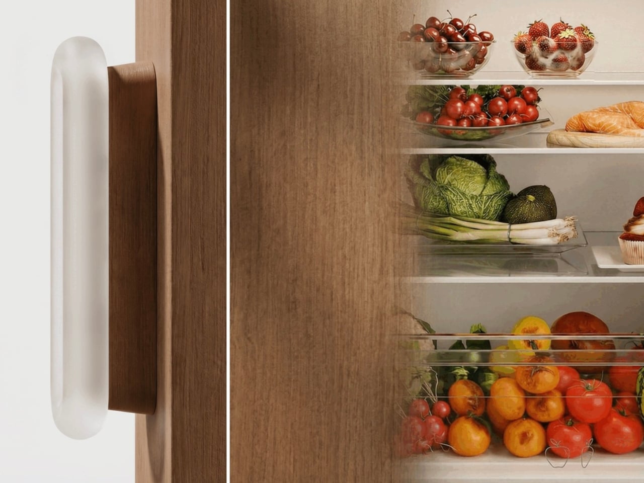
The water coming out of your tap has traveled through infrastructure that, in many American cities, predates the internet by several decades. Municipal treatment plants catch most of what they’re supposed to catch, but aging pipes, PFAS compounds from industrial and agricultural runoff, and lead from corroding plumbing each leave their own signature in what eventually fills your glass. Two people living thirty miles apart can have genuinely different water problems, and the solution that works perfectly in one kitchen may be entirely wrong for the other. Spring tends to be when many families actually act on this, a natural reset point where the habits and home conditions worth changing finally get real attention.

Waterdrop Filter has spent the better part of the last decade building a filtration lineup that treats water quality as a variable, not a constant. Five of their systems are currently on sale on Amazon through March 31st, spanning the full range of how people actually live: renters who can’t drill into cabinets, families running a high-demand kitchen with PFAS and lead on their radar, people who want their minerals preserved, and anyone who wants instant hot filtered water without the plumbing commitment. Each one is built around a different problem, and this guide helps narrow down which one is built around yours.

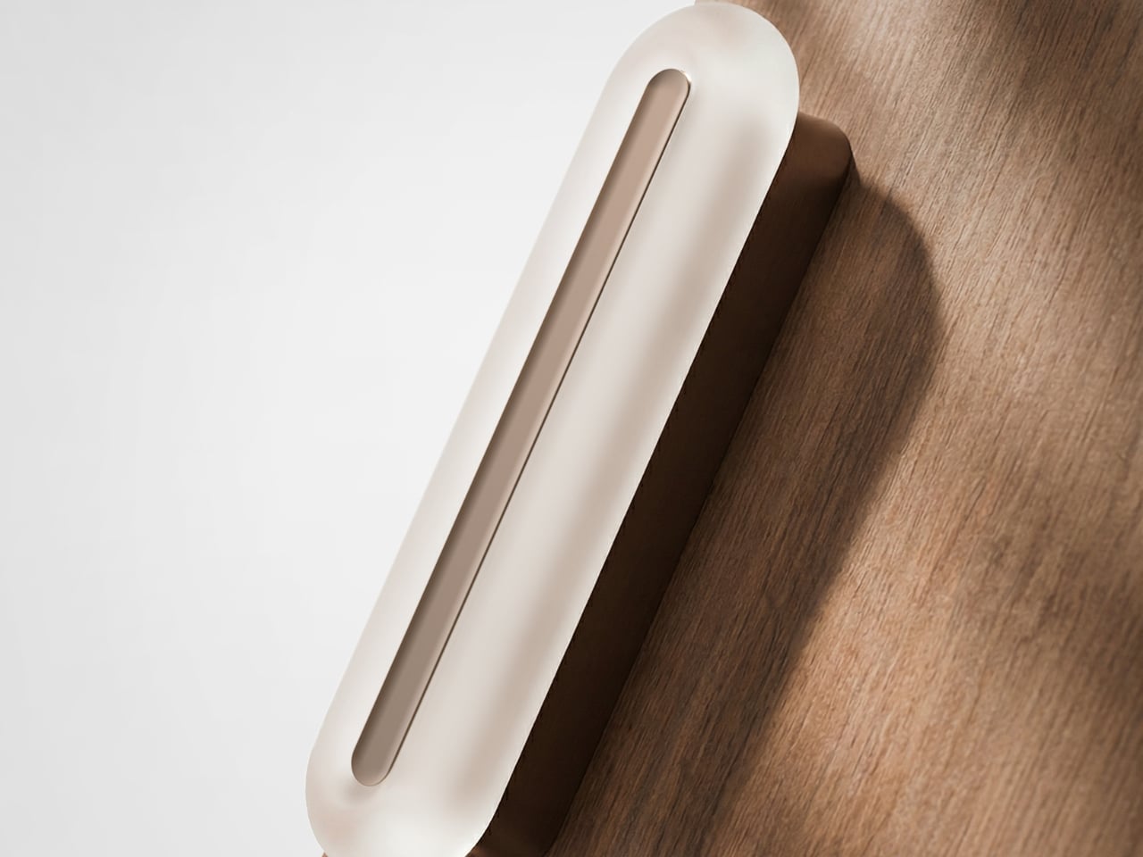
Waterdrop Filter G3P800 Tankless RO System: The Under-Sink Performer That Stays Out of Sight

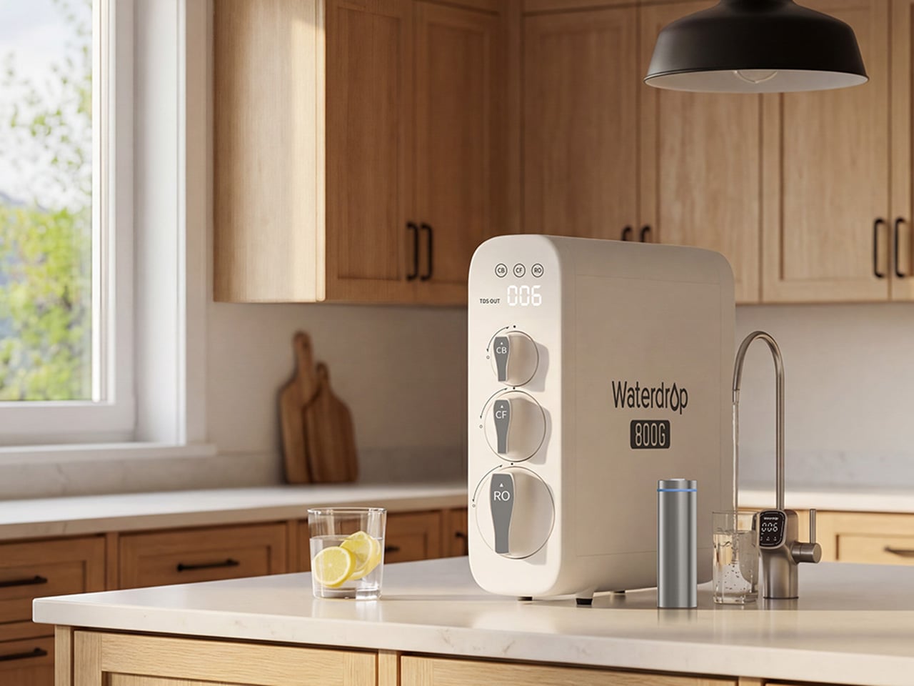
For families thinking seriously about what’s actually in their water this spring, the G3P800 is where Waterdrop Filter’s under-sink lineup earns its bestseller status. The concerns driving most of those conversations, PFAS compounds, lead from aging pipes, chlorine byproducts, are precisely what this system addresses. Its 10-stage RO filtration achieves 98% PFOA reduction, 99% PFOS, and over 99% lead, numbers that carry particular weight for households with infants, pregnant women, or elderly members. NSF/ANSI certifications across standards 42, 53, 58, and 372 back those claims with third-party verification. The tankless design reclaims 50 to 70 percent of under-sink cabinet space, and the UV sterilization stage catches bacteria and viruses that even a high-precision RO membrane cannot address alone.

At 800 gallons per day, the G3P800 handles the full rhythm of a busy family kitchen, from drinking water and cooking to coffee and baby formula preparation. A brushed nickel smart faucet displays real-time TDS readings and filter status at a glance, keeping the system legible without demanding attention. The 3:1 pure-to-drain ratio reflects a genuine shift in responsible RO design, producing meaningfully less drain water than older systems. Spring tends to be the moment families finally act on water quality concerns sitting in the back of their minds, and the G3P800 meets that decision with something durable, rigorously certified, and quietly capable of handling daily household demand for years.

Click Here to Buy Now: $699 $999 (30% off). Hurry, deal ends in 48-hours! Website Here.

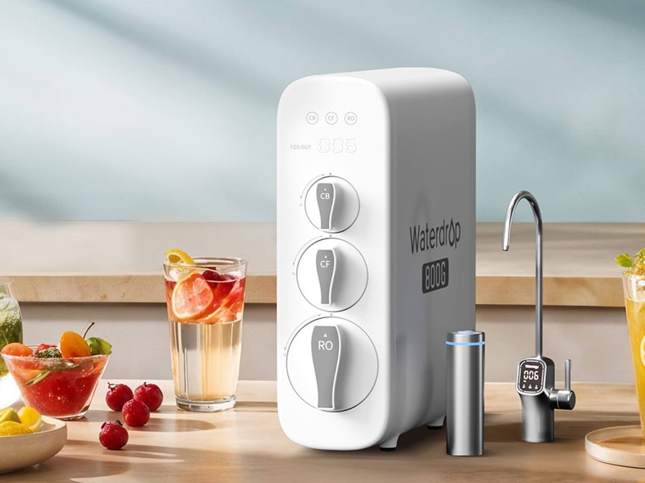
Waterdrop Filter X12 RO System: The Flagship That Puts Minerals Back Where They Belong

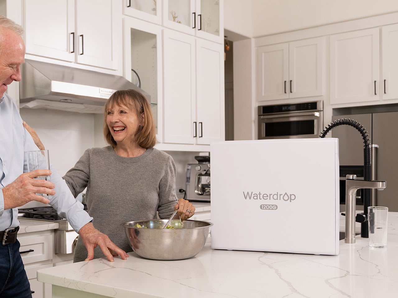
Where the G3P800 is built for families who want serious filtration at serious capacity, the X12 is for those willing to push further. At 1,200 gallons per day across 11 stages of precision RO filtration, it represents Waterdrop Filter’s most complete answer to the growing list of contaminants giving health-conscious households pause this spring. The PFAS reduction figures here are among the strongest in the lineup, achieving 98.88% PFOA and 98.97% PFOS reduction, alongside a greater than 99.87% lead reduction rate. Certified against NSF/ANSI standards 58 and 372, the X12 carries the kind of third-party verification that families with infants or elderly members look for before trusting a system with daily drinking water and formula preparation.

What genuinely separates the X12 from most flagship RO systems is what it does after filtration. Reverse osmosis at this level of thoroughness strips water down comprehensively, which is where the built-in alkaline mineralization stage earns its place. Calcium and magnesium are reintroduced post-filtration, supporting bone health over time and restoring the balanced, naturally mineral-rich character that makes water taste the way good water should. For families prioritizing both purity and nutritional quality, particularly those with growing children, that combination is difficult to replicate elsewhere. The smart digital faucet handles real-time TDS monitoring and filter life tracking with the same quiet intelligence found across the range. Spring health resets tend to go deeper for some households, and the X12 is designed for exactly that level of commitment.

Click Here to Buy Now: $854.05 $1299 (34.2% off). Use code YKSPRING26 during checkout. Hurry, deal ends in 48-hours! Website Here.

Waterdrop Filter DLG-P: Serious PFAS Protection Without the Installation Headache

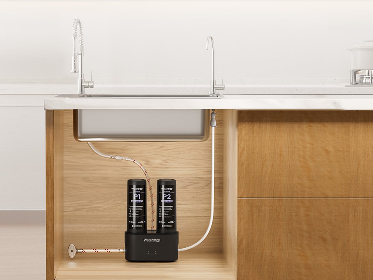
The conversation around PFAS and lead tends to center on high-capacity RO systems, and for good reason. But the reality of how many people actually live, in rentals, in first homes, in apartments where permanent under-sink modifications are off the table, means that access to serious water filtration has historically required commitment that many households simply couldn’t meet. The DLG-P is Waterdrop Filter’s answer to that gap. It installs in around three minutes without specialist tools, routes filtered water through an innovative dual-outlet design serving both a dedicated drinking faucet and the main kitchen tap, and achieves 99.7% PFOA and 99.6% PFOS reduction that rivals systems at considerably higher price points. For renters prioritizing PFAS protection this spring, those numbers reframe what budget-friendly filtration can actually deliver.

The system reduces chlorine, fluoride, sediment, and odors across its filtration stages, covering contaminants that affect daily drinking water quality in the most direct ways. A smart filter life indicator removes guesswork from maintenance, flagging replacement needs before performance drops. Filter cartridge replacement takes around three seconds, keeping upkeep genuinely frictionless for fast-paced households where the water filter is expected to work reliably in the background. The black finish gives it a contemporary presence that holds up in modern kitchen environments, and the compact footprint respects the limited under-sink space that comes with rental kitchens. For those who have looked at the G3P800 or X12 with interest but need a solution that fits a different budget and living situation, the DLG-P covers more ground than its entry price suggests.

Click Here to Buy Now: $91.19 $119.99 (24% off). Use code YKSPRING26 during checkout. Hurry, deal ends in 48-hours! Website Here.

Waterdrop Filter TSU: The Case for Filtration That Knows When to Stop

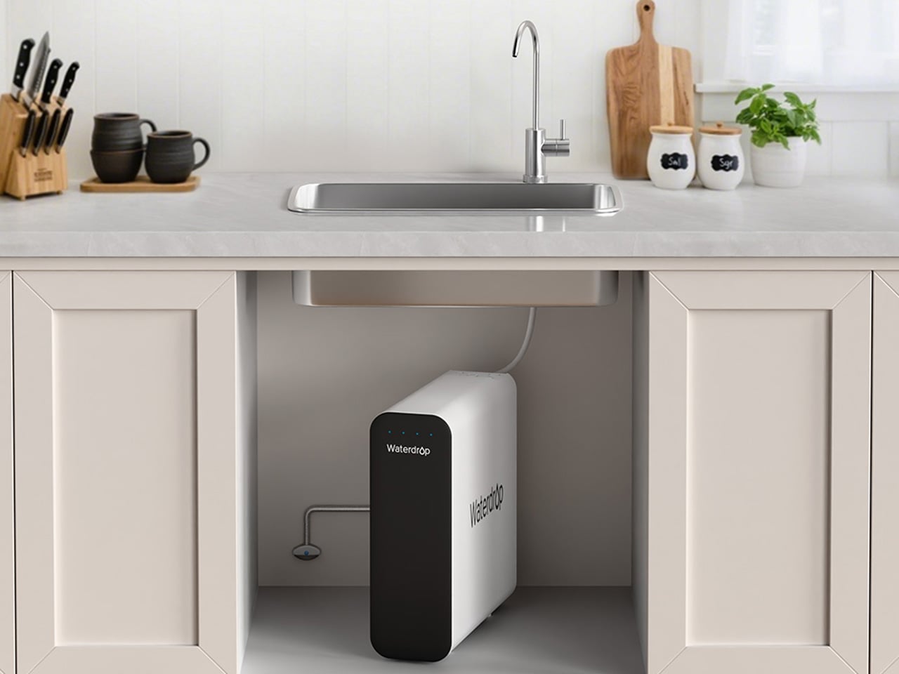
Not every household is starting from the same water quality baseline. In homes where municipal supply is reasonably clean but carrying chlorine taste, sediment, bacteria, and trace heavy metals like lead, deploying a full reverse osmosis system is a longer route than necessary. The TSU operates on that logic. Its 0.01-micron ultrafiltration membrane reduces 99.9% of bacteria, intercepts rust, sediment, fluoride, and heavy metals including lead, while leaving the water’s natural mineral content completely intact. Where the X12 reintroduces calcium and magnesium through a dedicated remineralization stage, the TSU simply never removes them, which for households with acceptable source water is both more efficient and more elegant.

What makes the TSU particularly compelling as a spring upgrade is what it doesn’t require. No electricity, no pump, zero wastewater, running entirely on standard water line pressure with nothing added to the utility bill. The 3-stage tankless system saves 50 to 70 percent of under-sink cabinet space. A brushed nickel dedicated faucet comes included, and the filter lifespan runs up to 24 months, meaning maintenance stays minimal across nearly two years. For busy families where easy installation and low ongoing upkeep matter as much as performance, the zero-waste design also reduces environmental impact and running costs over time. For households that want clean water supporting healthier spring routines without rebuilding their entire under-sink setup, the TSU makes a case that’s difficult to argue with.

Click Here to Buy Now: $123.99 $189.99 (34.7% off). Use code YANSPRING26 during checkout. Hurry, deal ends in 48-hours! Website Here.

Waterdrop Filter C1H: Countertop RO With a Trick Up Its Sleeve

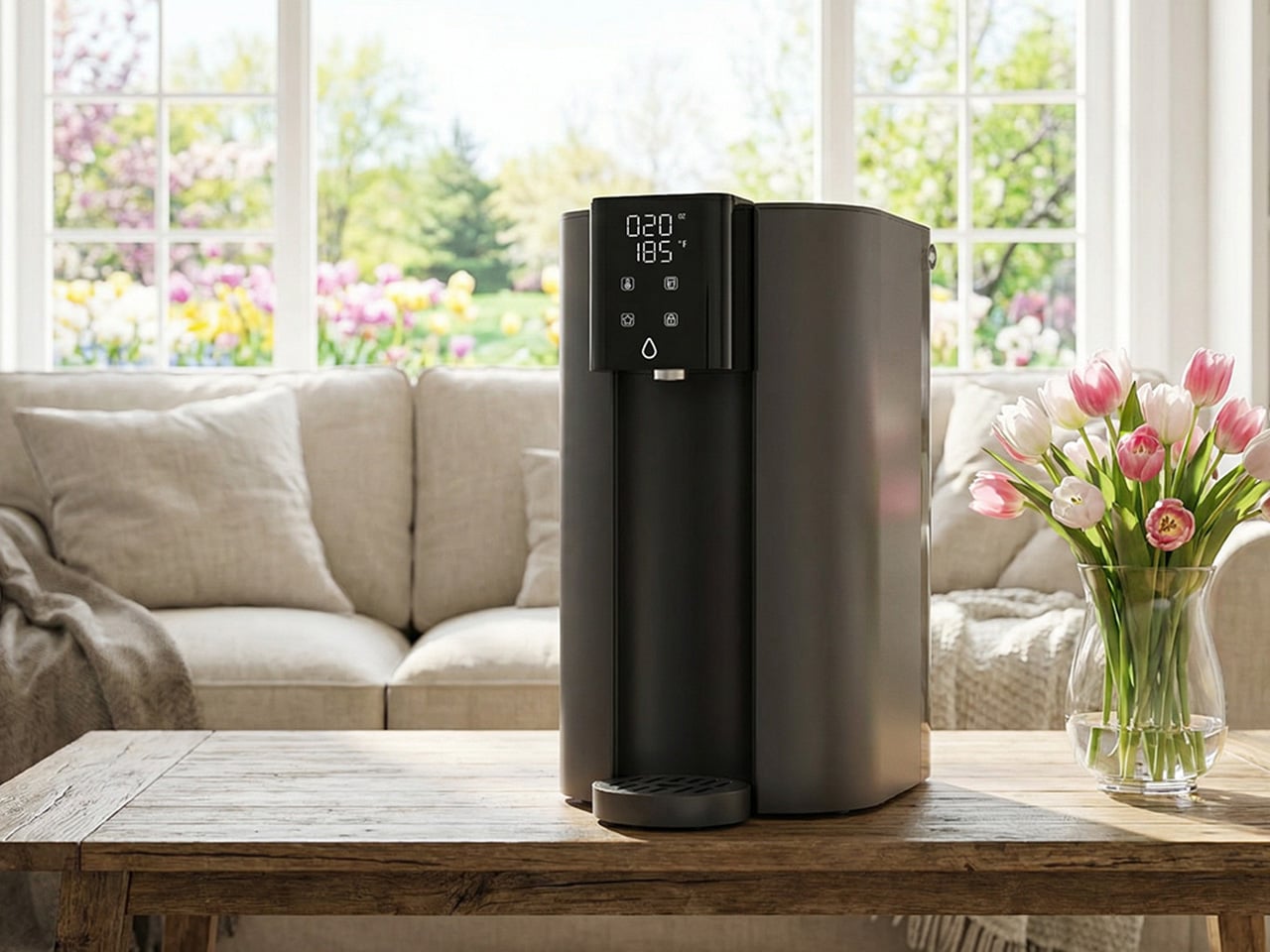
Every system covered in this guide has required going under a sink. The C1H abandons that requirement entirely. It sits on the counter, plugs into a standard outlet, connects to a water source without drilling or permanent modification, and starts delivering six-stage reverse osmosis filtered water with no installation window and no landlord conversation. The 0.0001-micron RO membrane targets the same field of contaminants that motivates most spring filtration upgrades, including PFAS, chlorine, heavy metals, and TDS. The detachable tank design means it moves between a kitchen, an office, or a bedroom without friction, which matters for parents with young children or elderly family members who want safe, filtered water accessible across different rooms rather than anchored to a single tap.

The feature that sharpens the C1H’s appeal for spring routines is instant hot water delivered in three seconds across five adjustable temperature settings. Morning tea, pour-over coffee, baby formula, and quick meal preparation all lose the waiting step that a separate kettle introduces. A Favorite Mode remembers preferred temperature and volume combinations so the same result comes out consistently. Smart touch controls manage everything from volume selection to real-time TDS monitoring and filter life tracking. The 3:1 pure-to-drain ratio and a twelve-month filter lifespan keep both environmental impact and ongoing upkeep to a minimum. For households that have followed this guide and still need a solution on entirely different terms, the C1H closes that gap with confidence.

Click Here to Buy Now: $219 $279 (22% off). Hurry, deal ends in 48-hours! Website Here.

The post 5 Best Waterdrop Filter Systems for Spring 2026, From Renters to Full Family Kitchens first appeared on Yanko Design.

This Red House Buried in a Czech Forest Is the Opposite of Every Forest Home You’ve Ever Seen

Deep in the spruce forests of Jevany, a municipality of barely 800 people in the Czech Republic’s Central Bohemian Region, a flash of cherry red cuts through the trees. This is Villa Jevany, a new residence by local studio Architektura, and it has absolutely no interest in blending in. Where most forest homes default to timber, stone, and muted tones, Architektura went the other way entirely, dressing the structure in saturated red steel and calling it exactly what it is: a deliberate, uncompromising act of contrast.

The site itself set the terms. The plot spans a generous 3,027 square meters on a steep southern slope, inhabited by deer, birds, and mature trees that tower up to ten meters above the building level. Architektura responded by carving the villa into the hillside rather than placing it on top, creating a structure the studio describes as an “organism” embedded in the earth. The red steel skeleton, visible in the sawtooth carport roof from the moment of arrival, signals that this is industrial thinking applied to domestic life, and it doesn’t apologize for it.

Designer: Architektura

The colour choice is rooted in theory as much as instinct. Architektura used green and red as complementary colors, a logic borrowed from the colour wheel and, more pointedly, from abstract art. The irregularly divided glazing across the façade draws a quiet reference to Mondrian, the rhythmic geometry of the windows creating a visual tension against the organic verticality of the trees behind them. From the road, the house reads almost like a painting hung in the forest. From the inside, the forest becomes the painting.

Internally, the layout unfolds across five distinct levels. The entrance opens into a hall with a 3.5-meter ceiling height, where a curved wall guides visitors into the main living space, or what the architects call the “day zone.” Here, industrial red steel windows frame the surrounding green; white walls meet black details; reddish stone counters anchor the kitchen alongside a floating steel fireplace. It’s a space of deliberate contrasts, domestic in function and raw in feeling.

The private quarters, reached through a long corridor lined with minimalist white cabinetry, are stripped of excess. The parents’ suite and children’s rooms are quiet and restrained, a counterpoint to the drama of the exterior. Terraces and balconies extend the living area into the canopy itself, turning the house into what Architektura intended all along: not just a place to live, but a place to look.

The post This Red House Buried in a Czech Forest Is the Opposite of Every Forest Home You’ve Ever Seen first appeared on Yanko Design.

These Wood and Leather Wall Holders Swap Hooks for Hidden Magnets

The entryway tends to be the most neglected spot in any home when it comes to design. Things pile up at the door, and most of the solutions people reach for, plastic key hooks, adhesive strips, wire baskets, tend to prioritize function so heavily that they end up looking like afterthoughts. It’s a corner of the home that rarely gets the same design attention as the living room or kitchen.

Ukrainian design brand dodomoom takes a different approach with its Magnetic Holders & Hooks collection. Designed by Andrii Burzi, the pieces combine natural wood and smooth leather to make something that looks far more like wall decor than a key holder. That impression, though, isn’t the whole story. Beneath the leather surface, a precision magnetic system does the actual work of holding keys and other small metal objects.

Designer: Andrii Burzi

That hidden mechanism is part of what makes the collection so satisfying to use. There’s no hook to loop your keys onto, no notch to fumble with when your hands are full. You just bring your keys close to the surface, and the magnets hold them flat against the leather face. Burzi described the reaction from people who try it: “It isn’t magic. It’s precision.”

The collection has six pieces in total, ranging from the compact Nordic Little Magnetic Holder to the larger Nordic Family Magnetic Holder, which can hold up to four sets of keys at once and measures roughly 8 inches square. You can mount any of them with 3M adhesive tape or standard screws, giving you the option to hang them without committing to permanent hardware on the wall.

Each piece is available in walnut, ash, or maple, with a Night Black option in painted ash for spaces with a darker palette. The leather inlay sits against the wood base, and the combination reads as considered rather than decorative for its own sake. These aren’t objects that need to be explained; you’d be happy having them on the wall even if they didn’t hold a single key.

The collection also includes the Nordic Little Coat Hook, which follows the same material language as the rest of the holders. That consistency matters if you’re planning to use more than one piece on the same wall, and dodomoom clearly anticipated that. The Nordic Line is designed with modularity in mind, so pairing a key holder with a coat hook feels more like a deliberate arrangement than an accidental one.

The Nordic Family Magnetic Holder is priced at $98, which puts it closer to a considered purchase than an impulse buy. That’s a fair trade-off for something that pulls double duty as a decorative object and doesn’t make you stare at an ugly key rack every time you come home. Most entryway solutions make you pick between looking good and working well, and dodomoom doesn’t put you in that spot.

The post These Wood and Leather Wall Holders Swap Hooks for Hidden Magnets first appeared on Yanko Design.

Rewild Homes Built a Tiny House That Actually Works for a Growing Family

The idea that tiny living demands sacrifice is one that the Starling quietly dismantles. Built by Rewild Homes out of Nanaimo on Vancouver Island, British Columbia, this 33-foot gooseneck tiny house was conceived with a growing family at the center of every decision. It doesn’t ask you to lower your expectations; it just reshapes what a home can look like.

At 33 feet long and 8’6″ wide, the Starling rides on a triple-axle gooseneck trailer. That raised front section is more than a structural choice; it’s what gives the layout its most valuable asset: real spatial separation. The exterior wears natural wood cladding under a metal roof, calm and considered against the Pacific Northwest landscape. It’s a home that looks like it belongs wherever it lands.

Designer: Rewild Homes

Inside, the convertible dining area sets the tone immediately. The banquette bench folds flat into a third sleeping space when needed, and every seat sits above a well of hidden storage. A built-in nook with deep shelving tucks behind one side, and an entry closet keeps the threshold from becoming a dumping ground. These are the kinds of details that don’t photograph dramatically but earn their place every single day.

The kitchen takes up a full U-shape anchored by dark wood countertops and a breakfast bar. A 24-inch four-burner propane range, a high-efficiency fridge with a bottom freezer, a double sink, and pull-out cabinetry keep things fully functional without tipping into visual noise. It doesn’t feel like a workaround. It feels like a kitchen that simply chose to be somewhere smaller.

A staircase leads up to the master loft, a proper bedroom with a double bed and a built-in closet rather than a ladder-accessed sleeping shelf. On the main floor, a second enclosed room offers a flex space that shifts with the family: a kid’s room, a studio, a home office, whatever the season calls for. The bathroom includes a full soaking tub, a rare and quietly luxurious feature in a home this size.

Running along the loft staircase is a custom aluminum railing commissioned from Wroughtenart, a local Vancouver Island artist. It functions as a guardrail and doubles as the home’s most expressive design moment, the kind of detail that separates a well-built tiny house from a truly considered one. The Starling doesn’t shrink your life. It edits it.

The post Rewild Homes Built a Tiny House That Actually Works for a Growing Family first appeared on Yanko Design.

SAOTA’s Kenmore Proves You Don’t Have to Sacrifice Space for an Impossibly Narrow Cape Town Hillside

When Mark Bullivant, principal at South African architecture studio SAOTA, came across a steep, impossibly narrow plot in Cape Town’s Tamboerskloof neighborhood, most architects would have walked away. He bought it. The result is Kenmore — a personal home that quietly dismantles every assumption about what a tight site can hold.

The numbers tell their own story. The plot stretches 58 meters long but only 14 meters wide, with the interior reaching a maximum width of just 7.44 meters. An existing structure occupied the land when Bullivant acquired it, but it was dark, fragmented, and unwieldy — torn down to make room for something entirely more considered. What replaced it sits on the hillside like a long, quiet exhale: terraces extending outward, oversized windows framing the landscape, a home that reads less like a building and more like a vantage point.

Designer: SAOTA Architecture Studio

That framing was intentional. The most compelling views fall on the short sides of the property — east toward Table Mountain and west toward Signal Hill and the national park behind it. The architecture is organized entirely around those two axes, turning the site’s constraints into its greatest asset. Rather than fighting the narrow footprint, the design leans into it — producing a continuous, open living space that flows visually from front to back, resisting the fragmentation that plagued the original structure.

The decision to elevate the primary living level to the top of the house was driven by more than views. Placing it there allowed the home to connect directly to the landscape of Signal Hill and maximize sunlight — a critical move given the site’s limited northern exposure. It also made room for a meaningful garden, something Bullivant had set as a core ambition from the very beginning. What could have been a rooftop afterthought becomes, instead, a living threshold between architecture and the mountain that cradles it.

Spanning three levels with five bedrooms, the home never feels like a corridor with rooms attached. Bullivant was deliberate about that. He has never been drawn to living environments defined by a sequence of small, closed-off rooms — and the constraints of the site only pushed that instinct further. The communal spaces are fluid and generous, a pointed rebuttal to the idea that a narrow house must feel narrow.

Kenmore is, in many ways, SAOTA’s philosophy made domestic. The firm has built its reputation on reading a site’s limitations as a design mandate rather than a compromise. Bullivant just happened to live that philosophy out this time — quite literally. The house doesn’t just sit within its difficult terrain. It belongs to it.

The post SAOTA’s Kenmore Proves You Don’t Have to Sacrifice Space for an Impossibly Narrow Cape Town Hillside first appeared on Yanko Design.