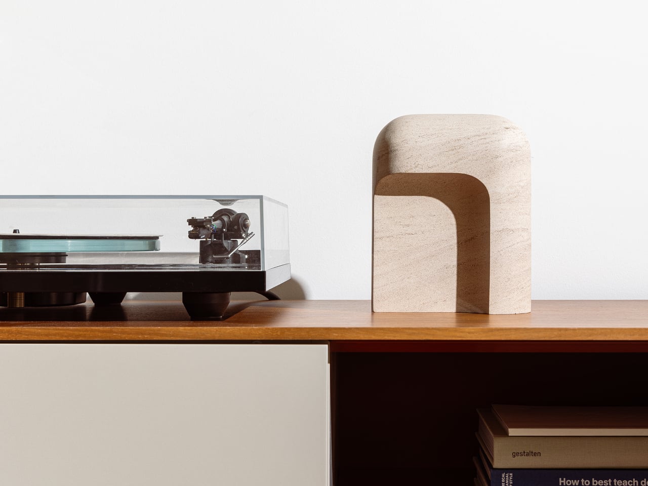
Most entryway surfaces tell a familiar story, and it’s rarely a flattering one. Keys get tossed wherever there’s space, coins scatter to the edges, and a watch ends up next to a forgotten receipt by morning. The valet tray was supposed to solve this, but most of them look clinical, forgettable, or like they belong in a hotel room rather than a thoughtfully arranged home.
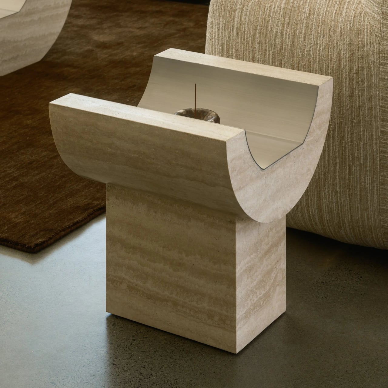
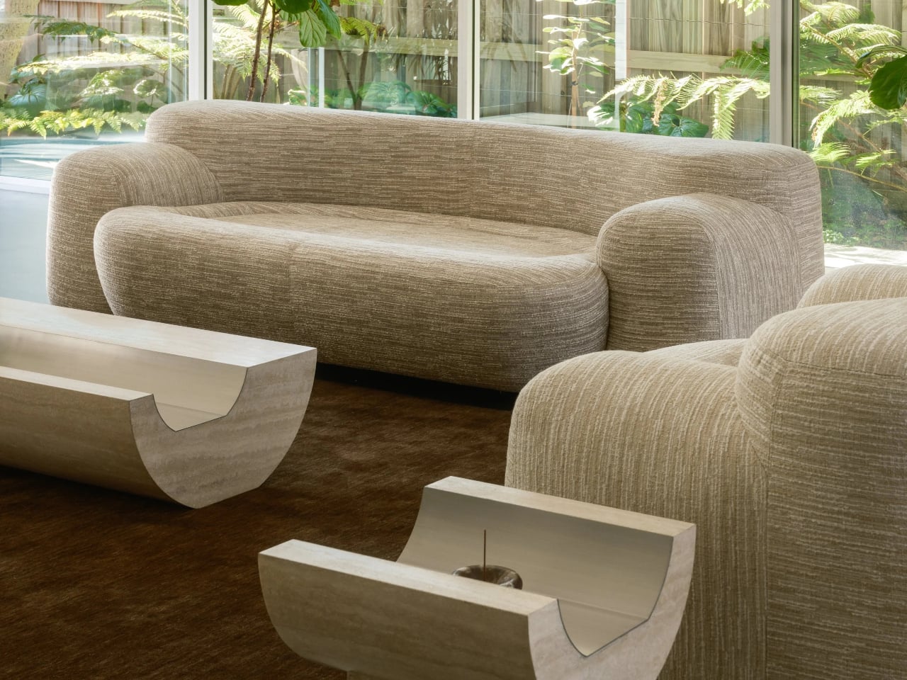
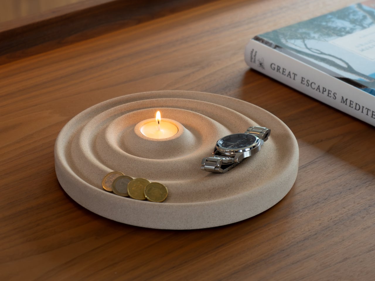
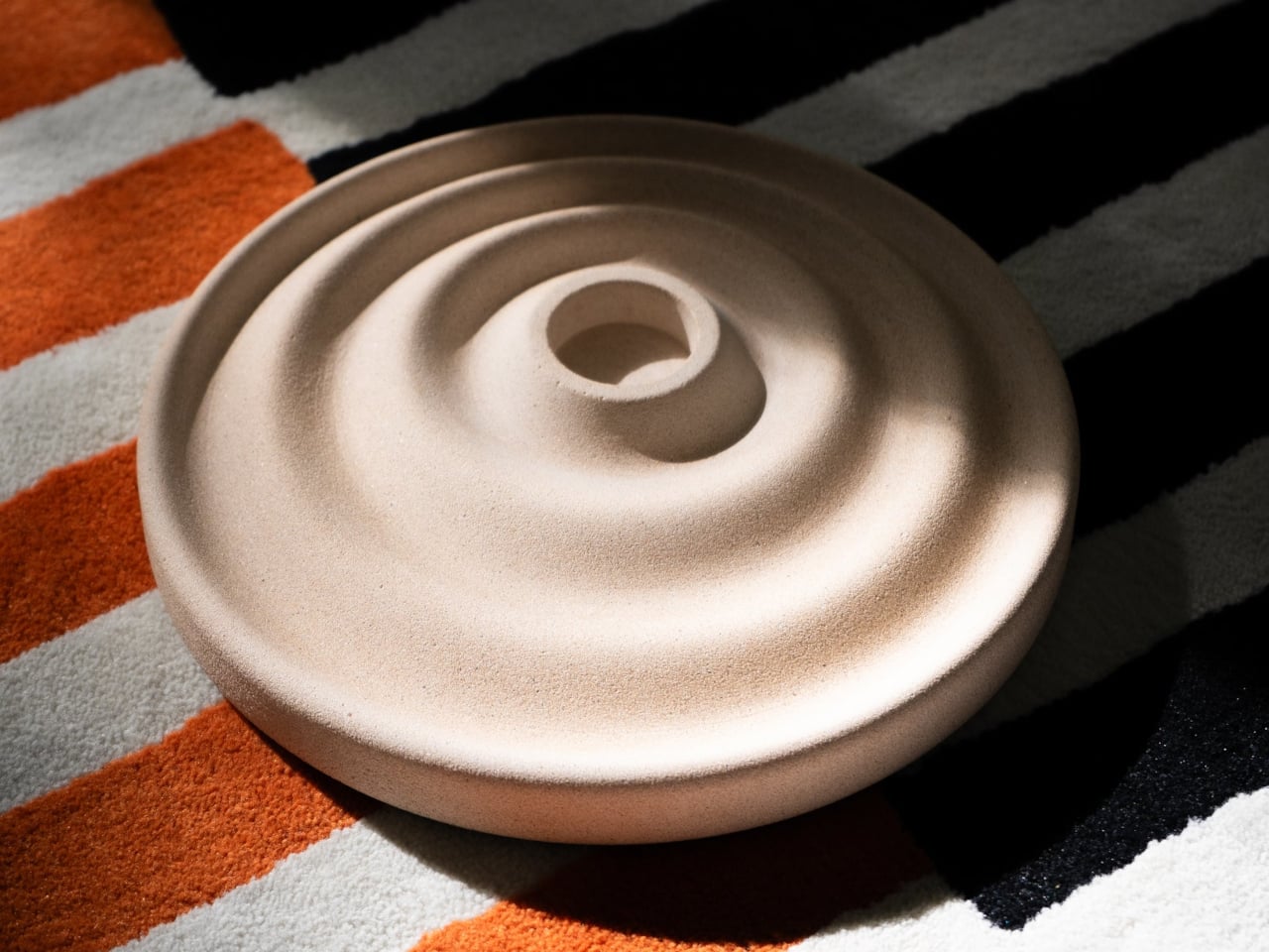
The Delicato Tray takes a different approach, and the solution comes from a direction you might not expect: ripples. Sold through Oftwise, it merges a valet tray and a candle holder into a single disc-shaped object cast from Jesmonite AC730, a sustainable stone composite. The result reads less like a utilitarian catchall and more like something a sculptor quietly left on your nightstand.
Designer: Joao Teixeira for Oftwise
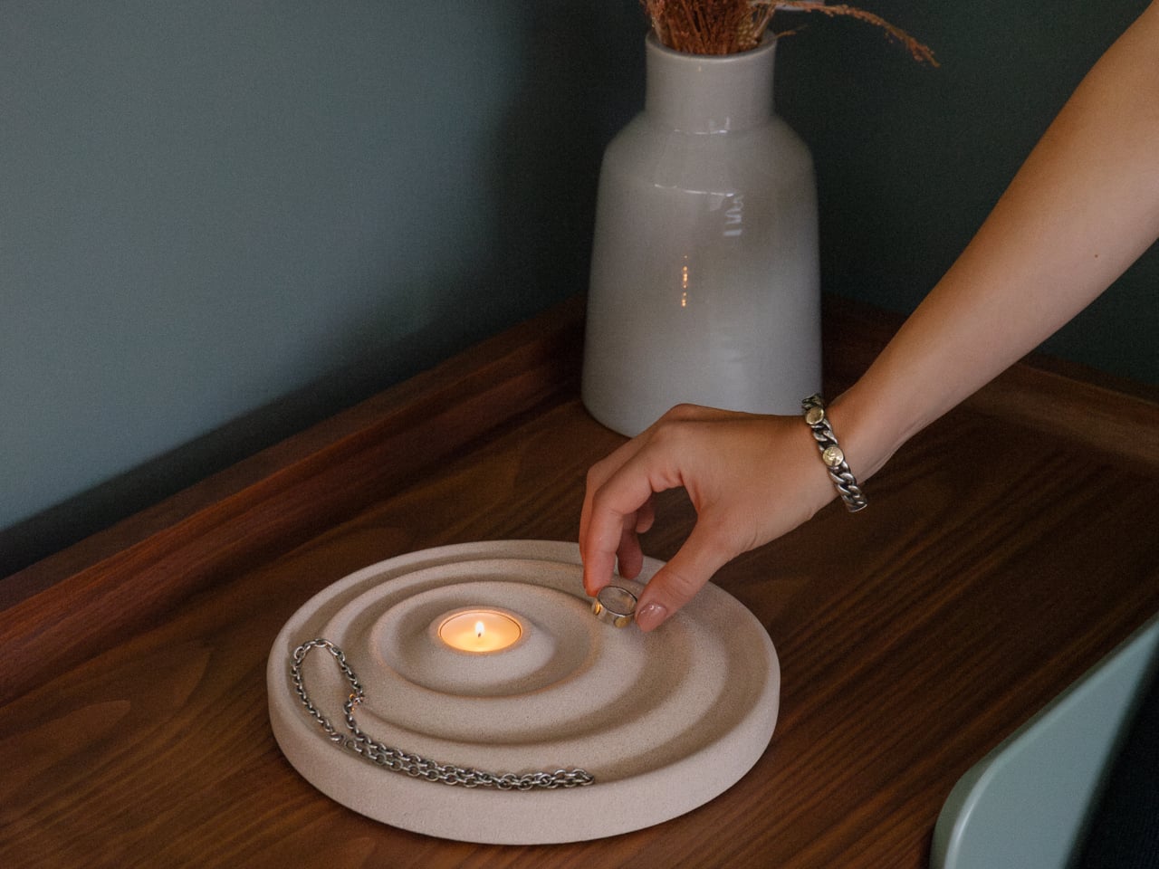
The ripple pattern isn’t purely decorative. The concentric waves are asymmetrical, with the outer rings wider at the front for bulkier items like keys or glasses, and the inner curves sitting closer toward the back for smaller things like rings or coins. It’s a hierarchy built into the shape itself, making organization almost unconscious rather than something you have to think about.
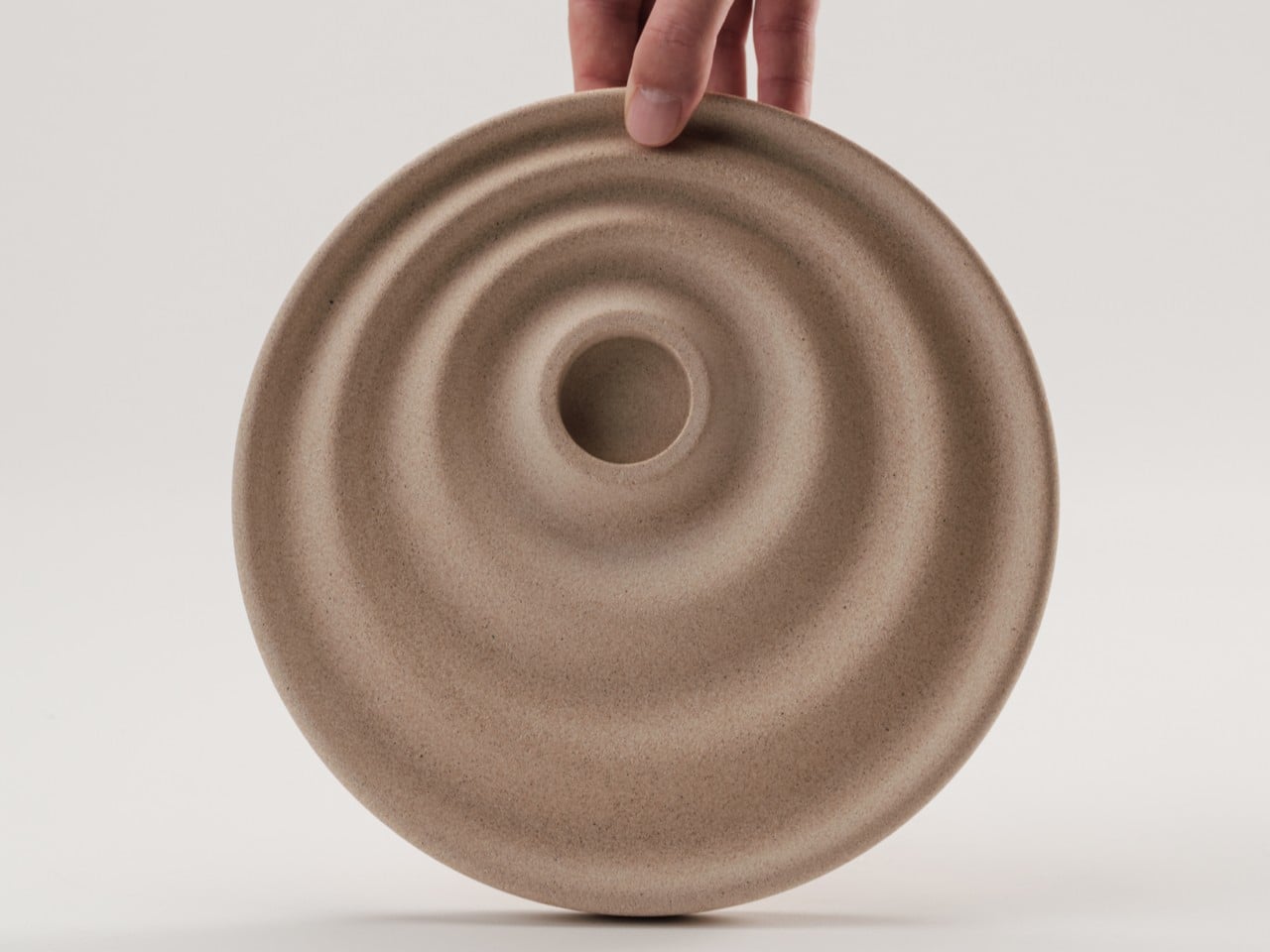
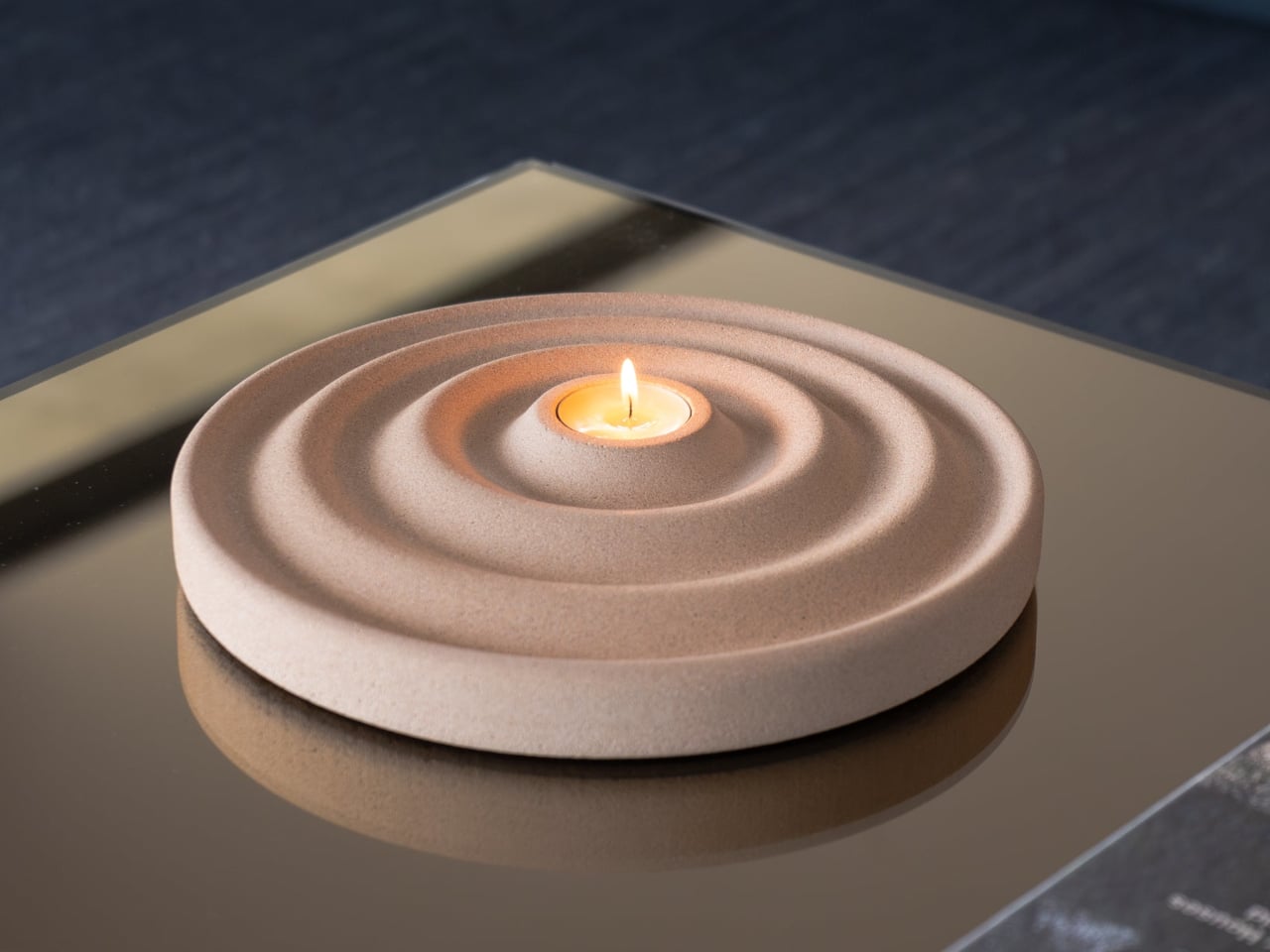
At the center of those ripples sits a recessed pocket sized for a tealight candle, turning the tray into a mood-setter as much as a catchall. Lighting a candle while dropping your watch and keys into the right grooves transforms a mundane habit into something closer to a ritual. It’s a lot to ask of a disc of stone, but Delicato manages it without breaking a sweat.
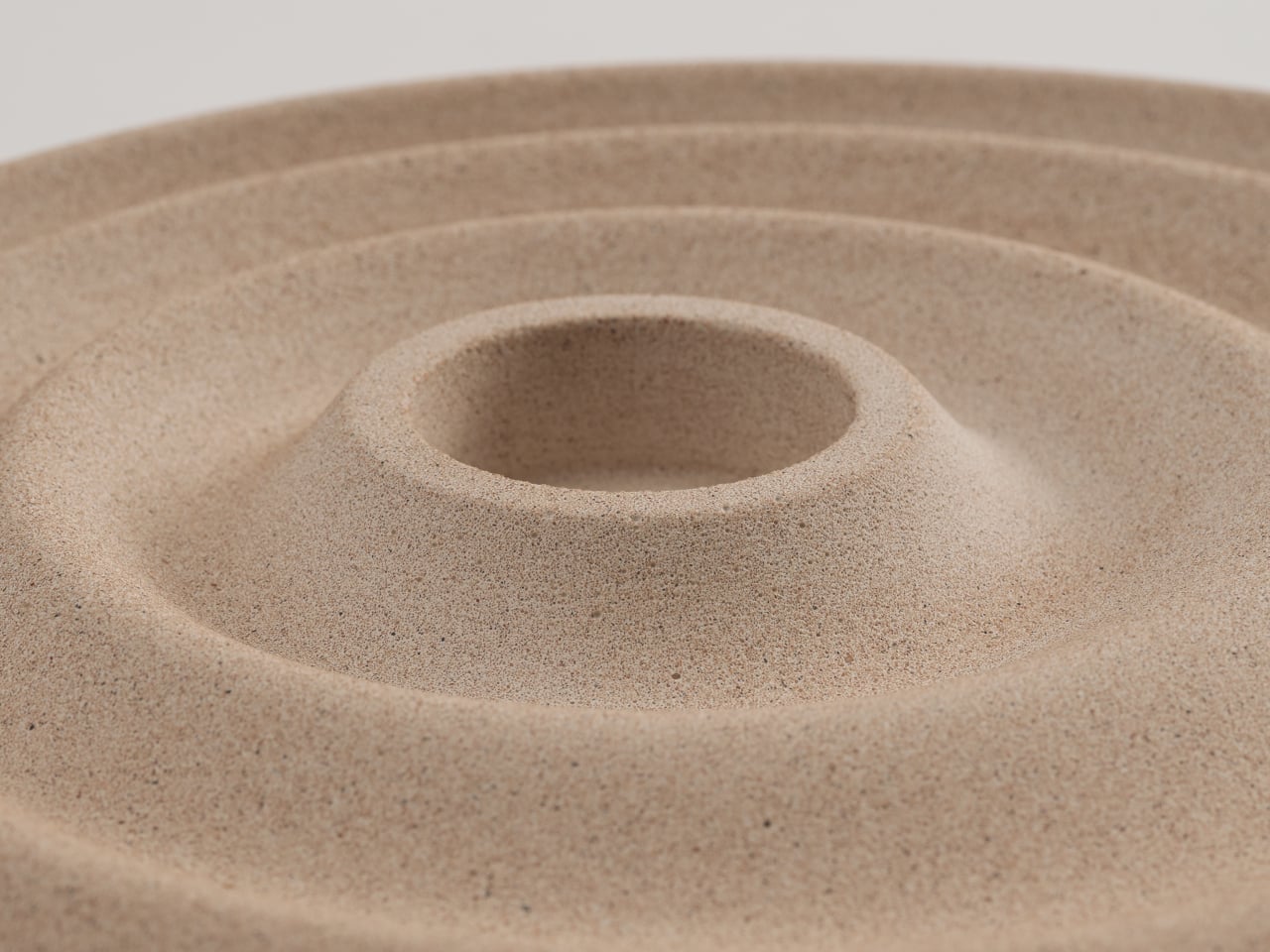
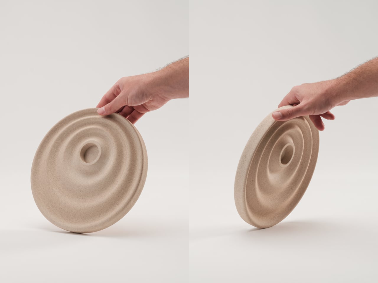
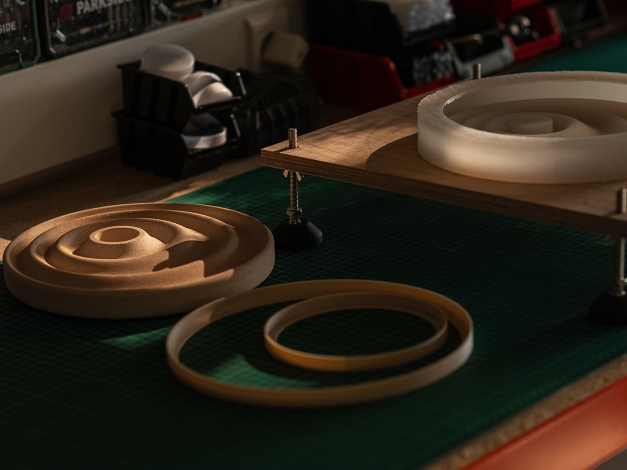
The material is what makes that balance possible. Jesmonite AC730 is a water-based, VOC-free stone composite that reproduces the look and texture of natural stone without concrete’s weight. It’s independently fire-rated and impact-resistant, which matters for something that routinely sits next to an open flame. A matte acrylic sealer and a cork anti-slip pad on the base round out the practical details.
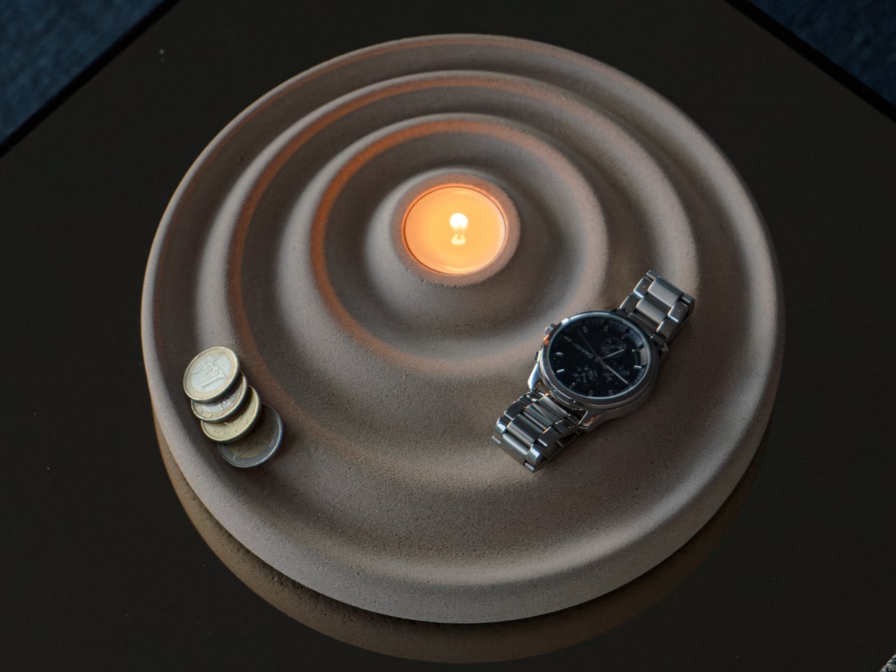
Because the tray is hand-cast, no two are identical. Small air bubbles, subtle texture variations, and minor color shifts are natural byproducts of the process, and Oftwise is upfront about that. The available color, Bath Stone, is a warm sandy beige neutral enough for almost any interior. At 2kg, it has a quiet weight that makes a surface look deliberately arranged.
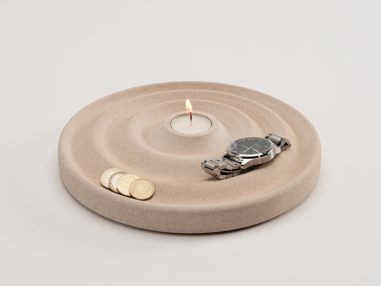
The Delicato Tray measures 24.5cm x 24.5cm with a height of just 2.8cm, low enough to sit under a bedside lamp without stealing vertical space. The candle pocket measures 3.9cm across and 1.5cm deep, a snug fit for a standard tealight. It retails for €235 on Oftwise, which places it firmly in the premium tier for an object of this category.
What Delicato gets right is something many design objects miss: it doesn’t try too hard to be either thing. It’s not decorative at the expense of being useful, and it’s not useful at the expense of looking good. A tray that doubles as a candle holder and a sculptural object sounds like a confused brief, but the ripple form settles all of that quietly.
The post This €235 Rippling Stone Valet Tray Has a Candle Holder Built In first appeared on Yanko Design.