Moser’s New Aura Collection Captures the Northern Lights in Crystal

Some things in design need no justification. They exist purely to be beautiful, and you either feel it or you don’t. Moser’s new Aura collection is one of those things, and I’ve been thinking about it since I first came across it.

If you’re not familiar with Moser, let me fix that. Founded in 1857 in Karlovy Vary, Czech Republic, this is one of the most quietly prestigious names in the world of luxury glassmaking. The brand has been handcrafting lead-free crystal for 169 years, and that’s not a marketing angle; it’s a genuine legacy. Their work has graced the tables of royalty, filled the shelves of serious collectors, and caught the eye of names you’d recognize. The Kardashians are fans. Dan Brown, while promoting his Prague-set novel in the city itself, received his own engraved Magnus vase. It’s that kind of brand.

Designer: Moser
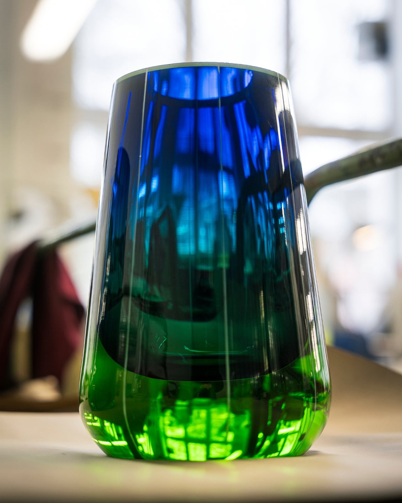
Moser occupies a specific and fascinating space in design. It’s neither ostentatious nor understated. It has weight to it, not just physically, but culturally. When you hold a piece of Moser crystal, you’re holding something shaped entirely by human hands, and that distinction matters more than ever in a market flooded with mass production.
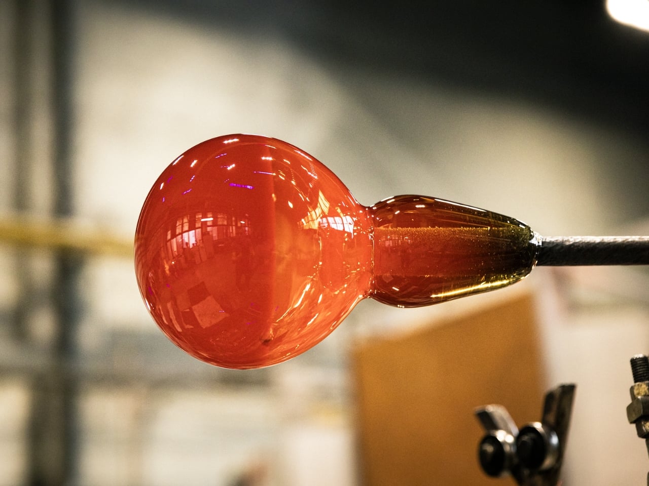
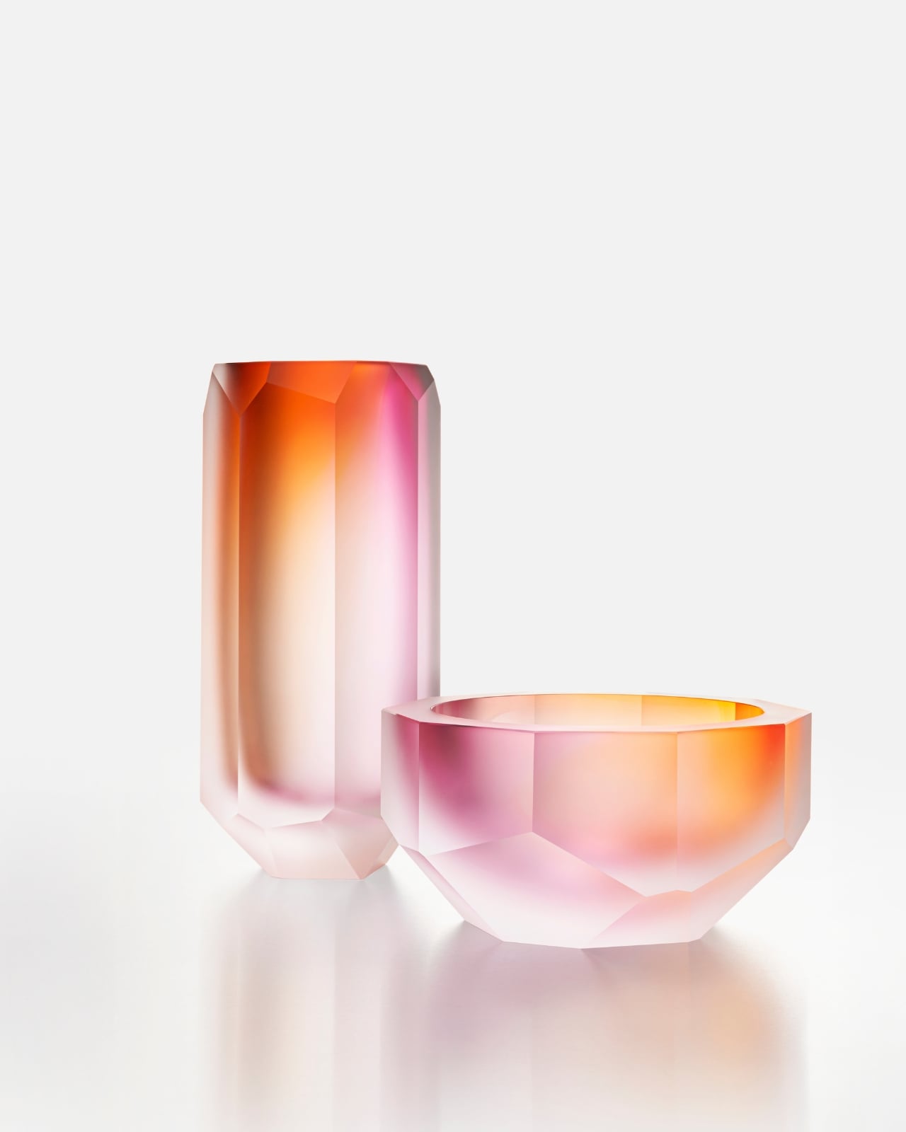
The Aura collection, their newest release, is inspired by the north. Not the idea of Scandinavia as an aesthetic trend, because we’ve all seen enough of that, but the raw, atmospheric reality of it. The icy cold. The depth of a darkened sky. The specific, almost spiritual moment when the aurora borealis ignites across the horizon. It’s an ephemeral experience most of us will only ever see in photographs, and somehow Moser has managed to capture it in glass.
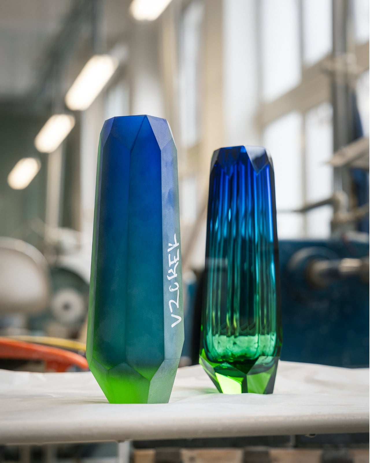
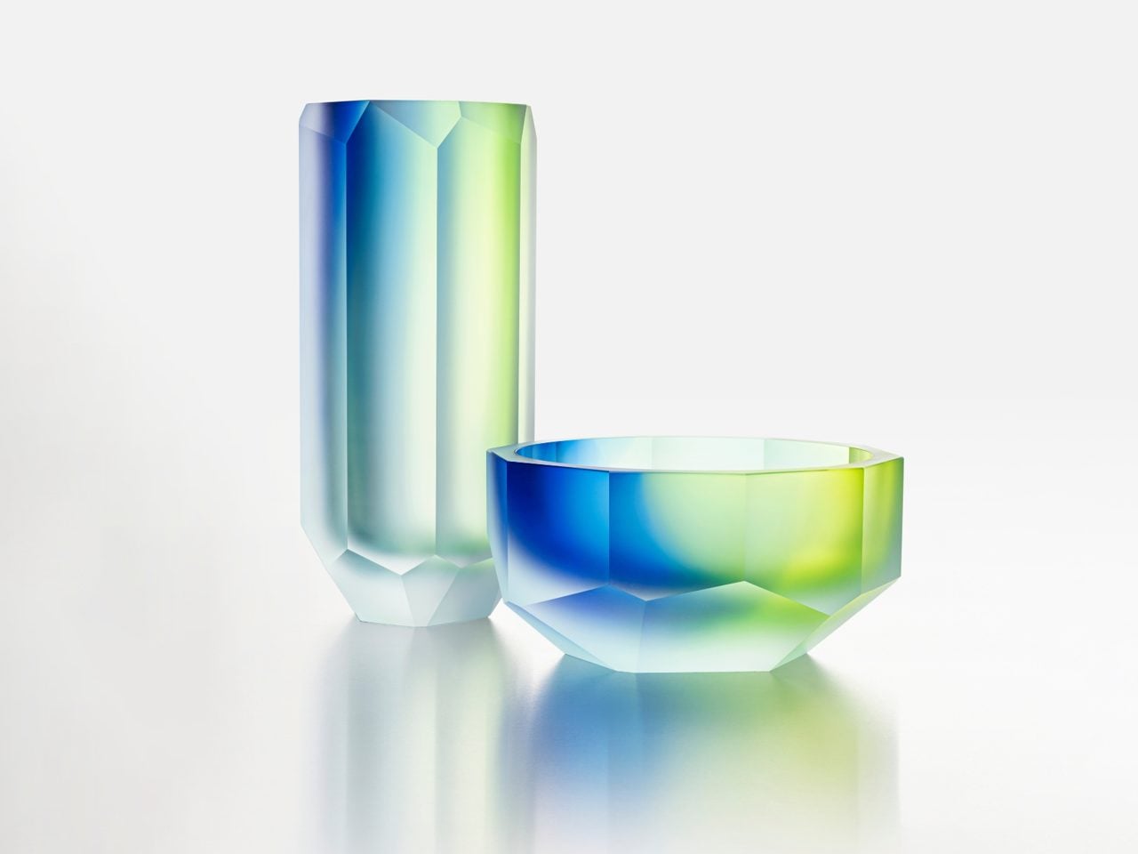
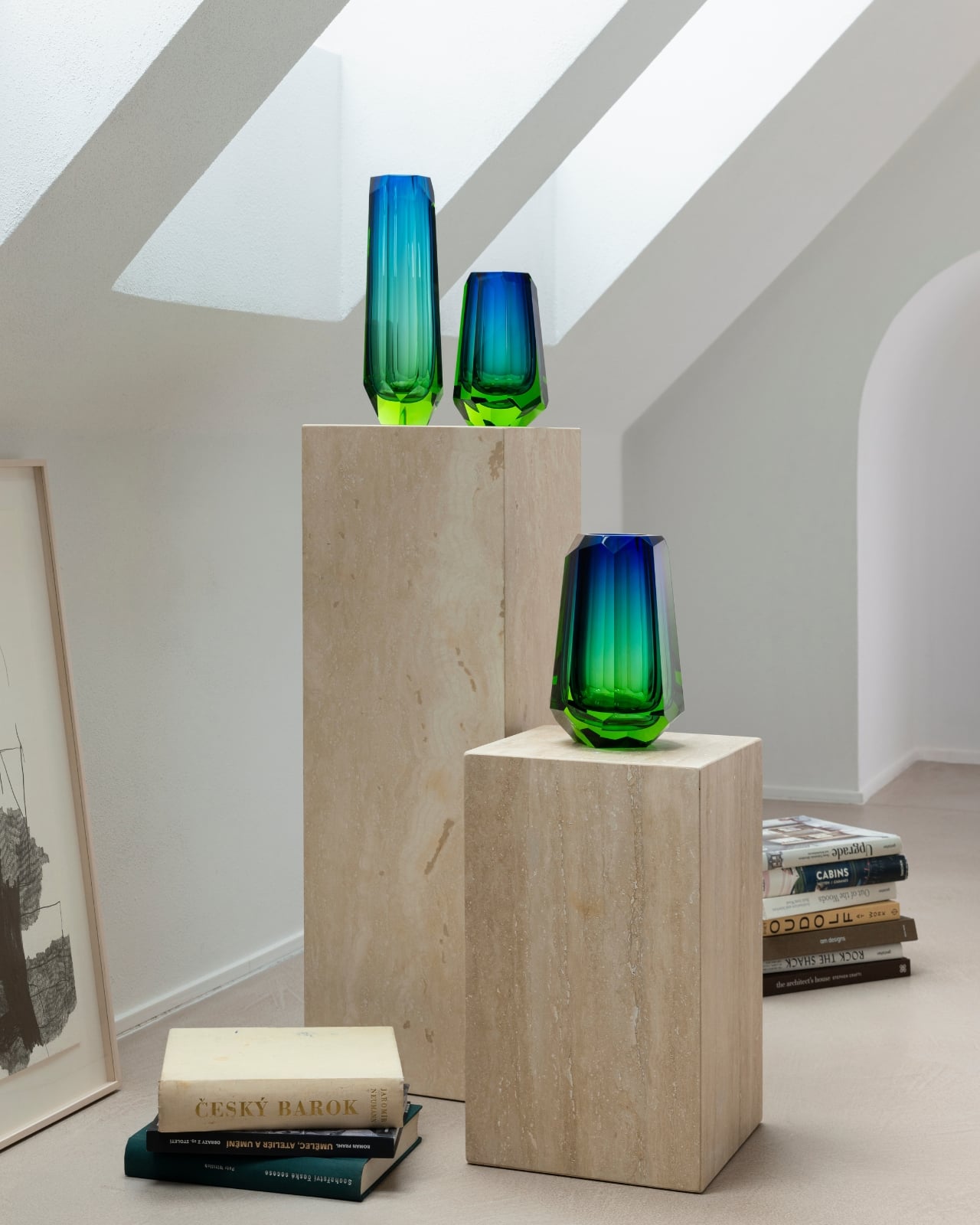
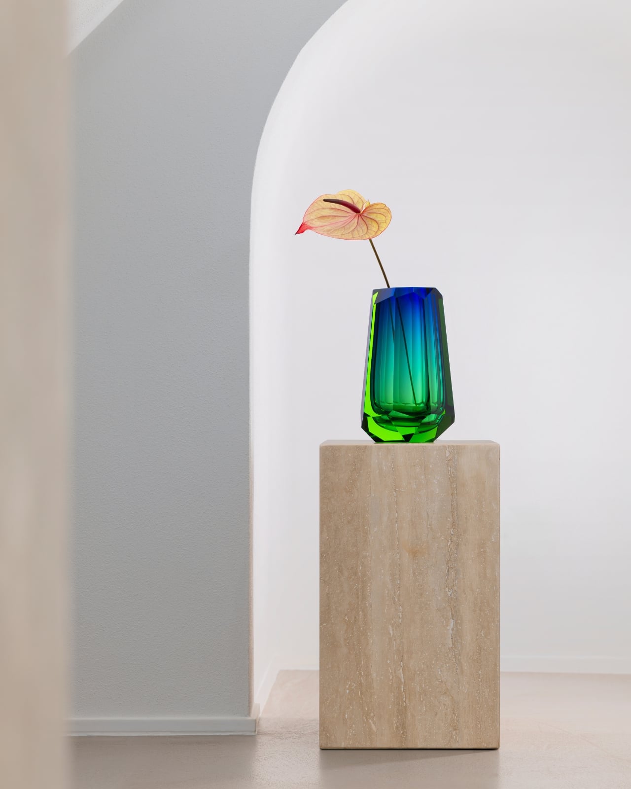
The collection’s standout pieces are the crystal vases, available in three heights: 21 cm, 26 cm, and 35 cm. Each captures the shifting color palette of the Northern Lights, that slow bleed from icy white into deep, oceanic blue, with striking cut edges that echo the geometry of the landscape itself. They’re atmospheric without being theatrical, and they carry the kind of quiet confidence that only comes from serious craftsmanship. These are objects you place in a room and simply let do the talking.
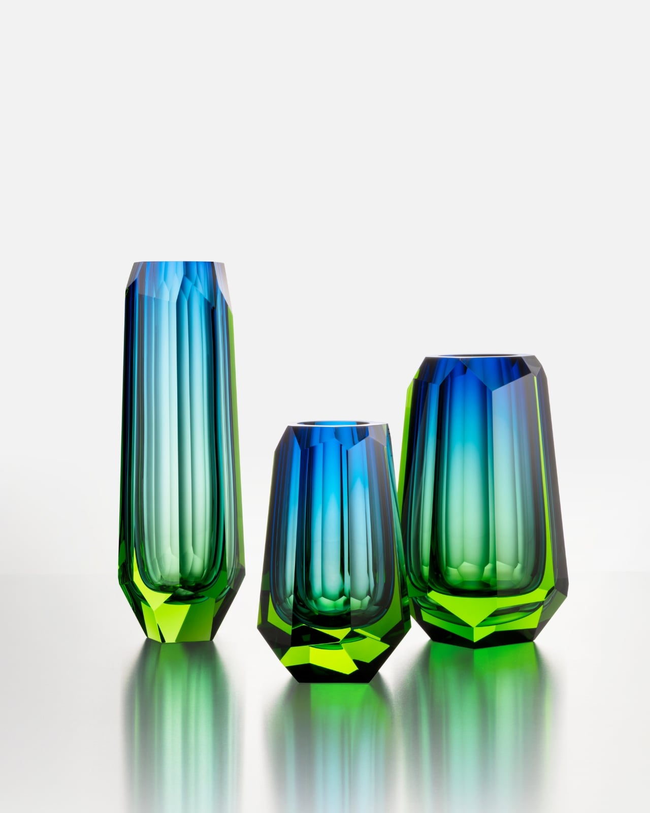
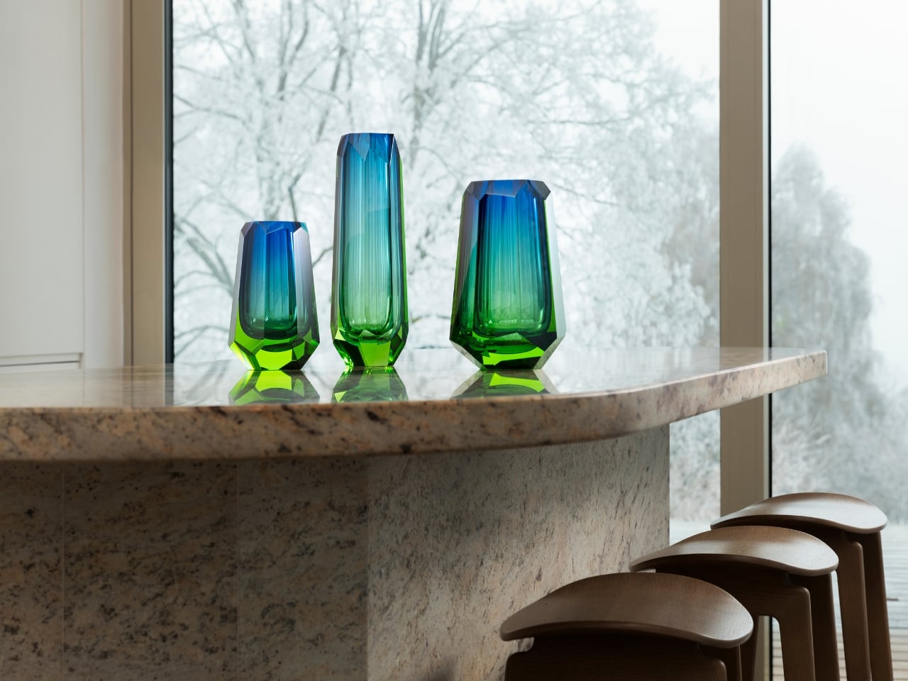
It’s rare to encounter a design that genuinely earns its inspiration. The aurora borealis is one of the most over-referenced phenomena in the aesthetics world. It shows up on wallpaper, yoga mats, screensavers. Moser’s version feels different because the glass actually does what the inspiration promises. The light moves through it. It shifts depending on the angle, the time of day, the room. It behaves like something alive, which is a strange thing to say about crystal, but it’s accurate.
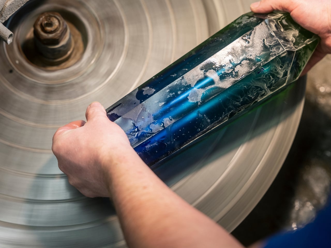
The matte vases and bowls in the collection deserve their own moment. These pieces feature a frosted surface that softens the drama and brings the aurora-inspired hues into something more intimate, like watching the lights through a quiet fog. The catch is that Moser’s masters can only produce 12 pieces of each type per year. Not 12 per collection. 12 total. That’s not scarcity as a marketing strategy. That’s simply the honest ceiling of human skill and time, and there’s a kind of integrity in that.
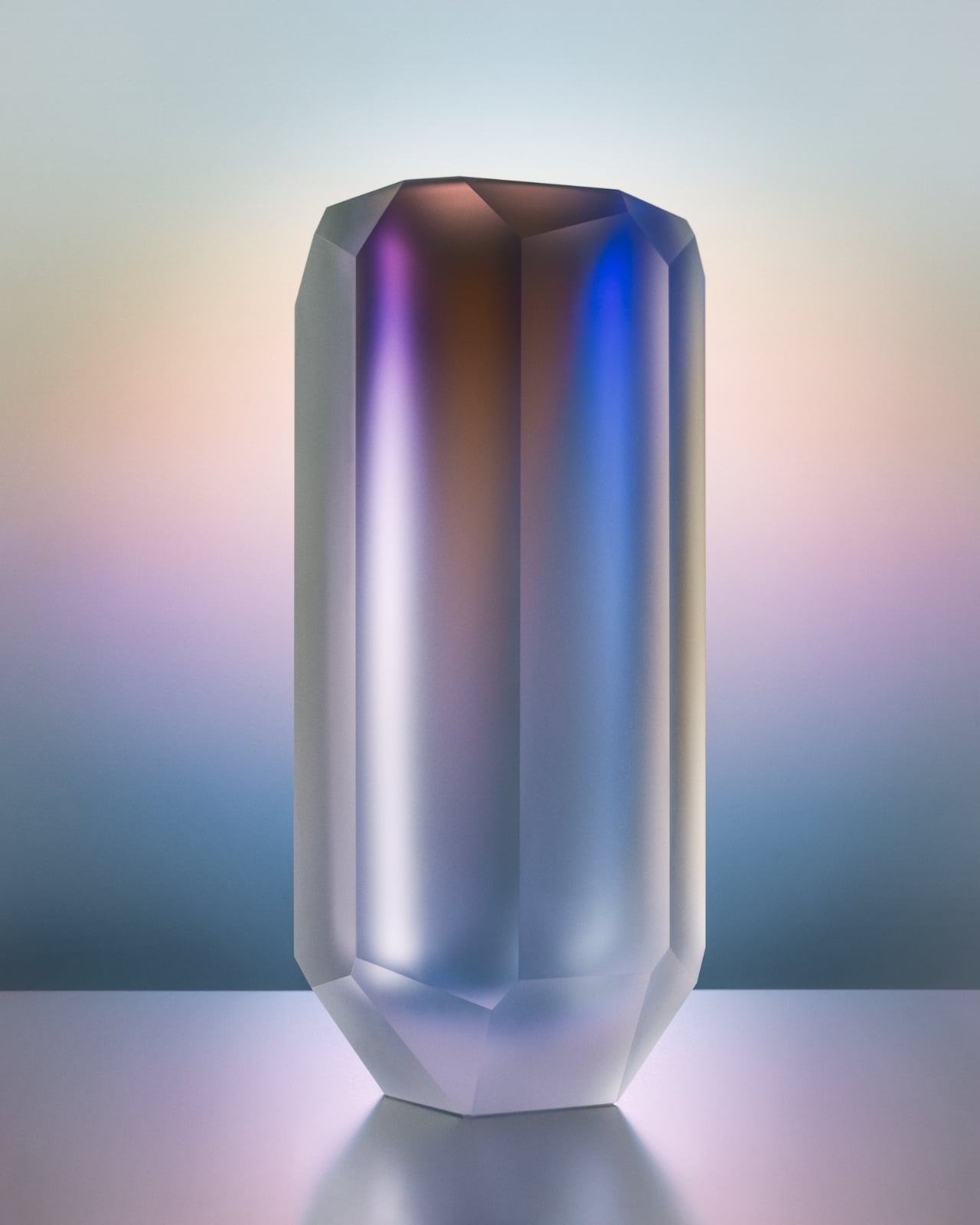
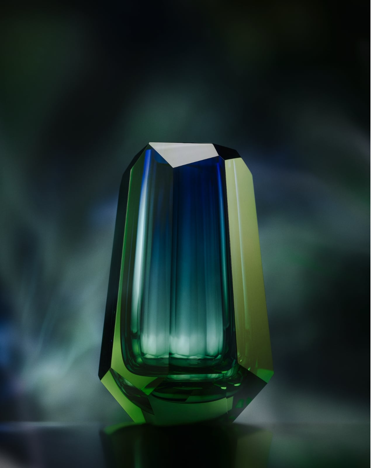
I’ve covered a lot of design collections, and “limited edition” has largely become white noise at this point. But this is genuinely different. These pieces take what they take to make, and no amount of consumer demand changes that. It’s a refreshing constraint in an industry that too often prioritizes volume over meaning. For anyone building a home with intention, collecting pieces that actually hold value, or just looking for something beautiful that won’t feel dated in five years, the Aura collection deserves your attention. It sits at the intersection of art, craft, and a deep reverence for the natural world, and it earns every bit of that description. Moser has been doing this for 169 years. At this point, they clearly know something the rest of us are still working out.
The post Moser’s New Aura Collection Captures the Northern Lights in Crystal first appeared on Yanko Design.

Mercedes’ New G-Wagon convertible lets you enjoy open-air luxury without giving up off-road power

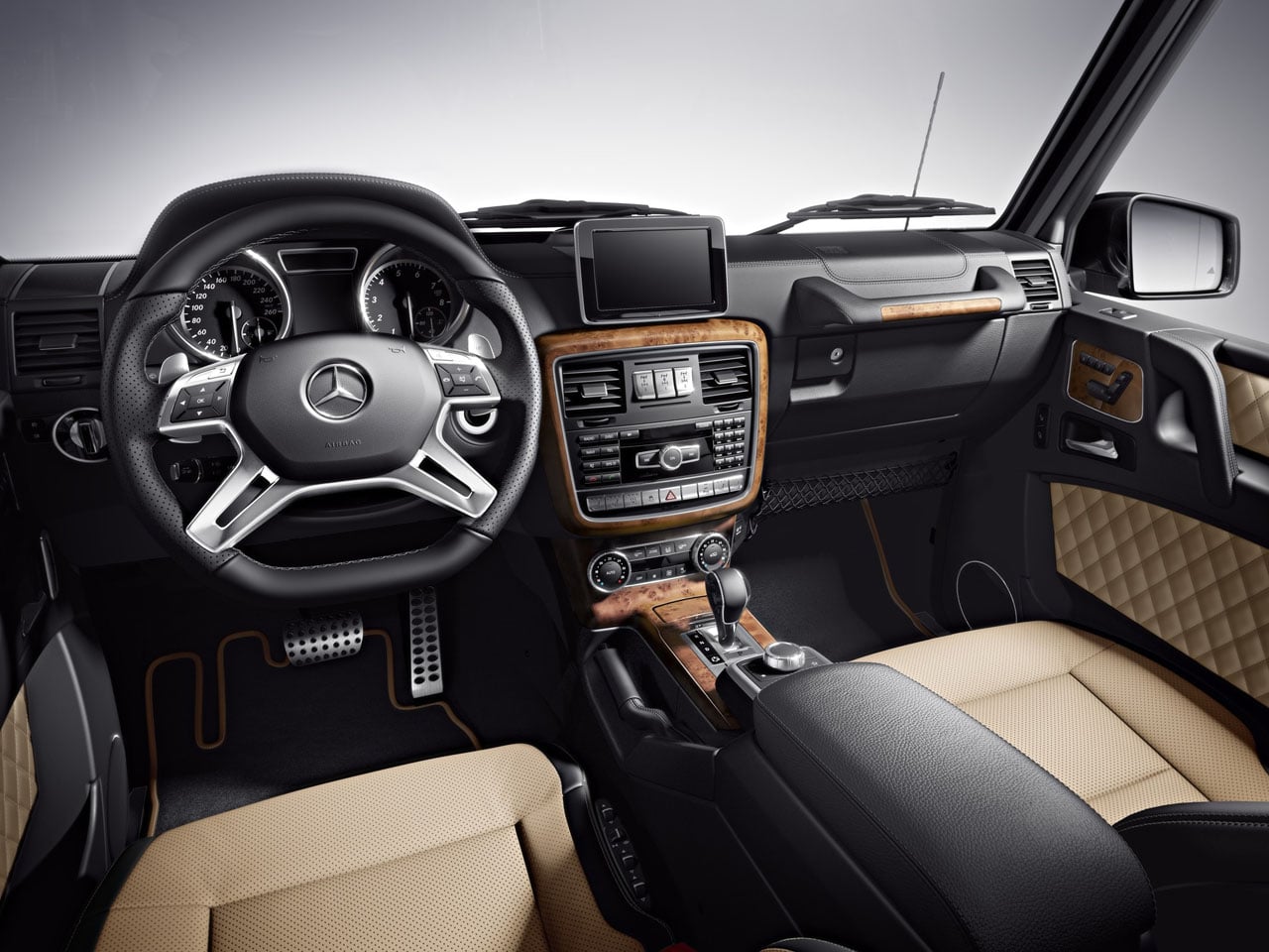
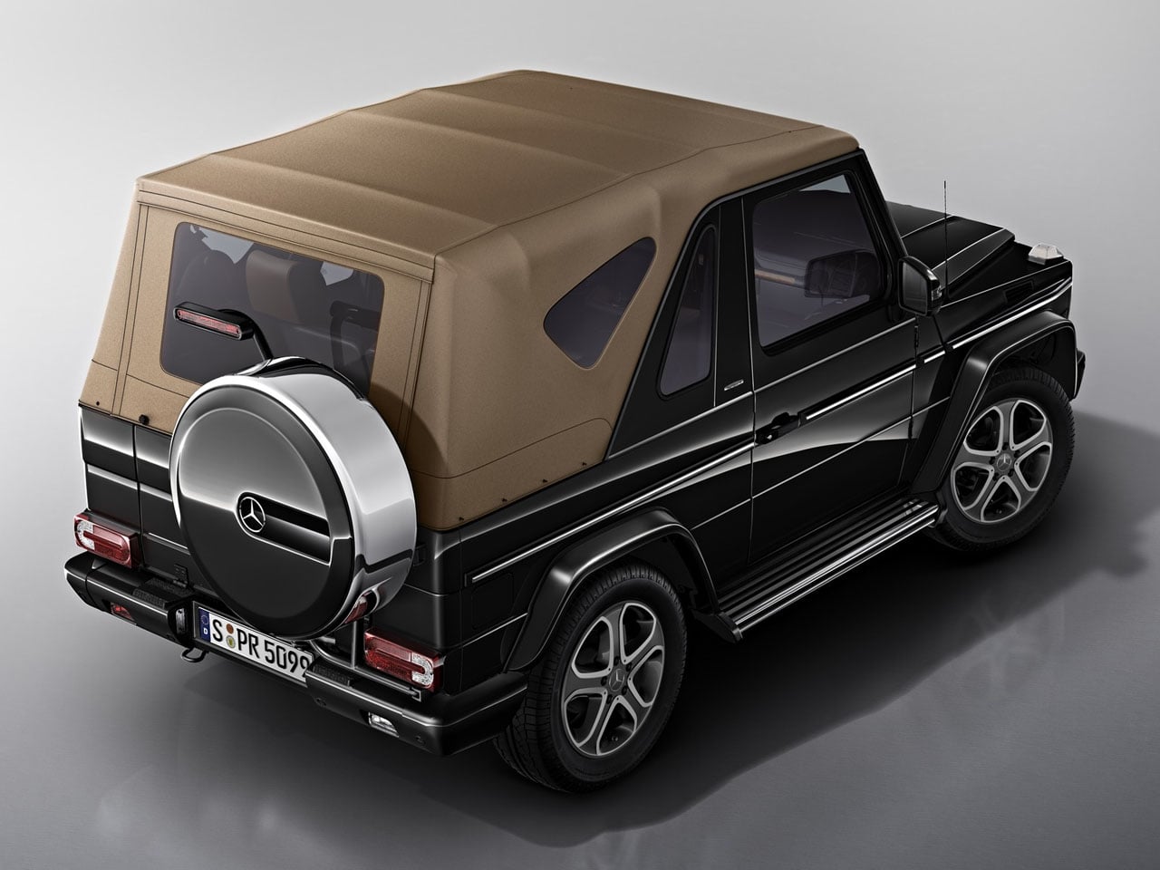
Mercedes-Benz fans last got a factory-built convertible G-Class in 2013, and after years without an open-top option, the German automaker appears ready to bring it back. The upcoming G-Class Cabriolet retains the SUV’s unmistakable boxy silhouette while introducing a folding fabric roof that gives the iconic off-roader a fresh sense of openness.

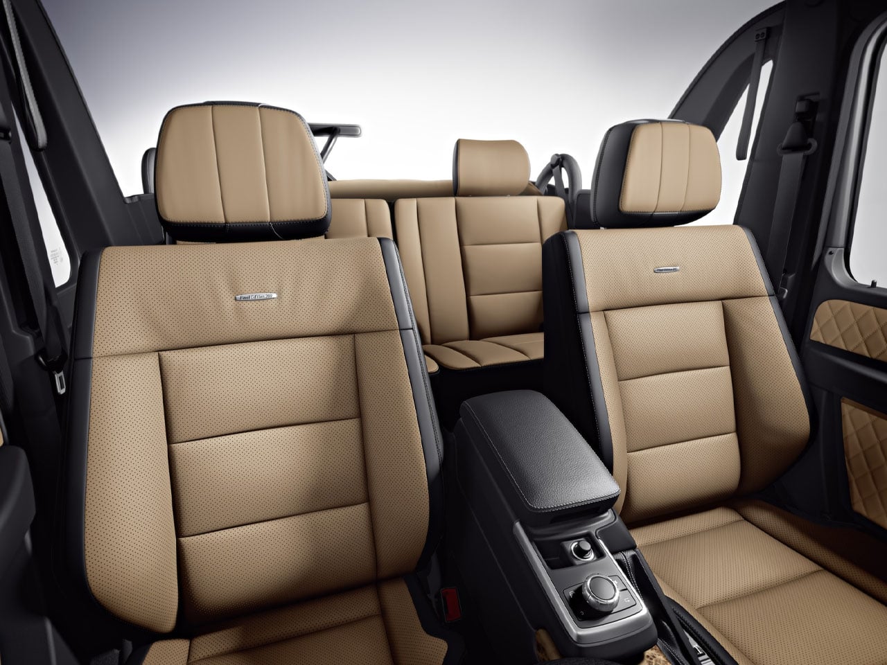
Based on the Mercedes-AMG G63, the four-door convertible preserves the rugged character of the standard SUV while adding a more lifestyle-oriented driving experience. The powered soft top folds away at the push of a button, stacking neatly behind the rear seats at roughly the height of the rear wheel arches. Unlike the earlier G-Class Convertible, which required owners to manually release roof latches before operating the top, the new system is fully automated for greater convenience.

Designer: Mercedes-Benz

Although Mercedes-Benz has yet to reveal complete specifications or an official launch timeline, prototype sightings and teaser footage offer a closer look at the engineering behind the transformation. Converting the G-Class into a cabriolet required substantial structural modifications, including a redesigned rear section and reinforced body to compensate for the removal of the fixed roof. Reports suggest the retractable roof mechanism alone consists of around 500 specially developed components.

The rear of the SUV also receives thoughtful revisions to accommodate the convertible layout. The signature spare wheel carrier remains, but its cover has been redesigned with an integrated high-mounted brake light. The rear pillars have a more angular profile than previous convertible G-Class models, giving the SUV a cleaner and more contemporary appearance while maintaining its instantly recognizable design language.

Performance is expected to remain unchanged from the AMG G63. The convertible is likely to be powered by the familiar 4.0-liter twin-turbocharged V8 engine producing 577 horsepower, paired with Mercedes-AMG’s all-wheel-drive system. That means buyers should still get the same blend of high-performance road manners and formidable off-road capability that has defined the modern G-Class.

The return of the G-Class Cabriolet is significant because Mercedes-Benz has largely focused on expanding its SUV lineup through new powertrains and special editions rather than introducing entirely new body styles. By reviving the open-top G-Wagon, the company is revisiting one of the model’s most distinctive variants while combining classic styling with modern engineering and convenience.

Whether cruising coastal roads or tackling rough terrain, the G-Class Cabriolet promises to deliver the unmistakable presence of the G-Wagon with the added appeal of open-air driving. More details, including pricing, production numbers, and availability, are expected to be announced closer to its official debut.

The post Mercedes’ New G-Wagon convertible lets you enjoy open-air luxury without giving up off-road power first appeared on Yanko Design.

Blue Bottle Coffee’s Harajuku Cafe Is a Study in Restraint Done Right

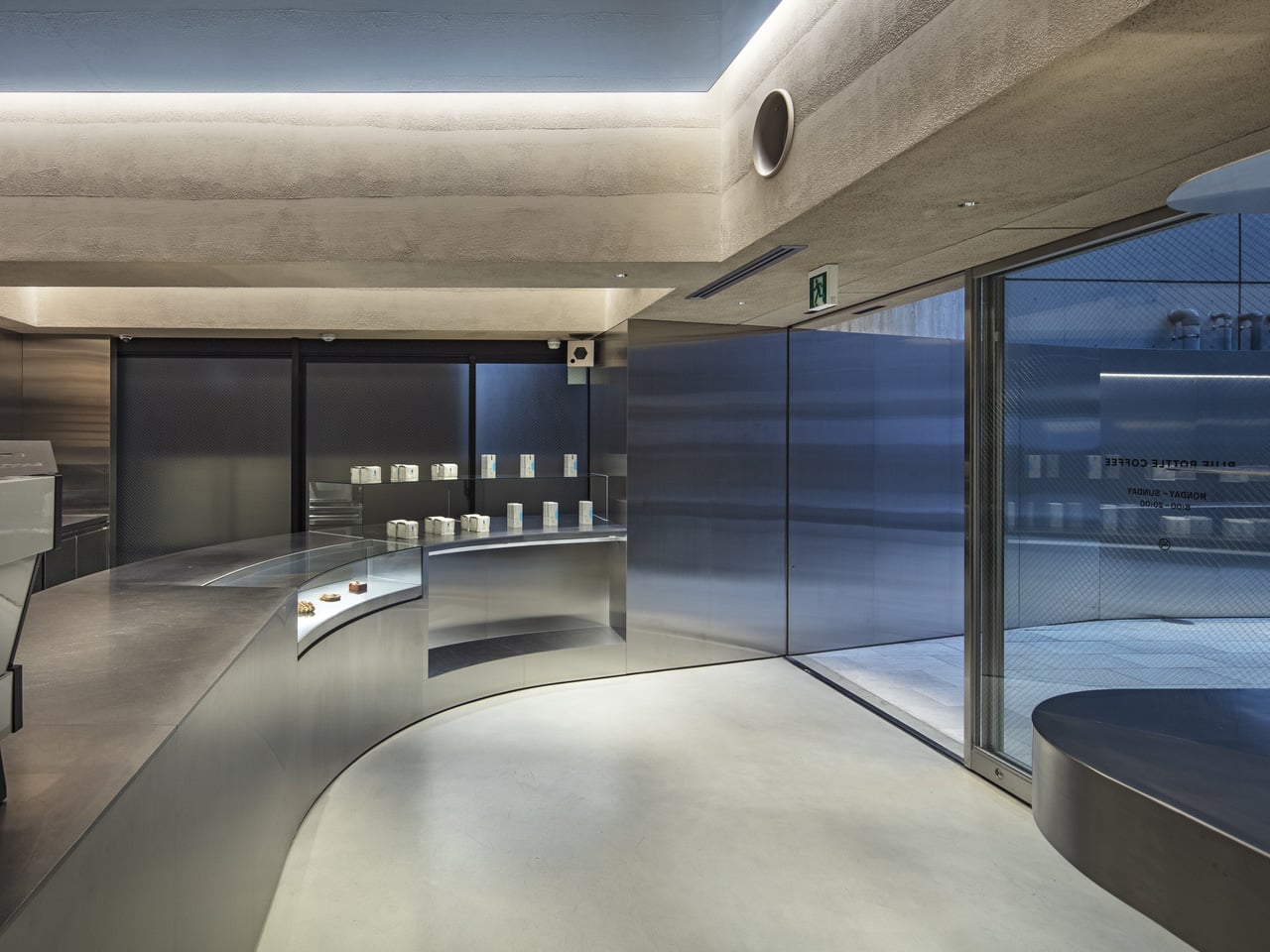
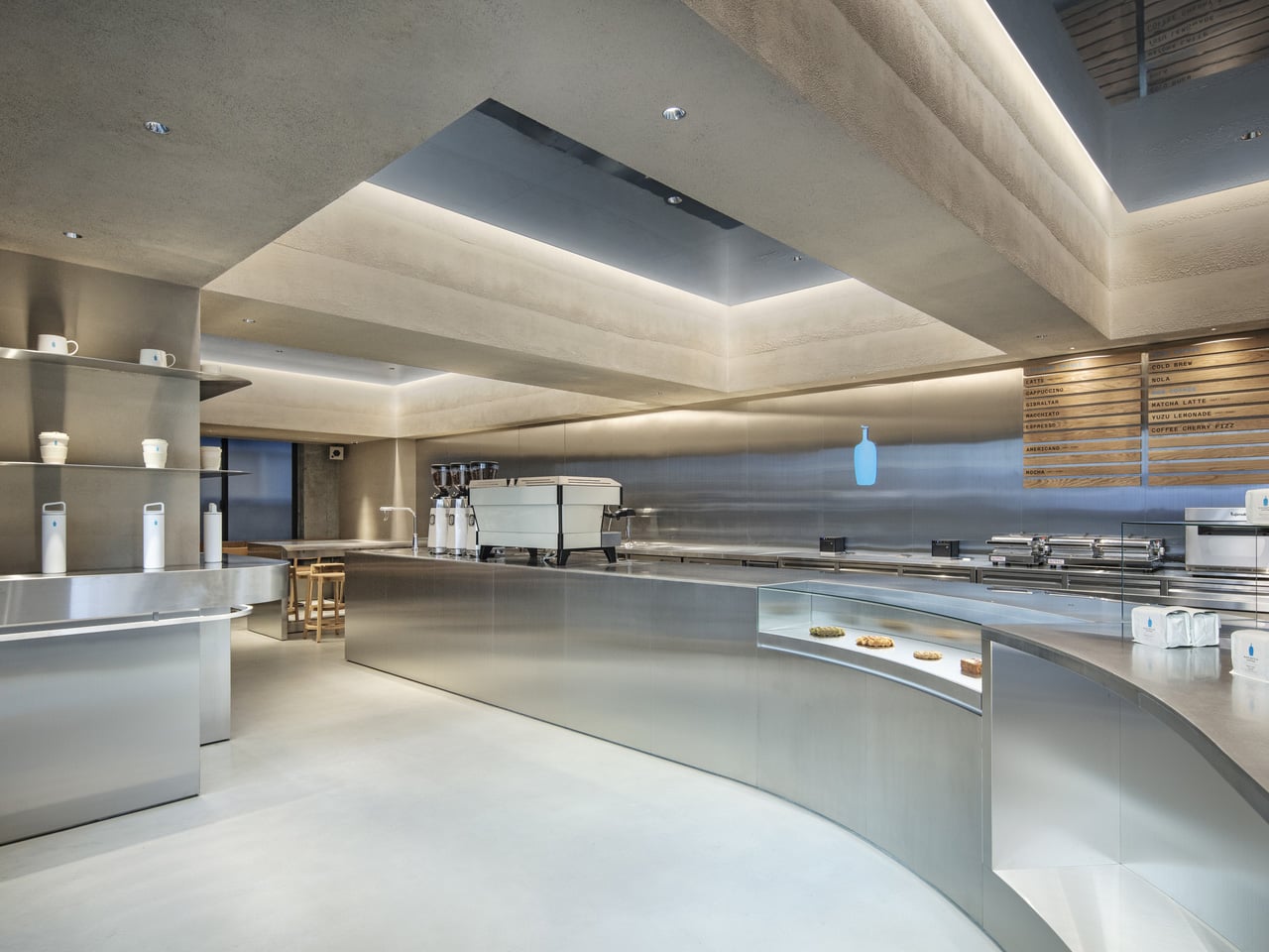
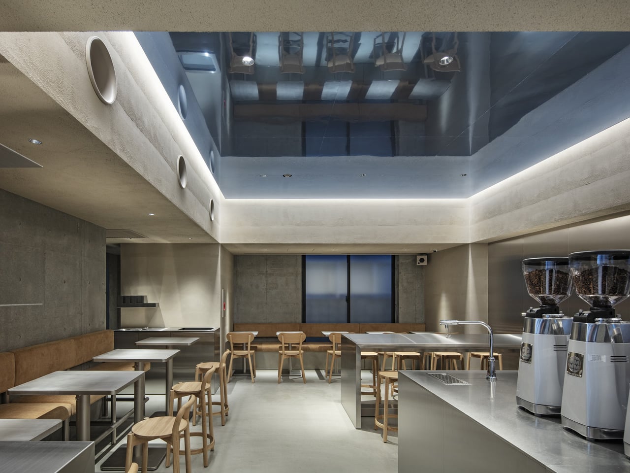
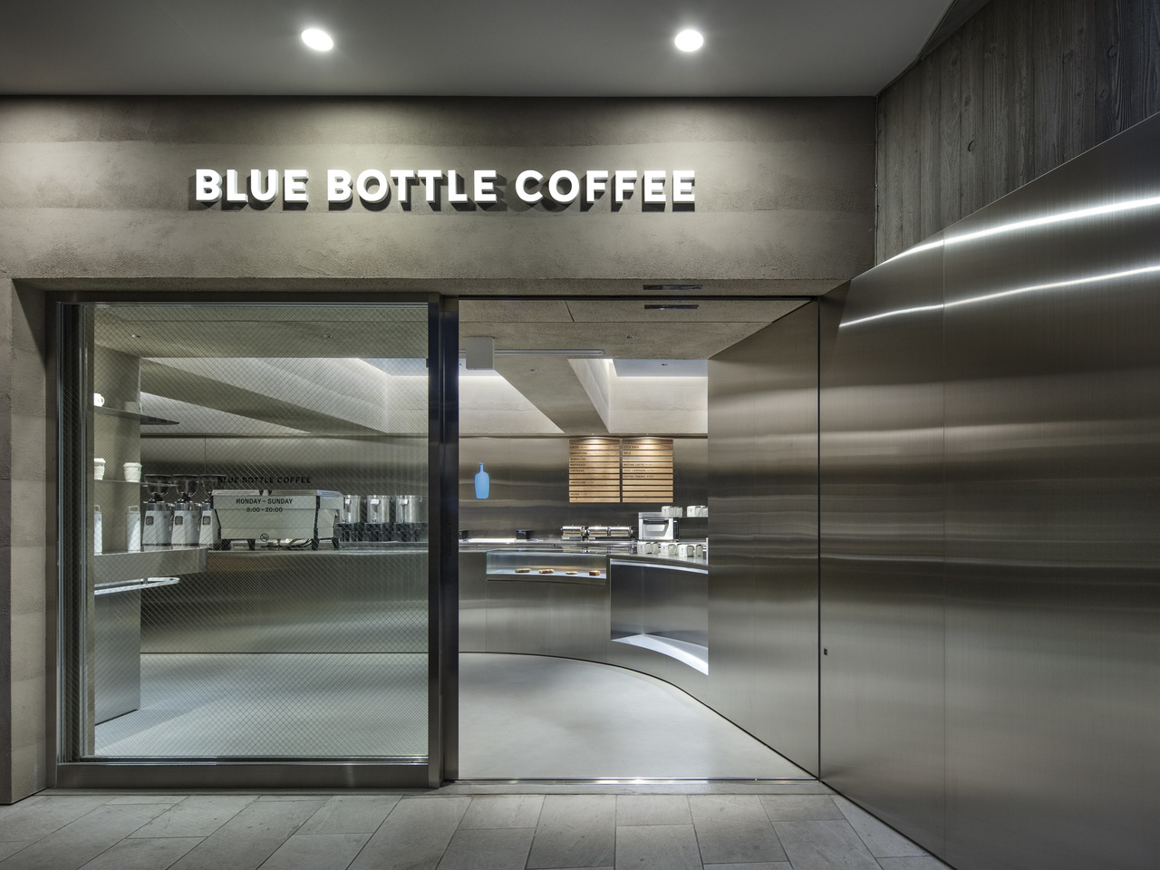
Walk into most cafes, and they’re already selling you something — exposed brick, neon signs, mismatched furniture, a playlist that changes every twenty minutes. Then there’s the Blue Bottle Coffee Harajuku cafe by TEKI Design, which says almost nothing, and means all of it.

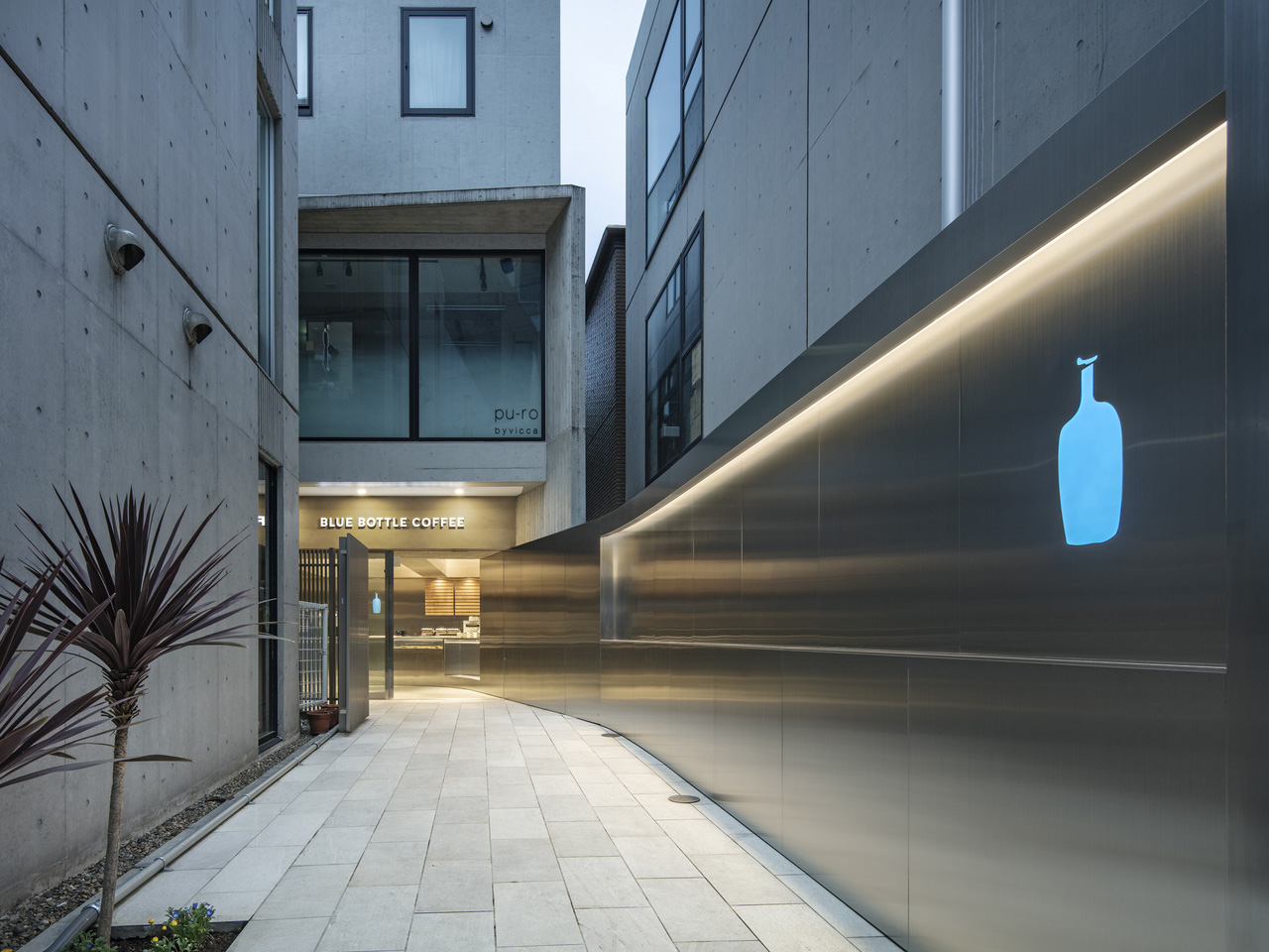
Tucked into one of Tokyo’s most visually chaotic neighborhoods, the Harajuku outpost functions as a deliberate counterweight to its surroundings. Harajuku is a place of spectacle — streetwear drops, cosplay, fashion tribes colliding on narrow sidewalks. TEKI Design’s response was to strip everything back. The cafe earns its calm rather than performing it.

Designer: TEKI Design

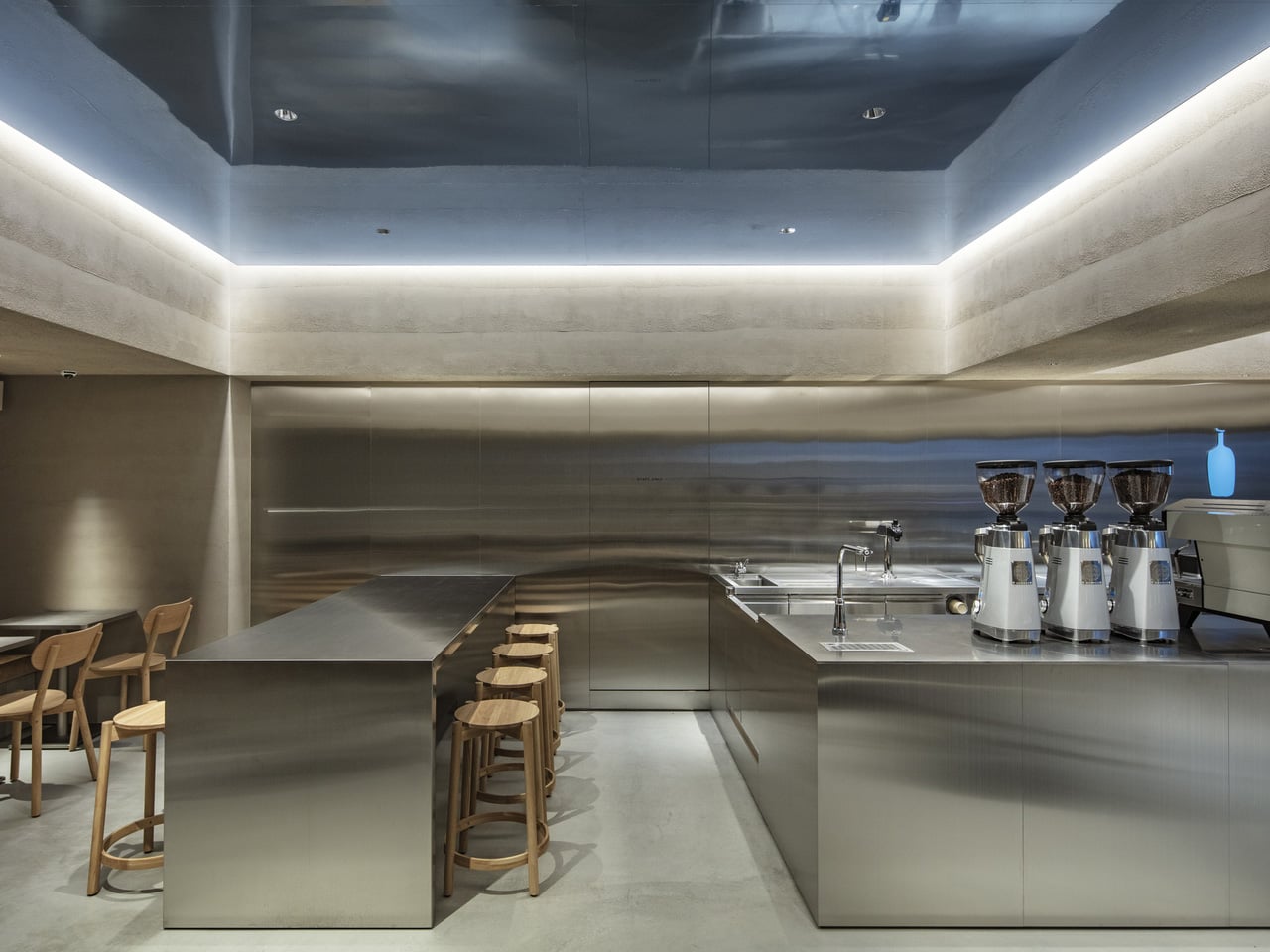
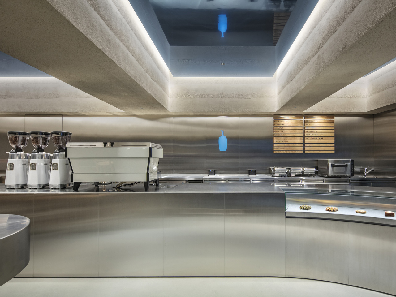
The interior leans into a vocabulary that feels distinctly Japanese in its economy of means. Clean lines, natural materials, and a spatial arrangement that prioritizes the ritual of coffee over the theatre of the brand. Light enters the space softly, falls across surfaces without drama, and leaves the room feeling like something you want to stay inside of. That quality — the sense of earned stillness — is harder to design than it looks.

TEKI Design has long understood that in a city as dense and stimulating as Tokyo, the most radical gesture a space can make is to ask nothing of you. The Harajuku cafe does exactly that. There’s no moment where the architecture competes with the coffee, or the coffee competes with the conversation. Each element holds its position and then steps aside.

Blue Bottle’s presence in Japan has always felt more considered than its American counterparts. The brand arrived in Tokyo in 2015 with a clear awareness that it was operating in a country with a coffee culture that predated its own by decades. That awareness shows up in spaces like this one — not as deference, but as genuine dialogue. The Harajuku cafe doesn’t try to look Japanese. It simply engages with what good Japanese design has always understood: that space is as much about what you remove as what you place.

The result is a cafe that photographs beautifully and experiences even better. A single cup of their single-origin pour-over, consumed in a room this quietly composed, lands differently than the same cup consumed anywhere noisier. That’s not pretension. That’s design working exactly the way it should — invisibly, in service of the thing you came for. In a neighborhood built on maximalism, TEKI Design and Blue Bottle Coffee have made the smallest possible move. It turns out that was the boldest one available.

The post Blue Bottle Coffee’s Harajuku Cafe Is a Study in Restraint Done Right first appeared on Yanko Design.

This $125 Glowing Pay Phone Charges the Smartphone That Killed It

The pay phone had a specific place in the urban landscape, usually on a corner, usually a little battered, and always surrounded by some combination of stickers and street art that turned it into an unintentional canvas. Cities spent decades pulling them out, convinced that no one needed them anymore now that everyone had a phone in their pocket. That logic was correct, of course, but it didn’t make the pay phone any less iconic.

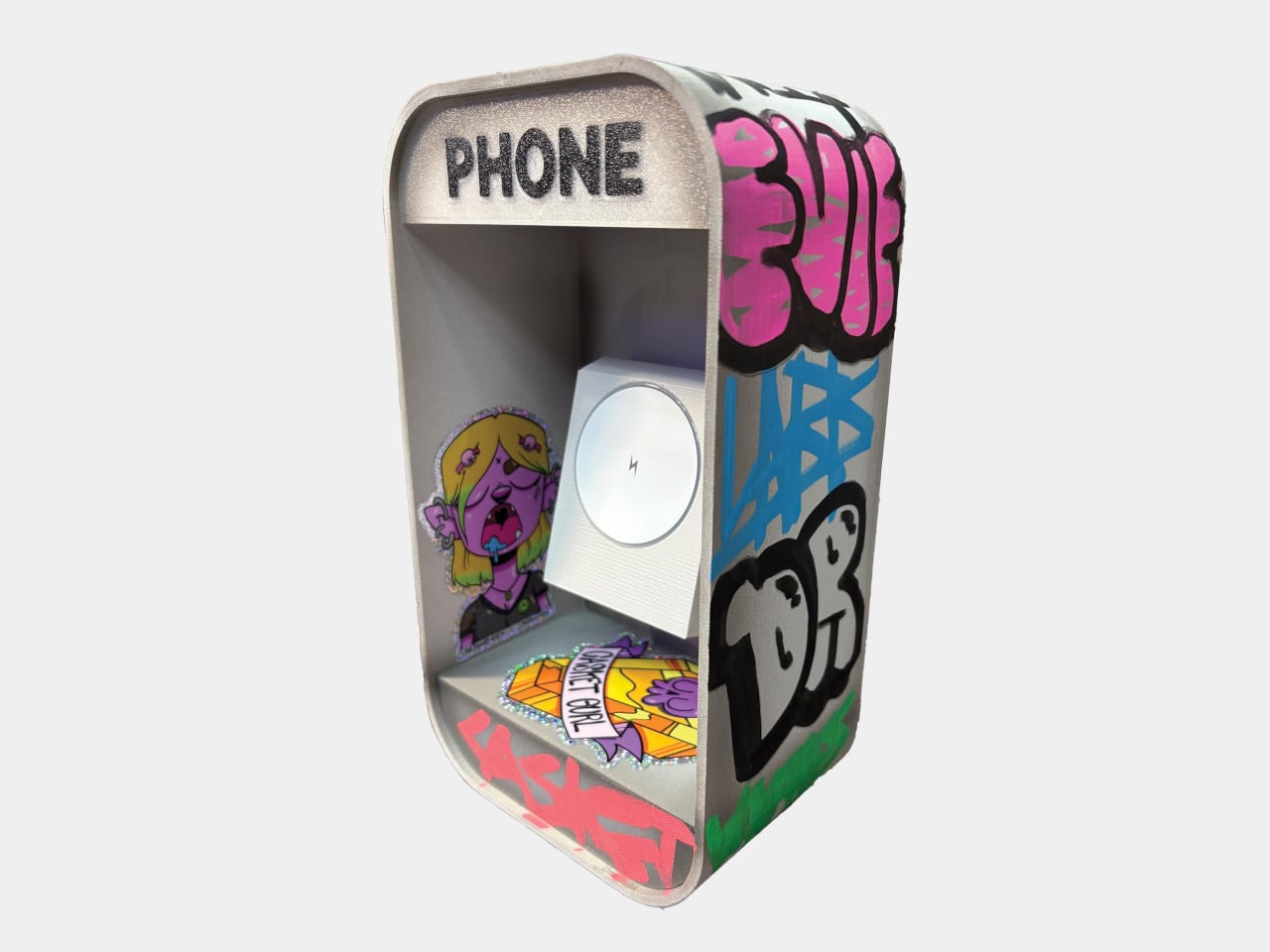
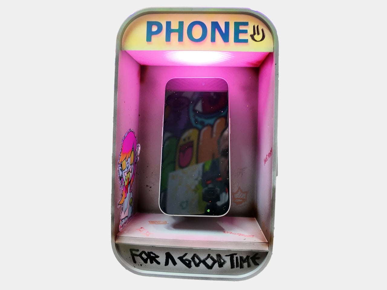
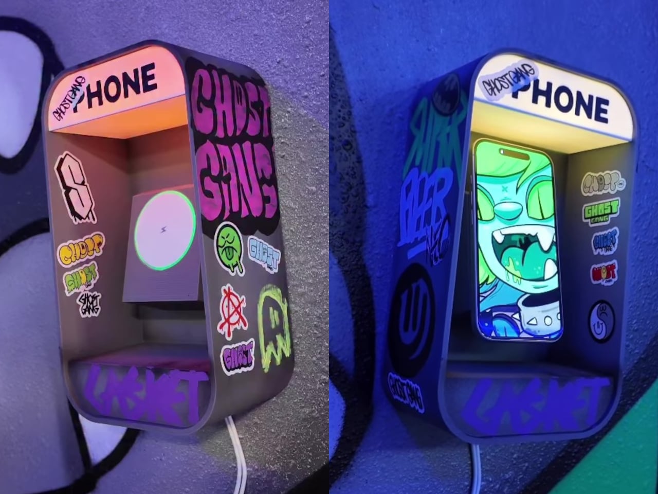
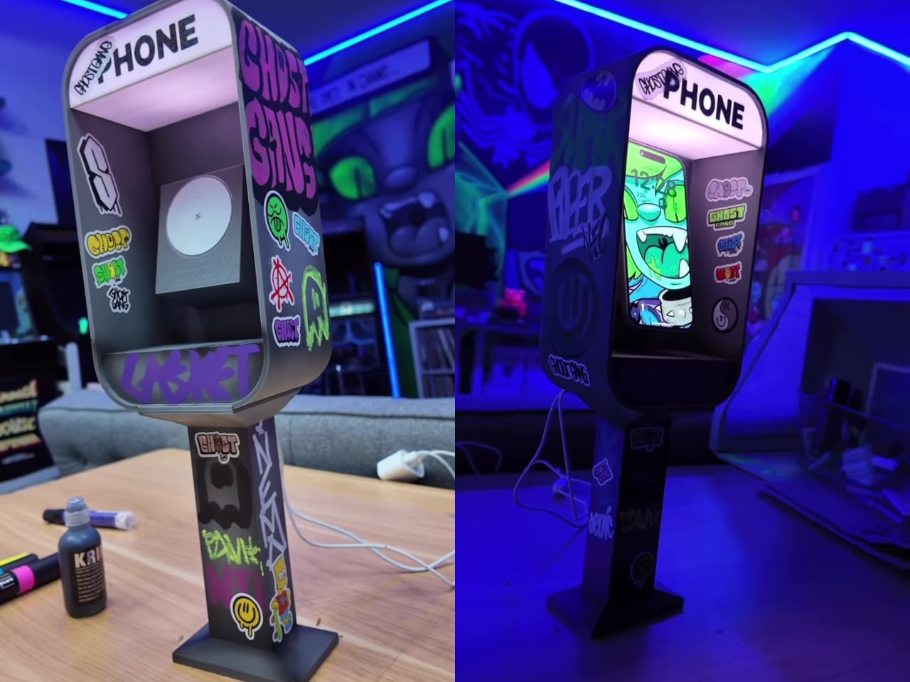
The Pay Phone Charger takes that object out of storage and puts it back on the desk, this time doing the one job the original never could: charging the very devices that replaced it. It’s a 3D-printed miniature pay phone booth with a built-in MagSafe-compatible wireless charger and RGB LED lights that illuminate the “PHONE” sign. Set your phone inside it, and it charges, while the lit-up booth sits on your nightstand or desk looking thoroughly unapologetic about the whole thing.

Designer: Nicky Davis

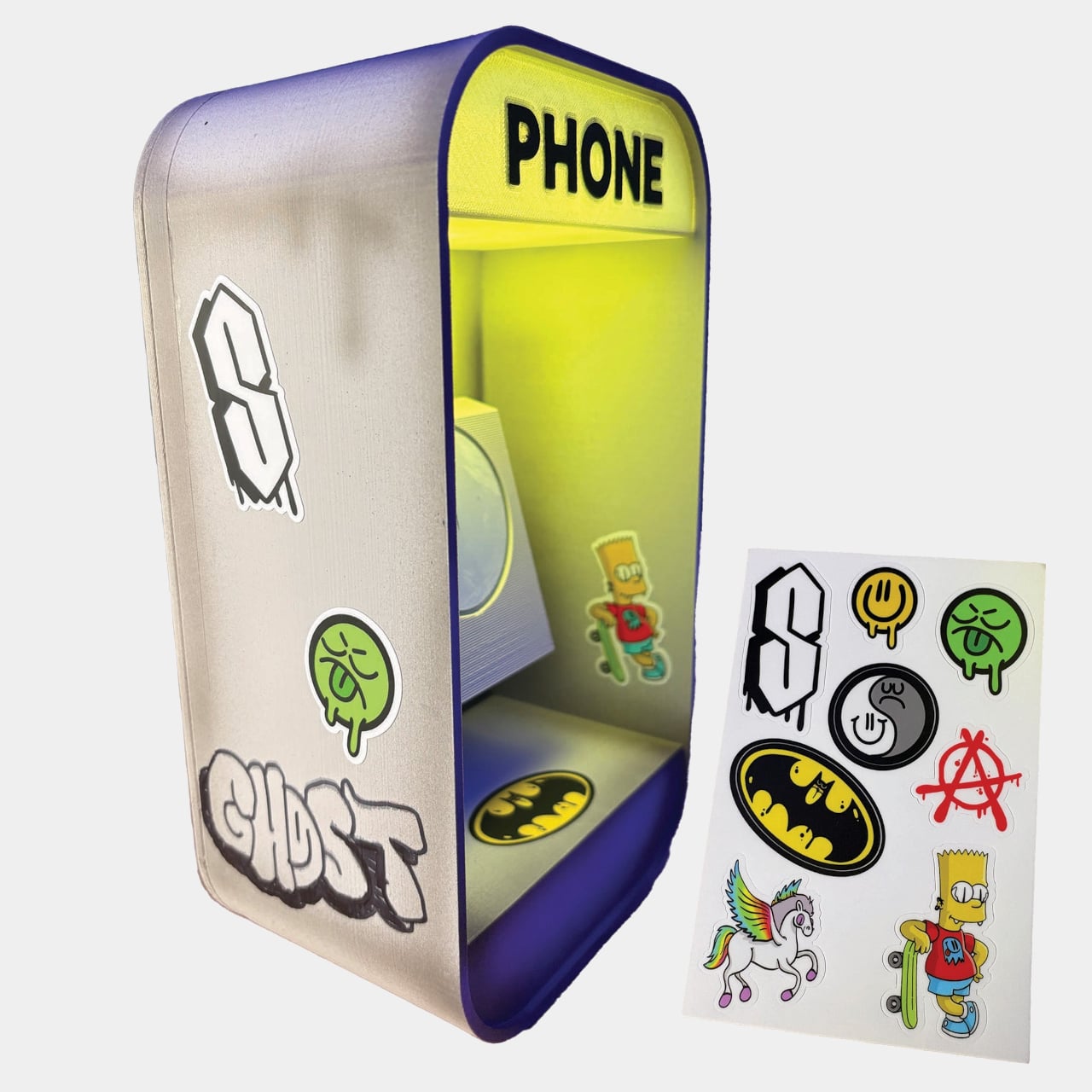
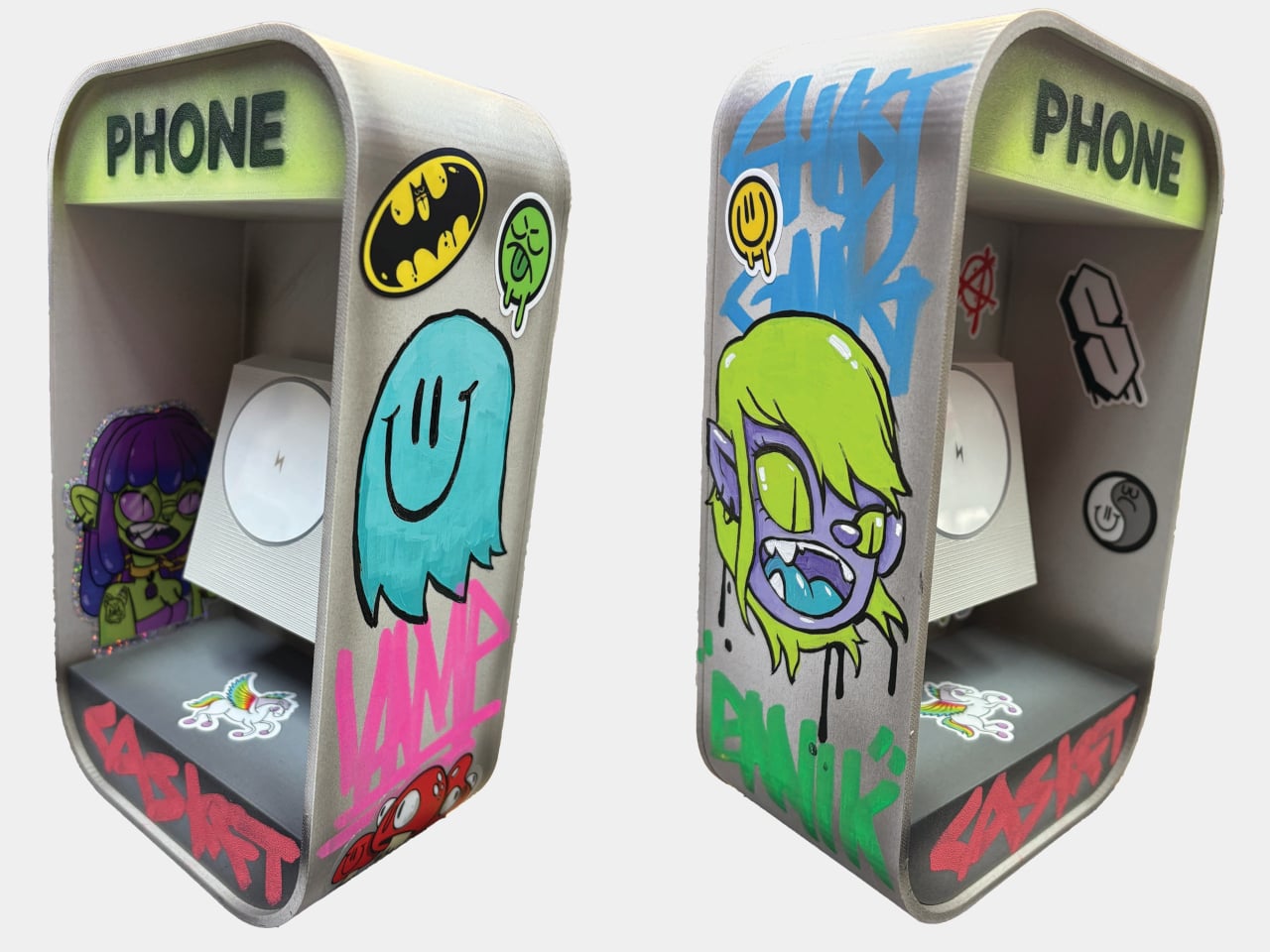
The version you receive depends on which style you choose at purchase. The DIY option arrives as a blank, undecorated body, with the MagSafe charger and LED lights included alongside a retro sticker sheet that lets you decorate it yourself. For anyone who’d rather skip that step, the Hand Painted and Graff version comes fully decorated with original artwork applied by hand before it ships.

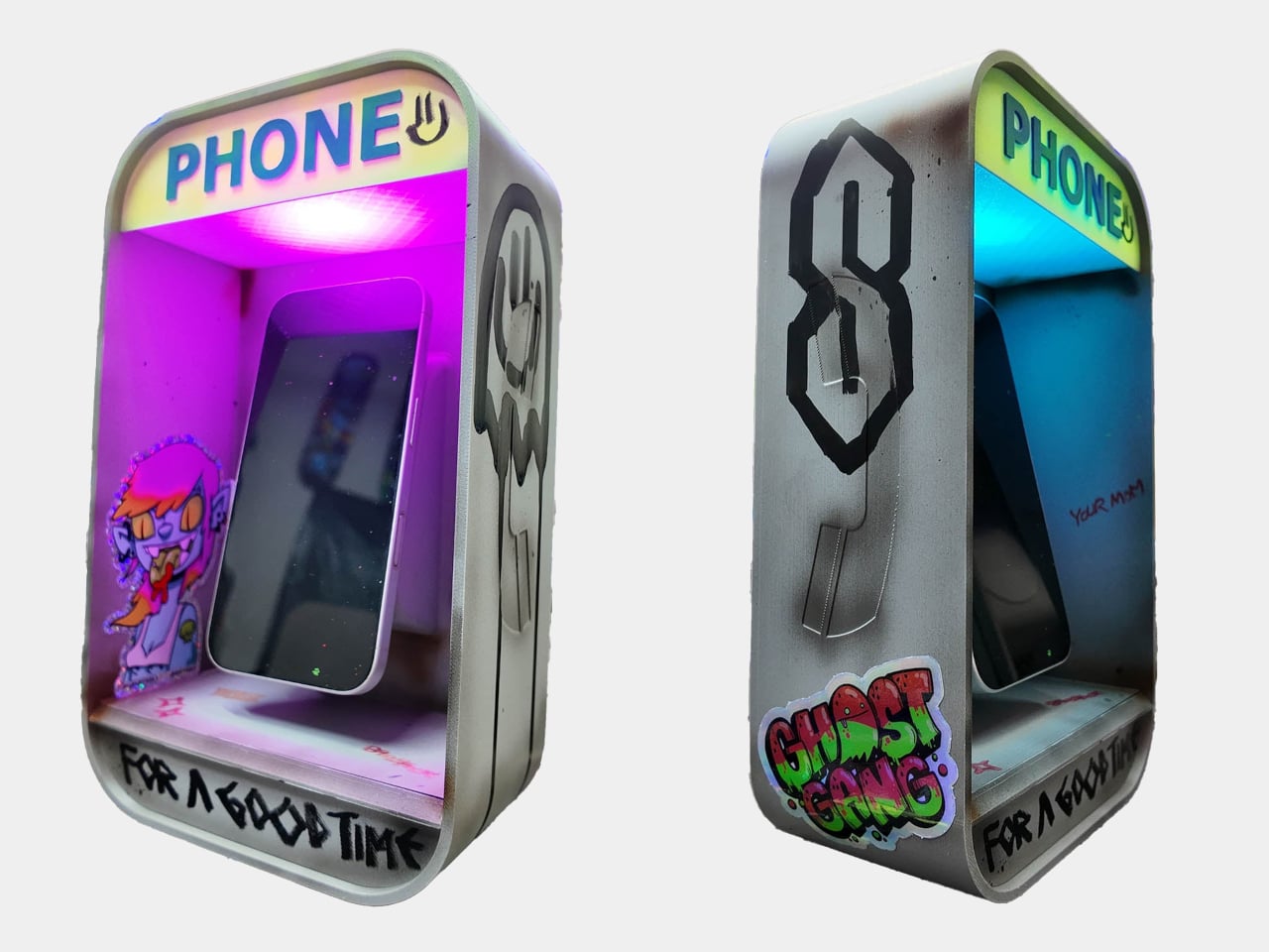
Two more options lean into the aesthetic of pay phones in their natural habitat. The Graffiti Covered version is fully tagged across the body, the kind of treatment any phone booth in a city block would accumulate over a few years. The 90’s Worn Looking version takes a different approach, styled to look genuinely aged and battered, as if it survived decades of street corners before ending up on your desk. Custom designs are also available on request for anyone with a specific vision.

Graffiti Covered

Each piece is made individually, not manufactured in batches, which is a detail that matters when you’re looking at something styled after hand-tagged street furniture. The LED-lit “PHONE” sign is a small but exactly right touch, nodding to the illuminated panels that real pay phones used to make themselves visible at night. Placed on a nightstand, it gives the charger a presence that a flat wireless pad simply doesn’t.

90s Worn Looking

The irony at the center of the design doesn’t need to be overstated. A miniature pay phone charging a smartphone is a visual joke that explains itself the moment anyone sees it, and that’s part of why the product went viral before most people had even had a chance to order one. The waitlist that followed was long enough that the creator switched to a preorder system just to manage demand, making units one at a time as an independent artist.

The charging function works on any MagSafe-compatible device, which covers a broad range of current iPhones without needing an adapter. The 3D-printed body is compact enough for a bedside table or desk corner without demanding too much space, and the sticker-ready surface of the DIY version makes it something of a collaboration between the maker and whoever ends up with it.

Pay phones disappeared because they were replaced by something more convenient. The Pay Phone Charger acknowledges that fully, charges it anyway, and glows while it does it. Starting at $125, it’s the kind of object that usually needs a lot more explaining than this one does.

The post This $125 Glowing Pay Phone Charges the Smartphone That Killed It first appeared on Yanko Design.