Canada cuts tariffs on Chinese EVs as part of new deal

Canada has agreed to drastically reduce its tariffs on imported Chinese EVs from 100 percent to 6.1 percent as part of a

between the two countries. In return, China will be reducing tariffs on Canadian canola seeds from 84 percent to about 15 percent.

The move is a break from the United States, which maintains a 100 percent tariff on EVs from China, effectively banning them in the country. Mexico currently tariffs the vehicles at 50 percent after

last year.

Under the agreement, which Canadian Prime Minister Mark Carney

"preliminary," Canada will allow up to 49,000 Chinese EVs into the country, with that number rising to 70,000 after five years. Until now the three major North American trading partners had been aligned in trying to protect their domestic electric vehicle manufacturing. Chinese EV companies benefit from

, and as such can often be priced at a far better value than domestic alternatives.

“Our relationship has progressed in recent months with China. It is more predictable and you see results coming from that,” Carney

. A warmer relationship may be forming in response to the Trump administration's

, with China hoping that alienated nations may

with the Eastern power.

As to concerns that cheaper electric vehicles from China could hurt the Canadian auto market, the prime minister was unconcerned, saying "it’s still in low, single-digit proportion of the size of the Canadian auto sector," Carney added, “Canadians buy about 1.8 million autos a year.” China remains Canada’s second-largest trading partner after the United States.

This article originally appeared on Engadget at https://www.engadget.com/transportation/evs/canada-cuts-tariffs-on-chinese-evs-as-part-of-new-deal-174241990.html?src=rss

X is fully online after going down for most of the morning

X seems to be working again after struggling with an outage that took the service offline and made it slow to load for much of the morning. According to X’s developer platform page, there is an ongoing incident related to streaming endpoints that’s caused increased errors. The incident started at 7:39AM PT, according to the page.

That roughly coincides with a spike in reports at Down Detector. The issues seemed to be somewhat intermittent. At some points, X’s website loaded partially and only showed older posts. At other times, the app and website failed to load at all.

As of 9:30AM PT, X’s Explore and trending pages were loading, but the “following” tab wasn’t showing posts and instead suggested users “find some people and topic to follow” (as shown in the screenshot below).

Posts aren't loading.
X

As of 11:15AM PT, X’s developer site was still indicating ongoing issues, so there may still be some lingering problems even though the website seems to be functioning normally again. Reports on Down Detector have also dropped off considerably.

X didn’t immediately respond to a request for comment on the outage. As TechCrunch notes, this is the second time this week that X has experienced significant issues. The service also went down for many users around the world on Tuesday.

Bluesky changed its profile photo earlier in the week.
X

But while the latest issues were widespread, some posts are were still managing to go through. Rival Bluesky, which earlier in the week changed its profile picture on X to its butterfly logo in a bikini, took the opportunity to throw some shade.

At 1PM PT, X updated its status page to indicate the issue had been resolved after nearly six hours. It didn’t elaborate on the underlying cause.

Update, January 16, 2026, 2:09PM PT: Updated with the latest information from X’s status page.

This article originally appeared on Engadget at https://www.engadget.com/social-media/x-is-fully-online-after-going-down-for-most-of-the-morning-171843711.html?src=rss

The latest Legend of Zelda Lego set pays tribute to Ocarina of Time’s final battle

We already knew something Ocarina of Time-related was coming from Nintendo and Lego in 2026, and now we know exactly what that set will look like. Weighing in at a surprisingly modest 1,003 pieces, the typically word salad-y Lego The Legend of Zelda: Ocarina of Time - The Final Battle is the second Lego Zelda set, following the 2,500-piece Great Deku Tree set in 2024.

While the latter lets you choose between building either a Breath of the Wild or OoT-themed replica of the wise old guardian of the forest, the upcoming set is aimed squarely at fans of the series’ debut 3D outing. As you can probably guess from the name, it’s a brick-built tribute to Link and Princess Zelda’s climactic battle with Ganondorf in the seminal Nintendo 64 game, in what remains of the castle. Inside the rubble are three recovery hearts.

It’s hard to see how this works without a video, but Lego says you can release Link’s nemesis by pressing a button that raises him from the debris. As well as the minifigures for Zelda and Link — complete with his Master Sword and Hylian Shield — you also get a suitably transparent Navi to display. And then there’s the large poseable Ganon (the pig demon version of Ganondorf), which is probably the highlight of the whole set.

Interestingly, the new Ocarina of Time set is the first high-profile Lego announcement since unveiling its new Smart Brick at CES, but it looks like we’ll be playing with regular dumb Lego only here. You’ll just have to do the final Hyrule-saving "Hyah!" yourself, I guess.

Lego The Legend of Zelda : Ocarina of Time - The Final Battle is available to pre-order from today and will be available from March 1, priced at $130.

This article originally appeared on Engadget at https://www.engadget.com/gaming/nintendo/the-latest-legend-of-zelda-lego-set-pays-tribute-to-ocarina-of-times-final-battle-172212137.html?src=rss

Pareto Pot Uses the 80/20 Rule to Give Your Favorite Pens a Better Home

Most creative desks have a cup overflowing with pens, markers, and tools, even though you reach for the same few every day. There is the Muji gel pen for sketches, a couple of render markers you trust, and then about 15 other things you keep just in case. The Pareto Principle says 80 percent of your output comes from 20 percent of your stationery, which feels accurate once you notice how often you dig past everything else.

Pareto Pot is a stationery holder designed around that rule. Designer Liam de la Bedoyere noticed his own reliance on a handful of hero tools and built a pot that prioritizes those while still keeping essential counterparts within reach. It is a small desk object that treats hierarchy as a feature rather than pretending every pen deserves equal billing, using form and compartment size to make your most-used tools easier to grab.

Designer: Liam de la Bedoyere

Sitting down to sketch or render, your main pen and key markers naturally drop into the larger front compartment, while backup colours, fineliners, or highlighters slide into the smaller rear section. Without thinking about it, you end up with a front row of tools you use constantly and a supporting cast that is still close but not fighting for attention every time you reach for something.

The object is made from bent and welded sheet metal, forming a nested, teardrop-like footprint that balances minimalism with clear function. The outer shell wraps around an inner wall to create two compartments in one continuous gesture, so it reads as a single form rather than a cluster of tubes. The result feels industrial and precise but not cold or overdesigned, more like a small sculpture that happens to organize your pens.

The base is wide enough to stay put when you grab a handful of markers, and a cork underside protects the desk and adds grip. The height keeps pens upright and visible without making them wobble or tip when you pull one out in a hurry. It is the kind of object you can slide around a crowded workspace without worrying about tipping or scratching the surface underneath.

A small “80/20” mark on the side acts as a quiet nod to the idea driving the form, not a loud logo. It is a reminder that the pot is not just another cylinder; it is a physical diagram of how most of us actually work, a big space for the few tools that matter most, and a smaller one for everything else.

Pareto Pot is less about storing as many pens as possible and more about making it easier to focus on the ones that pull most of the weight. It does not tell you which tools to love; it just gives them a better spot to live in. For anyone trying to tame a chaotic pen cup without giving up their favourite analog tools, that feels like a quietly smart upgrade.

The post Pareto Pot Uses the 80/20 Rule to Give Your Favorite Pens a Better Home first appeared on Yanko Design.

TikTok sued by former workers over alleged union-busting

You know things are messed up when a Big Tech company fights accusations of union-busting by insisting it was only AI layoffs. That's where things stand after a group of fired TikTok moderators in the UK filed a legal claim with an employment tribunal. The Guardian reported on Friday that around 400 TikTok content moderators who were unionizing were laid off before Christmas.

The workers were sacked a week before a vote was scheduled to establish a collective bargaining unit. The moderators said they wanted better protection against the personal toll of processing traumatic content at a high speed. They accused TikTok of unfair dismissal and violating UK trade union laws.

"Content moderators have the most dangerous job on the internet," John Chadfield, the national officer for tech workers at the Communication Workers Union (CWU), said in a statement to The Guardian. "They are exposed to the child sex abuse material, executions, war and drug use. Their job is to make sure this content doesn't reach TikTok's 30 million monthly users. It is high pressure and low paid. They wanted input into their workflows and more say over how they kept the platform safe. They said they were being asked to do too much with too few resources."

TikTok denied that the firings were union-busting, calling the accusations "baseless." Instead, the company claimed the layoffs were part of a restructuring plan amid its adoption of AI for content moderation. The company said 91 percent of transgressive content is now removed automatically.

The company first announced a restructuring exercise in August, just as hundreds of moderators in TikTok's London offices were organizing for union recognition. At the time, John Chadfield, CWU's National Officer for Tech, said the workers had long been "sounding the alarm over the real-world costs of cutting human moderation teams in favour of hastily developed, immature AI alternatives."

"That TikTok management have announced these cuts just as the company's workers are about to vote on having their union recognised stinks of union-busting and putting corporate greed over the safety of workers and the public,” Chadfield said.

This article originally appeared on Engadget at https://www.engadget.com/big-tech/tiktok-sued-by-former-workers-over-alleged-union-busting-170446921.html?src=rss

DarkSky One supercar lurks in the dark like a ninja with its sensible lighting

There’s something about nighttime that evokes different emotions. When driving on the expressway, the feeling is second to none. While supercars are designed to be appreciated in their full glory during the daytime, rarely has anyone thought about designing a fast four-wheeler that’s designed for the night, first and foremost.

This is DarkSky International’s take on a supercar that is designed with “darkness at the center of its vision.” Marking its debut at the Detroit Auto Show, the DarkSky One is the first-ever car that’s designed for “nighttime first.” This reminds me of While Bane’s words in The Dark Knight Rises, “You merely adopted the dark. I was born in it, molded by it.” Unlike other supercars that are focused on performance and looks, this one is inspired by the lack of light.

Designer: DarkSky International

The focus with the matte black-skinned supercar is on the lighting and how it affects the ambient environment. Maker wants to minimize light pollution with such automobiles, rather than going the conventional way of having brighter headlights shining high beam at oncoming traffic. That too, without even mentioning the auxiliary options to light up cars, making them shine out among other vehicles. According to them, the artificial light ruins the night, and the darkness helps drivers see better. It is equipped with LiDAR units that analyze the environment to adjust the headlight beam and direction to have a ninja-like road presence.

The forward lighting direction is adjusted with the All Beam Adaptive Driving Lights that toggle the brightness levels depending on the road ahead and the relative distance to other motorists. That’s an important feature as it reduces glare for oncoming traffic. The buck doesn’t stop there as the car has side lighting on doors, hood, and the side panels so that the car’s presence doesn’t overpower the ambient natural lighting. Perhaps the perfect commute for people who love to enjoy the Moonlight and stargazing on the quaint roads. Fewer beaming lights means reduced stress for wildlife as well, which is another major factor. DarkSky says that the supercar has polarization and reflection physics which are present in every “window, door and body angle to reduce specular reflection, maximizing viewability at all angles.”

DarkSky International has not mentioned any performance specifications of the vehicles yet, signaling their deep focus on DarkSky One’s muted presence. While improving visibility and consequently road safety are the maker’s prime objectives, the resulting light pollution also goes down. This is important in a world where we are gazing at bright lights even in the darkest hours of the day. Hence, this design hints at a shift towards peace and calm. The matte black color has a micro-textured pattern so that stray lights and glare from other vehicles are suppressed. As they love to exclaim that the body lines are “shaped so the night can breathe.”

The post DarkSky One supercar lurks in the dark like a ninja with its sensible lighting first appeared on Yanko Design.

No More Peeking: The Samsung Galaxy S26 Ultra’s New Privacy Screen is a Game Changer

No More Peeking: The Samsung Galaxy S26 Ultra’s New Privacy Screen is a Game Changer

The Samsung Galaxy S26 Ultra represents a bold step forward in the evolution of flagship smartphones, blending advanced technology with practical enhancements. As the top-tier model in the S26 series—which also includes the S26 and S26 Plus—it introduces significant improvements across display, battery, and charging technologies. Adding to the excitement, rumors hint at the possibility […]

The post No More Peeking: The Samsung Galaxy S26 Ultra’s New Privacy Screen is a Game Changer appeared first on Geeky Gadgets.

Posted in Uncategorized

Airline Meal Trays Are Broken: This Korean Design Fixes Them

There’s something deeply satisfying about opening a Korean meal to find those little side dishes, each in their own small bowl, arranged just so. The banchan tradition turns eating into a kind of visual feast before you even take a bite. Now, imagine bringing that same thoughtful, modular approach to one of the most notoriously cramped dining experiences: airplane meals.

That’s exactly what BKID co has done with their System Tray design, and honestly, it’s one of those ideas that makes you wonder why we didn’t think of this sooner. The project takes the organizational genius behind Korean side dish service and reimagines it for the narrow, tray-table constrained world of in-flight dining.

Designer: BKID co

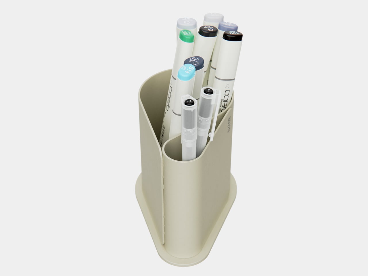
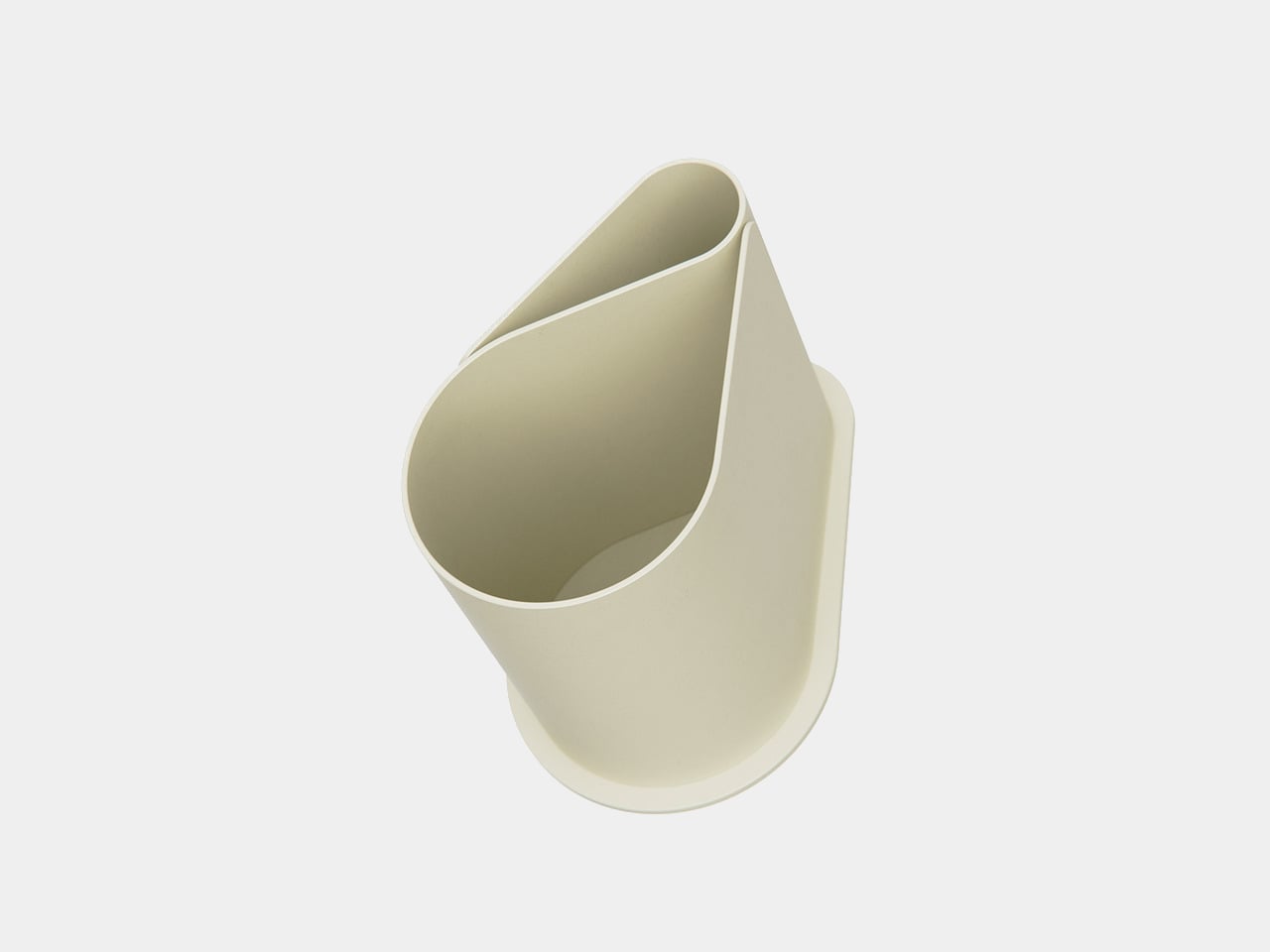
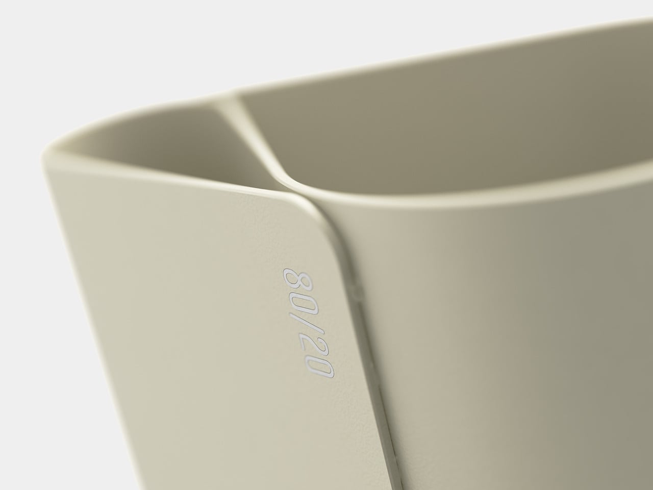
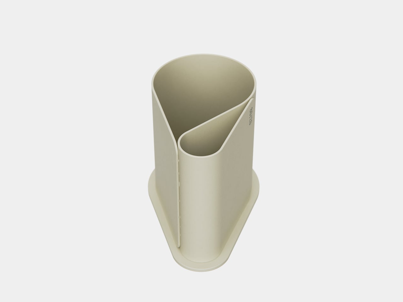
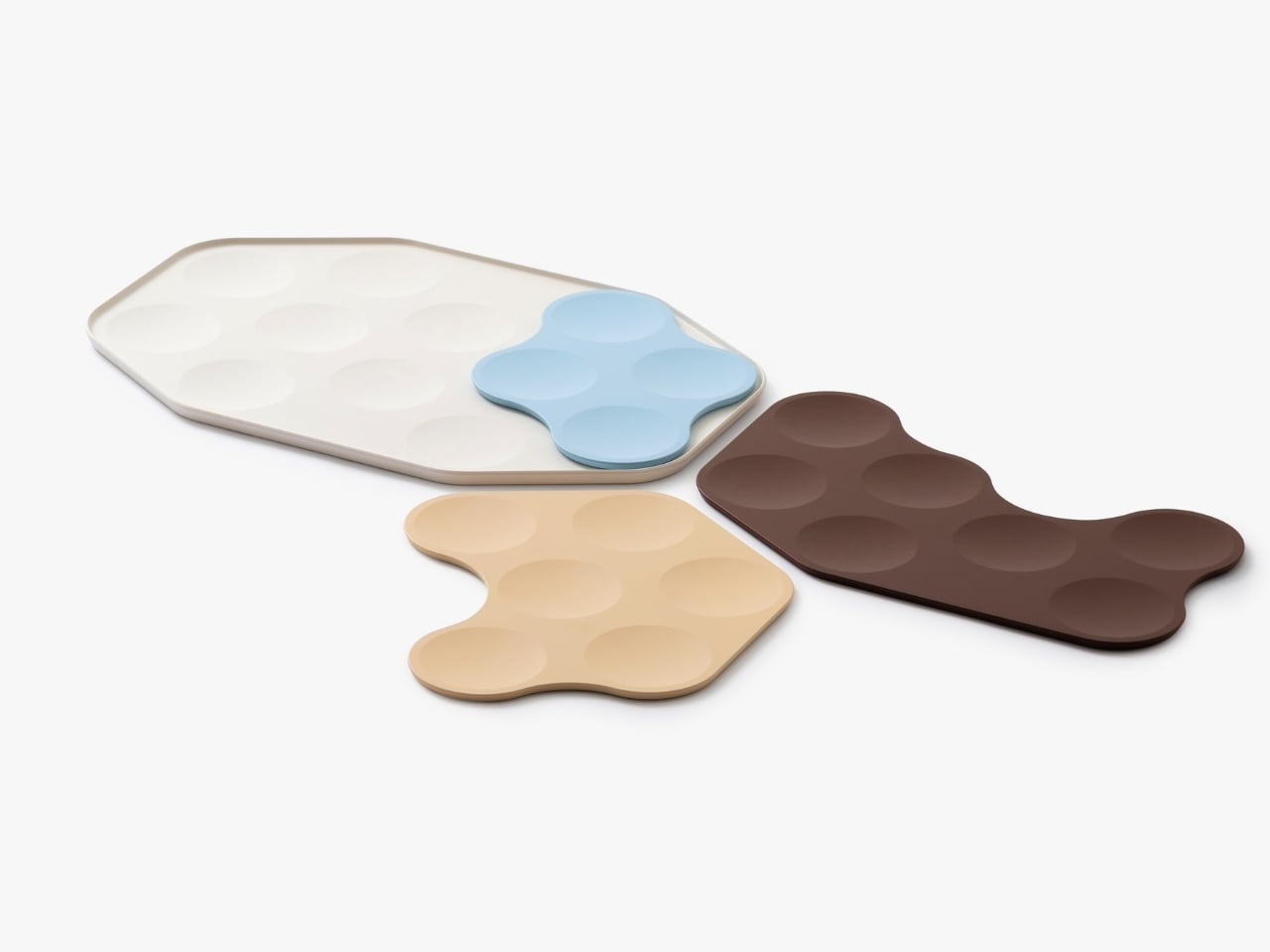
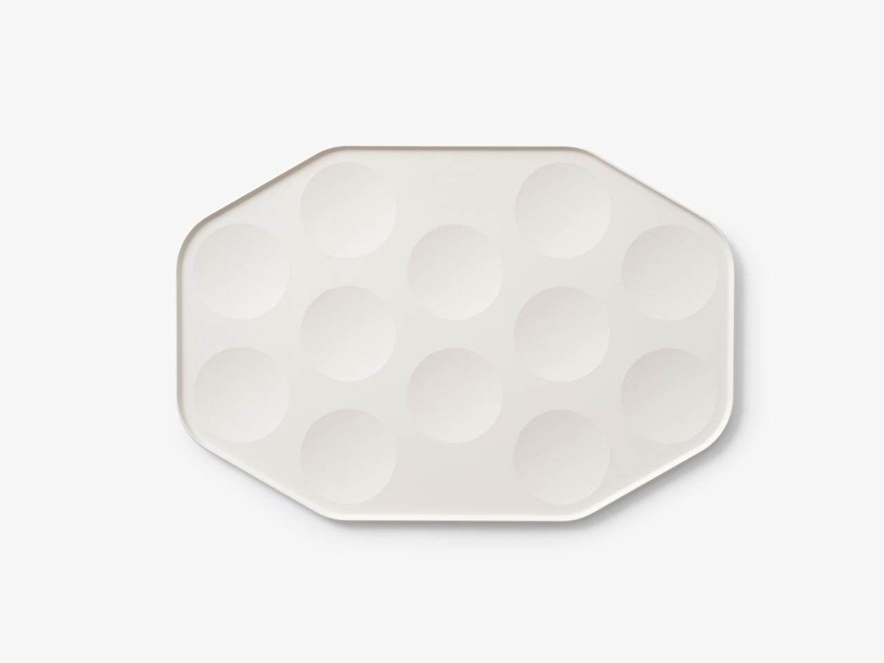
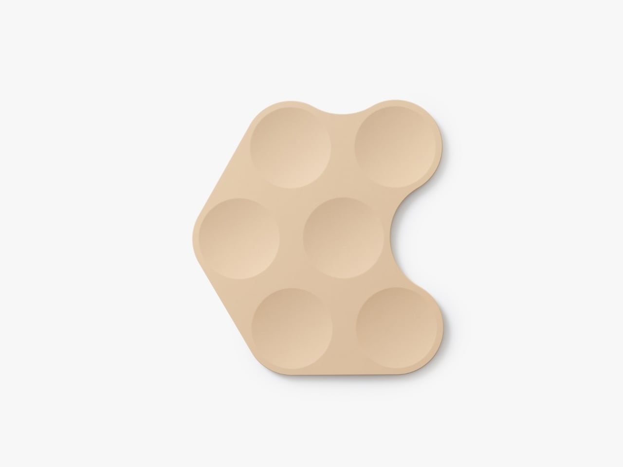
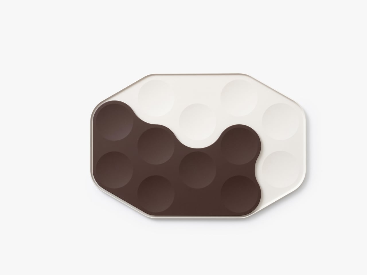
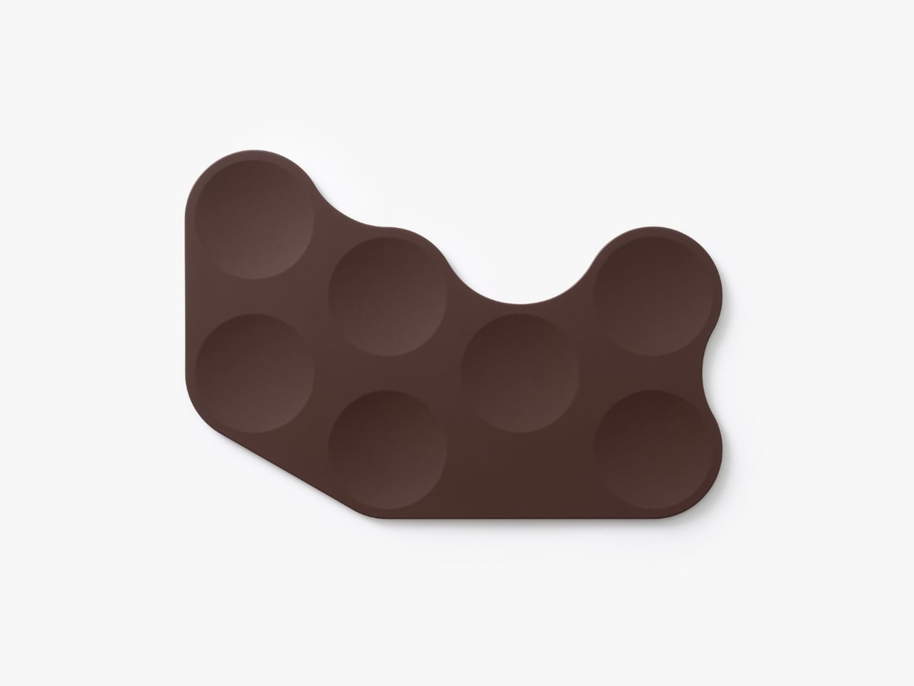
Anyone who’s flown recently knows the struggle. You get your meal tray, and it’s this precarious balancing act of overlapping plastic containers, a wobbly cup threatening to spill, and utensils that somehow always end up on the floor. There’s no elegance to it, no sense that anyone actually thought about the experience beyond “how do we get food from point A to point B?” The System Tray flips that script entirely. Drawing inspiration from traditional Korean wooden trays that hold multiple small dishes, the design creates a modular system where individual plates nest together like a puzzle. Each piece has those beautiful organic, flowing shapes that lock into each other or fit perfectly within the main tray. It’s functional geometry that doesn’t look robotic or cold.

What makes this particularly clever is how it addresses real constraints. Airlines aren’t going to adopt anything that doesn’t meet strict safety standards or adds significant weight. So BKID co worked with lightweight materials like durable plastics and lightweight ceramics, keeping things practical while maintaining that elevated aesthetic. The pieces can stack when not in use, which means they take up less storage space in the galley. For airlines constantly trying to maximize every square inch of cabin space, that’s a huge selling point.

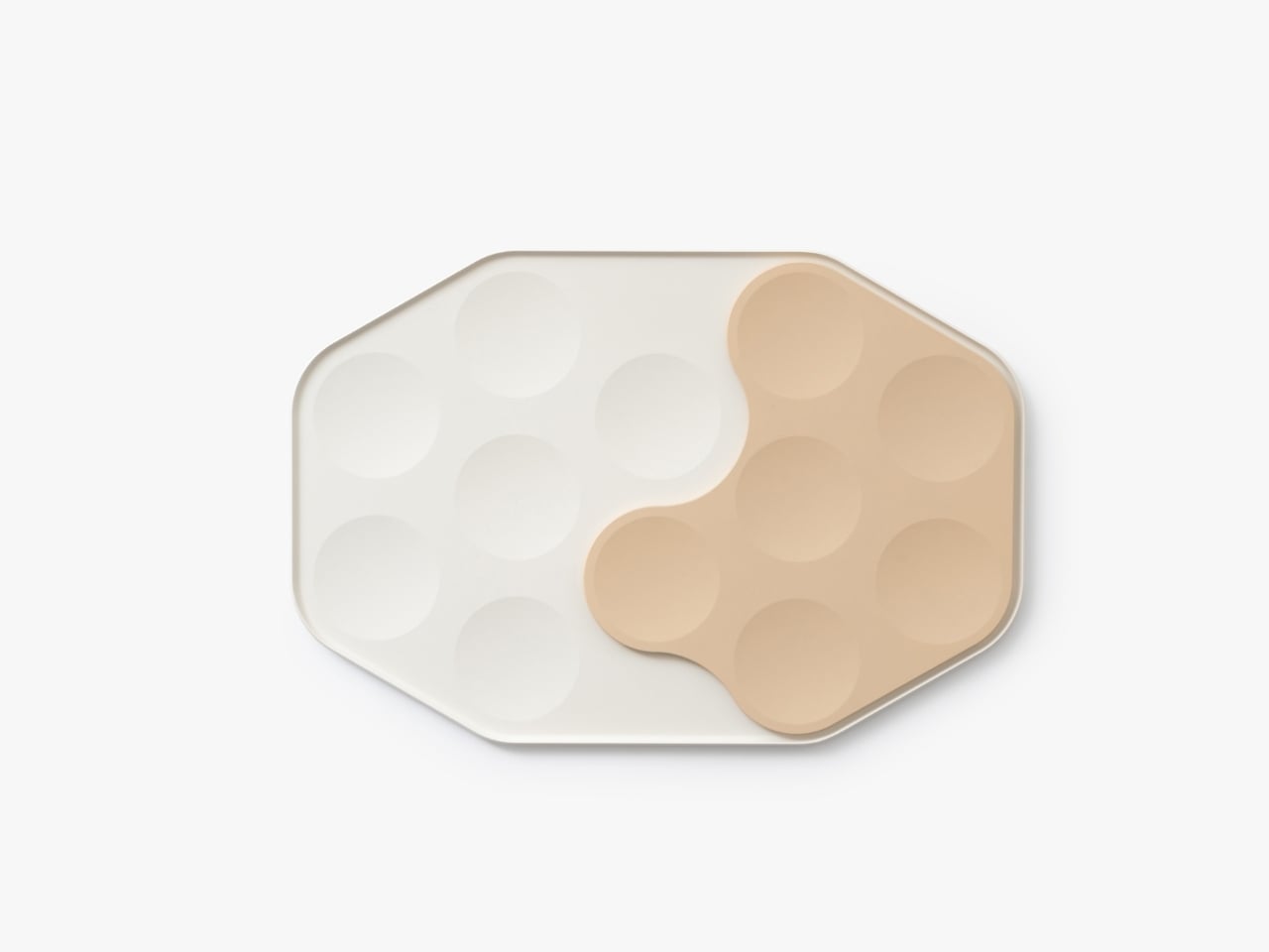
But let’s talk about the visual appeal, because this is where the design really shines. The color palette is subtle and sophisticated: soft creams, muted blues, warm beiges, and earthy browns. These aren’t the harsh primary colors or industrial grays we’re used to seeing on planes. The shapes themselves are organic and almost playful, with curved edges that interlock in unexpected ways. Laid out, they look more like modern art than airline serviceware.

There’s something almost meditative about the way the pieces fit together. You can configure them in different arrangements depending on the meal, whether it’s a full dinner service with multiple courses or a lighter snack. That flexibility is key because not every flight or passenger needs the same setup. The modular approach means the system can adapt rather than forcing one rigid solution.

This design also taps into a broader trend we’re seeing in travel and hospitality: the push to make utilitarian experiences feel special. We’ve watched airport lounges transform into design showcases. We’ve seen hotel rooms become Instagram-worthy destinations. Even train stations are getting architectural makeovers. Why should airplane meals be any different? The banchan tradition isn’t just about having multiple dishes. It’s about balance, variety, and presentation. It turns a meal into something communal and considered, where each element has its place and purpose. That philosophy translates surprisingly well to the challenge of airline food service, where space is limited but the desire for a pleasant dining experience remains.

What BKID co has created here isn’t just a better tray. It’s a rethinking of how we approach one of travel’s most mundane moments. It suggests that even in a space as constrained as an airplane cabin, there’s room for thoughtfulness and beauty. The design proves that solving practical problems doesn’t mean sacrificing aesthetics.

Will we see these trays on flights anytime soon? That’s the real question. Airlines move slowly, and switching out serviceware across an entire fleet isn’t a small undertaking. But as more carriers compete on experience rather than just price, innovations like this become more attractive. Passengers increasingly expect more, even in economy. A meal served on a thoughtfully designed tray system could become a differentiator.

For now, the System Tray stands as a brilliant example of cross-cultural design thinking, where a traditional dining practice inspires a modern solution to a very contemporary problem. It reminds us that good design often comes from looking at how people have solved similar challenges in different contexts, then adapting those insights with fresh eyes.

The post Airline Meal Trays Are Broken: This Korean Design Fixes Them first appeared on Yanko Design.

Samsung Just Beat Apple to a Crease-Free Display With the Galaxy Z Fold 8

Samsung Just Beat Apple to a Crease-Free Display With the Galaxy Z Fold 8

Samsung is expected to launch the new Galaxy Z Fold 8 this year. It is rumored to be a device that addresses one of the most persistent challenges in foldable phone technology: the visible crease on foldable displays. By unveiling a creaseless foldable OLED screen, Samsung has set a new industry standard, enhancing the user […]

The post Samsung Just Beat Apple to a Crease-Free Display With the Galaxy Z Fold 8 appeared first on Geeky Gadgets.

Posted in Uncategorized