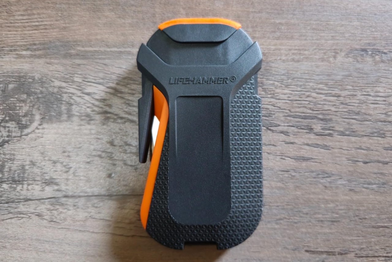
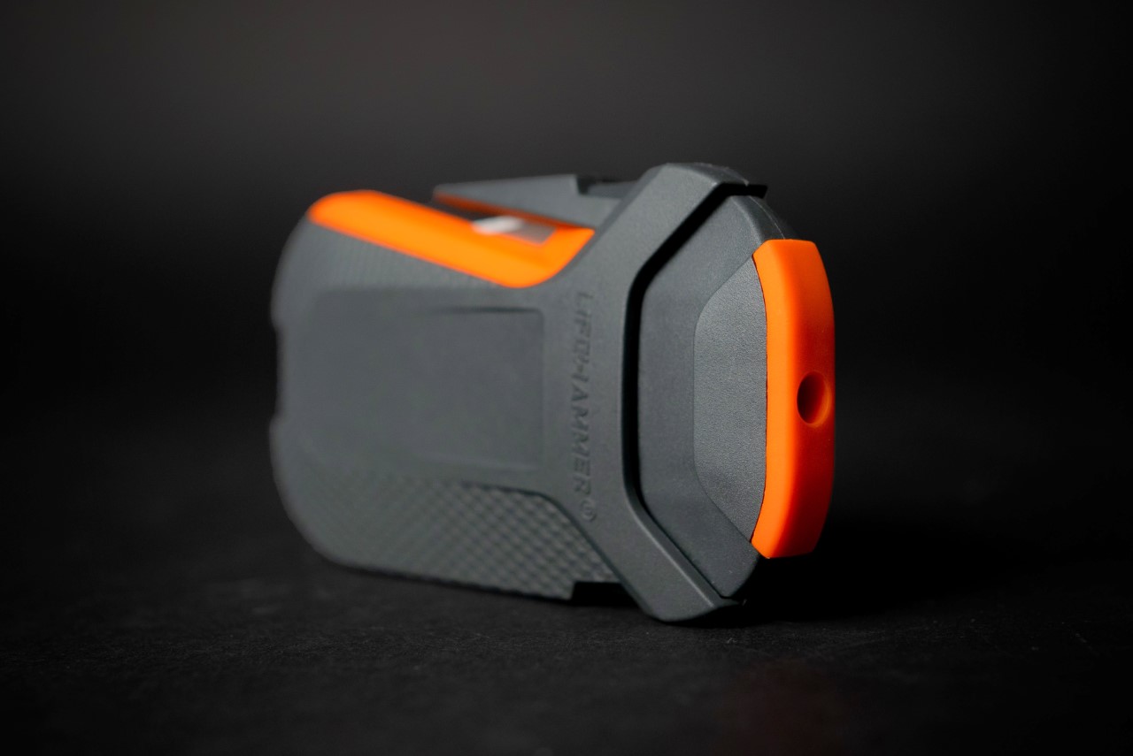
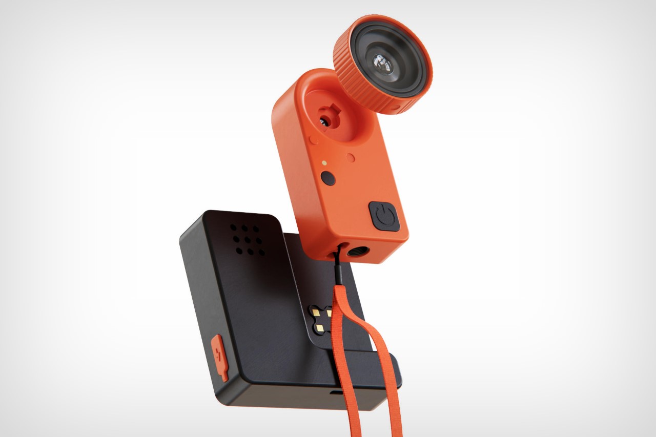
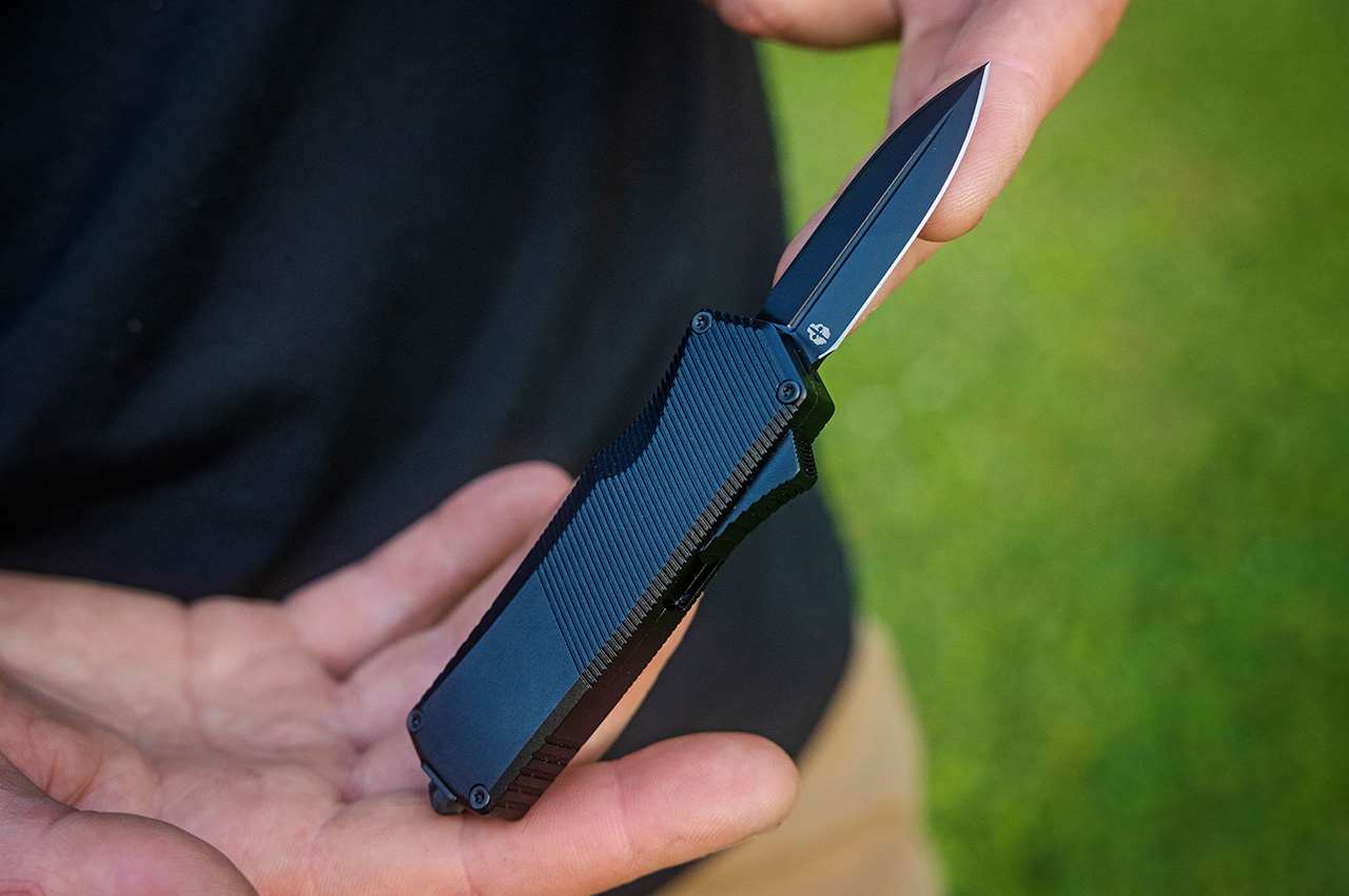
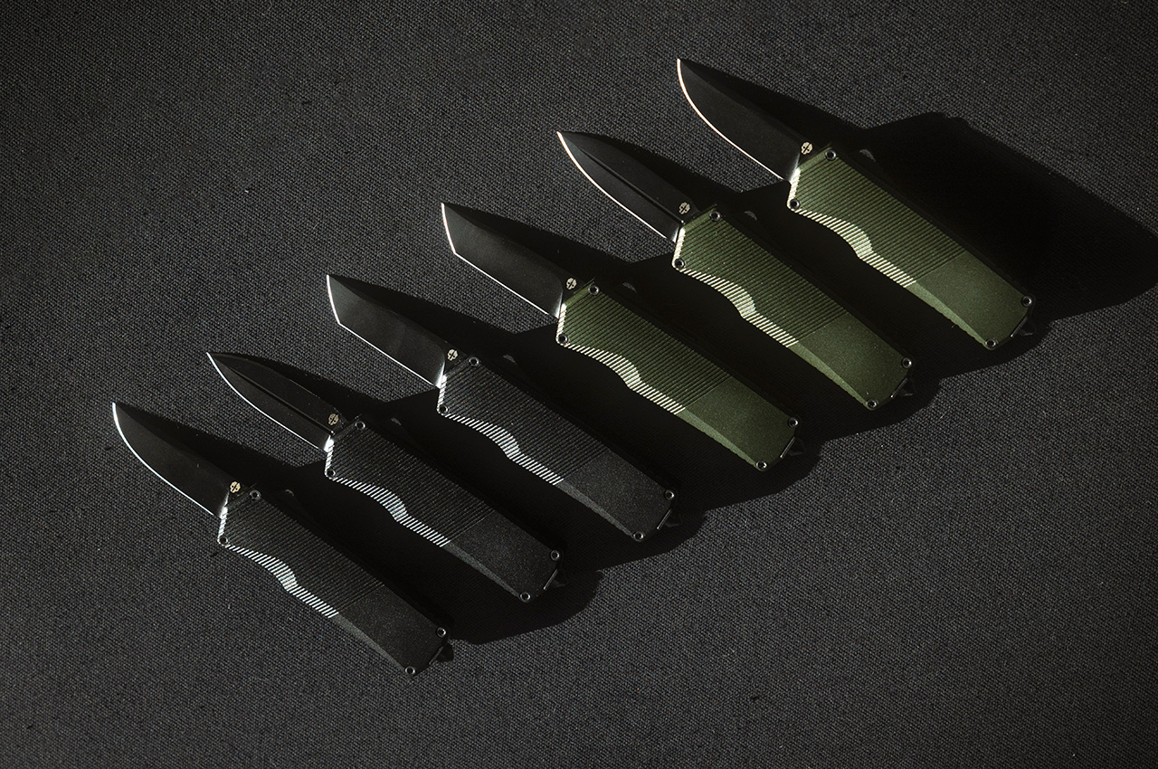
Good things come in small packages – this one measures just over 3 inches and packs a powerful blade deployed using one of the most satisfying mechanisms ever. Meet the Tekto A5 Spry Mini, a compact pocket blade with the company’s signature OTF mechanism that lets you deploy your cutting edge with a simple push of a button.
Named after its elder brother the A5 Spry, this mini marvel compresses everything that was great about its predecessor into a more compact, pocket-friendly package. While the original A5 Spry measured a nifty 4.9 inches when closed (and 8.6 inches when open), the A5 Spry Mini condenses it all into a 3.2-inch package that opens up to 5.3 inches, giving you a knife that’s smaller, lighter, more maneuverable, just as strong, and with the same satisfying OTF mechanism that deploys a titanium-coated S35VN steel blade, along with a tungsten steel glass-breaker on the rear to get you out of any sort of emergency.
Designer: Tekto
Click Here to Buy Now: $153 $179.99 (Use coupon code “Yanko15” to get $26.99 off). Hurry, deal end in 48-hours!
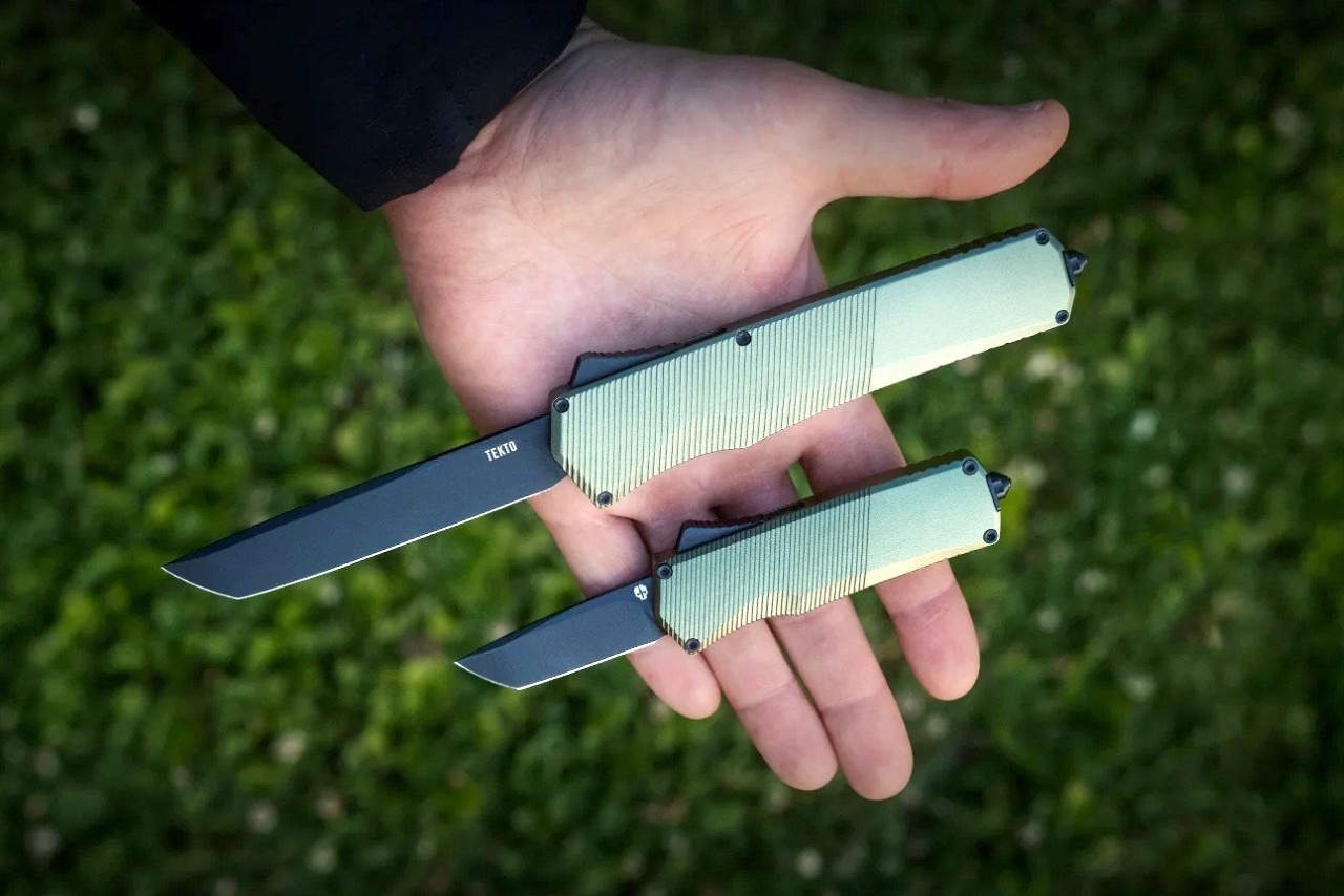
Tekto A5 Spry vs. A5 Spry Mini
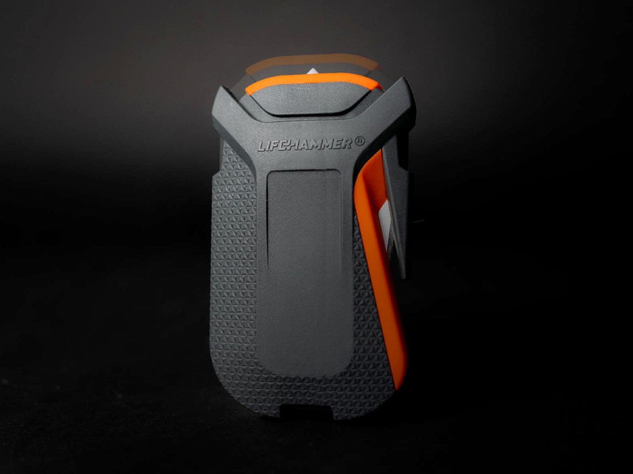
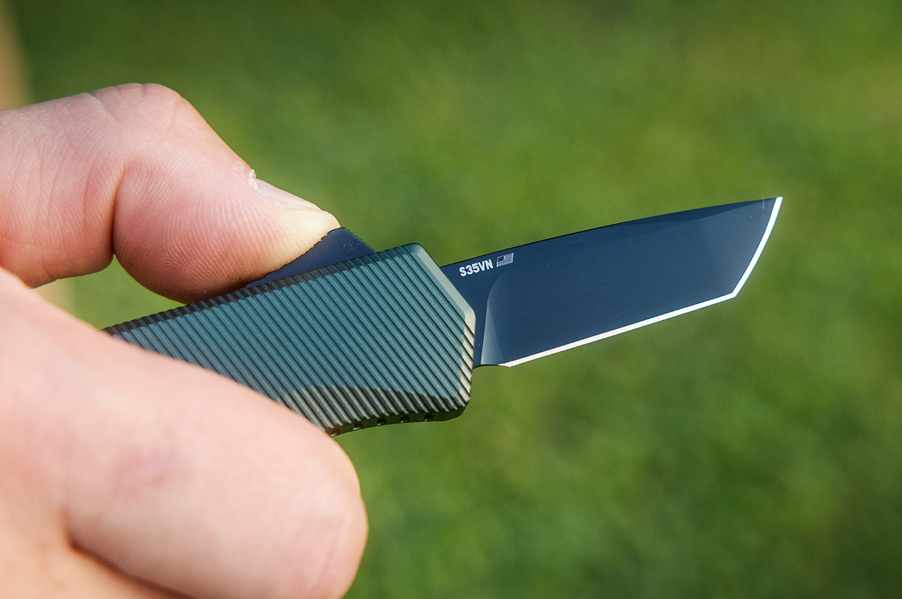
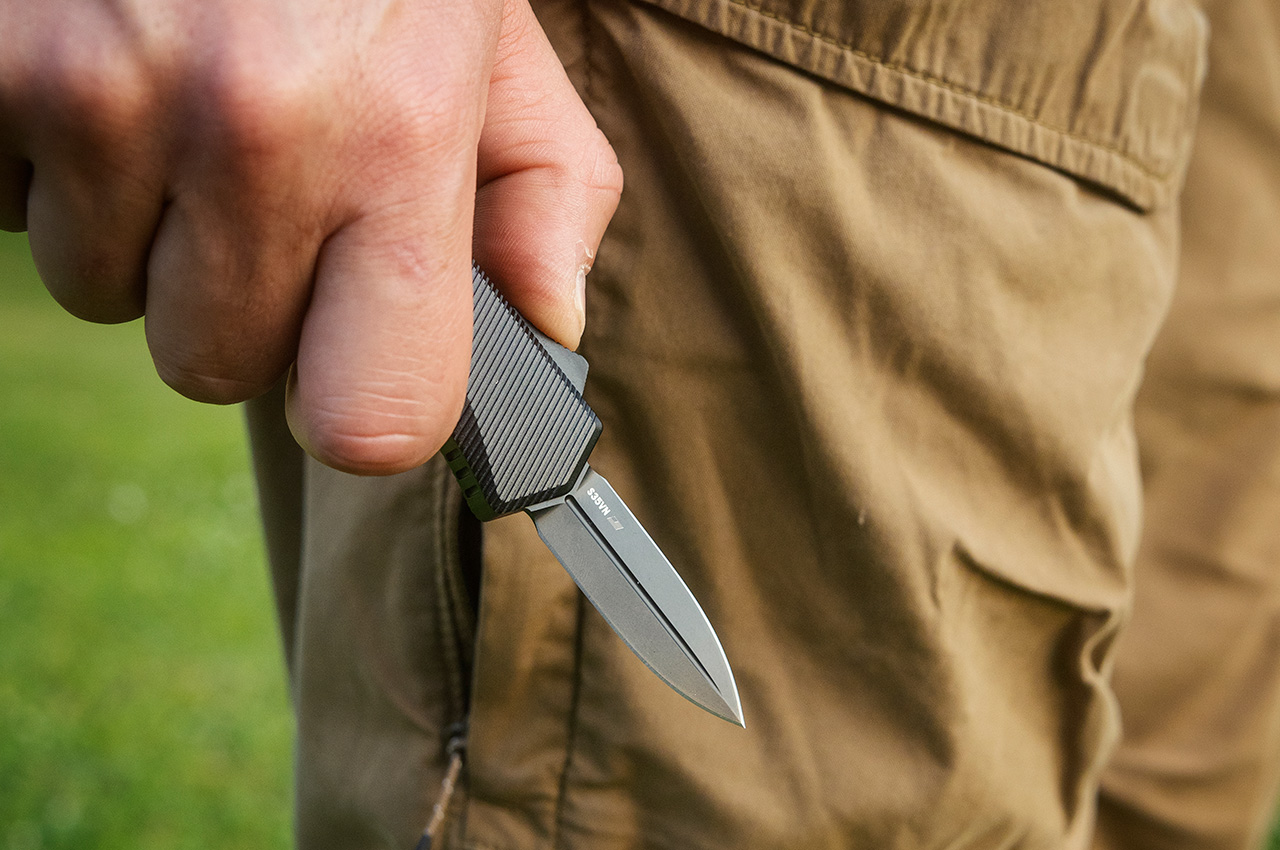
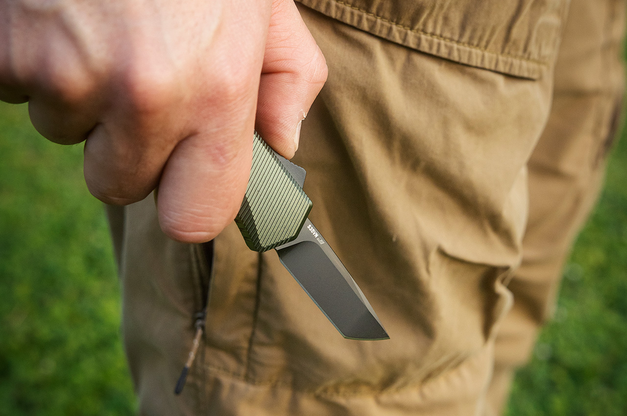
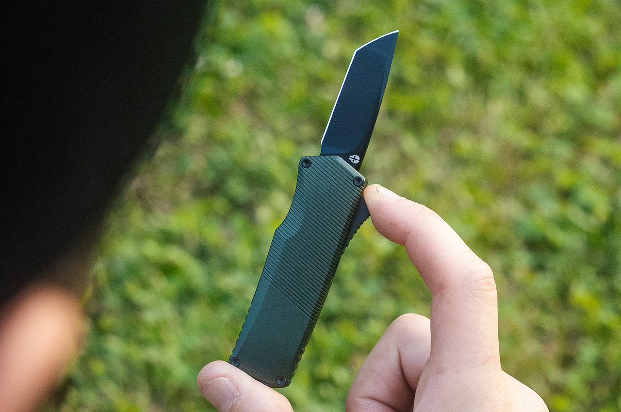
The A5 Spry Mini’s all-metal design is a pleasure for the eyes and the hands. You’ve got a handle machined out of 6061-T6 Aluminum, offering a cool, confident grip thanks to its ergonomic, ambidextrous design. Weighing a little more than knives with G10 or carbon fiber handles, the A5 Spry Mini gives you the confidence of a slightly larger knife while still being deviously compact. A single contoured switch helps deploy its blade, while pushing the switch back retracts the blade back into the handle. The process feels so incredibly tactile and satisfying I wouldn’t be surprised if you never wanted to buy a different flipper knife ever again.
Drop Point Blade
Dagger Blade
Tanto Blade
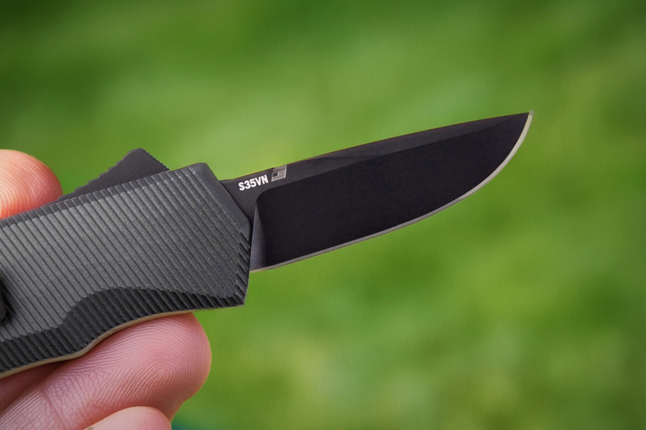
With the A5 Spry Mini, you have 3 blade styles to choose from – a Dagger-style blade with dual edges, a conventional Drop-point blade that’s an industry standard, and a Tanto-style blade with a faceted edge. You can choose the blade type depending on what you predominantly use your EDC knives for. The dagger style is a great tactical option, the drop-point is arguably the most classic of the lot, and the tanto blade is conventional with a twist. The blade itself is crafted from premium S35VN steel, known for its robustness and edge-retention, and further coated with a titanium layer to make the blades even stronger than before.
Equipped with a tungsten steel ball glass breaker for maximum effectiveness in emergencies. The new design ensures quick, efficient glass shattering, providing reliable safety and accessibility when every second counts.
Forged with a premium S35VN steel and coated in titanium, the A5 Spry Mini blade offers unparalleled durability and edge retention, ensuring reliability and peak performance in any situation.
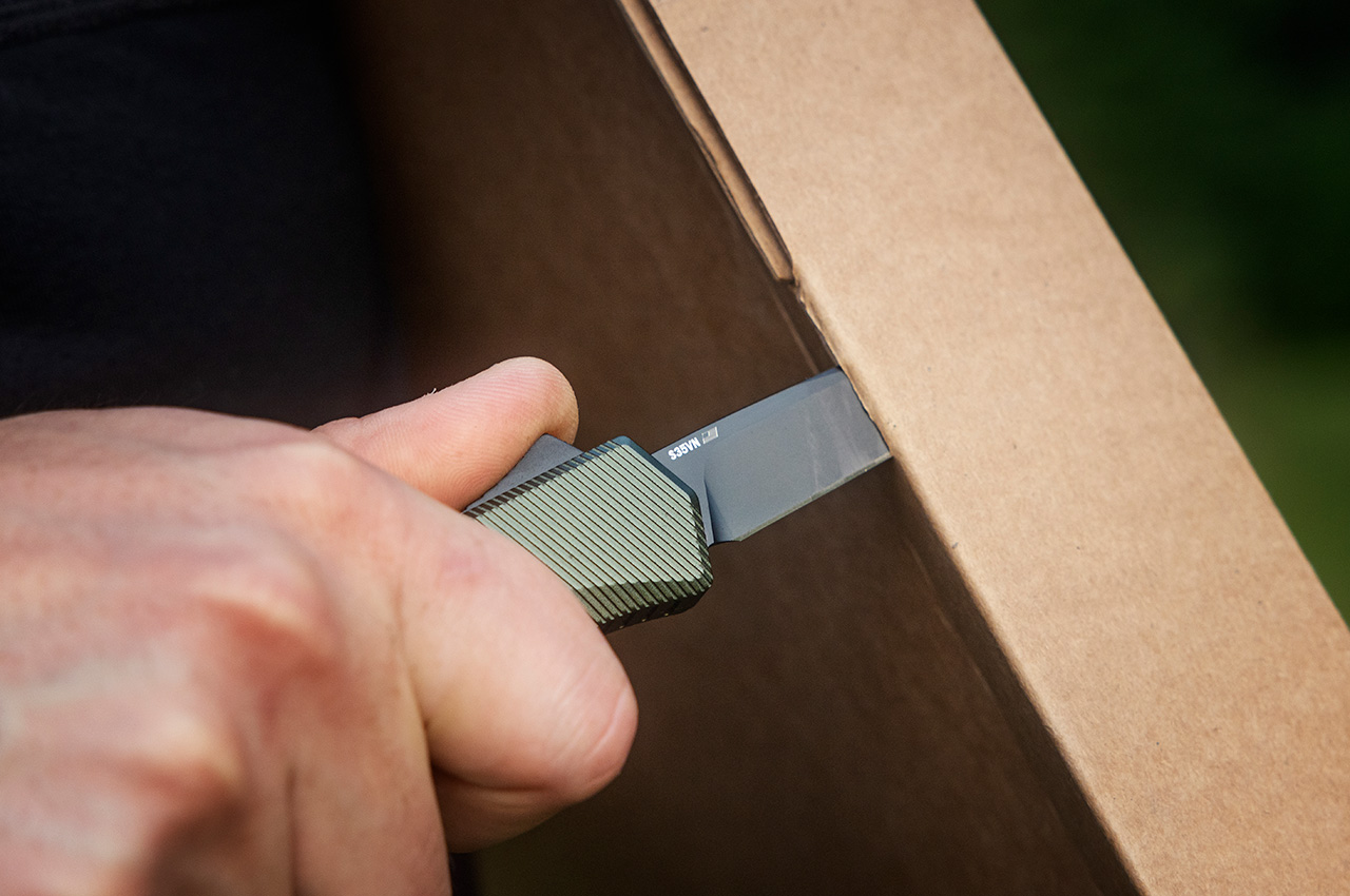
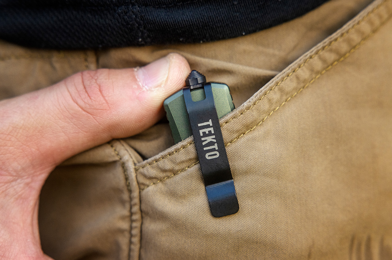
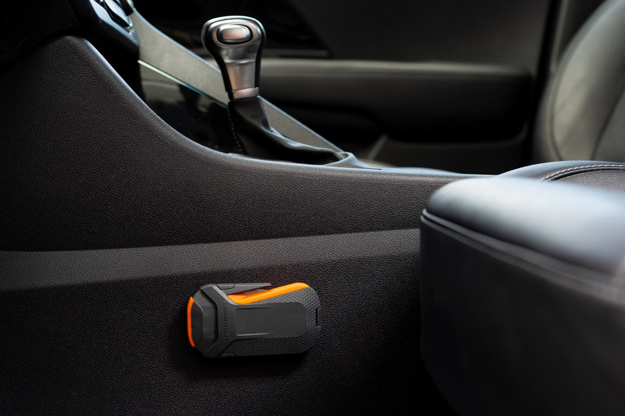
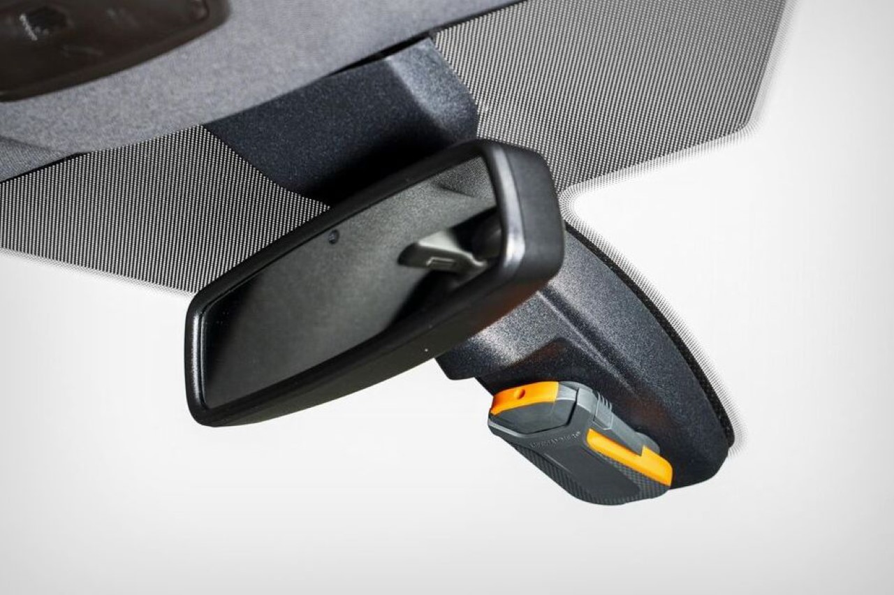
Move your eyes away from the blade and you see that the A5 Spry Mini’s body comes with a few more surprises, from an ambidextrous pocket clip that can attach itself to either the left or right side of the blade depending on your dominant hand. The rear has one last flourish in the form of a tungsten steel glass breaker that lets you strike at even reinforced or laminated glass (like the ones on cars), causing it to shatter at the point of impact. Absolutely ideal to have in the glove box of your car or even on your person, the A5 Spry Mini is one of those miniature miracles that can be quite a life-saver whether it’s escaping emergencies, surviving tactical or self-defense situations, or just using a folding knife for mundane activities like opening parcels, cutting fruits/veggies, or scraping flint to start a fire. Don’t worry, the mundane won’t feel that way for long given how much hands-on fun Tekto’s OTF mechanism is!
Click Here to Buy Now: $153 $179.99 (Use coupon code “Yanko15” to get $26.99 off). Hurry, deal end in 48-hours!
The post The Tekto A5 Spry Mini is a Tiny yet Mighty OTF Knife with a Tactical Demeanor first appeared on Yanko Design.


 Charge feature lets you enable 10-minute fast-charging when you’re in a rush. With the ASAP