This Italian-Designed Glass Hip-Flask Is the Most Thoughtful Gift You Will Find in 2026

The spirits world has spent decades perfecting what goes inside the bottle. The vessel that carries those spirits once you leave home has received considerably less attention. BARKUTAN, a Hong Kong-registered brand with Italian design roots, spent 19 months asking why that gap exists, and the glass hip flask it produced is essentially its answer. The core is lead-free glass, the same material distillers trust to preserve aroma and flavor integrity, wrapped in a removable top-grain leather sleeve that covers every surface of the bottle in a 360-degree embrace.

What separates this from leather-wrapped glass flasks already on the market comes down to how the sleeve attaches. Existing options either glue the leather to the glass permanently, meaning a cracked bottle wastes the whole product, or they use a removable sleeve that only wraps part of the flask. The BARKUTAN design wraps the glass completely and still allows the sleeve to be pulled off entirely, a combination the brand holds a premium patent on. Two capacities are available, 100ml and 210ml, in six leather colors.

Designer: BARKUTAN

Click Here to Buy Now: $109 $159 (31% off). Hurry, only 273/300 left!

At the heart of the BARKUTAN flask is a simple, powerful idea: your drink should taste like your drink. That metallic tang that often comes with a traditional flask is an accepted flaw, but it’s a flaw nonetheless. Using glass as the container material eliminates that issue entirely. Glass is neutral, it’s clean, and it respects the complex profile of a fine beverage. It’s the reason premium drinks are bottled in glass in the first place, so extending that logic to a portable vessel just feels like common sense that’s been a long time coming.

The design details show an obsessive level of thought. A beautiful, convex lens-style window is cut into the leather, letting you check the fill level at a glance. It’s a practical touch that also looks fantastic, sort of like a porthole into your own personal supply. The cap system is equally clever. It uses a combination of cork and silicone liners to create a genuinely leak-proof seal, because no one wants a damp pocket. The cap itself is connected to the flask with a custom snap-button tether, a feature common on metal flasks but rarely seen on glass ones, solving the age-old problem of fumbling with a loose cap outdoors. They even integrated a tiny label slot into the tether, so you can tell your different concoctions apart.
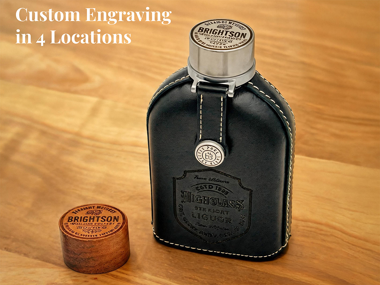
While it’s a great personal accessory, the BARKUTAN really shines as a gift. A flask is a classic choice for groomsmen, graduates, or any special occasion, but the personalization options here take it to another level. Unlike most brands that might offer a simple text engraving, BARKUTAN lets you customize up to four different areas: the leather sleeve, the stainless steel cap, the wooden cap, and even the cap tether’s snap button. With over 300 free templates to choose from, you can add names, dates, or custom emblems to create something truly personal. It already arrives in a premium gift box, so it’s ready to impress right out of the mail.

A great gift is also one that lasts, and this flask is designed for the long haul. The removability of the 360-degree leather sleeve is the main event. It provides full protection, but if the unthinkable happens and you drop it at just the wrong angle, the gift isn’t ruined. You just slide the sleeve off and pop in a new glass insert; every BARKUTAN even ships with a spare. This transforms the flask from a disposable item into a buy-it-for-life piece of gear. That spare wooden cap, full cleaning kit, and extra liners are all part of the package, making it a complete experience from day one.
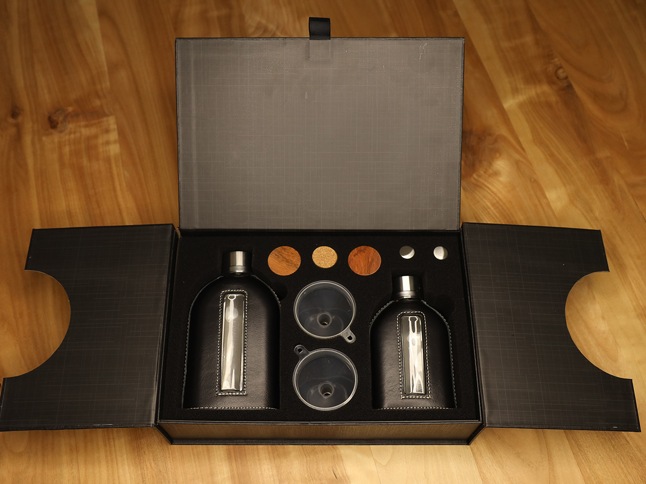

BARKUTAN is offering the flask in two sizes. There’s a pocket-friendly 100ml version that’s TSA-compliant for your carry-on, perfect for a single responsible serving. Then there’s the larger 210ml flask for longer trips, bigger gatherings, or for those who just have a bit more of a habit to satisfy. Both sizes are available on Kickstarter with Early Bird pricing starting at $109 for the 100ml flask and $125 for the 210ml. You can grab a set with both sizes for $209. The top-grain leather sleeves come in six classic colors: Black, Brown, Dark Brown, Navy Blue, Olive Green, and a rich Cherry Red. The flasks come with a 1-year warranty and lifetime support, which, for a vessel built to be repaired instead of replaced, seems just about right.

Click Here to Buy Now: $109 $159 (31% off). Hurry, only 273/300 left!

The post This Italian-Designed Glass Hip-Flask Is the Most Thoughtful Gift You Will Find in 2026 first appeared on Yanko Design.
Insta360’s foldable drone patent targets DJI Neo 2 at sub-250g

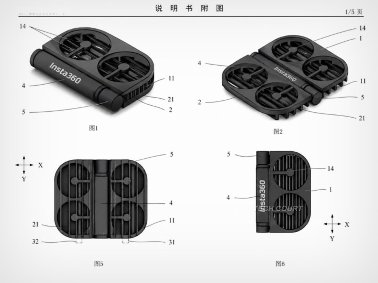
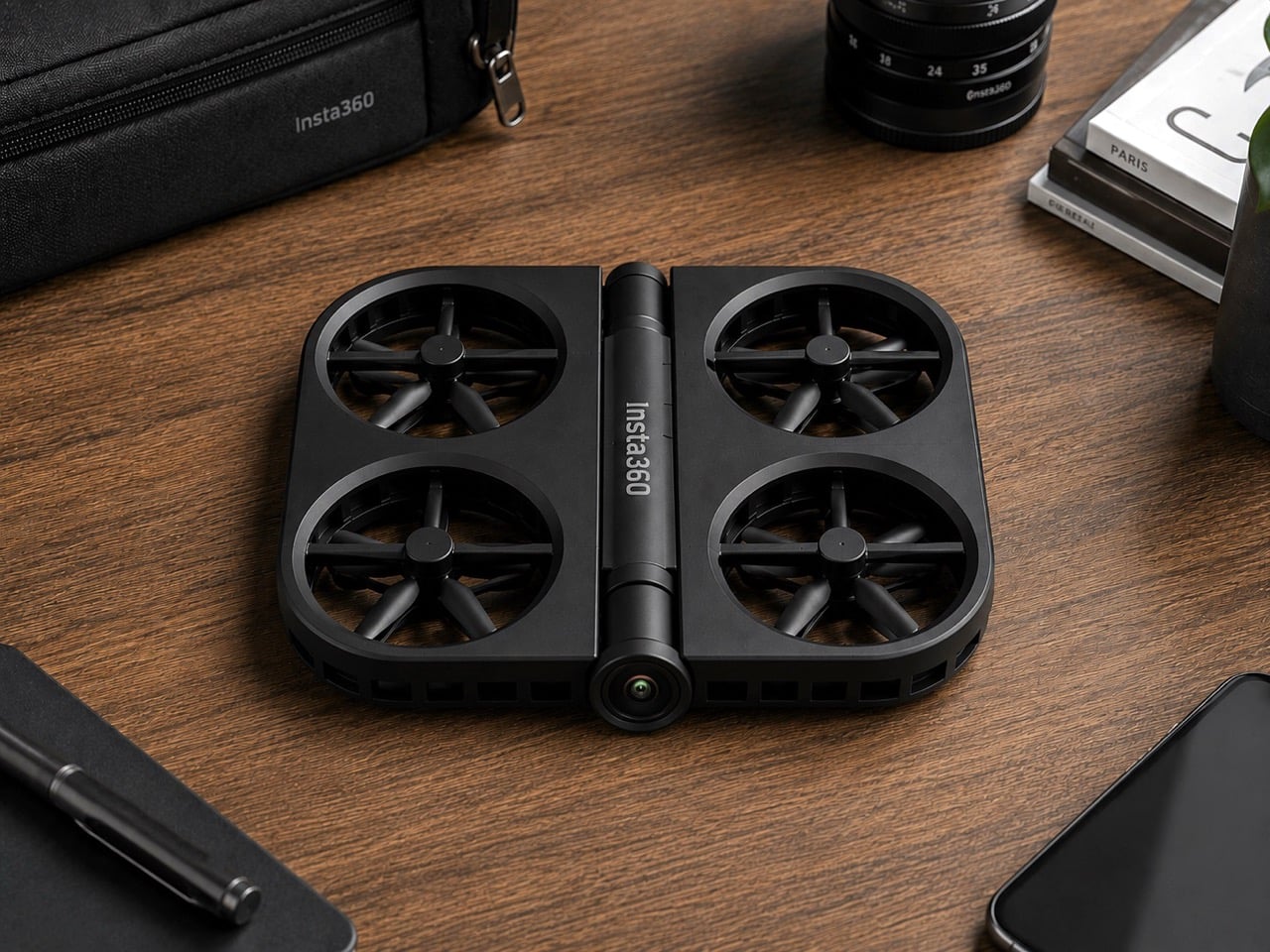
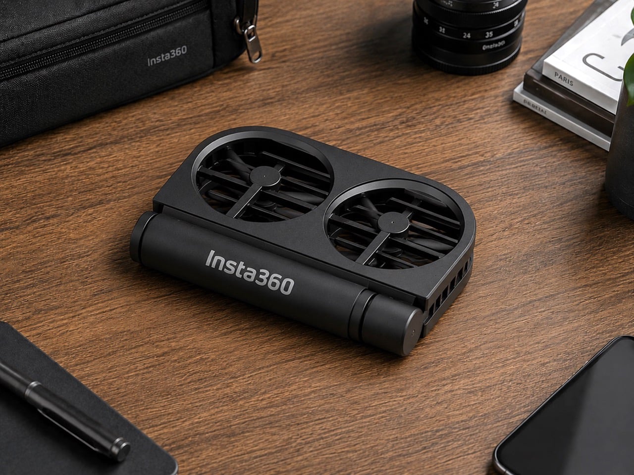
Insta360 built its reputation on cameras that see in every direction at once. It’s literally in their name. The X series made 360-degree capture accessible; the Luna Ultra brought Leica optics to a handheld gimbal. Flying something, though, is a different category of challenge, and the patent images that appeared in July 2026 show the company working through what a foldable drone looks like with Insta360 DNA. The illustrated design at the bottom shows folding arms, a ring-shaped propeller guard, and a dedicated locking mechanism, a form factor that prioritizes the moment of packing away just as much as the moment of takeoff.

DJI’s Neo 2 has the casual drone segment largely to itself in the sub-250g category, with a rigid one-piece frame and a 19-minute flight time that have made it a reliable default for creators who want aerial footage without the complexity of a serious drone setup. Insta360 entering that space would break what has effectively been a two-player market, with Zero Zero Robotics’ HoverAir as the only real alternative. The folding design alone gives Insta360 a structural argument against the Neo 2; a potential 360-degree camera, if it materializes, would give it a creative one. What a wonderful year for foldables, eh? We’re expecting a folding iPhone in September, and Insta360 might give us a folding drone too!

This isn’t just some forum rumor, either. The patent images (from patent file CN223865117U), which started making the rounds on July 16th and were highlighted by outlets like Tech Court, are pretty specific. They show a drone body with the “Insta360” logo stamped on it, with fully folding arms that tuck into the chassis and a distinctive ring-shaped guard protecting the propellers. There’s even a dedicated locking mechanism detailed, which tells you just how seriously they’re taking the whole “fold-and-go” concept. This is a design that screams it was made to be stuffed into a pocket, not carefully placed in a bespoke case.

But here’s the thing: this isn’t Insta360’s first aerial rodeo. Before they decided to put their own name on a drone, they sent in a scout team under the sub-brand Antigravity. The A1 drone they launched was, frankly, a bit of a monster: a sub-249g drone with a wild dual-lens setup that shot 8K 360-degree video and made the drone itself invisible in the footage. It was a spec-sheet beast and a clear shot across DJI’s bow, proving Insta360 had the engineering chops to compete in the sky. It was their way of testing the waters.

Now, it looks like they’re done testing. This new patent is the second, more direct shot. And here’s the kicker: for a company obsessed with 360-degree video, the patent images don’t show a fisheye lens. At all. It’s a huge question mark hanging over the whole project. Are they hiding the tech, or are they planning to launch a drone that, for the first time, doesn’t have their signature feature? If they’re aiming for a rumored sub-$200 price point, leaving the 360 camera on the cutting room floor might be the only way to get there. It’s a move that would be both shocking and, in a weird way, perfectly logical.

You also can’t forget that this is all happening while the two companies are actively suing each other in China. This isn’t friendly competition; it’s a full-blown hardware rivalry. Insta360 came for DJI’s gimbals, tested the drone market with a sub-brand, and is now preparing a direct assault on DJI’s most accessible drone. With a release window expected somewhere between late 2026 and early 2027, we’re not just watching a new product being born. We’re watching the next chapter in a tech soap opera, and it’s about to get very, very interesting.

The post Insta360’s foldable drone patent targets DJI Neo 2 at sub-250g first appeared on Yanko Design.
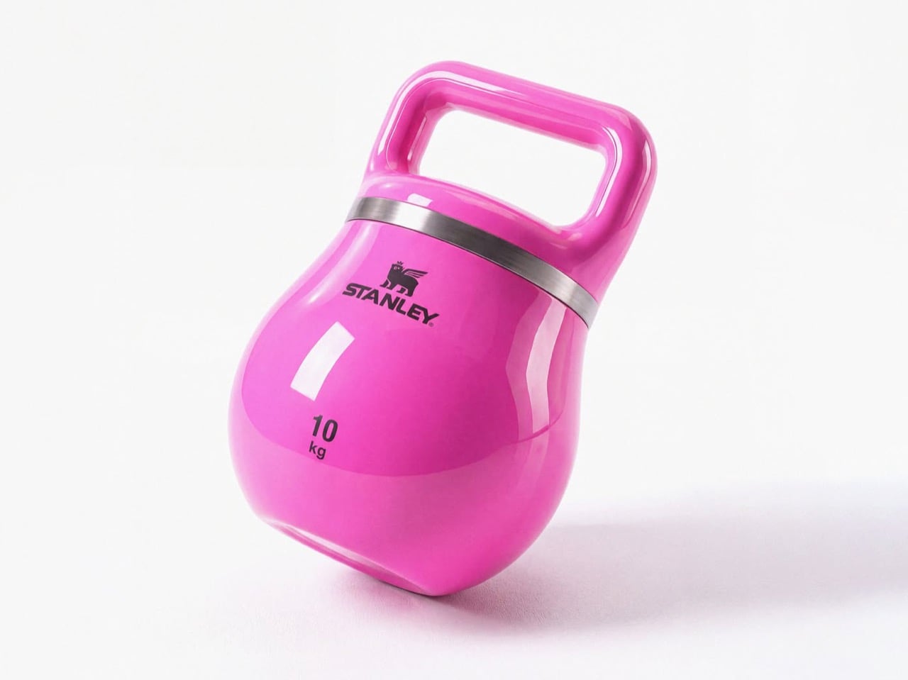
Stanley doesn’t make gym equipment… but this stylish kettlebell proves it should

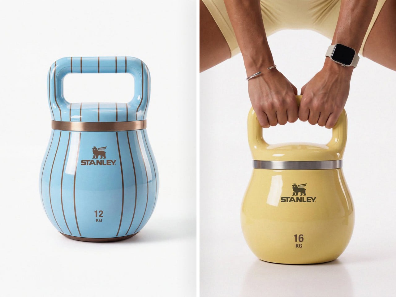
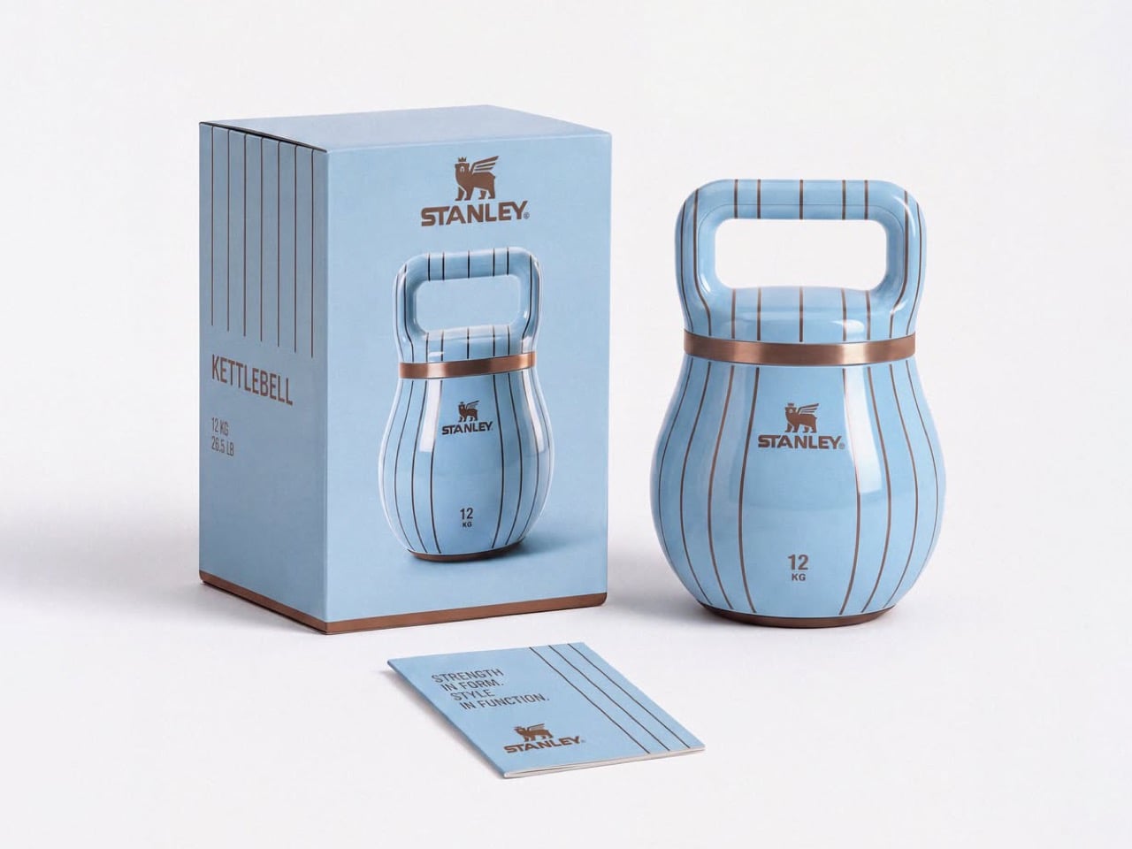
Fill a Stanley tumbler with a yogurt-based smoothie from bottom to top and you actually end up getting an arm workout. A 40oz Stanley cup can weigh close to 4lbs or upwards of 1.5 kilograms if filled to the brim with something dense like a smoothie or a thick latte. Jane Morelli just decided that if she was gonna give her arms a workout, why simultaneously rely on ugly looking kettlebells? Morelli superimposed Stanley’s design language onto kettlebells and the result looks just gorgeous.

Every gym equipment I’ve used has looked boringly functional. The kettlebells at my gym come in bright colors, but that’s just a color-code so you know the difference between a lighter and a heavier kettlebell even if the number on it wears off (it almost always does). Morelli’s design merely bridges two worlds together, and I won’t lie – the results look like the most seamless collab ever imagined. My only gripe is, I wish these kettlebells were actually tumblers too!

Designer: Emanuele Jane Morelli

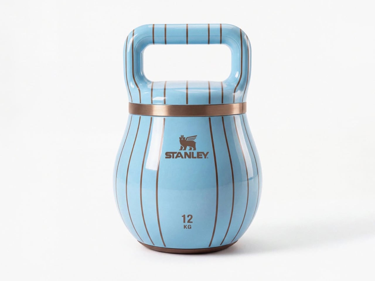
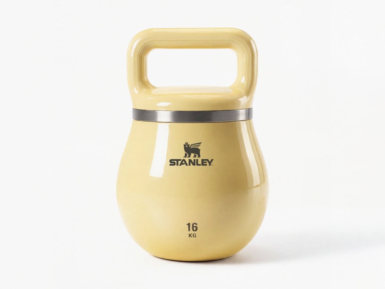
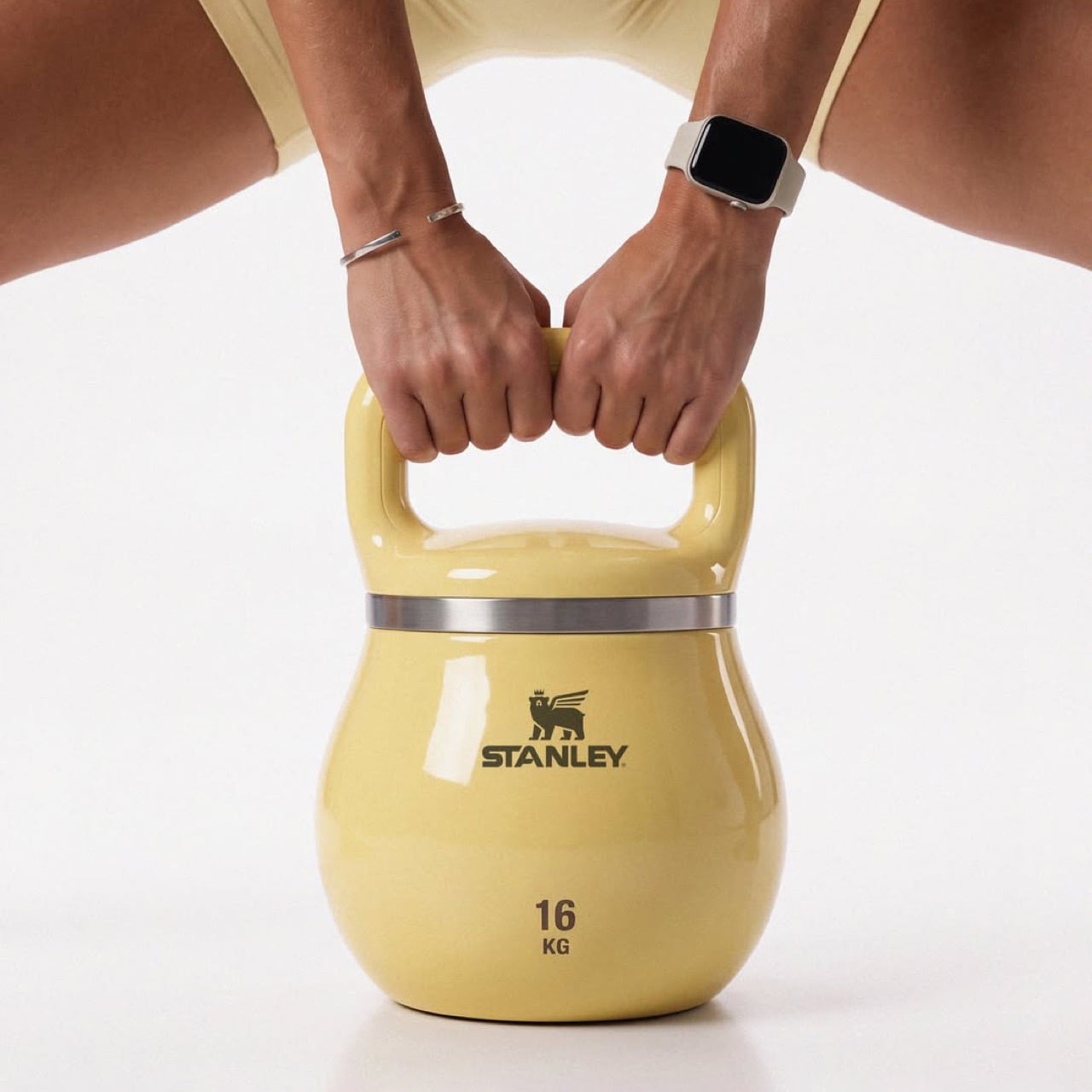
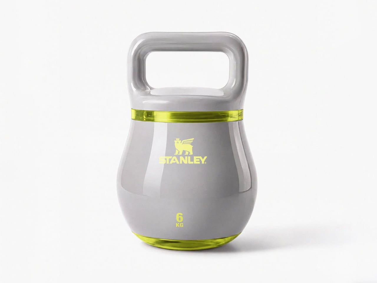
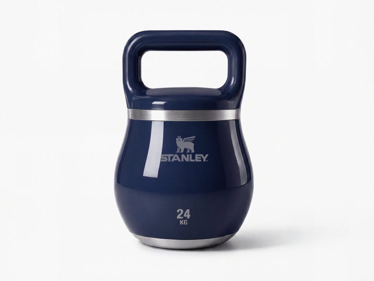
Haute gym equipment might not be a category but these kettlebells definitely make a case for it. Each one is styled with chic curves, and a color palette I’d only expect from companies like Hermès or Stanley. Subtle pastel shades, punctuated by just one hot pink color for the yoga-moms who need their gym equipment to be as flashy as their gym outfits. Each kettlebell has a lacquer-like sheen on it, along with the Stanley logo emblazoned on the front, larger than the weight units below it because that’s what matters more. The style statement.

I get that I can sound a little ironic, but I’m all for brand crossovers. (The only time I really object is when Tesla does stuff like manufacturing vodka or whistles because they seem to be obsessed with side quests and not really making any cars). This one piques my fancy because Stanley isn’t just a social statement, it’s perfect for fitness-freaks too who love chugging protein shakes from their 30-40oz cups, or sharing Strava stats superimposed against their Stanley cups just to paint a picture of how much ‘aura’ they have.

Morelli’s done a pretty remarkable job of simply yet effectively distilling Stanley’s brand language onto a piece of gym equipment, without necessarily caricaturing the Stanley cup’s silhouette. The kettlebells have a separate, distinct character, and the dual-band colors on each individual kettlebell represents a palette that feels distinctly high-fashion yet accessible. Quite like the company’s big, beautiful, nearly indestructible tumblers.

The post Stanley doesn’t make gym equipment… but this stylish kettlebell proves it should first appeared on Yanko Design.
This $79 “No-Laundry” Shirt stays fresh for 30 days without washing, thanks to its engineered fabric

The future keeps finding new ways to make water feel precious. Some of it goes to lawns, some to laundry, some to the AI data center working overtime to generate recipes for vegan, gluten-free, keto brownies made without chocolate. So when a shirt shows up claiming 30 days of wear without a wash cycle, the concept lands with a mix of curiosity, skepticism, and a weird amount of relevance. That curiosity is reasonable. The skepticism, depending on how you feel about a decade of textile engineering research, may not hold up.

HercLéon offers the HercShirt V5.0 in three versions. The Budget model stays smell-free for 3+ days, the Standard version stretches that to 14+ days, and the Max model is the one built for 30+ days between washes. The difference comes down to how many odor-fighting elements are woven into the fabric. Budget uses one, Standard uses four, and Max uses all seven. According to the brand, that seven element system includes copper, silver, zinc, gold, volcanic ash, and two proprietary ingredients, all embedded directly into the shirt rather than applied as a surface treatment.

Designer: Wen Muenyi / HercLéon America

Click Here to Buy Now: $39 $49 (20% off). Hurry, only 21/100 left! Raised over $246,000.

Copper is the shirt’s frontline defense, targeting the bacteria responsible for the locker-room smell that ruins gym gear by day two, with natural antimicrobial properties that have been recognized for centuries and are currently deployed on hospital surfaces to reduce microbial load. Silver handles a second class of odor-causing microbes, and its use in medical dressings and performance textiles makes its role here read as engineering rather than marketing. Zinc addresses the sharper, sulfurous compounds produced during heavy sweating, and because it is gentle on skin and widely used in skincare products, it adds another layer of protection without compromising comfort. Gold supports the performance of the other active elements, helping the smell-control system work together more effectively, and because it is highly stable, it helps the fabric maintain consistent performance across many washes. Volcanic ash absorbs moisture and environmental odors before they settle into the fabric, functioning as a porous internal sponge that traps what it catches until washing can clear it out. The final two elements stay off the published ingredient list, a reasonable call from a brand that has spent years narrowing this formula down to something that works.

Pack one shirt for a week-long trip instead of seven, and you begin to understand what HercLéon is selling, because the whole point of a trip is to have less on your plate, not to check a bag, wait at baggage claim, fight for trunk space, or spend vacation time looking for laundry. The V5.0 is built to hold up from a morning gym session to dinner at eight without a change, covering the kind of full-day travel that defeats most performance shirts by mid-afternoon. Shirt odor itself comes from seven distinct chemical processes, not one, which is why most fabrics may accidentally help with one or two types while the HercShirt was built to address all seven. Off-grid users, healthcare workers, and new parents with no bandwidth for weekly wash cycles all figure into HercLéon’s intended audience, and none of those use cases require a stretch of imagination to map. The shirt’s proposition is fundamentally about reclaiming time and space, two things that clothing has rarely been designed to address this deliberately.

Most performance shirts earn their odor-control claims through surface treatments, finishes applied at production that fade with every wash, while the HercShirt’s active elements are woven in and designed to perform like new for years. That construction choice means the odor control does not follow the same fade curve that makes most performance gear feel ordinary by its tenth wash. Most tees die in the wash rather than from wear, and because the HercShirt is washed far less frequently, it skips the cycle that degrades fabric, with one shirt reportedly outliving roughly seven ordinary tees. The brand estimates the V5.0 goes through around five times fewer wash cycles than a conventional tee across its lifespan, which reframes the premium price as a replacement-cycle calculation rather than a fashion expense. Less washing also means less water, less detergent, and less energy use, which quietly loops back to the resource anxiety the shirt was practically designed to exist inside.

The HercShirt V5.0 is available in three configurations, letting you choose how long you want to go between washes. The entry-level Budget model costs $39 and uses one active element for over three days of wear. For $69, the Standard version steps up to four elements, pushing the wear time to two weeks or more. The top-tier Max model, priced at $79, includes all seven elements and delivers on the full 30-day promise. All versions are designed to be smell-free from the start, with the only difference being their endurance.

Sizing is offered from Small to 4XL for men and Small to 2XL for women. The shirt is currently available in a matte, deep ink black, though a charcoal gray color has also been unlocked, with navy blue, maroon, and forest green planned as future options. For those looking for a more personalized fit, a set of three custom-tailored shirts is available for $399. HercLéon ships internationally to the US, Europe, Japan, and India, among other regions. While delivery for the V5.0 is estimated for November 2026, earlier generations of the HercShirt are currently available for purchase on the company’s website.

Click Here to Buy Now: $39 $49 (20% off). Hurry, only 21/100 left! Raised over $246,000.

The post This $79 “No-Laundry” Shirt stays fresh for 30 days without washing, thanks to its engineered fabric first appeared on Yanko Design.
WWDC 2026, Six Weeks Later: What Actually Shipped

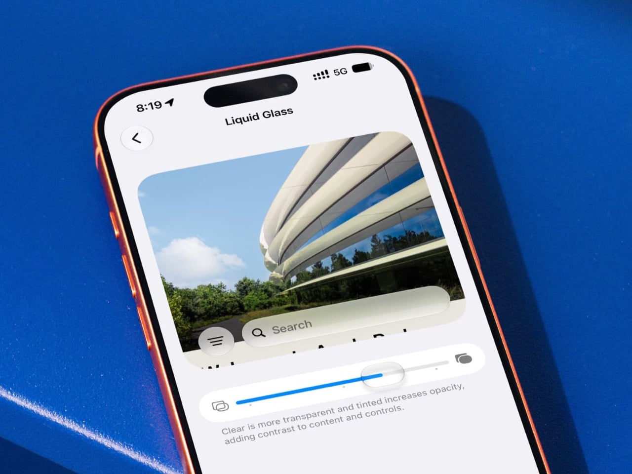
If Liquid Glass is the face of iOS 27, the intensity slider is the part that decides whether that face is wearing reading glasses. Apple never showed it during WWDC 2026, even though it may be the most visually crucial control in the entire redesign. This one setting lets users adjust the strength of the transparency effect system-wide, which means it directly shapes readability, contrast, depth, and the overall vibe of Apple’s biggest interface experiment in years.

That makes its quiet arrival in the public beta feel kind of wild. Apple presented Liquid Glass as a confident design statement, but the slider reveals something more interesting, a design system with a built-in self-correction mechanism. Suddenly the story is not only about what Apple announced on stage. It is about what Apple had to add once the software met real screens, real eyes, and real people who do not want their Control Center looking like a soap bubble.

Designer: Apple

Six weeks separate the WWDC 2026 keynote from iOS 27 Public Beta 2, and in software terms, that is enough time for a lot to shift. Public Beta 1 landed July 13 with the slider and a Siri AI rollout to general users. Beta 2 followed on July 22 with speed improvements, a Screen Time overhaul, and more. Together they paint a picture of iOS 27 that looks noticeably different from what Apple demoed at Apple Park in June.

App icons have been getting the same quiet treatment. Beta builds are shipping with re-layered icons that carry more visual depth than what showed up on stage, tweaking how the foreground and background elements of each icon interact with the glass effect behind them. It reads as subtle in a screenshot and feels significant once you are actually navigating the phone. The whole system carries a different visual weight than the keynote suggested.

Apple built Siri AI on Google’s Gemini, and that partnership is the backbone of the biggest headline in iOS 27. The revamped assistant can hold context across apps, answer open-ended questions, and dig into your emails, messages, and photos to surface relevant information, putting it in genuine competition with ChatGPT and other conversational AI tools for the first time. What the keynote mostly skipped was how that Gemini handoff surfaces visually inside Siri’s UI, what the latency actually feels like, and how different it is from the ChatGPT integration Apple shipped in iOS 18.

Thirty percent faster app launches, 80% faster AirDrop, 70% faster Photos capture loading. Apple is putting some big performance numbers on the table, benchmarked against an iPhone 11 Pro Max running iOS 26.4.2, which is more specific than the usual “up to” framing with nothing behind it. Whether those gains hold on newer hardware in real daily use is still something beta testers are working out.

macOS 27 Golden Gate is running the same play in parallel, bringing Liquid Glass refinements to the desktop and putting Siri AI inside Spotlight. It also becomes the first macOS to fully drop Intel support and retire Rosetta 2, which is its own headline for a different day. For anyone designing or building for Apple platforms, September is the target, when the stable release lands alongside the iPhone 18 lineup. The betas are the closest thing to a final spec sheet right now, which makes that quiet little slider a pretty loud signal about where Liquid Glass is actually headed.

The post WWDC 2026, Six Weeks Later: What Actually Shipped first appeared on Yanko Design.
Skullcandy’s $280 Headphones Pack A Subwoofer For Your Skull, And A Knob To Control How Hard It Hits

Everyone is obsessed with making gadgets sleeker, flatter, and more touch sensitive these days. So naturally, Skullcandy looked at that trend and said, nah, let us put a knob on it. The new Crusher 1080 ANC headphones (with sound by Bose) have an honest to goodness rotary dial sitting right on the ear cup, and it might be the single best design decision on the whole product.

Turning that dial controls the Crusher Bass feature, which is Skullcandy’s way of saying we built a subwoofer into your headphones. Twist it one way for a light rumble, twist it the other way and your skull becomes part of the sound system. It is a small, satisfying, slightly ridiculous piece of hardware, and after years of swiping at touch panels that never quite register your finger, it feels like coming up for air.

Designer: Skullcandy

Click Here to Buy Now

Bose headphones are great. They are also expensive enough to make you wince a little at checkout. So when Skullcandy rolled up with a pair of headphones that borrow actual Bose tech, including its noise canceling and audio engine, and slapped a $280 price on them, it got my attention fast. That is $170 cheaper than Bose’s own flagship, for tech with the Bose name stamped right on it. Whether the sound quality actually holds up against the real deal is a separate question, but on paper, this is a genuinely aggressive move.

Bose’s fingerprints have their way of showing up everywhere else as well. QuietControl active noise canceling uses six microphones to quiet the outside world, TrueSpatial creates a wider, more speaker like soundstage with head tracking, and the WaveForm audio engine keeps things clear even at high volume. There is also Personal Sound tech from Mimi, which builds a hearing profile tailored to you rather than relying on a generic preset. Toss in Bose-assisted call clarity and custom EQ modes, and Skullcandy is clearly betting that borrowed expertise beats going it alone.

The everyday stuff is handled well too. Automatic wear detection pauses your audio the second you take the headphones off, a low latency mode keeps games in sync, and the onboard buttons can be remapped to whatever functions you actually use. Battery life comes in at 60 hours with ANC off and 50 with it on, and a 10 minute charge buys you another 4 hours of playtime. The one number that raises an eyebrow is weight. At just over 13 ounces, these are noticeably heavier than rivals like the Sony XM6 or Bose’s own QuietComfort Ultra, the price you may pay for packing in all that bass hardware.

None of this guarantees the 1080 ANC will beat Bose or Sony at their own game, and we will not know for sure until these are actually strapped to some ears. But Skullcandy is not really trying to win a spec sheet fight here. It is selling a headphone with a genuine identity, one built around a feeling rather than a feature list, with a knob you can grab and twist like it is 1985. In a market full of interchangeable slabs of black plastic, that alone makes the Crusher 1080 ANC worth a second look.

Click Here to Buy Now

The post Skullcandy’s $280 Headphones Pack A Subwoofer For Your Skull, And A Knob To Control How Hard It Hits first appeared on Yanko Design.
This ‘Liquid Metal’ Ducati 821 Was Built by Hand in Vietnam, and Only One Remains

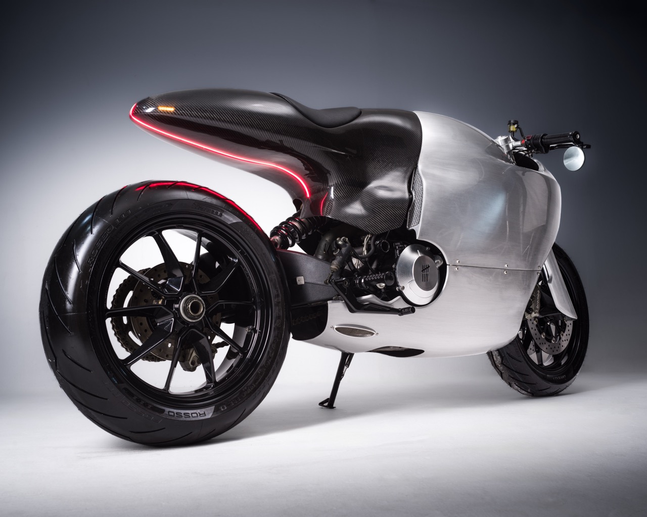
How does the greatest Ducati of the last decade get built four thousand miles from Bologna, in a workshop most people have never heard of? Ducati’s home turf is basically hallowed ground, all red paint and Borgo Panigale badges and a hundred years of racing pedigree breathing down every design decision. Bandit9 clearly did not get the memo, and thank god for that. The Saigon based atelier, founded by former creative director Daryl Villanueva, builds bikes the way a sculptor builds a monument, one hand shaped panel at a time, with zero interest in playing by anyone else’s house style. Their take on the Ducati 821 takes a stock Monster and turns it into something that somehow feels more Ducati than the actual Ducati. It is the kind of move you only get to make when you have absolutely nothing to lose.

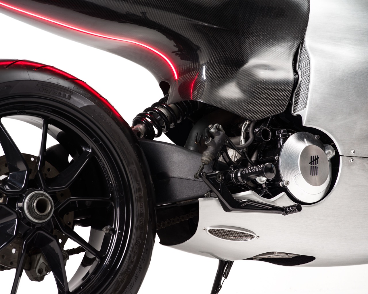
Only nine of these were ever going to exist, and eight of them are already gone, which means we are looking at the very last one on the shelf. Bandit9’s resume includes permanent spots in the collections of MoMA and the Petersen Automotive Museum, so this is not some garage tinkerer getting lucky once. Underneath the bodywork sits Ducati’s own 821cc Testastretta L-twin, 110 horsepower, a 3.3 second sprint to 60 mph, wrapped in a hand formed shell that splits clean between brushed aluminum and gloss carbon fiber. At $49,900 for the last unit, you are buying the argument as much as the motorcycle.

Designer: Bandit9

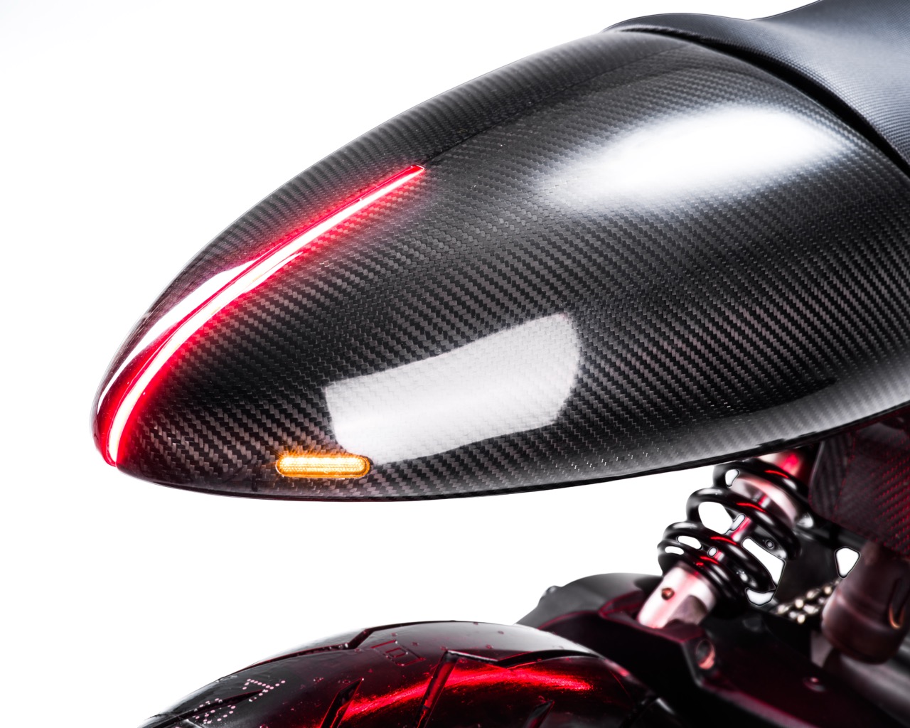
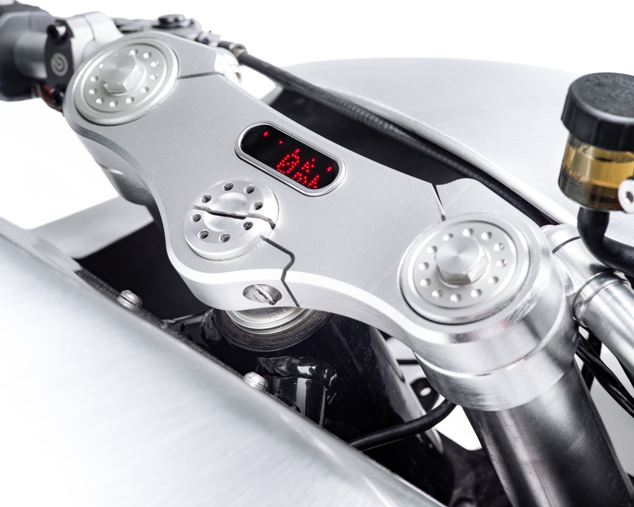
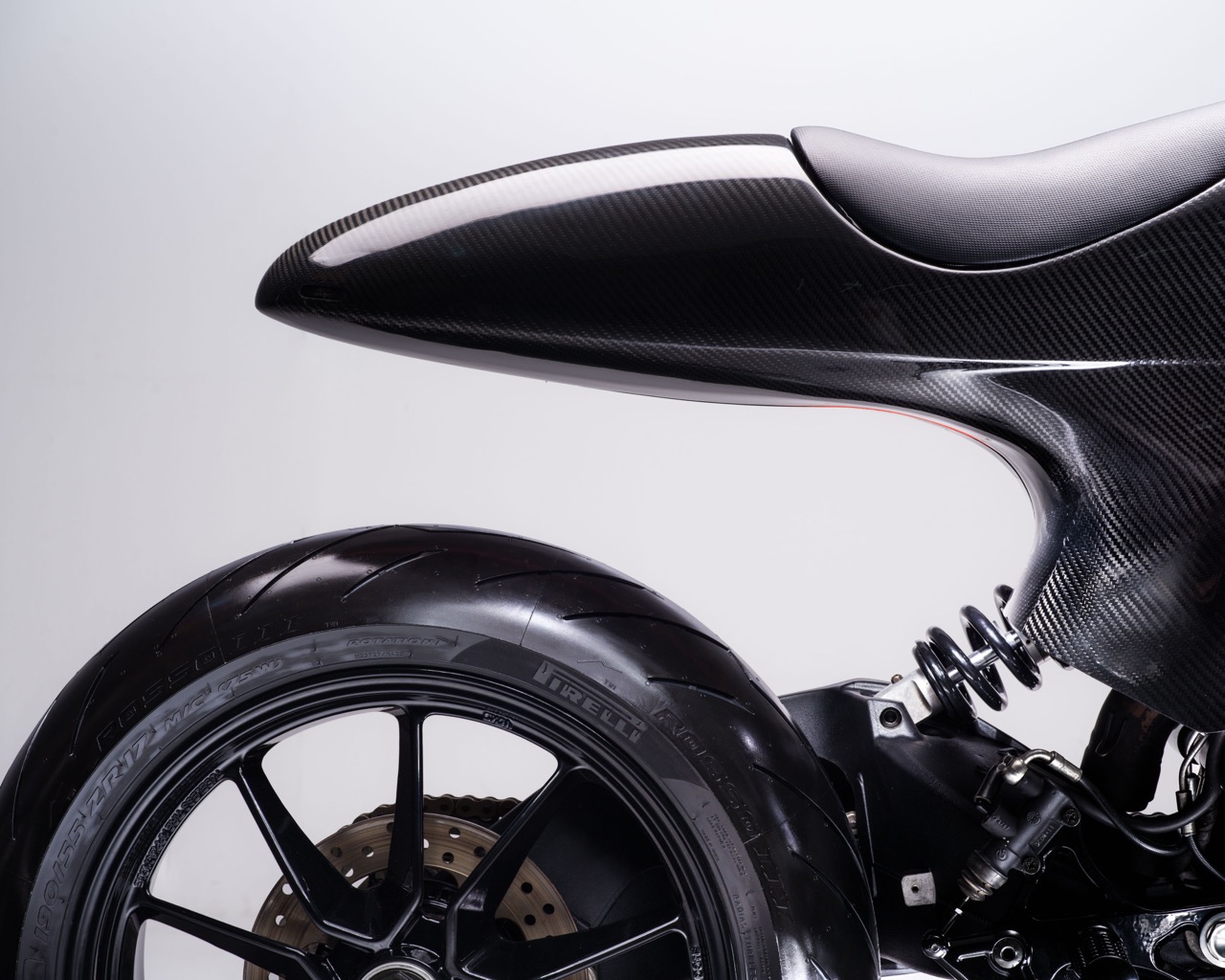
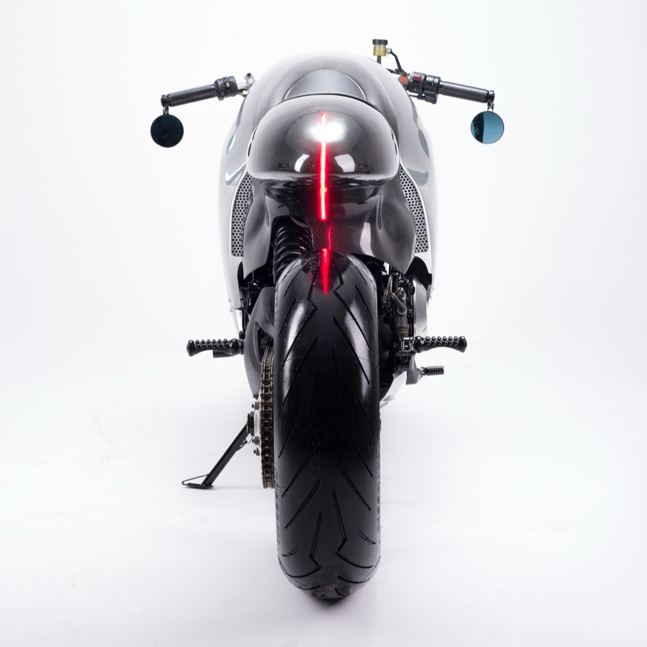
The material split down the middle grabs you first, and while it looks cosmetic, it actually serves a functional purpose. Brushed aluminum wraps the nose, tank, and belly, while gloss carbon fiber takes over the tail section, and the seam between the two materials tracks the actual bodywork geometry instead of sitting on top of it like a paint job. That tail section deserves its own moment, a bullet nosed unit with an LED strip tracing the ridge line into a tucked amber turn signal, wrapped in exposed weave carbon that catches light like a jewel. Flip to the cockpit and Bandit9 sweated even the smallest details, milling a top yoke in aluminum with a tiny embedded LED trip readout nested between the fork caps. Most custom shops would leave that space blank or bolt on an aftermarket gauge. Bandit9 machined a bespoke solution instead, because subtlety does not appear to be part of their vocabulary.

Ducati’s own 821cc Testastretta 11 degree L-twin sits underneath all that hand formed metal, still producing 110 horsepower and 65.8 ft-lb of torque, enough to send the bike from 0 to 60 mph in about 3.3 seconds. A custom tubular steel trellis frame carries the engine, paired with 43mm Sachs forks up front and an adjustable Sachs monoshock out back, while dual 320mm Brembo monobloc calipers handle the stopping duties. None of that is particularly radical on paper, and that is the point. Bandit9 never touched the parts that make a Ducati go fast or stop hard, they only rebuilt everything around it by hand. No stamping press currently exists that can produce a single panel wrapping from the front cowl over the tank and down the body without a seam, so every curve on this bike got there because a person spent months shaping metal the way a watchmaker shapes a case. That is what craftsmanship actually looks like, no marketing spin required.

Nine of these were ever going to exist, and eight already have owners, so the math here is simple. Bandit9 has spent years building a reputation that includes permanent placements in the collections of MoMA and the Petersen Automotive Museum, putting them in rare company within the custom bike world, alongside names like Deus Ex Machina and Icon, but operating on a different plane of ambition entirely. Founder Daryl Villanueva, a former graphic designer and creative director, runs the Saigon based atelier less like a garage and more like a small design house that happens to build motorcycles instead of furniture or typefaces. At $49,900, the last unit is not cheap, but measured against months of hand labor and a production run that will never reopen, the number starts to make sense. Whoever buys it walks away with a working sculpture that also happens to be a genuinely quick motorcycle.

Ducati will keep building excellent motorcycles in Bologna, and nobody is arguing otherwise. But Bandit9’s 821 makes an honest case that great design does not need a postcode, a century of racing heritage, or a factory at all, just a workshop, a stubborn sense of craft, and someone willing to spend months getting a single curve exactly right. The last unit will sell fast, probably to someone who already owns a garage full of things most people only see in magazines. What happens after that is anyone’s guess, though I would not be surprised if Bandit9 is already sketching whatever comes next. For a company that keeps proving Bologna does not have a monopoly on great Ducatis, retirement does not seem to be part of the plan.

The post This ‘Liquid Metal’ Ducati 821 Was Built by Hand in Vietnam, and Only One Remains first appeared on Yanko Design.
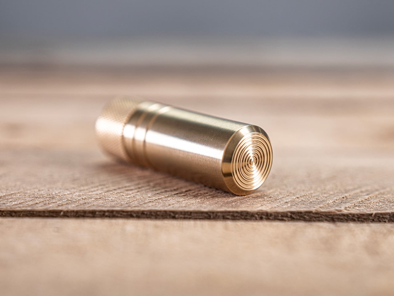
Ultra-silent brass fidget piston is built with such precise tolerances that air becomes the spring

Pneumatics is an industrial workhorse, a brute-force technology that uses compressed air to power everything from factory robots to freight train brakes. It is almost always loud, powerful, and hidden deep inside a machine’s guts. The idea of holding it in your hand, of feeling its power at a small, personal scale, has always been out of reach. It was a force to be used, not a phenomenon to be experienced. MetMo, however, specializes in turning these forgotten industrial principles into beautiful, handheld objects.

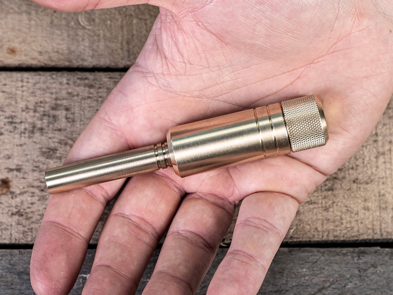
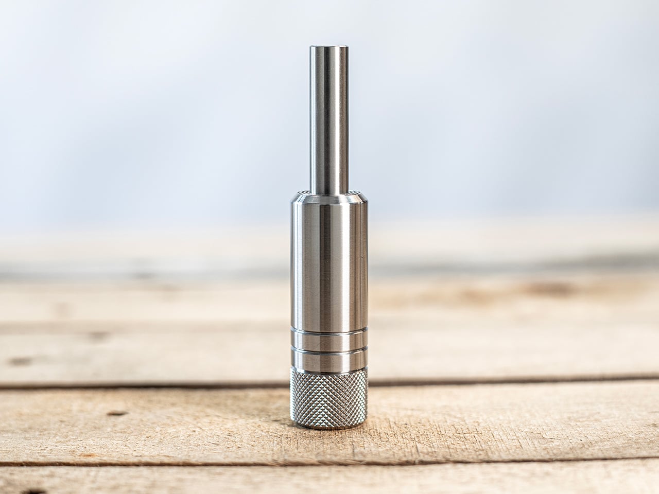
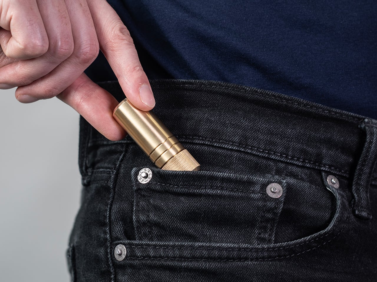
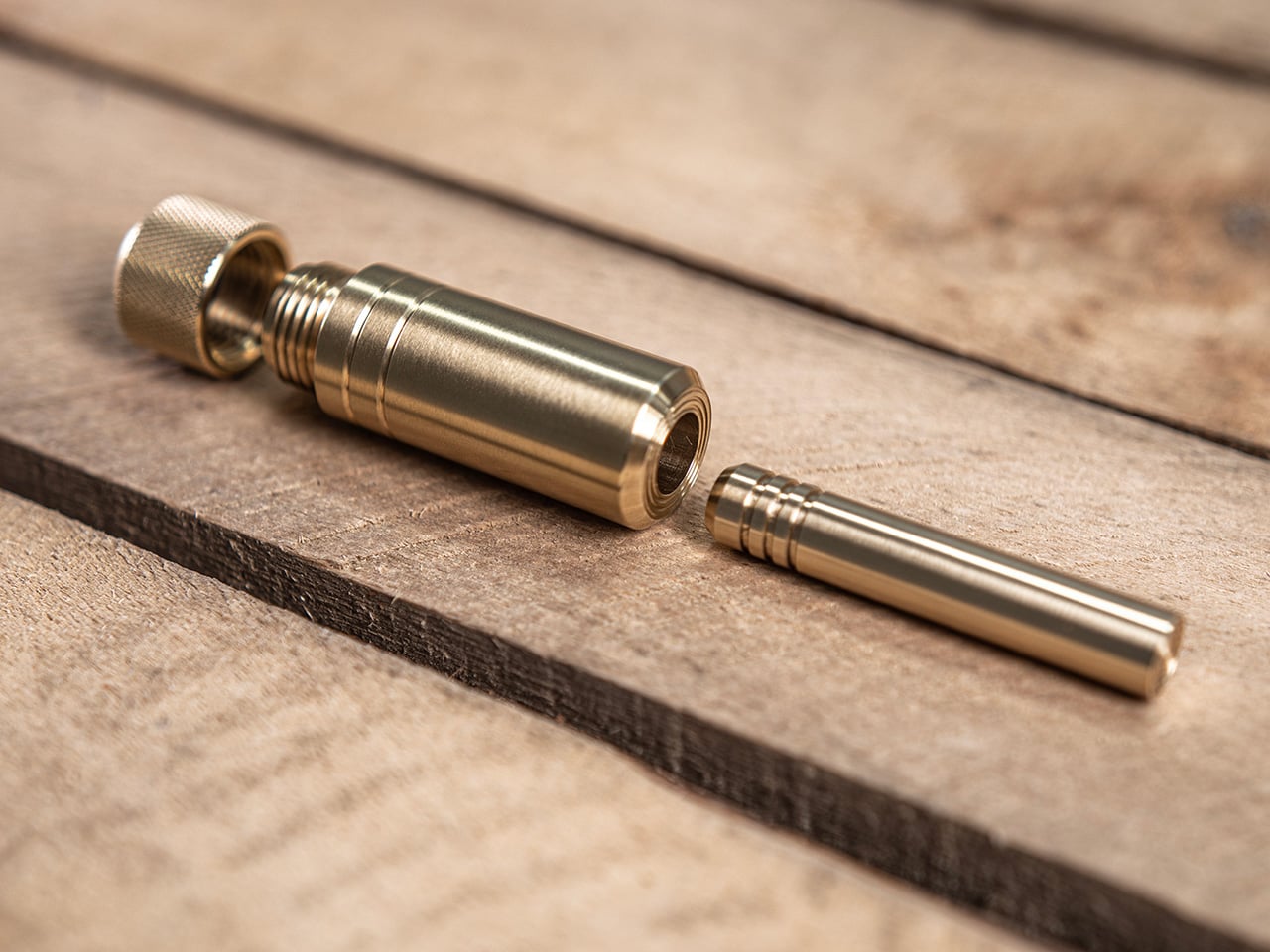
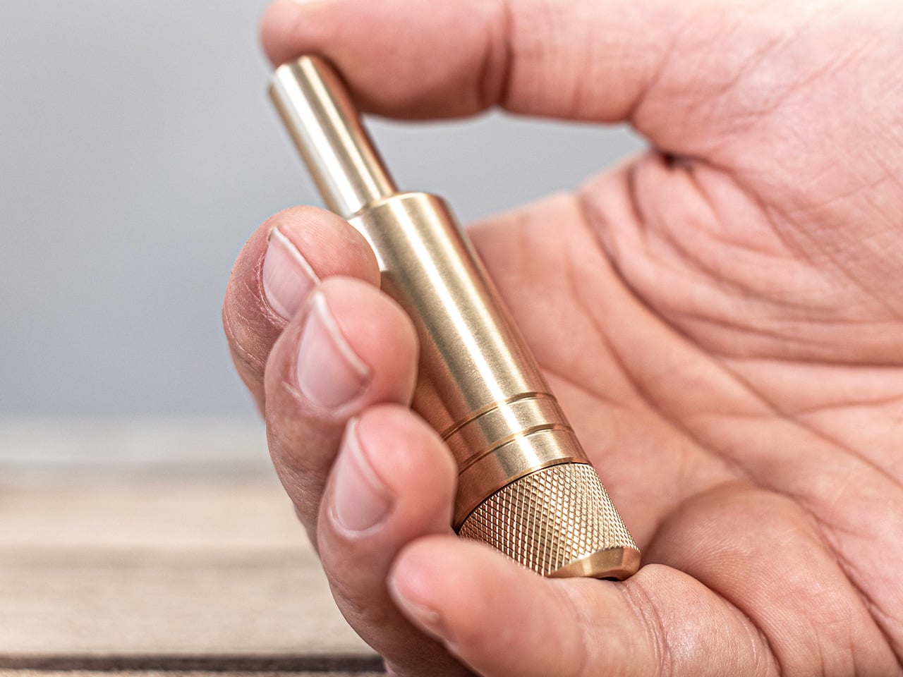
The MetMo Piston is what happens when you shrink a pneumatic system down to pocket size and machine it from solid brass. The slow, satisfying resistance you feel when you press down is the feeling of air compressing in a perfectly sealed chamber. The silent rebound is that same air expanding, pushing the piston back with a gentle, inevitable force. For anyone who appreciates engineering, it is a tiny, working demonstration of physics. For everyone else, it is just an incredibly satisfying object to hold and press.

Designers: Sean Sykes & James Whitfield (MetMo)

Click Here to Buy Now: $89.99

The mechanism itself is deceptively simple, which is why MetMo felt it important to reiterate – no springs, no magnets. A precision-machined piston pin slides into an equally precise cylinder block, and the tolerances between the two are so tight that air cannot escape, even under pressure. When you press the piston down, you are compressing the air trapped inside the chamber, and that compressed air is what pushes back against your thumb. No hidden parts, springs, neodymium magnets, mechanical detents. The feedback is purely pneumatic, the same principle that powers much larger systems like robot arms, hammer drills, and train brakes… scaled down to something you can operate with one hand.

What separates this from every other fidget object on the market is the sheer precision required to make it work. No sourcing ball-bearings from AliBaba to make $2 fidget spinners. MetMo machines each component from solid HTB1 brass, a high tensile alloy chosen specifically for its wear resistance and smooth surface finish. The piston pin and cylinder block are both machined to tolerances typically reserved for aerospace engineering, because even a microscopic gap would let air escape and ruin the pneumatic seal. The fit is so precise that when you press down and feel that cushion of resistance, you are experiencing the literal limits of what air molecules can do when trapped in a perfectly sealed chamber. It’s engineering you can feel through your fingertips.

The Piston also features a secondary interaction that might be even more satisfying than the press itself. Spin the knurled housing, and the piston pin rotates on what MetMo calls an aerodynamic bearing, a thin cushion of air that forms between the pin and the cylinder block. The result is a nearly frictionless spin that feels almost supernatural, like the object is hovering inside its own housing. It is the same principle used in precision scientific instruments, and experiencing it in a handheld desk toy is quietly mesmerizing. You can spin it for minutes at a time, and the motion stays smooth, silent, and hypnotic.

One of the best practical benefits of the Piston is its complete silence. If you have ever been stuck in a meeting next to someone clicking a pen, you understand why this matters. The pneumatic mechanism operates without any noise at all, which means you can fidget freely without disrupting anyone around you. It is a desk toy that respects shared spaces, and that alone makes it more thoughtful than most of its category competitors. The tactile satisfaction is entirely private, which is exactly how it should be.

MetMo also included a pressure release valve that lets you adjust the drop speed and rebound behavior of the piston. Tighten it for a slow, controlled descent, or loosen it for a faster, bouncier response. It is a small detail, but it transforms the Piston from a fixed experience into something you can tune to your own preference. For people who appreciate control over their tools and objects, that adjustability is a quiet but meaningful touch.

The MetMo Brass Piston is priced at £59.99 GBP ($81.23 USD) and is available directly from MetMo’s UK workshop. It is machined from solid brass, although there’s a stainless steel version priced at £94.99 ($126.4 USD) too, hand-assembled to order, and backed by MetMo’s 200-year guarantee. For anyone who thinks with their hands, who values mechanical honesty over gimmicks, or who simply wants a desk object that does one thing exceptionally well, this is one of the most compelling fidget toys I have come across in a while.

Click Here to Buy Now: $89.99

The post Ultra-silent brass fidget piston is built with such precise tolerances that air becomes the spring first appeared on Yanko Design.

Do Smart Homes Need More Innovation, Or Just More Common Sense?

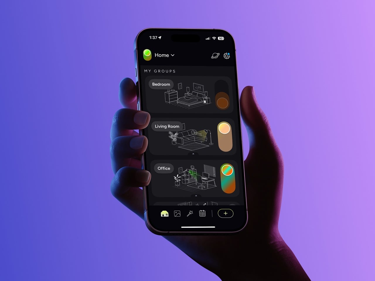
Yanko Design’s Design Mindset continues to spotlight the thinkers, makers, and brands shaping the future of design. Now in Episode 23, the weekly podcast turns its attention to one of consumer tech’s most persistent frustrations: the smart home. What was meant to simplify daily life has often done the opposite, leaving users juggling apps, switches, hubs, and setup flows that feel more like maintenance than convenience. This episode, Powered by LIFX, asks a timely question: if smart homes still feel complicated, is the problem really the technology, or is it the way that technology has been designed?

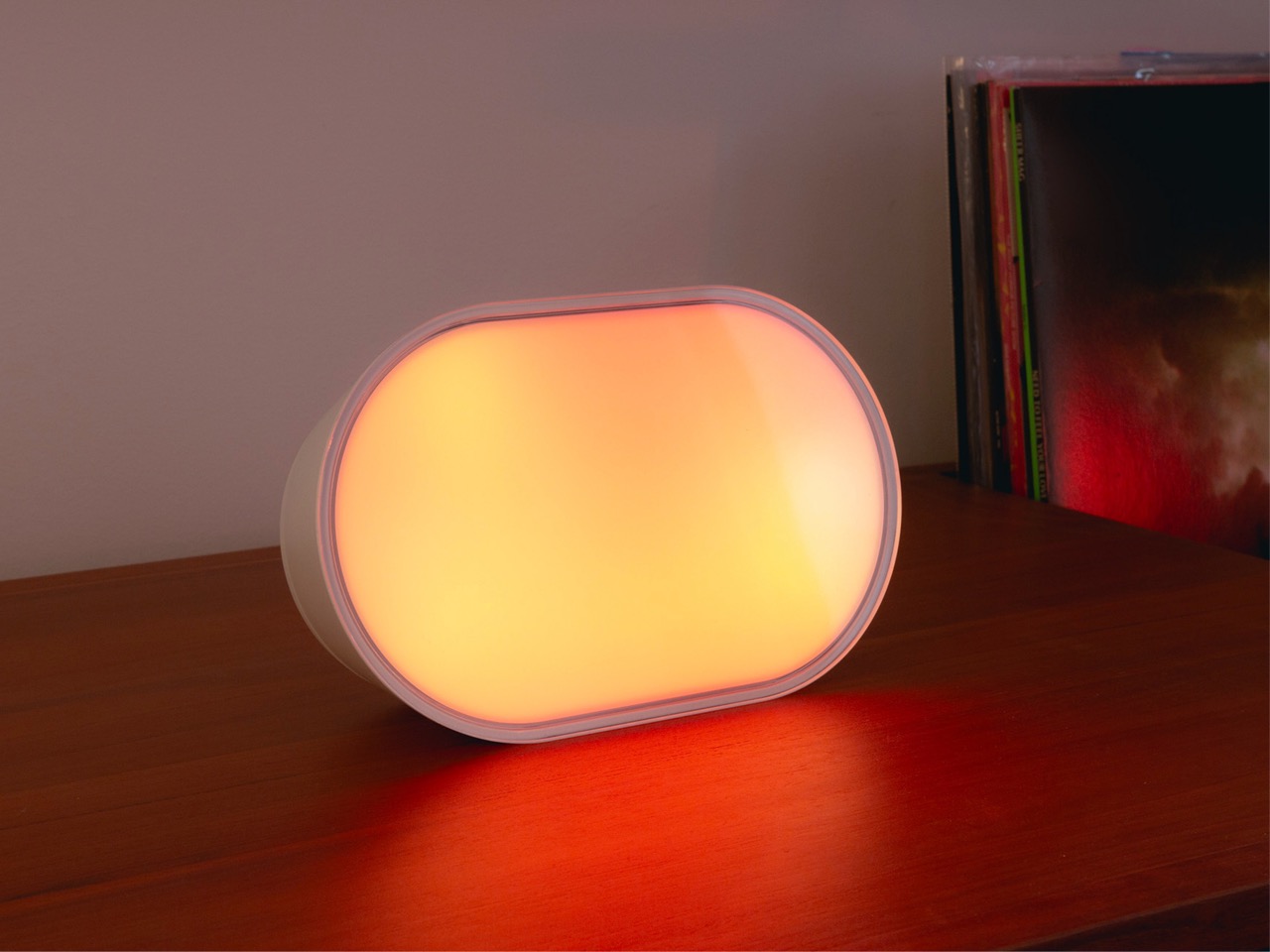
The episode features three key voices from LIFX: Rachel Wilson, Creative Director; Mark Hollins, CTO; and Matthew Redding, Hardware Director. Together, they offer a layered view of the smart home from brand, engineering, and hardware perspectives, while unpacking how products like the Smart Mirror, Luna, and Smart Dimmer are being shaped around real behavior instead of feature overload. The result is a conversation about lighting, interfaces, wellness, and why the best smart technology may be the kind that quietly disappears into everyday life.

Explore LIFX Products here | Mirror | Luna | Dimmer

Why the smart home still feels harder than it should

The episode begins with a blunt acknowledgment that the smart home industry has not fully delivered on its original promise. For all the progress in connectivity and automation, many people still experience smart living as a patchwork of apps, ecosystems, and workarounds. Mark Hollins does not pin the blame on one side alone, saying, “I think it’s a mix of both,” when asked whether this is a technology failure or a design failure. His point is that the industry has spent years building around technical constraints, while users have continued to ask a much simpler question: does this actually make life easier?

That gap between capability and convenience becomes the foundation of the conversation. Hollins explains that products need to be tied back to use cases from the very beginning, rather than forcing people to adapt to whatever the technology happens to enable. It is a useful reframing, especially in a category that has often rewarded complexity as a sign of sophistication. LIFX’s position is that smart living should not feel like system management. It should feel natural, reliable, and worth having in the first place.

Designing for behavior, not just features

One of the strongest ideas in the episode is that smart home products have too often been shaped by enthusiasts rather than households. Early adopters were willing to experiment, troubleshoot, and spend time optimizing their spaces, but most homes are shared by people with very different comfort levels around technology. Hollins points out that “those users tend to have a high technical competency and a willingness to experiment,” but that often creates friction when everyone else in the home is expected to live with the result.

That is where the conversation becomes less about features and more about behavior. A connected home cannot be successful if it only works for the person who installed it. It has to make sense for partners, children, guests, and anyone else using the space. This is also why the return of physical controls matters so much. As Matthew Redding puts it, “It shouldn’t be the only way to turn on the lights,” referring to the app-first mindset that once defined the category. For LIFX, hybrid control through buttons, voice, schedules, and automation is not redundancy. It is simply better design for real life.

Why lighting needs a more emotional design language

Rachel Wilson brings a different lens to the discussion by arguing that lighting should not be treated like just another piece of consumer electronics. Too often, tech brands focus on the object itself, trying to make it look futuristic or visually distinctive without considering the room it lives in. Wilson pushes back on that approach by saying, “It’s more about the effect of the product in the space that you are living in rather than the product itself.” In other words, the value of lighting is not just in the hardware, but in how it transforms the atmosphere around it.

That shift in thinking opens up a more emotional understanding of smart lighting. Wilson describes light as something that changes how people see the objects they love, the rooms they have built, and even themselves. She also points to its biological impact, which makes lighting one of the few smart home categories that is both functional and deeply personal. That is what separates it from many other connected products in the home. Done well, lighting does not just help a room work better. It changes how the room feels.

The Smart Mirror, Luna, and the return of tactile design

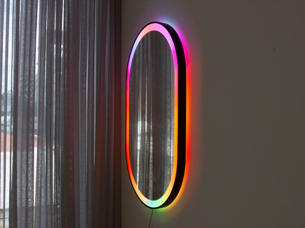
That philosophy becomes more tangible in LIFX’s newer products, especially the Smart Mirror and Luna lamp. Redding explains that these are products used at arm’s reach, often in moments when people are tired, distracted, or dealing with wet hands. In those situations, reaching for a phone is not elegant, it is inconvenient. “A button’s on the mirror, it’s not a step backwards, it’s just meeting the user where they are,” he says. It is a simple line, but it captures a more mature approach to smart product design, one that chooses the right interface for the context instead of forcing the newest one.

The Smart Mirror also reflects how LIFX is trying to turn lighting into a more personal and wellness-driven experience. Wilson highlights the mirror’s “makeup check” feature, which cycles through different Kelvin temperatures so users can see how they will look in varying light conditions before stepping out. That kind of feature is specific, but not gimmicky. It solves a real everyday problem while also reinforcing the idea that lighting can support routines, rituals, and self-perception in ways that go far beyond turning a bulb on and off.

Matter, fragmentation, and the limits of interoperability

No smart home conversation today can avoid Matter, and Hollins offers a measured take on what the standard really solves. He sees it as a meaningful improvement in interoperability, onboarding, and security, especially for brands that previously had to build separate integrations for multiple ecosystems. Matter helps simplify the common ground, making it easier for products to work together across platforms without duplicating effort. That alone makes it one of the most important shifts the category has seen in years.

At the same time, Hollins is careful not to frame Matter as a magical fix for every pain point. It is not, in his words, going to create “one app to rule them all.” Some features will always live outside a shared standard, especially when brands want to build differentiated experiences. That honesty is important because it keeps the conversation grounded. Interoperability matters, but it does not replace the need for thoughtful product design, especially when homes contain multiple users, multiple habits, and multiple expectations around what smart living should feel like.

What the future of smart living should actually look like

By the end of the episode, a clearer vision of the future begins to emerge. It is not a future filled with more visible tech, more dashboards, or more complicated layers of control. Instead, it is one where smart products become quieter, more contextual, and more responsive to everyday behavior. Hollins says a smart home has done its job when it “is invisible,” while Redding describes the ideal experience as one that “just does the work for you.” Both ideas point to the same goal: intelligence that fades into the background instead of constantly demanding attention.

Wilson extends that vision even further, suggesting that the habit of “pressing buttons all the time” may gradually disappear as sensors, voice, and other natural interfaces become more robust and more affordable. If that happens, the biggest change in smart homes over the next few years may not be about adding more technology, but about making interaction feel less technical altogether. Episode 23 of Design Mindset, Powered by LIFX, makes a compelling case that the next chapter of smart living will belong to brands that understand simplicity is not basic. It is the hardest thing to design well.

Explore LIFX Products here | Mirror | Luna | Dimmer

The post Do Smart Homes Need More Innovation, Or Just More Common Sense? first appeared on Yanko Design.

This Stabilo Table Lamp puts the ‘Light’ in Highlighter!

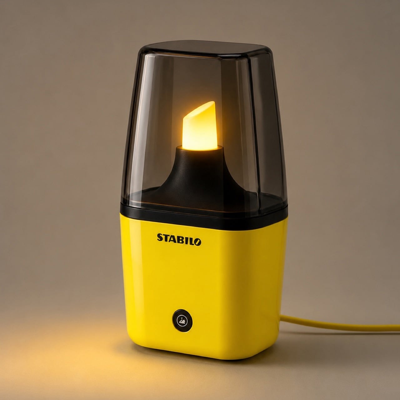
Creatives see the world very differently from how the rest of us do. Someone sees a binder clip, a creative sees a miniature handbag, someone sees a fork, a creative holds the fork close to their eyes to simulate being in a prison cell. Someone sees a highlighter as a piece of stationery used to make text prominent, Jane Morelli saw the ‘light’ in highlighter, turning it into a tabletop lamp every stationery nerd will absolutely love.

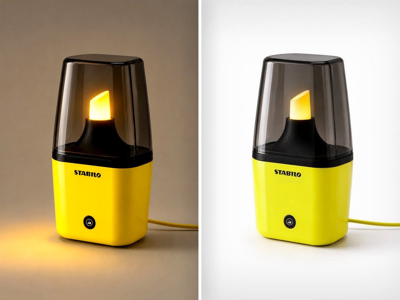
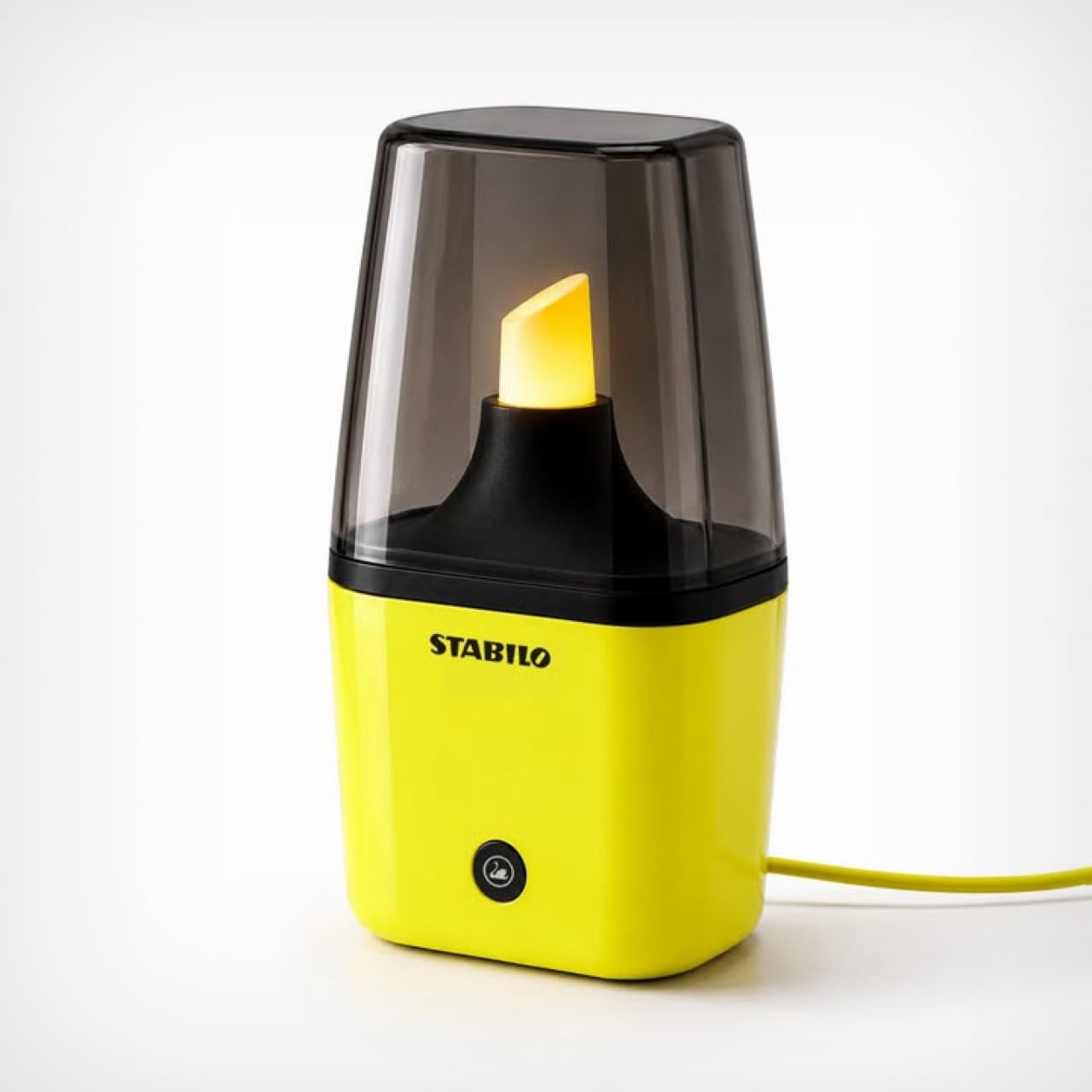
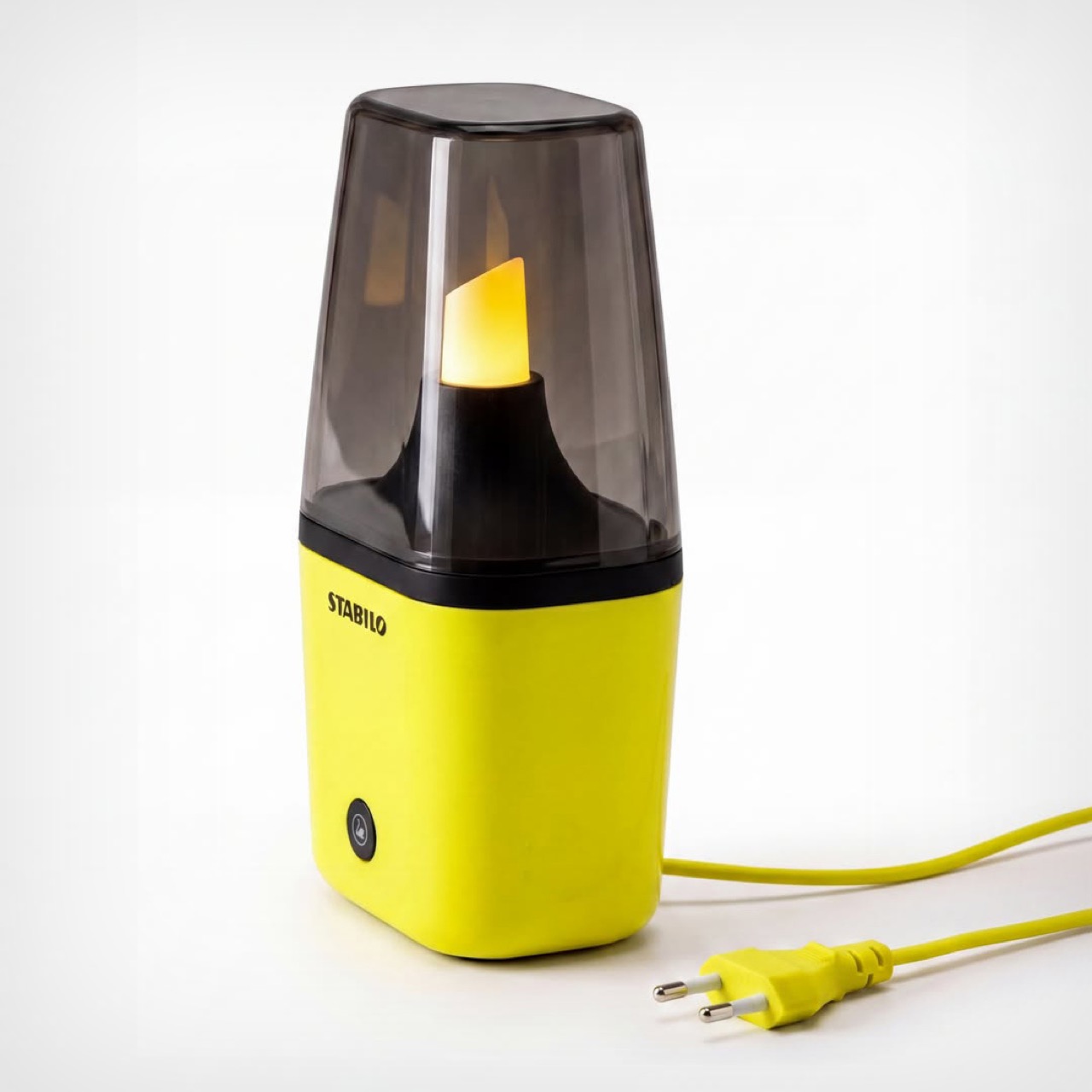
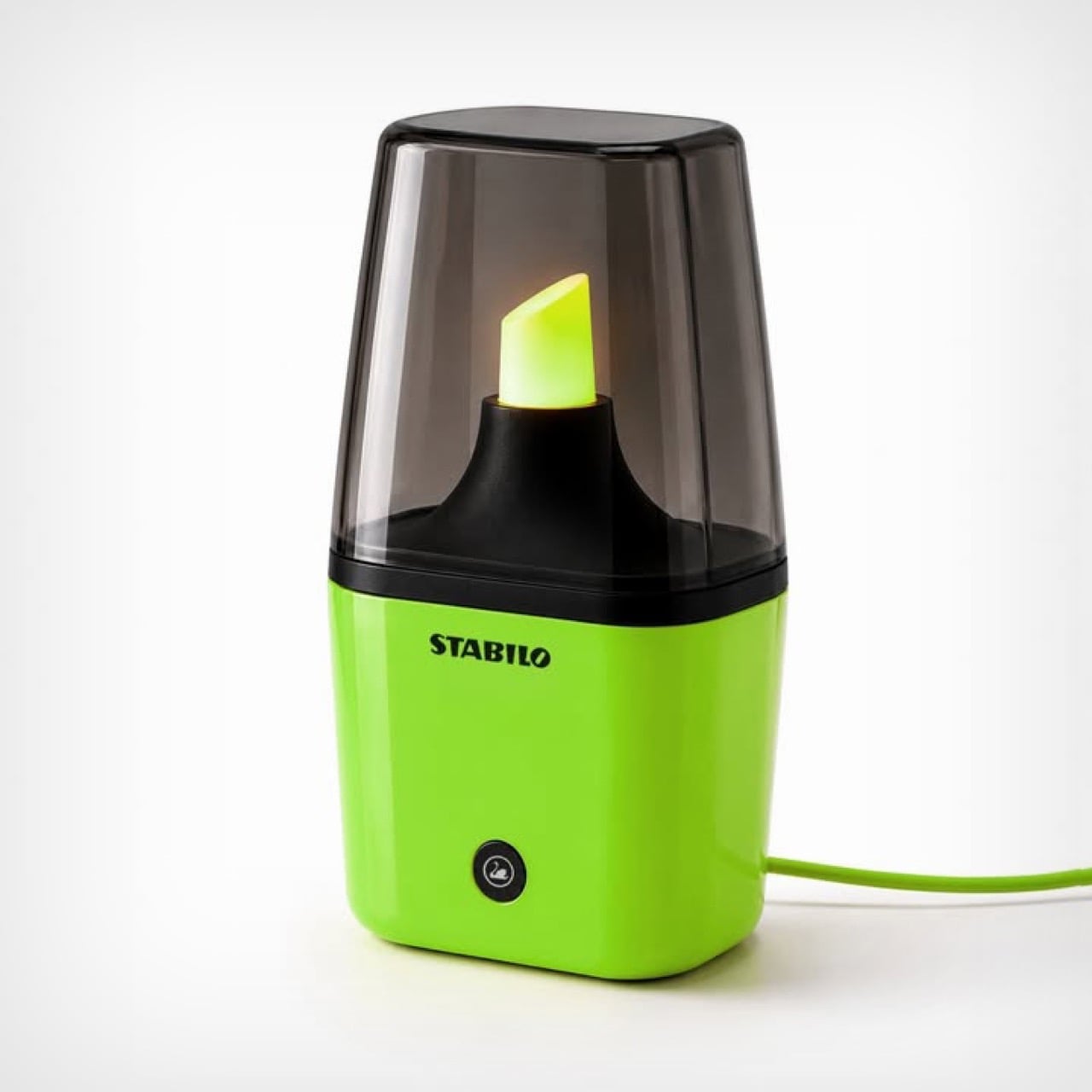
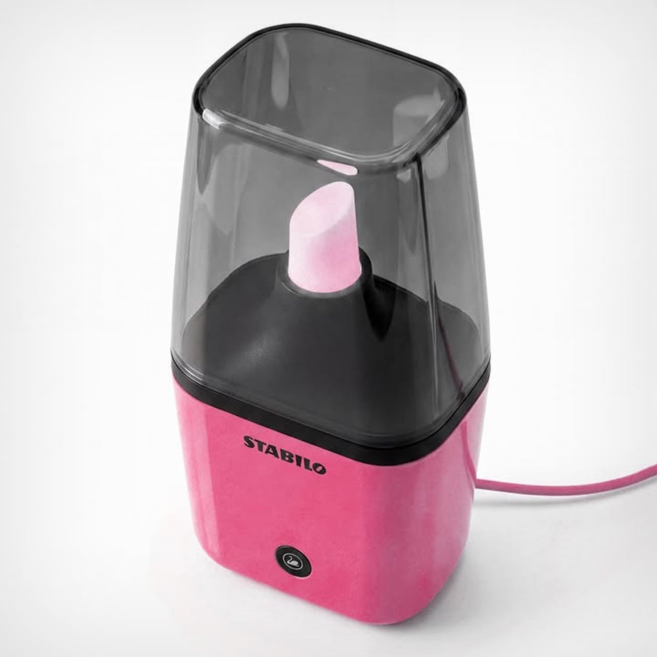
Modeled on the iconic Stabilo highlighter, Morelli’s Stabilo Lamp is an unofficial tabletop lamp that turns the fluorescent tip of a highlighter into a literal light source. Designed to be roughly a foot tall, the lamp comes with a cord – plug it in, switch it on, and the tip glows in its signature color. Morelli’s designed the lamp in 3 common colors for now, neon yellow, pink, and green. I say unofficial because this is purely fan-made visual punnery – but Stabilo did comment on Morelli’s post, marveling at her idea.
Designer: Emanuele Jane Morelli

The lamp is witty, fun, and caters to a highly specific niche. Not everyone wants to celebrate stationery in such a literal way, but for the people who do, this is an absolute win. The lamp is modeled on the short Stabilo highlighters, the proportions have been adjusted to ensure the base doesn’t overpower the actual light source – something that bright is sure to command one’s attention, but it mustn’t steal it. The showstopper is the nib, a cloudy, translucent element with a powerful light source underneath that causes it to glow once switched on. A tinted ‘lampshade’ in the form of a highlighter cover sits on top, acting as a visual and physical barrier from the light source.

The lamp’s pretty tiny, as is its light source. Don’t expect it to produce enough light to let you read a book. Its sole job is to emit a warm, diffused glow akin to a lava lamp, setting the mood with a nerdy panache that only will appeal to stationery lovers and people with a quirky personality. You won’t see this in an edition of Architecture Digest, or an eclectic Airbnb. Then again, to be honest, you won’t see this anywhere because Morelli’s work is currently just a concept.

However, with enough attention, Morelli could totally build a working prototype and take this to production. Stabilo definitely loved the idea, and this isn’t the first time we’ve seen designers garner attention on their work on social media and get enough validation to turn them into real products. David Delahunty’s work is a brilliant example of how creative thinking and visual puns can turn into real merch and a genuine business. Morelli, if you’re reading this, I’d suggest busting out your 3D printer, heading down to Home Depot or the like, and putting together a prototype!

The post This Stabilo Table Lamp puts the ‘Light’ in Highlighter! first appeared on Yanko Design.