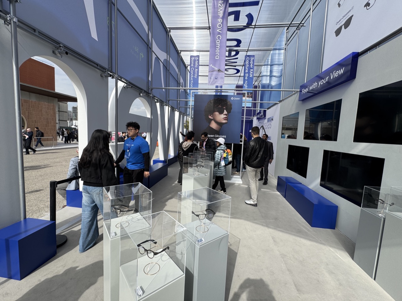
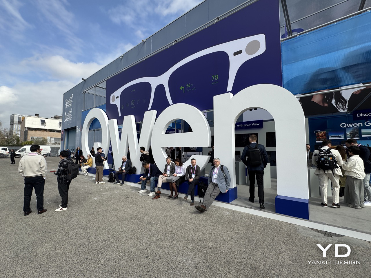
It was one of the more audacious moves at MWC 2026. Right across the aisle from Meta’s smart glasses booth at Fira Gran Via, Alibaba’s Qwen pavilion was anchored by a pair of glasses so oversized they were practically architecture, a giant sculptural prop that functioned as a very literal invitation to come over and look. People did. And once they got close enough to see the actual products, the conversation shifted fairly quickly from “interesting marketing stunt” to “wait, what exactly is this?”
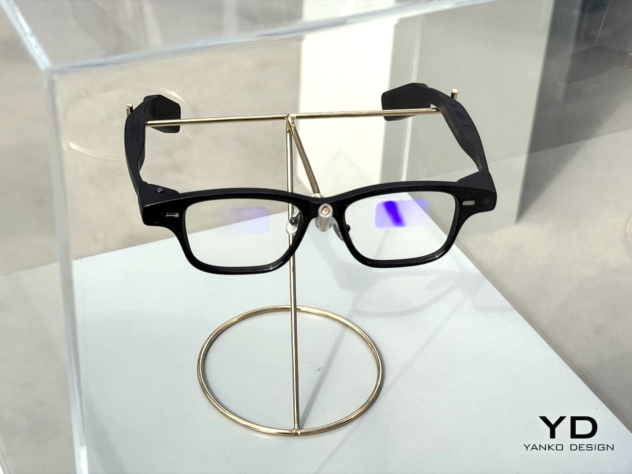
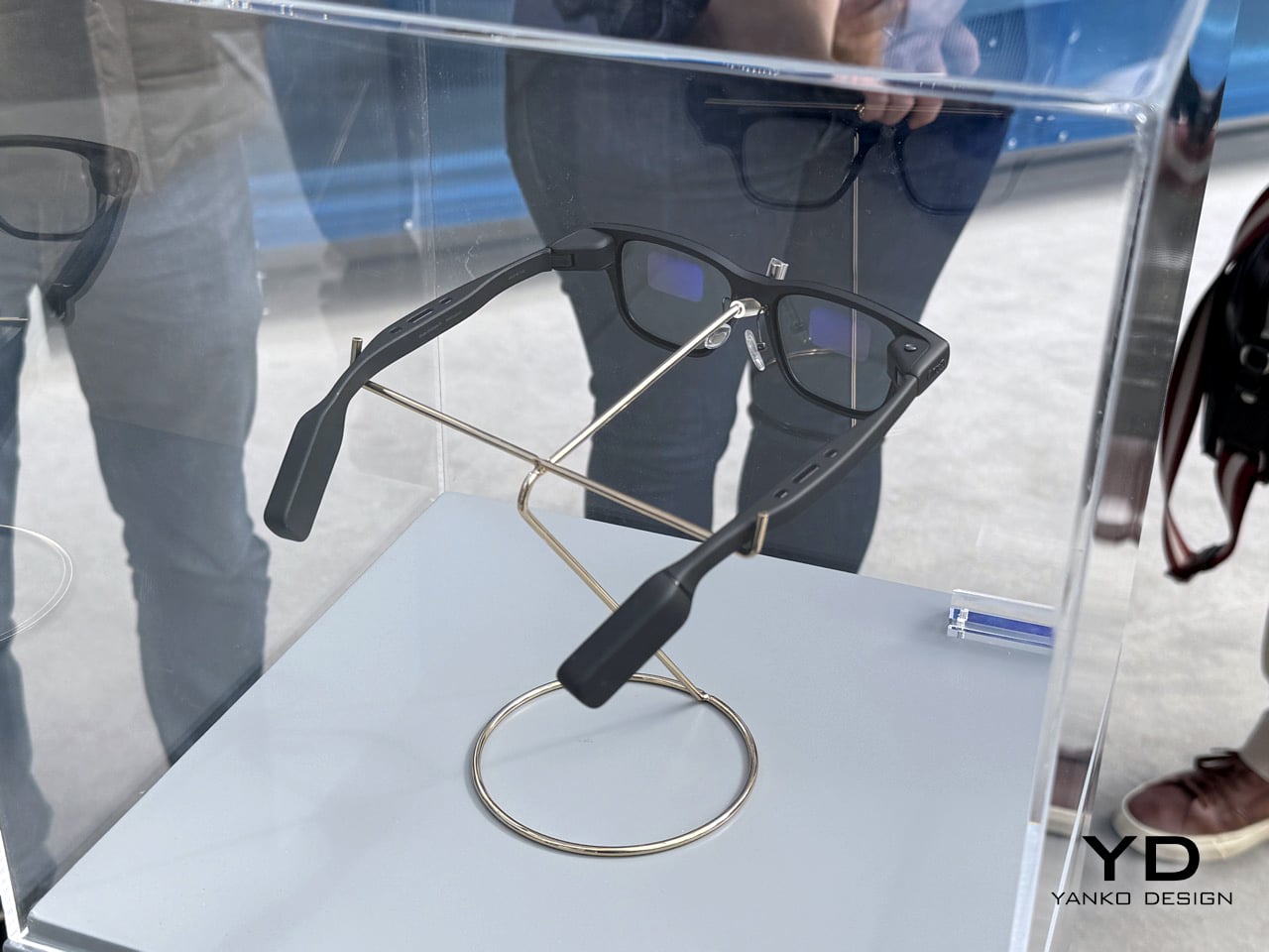
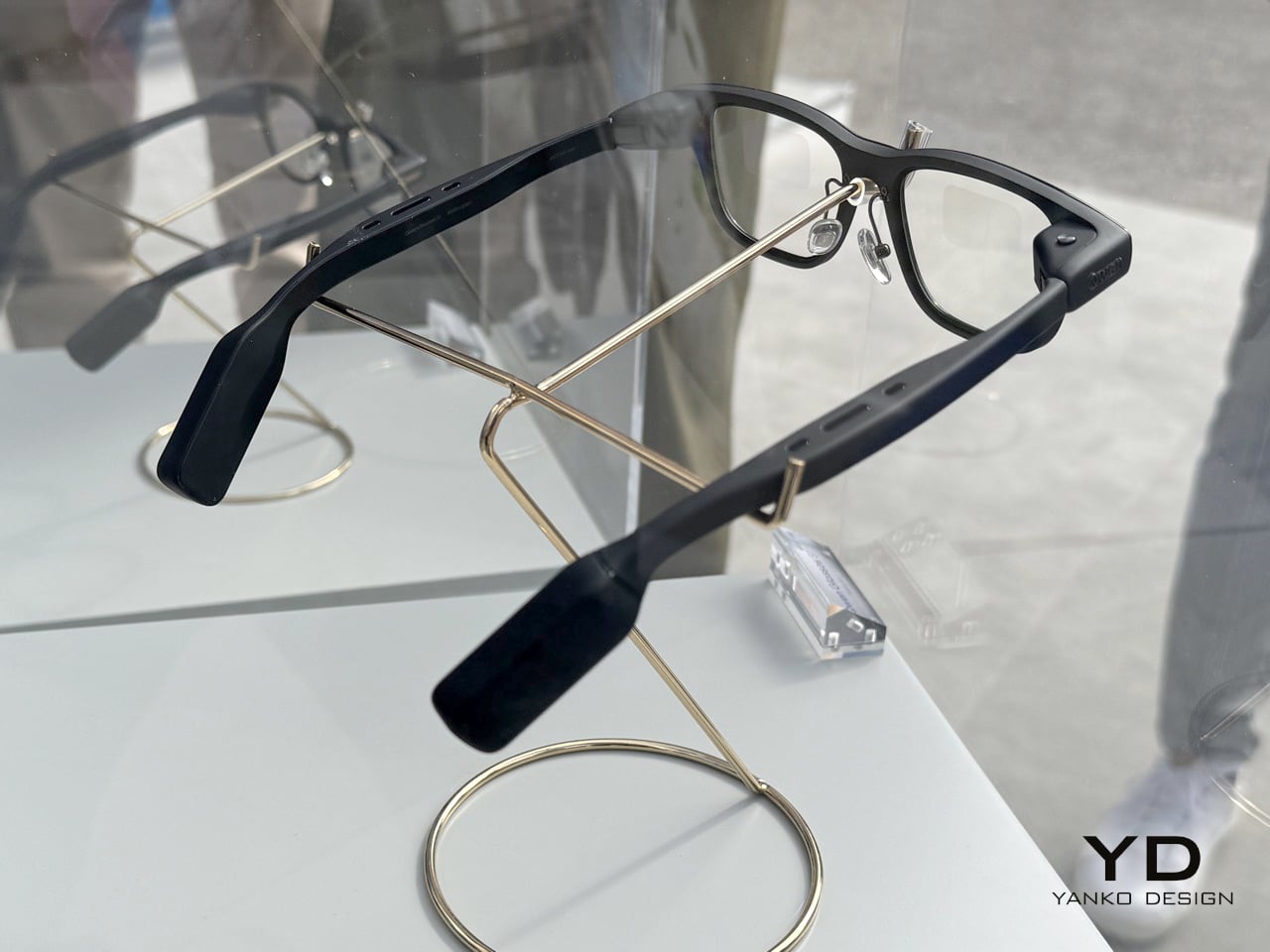
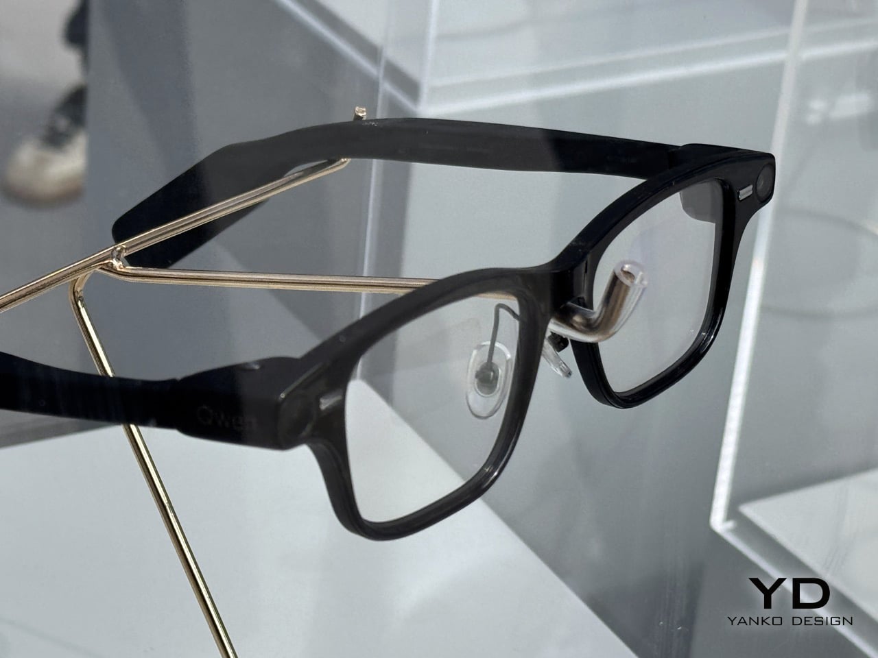
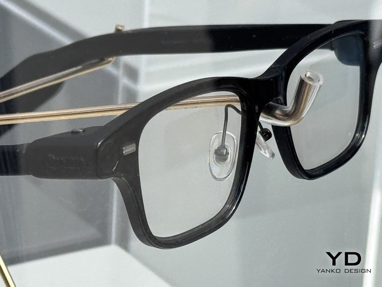
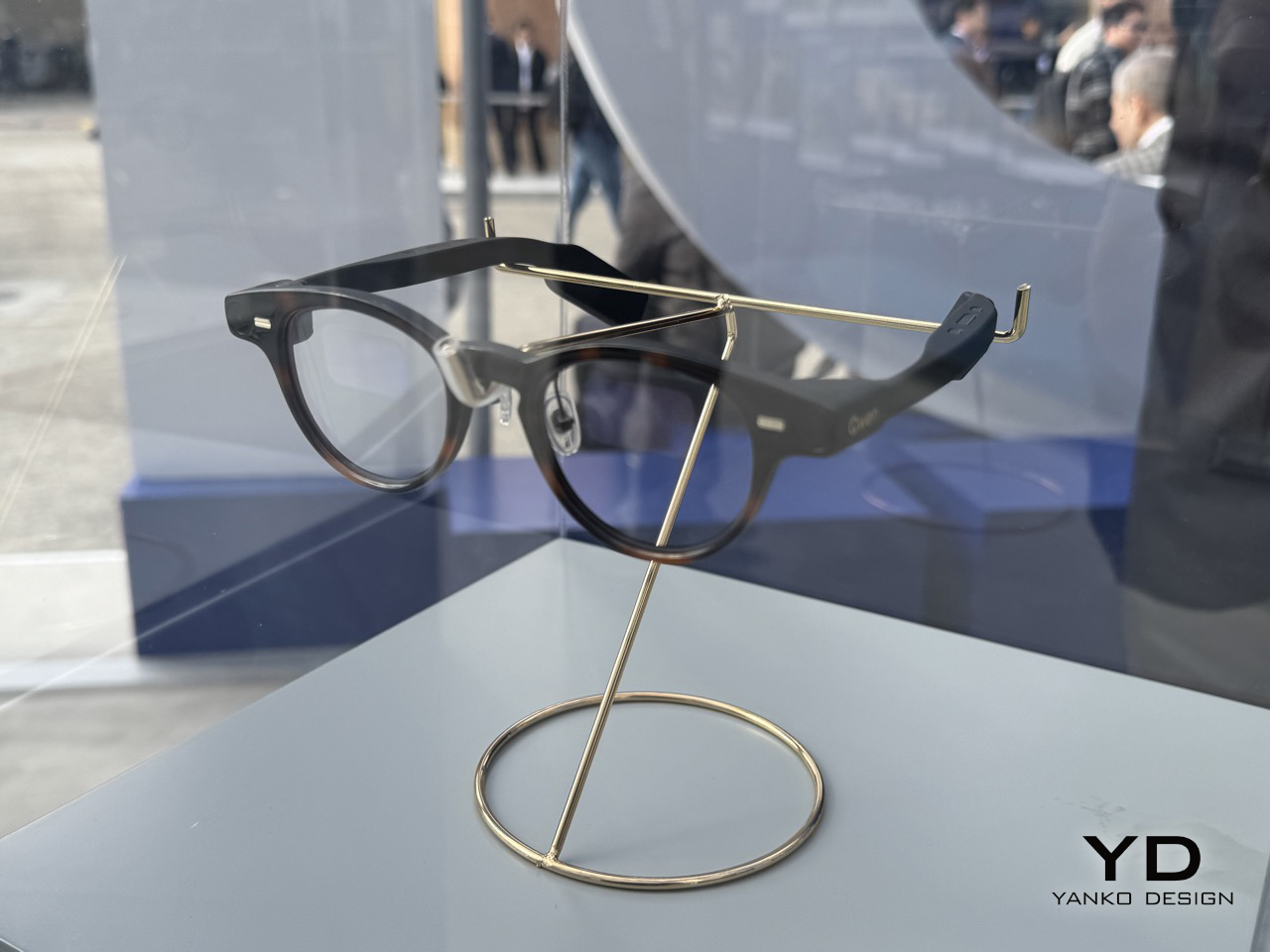
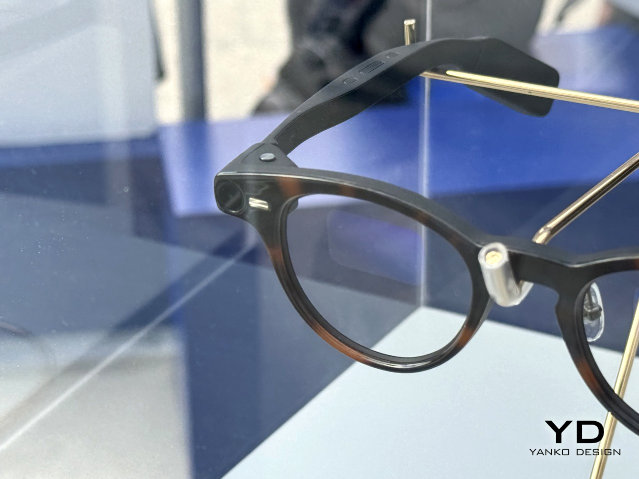
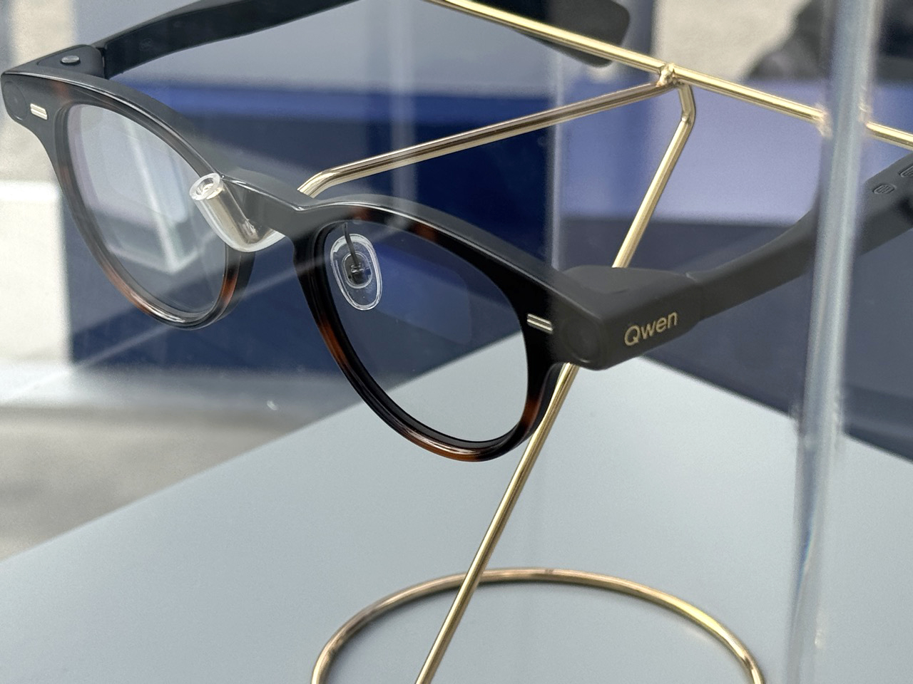
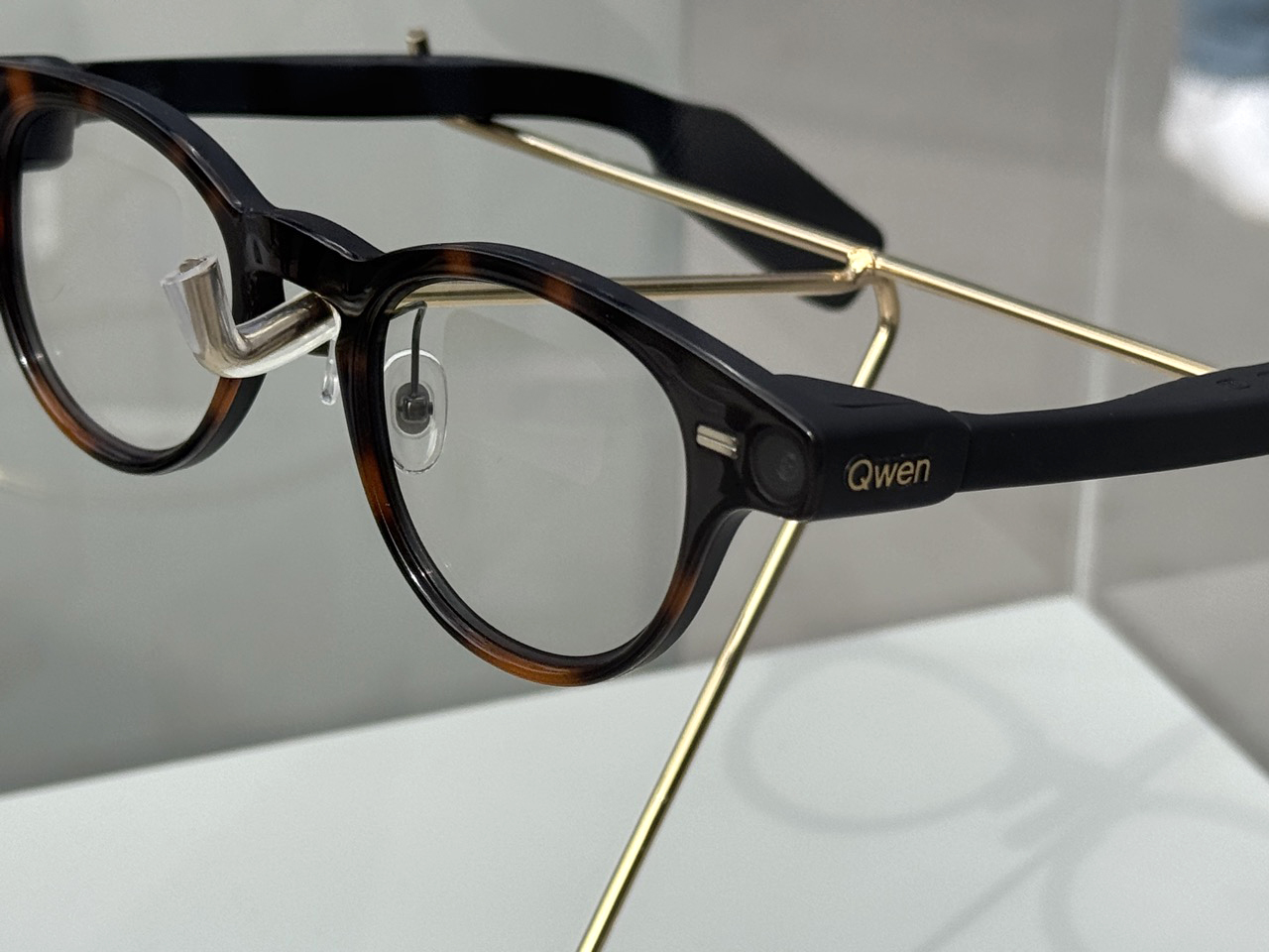
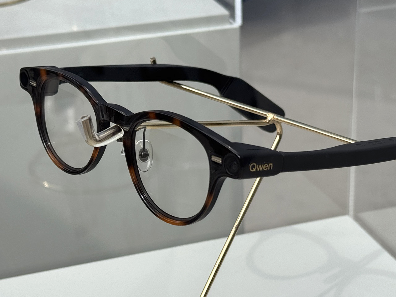
What they found were two frame styles that could sit in any optician’s window without raising an eyebrow. A rectangular wayfarer in matte black, clean and understated. A rounded frame in warm tortoiseshell with a two-tone contrast that leans vintage without being self-conscious about it. Both carry the “Qwen” wordmark on the temple, small and unobtrusive. Both have cameras tucked discreetly at the hinge corners rather than mounted on the bridge. And inside the lenses, visible only when you look closely, is the faint shimmer of a waveguide display.
Designer: Qwen
That last detail is where the competitive context gets genuinely interesting. The smart glasses market in 2026 has essentially sorted itself into two camps. On one side, you have camera-and-speakers devices like the mainstream Ray-Ban Metas, starting around $299, which have been wildly successful because they figured out that looking normal matters more than most features. On the other, you have display-first devices like the Even Realities G1 and G2, which sit at $599 and offer binocular waveguide displays, but sacrifice the camera entirely and strip out the speakers to keep weight down to a remarkable 36 grams. Meta entered the premium display tier late last year with the $799 Ray-Ban Display, a full-colour waveguide in one eye, a 12MP camera, and open-ear audio. It’s a compelling package, but $799 is a significant ask for a first-generation product in a category most consumers are still on the fence about.
The Qwen glasses, if they land close to the pricing of Alibaba’s previous Quark AI Glasses at around $277, would be threading an entirely different needle. Camera, display, on-device AI, and a frame design that competes aesthetically with anything in this space, all at a price that undercuts the Even G2 by more than half and the Meta Display by almost two-thirds. On paper, that’s a serious value proposition. The technology powering it is a lightened version of Qwen 3.5, running directly on the device rather than offloading everything to the cloud, which matters both for latency and for use cases where connectivity is limited.
The honest caveat is the brand itself, and it’s worth sitting with. Qwen is well regarded within AI research circles, particularly since Alibaba open-sourced much of the model family and developers worldwide have built on it. But Qwen as a consumer product, as something you’d buy at a store or recommend to a friend in Europe or North America, carries essentially zero name recognition. The app ecosystem that Alibaba plans to migrate onto the glasses, things like food delivery and ride-hailing integrations, is deeply rooted in China’s domestic services infrastructure and doesn’t translate directly to international markets without significant rework. Meta spent years building the Ray-Ban brand before it put a chip inside the frame. Alibaba is trying to build hardware credibility and software trust simultaneously, in markets where it starts from a cold position.
None of that makes the product less interesting. The Qwen glasses are arguably the first device in this category to arrive with a camera, a waveguide display, on-device AI, and a design that doesn’t require the wearer to make aesthetic compromises, all at a price that could realistically attract mainstream buyers rather than just enthusiasts. With North America and Western Europe commanding the vast majority of global smart glasses demand, Alibaba is clearly going after the big markets, and the product is credible enough to deserve a proper hearing there. The harder work, convincing people in those markets to trust a brand they have never heard of with a face-worn AI device that has cameras and a display, is the challenge that no amount of giant sculpture at a trade show can solve on its own.
What MWC established is that the hardware is real, the ambition is real, and the timing is deliberate. Alibaba confirmed that AI earbuds and a smart ring are coming later this year under the same Qwen brand, building out a wearable ecosystem that mirrors the strategy Meta has been executing for several years. The glasses are the opening argument. Whether the rest of the world ends up listening is the part that plays out over the next twelve months.
The post Meta better be worried. Qwen’s affordable AI Smart Glasses have cameras, speakers, and even a built-in display first appeared on Yanko Design.