Arduino’s $61 Matter Bundle Lets You Build Smart Home Devices That Work With Apple, Google, and Amazon

The smart home space has always had a problem, and that problem has a name: fragmentation. Your Philips Hue bulbs want to talk to your Google Home, your Apple HomeKit wants to command your smart thermostat, and somewhere in the middle, your Amazon Alexa is just standing there, confused. For years, developers and tinkerers alike had to pick sides or wrestle with clunky workarounds. Then Matter came along, and the industry finally had a universal language for connected devices. Now, Arduino wants to put that language in your hands with the brand new Matter Discovery Bundle, priced at a very approachable $61.04.

Because here’s the thing: once every major smart home platform agrees to speak the same language, the real fun begins. Imagine designing your own smart thermostat, building a presence sensor that dims the lights when you leave a room, or retrofitting that vintage lamp on your desk into something your phone can control. Arduino’s bundle turns those ideas from “cool concept” into “actually buildable weekend project,” and it does it without requiring a computer science degree or a garage full of equipment.

Designer: Arduino

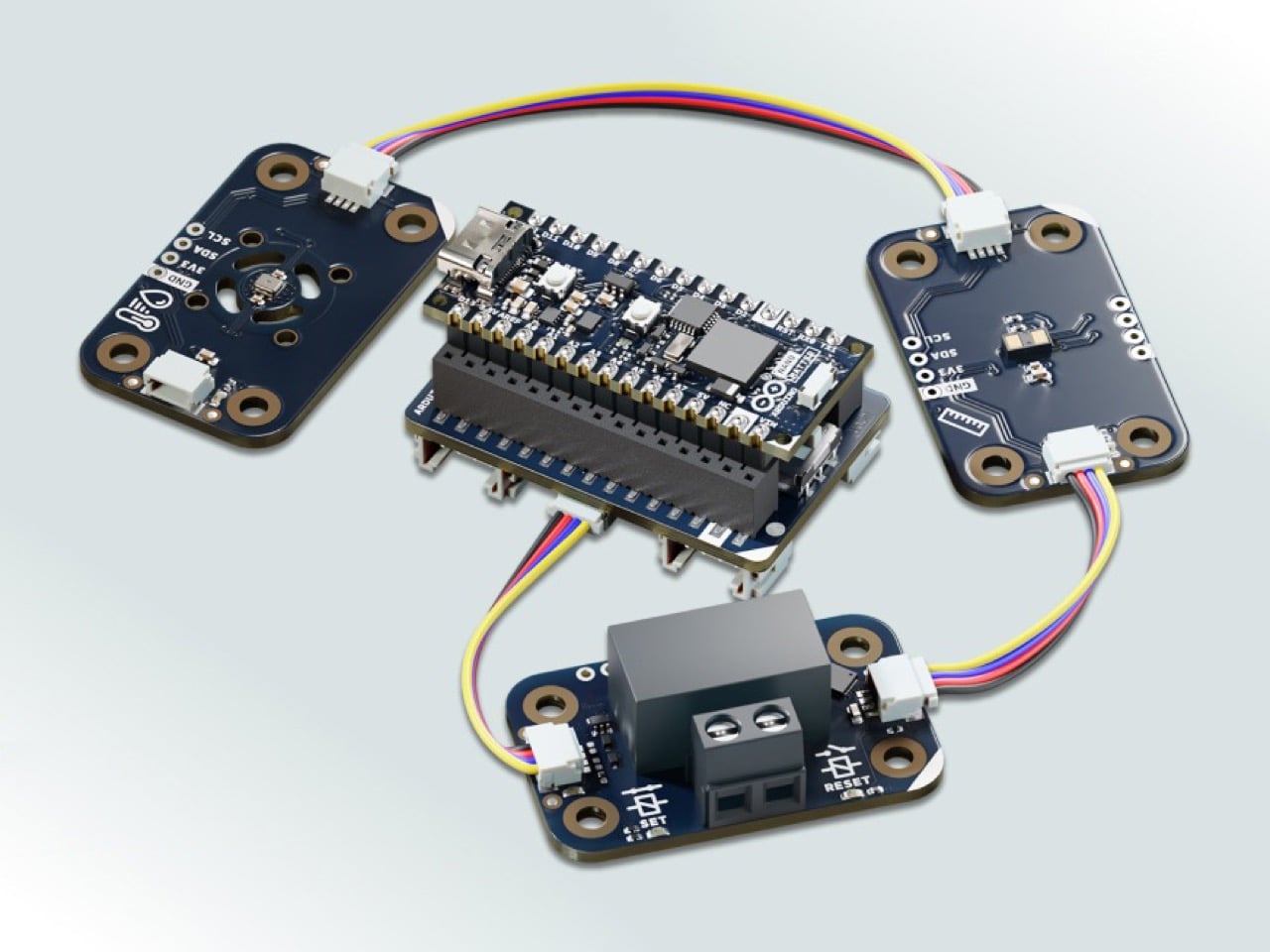
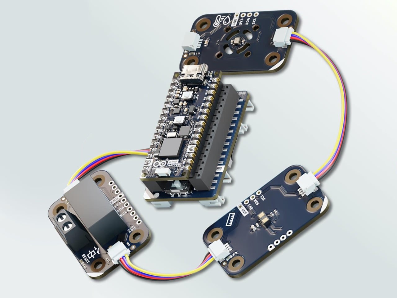
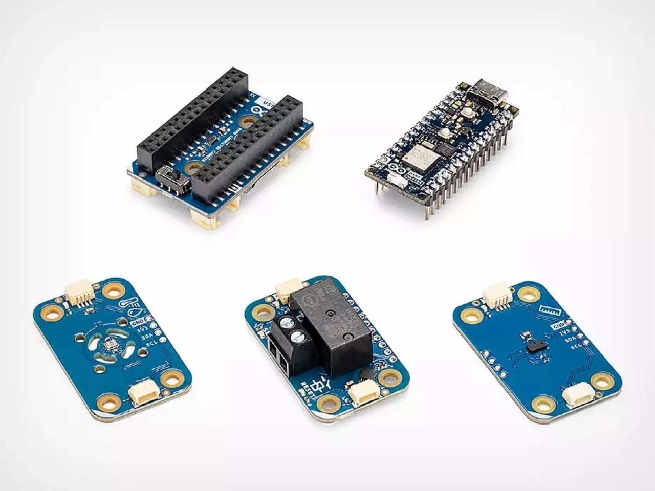
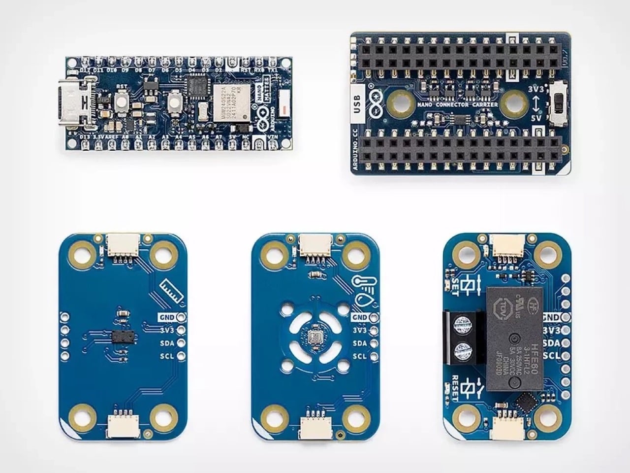
The kit is built around the Arduino Nano Matter, a compact but capable little board that forms the brain of whatever connected device you want to bring to life. Alongside it, you get a plug-and-play connector carrier that lets you snap in additional components without any soldering, and three sensor and control modules that cover the core building blocks of almost any smart home creation. One module handles switching real-world appliances and devices, one detects presence in a room using distance sensing, and one reads temperature and humidity. Output, presence, environment. Those three capabilities alone unlock a surprisingly wide range of DIY smart devices, all of which talk natively to Apple HomeKit, Google Home, Amazon Alexa, and Home Assistant right out of the box.

If the idea of jumping into this stuff headfirst sounds daunting, don’t worry… there’s a free 7-course curriculum you can access. Arduino built a free seven-module course on their Cloud platform that takes you from a complete beginner all the way through building devices that can be officially certified and even commercialized. The course balances theory with hands-on building, so you’re always making something tangible rather than just reading about abstract concepts. Complete the whole thing and you earn an Arduino Certified Engineer credential, which is a genuinely useful thing to have if you’re building a portfolio in the product design or IoT space.

The bundle was developed in collaboration with Silicon Labs, whose wireless chip technology powers the Nano Matter board at the kit’s core. All the complex smart home communication happens automatically in the background through Arduino’s Matter library, leaving you free to focus on the creative side of what you want to build and how you want it to behave. That’s been Arduino’s philosophy since the beginning, stripping away the intimidating technical layers so the idea can take center stage.

One small caveat worth knowing upfront: connecting your creations to a live smart home network requires a Thread border router, like an Apple TV 4K or a HomePod. Most households already deep in the Apple or Google ecosystem will have one without even realizing it. For everyone else, it’s a minor additional step before things really come alive.

The bigger picture here is genuinely exciting for tinkerers and creators wanting to hack together a product or an idea within an existing ecosystem. We talk about the smart home almost exclusively as a product category, something you buy off a shelf and plug into an app. Arduino’s Matter Discovery Bundle reframes it as something you design and build yourself, shaped around your actual space and your actual needs. Custom connected devices that fit your life rather than the other way around, available to anyone curious enough to try, for about the price of a nice dinner out.

The post Arduino’s $61 Matter Bundle Lets You Build Smart Home Devices That Work With Apple, Google, and Amazon first appeared on Yanko Design.

This Bonkers F1 Off-Road Racer Concept Puts Senna’s McLaren MP4/4 on Monster Truck Stilts

What happens when you yank one of the most dominant Formula 1 cars in history off the smooth tarmac of Suzuka and hand it the suspension travel of a Baja 1000 trophy truck? Pascal Eggert decided to find out, and the result is equal parts sacrilege and beautiful.

Eggert, a Presentation Director at EA DICE in Stockholm (the studio behind the Battlefield franchise) and former Art Director at Crytek, clearly spends his off-hours channeling a very specific brand of automotive madness. His latest personal project, titled “Offroad Racer,” takes the unmistakable silhouette of a late-1980s Formula 1 car and reimagines it as a lifted, wide-track off-road machine that looks like it escaped from a fever dream involving Ayrton Senna, the Dakar Rally, and a really ambitious RC car collection.

Designer: Pascal Eggert

The primary variant wears the iconic Marlboro McLaren livery in all its red-and-white glory, complete with the number 3 on the nose cone, Honda badging on the rear wing endplates, Shell logos, Canon branding, and Goodyear Eagle tires. For anyone with even a passing knowledge of F1 history, that combination screams McLaren MP4/4, the 1988 car that won 15 out of 16 races with Senna and Alain Prost behind the wheel. It remains one of the most successful single-seater race cars ever built, designed by the legendary Gordon Murray and Steve Nichols, powered by a Honda RA168E turbocharged V6. Eggert has taken that iconic bodywork and done something beautifully absurd with it.

The track width has been stretched dramatically. Long-travel double wishbone suspension arms sit fully exposed at both the front and rear, made from what appears to be tubular steel framework that would look right at home on a desert pre-runner. The ride height is jacked up considerably, giving the car enough ground clearance to tackle terrain that would shred a real F1 car’s floor in milliseconds. Up front, a pair of compact headlights sit recessed into the nose, giving the machine a menacing, almost insectoid face when viewed head-on. And at the back? The entire rear end is stripped bare, exposing a complex engine with a tangled web of exhaust headers, intake trumpets, and mechanical components that give the concept an incredibly raw, mechanical honesty. There is no rear bodywork hiding the powertrain. Everything is on display, and it looks glorious.

The rear wing, meanwhile, stays faithful to its F1 roots, mounted high on twin supports with the Marlboro branding proudly running across its main plane. It is a beautiful contradiction: a component designed purely for high-speed downforce on a vehicle that looks like it wants to jump dunes and spit rooster tails of dirt. A pretty audacious render below shows the car in full flight on a circuit, a helmeted driver hunched low in the open cockpit, flames erupting from the exposed exhaust. It captures the raw energy of the concept perfectly.

Eggert also presents a second colorway that swaps the Marlboro livery for a darker, moodier Martini Racing-inspired scheme. The base shifts to black with the signature blue, red, and light blue stripe work running across the bodywork and rear wing. This version, photographed in dramatic low-key studio lighting, feels like the nighttime counterpart to the Marlboro variant’s daytime bravado. Red LED taillights glow through the exposed rear mechanicals, and the overall effect is significantly more sinister. If the Marlboro version is the weekend warrior, the Martini edition is the car that shows up uninvited to a hillclimb at midnight.

What makes this project so compelling is the tension between two completely opposing design philosophies. Formula 1 cars are perhaps the most track-specific machines ever created, engineered down to the millimeter to extract performance from perfectly manicured asphalt. Off-road racers, by contrast, are built to survive chaos, to absorb impacts, to maintain composure when the surface beneath them is actively trying to destroy them. Eggert has found a surprisingly coherent visual language between these two worlds, borrowing the aggressive aero surfaces and low-slung cockpit from F1 while grafting on the muscular stance, generous wheel travel, and exposed mechanicals of desert racing.

It helps that Eggert brings serious professional chops to the table. His career spans time at Crytek, where he rose to Director of Visual Design and served as Art Director on titles like The Climb, before moving to DICE where he has worked on Battlefield V and Battlefield 2042. The man understands how to make vehicles look both believable and aspirational, and that game-industry sensibility shows in every render. The weathering on the bodywork, the subtle dirt accumulation, the realistic tire textures: everything is dialed in to sell the illusion that these machines actually exist somewhere, parked in a dusty garage, waiting for their next outing.

The post This Bonkers F1 Off-Road Racer Concept Puts Senna’s McLaren MP4/4 on Monster Truck Stilts first appeared on Yanko Design.

TORRAS’ Galaxy S26 Ultra Case Has a 360° Rotating Magnetic Stand, Leather-Like Skin, and a Design Award

Galaxy S26 Ultra users tend to fall into a specific category. They’re the people who picked the Ultra not because they needed the absolute maximum specs, but because they actually use those specs. The 200MP camera system gets put to work, the S Pen stays in regular rotation, and the phone handles everything from spreadsheet edits to client presentations. Cases for these users need to solve real problems, which makes the TORRAS Ostand Q3 Vegskin feel purpose-built rather than mass-marketed.

Vegskin covers the back panel with organic silicone fabric that mimics the texture of quality calfskin leather, complete with Italian-inspired embossing that delivers a matte, slightly velvety surface. The material resists oil and water stains while offering antibacterial and anti-mold protection, staying clean through daily handling without constant maintenance. Inside, a beige microfiber lining guards the S26’s glass back from scratches and scuffs. The combination of materials creates a case that works in business settings without looking sterile, pairs well with casual use without feeling too relaxed, and handles outdoor situations without compromise.

Designer: TORRAS

Click Here to Buy Now: $51.30 $56.99 (10% off, use coupon code “YANKO111”). Hurry, deal ends in 48-hours! Amazon Link Here.

The Ostand has been arguably TORRAS’ most clever invention, providing an ultra-slim yet robust O-shaped ring/stand that rotates on a 360° pivot point for flexible gripping as well as docking (while sitting flush against the case when shut). The Tora-Hold™ 
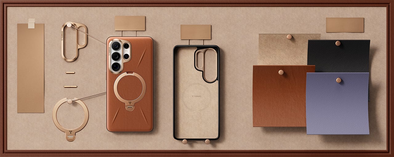
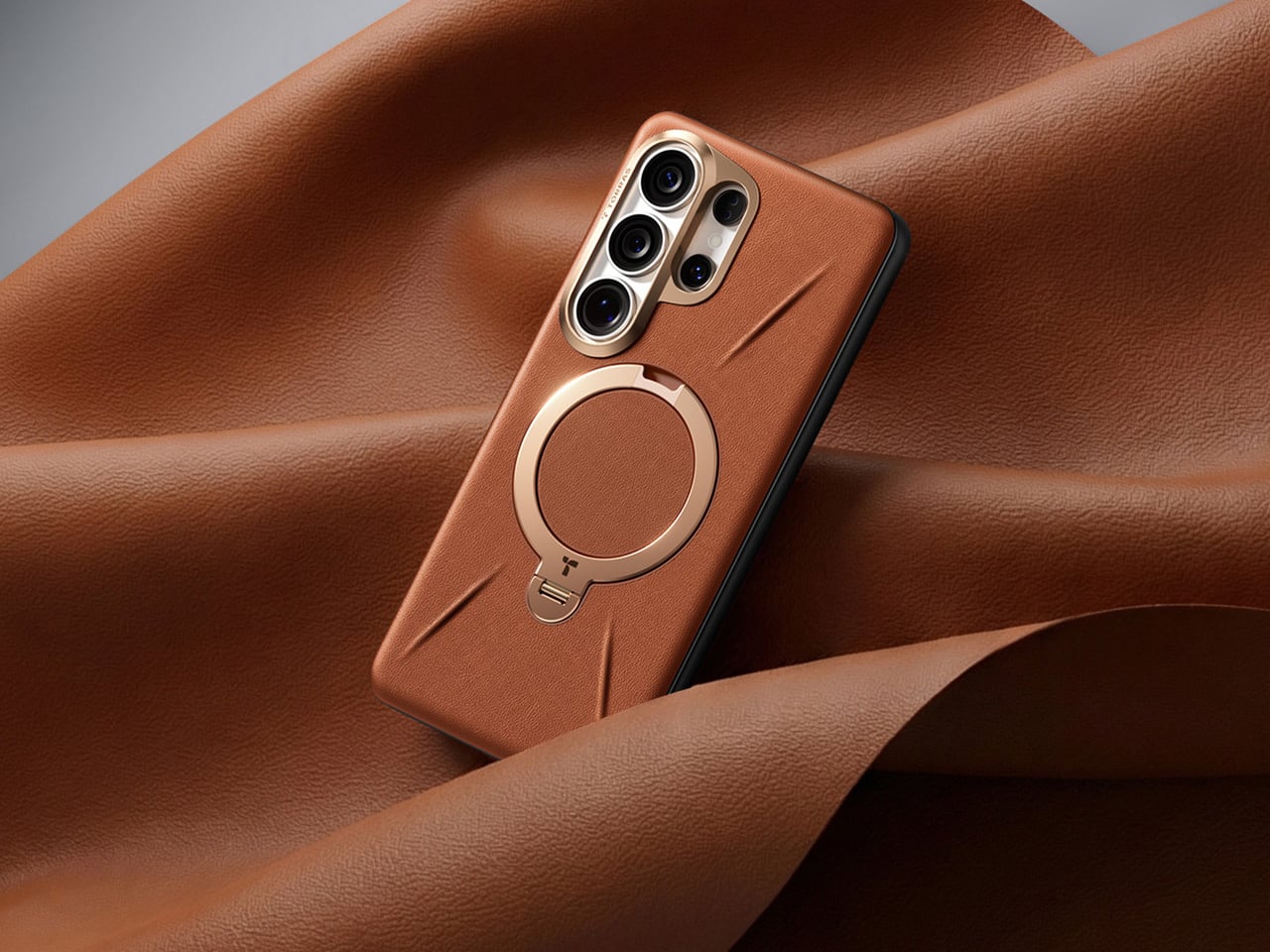
perfects on that technology by packing components that are slimmer, stronger, and somehow smoother in their motion and use too. Eight layers of intricate components (down to micrometers in thickness) deliver the 360-degree rotation with stable angle-locking at any position you choose. The stand measures 2.7mm thick, integrating seamlessly into the backplate when closed, which matters because most kickstand cases add noticeable bulk that ruins the phone’s profile. Flip it open and the hinge operates silently, tuned for smooth reliable motion through over 30,000 rotations according to durability testing. The aerospace-grade aluminum construction went through more than 400 trials refining texture, tone, and color, which explains why the champagne gold finish feels considered rather than flashy.

Four quick-stop positions at 90°, 180°, 270°, and 360° let you snap the stand into place for fast setup, but the mechanism also locks smoothly at any angle between those points – a feature I’ve come to absolutely fall in love with on TORRAS’ Ostand cases. The magnetic ring doubles as a stand and a mounting solution, delivering 15N of magnetic force that holds firmly to car mounts, refrigerators, whiteboards, or any magnetic surface you encounter. That force rating means the phone stays put during workouts or bumpy commutes, which makes the stand viable for actual use rather than occasional convenience. The one-click locking and hidden hinge design keeps the mechanism from feeling like an afterthought bolted onto the case. And, your S26 Ultra will be wireless charging capable with this case on.

The lens guard deserves its own mention because TORRAS designed it specifically for the S26’s camera layout. A precision raised frame wraps around the camera module, following Samsung’s left-high, right-low runway-and-pillar design that keeps the lenses elevated above flat surfaces. The protection works without blocking the flash, the 10MP telephoto cameras, or the radar sensors Samsung packed into that corner, so every shooting function stays fully operational. Camera bump designs change with every phone generation, and cases that ignore those specifics end up causing problems with focus or flash washout. TORRAS clearly mapped the S26’s exact sensor placement, which matters when you’re spending flagship money on computational photography.

The sides use concave TPU that curves to fit your hand naturally, creating a secure hold without adding aggressive texture or rubber grips that collect lint. Soft-touch TPU increases friction just enough to prevent slips while keeping the case comfortable during extended handling, which matters when you’re scrolling through long documents or editing photos. The metal buttons deliver precise tactile feedback with every press, maintaining the satisfying click of the S26’s physical controls instead of mushing them into spongy approximations. Samsung brought back the S Pen slot for the Ultra, and TORRAS built an ergonomic cutout that makes removal effortless with one press for smooth extraction. Little details like that separate cases designed around a specific phone from universal designs adapted to fit whatever Samsung releases.

TORRAS prices the Ostand Q3 Vegskin at $54.99, positioning it in premium territory alongside first-party Samsung cases and established accessory brands. Three colors cover different aesthetic preferences: Amber Brown for warmth and character, Obsidian Black for understated professionalism, and Amethyst Purple for users who want their tech to show some personality. The case works exclusively with the S26 Ultra, designed around that specific body and camera configuration. If you’re investing in the Vegskin, might as well grab one of TORRAS’s 9H hardness screen protectors too, since a premium phone with a scratched display isn’t particularly pleasing to the eye or the pocket.

Click Here to Buy Now: $51.30 $56.99 (10% off, use coupon code “YANKO111”). Hurry, deal ends in 48-hours! Amazon Link Here.

The post TORRAS’ Galaxy S26 Ultra Case Has a 360° Rotating Magnetic Stand, Leather-Like Skin, and a Design Award first appeared on Yanko Design.

The Vintage Apple Computer That Belongs on Every Tech Lover’s Shelf, in LEGO Form

In 1977, Steve Jobs walked through the kitchen appliance section of a Macy’s department store and came away with a vision for what a personal computer should look like. The result, shaped by industrial designer Jerry Manock and powered by Wozniak’s engineering genius, was the Apple II: a smooth, warm-beige enclosure that suggested domesticity rather than machinery. It belonged on a desk the way a telephone did. That calculated approachability helped sell millions of units across sixteen years of production.

LEGO Ideas builder BrickMechanic57 has translated that design philosophy into 1,772 pieces, and the attention to detail rewards anyone familiar with the original. The signature Pantone beige carries across the computer body, monitor, and dual Disk II drives. The rainbow Apple II badge sits front and center above the keyboard. Pull out the monitor screen and you get two display states: the authentic green-on-black DOS boot screen or a clean, powered-off black panel.

Designer: BrickMechanic57

Wozniak designed the Disk II floppy controller over the 1977 Christmas holidays and reduced the chip count from the industry standard of dozens down to six. Competing controllers from the same era used 50-plus chips and cost significantly more. Apple sold the Disk II for $495 in 1978, and the engineering inside that price point was borderline absurd. BrickMechanic57 stacks two of them beside the main unit, exactly as they appeared on real desks, and a brick-built floppy disk element actually inserts into the lower drive.

The real Apple II keyboard had no cursor keys in its original 1977 configuration, a REPT key for repeating characters, and RESET sitting exposed and dangerous in the top-right corner like a trap for clumsy typists. The close-up render of this build shows every one of those details reproduced faithfully, including the staggered layout, the CTRL and ESC placement, and the POWER button isolated at the lower left. The rainbow Apple II badge above it is sharp enough to make a vintage collector emotional.

The swappable monitor screen states are what separate a good LEGO set from a great one. The LEGO NES set had the working cartridge slot. The LEGO Atari 2600 had the joystick. This build has a DOS boot screen reading “APPLE II / DOS VERSION 3.3 SYSTEM MASTER / JANUARY 1, 1983” in green phosphor text, and that alone justifies the piece count. The monitor face pulls out cleanly, the off-state panel drops in, and suddenly you have two different display moments from the same machine’s life.

LEGO Ideas is the platform where fan-designed builds compete to become official retail sets. Any project that hits 10,000 supporter votes within its window gets reviewed by LEGO’s own designers, and the strongest candidates go into production. Previous successes include the NES, the Polaroid OneStep SX-70, and the Atari 2600. BrickMechanic57’s Apple II has 587 days left on the clock. Voting is free on the LEGO Ideas website, and if this one makes it to shelves, it will be because enough people who care about this history showed up.

The post The Vintage Apple Computer That Belongs on Every Tech Lover’s Shelf, in LEGO Form first appeared on Yanko Design.

Nothing Phone (4a) Is the Most Confident Phone Nothing Has Ever Made

The best thing that can happen to a design team is that they stop trying to go viral. Early Nothing had an almost anxious energy to it, products that felt engineered for the screenshot, for the unboxing video, for the moment of surprise. That produced some genuinely striking work, and some choices that aged less gracefully. The Phone (4a) suggests the team has moved past that entirely.

The Phone (4a) is the clearest expression of that shift yet. The pink colorway, the refined glyph interface, the periscope camera quietly migrating down to the base model, none of it screams for attention. It rewards it. This is a phone designed for people who will notice things gradually, over weeks of use, rather than in the first thirty seconds of an unboxing video.

Designer: Nothing

The pink is the first thing people will talk about, and most of them will get it slightly wrong. The phone reads pink, but the back panel is technically white. The color comes from tint layered inside the transparency, sitting between the glass and the resin underneath, which means the light has to travel through it before it bounces back to your eye. That gives it a depth and a luminosity that solid paint physically cannot produce. Nothing’s designers described it as starting with the resin being nearly identical to white, then adding a small amount of tint, then letting the tinted glass layer do the heavy lifting. The result shifts depending on the light you’re standing in, giving you a phone that changes ever so slightly in different lighting scenarios. It’s clever, considering Nothing’s done this in the past by playing with depth, relying on textures and components casting unique shadows based on the light source. Now, the company’s adding color to that formula.

Apple has been doing a version of this for years. The iMac G3 in the late nineties used translucent colored plastic to create that same sense of depth, and modern iPhones apply color to the inside surface of the rear glass rather than painting the outside. It’s a technique with a real legacy, and Nothing’s designers actually had a pink iMac on their mood board. That’s worth knowing, because it reframes the colorway from trend-chasing to something with genuine design lineage. The difference is that Nothing puts the engineering on display underneath it, so the tinted glass is also a window into the hardware, which layers the effect further.

The glyph interface on the (4a) is a 1×6 LED strip, and for the first time on an A series device, it includes the red recording indicator that has been on the numbered phones since the beginning. The team is almost protective about that red square, describing it as deserving its place on every device because being recorded carries real consequence. The animations have been rebuilt from scratch rather than ported from Phone (3), which matters because the linear format demands different thinking. The timer, for instance, uses a single falling column of light instead of the hourglass matrix on Phone (3). Same idea, different grammar. Glyph Progress now runs on Android 16’s live updates API, which means broader app compatibility across the board.

The camera doesn’t get talked about much, but it’s clearly an important part of any phone’s design and spec sheet. For starters, its design relies on a format set by its predecessor, the (3a). No fancy changes, no weird alignment like the (3a) Pro, just homogeneity… with a few upgrades. The periscope module in the (4a) uses a tetraprism design, bouncing light through multiple internal reflections to achieve optical zoom in a package compact enough to fit the base model’s profile. The (3a) Pro had a periscope too, but this one is significantly smaller. Nothing has been careful to represent the internal hardware authentically through the cover panel design, so what you see through the back is a stylized but honest reference to what’s actually underneath, including the PCB boundary, the FPC connectors, and the wireless charging coil.

Nothing announced there will be no flagship this year, and that decision reframes everything about the (4a). The A series carries the full weight of the brand’s hardware story in 2025, which means this phone needed to be genuinely good rather than good for the price. The same core design team has been on the A series since the 2A, and that continuity is visible in the way the (4a) sits between its predecessors, borrowing proportions from both without feeling like a compromise. They’ve stopped performing and started building, and the (4a) is the clearest evidence yet that those are very different things.

The post Nothing Phone (4a) Is the Most Confident Phone Nothing Has Ever Made first appeared on Yanko Design.

Forget Smart Pens. This Titanium Fidget Pen Writes, Clicks, Spins, and Delights.

Your hands are restless by design. Even when you’re sitting still and supposedly focused, they want to press something, rotate something, click something into place. This tendency has been pathologized and productized in equal measure, first by disapproving teachers, then by the fidget spinner industry. But before any of that, there was just the pen. The clicking ballpoint. The cap you’d snap and unsnap. The barrel you’d roll between your knuckles during a long phone call. Pens have always had a secondary life as objects of physical preoccupation, and most people who’ve ever worked at a desk know exactly what that feels like.

SPINNX takes that secondary life and makes it the whole point. Built by WEIWIN out of aerospace-grade titanium and held together by magnets, the pen separates into three modules that each deliver a distinct tactile sensation. Snap them together and there’s a crisp magnetic click. Press the spring-loaded ball in the middle and it gives you another one. Spin the dice top and it rotates through a series of rhythmic mechanical detents. The pen tip deploys with a twist rather than a click, because even the functional part of the experience has been thought through. Three years of development, ten design revisions, and one very specific goal: a pen that writes and delights.

Designer: WEIWIN

Click Here to Buy Now: $59 $102 (42% off). Hurry, only 168/200! Raised over $46,000.

The three-part system allows you to reconfigure the pen’s entire sensory output. You can flip the middle module to put the spring-loaded ball on top for a different kind of thumb-actuated click. Each combination changes the weight distribution and the way the pen feels in motion, which creates a surprisingly deep rabbit hole of tactile experiences. The team claims over fifty different ways to spin and fidget with the thing, and that number feels plausible once you start playing with it. The design provides a whole palette of physical feedback, letting you find the specific sensation your brain needs at that moment to stay locked in.

The snap of two modules connecting sounds like a well-tuned mechanical keyboard switch, something the designers obsessed over to ensure the end-product has a strong audio-visual-tactile experience. WEIWIN engineered the acoustic and tactile response of each magnetic separation and reconnection as an intentional product feature, treating the sound with the same design attention as the geometry… sort of like how luxury car designers obsess over how the doors sound when they close. Most clicking pens produce their click as a mechanical consequence, with nobody sitting in a room deciding whether it needs to be crisper or more controlled. With SPINNX, somebody clearly did sit in that room, and the result is a snap that feels sound-designed for sheer satisfaction.

The dice module functions like a high-quality EDC spinner, rotating with a series of crisp, audible clicks that feel like running your thumb over the crown of a well-made watch. Its ceramic bearing ensures the rotation is smooth and completely unaffected by the precision-engineered magnets holding the pen together. Choosing a non-metallic bearing is the kind of small, deliberate decision that separates a durable tool from a simple toy. Beyond the satisfying spin, it serves as a simple decision-making device. When you’re stuck between two choices, a quick roll gives you an answer, which is a surprisingly effective way to get past minor mental roadblocks.

Choosing aerospace-grade titanium for the body does more than just add a premium feel. The material provides a specific heft and durability that aluminum or steel can’t quite match, giving the pen a reassuring presence in the hand without being overly heavy. This balance is critical for an object designed for constant manipulation. The pen tip itself deploys with a smooth twist mechanism, which feels more deliberate and controlled than a standard clicker. WEIWIN also engineered its own proprietary “Super Refill,” which they claim has up to six times the writing life of a standard refill. Sure, it won’t work with standard refills, but standard refills only last 1/6th as long as the one that comes with the SPINNX.

There’s an optional Maglev Pen Stand that completes the package for anyone who spends most of their day at a desk. The stand uses magnetic levitation to balance the pen perfectly upright, letting it float and glide with a gentle touch. It turns the pen into a kinetic sculpture when you’re not using it, a piece of interactive art that settles back to its center with precision. This stand isn’t just for storage; it’s an extension of the pen’s core philosophy. It’s another way to engage your hands and mind with a simple, satisfying physical interaction, turning a moment of pause into something quietly delightful.

The standard SPINNX comes in four finishes. The base model is a silver-colored aluminum for $59, while the premium versions are offered in natural titanium, matte black titanium, and a striking brass-colored titanium for $69. For those who want the complete experience, a $99 Professional Kit bundles the pen with a leather pouch and other accessories. There are also several add-ons available separately, including extra refills, a calfskin leather pouch for protection, a spiral module to swap with the dice cap for a different visual flow, and the magnetic fidget sticks for more desk-based play. The Maglev Pen Stand is also available as a standalone $35 purchase. All SPINNX variants ship worldwide starting April 2026.

Click Here to Buy Now: $59 $102 (42% off). Hurry, only 168/200! Raised over $46,000.

The post Forget Smart Pens. This Titanium Fidget Pen Writes, Clicks, Spins, and Delights. first appeared on Yanko Design.

This Resin Chair Has a Real iMac, Magic Keyboard, and Mouse Sealed Inside It… Because ‘Art’

There’s a common saying that beauty hurts. Pretty shoes that blister your heels by noon. A dress cut so perfectly that breathing becomes a optional. The needle of a tattoo tracing something meaningful into your skin. Or even a surgical knife, for the dream of a better face or physique. People have always been willing to trade comfort for something that looks or feels transcendent, and the logic has always made a strange kind of sense. What I never anticipated was applying that same sentiment to sitting on an iMac.

Dip1, a chair by Korean designer Lim Wootek, takes that idea literally. The backrest is a real iMac monitor, its slim aluminum frame pressed against your spine as you settle in. It sounds wrong. It feels wrong. And somehow, that wrongness is exactly what makes it so addictive to look at. The keyboard, mouse, and storage bins are encased beneath the seat in a glowing block of cyan resin, visible through the haze like memories you recognize but can no longer touch. I guarantee you, you’ll grimace at the thought of sitting on the chair, as you lean back against what might be the most expensive and engineered backrest known to mankind.

Designer: Lim Wootek

The resin block is where the craft gets interesting. Lim sealed a full Apple Magic Keyboard, a Magic Mouse, and a set of colored desktop storage bins inside the body of the chair. The bins are the kind that live on studio shelves holding batteries, USB cables, and every small object that never quite found a permanent home. Through the semi-translucent resin, their shapes read clearly near the seat surface and dissolve into soft blur toward the base. That gradient from legible to ghosted is the whole thesis of the piece made physical, and it required real material control to pull off at this scale.

The iMac is a 27-inch model, the flat-chinned aluminum design that Apple ran from 2012 through 2022, with the display sitting at 68.6cm diagonally and the full unit standing around 65cm tall. These are not small numbers, and the chair has the presence to match. The monitor backrest positions the screen at exactly the height you would have once made eye contact with it, which means the sitter has literally turned their back on it. The screen now faces outward, away from the person in the chair, and that single spatial decision carries more conceptual weight than most designers manage in an entire project.

Standard seat height on the resin block sits at around 45cm, which is ergonomically normal, and that normality is part of what makes the piece so disorienting. You could actually sit in this. People do sit in this, as the campaign photos show. A figure in all black, hooded, leaning back against the aluminum monitor stand with the posture of someone who has fully accepted the situation. The chair functions, and that functionality makes the statement sharper rather than softer.

Lim Wootek’s studio works across industrial design, digital design, mold design, and CMF, and Dip1 has all four disciplines firing together. The resin body has soft radii on the seat edges and a gently tapered base that stops it from reading as a plain block. The cyan is specific, close to shallow tropical water, which is why the submerged objects feel genuinely drowned rather than just encased. Getting optical clarity, structural load capacity, and color depth to coexist in a resin cast this large is a serious material engineering problem, and the fact that it reads as effortless is the tell of someone who actually knows what they’re doing.

The post This Resin Chair Has a Real iMac, Magic Keyboard, and Mouse Sealed Inside It… Because ‘Art’ first appeared on Yanko Design.

Functional LEGO Sewing Machine actually moves a needle up and down when cranked

There’s nothing from stopping this LEGO machine from actually sewing clothes, apart from the fact that attaching a real needle to it would make it an ‘illegal’ build. Illegal builds in LEGO are when you use bricks in unauthorized ways (wedging them, gluing them, using them upside down), or using non-brick parts in a LEGO build. Sadly, this rather outdated law is the only thing preventing BrickStability’s Sewing Machine from letting you stitch clothes, kerchiefs, and quilts together.

What I love about LEGO MOCs (My Own Creations) is that some people try to achieve aesthetic perfection, while others try to actually make LEGO builds functional. There’s a LEGO lawnmower that cuts grass, a LEGO Typewriter that types, and even a functional LEGO Turing Machine that ‘computes’. Add this sewing machine to that list because it isn’t just a visual masterpiece, it’s complicated, intricate, and to a great extent, functional.

Designer: BrickStability

It’s true that nobody can agree who first invented the ‘sewing machine’. Elias Howe is credited with the version we popularly use today, although Thomas Saint, Barthelemy Thimonnier, and Isaac Singer are all also attributed as key figures in helping create some version of the modern-day sewing machine. This particular version, the lockstitch sewing machine, was patented in 1846 by Elias Howe, and while the LEGO MOC isn’t exactly Howe’s patented design, it’s an antique machine that takes that lockstitch technology and packages it into a form factor a lot of us recognize even today.

There are multiple YouTube shorts and GIFs on how these machines actually ‘stitch’ clothes, but the simple explanation is that a rotating element (powered by a crank on the side or a foot-pedal at the bottom) moves a special needle up and down, while a spool feeds continuous thread directly to the needle. As you stitch, the machine creates that rhythmic noise associated with tailoring shops, while the spool gradually rotates too, feeding thread into the ever-hungry machine.

BrickStability’s version is gorgeously accurate. Not only is it functional (the crank rotates and the needle element moves up and down), it also comes with LEGO spools of colored thread, along with a tailoring scissor made from LEGO bricks too. The machine is black, just like almost every machine in that time (funnily enough I only remember the motorized ones as being white in color), and comes with some ornate gold brickwork, reminiscent of the detailing seen on vintage machines.

This MOC is different from the usual ones we feature on the website. It wasn’t created for LEGO Ideas the way we know it, but rather, was designed as a submission for a challenge hosted by LEGO on its Ideas website. Needless to say, it took home the grand prize, and one can only hope LEGO actually turns this build into a real retail box set!

The post Functional LEGO Sewing Machine actually moves a needle up and down when cranked first appeared on Yanko Design.

Modded Transparent iPhone Air with a Working SIM Slot Looks Like Apple and Nothing had a Dream Child

12:28 AMHuaqiangbei operates on its own physics. The sprawling electronics market in Shenzhen is the place where flagship smartphones get dismantled, reimagined, and rebuilt into things their original manufacturers never approved and probably never imagined. It runs on American time, buzzes with microscopes and milling machines, and treats the word “warranty” as a polite suggestion. If you want something done to your phone that a brand explicitly decided against, this is where you go.

Taiwanese creator Linzin Tech went there with a blue iPhone Air, the thinnest iPhone Apple has ever made and the first one sold without a physical SIM slot anywhere in the world. He left with something that looks like a cyberpunk collector’s piece: a fully transparent-backed iPhone Air with a functioning nano-SIM tray carved directly into its frame, wired into the motherboard by hand, under a microscope, late at night. A Dbrand X-Ray case could never…

Designer: Linzin Tech

YouTuber Scotty Allen built an iPhone with a headphone jack in Huaqiangbei. He also assembled a working iPhone almost entirely from parts bought off the street there. The market has this reputation for turning Apple’s deliberate omissions into solved problems, and the community around it keeps raising the difficulty level. Linzin’s challenge was particularly gnarly because he wanted two separate modifications on Apple’s most space-constrained iPhone ever, one cosmetic and one structural, and both required touching parts of the phone that Apple engineers spent years optimizing down to the millimeter.

The transparent back came first, and the process was a laser job performed on the rear glass panel. Technicians at Changlong Technology stripped the internal paint layer without touching the MagSafe charging coil sitting directly beneath it, which is about as precise as it sounds. Once the coating was gone, the phone’s internals became fully visible through the glass: the battery, logic board, shielding, internal connectors, and the flexible cable running between the upper and lower assemblies with “Changlong Technology” printed right on it. The Apple logo floats above actual hardware now. It looks like a concept render that somehow got approved.

The iPhone Air has no physical SIM slot in any market, globally, which meant Changlong’s team had to use a CNC milling machine to carve a slot opening into the phone’s ultra-thin metal frame. The original Taptic Engine had to come out entirely because there was simply no room for both it and a SIM tray in that chassis. A smaller third-party linear motor went in its place. Linzin estimates the haptic feedback at around 98% of the original, with the main perceptible difference being less granularity between light and heavy vibration patterns. Apple’s Taptic Engine is genuinely one of the finest haptic systems in consumer electronics, so even a 2% degradation is something purists will notice.

Board-level microsoldering connected the new SIM reader to the motherboard, and after a reboot the phone recognized a physical nano-SIM and connected to a carrier on 5G. Hot-swapping requires a restart to register a new card, which is a minor workflow tax. The thermal picture is less rosy. The graphite heat spreader sheets were casualties of the laser process and were not fully reinstated, which pushed operating temperatures noticeably higher under sustained load. Linzin ran 20 rounds of stress testing and confirmed the throttling. IP68 water resistance is also gone the moment the frame gets milled. And on the morning he flew back to Taiwan, the microphone ribbon cable came loose, sending the phone back to Shenzhen for repairs.

Close-up of the machined SIM tray

Here is the thing though. Linzin paid real money for a phone Apple sells for a premium, then paid again to have it modified, accepted degraded thermals, lost water resistance, voided his warranty instantly, and still calls it worth it. His reason is genuinely practical: he changes phones weekly and eSIM-only means a carrier visit every single time. The modification solves a real problem for a specific kind of power user, and it does so with enough visual drama that you would probably auction this thing for three or four times its retail price. Huaqiangbei has been poking holes in Apple’s “impossible” list for years. This one just happens to be the most beautiful hole yet.

The post Modded Transparent iPhone Air with a Working SIM Slot Looks Like Apple and Nothing had a Dream Child first appeared on Yanko Design.

This Hollow-Handle Titanium Kitchen Knife Actually Shifts Its Own Balance Point Toward the Blade

That elongated oval cutout running through the handle of the Titanion APEX catches attention first. It reads almost like a tuning fork, or a beautifully machined piece of industrial hardware that ended up on a cutting board. The form is deliberate on multiple levels: it trims weight from the handle end, which naturally shifts the balance point forward toward the blade. For cooks who prefer that blade-forward feel, the shift is immediately noticeable. And because the whole knife is machined from a single continuous piece of TC4 titanium alloy, there are no separate components, no rivets to rust, no scales to loosen over years of daily use. The result is a full-tang construction by default, which, in a knife made from one of the strongest lightweight metals on the planet, makes for an exceptionally robust tool.

Titanion is a Hong Kong-based brand with three years of focused research into bringing aerospace-grade titanium materials into everyday kitchen use. Their previous tools have already attracted over 5,000 professional chefs and dessert masters as loyal users. The APEX series is their most knife-forward move yet: two serrated blades, a Titanium Bread Knife and a Titanium Multifunctional Serrated Knife. The blade is forged from high-performance 10Cr15MoV steel with precision serrated edges, boasting outstanding hardness, wear resistance, and long-lasting sharpness. Titanion claims this is the first serrated kitchen knife on the market to feature a titanium alloy handle.

Designer: Byron Ho

Click Here to Buy Now: $81 $116 (30% off). Hurry, only a few left!

The bread knife runs 13.98 inches (35.5cm) total, sitting on the longer end of the bread knife category, which means more stroke per pass and fewer awkward repositions on a large loaf. Titanion uses a segmented serration pattern: larger wavy serrations on the main cutting area for smooth strokes without crushing the crumb, and finer serrations at the tip for piercing hard outer crusts, croissant shells, and thick-skinned fruit. That dual-geometry setup sounds like marketing until you’ve worked through a dense sourdough and realized the tip teeth were doing actual work before the wavy section ever takes over. Blade thickness sits at 0.06 inches (0.15cm), keeping the profile lean enough for clean slicing without wedging. The longer format also makes it useful beyond bread, handling anything that benefits from a long, smooth sawing stroke.

The utility knife at 9.45 inches (24cm) takes a completely different approach: consistent serration from base to tip, the same tooth geometry across the entire blade for stable and uniform cutting performance on whatever it’s working through. That uniformity makes it a genuine generalist, handling root vegetables, steaks, small pastries, and protein foods with equal confidence. Roughly half the length of the bread knife, it’s maneuverable enough for intricate prep but substantial enough for harder cuts, and the compact size pairs well with the ergonomic titanium handle during active cooking. Consistent serration also makes future sharpening more predictable, something the bread knife’s dual-geometry complicates. The two knives fill completely different roles and work as actual complements in daily kitchen use.

TC4, or Grade 5 titanium alloy, runs about 40% lighter than stainless steel while combining superior strength, corrosion resistance, and heat tolerance. The same alloy shows up in aircraft structural frames and orthopedic implants, both of which make the kitchen counter look like a retirement post for the material. In a culinary context, the relevant properties are direct: no moisture absorption, no odor retention, no degradation over time, and full corrosion resistance against acidic ingredients like citrus or vinegar. The 10Cr15MoV steel on the blade side is a high-carbon, high-chromium martensitic stainless that maintains stable sharpness and holds its edge under heavy use significantly better than standard stainless steel options. Together, the materials spec reads closer to precision tooling than kitchen cutlery.

The hollow-out handle is an ergonomic device as much as a visual one. It enhances tactile feedback through the grip, ensures a secure hold even in damp or greasy environments, and significantly reduces fatigue during use. Titanion built in distinct finger grips and a thumb support area, with a flowing contour that allows users to naturally position their thumb and index finger close to the blade’s balance point for a comfortable and precise grip. The oval opening doubles as a hanging point for wall or rail storage, with no extra hardware required. On a knife that gets reached for multiple times a day, small ergonomic decisions like that compound quickly into meaningful quality of life.

Pricing runs $100 for the bread knife, $75 for the utility knife, and $175 for the twin set at the Super Early Bird tier, amounting to a 30% discount on the original price. A discount you should absolutely grab if you’ve made it this far. International shipping is a flat $15 worldwide, with knives delivering starting August 2026. That’s because machining single-piece titanium knives individually takes way more time than snapping components together with glue and rivets. Also, Titanion doesn’t necessarily provide a warranty on the knives, because they don’t need to. Rest assured your GR5 titanium knife will probably outlast you, and then your grandkids too. Wait, why are you still reading? The link’s down below!

Click Here to Buy Now: $81 $116 (30% off). Hurry, only a few left!

The post This Hollow-Handle Titanium Kitchen Knife Actually Shifts Its Own Balance Point Toward the Blade first appeared on Yanko Design.