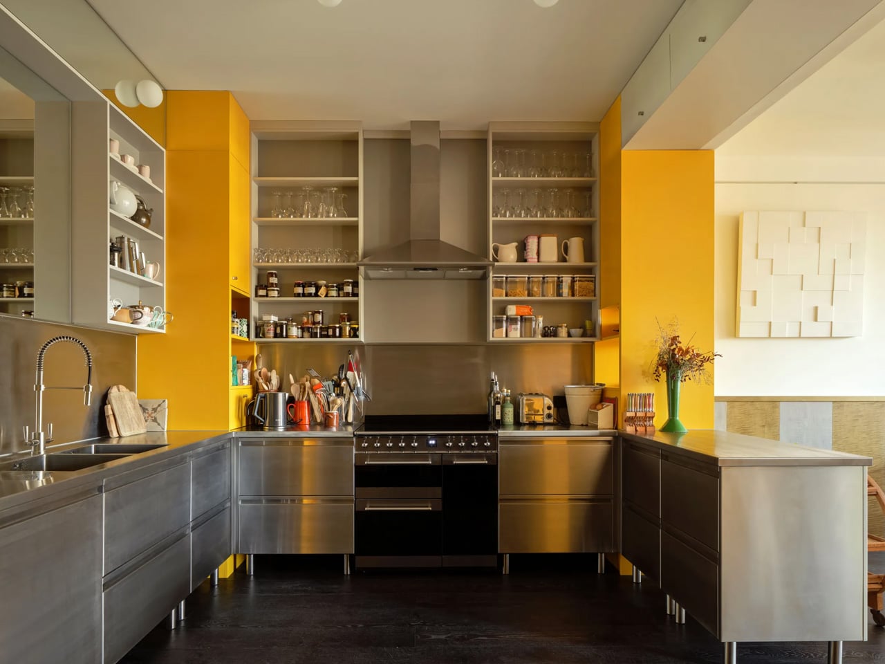
7 Best Tech Gadgets of August 2026

August arrives with a lineup that feels genuinely considered. Not every gadget this month is chasing a headline spec or fighting for shelf space. Some of the most interesting things landing right now are smaller, quieter, and more honest about what they actually do — a folding mouse that disappears into a shirt pocket, a bedside unit that replaces three devices at once, and a dual-screen E Ink tablet that finally treats reading and writing as a single workflow rather than two separate tasks competing for the same screen.

There’s also something larger worth paying attention to. Samsung is officially pulling back the curtain on the Galaxy Z Fold 8 this month, and what’s shaping up as a tiered foldable lineup could redefine the category’s identity. Meanwhile, Google has quietly slipped a new smart speaker onto store shelves for the first time in six years. August, as it turns out, rewards patience — and knowing exactly where to look.

1. piBrick Pocket-CM5
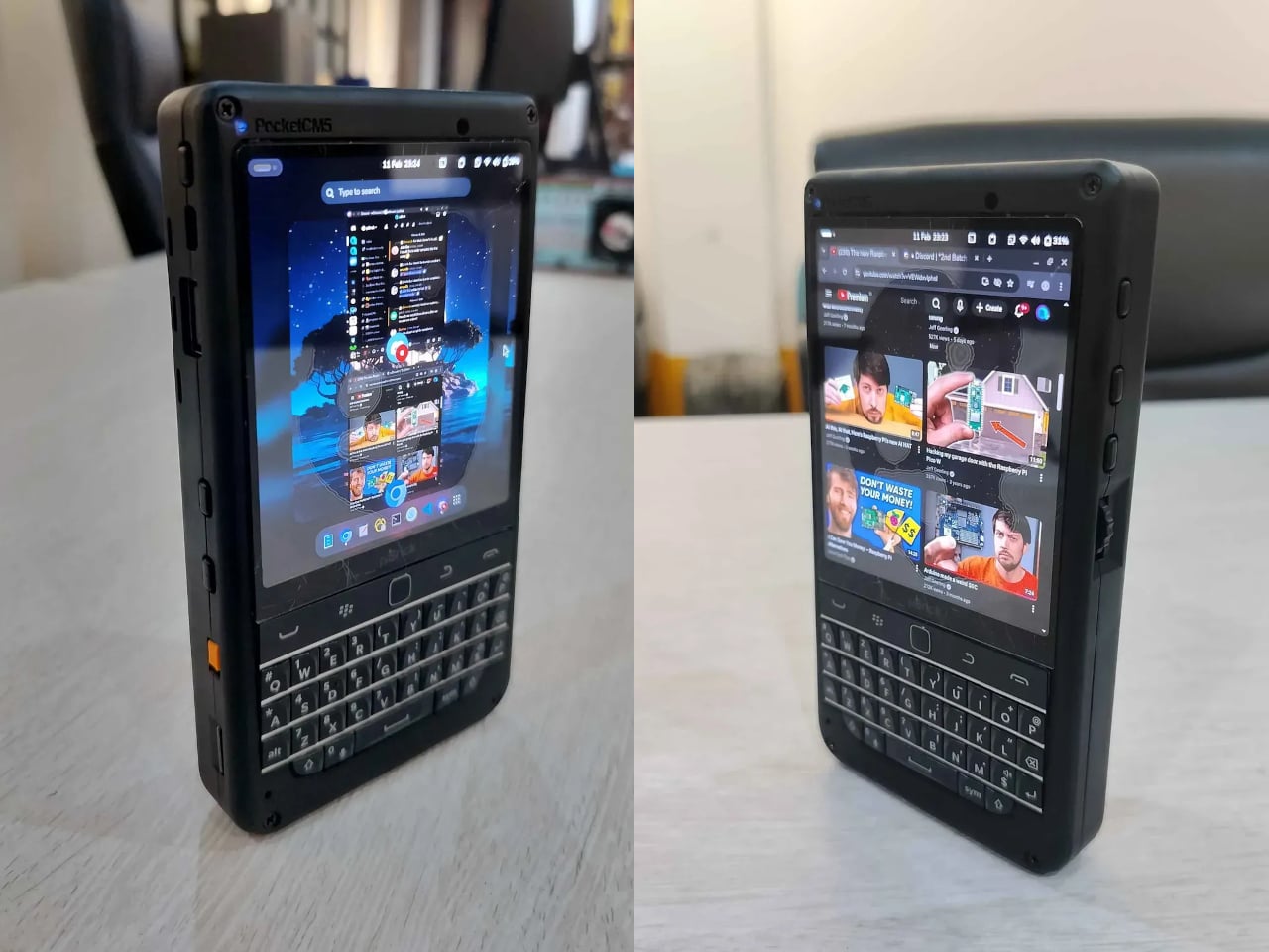
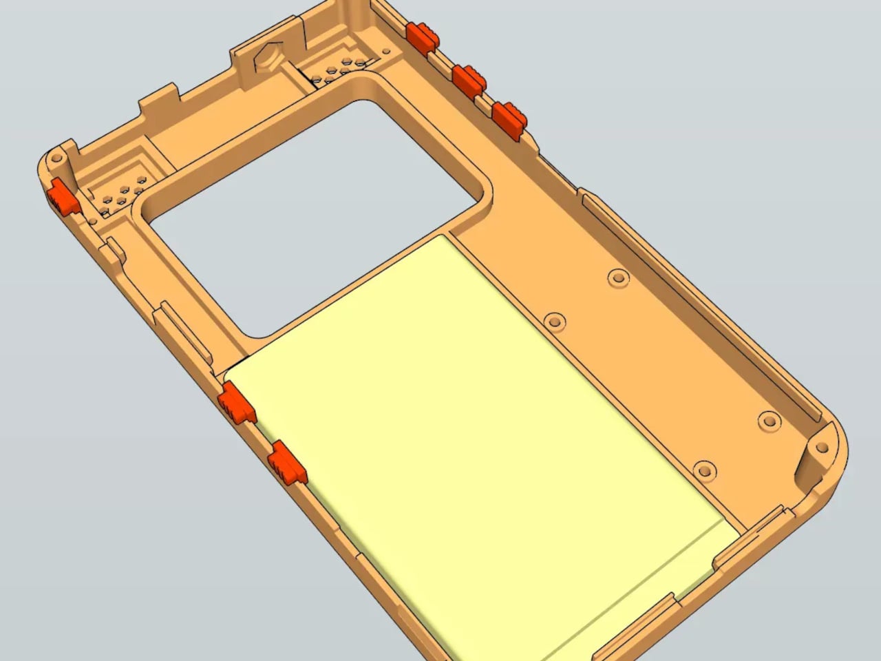
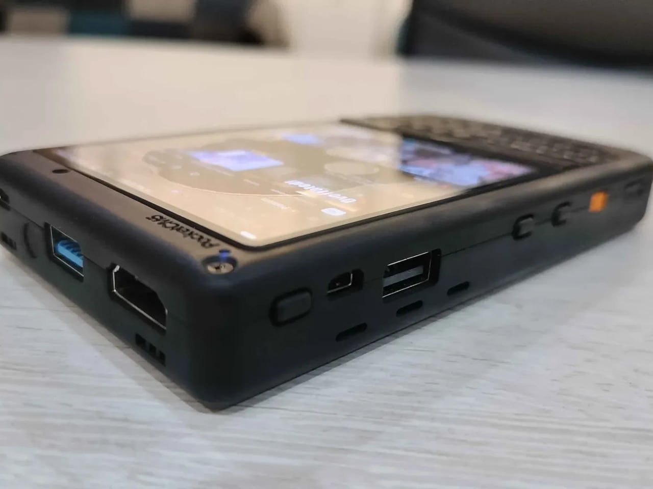
The piBrick Pocket-CM5 is one of those projects that reads better the longer you spend with the spec sheet. Built by Ahmad Amarullah on a custom PCB designed around the Raspberry Pi Compute Module 5, this open-source handheld costs around $172 in parts and arrives at smartphone proportions — 80 × 145 × 19.6mm. The 3.92-inch AMOLED display runs at 1080 × 1240 and 90Hz with Asahi tempered glass over the top, which is the kind of detail that separates a deliberate design from a prototype that merely happens to work. Full-size and micro-HDMI outputs mean the same pocket device can drive an external display when a larger workspace makes more sense.

The BBQ20 keyboard with its integrated BlackBerry-derived trackpad gives the piBrick a tactile depth that touchscreen-only handhelds cannot match, and side rotary encoders plus five programmable buttons extend the input options further still. A 5,000mAh LiPo keeps everything running, NVMe SSD support in 2230 or 2242 formats handles storage, and USB 3.0 with Type-A and Type-C covers connectivity. The most quietly useful feature is USB-HID mode — plug the piBrick into any external machine and its keyboard and trackpad instantly become a functional input device, independent of the Pi entirely. For a sysadmin who shows up at a server rack without a spare keyboard, that framing changes the device from hobbyist novelty to legitimate daily carry tool.

What we like:

  • USB-HID mode turns the whole device into a USB keyboard for any external computer
  • 90Hz AMOLED at this price point and form factor is a genuinely rare combination

What we dislike:

  • Requires hands-on sourcing, PCB manufacturing, and 3D-printed shell assembly
  • The compact BBQ20 keyboard layout carries a real learning curve for extended typing sessions

2. OrigamiSwift Folding Mouse

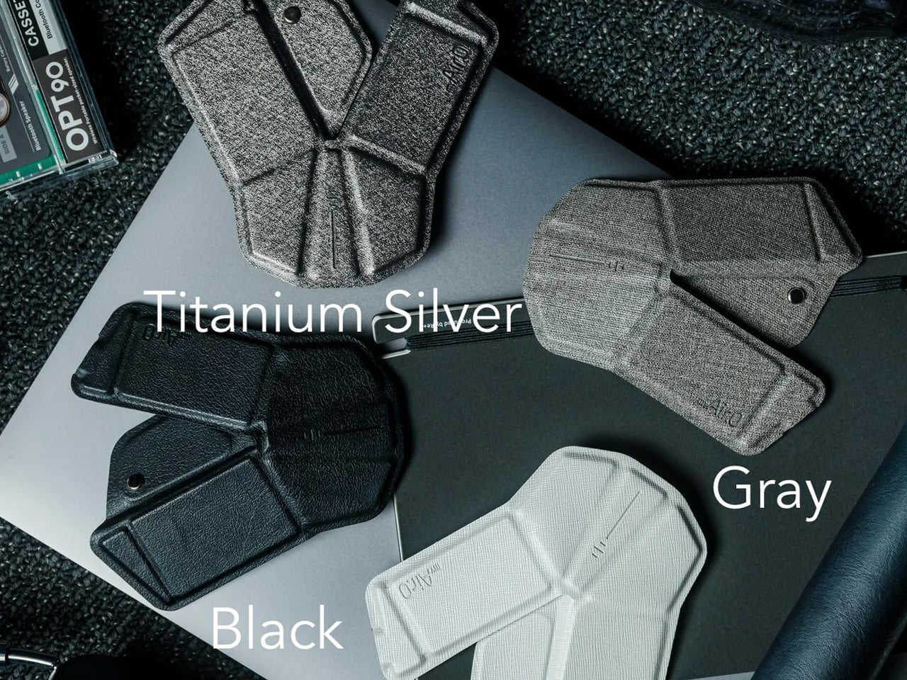
The OrigamiSwift is a Bluetooth mouse that folds flat to 0.18 inches — thinner than most notepads — and springs back into a full-size ergonomic form in under half a second. Designed by Horace Lam and built around the geometry of traditional origami folding, it weighs just 40 grams and connects over Bluetooth 5.2, with a 4,000 CPI HD infrared sensor tracking at up to 30 inches per second. For digital nomads and frequent travelers, the appeal is immediate: full-size mousing comfort that compresses to the front pocket of a bag without any structural compromise.

Soft-click buttons and a smooth, consistent glide make it discreet in quiet environments, and the triangular origami structure that enables the folding mechanism also gives the frame enough rigidity to absorb daily use without flex. Battery life is a genuine standout — one USB-C charge lasts up to three months, which removes the disposable battery cycle from the equation entirely. At $85, it sits in a price range where compromises tend to accumulate, and the sensor performance, weight, and build quality keep most of them from appearing. It works across Mac, iPad, Windows, and Android without additional drivers, which keeps the setup frictionless wherever you end up working.

Click Here to Buy Now: $85.00

What we like:

  • Three-month battery life on a single USB-C charge is genuinely exceptional for a wireless mouse
  • 40 grams means you stop noticing it’s in your bag until the moment you actually need it

What we dislike:

  • 4,000 CPI ceiling may not satisfy users working on high-resolution or multi-monitor setups
  • Stock is currently very limited, with only a few units available in the shop

3. Divoom FlowToo
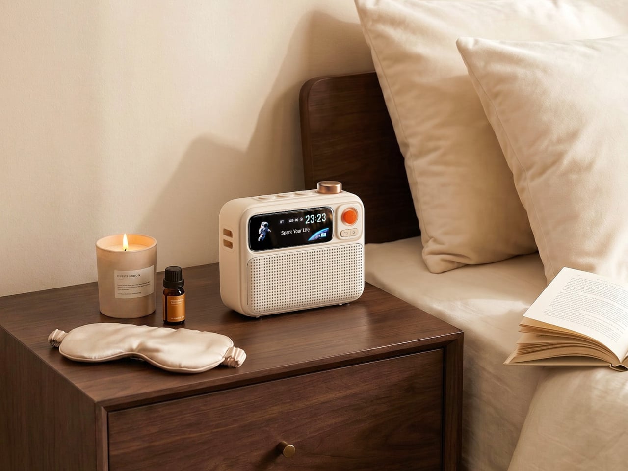
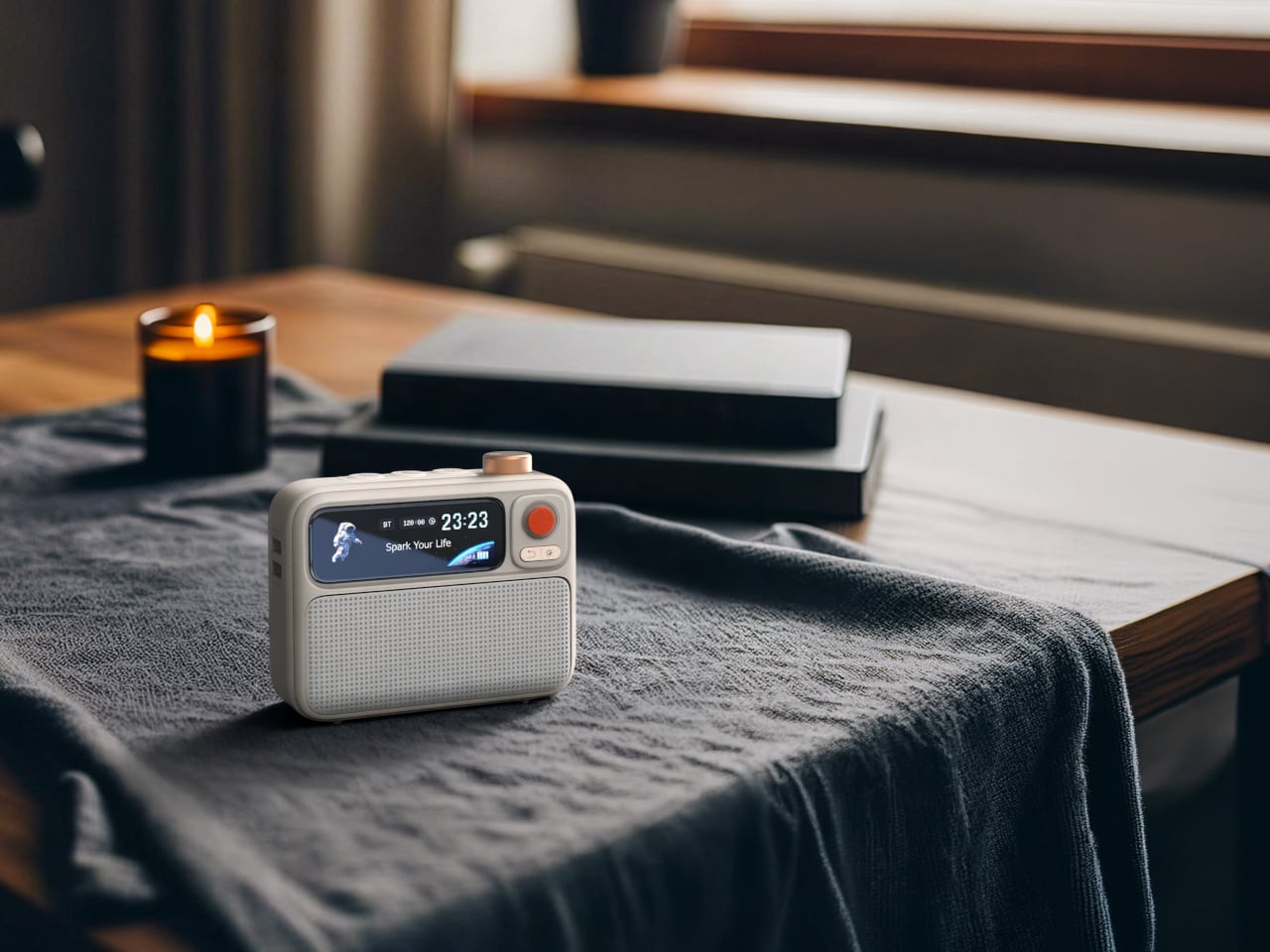
The Divoom FlowToo costs $99.99 and replaces three things that have been quietly cluttering nightstands for years — a Bluetooth speaker, a white noise machine, and an alarm clock. It runs through a 10W amplifier with a 45mm full-range driver, which is enough to fill a bedroom at a respectable volume without the sound becoming harsh at the high end. More than 90 built-in sounds cover the categories people actually reach for at night and during focus sessions, from rain and ocean ambience to forest and calming tones, and the Divoom app handles everything from alarm scheduling to sound selection directly from your phone.

The 2.26-inch smart display is the part that makes the FlowToo feel like something designed with some care rather than assembled from a parts list. It cycles between multiple clock faces, music visualizers that react to whatever’s playing, sleep scene animations, and mood lighting depending on the mode and the time of day. The wake-up sequence replaces a jarring alarm tone with natural sounds that build in volume while the display gradually brightens — a small change that makes a real difference to how the first few minutes of a morning feel. Available in White and Black, the form is clean, rounded, and scaled well enough to sit beside most beds without dominating the surface.

What we like:

  • A 10W full-range driver makes this a real speaker, not just an alarm clock with Bluetooth bolted on
  • The gradual light-and-sound wake sequence is a meaningfully better way to start the morning

What we dislike:

  • Dedicated white noise machines and standalone speakers will each outperform the FlowToo in their respective categories
  • Full feature access requires the Divoom app, which adds dependency to a device built around simplicity

4. Portable CD Cover Player
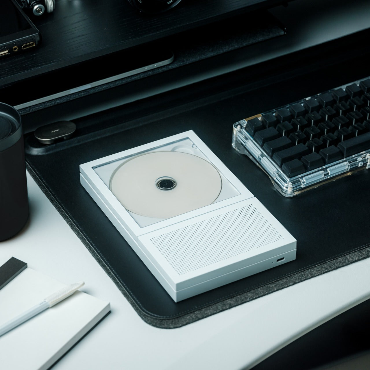
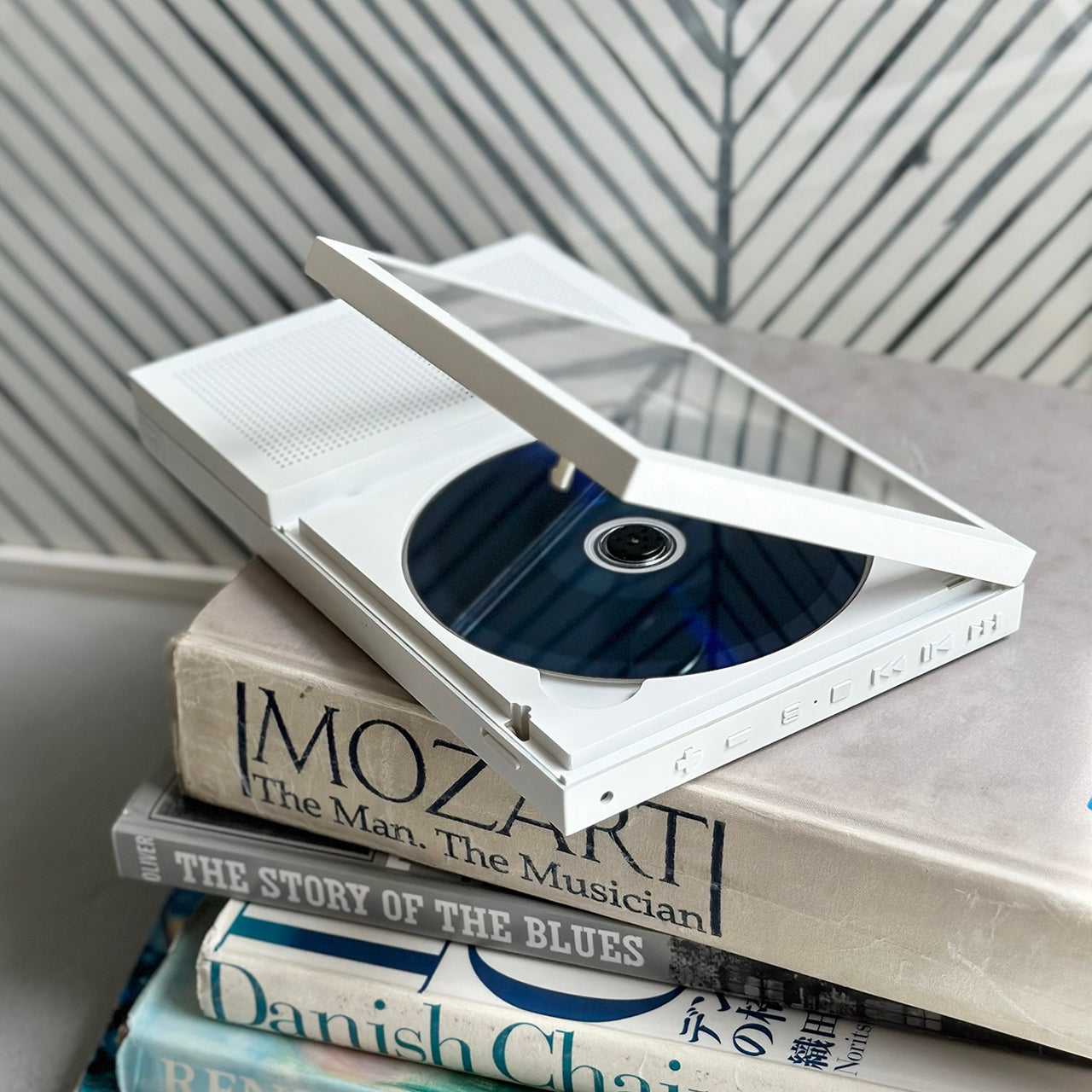
The Portable CD Cover Player brings album artwork back to the physical center of the listening experience at a time when streaming has reduced most music libraries to a scrollable grid of thumbnails no larger than a postage stamp. The form factor is slim and designed to echo the proportions of a CD sleeve — built for the kind of listening that happens away from a desk, on a commute, in a hotel room, or anywhere else a record player cannot reasonably follow you without significant planning.

There is something the CD format offers that streaming still hasn’t managed to replicate — intentionality. You chose this album. You put it in. You listened front to back, the way it was meant to be heard. The Portable CD Cover Player leans into that ritual rather than treating it as an inconvenience to be engineered away. At a moment when cassette players and vinyl decks have staged a credible commercial comeback, there is a real and growing audience for physical music hardware that does not apologize for existing in 2026. For anyone rebuilding a CD collection or looking for a reason to use the one they never threw out, this is the device for it.

Click Here to Buy Now: $199.00

What we like:

  • Restores album artwork as a physical, tactile part of the listening experience rather than a compressed thumbnail
  • The intentionality of the CD format is something streaming genuinely cannot replicate

What we dislike:

  • The price requires an existing or rebuilt CD collection to justify the investment
  • Stock is tight, with only a few units currently available through the Yanko Design shop

5. Samsung Galaxy Z Fold 8
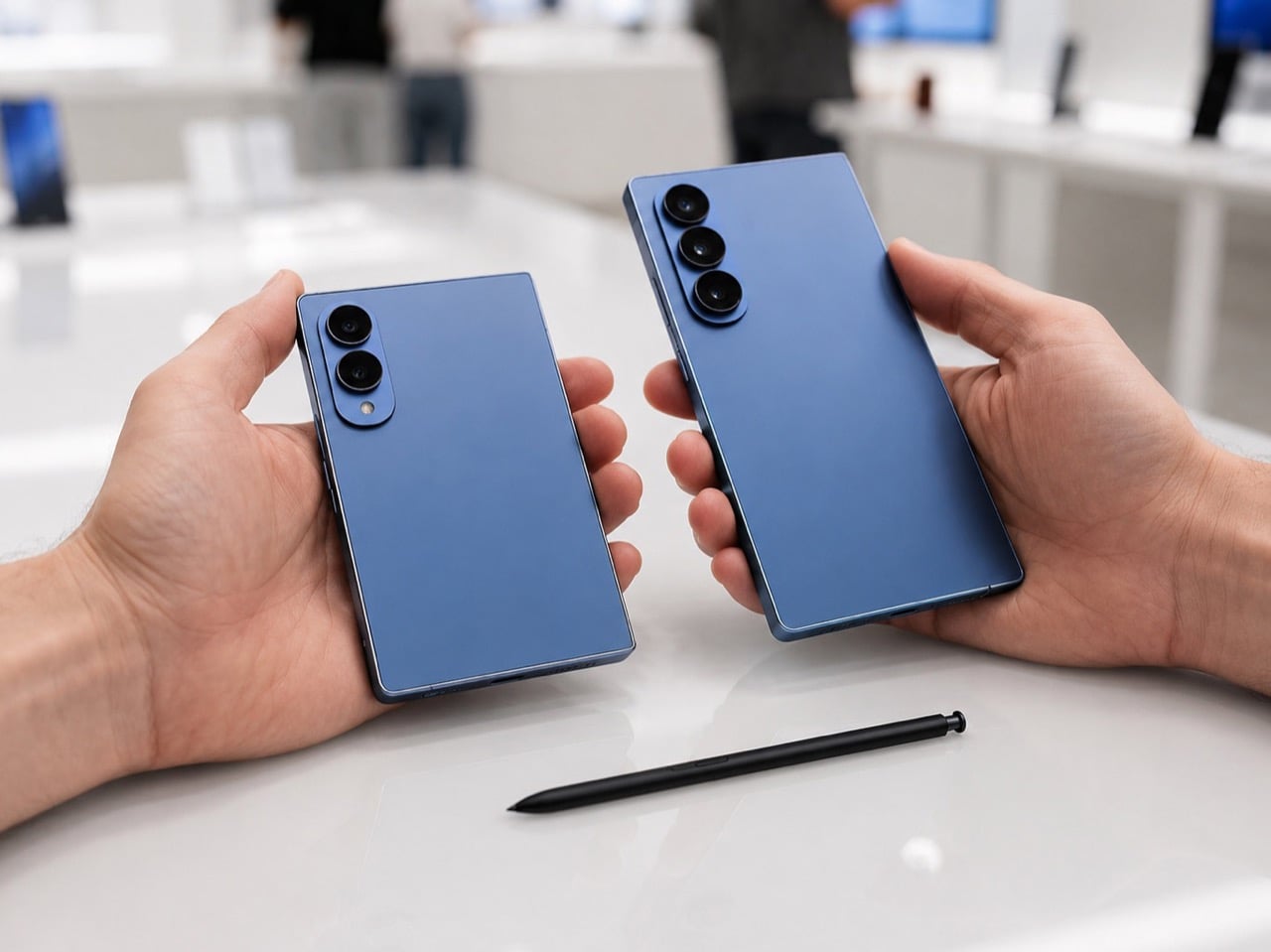
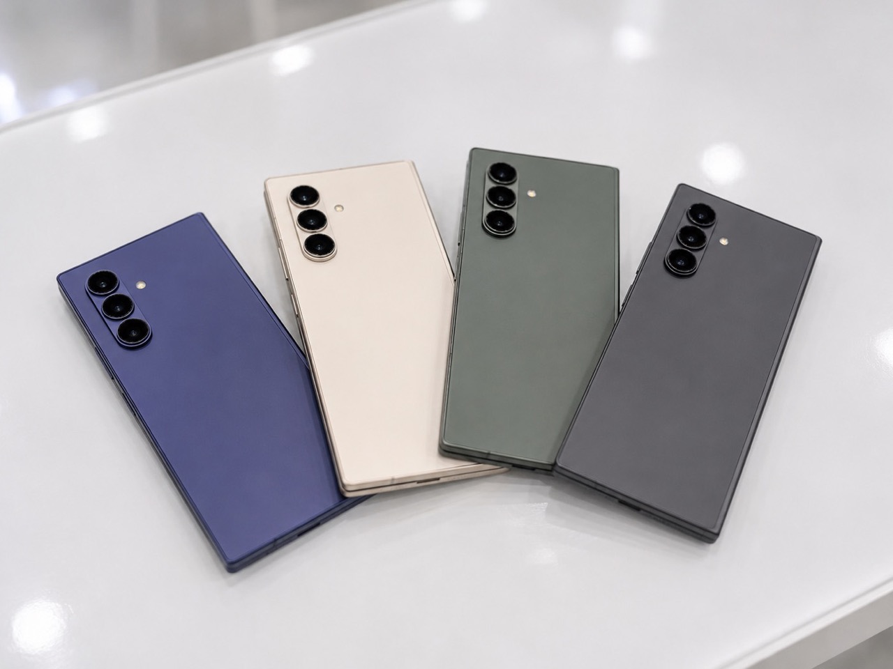
Samsung confirmed the Galaxy Z Fold 8 Unpacked event for July 22 in London, and what’s taking shape is arguably the most architecturally ambitious foldable lineup the company has attempted. Three models appear to be in play — the standard Fold 8 at 4.1mm unfolded, the wide-format Fold 8 Wide at a remarkable 3.9mm, and the Fold 8 Ultra, which is where the S Pen is making its return after being stripped from the Fold 7 to achieve that device’s headline thinness. Reports point to a titanium-plus-carbon-fiber construction for the Ultra, a material combination that works more naturally with the digitizer layer the stylus requires than the pure titanium backplate the Fold 7 used.

The Ultra is the model worth watching most closely. A 5,000mAh battery — the largest in the Fold line since the third generation — marks the first meaningful capacity upgrade the series has seen in years, and the S Pen’s return shifts the Fold 8 Ultra from a premium hardware story into something with actual software depth for power users. Samsung is also reportedly developing a digitizer-free stylus solution for future generations, which would eventually decouple S Pen functionality from physical bulk entirely. If the Ultra ships as the leaks describe, it becomes the first Z Fold that stops treating its own productivity features as a problem to be engineered around, and starts treating them as the reason the device exists.

What we like:

  • S Pen returns on the Ultra alongside the line’s largest battery to date
  • A tiered lineup lets buyers choose between thinness-first or capability-first without compromise

What we dislike:

  • Splitting S Pen support exclusively to the Ultra positions it as a premium within an already premium product line
  • Three distinct SKUs risk diluting the design identity that made the Fold recognizable in the first place

6. Google Home Speaker

The Google Home Speaker is the company’s first new standalone smart speaker since the Nest Audio launched in September 2020. Nearly six years is a long time to leave a product category untouched in consumer electronics — Apple refreshed AirPods three times in that window, Sonos shipped new hardware, redesigned its app, and broke it, and still found time to come back. Google’s return is framed almost entirely around Gemini, now built directly into the speaker and positioned as the primary reason to put it on your kitchen counter rather than any particular advancement in audio engineering.

The hardware reads clean — small, rounded, and available in the kind of understated colors Google’s design teams have always been good at selecting. It features 360-degree audio, faster processing for more fluid conversational responses, and a new light ring that signals when Gemini is listening, thinking, or responding. Whether this launch represents a genuine recommitment to the smart home category or simply Google finding Gemini another product surface to occupy is a fair question to ask. The speaker is back on the counter after six years. Whether the company chooses to stay in the room this time is the harder and more important question.

What we like:

  • Gemini integration makes this the most conversationally capable Google speaker the company has ever shipped
  • Six years of hardware and processing advancement mean the gap over the Nest Audio should be substantial

What we dislike:

  • Google’s well-documented history of deprioritizing smart home hardware makes long-term software support a legitimate concern
  • The launch narrative frames the speaker as AI infrastructure first, and as a designed product second

7. Inkleaf Foldable Dual-Screen E Ink Notebook

The Inkleaf is a foldable dual-screen E Ink tablet with two 10.3-inch Carta panels that open side by side — one for reading, one for writing, simultaneously. That single feature solves a problem researchers, students, and writers have been navigating awkwardly for years, usually by propping a tablet next to a paper notebook or toggling between apps and losing their place each time. Designed by Kameron Yu, it closes to 8.4mm and 480 grams, thinner than a standard paperback, and each open panel measures 4.2mm — slimmer than the reMarkable 2 at 4.7mm, the Kindle Scribe at 5.4mm, and the Boox Note Air4 C at 5.8mm. None of those fold.

The cast aluminum body and precision-machined hinge barrel lay perfectly flat at 180 degrees when open, tactile page-turn buttons sit exactly where your thumb expects them, and the pressure-sensitive stylus ships in the box with no subscription fee attached. Android handles the OS with support for PDFs, EPUBs, MOBI, and TXT files, and an AI-powered handwriting search can surface any phrase across every notebook you’ve filled. First units are expected to reach founders in August 2026. At around $450, it is a serious financial commitment, but one the form factor and the problem it actually solves manage to earn.

What we like:

  • Dual-screen setup genuinely resolves the read-and-write-simultaneously problem that every comparable single-screen device ignores
  • 4.2mm per panel open is thinner than any single-screen E Ink device currently on the market

What we dislike:

  • The price point requires a real commitment to the E Ink workflow to justify
  • Android on an E Ink display still carries limitations in app responsiveness and screen refresh speed

August Belongs to the Gadgets That Get Out of the Way

August’s lineup doesn’t follow a single theme, which is part of what makes it worth paying attention to. The piBrick and the Inkleaf both treat computing as something that should fit your actual workflow rather than just your desk. The OrigamiSwift and the FlowToo make the case that the best everyday tech is the kind that removes something from your bag or your nightstand rather than quietly adding to it. The Portable CD Cover Player is a reminder that intentional listening never actually went away — it just needed hardware worth using again.

The bigger stories — Samsung’s Fold 8 and Google’s long-overdue speaker — tell you something meaningful about where two of the industry’s largest companies have landed on the question of what smart hardware is actually for. One is restoring capability it arguably should never have removed. The other is making up for six years of silence with an AI pitch and hoping nobody checks the calendar. Both are worth watching this month, for very different reasons.

The post 7 Best Tech Gadgets of August 2026 first appeared on Yanko Design.
Escape Tucked Two Bedrooms Into the Ceiling to Let 26 Feet Live Like a Full House

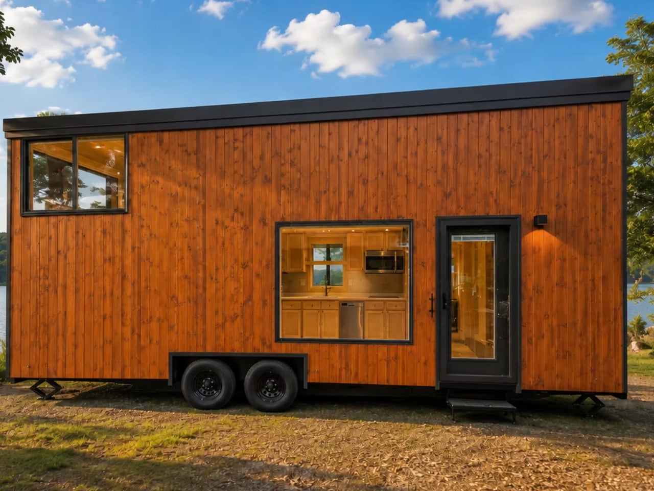
There are plenty of towable tiny houses that look good in a photoshoot. Far fewer are ones you could actually live in. The eONE Limited – Special Edition by Escape is quietly one of the exceptions, and it makes its case not with gimmicks, but with restraint and good decision-making at every turn.

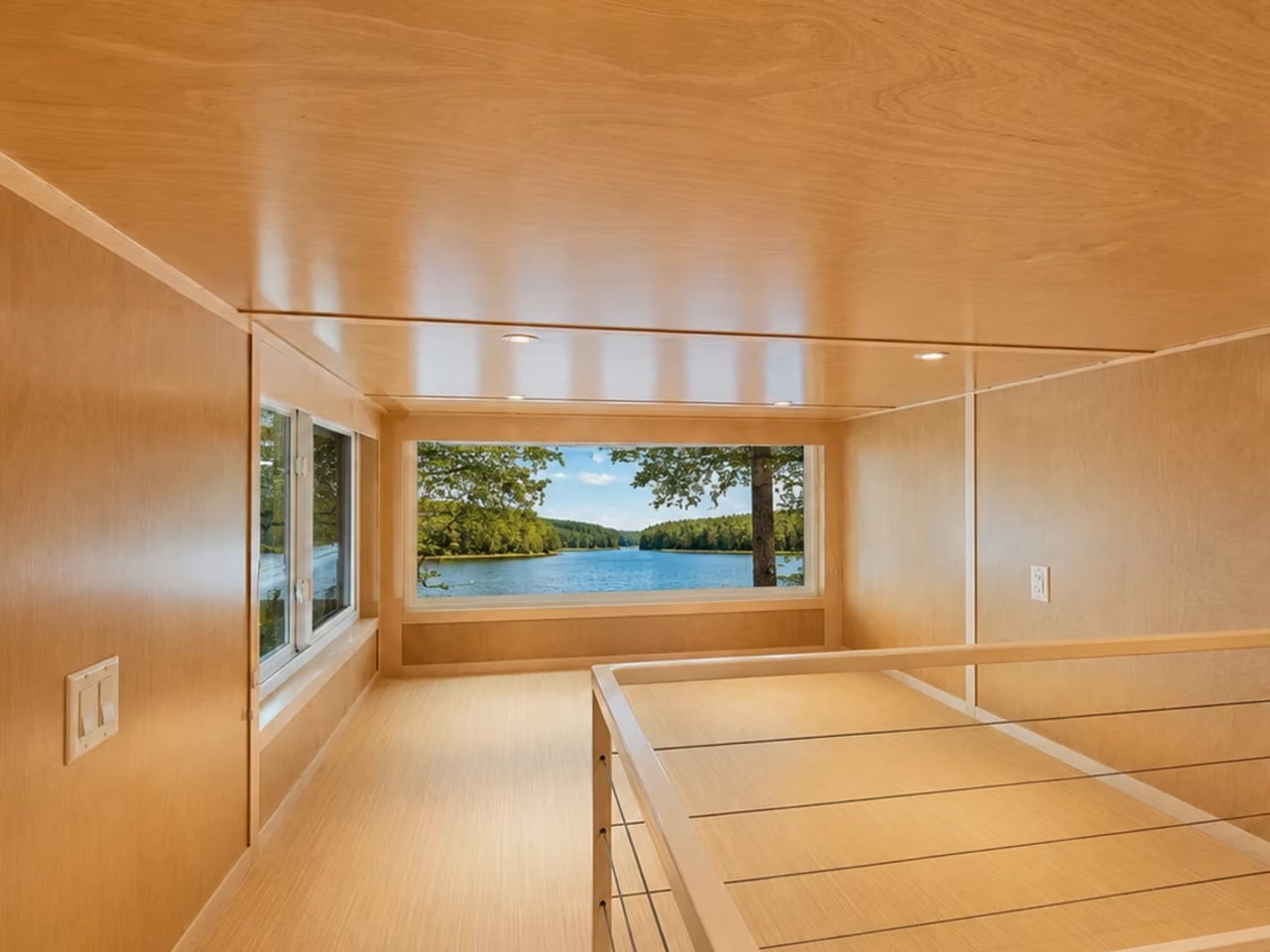
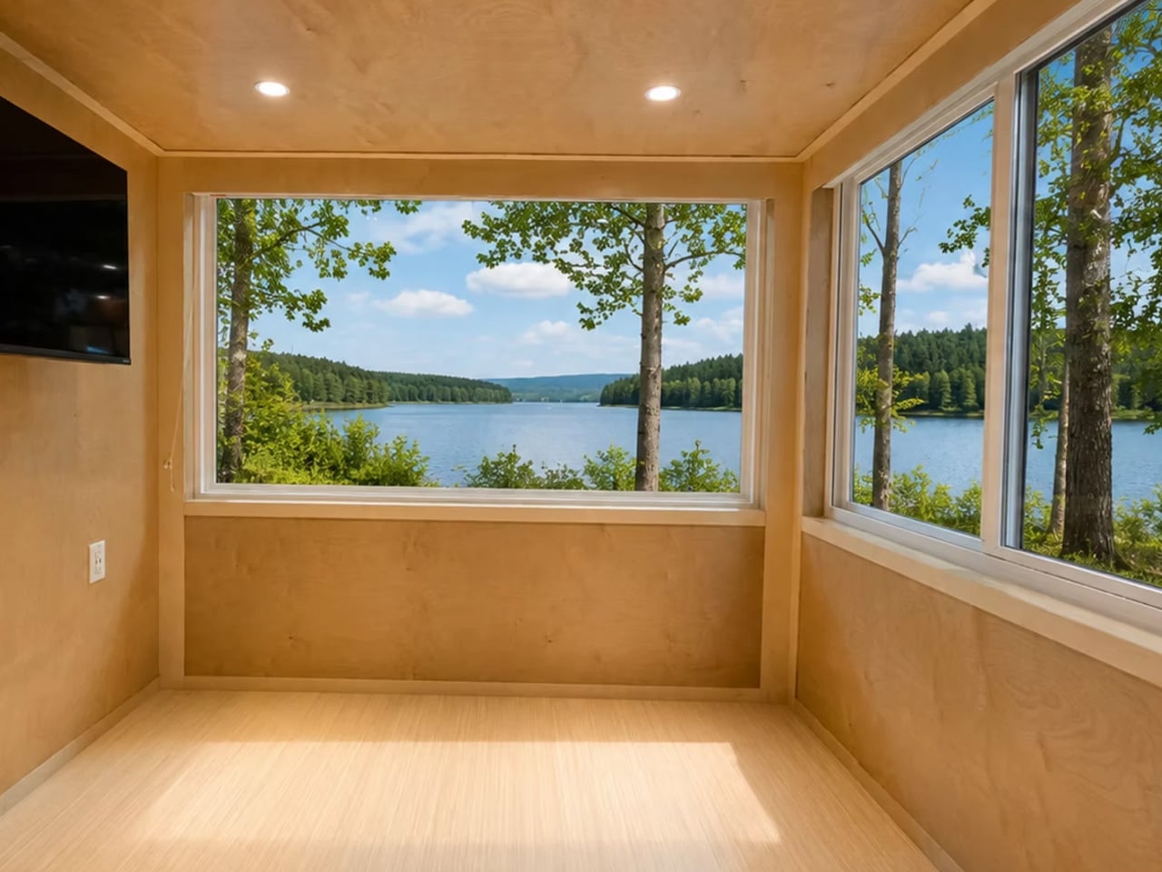
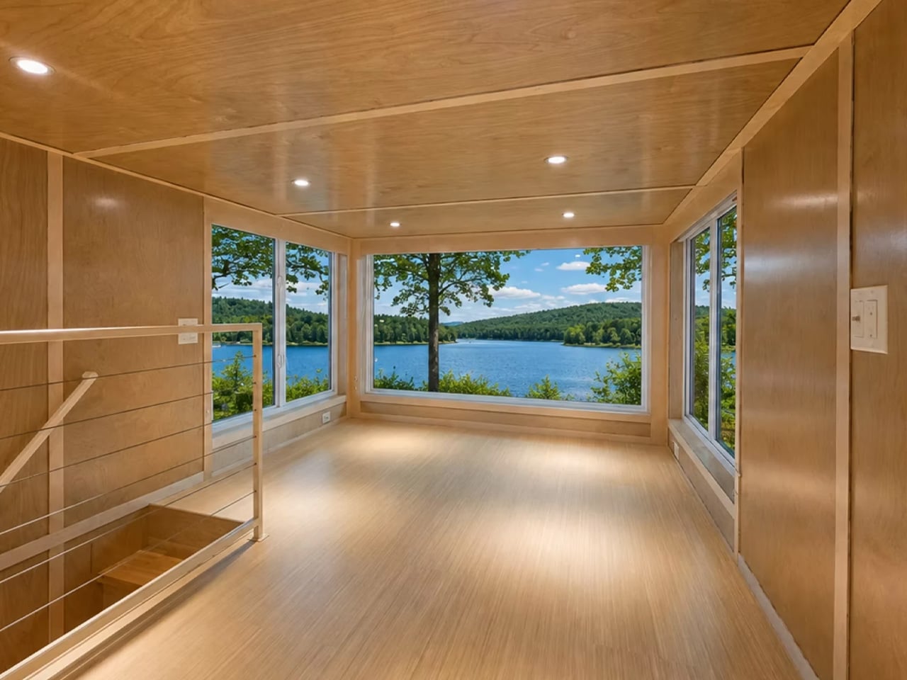
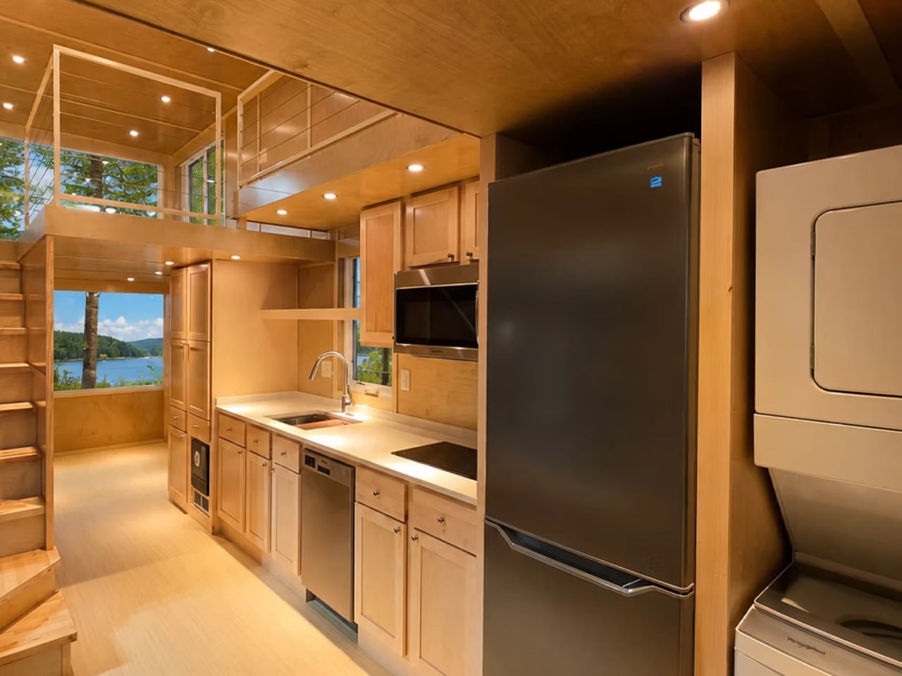
Built on a double-axle trailer and clad in custom-engineered wood siding with a metal roof, the home measures 26 feet long and 8.6 feet wide — compact enough to tow without a special permit, but not so small that you’re constantly rearranging your life to fit inside it. The interior carries Escape’s signature design language: birch-lined walls, an abundance of glazing, and a floor plan that feels genuinely bright rather than aggressively efficient. The floor-to-ceiling glass on the second floor is the standout move — it floods the upper level with light and keeps the whole structure from reading as a box.

Designer: Escape

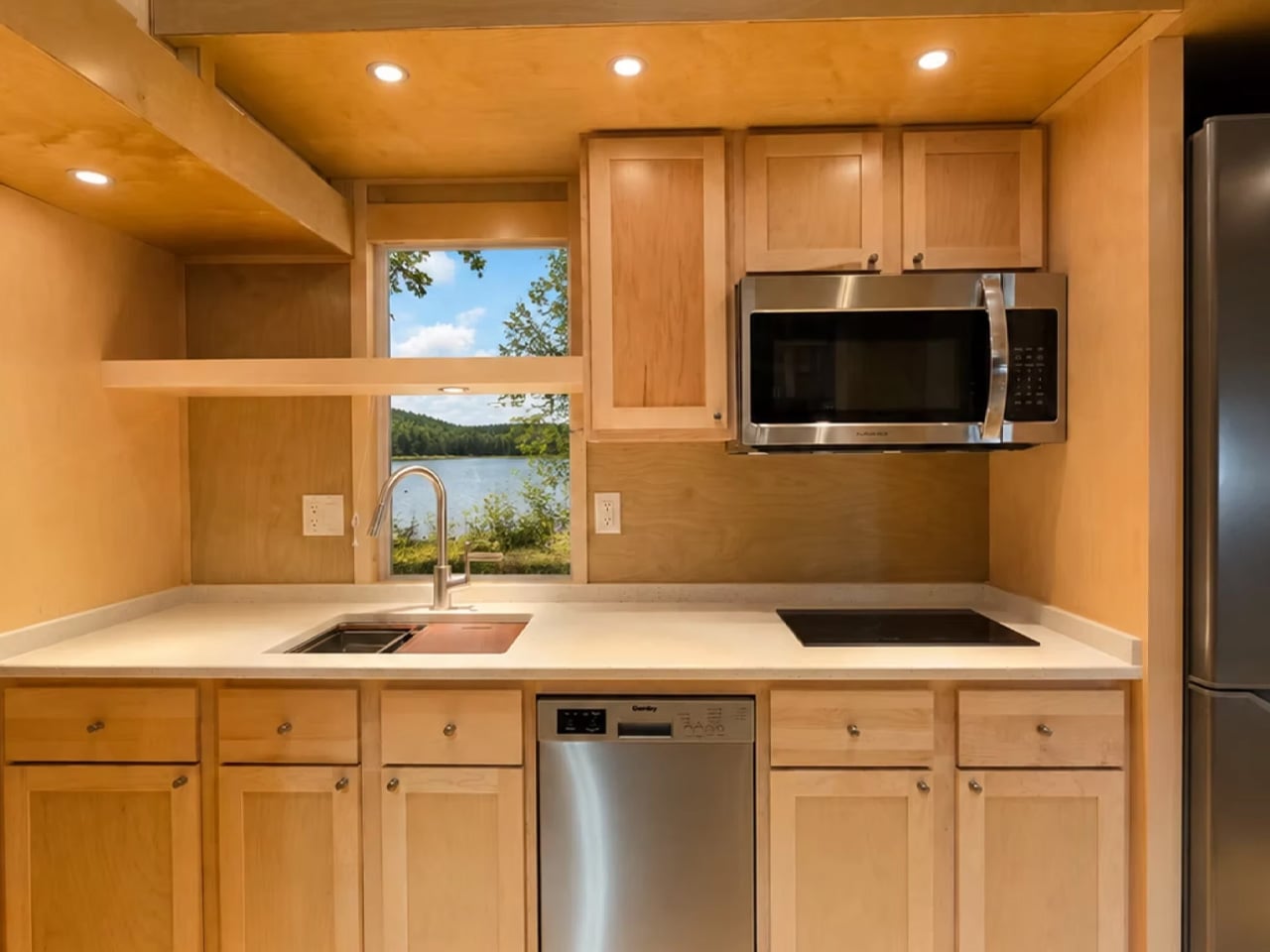
What makes this the Limited edition are the upgrades Escape doesn’t typically bundle into the base eONE. The kitchen arrives fully loaded: induction cooktop, combination microwave and convection oven, a tall fridge and freezer, a large deep sink, a dishwasher, and a stacked washer and dryer — all behind a quartz countertop with generous cabinetry. In most tiny houses, you’re choosing between a dishwasher and usable counter space. Here, you don’t have to choose. A storm and screen door, modern cable rail detailing, and window coverings round out the details that separate the Limited from a standard build.

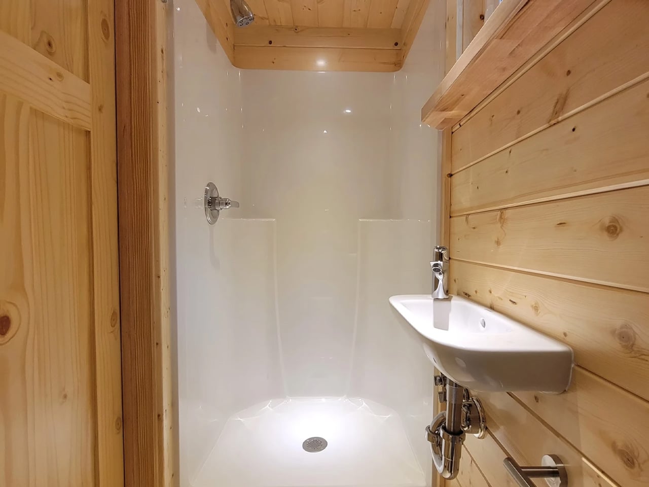
The living area sits beside the kitchen, big enough for a proper sofa and a wall-mounted television — the kind of arrangement that lets you sit down and decompress rather than perch on the edge of your bed. The bathroom holds a walk-in shower, toilet, sink, and a bit of storage. Nothing is squeezed.

The bedroom layout is where the design earns its keep. A staircase built around integrated storage leads up to the main bedroom, sized for a double bed. From there, a catwalk connects to a secondary loft — a smart move that keeps a second sleeping or storage space accessible without eating up floor area downstairs with its own ladder.

High R-value spray foam insulation and a high-efficiency heat pump handle the climate side of full-time living, and the home runs entirely on electricity. The eONE Limited is currently listed at $105,389. For a home this considered, that number is harder to argue with than you’d expect.

The post Escape Tucked Two Bedrooms Into the Ceiling to Let 26 Feet Live Like a Full House first appeared on Yanko Design.

MVRDV Built a Mountain in the Middle of Rotterdam

What does a building look like when it’s designed for birds, insects, and plants just as much as people? According to MVRDV, it looks like a mountain that grew out of the Maas riverbank — rough, porous, and unapologetically massive.

Rotterdam ROCKS! is MVRDV’s winning entry in Shift’s international design competition, which called for proposals for a “new world wonder” capable of motivating people to act on the climate and biodiversity crises. The €240 million project beat out a formidable shortlist that included Heatherwick Studio, Mecanoo, Office for Political Innovation, and Ecosistema Urbano. The jury — which included Zaha Hadid Foundation director Aric Chen and UNS founder Ben van Berkel — called the proposal “remarkably bold.”

Designer: MVRDV

That’s an understatement. The design takes the form of seven giant stacked rocks arranged into two towers on the south bank of the Maas, in Rotterdam’s emerging Waterkant district. The district itself is slated to deliver over 3,500 homes alongside schools, offices, and a new train station — Rotterdam ROCKS! is meant to be its cultural heartbeat.

At 30,000 square metres, the building is organized around two internal circulation routes and a series of cave-like exhibition spaces carved into the rock forms. A third route wraps the exterior of the structure, leading visitors through an immersive area called The Elysium before arriving at a viewing terrace overlooking the city. Below that, the program includes a 200-room hotel, a conference centre, a food court, and event spaces — essentially a vertical neighborhood compressed into a geological fiction.

The facade is designed to be genuinely alive. Pockets built into the exterior hold soil, water, plants, and nesting habitats for birds and urban wildlife. MVRDV has said the building will “showcase the latest innovations in low-carbon construction,” though specific materials have yet to be disclosed. Founding partner Winy Maas described the design logic directly: “We need to reduce carbon dioxide emissions and to create inclusive spaces for people, trees, plants, for water, air, and for animal habitats, balancing the need for new built space with new landscapes to compensate our ecological impact.”

The project is the first-ever Shift Embassy — a new typology conceived by the social enterprise as a permanent physical institution for ecological and societal change. Shift is targeting a 2032 launch, which gives the design time to move through further development and public consultation. Rotterdam already has the Markthal, De Rotterdam, and the Cube Houses. It’s building a reputation for architecture that refuses to be quiet. Rotterdam ROCKS! might be its loudest statement yet.

The post MVRDV Built a Mountain in the Middle of Rotterdam first appeared on Yanko Design.

MVRDV Built a Mountain in the Middle of Rotterdam

What does a building look like when it’s designed for birds, insects, and plants just as much as people? According to MVRDV, it looks like a mountain that grew out of the Maas riverbank — rough, porous, and unapologetically massive.

Rotterdam ROCKS! is MVRDV’s winning entry in Shift’s international design competition, which called for proposals for a “new world wonder” capable of motivating people to act on the climate and biodiversity crises. The €240 million project beat out a formidable shortlist that included Heatherwick Studio, Mecanoo, Office for Political Innovation, and Ecosistema Urbano. The jury — which included Zaha Hadid Foundation director Aric Chen and UNS founder Ben van Berkel — called the proposal “remarkably bold.”

Designer: MVRDV

That’s an understatement. The design takes the form of seven giant stacked rocks arranged into two towers on the south bank of the Maas, in Rotterdam’s emerging Waterkant district. The district itself is slated to deliver over 3,500 homes alongside schools, offices, and a new train station — Rotterdam ROCKS! is meant to be its cultural heartbeat.

At 30,000 square metres, the building is organized around two internal circulation routes and a series of cave-like exhibition spaces carved into the rock forms. A third route wraps the exterior of the structure, leading visitors through an immersive area called The Elysium before arriving at a viewing terrace overlooking the city. Below that, the program includes a 200-room hotel, a conference centre, a food court, and event spaces — essentially a vertical neighborhood compressed into a geological fiction.

The facade is designed to be genuinely alive. Pockets built into the exterior hold soil, water, plants, and nesting habitats for birds and urban wildlife. MVRDV has said the building will “showcase the latest innovations in low-carbon construction,” though specific materials have yet to be disclosed. Founding partner Winy Maas described the design logic directly: “We need to reduce carbon dioxide emissions and to create inclusive spaces for people, trees, plants, for water, air, and for animal habitats, balancing the need for new built space with new landscapes to compensate our ecological impact.”

The project is the first-ever Shift Embassy — a new typology conceived by the social enterprise as a permanent physical institution for ecological and societal change. Shift is targeting a 2032 launch, which gives the design time to move through further development and public consultation. Rotterdam already has the Markthal, De Rotterdam, and the Cube Houses. It’s building a reputation for architecture that refuses to be quiet. Rotterdam ROCKS! might be its loudest statement yet.

The post MVRDV Built a Mountain in the Middle of Rotterdam first appeared on Yanko Design.

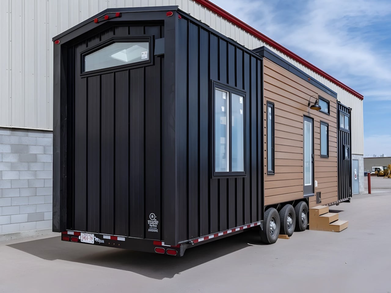
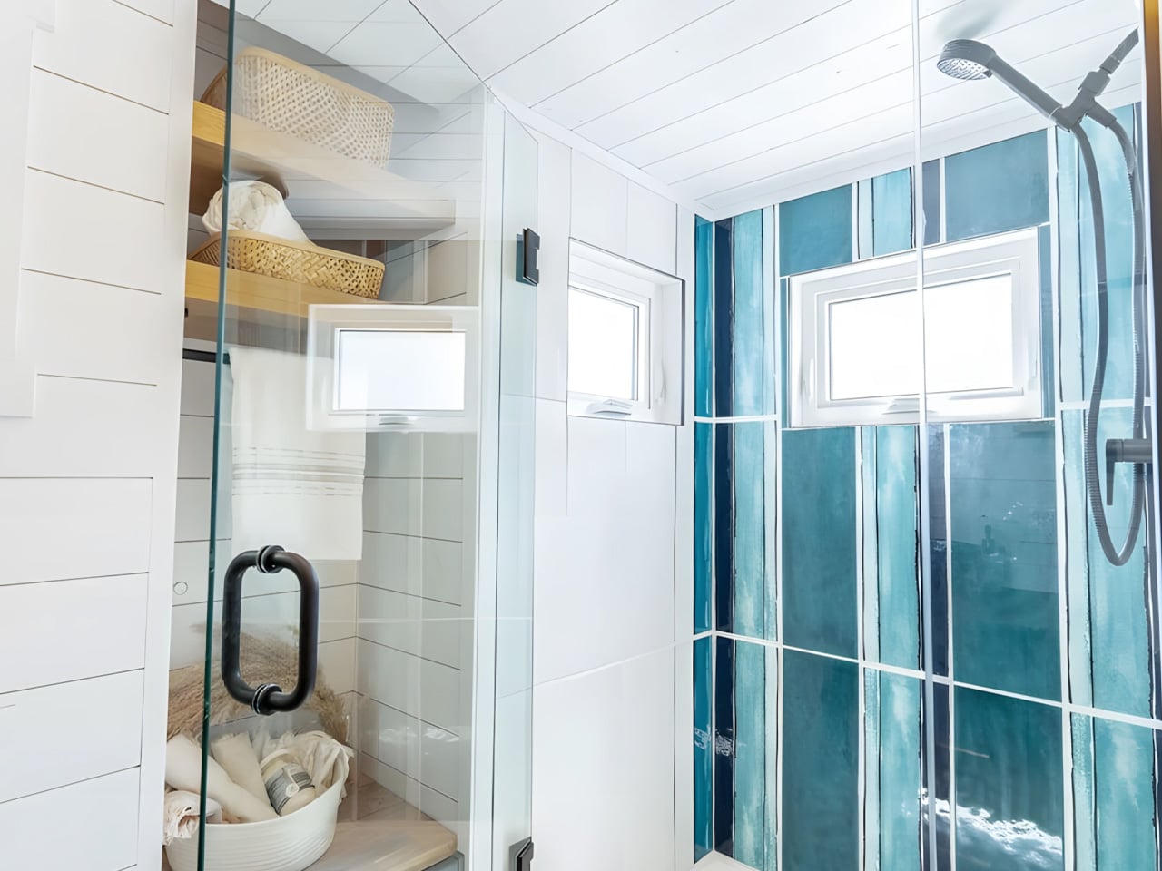
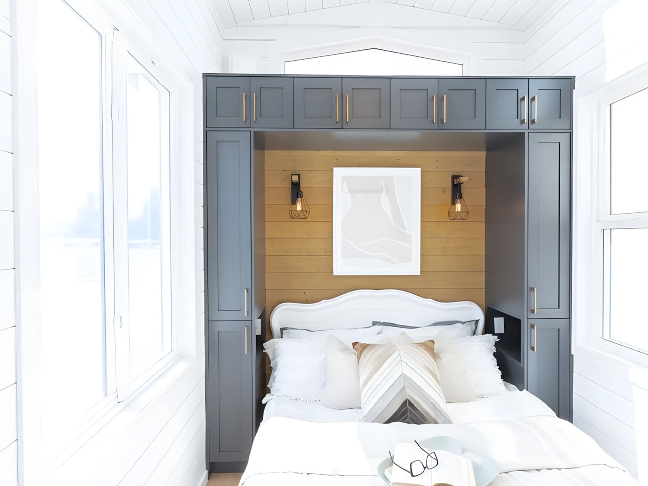
This Tiny Home Packs a Bathtub, Dishwasher, and Two Bedrooms Into 423 Square Feet

Most tiny homes make you choose: comfort or portability, but rarely both. The Laurel, a custom build by Canadian builder Teacup Tiny Homes based on their Bernice plan, manages to sidestep that entirely. At 423 square feet across a 34-foot triple-axle trailer, it sleeps four people, fits a dishwasher, a full bathtub, and still feels like somewhere you’d actually want to live.

The exterior sets the tone before you step inside. White vertical siding runs the length of the home, capped by a black metal roof — clean, modern, and unfussy. At 8.5 feet wide, it stays within standard road-legal dimensions, which means taking it to a new site doesn’t require a special permit or a nervous conversation with your tow truck driver.

Designer: Teacup Tiny Homes

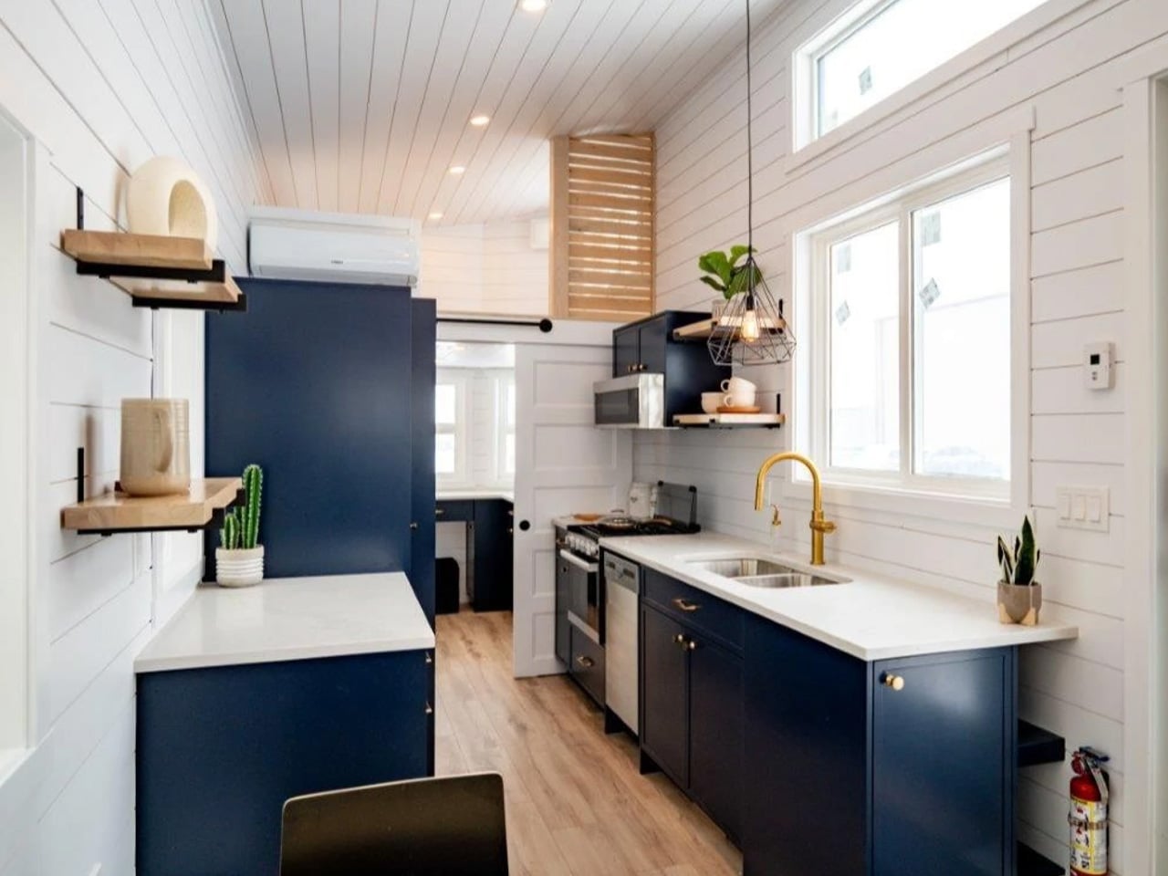
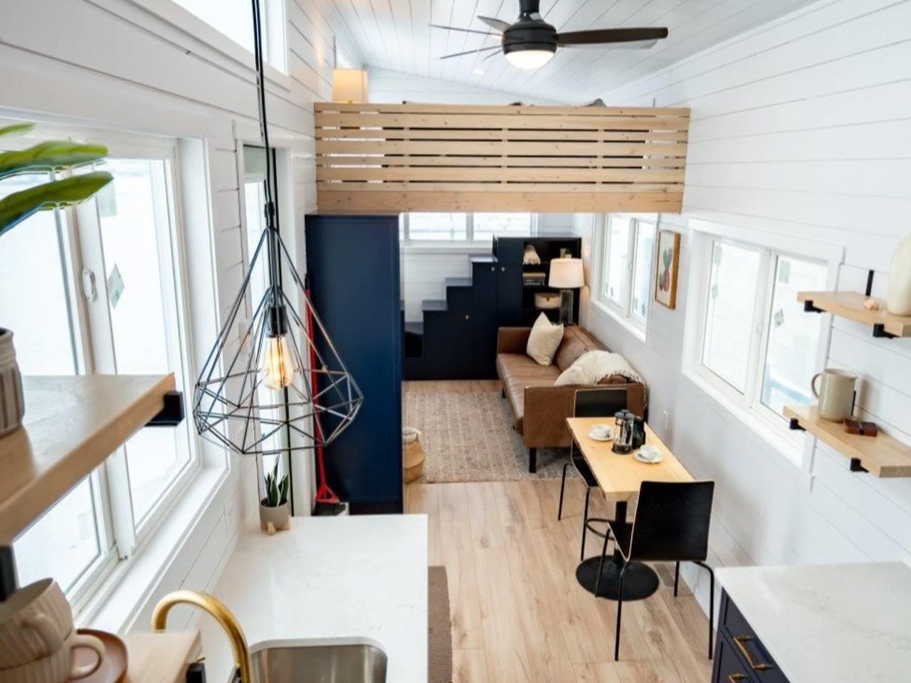
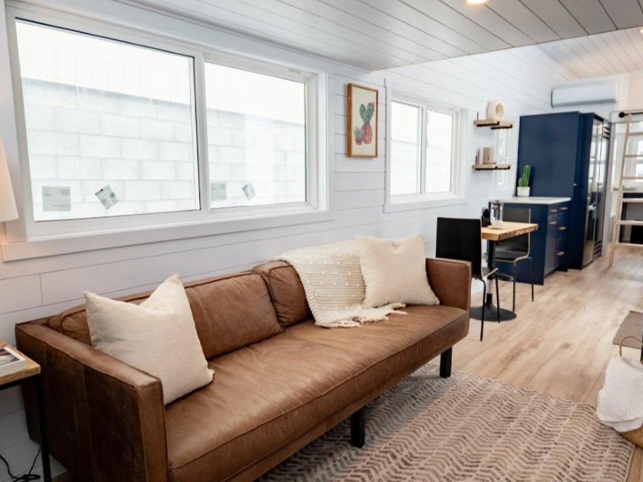
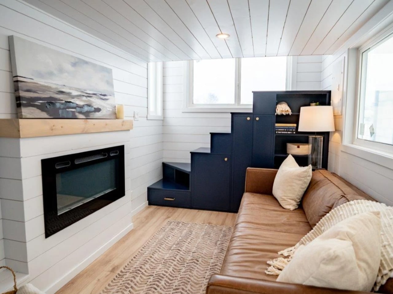
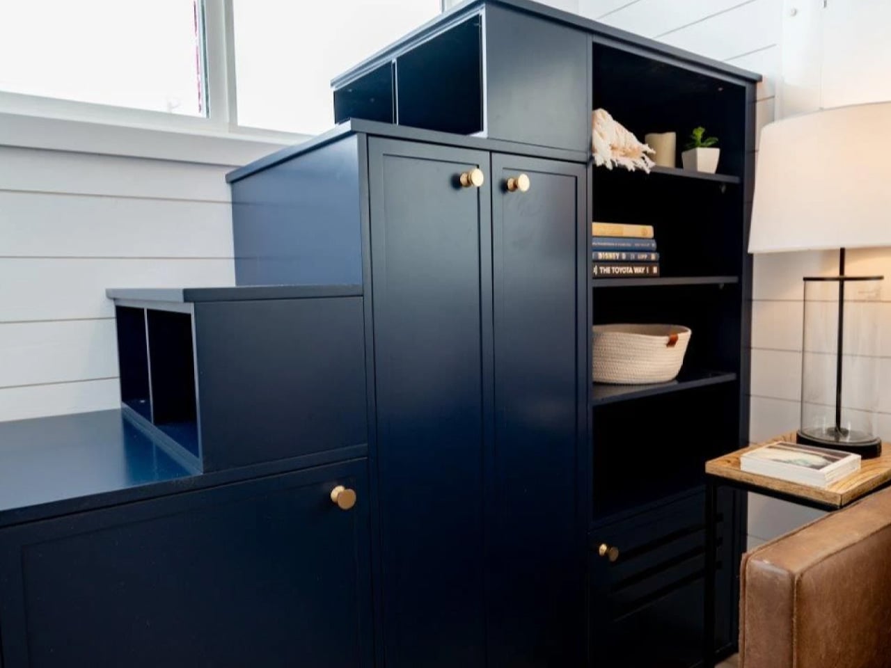
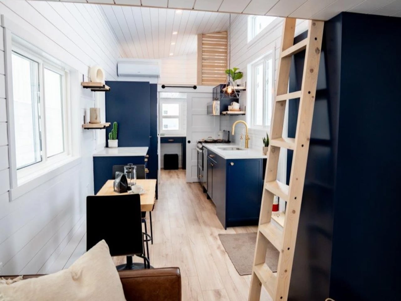
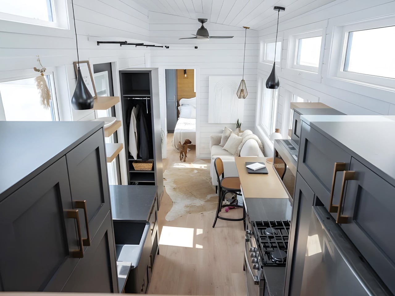
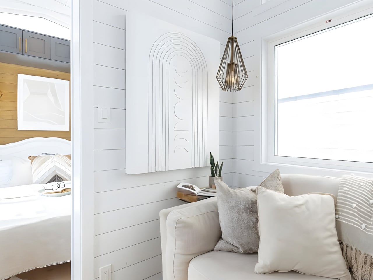
Inside, the aesthetic leans into modern farmhouse without being heavy-handed about it. White tongue-and-groove paneling lines the walls, dark blue cabinetry anchors the kitchen, and vinyl flooring runs throughout the lower level, kept warm by propane-powered underfloor heating. The living room is proportioned well enough to hold a full sofa and an electric fireplace, with room for a TV and actual breathing space. The staircase leading up to the main loft doubles as a storage unit — drawers and cupboards built directly into each step, so no square inch goes to waste.

The kitchen is galley-style with cabinetry on both sides, and it’s more capable than most tiny homes manage. A four-burner propane stove, oven, fridge and freezer, microwave, twin-basin stainless steel sink, and a dishwasher. That last one gets mentioned a lot because it rarely shows up in this category. A small dining table seats two just off the kitchen.

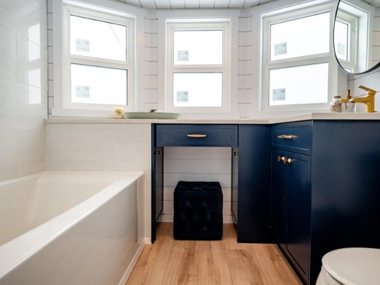
The bathroom earns its own mention. A sliding barn door opens into a space with an L-shaped vanity, a flushing toilet, and a combined bathtub and shower. Bathtubs in tiny homes are practically currency — most builders skip them entirely to save the square footage. Finding one here, in a home that’s also road-legal, is genuinely rare.

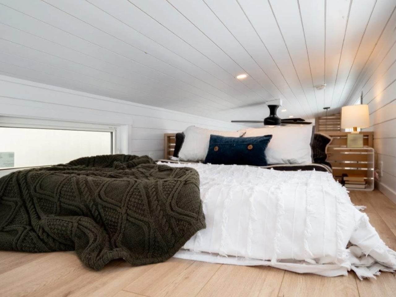
Two loft bedrooms handle the sleeping situation. The main loft sits above the living room with a double bed, storage, and a privacy divider. A second loft above the kitchen and bathroom is accessed by a removable ladder and fits another double bed. Combined, the Laurel sleeps four comfortably. Pricing is based on Teacup’s Bernice Range, which starts at roughly US$121,000, with delivery rates depending on location.

The post This Tiny Home Packs a Bathtub, Dishwasher, and Two Bedrooms Into 423 Square Feet first appeared on Yanko Design.

5 Home Objects That Look Like They Belong in a Design Museum but Cost Less Than a Dinner Out

The design museum makes one quiet argument. Certain objects deserve to be looked at, and how a thing is made can matter as much as what it does. Most people accept this on a Saturday afternoon in front of a Noguchi lamp or an Eames chair, then go home to a shelf full of things nobody chose with the same intention. That gap is worth closing, and it does not require a renovation budget.

These six objects cost somewhere between a round of drinks and a dinner for two. None are functional in the way a charging cable is functional. They are functional in the way a good room is, changing how a space reads and getting noticed before anyone can articulate why. That quality has very little to do with price and everything to do with knowing where to look for it.

1. Carte Blanche Ceramics

Dutch designer Annebet Philips began this collection in cardboard rather than clay, cutting shapes with deliberately uneven edges and treating the paper prototype as the design language itself rather than a step to be discarded. Belgian brand Serax carries the result through to porcelain: a coffee and tea service that has since grown to include plates, a breakfast bowl, an egg cup, and a salt and pepper set. Every piece started as a childlike cutout on a blank page. Nothing about that origin was smoothed away in production.

What makes each piece genuinely strange is that it reads as a drawing of itself. Hand-painted black lines trace every fold and seam, giving cups and saucers the flattened quality of ink on paper rather than fired ceramic. Photographed straight on, a cup collapses into what looks like a quick sketch, the handle reading as a doodled loop rather than a ceramic ear. Everything is microwave and dishwasher safe, which keeps the concept in daily use rather than retreating to a shelf nobody touches.

What we like

  • The trompe-l’oeil effect holds in person, not only in photographs
  • Dishwasher safe at a design level that rarely permits it

What we dislike

  • Sold through Serax stockists rather than one direct channel, which makes sourcing specific pieces more work than it should be
  • Hand-painted lines vary slightly between pieces, which is part of the concept but can feel inconsistent in a matched set

2. ECHO Ceramic Speaker

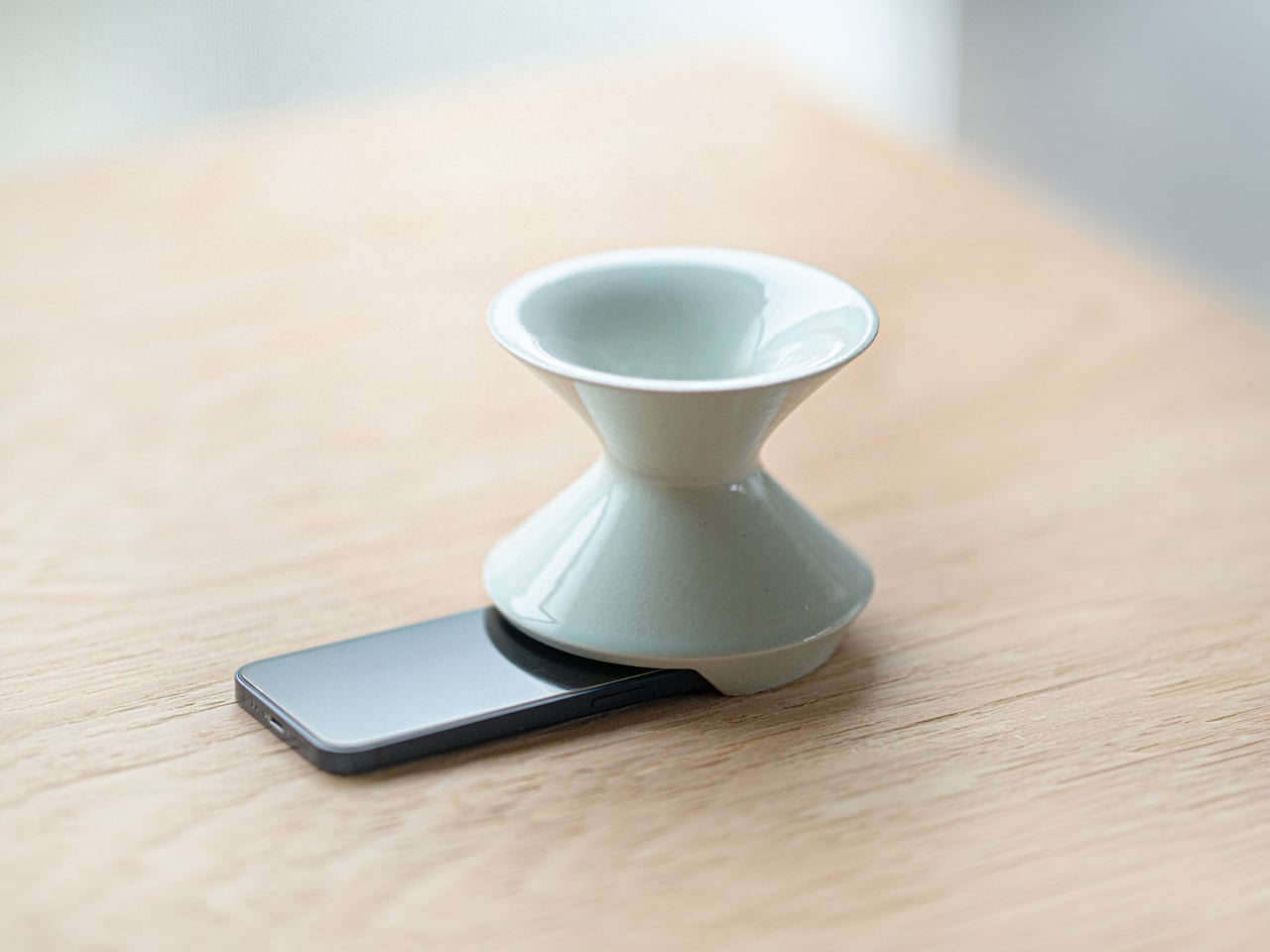
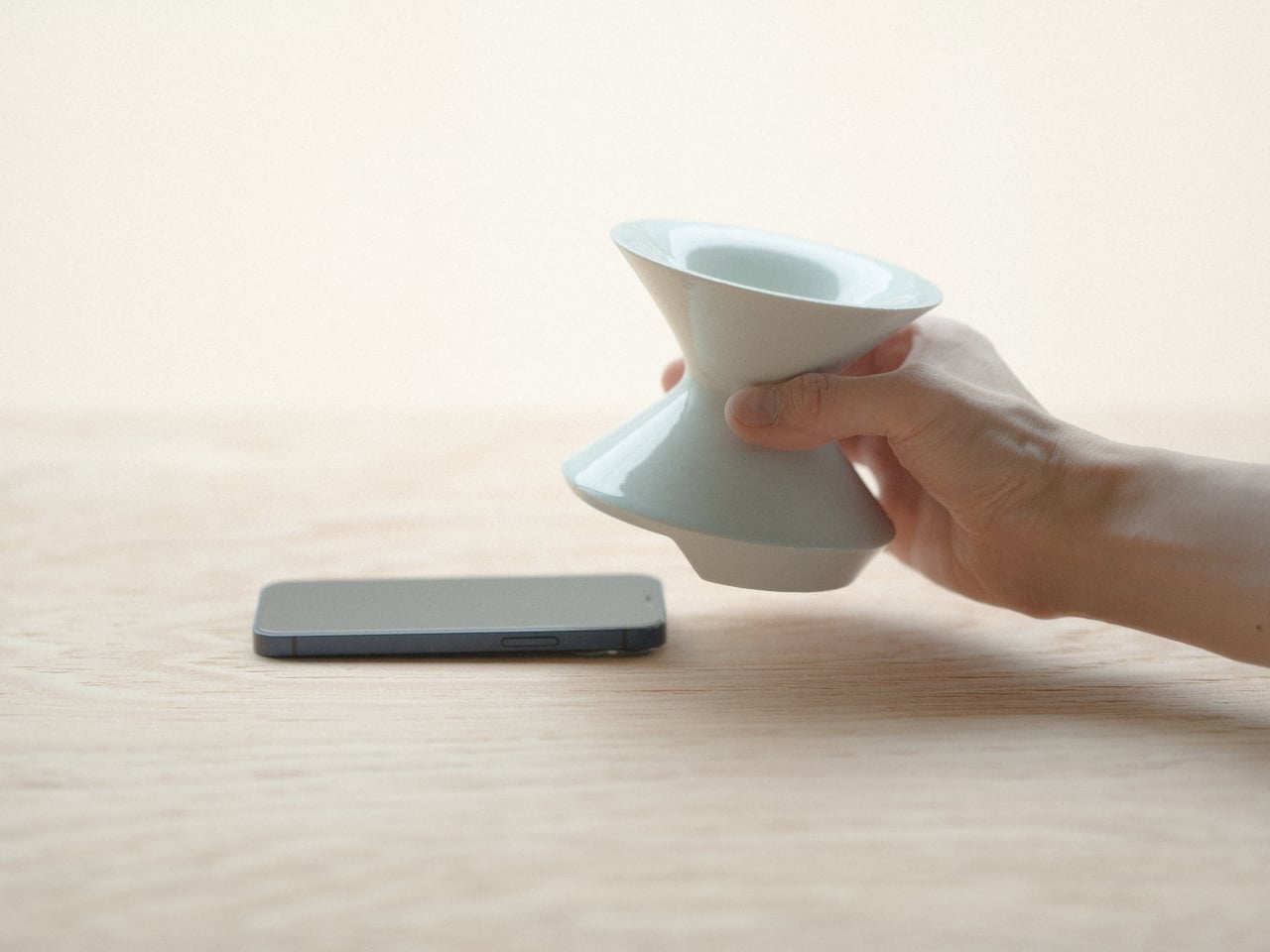
Most speakers announce themselves. They sit on surfaces with blinking lights and trailing cables, with the general suggestion of being placed there temporarily. Kenji Abe’s ECHO arrives from the opposite direction. It is a glazed ceramic chamber built on the acoustic logic of a seashell and a cupped hand that looks exactly like a small vase. Slide a phone underneath, and the cavity carries audio outward in soft, diffused waves. No power. No pairing. Nothing to charge or set up.

The decision to use ceramic was not incidental. Ceramic belongs to the visual grammar of a home, the language of objects that have simply always been there, and ECHO uses that familiarity to disappear into a room entirely. A guest would not identify it as a speaker. The glazed surface catches light the way pottery does, and when the phone is gone, it stays on the shelf with the composure of something that was never trying to perform in the first place.

What we like

  • Looks like a ceramic piece because it is one, not a speaker wearing a vase disguise
  • No charging, no pairing, no batteries to deplete or replace

What we dislike

  • The amplification is warm and subtle rather than loud, better suited to a quiet kitchen than a busy room
  • Designed for smartphones placed directly underneath, which limits where in a room it can be used

3. Petal Vase

Every day, thousands of tons of cut flowers are incinerated at flower markets because they reached the end of their shelf life before a buyer arrived. Rebloom Studio, a Korean design practice, collects those discarded blooms, processes them into pulp with Korean paper pulp and a natural binder, and molds the result around an interior glass cylinder. The finished piece is a vase made entirely from flowers that never got the chance to be seen by anyone.

No two Petal Vases look alike. The flowers used to make each one determine its final color, texture, and edge profile. The jagged rim, the petal compression visible in the walls, the slight asymmetry in the silhouette- all of it is preserved deliberately rather than corrected in finishing. When the vase reaches the end of its life, the biodegradable shell returns to the earth. It is one of those rare objects where the material story requires no explanation because you can already see exactly where it came from.

What we like

  • Every piece is genuinely one of a kind, not in the marketing sense but the literal one
  • The biodegradable origin is visible in the object itself rather than printed on the packaging

What we dislike

  • Availability depends on Rebloom Studio’s production schedule, and stock from a small Korean studio can be intermittent
  • The rough, irregular surface is the whole point, but buyers expecting a conventional smooth ceramic finish may need to adjust

4. Delicato Tray

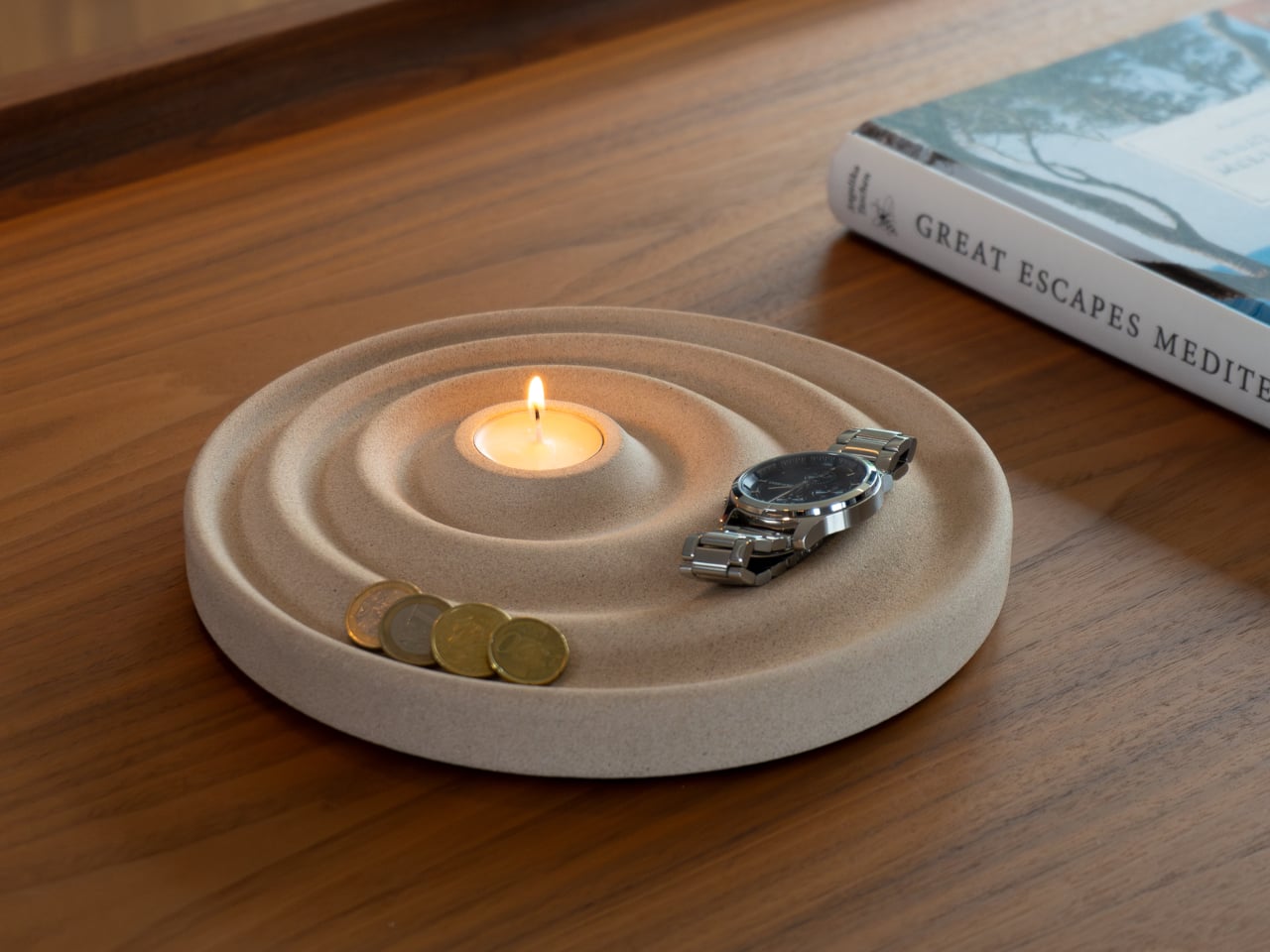
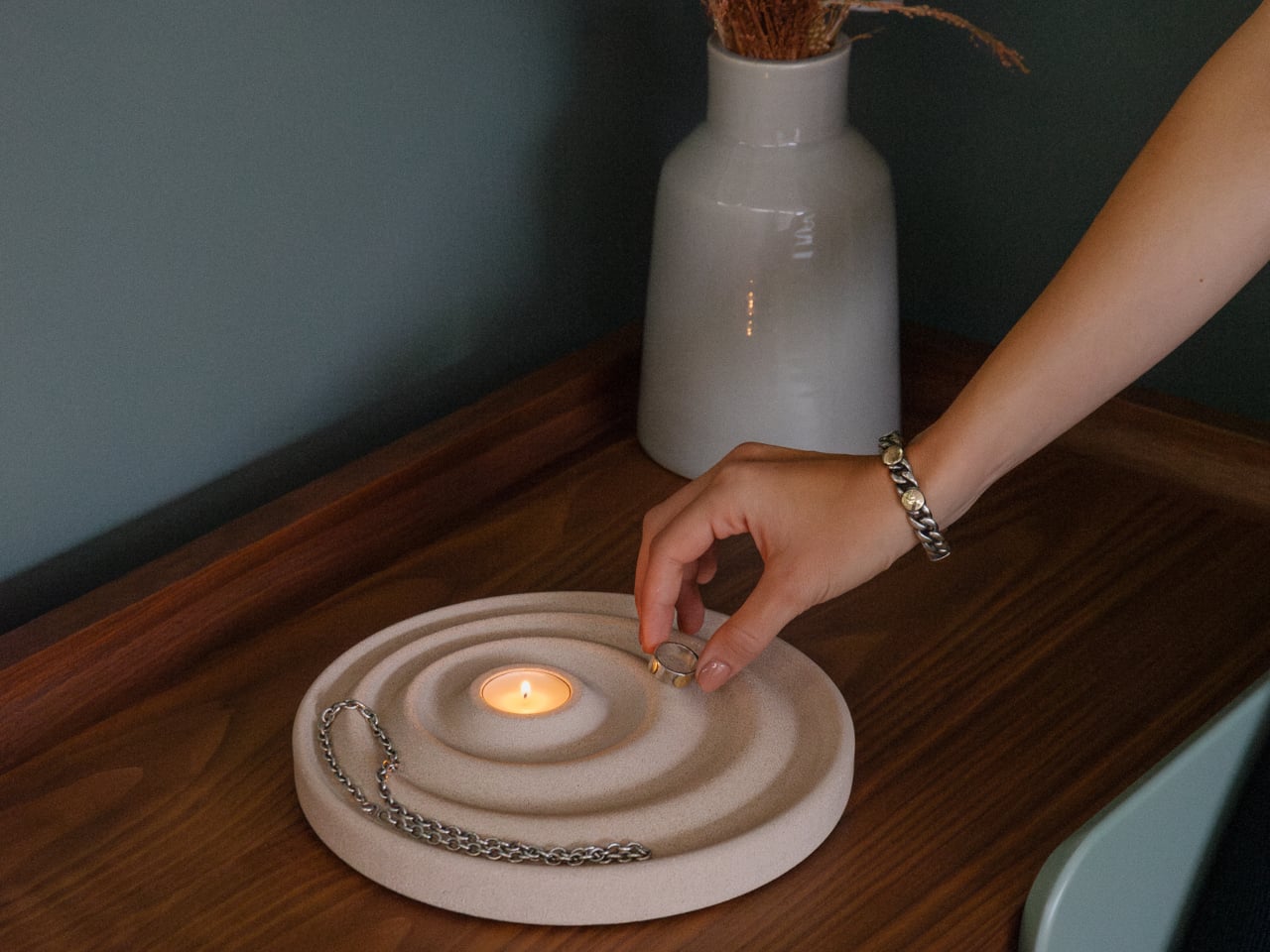
The entryway surface tells a familiar story, and it is rarely flattering. Keys land wherever there is space, coins scatter to the edges, a watch ends up beside a receipt from last week. Joao Teixeira’s Delicato Tray for Oftwise is cast from Jesmonite AC730, a water-based, fire-rated stone composite, in the form of a rippled disc. The concentric waves are asymmetric by design: wider at the outer ring for keys and glasses, tighter toward the center for rings and coins.

At the center of those ripples sits a recessed pocket sized for a tealight candle, turning the daily ritual of dropping your things at the door into something closer to a ceremony. Because the tray is hand-cast, no two are identical. Small air bubbles, subtle texture variations, and minor color shifts are natural byproducts of the process. The result is two kilograms of warm sandy stone that makes a surface look deliberately arranged before anything has been placed on it at all.

What we like

  • The hierarchy is built into the form itself, so organization becomes almost unconscious
  • Hand-cast production means no two pieces are identical, in the way that actually matters

What we dislike

  • At €235 it sits at the very top of the dinner framing, and that math depends on which dinner you have in mind
  • Currently available in one color, which limits how it integrates into darker or cooler interiors

5. Luna

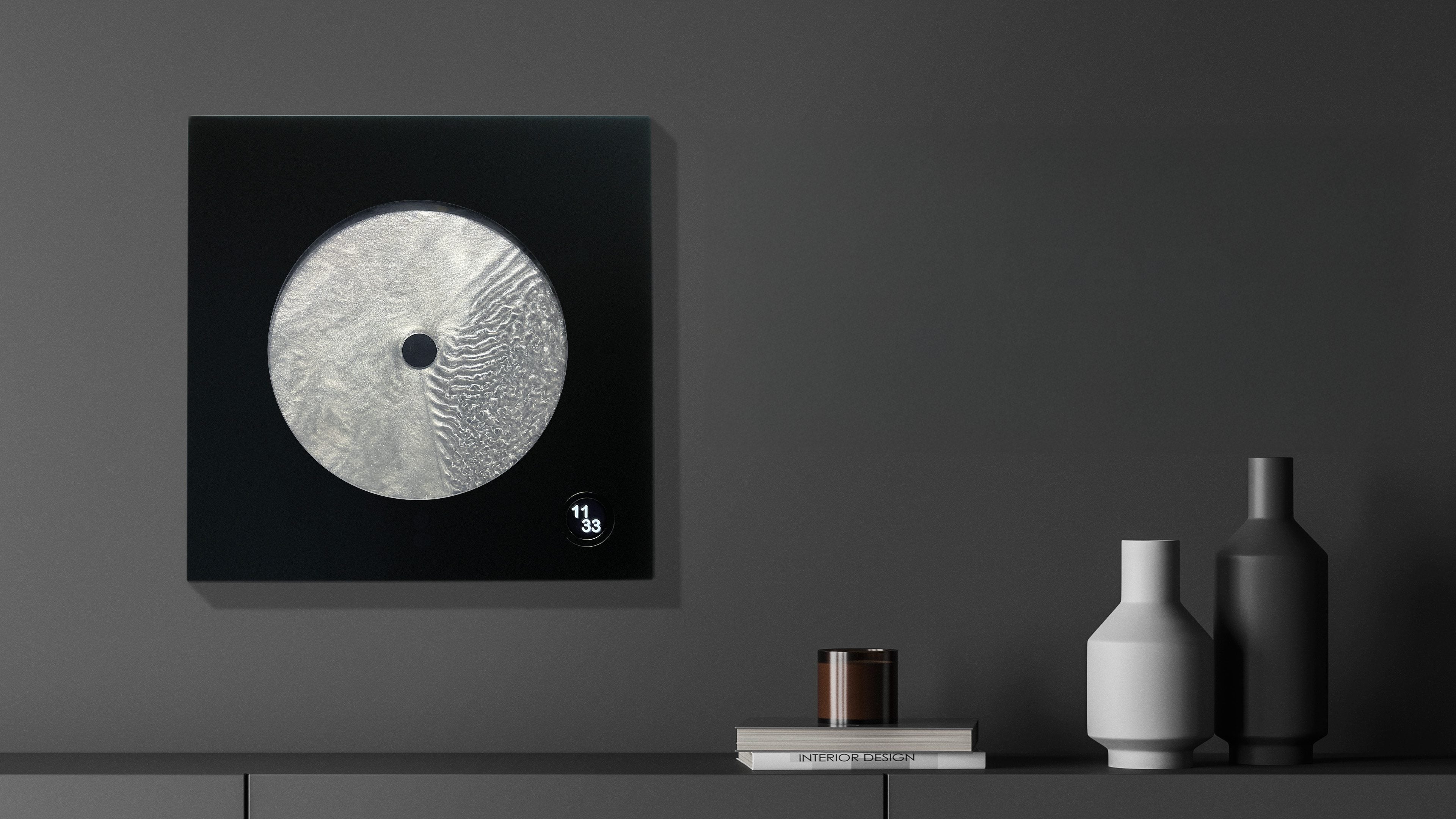
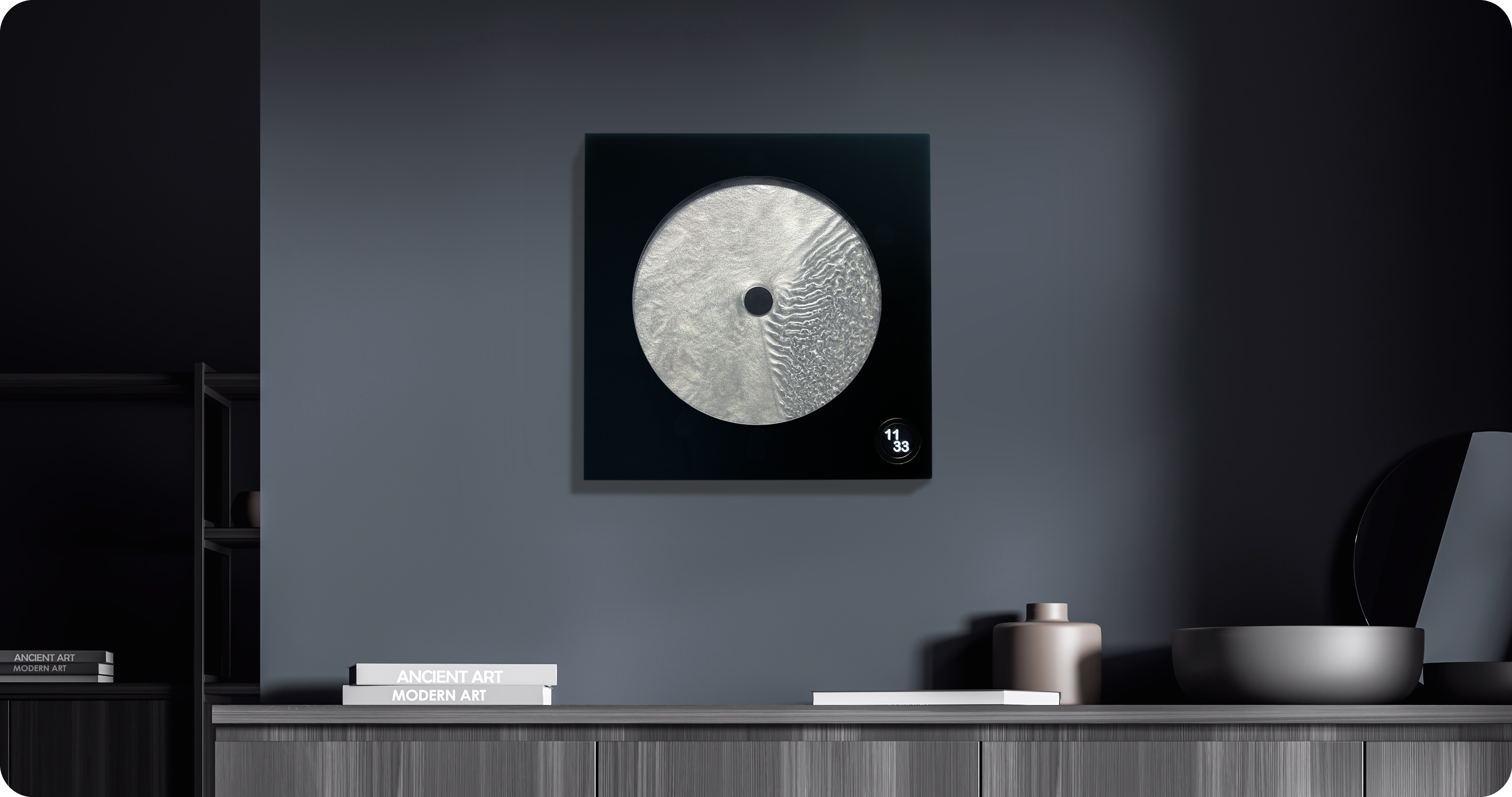
Robert Spillner spent years building components for Formula 1 teams before reversing the entire premise of his career. Instead of measuring speed, he built an object that stages time. Luna is a 400 x 400mm wall piece framed in matte black solid wood with a cast acrylic pane at its center. Inside, a single pointer moves through Zero Flow Technology, Spillner’s proprietary fluid made from distilled water, additives, micro-particles, and a small quantity of genuine lunar dust. Behind the pointer, turbulent patterns mark what has passed. Ahead of it, the liquid sits completely undisturbed.

The exact composition of the fluid is deliberately undisclosed, and that is the right call. The lunar dust is certified and billions of years old, documented with a certificate of authenticity that ships with each piece. Every Luna is signed, numbered, and limited to 99 per year, all made on demand in Germany. A small LCD touchscreen adjusts time and brightness without competing visually with the fluid. Spillner describes it as an art object with a time function, and the order of those words is correct.

What we like

  • The past-and-future visual logic is legible in the object itself, not only in the written description of it
  • Lunar dust certification and a limit of 99 per year make each piece traceable and unrepeatable

What we dislike

  • No public price is listed; the limited edition, handmade production profile suggests it sits above the other objects in this list
  • The 400mm square format demands a wall that can hold it as a singular focal point rather than one object among several

Editor’s Choice: Japanese Lantern Candle

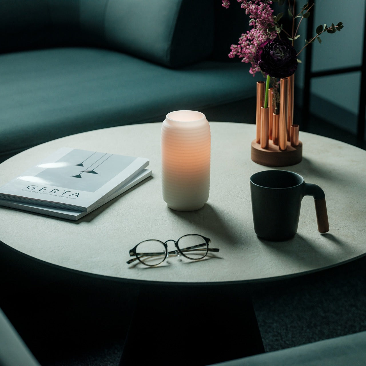
The paper lantern is one of the oldest resolved problems in lighting design. How do you carry warmth from a candle flame into a room without losing it to the hardness of the fixture? Japanese designers worked through that question for centuries and arrived at a form that required almost no further development: a collapsible structure of thin ribs and translucent paper that diffuses candlelight into a soft, directionless glow.

What separates a well-made Japanese lantern from a decorative replica is the quality of light it produces and how it behaves in a room. Warm and sourceless, candlelight filtered through translucent paper fills a corner the way natural light from a small window does, without the hard edge of a focused lamp or the flatness of overhead lighting. On the floor beside a chair or a side table, it becomes the kind of object people notice and comment on before they have thought to ask what it is.

Click Here to Buy Now: $70.00

What we like

  • The quality of diffused candlelight it produces is genuinely different from any other fixture in a room
  • Stores flat, which matters in a small apartment where every permanent object has to earn its place

What we dislike

  • Works best as ambient lighting rather than a primary source for reading or close work
  • The candle paired with it needs to suit the scale and material to get the full effect

The Best Things in a Room Are the Ones Nobody Can Quite Explain

None of these objects ask for much. A shelf, a corner, a spare stretch of counter. They do not need a gallery to earn the attention they receive. What they share is the quality of being genuinely chosen, the sense that someone worked through a problem not just until it was functional but until it was right. That difference is immediately visible and, unlike most things in a home, it does not fade with time.

The museum argument is that certain objects deserve to be seen. These six make the same case from a kitchen counter, an entryway shelf, a bedroom wall. The price point is almost beside the point, though it helps. What matters is that buying thoughtfully and buying well tend to produce the same result: a home that feels assembled by someone who paid attention, rather than one that simply accumulated things over time.

The post 5 Home Objects That Look Like They Belong in a Design Museum but Cost Less Than a Dinner Out first appeared on Yanko Design.

The 3 Best Japanese Kitchen Tools You Need to Buy August 2026

Japanese kitchen tools tend to arrive with a very specific philosophy attached. They do less than you expect on paper and more than you realize until you’ve used them for a week. The three objects below cover different ends of that idea: a precision appliance from one of Japan’s most storied engineering brands, a pair of scissors built for the demands of serious kitchen prep, and a clay pot that has been doing its job correctly since the Kamakura period.

What connects them isn’t aesthetic or price point. It’s the sense that each was designed by someone who had a genuine opinion about what the object should do, then made it do exactly that. August is a good month to pay attention to the kitchen — the produce is at its best, the cooking is more instinctive, and the tools you reach for most tend to reveal themselves. These three are worth reaching for.

1. Mitsubishi Bread Oven

The name requires a moment. Mitsubishi, the Japanese conglomerate better known for cars and precision electronics, makes one of the most exacting home bread ovens available. The machine applies the same engineering discipline to baking that Mitsubishi Electric brings to everything else it builds: controlled heat, precise internal timing, and an attention to the baking chamber environment that consumer appliances from Western brands rarely match. The result is a loaf with a crust and crumb structure most countertop machines simply cannot produce, regardless of recipe.

What makes it worth covering in a design publication isn’t only the output. The form is unmistakably Japanese in its restraint — minimal, white, without the button complexity that clutters European bread makers at comparable prices. It occupies counter space the way well-considered appliances should: as an object with a clear visual point of view rather than a machine that apologizes for being there. Bread that comes out of it tastes like something was genuinely thought about. Because it was.

What We Like

  • Precision heat management produces a crust and crumb that typical home bread makers don’t come close to replicating
  • The minimalist appliance design treats the machine as a considered object rather than a utility box competing for counter attention

What We Dislike

  • Sourcing outside Japan requires import channels, which adds cost and complicates any warranty or service process
  • The price point places this firmly in investment appliance territory — this is a deliberate purchase, not a casual one

2. Precision Chef Kitchen Scissors

Kitchen scissors are one of those tools most cooks underestimate until they own a genuinely good pair. The Precision Chef Kitchen Scissors make the case for re-evaluation. Built with the material standards and blade geometry you’d expect from Japanese cutlery, they work through herbs, spring onions, dried chilies, and butcher twine without the handle torque that cheaper scissors force you to compensate for on every cut. Edge retention is where the quality gap between these and a supermarket pair becomes immediately obvious.

The design is deliberately restrained, which is exactly the right call for a kitchen tool that needs to sit in a drawer and get used without ceremony. Nothing superfluous in the grip, nothing decorative in the blade. Japanese kitchen scissors at this level function as precision instruments that happen to look like scissors. Once you’ve used a pair built this well for a full week of regular prep, the ones you owned before start to feel like a different category of object entirely.

Click Here to Buy Now: $95.00

What We Like

  • Edge retention and blade geometry handle repeated kitchen use without the performance drop that cheaper alternatives show within weeks
  • The restrained design means these function as tools first, rather than objects performing the idea of quality

What We Dislike

  • The refined aesthetic means they can disappear in a crowded kitchen drawer — worth designating a fixed home for them
  • Like most professional kitchen scissors, they require hand-washing to preserve edge quality, which adds a small but real step to cleanup

3. Iga-yaki Donabe Clay Pot

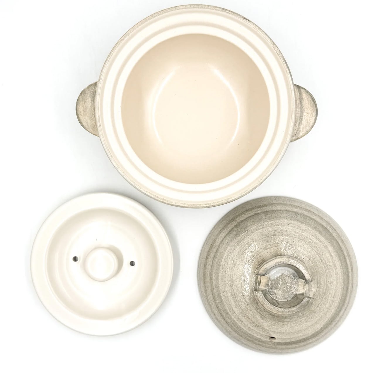
Iga clay comes from Mie Prefecture in Japan, where the local earth has been used for ceramics since at least the Kamakura period. The porous structure of Iga-yaki absorbs heat slowly and releases it with a consistency that metal pots structurally cannot replicate. Rice cooked in it sweetens. Broth deepens over a lower flame than you’d expect to produce it. The exterior stays rough and unfinished while the interior is glazed smooth — two surfaces on the same vessel, each doing exactly what it should.

Available from TOIRO Kitchen in several sizes, the donabe asks for a single seasoning step before first use — simmering rice water in the vessel — and then becomes one of the most reliable pots in the kitchen. It handles rice, hot pot, steaming, and slow braise with equal competence, which makes it the rare piece of cookware that earns its space by quietly replacing three other things. Store it with the lid off after washing, and it will be in your kitchen for decades.

What We Like

  • Iga clay’s heat retention produces results in rice and broth that no metal pot at any price point genuinely replicates
  • Real versatility across rice, hot pot, steaming, and slow cooking means one vessel covers what several usually would

What We Dislike

  • Requires a seasoning step before first use that the packaging doesn’t always communicate clearly upfront
  • The porous clay absorbs strong cooking odors over time and needs to be stored with the lid off after washing to stay fresh

Make the Kitchen Better, Not Faster

Three tools, three distinct registers of Japanese kitchen culture. Mitsubishi brings precision engineering to something as ordinary as a morning loaf. The scissors bring professional blade standards to daily prep work. The donabe brings centuries of ceramic craft to the kind of cooking that rewards patience over speed. None of them are trying to make the kitchen faster or more efficient. They’re trying to make it better, which is a different ambition and one worth paying for.

August is when most kitchens are running at full capacity — markets are abundant, evenings stretch long enough to cook properly. The tools you own in that window shape what’s actually possible in it. These three share a conviction that how something is made matters as much as what it does, and that conviction shows up every single time you reach for them. Start with whichever one your kitchen is currently missing most.

The post The 3 Best Japanese Kitchen Tools You Need to Buy August 2026 first appeared on Yanko Design.
A 355-Square-Foot Tiny Home With Room to Actually Walk Around

Most tiny homes are upfront about their limitations. The Florence isn’t interested in that conversation. The Florence, by Alberta-based Teacup Tiny Homes, is the argument against all of that. Sitting on a triple-axle trailer, the Florence stretches 36 feet long and 8.5 feet wide, placing it at the roomier end of the towable tiny home spectrum. Its 355 square feet of interior space is arranged with the kind of logic you’d expect from a full-size home — not an afterthought. That discipline in planning is what separates it from the crowd.

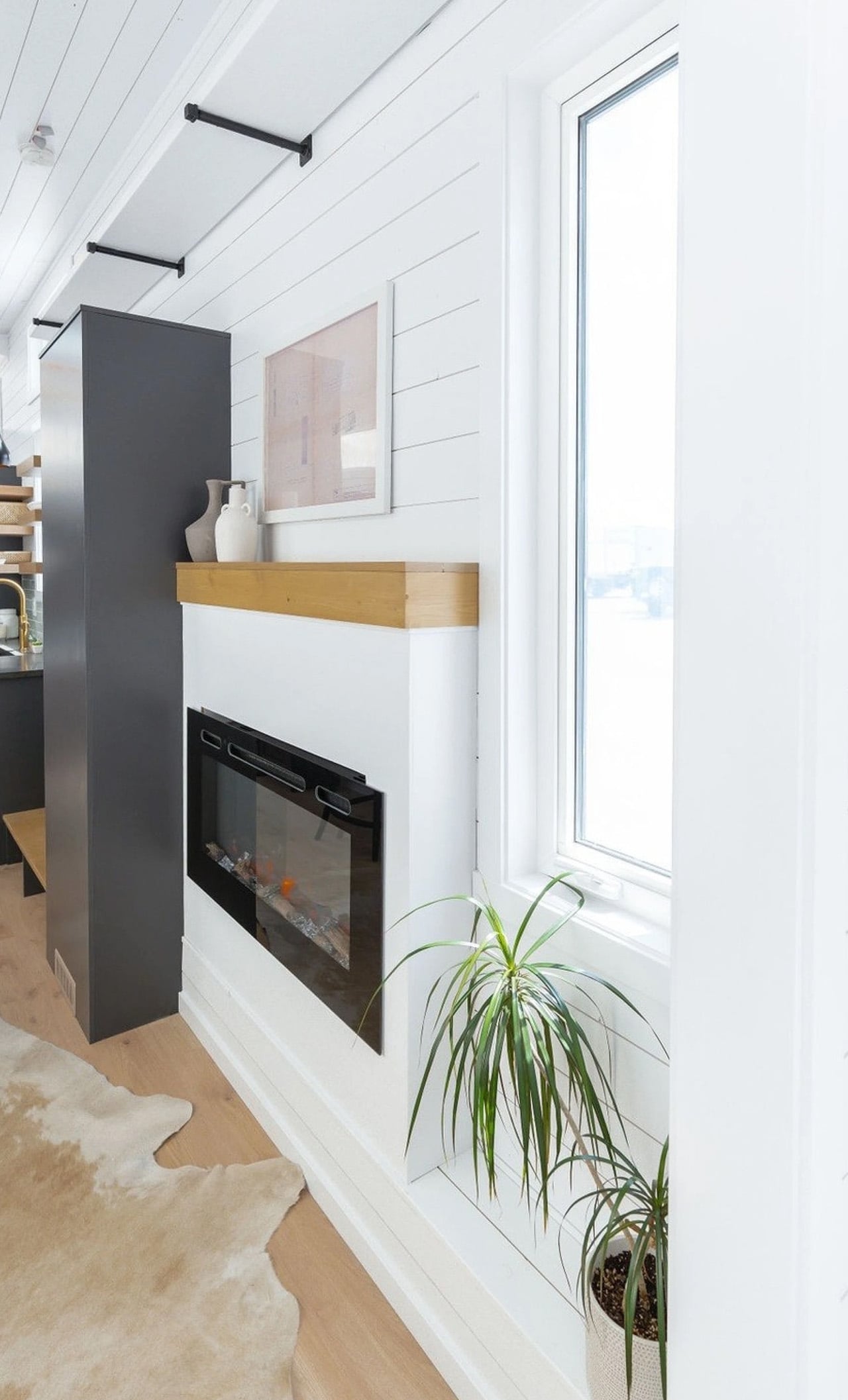
Step inside and the first thing you notice is light. White tongue-and-groove paneling wraps the walls, 11-foot vaulted ceilings push the space upward, and generous windows pull the outdoors in. The living area anchors the layout, centered around a sofa and electric fireplace, with room for a television and a large built-in storage unit near the entrance. It doesn’t read like a compromise. It reads like a considered home.

Designer: Teacup Tiny Homes

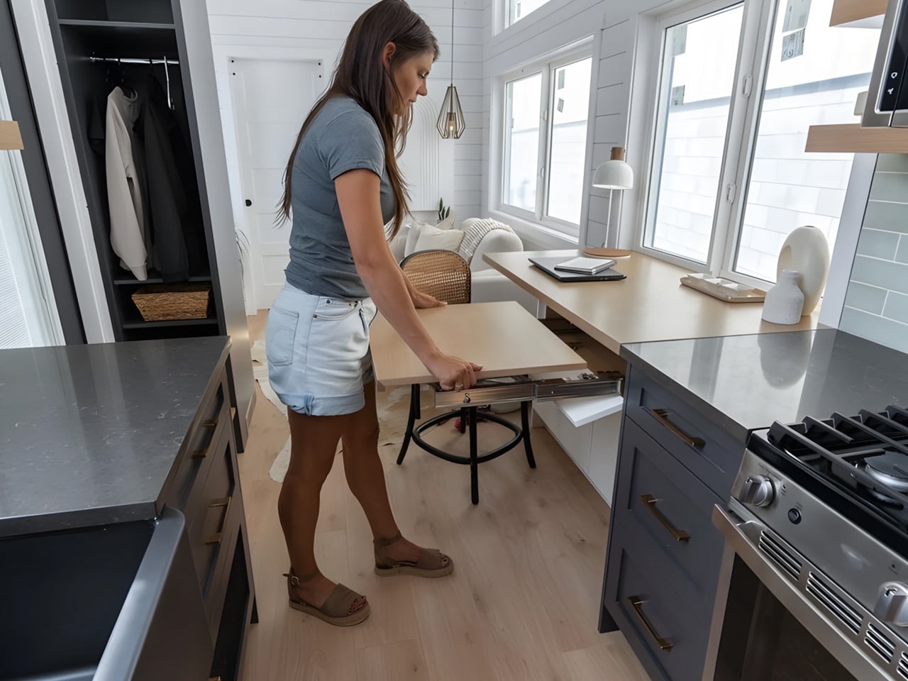
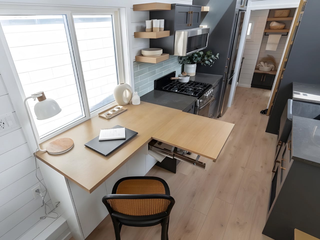
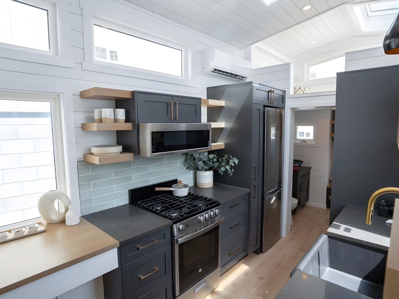
Immediately adjacent is one of Florence’s more thoughtful touches — a dining nook that doubles as a home office, complete with an extending desk and integrated storage. For remote workers or anyone who needs a dedicated workspace without sacrificing a room, this dual-function zone is quietly brilliant. The kitchen runs along the galley wall nearby, equipped with a four-burner propane stove, oven, microwave, fridge/freezer, a large sink, and storage that actually holds things.

The master bedroom is located on the main floor, which is rarer than it should be in the tiny home world. Positioned next to the living area, it fits a double bed with genuine walking clearance on both sides and enough built-in storage to feel like a real room. A secondary sleeping loft sits above the kitchen and bathroom, accessed by a removable wooden ladder, offering space for a second double bed. The bathroom, tucked between the kitchen and bedroom, features a glass-enclosed shower, flushing toilet, and vanity sink.

Teacup Tiny Homes, a 100% female-owned and operated company founded in 2016, offers the Florence with a range of customization options — a soaking tub in place of the shower, choice of materials and furnishings, and permanent foundation installation if mobility isn’t the priority. Delivery runs across both the US and Canada. The Florence starts at roughly US $122,000. For a home this size, it’s a number that’s easier to justify than it might first appear.

The post A 355-Square-Foot Tiny Home With Room to Actually Walk Around first appeared on Yanko Design.

The 5 Best Tech Gifts for the Guy Who Thinks He’s Already Seen Everything in 2026

There’s a specific kind of person who is genuinely difficult to shop for. He already owns the good headphones, already upgraded the keyboard, already knows the spec sheet of whatever you’re about to suggest before you finish the sentence. The products that actually land with him aren’t better versions of things he already has. They’re objects that make him stop, turn it over in his hands, and ask a question he hasn’t thought to ask before. That’s the bar this list is built around.

Every pick here does something the category wasn’t supposed to do. A power bank thinner than a phone. A mouse that folds flat enough to slip into an envelope. A speaker you can see straight through while it plays. A notebook that records the room while you write in it. A handheld Linux computer that doubles as a keyboard for any machine on earth. Five gifts, five moments of genuine surprise, and a price range wide enough that none of them feel like settling.

1. piBrick Pocket-CM5

The piBrick Pocket-CM5 is the size of a smartphone and runs a full Linux desktop. Built from a custom PCB, a 3D-printed shell, and an open-source parts list that totals $172, it arrives at 80mm × 145mm × 19.6mm with a 3.92-inch AMOLED display running at 1080×1240 pixels, 90Hz, and 560 nits of brightness. A BBQ20 BlackBerry-style keyboard sits on the face, complete with an integrated trackpad, rotary encoders on the sides, and five user-programmable buttons. Asahi Tempered Glass covers the display, and a 5,000mAh battery keeps everything running without a desk.

The feature that makes it genuinely surprising lives in the USB stack. Plugging the piBrick into any external computer or server activates USB-HID mode, turning its keyboard and trackpad into a fully standalone input device, independent of the Linux system running underneath. A sysadmin arrives at a server rack without a spare keyboard. The piBrick already is one. Full-size and micro-HDMI outputs let the same device drive an external display. NVMe SSD support in 2230 and 2242 formats adds real storage headroom.

What we like

  • A full Linux machine that moonlights as a USB keyboard for any device on earth — two completely distinct, genuinely useful capabilities in smartphone dimensions
  • Built for significantly less than a budget phone, with an open-source design that belongs to anyone who wants to build on it

What we dislike

  • Building the piBrick requires sourcing parts and assembling the hardware yourself, which puts it out of reach for anyone not comfortable with a soldering iron
  • The $172 figure is the parts cost floor, not a retail price — the full build investment in time and effort needs to be factored in

2. OrigamiSwift Mouse

Horace Lam designed the OrigamiSwift around a single constraint: a Bluetooth mouse that collapses small enough to carry without thinking about it. Folded, it measures 0.18 inches thick and weighs 40 grams, lighter than most pens. Open, it becomes a full-sized working mouse in under half a second. The origami-inspired triangular structure gives the folded form real rigidity, so it holds its shape through actual work sessions rather than shifting on the desk after the first hour. The soft-click buttons keep things quiet in shared spaces, which turns out to be something you notice immediately.

The internals match the ambition of the form. A 4,000 CPI HD infrared sensor tracks at up to 4,000 frames per second, Bluetooth 5.2 pairs across Mac, Windows, Android, and iPadOS within a 32.8-foot wireless range, and a single USB-C charge delivers up to three months of use. That last figure is the one worth sitting with. Most wireless mice need charging every few weeks. The OrigamiSwift needs it roughly once a season.

Click Here to Buy Now: $85.00

What we like

  • Folds to 0.18 inches thick and weighs 40 grams — small enough to forget it’s in a bag until you actually need it
  • Three months of battery life on a single USB-C charge, which makes every other wireless mouse feel like a maintenance obligation

What we dislike

  • Stock is limited at the time of writing, so availability may not line up with gift timing
  • The 4,000 CPI ceiling may feel restrictive for anyone whose work involves precision-heavy creative or illustration workflows

3. Xiaomi UltraThin Magnetic Power Bank

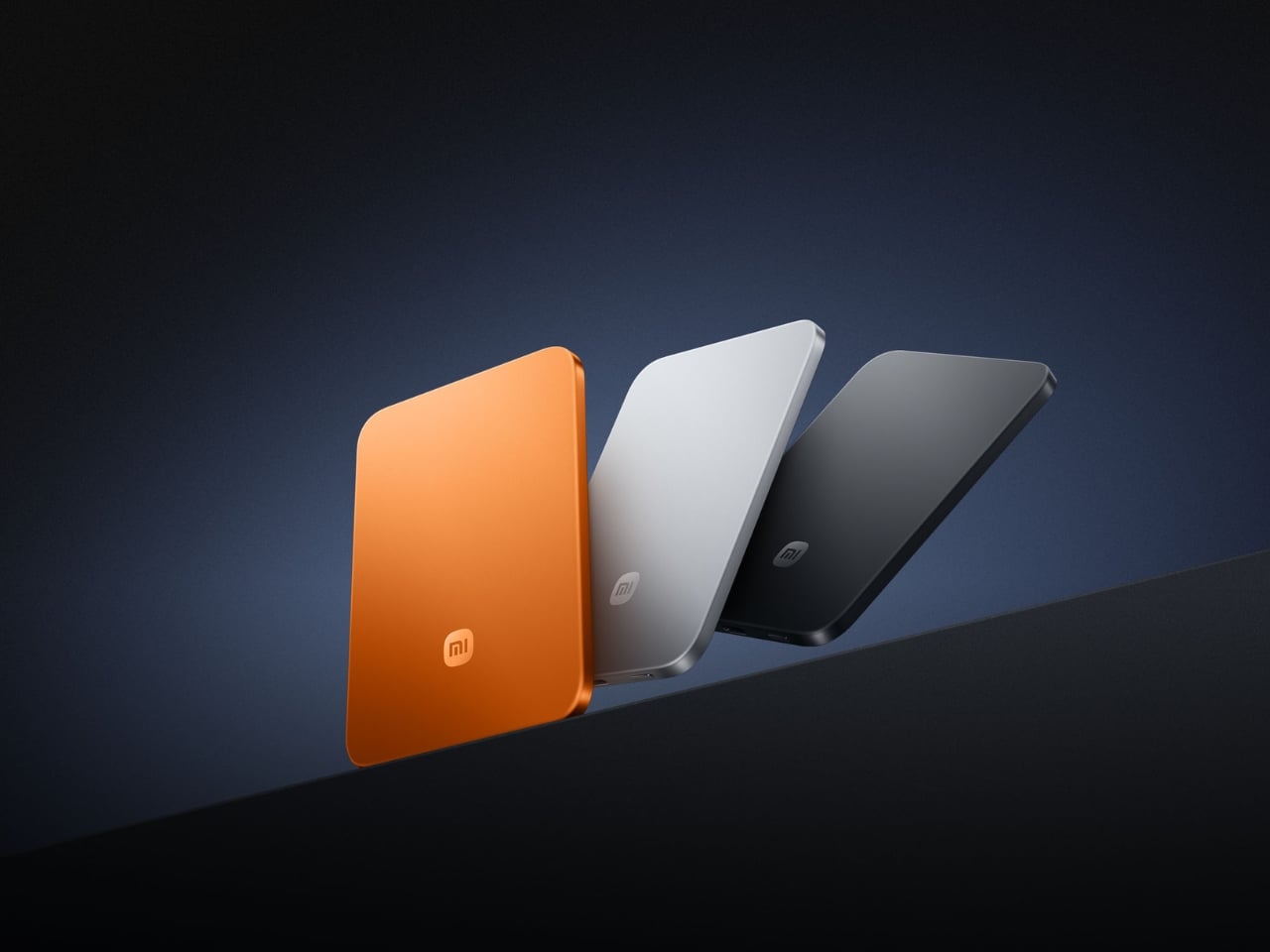
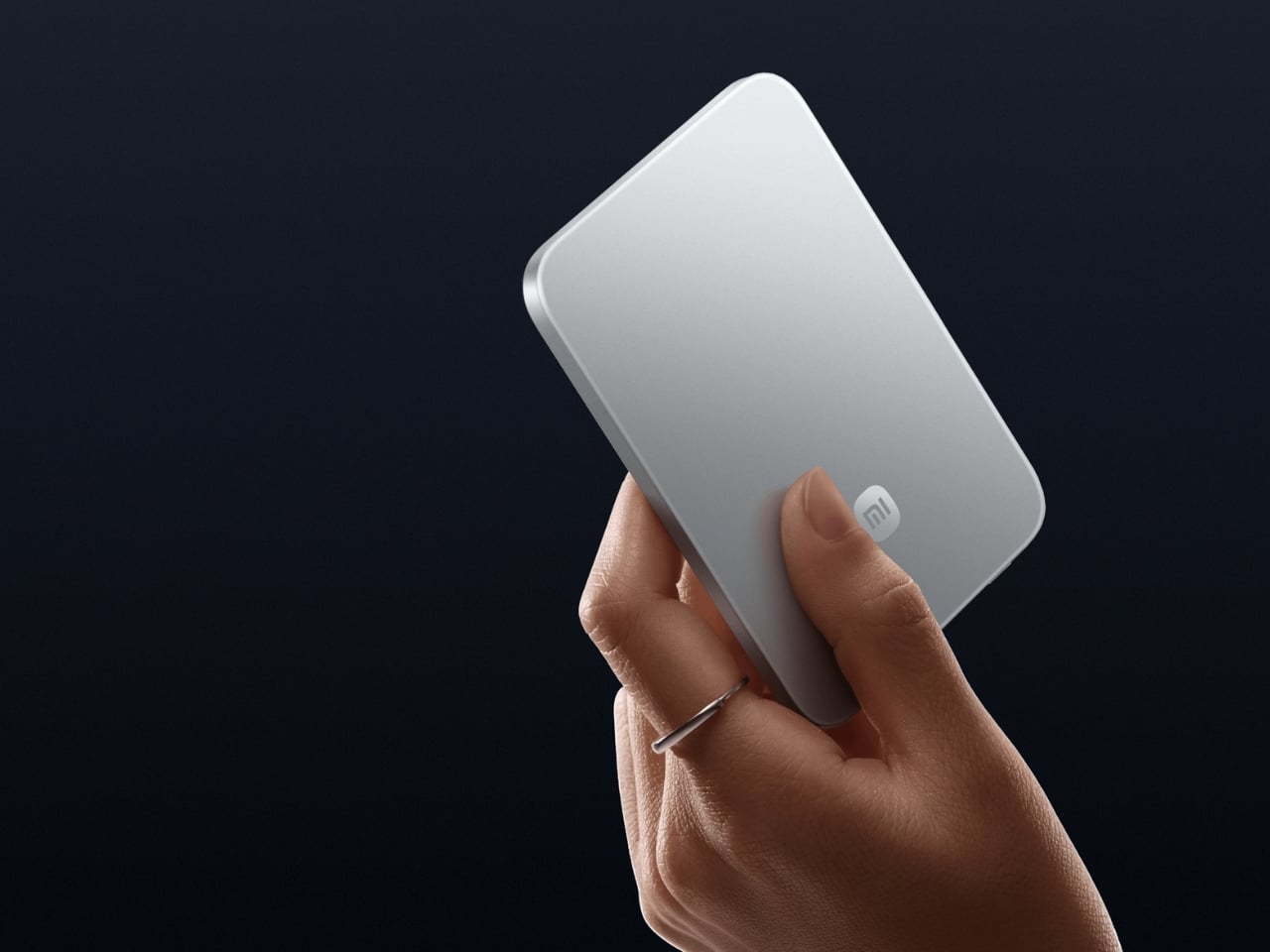
The power bank category has been stuck in the same design rut for a decade. Bigger capacities, same uninspired bricks. Xiaomi broke that logic at MWC 2026 in Barcelona with a magnetic power bank measuring 6mm thick, thinner than any current smartphone on the market, including the iPhone 17. The 5,000mAh capacity is made possible by silicon-carbon battery chemistry with 16% silicon content, the same material science pushing next-generation electric vehicle batteries into smaller form factors. It weighs 98 grams. The aluminum alloy shell has a photolithographically etched logo on the back, and the phone-facing surface uses fire-resistant fiberglass with an excimer coating for heat management.

Wireless charging tops out at 15W when paired with the Xiaomi 17 series and 7.5W for iPhones via MagSafe. A USB-C port pushes 22.5W wired, and the bank charges two devices simultaneously. Ten layers of protection cover overvoltage, overcurrent, overheating, and short circuits, with dual NTC temperature sensors monitoring heat in real time.

What we like

  • At 6mm and 98 grams, it snaps magnetically to the back of a phone and disappears there — the first power bank in the category to make you genuinely forget you’re carrying one
  • Silicon-carbon battery chemistry packs 5,000mAh into a profile that has no business fitting that much capacity

What we dislike

  • The 7.5W cap on iPhones is an Apple MagSafe restriction rather than a Xiaomi design choice, but it still stings
  • US buyers will need to source it internationally for now, as domestic availability is unconfirmed at the time of writing

4. Huion Note E

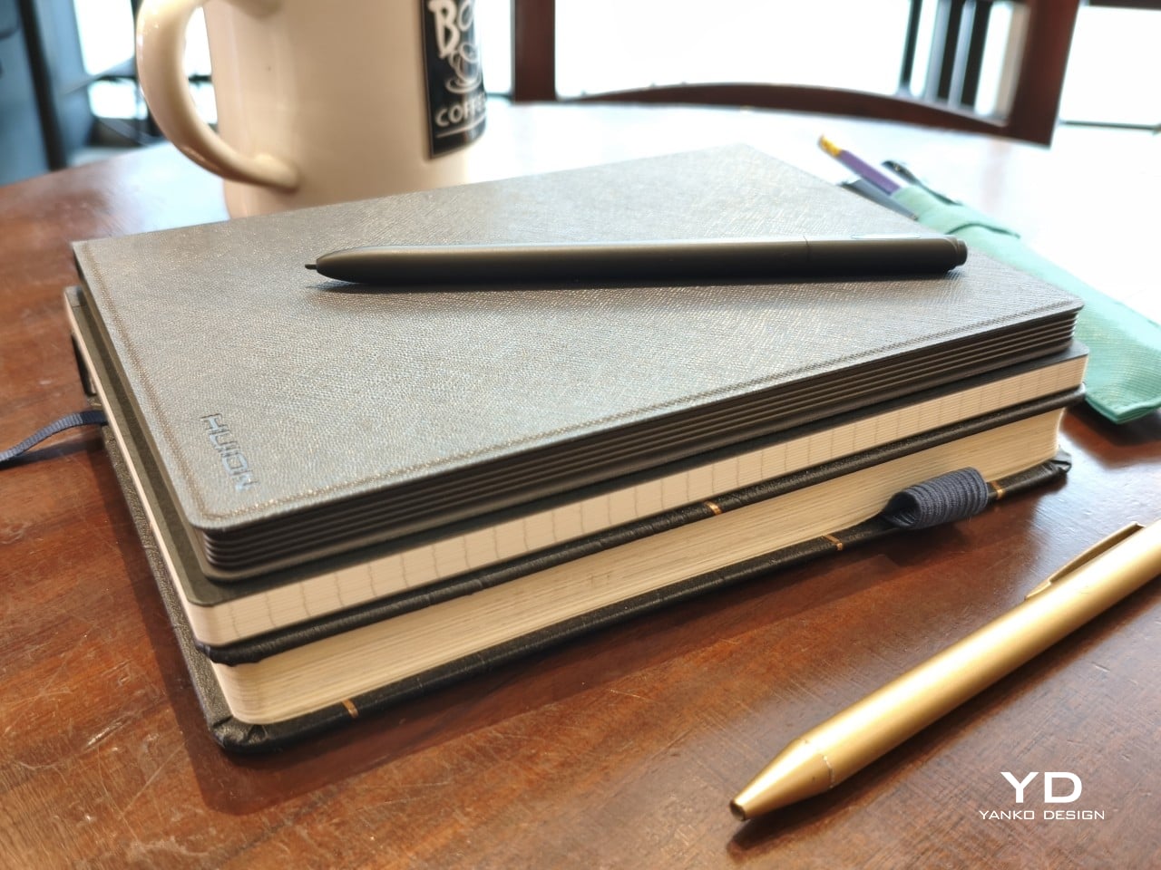
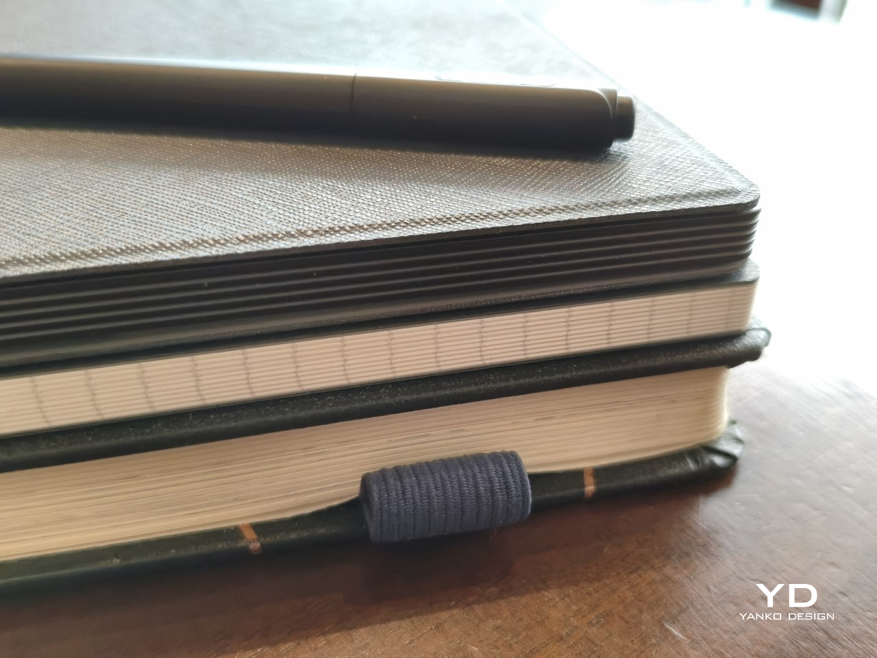
Huion built the Note E to pass as a paper notebook from any angle. The sides are rigid to mimic the page block of a bound journal. The cover is PU leather with a felt lining on the inside. At exactly A5 proportions and 348 grams without the cover, it is the size and weight of an 80-page notebook. The 8.4-inch laminated LCD screen uses anti-glare nano-etching that Huion’s own reviewer describes as writing on smooth Japanese paper, with DC dimming over PWM to reduce the eye strain that builds across a long writing session. Turning it to the side, nothing about it reads as electronic.

What genuinely separates it from every other stylus tablet is a feature buried in the note-taking app. The Note E records audio while you write. Play it back later and the recording advances in sync with your handwriting reappearing on screen, line by line, exactly as it was written. Every word is anchored to the sound in the room at the moment it landed on the page. The included PW510 stylus is battery-free, offers 8,192 levels of pressure sensitivity with tilt support, and attaches magnetically to the side of the device.

What we like

  • The audio-sync playback turns any page of notes into a timestamped recording — you can replay exactly what was being said in the room at the moment each line was written
  • The battery-free PW510 stylus with 8,192 levels of pressure sensitivity is included, alongside a cover that genuinely looks like a premium leather journal

What we dislike

  • No microSD expansion means 128GB is the ceiling, which fills up faster than expected once drawing files enter the picture
  • The cover attachment mechanism feels less robust than a product at this price point should, with prongs that require a specific sliding motion to engage

5. MorningBlues SonicGlass A1

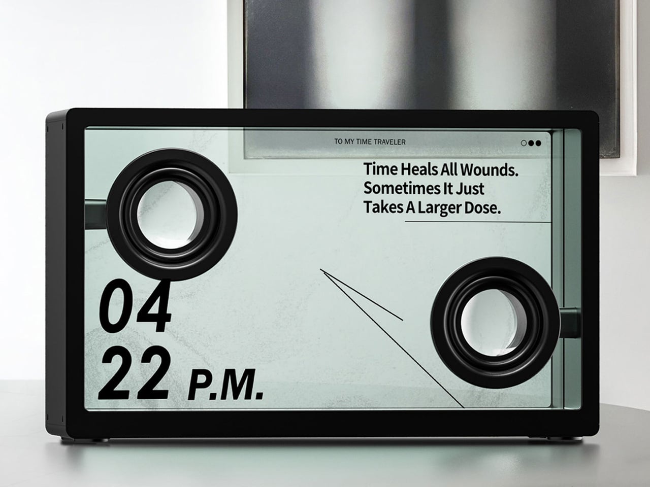
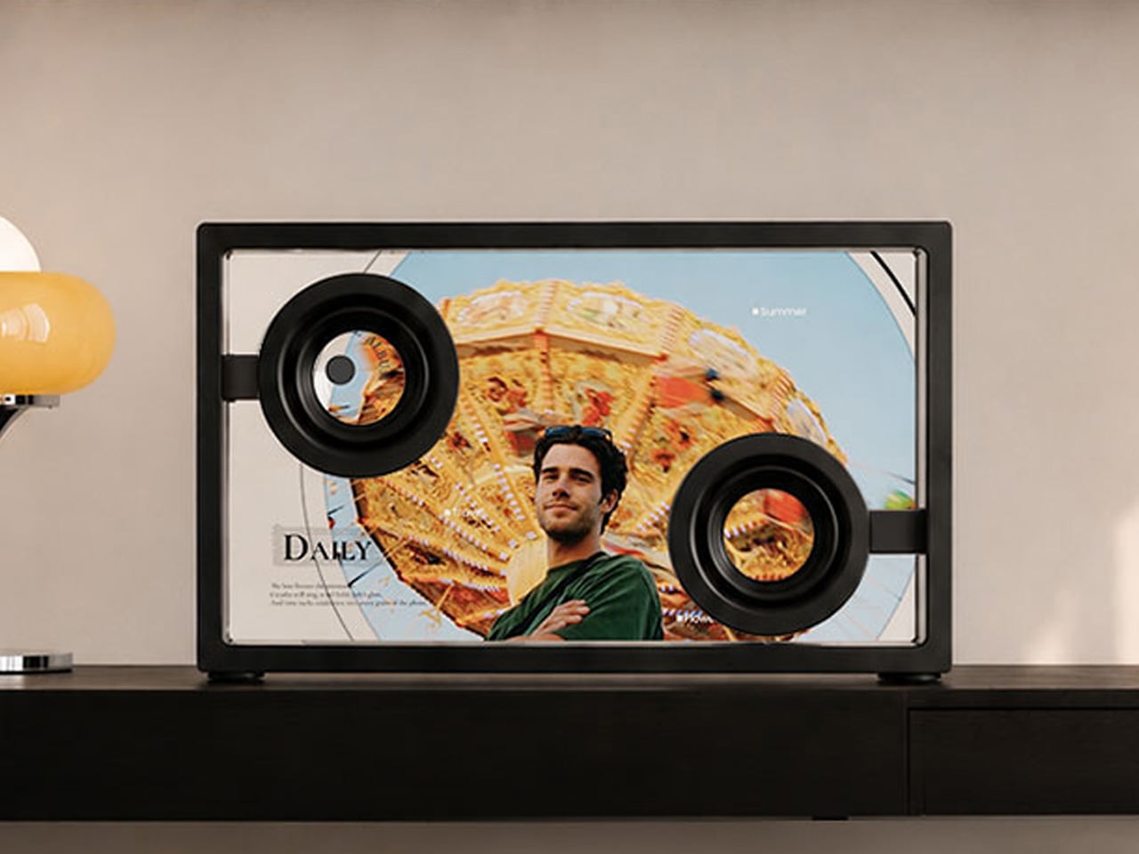
The MorningBlues SonicGlass A1 is a speaker most home audio brands would not have the confidence to make. The front face is a 21.5-inch TFT panel with over 90% light transmission, framed in black with the driver sitting fully visible behind the glass. When a song plays, licensed lyrics appear across the transparent surface in motion styles tuned to the track’s emotional character, a feature called MoodLyric, trained on hundreds of millions of playbacks with all lyrics licensed through LyricFind to properly credit the artists. The driver is not hidden. The mechanics are not disguised. The whole object is designed to be looked at.

A second layer called SceneSync generates AI visuals in real time matched to the genre playing, with pop, hip-hop, R&B, and rock each triggering distinct visual aesthetics on the glass. When the music stops, it shifts to ambient room mode: rotating backgrounds, a dynamic clock face, or an ASMR sleep display for winding down. A microphone turns it into a karaoke setup with live scrolling lyrics. The MorningBlues Music Hub 1 controller handles playback without involving a phone.

What we like

  • A transparent 21.5-inch display that animates licensed lyrics while the music plays and becomes ambient room art when it stops — the speaker category has needed something this committed to its own idea for a long time
  • SceneSync and MoodLyric together mean the visual experience is never the same twice, tuned in real time to the genre and emotional character of whatever is playing

What we dislike

  • At $646, the price is a meaningful ask for a product that hasn’t shipped yet

The Best Gifts Don’t Improve on What He Already Has – They Make Him Rethink the Category

What makes each of these worth picking is that none of them are better versions of something he already owns. The piBrick isn’t a better mini PC. The OrigamiSwift isn’t a better travel mouse. The Xiaomi power bank isn’t a higher-capacity brick. Each one rethinks the category assumption from the ground up, which is the only kind of product that genuinely surprises someone who already knows the market well and has largely stopped being surprised by it.

The price range runs from $85 to $646, which means there’s a real pick at every budget with no filler option anywhere in the list. Whether it’s the SonicGlass as the room’s defining object or the piBrick as the most interesting thing in a bag, each earns its place the way the best gifts do — by being something the person would never have bought for himself, but won’t want to give back.

The post The 5 Best Tech Gifts for the Guy Who Thinks He’s Already Seen Everything in 2026 first appeared on Yanko Design.
Smart’s Place Turns a Covent Garden Rooftop Into a Full-Blown London Home

London has always demanded creative solutions from its architects. Space is scarce, plots are irregular, and the city’s historic fabric rarely makes room for anything new without a fight. Smart’s Place, designed by David Kohn Architects for developer Baylight Properties, found its answer not on the ground, but above it — perched atop a 19th-century Covent Garden warehouse where a rooftop became the foundation for a proper two-story home.

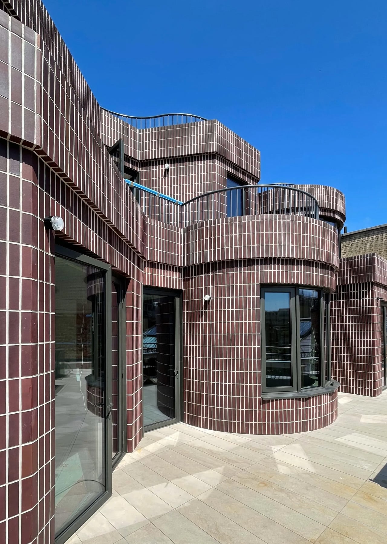
At 3,046 square feet, the residence doesn’t read like a rooftop addition. It reads like a house. The exterior is clad almost entirely in brick, but not laid in the conventional staggered pattern found across London’s surrounding streetscape. Here, each brick is turned on its narrow side and stacked vertically, producing a tighter, more textured surface. The dark plum tone and pale mortar still acknowledge the neighborhood’s palette — it fits without blending in.

Designer: David Kohn Architects

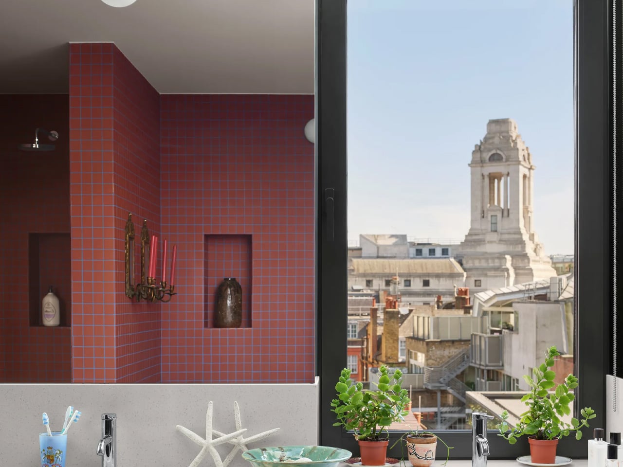
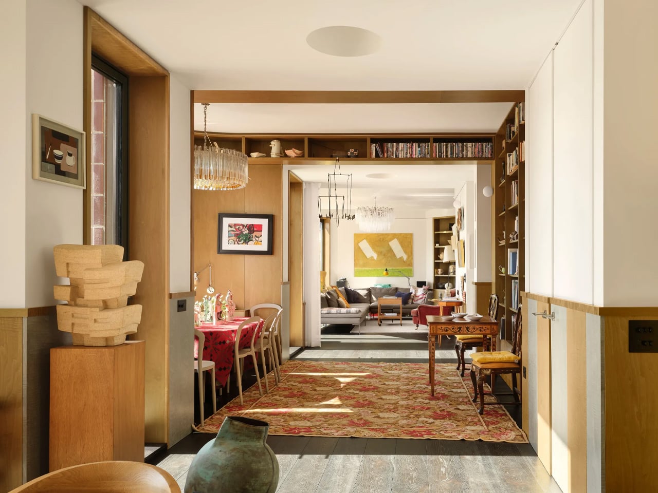
The ground floor is organized as an enfilade — dining room, library, and lounge arranged in an open sequence with no doors between them, flowing as one continuous space. It’s a layout that suits the owner well; the brief called for a home built around hosting. Each room faces south, framed by bay windows that pull London’s skyline into view, with a terrace extending the living space outward. Behind this sequence sits the kitchen, bathrooms, and a lift connecting the home to the warehouse below, which the owner uses as an office.

Upstairs, the character shifts slightly. Two bedrooms, each with its own bathroom, are lined with shelving and wood paneling — a deliberate backdrop for the owner’s collection of art and ceramics. Picture rails run throughout, and a study completes the floor. The staircase connecting both levels is lit from above by circular skylights, a quiet architectural gesture that makes the climb feel considered. Each bedroom has bay windows set back from the facade, carving out private terraces landscaped by Todd Longstaffe-Gowan.

David Kohn himself acknowledged the layered references embedded in Smart’s Place. He cited Sir John Soane’s Museum and the Villa Necchi in Milan alongside the studio’s own Red House — the Dorset project that won RIBA’s House of the Year in 2022, praised specifically for its enfilade that “magically flows.” That same spatial logic reappears here, refined and transported to a London rooftop.

What Smart’s Place demonstrates, much like the studio’s previous work, is an ability to find genuine domesticity inside unlikely shells. Two years in the making, it doesn’t try to look temporary or apologetic about its position above the city. It simply looks like a home — which, given where it sits, is the hardest thing to pull off.

The post Smart’s Place Turns a Covent Garden Rooftop Into a Full-Blown London Home first appeared on Yanko Design.