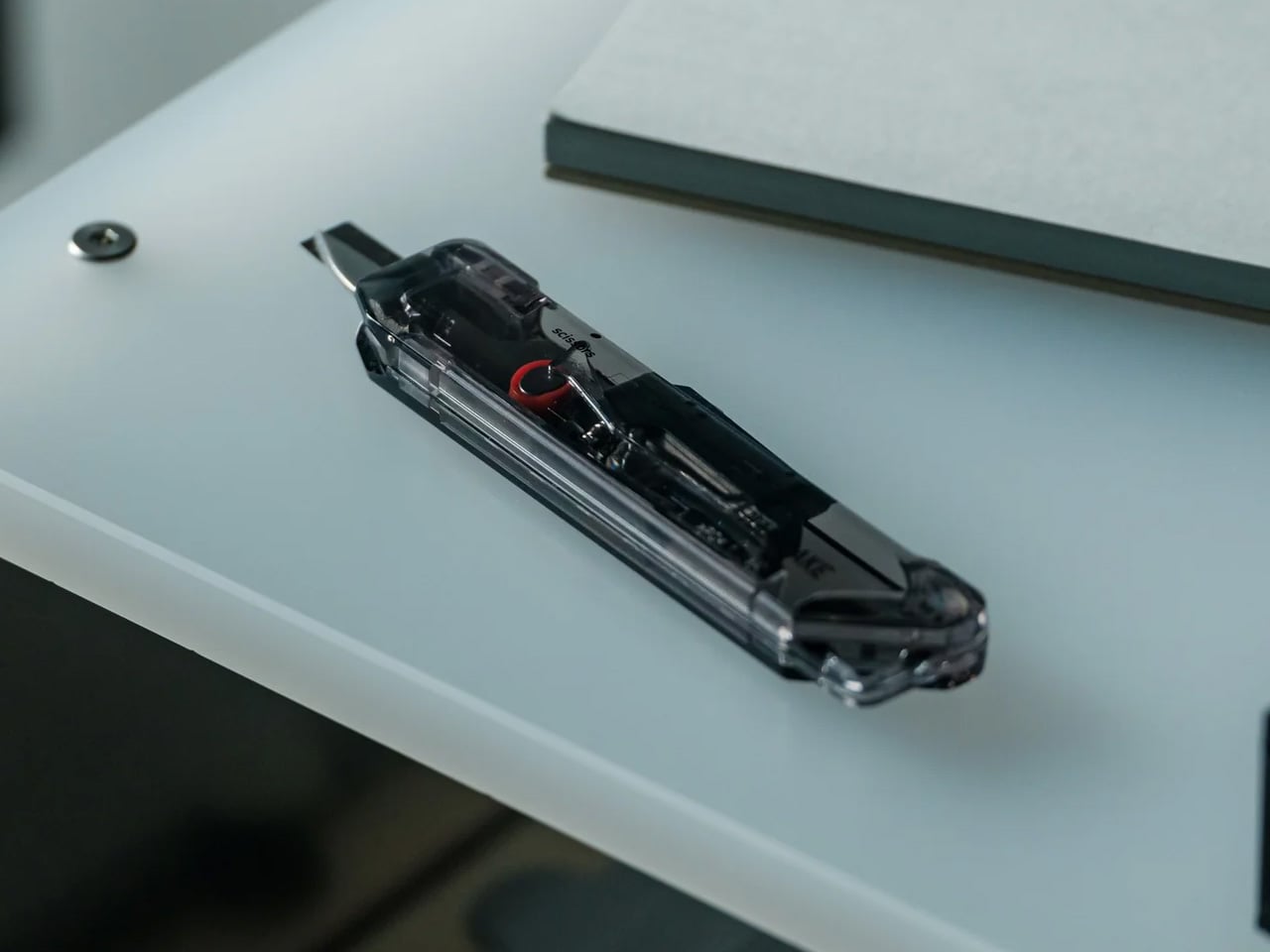
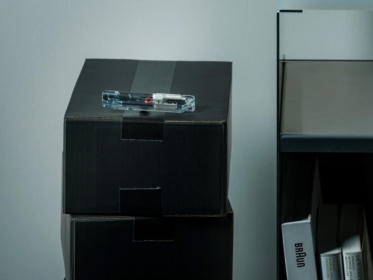
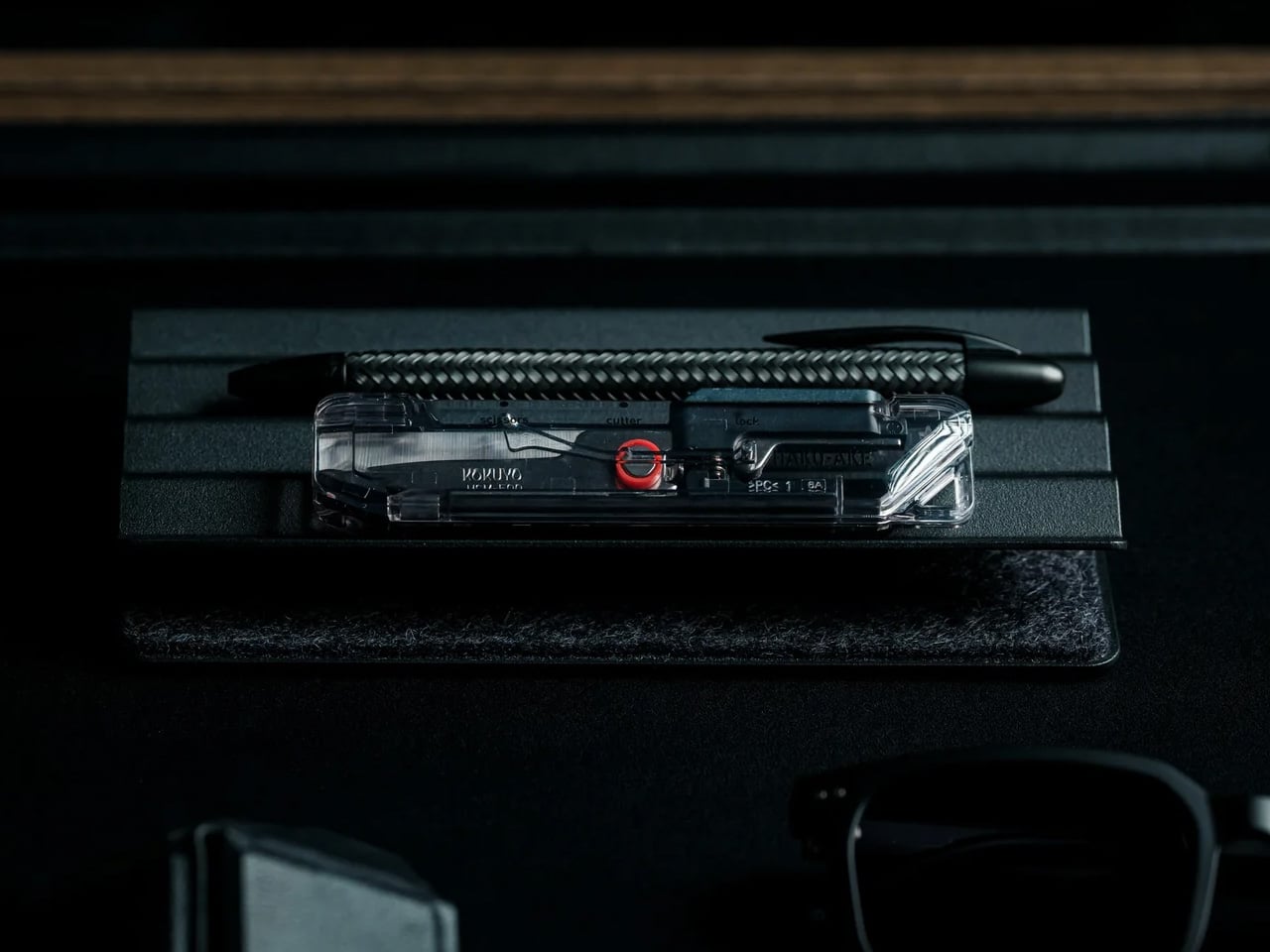
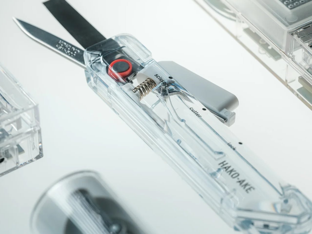
Most box cutters do one thing and leave the scissors somewhere else. The ritual of tearing into a delivery becomes a hunt for a second tool, or a decision to use the first one for everything and hope it does not cut too deep. The ClearSlide Box Opener removes that problem. A blade and scissors in a single compact body, it handles packaging tape and tags in one uninterrupted motion, without putting the package down.
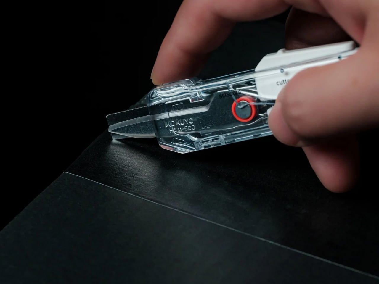
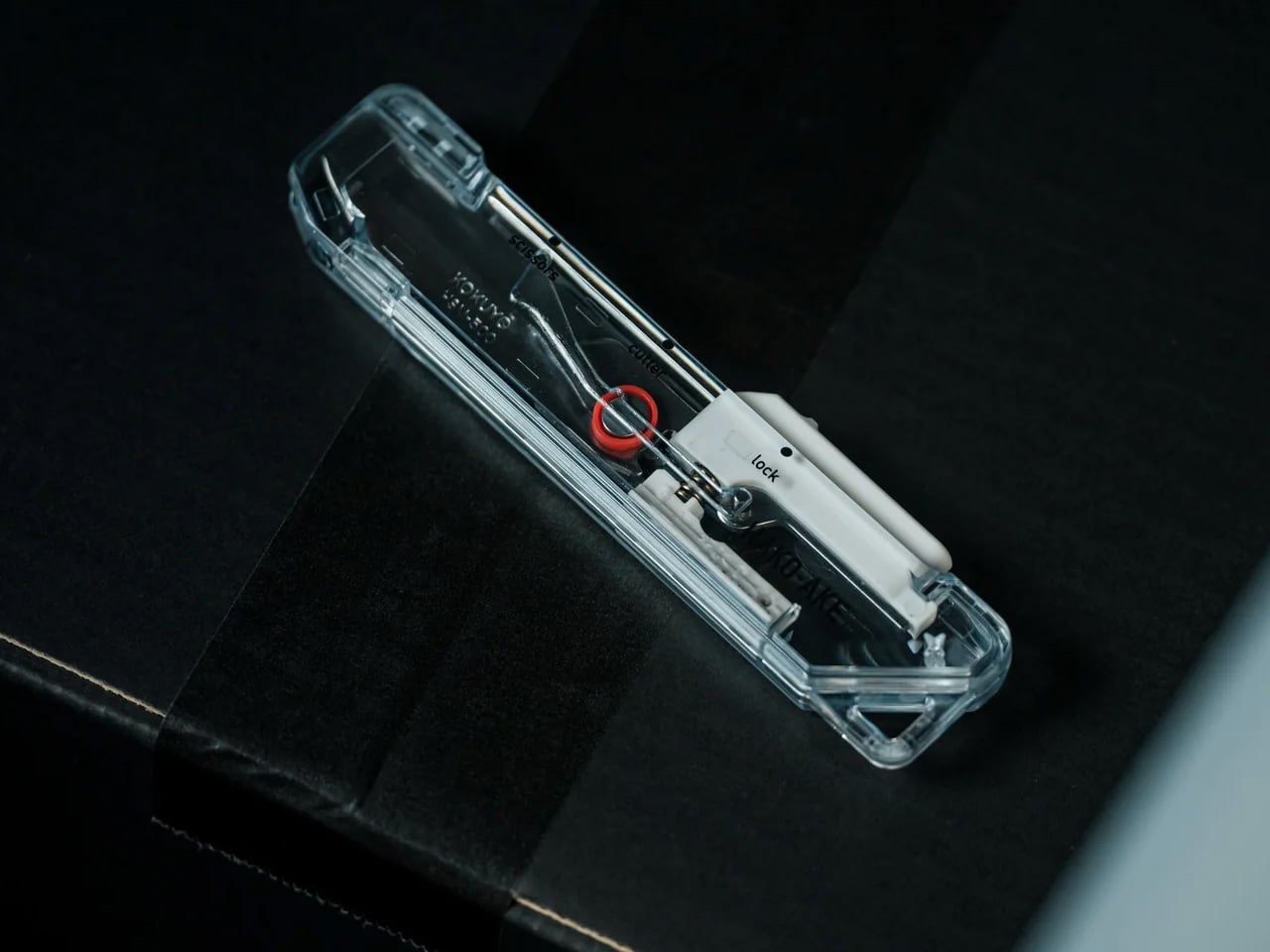
What makes it worth keeping on the desk is the mechanism. A sliding thumb control moves between lock, cutter, and scissors without requiring both hands; each position locks in before releasing cleanly. The blade extends just 0.12 inches, enough to slice through tape without reaching the contents inside. The transparent body shows the internal mechanism’s shift with every adjustment, turning a utility object into something that actually earns its spot next to the keyboard.
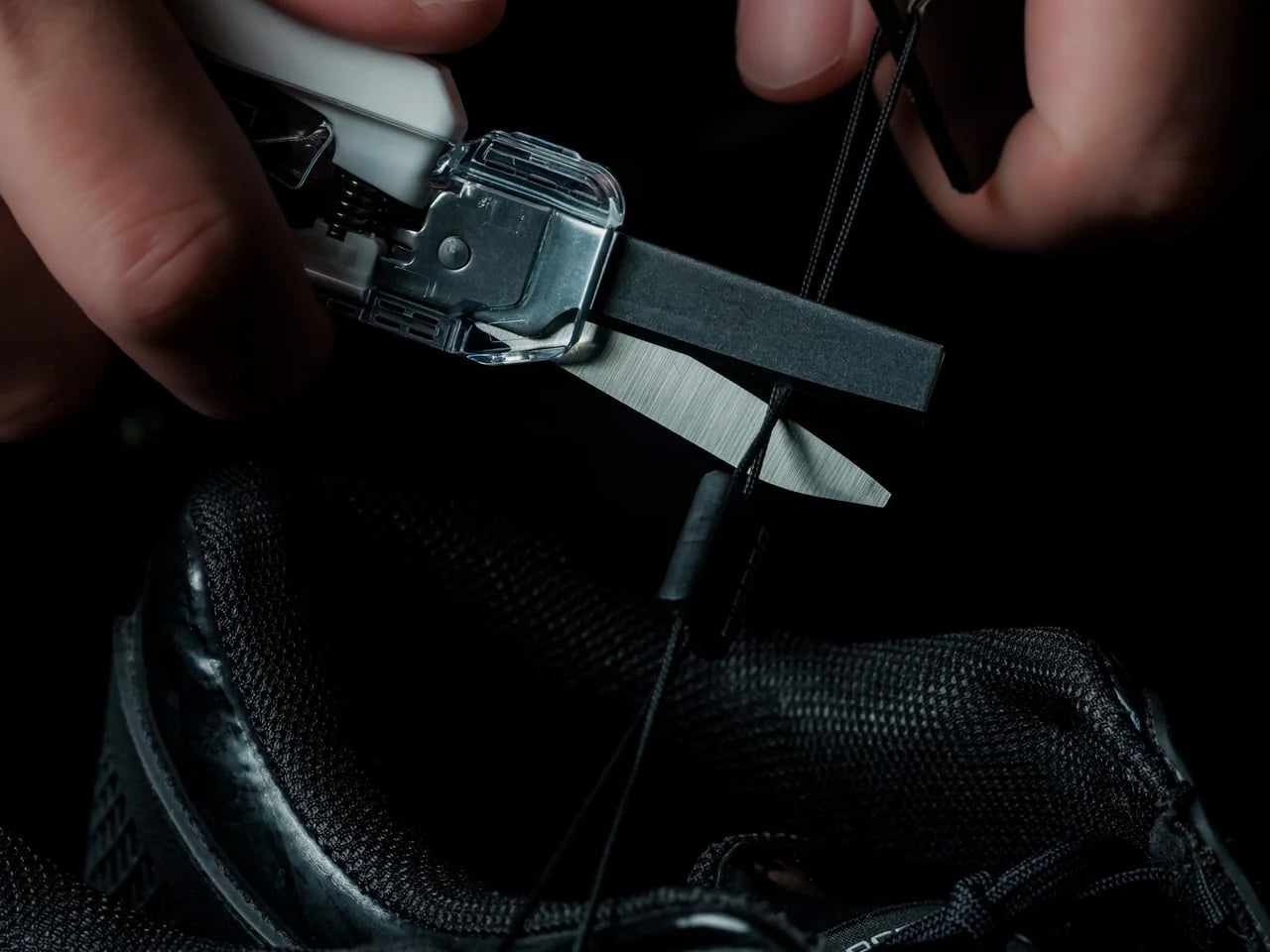
Box cutters and scissors solve the same last step in two different ways. The ClearSlide puts both into a single form factor small enough for a pocket. The sliding mechanism moves through three positions: lock, cutter, and scissors, each one clicking into place before releasing with a clean spring action. That kind of tactile confirmation in something this compact is not common. It changes how deliberate the tool feels in use and removes the uncertainty from every position change.
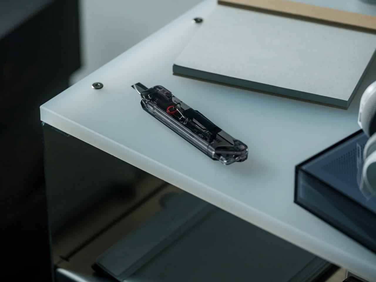
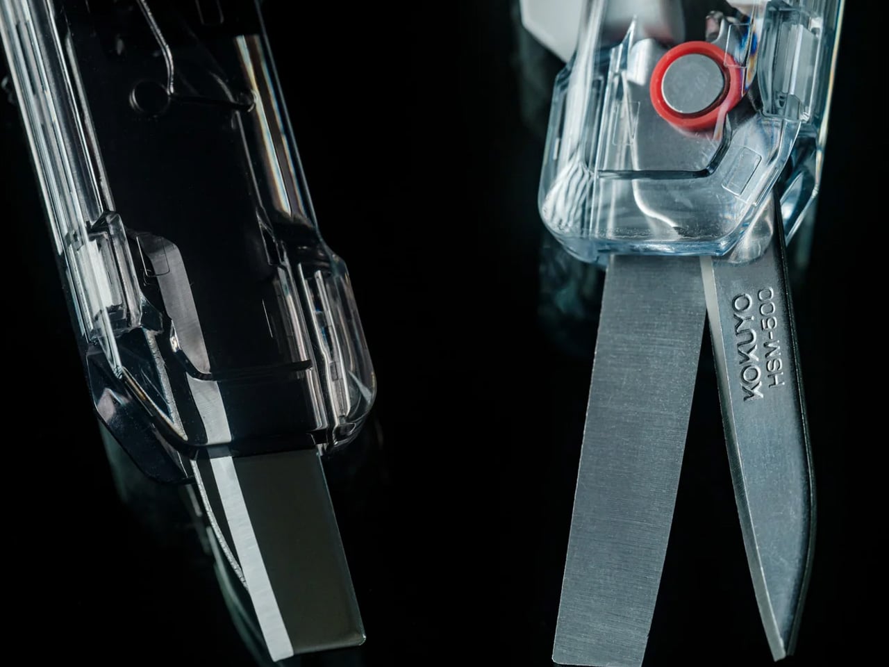
The blade extension is limited to 0.12 inches, which sounds like a constraint until you consider what it actually prevents. Most damaged deliveries come from a blade that cuts too deep on the first pass. At this depth, the cutter handles tape without reaching the contents underneath, which is the only job it needs to do. The scissors handle the rest: tags, inner packaging, anything that a blade would otherwise make worse rather than better.
Transparent by Design
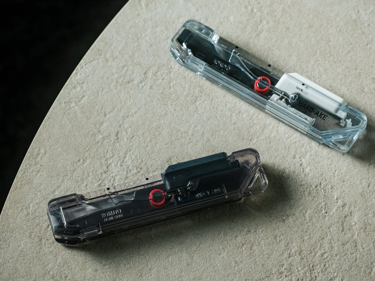
Most tools hide their engineering inside an opaque body. The ClearSlide does the opposite. The transparent shell makes the internal sliding mechanism visible with every position change, so you can see the active mode before making the cut. It is a functional decision dressed as an aesthetic one, or an aesthetic one that happens to be functional. The result is a tool that communicates clearly and carries a retro-tech character most utility objects never bother developing.
Compact enough for a pocket, fitted with a built-in strap hole for clipping onto a bag, and retractable for safe carry, the ClearSlide is designed to stay within reach. The frustration of opening packages is rarely about the cutting itself. It is about the pause before it: the drawer search, the tool switch, the moment where the delivery wins. This closes that gap. One tool, one pocket, one motion from the moment it arrives at the door.
What We Like
Blade-and-scissors combination: replaces two tools with one slim body that handles packaging tape and tags in a single session, without switching grip or setting the package down
Single-hand operation: the thumb-controlled slider moves between lock, cutter, and scissors with one hand, leaving the other free to hold whatever is being opened
Controlled 0.12-inch blade depth: cuts through tape cleanly while staying clear of the contents underneath, solving the most common frustration of opening deliveries with a standard blade
Visible internal mechanism: the transparent body lets you confirm the active mode before every cut, and gives the tool a distinct retro-tech character that sets it apart from every other cutter in a drawer
What We Dislike
Blade replaceability: the product does not specify whether the cutter blade is replaceable, which matters for anyone opening packages regularly and expecting long-term performance from a $30 tool
Limited color range: Clear, White, and Smoke Black are clean choices, but the transparent body has the visual potential to carry a wider palette than three colorways currently allow
The Tool That Ends the Two-Step
The ClearSlide Box Openerwas built around a problem most people have learned to live with rather than solve. Two functions in one tool, controlled by a single thumb, with a blade depth engineered to protect what matters. For something that lives on a desk or clips onto a bag, that level of considered detail at $30 makes it difficult to justify keeping a box cutter and scissors as two separate jobs.
If the current setup involves reaching for one tool and then switching to another halfway through, that is the exact friction this replaces. Pick it up in Clear, White, or Smoke Black. Let the next delivery be the last time the packaging feels harder to deal with than whatever is inside it, and let the scissors that used to live in the desk drawer finally earn a proper rest.
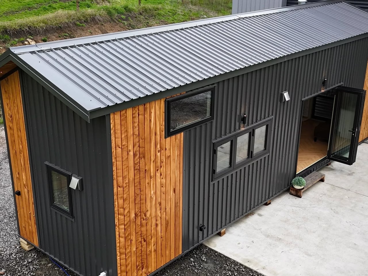
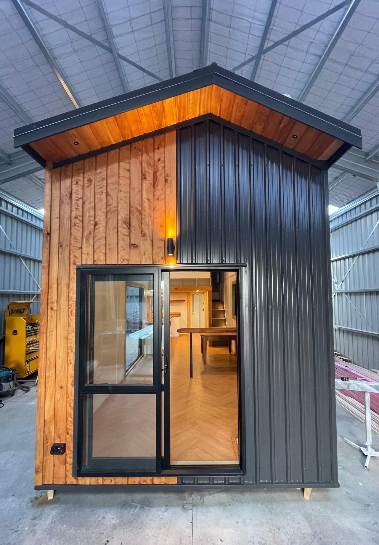
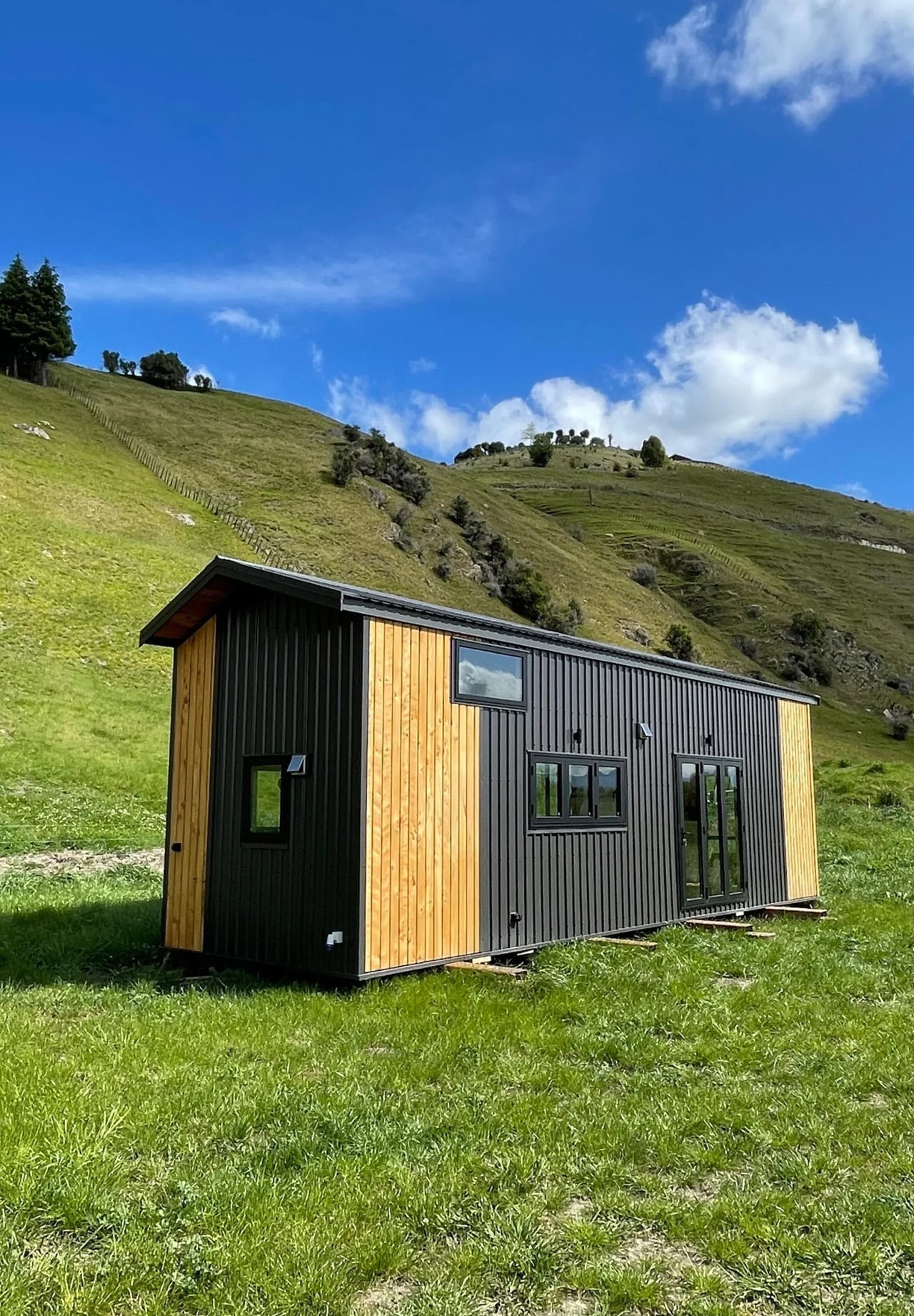
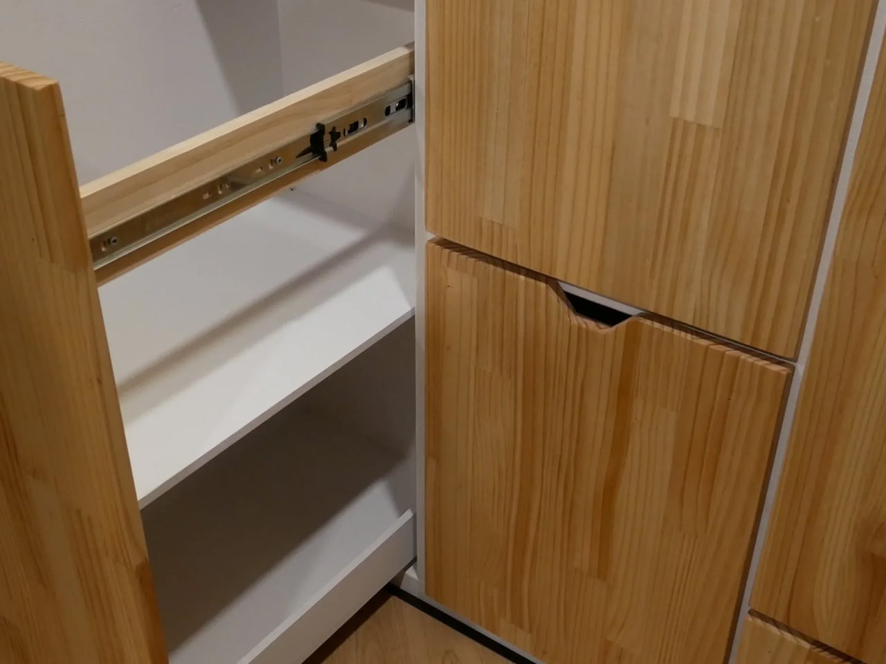
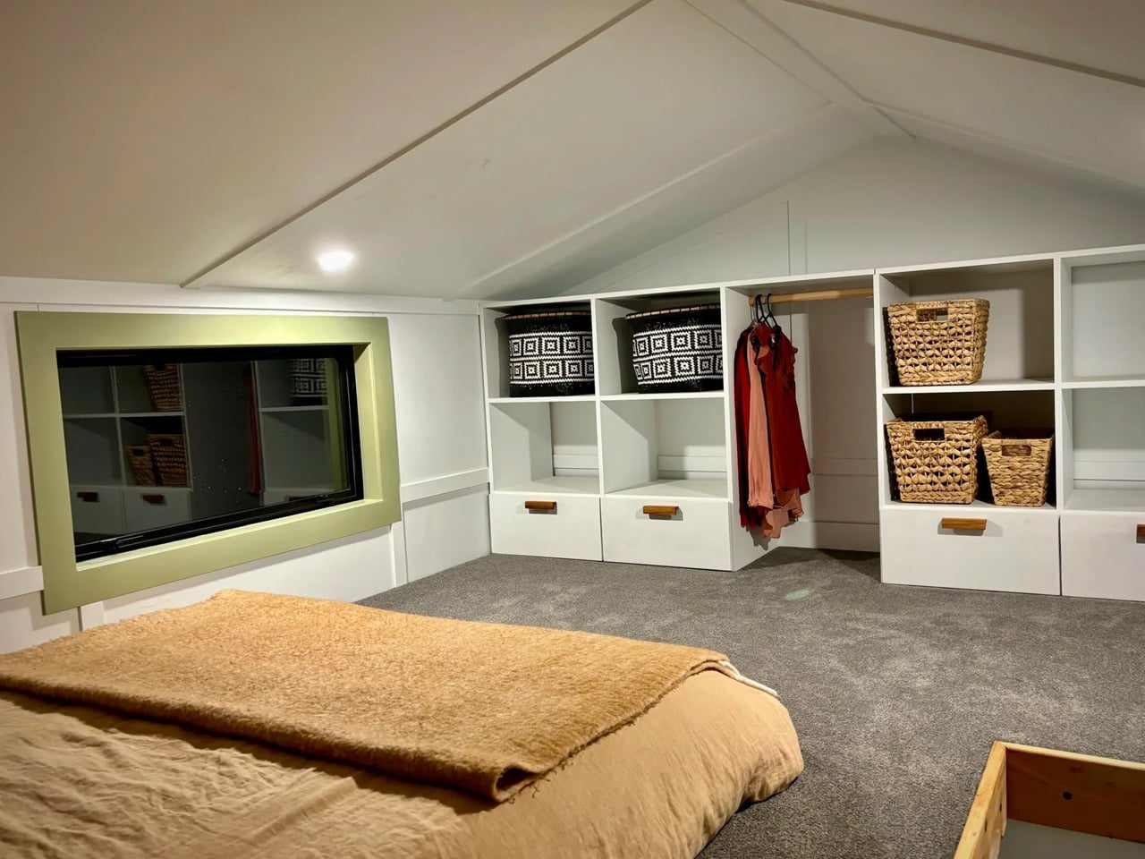
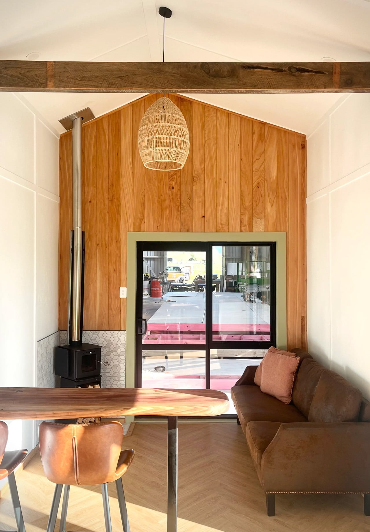
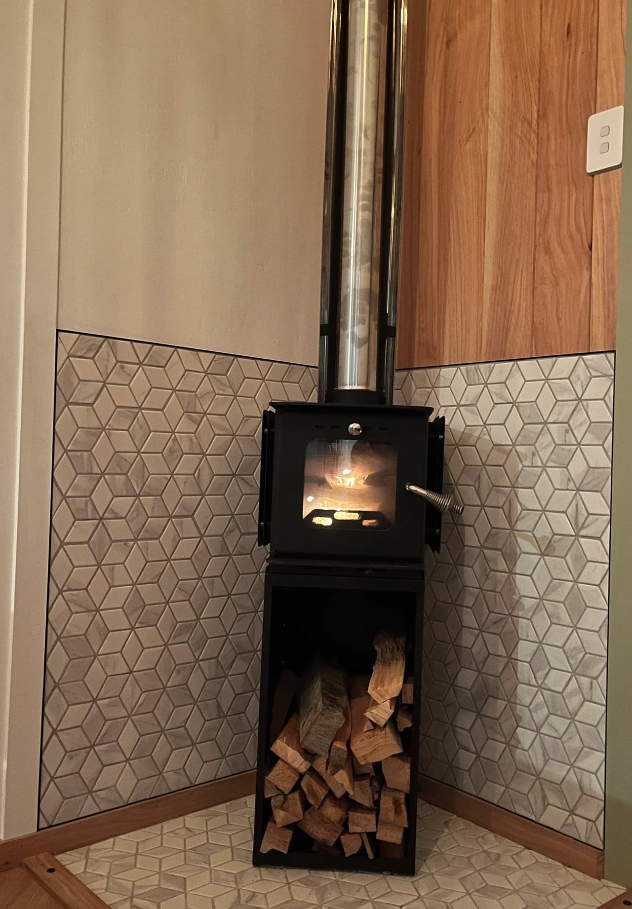
Wood has a way of telling you exactly where it’s been — and the Redwood by Tiny Timber Homes wears that history well. The Redwood leans into that quality completely — and the result is a tiny house that feels less like a compromise and more like a choice you’d make twice.
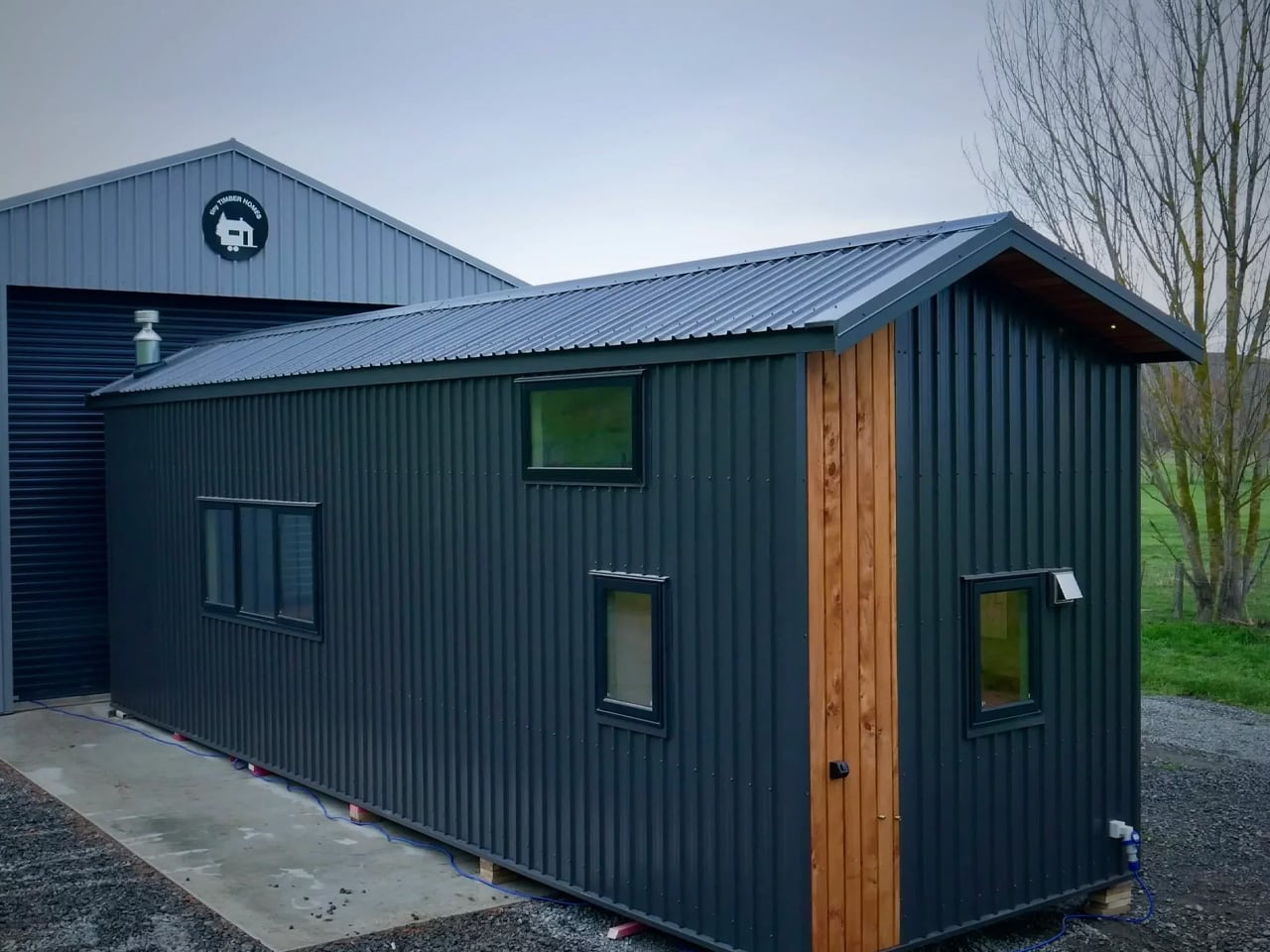
Tiny Timber Homes has built its reputation on one idea: that small spaces deserve the same craftsmanship as full-sized ones. The Redwood is perhaps the clearest expression of that philosophy. Its exterior reads immediately as intentional — warm wood cladding, clean rooflines, and a silhouette that sits confidently without trying to mimic a traditional house. It’s not cosplaying a cabin. It’s its own thing.
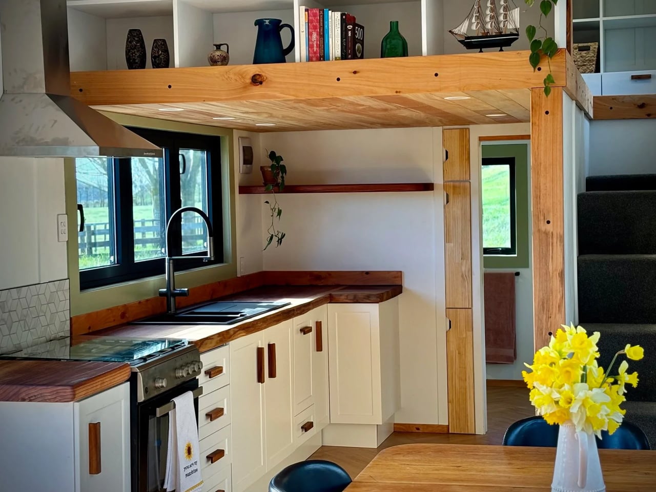
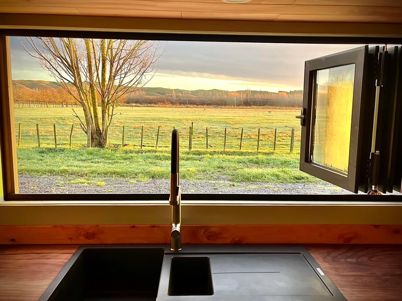
Step inside and the material language continues without interruption. Exposed timber framing lines the interior walls, giving every room a structural honesty that most tiny homes paper over with drywall and distraction. Natural light does the heavy lifting here — strategically placed windows pull the outdoors in and keep the interior from ever feeling like a box you’re trapped inside.
The kitchen is compact but considered. Counter space is used with real intention, storage is tucked where you’d actually look for it, and the layout doesn’t ask you to turn sideways to reach the sink. It’s the kind of kitchen that rewards a slower pace — coffee in the morning, dinner from scratch, no dishwasher you don’t need.
The sleeping loft sits above it all, accessible by a stair ladder that doubles as storage. From up there, the whole space reads differently. You see the structure, the grain of the wood, the way everything fits without forcing. It’s a perspective that makes you appreciate the design more, not less.
What separates the Redwood from the growing noise in the tiny home market is restraint. There’s no attempt to cram in features that don’t belong, no feature list that sacrifices livability for a spec sheet. What you get instead is a home that understands its own scale and works with it — not against it.
Tiny Timber Homes builds for people who’ve thought seriously about what they actually need from a home. The Redwood answers that question with timber, light, and a layout that respects the person living inside it. In a category full of aspirational renderings and underwhelming follow-through, that’s worth something. It looks like a home. It lives like one too.
Most tiny homes ask you to make peace with the compromise. Wind River Built’s Rogue Mini skips that conversation entirely. Built in Tennessee by one of the most respected names in the tiny home space, the Rogue Mini is a trailer-mounted dwelling that treats small square footage not as a limitation, but as a design brief.
From the outside, the Rogue Mini reads clean. Board-and-batten siding, a pitched roofline, and restrained exterior detailing give it the visual composure of something far more permanent than its wheels suggest. Wind River Built has always leaned into quality construction over novelty, and the Rogue Mini reflects that. Every edge feels considered. Nothing about the exterior screams “novelty camper” — it looks like a house someone actually wants to live in.
Step inside, and the interior continues that conversation. Wood-paneled walls and vaulted ceiling lines open the space upward, drawing the eye in a way that makes the square footage feel more generous than it is. The kitchen is compact but functional, with enough counter space to cook a real meal rather than reheat one. The sleeping loft sits above, accessible by a staircase or ladder depending on configuration, and offers a surprisingly comfortable retreat that feels separated from the main living area in the way a bedroom should.
What Wind River Built understands — and what a lot of tiny home builders get wrong — is that smallness only works when the details are right. Inadequate storage, poor natural light, and awkward transitions between zones make a small home feel punishing. The Rogue Mini sidesteps most of those pitfalls. Windows are placed deliberately, throwing light into corners that would otherwise collapse. Storage is woven into the structure rather than bolted on as an afterthought.
The Rogue Mini isn’t designed for the weekend warrior or the festival-goer chasing Instagram backdrops. It’s designed for someone who has genuinely decided to live differently — to trade square footage for mobility, and square footage for intention. That kind of design decision requires a builder who takes the task seriously, and Wind River Built clearly does.
At a time when housing feels increasingly abstract — prices climbing, spaces shrinking, and permanence fading — the Rogue Mini offers something rare. It chooses to make living small feel like an upgrade rather than a retreat. That’s not an easy thing to design. Wind River Built pulls it off.
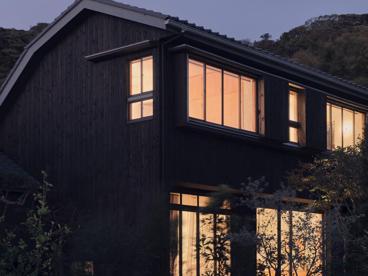
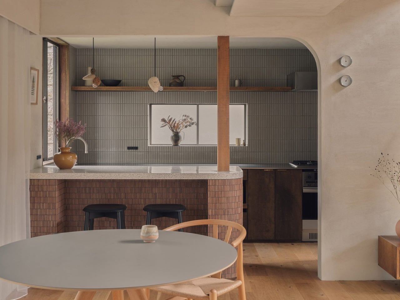
Renovation is harder than building from scratch. You inherit someone else’s decisions — structural, spatial, aesthetic — and you’re asked to make them feel new without erasing what made them worth saving. Studio HYAN understood that with the Green Sandwich House, a 1970s home in Hayama, south of Tokyo, renovated for the studio’s own founders: architect Anna Naganuma and designer Shohei Hasegawa.
The starting point, as Hasegawa puts it, was inheritance rather than demolition. “Preserving a 1970s house wasn’t the goal in itself; we wanted to read the potential of the existing frame and update it for how we live today.” That clarity of intent matters. A lot of renovations get lost between nostalgia and novelty. This one knew exactly what it was doing.
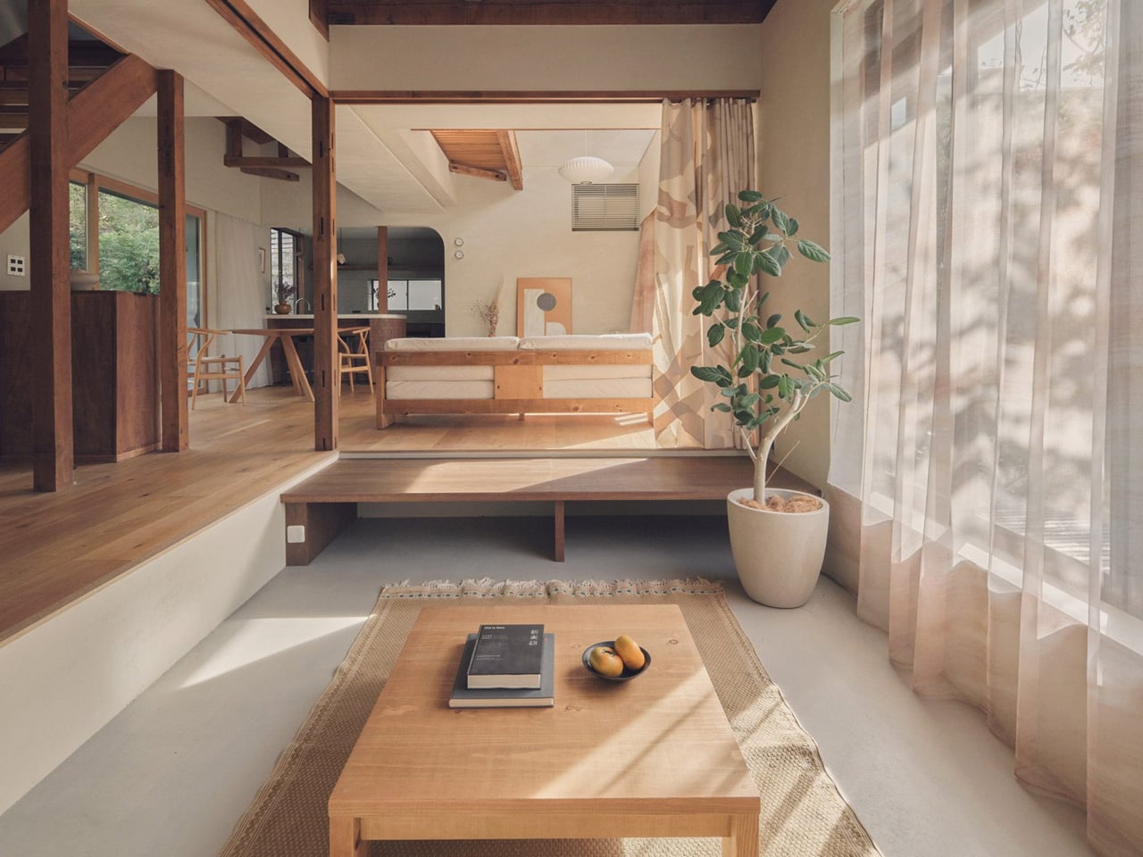
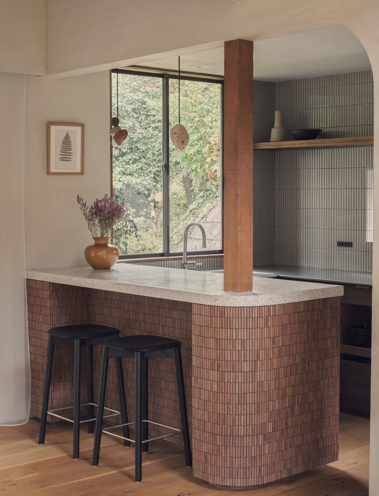
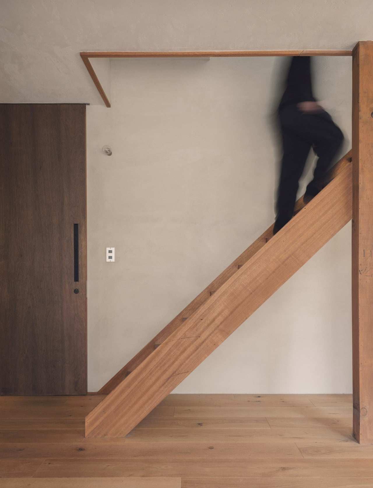
The home required significant structural reinforcement to meet modern seismic codes — a constraint HYAN turned into an opportunity. Rather than hiding the work, they built around it. The retained timber columns and roof beams are left exposed throughout, quietly tracing where the old partition walls once stood. The structure becomes the architecture. Almost every internal partition on the ground floor was removed, replaced by a single, flowing living, dining, and kitchen space where zoning is handled through changes in floor level and ceiling height rather than walls.
The living area occupies a double-height volume beside the kitchen and dining zone, while the floor steps down slightly to form a lounge with a daybed nook, closed off when needed by patterned curtains. It’s a spatial move that feels considered rather than open-plan for its own sake. Work, daily life, hosting — everything overlaps naturally, the way it actually does in a home people live in fully.
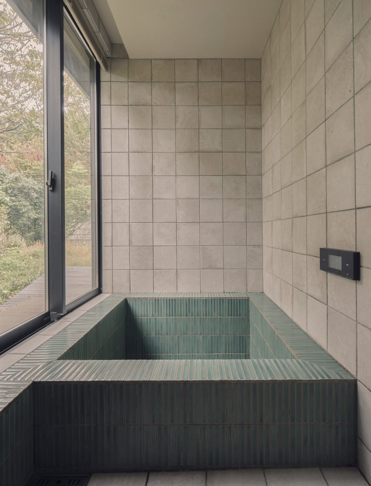
Materials carry the warmth the bare frame alone couldn’t. Pale plastered walls, timber floors, coloured tiles and terrazzo in the kitchen and bathroom — a restrained palette chosen for how surfaces catch light through the large windows and surrounding trees rather than for how they photograph. The wooded hills of Hayama are present throughout the day in the way the light shifts across those surfaces, tying the interior to the landscape without a single piece of statement furniture doing the heavy lifting.
Upstairs, the more private rooms — bedrooms, a study overlooking the double-height living space below — step back from the openness of the ground floor without feeling disconnected from it. Hasegawa describes the house not as a finished work but as one that grows with daily life. For a home this attuned to how its spaces breathe and change with the seasons, that feels exactly right.
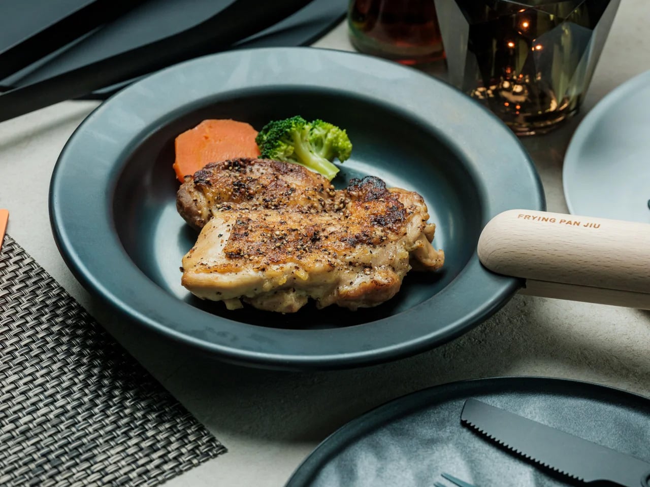
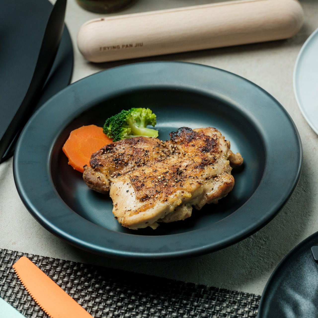
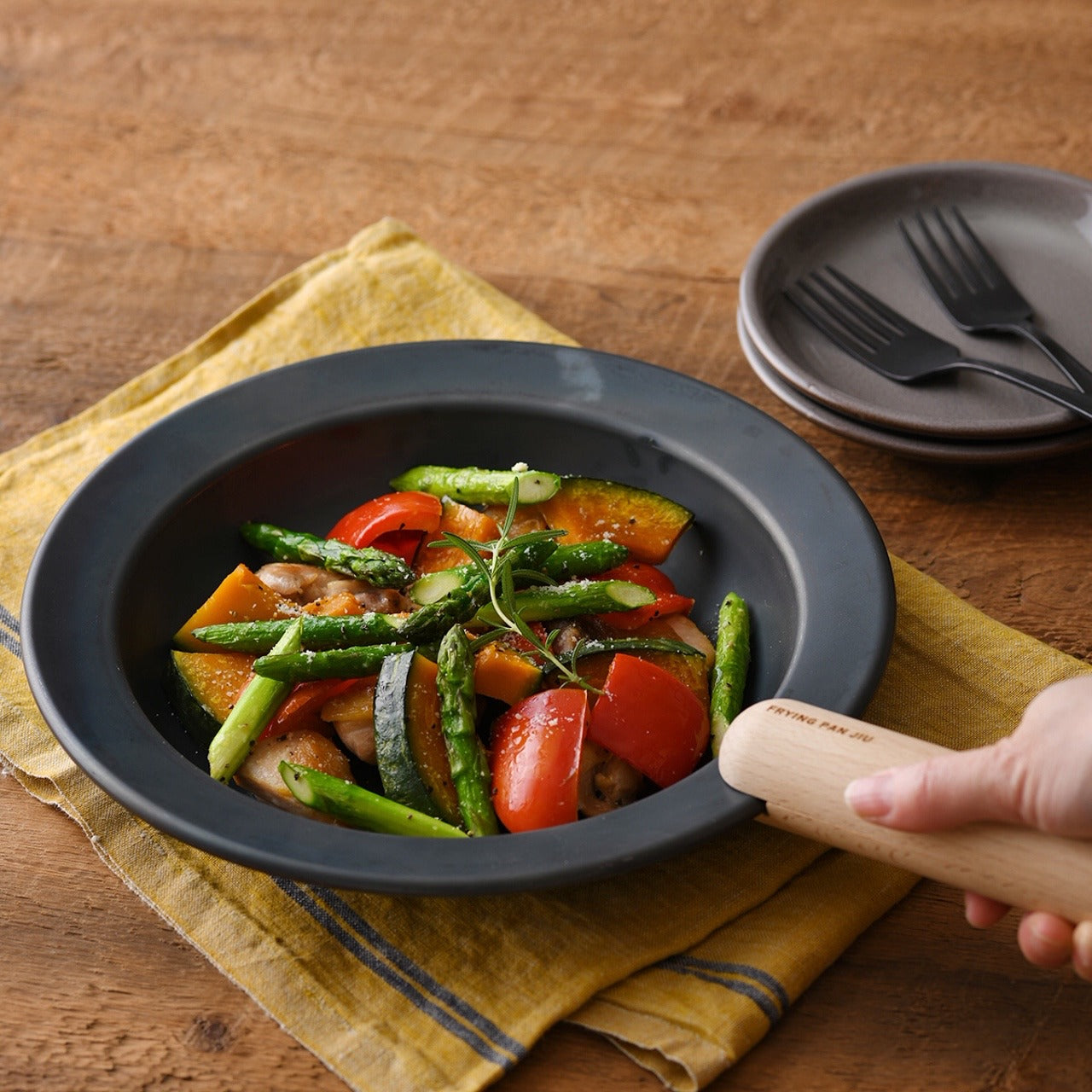
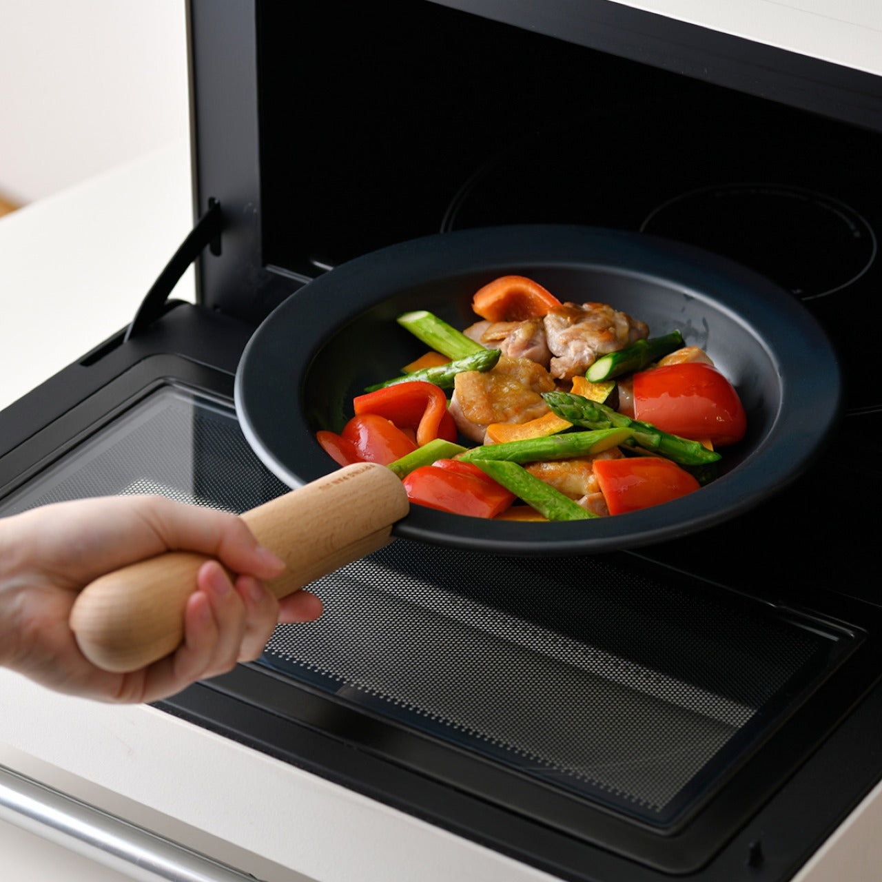
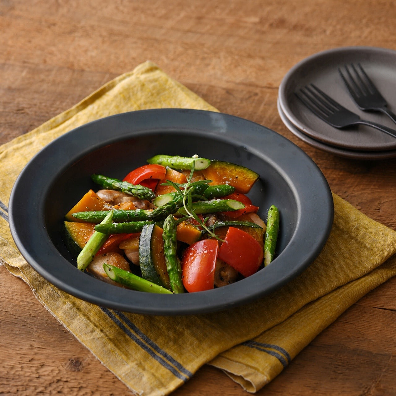
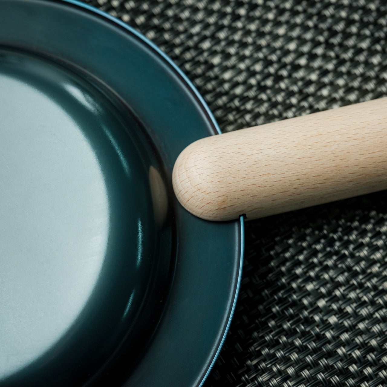
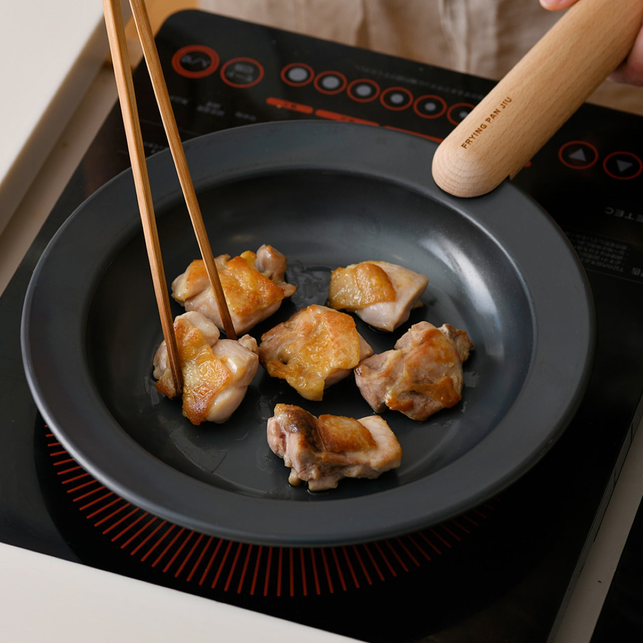
Most pans are designed for the cook. The Iron Frying Plate was designed for the meal. It removes the transfer step entirely, functioning as the cooking surface and the serving plate in one. When the food is done, it comes to the table on the same steel it was cooked on, without losing the heat, the texture, or the visual honesty of something made properly. That is not a workaround. It is a deliberate design decision, and it changes how a meal feels from start to finish.
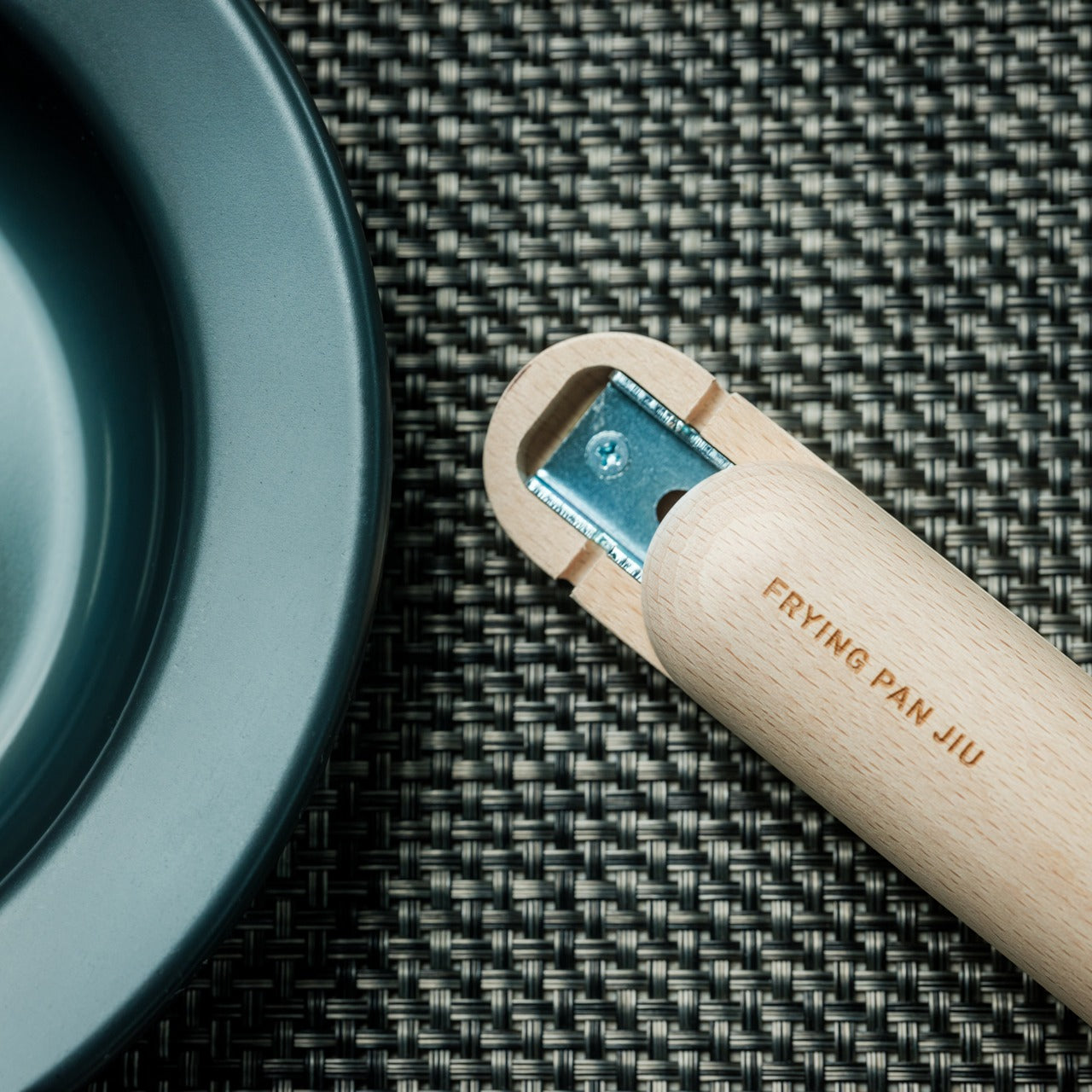
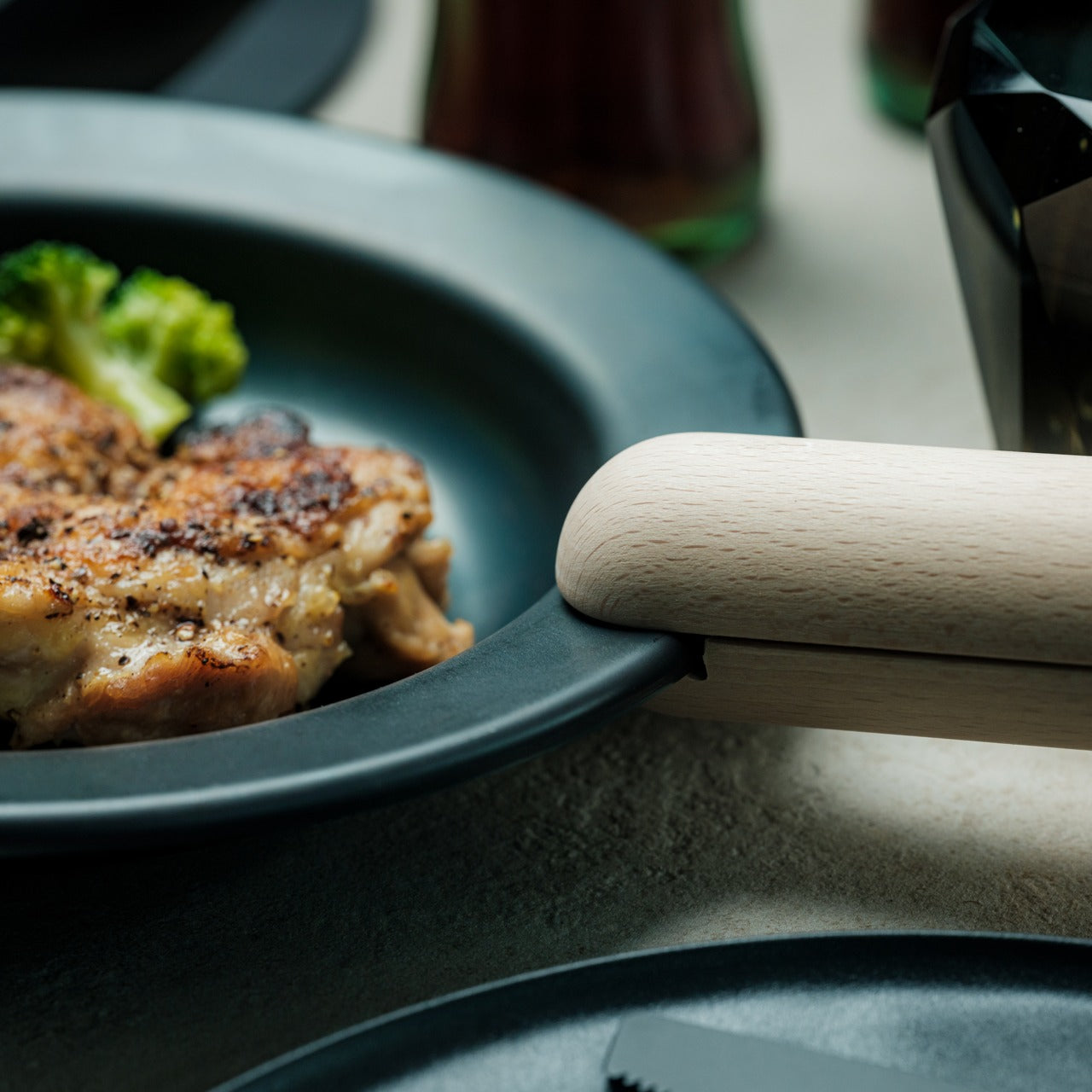
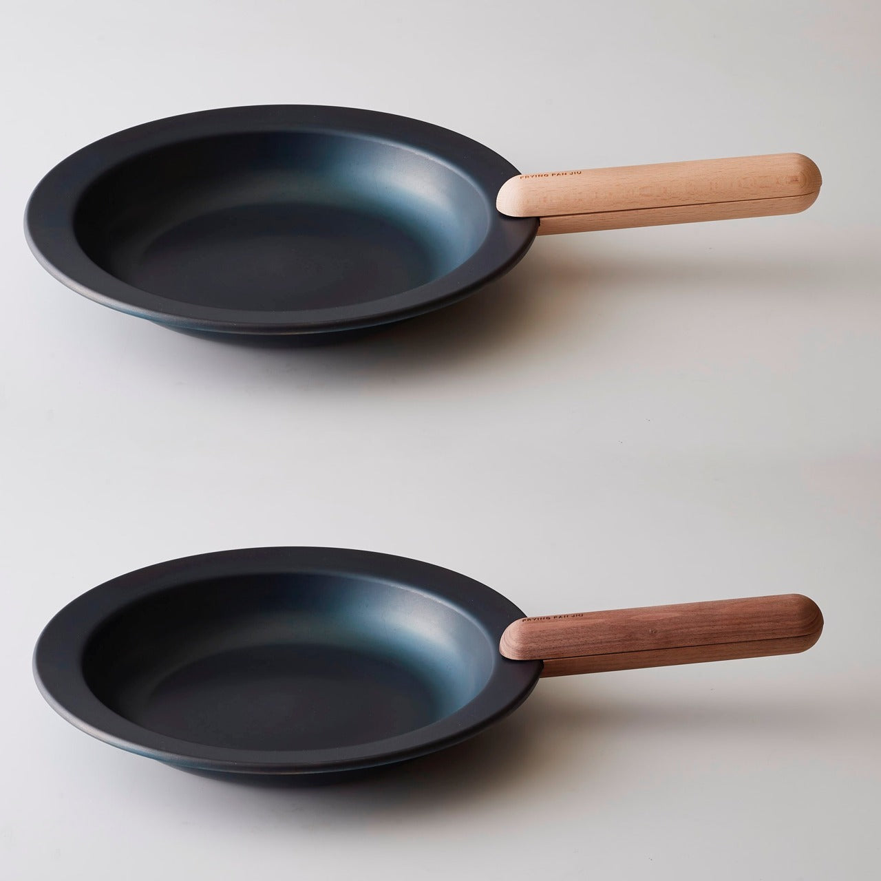
The plate is made from 1.6mm-thick mill scale steel, uncoated and rust-resistant, and arrives ready to use without any initial seasoning requirement. The wooden handle attaches and detaches with one hand, so the transition from stove to table takes nothing more than a single motion. Stick resistance builds naturally through use, and the steel itself develops character over time. There are no coatings to preserve, no temperature limits to track, and no gap between the way the food was cooked and the way it tastes.
Mill scale steel brings heat retention and natural stick resistance to the surface, and because JIU is uncoated, nothing softens what happens between the flame and the food. That directness is where flavor and texture come through cleanest. A proper sear forms the way it should, without interference from synthetic materials or temperature limitations. The surface improves with use, developing a natural patina that builds over time rather than degrading the way coatings tend to. Rust resistance is built into the material, so the plate holds up to regular use without the maintenance anxiety that follows other types of bare steel cookware.
From Stove to Table in One Motion
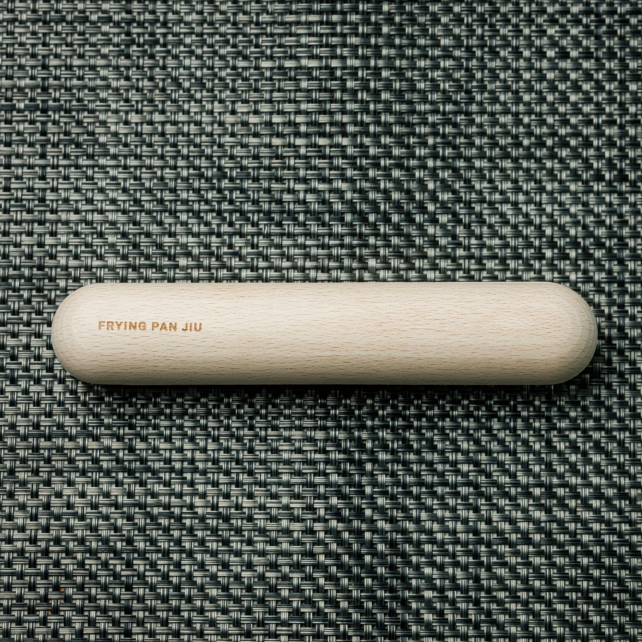
The detachable wooden handle is the detail that makes this work at the table. It comes off with one hand, which means the plate moves freely from the cooking surface to wherever the meal is being eaten without requiring tools, extra grip, or a second set of hands. The wood stays cool during cooking, and the mechanism is intuitive enough to become automatic after the first use. Cookware that disappears into a routine rather than interrupting it earns its place in a kitchen. JIU does that by solving the transition problem that most cookware does not acknowledge exists.
What We Like
Mill scale construction: 1.6mm-thick uncoated steel that builds natural stick resistance through use and delivers genuine flavor without synthetic coating interference between the food and the heat
Cook-to-table design: the plate is the cooking surface and the serving vessel in one, cutting out the transfer step where heat, texture, and presentation quality typically suffer
One-hand handle operation: the wooden handle attaches and detaches in a single motion, making the move from flame to table clean without requiring tools or both hands
Ready to use from the start: no seasoning ritual before the first cook; the plate performs immediately and improves with continued use over time
What We Dislike
Wooden handle durability unclear: the detachable handle is a strong design choice, but the product provides no information on its heat tolerance threshold or long-term maintenance requirements
The Pan That Closes the Loop
The Iron Frying Plate is the kind of object that makes a meal feel more intentional without asking anything extra of the person making it. The steel does the work. The handle comes off when cooking is finished. The plate goes straight to the table. Nothing is lost in the move from stove to seat, because there is no move to make. That level of consideration in a cooking tool is rarer than it should be.
If the meals you cook deserve better continuity from the moment they leave the heat to the moment they are eaten, this is the straightforward answer. No extra dishes, no coating to preserve, and a surface that gets better the more it earns its keep. JIU makes the case for cooking and eating on the same terms.
A dorm room desk is rarely designed. It arrives with the furniture package or gets assembled in the first week, and everything that lands on it does so gradually: a charger from one order, a notebook from the bookstore, a lamp someone left behind. The surface accumulates. None of it is chosen. These seven products exist in deliberate contrast to that, each one here because it makes the desk feel considered rather than assembled.
The premise is simple. A dorm room can look like a design studio if the objects on the desk are treated with the same attention you’d bring to anything else worth doing well. A precisely made pen changes how writing feels. A lamp without a cord changes how the room reads at 11 pm. Seven products, one desk, and a genuinely different place to spend the next four years working.
1. Varydes Virga Steel Pen
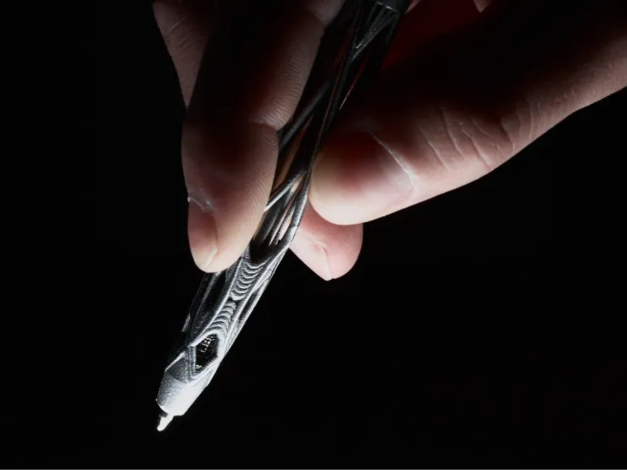
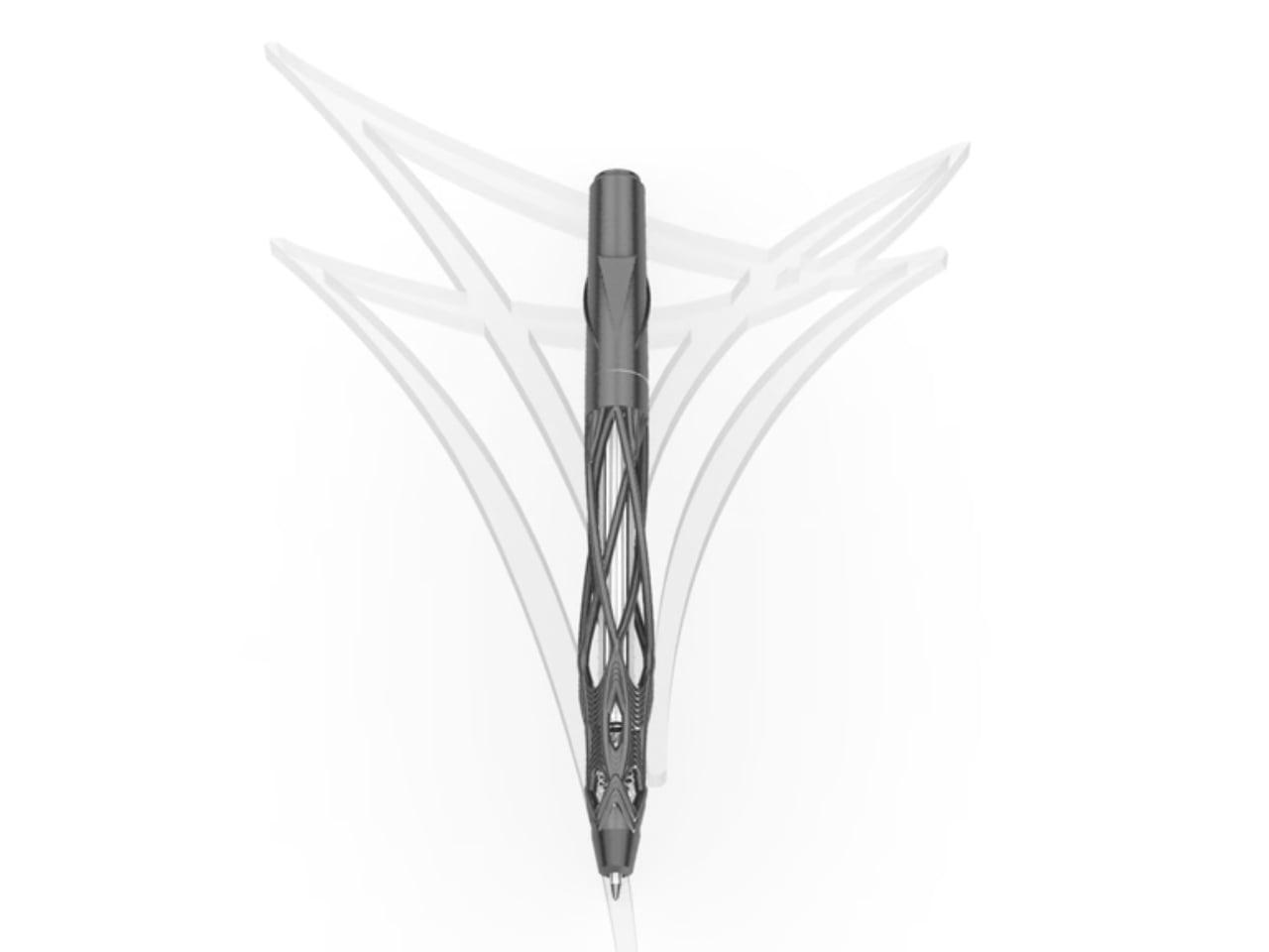
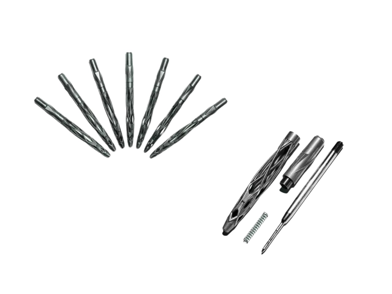
Most pens earn their place on a desk by being easy to forget. The Virga earns it by being impossible to ignore. Designed by Kjell Semmer in Berlin, it’s built from solid 316L stainless steel formed into an open lattice structure that reads less like a manufactured object and more like something that simply grew. Fine steel strands weave together and pull apart, dense in places, open and airy in others. Rotate it slightly in the light, and it shifts. You never quite see the same pen twice.
The name borrows from meteorology. Virga is the term for precipitation that falls from clouds but evaporates before reaching the ground: rain that exists but never lands. It’s a strange thing to name a writing tool after, and it’s exactly right. The pen lives between two states at once, organic and industrial, wild-looking and precisely made. Functionally, it stays simple: a smooth twist mechanism, a standard G2 refill, 12.7 centimeters long, 39 grams of steel in your hand. Every piece is individually examined and hand-polished before it ships from the Berlin studio.
What we like:
The open lattice geometry shifts visually with every rotation, making this genuinely different to hold and look at than anything else on the desk
G2 refill compatibility keeps it going indefinitely without tying you to proprietary cartridges or a single brand’s ink system
What we dislike:
At 39 grams, the weight is deliberate and welcome at the desk but noticeably heavier than most pens people carry in a bag throughout the day
The raw steel finish that makes it look so honest marks with fingerprints and needs a wipe periodically to stay looking as good as it photographs
2. OrigamiSwift Folding Mouse
The folding mouse has been a category of compromise for years: compact in the bag, limited in use. The OrigamiSwift ends that trade-off by treating the fold as a real engineering problem rather than a marketing convenience. At 40 grams, it collapses to 4.5mm flat, thin enough to slide between the pages of a notebook without leaving a visible ridge. On the desk, it opens in under half a second into a full-sized ergonomic shape that sits naturally in the hand and tracks precisely.
What earns it its place here is how it reframes portability entirely. Portable doesn’t have to mean diminished. The OrigamiSwift performs on a permanent desk just as capably as it does pulled from a bag in a campus café, which is genuinely rare in hardware built around a constraint. The fold mechanism stays satisfying after weeks of daily use, and the Bluetooth connection is reliable. At $85, it asks very little relative to what it returns each time it opens.
Folds to 4.5mm flat, then opens into a full ergonomic form in under half a second without asking you to adapt your grip
Performs as well on a permanent desk as it does in transit, which is not a given in any product built around a folding mechanism
What we dislike:
At 40 grams, the weight registers as unfamiliar for anyone coming from a heavier desktop mouse and takes a few days before it stops being noticeable
Bluetooth-only connectivity rules out a wired fallback for tasks where even brief latency becomes friction
3. Inkleaf Foldable Dual-Screen E Ink Notebook
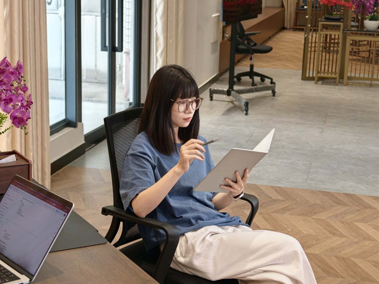
Every E Ink tablet solves roughly the same problem and leaves the same one unaddressed. You get one screen, which means you’re reading or writing, never both at the same time. The Inkleaf closes that gap with two full 10.3-inch Carta E Ink panels opening side by side. Source material on the left, notes on the right. Students moving through a textbook while keeping running annotations, or working between a PDF and a draft document, get the workflow every other tablet approximates but doesn’t complete.
Designed by Kameron Yu, the Inkleaf folds shut like a hardcover at 8.4mm closed and 480 grams. Each open panel measures just 4.2mm, thinner than the reMarkable 2 at 4.7mm and the Kindle Scribe at 5.4mm, and unlike either of those, it folds. It runs Android, supports PDFs, EPUBs, MOBI, and TXT files with no subscription attached to reading your own content. AI handwriting search surfaces any phrase across every notebook you’ve filled. Priced at around $450, with first units shipping to founders in August 2026.
What we like:
Two independent panels let you read and annotate simultaneously without switching apps, which changes the actual rhythm of studying rather than just adding a feature
Folds to a hardcover profile, thin enough to carry anywhere, and functions as a portable secondary display in a coffee shop or lecture hall just as well as at the desk
What we dislike:
At $450, it’s the most significant investment on this desk, and the value compounds most for students who genuinely spend long hours moving between reading and writing in the same session
Getting files, handwriting preferences, and AI search configured fully takes longer than it should before the device starts to feel like it actually belongs to you
4. Rolling World Clock
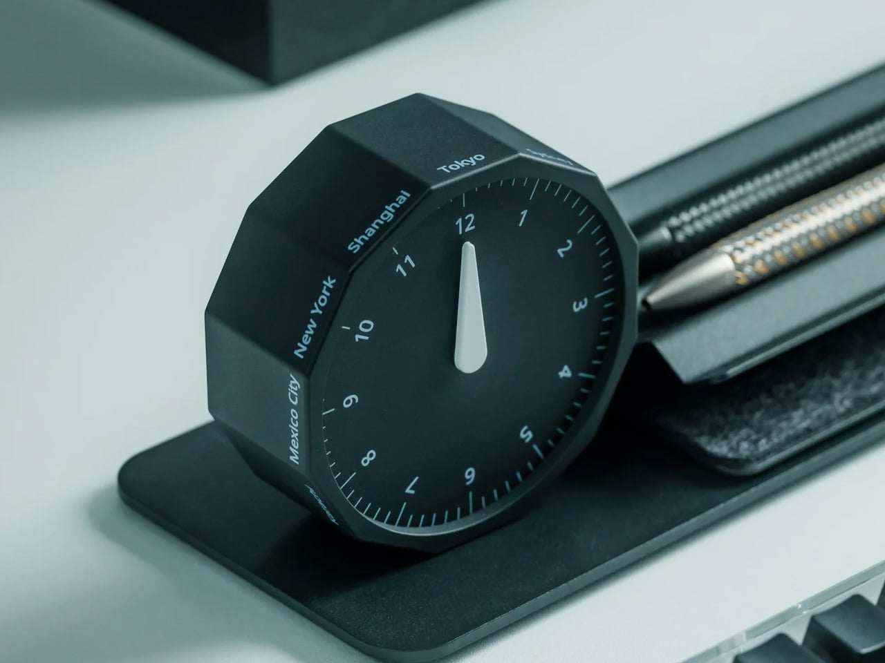
The phone is a bad clock. Not technically, but experientially. Reaching for it to check the time in another city means picking up a device that always has something else to offer, and three minutes later the thread is gone. The Rolling World Clock puts that information on the desk as a physical object: a 12-sided desktop piece that displays the current time across major world cities. It’s there when you need it and quiet when you don’t.
For a student working with an international cohort, coordinating across time zones, or tracking where a professor’s office hours land on the other side of the world, the clock makes that awareness tactile. You don’t need to reach for it. You simply know. It’s the kind of object that makes a desk feel like it belongs to someone doing real work, which is partly functional and partly about what a well-chosen object does to the space around it. Both things are worth having on the same surface.
Puts world time on the desk as a physical object rather than inside a device, removing the distraction of unlocking a phone every time you need to check a collaborator’s local hour
Functions as a desk object in its own right, contributing to the setup aesthetically rather than introducing a single utility with nothing else to offer
What we dislike:
Requires a clear section of desk surface to be read easily, so it earns its footprint only on a desk organized enough to give it one
City selection is fixed by the design, so students with contacts in less commonly featured cities will still need a secondary source occasionally
5. King Jim MagFlap Magnetic Clipboard
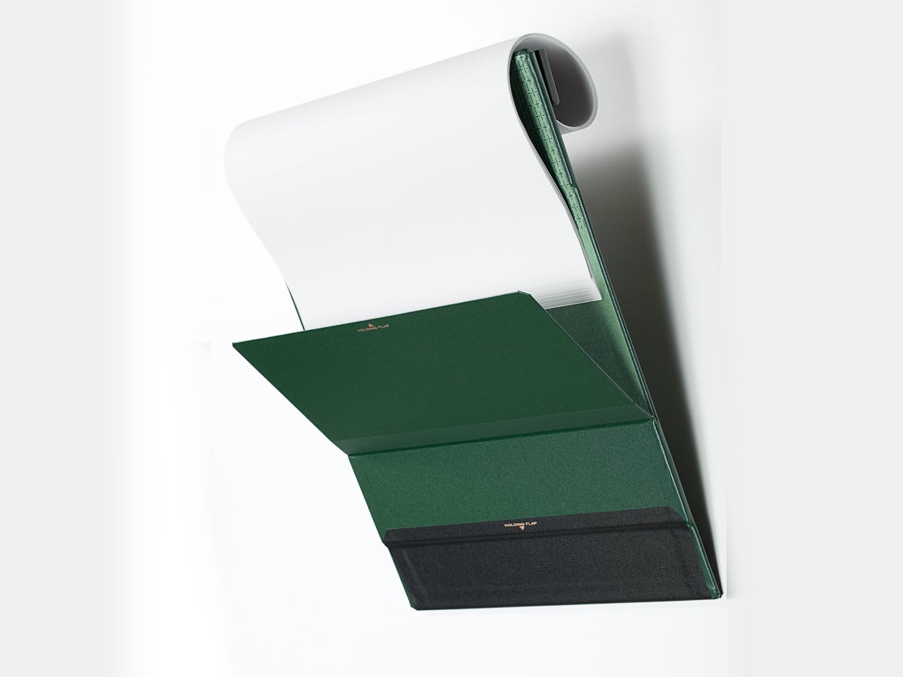
The clipboard has been the same object for over a century: a flat board, a spring clip at the top, and a quiet acceptance of everything frustrating about it. Papers flap. Finished pages dangle. There’s nowhere convenient to mount it. King Jim, the Japanese stationery brand, took those frustrations seriously with the MagFlap. Three magnetic additions change how the whole form works: a front flap locks pages flat against the board, a back flap holds completed sheets out of the way, and a full-width clip spans the entire page edge rather than gripping only the center.
The board itself is magnetic, which means it mounts directly to a locker door, a filing cabinet, or any steel surface in the room. At $20.99, it’s the most affordable item on this desk, and possibly the one with the most immediate daily impact. It comes in four colors and three sizes, holds 30 sheets, and stays 0.7 inches thin throughout. For anyone still working through printed readings, annotated syllabi, or multi-page problem sets, it’s the version of the clipboard that should have existed already.
What we like:
Three separate magnetic solutions address three separate frustrations, and the full-width clip alone improves on any clipboard that only grips the center of the page
Mounts to steel surfaces, turning a dorm locker or filing cabinet into a document station that keeps paper off the desk without losing it
What we dislike:
A4 sizing aligns to European paper standards, so US Letter sheets won’t line up precisely with the position guideline printed on the board
The back flap holds completed pages reliably at rest but can need a manual reset in a busy lecture hall where movement occasionally pulls things loose
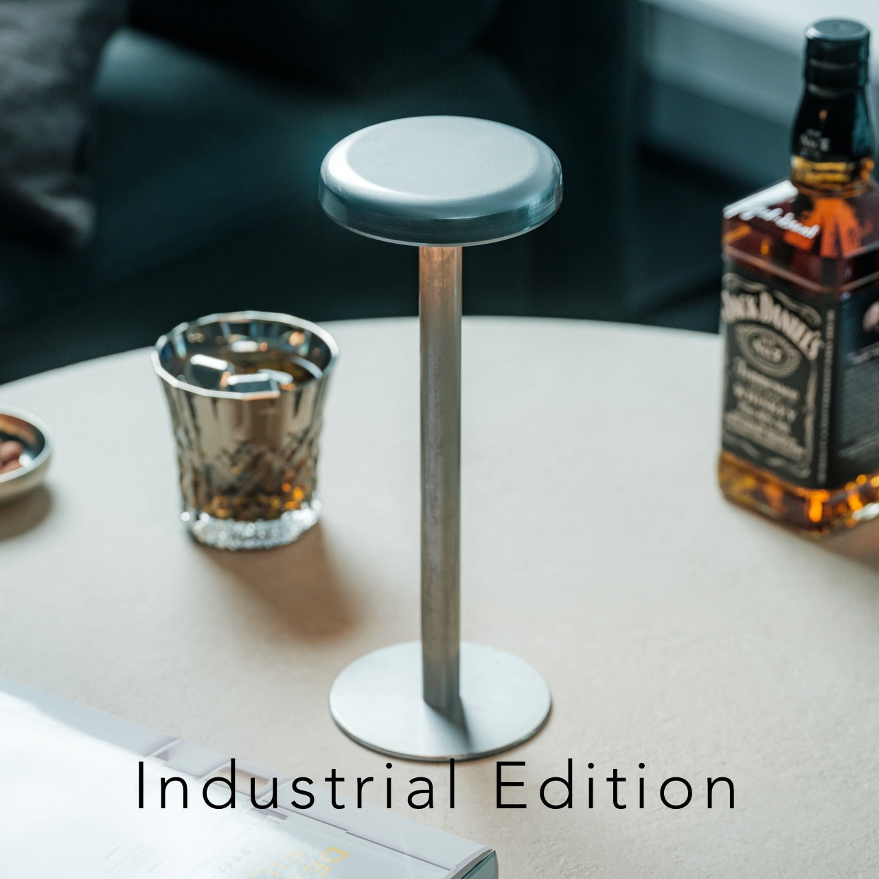
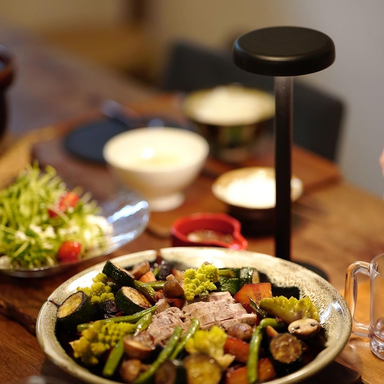
6. Anywhere-use Lamp
Most desk lamps assume the desk doesn’t move, the outlet is nearby, and the cord can be managed. In a dorm room, none of those assumptions hold reliably. The Anywhere-use Lamp is built for the actual conditions: no cord to route, no outlet to negotiate, placement wherever the light needs to be rather than wherever the hardware allows. That flexibility changes how the room works in the evening, giving a reading corner, a bedside surface, or the desk itself usable light without rerouting anything or making a permanent decision.
Good light is one of the least discussed ways a space changes in character. A desk that reads as designed at noon can look like a pile of unrelated objects at 10 pm under a single overhead bulb. The Anywhere-use Lamp fixes the evening version of the room without a cord snaked across the floor or a fixed mounting point that limits where everything else can go. It doesn’t call attention to itself. It makes everything around it easier to see, which turns out to be the more durable kind of value after the first week.
Complete placement freedom means the light follows the work rather than the work following the outlet, which is the more sensible arrangement in any room not purpose-built around a fixed desk position
Removes cord management from the surface entirely, making everything else on the desk read as cleaner by default
What we dislike:
Battery-dependent operation adds charging to the routine, and forgetting it before a late-night session is a real failure mode worth building a habit around early
Portability means the lamp migrates to wherever it was last useful, which is a feature until you need it at the desk and it isn’t there
7. Orbitkey Desk Mat
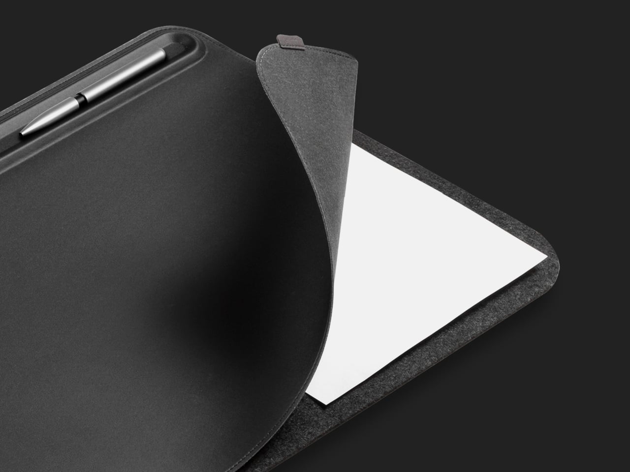
The desk mat is usually the last thing anyone buys and the first thing that changes how a setup reads. Orbitkey’s version is built on the premise that the surface doesn’t just need better material; it needs a better system. Made from premium vegan leather over 100% recycled PET felt, water-repellent and easy to wipe clean, it anchors the desk both practically and visually. A quick-access toolbar runs along one edge, giving pens, a stylus, and small accessories a fixed address instead of leaving them to drift.
Beneath the top layer sits a document hideaway: a flat sleeve that keeps readings and notes stored flush with the surface, invisible from above, and available with a single edge pull. A magnetic cable holder clips freely along the toolbar and repositions as port locations and cable lengths change across different devices. Put everything else on this list on top of it, and the desk finally looks like it was chosen. It ships with a two-year warranty and a 30-day return window, both of which signal confidence in the materials.
What we like:
The document hideaway removes paper from the surface without removing it from reach, a more useful distinction than it sounds across a semester of printed readings and annotated handouts
The magnetic cable holder repositions freely along the toolbar rather than committing to one fixed anchor point, which matters as the setup changes across the year
What we dislike:
Arrives rolled and takes two to three days to lie fully flat; reverse-rolling helps, but patience is part of the initial setup
The Medium size works well for a single monitor but will feel narrow for anyone running a second screen alongside their laptop
Seven Objects, One Decision
Seven products, each one solving something the previous object on the desk didn’t. The Virga pen makes writing feel like a decision. The mouse makes portability feel like an upgrade. The Inkleaf turns the way you study into something that reflects how you actually think. The clock puts the world on your surface without the phone. The lamp puts light exactly where the room needs it, not where the outlet happens to be.
The MagFlap and the Desk Mat do the unglamorous work of making the whole setup hold together: paper managed, surface organized, every object with somewhere to live. None of these things announce themselves. They do the work and stay out of the way. That’s what separates a desk that reads as designed from one that just accumulated over time. Four years is a long time to spend in one room. The surface you work at is worth getting right.
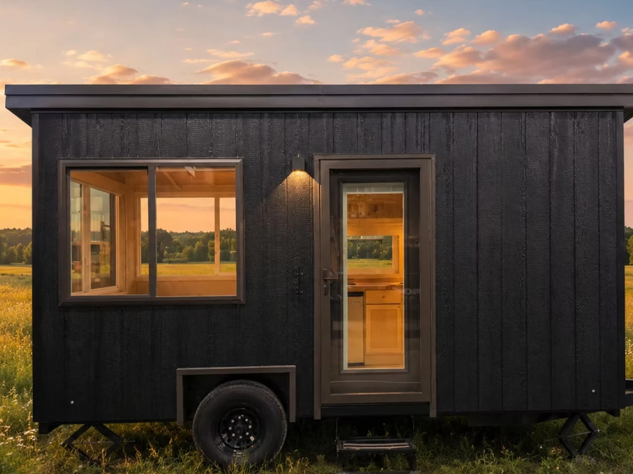
There’s a certain kind of freedom that comes with owning less. Escape’s eBoho Go leans into that idea with zero apology — a 16-foot, all-electric tiny home that packs a kitchen, bathroom, queen bed, and a surprising amount of breathing room into just 152 square feet. It starts at $39,440, and a production unit is currently available for $45,440. For context, that’s less than some high-end camping trailers, and considerably more livable than any of them.
The eBoho Go rides on a single-axle trailer, making it one of the more portable tiny homes on the market. Escape clads the exterior in engineered wood siding and wraps it in large glazed panels that pull daylight deep into the interior. From outside, it reads as the smaller sibling of Escape’s premium N2 model — the same clean design language, just distilled down to its essentials. An all-steel roof caps the structure, giving it an architectural finish that most homes in this price range don’t deliver.
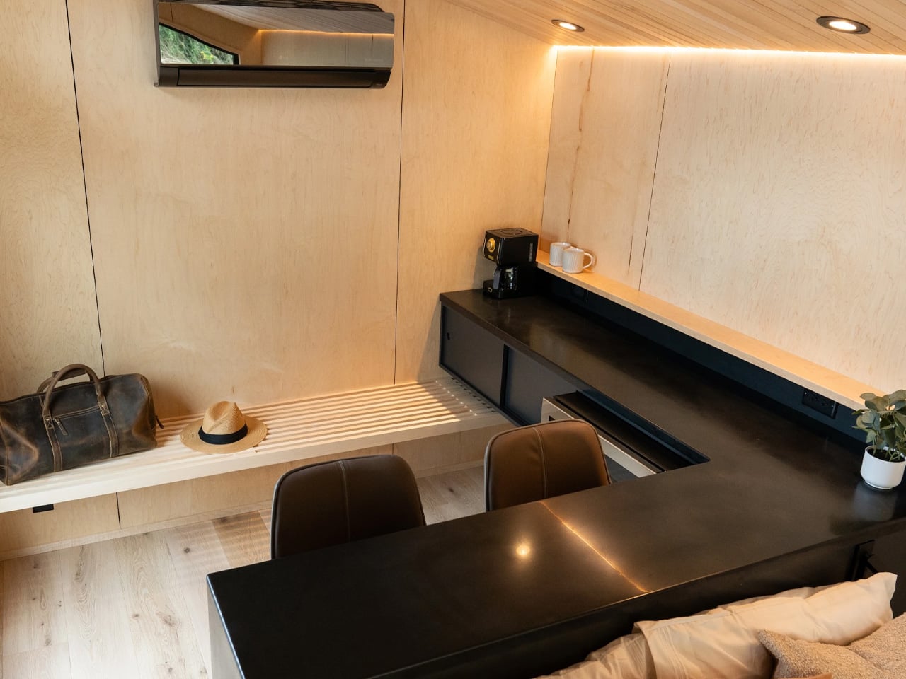
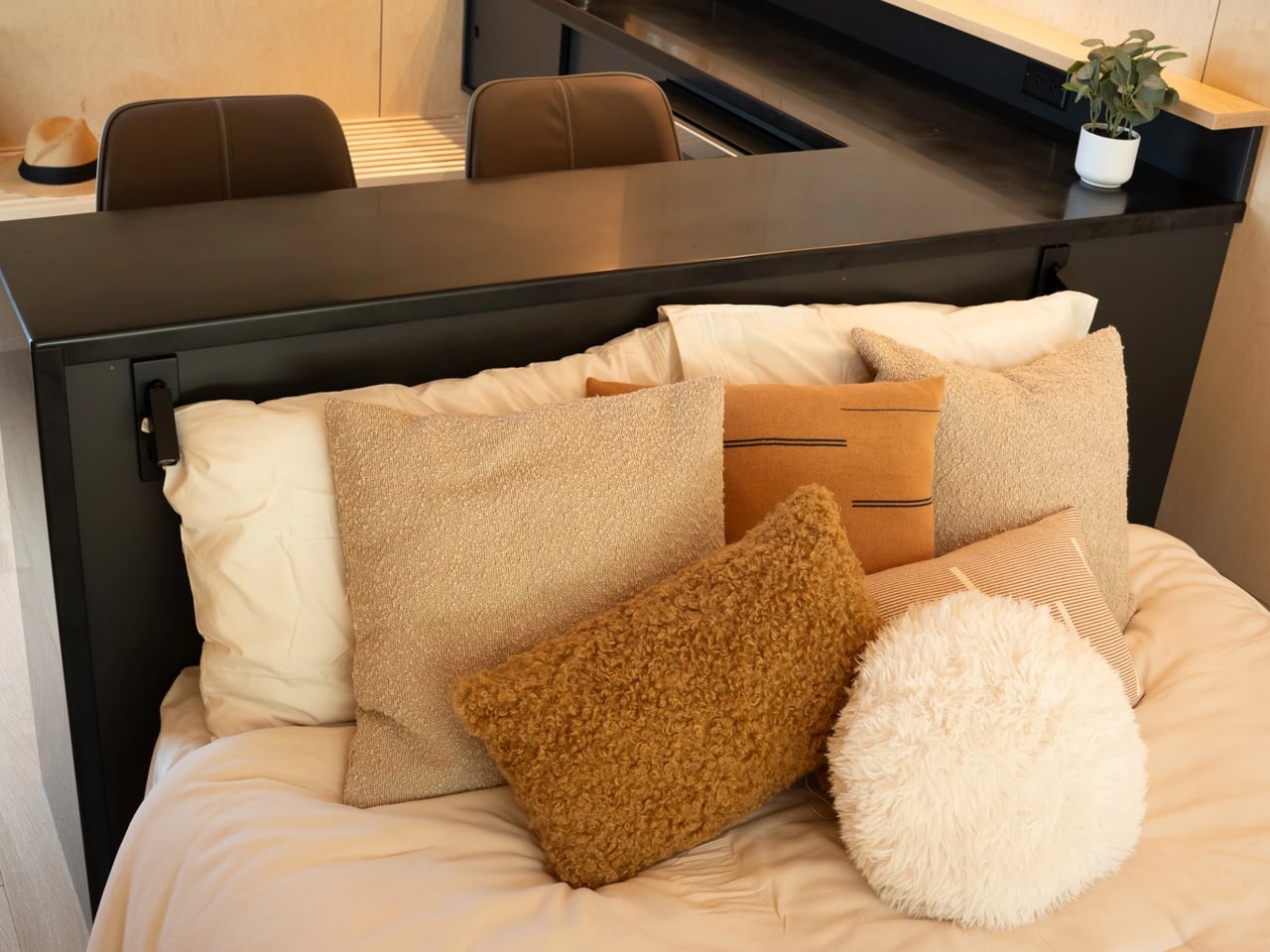
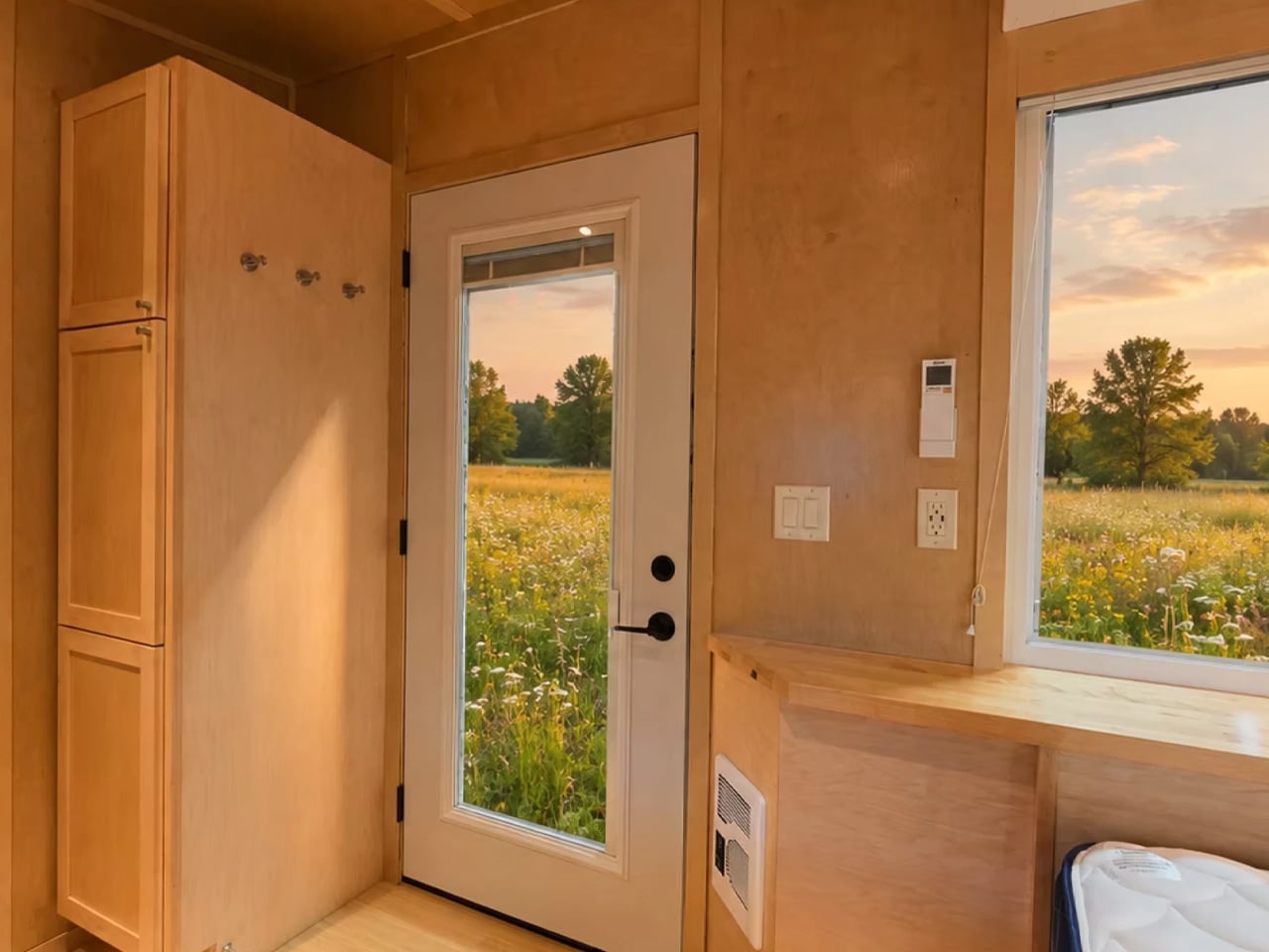
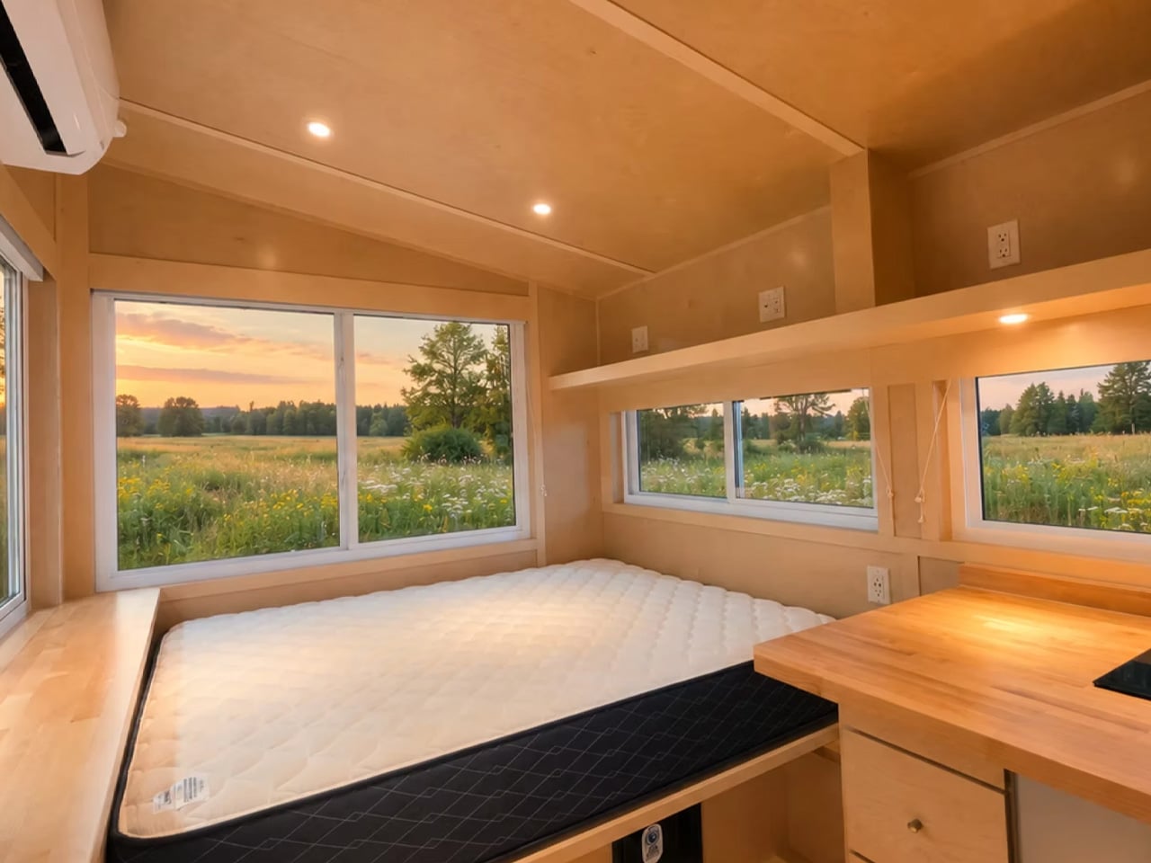
Inside, everything is finished in sealed birch — warm, tactile, and easy to maintain. The layout is a single floor, which is the right call for a home this compact. A dedicated living room would have been a compromise too far. Instead, the sleeping area earns its real estate twice over: the queen-sized bed anchors the space during the night and functions as the primary seating during the day, framed by multiple opening windows and integrated storage underneath and alongside. A mini-split AC unit handles climate control, and it’s more than sufficient for a footprint this size.
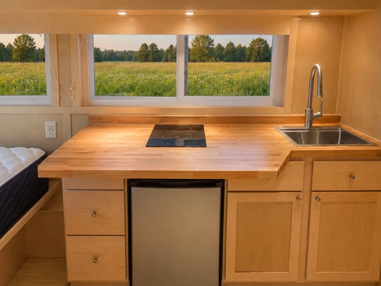
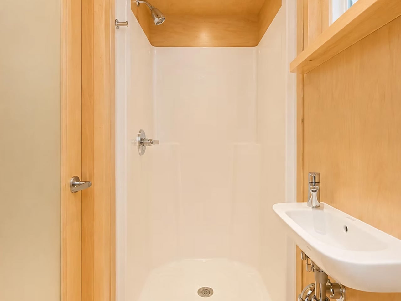
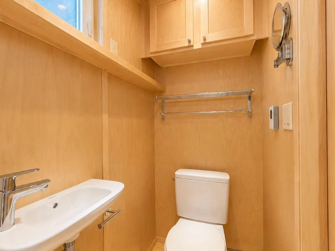
The kitchen is compact but complete. An induction cooktop, fridge/freezer, sink, and butcher block countertops sit along one wall, fronted by solid cabinetry. It won’t host dinner parties, but it handles daily life without friction. The bathroom, behind a wooden door, punches above its weight — walk-in shower, flushing toilet, vanity sink, heater, and a towel rack. Storage is tucked in wherever the geometry allows.
What makes the eBoho Go genuinely interesting isn’t just the footprint or the price. It’s that Escape built it as a real production unit — not a concept, not a preorder — powered entirely by electricity. The brand calls the lineup eESCAPE, and the Go is the entry point. As a rental unit, a guest house, or a private office dropped at the edge of a property, it makes a compelling case. Escape delivers nationwide, with costs depending on location.
At 152 square feet, it won’t suit everyone. But for those who’ve been waiting for a well-designed, genuinely affordable entry into the tiny home space, the eBoho Go might be the most honest answer yet.
There is a kind of man who takes longer at the electronics counter, not because he cannot decide, but because he is looking for something worth deciding on. He wants an object with a reason for existing, one designed around a single purpose and built to last beyond a firmware update. These five picks exist for exactly that person. Each one runs on modern technology dressed in a form that knows precisely what it is.
The range here covers the wrist, the desk, the bag, and the wall socket. A Nixie tube watch that glows orange through Soviet-era glass. A camera that passes for a roll of 35mm film. A CD player that makes you want to buy discs again. A seven-function radio that still works when nothing else does. A Mac-shaped charger that smiles back at you from the outlet. This is what considered gifting looks like.
1. Nixoid Next
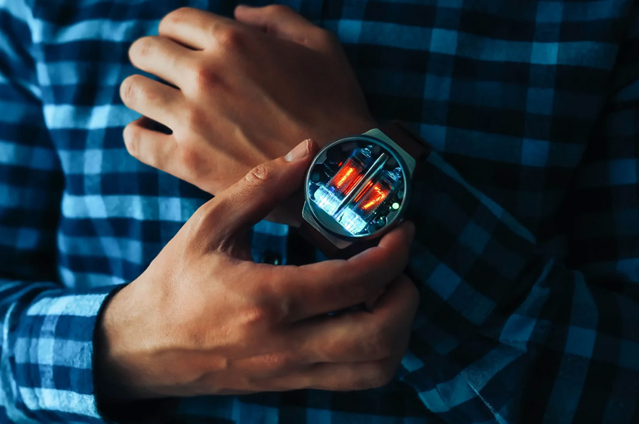
Nixie tubes are glass cylinders filled with neon gas, each one housing a stack of metal numerals that glow orange when current passes through them. They appeared in Soviet laboratory instruments long before the digital display made them obsolete. The Nixoid Next installs two original IN-16 tubes into an aluminium 2026 T4 case with sapphire scratch-resistant glass and puts that history on your wrist. A built-in motion sensor reads the gesture of raising your arm and triggers the display without touching a button.
The watch shows the hour first, holds for a 1.5-second pause, then switches to minutes. A date display is also available at the press of the single knurled button. Battery life runs ten to fifteen days of regular use or up to two months in standby, with a full charge taking around 60 minutes via the included USB cable. The Nixie lamps carry a lifetime warranty. Every time you check the time, someone nearby will stop and ask what you are wearing.
What we like:
Lifetime warranty on the Nixie lamps
Gesture-activated display that turns reading the time into something worth doing
Sapphire scratch-resistant glass on a watch at this price point
What we dislike:
Shipping runs 16 to 25 business days, so plan for any gifting occasion
Splash-resistant but not a swimming watch — water exposure limits apply
2. Analog Capsule Camera
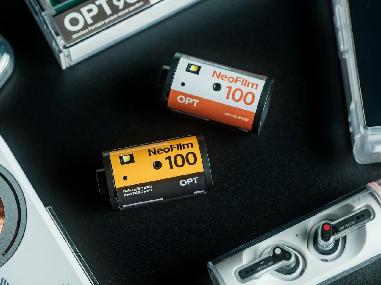
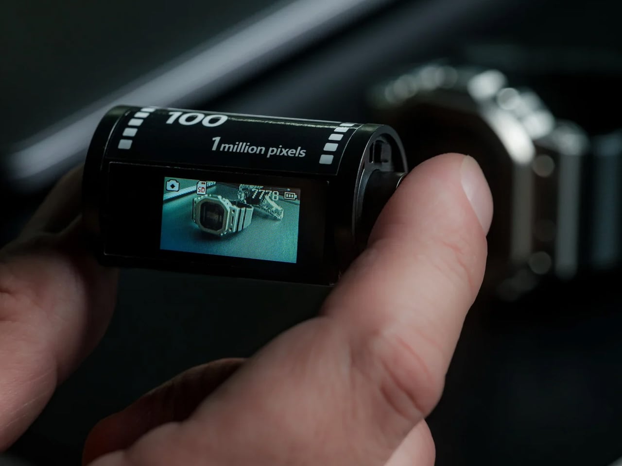
Pick it up, and it reads as a roll of 35mm film. The cylindrical body matches the proportions of a standard film canister exactly, right down to the way it sits in your palm. Inside, a 1-megapixel CMOS sensor has been deliberately tuned to produce grain, blown highlights, and softness. This is not a limitation. It is the design intent. No rolls to buy, no development to arrange. Everything stores to a microSD card the moment you press the shutter.
At 25 grams, the Analog Capsule weighs less than a set of keys. An included strap lets it hang from a bag or belt loop, always within reach when something catches your eye. Digital playback means every shot is reviewable immediately, and USB-C handles both transfers and charging. The packaging arrives looking like a roll of Kodak film, which means the surprise begins before the box is even open. As a gift, it delivers twice over.
The intentional 1MP sensor that treats imperfection as a feature rather than an apology
25g weight means it genuinely disappears into a bag or pocket
The packaging reveal that earns its moment before a single photo is taken
What we dislike:
One megapixel is genuinely low resolution — this is a mood camera, not a documentation tool
The recipient needs to understand the aesthetic intent going in, or it will disappoint
3. SYITREN R300 Portable CD Player
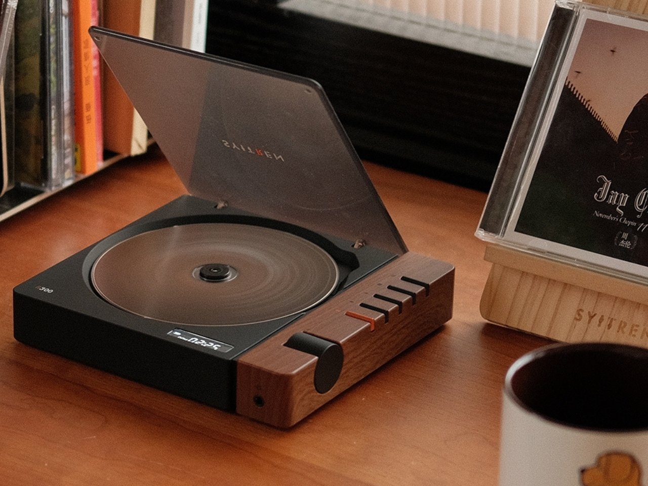
The SYITREN R300 makes the strongest case for the CD player’s return. Available in warm wood, clean white, and fruit green, it carries the proportions of a mid-century audio instrument: low-profile, ordered, designed to sit in view rather than be tucked into a drawer. The flat silhouette reads more like considered furniture than consumer electronics. It supports CD, CD-R, and CD-RW formats, covering virtually every disc in most existing collections without asking anything of the listener in return.
Bluetooth 5.3 removes the last practical objection to using a CD player in 2026. Pair wirelessly to any speaker while the disc spins, or run the SPDIF optical output for audiophile-grade listening. The 2,000mAh battery handles extended sessions without interruption. The R300 has developed a following on social media and Reddit that reads less like tech enthusiasm and more like relief — that someone finally built a CD player as considered as the music it plays back deserves.
What we like:
The wood finish option that makes the player feel like furniture rather than electronics
Bluetooth 5.3 and SPDIF optical output covering both wireless and audiophile use cases
A 2,000mAh battery that handles long listening sessions without interruption
What we dislike:
The price has drifted upward from its original retail point
A working disc collection is required to get full value from it as a gift
4. RetroWave 7-in-1 Radio
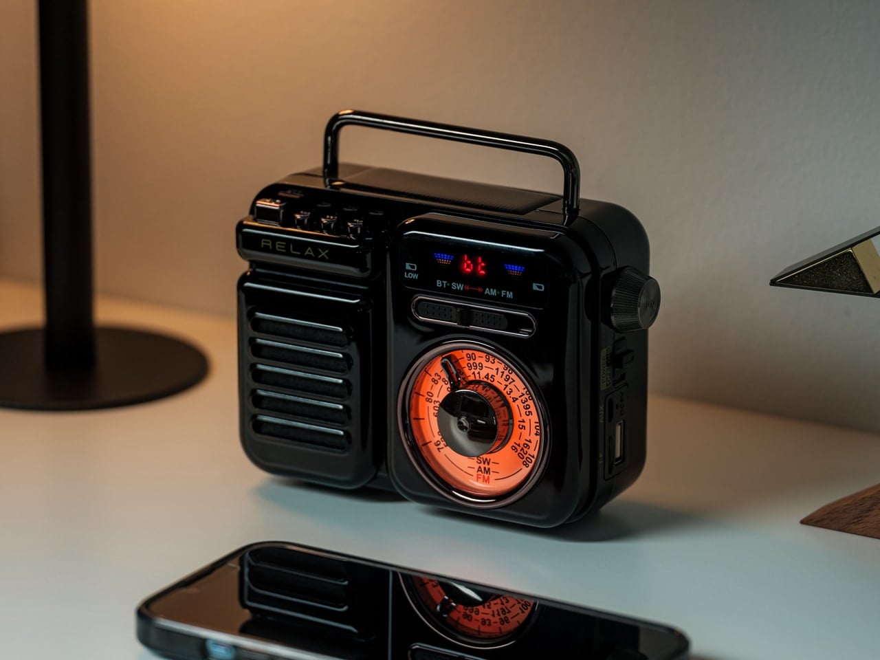
Seven functions inside one compact device: Bluetooth speaker, MP3 player, AM and FM radio, shortwave tuner, LED flashlight, clock, power bank, and SOS siren. The form borrows from mid-century transistor radios, the kind that sat on kitchen counters in the 1960s pulling in baseball games from two states over. The RetroWave is not a direct replica of any single model, which works in its favor. It speaks the visual language of that era without tipping into a museum piece.
The shortwave radio tuner is what separates this from most Bluetooth speakers on the market. When a grid goes down, shortwave is still broadcasting, giving the RetroWave a practical edge that wireless-only devices will never match. Hand-crank power means the battery situation is never fully critical. On a desk it reads as a design object from another decade. Off-grid it functions as serious emergency equipment. Very few products manage both of those things convincingly, and fewer still do it at this price.
Shortwave tuning and hand-crank power as genuine tools, not marketing copy
Earns its shelf placement aesthetically and its field placement practically
SOS siren and power bank functions that justify keeping it out permanently
What we dislike:
Seven functions across one device means no single function is best in class
The form prioritizes aesthetics over raw audio fidelity
5. Shargeek Retro 35W GaN Charger
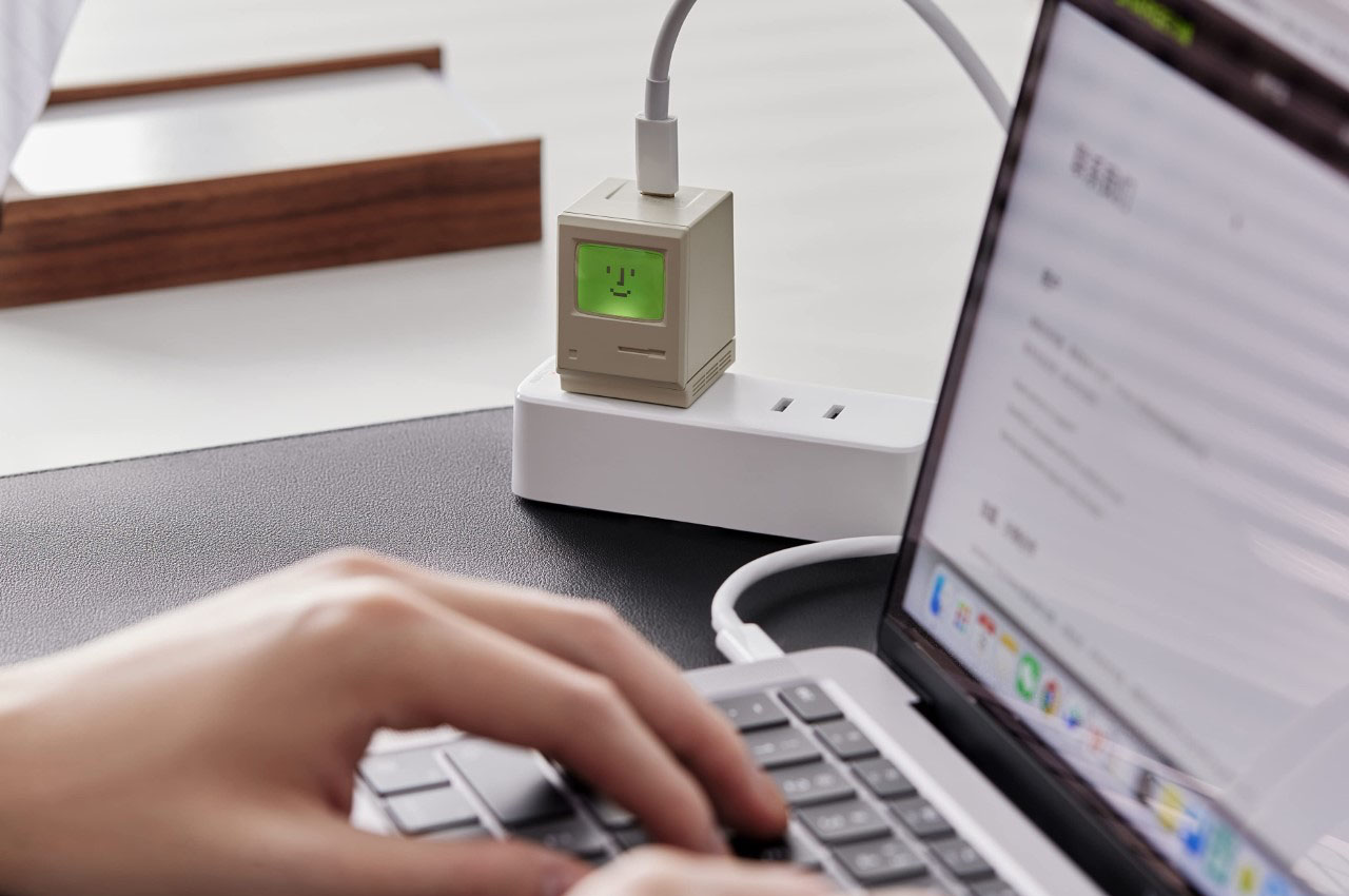
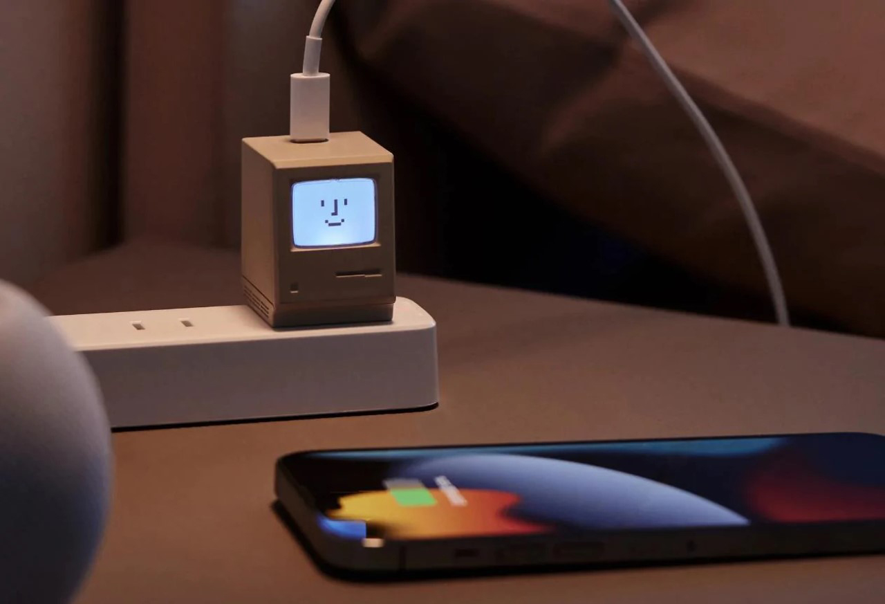
The Shargeek Retro 35W is shaped like a first-generation Macintosh computer, screen and all, and the screen actually works. It lights up to communicate charging status, moving from white when idle through yellow, blue, and green as the rate increases. Inside, GaN III technology delivers up to 35W, enough to take an iPhone from empty to 50 percent in around 30 minutes. The whole unit weighs 55 grams. The original Mac weighed around 7.5 kilograms. Progress clearly has a sense of humor about itself.
A set of DIY stickers ships with every unit, designed to sit over the tiny display and act as changeable wallpaper for the miniature screen. Compatibility runs wide: phones, tablets, earbuds, drones, handheld gaming consoles, and laptops within the wattage range all charge without complaint. This is a charger that belongs on a desk in plain sight, not tucked behind furniture. It has earned its visible placement in a way that almost no other charging brick ever will.
What we like:
The glowing screen that communicates charging status without requiring a connected app
DIY sticker set that adds a layer of personalization to an already distinctive object
55 grams and pocket-sized, so it travels without adding weight
What we dislike:
35W tops out before reaching laptops that need 60W or more
The standout design draws attention on a shared power strip, which is not always welcome in an office setting
The Best Tech Is the Stuff You Never Want to Put Away
Retro done well is not about looking backward. It is about recognizing that some forms were correct the first time and deserve better internals, not a redesign. The Nixoid Next, the Analog Capsule, the SYITREN R300, the RetroWave, and the Shargeek charger each make that argument through the object itself. Nothing here relies on a spec sheet to justify its place in a room.
They earn their spot on a wrist, a desk, a shelf, or a wall socket, and none of them need a software update to stay relevant. The man who receives any one of these will understand immediately why it was chosen. That kind of clarity is what separates a gift from a good one.
The best home products earn their place through specificity, not by doing everything, but by doing one thing with enough precision that every cheaper alternative starts to look like a guess. This month’s list spans five categories and five very different problems, and what ties them together isn’t a theme. It’s a standard: each product here has a specific reason to exist that a more general one cannot replicate.
Cleaning, listening, making coffee. Three of those sound like categories where the object barely matters. They’re not. The right tool changes a daily routine in a way that accumulates quietly over time. The five picks below make that case across the full breadth of a home, from the floor to the entryway, from the kitchen counter to the shelf where the music lives.
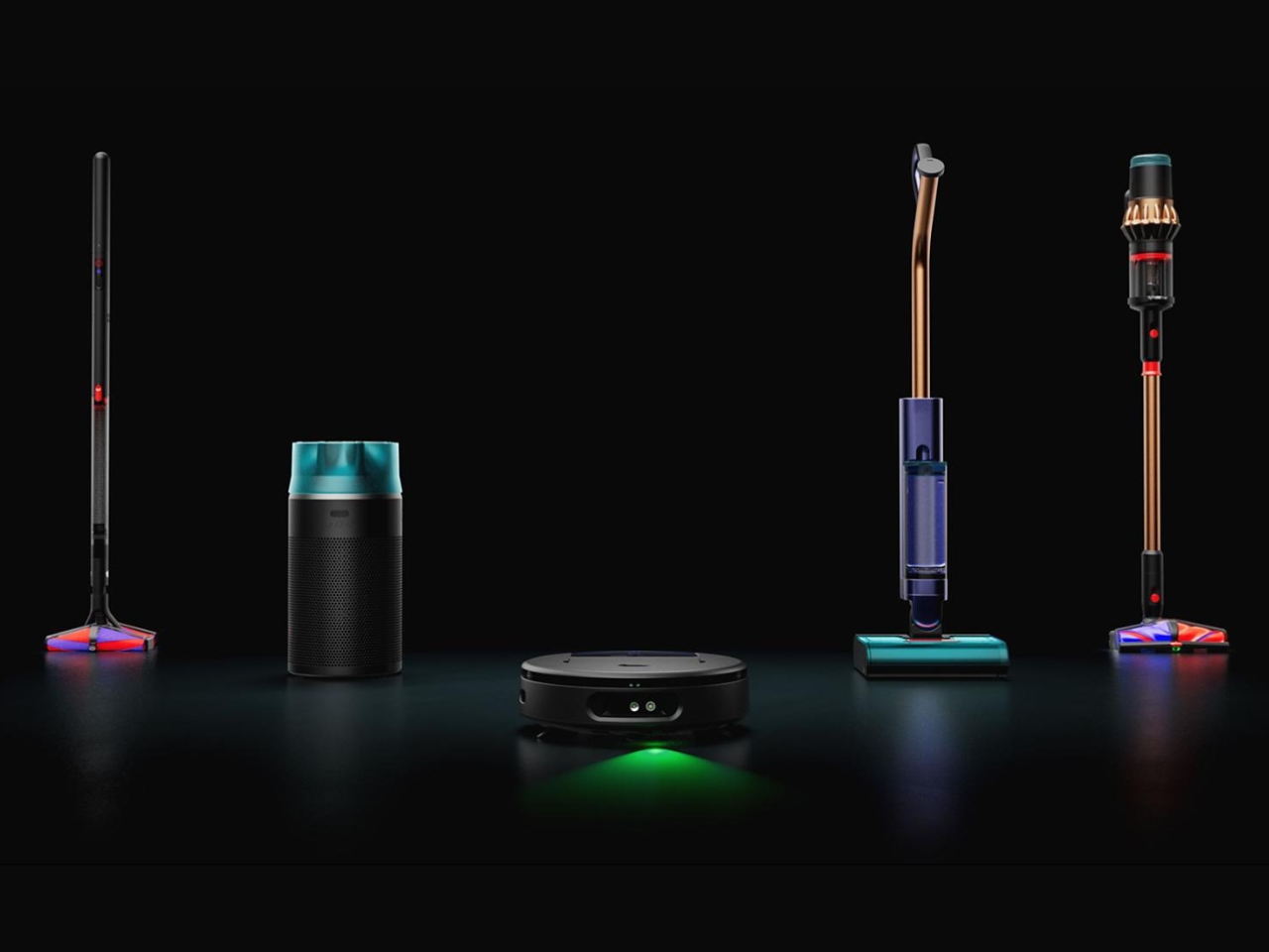
1. Dyson V16 Piston Animal
The Dyson V16 Piston Animal is what happens when a vacuum brand stops chasing raw suction numbers and starts solving the problems that live just beneath them. Smart suction adapts automatically to different floor types without any manual input from you. A green dust-revealing light makes the invisible visible, showing exactly where debris has been missed rather than asking you to trust the pass. The result is a machine that changes how you verify the work is actually done.
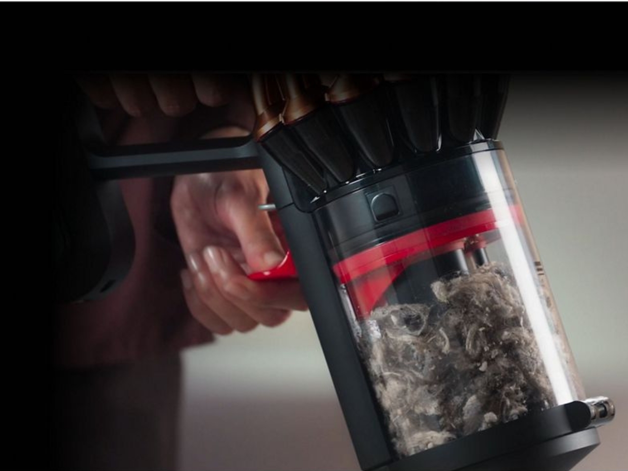
The dual conical brush bar addresses the problem that has quietly frustrated cordless vacuum users for years: hair. Rather than letting it wind around the bar until it needs manual removal, the system directs long hair outward to the ends for easy disposal. A compression mechanism lets you compact collected debris and empty the bin with considerably less mess than the standard push-and-hope approach. Compatibility with the Submarine 2.0 wet roller extends the V16 into wet floor cleaning without the need for a second machine.
What We Like
Smart suction adapts across floor types without switching modes or interrupting the clean
Green dust-revealing light gives you actual evidence of a clean floor, not just faith in the pass
What We Dislike
As a premium cordless machine, it represents a significant investment before attachments are even considered
The compression emptying system, while genuinely clever, still places your hand near the bin in a way some users will want to work around
2. Narwal Flow 2 White
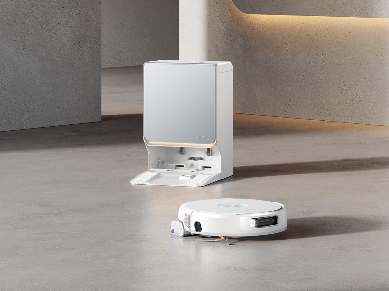
Most robot vacuums know how to read a floor. The Narwal Flow 2 White is one of the first that has started to read the room. Baby Care Mode runs quieter near nursery zones and uses the machine’s mapping intelligence to log displaced toys after each clean. Pet Mode directs deeper attention to high-traffic pet areas and includes a Find My Pet function through the app. These aren’t novelties. They’re evidence of a product designed around how a home actually operates, not just how it’s laid out on a map.
The white colorway carries a frosted glass-textured dock panel and a slim ambient status light bar that communicates the robot’s state without demanding attention. Together they give the system a composed, architectural presence in pale-toned interiors where most cleaning robots still look like they arrived from a utility room. The FlowWash system heats water to 140 degrees Fahrenheit to keep the mop clean throughout each cycle. 31,000 Pa suction and a 120-day self-emptying station sit underneath the considered exterior, fully intact.
What We Like
Baby Care Mode and Pet Mode reflect genuine design thinking about how domestic life actually works, not just how floors are laid out
The frosted glass dock and ambient light bar make this the first robot vacuum that earns a visible place in the room
What We Dislike
At over a thousand dollars, the value argument is strongest for households actively managing pets, young children, or both
The full feature set rewards regular app engagement to get the most from the AI-driven mapping intelligence
3. Portable CD Cover Player
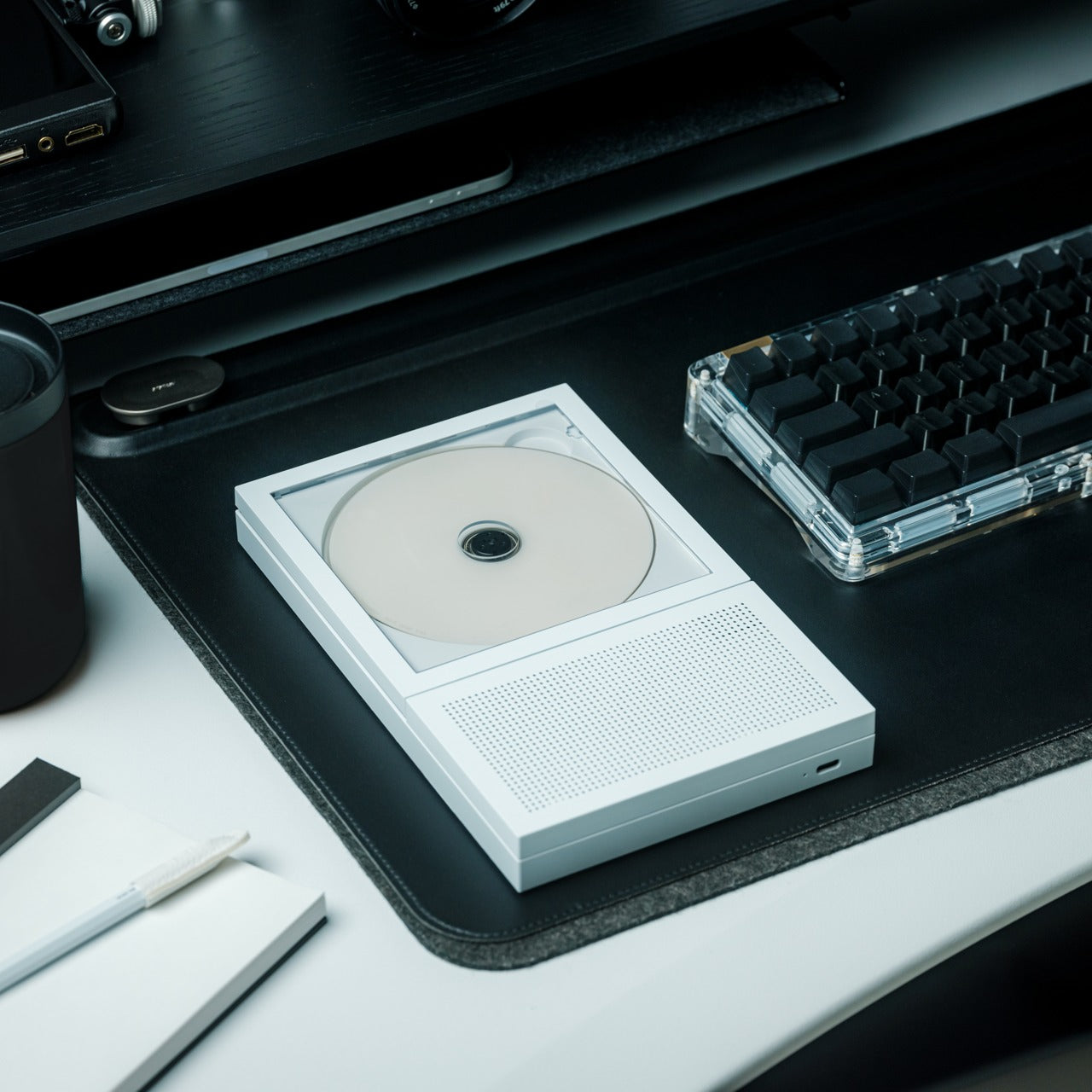
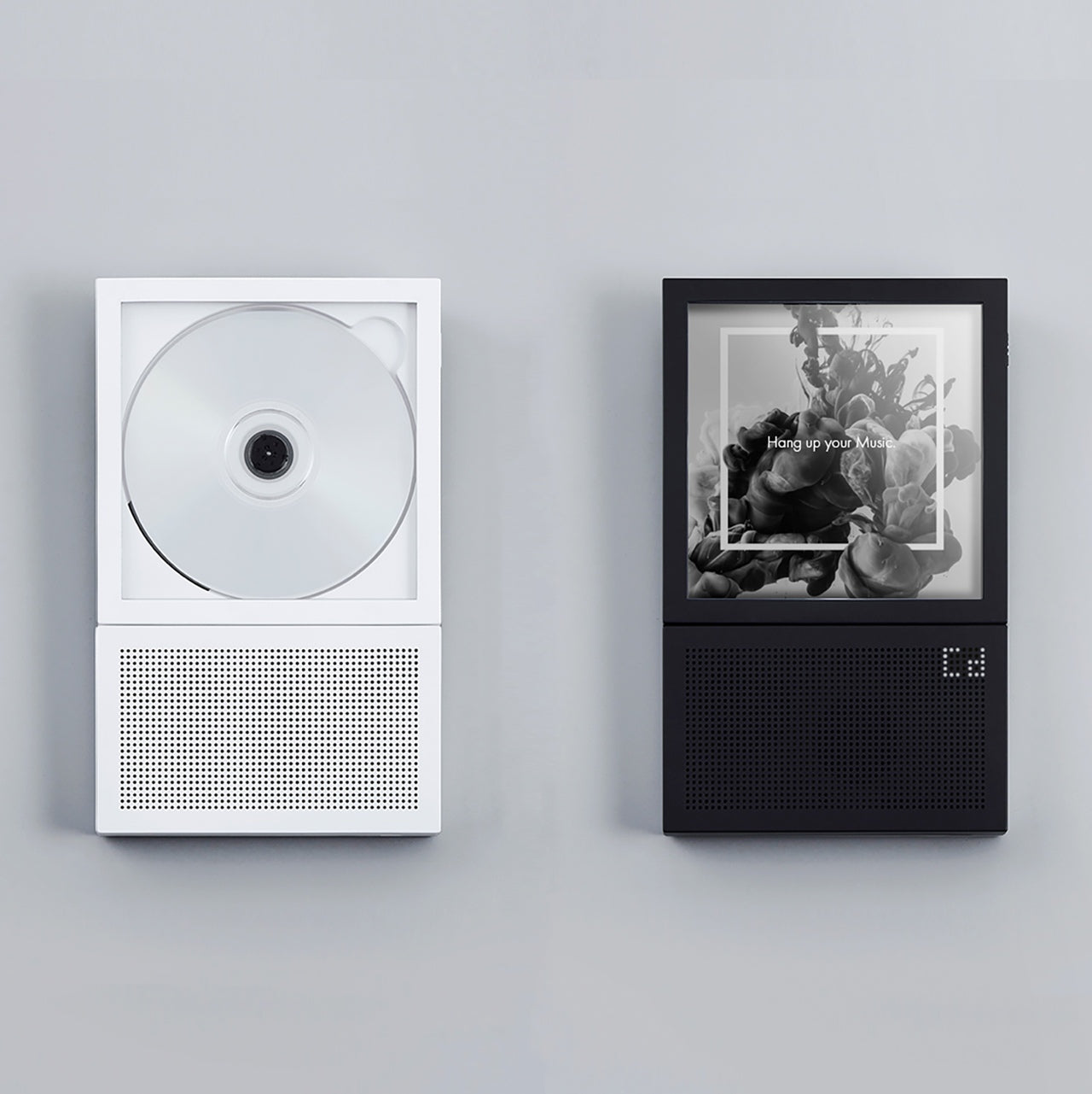
The album cover was never just packaging. For a generation of listeners, it was the first thing you saw before the music started, and it became inseparable from the sound in a way a two-inch streaming thumbnail never replicates. The Portable CD Cover Player treats that relationship as a design brief. Whichever disc you load, the jacket displays as part of the listening experience, giving the art around the music a reason to exist in the room again rather than a reason to be forgotten behind a queue.
Built-in speakers and a rechargeable battery make it a standalone object, not a peripheral waiting for something else to do the heavy lifting. A wall-mount bracket option takes it from desk accessory to room feature, turning the player into a rotating display of covers you’ve owned and music you still reach for. Starting at $199, it operates at the intersection of audio hardware and interior design in a space that streaming has spent fifteen years quietly dismantling, and this single object quietly rebuilds.
Album art displayed at real scale returns an emotional context to listening that streaming platforms removed by default
Wall-mount capability turns a CD player into a considered room object without any modification required
What We Dislike
At $199, the price asks you to weigh genuine affection for the format against the convenience of software that costs nothing
Audiophiles wanting precise control over output quality may find the built-in speaker setup limiting
4. Fellow Stagg EKG Pro
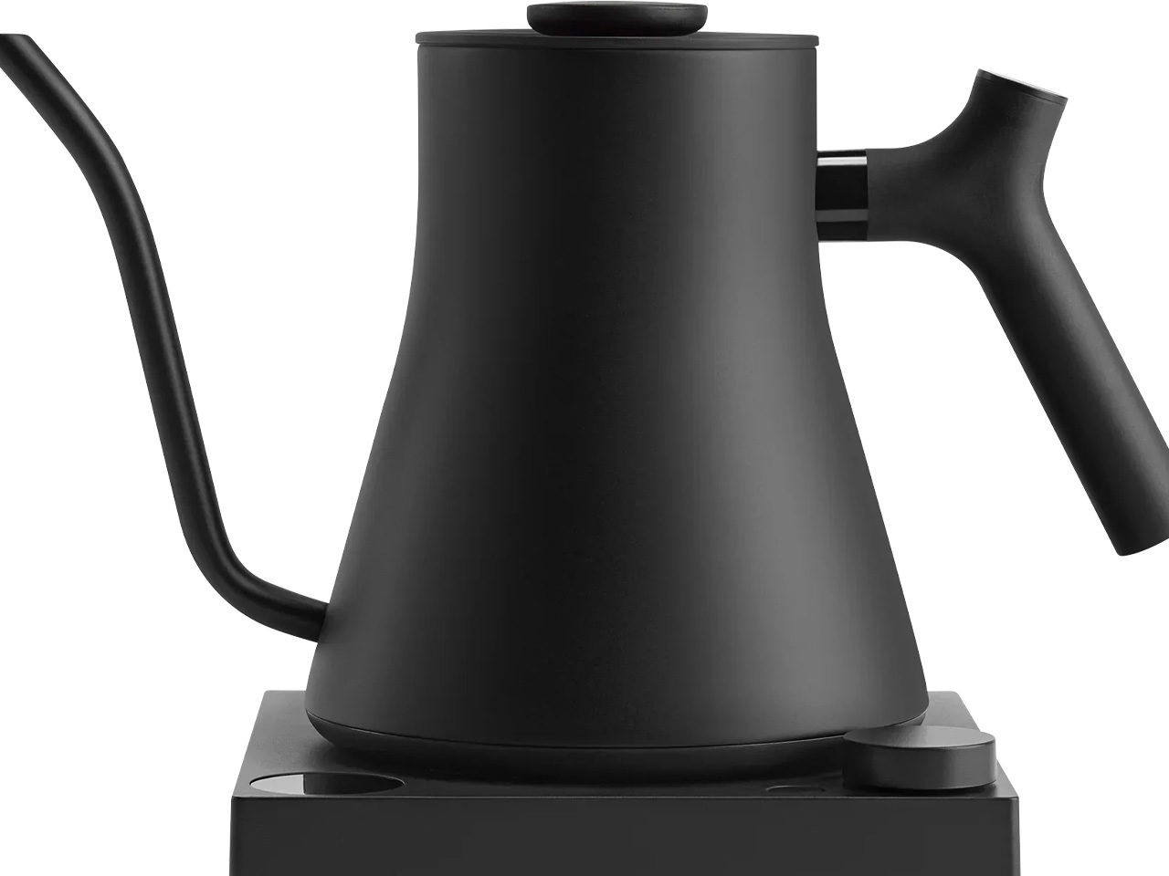
Most kettles are designed to boil water and stay out of the way. The Fellow Stagg EKG Pro starts from the position that the kettle is the wrong object to make invisible. It lives on the counter every morning. It is involved in the first deliberate thing most people do each day. A counterbalanced gooseneck handle, a precision spout, and variable temperature accurate to a single degree reflect the argument that if something earns daily use, it should earn daily consideration too.
A hold function keeps the target temperature stable for up to 60 minutes between pours, which matters for pour-over coffee and temperature-sensitive teas where a few degrees of cooling changes the result noticeably. Bluetooth connectivity links to the Fellow app for programmable presets, and a memory feature recalls the last-used temperature at startup. The 0.9L matte-finish body belongs on the counter rather than in a cabinet, which is a quieter but more durable argument than anything a spec sheet can make for a product in a category that rarely makes it.
What We Like
Variable temperature to one degree produces a measurably different result for specialty coffee and delicate teas
The counterbalanced handle makes a controlled slow pour feel entirely natural rather than effortful
What We Dislike
The 0.9L capacity limits households that regularly need to boil larger quantities in a single fill
Bluetooth and app connectivity are secondary to the hardware quality, and most users will likely never configure them
5. 3-in-1 Luminous Mirror Diffuser
Most bedside setups are a quiet negotiation. The lamp is tolerable but too directional. The mirror is functional but positioned wrong. The diffuser is somewhere on a shelf, half-forgotten after the first week. The Luminous Mirror Diffuser collapses all three into a single oval object crafted from anodized aluminum, and the result looks better than any of the items it replaces. Shadow-free reflected light technology eliminates the harsh contrast a single source creates, while the 360-degree rotatable mirror adjusts to any angle for grooming, makeup, or simply getting the reflection where it needs to be.
Three color temperatures do the work a fixed lamp never can. The 2400K warm setting creates the kind of amber glow most bulbs can’t reach without a separate swap. A neutral mid-range handles focused tasks without visual fatigue. The 6000K daylight mode delivers precision clarity where color accuracy matters. Four brightness levels sit beneath each temperature, and the patented aroma plate uses an aluminum matrix to diffuse fragrance from a few drops of essential oil. Wireless charging keeps the surface clean. At $800, it is one object doing the work of three, and doing it more elegantly than any of them managed alone.
Three color temperatures with four brightness levels each means the same object serves a 6 am routine and an evening wind-down without compromise
Anodized aluminum with a matte scratch-resistant finish feels premium at every point of contact
What We Dislike
At $800, it rewards people who use all three functions regularly and will underserve those who only need one
A dedicated studio mirror or a standalone high-end diffuser will outperform it in those individual categories
The Difference Is Always Specific
What this month’s list resists is the idea that a home product earns its place through specification alone. The Dyson V16 finds dust you missed. The Narwal adapts to the people living in the room. The CD player returns something streaming quietly removed. Each object here is defined by what it decided to care about most, and the best ones communicate that decision before you’ve read a single line of copy.
A well-chosen tool doesn’t announce itself. It changes a routine in a way that takes a few weeks to fully notice, and then becomes the thing you miss immediately when it’s gone. These five earn that standard across five very different moments in a home, from the floor on the way out the door to the kettle on the counter at six in the morning. The difference is specific, and specific is always worth it.
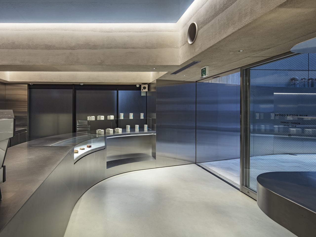
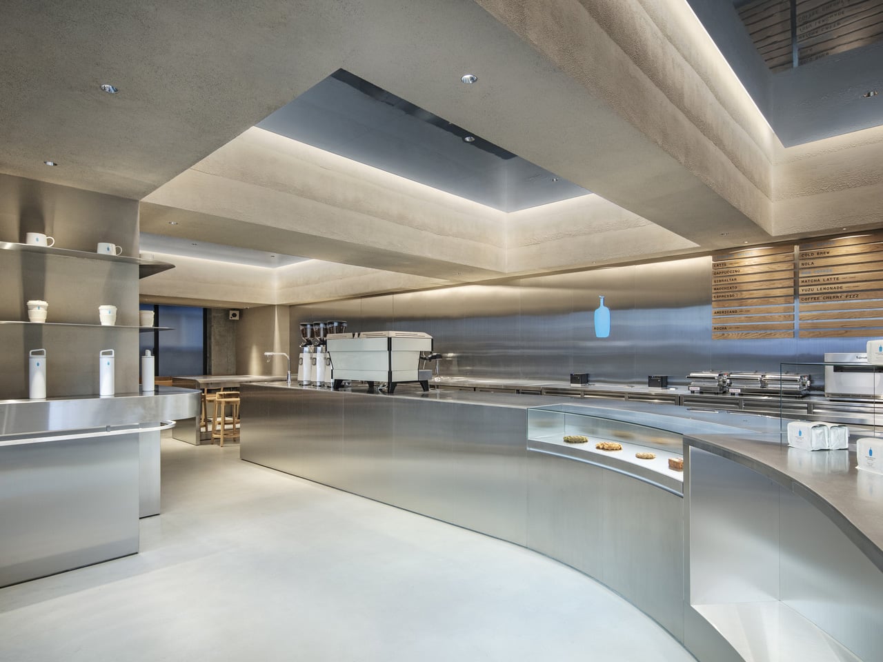
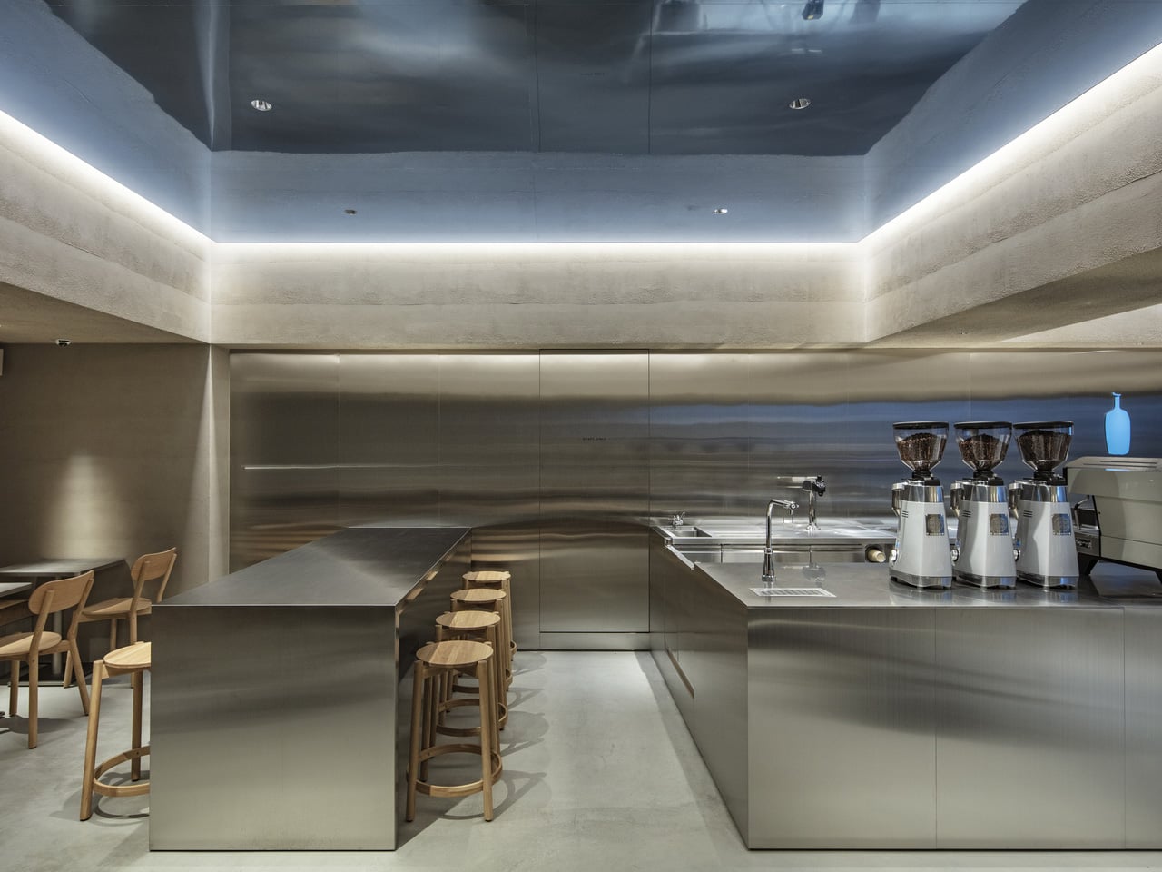
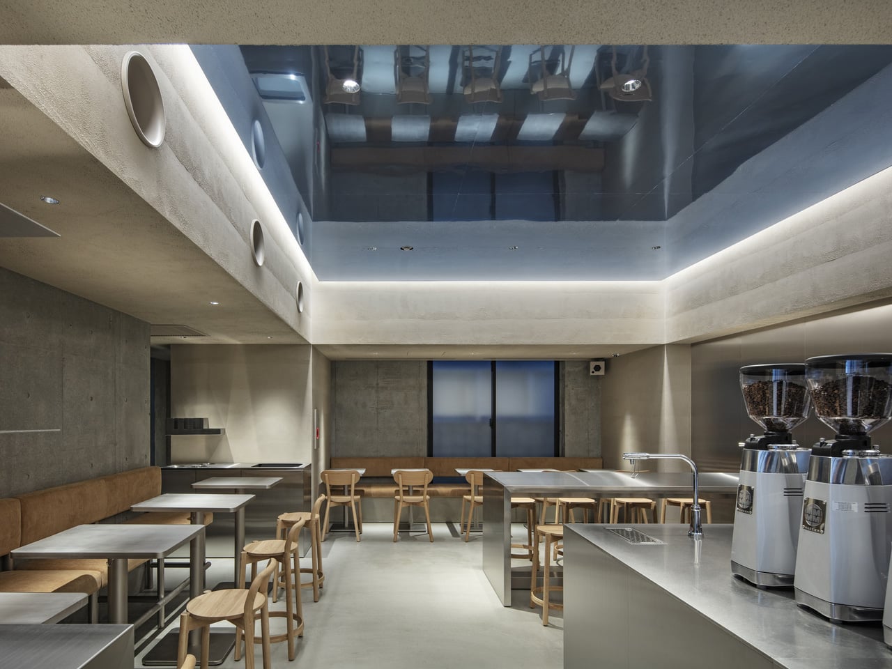
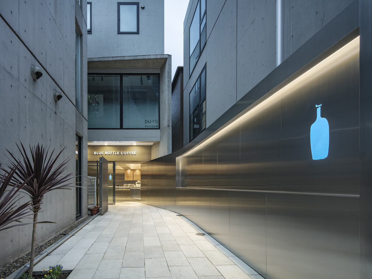
Walk into most cafes, and they’re already selling you something — exposed brick, neon signs, mismatched furniture, a playlist that changes every twenty minutes. Then there’s the Blue Bottle Coffee Harajuku cafe by TEKI Design, which says almost nothing, and means all of it.
Tucked into one of Tokyo’s most visually chaotic neighborhoods, the Harajuku outpost functions as a deliberate counterweight to its surroundings. Harajuku is a place of spectacle — streetwear drops, cosplay, fashion tribes colliding on narrow sidewalks. TEKI Design’s response was to strip everything back. The cafe earns its calm rather than performing it.
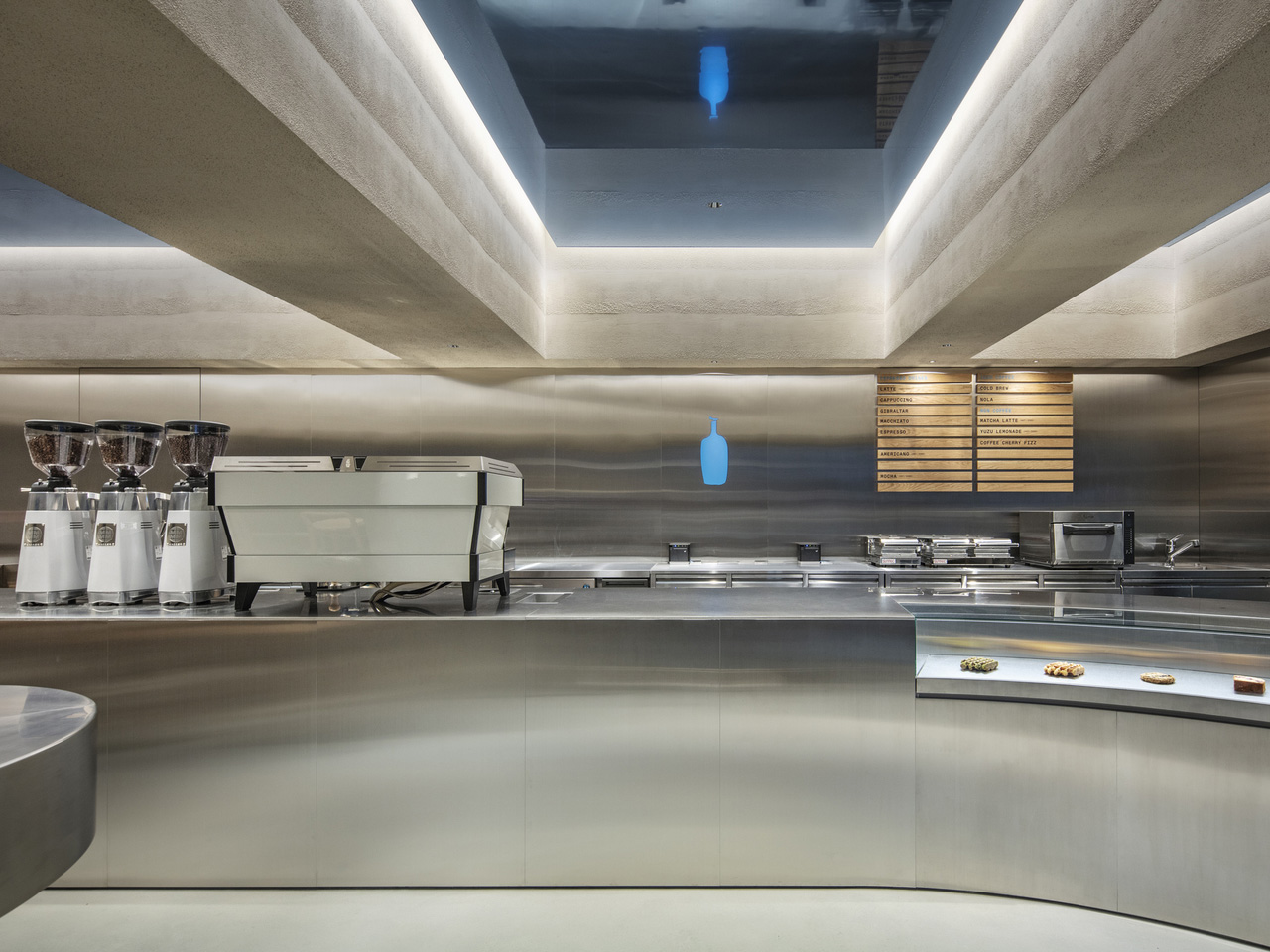
The interior leans into a vocabulary that feels distinctly Japanese in its economy of means. Clean lines, natural materials, and a spatial arrangement that prioritizes the ritual of coffee over the theatre of the brand. Light enters the space softly, falls across surfaces without drama, and leaves the room feeling like something you want to stay inside of. That quality — the sense of earned stillness — is harder to design than it looks.
TEKI Design has long understood that in a city as dense and stimulating as Tokyo, the most radical gesture a space can make is to ask nothing of you. The Harajuku cafe does exactly that. There’s no moment where the architecture competes with the coffee, or the coffee competes with the conversation. Each element holds its position and then steps aside.
Blue Bottle’s presence in Japan has always felt more considered than its American counterparts. The brand arrived in Tokyo in 2015 with a clear awareness that it was operating in a country with a coffee culture that predated its own by decades. That awareness shows up in spaces like this one — not as deference, but as genuine dialogue. The Harajuku cafe doesn’t try to look Japanese. It simply engages with what good Japanese design has always understood: that space is as much about what you remove as what you place.
The result is a cafe that photographs beautifully and experiences even better. A single cup of their single-origin pour-over, consumed in a room this quietly composed, lands differently than the same cup consumed anywhere noisier. That’s not pretension. That’s design working exactly the way it should — invisibly, in service of the thing you came for. In a neighborhood built on maximalism, TEKI Design and Blue Bottle Coffee have made the smallest possible move. It turns out that was the boldest one available.