Note apps are frictionless. That is supposed to be their advantage. You open one in two taps, type something forgettable, close it, and lose it somewhere between screenshots and grocery lists. The problem is that “frictionless” and “memorable” are not the same thing. Japanese stationery designers figured this out long ago, which is why they keep building analog tools that feel more considered than anything a software update has ever produced.
Every product here solves a specific friction point you have probably accepted as normal: a pen that vanishes when you need it, a clipboard that fights back when you add a sheet, a tape dispenser that looks like it escaped from a supply closet. These five finds fix all of that without an app store, a subscription, or a settings menu.
1. Inseparable Notebook Pen
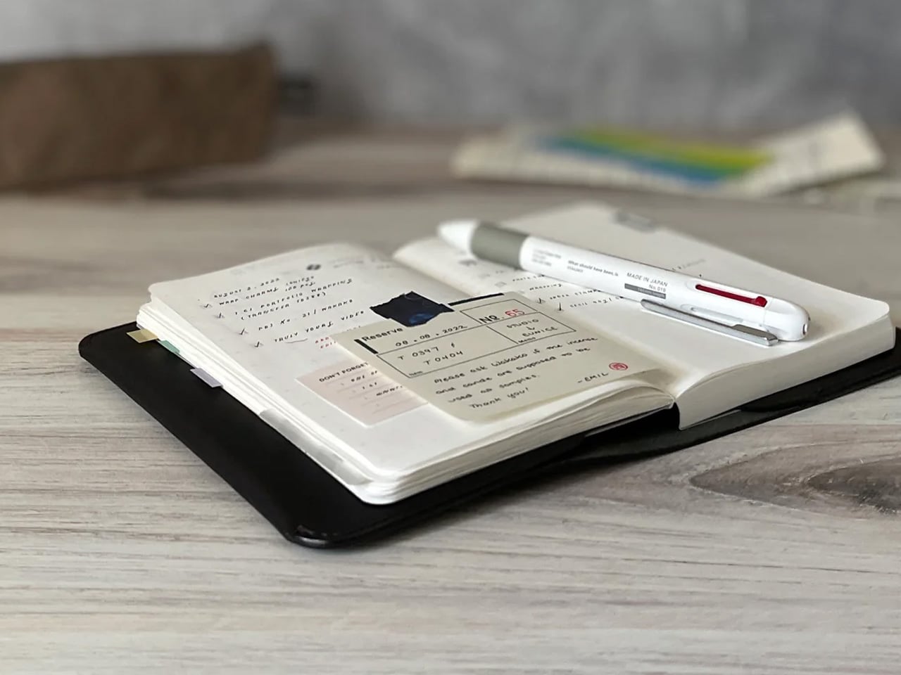
Most pens exist independently of the surface they write on. The Inseparable Notebook Pen rejects that assumption, using a magnetic clip that locks it to your notebook cover every single time. A built-in silencer dampens the attachment so there is no click, no rattle, just a quiet lock into place. The barrel is slim, the gel ink immediate, and the whole system rests on a principle Japan has long understood: the best tools are the ones you eventually stop noticing.
The gap between reaching for a pen and writing is small but real. In a meeting, on a train, mid-thought at a cafe table, that search breaks momentum in a way you feel but rarely name. By attaching itself to the notebook, the Inseparable closes that gap completely. It arrives wherever the notebook goes, leaves when the notebook leaves, and sits almost invisible against the cover. At $19.95, it is a quiet fix for an annoyance most people have long stopped trying to solve.
The magnetic clip holds firm during transit but releases instantly the moment you need it
The built-in silencer makes every attachment feel deliberate rather than mechanical
What we dislike
The slim barrel may feel too narrow for anyone who prefers a wider, more substantial grip
Ink cartridge options are limited, which restricts customization for specific writing preferences
2. Stalogy Editor’s Series 365-Day Notebook (A6)
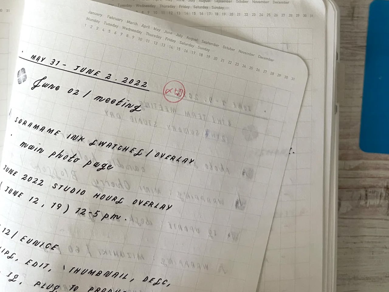
The Stalogy Editor’s Series 365-Day Notebook packs 368 pages into an A6 form factor that still slides into a coat pocket. Each page carries minimal printed detail: faint dates, a light grid, time indicators running along the margin. Use them or ignore them entirely. The paper is ultra-thin but writes with a smooth resistance that makes ink feel like it belongs on the page rather than sitting on top of it. Gel pens, ballpoints, and lighter fountain pen inks all perform cleanly without feathering.
Most planners assume they know how your day should be structured. The Stalogy steps back. The faint markings give you reference points without enforcing a system, which means the same notebook works for bullet journaling, meeting notes, rough sketching, and daily records without ever feeling like you are working against the page. For anyone who has cycled through five different note apps looking for the one that finally fits their brain, this is what that search was actually about.
Thin paper keeps 368 pages from becoming heavy, maintaining genuine pocketability throughout
Minimal page markings suit both rigid planning systems and completely freeform, unstructured use
What we dislike
Heavy fountain pen inks will ghost through the thin paper, limiting compatibility with certain instruments
Date and time markings are printed very small, making them difficult to read comfortably in low light
3. MagBoard Clipboard
Most clipboards run on the same tired mechanism: a spring-loaded lever that crushes paper at the top and leaves the rest of the sheet free to shift around below. The MagBoard replaces all of that with a magnetic and lever system that holds up to 30 sheets securely, without the grip marks. The hardcover backing is stiff enough to write on while standing, and the water-resistant surface means it survives bag life in a way paper-covered clipboards rarely manage.
The real advantage is speed. Adding or removing a sheet from most clipboards requires two hands and patience. The MagBoard lets you slide paper in and out cleanly, which changes how you interact with your notes during a meeting or a site walkthrough. It is the kind of improvement that sounds trivial until the first time you need it in a moment where fumbling costs you. At $45, it earns its place on the desk and equally off it.
The magnetic system holds sheets flat without grip marks or any pressure damage to the paper
The water-resistant hardcover handles bag use and outdoor conditions better than standard clipboards
What we dislike
Bulkier than a standard clipboard, which can be a tight fit inside slimmer bags and sleeves
The magnetic hold may feel less secure with very thick paper stocks or layered sheets of card
4. Classiky Wooden Tape Dispenser
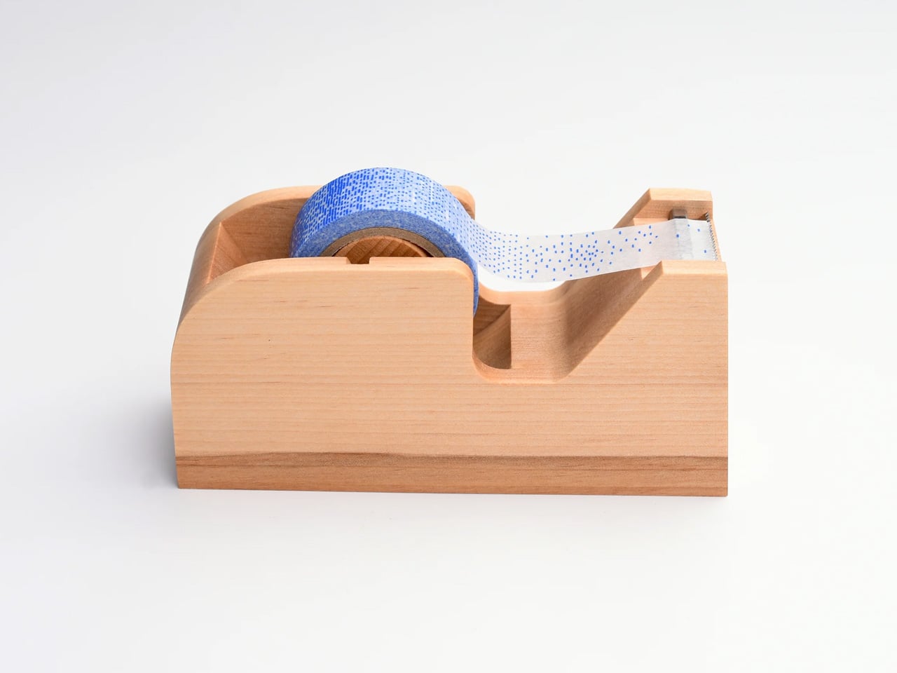
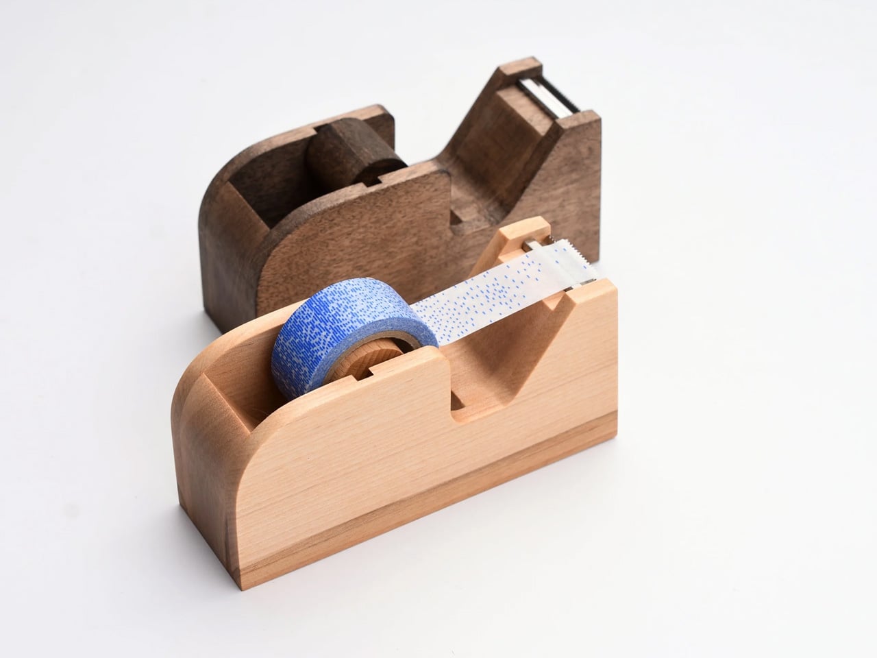
The tape dispenser is the most overlooked object on any desk. It sits in a corner, accumulates dust, and looks like it arrived from a supply closet rather than a considered workspace. Classiky’s version, cut from varnished Japanese wood with rounded, sculpted edges, refuses that role entirely. The grain is warm, the weight satisfying in the hand, and the mechanism precise enough to produce a clean tear every time. It quietly raises the standard for everything else sharing the same surface.
Classiky is a Japanese zakka brand that applies the same material thinking to everyday objects that most designers reserve for furniture. The Wooden Tape Dispenser is that philosophy made literal: a utilitarian desk tool reconsidered from the outside in, built from a material that improves with handling. The varnished wood deepens over time, picking up warmth from the room and the hands that reach for it daily. At $42, it makes every other object on your desk look like it is still waiting to be properly replaced.
The varnished wood looks considered at rest and develops a warmer character with regular handling over time
The mechanism produces a clean, controlled tear that most plastic dispensers never consistently manage
What we dislike
Sized for standard tape rolls, so it will not accommodate wider washi tape or specialty roll sizes
The wood surface will mark with use over time, which reads as earned patina to some and damage to others
5. Sonic Kakusta Portable Pen Stand
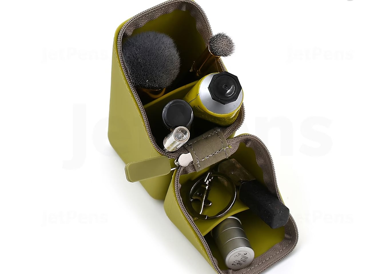
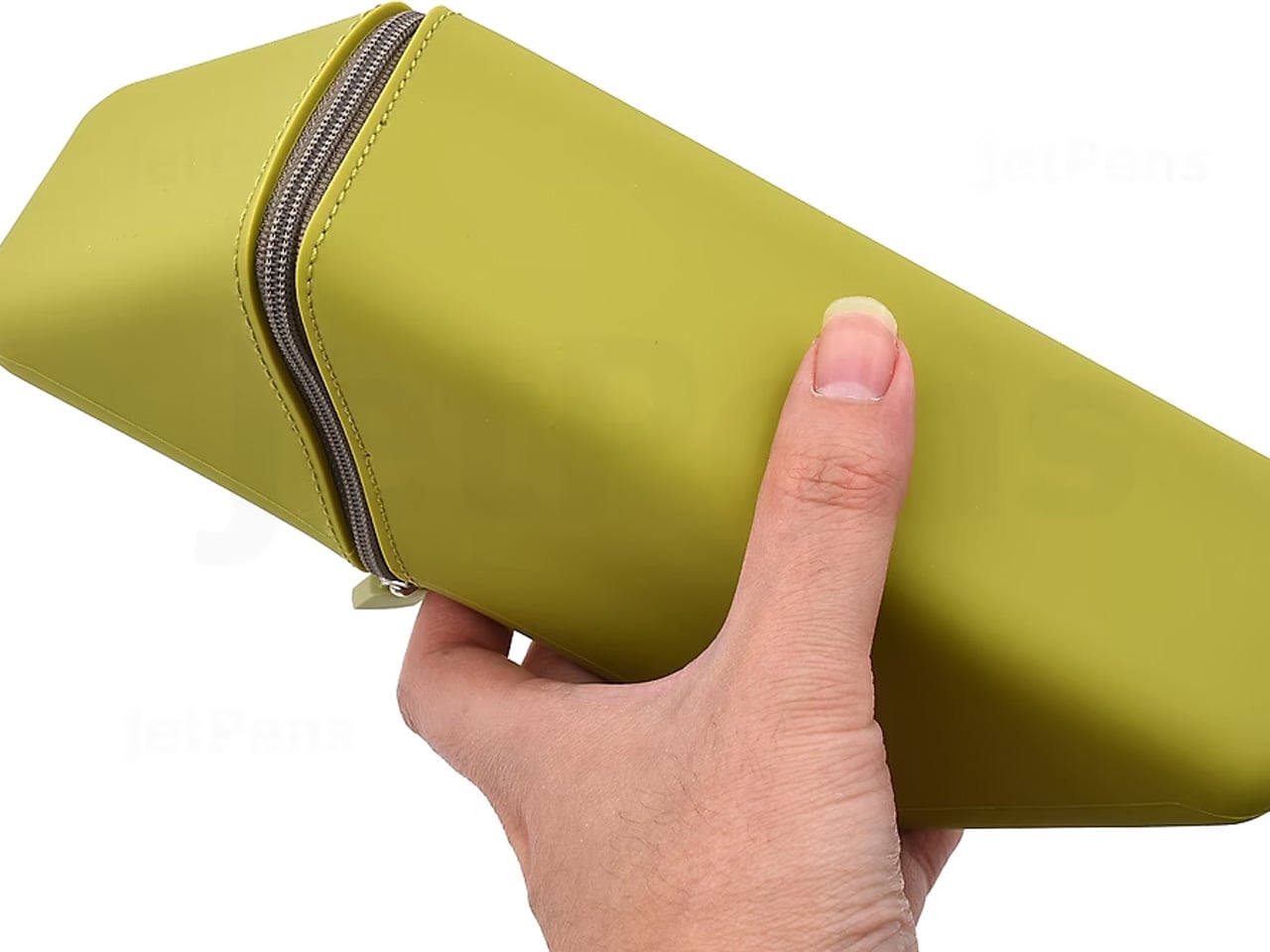
The Sonic Kakusta starts as a flat soft pen case and folds into a triangular desk stand in a single motion. Open, it props pens at a 60-degree angle: steep enough to show pen caps for quick identification, shallow enough that instruments slide out without tipping the whole case over. A built-in divider splits the interior into two sections, and a second divider in the lid creates a small shelf for erasers or sticky notes. Strong magnets hold the stand shape reliably on any flat surface.
For anyone moving between home, office, library, and studio, this is the object that makes carrying stationery feel considered rather than improvised. The case lies flat in a bag without occupying more space than a notebook. On a desk, it becomes a proper display stand, keeping what you need visible rather than buried at the bottom of a pouch. That transition from flat to functional in one fold is precisely the kind of engineering detail that separates Japanese stationery design from everything else in the category.
The magnetic lid holds the stand shape firmly, even on slightly uneven or textured surfaces
The lid divider creates a genuinely usable small shelf, an extra that most pen cases never think to include
What we dislike
The soft material offers limited protection against crushing when a bag is packed tightly around it
The triangular footprint when open takes up noticeably more desk space than a flat case would
The Best Tools Don’t Get Updated. They Get Better.
These five objects share one quality that note apps cannot replicate: they get better the more you use them. The wood deepens. The magnetic mechanism smooths out. Each session leaves a trace in the material that accumulates into something that is unmistakably yours. That is not sentimentality; it is the material logic of objects built to outlast a software cycle. Japanese stationery design at its best does not chase novelty. It makes the ordinary interaction between a person and a tool feel like it was worth designing in the first place.
The note app on your phone is not going anywhere. But after a week with these on your desk, you might find you reach for it less. Not because analog is inherently better, but because the right physical tool makes thinking feel different from typing. Slower, more deliberate, more yours. That is a harder thing to engineer than an app. Japan has been doing it for a long time.
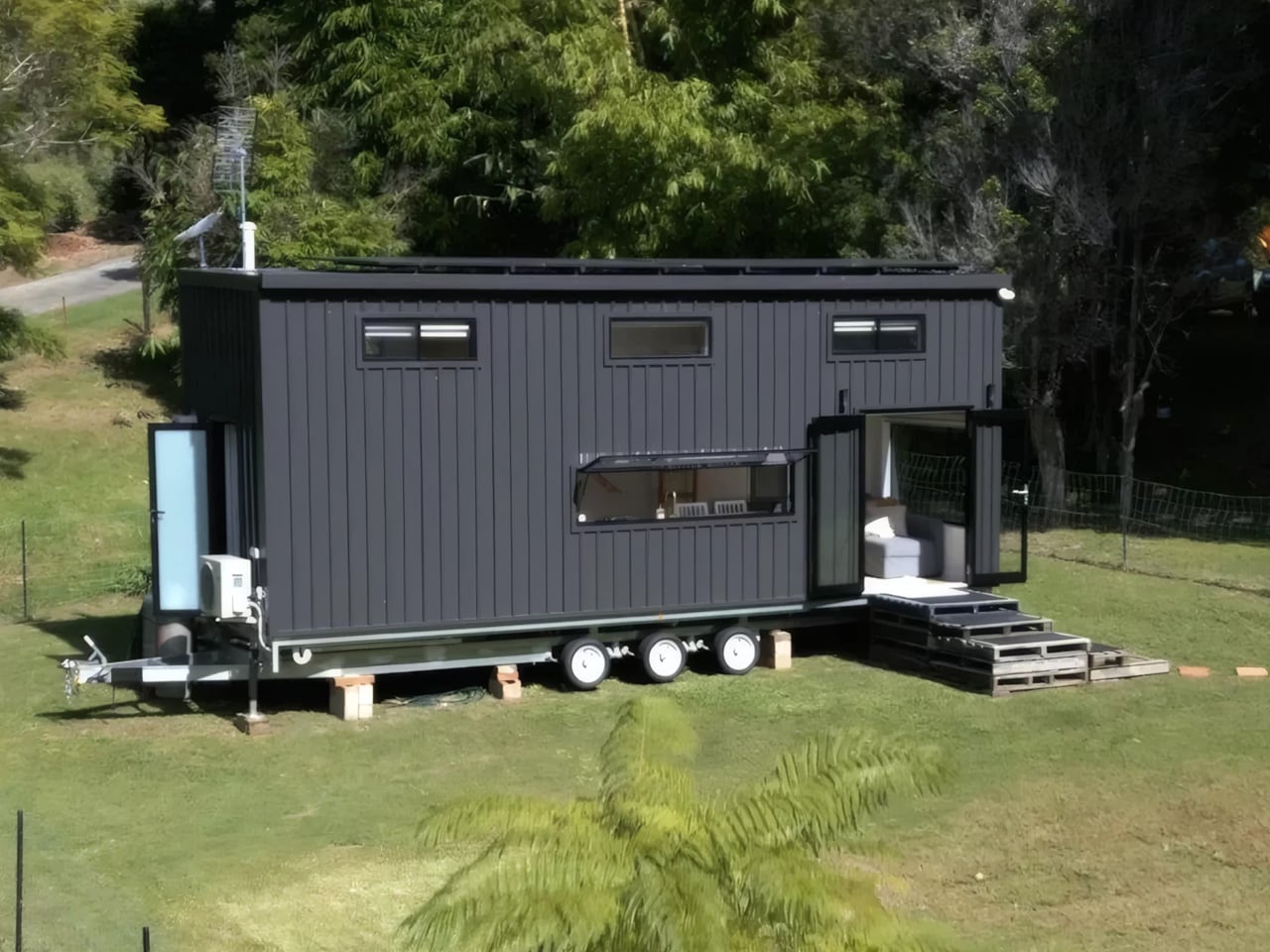
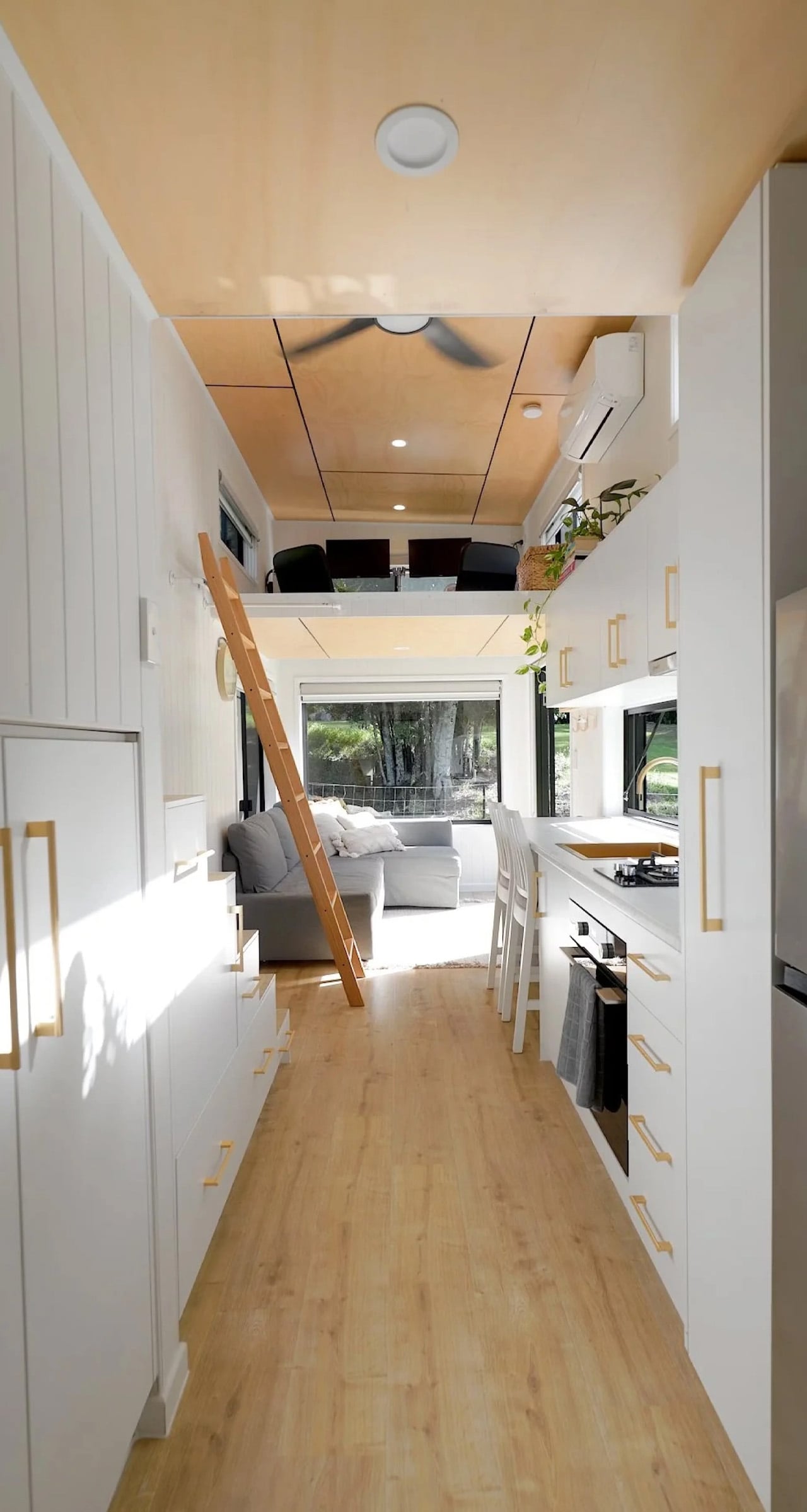
Tiny house living has long come with an unspoken agreement — you trade space for freedom, and you make peace with the limitations. The Coolangatta 8.4 by Gold Coast-based Removed Tiny Homes wants to renegotiate that deal entirely. Named after its dimensions, the 8.4-meter (27.5 ft) build sits on a triple-axle trailer and arrives not as a stripped-back escape pod, but as a considered, liveable home — one that takes full-time living seriously without abandoning the lightness that makes tiny architecture worth chasing.
The exterior sets the tone immediately. Wrapped in monument Colorbond steel cladding and softened with natural textures, the Coolangatta 8.4 walks the line between coastal restraint and contemporary edge. It’s not trying to disappear into the landscape — it has presence. The kind that reads well in the late afternoon sun and doesn’t scream for attention while doing it. From the outside, the massing feels deliberate: clean rooflines, a tight material palette, and just enough visual weight to signal that what’s inside has been thought through.
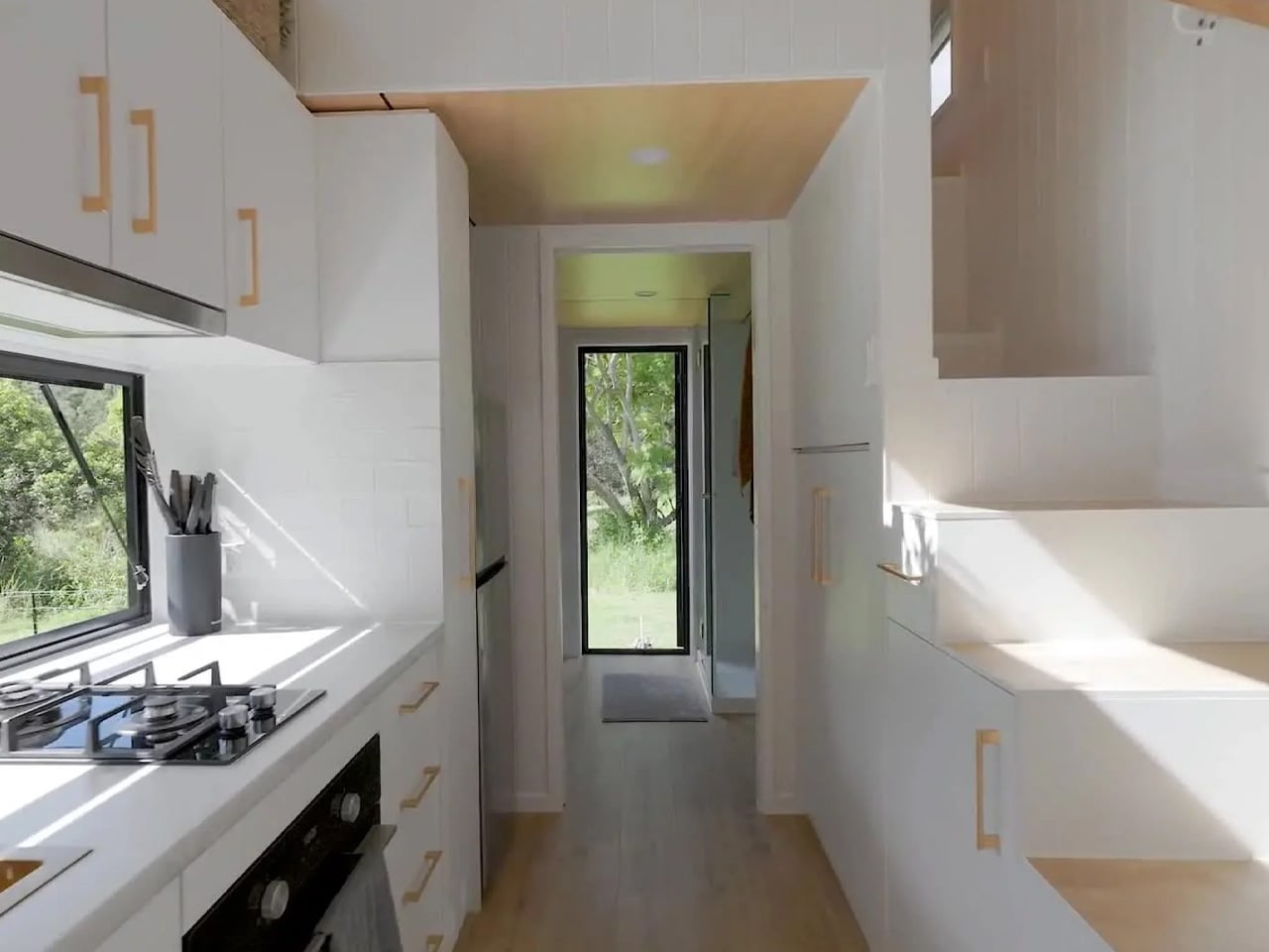
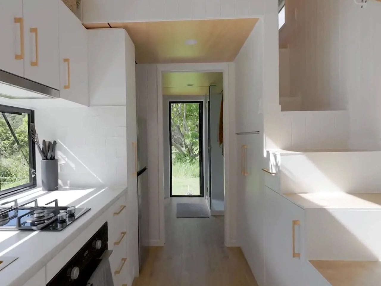
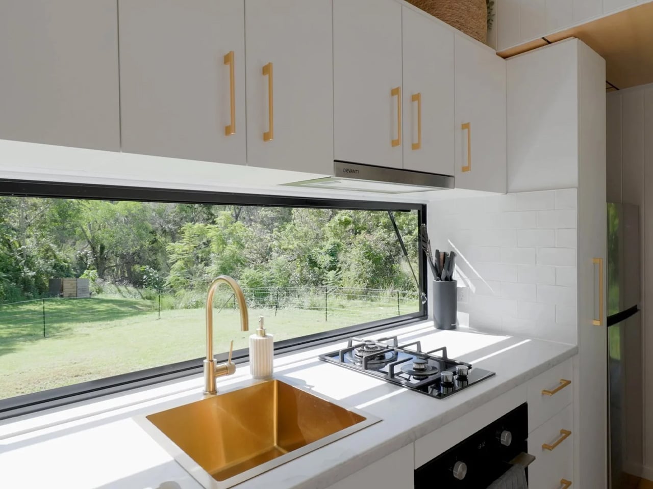
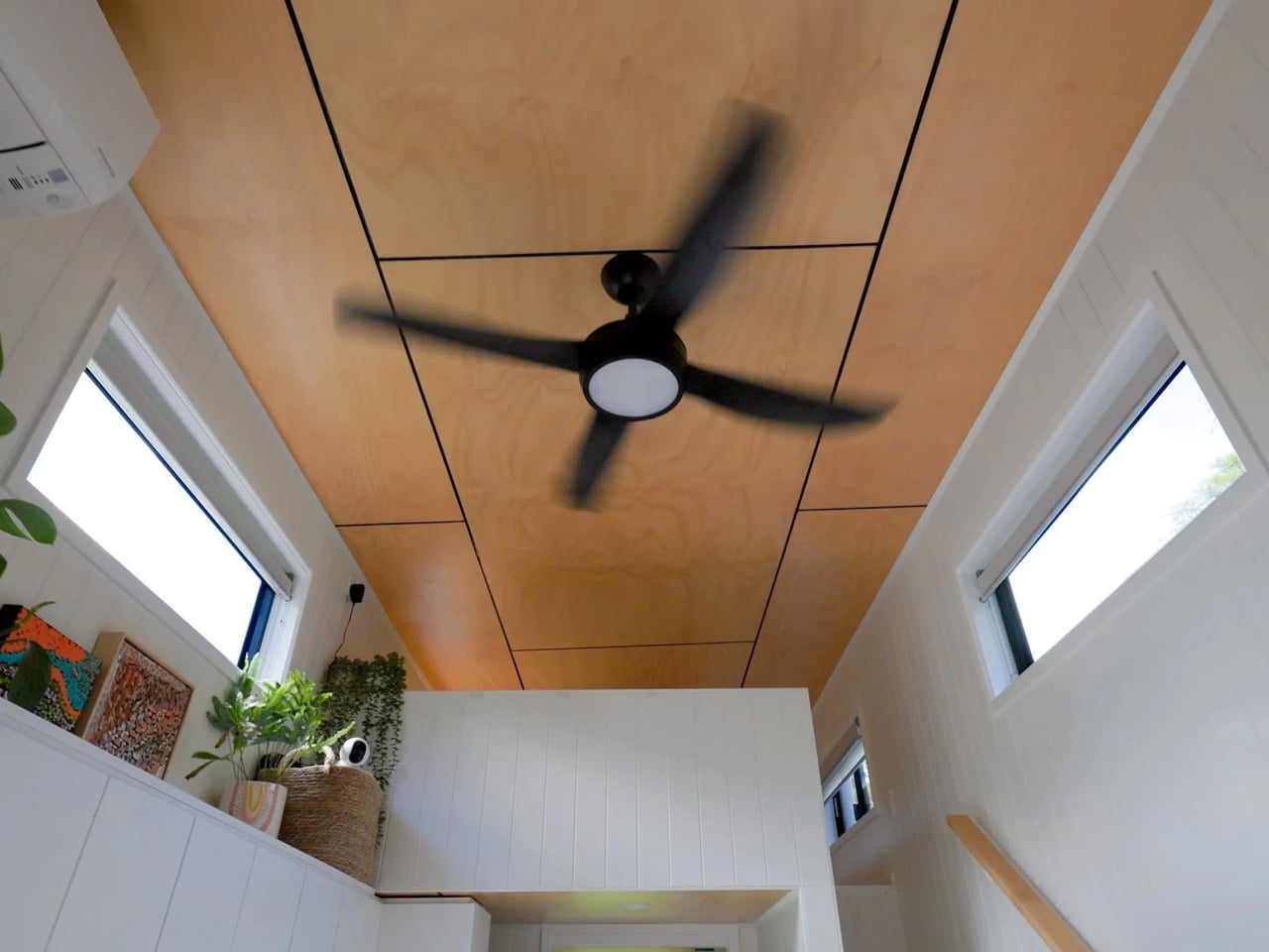
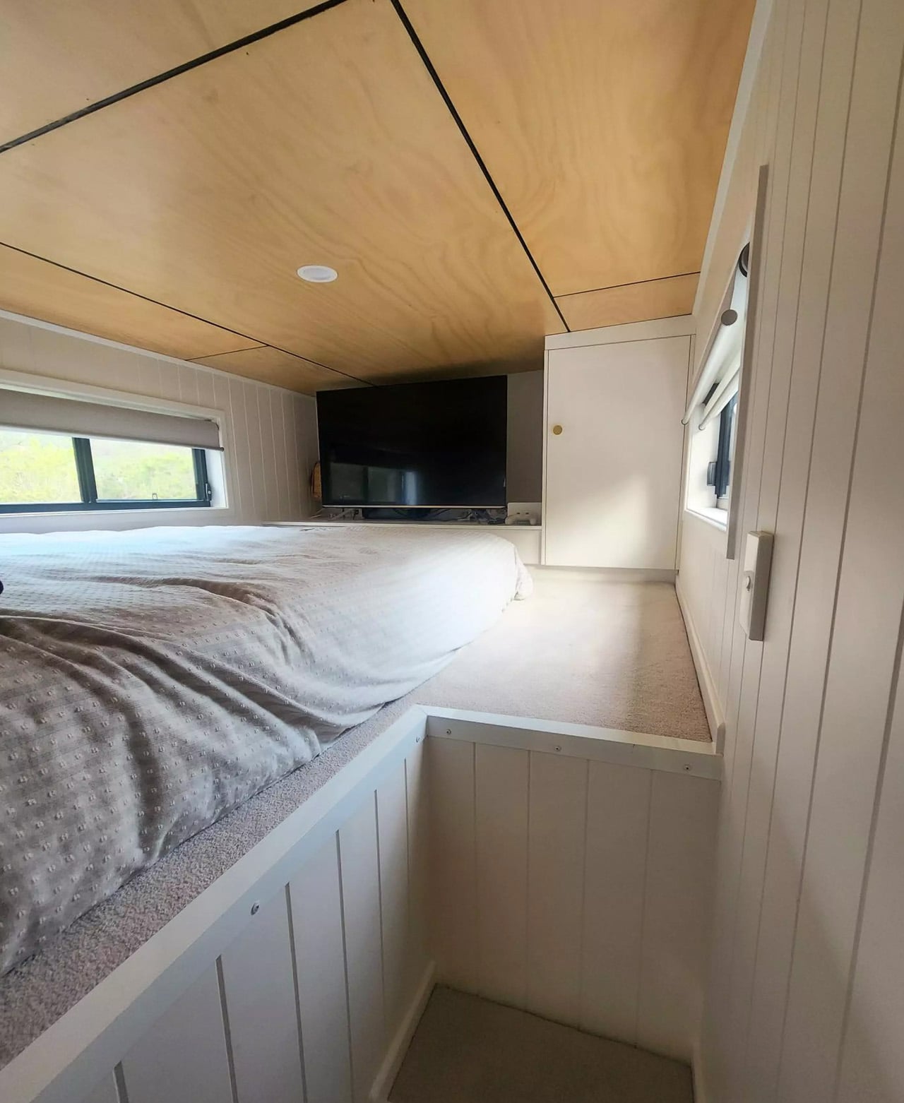
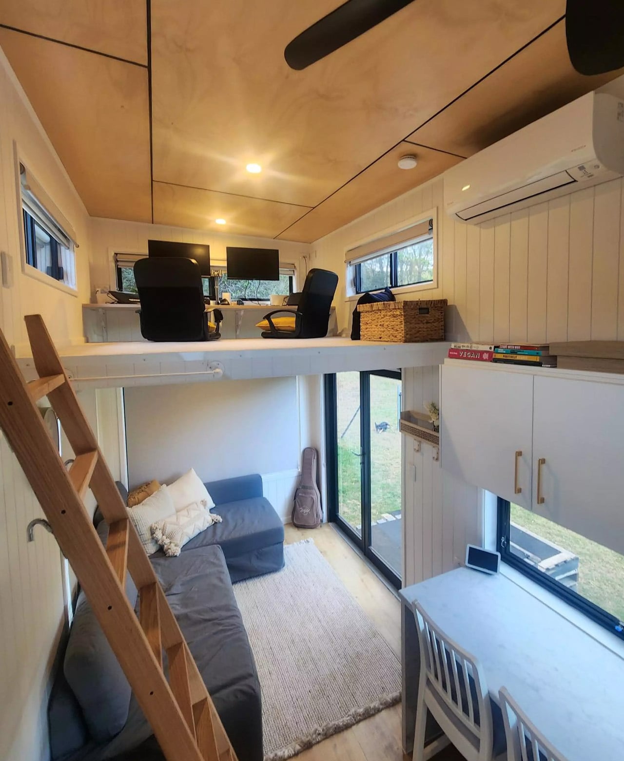
Step inside, and the first thing you notice is the light. Generous glazing throughout the interior keeps the space feeling open in a way that floor area alone never could. The kitchen anchors the main living zone, featuring a breakfast bar seating area for two — a small but telling detail that says this home was designed for actual mornings, not just floor plans. Storage is woven into the architecture rather than bolted on as an afterthought, which is where many tiny homes lose their footing.
What genuinely distinguishes the Coolangatta 8.4 is the second loft. Floating above the main living space, it functions as a workspace, a guest loft, or a second bedroom depending on the day. That kind of programmatic flexibility is rare in a build this size. It’s not a gimmick — it’s a spatial move that multiplies how the home can be used without adding a single square metre to the footprint. The layout was reworked specifically around how the clients planned to live, which is exactly the kind of client-led thinking that separates a custom build from a catalogue selection.
Removed Tiny Homes operates out of the Gold Coast and delivers across Australia, building for downsizers, young families, and investors. The Coolangatta 8.4 sits within their custom range — a collection of builds that begin with a conversation and end with something that couldn’t have existed any other way. It’s proof that in the right hands, going smaller doesn’t mean settling for less.
Cabin living has a particular quality that city life cannot replicate. The quiet is different. The light moves differently through the trees. Time slows enough that you notice it again. Most gear designed for outdoor living treats comfort as an afterthought and beauty as a luxury. These five products disagree with that assumption. Each one was chosen because it earns its place without compromising what a cabin is supposed to feel like.
None were chosen for their marketing or their price tag. Each one was selected because it solves something a cabin summer actually demands — and because the design is good enough to earn a permanent place in the gear bag rather than get quietly left behind after the first trip. Together they cover everything the experience requires: power, comfort, ritual, warmth, and sound.
1. Retro Wave 7-in-1 Radio
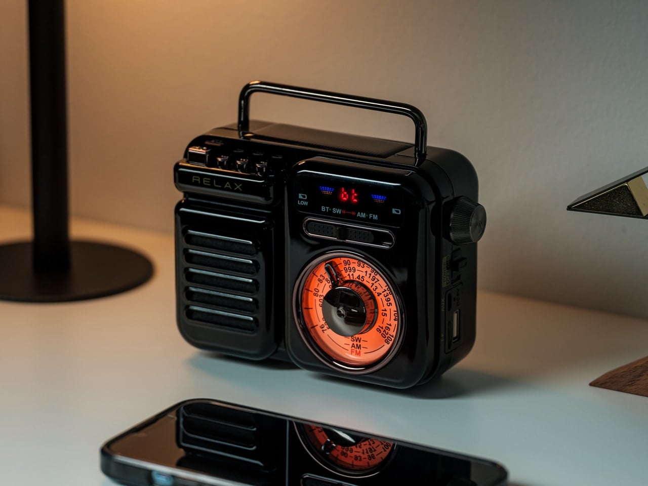
The Retro Wave 7-in-1 Radio solves a problem most outdoor audio products miss entirely: it looks like something worth keeping in the cabin even when it is not in use. The housing draws from mid-20th-century Japanese radio aesthetics, with a tactile tuning dial and two colorways, black and warm gray, that sit naturally next to wood surfaces and ceramic cups. Behind that retro face is a 7-in-1 device handling AM, FM, and shortwave reception, Bluetooth streaming, a built-in flashlight, an SOS alarm, and a power bank function for charging other devices.
The 8W speaker delivers warmth rather than raw volume, which suits a cabin setting far better than any portable speaker with a marketing number in its name. The 2000mAh battery carries a 20-hour radio battery life and recharges via USB, hand-crank, or solar panel. That last detail matters more than it might seem: if the grid goes out, the radio keeps going regardless. It is the kind of contingency that feels less like a spec and more like the whole point of the object.
The 7-in-1 function set collapses a flashlight, emergency radio, portable charger, weather band receiver, and Bluetooth speaker into one object, which meaningfully reduces what needs to be packed for a cabin weekend.
Solar and hand-crank charging options mean the Retro Waves keeps functioning when the power goes out, or the sun disappears, making it as practical in a genuine emergency as it is during a relaxed evening by the fire.
What We Dislike
Bluetooth battery life reaches approximately five hours at 75% volume, meaning a full day of wireless streaming will require a recharge before the evening settles in, particularly on overcast days when the solar option is limited.
The compact body keeps it portable and well-proportioned, but the speaker volume has a ceiling that wide-open outdoor settings can expose once the environment gets loud and conversation picks up around the fire.
2. ARKEEP Halo Portable Power Station
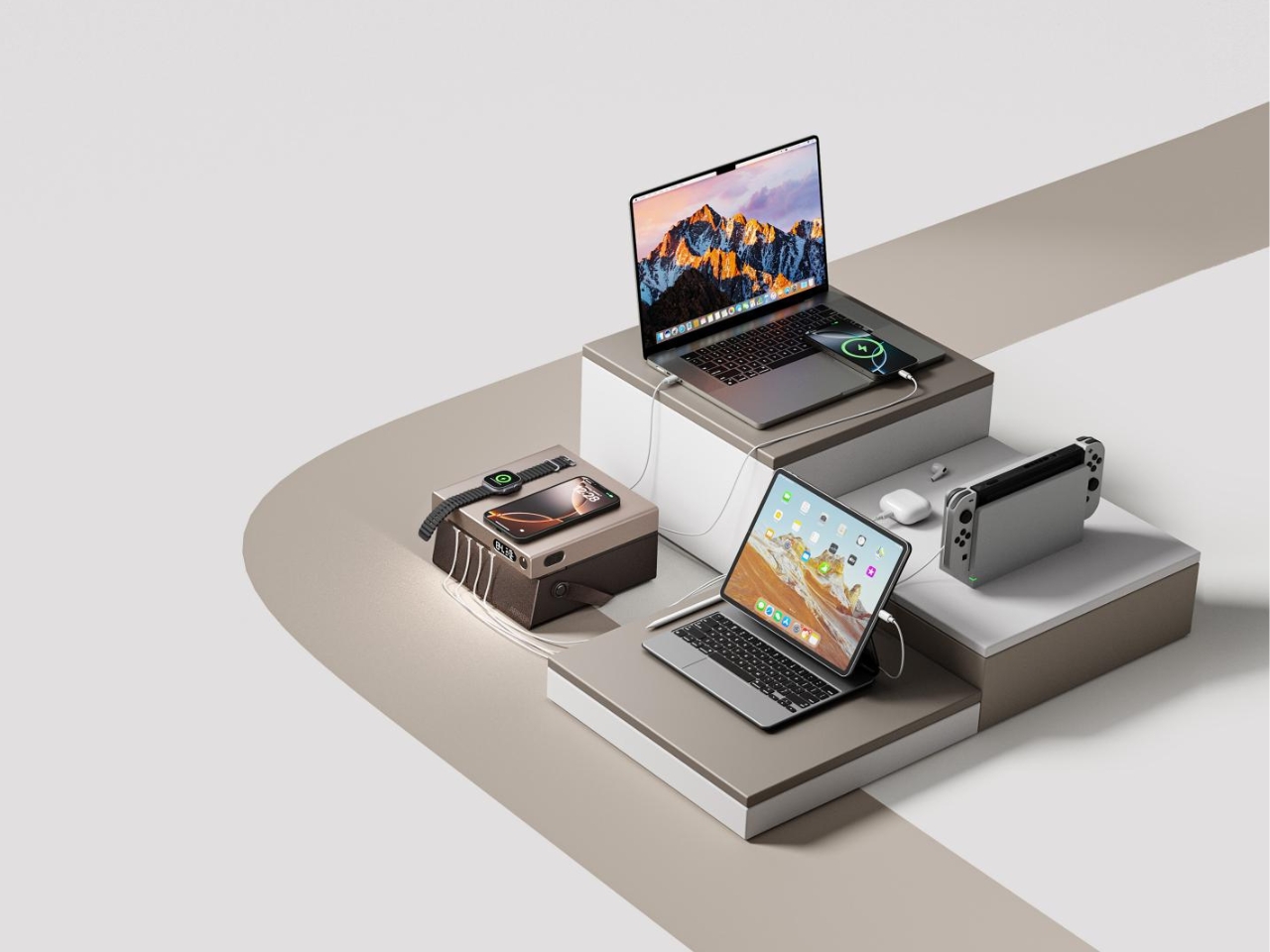
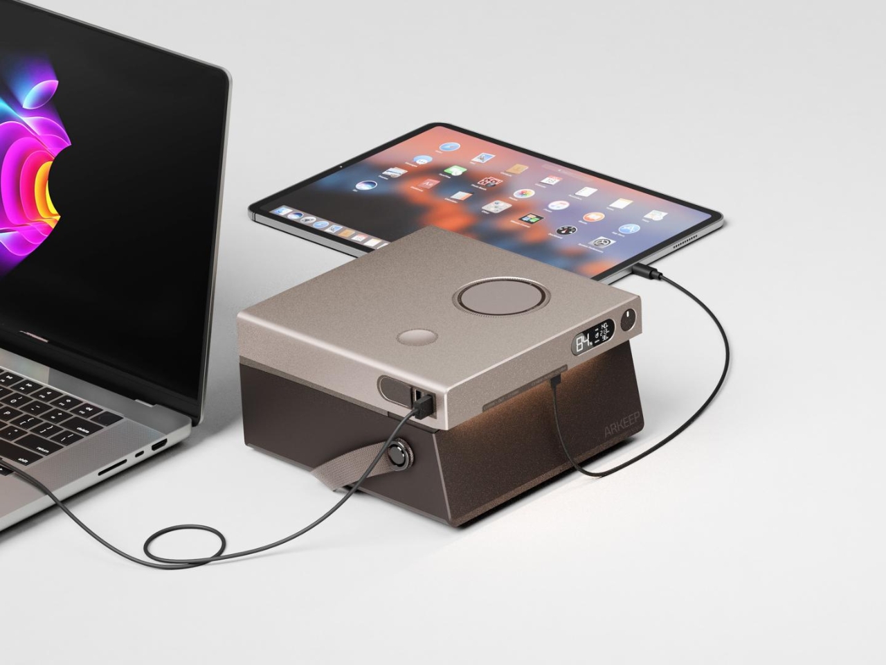
Most portable power stations are designed to disappear. They are tolerated rather than chosen, the kind of object that earns its place only when something fails. The ARKEEP Halo, designed by Union Suppo Battery, takes the opposite approach entirely. It arrives with eight charging ports: dual 140W PD3.1 inputs, dual 100W USB-C ports, two 22.5W USB-A ports, and wireless charging pads at 15W and 5W. Everything a cabin needs to stay powered, wrapped in a form considered enough to sit on the table rather than hide beneath it.
The lighting feature is where the ARKEEP Halo earns its cabin credentials. The 270-degree ambient glow system adjusts color temperature and brightness to simulate natural light rhythms, shifting from functional daytime white to warmer, lower blue light output as the evening settles in. In a cabin where the goal is to feel less connected to your phone and more connected to your surroundings, that distinction matters more than any spec sheet would suggest. It is the rare power station that actually improves the room it sits in.
What We Like
Eight simultaneous charging ports, including dual wireless pads, means an entire group can power up without needing separate charging bricks or arguing over the single outlet by the bed.
The 270-degree ambient lighting system means the Halo replaces both a power station and a mood lamp in one form, reducing the number of objects competing for surface space inside the cabin.
What We Dislike
Runtime figures for the battery capacity are not prominently published, making it harder to calculate how long the Halo will last during an extended off-grid stay without access to a wall source.
The ambient lighting is integrated into the housing rather than detachable, so you cannot use it independently as a standalone lamp if you want to separate the light from the charging station.
3. Houdini x Rumpl Reconnect Puffy Blanket
The Houdini x Rumpl Reconnect Puffy Blanket is built on the idea that a blanket should be able to go wherever the evening takes you. The outer shell is a 2-layer waterproof hardshell rated at 20,000mm H2O with a breathability of 15,000 g/m2/24h, built from Houdini C9 Ripstop. The 200g hollow-fiber insulation handles the warmth underneath. What this means practically is that you can move from the couch to the porch to the tree line without stopping to think about whether the blanket can keep up.
The detail that sets it apart is the Double-snap Cape Clip, which converts the blanket into a hands-free wearable in seconds. Walking to the fire, carrying a drink, collecting firewood — none of those require putting the blanket down. The environmental case is clean too: every blanket is made from 100% post-consumer recycled materials, with each one representing the equivalent of 66 plastic bottles removed from landfills.
What We Like
The 20,000mm waterproof hardshell rating means this blanket functions as genuine weather protection across the full range of conditions a cabin summer delivers, not just a cozy indoor accessory.
The Double-snap Cape Clip gives you complete freedom of movement at the campfire without choosing between warmth and having your hands available for everything else.
What We Dislike
At $200, the Reconnect Puffy Blanket sits at a price point that requires genuine commitment, particularly for anyone who has a habit of leaving blankets behind on outdoor trips.
The hardshell outer material, while properly waterproof, has a stiffer initial feel than a soft fleece, and takes a short while to settle and soften around you compared to more familiar blanket textures.
4. Haori Cup
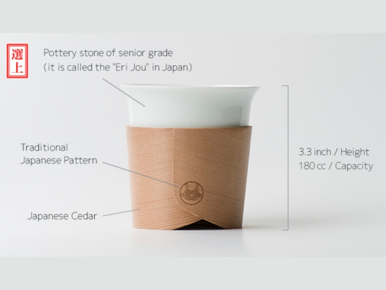
Designer Tomoya Nasuda built the Haori Cup from a single piece of Japanese cedar, reviving the Hakata Magemono craft that has been practiced for over 400 years. The technique involves hand-bending thin cedar strips into curved forms, and the result is a cup where no two grain patterns are the same. Cedar insulates naturally, which means the exterior stays comfortable to hold while the drink inside stays hot. There is no handle required because the material itself solves the problem the handle was invented to address.
In a cabin, the Haori Cup changes what the morning means. Sitting outside with coffee in a vessel hand-bent from Japanese cedar, surrounded by trees not unlike the ones that made it, is the kind of moment that does not require any explanation to anyone who has experienced it. Available in several colorways including a Sakura edition, the cup is light enough to pack without concern and carries a faint, clean forest fragrance that frames whatever you are drinking without competing with it.
What We Like
The 400-year-old Hakata Magemono craft means every Haori Cup is genuinely unique, with grain patterns that belong to that specific piece of cedar, which no mass-produced camping mug can replicate at any price.
Cedar’s natural thermal properties keep the exterior comfortable to hold with a freshly poured drink inside, solving the basic problem of a hot cup without requiring a sleeve, double wall, or separate handle.
What We Dislike
Cedar requires careful hand-washing and thorough drying to maintain the material over time, which is more maintenance than most people expect from a camping cup and adds a small task to the end of a long day outdoors.
As a handcrafted artisan object, the Haori Cup carries a premium that places it in the considered-purchase category, and the risk of dropping it on river rock introduces a quiet anxiety that a $12 tin mug simply does not.
5. Harmony Flame Fireplace
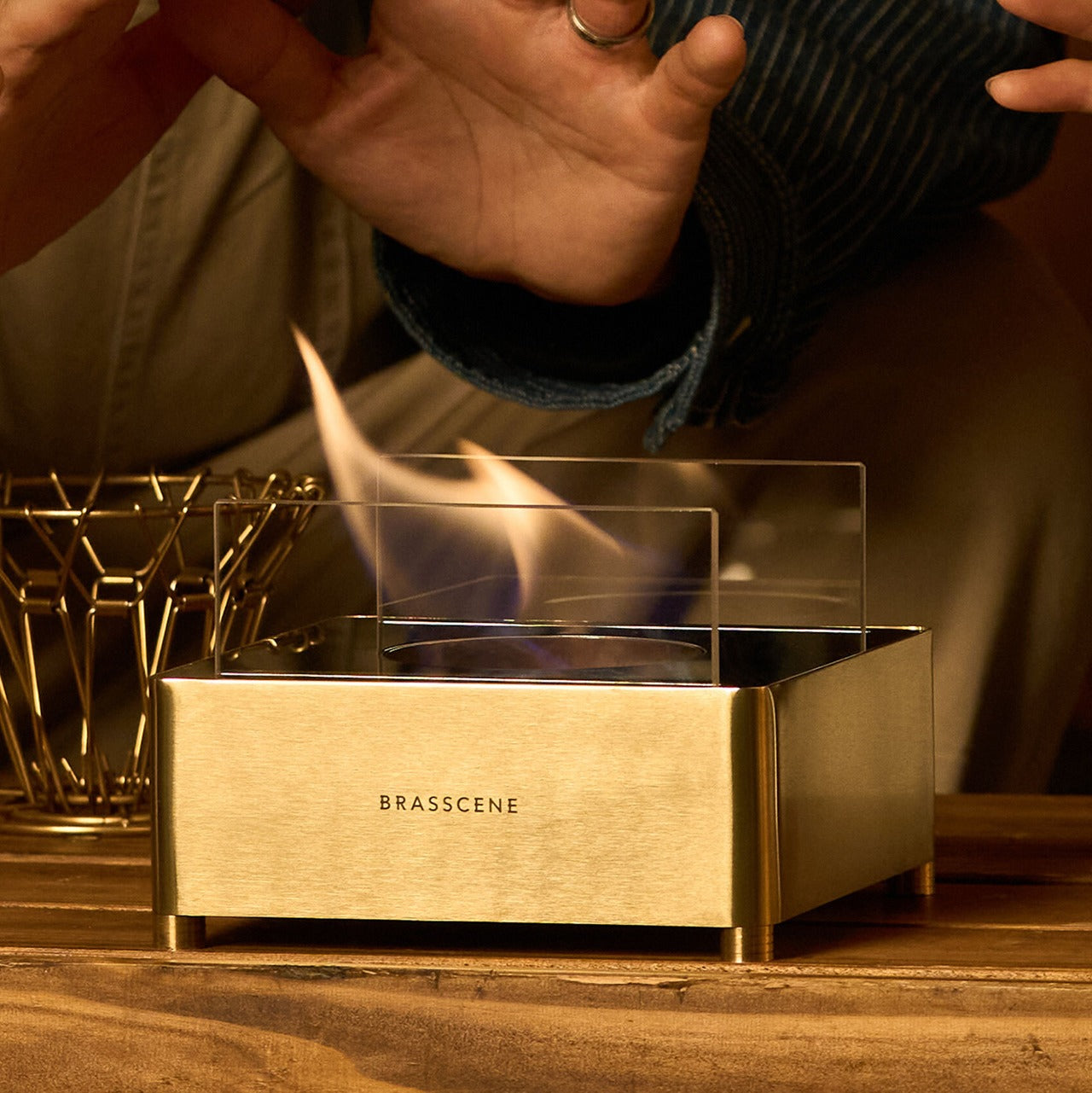
A cabin without a fireplace is a room you tolerate. A cabin with one is a place you want to stay. The Harmony Flame Fireplace was chosen because it understands that distinction entirely — not just as a heat source, but as the object the whole evening organizes itself around. Its presence shifts how a room feels before it even does anything. The design is considered enough to look like it belongs in the space rather than sitting in apology for being there.
What the Harmony Flame does is give a cabin its center of gravity. People sit closer together. Conversations slow down. The specific quality of light that a flame produces, warm and mobile and alive, is something no overhead fitting has ever replicated. Whether you place it against the main wall or at the end of a reading corner, the effect is the same: the room stops being functional and starts being somewhere you choose to be. That shift is the whole point of the trip.
Its presence functions as the room’s organizing principle, creating warmth and atmosphere that transforms an ordinary cabin evening into the reason you made the drive in the first place.
What We Dislike
A fireplace of this quality deserves deliberate placement within the cabin layout to maximize its visual and atmospheric effect — treating it as an afterthought will undercut everything it is capable of delivering to the space.
As the centerpiece product in any room it occupies, the Harmony Flame raises the visual standard for everything around it, which means pairing it with careless gear will make the contrast more visible rather than less.
This Is What a Cabin Summer Is Supposed to Feel Like
None of these five products were chosen because they photograph well or carry a recognizable name. They were chosen because they understand what a cabin summer actually is: a specific arrangement of light, warmth, sound, and stillness that most gear interrupts rather than supports. A power station with a lamp inside. A blanket you can wear. A cup made from a single piece of cedar. A fire that earns its center of the room. A radio that makes switching it on feel like a small occasion.
The best cabin gear does not announce itself. It earns its space quietly, does its job without asking for attention, and disappears into the experience of the trip. These five do exactly that. Pack them, and the cabin stops being a place you stay and starts being a place you go back to. That distinction is the whole point of summer in the first place.
The phone is always the easy answer. Timer goes off — reach for it. Stuck on a thought — reach for it. Five minutes later, you’ve watched three videos and forgotten what you were working on. The real cost of deep work isn’t effort; it’s attention. And attention is exactly what these five desk objects are designed to protect, each one quietly replacing a digital habit with something more physical and deliberate.
None of these are apps or subscription tools. They’re objects — things you touch, twist, write on, and look at from across the room. Some are already on shelves. Others are still concepts. All of them point in the same direction: toward a desk that improves your focus so your phone can do less. Here are five designs worth making room for.
1. Air Powered Segment Clock
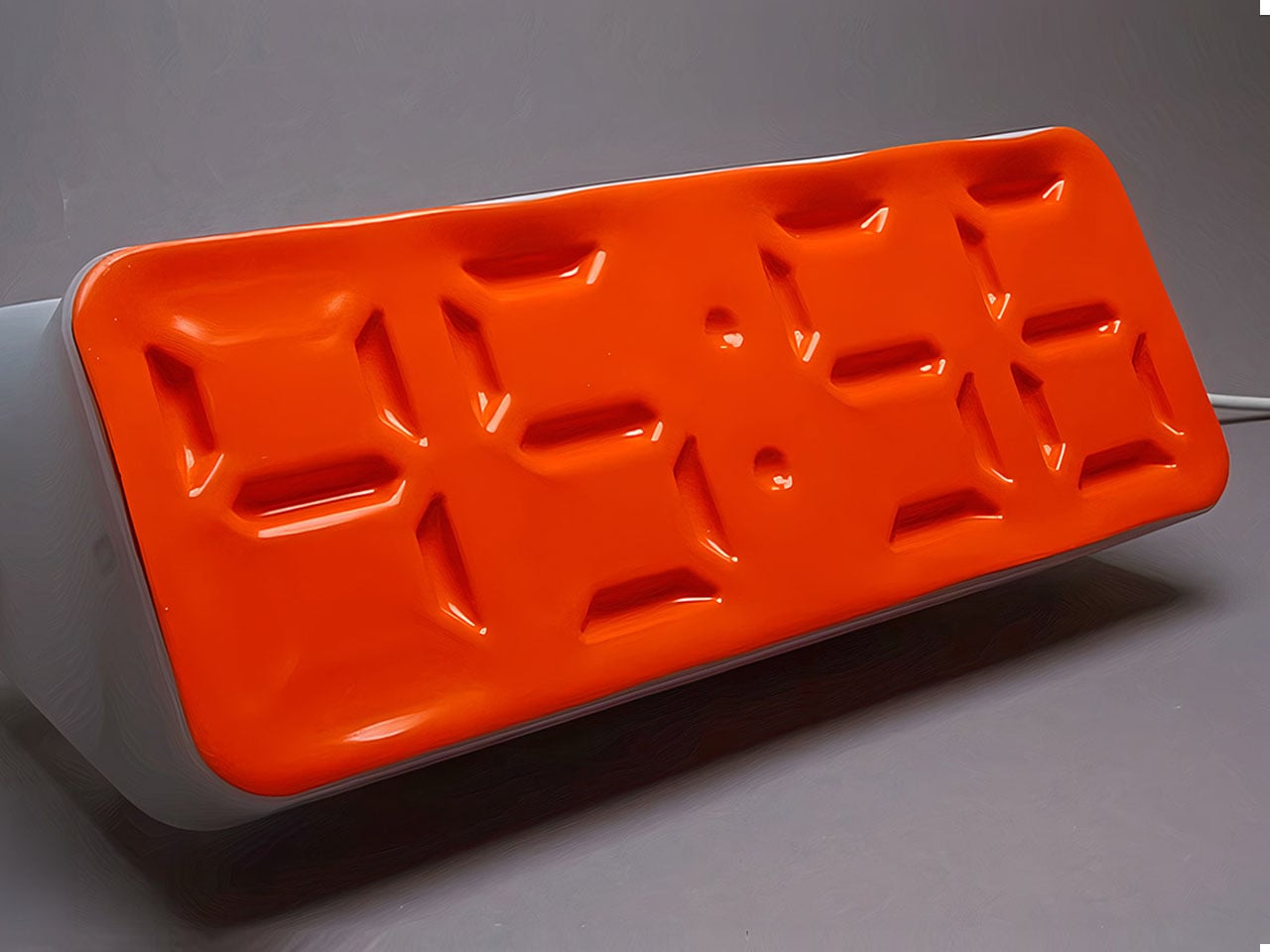
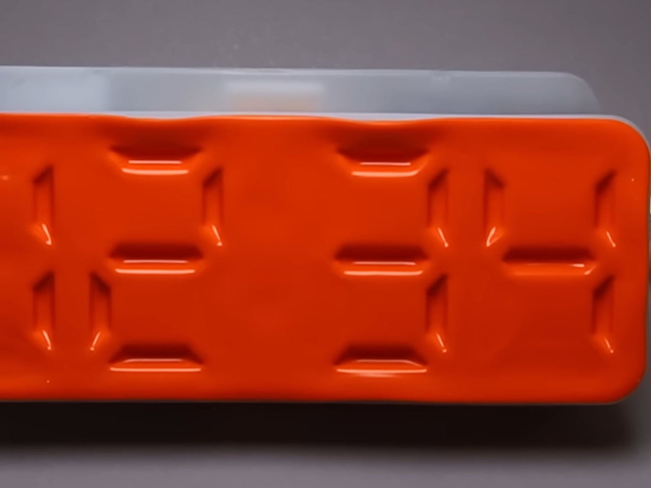
Time-checking is one of the most common reasons people pick up their phones — and one of the quickest ways to lose focus. The Air Powered Segment Clock answers that with something genuinely unlike anything else on a desk: a four-digit display that uses no LEDs at all. Instead, vacuum pressure pulls sections of a flexible silicone membrane inward to form each digit, the way a pneumatic system flexes a muscle. It’s mechanical, quiet, and mesmerizing to watch change.
What makes the engineering remarkable is that each segment behaves like a memory cell — holding its shape after pressure is removed, only resetting when the next command arrives. The architecture mirrors how RAM functions. The clock is DIY-built from 3D-printed parts, a small vacuum pump, solenoid valves, and an Arduino, and it includes a stopwatch mode. It lives on your desk to tell you the time, and that’s it — there’s nothing else it can tempt you with.
What we like:
The pneumatic segments hold each digit without continuous power, making it a genuinely low-energy timekeeping system
Watching the silicone membrane shift and settle is a micro-moment of calm between tasks
What we dislike:
As a DIY build, it requires significant technical skill to replicate — this isn’t something you can simply order
The vacuum pump and solenoid system adds mechanical complexity that may require periodic maintenance
2. OrigamiSwift Mouse
A mouse might seem like an unlikely candidate for this list, but the Origami Swift earns its place by making your physical workspace feel intentional. Designed by Horace Lam and inspired by the art of origami, it folds completely flat — just 4.5mm thin and 40 grams — and snaps into full mouse form in under half a second. That small ritual of unfolding and clicking into position is a quiet but real signal to your brain that work is starting now.
Bluetooth 5.2 keeps connectivity fast and reliable, with a wireless range of up to 32.8 feet in open areas, and the USB-C rechargeable battery lasts up to three months on a single charge. Soft-click buttons and a smooth glide keep sessions quiet and distraction-free. Compatible with Mac, Windows, and Android, it performs like a full-sized mouse when open and disappears into a bag without drama when the day is done.
The fold-to-activate gesture creates a physical transition into work mode that a trackpad or standard mouse doesn’t offer
At 40 grams with a three-month battery life, it’s both genuinely portable and technically capable
What we dislike:
The folded form factor requires adjustment for users accustomed to traditional palm-grip mice
Soft-click buttons may feel less satisfying for those who prefer strong tactile feedback
3. Note
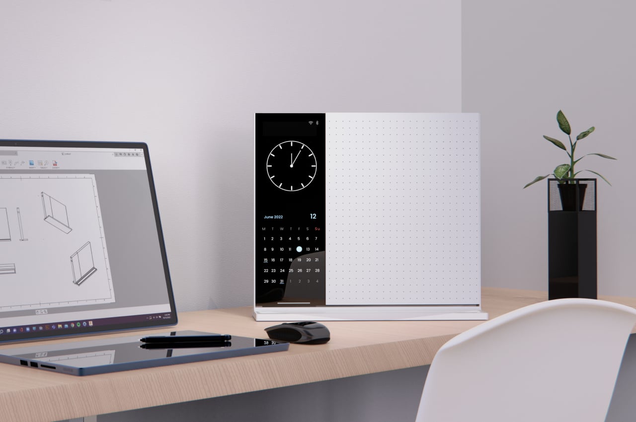
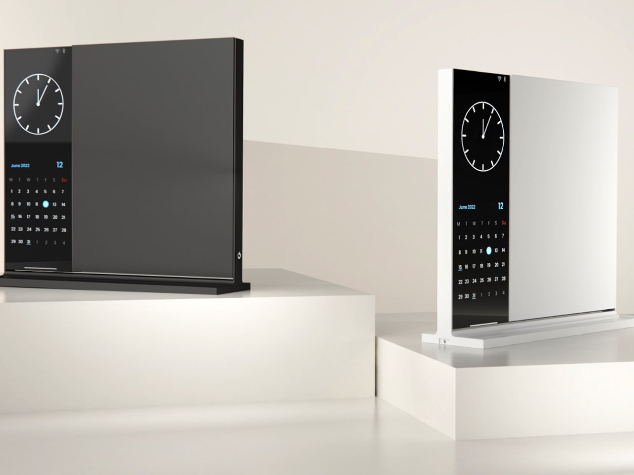
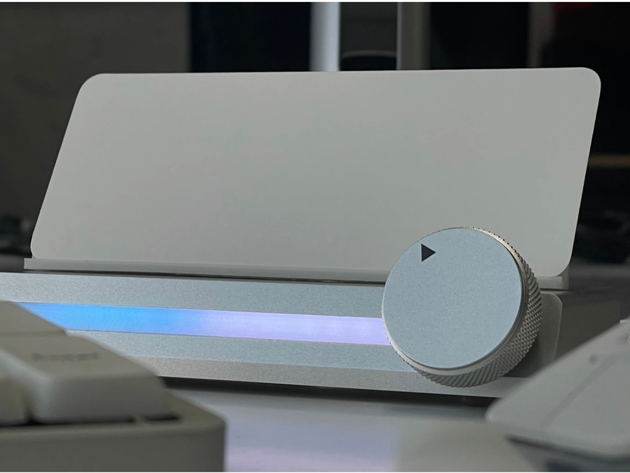
The Note is deceptively simple: a desk object that bridges analog note-taking with just enough digital utility to make it genuinely useful. The device pairs a whiteboard surface for jotting ideas with a small built-in display on the left side that shows the time, date, and music controls. Rather than asking you to open an app or unlock a screen, Note keeps that essential information directly in your peripheral vision, fixed and passive.
The design addresses something real: the modern digital workstation is so fully loaded that reaching for anything — a timestamp, a song, a quick note — means crossing through a notification minefield. Note keeps those basic needs on the desk and offline. Sketch an idea on the whiteboard, check the time from the side display, and keep moving. It doesn’t replace your technology. It quarantines the parts of it that constantly pull your attention away from the work directly in front of you.
What we like:
Combining a whiteboard surface with a peripheral display eliminates two of the most common reasons for picking up a phone
The minimal form factor stays present without demanding attention
What we dislike:
Note remains a concept with no confirmed production timeline or retail availability
The side display’s feature range is limited compared to a full smart display, which may frustrate users who want more
4. Immerge Desk Timer
There’s a reason so many people use the Pomodoro method but can’t stick to it: phone timers live on the same device that breaks focus. The Immerge Desk Timer by Adam Cole Edwards is a concept for a CNC-machined aluminum timer with an anodized finish, designed to sit on your desk as a physical commitment to a work block. A smooth-rotating wheel sets the desired interval. There’s no screen, no app, and no chance of a notification bleeding through from something else.
A built-in note card slot on the front holds a small index card — space to write the day’s top priority, a single task, or a short reflection. That combination of timer and intention-setting turns the Immerge into something more considered than a countdown. The design language is deliberately understated, built to complement any desk without demanding to be noticed. It’s still a concept, but the idea it represents — analog focus as a deliberate cultural choice — feels overdue.
What we like:
The integrated note card slot pairs time management with written intention, reinforcing focus before a session even begins
CNC-machined aluminum with an anodized finish places it firmly in premium desk object territory
What we dislike:
The Immerge remains a concept with no confirmed production timeline or pricing
A purely analog timer offers no connectivity for users who track productivity data or want to log sessions
5. MagBoard Clipboard
Paper has a focus advantage that screens don’t: it notifies you of nothing. The MagBoard Clipboard leans into that advantage while solving the one real problem with loose paper — keeping it together. A Magnet x Lever mechanism secures up to 30 sheets without a traditional spring clip, and releasing or adding pages takes nothing more than a light press on the edge. It’s made in Japan, and the material quality reflects that without needing to announce it.
The hardcover design means you can write on it standing up, on a couch, or anywhere a thought shows up. The surface is water-resistant and easy to clean. Available in A4 and A5 sizes, it accepts any paper you choose — blank, grid, dotted, printed, perforated, or mixed. There’s no prescribed format and no app syncing required. You write what you think, in whatever order makes sense, and reorganize whenever the work demands it.
The Magnet x Lever system secures any combination of paper types without marking or damaging sheets
Water-resistant hardcover construction makes it practical well beyond a standard desk setup
What we dislike:
The 30-sheet capacity may feel limiting for users who work through large volumes of material in a single session
Unlike digital tools, there’s no built-in way to search, tag, or retrieve older pages
The Best Tools Are the Ones That Stay Out of the Way
The phone isn’t going anywhere, and none of these objects pretend otherwise. What they offer is friction — the deliberate, productive kind. A clock that reads time through air pressure. A timer shaped from aluminum. A clipboard that holds whatever paper you choose. Each one introduces a small ritual into the day, and rituals are how deep work actually gets done. The setup matters more than most people give it credit for.
Good desk design is quiet. It works without asking to be noticed and keeps your attention where it belongs. These five objects don’t promise a productivity revolution — they just remove one more reason to reach for your phone. Sometimes that’s enough to finish the thing you’ve been putting off. Not because you became more disciplined overnight, but because nothing interrupted you long enough to break the thread.
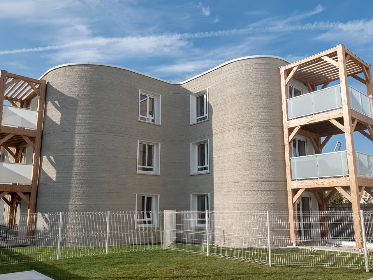
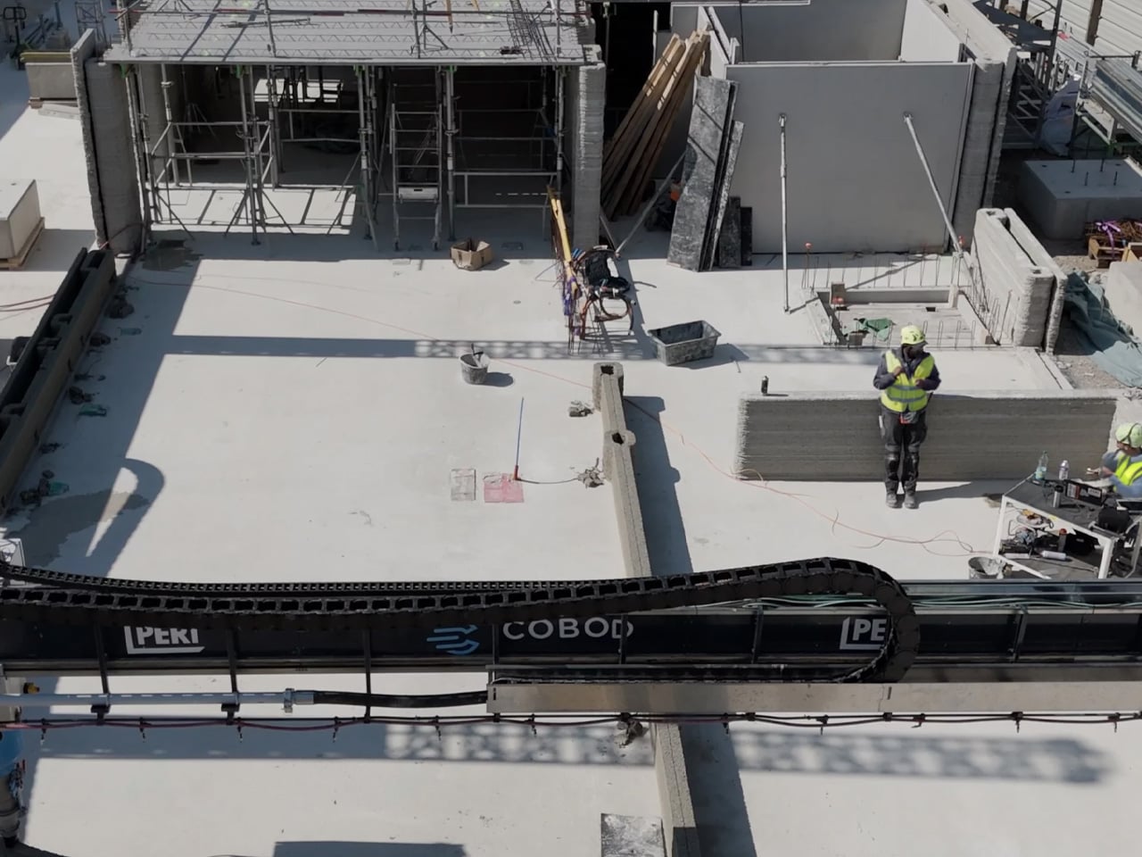
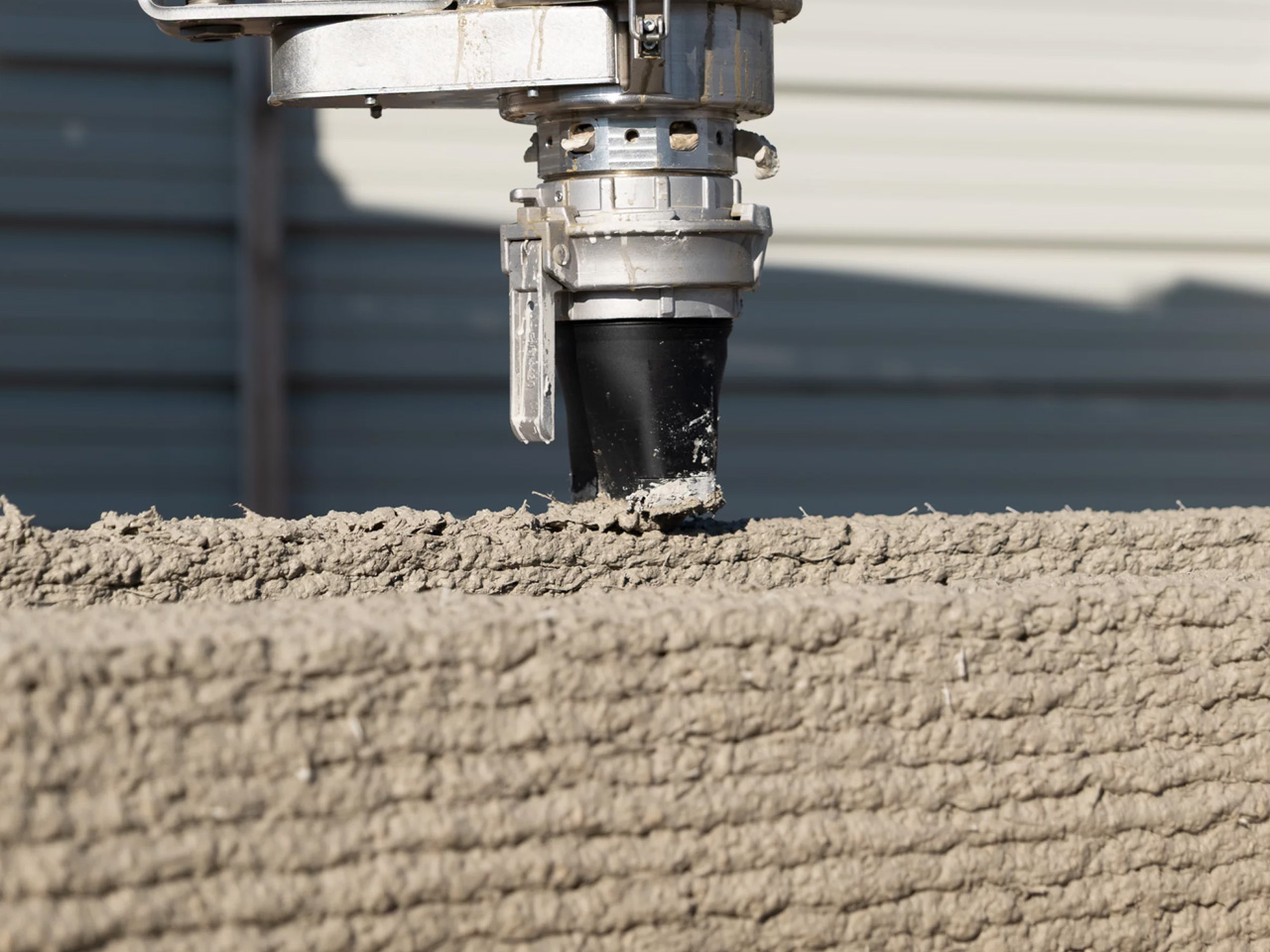
Something significant happened in Bezannes, France — and the construction industry should be paying close attention. ViliaSprint², Europe’s largest 3D-printed apartment building, has been completed, and it arrives less as a proof of concept and more as a genuine blueprint for what housing could look like moving forward. Developed by Plurial Novilia, designed by HOBO Architecture, and printed by PERI 3D Construction using a COBOD BOD2 printer, this is the kind of project that makes you reconsider what a building even is.
The numbers are striking. Twelve social housing apartments across three floors, 800 square meters of living space — all printed on-site in just 34 days, down from an originally planned 50. That alone would be a headline. But what makes ViliaSprint² genuinely remarkable is that it’s the first building in France where both the load-bearing structure and every wall were printed directly on-site, with 100% of all loads transferred through the 3D-printed walls. No hybrid workarounds. No conventional skeleton hiding beneath the surface. The printer did the heavy lifting, quite literally.
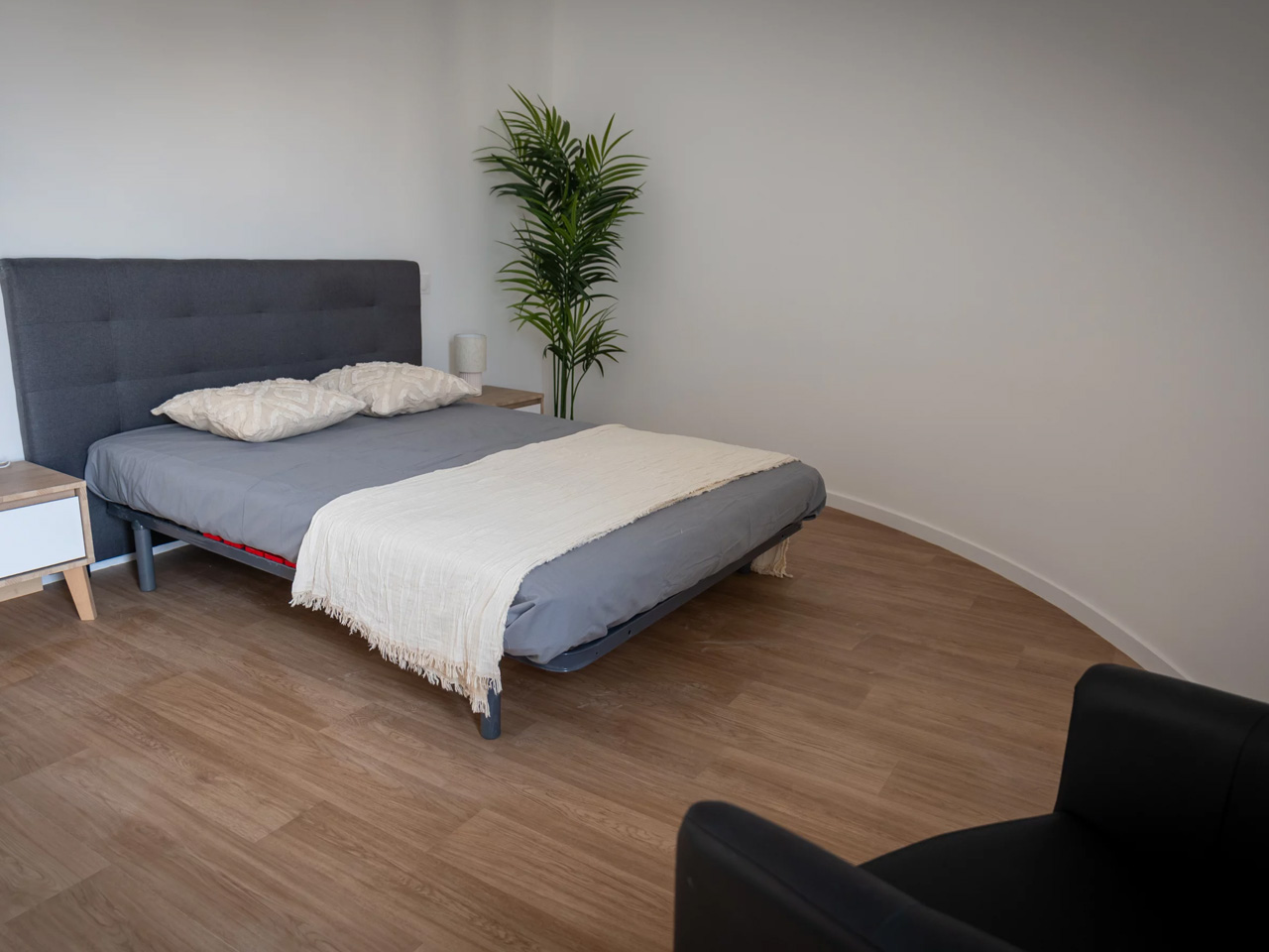
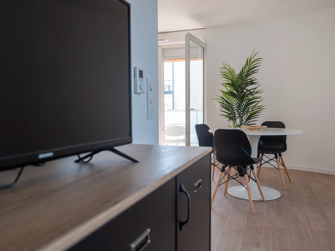
HOBO Architecture’s design leans into the honesty of the medium. The building’s rounded geometry — fluid curves that would cost a fortune to achieve through conventional formwork — is made possible precisely because a machine, not a tradesperson, is doing the forming. It’s design that could only exist with this technology, which is a rarer claim than it sounds. Timber balcony structures offset the weight of the concrete shell, adding warmth to a building that could otherwise read as cold and industrial.
Sustainability is baked into the structure rather than retrofitted onto it. The optimized curved form saved roughly 10% of concrete volume. Holcim supplied the printable concrete using its TectorPrint technology within the CO₂-reduced ECOPact range, reinforced with synthetic macro fibres. Perlite insulation, 500 square meters of photovoltaic panels, and a hybrid gas-heat pump system by Atlantic Systèmes push the building to around 60% energy self-sufficiency — fully compliant with France’s RE2020 2025 green building targets.
The building sits directly beside a conventionally constructed twin, built by the same developer simultaneously, as a live comparison. The 3D-printed version finished three months ahead. It also required only three workers to erect the walls, compared to six for the conventional build — a meaningful detail as the construction industry faces deepening skilled labor shortages.
Plurial Novilia is already planning the next move: roughly 40 apartments, two printers running simultaneously, with a target to cut print time by a factor of four. ViliaSprint² isn’t the destination. It’s the proof that the destination is real.
There is a different kind of that happens in late June. Your feed fills with gear photographed in good light, linked before the image has finished loading, and gone from stock by the time you circle back. Some of it is noise. Some of it quietly solves a problem you have been working around for years without naming it. The ten products here belong to the second category, and every one of them is genuinely worth the attention.
They cover the full arc of a summer day, from the first outdoor coffee to the last photograph before the light drops. Not one of them asks you to sacrifice design quality for function, or function for form. These are the products that spread because they earn it, objects that change something specific about the next few months. Whether you find three of them or all ten, your summer bag has room for the upgrade.
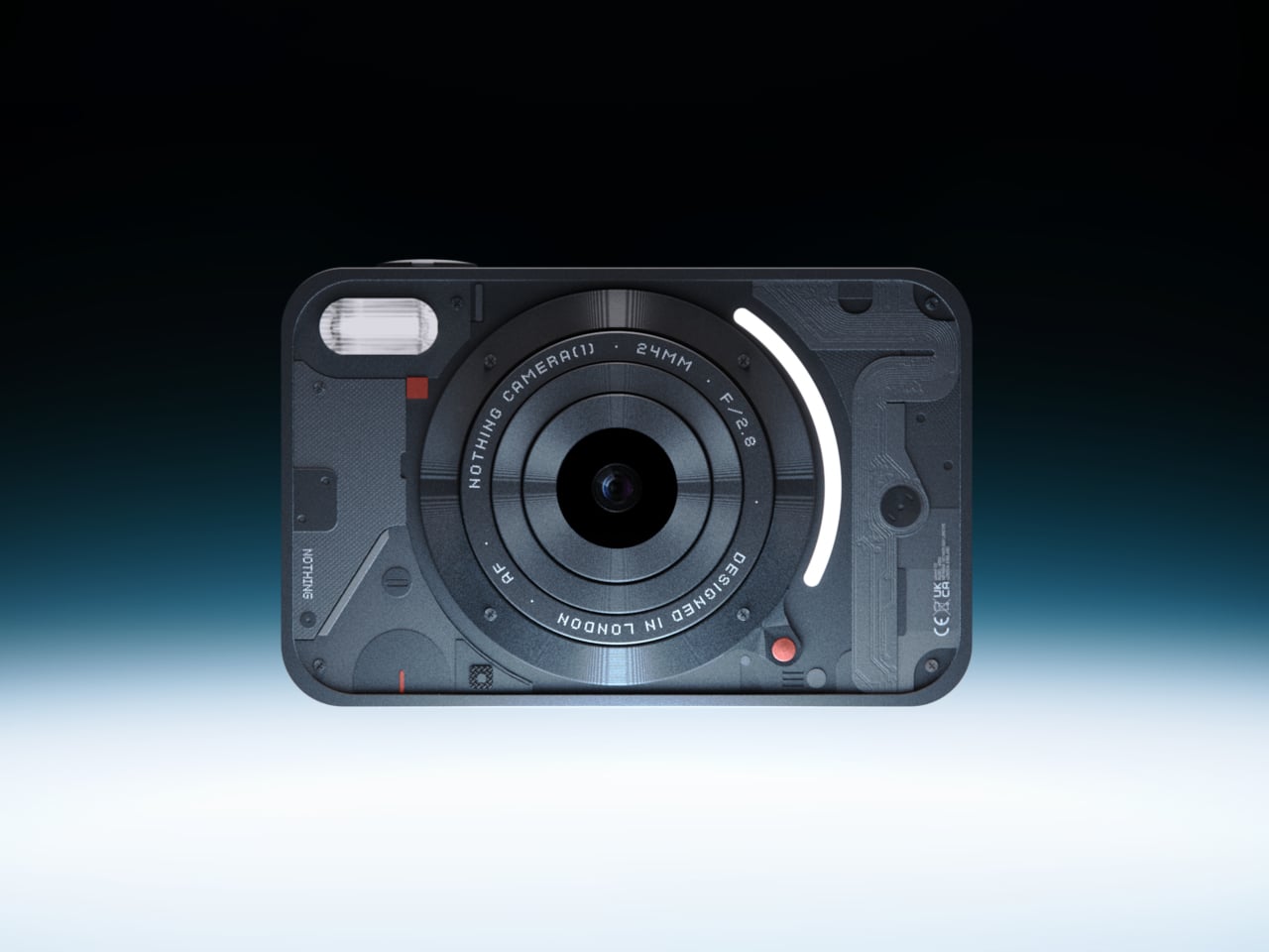
1. Camera (1)
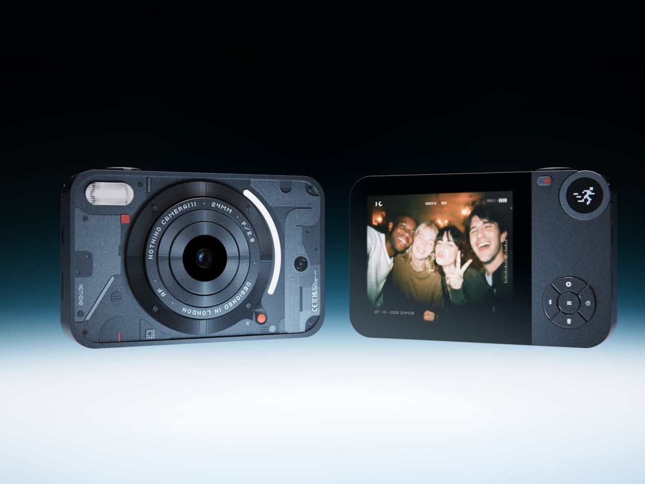
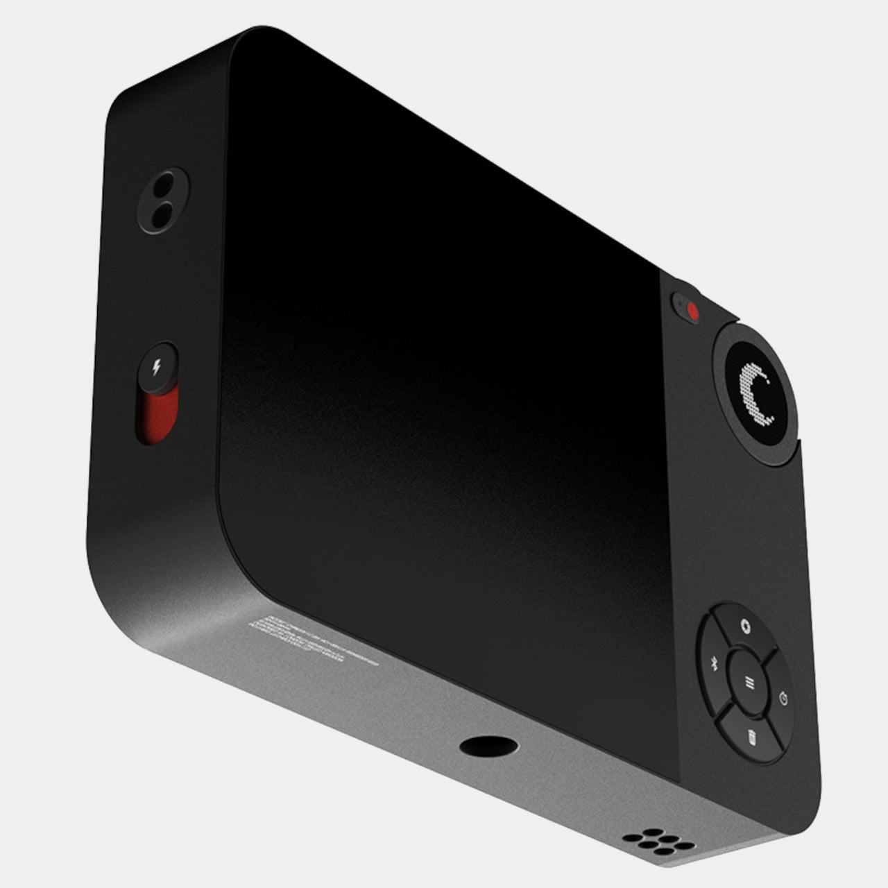
Most photographs live inside phones now, buried between notifications, grouped by algorithm, and rarely looked at twice. A growing number of people have started picking up older digital cameras to make shooting feel like a separate, deliberate act. Camera (1) is a concept design by Rishikesh Puthukudy that explores what a modern compact could feel like if built around physical controls and tactile feedback rather than software layers and touchscreen menus. All main controls sit on one edge, placing the shutter, a mode dial with a small glyph display, and a D-pad within reach of thumb and index finger without shifting grip or touching a screen.
The concept draws its design language from Nothing’s transparent, hardware-forward aesthetic. A curved light strip around the lens pulses during the self-timer, confirms focus lock, and signals when video is being recorded. The engraved lens ring, marked with focal length and aperture, turns zoom and focus into a physical twist rather than a digital pinch. A bead-blasted metal shell, circuit-like relief panel, and small red accents give it a technical, considered character.
What We Like
Physical edge controls and glyph-based mode dial put the entire interaction in the hand rather than on a screen, which is exactly what compact camera design has been missing
Bead-blasted metal body and red accent details communicate material intent and quality without relying on branding
What We Dislike
A concept with no confirmed production path means you are left admiring the idea rather than buying the object
The design draws heavily from Nothing’s visual language, which will feel derivative to those who follow that brand closely
2. Shark ChillPill
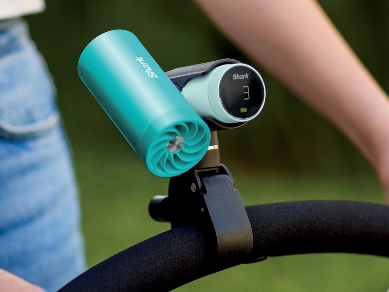
Most personal cooling devices ask you to make a simple trade: accept bulk, noise, or mediocre performance in exchange for staying cool. The Shark ChillPill declines the trade. Its three-function body is compact enough to clip to a bag strap, a wristlet, or a stroller bar, and each mode does something genuinely distinct. A bladeless fan with ten adjustable speed settings delivers steady airflow at up to 25 feet per second. An evaporative mist system produces what SharkNinja calls a dry-touch effect, refreshing skin without the soaked-fabric sensation most spray fans leave behind.
The third function sets it apart. The InstaChill cooling plate, a cryo-inspired metal surface, reduces skin temperature by up to 16 degrees Fahrenheit within seconds when pressed against a pulse point on the neck or wrist. Battery life reaches eleven hours on the lowest fan setting, with USB-C charging returning it to full in roughly three and a half hours. Priced at $149.99 and available in seven colorways including Glacier, Matcha, and Rose Gold, it is the rare piece of personal tech that adapts to the activity rather than defining it.
What We Like
Three distinct cooling modes in one portable body that clips, sits, or wears across any outdoor context
Eleven-hour battery on low covers a full outdoor day without any recharging anxiety
What We Dislike
Maximum fan output reduces runtime to around ninety minutes, requiring some planning on longer days
The premium price over single-function portable fans requires commitment before knowing how much all three modes get used
3. All-in-One Grill
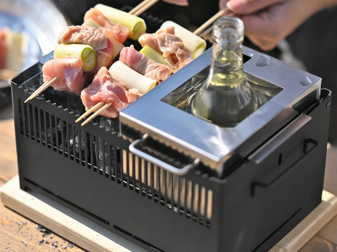
Outdoor cooking has always had a logistics problem. Bring a single-function grill and eat variations of the same thing all weekend. Haul a full kit and spend the first hour on setup rather than cooking. The All-in-One Grill, made by a small family-owned Japanese factory specializing in sheet metal fabrication, takes a third position. Interchangeable cooking modules cover barbecuing, frying, grilling, steaming, smoking, and stew cooking from a single portable tabletop base designed to maximize limited space without dominating any camp table it lands on.
A dedicated upright module warms bottles directly, mulled wine included, a specific practical detail that most outdoor cooking systems treat as someone else’s problem. The modular construction that makes it versatile also simplifies cleanup: each component can be handled independently rather than breaking the whole unit down at once. One device handles what most setups need four for, and it packs into a footprint that leaves room for everything else.
Six cooking methods from one portable base without multiple fuel sources or separate devices
Dedicated bottle-warming module covers a specific outdoor ritual that most cooking systems overlook entirely
What We Dislike
Modular systems accumulate small components that are easy to misplace in the field
Tabletop-only design limits cooking capacity for groups larger than four or five people
4. DraftPro Top Can Opener
Drinking from a can is convenient. Actually tasting what is inside it requires something better. Designed by award-winning Japanese designer Shu Kanno and built in Japan, the DraftPro Top Can Opener removes the entire lid of a standard can to create a wide-mouth, glass-like opening that changes the experience immediately. The aroma lifts the moment the top comes off. The first sip feels more direct, more open, more intentional. A smooth-edged finish removes the safety concern that has historically made full-removal openers feel like a rough trade rather than an upgrade.
The function extends well past beer. With the top removed, ice drops in directly. A mixer or citrus can be added without needing a separate cup. The can itself becomes a cocktail vessel that requires no additional tools. It works with domestic and international can sizes, making it as useful at a campsite abroad as in a backyard.
Full top removal releases aroma and creates a draft-style drinking experience that a standard can opening physically cannot deliver
The can-as-vessel format allows ice, mixers, and garnishes without reaching for additional cups or shakers
What We Dislike
Single-function design earns its place only if canned drinks appear regularly in your outdoor routine
No published specification for how the cutting mechanism holds up across extended use over time
5. TMB: The Modular Bottle
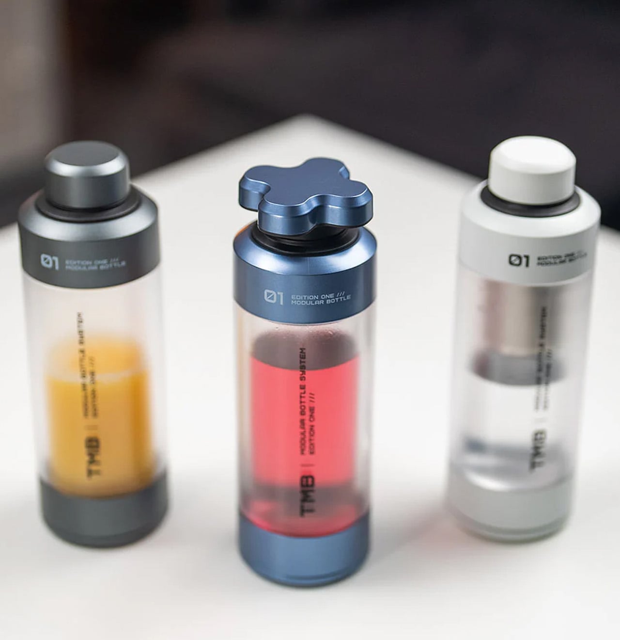
Most bottles make one implicit promise: hold liquid without leaking. The TMB Modular Bottle starts from that baseline and keeps going. The borosilicate glass interior keeps every drink tasting like itself rather than the container, a material property that separates it decisively from the steel and plastic alternatives dominating this category. A translucent mid-section gives a real-time view of remaining liquid without removing the lid. Modular tops include a tea infuser, a shaker ball, and interchangeable caps, shifting configuration based on what the day or activity requires.
A built-in secret compartment handles small EDC items, supplements, or snack portions. The glass interior cleans thoroughly without the residual odor buildup that makes most reusable bottles unpleasant after weeks of regular use. For summer travel, the modularity earns its weight because the same bottle that starts a morning with loose-leaf tea covers an afternoon of plain water and an evening cocktail shaker setup without adding anything else to the bag.
What We Like
Borosilicate glass interior preserves drink flavor without absorbing taste or odor regardless of what you put in it
Modular tops cover tea brewing, protein shaking, and standard hydration from a single body without any additional vessels
What We Dislike
Glass interior carries more breakage risk than steel alternatives under rough outdoor handling or travel
Modular assembly adds cleaning complexity compared to a straightforward single-piece bottle
6. MokaMax
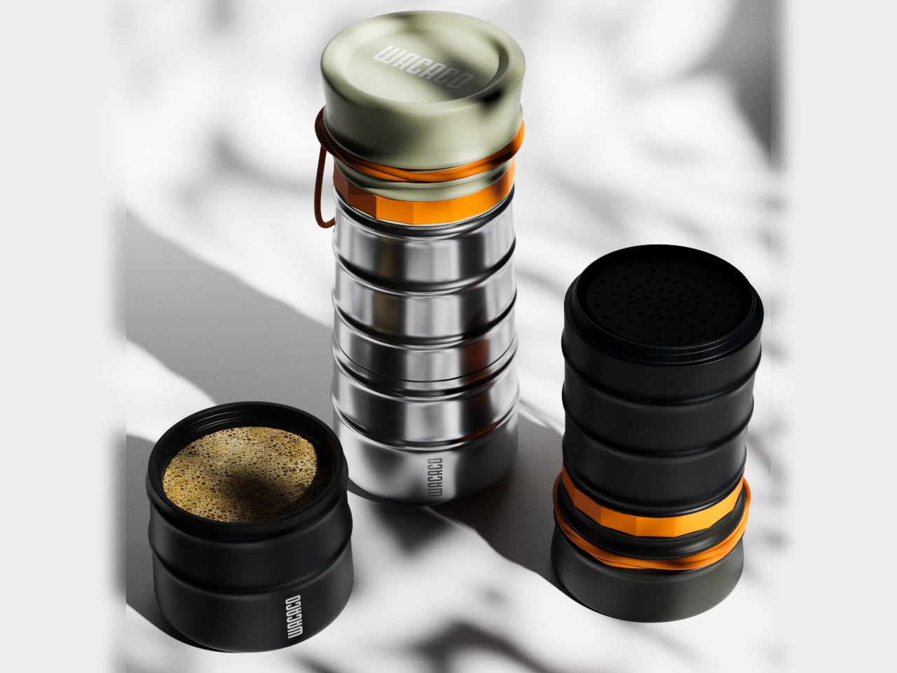
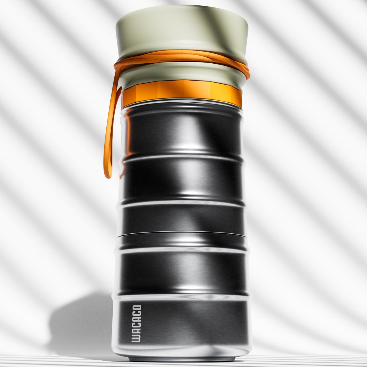
The campsite coffee situation has always been a negotiation between quality and effort. Every solution asks you to accept some version of the compromise: gritty grounds, a cold mug, a disposable capsule, a second bag of kit. The MokaMax resolves it by integrating a full pressure brewer into a ridged stainless steel travel mug, delivering espresso-style coffee in under three minutes using boiling water from any source. The brewer, the vessel, and the lid, which doubles as a cup, are a single sealed system with no loose components to lose between campsites or cities.
At 400 grams fully loaded, it fits in the front pocket of most travel backpacks and carries nothing superfluous. The ridged stainless exterior gives it a visual identity distinct from every other travel mug on a shelf, communicating outdoor utility without the rubberized bulk that most portable coffee gear defaults to. For summer mornings at a campsite, a hotel room in a new city, or a long train ride through somewhere worth paying attention to, the MokaMax handles the coffee ritual with equipment that fits the occasion without requiring a word of explanation.
What We Like
Pressure brewer and carrying vessel integrated into one sealed body means no separate components and no compromises across a summer of movement
Ridged stainless form integrates visually with quality outdoor gear rather than looking out of place beside it
What We Dislike
Cleaning the pressure chamber thoroughly on the road requires a sink and a few uninterrupted minutes that travel rarely provides on schedule
Espresso-style output will not satisfy those who prefer larger-volume filter coffee while camping or traveling
7. RedMagic Deuterium Power Card Pro
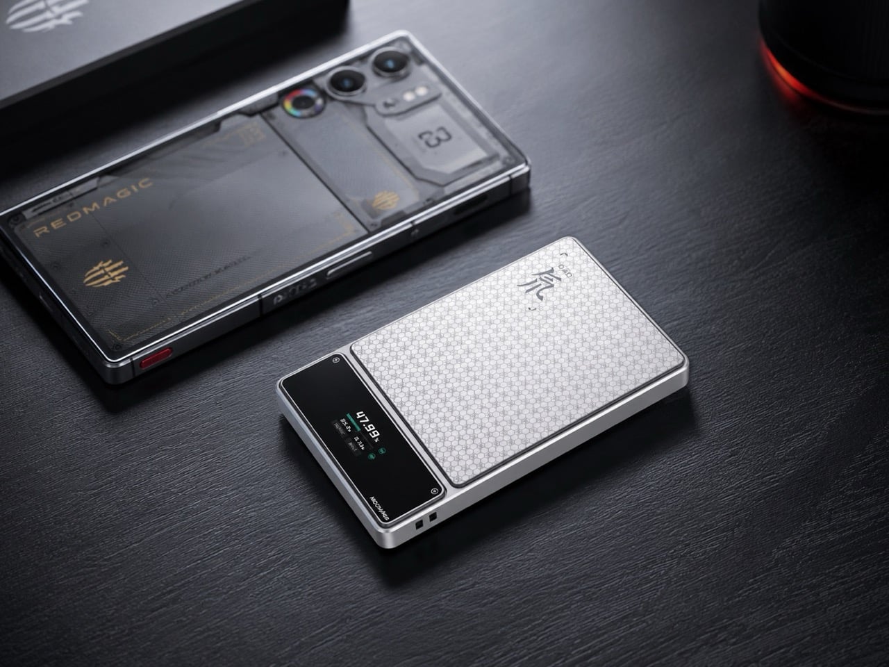
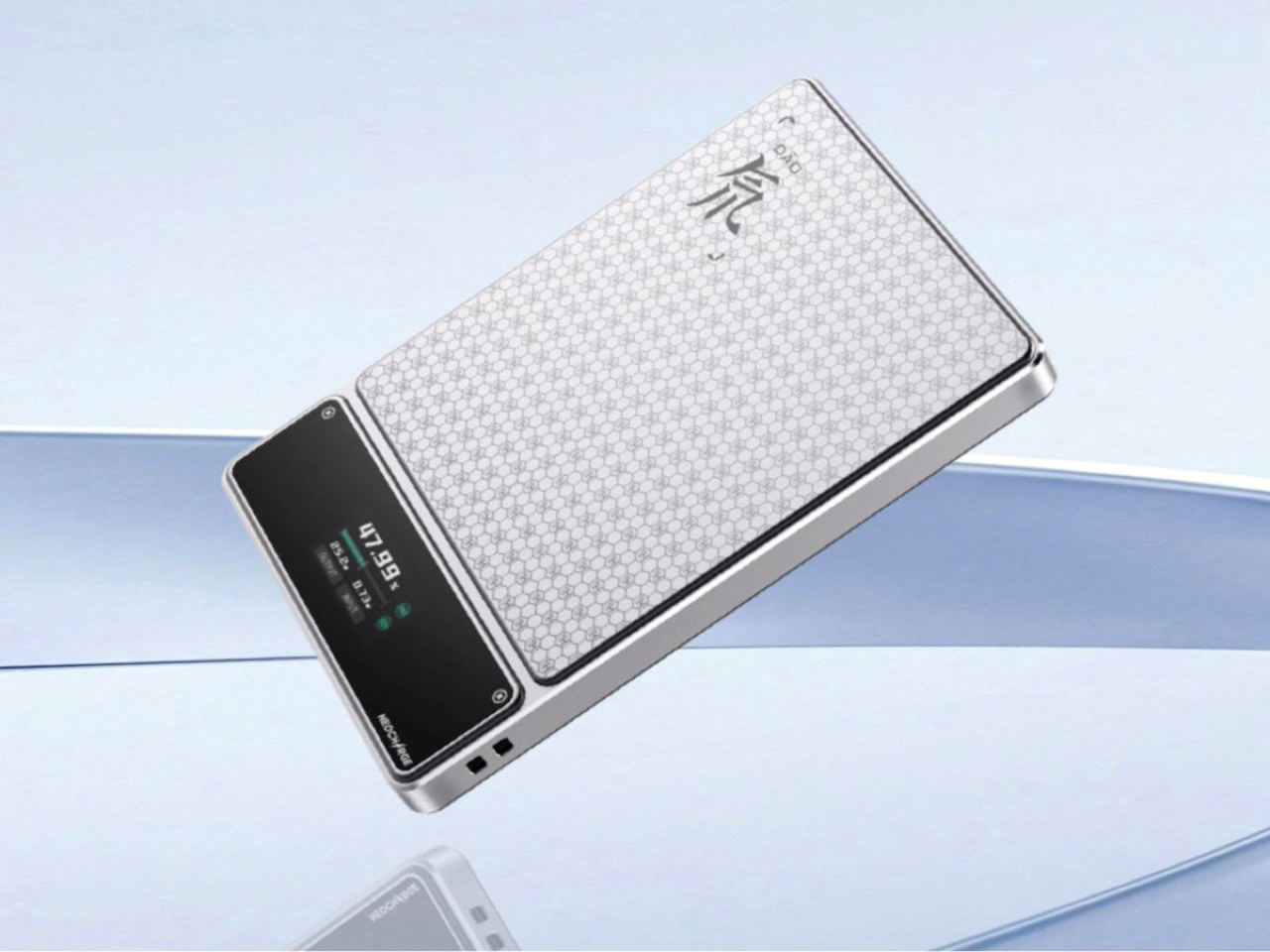
Aviation rules around lithium batteries keep tightening, and most power bank manufacturers have responded by adding a line to the FAQ. RedMagic responded by adding a dedicated hardware button to the device. The Deuterium Power Card Pro includes a one-touch flight mode that cuts wireless transmission immediately at the press of a single control, addressing the airline regulations that have turned gate-side power bank checks into a genuine inconvenience. The H21 honeycomb pattern engraved into the anodized aerospace aluminum body gives it a texture that reads as premium hardware rather than commodity carry gear.
A 25W wireless charging pad and 45W wired output handle most modern smartphones at full speed. An AI-assisted thermal management system monitors a five-layer heat dissipation stack in real time, keeping surface temperatures controlled during wireless charging where cheaper alternatives tend to run noticeably warm. A rectangular status display shows exact battery percentage rather than the single LED indicator dot that most power banks still ship with. Available in 5,000 and 10,000 mAh configurations, with pricing and a confirmed release date still pending at the time of publishing.
What We Like
One-touch flight mode solves the airline power bank regulation problem that every other manufacturer currently treats as the passenger’s responsibility
Rectangular display showing exact battery percentage is a small but genuinely useful upgrade over the LED dots most competitors use
What We Dislike
Pricing and release date remain unconfirmed, making it the most compelling item on this list that cannot yet be added to a cart
The RedMagic brand identity is built around gaming hardware, which may feel tonally mismatched for travelers whose gear skews toward neutral aesthetics
8. Benro Theta Tripod
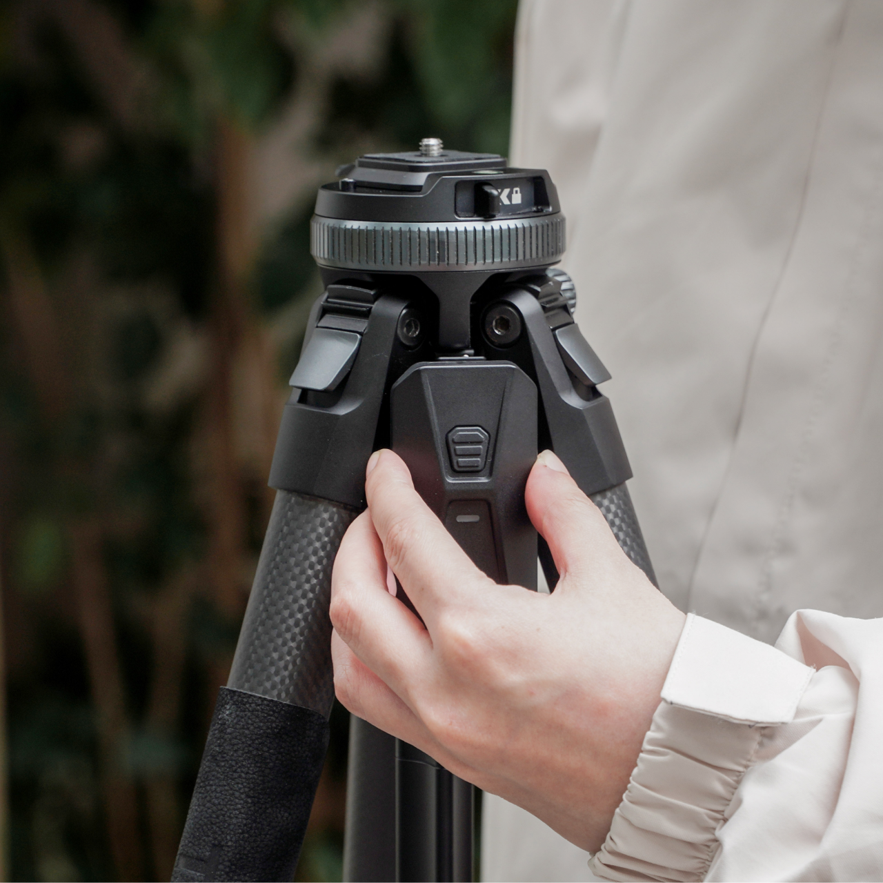
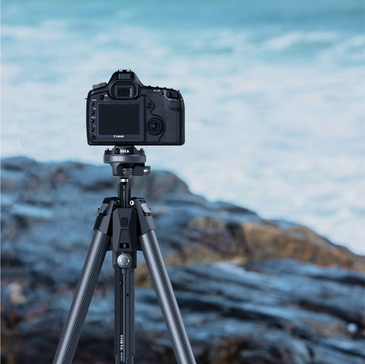
A level horizon used to be a manual discipline. You twisted the head, watched a bubble, made small corrections, twisted again, repeated. The Benro Theta removes that entire sequence with a motorized auto-leveling system that reads the surface, adjusts the head, and confirms the camera is plumb before you look through the viewfinder. Benro positions it as the world’s first smart modular travel tripod, and the auto-leveling claim holds, particularly for photographers who regularly set up on uneven terrain and have run out of patience for repeating the process twice every time.
The body weighs 331 grams and runs on a 2500 mAh battery that delivers up to three hours of motorized operation. Arca standard compatibility keeps it immediately compatible with existing head and plate systems without requiring new accessories to bridge the gap. The modular construction adapts the Theta across shooting configurations without needing a separate travel head. For the summer photographer who sets up quickly and moves rather than spending the golden hour leveling equipment, the auto-leveling feature alone covers the cost of the upgrade. Available from Benro directly at benrousa.com.
What We Like
Motorized auto-leveling removes the most time-consuming manual step in tripod setup, especially on uneven outdoor terrain
Arca standard compatibility integrates immediately with existing accessories without requiring additional purchase
What We Dislike
Three-hour battery means extended shooting sessions require either a recharge mid-day or a backup power source
Premium construction and motorized system place it above conventional travel tripods at the same weight class
9. Battery-Free Amplifying iSpeakers
The pitch is simple enough to sound too good: set your phone in the slot, and Duralumin, the aircraft-grade aluminum alloy used in aerospace construction, does the amplification. No Bluetooth pairing. No battery charging. No setup at all. The metal body channels and amplifies your phone’s speaker output through material physics rather than electronics, adding warmth and volume with zero power draw. Golden ratio proportions give it a visual presence that reads as a considered object on a surface, not another piece of audio hardware waiting to be plugged in.
For summer specifically, the always-ready quality matters in a way that becomes obvious the first time you do not have to think about it. There is no battery level to check before heading outside, no cable to remember, no update that delays the morning. Set the phone in and music plays. Optional Bloom and Jet modular accessories let you direct the sound output if the environment calls for more control.
No battery, no power, and no setup required means it is always immediately ready without any preparation
Aircraft-grade Duralumin construction shaped to golden ratio proportions is a genuine material and design achievement at any price
What We Dislike
Amplification quality depends entirely on the phone’s own built-in speaker, so the result varies significantly by device
Sound-directing modular accessories are sold separately at additional cost
10. Canon Gimbal Camera
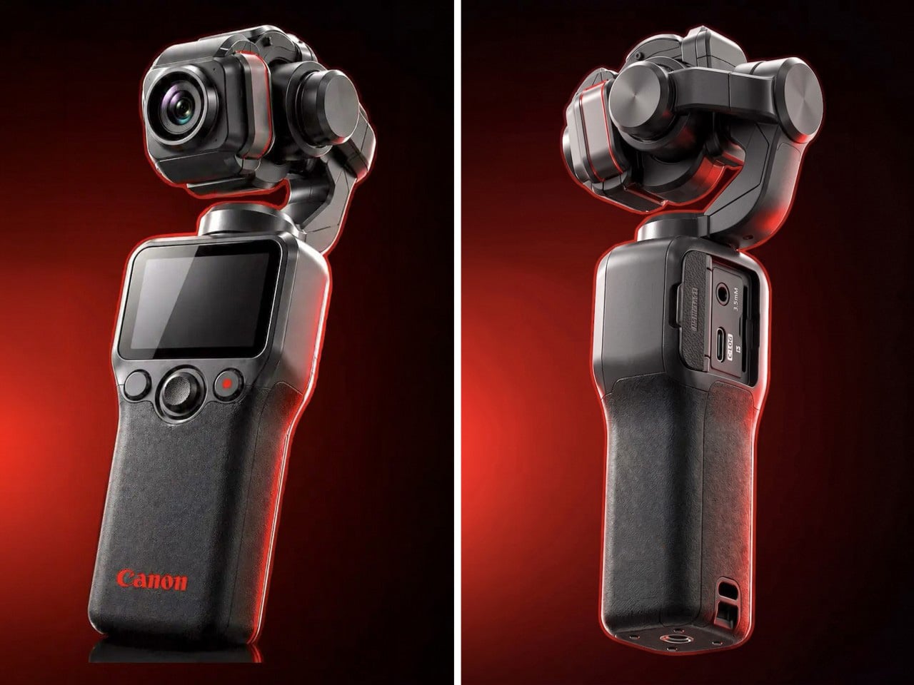
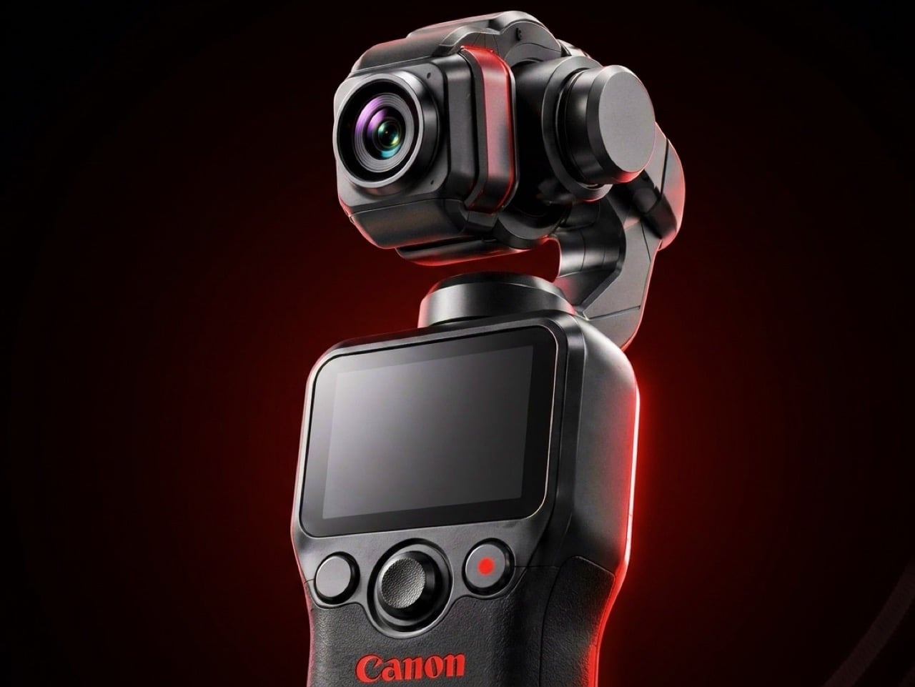
Canon has filed three gimbal camera patents since 2021, each one more practically minded than the last. The April 2026 filing describes a compact handheld body with a fixed lens, three-axis stabilization, a grip-mounted screen, and a folding mechanism that guides the gimbal head into a safe resting position before cutting motor power. That shutdown sequence is the engineering detail most readers will pass over, and the one that signals the most serious product thinking. Mechanical wear from limp-motor shutdowns is the quiet failure mode that causes cameras in this category to age faster than their owners expect.
DJI launched the Osmo Pocket 4 in April 2026 with a 1-inch sensor and 4K at 240fps. Insta360 followed closely. Canon is entering the category with five years of increasingly precise engineering, a fixed-lens form factor that prioritizes portability over interchangeable versatility, and a color science reputation that outdoor and travel shooting consistently validates. No release date has been confirmed and no pricing announced. Based on the patent arc from 2021 through 2026, this reads like a company that has done the homework carefully and is nearly ready to deliver.
What We Like
Smart folding shutdown mechanism addresses a real mechanical failure point that the rest of the pocket gimbal category has consistently ignored
Five-year patent arc spanning increasingly specific engineering detail signals a product shaped by sustained development rather than a reactive market response
What We Dislike
Remains a patent with no confirmed launch date or price, making it the most compelling item on this list and still out of reach
Canon’s track record in premium compact formats suggests a launch price that will require serious consideration before committing
The Right Gear Stays in the Bag Past August
Summer tends to reveal what gear actually holds up. The items that stay in the bag past August are the ones that solve something specific without creating new problems to manage. Not every product on this list is purchasable today. The Canon Gimbal and Camera (1) both exist in the space between a promise and a product. The RedMagic Power Card Pro is close. Everything else is available now and worth the decision.
The best summer kit is not the most comprehensive one. It is the one built around the things you actually reach for. Three of these will make more difference than ten purchased out of obligation. Pick the gaps your current setup has never filled properly, and start there. Everything on this list was designed by someone who looked at a specific problem and decided it deserved a real answer. Summer is a good time to find out which answers fit yours.
There is a particular challenge that confronts any building asked to stand at a prominent corner in one of São Paulo’s most culturally dense neighborhoods: it has to earn its place visually without performing for the street at the expense of the people inside it. The Valente building, completed by FGMF Arquitetos for developer Idea!Zarvos in the Pinheiros district, resolves that tension in a way that is worth paying attention to.
The 21-story mixed-use tower sits at the intersection of Cardeal Arcoverde and Capote Valente streets, right at the heart of a neighborhood known for its historic character, its restaurants, and the particular quality of urban life that makes Pinheiros one of the most sought-after addresses in the city. The building’s façade reads as a pixelated composition of protruding rectangular volumes, white and deliberate, stacked in a configuration that has drawn comparisons to a Jenga tower mid-game. It is immediately recognizable without being theatrical.
What makes the design worth examining beyond its silhouette is the logic that produced it. “Valente was designed from the inside out,” said FGMF partner Fernando Forte. The concept, developed with Idea!Zarvos, was built around a three-dimensional occupation of corporate space, using triplex and duplex units to create spatial arrangements that the conventional office tower market rarely offers. Flexible, adaptable, and responsive to the way people actually want to work and live rather than the way developers typically expect them to — that design position shows clearly in the result.
This is the third collaboration between Idea!Zarvos and FGMF, following a 2016 building that explored similarly unconventional office layouts. That prior project directly informed the thinking behind Valente, and the continuity shows. The relationship between developer and architect here is genuinely iterative rather than transactional, which is the kind of condition that produces buildings worth discussing. Each project has pushed the brief further than the previous one.
Pinheiros is a neighborhood that can absorb a bold building without being overwhelmed by it, and Valente reads correctly within that context. The pixelated massing creates a rhythm of light and shadow across the façade that shifts through the day without requiring any moving parts. The protruding volumes that define the exterior also define the interior — each one corresponds to a usable space with a specific relationship to the view and the air around it.
Brazilian architecture has been producing some of the most considered mixed-use buildings of the last decade. Valente is a strong addition to that conversation, built from the inside out and unmistakable from every angle.
The home office has become the most personal room in the house — and somehow still the hardest room to shop for. He already has the monitor arm, the mechanical keyboard, the cable organizer that never actually organized anything. The things worth giving now aren’t upgrades to what he owns. They’re objects that introduce something genuinely new to how a desk feels, functions, and performs — gifts that earn a permanent spot rather than a polite shelf appearance.
The best home office gifts of 2026 share one quality: they’re genuinely hard to explain without handling them. A pen that never needs ink. A lamp that works anywhere without a single cord. A speaker bar that makes RGB feel like a design choice rather than a gamer’s checkbox. These aren’t novelties with a short shelf life. They’re tools and objects with real staying power — the kind of things you’d buy for yourself if someone hadn’t already beaten you to it.
1. Mosaic
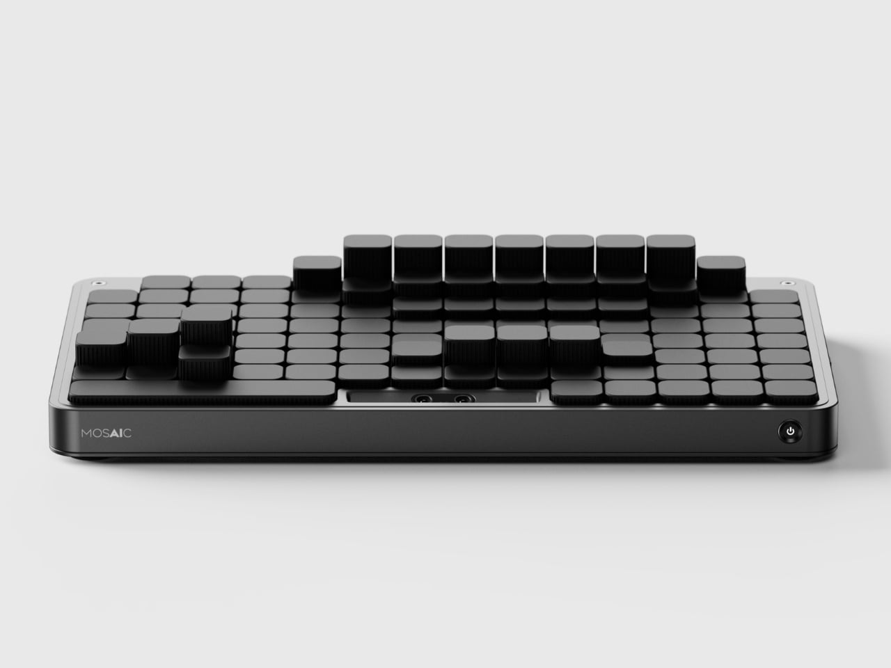
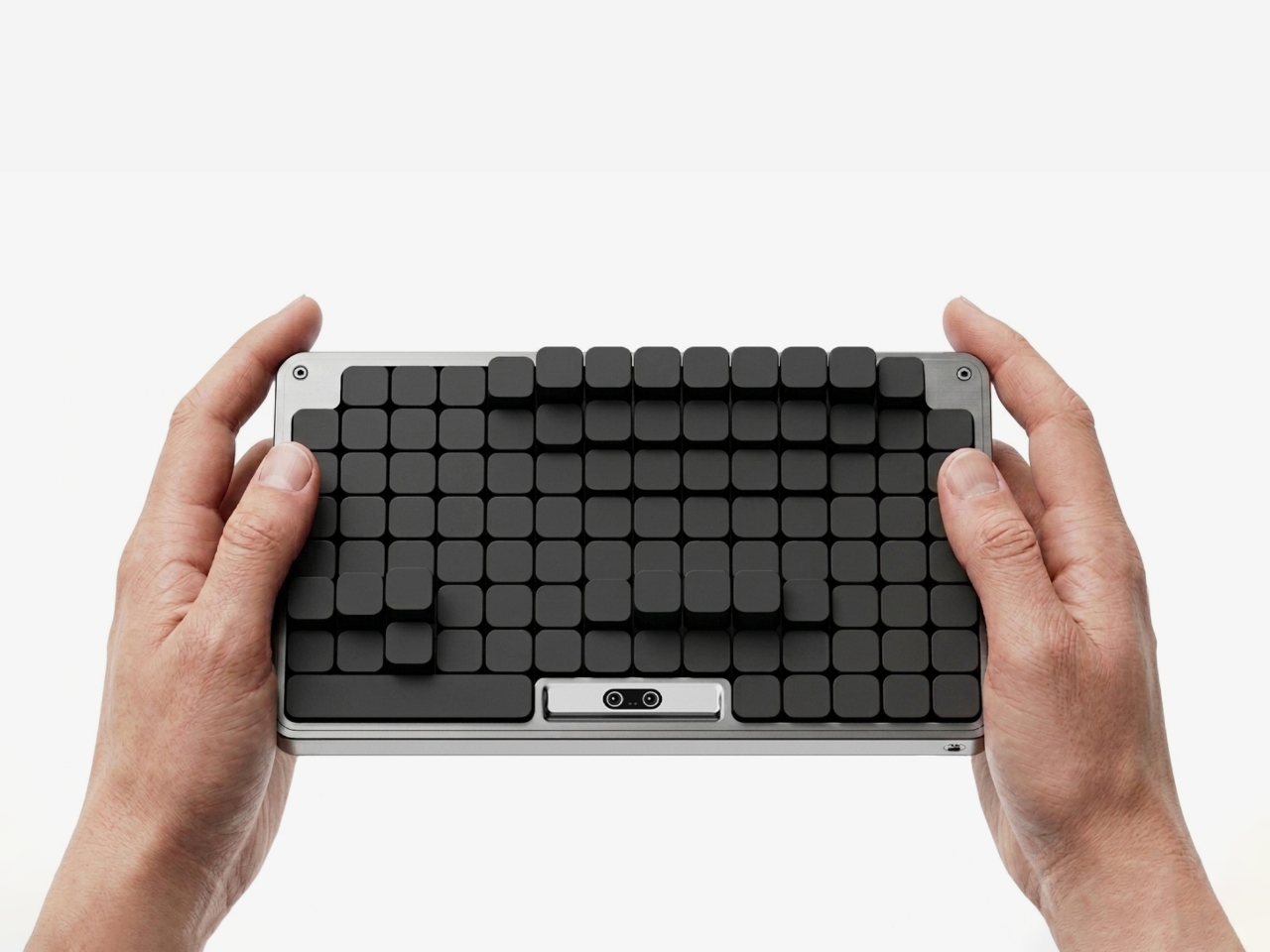
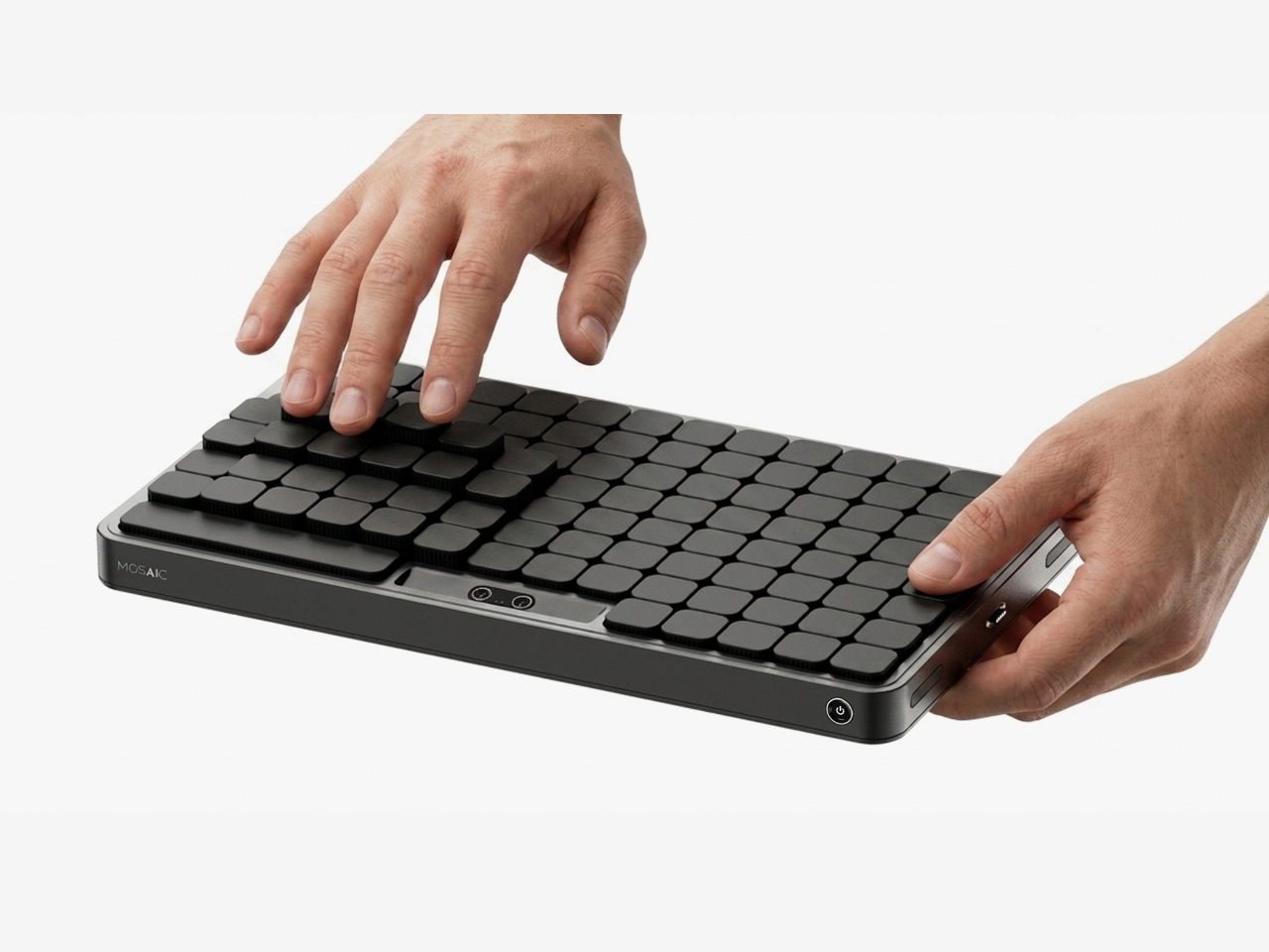
The most striking thing about the Mosaic isn’t what it does — it’s what it undoes. Most desk organizers arrive with a fixed grid of compartments and expect you to adapt, which is exactly why most of them end up abandoned in a drawer within weeks. The Mosaic flips the dynamic entirely, using AI to learn how objects get arranged and rearranged on a real desk over time, then reshaping its modular surface to match those habits rather than a designer’s assumptions about them.
What that looks like in practice is a tray that never quite looks finished — and that’s entirely the point. As a setup evolves, it moves with you, accommodating a new phone dock here, a relocated notebook there, without requiring a full reset. The dark modular surface carries a kind of purposeful architecture that reads as considered rather than cluttered. For anyone who has bought a beautiful organizer only to abandon it two weeks later, the Mosaic is the version that actually earns its permanent place.
What We Like
Learns and adapts to actual desk behavior instead of imposing a fixed layout
Modular surface reads as architectural on the desk — purposeful rather than busy
What We Dislike
AI calibration takes time before it fully understands desk patterns and adjusts accordingly
Darker aesthetic may not suit lighter or more minimal setups
2. Precision Sakura Metal Puzzle
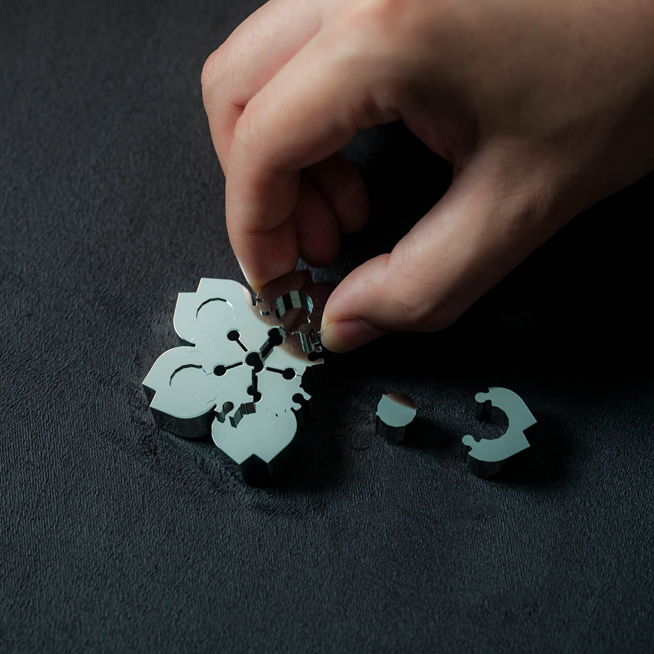
The Precision Sakura Metal Puzzle is the kind of object that earns its spot on a desk by doing almost nothing visible — until you pick it up. Machined to a 0.004mm tolerance, it captures the shape of Japan’s most iconic flower in a set of pieces so similar to each other that distinguishing them becomes its own discipline. No solution is included. The intent was never to finish it quickly. The intent is to spend sustained, satisfying time with something that genuinely demands your attention.
For the person who says he has everything, this is a rare thing: an object that introduces something entirely new to the desk. It works as a precision puzzle and a sculptural display piece simultaneously, the polished metal finish clean enough to hold its own against far more expensive objects. Even unsolved, it belongs on the desk. When you finally do close it, the satisfaction is the kind no app or productivity widget has ever come close to delivering.
0.004mm machining tolerance makes every piece feel intentional and genuinely premium
Functions as desk sculpture whether actively mid-solve or sitting completed
What We Dislike
No solution included — a real test of patience for anyone expecting a guided experience
Small scale means pieces are easy to lose on a desk that isn’t kept clear
3. Pininfarina Aero Ethergraf
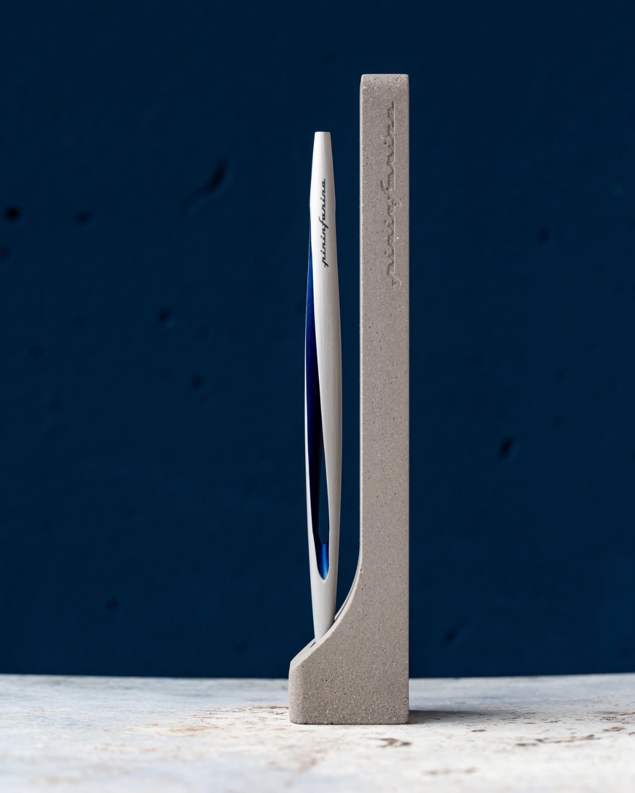
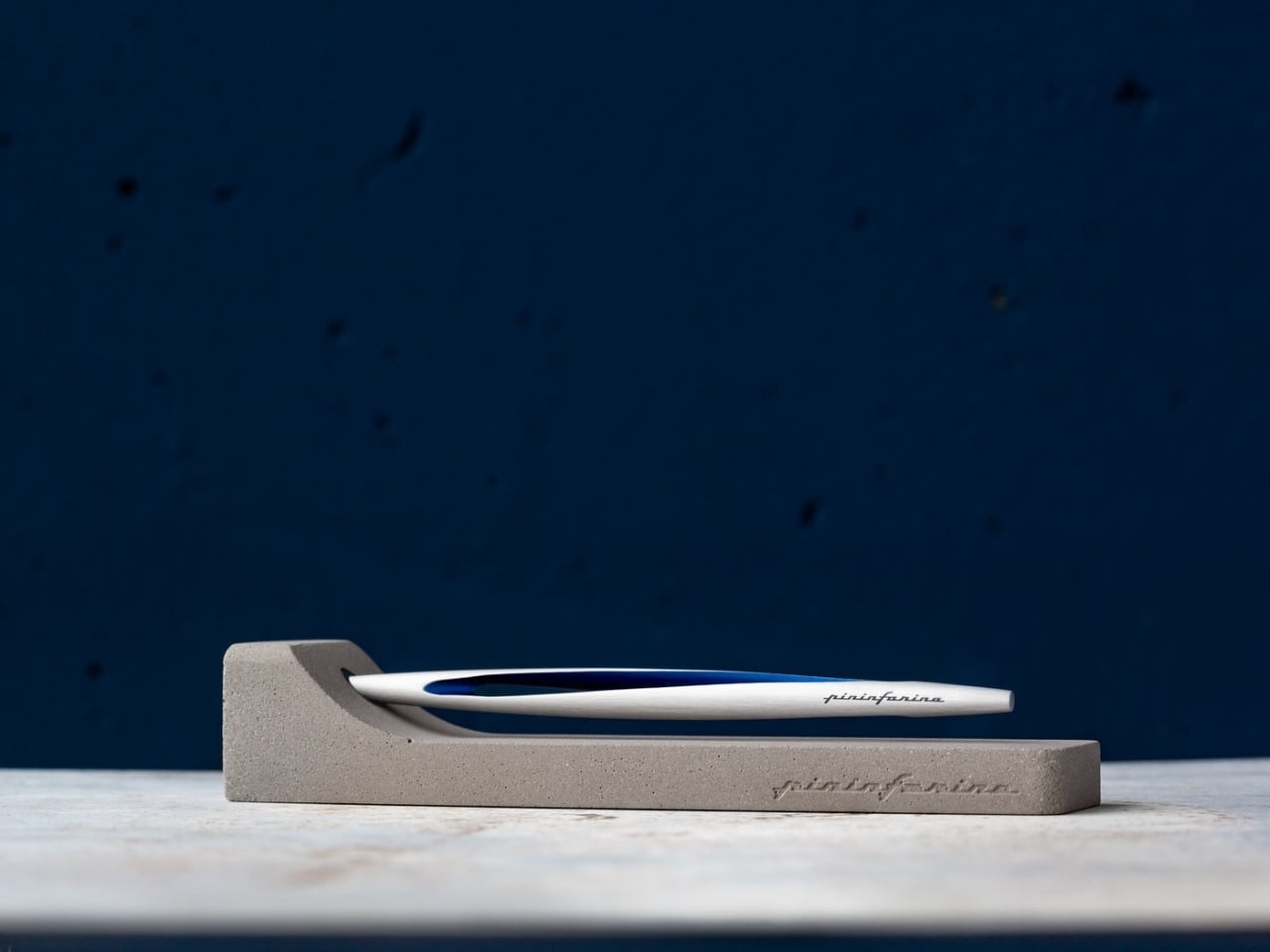
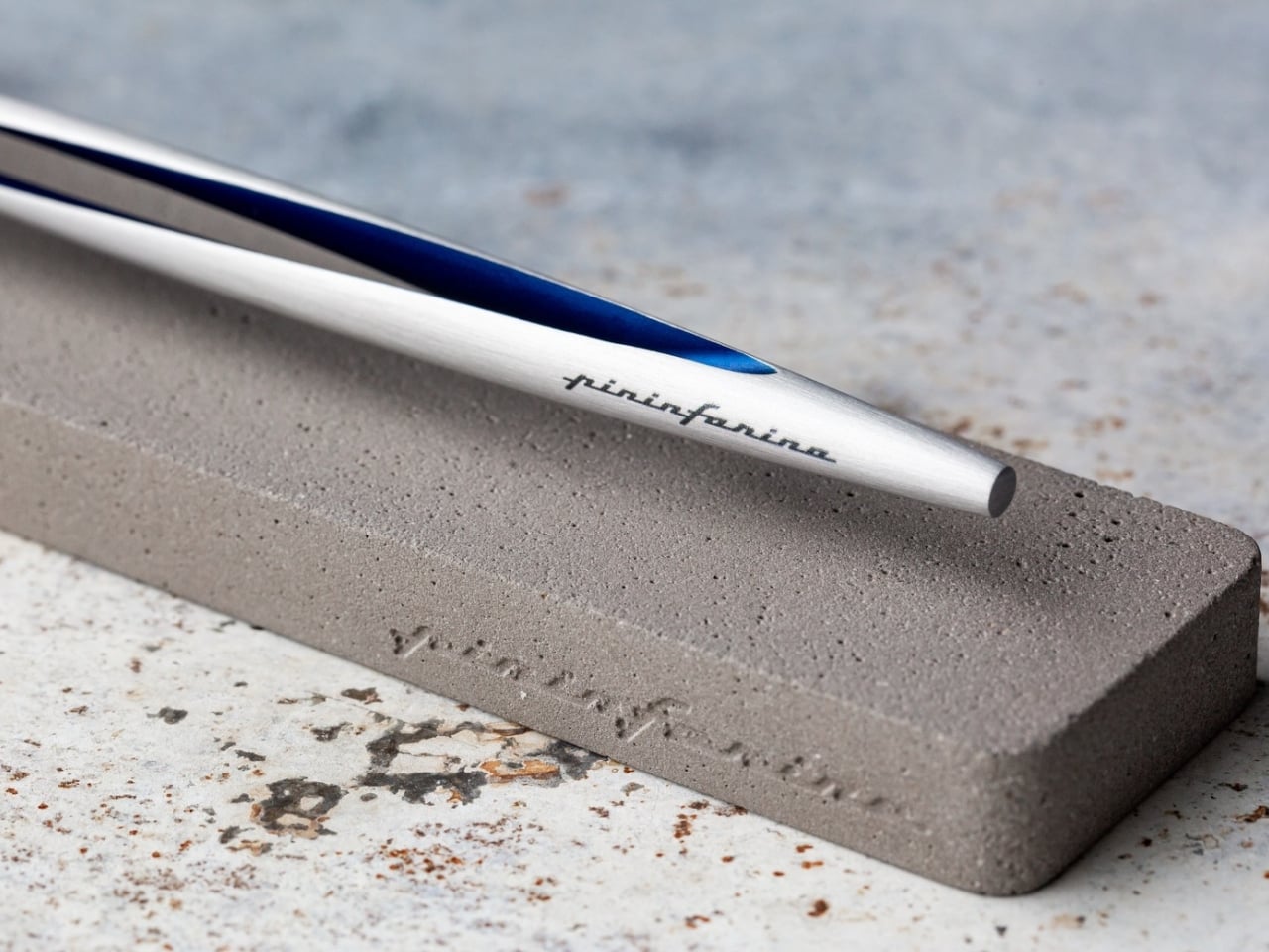
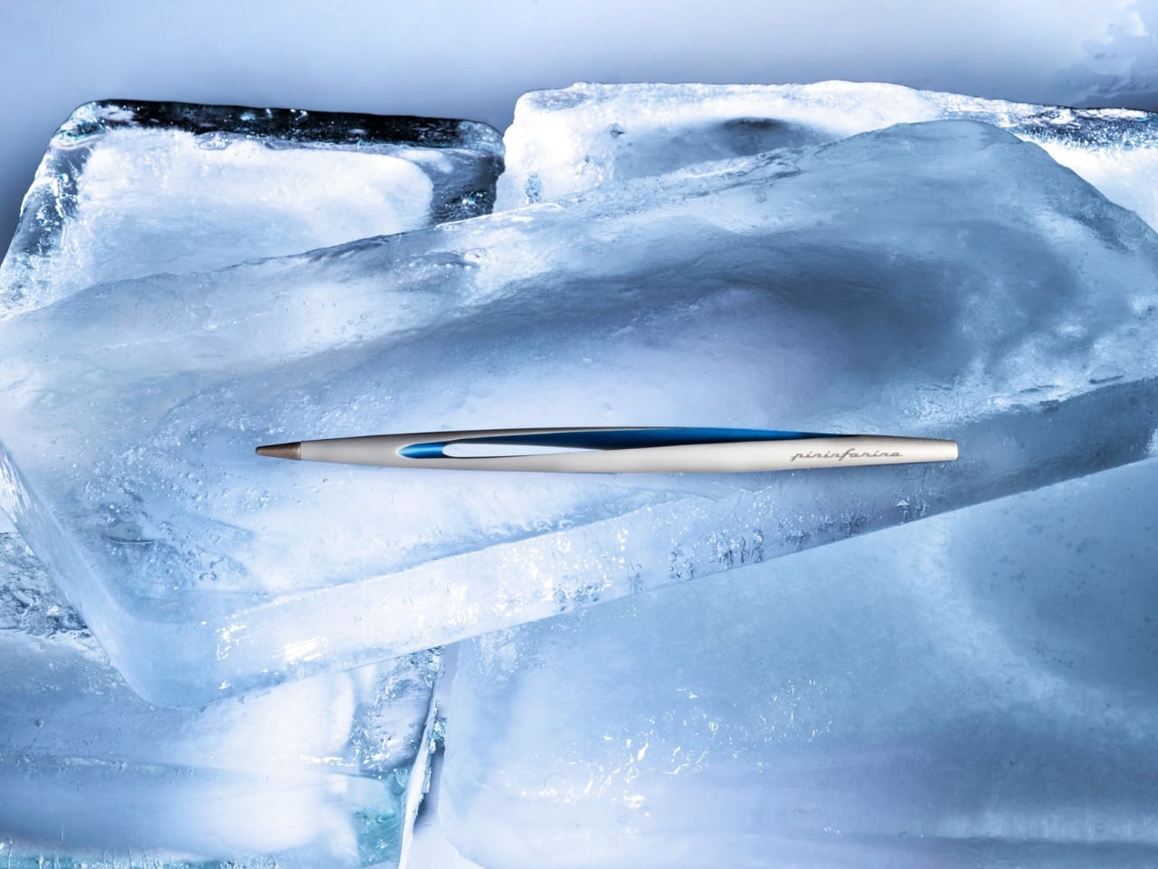
Pininfarina’s name lives in the curves of Ferraris and Maseratis, but the Aero Ethergraf makes a more interesting argument — that restraint is the harder design problem. Made from aerospace-grade aluminum, it weighs 17 grams and measures 160mm, numbers that don’t fully prepare you for how it sits in the hand. The tip is Ethergraf, a patented metal alloy that writes through oxidation, leaving a permanent mark on paper without a single drop of ink. No cartridges. No refills. No maintenance, ever.
It ships paired with a raw concrete stand — a deliberate material contrast that, on a desk, reads as sculpture rather than office supply. Handcrafted in Italy and rooted in a technique older than the modern ballpoint, the Aero makes every other writing instrument on the desk feel temporary by comparison. For a man who already has everything, it’s a quiet, permanent counterargument. Because nothing else quite like it exists on any desk, anywhere.
What We Like
Ethergraf tip writes indefinitely through oxidation — zero maintenance, zero refills, ever
Concrete stand creates genuine material tension that turns the pen into desk sculpture
What We Dislike
Performs best on dedicated paper — not every standard notebook will reveal the tip’s quality clearly
Concrete stand adds bulk that may feel heavy in a stripped-back minimal setup
4. Anywhere-Use Lamp
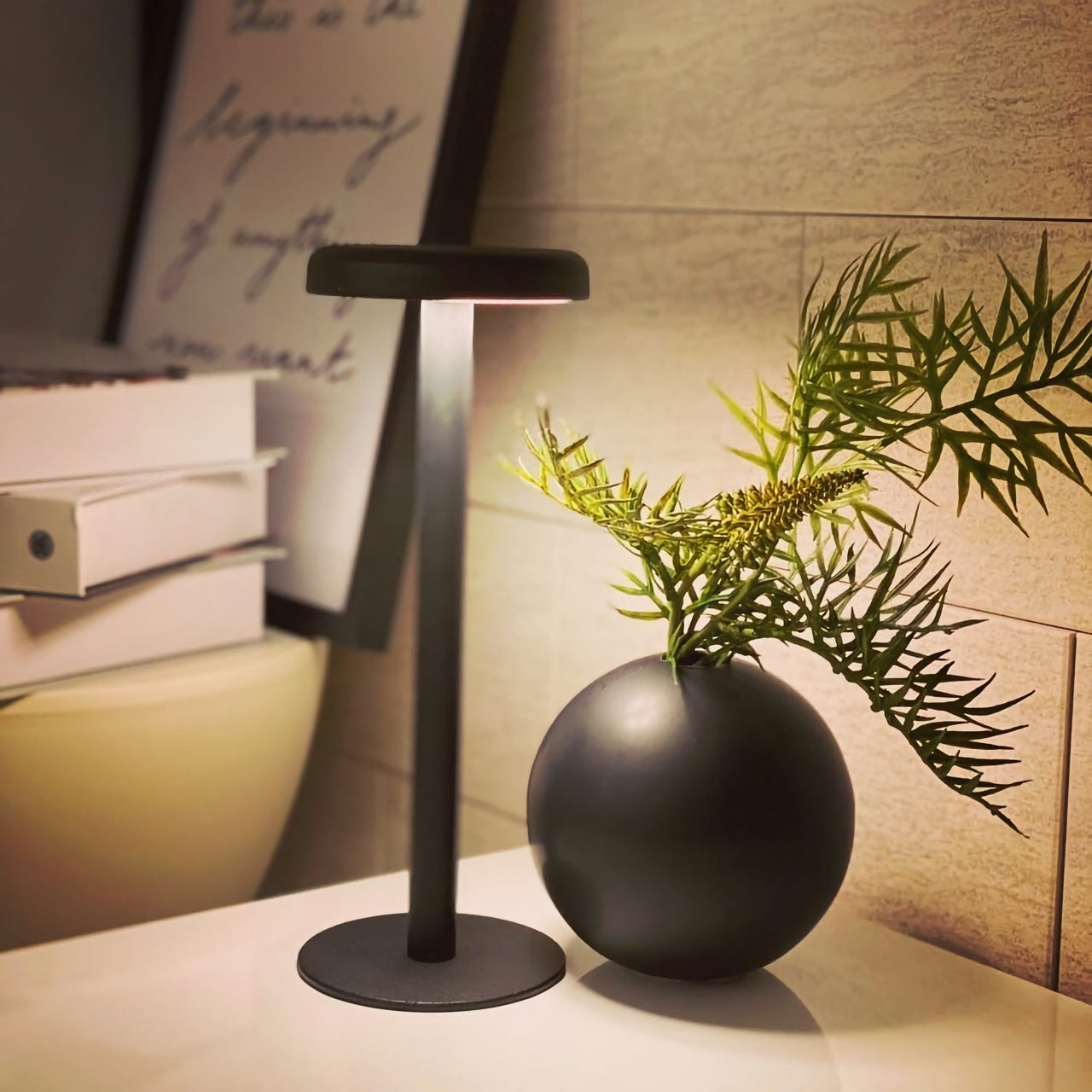
The Anywhere-Use Lamp starts from one honest premise: good light shouldn’t be tethered to a wall. Running on four AA batteries, it removes every cord and cable from the equation, making it as functional in a hotel room, on a bookshelf, or in an outdoor corner as it is on a permanent desk. Six high color rendering LEDs produce warm, soft output that settles naturally into a space without announcing itself as the room’s loudest design decision. The result is light that feels like it always belonged where you put it.
Available in black, white, and an Industrial edition with a scratch-detailed metal base that treats surface wear as character rather than damage, it holds across every desk aesthetic without effort. Pressing any edge of the cap cycles through four brightness levels with a haptic click that makes even that small interaction feel considered. Modular construction means it breaks down flat for a bag. At $149, the Anywhere-Use Lamp is one of the most versatile objects on this list — earning its price through location freedom alone, before you’ve even switched it on.
AA battery power removes all cord dependency and gives it genuine, unconditional location freedom
Industrial edition’s scratch-detailed base treats material wear as intentional character, not a flaw
What We Dislike
AA batteries mean ongoing replacement costs compared to a rechargeable alternative
Four brightness levels may feel limited for those who prefer more granular control over output
5. Edifier Melo Bar
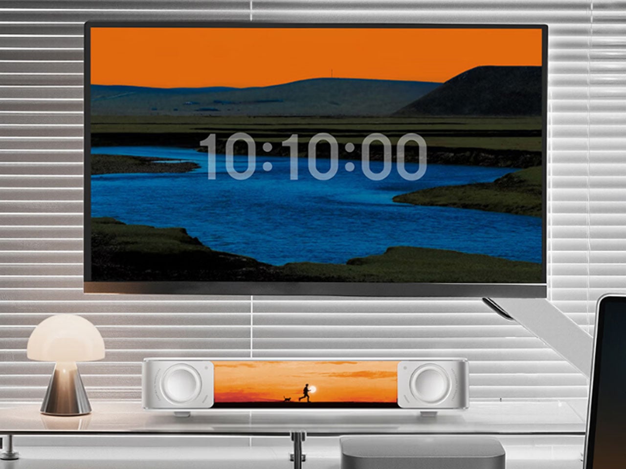
The Edifier Melo Bar does the thing most desk speaker bars never quite pull off — it makes RGB feel like a design decision rather than a hardware checkbox. Three distinct audio modes handle music, gaming, and movie listening, each tuned differently and each backed by near-field sound clear enough to remind you how much you’ve been tolerating laptop audio. The interchangeable front panels are the detail that separates it from every other bar on the market, letting the object adapt to the desk instead of demanding the desk adapt around it.
The light output is deliberately understated for something that supports 16.8 million colors and 15 carefully tuned lighting themes. It frames a setup rather than overwhelming one — adding ambient depth without demanding that the desk revolve around it. For a home office that already has the monitor, the keyboard, and the cable routing handled, this is the piece that completes the sensory experience rather than complicating it. Sound and light are treated as a single designed object. That’s harder to achieve than it sounds, and the Melo Bar gets it consistently right.
What We Like
Interchangeable front panels let the speaker blend into or intentionally accent any desk aesthetic
Three dedicated audio modes handle every use case without asking for a compromise
What We Dislike
RGB-heavy profile may feel redundant on setups that already favor a completely dark aesthetic
Near-field performance is strongest close to the desk — less effective across a larger open room
The Right Desk Tells You Something About the Person Behind It
Each of these five objects earns its place for reasons that go further than specs. The Mosaic learns. The Sakura puzzle challenges. The Aero Ethergraf lasts forever. The Anywhere-Use Lamp untethers. The Melo Bar performs and illuminates. None of them exist because a spec sheet demanded them — they exist because someone asked what a desk should actually feel like and then had the discipline to build the answer without compromise.
The man who says he has everything doesn’t need another gadget. He needs the object he didn’t know was missing — and all five of these are exactly that. Each carries intention, permanence, and the kind of quiet confidence that makes a desk feel genuinely complete rather than just assembled. Buy one, and it earns its keep. Buy all five, and you’ve given someone the most considered setup they’ve ever worked from.
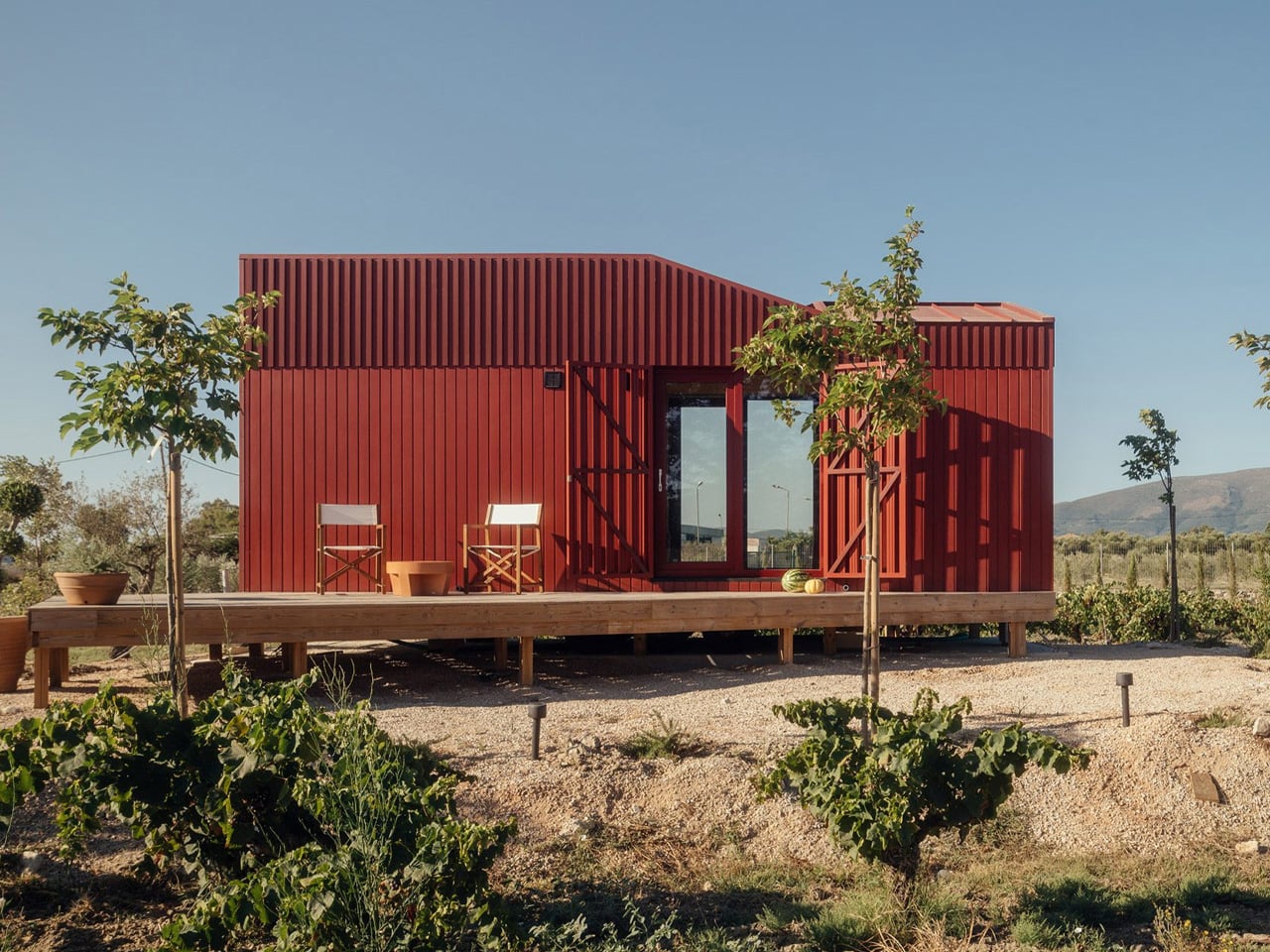
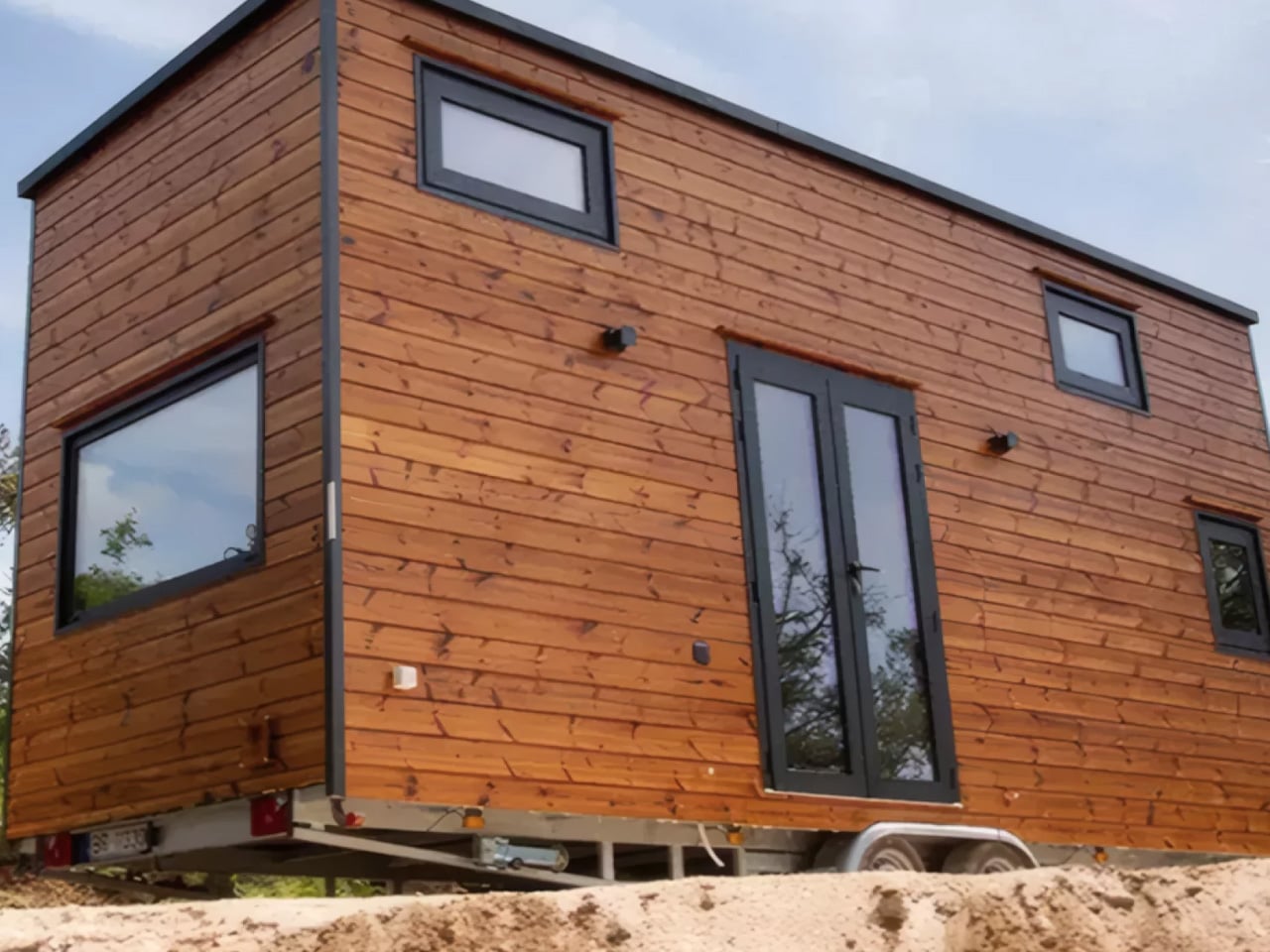
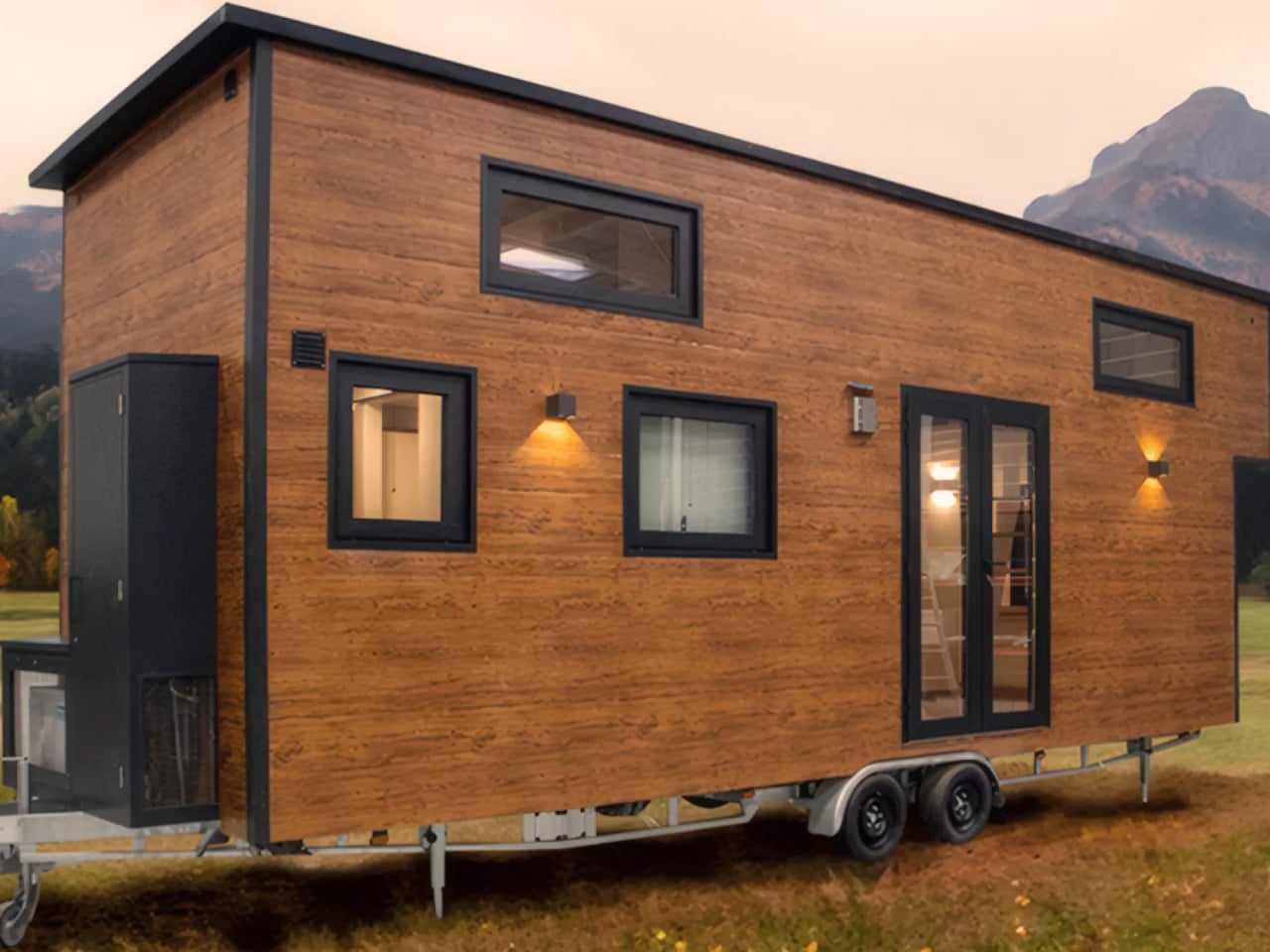
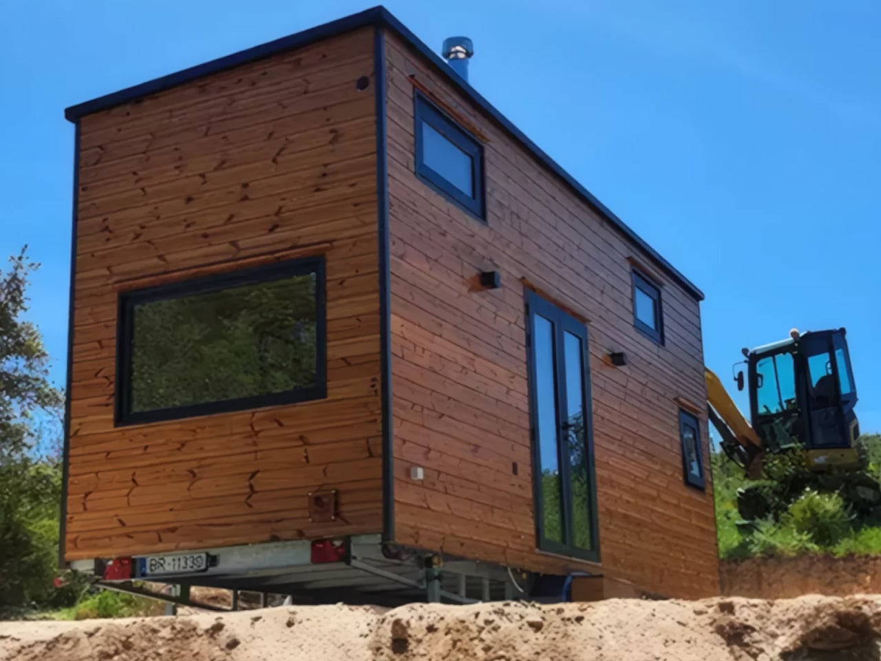
Portugal has long exported culture, cuisine, and craftsmanship. Now, it’s quietly exporting a new kind of living — one that fits on a trailer. The Gerês is Casagaea’s most ambitious tiny home to date. Named after one of Portugal’s most breathtaking national parks, the Gerês is built on a double-axle trailer stretching just 7.8 meters (25.7 ft) in length — compact enough to tow, generous enough to actually live in.
The exterior is clad in engineered wood that ages gracefully, with a small storage box tucked near the tow hitch — a quiet, practical detail that tells you everything about how thoughtfully the whole thing has been considered.
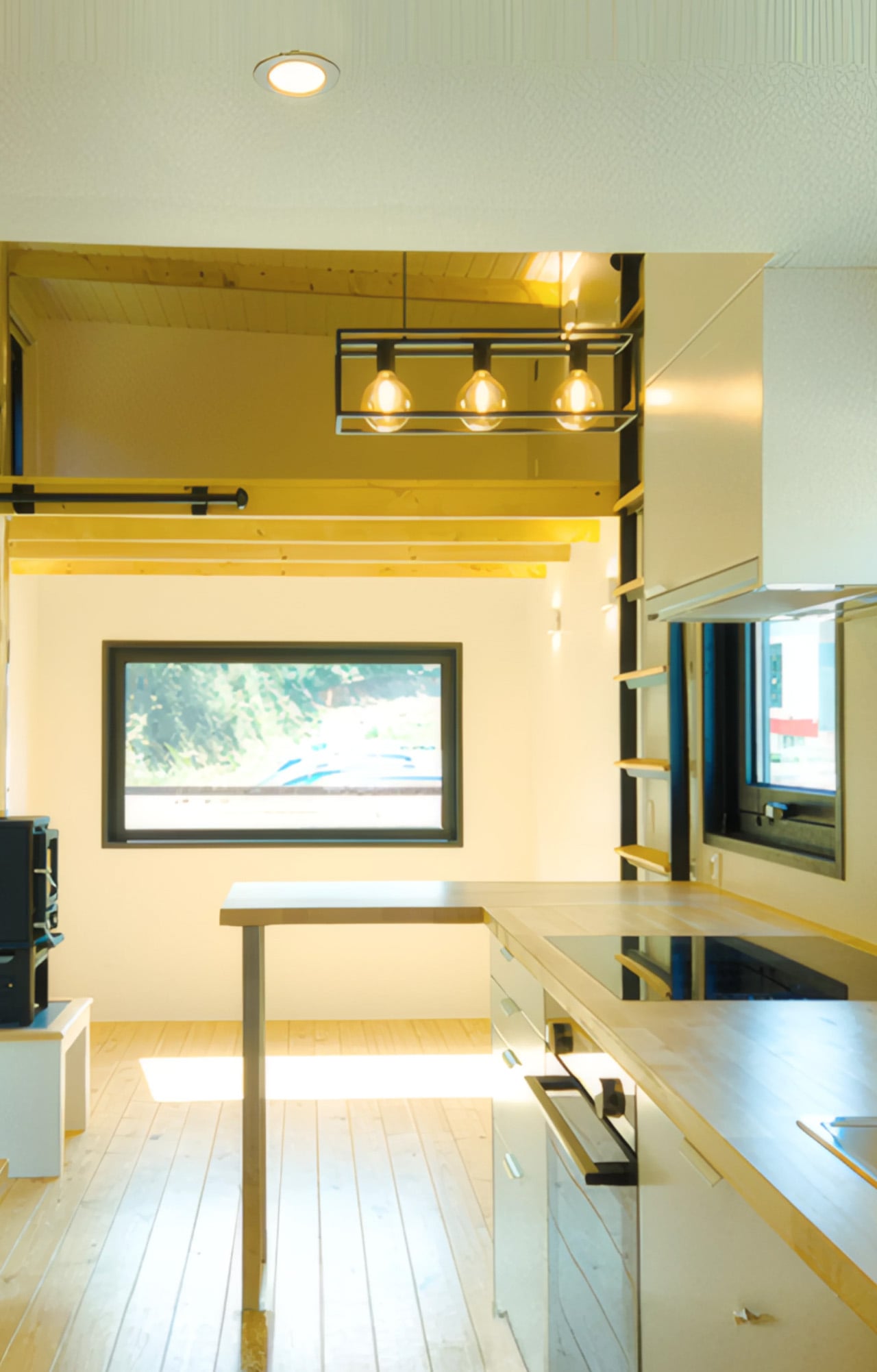
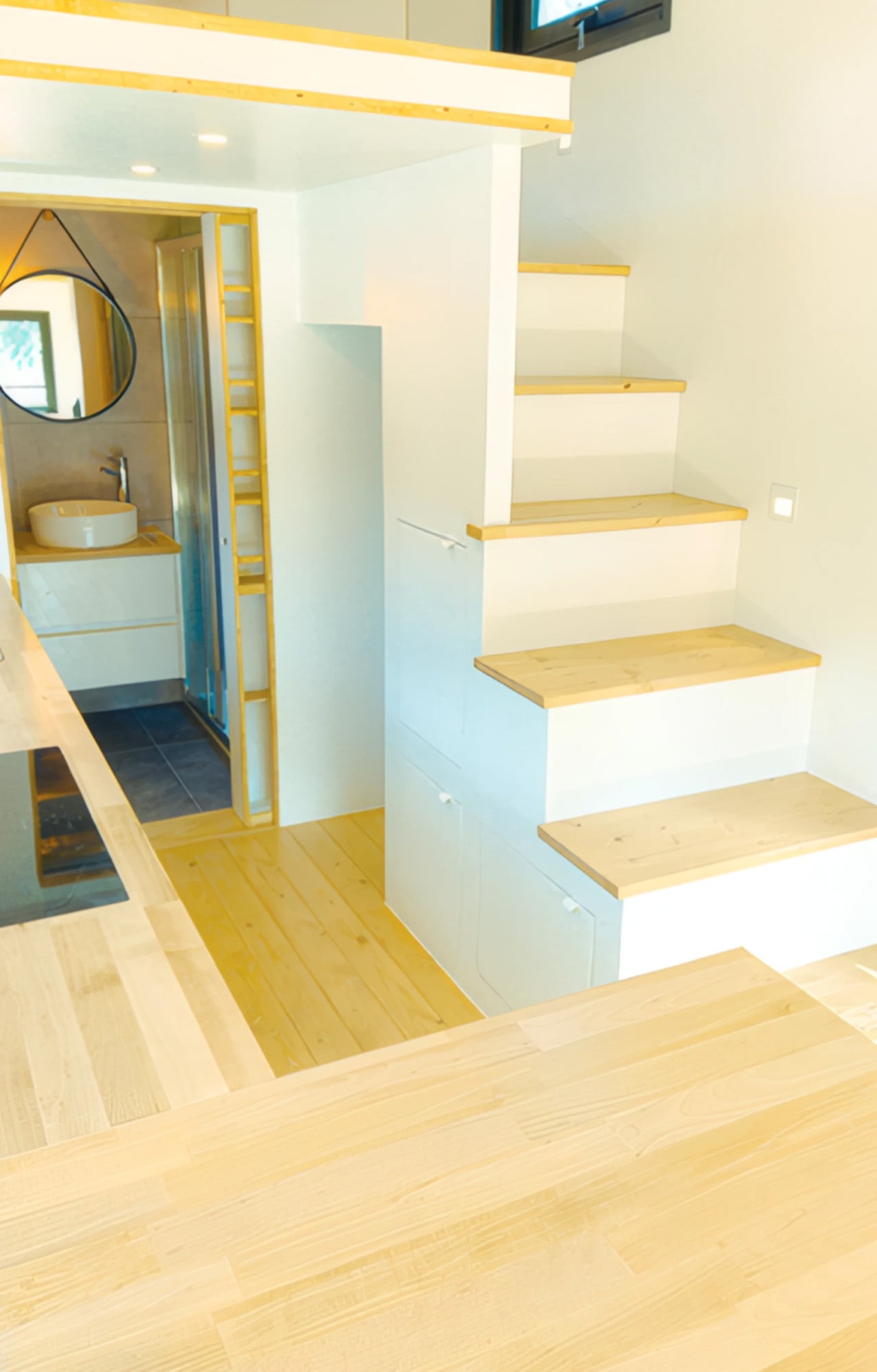
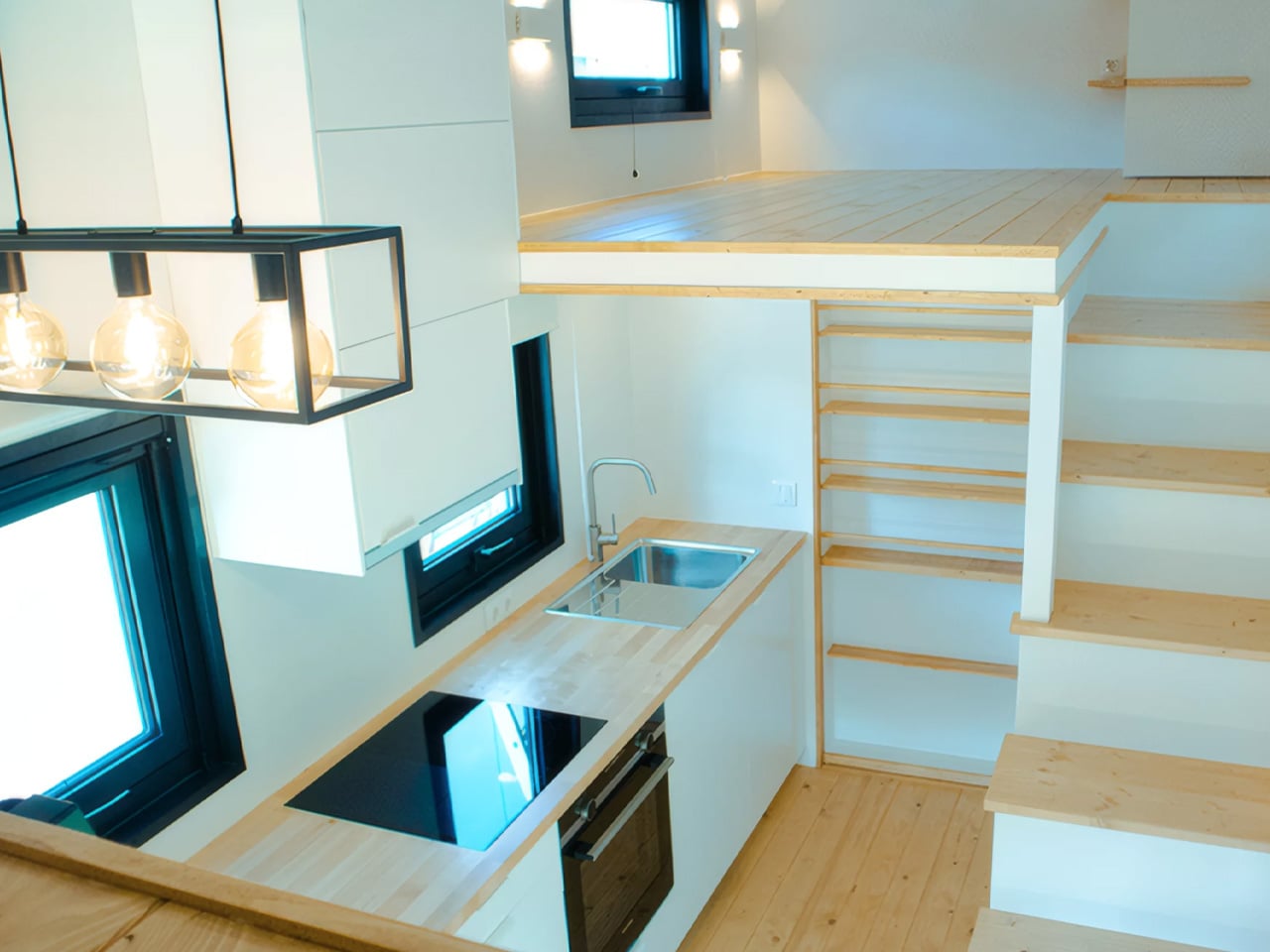
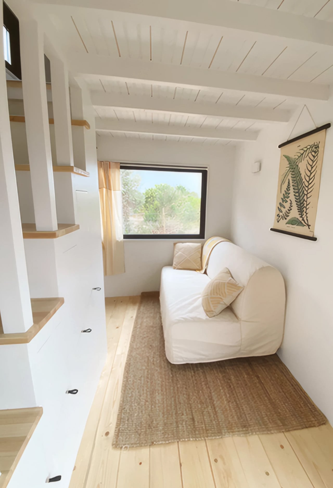
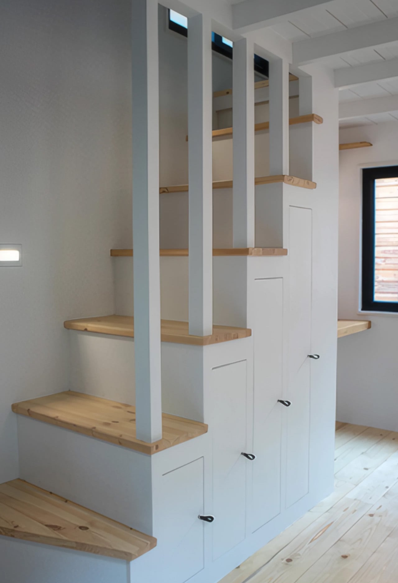
Step inside and the 30 square meters (322 sq ft) feel surprisingly unhurried. The layout centers on an open-plan kitchen and living area, the kind of space that rewards the people who believe a home doesn’t need to be large to feel alive. The kitchen includes a breakfast bar that seats two — a social anchor in a compact floorplan — while the bathroom sits neatly off to the side. The interior leans into simple wood finishes throughout, which keeps the warmth tangible and the aesthetic clean without veering into the sterile.
What makes the Gerês genuinely surprising is its sleeping capacity. The home sleeps up to six adults — two bedrooms do the heavy lifting, with the living area stretching to accommodate two more when needed. For a structure that can be hitched to a truck and moved across the country, that’s a remarkable feat of spatial thinking. It doesn’t feel like a compromise. It feels like a decision — one made by people who understand that mobility and comfort don’t have to cancel each other out.
Casagaea also offers optional off-grid upgrades, which open the Gerês up to placements far beyond the reach of traditional infrastructure. Whether parked at the edge of a pine forest or settled on a rural plot in the Alentejo, the home carries its context well. The engineered wood cladding doesn’t fight the landscape — it joins it.
The tiny home movement has produced no shortage of novelty concepts that look better in renders than in reality. The Gerês sits in a different category. It’s a road-ready home built by a Portuguese studio that seems less interested in hype and more interested in the long game — designing spaces that hold up not just aesthetically, but in the day-to-day texture of actual life. That restraint, in a category prone to excess, might be its most compelling design feature of all.
Most Father’s Day gifts start and end with good intentions. A nice watch, a tool kit, a gift card wrapped in tissue paper. They say “I thought of you” without really saying much else. But some dads notice when something is well-made, keep objects long after they stop being new, and believe the things around them say something about how they live. If that sounds familiar, this list is for you.
The five gifts below aren’t the most expensive things you’ll find this season, and that’s the point. Each one earns its place through material honesty, considered proportions, or a mechanical logic that just feels right. Some are built to last decades. One runs indefinitely without a refill. Another turns a scattered desk into something worth photographing. All five were chosen because they respect the intelligence of the person receiving them.
1. Pininfarina Aero Ethergraf — The Forever Pen
Pininfarina built its reputation on some of the most celebrated automotive silhouettes in history, including Ferrari and Maserati bodies that turned heads for decades. The Aero Ethergraf brings that same design philosophy down to the scale of a writing instrument. Crafted from aerospace-grade aluminum, weighing just 17 grams and measuring 160mm in length, it arrives paired with a raw concrete stand that sits beside it on the desk like a quiet still-life. Made in Italy, built to last.
What makes it genuinely unusual is that it contains no ink. The Ethergraf metal alloy tip writes through oxidation, leaving a graphite-like mark on paper without a cartridge, a cap to misplace, or a refill cycle to manage. The line is precise and smudge-resistant. The pen never dries out and never runs out. For someone who has spent years maintaining fountain pens or replacing rollerball inserts, this inverts the entire expectation of what a writing tool asks of you.
What We Like:
The Ethergraf tip writes indefinitely through oxidation, with no ink, no cartridges, and no refills ever needed
Pininfarina’s automotive design DNA reads clearly in the body: aerodynamic, precise, and quietly confident about its own beauty
What We Dislike:
The oxidation-based line runs lighter than a standard ballpoint, which will not suit every writing style or paper type
The raw concrete stand, while a genuinely beautiful pairing, adds considerable volume and weight to the overall package
2. Foldline Pen Roll
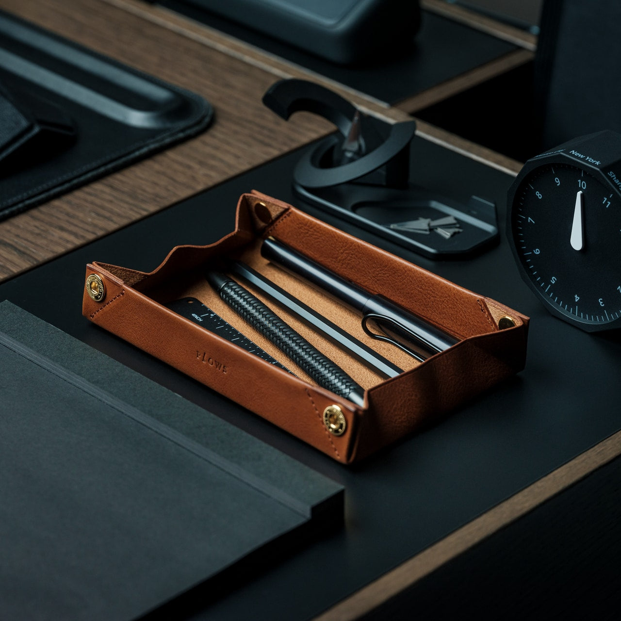
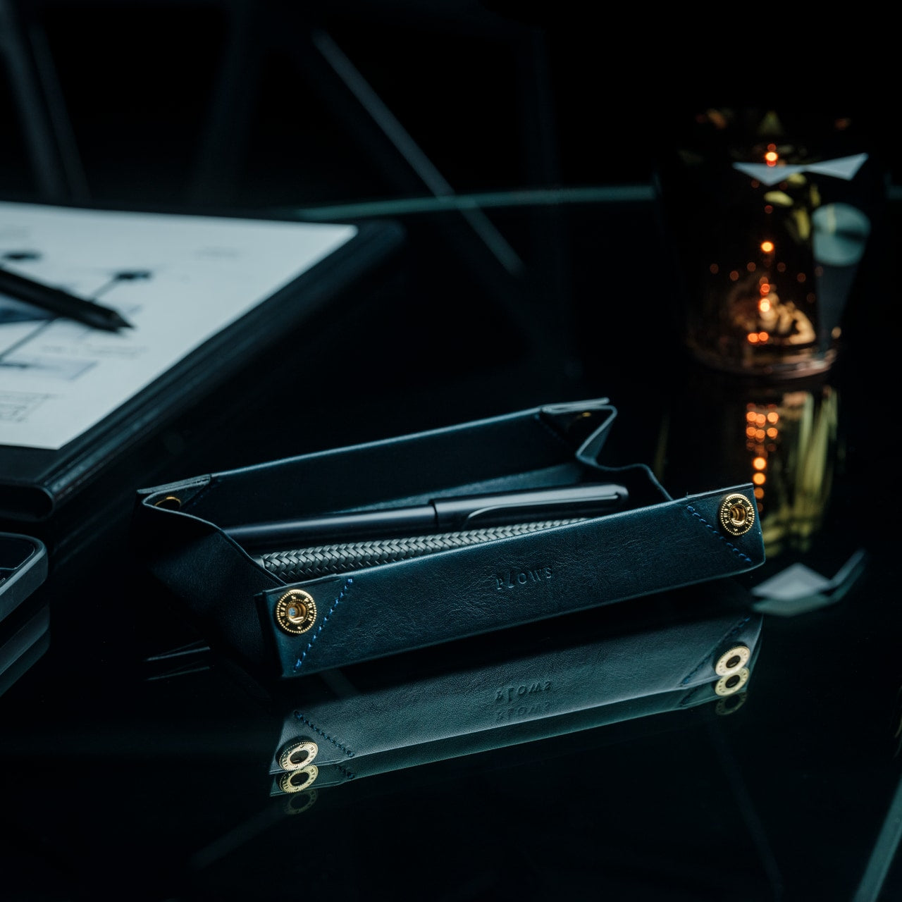
The FoldLine Pen Roll comes from PLOWS, a Japanese leather goods brand founded by a farming company, which may explain why its objects carry a particular kind of patience. The roll is cut from a single piece of Minerva Box leather sourced from Badalassi Carlo, an Italian tannery known for vegetable-tanned hides enriched with cow leg oil. That combination of material sourcing and hand-formed construction produces something that develops a patina entirely personal to how it is used and who carries it.
Structurally, it unfolds in two steps and under two seconds into a tray that holds pens in place without stitched slots or rattling. The entire form comes from precise folds rather than seams or inserts. A large machined snap from Italy’s PRYM closes the roll with satisfying solidity. The symmetrical design opens cleanly from either side, making it equally usable whether you are left- or right-handed.
A single piece of Minerva Box leather that develops a personal patina over time, making each roll gradually distinct to its owner
No designated top or bottom, no correct side to open from: a small but considered detail that removes daily friction entirely
What We Dislike:
The value is only legible to someone who already appreciates quality leather goods, making it a harder sell as a blind gift
Only a few units remain in stock, so availability is not guaranteed as Father’s Day approaches
3. Orbitkey Grid Desk Organizer
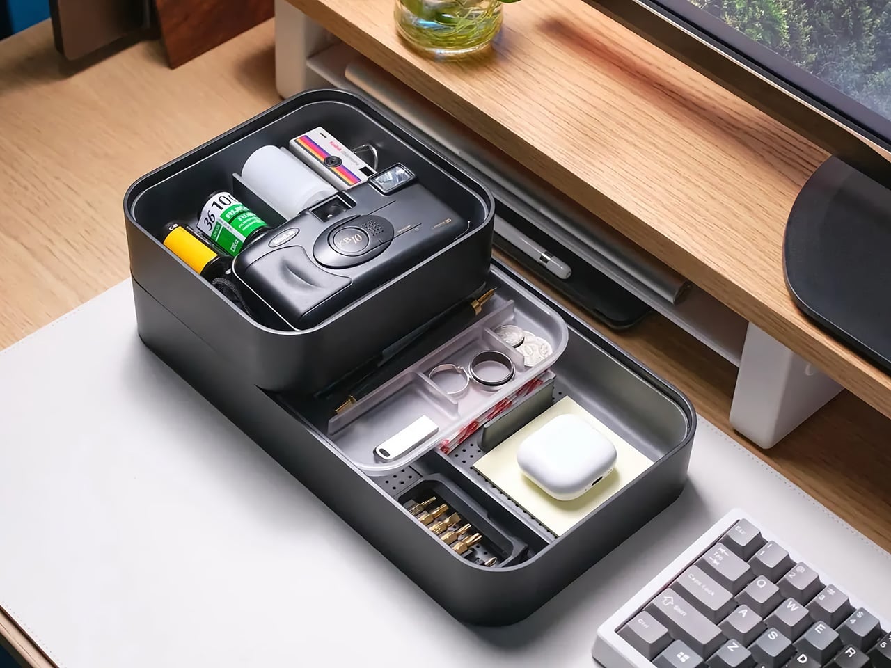
Orbitkey built its name around the idea that small daily frictions deserve serious design attention. The Grid Desk Organizer extends that logic into a broader desktop format. Its perforated tray base accepts snap-in dividers at any position, so the internal layout responds to whatever lives inside it rather than demanding objects conform to fixed compartments. Long dividers run the full tray depth while shorter ones slot in crosswise, and any arrangement can be lifted out and reconfigured in seconds. The system earns the word modular.
A soft-touch rubberized interior lining protects items from scratching and gives the tray a tactile quality that cheaper desk accessories rarely bother with. Silicone feet on the base prevent it from migrating across hard surfaces. The lid doubles as a valet tray on top, and its handle converts into a portrait phone stand when set upright.
The patent-pending snap-divider system adapts to the contents rather than demanding conformity, a structural logic that sounds minor until you experience the alternative
Three colorways (Black, Stone, and Terracotta) land in the space between generic and overdone, making it a natural fit for almost any desk setup
What We Dislike:
The $42 base price covers the standard configuration, but adding the Mini version raises the total cost beyond the initial impression
4. Olight Oclip Pro S EDC Flashlight
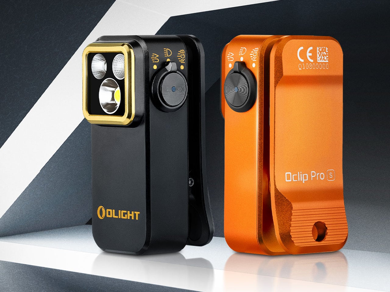
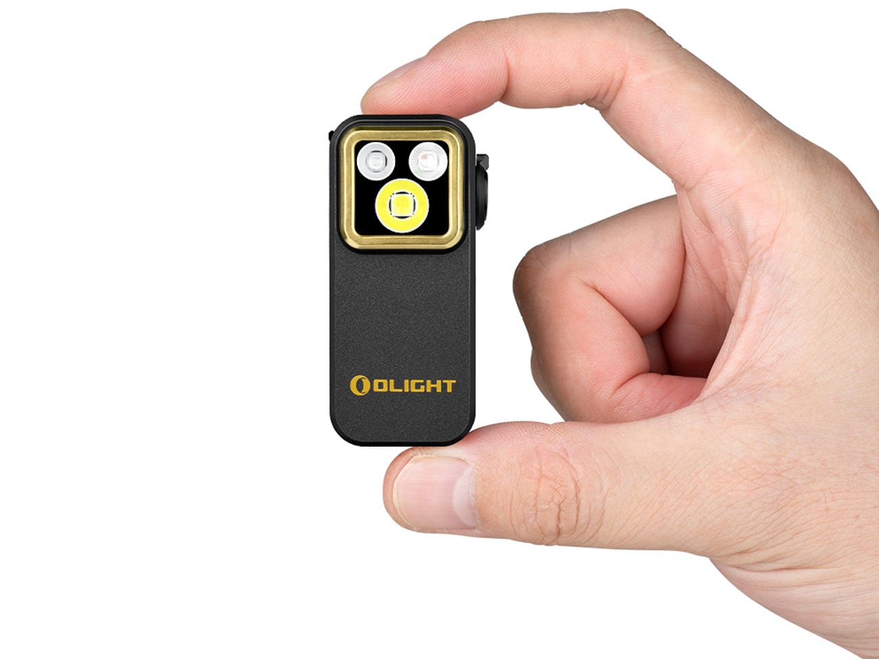
At 57 × 28 × 27 mm and 53 grams, the Olight Oclip Pro S is the kind of EDC tool that earns its carry weight by doing considerably more than one thing. Its integrated clip handles pockets, bags, and gear straps, while a magnetic attachment option makes it a capable hands-free light for tasks that require both hands. The body is compact enough to disappear in a pocket until it becomes exactly what is needed, which is the best quality a carry tool can have.
The 5-in-1 lighting system is what elevates it beyond a simple flashlight. Primary white LEDs deliver up to 600 lumens with an 80-meter beam distance, switchable between flood and spotlight modes. RGB illumination adds red, green, and blue signaling options. A 365nm UV light extends its usefulness into detecting fluorescent materials and checking cleanliness in specialized situations. A side dial controls the entire system intuitively, and battery life reaches up to 144 hours in low mode with USB-C charging throughout.
What We Like:
Five distinct lighting modes packed into a 53-gram body is a genuine engineering feat, and the UV capability is the kind of quiet surprise that distinguishes thoughtful design from merely competent design
USB-C charging integrates it cleanly into any modern kit without the need for proprietary cables or spare batteries
What We Dislike:
A dad who primarily needs a reliable everyday flashlight may never explore most of what the Oclip Pro S actually offers
At maximum brightness, thermal management limits extended runtime, which is a reasonable engineering trade-off but worth knowing before relying on it in demanding conditions
5. Side A Cassette Speaker
The Side A Cassette Speaker is shaped exactly like a real mixtape: transparent shell, side A label, the whole thing, and it makes no apologies for that. At $49, it is a speaker you would buy for what it looks like before you hear what it sounds like. The design is faithful enough to prompt a genuine double-take. Weighing just 80 grams with the clear storage case that doubles as a display stand, it occupies almost no space on a shelf but immediately defines wherever it sits.
Bluetooth 5.3 handles wireless connection to phones, tablets, and laptops. A microSD card slot supports offline MP3 playback for anyone who still curates music rather than just streaming it. Battery life runs to six hours at full volume, with a two-hour recharge via the included USB-C cable. The sound is tuned to evoke analog warmth rather than clinical accuracy, which is entirely the right call for the character of the object. For a dad who remembers making mixtapes, this does the emotional work before it plays a single note.
The cassette form is executed with enough fidelity to spark a real conversation, not just a brief smile before it gets set aside on a shelf
microSD offline playback is a thoughtful addition for anyone who still curates their own playlists rather than surrendering entirely to an algorithm
What We Dislike:
Audio performance leans toward warmth and character rather than reference quality, which suits the object perfectly but is worth setting expectations for anyone anticipating hi-fi output at this price
Six-hour battery life is modest compared to larger Bluetooth speakers, though the size makes the trade-off obvious and entirely forgivable
Good Design Doesn’t Need a Bow on Top
The best gift for a design-minded dad isn’t the most expensive thing on the shelf. It’s the one that shows you understood something about how he thinks and what he values. A pen that never needs ink. A leather roll shaped by hand in Japan. A flashlight that carries five functions in a 53-gram body. These aren’t objects that need explaining when someone picks them up. They make their case on their own.
Each pick here falls under $135 and spans a range of interests from desk organization to EDC carry to audio nostalgia. What they share is a commitment to material honesty and considered function. Father’s Day doesn’t have to be another gift that gets thanked and quietly forgotten. Give something built to last, and there is a good chance it becomes the thing he mentions to people for years, without quite being able to explain why.