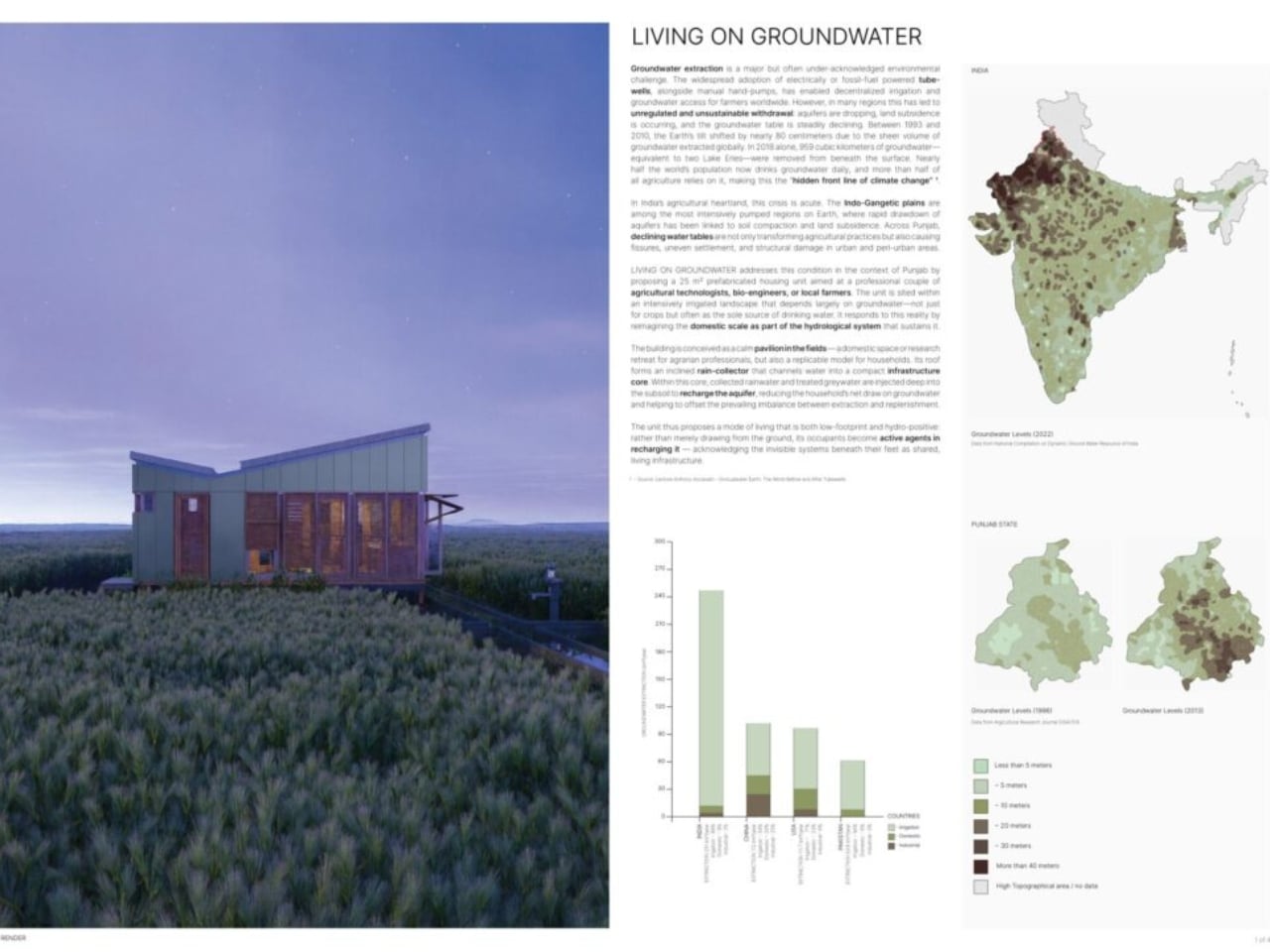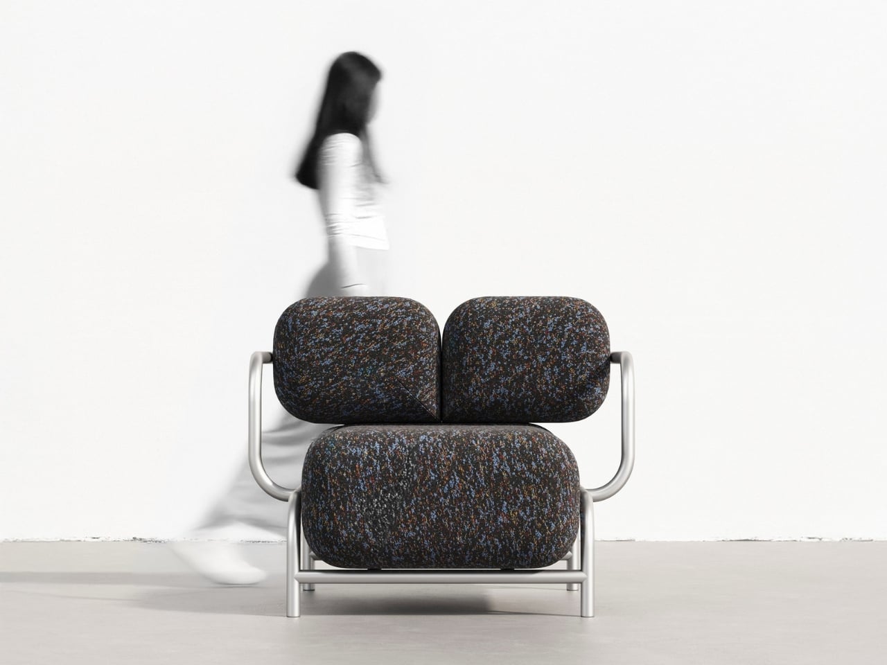
There’s something beautifully contradictory about furniture that looks hard as stone but promises cloud-like comfort. That’s exactly what Mudu Studio has achieved with the Rokko Sofa, a design concept that takes inspiration from massive geological formations and transforms them into something you’d actually want to sink into after a long day.
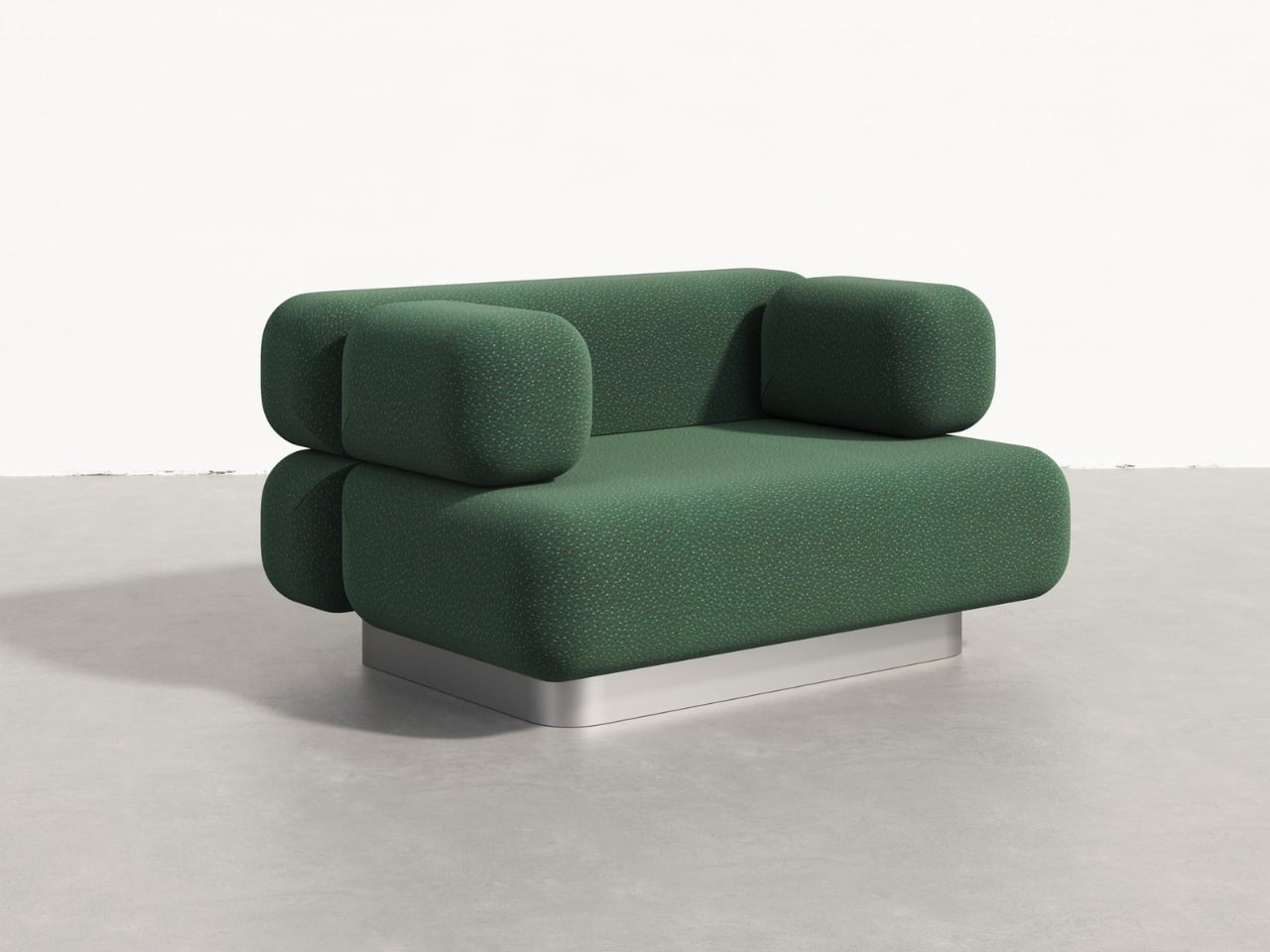
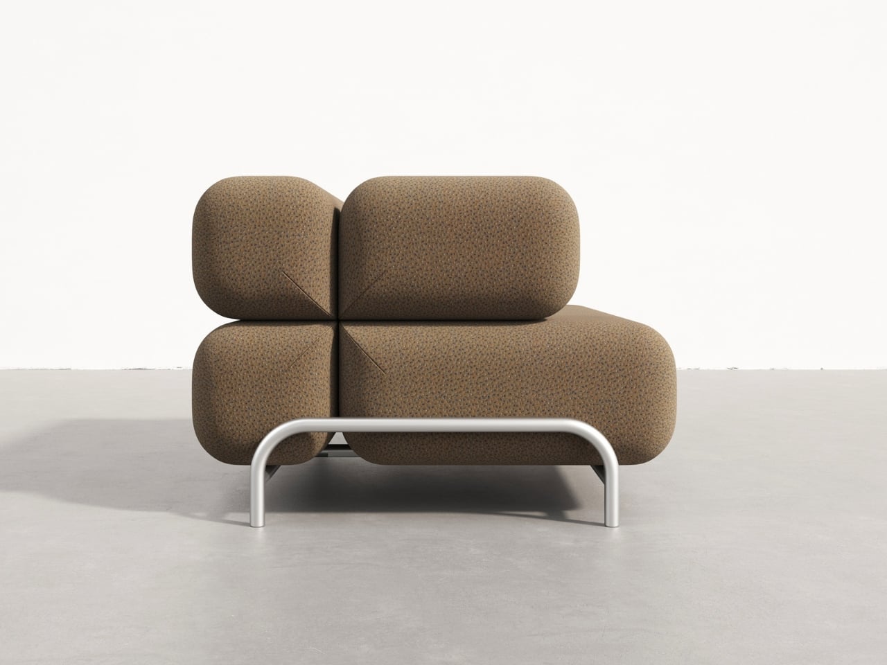
Look at the Rokko series and you’ll immediately see the resemblance to smooth river stones or ancient boulders shaped by centuries of wind and water. But instead of cold, unyielding rock, these sculptural forms are generously upholstered cushions that capture the visual weight and monumentality of stone while offering the kind of comfort that makes you want to stay put for hours. The genius here is in that tension between appearance and reality, between what looks solid and immovable and what actually cradles your body.
Designer: Mudu Studio
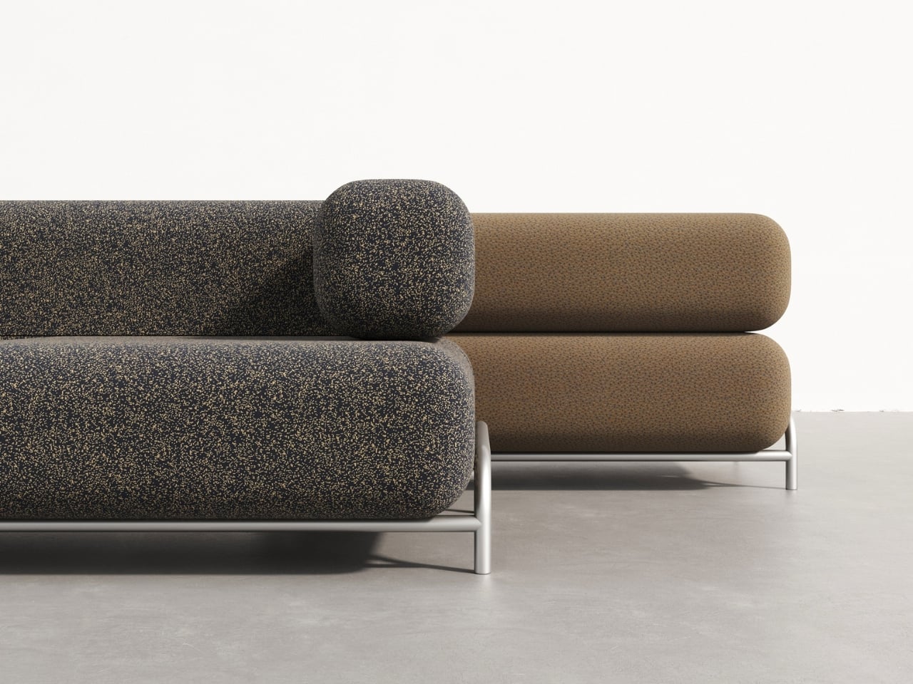
The design plays with scale in an interesting way. These aren’t your typical sleek, minimalist cushions. They’re voluminous and bold, each one reading as a distinct sculptural element. Yet despite their substantial presence, the pieces don’t feel heavy or overwhelming in a space. That’s largely thanks to the contrast Mudu Studio creates with the base structure.
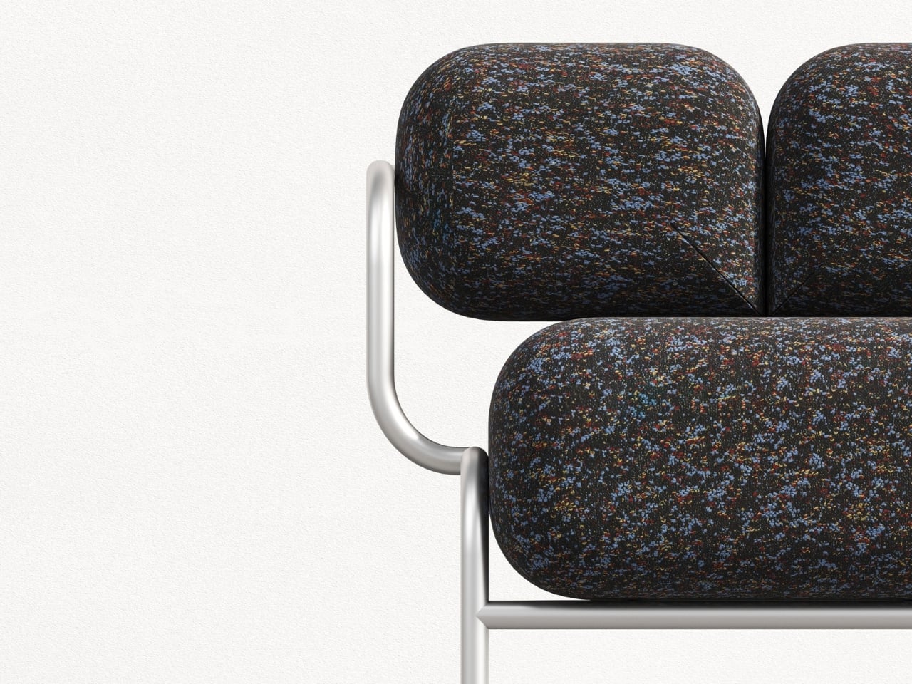
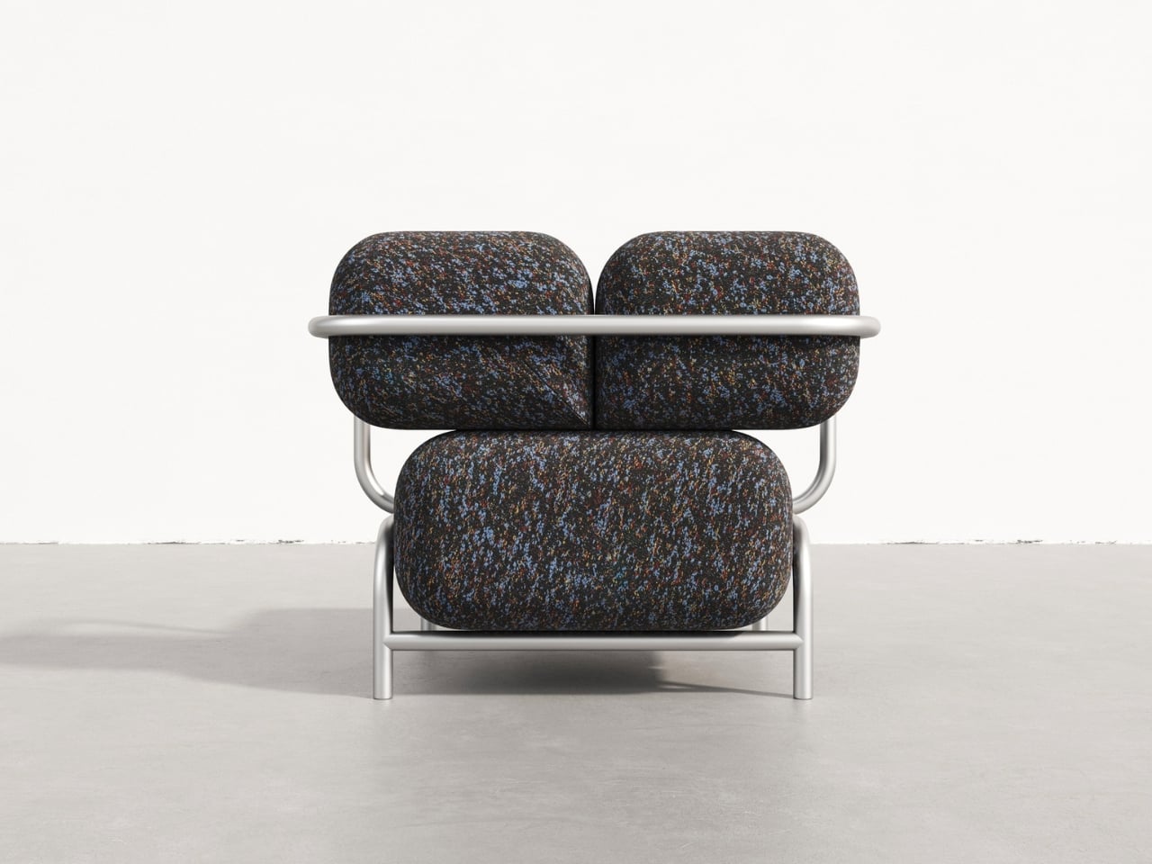
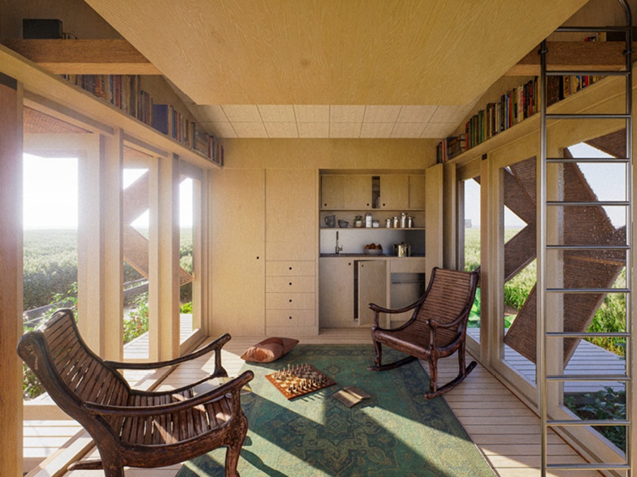
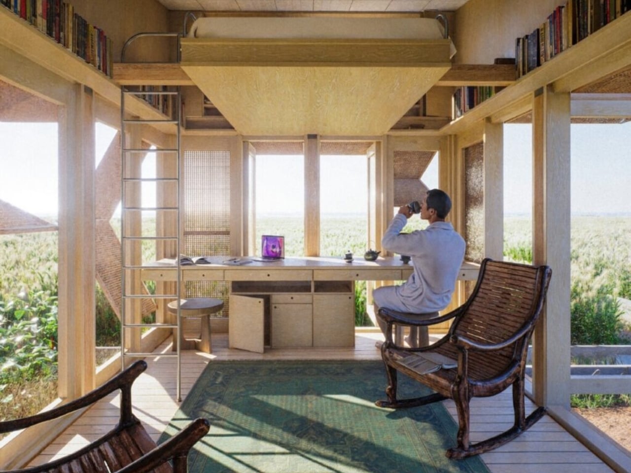
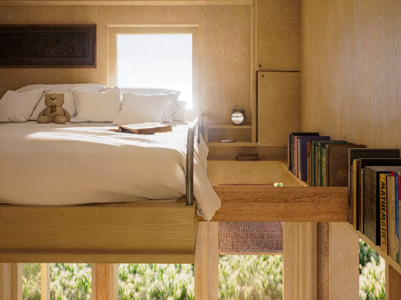
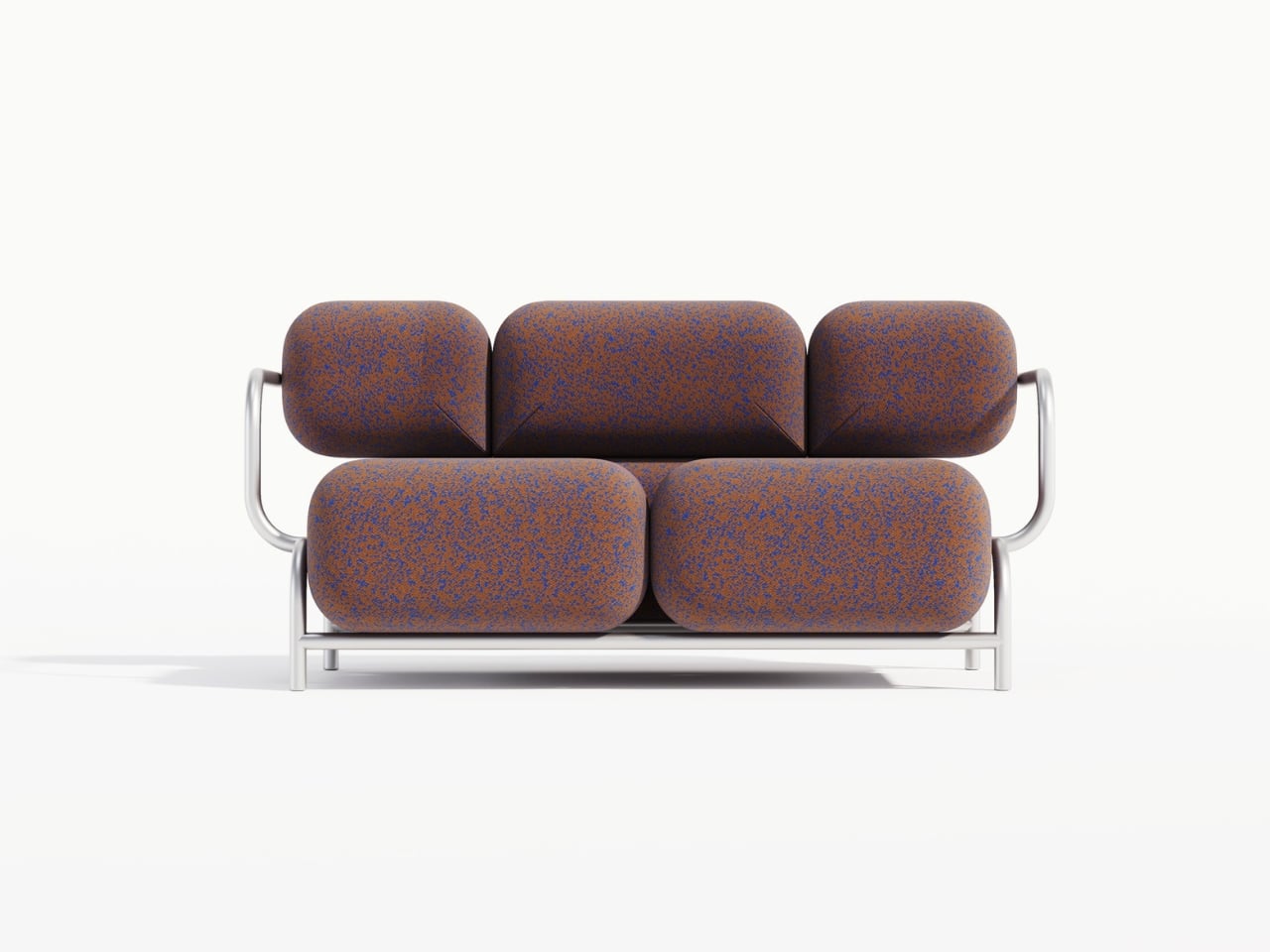
The frame options are where things get really interesting. The main collection features processed aluminum bases that are remarkably slender and airy. It’s almost like the massive cushions are floating, held aloft by these delicate metal structures. The visual lightness of the aluminum creates this wonderful illusion of defying gravity. You’ve got these boulder-sized forms that appear to hover just above the ground, supported by what looks like nothing more than bent wire (though obviously it’s engineered to be far sturdier than that).
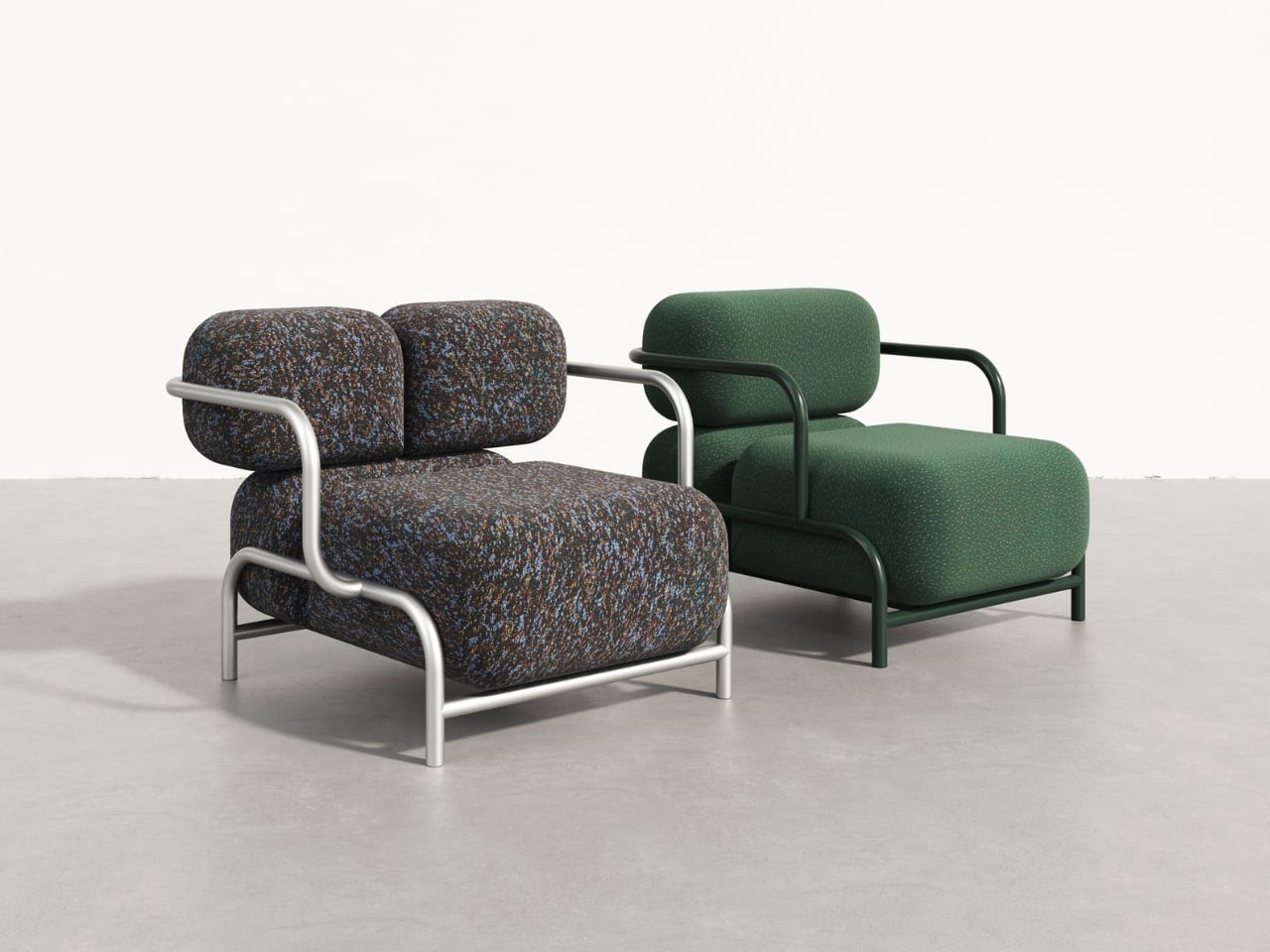
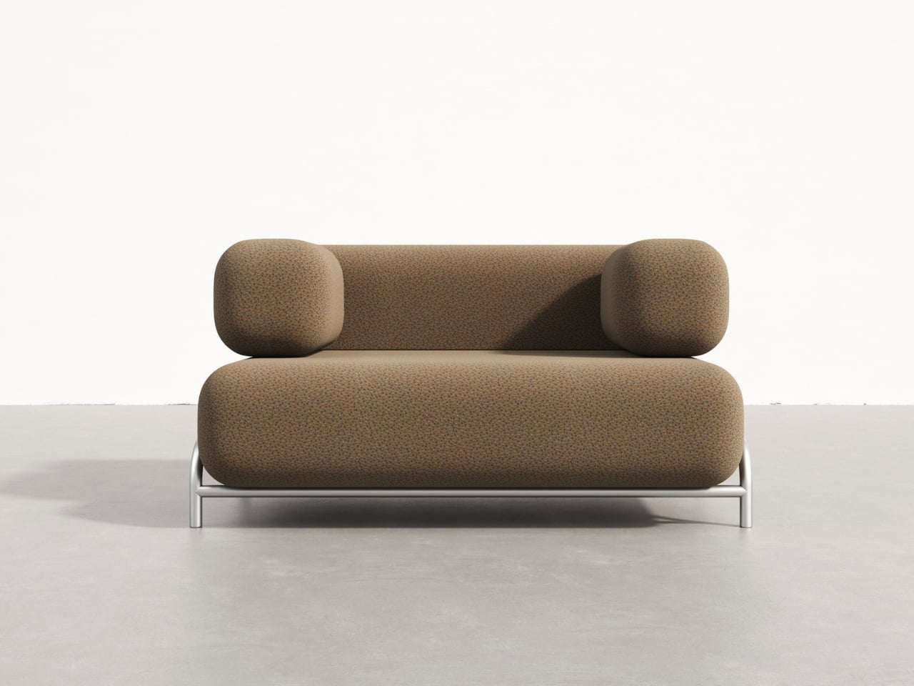
For those who prefer a different aesthetic, there’s an alternative version with a podium base wrapped in stainless steel. This option grounds the piece more firmly, adding a sense of refined solidity that complements the cushions in a different way. Instead of floating stones, you get something more architecturally grounded, like sculptures placed on pedestals in a gallery.
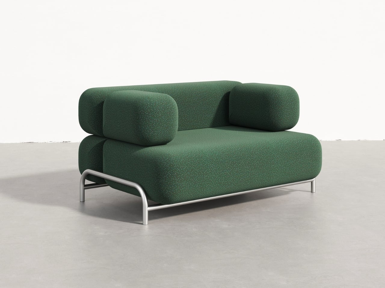
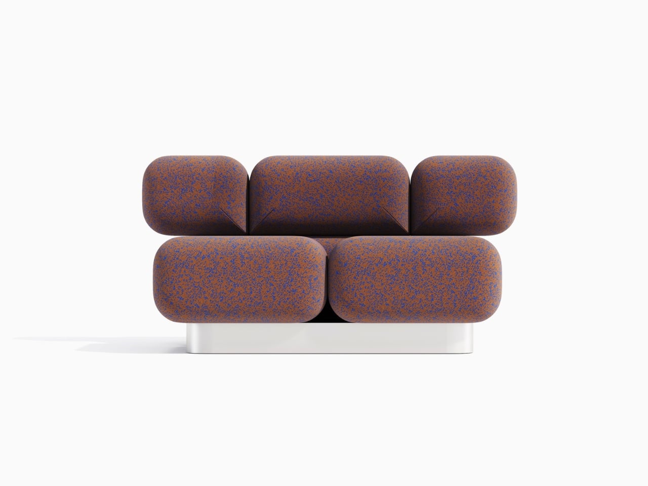
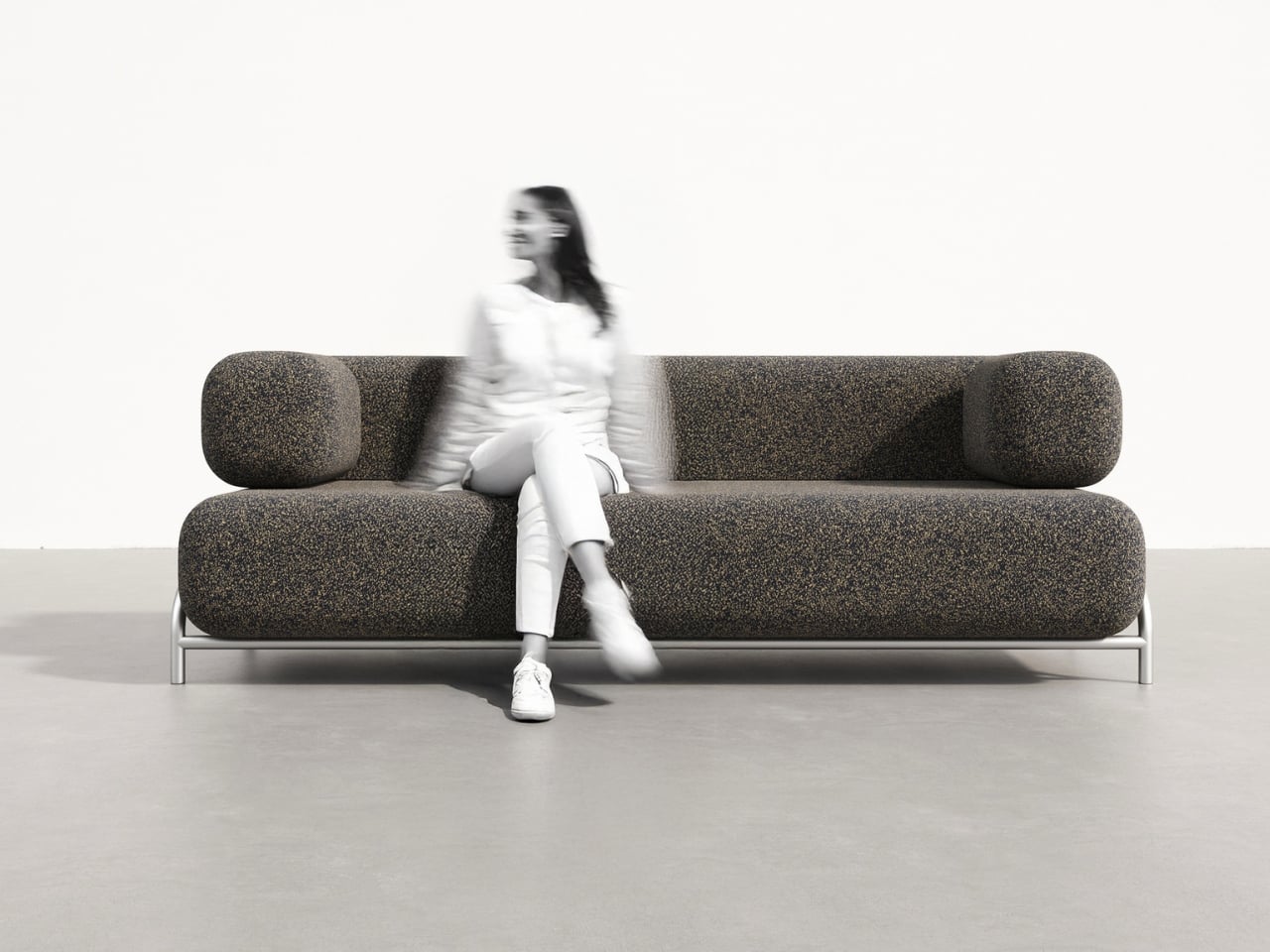
The modularity of the system is another smart move. From the images, you can see everything from compact single-seaters to generous three-seater configurations. Some versions include wraparound armrests that echo the cushions’ rounded forms, while others keep things more open and flexible. The textiles shown range from earthy, tweedy textures that emphasize the geological inspiration to rich solid colors that take the design in a more contemporary direction.
What makes the Rokko particularly relevant right now is how it bridges multiple design movements. There’s definitely some postmodern playfulness in the exaggerated forms and the way different materials and aesthetics collide. But there’s also a nod to biophilic design, that growing interest in bringing natural forms and textures into our interiors. And the modular, configurable nature speaks to contemporary needs for flexible, adaptable furniture that can evolve with how we actually use our spaces.
The fabric choices visible in the renderings are particularly thoughtful. Those speckled, textured options genuinely evoke stone surfaces without being literal about it. They give the cushions visual depth and interest up close while reading as solid, substantial forms from a distance. It’s the kind of detail that elevates a concept from clever idea to genuinely covetable piece.
Right now, the Rokko exists as a concept looking for a manufacturer, which means these gorgeous renderings represent potential rather than reality. But that’s often how the most interesting furniture begins. Designers push boundaries with bold ideas, and the right manufacturing partner helps figure out how to translate vision into something people can actually purchase and live with.
For anyone who appreciates furniture that makes a statement without shouting, that brings sculptural presence without sacrificing comfort, the Rokko Sofa is definitely one to watch. It’s the kind of design that could easily become an icon if it finds its way to production. Those cushions that look like they were carved by ancient forces but actually cradle you in modern comfort? That’s the kind of paradox that makes design fascinating.
The post This Sofa Looks Like Stone Boulders But Feels Like Clouds first appeared on Yanko Design.