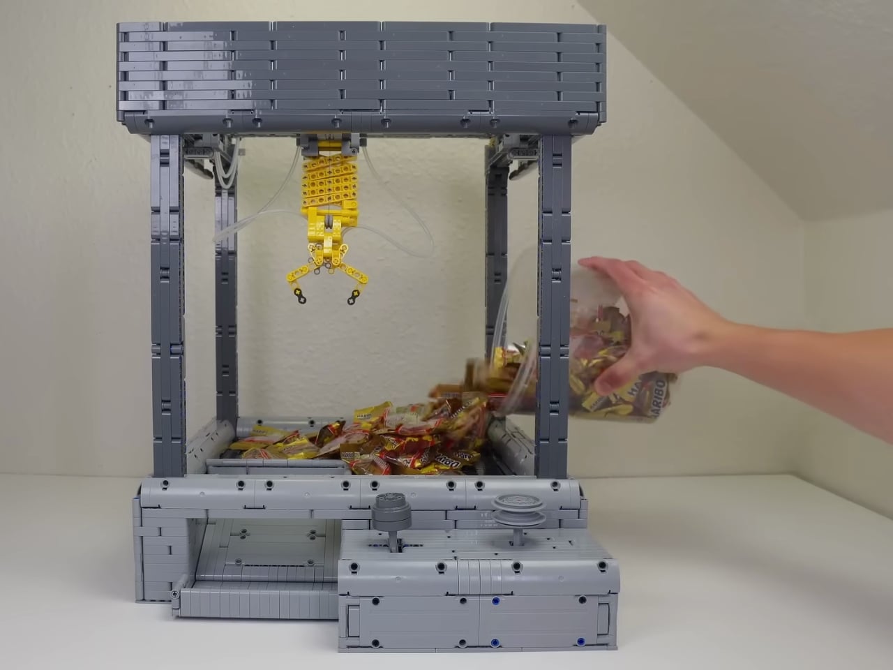
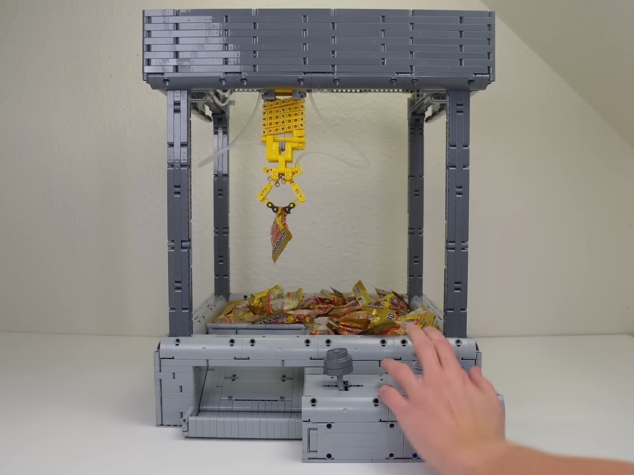
You know that feeling when you’re at an arcade, pumping quarters into a claw machine, convinced that this time you’ll finally snag that plush toy? Well, someone decided to recreate that delightful torture in LEGO form, and if I could, I would probably line up to buy this one.
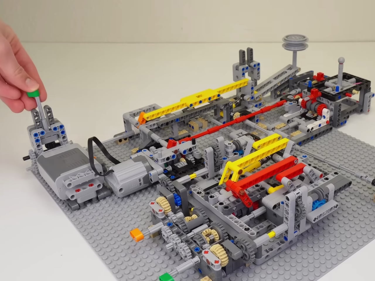
Brick Builds, a YouTuber with a knack for mechanical marvels, recently shared their fully functional LEGO claw machine, and it’s the kind of project that makes you want to dump out your entire brick collection and start building immediately. Sure, plenty of LEGO enthusiasts have tackled claw machines before, but what sets this one apart is its elegant simplicity paired with surprisingly complex engineering.
Designer: Brick Builds
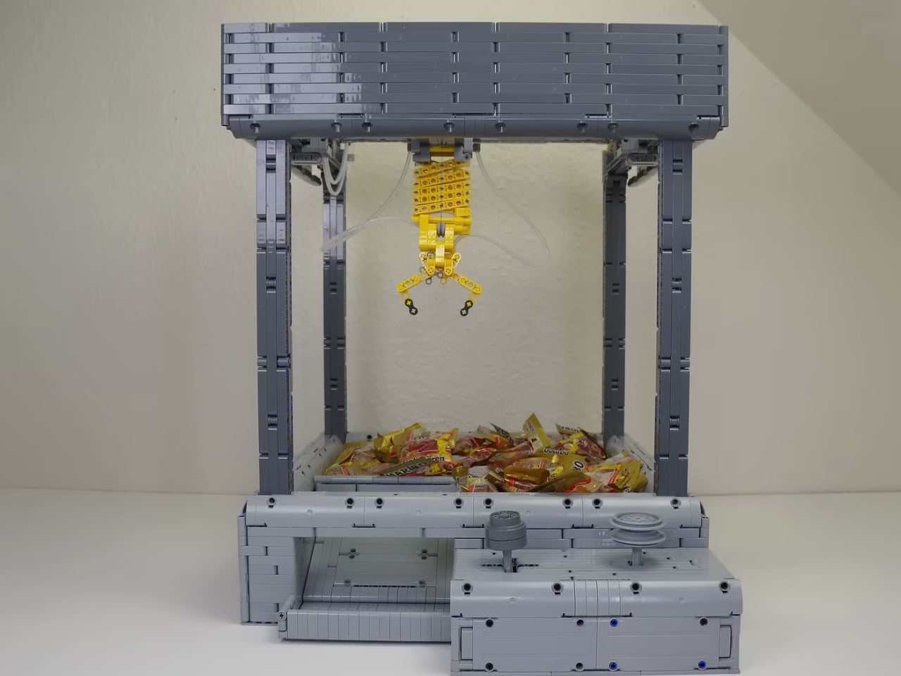
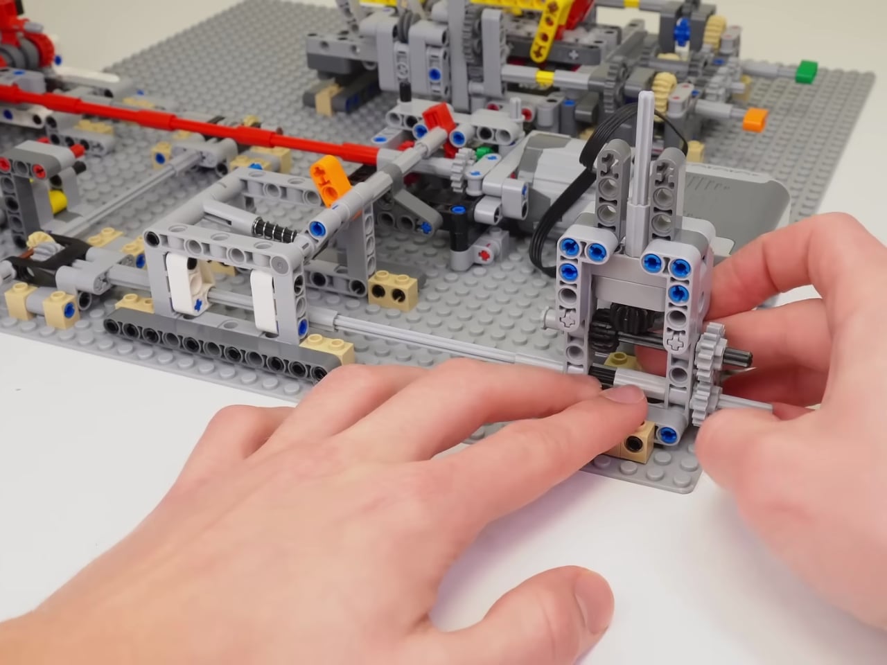
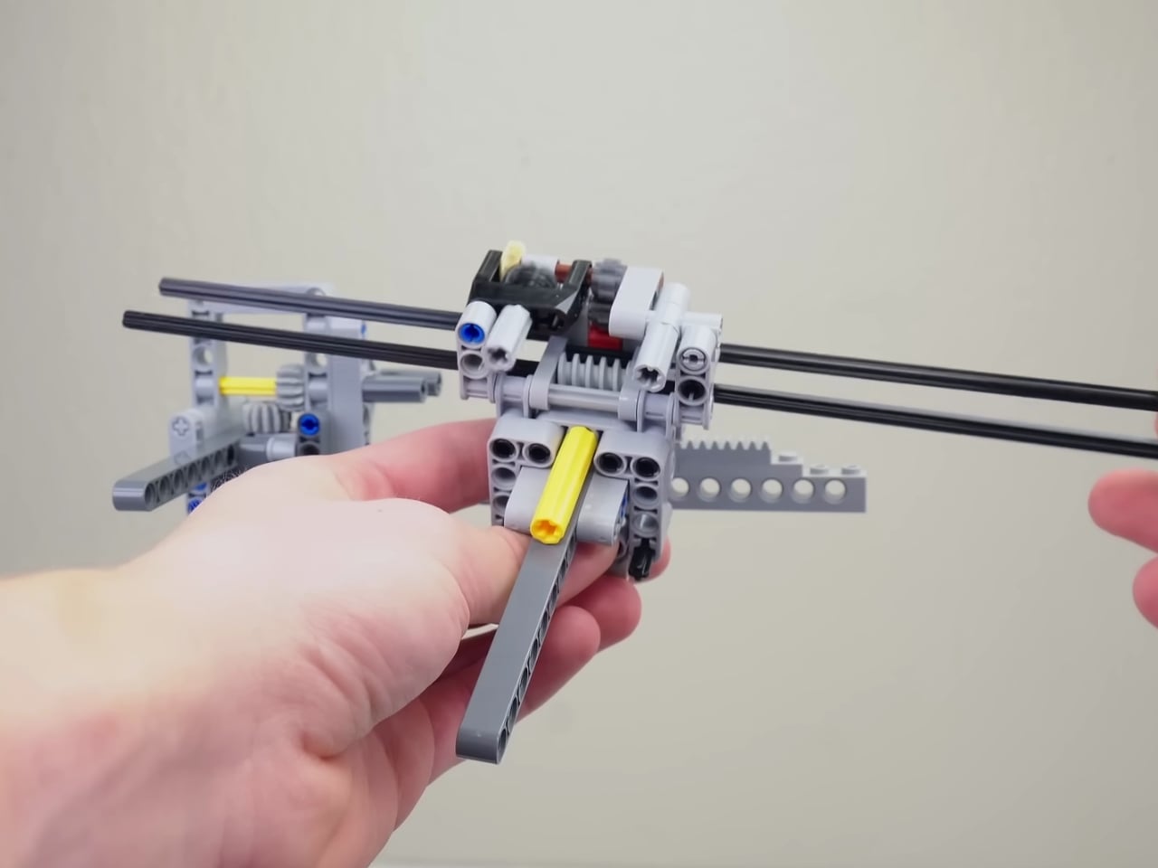
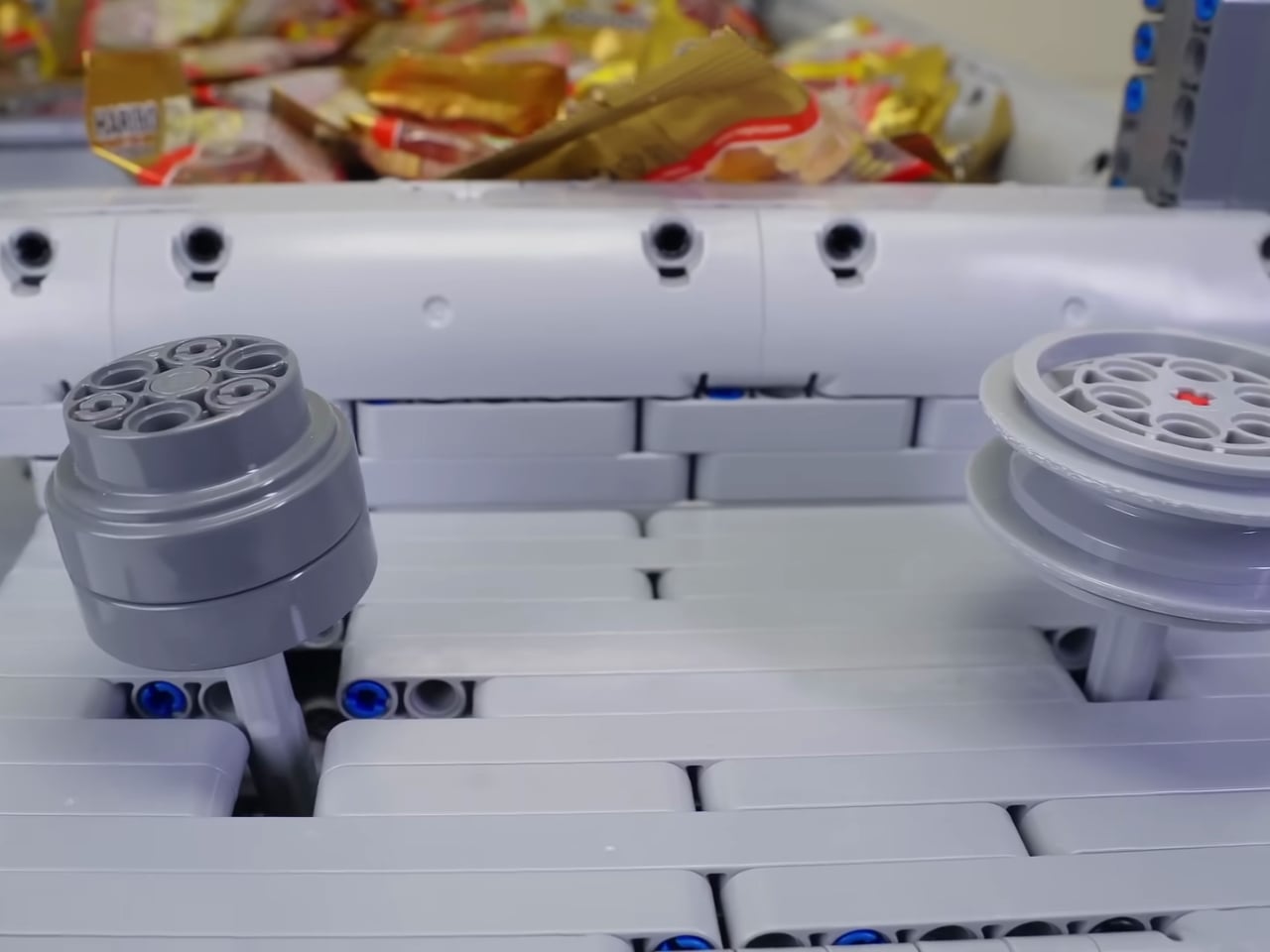
Here’s the kicker: the entire machine runs on just a single motor. No fancy Mindstorms robotics kits, no Power Functions overload, just one motor and an absolutely ingenious system of gearboxes doing all the heavy lifting. If you’ve ever tried building anything motorized with LEGO, you know how easy it is to throw motors at a problem until it works. But Brick Builds went the opposite direction, creating something that’s mechanically efficient and genuinely impressive to watch in action.
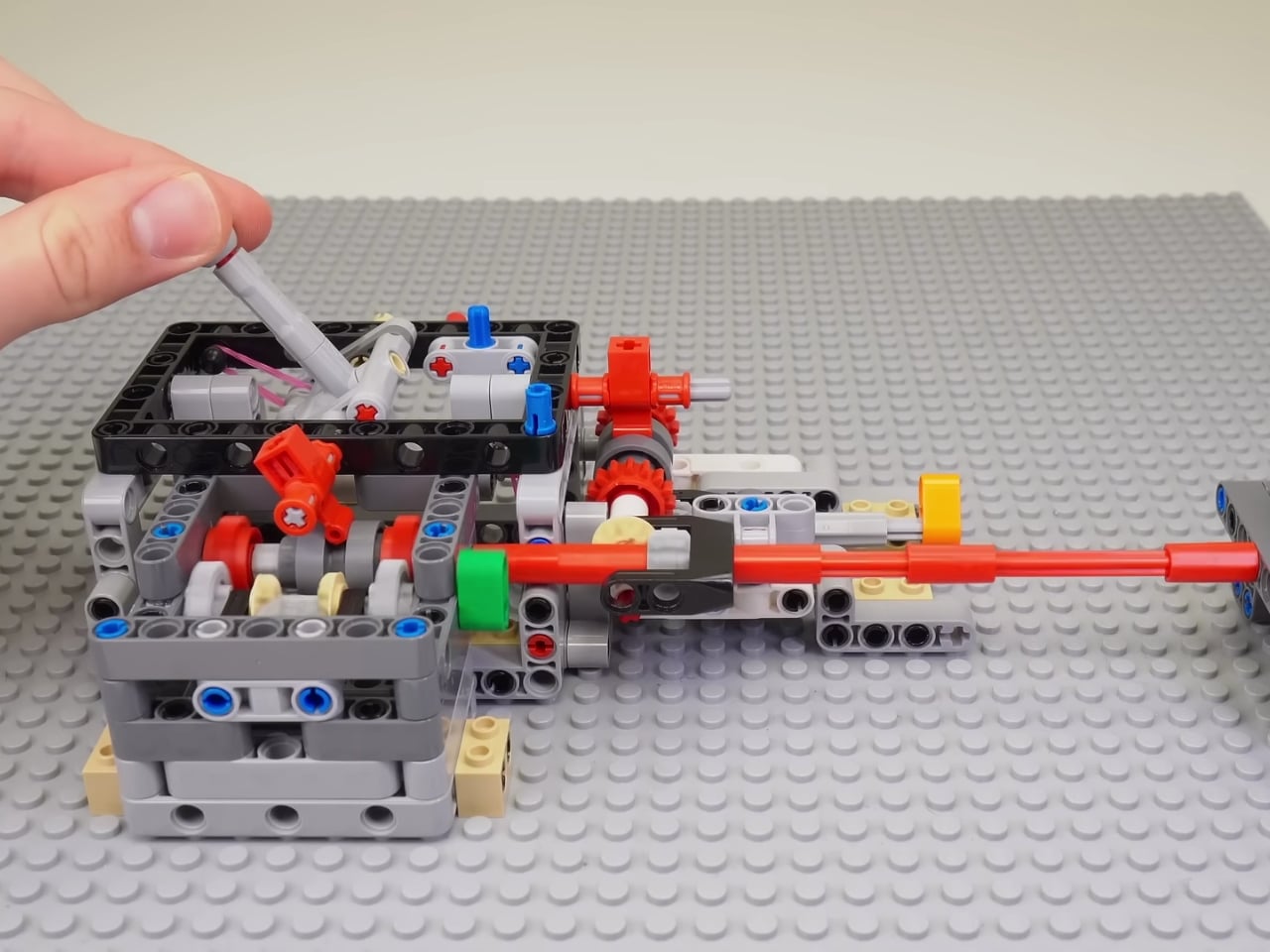
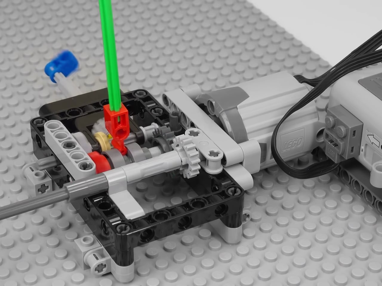
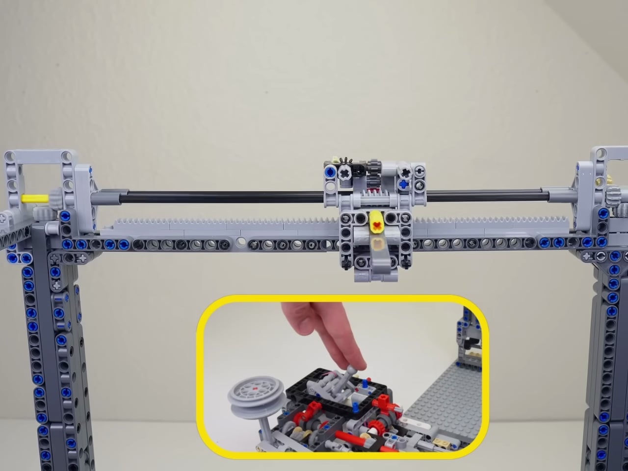
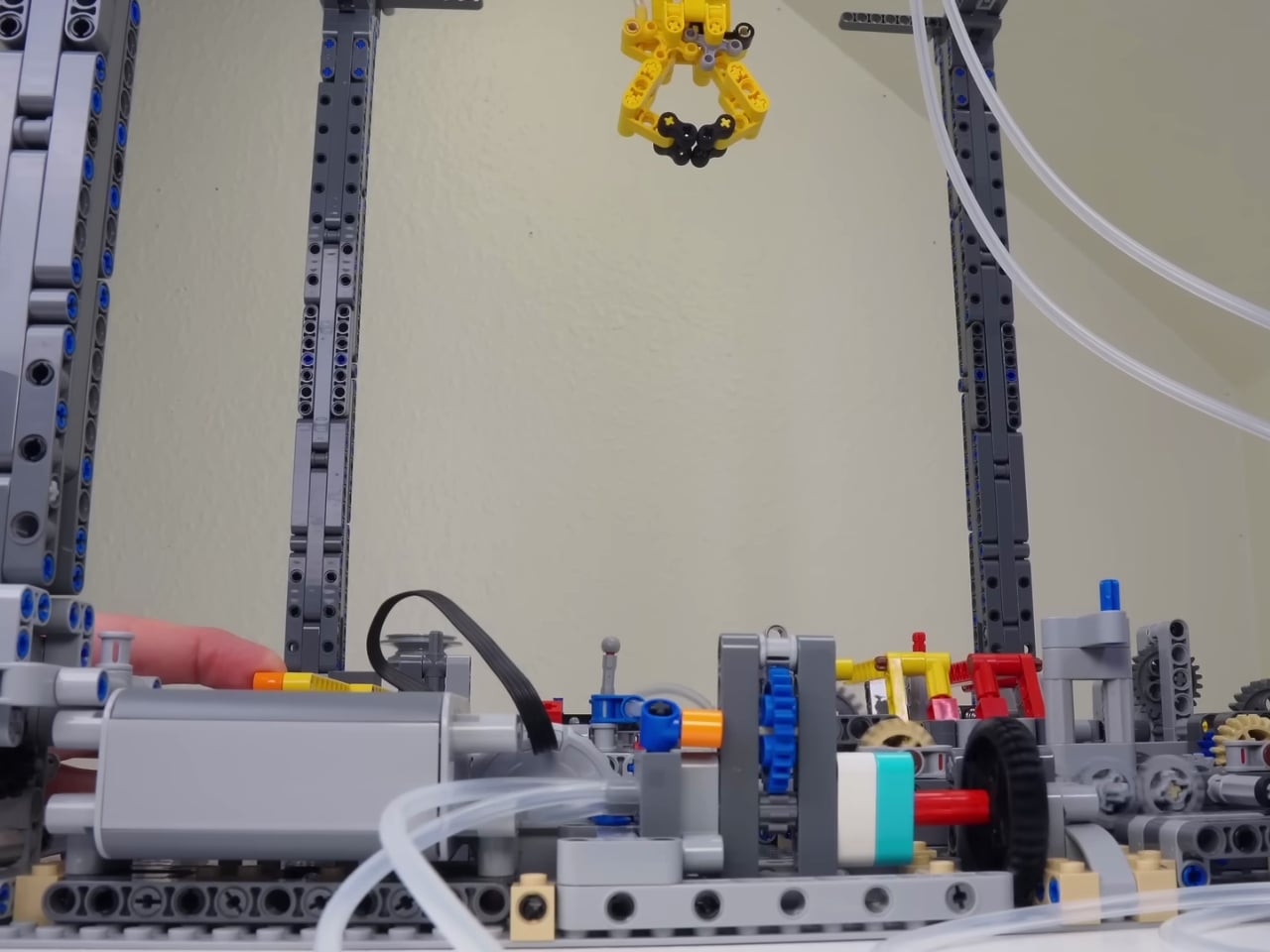
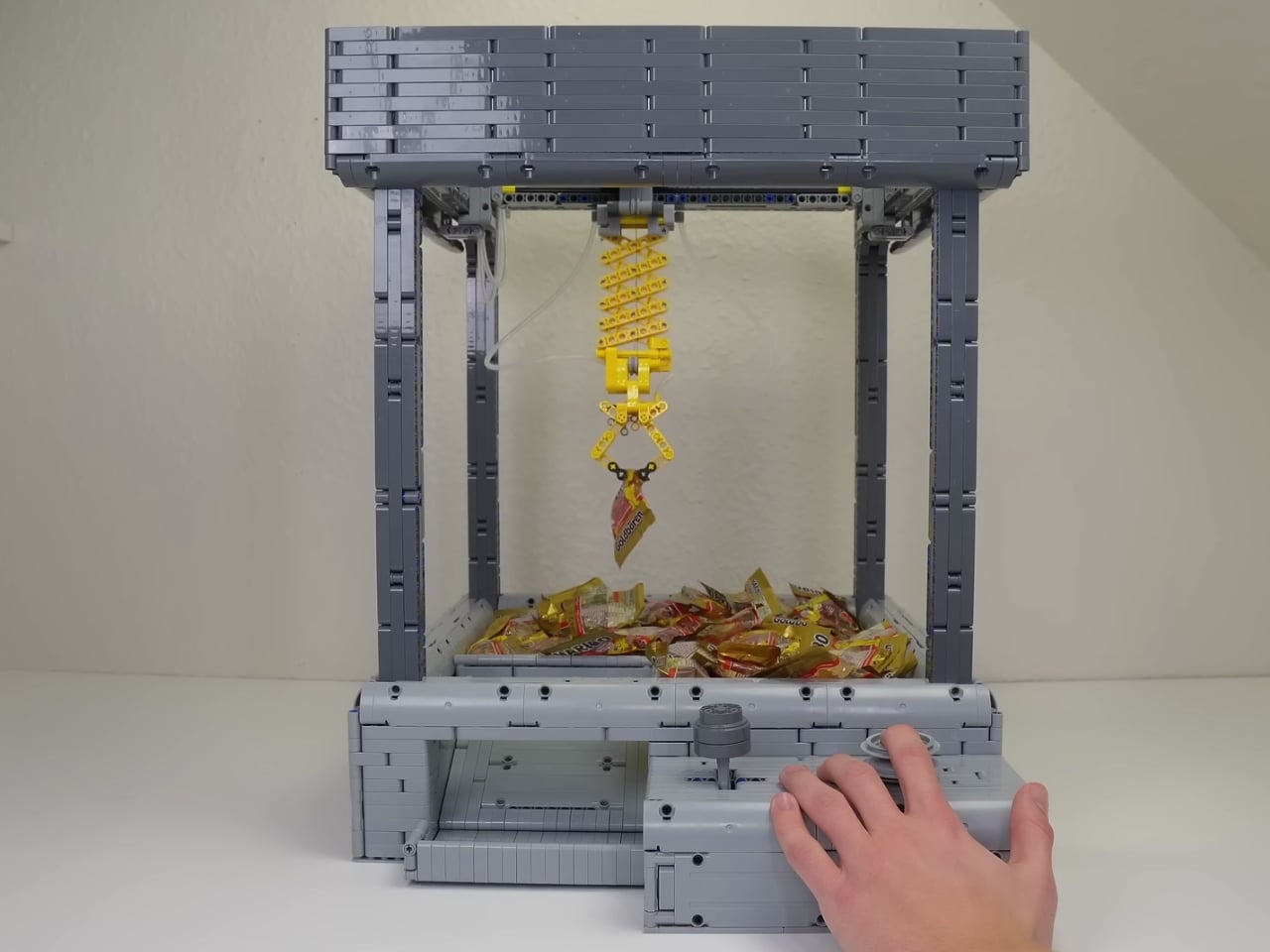
The magic happens through a series of clever gearboxes that control the claw’s movement in multiple directions. You’ve got your horizontal travel, your vertical drop, and of course, the all-important grip function. Getting one motor to orchestrate all of that? That’s the kind of problem-solving that separates casual builders from true LEGO engineers. The scissor mechanism used for the claw itself is particularly neat, giving it that satisfying open-and-close action we all recognize from the arcade versions that constantly disappoint us.
What I love about projects like this is how they blur the line between toy and genuine engineering exercise. LEGO has always been about more than just following instructions and building whatever’s on the box. It’s a creative medium that rewards experimentation and mechanical thinking. When you watch this claw machine in operation, you’re not just seeing plastic bricks move around. You’re witnessing someone who really understands concepts like gear ratios, mechanical advantage, and sequential motion control.
The build also serves as a reminder of why LEGO remains relevant in an age of sophisticated robotics kits and 3D printing. There’s something deeply satisfying about working within constraints. By limiting the design to a single motor and standard LEGO components, Brick Builds essentially gave themselves a puzzle to solve. How do you create complex motion from simple inputs? How do you translate rotational force into the precise movements needed for a claw machine? These aren’t trivial questions, and the answers are all visible in the finished product.
If you’re curious about the nitty-gritty details, Brick Builds included captions in their build video that break down the mechanical systems at play. It’s worth watching even if you’re not planning to build one yourself, because there’s genuine educational value in seeing how all those gears and axles work together. Plus, let’s be real, watching a LEGO claw machine successfully grab and transport a small object is oddly mesmerizing.
This kind of creation also speaks to the vibrant community of adult LEGO fans who’ve elevated brick building into legitimate artistic and engineering territory. MOCs, or “My Own Creations,” have become increasingly sophisticated over the years, with builders sharing techniques, competing in design challenges, and pushing the boundaries of what’s possible with those iconic interlocking bricks.
Whether you’re a longtime LEGO enthusiast, a design nerd who appreciates elegant mechanical solutions, or just someone who enjoys watching cool stuff work, this claw machine deserves your attention. It’s a perfect example of how creativity and technical skill can transform a childhood toy into something genuinely impressive. And unlike the arcade version, this one probably won’t eat your quarters and leave you empty-handed.
The post This LEGO Claw Machine Uses Just One Motor (And Lots of Genius) first appeared on Yanko Design.