Every design exhibition ends the same way. The crowds leave, the lights go out, and someone starts breaking things down. Usually, all that carefully curated architecture gets tossed, trucked away, or scrapped with minimal ceremony. It’s a pattern so common we barely register it anymore. Most temporary pavilions are built to impress, not to last, and that’s always felt like an uncomfortable contradiction for an industry that increasingly talks about sustainability.
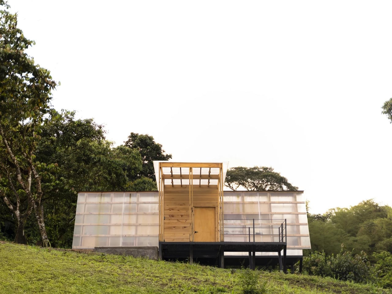
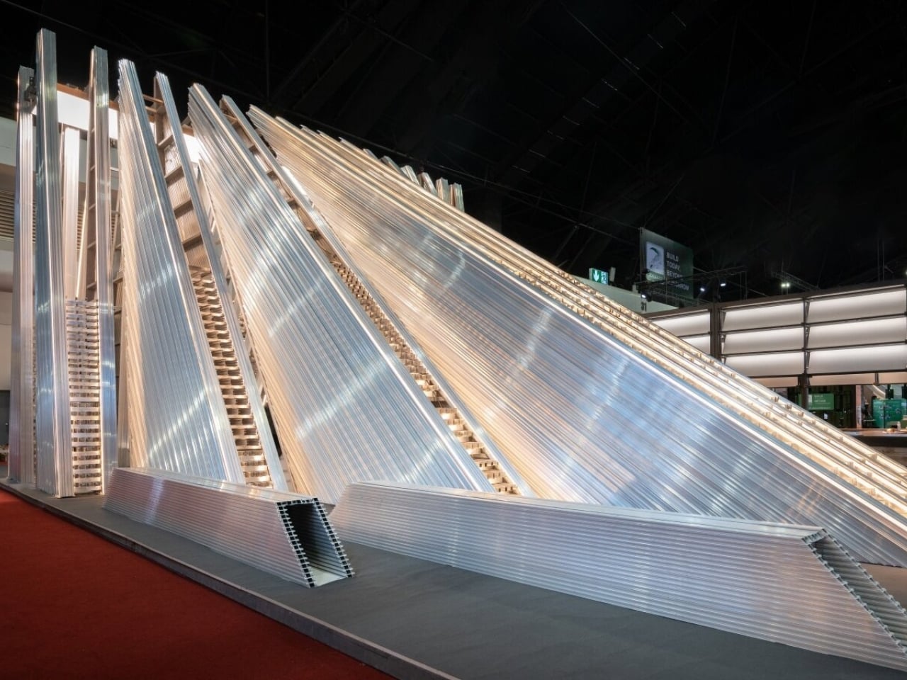
UNFOLD, a thematic pavilion designed by Bangkok-based Unknown Surface Studio for aluminum brand Aluframe, takes direct aim at that contradiction. Not loudly, not with a manifesto, but through the logic of how it was designed and what it’s made of. The premise is deceptively simple: build a temporary structure that isn’t actually temporary in the way we’ve come to accept.
Designer: Unknown Surface Studio for Aluframe
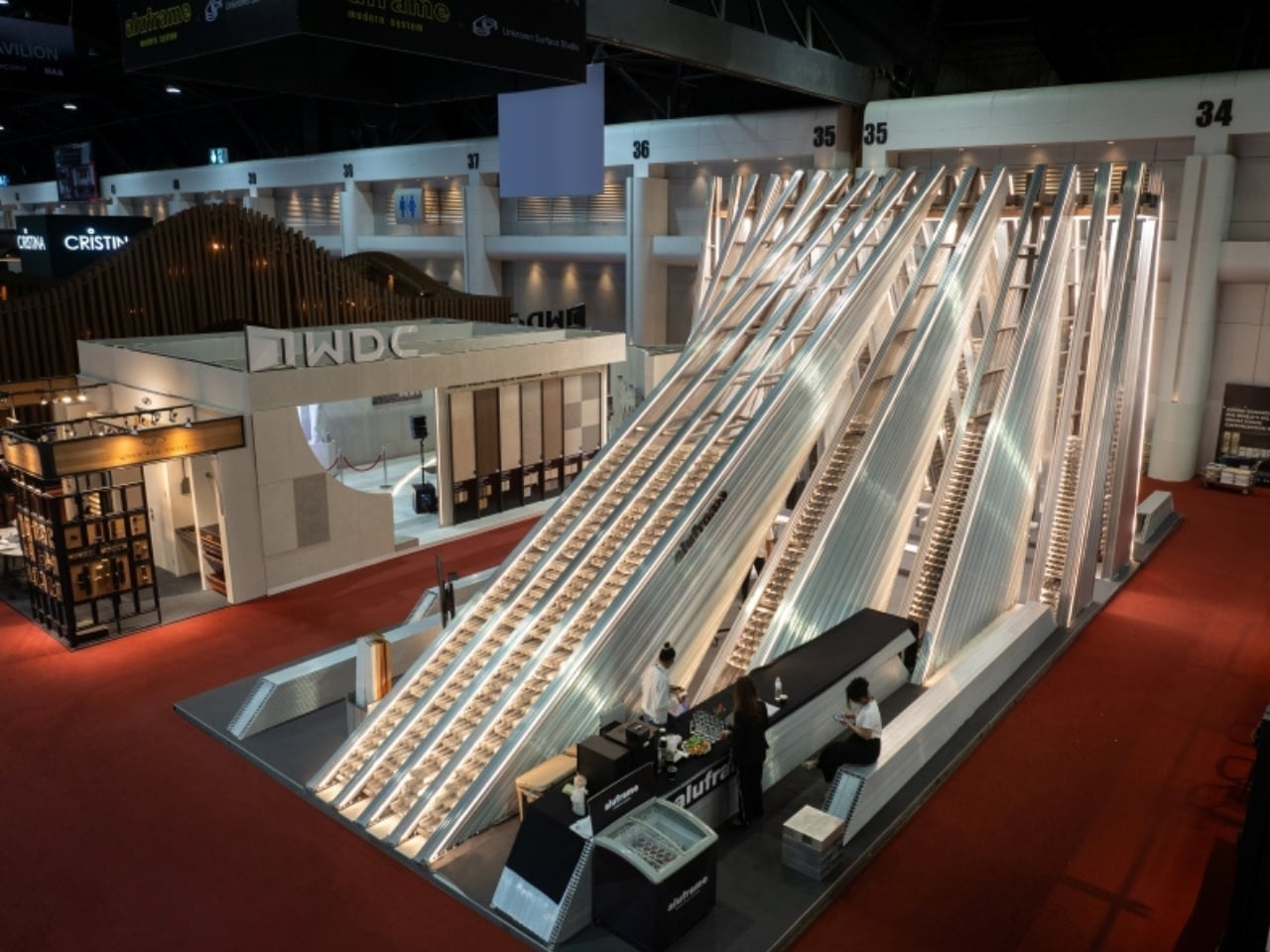
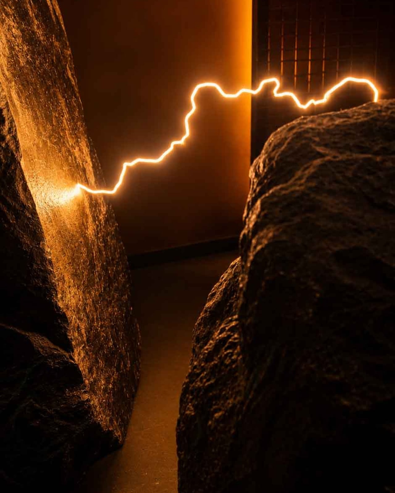
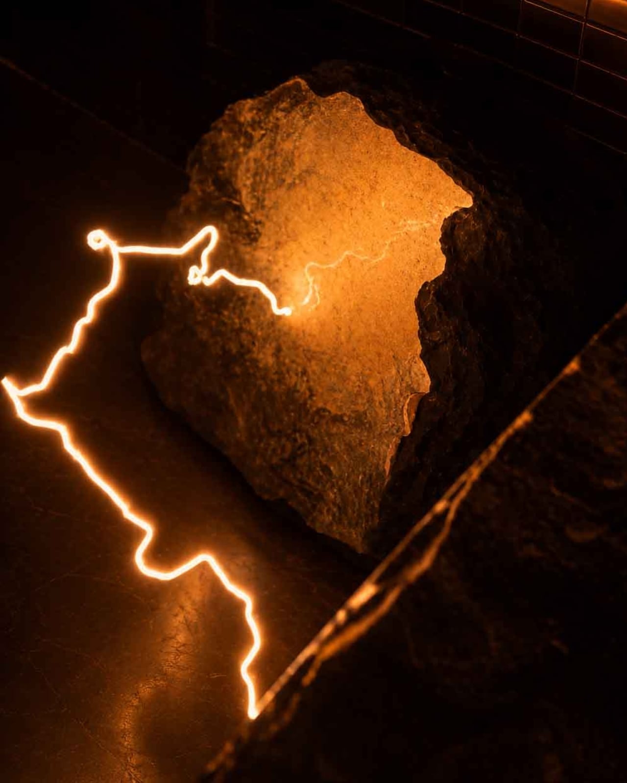
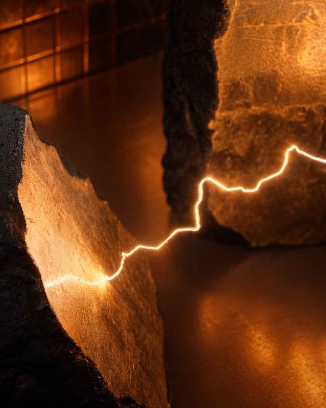
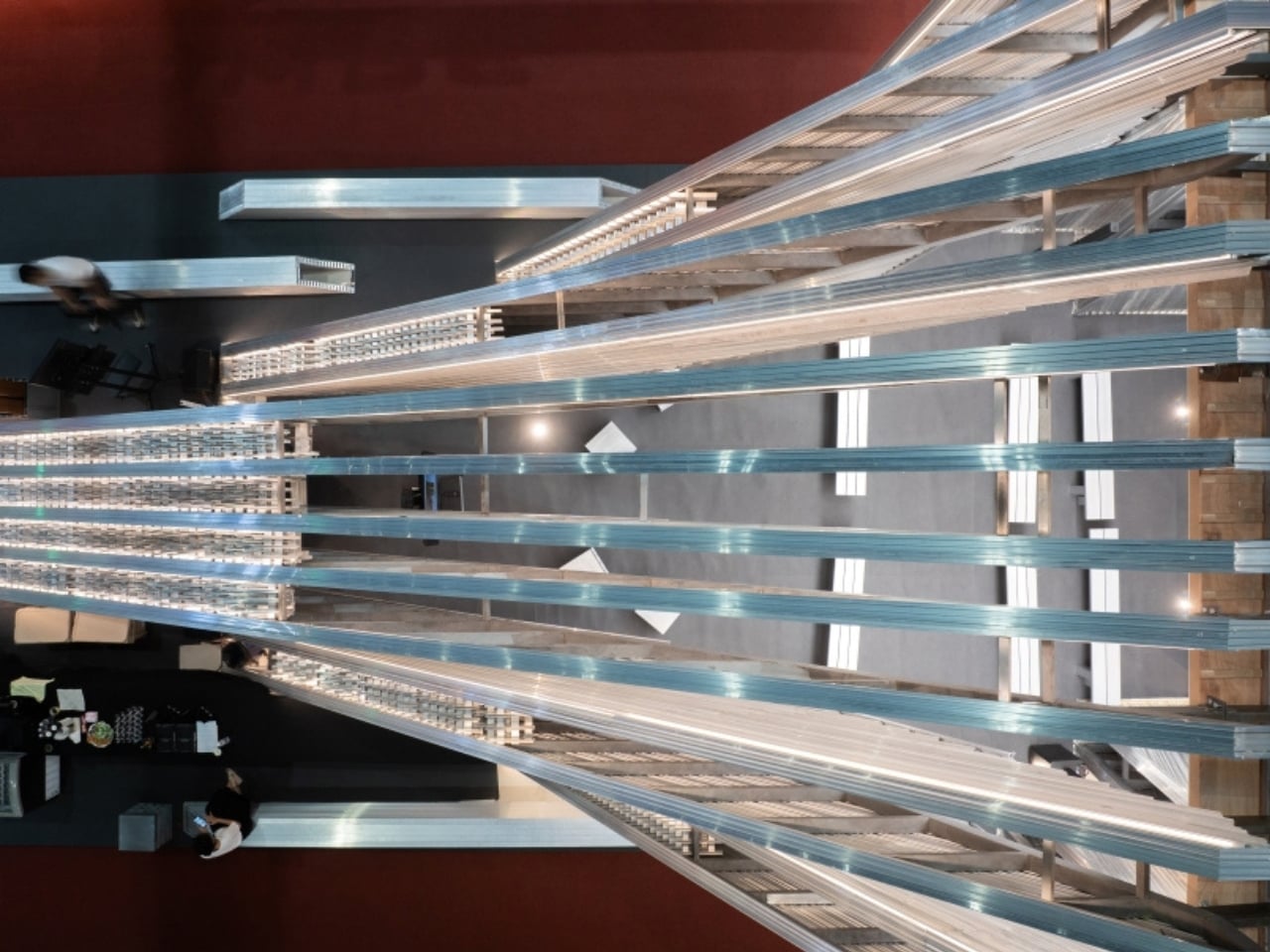
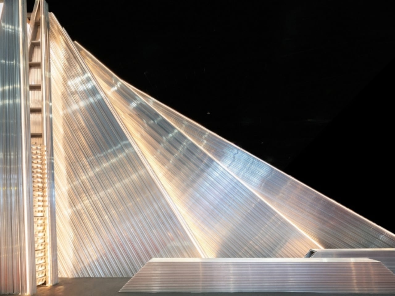
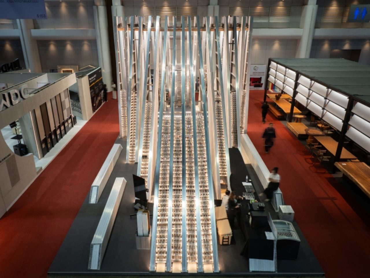
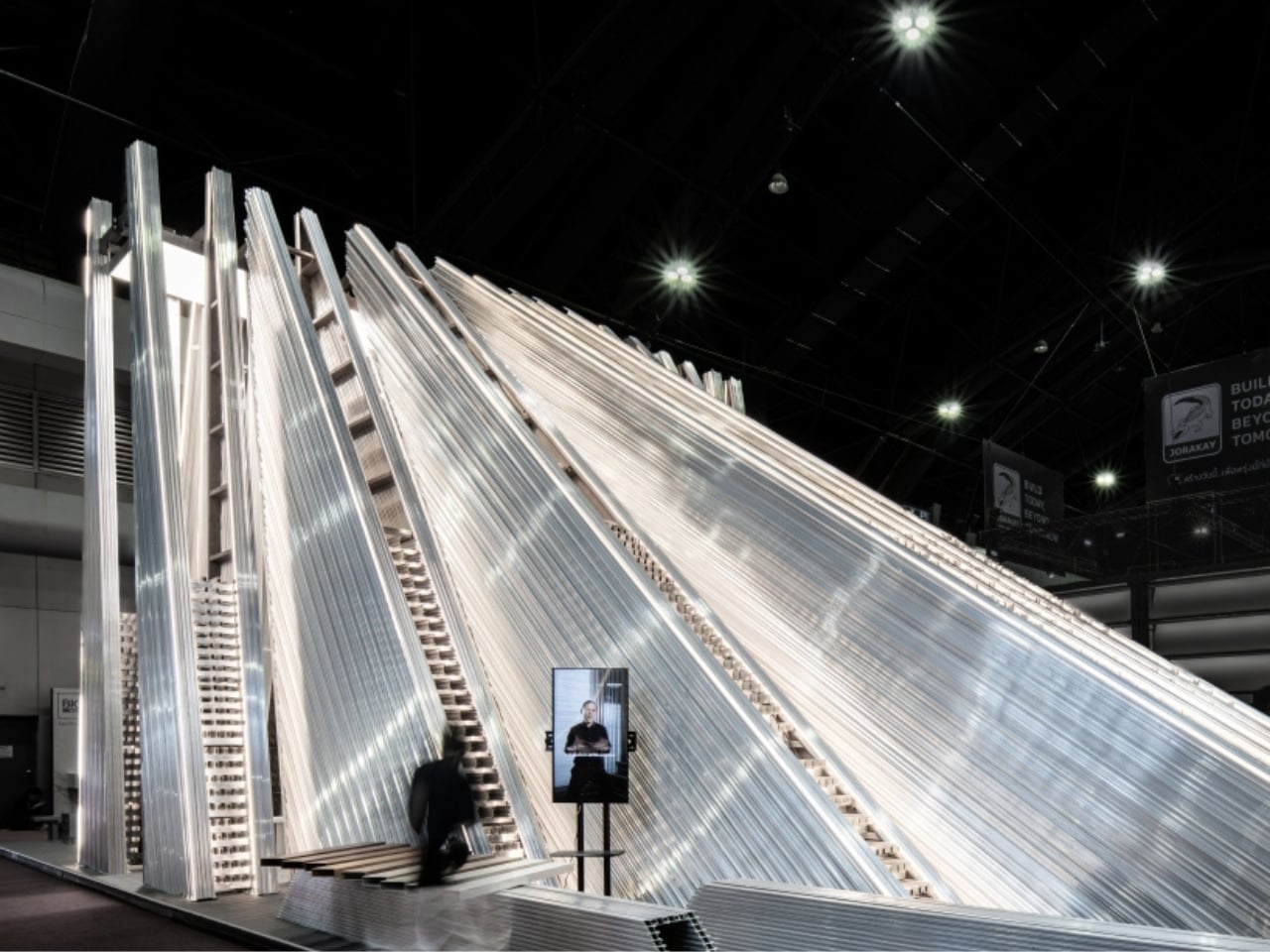
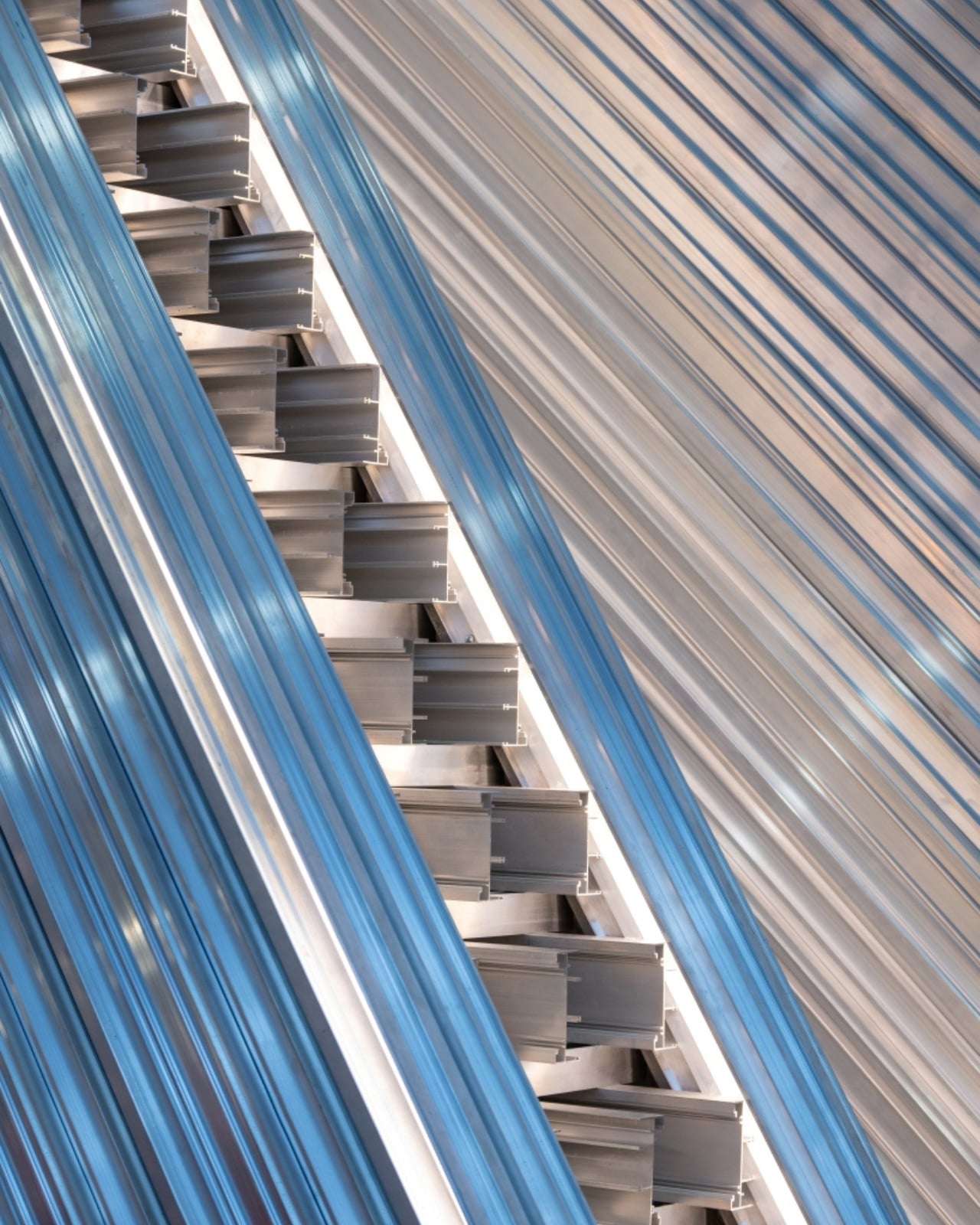
The pavilion is made entirely from industrial aluminum profiles, the kind you’d find stacked and organized in a warehouse, not draped over a building or polished beyond recognition. Unknown Surface Studio didn’t just use the material; they took their cue from the environment it typically lives in. Rows of aluminum in storage, ordered by size and system, become the architectural reference. Repetition, rhythm, and density become the visual language. The warehouse, in other words, becomes a design brief. It’s a bit like deciding to build a library that looks exactly like the factory where the books were printed, and somehow making it feel exactly right.
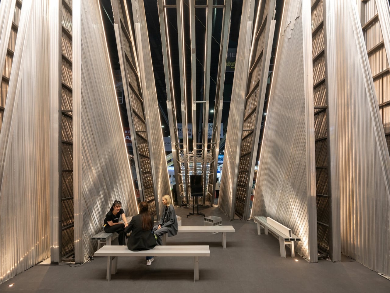
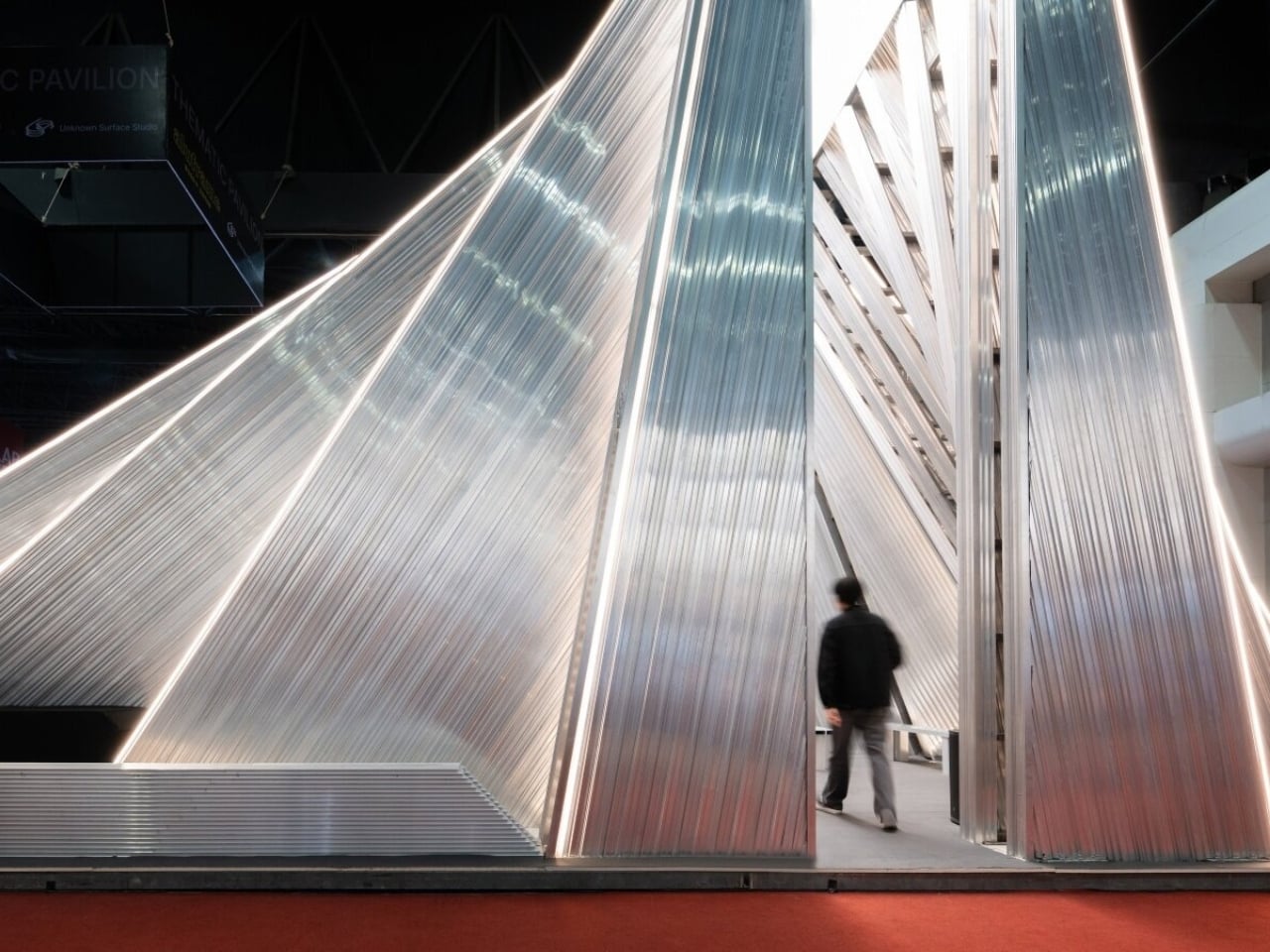
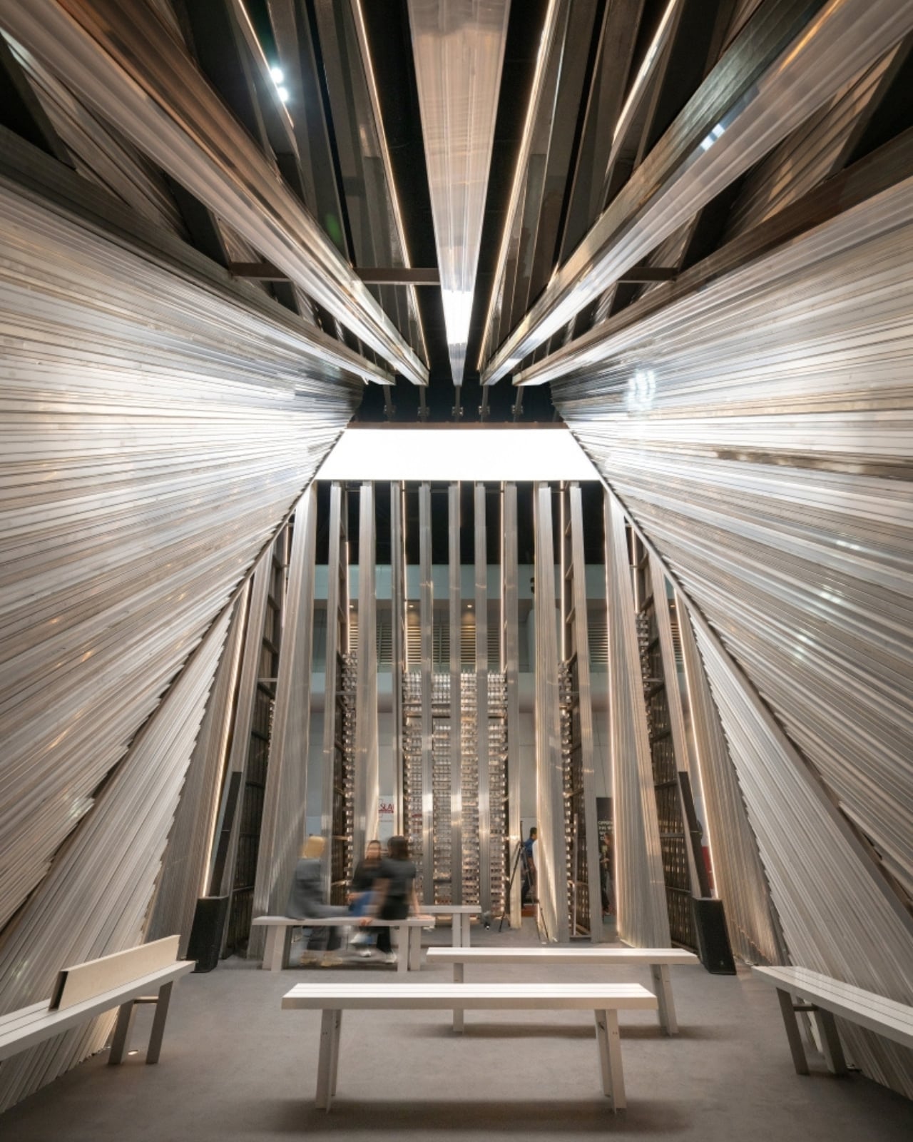
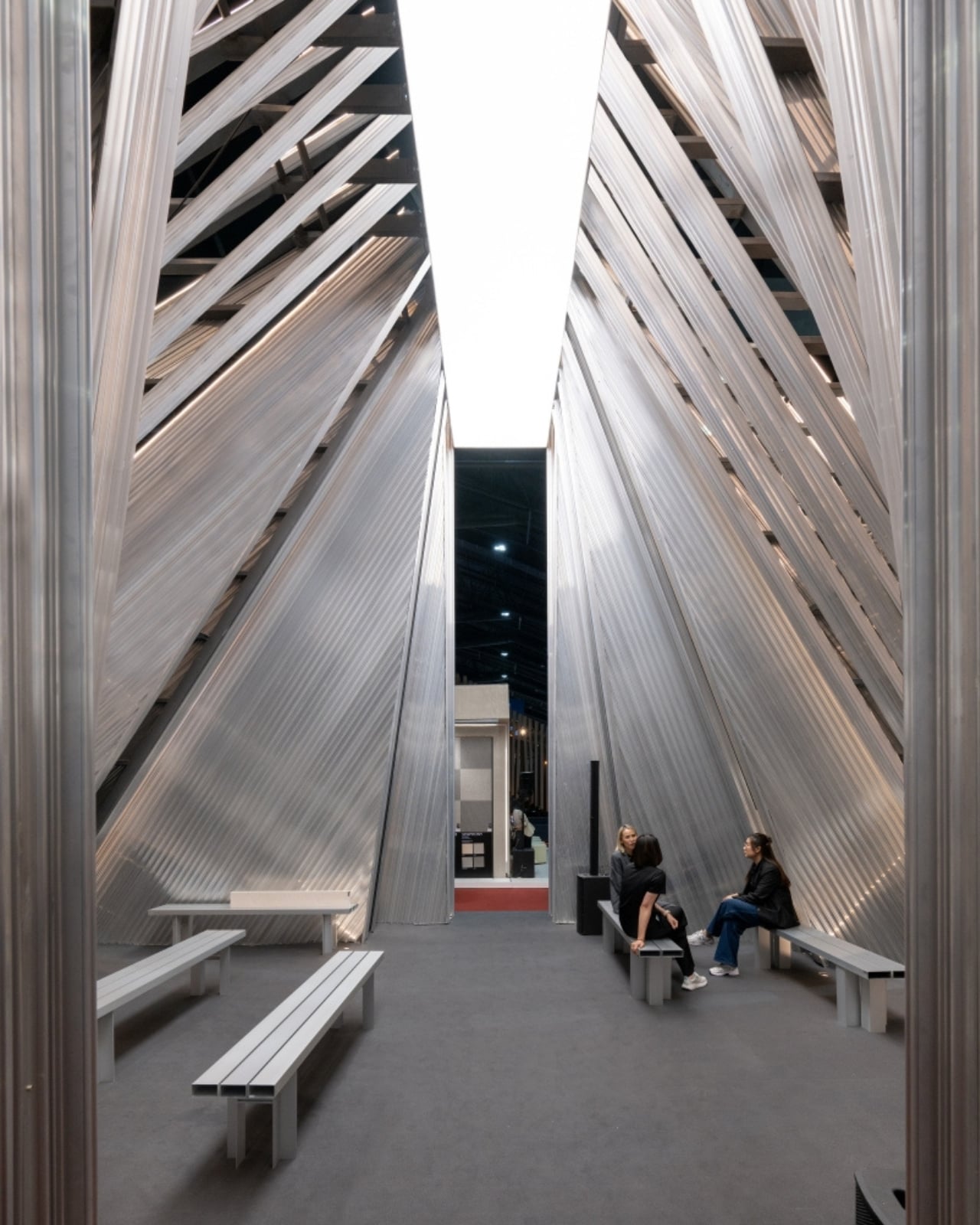
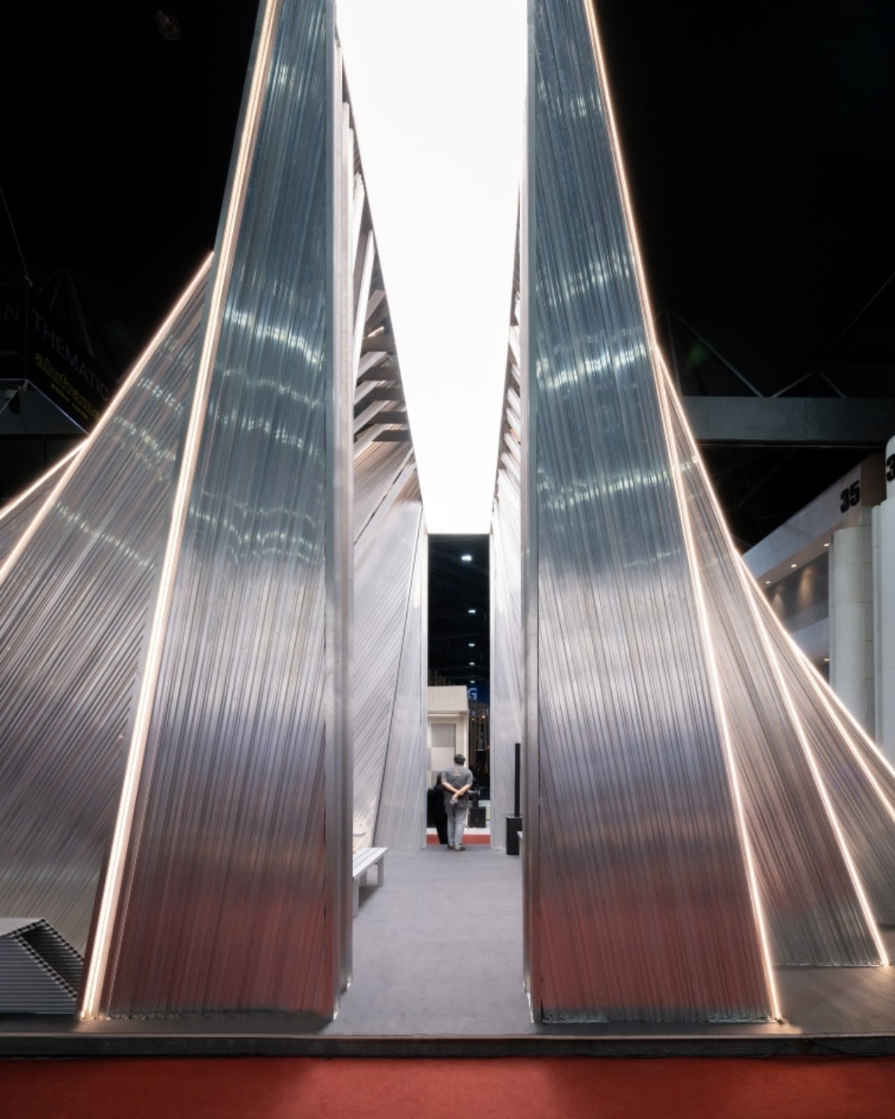
The structure opens in a fan-shaped configuration, layers of aluminum profiles fanning outward to form a semi-open enclosure that does several things at once. It shades. It displays. It frames space. It defines a boundary without becoming a wall. The shifting density of the profiles controls how much you see, how much light filters through, where your eye lands. The form moves from dense to open as you walk around it, creating a different experience at every angle. It’s the kind of spatial trick that feels effortless when done well, and genuinely difficult to pull off.
What the designers call a “Living Material Library” is an idea worth sitting with. The pavilion reframes the warehouse as a public experience rather than a backstage operation. All the precision and engineering that usually stays hidden behind polished finishes gets front row treatment here. The exposed profiles, the visible connectors, the honest industrial logic of the whole thing are the aesthetic. It’s not industrial-chic for the sake of a trend. It reads more like an argument that the material is already beautiful, if you’re willing to look at it directly.
The bigger idea, though, is the circular system the whole thing is built around. When the exhibition ends, UNFOLD doesn’t end. The aluminum components return to use, whether through the same structure reassembled elsewhere, or through the components cycling back into Aluframe’s inventory and flowing into new projects. Nothing goes to a landfill. Nothing gets dismantled into waste. It’s a regenerative model, and it makes the usual approach to temporary exhibition architecture look pretty careless by comparison.
I’ll admit that “circular design” gets thrown around enough that it’s starting to feel like fine print on a product label. But UNFOLD is concrete about it in a way that’s difficult to dismiss. The components are standardized industrial profiles, not custom one-off parts. Demounting isn’t an afterthought; it’s built into the concept from the beginning. The structure was designed to be taken apart and put back together, which means it was designed for a life that extends well beyond its debut.
Temporary architecture occupies a strange space in design culture. We expect it to be spectacular enough to photograph and forgettable enough to discard. UNFOLD quietly pushes back against that expectation, and it does so without spectacle or noise, just good thinking at the material level. A structure that returns to use, that borrows from industrial logic and offers it back as something genuinely worth experiencing, doesn’t need to be permanent to be meaningful. It just needs to be thought through. That might be the most quietly radical thing about it.
The post The Aluminum Pavilion Built to Never Become Waste first appeared on Yanko Design.