Your Knife Block Has No Business Looking This Good

Most kitchen accessories come with an unspoken agreement: you accept that they look utilitarian, and in return, they do their job quietly in the background. Knife holders, in particular, have always been the least glamorous residents of the countertop. The wooden block is fine. The magnetic wall strip is practical. But neither has ever made anyone stop and stare. Samyuktha S’s Eclipse Edge concept breaks that agreement entirely, and I’m genuinely glad it does.

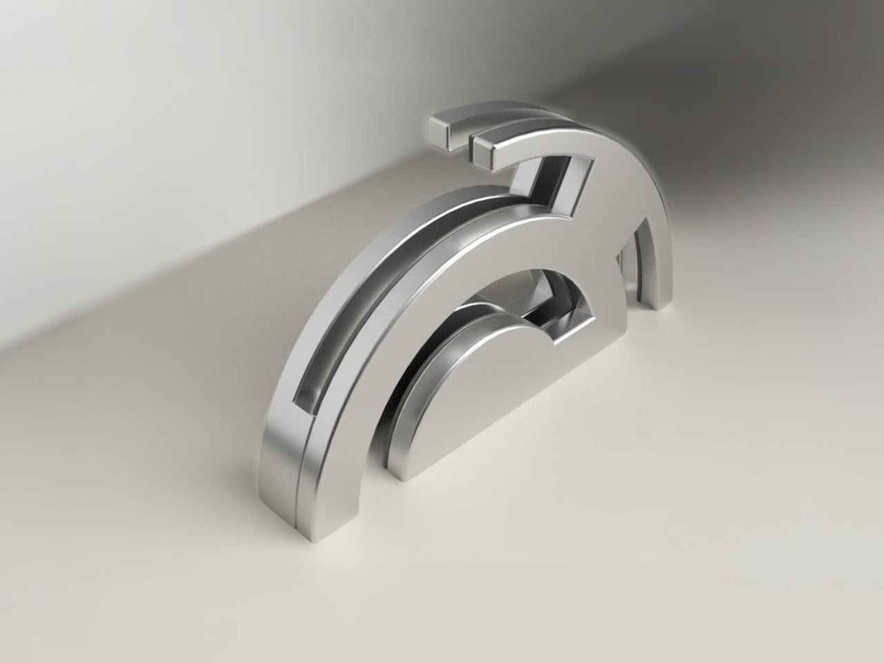
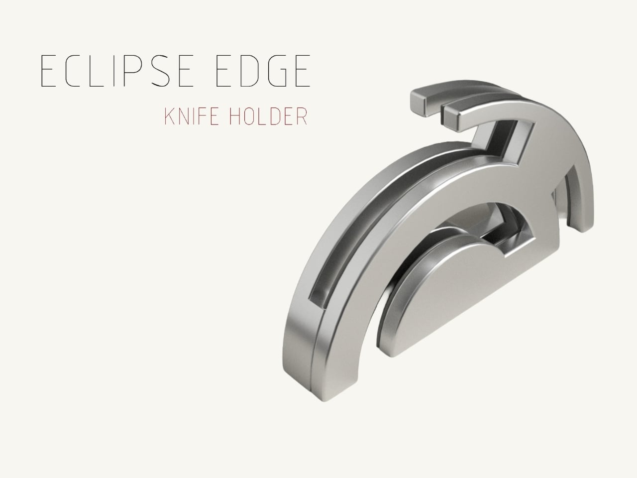
The Eclipse Edge is a magnetic knife holder inspired by the geometry of a lunar eclipse, specifically the moment when Earth aligns between the sun and moon, casting that iconic half-shadow silhouette into the sky. That form, an abstracted arc built from layered, concentric half-circles, becomes the entire design language here. Looking at it on a countertop, you wouldn’t immediately guess what it does. You’d probably assume it was a sculpture. That confusion is precisely the point.

Designer: Samyuktha S

Samyuktha’s design brief was direct: create a kitchen storage accessory that bridges functional utility and structural statement decor. The goal was to reimagine a standard tool organizer as a decorative landmark within the home, elevating it to a high-end sculptural piece. She achieved this without resorting to the usual tricks of adding color or unconventional materials. The Eclipse Edge is sand-casted aluminum with a hand-carved finish, and it leans entirely into that material’s dual nature: raw and refined at the same time.

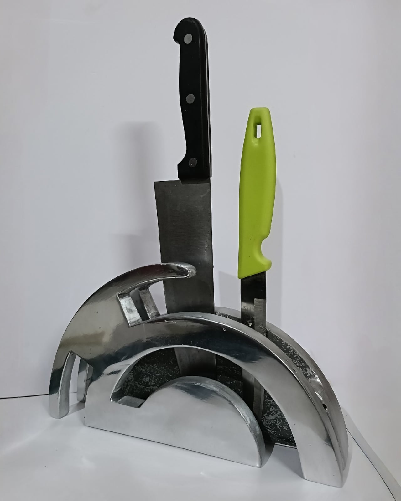
The mechanics are equally considered. Hidden magnetic sheets inside the form hold knives parallel to the surface, which means blades are secured safely without any visible hardware or slots cutting into that clean silhouette. The oil and waterproof protective layering is built into the construction. Multiple knife sizes are accommodated without compromising the holder’s structural integrity or visual lines. It’s the kind of detail work that separates a pretty sketch from a design that actually holds up under scrutiny.
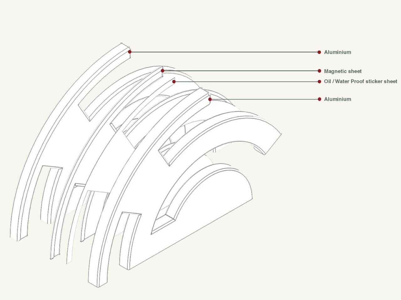
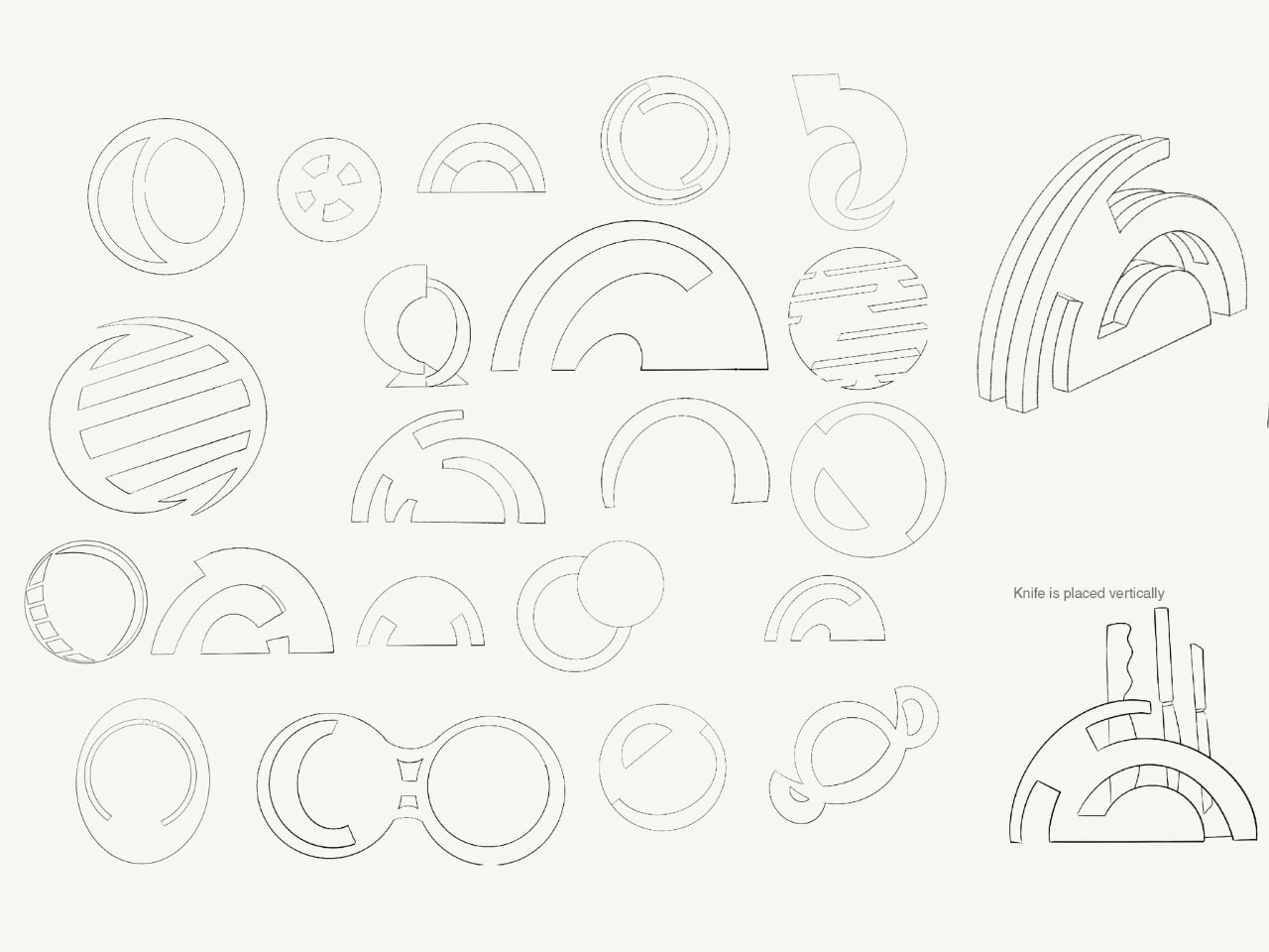
The ideation pages on Samyuktha’s Behance project tell you a lot. There are dozens of iterations, circular forms, crescent variations, abstracted lunar shapes explored and discarded before arriving at the stacked arch that became the final concept. Getting from a celestial reference to something that can hold a chef’s knife at the right angle and still look like contemporary sculpture takes a specific kind of problem-solving patience. The sketches make clear that nothing was accidental.
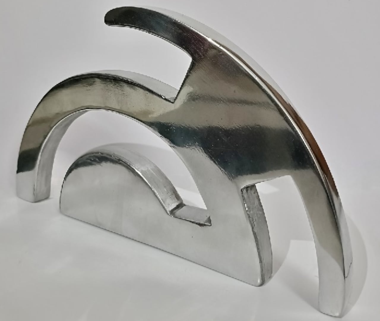
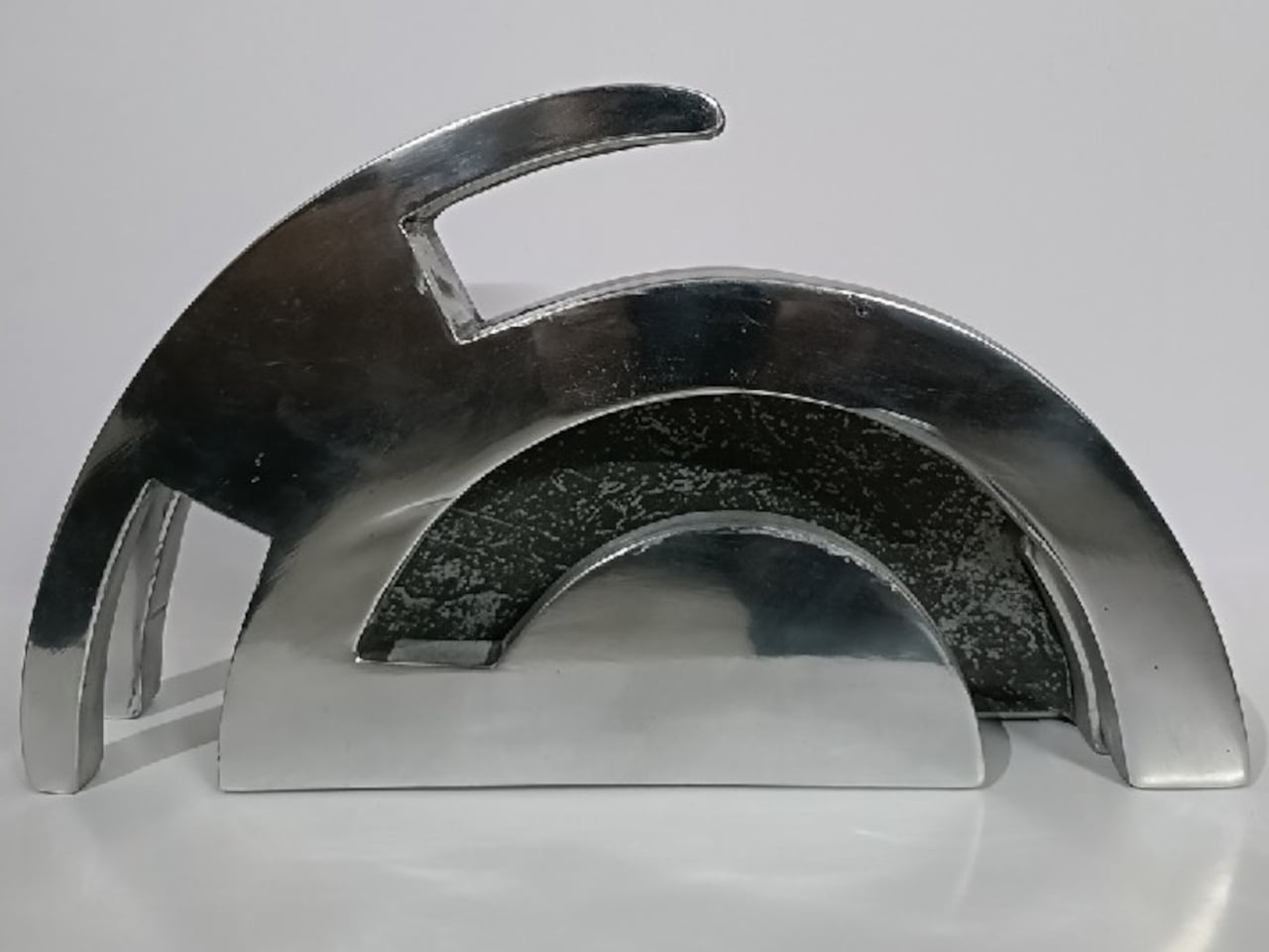
A physical prototype was also produced through aluminum sand casting using an MDF pattern, which means this design was tested in the real world, not just rendered beautifully and left to live on a screen. Seeing the actual object in photos alongside actual kitchen knives brings the concept into sharp focus. It looks grounded and serious in person, the kind of object that would hold its own on any well-styled countertop without asking for too much attention.
I do think about the practical day-to-day reality of owning something like this. Keeping polished aluminum pristine in a working kitchen takes effort, and the hand-carved finish, while gorgeous, would need care. But that’s not necessarily a flaw in the design. High-end kitchen objects have always required a little more commitment. A copper pot needs polishing. A cast iron pan needs seasoning. The Eclipse Edge feels like it belongs in that same category of objects you choose deliberately and tend to over time.

The broader conversation around kitchenware has been shifting for a while now. People increasingly want their kitchen tools to reflect how they live and what they care about, not just what they cook. The Eclipse Edge speaks to that shift with real confidence. It doesn’t apologize for being beautiful. It doesn’t hide its utility behind a costume. It just quietly insists that a knife holder can be, at the same time, an object worth looking at. Samyuktha S’s Eclipse Edge is a concept for now, but it’s the kind of concept that feels ready. The thinking is there. The craft is there. The prototype is there. Sometimes the only thing standing between a student project and a product is someone willing to bet on it.
The post Your Knife Block Has No Business Looking This Good first appeared on Yanko Design.


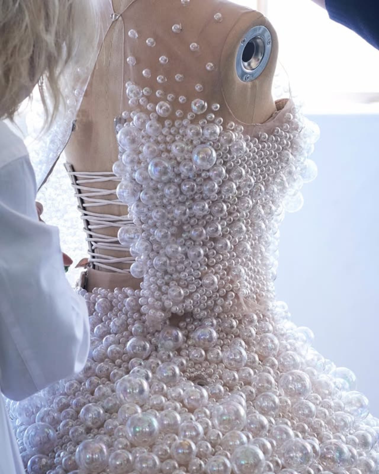
This 2,550-Hour Dress Blew Real Bubbles at the Met Gala

The Met Gala is probably the most popular and glamorous fashion event in the Western world. Whichever way you feel about the organizers and having such a lavish event in these times, you can’t deny that it is very much talked about, especially on social media, due to the personalities who attend and, of course, what they’re wearing.

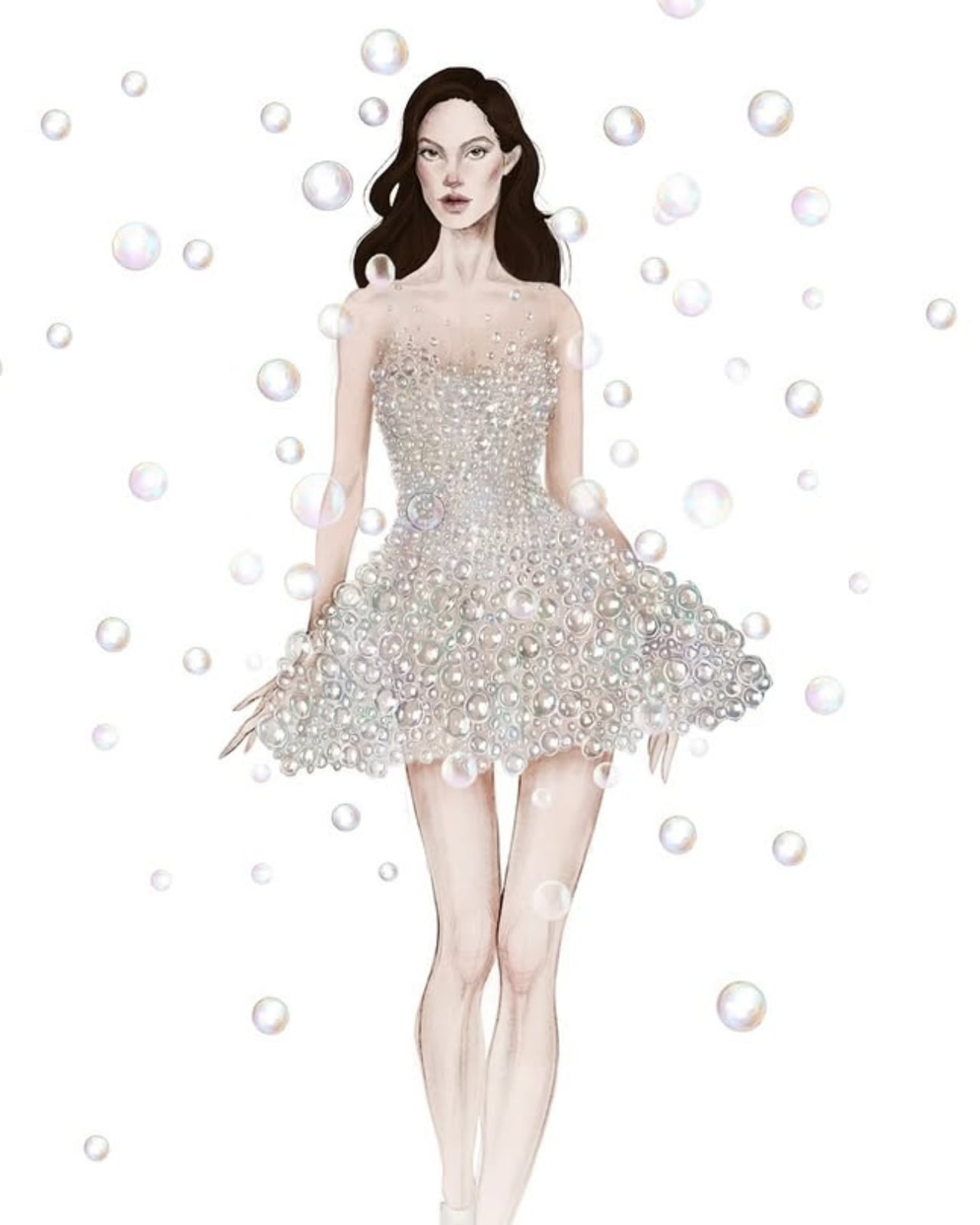
This event is also a chance for designers to showcase their more experimental works. One of the most eye-catching and interesting dresses we saw this year is the Airo dress, worn by Olympic freestyle skier and model Eileen Gu and designed by Iris van Herpen in collaboration with artist duo A.A. Murakami. The dress features 15,000 iridescent glass bubbles and, believe it or not, it actually released real floating bubbles live on the red carpet.

Designer: Iris van Herpen

The dress’s silhouette is sculptural and mini in length, giving off a cloud-like, ethereal effect that instantly captured eyes on the red carpet. Van Herpen described the bubbles as a reflection of human anatomy, “which is composed of 99.9% empty space,” and the piece is also a nod to her ongoing fascination with biotech couture. Olympic triple medalist Eileen Gu is a wonderfully fitting muse, as the concept philosophically mirrors the kind of weightless, almost gravity-defying precision her sport demands on the snow slopes.

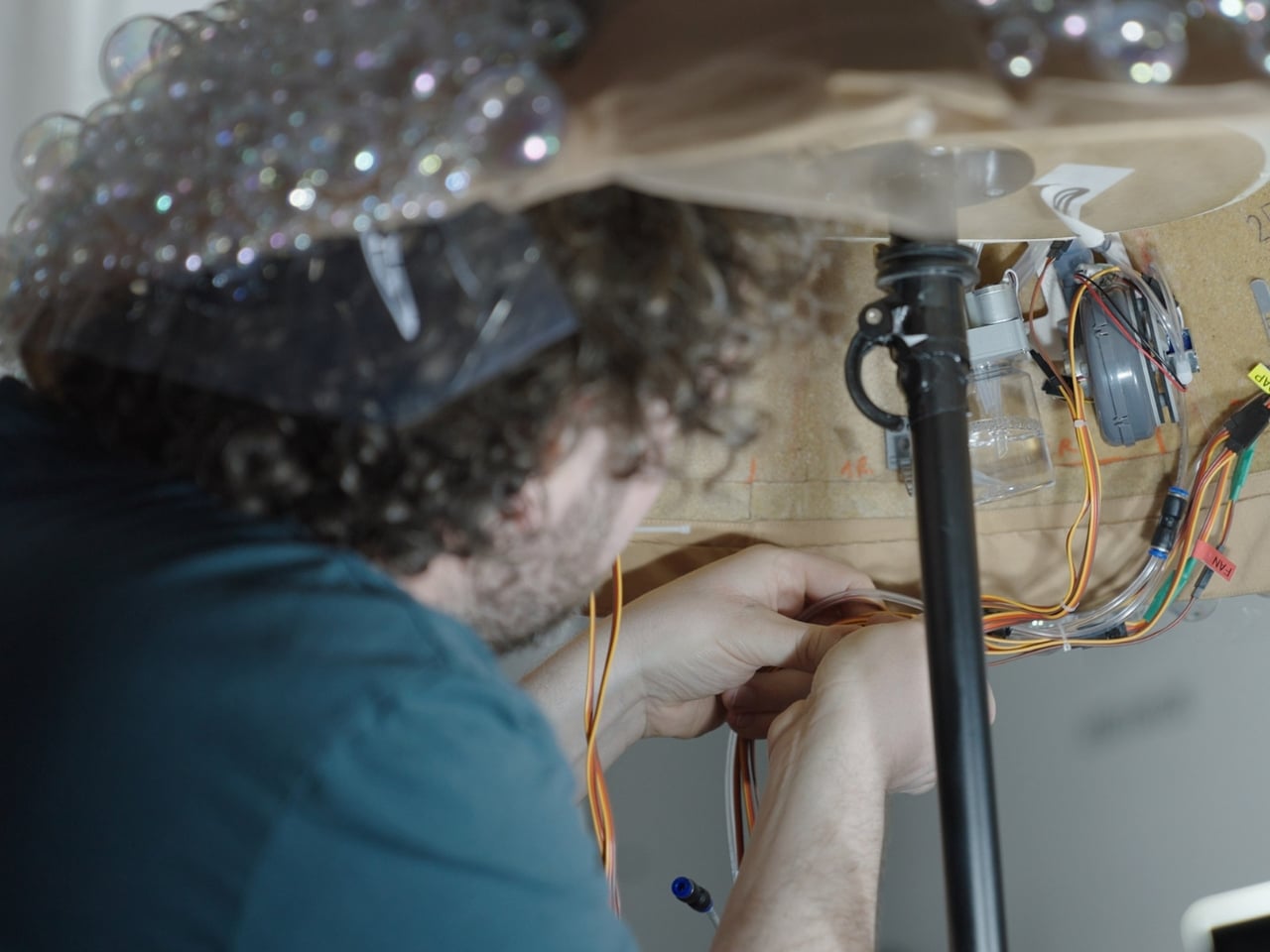
This is not just a simple dress adorned with bubbles. Each of the 15,000 iridescent glass bubbles was hand-moulded and then attached to the bodice using UV light, a meticulous process that required 2,550 hours of work across 15 weeks, carried out by a dedicated team of specialists in couture, science, and computational design. Underneath the skirt, hidden microprocessors pressurized gas and released real, floating bubbles in timed sequences. Everything you saw on that red carpet was completely real, with no filters and no CGI. It was a pure, breathtaking collaboration between fashion, art, and science.

What truly elevates the Airo dress from couture to living art is the partnership with A.A. Murakami. Alexander Groves and Azusa Murakami, who work between London and Japan, are celebrated for transforming ephemeral materials like steam, light, and air into immersive living installations. Their renowned “Floating World” exhibition is a perfect example of how they blur the line between the tangible and the invisible. Remarkably, the Airo dress marks the very first time they have applied their artistic philosophy to a wearable garment, and the result is nothing short of extraordinary.

What makes this piece particularly compelling is the question it poses while you’re simply looking at it: where does the body end and the space around it begin? The cloud of iridescent glass and the soft stream of real bubbles dissolving into the air around Eileen Gu created something genuinely hypnotic. It wasn’t just a dress being worn; it was a statement unfolding in real time. The silhouette seemed to blur the lines of her athletic frame, giving her an almost otherworldly quality that no CGI could ever replicate.

Van Herpen is no stranger to this kind of boundary-pushing. Her previous viral creation was a luminous dress made of living algae, crafted in collaboration with a bio-engineer and biophysicists from the University of Amsterdam. With every headline-making piece, she continues to challenge what fashion can be, not just as clothing, but as a vehicle for scientific exploration, philosophy, and wonder.

And perhaps that’s the most exciting thing about the Airo dress. In a sea of beautiful gowns at the Met Gala, this one made people stop and ask questions about science, about art, about the human body, and about what fashion is even for. At a time when so much of what we see has been filtered, edited, or AI-generated, there’s something incredibly refreshing about a dress that creates its own quiet spectacle from the inside out. Real bubbles. Real craft. Real wonder. That’s the kind of fashion that stays with you long after the cameras have gone.

The post This 2,550-Hour Dress Blew Real Bubbles at the Met Gala first appeared on Yanko Design.

This 130cm Robot Just Took Buddhist Vows at a Seoul Temple

There has been a lot of discussion lately about how Artificial Intelligence can affect all kinds of religion. From using ChatGPT to create sermons to having an AI give spiritual guidance (with one even pretending to be Jesus), there are a lot of gray areas that are open to debate and discussion by different sectors. But how would you feel if an AI robot actually joined your congregation?

South Korean monks at Jogyesa Temple in Seoul are facing that situation now as they ordained Gabi, the country’s first robot monk. Dressed in traditional grey-and-brown Buddhist robes, it joined the Jogye Order of Korean Buddhism as part of the celebrations ahead of Buddha’s birthday later this May. South Korea joins its neighbor Japan, which previously had its own AI monk, Buddharoid, join a Kyoto temple, a sign that the intersection of faith and technology is becoming a growing trend across Asia, and that the question of AI’s role in religion is no longer purely theoretical.

Designer: Unitree Robotics

Gabi, whose name comes from a Korean term associated with compassion and mercy and is inspired by Siddhartha, stands 130 cm tall and is based on the Unitree G1 model developed by Chinese civilian robotics company Unitree Robotics. The G1 is a compact humanoid platform engineered with over 23 degrees of freedom, giving it a remarkably fluid range of motion. Built to replicate natural human movement, the robot can walk steadily, maintain balance, and perform deliberate, precise gestures with its articulated hands. It is also AI-powered, capable of processing and responding to verbal questions, which is exactly how it was able to respond to the senior monk during the ordination. It’s this combination of physical dexterity and responsive AI that made Gabi such a fitting presence at a Buddhist ceremony: its hands are capable of folding gracefully into the traditional prayer position, and its frame is nimble enough to perform a respectful bow, movements that carry deep spiritual meaning in Buddhist practice.

During the ceremony on May 6, Gabi did exactly that, folding its metallic hands and bowing respectfully alongside the other monks. When a senior monk asked if it would devote itself to Buddhism, it answered, “Yes, I will devote myself.” The monks then placed a traditional 108-bead rosary around its neck. In a small but telling concession to its mechanical nature, Gabi received a symbolic sticker instead of undergoing the customary incense burn, a reminder that, despite its robes and vows, it is still very much a machine.

Not everyone, however, is moved by the spectacle. The ordination has sparked debate among religious scholars and the public alike, with many questioning whether a machine can genuinely hold spiritual vows or embody the core Buddhist ideals of mindfulness, compassion, and the pursuit of enlightenment. Can a robot truly understand suffering, the very foundation of Buddhist teaching, when it cannot feel it? Critics also raise concerns about the trivialization of sacred rituals, arguing that ordination should remain a deeply human and intentional act. On the other side of the debate, however, supporters see Gabi as a creative and modern bridge, one that could engage younger generations with ancient teachings and make spirituality more accessible in an increasingly technology-driven world.

Whether you see Gabi as a bold leap into the future or a step too far, one thing is certain: this is just the beginning. Three more “spiritual cyborgs” are already set to join it at the temple for Buddha’s birthday celebrations on May 24. As AI continues to weave itself into every corner of human life, including our most sacred spaces, the line between the spiritual and the synthetic grows thinner by the day. What does it mean for a machine to seek enlightenment, or to offer compassion, when it was never capable of suffering to begin with? Perhaps the real question isn’t whether a robot can be a monk, but what it reveals about us that we’re the ones doing the ordaining.

The post This 130cm Robot Just Took Buddhist Vows at a Seoul Temple first appeared on Yanko Design.

This 130cm Robot Just Took Buddhist Vows at a Seoul Temple

There has been a lot of discussion lately about how Artificial Intelligence can affect all kinds of religion. From using ChatGPT to create sermons to having an AI give spiritual guidance (with one even pretending to be Jesus), there are a lot of gray areas that are open to debate and discussion by different sectors. But how would you feel if an AI robot actually joined your congregation?

South Korean monks at Jogyesa Temple in Seoul are facing that situation now as they ordained Gabi, the country’s first robot monk. Dressed in traditional grey-and-brown Buddhist robes, it joined the Jogye Order of Korean Buddhism as part of the celebrations ahead of Buddha’s birthday later this May. South Korea joins its neighbor Japan, which previously had its own AI monk, Buddharoid, join a Kyoto temple, a sign that the intersection of faith and technology is becoming a growing trend across Asia, and that the question of AI’s role in religion is no longer purely theoretical.

Designer: Unitree Robotics

Gabi, whose name comes from a Korean term associated with compassion and mercy and is inspired by Siddhartha, stands 130 cm tall and is based on the Unitree G1 model developed by Chinese civilian robotics company Unitree Robotics. The G1 is a compact humanoid platform engineered with over 23 degrees of freedom, giving it a remarkably fluid range of motion. Built to replicate natural human movement, the robot can walk steadily, maintain balance, and perform deliberate, precise gestures with its articulated hands. It is also AI-powered, capable of processing and responding to verbal questions, which is exactly how it was able to respond to the senior monk during the ordination. It’s this combination of physical dexterity and responsive AI that made Gabi such a fitting presence at a Buddhist ceremony: its hands are capable of folding gracefully into the traditional prayer position, and its frame is nimble enough to perform a respectful bow, movements that carry deep spiritual meaning in Buddhist practice.

During the ceremony on May 6, Gabi did exactly that, folding its metallic hands and bowing respectfully alongside the other monks. When a senior monk asked if it would devote itself to Buddhism, it answered, “Yes, I will devote myself.” The monks then placed a traditional 108-bead rosary around its neck. In a small but telling concession to its mechanical nature, Gabi received a symbolic sticker instead of undergoing the customary incense burn, a reminder that, despite its robes and vows, it is still very much a machine.

Not everyone, however, is moved by the spectacle. The ordination has sparked debate among religious scholars and the public alike, with many questioning whether a machine can genuinely hold spiritual vows or embody the core Buddhist ideals of mindfulness, compassion, and the pursuit of enlightenment. Can a robot truly understand suffering, the very foundation of Buddhist teaching, when it cannot feel it? Critics also raise concerns about the trivialization of sacred rituals, arguing that ordination should remain a deeply human and intentional act. On the other side of the debate, however, supporters see Gabi as a creative and modern bridge, one that could engage younger generations with ancient teachings and make spirituality more accessible in an increasingly technology-driven world.

Whether you see Gabi as a bold leap into the future or a step too far, one thing is certain: this is just the beginning. Three more “spiritual cyborgs” are already set to join it at the temple for Buddha’s birthday celebrations on May 24. As AI continues to weave itself into every corner of human life, including our most sacred spaces, the line between the spiritual and the synthetic grows thinner by the day. What does it mean for a machine to seek enlightenment, or to offer compassion, when it was never capable of suffering to begin with? Perhaps the real question isn’t whether a robot can be a monk, but what it reveals about us that we’re the ones doing the ordaining.

The post This 130cm Robot Just Took Buddhist Vows at a Seoul Temple first appeared on Yanko Design.

Google’s $99 Gemini Speaker Is About to Land

The smart speaker category has been quietly stagnating. Go ahead and look around your house. Chances are there’s a Nest Audio or an Amazon Echo gathering dust on a shelf, doing exactly what speakers did in 2018 but with a fresh coat of AI marketing layered on top. It still feels like a tech product, which is to say, it still looks like one. Google seems to have noticed.

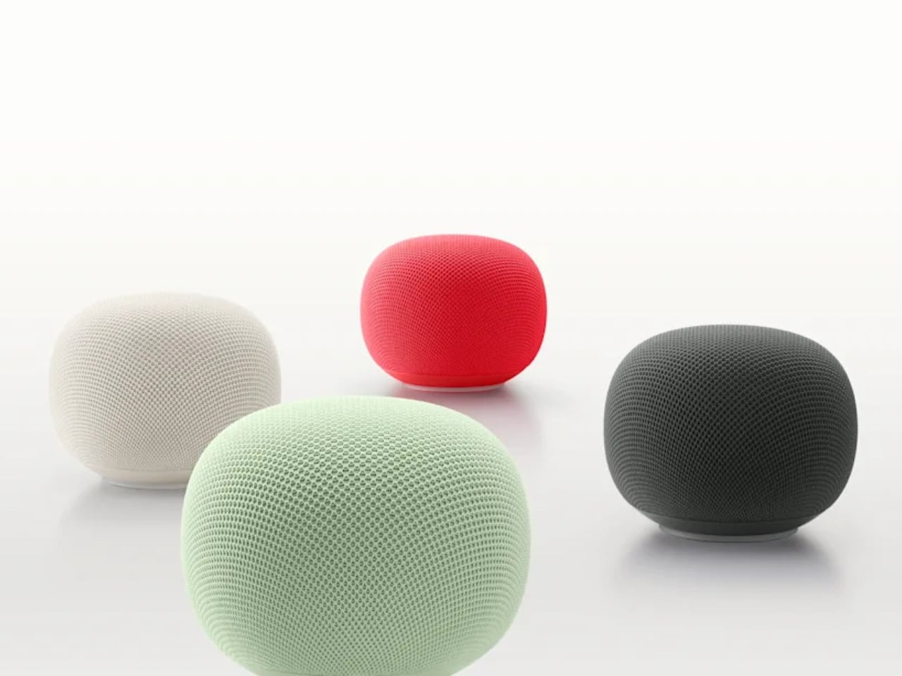
The new Google Home Speaker, officially arriving spring 2026 at $99.99 and heading to 19 countries, is not a Nest. That’s the first thing worth saying. Google dropped the Nest name entirely, and the shape that went with it. The speaker is round, compact, and wrapped in a 3D-knitted eco-friendly fabric that reads less like a gadget and more like something you’d find alongside handmade ceramics and artisan candles on a design blog. Google is calling the colorways Berry, Hazel, Jade, and Porcelain. Those aren’t accident names. That’s homeware language, not consumer electronics language.

Designer: Google

That shift matters more than it might seem. The naming tells you exactly who Google is designing for now, and it isn’t the person who organizes their cable management. Porcelain and Hazel are colors a person picks when they’re thinking about how something looks on a bookshelf, not which one has the best specs. Whether the average buyer consciously registers this or not, the vocabulary of the product positions it closer to a Muji lamp than a mesh Wi-Fi node. For a category that has long been aesthetically stranded, that’s a meaningful move.

Underneath the fabric, the hardware story is genuinely interesting. The Google Home Speaker is built around Gemini for Home, which means it isn’t running a legacy assistant clumsily retrofitted with new AI layers. It has custom processing designed specifically for Gemini’s computational demands, meant to make conversations feel faster and more natural. A new light ring gives visual feedback as Gemini listens, thinks, and responds. The speaker also delivers 360-degree sound and supports stereo pairing. At $99, that’s a competitive package, especially compared to what Amazon and Apple are currently offering in the same price range, which hasn’t changed much in years.

Here’s the angle that gets underplayed in most coverage: Google built this speaker to coexist in an ecosystem that’s already expanding before the device even ships. Walmart’s Onn smart speaker appeared in CSA Matter filings in early May 2026, suggesting a budget tier of Gemini-compatible hardware is on its way. Google confirmed last October that Walmart’s Onn devices would work within Google Home. A $99 Google speaker alongside a cheaper third-party Gemini option creates a layered ecosystem where entry-level users get into the platform and those who want a more refined experience buy the Google-branded version. That’s a smarter market play than Google has made in this category in years.

What makes me take this launch seriously isn’t the hardware alone. Amazon has Alexa, which has gone through its own AI reinvention but still carries the aesthetic baggage of the cylinder era. Apple’s HomePod is excellent and priced accordingly. Sonos is navigating its own turbulent chapter. None of them are shipping something that looks like a river stone, costs $99, and runs a genuinely current large language model. Google, for once, doesn’t have obvious company in that specific lane.

The question I keep sitting with is whether the design conviction will hold once the product is actually in people’s homes. It’s easy to look good in product shots, and the Nest Audio looked great too. But if Google has genuinely committed to positioning this as a home object first and a gadget second, and if the Gemini experience inside it is as conversational as promised, then spring 2026 could mark something worth paying attention to.

The smart speaker had a moment, then it plateaued. A pebble-shaped $99 AI speaker with pastel names and a language model built for conversation might not sound revolutionary. Compared to what’s been sitting on kitchen counters for the last five years, though, it kind of is.

The post Google’s $99 Gemini Speaker Is About to Land first appeared on Yanko Design.

Why Does Every Kids Chair Feel Disposable? ROCCO Disagrees

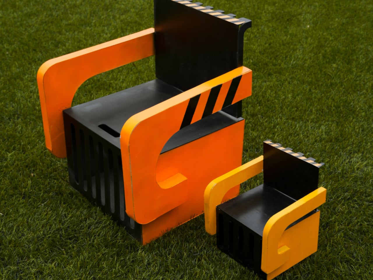
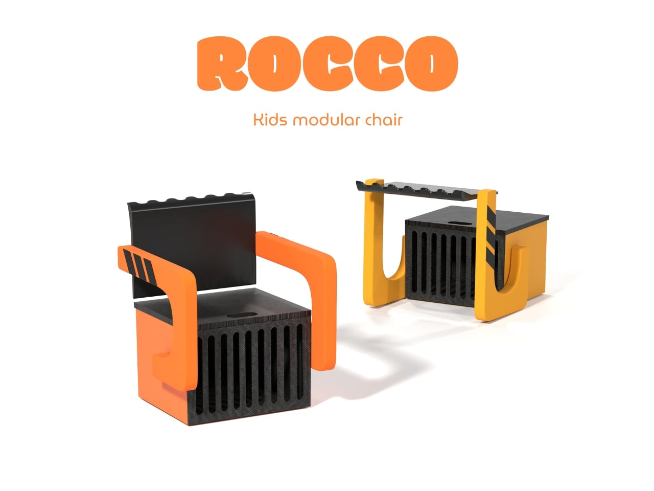
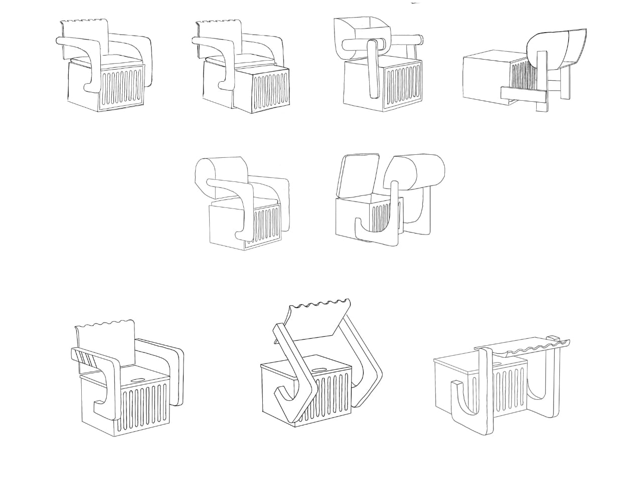
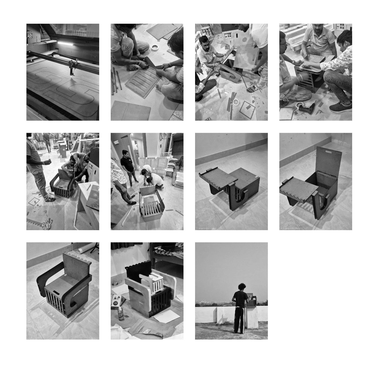
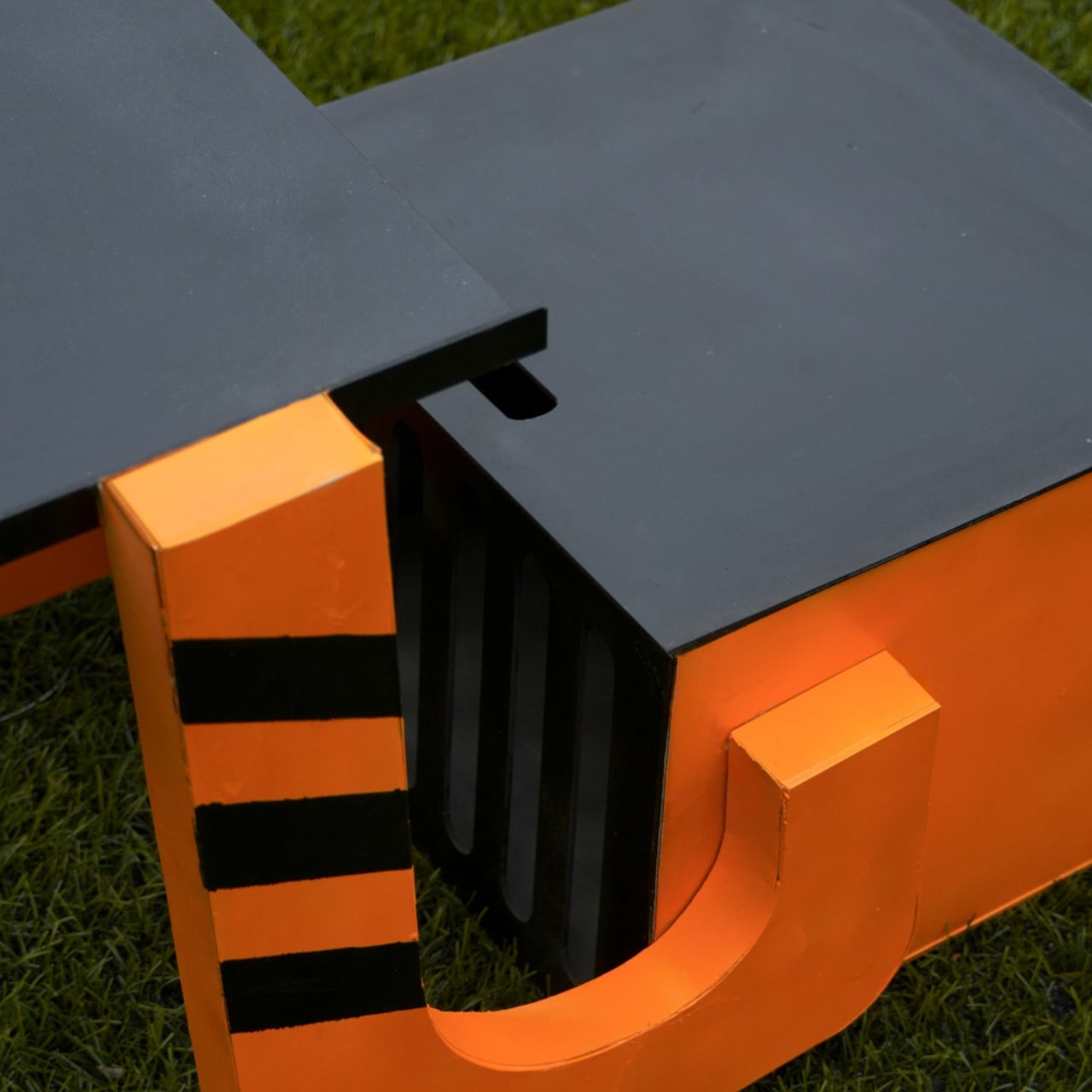
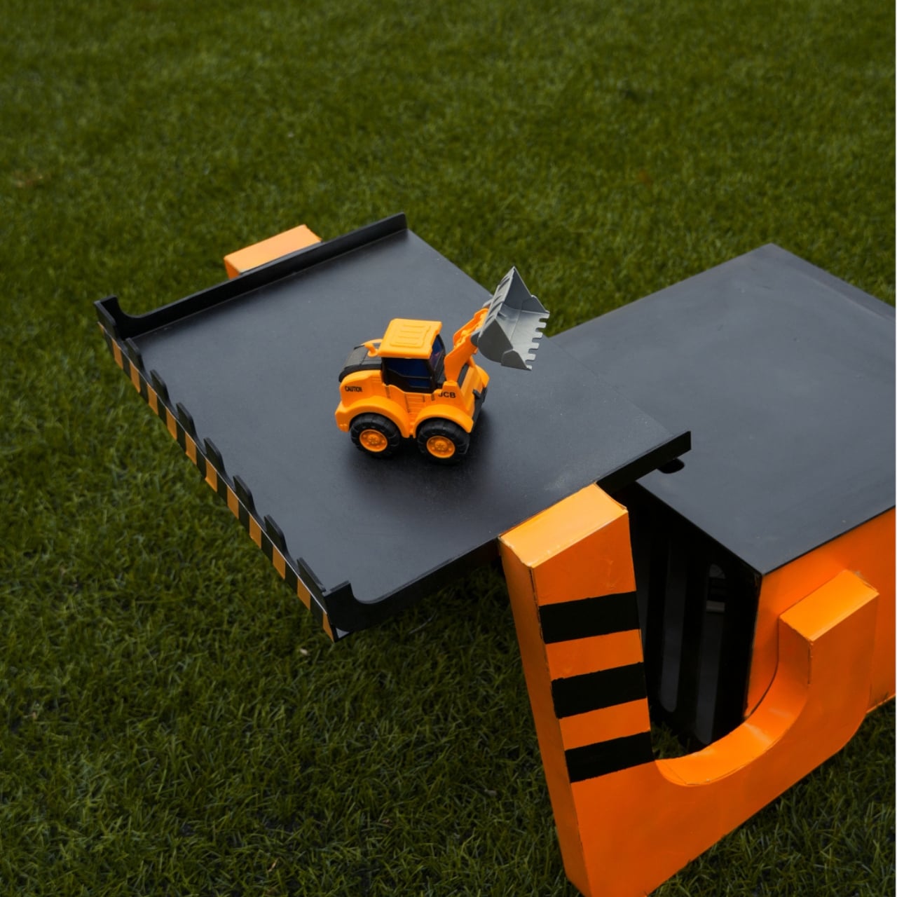
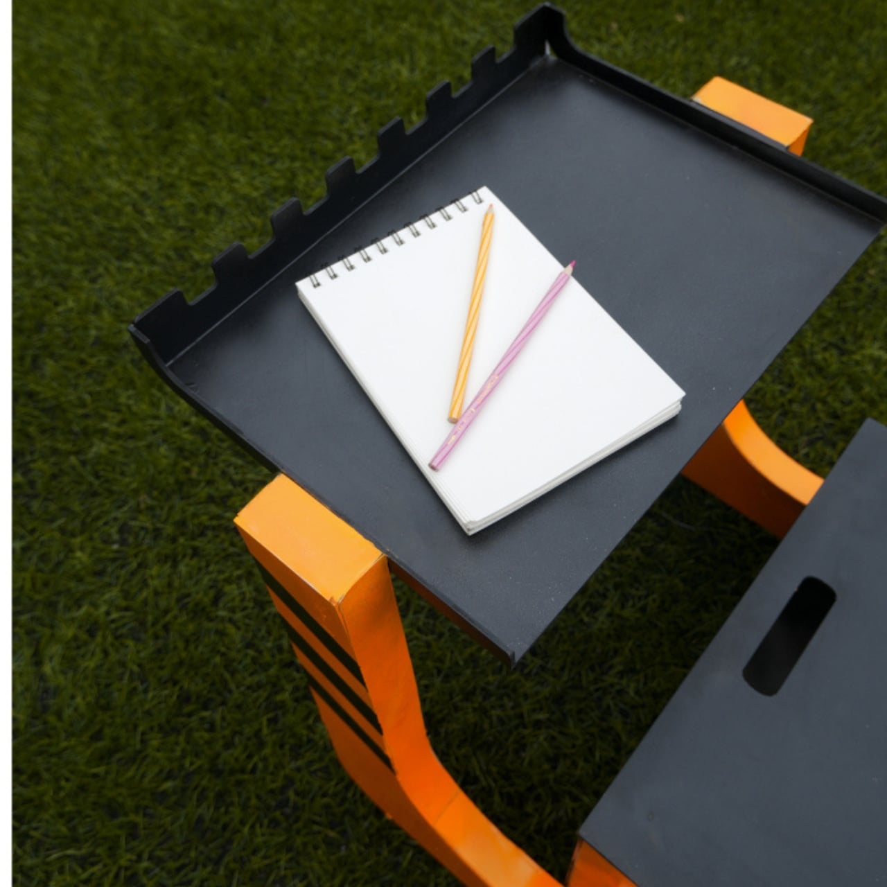
Kids furniture has a peculiar habit of lying about its usefulness. You buy it, your child loves it for roughly eight months, and then it either disappears into a donation pile or gets repurposed as a makeshift step stool. The furniture industry has been quietly trying to solve this problem for years, but designer Nidhun K M may have found an answer worth paying attention to. ROCCO is a modular chair concept for children that challenges the idea of a seat being a single, fixed thing.

ROCCO isn’t just a small chair. It’s a modular system, which means its components can be reconfigured, reused, and adapted as a child grows and as the context around them changes. Shared on Behance, the concept has been picking up attention from the design community, and it’s easy to see why. The proposal isn’t flashy in the way that kids furniture often tries to be, with primary colors and cartoon motifs that scream “this is for children.” ROCCO looks like it was designed with a quieter kind of intelligence.

Designer: Nidhun K M

The modular approach to kids furniture is not a new idea, but it rarely gets executed with this kind of intention at the seating level. Most modular children’s furniture applies to beds, storage units, or room systems. A chair, by comparison, seems too small to bother with. And yet the chair is one of the most-used pieces of furniture in a child’s day. They sit to eat, to draw, to read, to play. A chair that could shift configuration as the child’s proportions change, or as the task at hand demands something different, is genuinely useful in a way that a novelty dinosaur sofa simply isn’t.

What makes ROCCO feel credible as a design concept is its commitment to the idea over pure aesthetics. The form is considered without being overdesigned. There’s no attempt to win the child’s attention through gimmick. Instead, the design seems to trust that a well-proportioned, adaptable piece of furniture is interesting enough on its own terms. That restraint is harder to achieve than it looks, especially in a market segment that tends to equate loudness with appeal.

The broader conversation that ROCCO fits into is one about sustainability and longevity in children’s product design. Parents who are thinking carefully about consumption are increasingly reluctant to replace furniture every two years. The global kids furniture market is projected to grow significantly over the next decade, with a meaningful portion of that demand driven by parents who want adaptive, durable pieces that don’t become obsolete. Modular systems address this directly. When you can reconfigure rather than replace, you reduce waste and, over time, potentially reduce cost.

There’s also a less practical dimension to this that I keep thinking about. Children learn by doing, by arranging, by making their environments their own. A modular chair invites a small but meaningful degree of participation. If a child can shift a piece, adjust a configuration, and see the result of that choice, the chair becomes part of how they understand space and autonomy. That might sound like a stretch for a piece of seating, but design has always had this double life: the functional and the formative.

Nidhun K M’s work is currently a concept, which means ROCCO doesn’t yet exist in the way that you could order one and have it arrive at your door. That’s actually fine. The value of concept work in product design is that it forces a conversation before manufacturing decisions set in. It asks: what if we took this more seriously? What if a child’s chair were worthy of the same design thinking we apply to adult furniture? I think the answer is yes. And ROCCO, even at the concept stage, makes a decent case for it.

The post Why Does Every Kids Chair Feel Disposable? ROCCO Disagrees first appeared on Yanko Design.
Fellow Just Designed the Espresso Machine Beginners Always Wanted

While I really do love coffee, I do not have the tools at home to experiment with different espresso pulls and make my own espresso-based drinks. So I always end up just buying drinks from my favorite coffee shops. Every time I get the urge to actually buy my own machine, the fact that machines seem so complicated stops me from building my own home coffee bar.

The Espresso Series 1 by Fellow, the first home espresso machine from the coffee equipment brand, is positioned as a premium semi-automatic machine that bridges the gap between professional-level performance and approachability. This means that whether you are a beginner in the home coffee game or you are an expert, you will be able to appreciate the features that this machine brings.

Designer: Fellow

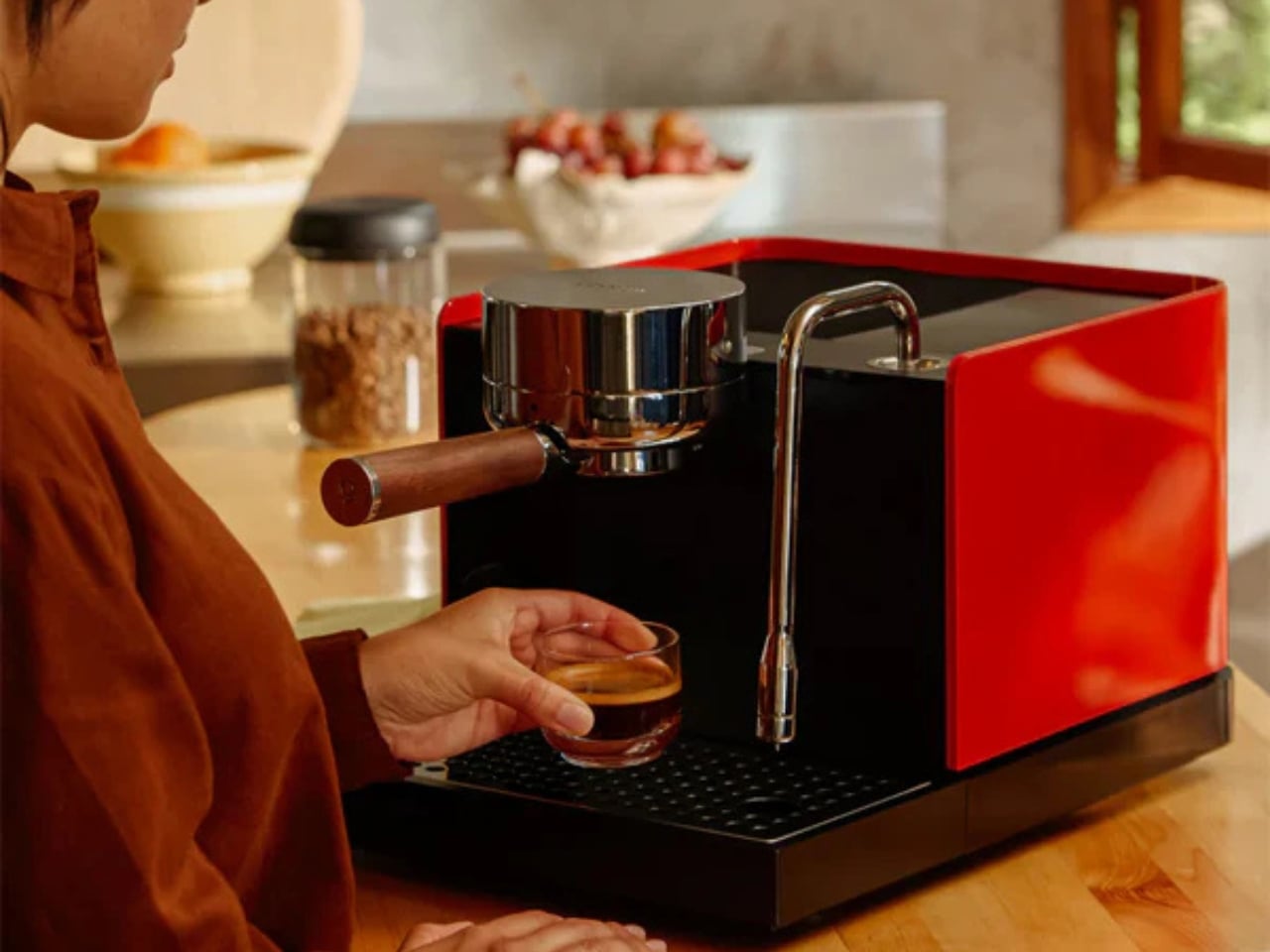
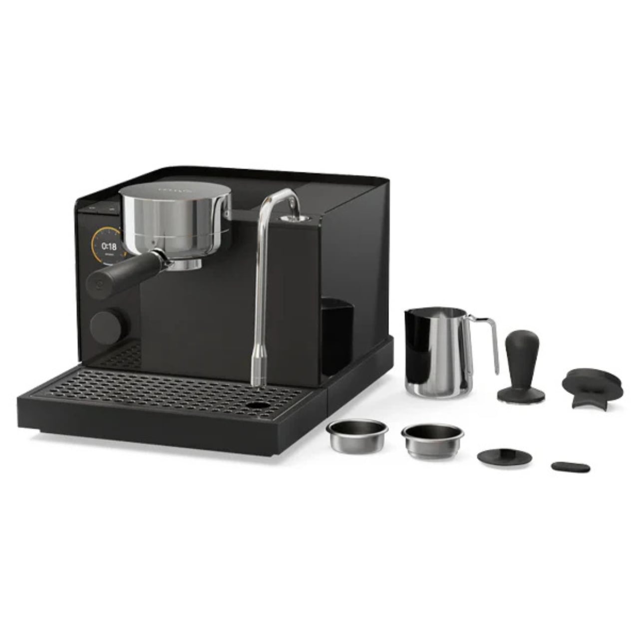
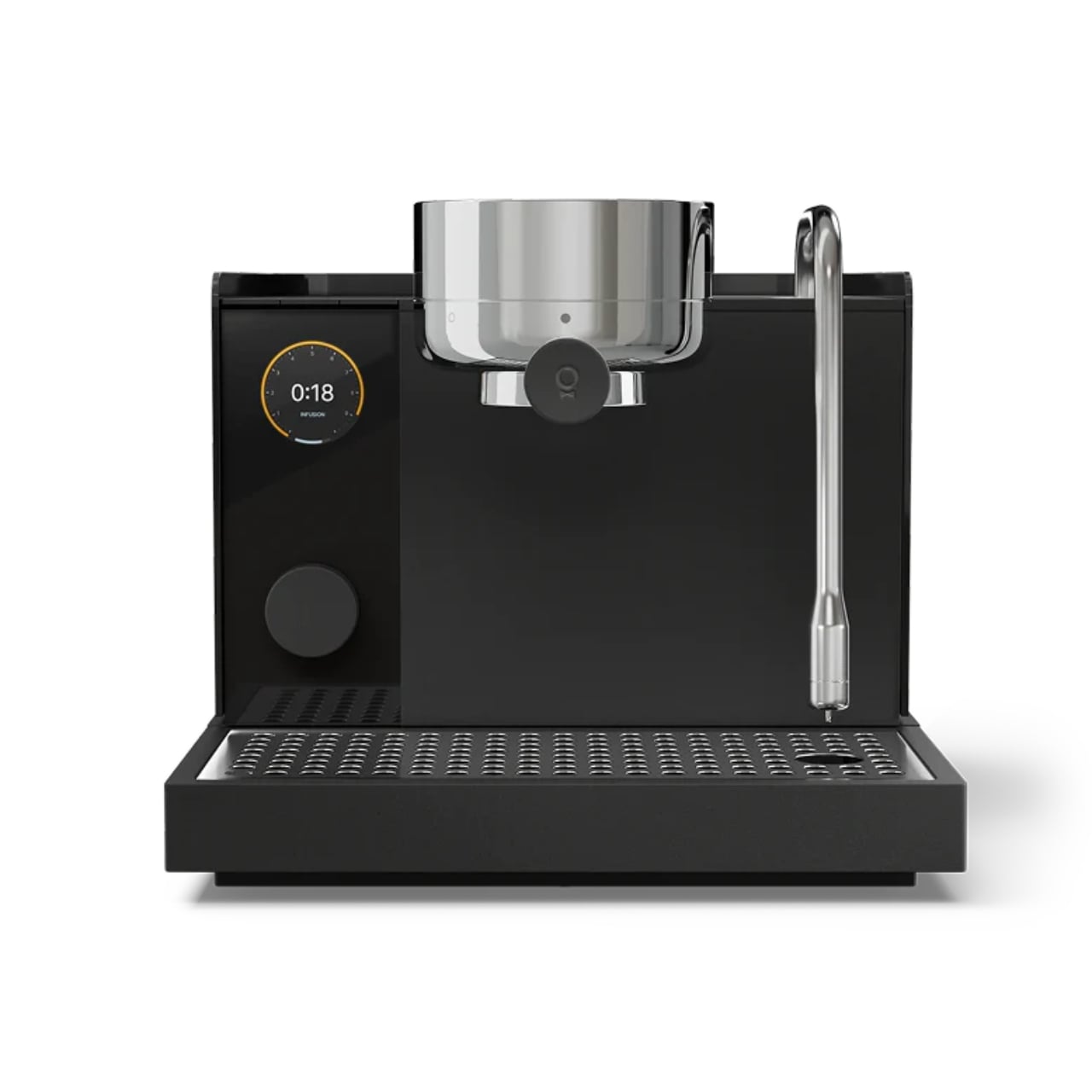
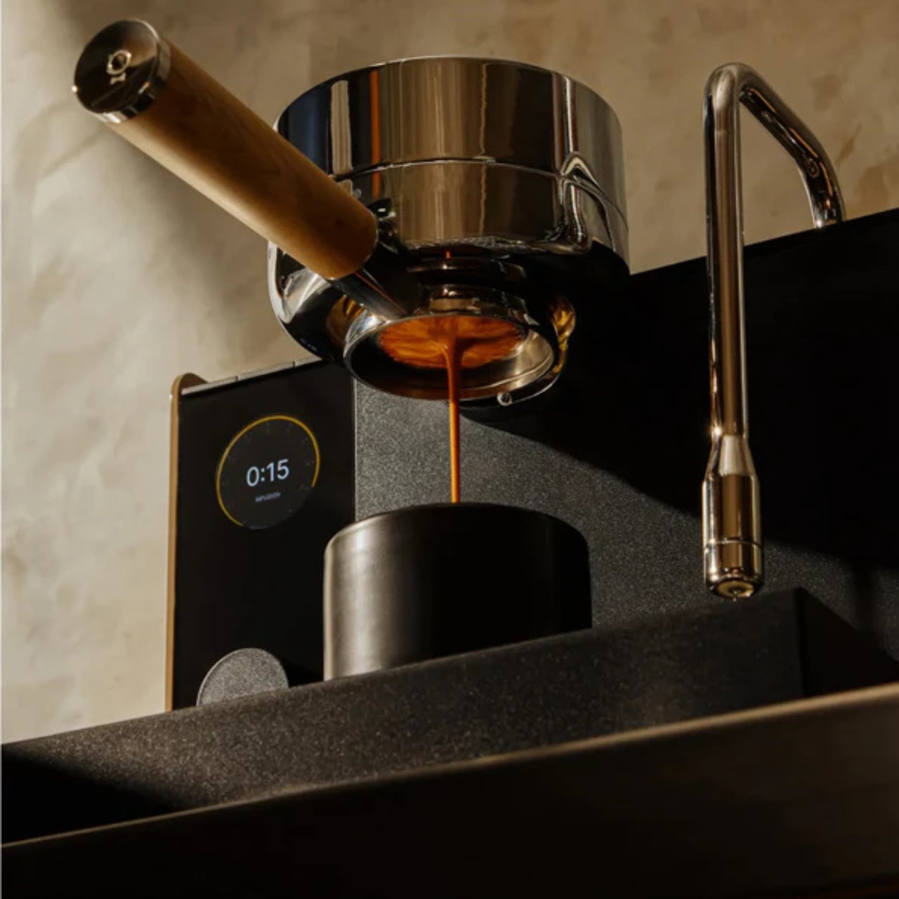
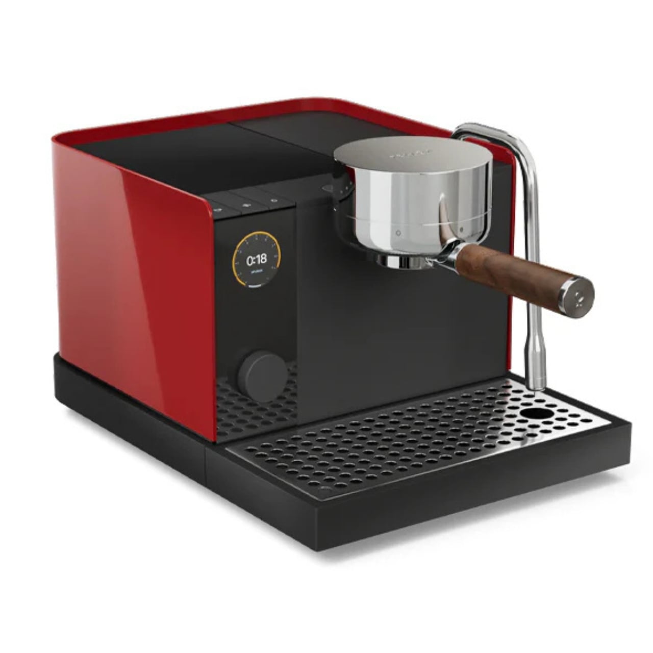
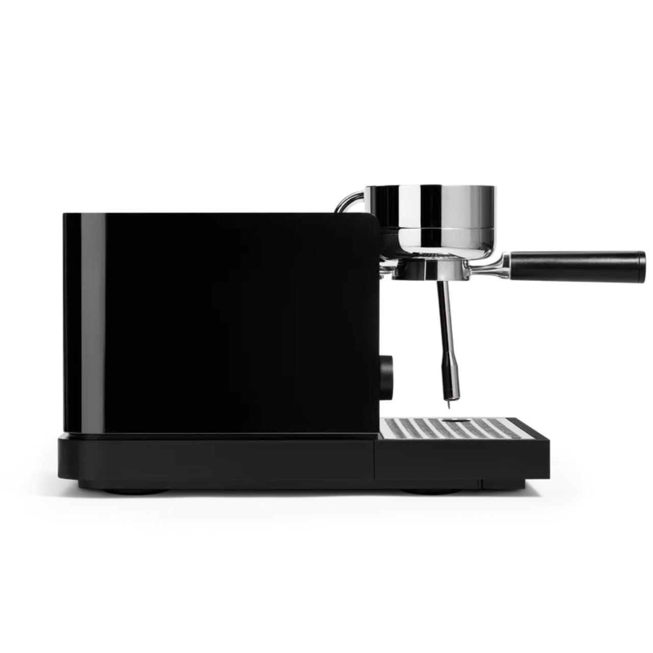
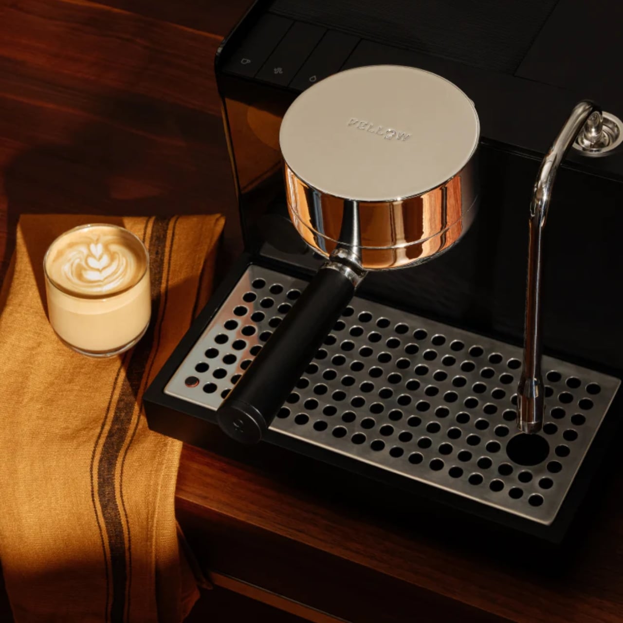
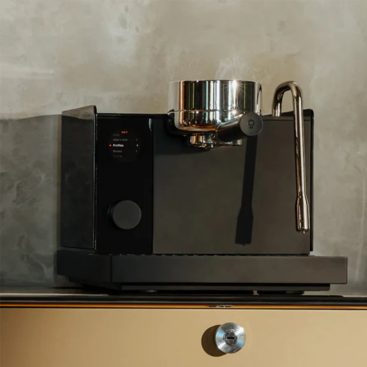
Before we even talk about what it does, let’s talk about what it looks like, because this machine is genuinely beautiful. Fellow has always been known for its clean, minimal aesthetic, and the Espresso Series 1 is no different. It comes in a sleek matte black finish with a painted ABS outer wrap, and the portafilter features a real wood accent that gives it a warm, premium feel. The three piano-style buttons for brew, steam, and hot water sit flush against the front panel, keeping things looking uncluttered and intentional. There is also a rubberized cup-warming mat on top, which is a small but thoughtful detail that makes it feel more like a café machine than a home appliance. With dimensions of 12.4 inches wide, 11 inches tall, and 17.25 inches deep, it has a compact footprint that would sit beautifully on any countertop without overwhelming the space.

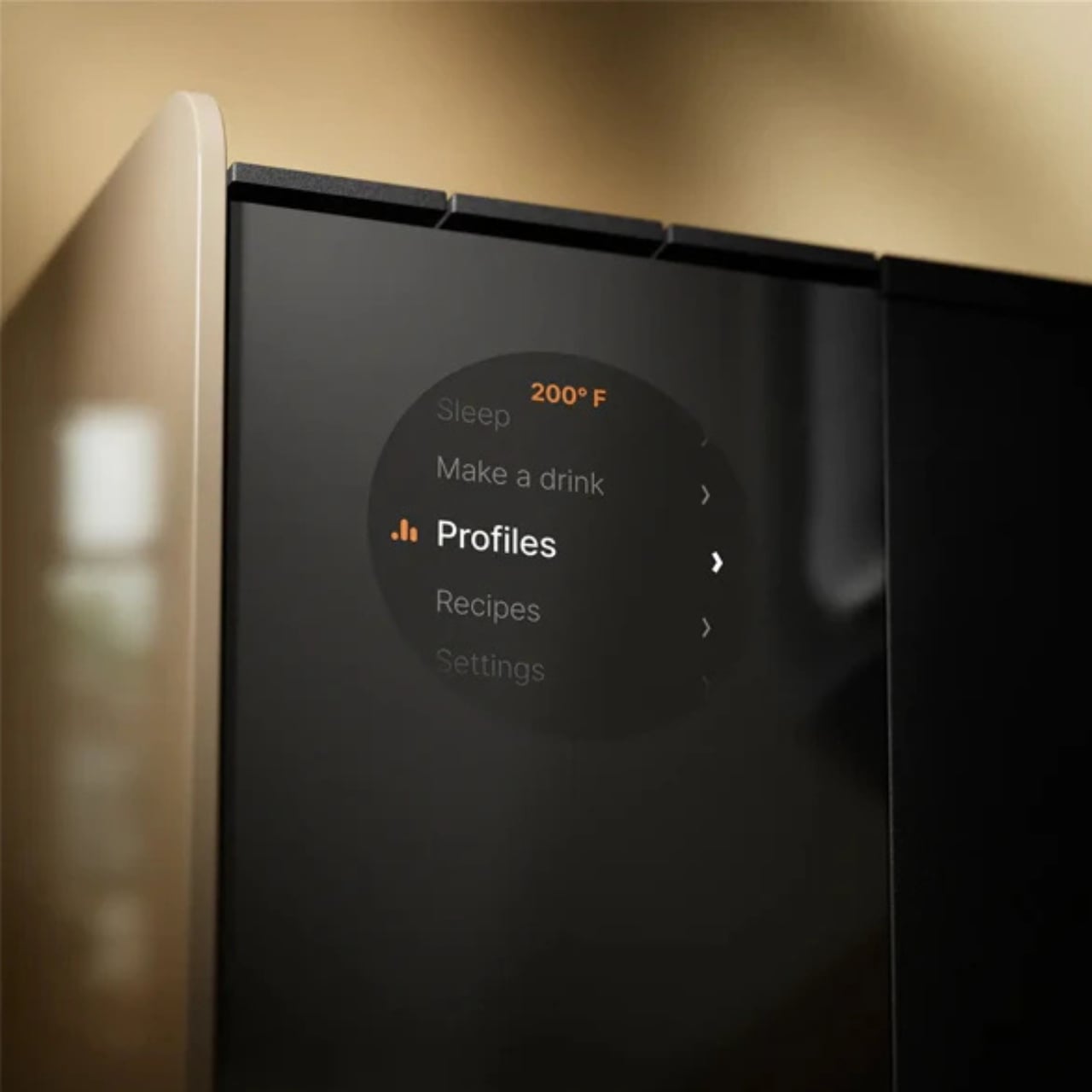
One thing that I appreciate about this machine is that the full-color LCD display will walk you through your entire brewing process. It can tell you if your shot ran too fast or too slow and can even suggest grind adjustments you can make. As a noob, this would be truly helpful if I ever got something like this. It also gives you customizable profiling including pressure, pre-infusion, brew temperature, and steam pressure, so as your skills grow, the machine grows with you.

Another feature worth highlighting is its patented Boosted Boiler system. It has a three-part heating system: a flow-through heater, a 225ml boiler, and a dedicated group head heater. This system works together to give you to-the-degree temperature stability and near-instant transitions between brewing and steaming. The warm-up time is also impressively fast at under two minutes, so you are not standing around waiting for your machine to be ready before your first morning cup.

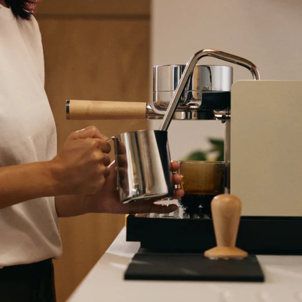
Speaking of steaming, the steam wand comes with auto-purge and auto-stop functions, which are features typically found in high-end café machines. This takes a lot of the guesswork out of steaming milk, which is something that intimidates a lot of beginners (myself very much included). Whether you are going for a flat white, a latte, or a cappuccino, having a wand that practically guides you through the process is a huge plus.

The Espresso Series 1 also connects to Wi-Fi and syncs with the Fellow app, where you can save, download, and share espresso profiles with other users. You can download brewing profiles built specifically for certain coffee roasts, which is incredibly useful when you are still learning how different variables affect your shot. It turns espresso-making into something closer to a community experience, where you can learn from other home baristas and experiment with profiles without having to start from scratch every time.

From a materials standpoint, Fellow did not cut any corners. The boiler, portafilter, and baskets are all food-grade stainless steel, the water lines are reinforced silicone, and the entire machine is BPA and PFAS-free throughout. For anyone who is conscious about what their beverages come into contact with, this is a meaningful detail that is genuinely worth calling out. The machine also uses a commercial-standard 58mm portafilter, which means it is compatible with a wide range of third-party baskets, tampers, and accessories. So as you go deeper down the espresso rabbit hole, you have the freedom to upgrade and personalize your setup without being locked into proprietary parts.

Priced at $1,499, the Fellow Espresso Series 1 is definitely an investment. But for everything it offers, from guided brewing and app connectivity to professional-grade temperature control and a genuinely beautiful design, it makes a compelling case for itself. If you have been putting off building your home coffee bar because espresso machines have always felt too intimidating or too technical, this might just be the one that finally changes your mind. It certainly has me reconsidering my morning coffee shop run.

The post Fellow Just Designed the Espresso Machine Beginners Always Wanted first appeared on Yanko Design.

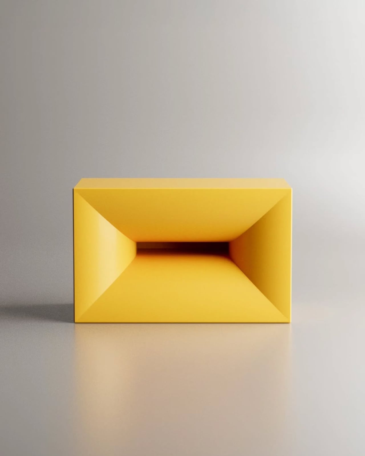
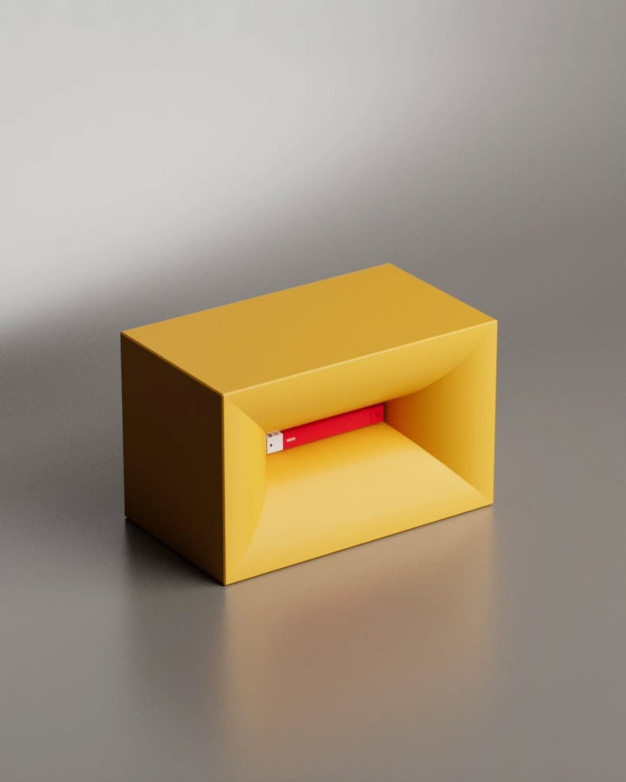
NjommNjomm Is Exactly What It Sounds Like (It Eats Books)

Say the name out loud. NjommNjomm. Go ahead. It sounds exactly like what you think it sounds like. Nom nom. Like something chewing. Like something very happily eating. And once you see what this coffee table concept actually does, you’ll understand that the name is entirely intentional and absolutely perfect.

Stuttgart-based designer Deniz Aktay, who goes by dezinobjects online, studied architecture and urban planning at the University of Stuttgart before turning his focus to furniture and object design. He has built a quiet but devoted following with pieces that feel more like riddles than furniture. His previous work includes tables named “Bookpet” and “Nessie,” and an award-winning piece called “Overlap.” The man clearly has a sense of humor, and with NjommNjomm, he’s leaning all the way into it.

Designer: Deniz Aktay (dezinobjects)

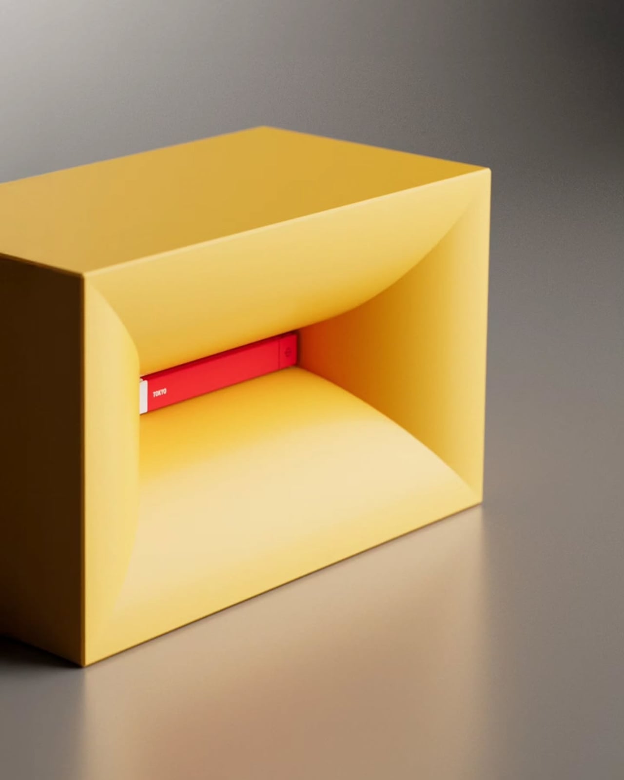
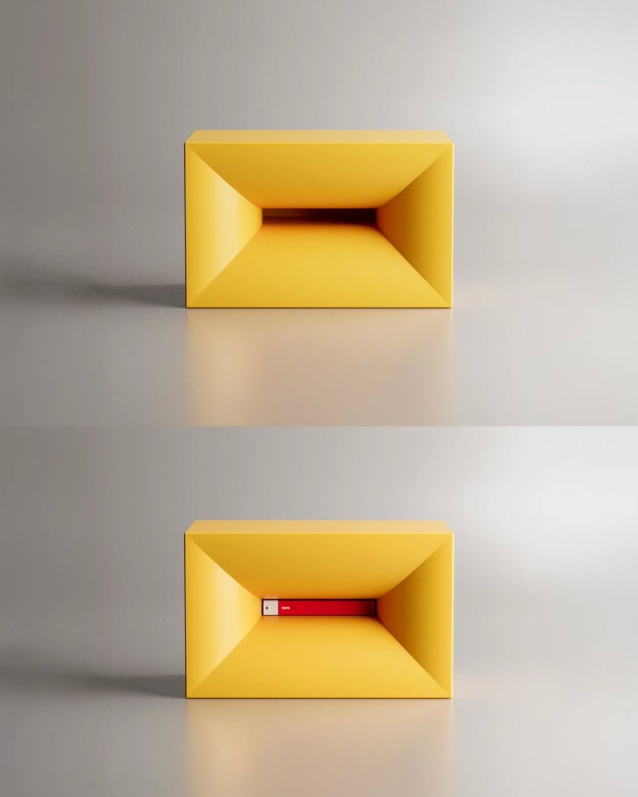
The concept is deceptively simple. NjommNjomm is a cuboid coffee table made from sustainable plastics. It has a clean, minimal silhouette, and nothing about it screams “look at me” from across the room. But tucked inside is a bevelled storage compartment, and when you slide a book of just the right size into it, something kind of surreal happens. The book appears to disappear into the table. The table appears to have swallowed it. Nom nom, indeed.

It’s the kind of visual trick that makes you do a double-take, and then immediately want to show everyone who walks into your living room. That impulse is actually one of the more underrated qualities a piece of furniture can have. Most objects just sit there. NjommNjomm performs.

The optical illusion comes from the bevelled cut of the internal compartment, which creates a striking contrast against the clean outer form. The book doesn’t just sit inside the table. It looks consumed, tucked away by the table itself. There’s a small theatrical quality to it that elevates it well beyond a storage solution and into something closer to a stage prop, except it lives in your living room and holds your coffee.

I’ll admit, my very practical brain did pause for a moment to wonder about the mechanics of it all. How exactly do you get the book in? Do you slide it through the opening? Is there a specific angle? And when you want to actually read it, does retrieving it break the illusion entirely? I genuinely don’t know, and I find myself hoping the answer is something elegantly simple, because the last thing this design needs is a frustrating extraction process every time you want to pick up where you left off.

Beyond the trick, the design is genuinely practical in other ways. The cuboid shape means it can be positioned horizontally as a traditional coffee table or flipped vertically to change its function entirely, making it more adaptable than most single-use furniture. For smaller spaces especially, that kind of flexibility matters. Being made from sustainable plastics also puts it in line with where furniture design is heading broadly, with more and more designers prioritizing materials that don’t cost the planet what they cost the consumer.

Aktay’s body of work says a lot about what he values as a designer. His pieces consistently sit at the intersection of wit and function, which is a harder balance to achieve than it looks. It’s easy to make something clever. It’s harder to make something clever that also works as real furniture in a real home. NjommNjomm feels like it manages both.

What makes the concept particularly compelling right now is the timing. The conversation around coffee tables in 2026 has largely been about sculptural forms and pieces that feel more like objects of art than pieces of furniture. NjommNjomm fits into that moment without trying too hard to belong to it. It’s minimal, almost to the point of invisibility, and then it does its little trick, and you realize it was never trying to be quiet at all.

For those of us who stack books on every available surface, there’s something poetic about a table that embraces the book as part of its identity rather than treating it as clutter. NjommNjomm doesn’t just hide the book. It celebrates it by making it look like the table chose to eat it.

It’s currently a concept, and Aktay shares his work on Instagram where designs like this tend to get picked up quickly by communities who recognize a good idea when they see one. Whether it eventually moves into production or stays in concept territory, it’s already done what great design is supposed to do. It made me stop scrolling. It made me think. And it made me want one.

The post NjommNjomm Is Exactly What It Sounds Like (It Eats Books) first appeared on Yanko Design.

This Korean Partition Uses A Periscope-Inspired Design To Reflect The Sky In Your Room

Most of us living in cities have gotten used to a very particular kind of light. It comes in flat and filtered through glass, bounced off neighboring buildings, and stripped of any real sense of time. Morning looks a lot like afternoon. The sky, if you can see it at all, is a narrow strip somewhere above the roofline. It’s become the default setting of urban life, and most of us have stopped noticing.

That quiet loss is exactly what CHAGYEONG is designed to address. Created by designers SeongJin Hwang (Neo), Soyeon Kim, and Minje Park, this series of metal craft-based living objects isn’t trying to replicate nature or substitute it with some wellness trend. It’s doing something more deliberate than that: it’s pulling an ancient architectural principle out of history and asking whether it still has something useful to say about the way we live now.

Designers: SeongJin Hwang (Neo) / Soyeon Kim / Minje Park

The concept borrowed from (and named after) is chagyeong (借景), a traditional East Asian practice that translates literally to “borrowed scenery.” The idea is that a space doesn’t have to generate its own landscape. It can simply frame, redirect, and invite the one that already exists outside. Korean architects used this principle for centuries, orienting pavilions and residences so that distant mountains, seasonal foliage, or the open sky became part of the interior experience. The environment wasn’t something to block out. It was a resource.

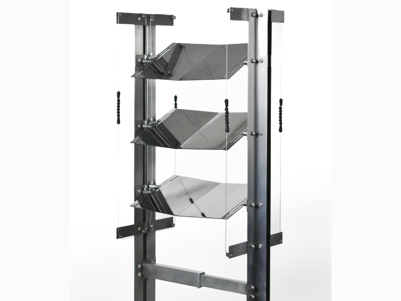
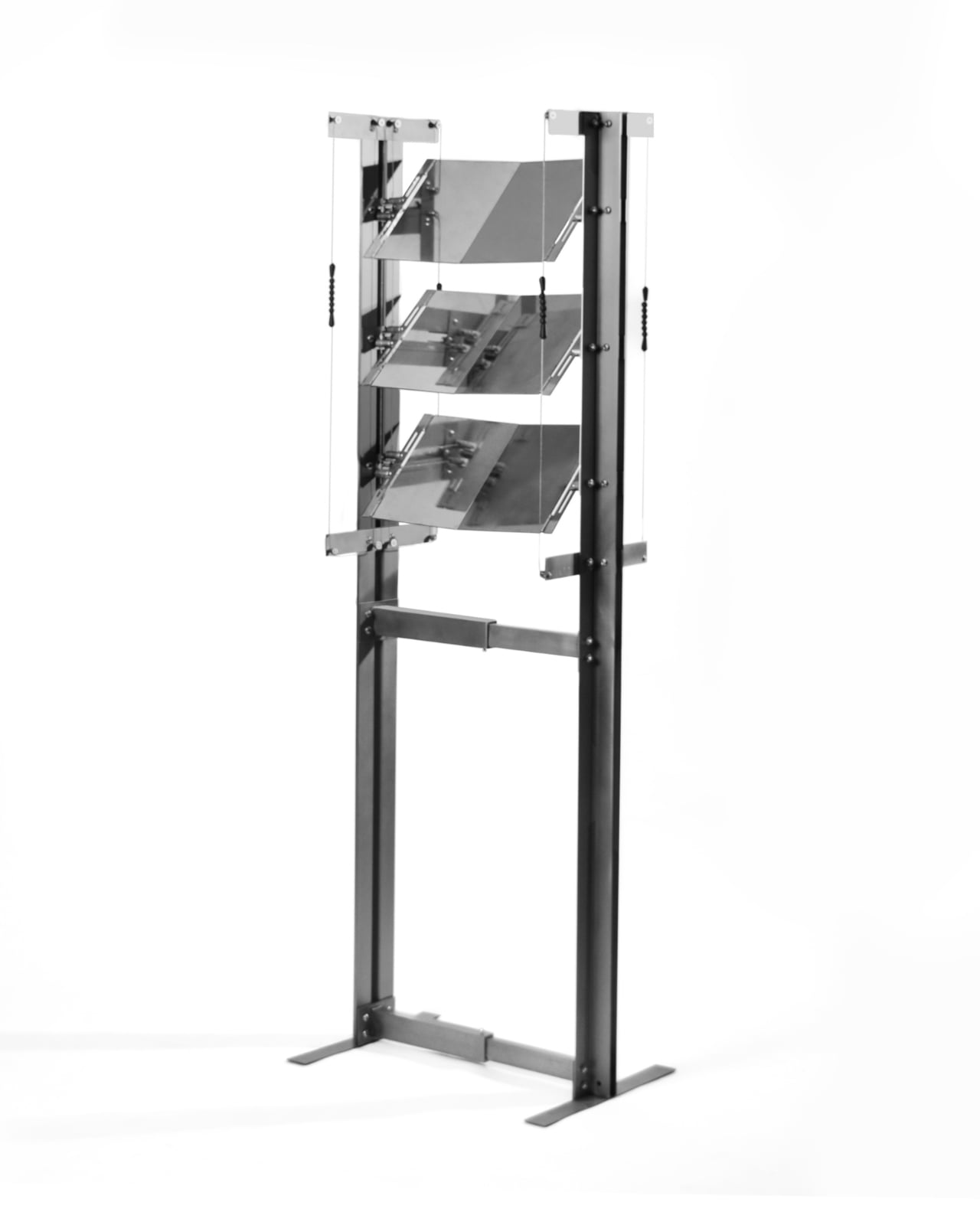
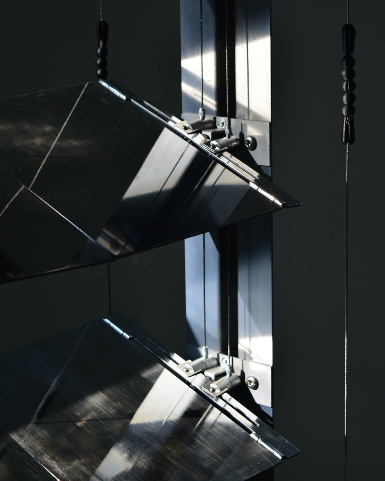
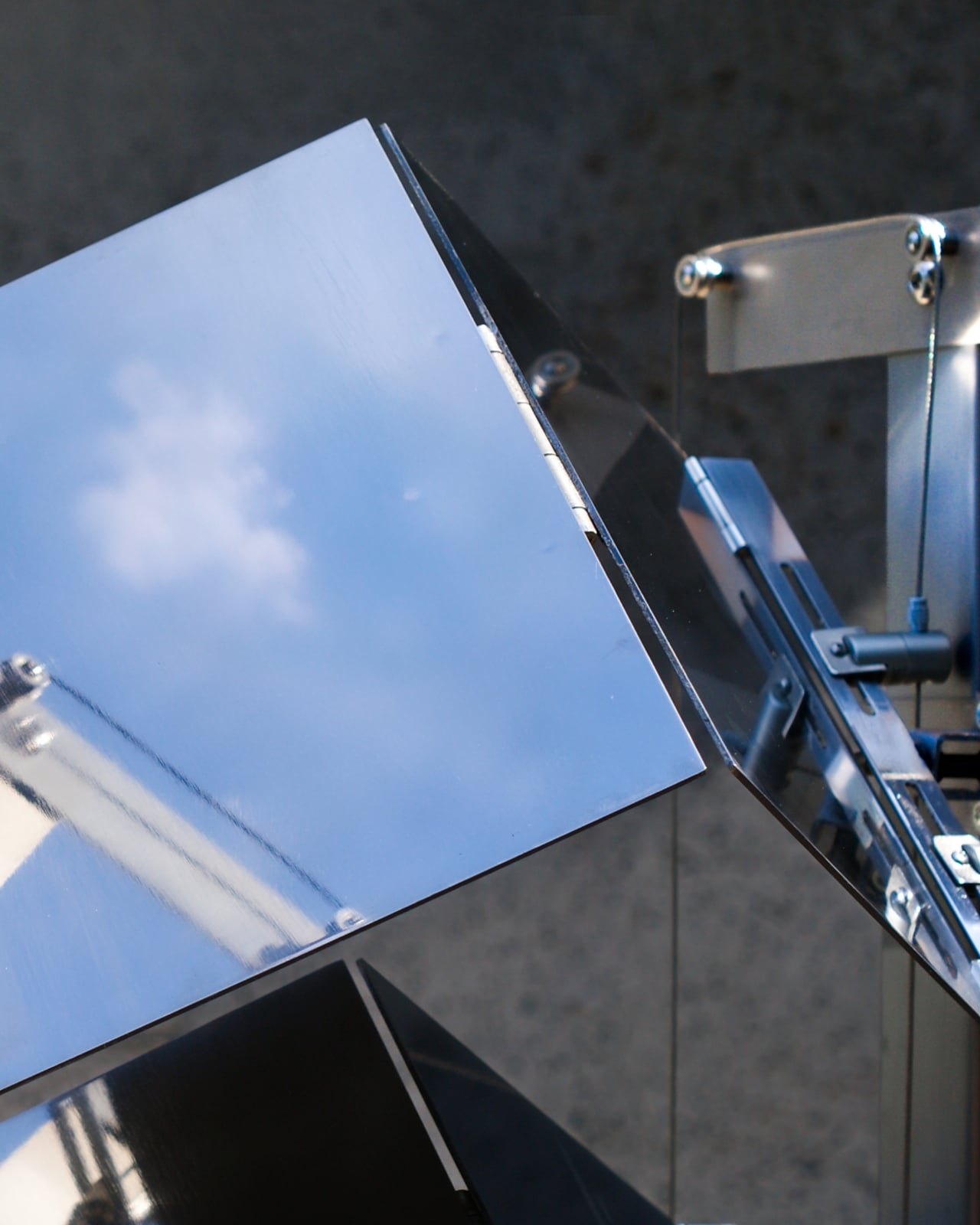
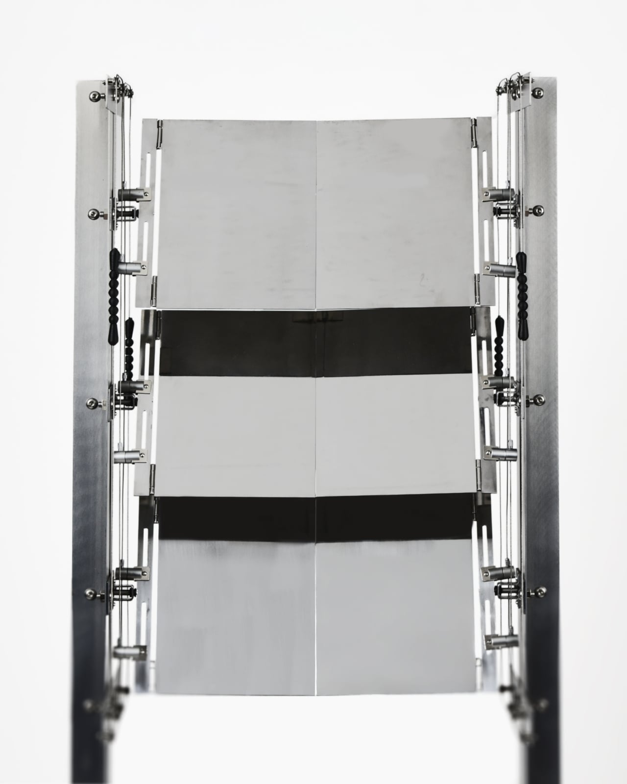
What Hwang, Kim, and Park have done with the CHAGYEONG partition is apply that sensibility to a very specific contemporary problem: urban apartments where privacy and natural light are constantly in tension with each other. The partition sits near a window, and through its rotating mirror-like metal panels, it manages to block direct sightlines from the outside while redirecting the changing colors of the sky inward. You get privacy without the heavy curtain. You get natural light without the exposure. The sky, in a very literal sense, comes inside.

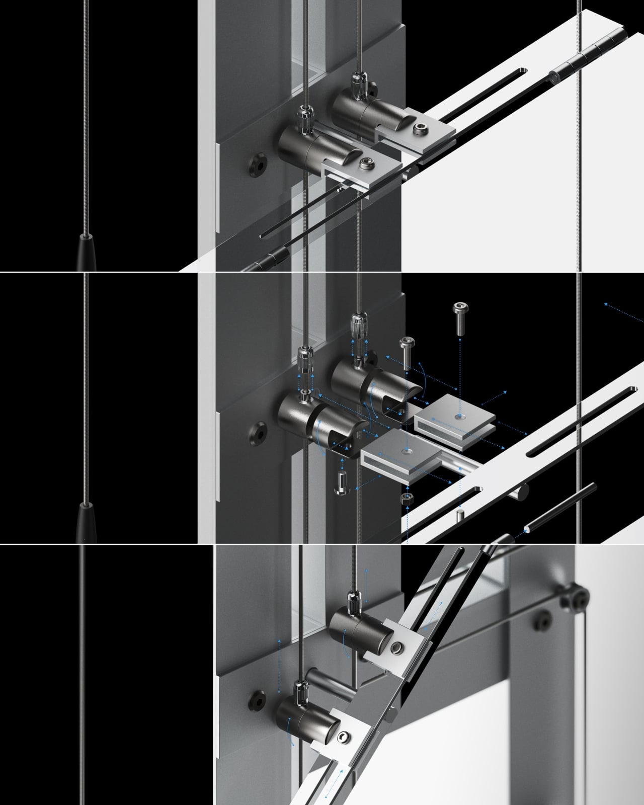
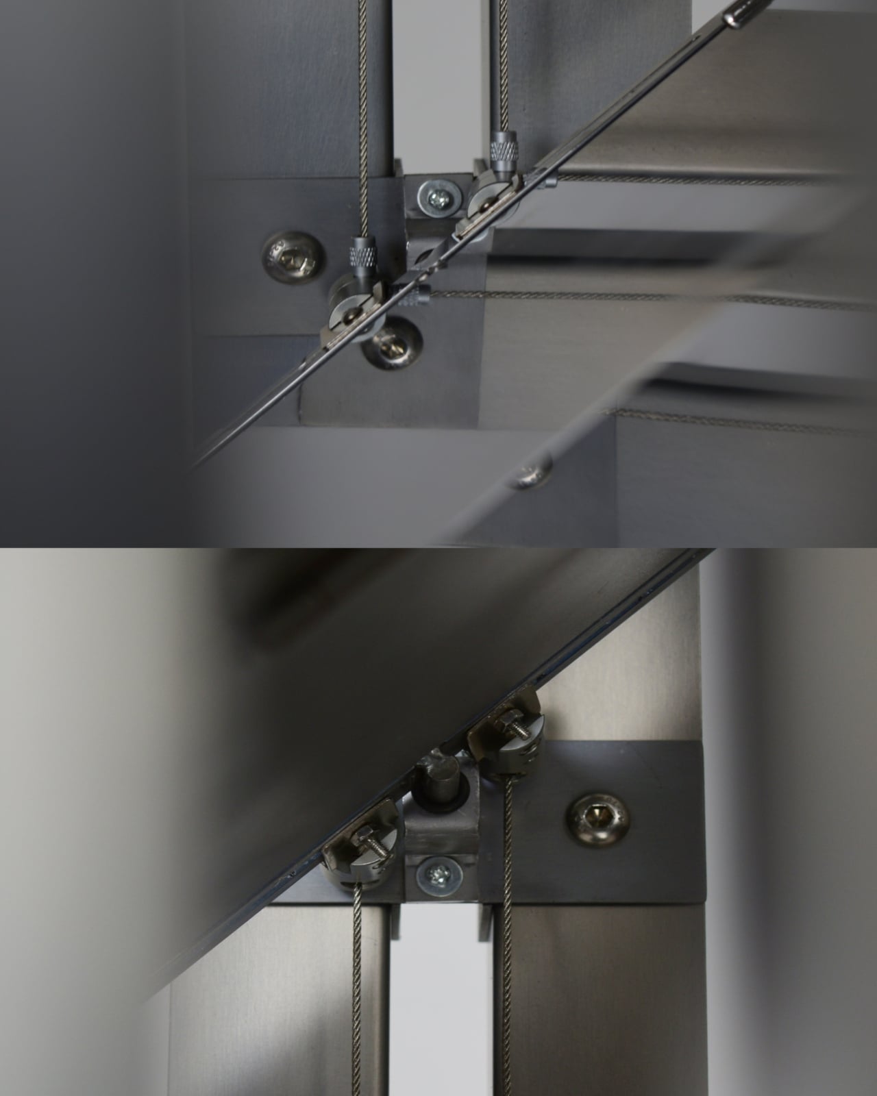
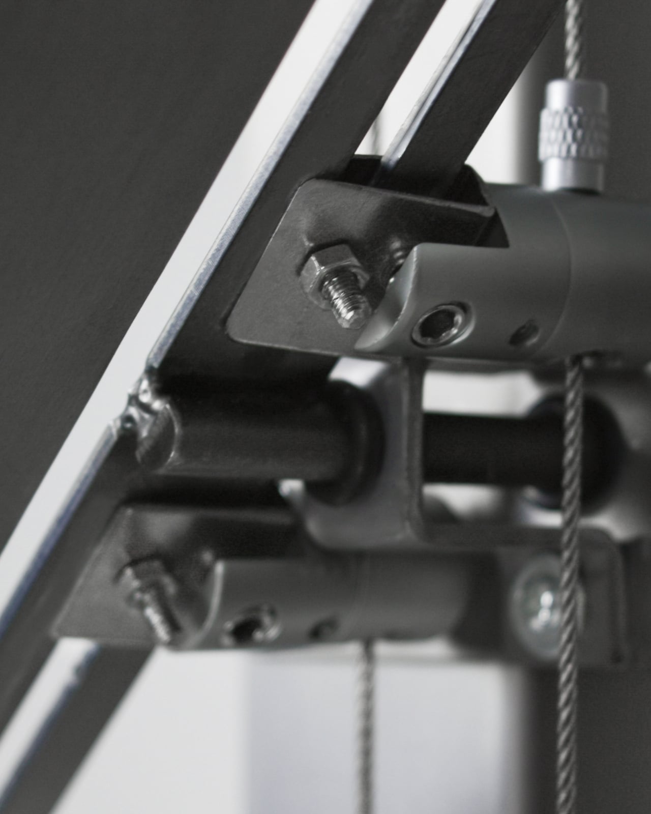
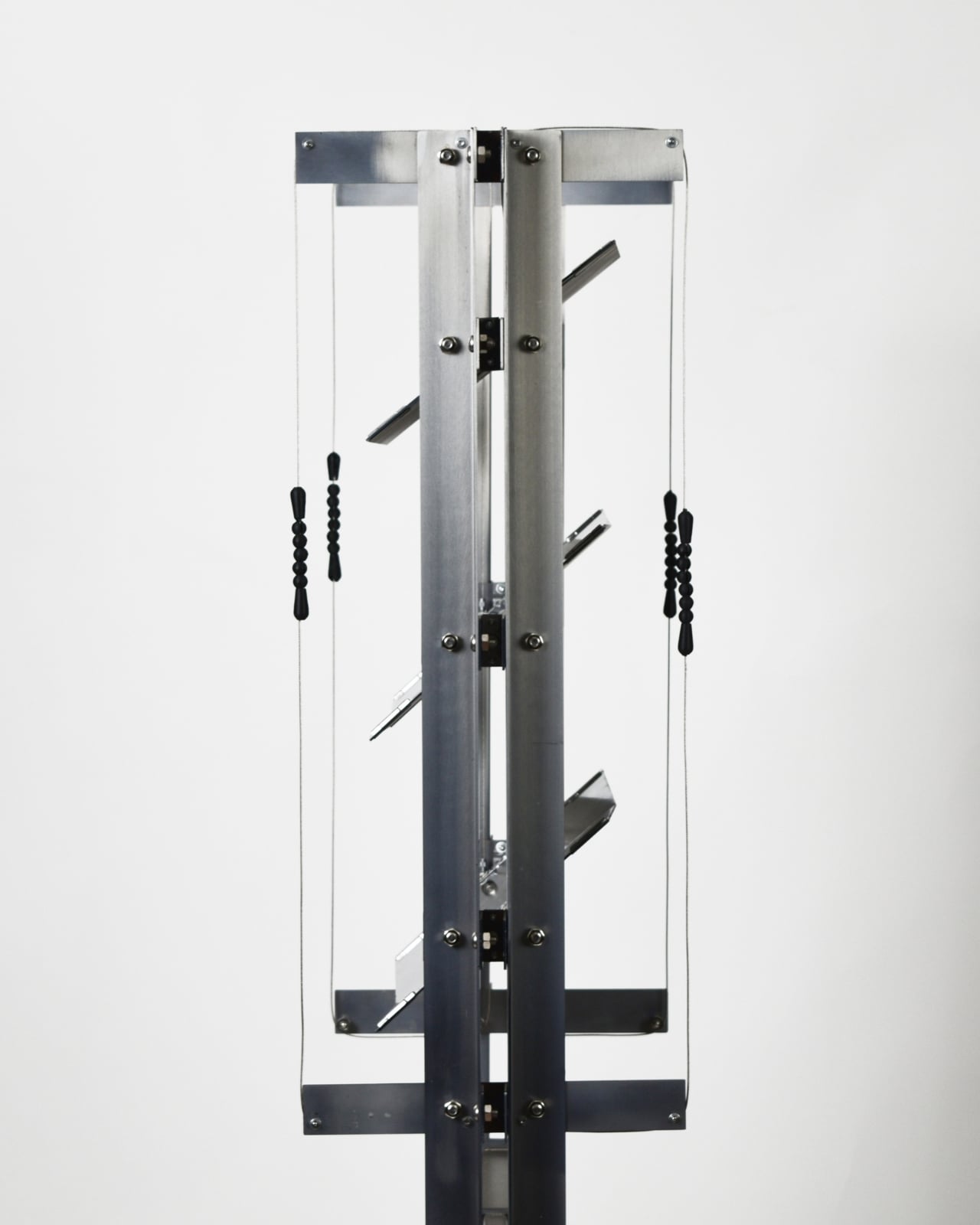
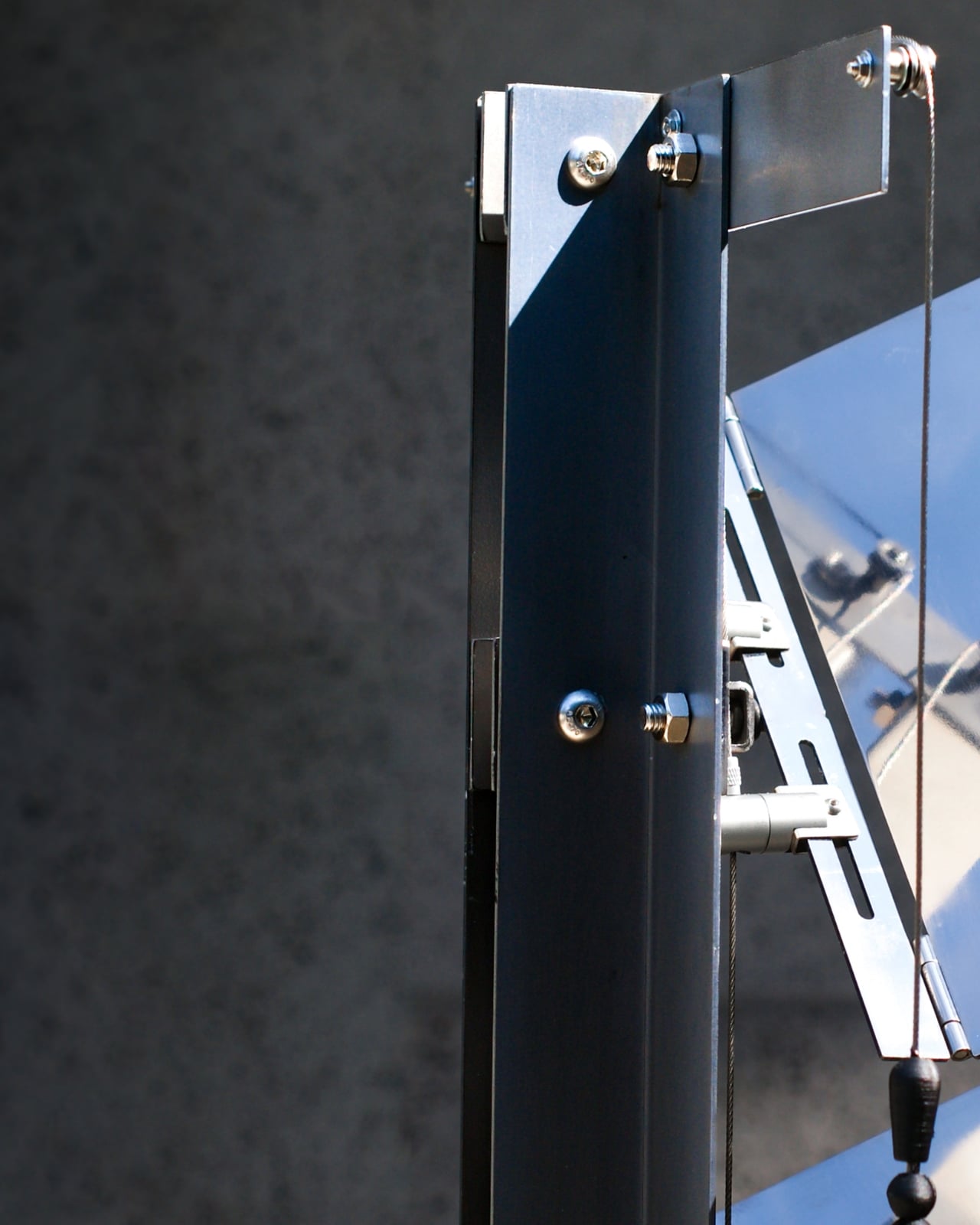
The mechanics of this are more interesting than they first appear. Each reflective metal panel can be angled to adjust the view, which means the object responds to the space rather than dictating to it. The structure is also freestanding, using load distribution instead of wall fixation, so it doesn’t require drilling or permanent installation. This matters more than it sounds. Design objects that require commitment are design objects that most renters never get to own. The flexibility here feels intentional, not just practical.

Visually, it reads as sculpture before it reads as furniture. The finely finished metal surfaces, the suspended panels, the small articulated joints and cables connecting everything: it looks like something that belongs equally in a gallery and a living room. That’s a difficult balance to strike, and the team has managed it. The industrial precision of the hardware sits alongside something quieter, almost contemplative, in the overall form.

I’ll admit that the first time I looked at it, the engineering detail drew my attention more than anything else. Looking at the close-up images of the rotating joints and the tension cables, you realize how much considered problem-solving sits behind what appears to be a minimalist aesthetic. The freestanding structure, the angled panels, the wire suspension system: none of it is accidental. Everything is load-bearing in the most literal and conceptual sense.

What stays with me, though, is the premise. The idea that a piece of furniture could be designed specifically around giving you back the sky. Not a wellness app, not a daylight lamp, not a houseplant. A metal object, engineered to redirect your attention upward and outward at the part of the world we’ve quietly agreed to stop looking at. Urban living asks us to trade a lot of things in exchange for density, convenience, and connection. Natural time, that slow visible shift from morning to dusk, is one of them. CHAGYEONG is making an argument, calmly and without drama, that the trade doesn’t have to be permanent.

The post This Korean Partition Uses A Periscope-Inspired Design To Reflect The Sky In Your Room first appeared on Yanko Design.

Nytrus Reserve Just Put a Meteorite in Your Whiskey Glass

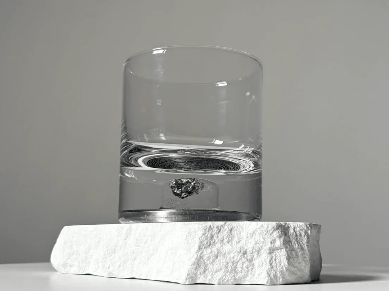
Before we talk about the glass itself, let’s take a moment to appreciate the audacity of the idea. Someone looked at a 4.6-billion-year-old space rock, pulled from the ground in northern Argentina, and thought: what if we put it inside a whiskey tumbler? The result is the Nytrus Reserve Meteorite Tumbler, and I have to say, it’s one of the more genuinely fascinating objects I’ve come across this year.

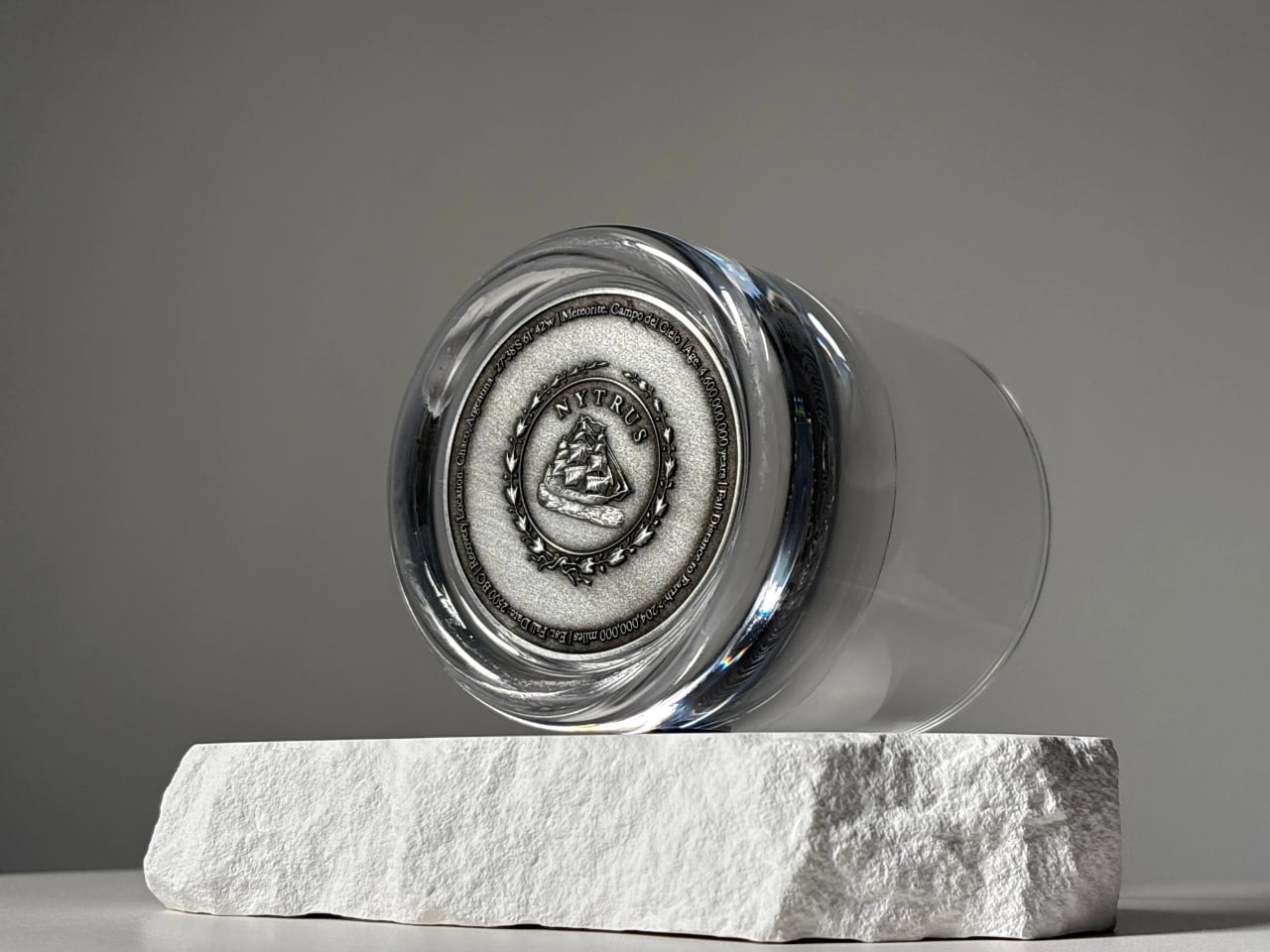
The Campo del Cielo meteorite has a story worth knowing. It broke apart over northern Argentina around 2500 BCE, scattering across a region now called Chaco. The name itself translates to “Field of Sky,” which feels almost too poetic for something so ancient. It was first mined in 1926, and fragments have since traveled everywhere from museum display cases to private collections. Now, a piece of it lives at the bottom of a crystal tumbler, and I think that’s a fitting next chapter.

Designer: Nytrus Reserve

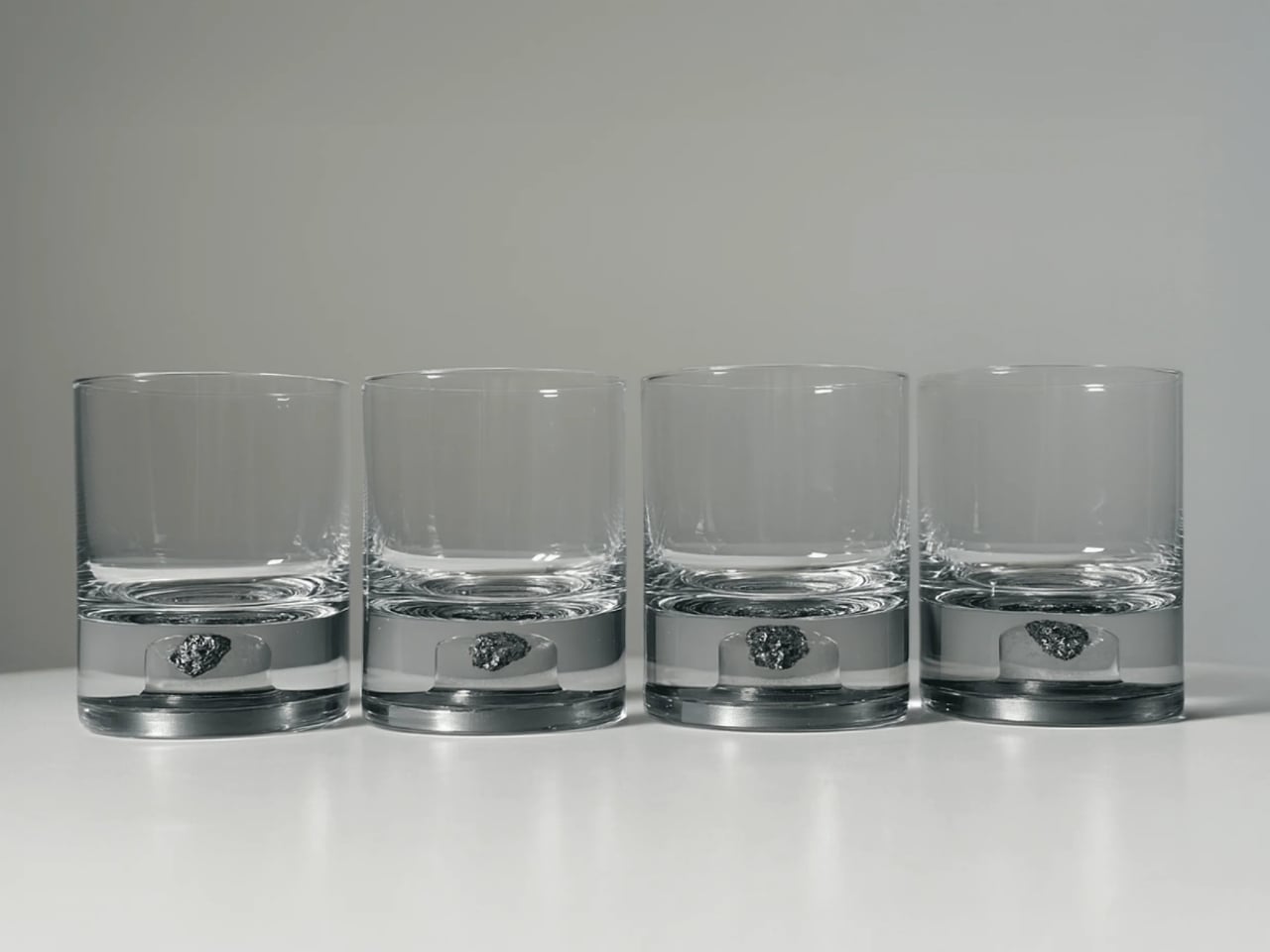
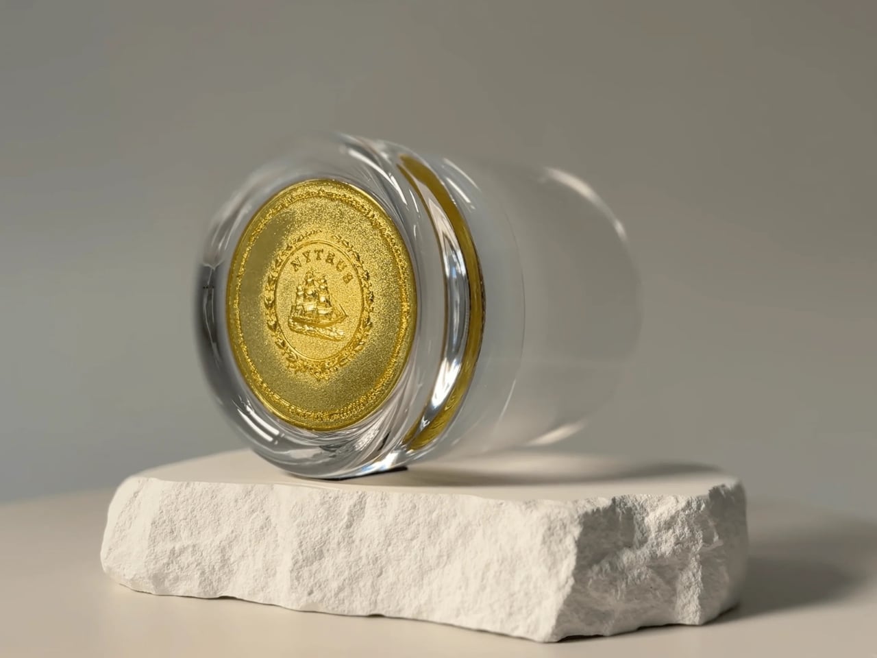
Each Nytrus tumbler is 8.5 oz and hand-blown from high-clarity glass, with the meteorite fragment suspended in the thick base. The design stays clean and minimal so the eye goes straight to the artifact. You can see it from every angle: the rough-edged, ancient rock sitting there like a period at the end of a very long sentence. No two fragments are identical, which means no two tumblers are exactly the same. A Coin of Authenticity sits beneath the fragment as a finishing detail, and it’s the kind of small gesture that signals a brand takes provenance seriously rather than just treating it as a selling point.

The tumbler is available in two finishes: Antique Tin and Amber Gold. Both are understated enough to work across different aesthetics, which matters more than people admit. A beautifully made object still has to fit where you live. The Amber Gold leans warmer, the Antique Tin more cool and contemporary. I’d probably go Antique Tin just for the visual contrast against the darker meteorite fragment, but that’s entirely personal preference.

Nytrus has been releasing these in limited series, each capped at 300 editions. They’re currently on Series IV, and previous series have sold out. That doesn’t surprise me at all. For a product sitting so specifically at the intersection of science, craft, and ritual, that kind of traction makes sense. It’s not trying to be for everyone, and the people it’s for seem to know it immediately.

The weight and presence of the glass is something that comes up again and again in reviews. It feels solid in the hand, which matters when you’re drinking something worth savoring slowly. Luxury drinkware often gets the look right and then fails on feel, so it’s reassuring that the craftsmanship follows through on what the concept promises. Over 1,200 collectors have bought in, with the tumbler holding a 4.9-star rating, which for a product this specific is pretty telling.

I’ll be honest about something. Products pitched as “conversation starters” can sometimes feel like a lazy shortcut for things that don’t have much else going on. But the conversation a meteorite tumbler actually starts is a good one. How did this thing get here? What was happening on Earth when this rock was falling through space? When you can trace a drinking glass back to a fragment that traveled 204 million miles from the asteroid belt, that’s not a gimmick. That’s just a legitimately extraordinary object.
Whether or not you drink whiskey, the Nytrus Reserve Meteorite Tumbler earns its place in a rare category of design objects that justify their asking price through real rarity and genuine craft. The fragment is authentically ancient. The glass is authentically handmade. The scarcity is real. That combination doesn’t come together very often, and when it does, it’s worth paying attention. If you want to feel a little more connected to the universe the next time you sit down with a drink, this is a pretty direct route.

The post Nytrus Reserve Just Put a Meteorite in Your Whiskey Glass first appeared on Yanko Design.