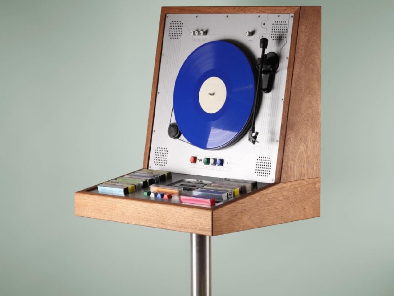
Arcade Game-shaped Wooden Cabinet Plays Vinyl Vertically and Cassette Tapes

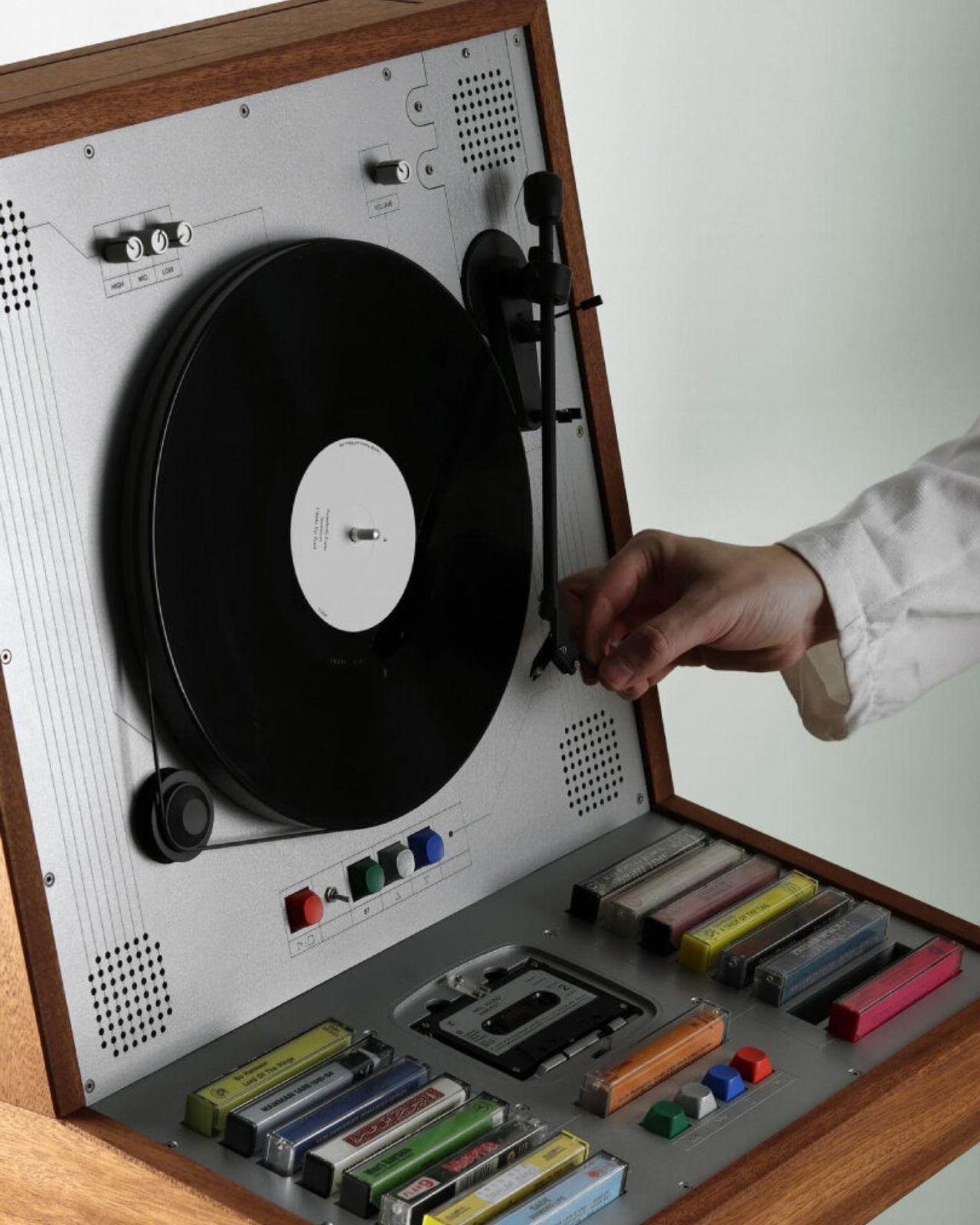
There’s something genuinely exciting happening in the world of audio design, and it comes packaged in warm wood and a beautifully nostalgic aesthetic. Swedish artist and craftsman Love Hultén has just unveiled a wooden music cabinet that does something no one really asked for, but everyone immediately wants: it plays vinyl records vertically while also housing a full collection of cassette tapes.

Yes, vertically. Your records, standing upright, spinning in a way that feels both physically unlikely and somehow completely right. It’s the kind of design move that makes you stop scrolling, tilt your head, and go, “Wait, how?”

Designer: Love Hultén
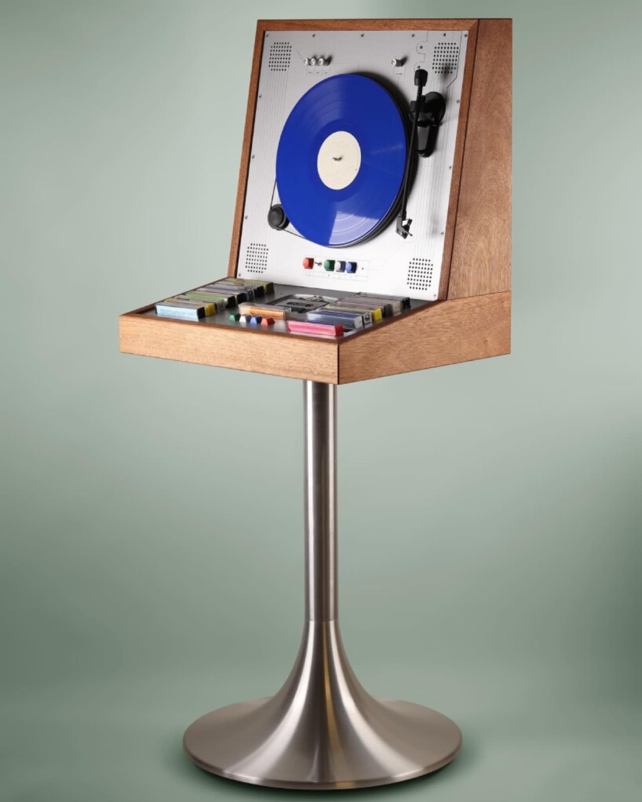
Hultén has built a reputation for creating custom, handcrafted audio devices that sit at the crossroads of art, furniture, and technology. His past work includes a synthesizer housed inside a wooden cabinet, retro-inspired tape players, and all manner of beautifully tactile objects that feel more like heirlooms than gadgets. The wooden music cabinet is very much in that tradition, except it’s one of his most complete visions yet.
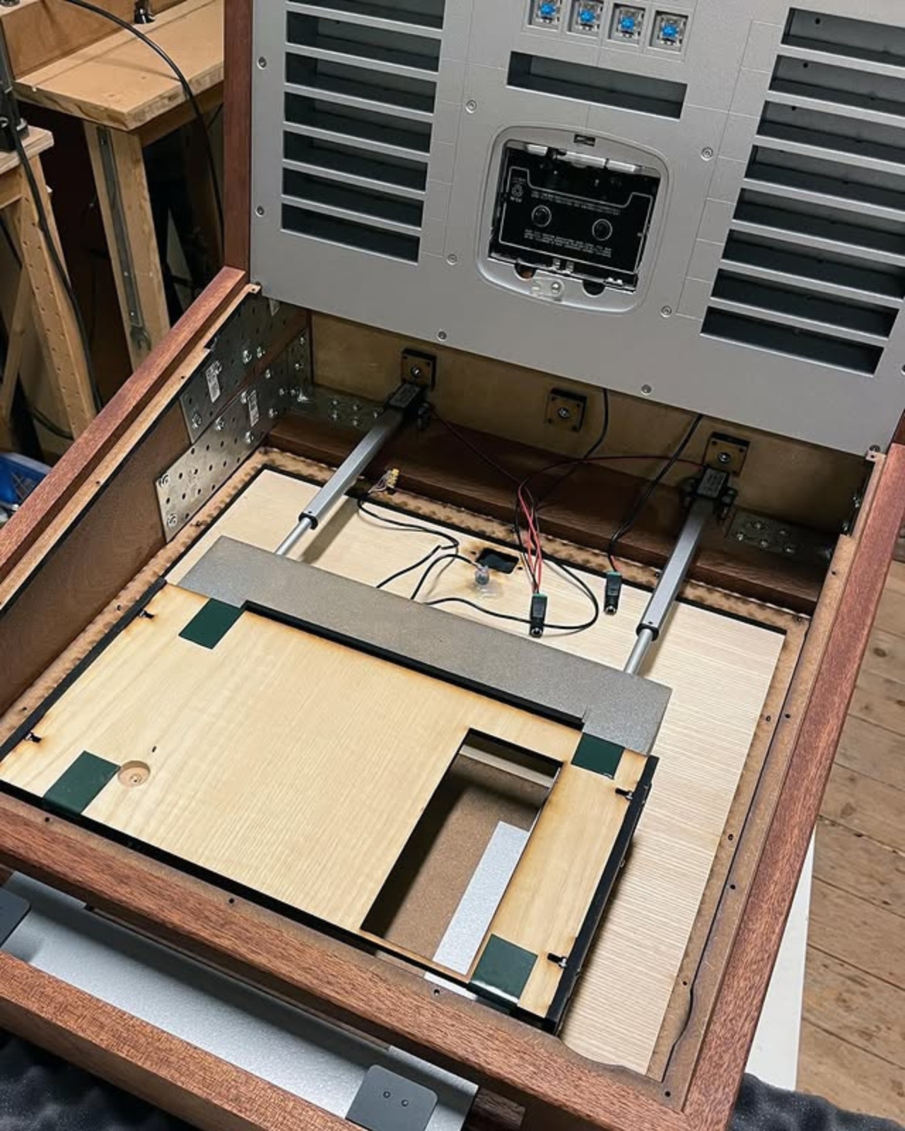
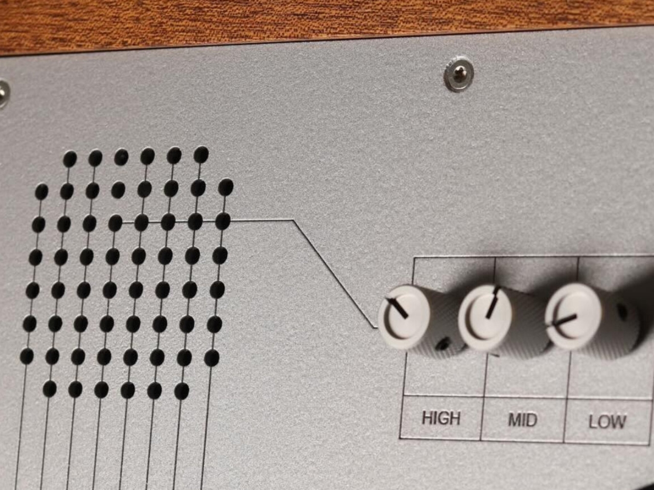
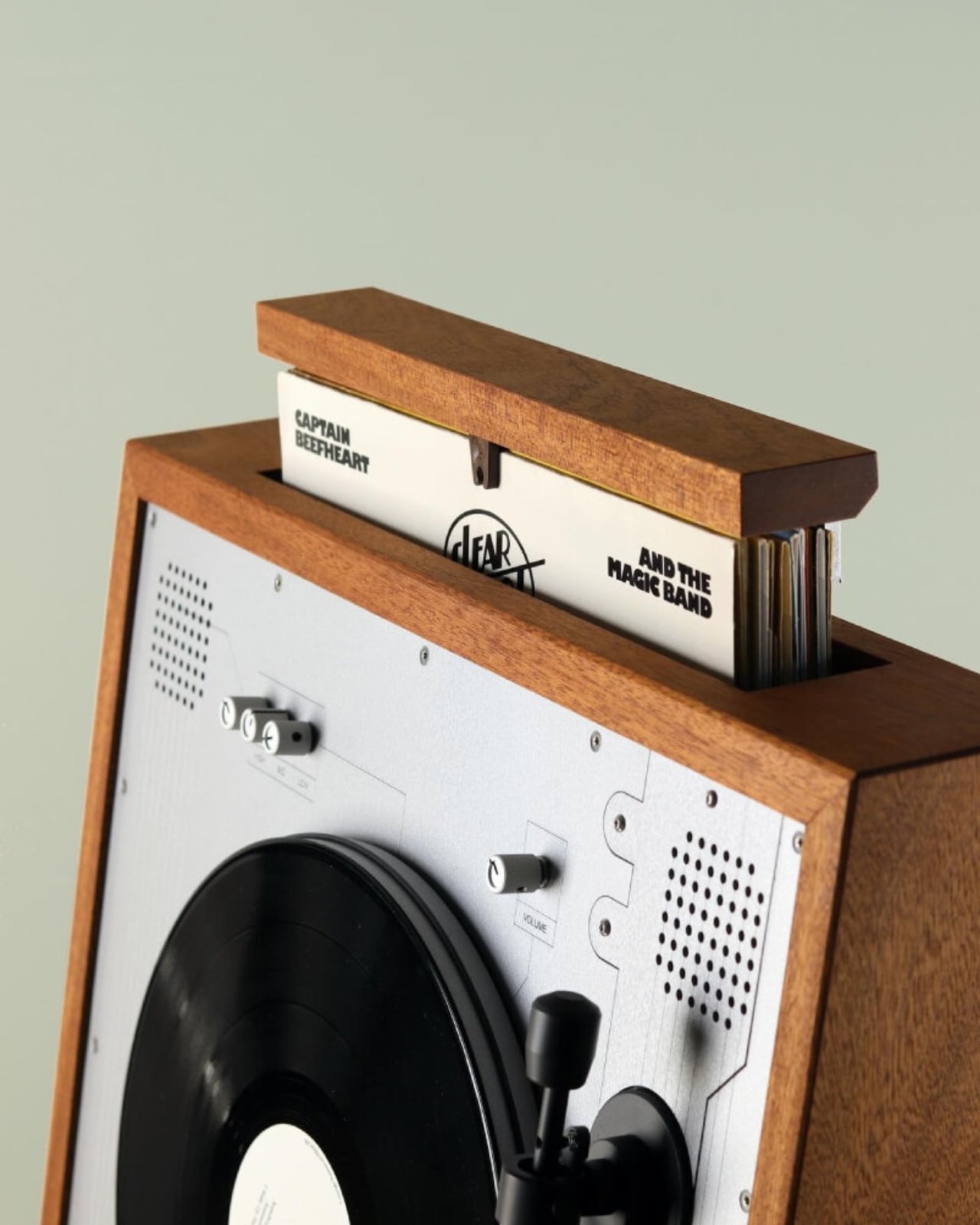
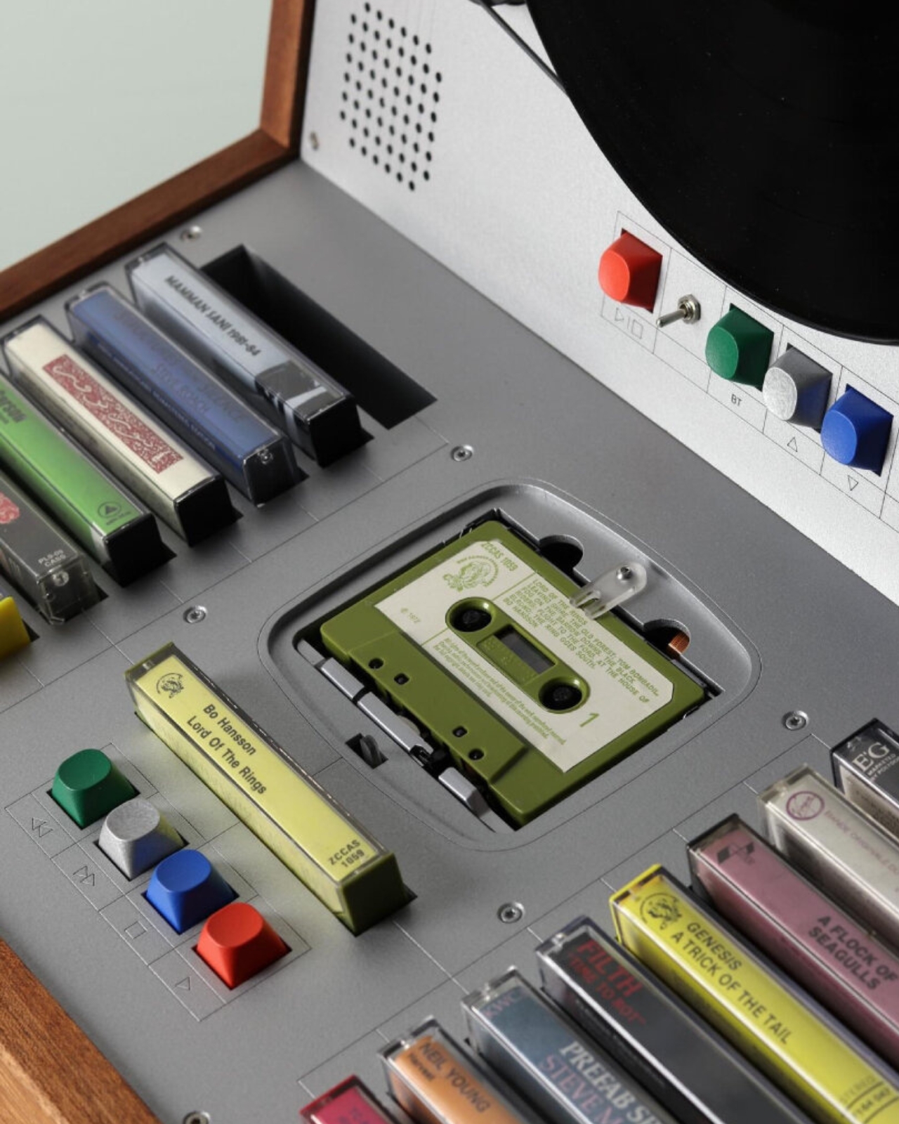
The cabinet itself is built from rich, natural wood, giving it the warmth and weight you’d expect from a well-made piece of furniture. But the front panel around the record player breaks from the organic material and shifts into light gray metal, a nod to an older vision of futurism. It’s a contrast that works surprisingly well, the wood grounding the piece while the metal gives it a certain retro-industrial cool.
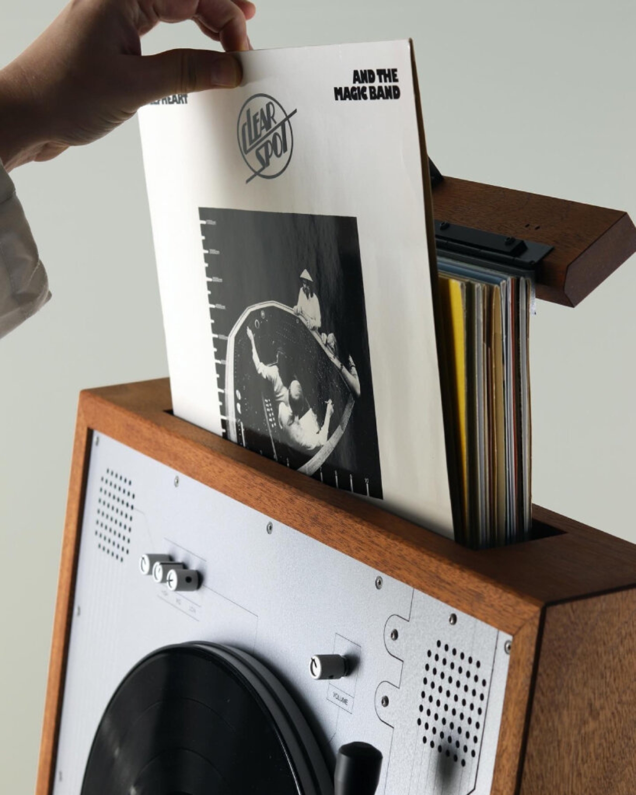
Sound control comes through a row of small, round knobs at the top of the panel, each one labeled for high, mid, and low. Flanking them on both sides are speaker holes arranged in a clean grid pattern, the kind of detail that feels satisfyingly considered. Nothing is there by accident. Everything has a place.
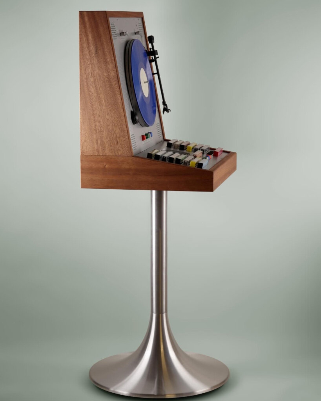
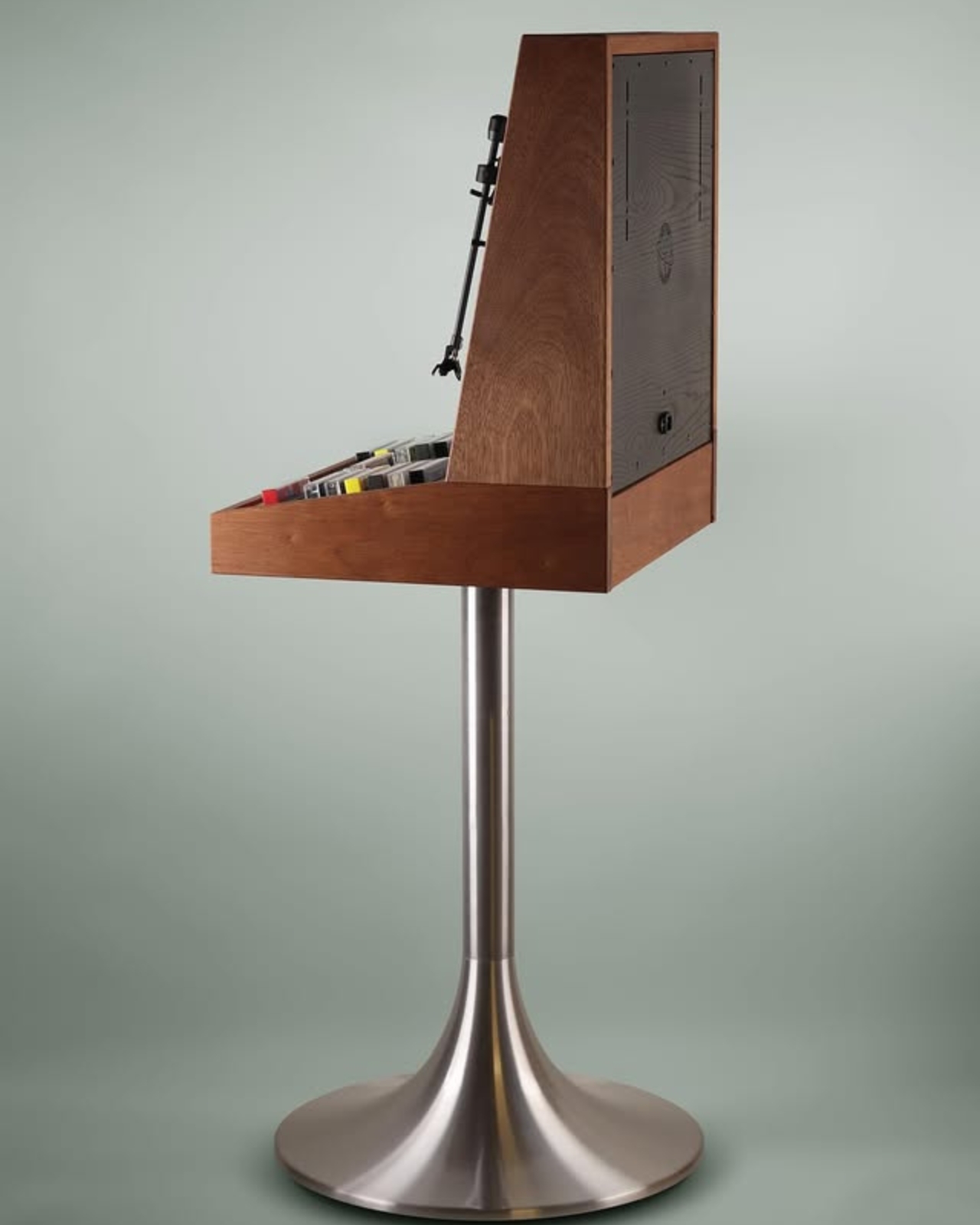
Below the turntable, the cabinet opens up into storage for cassette tapes, with several colorful ones arranged neatly in rows, also stacked vertically to mirror the record player above. The storage section holds up to 12 records. The whole layout feels like Hultén thought carefully about the ritual of listening, giving both formats their own dedicated space without either one feeling like an afterthought.
The design draws clear inspiration from the Rosita Commander Luxus, a 1970 audio unit with that signature high-chair silhouette and a decidedly mid-century European flair. Hultén’s version carries that same upright, almost architectural posture but updates it with his own sense of craft and intention. The result is something that belongs in a well-curated living room or a design studio, not tucked under a TV stand or shoved in a corner.

What makes Hultén’s work so compelling is that it refuses to be just one thing. It’s not purely nostalgic, leaning entirely on the romance of physical media. It’s not purely modern either, chasing specs and wireless connectivity. It lives in the middle, treating analog formats as something worth celebrating rather than merely tolerating, and wrapping them in an object that demands to be looked at as much as listened to. Hultén himself has described his practice as playing with preconceptions about the distinct realms of art and design, breaking patterns of function and aesthetics.
There’s also something worth noting about the moment we’re in. Vinyl sales have been climbing steadily for years, and the cassette tape revival has moved from niche curiosity to genuine cultural moment. Hultén’s music cabinet arrives at exactly the right time, when people aren’t just listening to physical media again but actively thinking about how it fits into their spaces and their identities.

A music cabinet like this isn’t just a player. It’s a statement about what you value, a rejection of invisible, streaming-era audio in favor of something you can touch, organize, and display. It’s the kind of object that starts conversations, the kind people notice the moment they walk into your room. No price or availability has been announced yet, which tracks for a piece this considered. Love Hultén’s creations tend to be custom or limited, made with the patience and intention that mass production simply can’t replicate. Whatever the wait turns out to be, it might just be worth it.
The post Arcade Game-shaped Wooden Cabinet Plays Vinyl Vertically and Cassette Tapes first appeared on Yanko Design.


Two Artists Wrapped a Farm Greenhouse in a Giant Quilt

Every winter, Minneapolis does something the rest of the country quietly envies. Instead of hibernating indoors until spring shows up, the city drags its creativity out onto the frozen surface of Lake Harriet and builds a village. Not a regular village, though. An art village, made up of artist-built structures, performances, and interactive installations that take over the ice for four consecutive weekends. That’s the spirit behind Art Shanty Projects, now celebrating its 20th anniversary season, and it gets better with every passing year.

For 2026, one installation has been making the rounds online for all the right reasons. Artists Emily Quandahl and Madeline Cochran were commissioned to create a structure of their own, and what they came up with is genuinely one of the most charming things you’ll see all year. They called it the Quilt Shanty, and the name does exactly what it says.

Designers: Emily Quandahl and Madeline Cochran

The structure is a hoop house, the kind you’d typically find on a farm protecting crops from the cold, wrapped entirely in a patchwork quilt. Big, bold, colorful squares stretch across the curved surface of the frame, sitting right there on the frozen lake like someone dragged their grandmother’s most treasured blanket outside and built a room around it.

The concept is rooted in the tradition of barn quilts, those large painted quilt-pattern squares that farmers in rural America hang on the sides of their barns. Quandahl and Cochran took that idea and made it three-dimensional and tactile. The quilt itself measures 9 feet by 16 feet and is made from quilt squares that Quandahl designed and constructed by hand, pulling materials from her own studio: leftover painting scraps, drop cloth, and colored vinyl. Cochran contributed illustrated muslin pieces featuring folk-style drawings, as well as wood-burned quilt tiles that add another layer of texture and craft to the whole thing.

What makes it stand out beyond its visuals is the way it pulls people in. The installation is interactive. Visitors can sit inside, pick up quilt-square puzzle pieces, and assemble their own designs. Cochran designed the wood-burned puzzle pieces, and Quandahl created a colored vinyl trifold key to help guide the activity. It’s the kind of participatory experience that makes you slow down and actually engage, rather than just snap a photo and move on, though you will absolutely want to snap a photo.

The two artists bring complementary practices to the table. Quandahl works primarily in painting, while Cochran takes a multimedia approach that frequently incorporates textiles and weaving. Their collaboration feels natural because of that balance, one thinking in structure and surface, the other in fiber and folk tradition. Together, they’ve created something that doesn’t feel like a design project as much as it feels like an invitation.

There’s also something quietly meaningful in the choice of a hoop house as the base form. Hoop houses are agricultural structures, tied to growing seasons and the cycle of land. By covering one in a quilt and placing it on a frozen lake in the middle of winter, Quandahl and Cochran are drawing a line between rest and care, between the quiet dormancy of cold months and the warmth of human hands making things. The installation celebrates rural craft traditions like quilting, embroidery, woodcarving, and wood burning, while highlighting the seasonal cycles of rest and care when the land is quiet. These are old skills finding renewed appreciation in contemporary art and design circles, and seeing them applied to a public installation on a frozen lake feels exactly right.

This is exactly the kind of project that reminds you why public art matters. It doesn’t ask anything complicated of you. It just shows up on a frozen lake, colorful and open, and invites you to come inside. That accessibility, that warmth in the middle of all that ice, is no accident. It’s the whole point. If you haven’t heard of Art Shanty Projects before now, consider this your introduction. And if you’re anywhere near Minneapolis this winter, there’s a patchwork hoop house on Lake Harriet waiting for you.

The post Two Artists Wrapped a Farm Greenhouse in a Giant Quilt first appeared on Yanko Design.

Box Clever Just Designed the Air Purifier Offices Want on Desks

There’s a particular kind of object that design-minded people notice when they walk into a room. Not the artwork on the wall or the fancy ergonomic chair. It’s the small, considered thing sitting on a desk or a conference table that makes you stop and think, “wait, what is that?” The Delos WellCube is that kind of object.

Created by San Francisco-based studio Box Clever in collaboration with wellness technology company Delos, the WellCube represents a design challenge that most air purifier manufacturers have been getting wrong for years: how do you make something people actually want in their workspace instead of something they tolerate?

Designer: Box Clever

The brief was specific. Delos has spent more than a decade researching the relationship between indoor environments and human health, and they wanted to create the first connected platform of hyper-localized air purifiers designed specifically for the modern office. Eight built-in sensors. HEPA filtration. Real-time environmental monitoring. All the technical capabilities you’d expect from a serious wellness device.

But here’s where it gets interesting. Box Clever’s job wasn’t just to house all that technology in a box. It was to create something that employees, facilities managers, and companies would genuinely choose to place on desks and in shared spaces. Something that doesn’t broadcast “corporate compliance equipment” the second someone walks into a room. The result is a study in how thoughtful industrial design can completely reframe a product category.

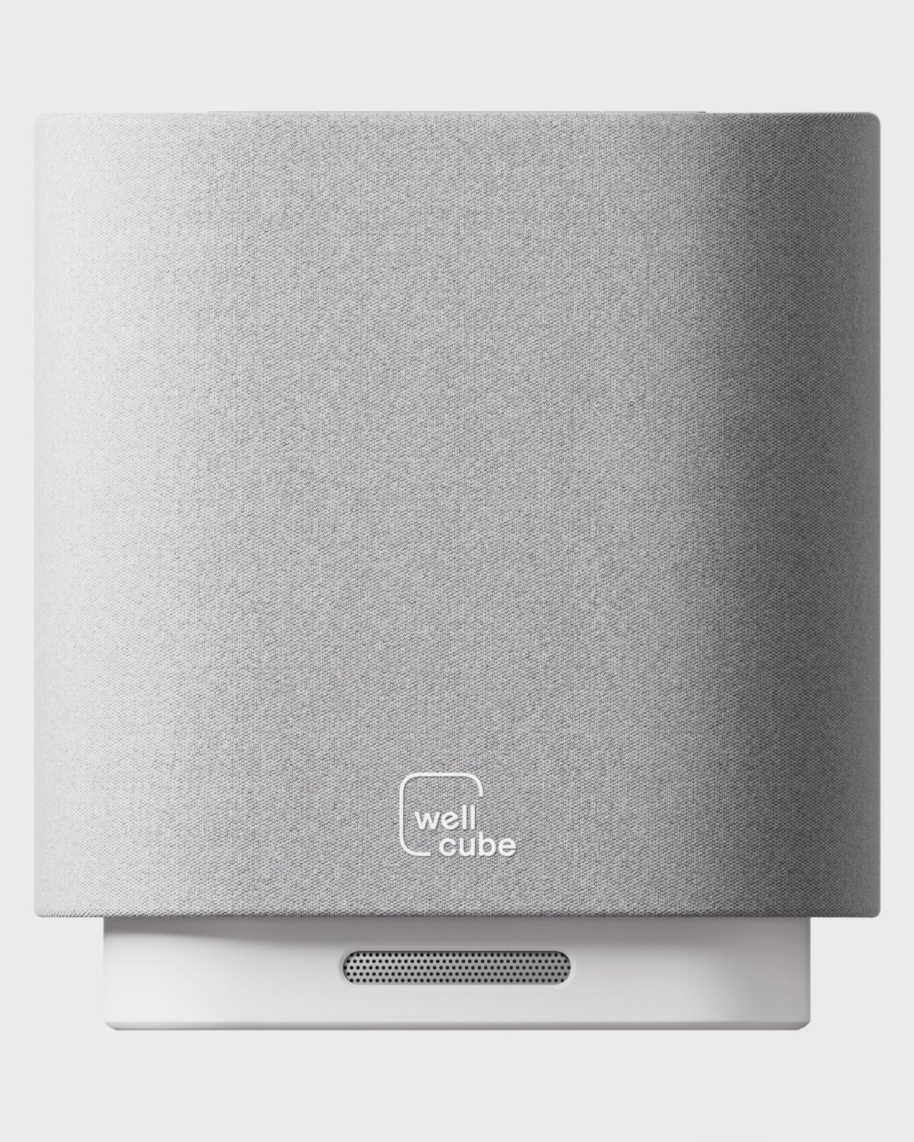
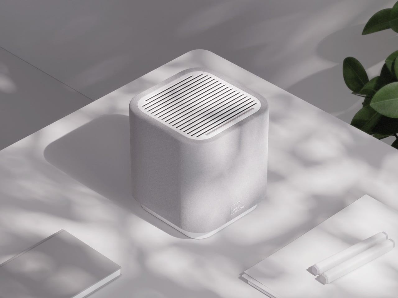
The WellCube sits compact on a desk or table, roughly the size of a Bluetooth speaker. It delivers 99.97% filtration efficiency at 0.3 microns, covering up to 250 square feet while operating at a whisper-quiet 32 to 52 dBA. Those eight sensors track air quality, temperature, humidity, occupancy, lighting levels, and noise simultaneously, creating what Delos calls an insightful view of the invisible health of office spaces.

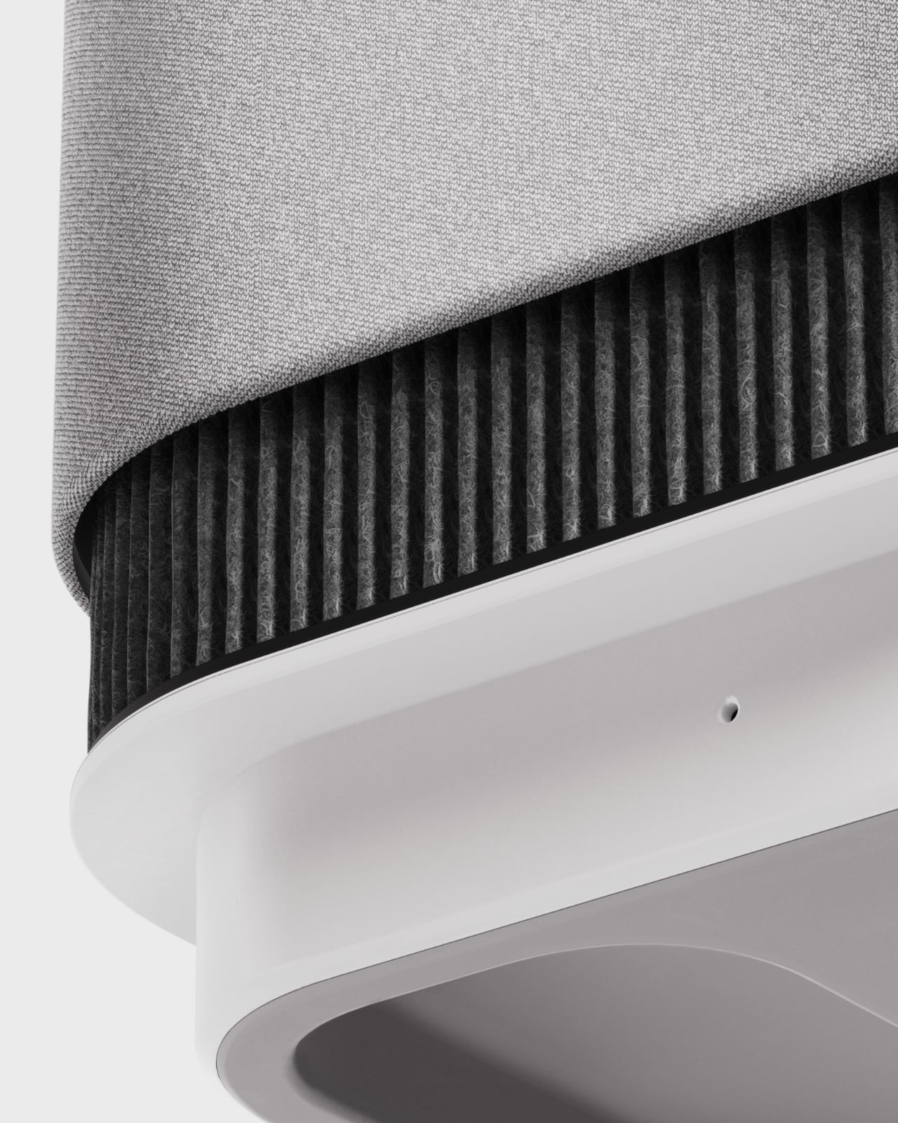
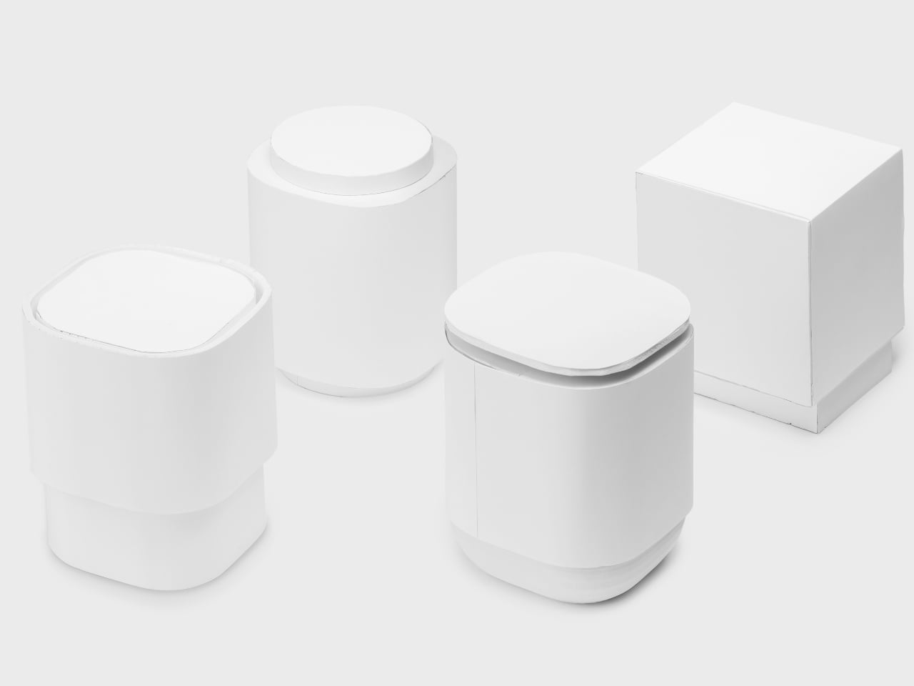
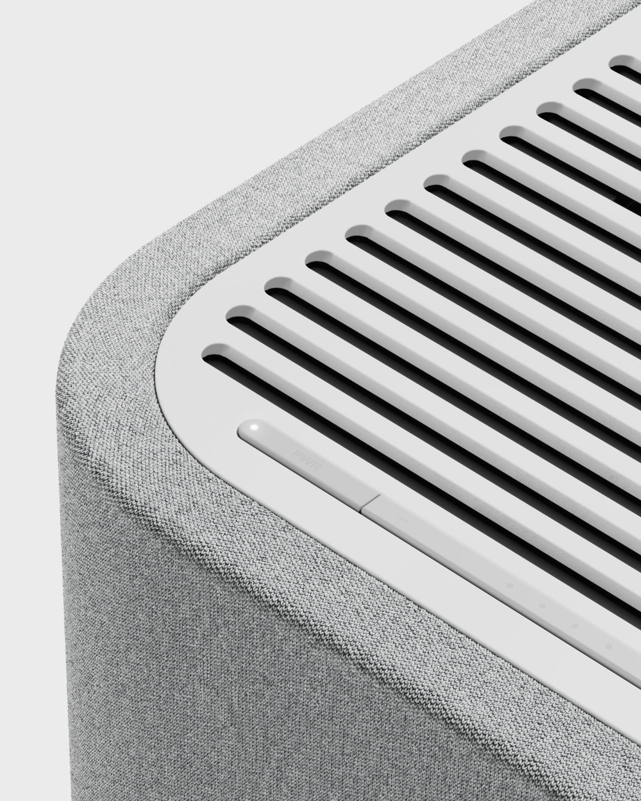
But what makes this design competition-worthy is how Box Clever handled the exterior. The outer layer is a soft, interchangeable fabric cover that completely transforms the visual language of what an air purifier can be. Instead of looking clinical or industrial, it reads as approachable and residential. The fabric isn’t just aesthetic either. It doubles as access to the replaceable filters inside, so maintenance stays simple and unobtrusive. Companies can customize the cover to match any environment’s color palette, which means the same device can feel at home on a personal desk, in a collaborative meeting space, or in an executive conference room.

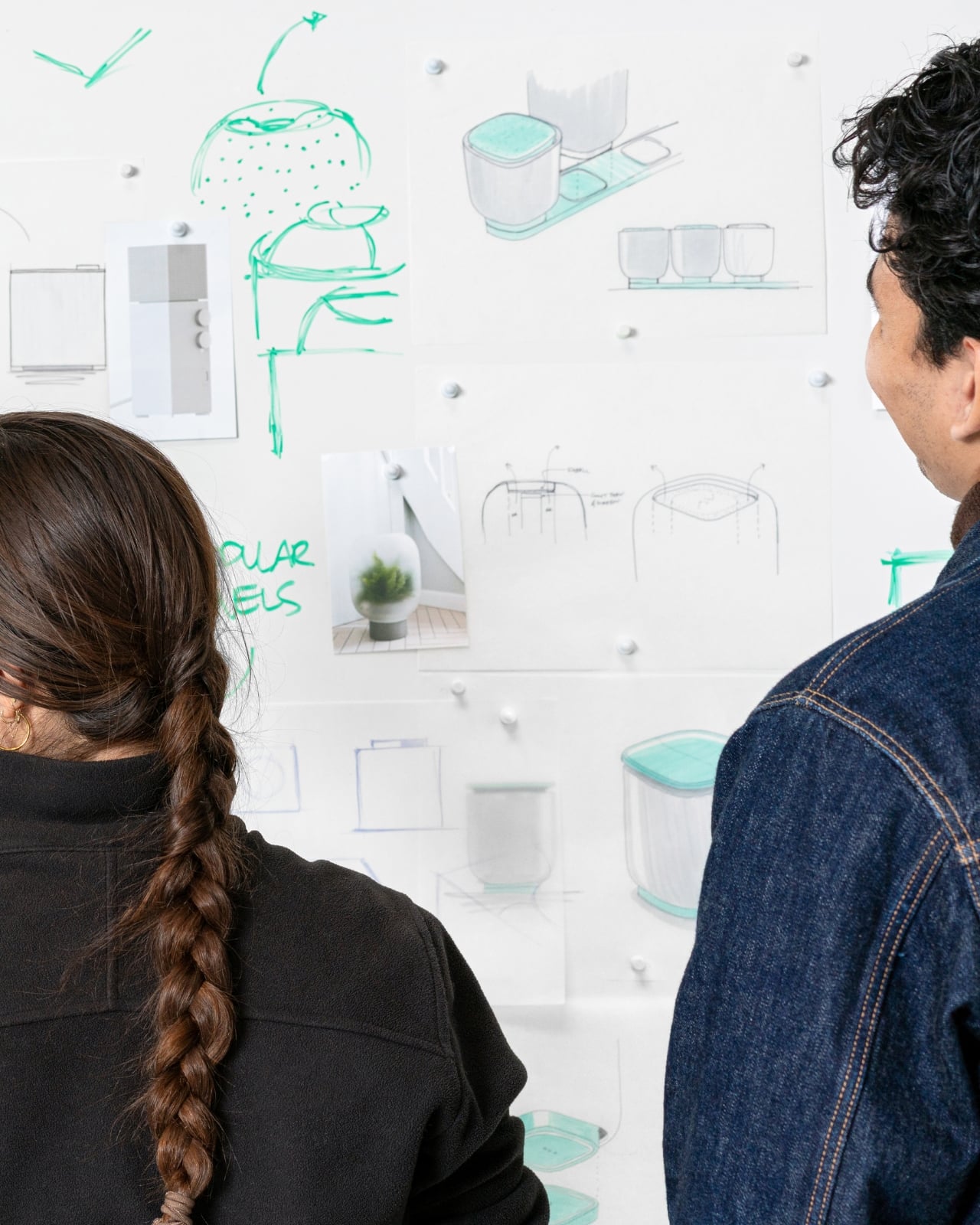
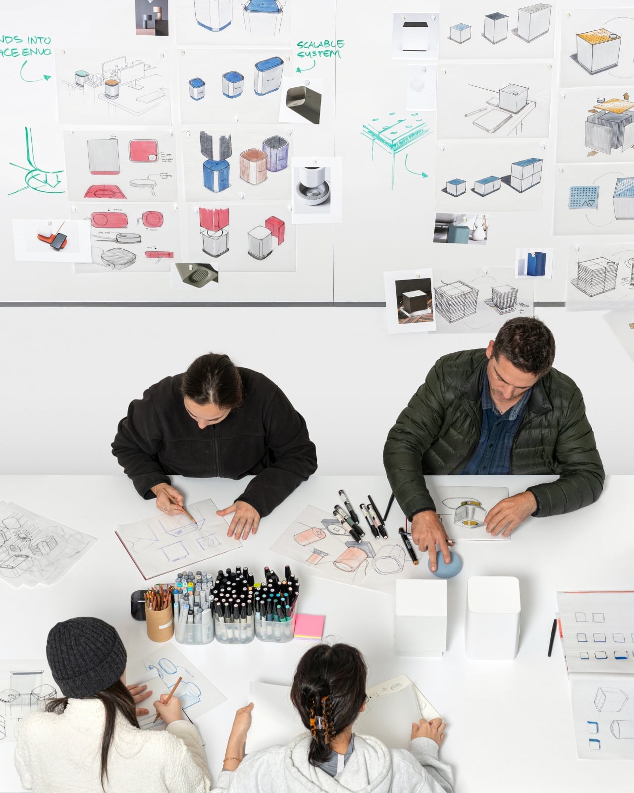
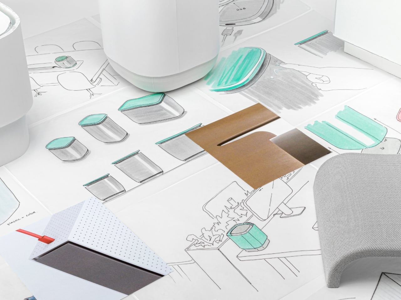
The design development process tells the real story. Box Clever’s documentation shows walls covered in sketches, early foam models exploring different proportions, material samples testing various fabric weights and textures, and iteration after iteration before landing on dimensions that feel, as the team describes it, just right. It’s the kind of rigorous, unsexy work that separates objects that merely look designed from objects that are actually designed all the way through.

What elevates this project beyond a typical product redesign is how seriously both teams took the challenge of balancing technical performance with human-centered design. Office wellness technology typically falls into one of two traps: highly capable but clinical-looking, or beautiful but functionally superficial. The WellCube pushes back on that false choice entirely. The sensor data does more than just measure. It feeds real-time information that helps facilities managers and companies optimize spaces for healthier outcomes, room by room, desk by desk. Think of it as giving buildings the ability to communicate what they actually need. But that sophisticated backend never makes the device itself feel complicated or intimidating to the people using the space.

This is exactly the kind of design thinking that contests and showcases exist to highlight. It’s not just about making something look better. It’s about fundamentally rethinking what a product category can be when you start with human needs instead of engineering specifications. If the future of office wellness is going to look anything like this, it’s going to be a lot more inviting than the sterile solutions we’ve been stuck with. And a lot better looking on your desk.

The post Box Clever Just Designed the Air Purifier Offices Want on Desks first appeared on Yanko Design.

Gorgeous Audio-Technica Turntable Concept is worthy of being in an Art Gallery

If you’ve ever looked at your turntable and thought it could be on a museum shelf, you’re not alone. Hive Industrial, a design studio with a real track record working with Audio-Technica, went ahead and made that thought into a full concept. And once you see it, it’s genuinely hard to look away.

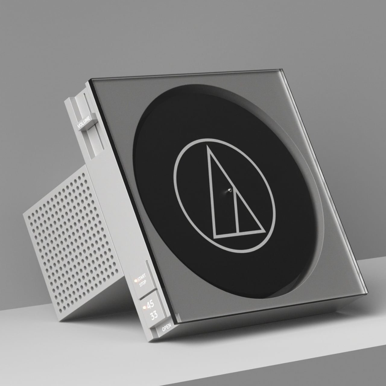
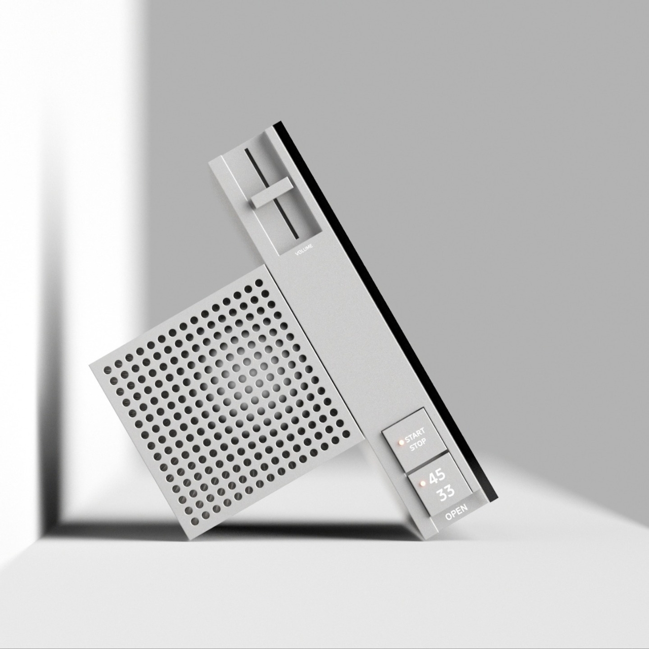
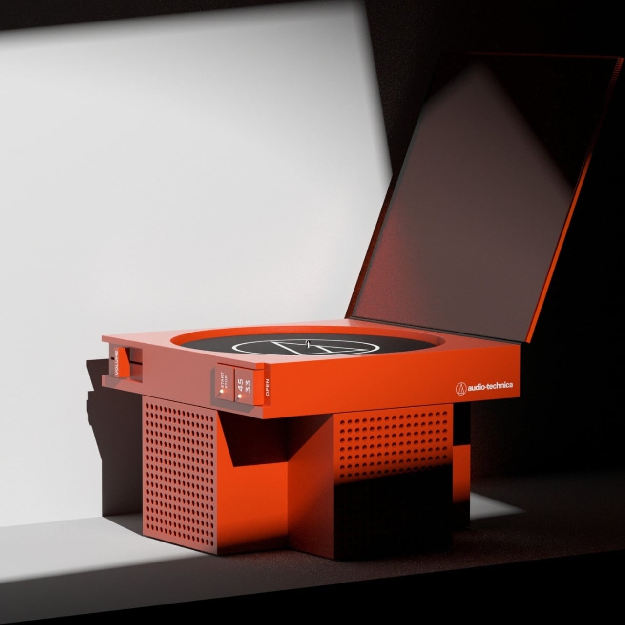
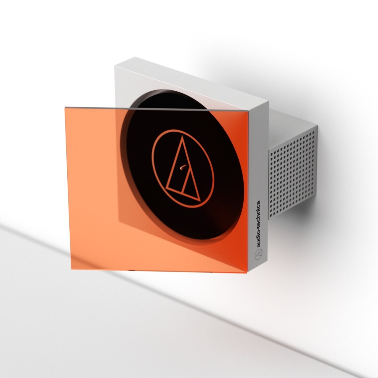
The ID Concept for Audio-Technica isn’t one turntable. It’s a family of forms, all sharing the same design DNA, all pushing the question of what a vinyl player can be when you stop treating it purely as audio equipment and start treating it like a sculptural object. The concept explores three distinct configurations: a flat tabletop version that opens like a precision box, a wall-mounted version where the record faces outward behind a tinted panel, and a vertical format where the disc and player stand together like a piece of framed art.

Designer: Hive Industrial

What makes it immediately striking is the geometry. Hive Industrial built the whole concept around a T-shaped extrusion, a form language that is clean and architectural without trying too hard. There are no soft curves begging for your attention, no retro-inspired wood paneling chasing nostalgia points. The shapes are confident and geometric, almost brutalist in their directness, which is exactly what makes them feel both modern and collectible.

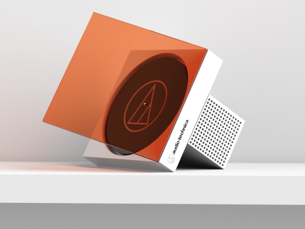
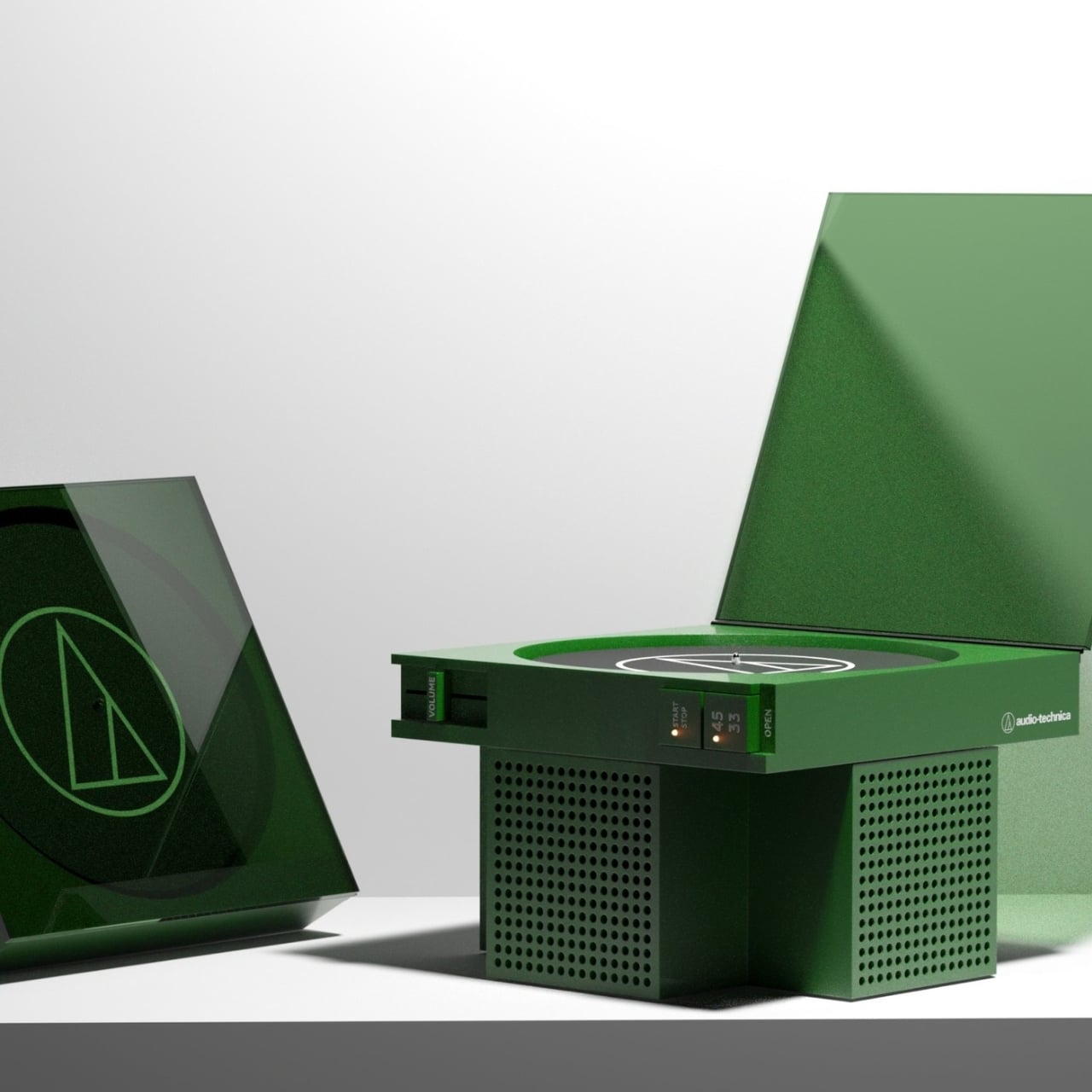
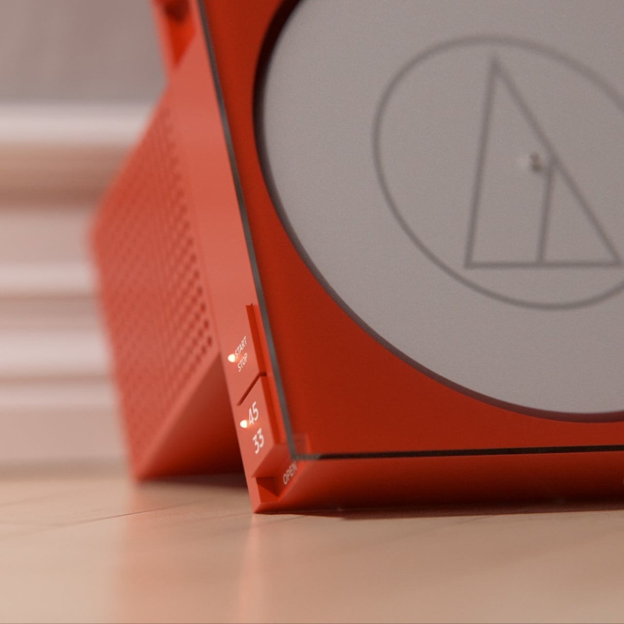
The colorways are doing a lot of heavy lifting, too. The terracotta red version reads bold and warm, the kind of piece that anchors a room the moment you place it down. The forest green edition has a more muted, considered quality that would sit comfortably alongside design-forward furniture. The gray and silver variant is crisp and precise. Then there is the wall-mounted orange-tinted version, which looks less like audio gear and more like something you would find at a gallery opening with a four-digit price tag on the label. Each colorway feels like a deliberate creative decision rather than a marketing checkbox.

The controls are minimal by design. Along the side spine of each unit, you get a volume slider, a start/stop toggle, a 33 and 45 RPM selector, and an open mechanism. That is it. Nothing clutters the surface. The speaker grille, punched with a tight grid of circular perforations, sits flush into the body and reads almost as texture rather than hardware. The Audio-Technica triangle logo appears on each version, etched or applied with restraint, which is exactly how branding should be handled on a piece this considered.

The wall-mounted interpretation is the one that really challenges your expectations. Getting a turntable off the desk and onto the wall is not a new idea, but presenting the record itself as a visual element, visible through a color-tinted panel that doubles as the lid, is genuinely fresh territory. The record becomes part of the display. When the player is in use, you would be watching it spin behind that translucent orange surface, which is the kind of detail that takes something from useful to memorable.

Hive Industrial has a real history with Audio-Technica. The studio’s portfolio includes several actual products for the brand, including headphones that have shipped to real consumers. So this concept is not just a fantasy render from someone who has never held a stylus. It comes from a team that understands Audio-Technica’s design vocabulary and is asking, quite deliberately, what the next chapter of that vocabulary could look like.

Vinyl’s so-called revival has been going strong for well over a decade now. Sales have climbed consistently, and the audience has expanded well beyond classic rock collectors and dedicated audiophiles into a much broader group of people who simply want something more intentional than a streaming playlist. That audience, which has grown up caring about how things look as much as how they sound, is exactly who a concept like this speaks to.

Whether this ever makes it to production is an open question. But that is almost beside the point. Concepts like this matter because they move the conversation forward and remind you that even an object as established and beloved as a turntable still has room to surprise you.

The post Gorgeous Audio-Technica Turntable Concept is worthy of being in an Art Gallery first appeared on Yanko Design.
This Designer Concept Is the First Portable Charger You’d Wear

EDC used to mean something very specific. Ask any survival enthusiast and they’ll tell you it stands for EveryDay Carry, the essential tools you keep on hand at all times. A Swiss Army knife. A multi-tool. A compact flashlight. Things built for the unpredictable, the inconvenient, and the emergency. The whole point was physical survival, and the design language to match: rugged, matte, built to last.

Then designer Juhyeon Kwon asked a pretty sharp question: what does survival actually look like today? The answer, apparently, is a 3% battery warning which may eventually lead to FOMO (fear of missing out), digital version.

Designer: Juhyeon Kwon

Kwon’s EDC concept takes the abbreviation and flips it into something that feels truer to how we actually live now: EveryDay Charge. Because whether we want to admit it or not, keeping our devices powered has become just as critical as anything a Swiss Army knife ever solved. You need your phone to navigate, communicate, work, bank, and basically exist in modern life. A dead battery isn’t just an inconvenience. It’s a full stop. And unlike the emergencies that a multi-tool was built for, this one happens every single day.

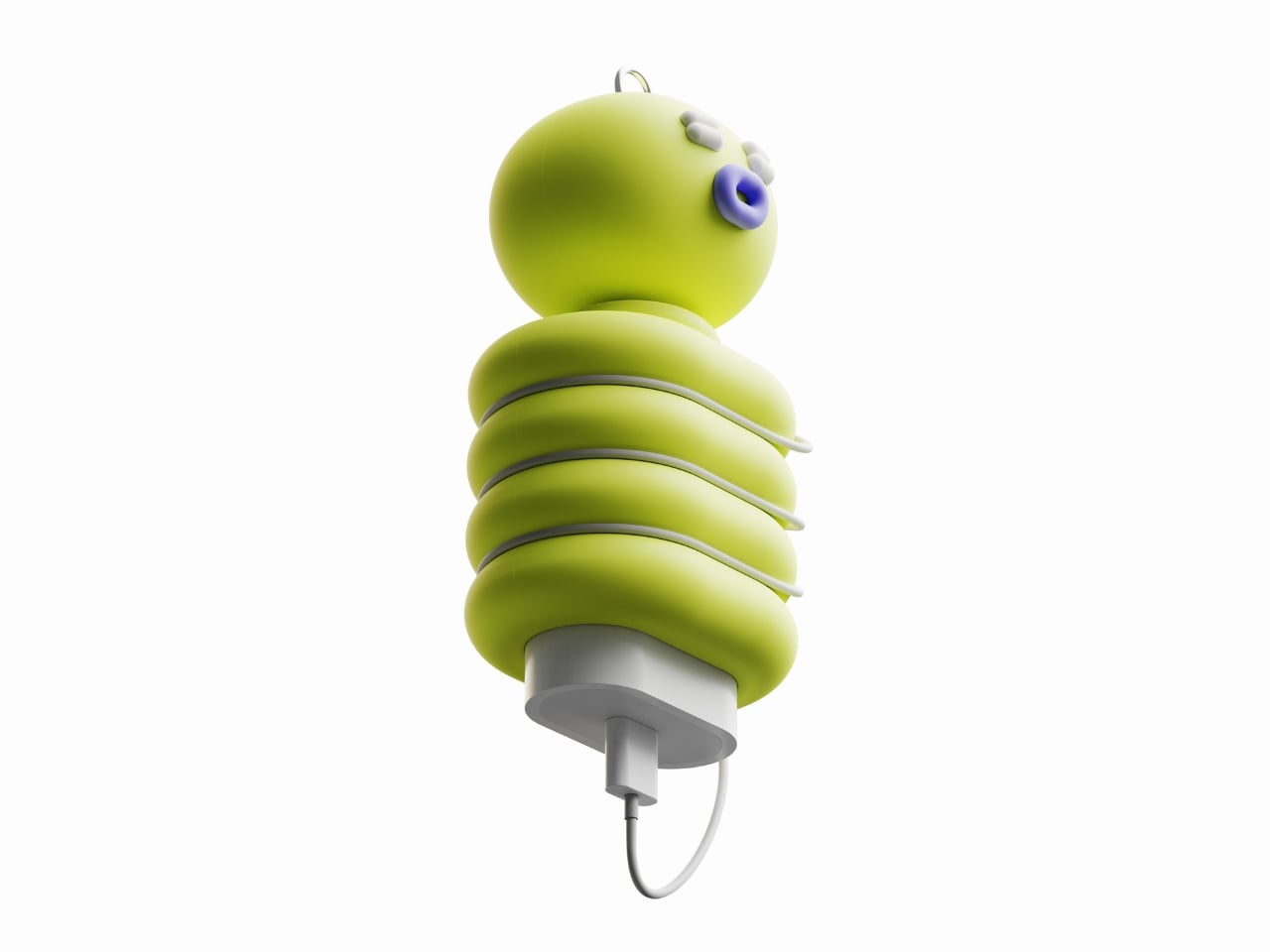
That said, Kwon didn’t just design a portable charger and call it done. The proposal imagines one that looks like a tiny creature you’d want to clip to your bag and take everywhere. The EDC charger concept takes the form of a small caterpillar-like character: a round, bulbous head with sleepy eyes and a little round mouth, perched on top of a segmented body made of plump stacked rings.

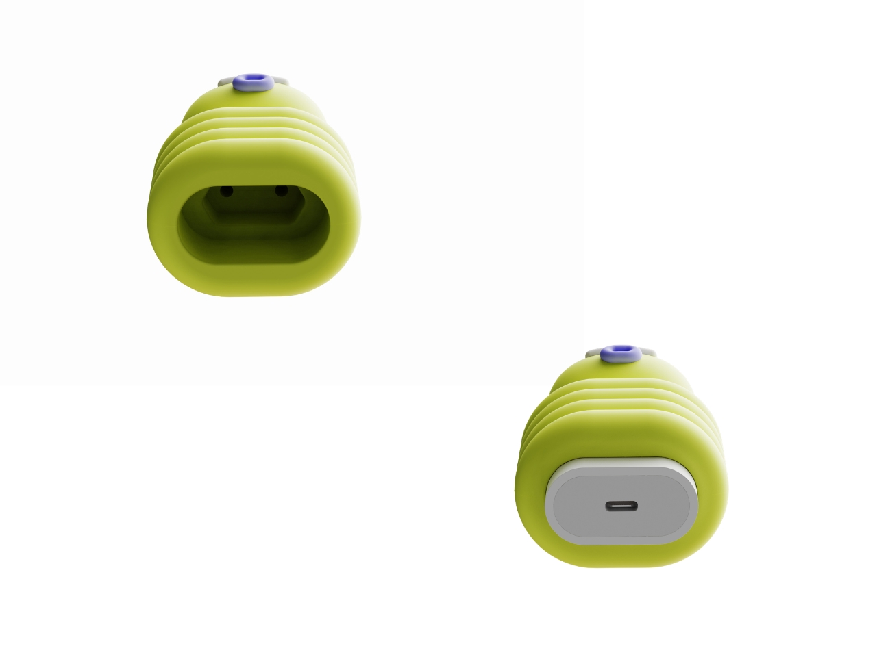
There’s a metal loop at the top so it can hang from a bag or keychain, and the cable wraps neatly around those body segments when not in use. The USB-C port sits at the base, tucked cleanly under the soft silicone form. It’s part functional device, part desktop toy, part bag charm, and it somehow makes all of that feel intentional rather than gimmicky.

The cable management alone is worth paying attention to. Cord clutter is one of those low-key annoyances that no one talks about enough, and the segmented body of the EDC makes the solution almost automatic. You just wind the cable around and let the rings hold it in place. It’s clever without being complicated, which is the hallmark of good design.

What really sells the concept, though, is the character. The face gives the EDC a presence that most tech accessories completely lack. It’s expressive in a way that feels pulled from the world of collectible figures and character design, sitting somewhere between a Studio Ghibli creature and a designer toy you’d find in a boutique concept store. It doesn’t feel out of place next to the kind of objects people deliberately choose to surround themselves with. It feels like it belongs in that company.

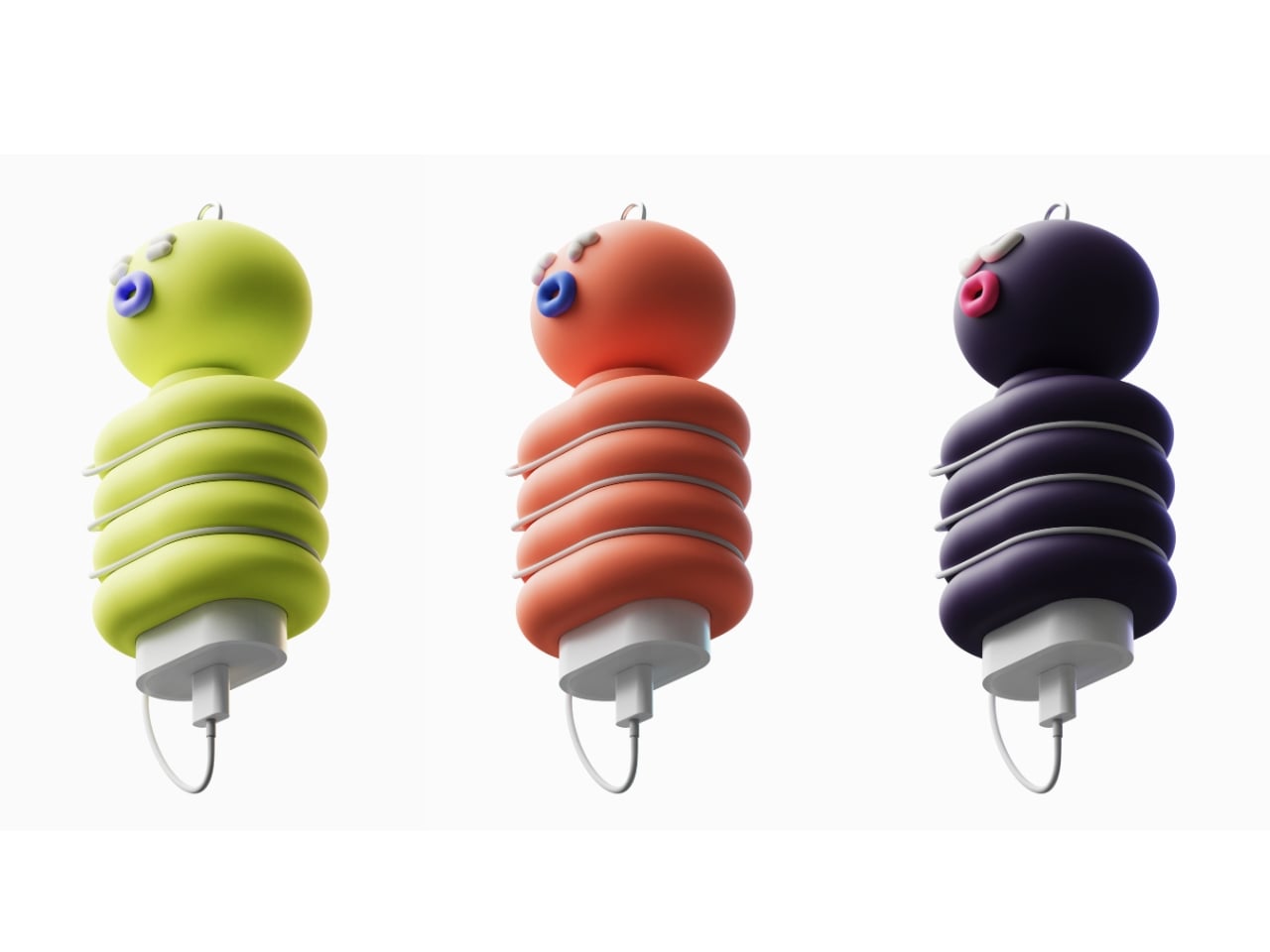
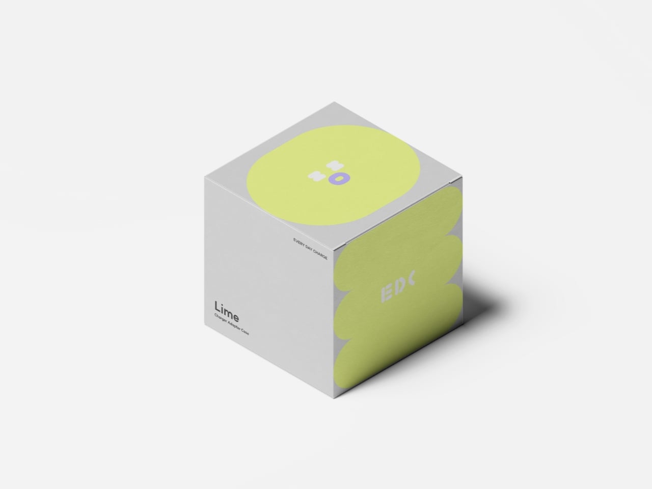
The proposed colorways extend that collectible energy further. The Lime version is probably the most striking, with that acid green being the kind of color that photographs well and catches eyes in person. The Coral and Dark Purple variants round out the lineup with personalities of their own, and the packaging design plays into the whole aesthetic too: illustrated faces printed across the boxes, each one different, like a small cast of characters rather than just another product line.

What Kwon has captured with this concept is something that product designers rarely get exactly right: the idea that an object can be genuinely useful and genuinely desirable at the same time. Not useful despite being cute, or cute despite being functional. Both, fully, without compromise.

It also reflects something real about how people relate to their things now. There’s a growing appetite for objects that carry personality, that feel like they were chosen rather than just purchased out of necessity. Your charger used to be something you stuffed in the bottom of your bag and forgot about. The EDC is the kind of thing you’d clip to the outside of your bag on purpose. That’s the shift. Survival looks different now, and if this concept ever makes it to production, it comes with a face.

The post This Designer Concept Is the First Portable Charger You’d Wear first appeared on Yanko Design.
LEGO Finally Built the $130 Sherlock Holmes Set Fans Needed

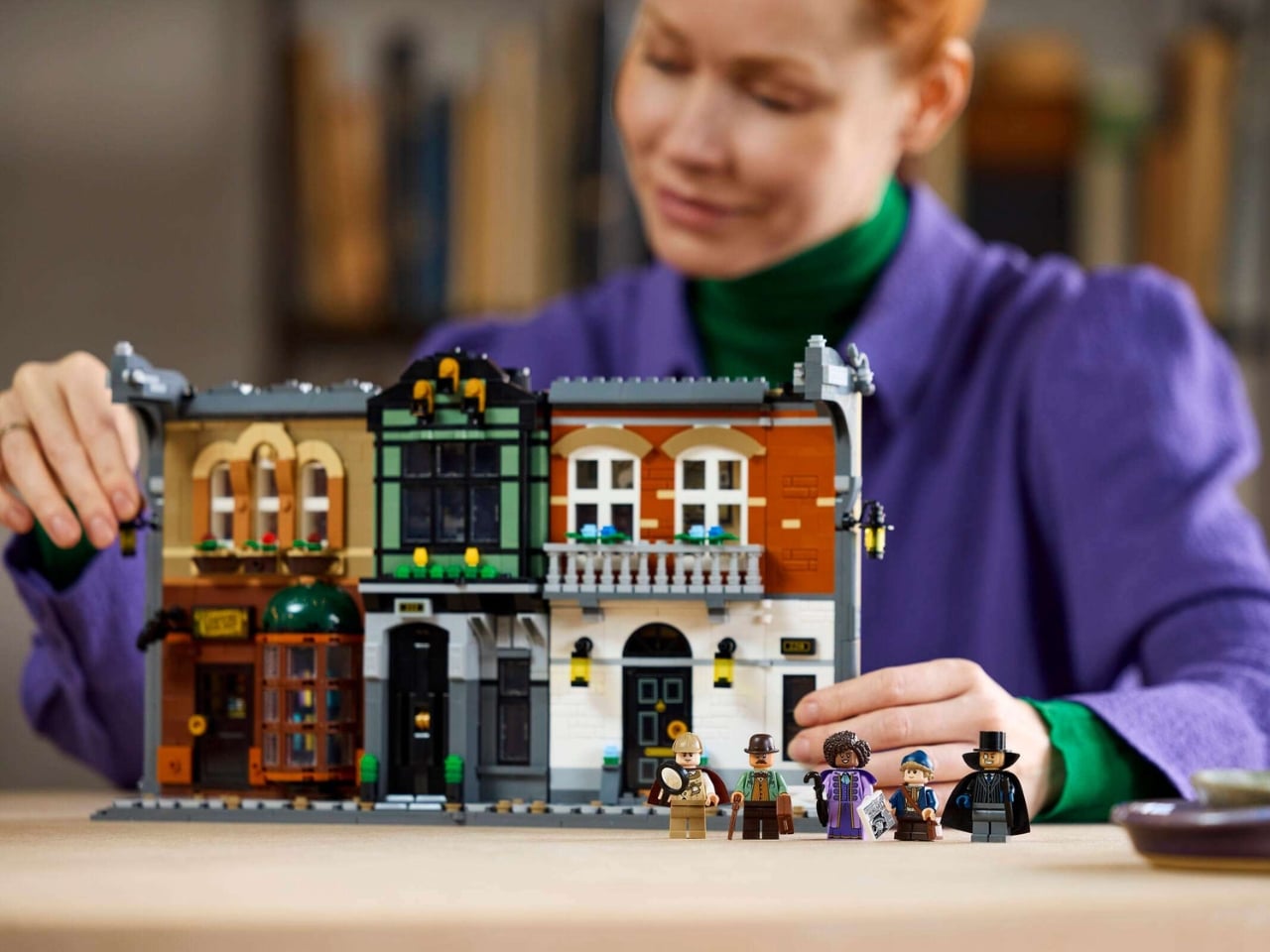
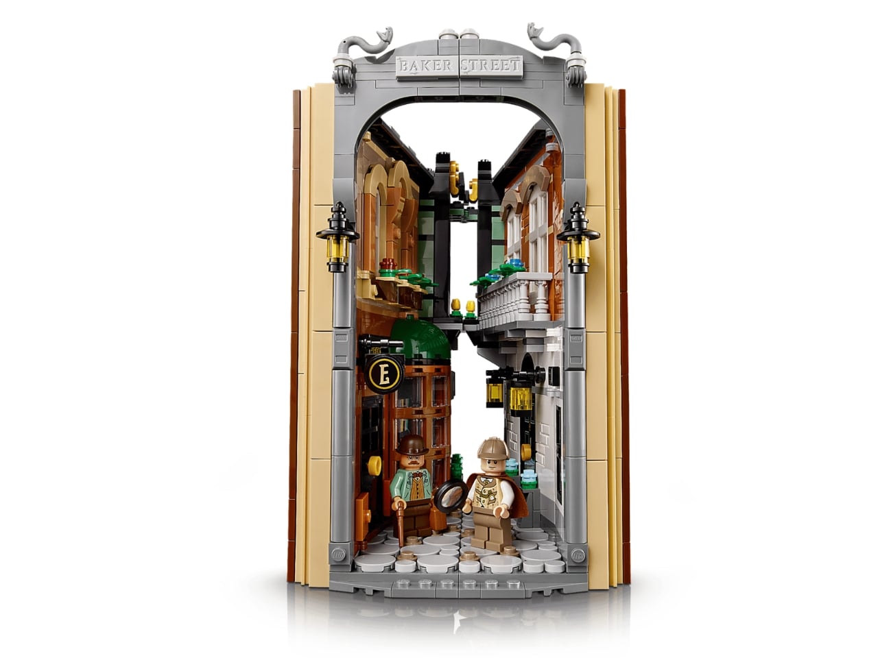
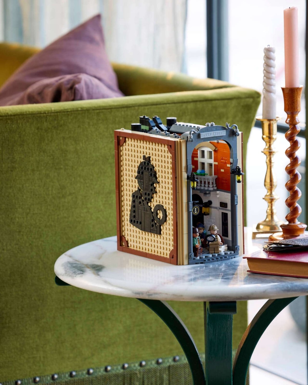
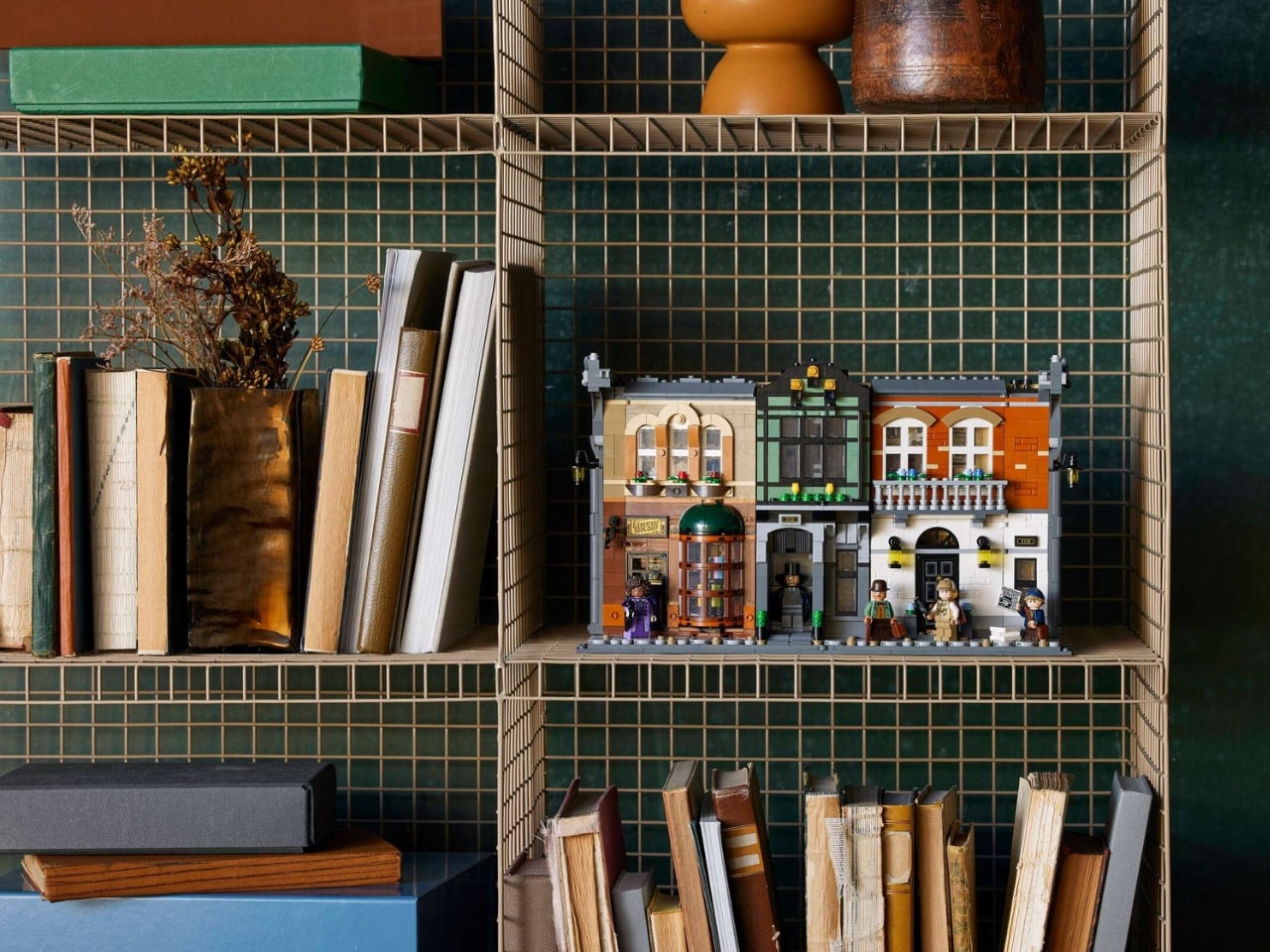
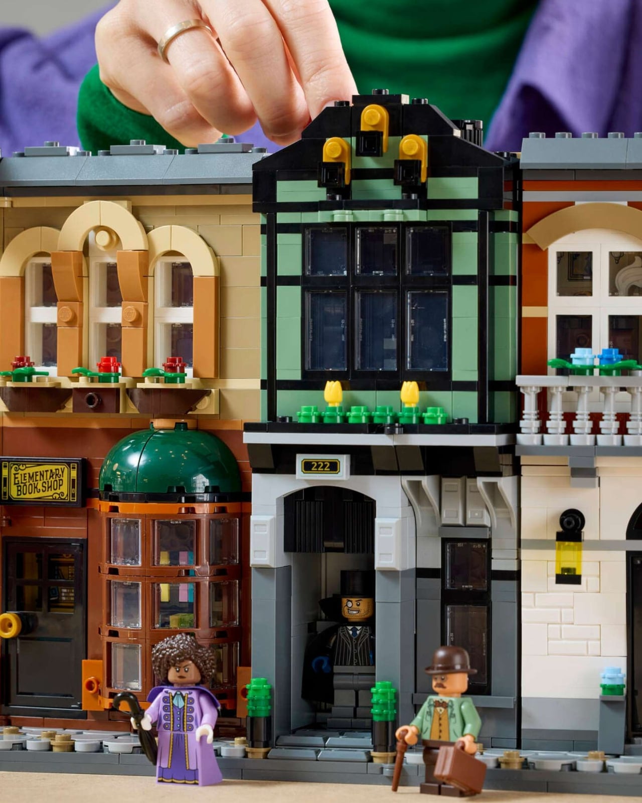
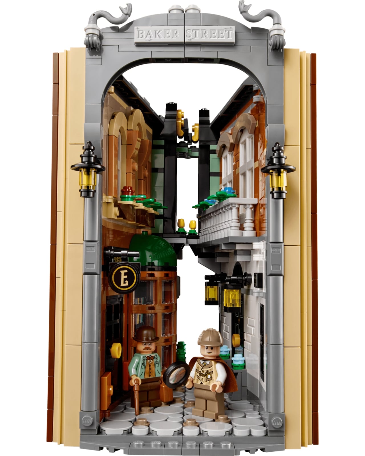
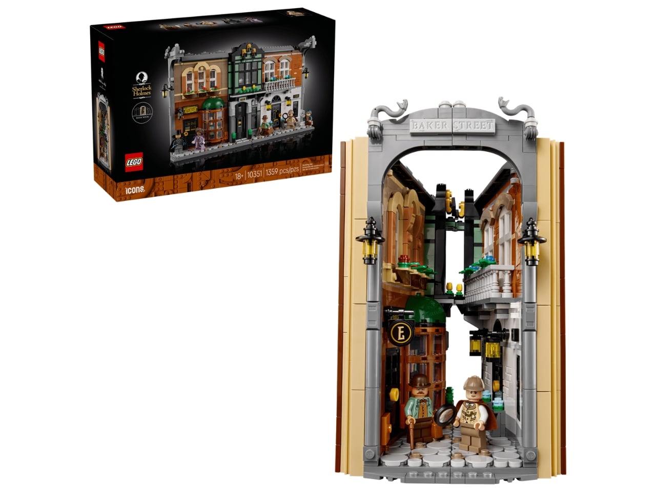
If you’ve ever stared at your bookshelf and thought “something’s missing,” the answer might just be 1,359 bricks and a deerstalker hat. LEGO’s newest entry in its Icons line, the Sherlock Holmes: Book Nook (set #10351), is the kind of thing that makes you stop and look twice. It’s a fully detailed slice of Victorian Baker Street that folds up slim enough to slip between your novels like it was always meant to be there.

Sherlock Holmes is arguably the most iconic fictional detective ever created. Arthur Conan Doyle first introduced him to the world in 1887, and the character has never really left the cultural spotlight since. Books, films, BBC adaptations, podcasts. The man in the deerstalker hat has shown up in just about every medium imaginable. And yet, despite LEGO spending decades immortalizing everything from Hogwarts to the Millennium Falcon, Holmes somehow never got his own set. That changes with this release, and it feels long overdue.

Designer: LEGO

The Sherlock Holmes: Book Nook is LEGO’s first-ever official Sherlock Holmes set and is priced at $129.99. Part of the LEGO Icons lineup and rated for adults 18 and up, it also introduces the brand’s new Book Nook format: a concept built around the idea that a LEGO display doesn’t have to dominate a room. It can quietly live on your shelf instead.

Book nooks as a category have been a niche collector’s obsession for years, with independent artists crafting tiny lit worlds to slip between volumes on a shelf. LEGO entering that space makes a lot of sense, and they’ve done it with their typical level of attention to detail.

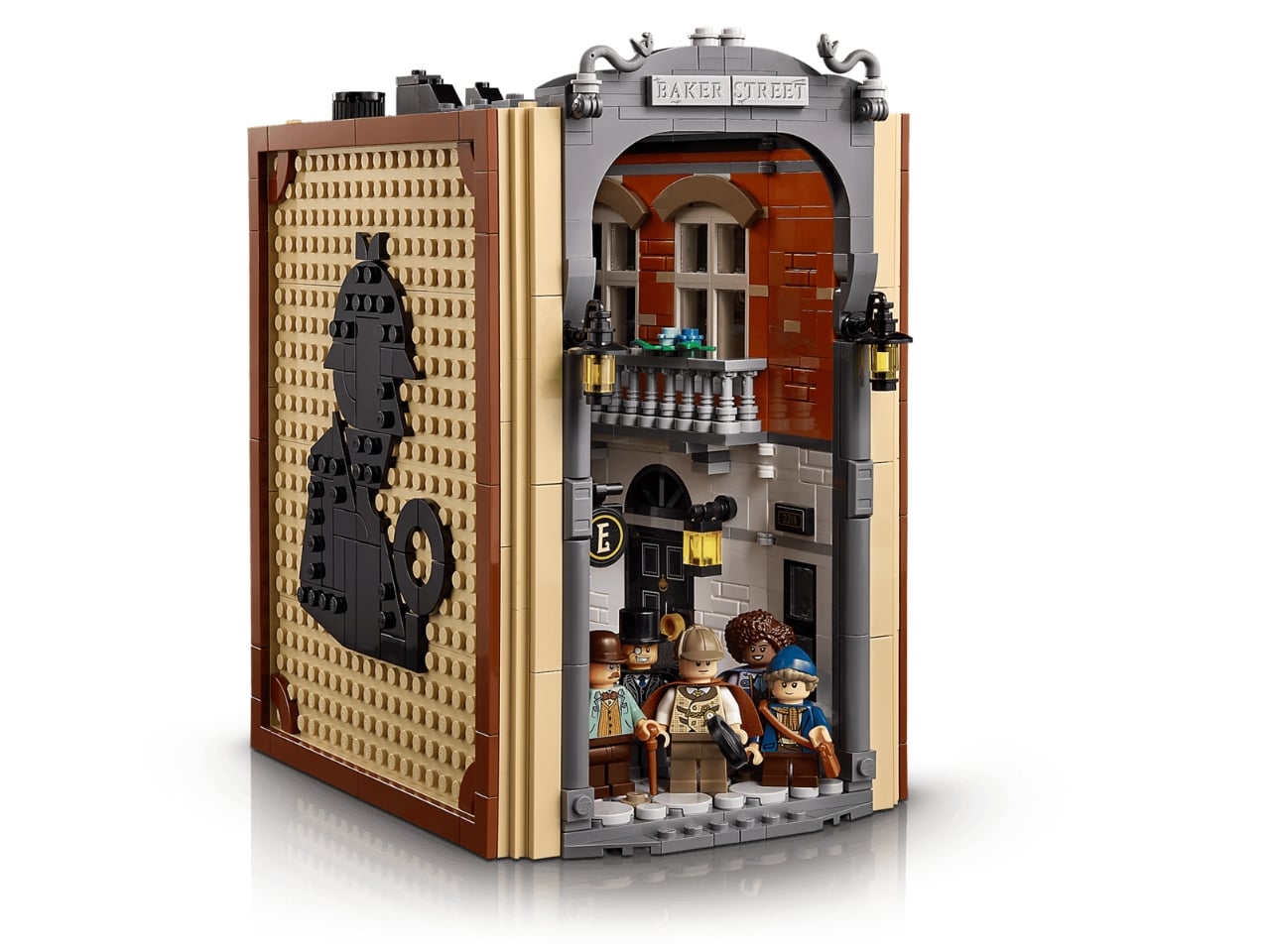
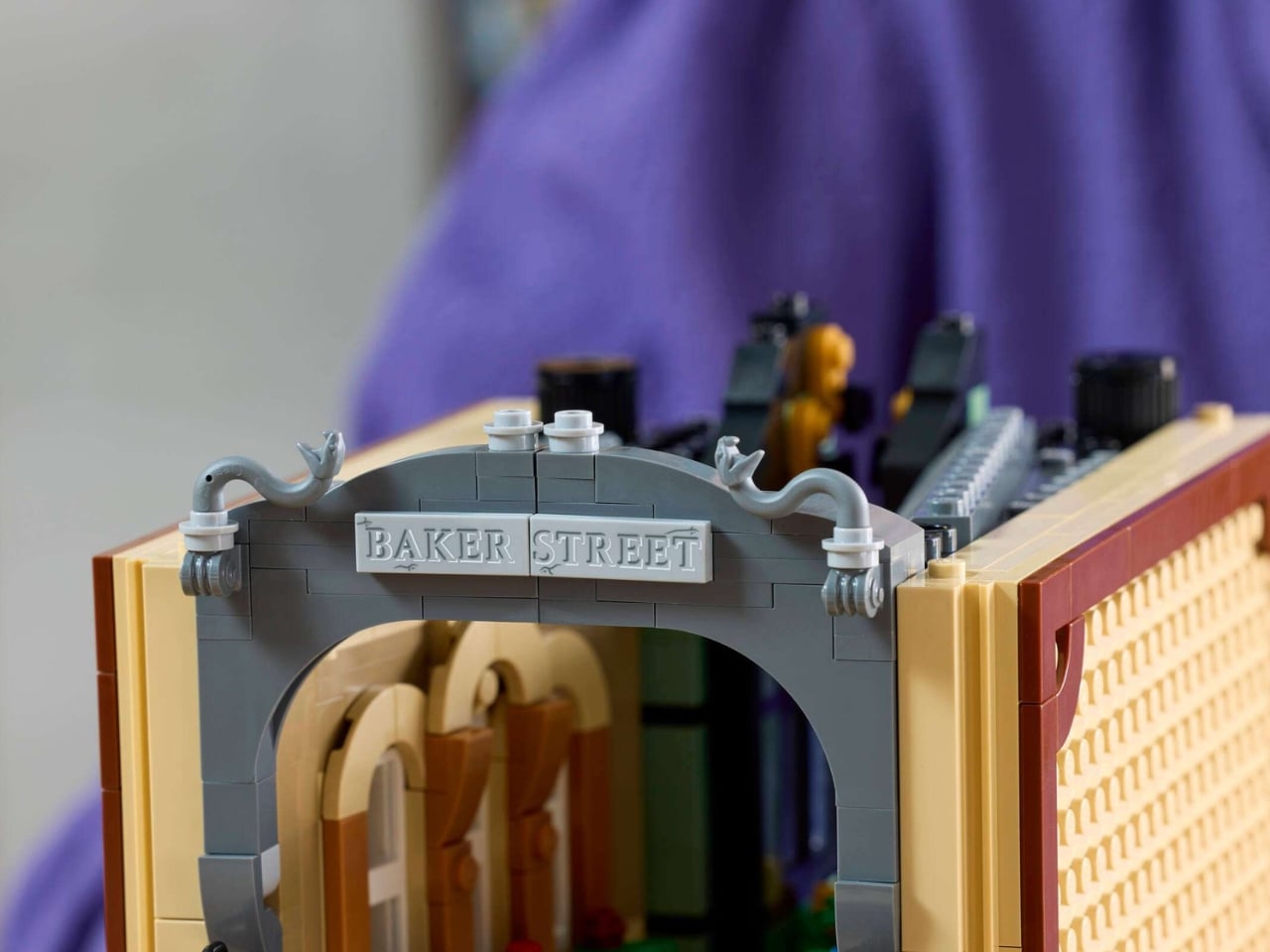
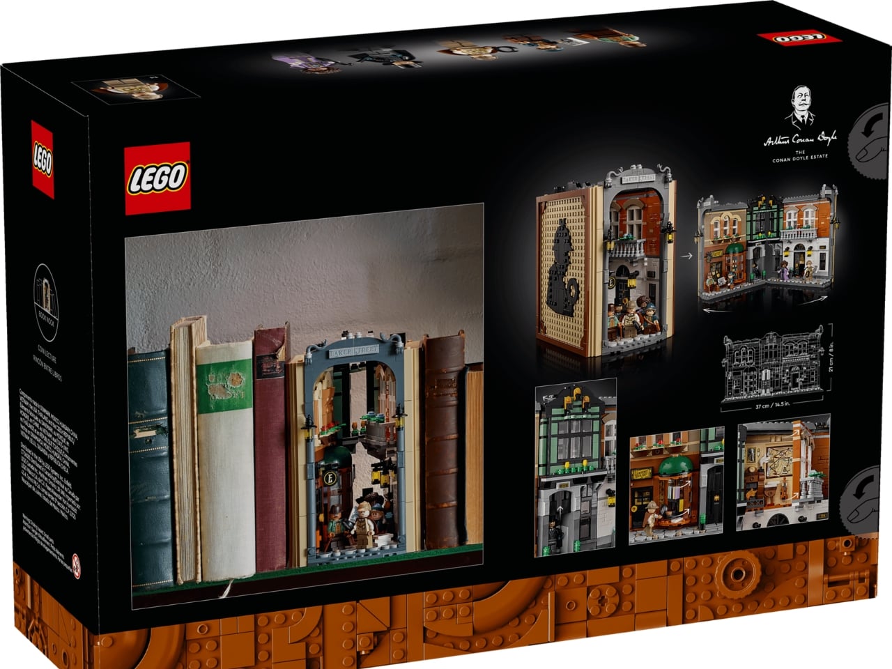
When folded shut, the set presents a flat, bookend-style exterior decorated with a tiled black silhouette of Holmes against a tan background. It’s clean, intentional, and designed to sit comfortably alongside an actual Sherlock Holmes collection without looking out of place. That kind of restraint in presentation is a smart design call. But unfold it, and that’s where things get genuinely impressive.

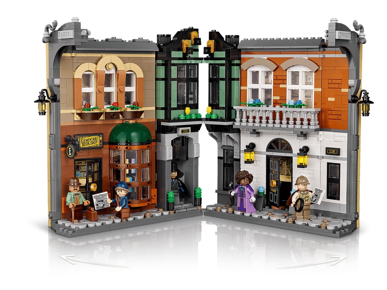
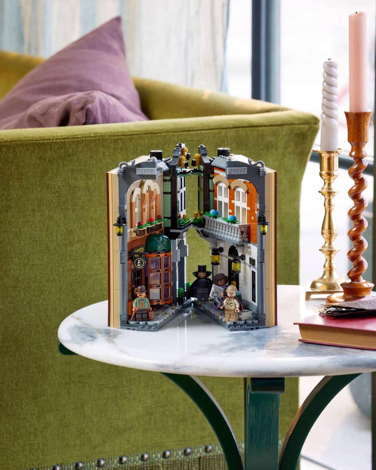
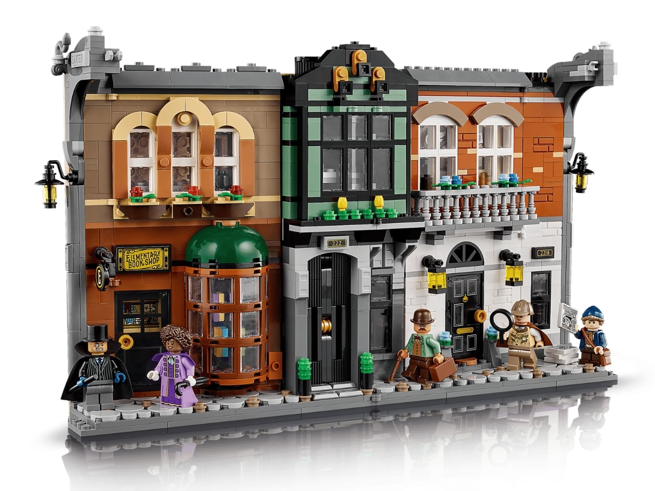
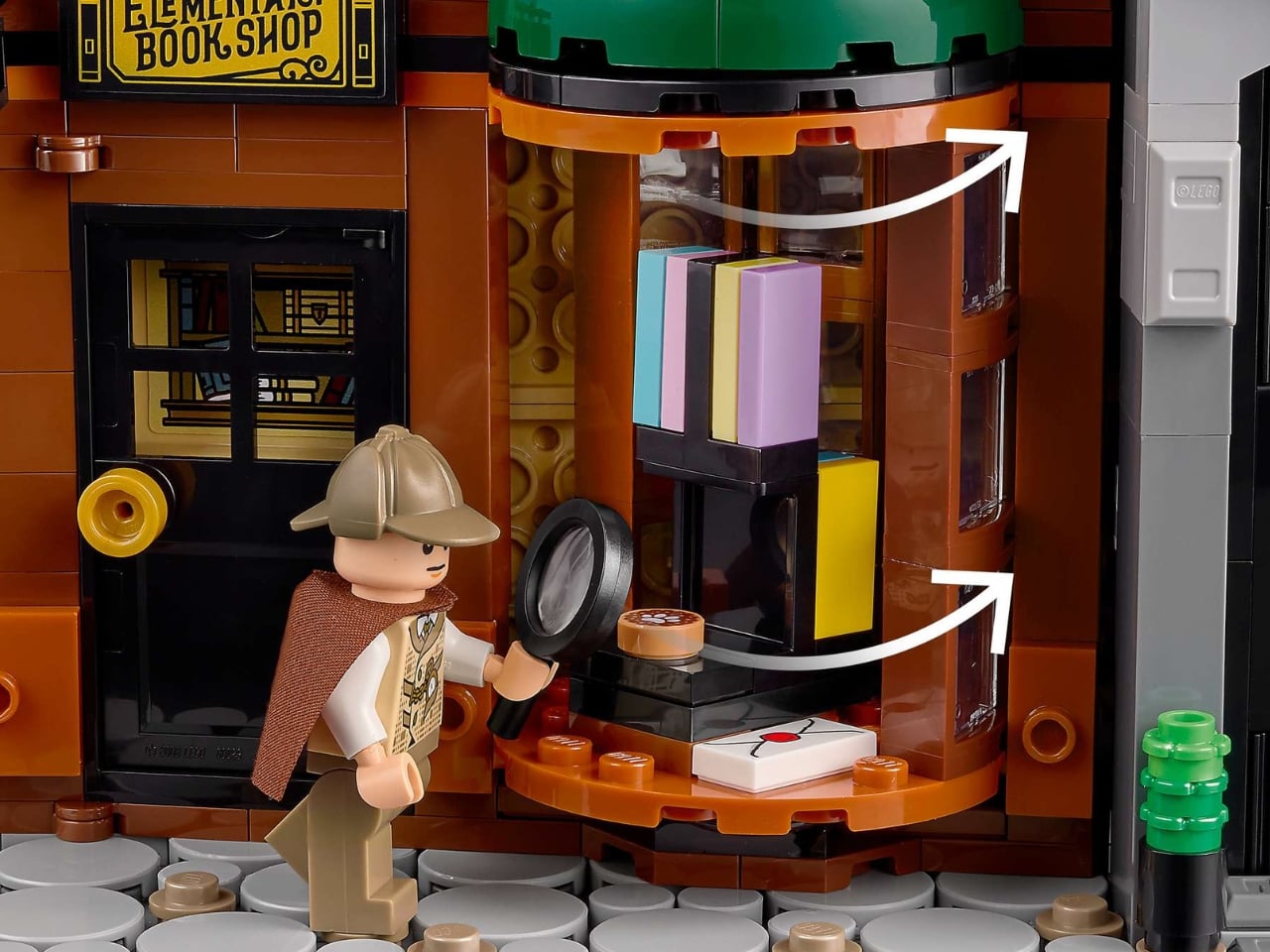
The opened build stretches to 14.5 inches wide and just over 8 inches tall, revealing a Baker Street facade split across two distinct sides. One side gives you a bookshop with a revolving display window. The other is a shadowy terraced residence with a sliding front door. Turn a dial and the door rises to expose Professor Moriarty’s hideout tucked just behind it. It’s a small mechanical touch that delivers quite a lot of atmosphere in a tight space.

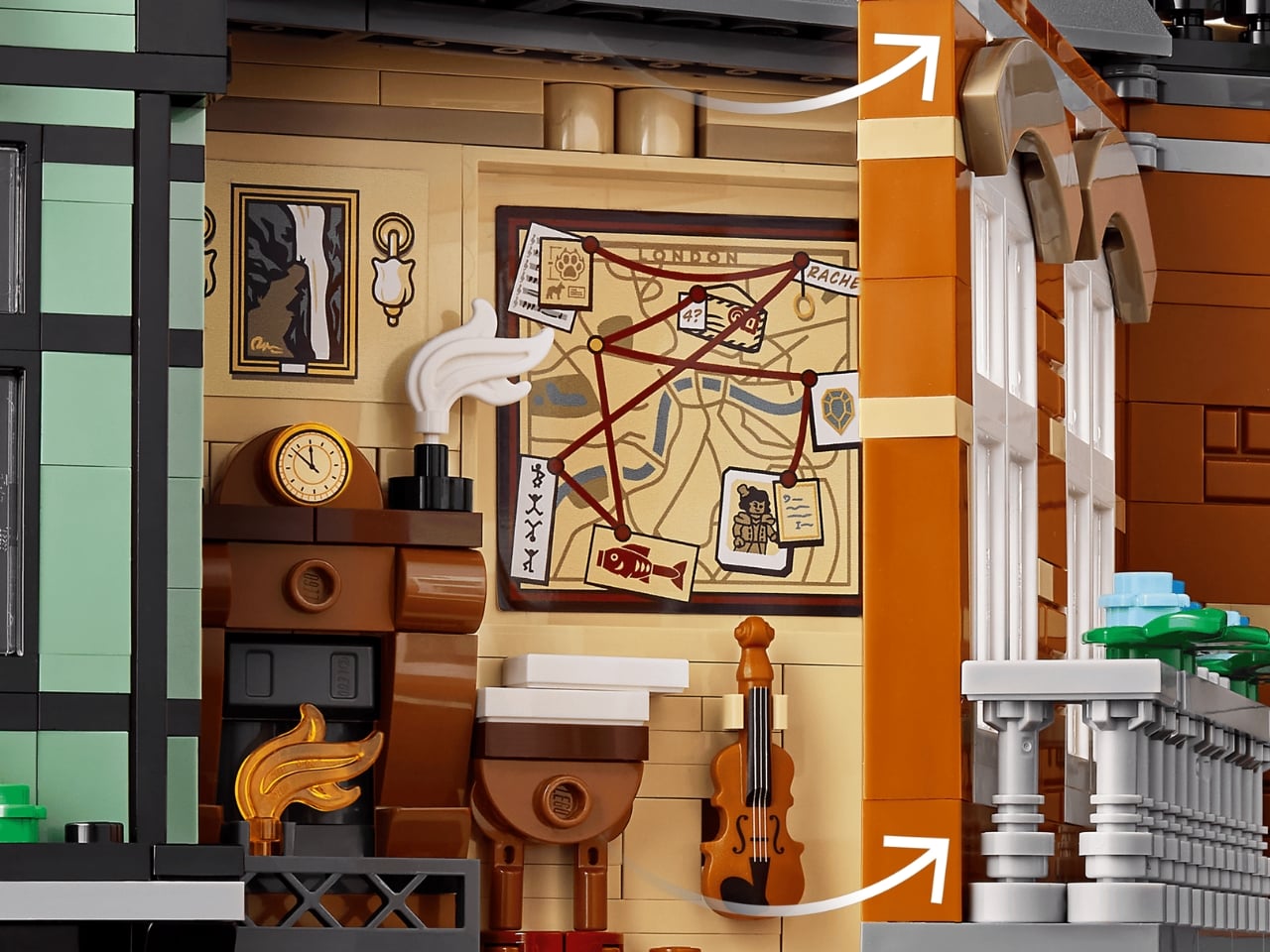
Flip open the facade of 221B Baker Street and you’re looking directly into Sherlock’s apartment in miniature: a brick-built fireplace, a clue board pinned with evidence, and his beloved violin. The storytelling packed into a build just 2.5 inches deep is genuinely impressive. Outside, a cobbled walkway runs along the base, giving the whole thing the same street-level texture that fans of LEGO’s Diagon Alley sets will immediately recognize.

Five exclusive minifigures complete the package: Sherlock Holmes, Dr. Watson, Irene Adler, Professor Moriarty, and a newcomer named Paige. All five are brand new to LEGO, which alone makes this a collector’s milestone. The lineup covers the key players well. You get the detective, his loyal companion, his greatest adversary, the woman who outsmarted him, and a fresh Baker Street face.

What makes the Book Nook format feel like such a smart direction for LEGO’s adult lineup is how it collapses the gap between collectible and functional object. There’s no dedicated display case required, no plinth, no cleared shelf space. You slide it between your books, and it lives there quietly until a guest spots it and can’t stop staring. It’s designed to be discovered, not displayed. LEGO is releasing two more Book Nooks alongside this one, a Lord of the Rings and a Harry Potter edition, signaling a real commitment to the format.

The Sherlock Holmes Book Nook is available now on LEGO.com and at Barnes & Noble for $129.99. Whether you’re a Conan Doyle devotee, a design enthusiast, or just someone whose shelf could use a little mystery, this one is worth a closer look.

The post LEGO Finally Built the $130 Sherlock Holmes Set Fans Needed first appeared on Yanko Design.
This Free Lidl Handbag Is Actually a Wearable Shopping Trolley

There are collaborations that make you nod and think, “that makes sense.” And then there are collaborations that make you stop mid-scroll, squint at your screen, and laugh out loud before you inevitably want the thing. Lidl and Nik Bentel’s new Trolley Bag is firmly in the second category.

If you missed the chaos last year, here’s a quick recap: Nik Bentel is a New York-based designer who has built a career turning completely ordinary objects into pieces that live somewhere between fashion, sculpture, and a really good joke you can carry. His portfolio includes pasta boxes reimagined as bags, a lopsided coffee mug, and a steel musical ball. So when Lidl, the German budget supermarket chain, came calling for a second collaboration, it was never going to be boring. Their first project in 2024 was the Croissant Bag, a leather handbag shaped like a croissant tucked inside a replica of a Lidl bakery bag. It sold out in two minutes. Two minutes.

Designers; Nik Bentel x Lidl

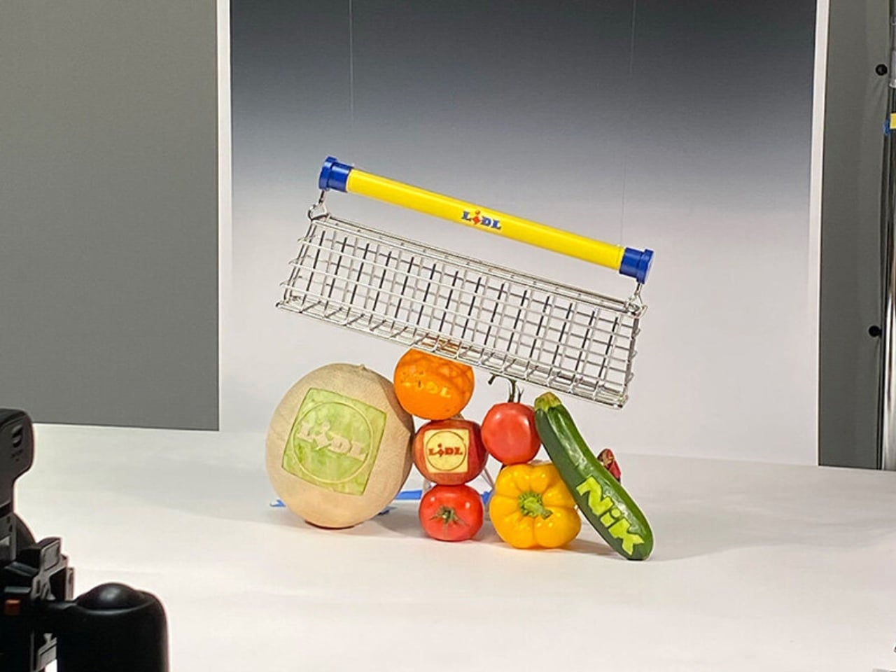
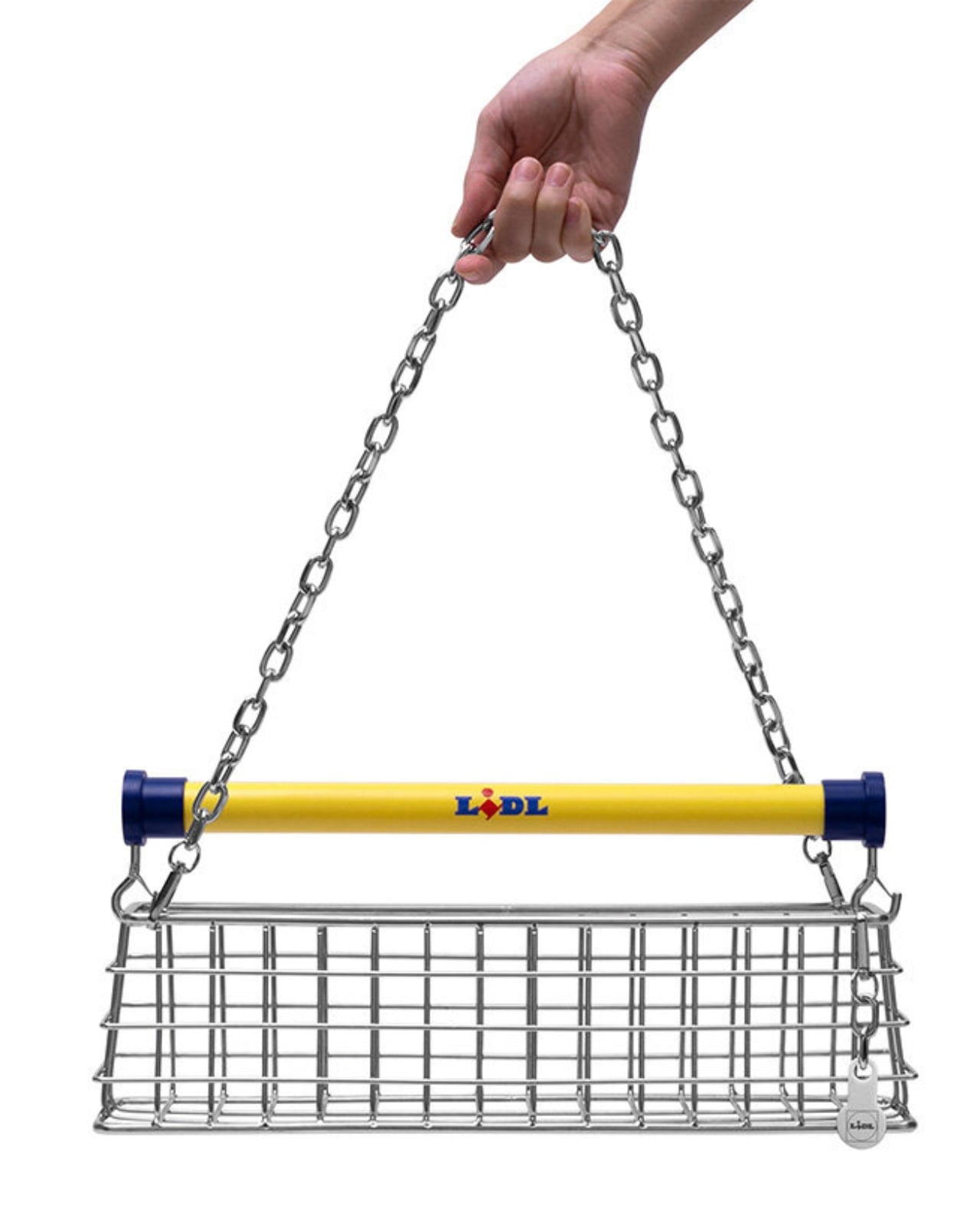
So the question everyone has been asking since is: what does the second act look like? The answer is the Trolley Bag, and it’s exactly what it sounds like. Fabricated from industrial stainless steel, the bag is a miniaturized, wearable version of the Lidl shopping trolley. It keeps the cart’s recognizable grid structure, the tubular handlebar finished in Lidl’s signature yellow and blue, and even comes with a trolley coin keychain fob that actually works on real Lidl shopping carts in store. A detachable chain strap lets you wear it over the shoulder. It comes packaged with a dust bag and a gift box. It’s ridiculous. It’s brilliant. It’s possibly both at the same time.

What makes this collaboration land is the way Bentel thinks about the objects he chooses to reinterpret. He isn’t just slapping a designer name on something random for the sake of going viral. The shopping trolley caught his attention for a specific reason: the metal grid, the wheels, the child seat. It’s instantly recognizable anywhere in the world, purely utilitarian, never designed to be beautiful but accidentally achieving it anyway. When something is that optimized for function, it becomes timeless. That’s not the thinking of someone chasing a moment. That’s an actual design philosophy.

Lidl, for its part, seems to genuinely understand the assignment. Joanna Gomer, Lidl’s Marketing Director, described the Trolley Bag as “a reimagination of an everyday shopping essential designed for working not just the runway, but the aisles too.” There’s a knowing wink in everything about this collaboration, and yet it never tips over into being dismissive of its own concept. It takes the absurdity seriously, which is exactly what makes it work.

The bag made its debut around London Fashion Week, unveiled at a special Lidl Fresh Drop pop-up at 19 D’Arblay Street in Soho. The event ran on February 20 and 21, and to score the bag, attendees had to try their luck on a custom-built fruit machine. Because of course they did. A ballot opened on February 26 via Nik Bentel’s website for anyone who couldn’t make it in person, though entering doesn’t guarantee you one. And here’s the detail that makes the whole thing even more surreal: the bag is free. You read that right. One of the season’s most talked-about accessories comes at no cost, which may be the most Lidl thing about any of this.

It’s worth stepping back and appreciating what Lidl is pulling off here. Budget supermarkets getting in on fashion season used to be a novelty stunt. Now it feels like a legitimate creative strategy. Bentel’s work gives the brand a credibility that no amount of traditional advertising could buy, because the objects themselves start conversations. You see someone carrying a stainless steel shopping cart on their shoulder and you have to ask about it. That’s the real magic of the Trolley Bag. It doesn’t just sit at the intersection of design and everyday life. It points at that intersection and asks why we ever thought the two were separate in the first place.

The post This Free Lidl Handbag Is Actually a Wearable Shopping Trolley first appeared on Yanko Design.
A Wind-Powered Sculpture Is Lighting Up Tanzania’s Plains

There’s something almost unsettling about a structure that appears to breathe. Not in a horror movie kind of way, but in that quiet, mesmerizing way that makes you stop, squint, and wonder if what you’re seeing is really happening. That’s exactly what Vincent Leroy’s Fractal Swarm does to people. It sits in the vast openness of the Tanzanian plains, and it moves. Not because of motors or hidden mechanisms, but because of the wind.

Leroy is a Paris-based French artist who grew up in rural Normandy tinkering with whatever he could get his hands on. That early habit of experimenting turned into a full-blown obsession with movement, which led him to study industrial design at the Ecole Nationale Supérieure de Création Industrielle in Paris. By the time he graduated, he was already making kinetic work that galleries wanted to show. Since then, he has built a practice that sits comfortably between sculpture, installation art, and something that doesn’t quite have a name yet. His work has appeared everywhere from Parisian museums to Zanzibar’s shoreline, and the thread that runs through all of it is the same: movement as a material, not just as an effect.

Designer: Vincent Leroy

Fractal Swarm is his latest statement on that idea, and it might be the most ambitious one yet. The installation is built around the logic of fractal geometry, which is the kind of math that describes the way nature repeats itself at different scales. Think of the branching pattern of a tree, or the way a fern unfolds, or the texture of a coastline seen from above. Nature uses this structure constantly, and Leroy decided to make it visible in a landscape where that pattern is already everywhere.

The Tanzanian plains during the dry season are stripped down to essentials. Acacia trees stand with bare, branching silhouettes against the sky. The ground breaks into fragmented, textured patches of arid vegetation. Leroy’s installation mirrors all of that. Its branching configuration echoes the acacia silhouettes so closely that from a distance, it reads more like something that grew there than something that was built. That’s the point. Rather than imposing itself on the landscape, Fractal Swarm extends it.

What makes it come alive, literally, are the mirrored fins embedded within the structure’s modules. Thin and precisely placed, these fins catch and refract the intense light of the plains as they move. The wind sets everything in motion, and the fins respond by scattering light in constantly shifting patterns across the ground and the air around them. The result is something that changes every second depending on where you’re standing, what direction the wind is coming from, and what time of day it is. No two moments of looking at it are the same.

This is what Leroy keeps coming back to in his practice: the idea that slowing down and watching something move can completely change how you see it. His work tries to reveal the gaps that usually go unnoticed in today’s frenetic race for speed and performance. Fractal Swarm does that on a grand scale. It puts you in front of something enormous and quietly says: stand here. Watch this. Let the wind do something beautiful.

It’s also worth noting that Leroy isn’t new to working with wind in dramatic outdoor settings. His Drifting Cloud installation on Zanzibar’s east coast used rotating canvas discs that interacted directly with the shoreline’s breeze. Fractal Swarm takes that same sensibility deeper into the continent and scales it up into something more structural and mathematically precise.

What’s quietly radical about all of this is that Leroy uses some of the most rigorous abstract math available (fractal geometry) and turns it into something you feel before you think about it. You don’t need to understand the Mandelbrot set to be moved by Fractal Swarm. You just need to stand near it when the wind picks up and watch the plains light up like they’re waking. That’s the kind of art that sticks with you long after you’ve walked away.

The post A Wind-Powered Sculpture Is Lighting Up Tanzania’s Plains first appeared on Yanko Design.
Hot Water in 3 Minutes: The Garden Shower Fueled by Fire

If you’ve ever dreamed of taking a hot shower in the middle of your garden, off the back deck, or somewhere completely off the grid, an Austrian brand called Feuerwasser just made that dream look really, really good.

Feuerwasser, whose name literally translates to “fire water,” is a small manufactory based in Styria, Austria, and they’ve been quietly building a cult following with their line of wood-fired outdoor wellness products. Their latest spotlight moment? A patented garden shower that heats water using an integrated wood-burning stove, with zero electricity required.

Designer: Feuerwasser

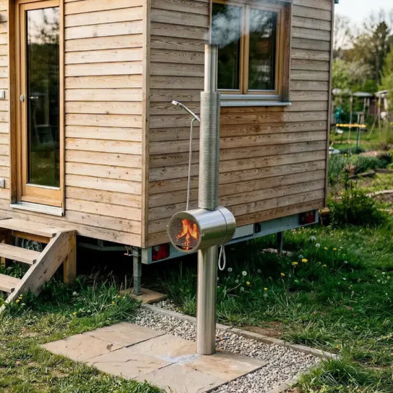
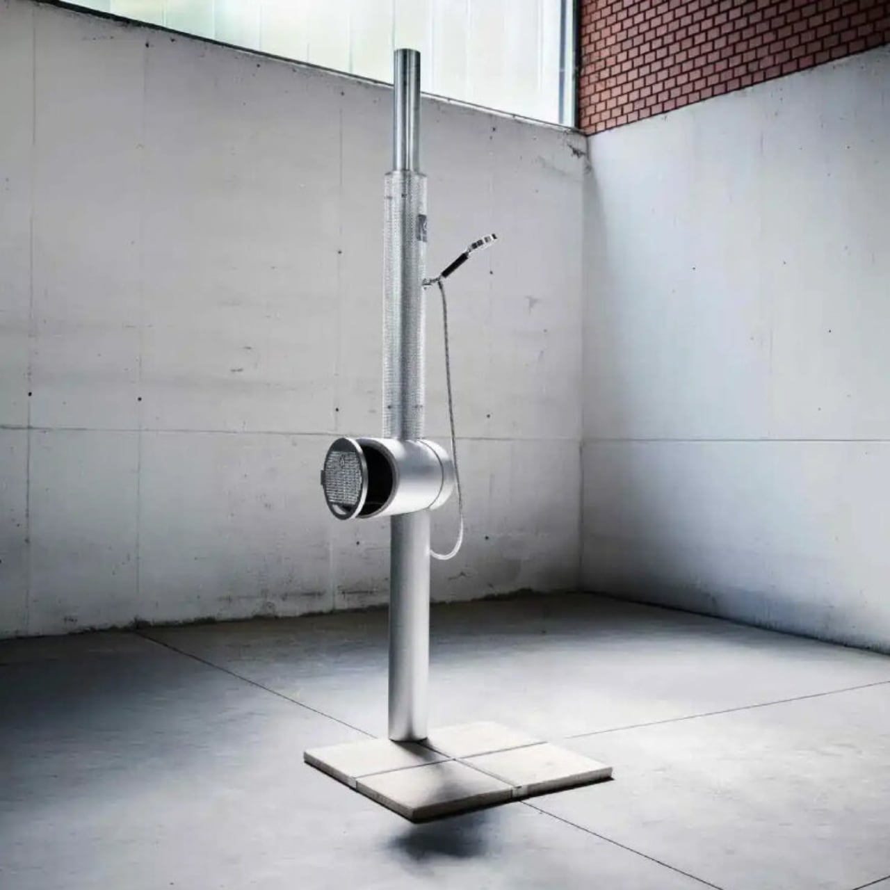
The concept is almost ridiculously simple, and that’s exactly what makes it so clever. The shower is built around a stainless steel frame with a wood-fired heater at its center. You connect a garden hose to fill the pipes with water, load up the stove with small logs, and in about three minutes, you’ve got hot water flowing through a fully functional outdoor shower. That’s it. No solar panels, no electrical hookups, no waiting for the sun to cooperate.

The fact that it works in winter is the part that really gets people talking. Most outdoor showers are a warm-weather luxury that gets packed away the moment temperatures drop. Feuerwasser’s design doesn’t care about the season. As long as you have water and a few blocks of wood, you’re showering in comfort. It’s the kind of design thinking that makes you wonder why no one did this sooner.

Temperature control comes through a mixing valve, so you’re not just getting a blast of scalding water with no say in the matter. You can dial it in to exactly where you want it, which honestly makes it feel far more intentional and refined than you might expect from something fueled by an open fire.

The structure itself is all stainless steel, which means it’s rust-resistant, easy to clean, and built to last through years of outdoor exposure. It doesn’t need to be drilled into the ground either. The shower comes with a freestanding base designed to be anchored with four stone slabs, keeping it stable without any permanent installation. That portability detail is a bigger deal than it sounds. Want to move it to a different corner of the yard? Done. Taking it to a vacation cabin? Also doable. It’s the kind of flexibility that makes a luxury product actually useful.

Since gaining wider attention online, including a viral moment with over four million views, the shower has drawn a lot of curiosity from people who never thought they’d be interested in an outdoor shower. And that’s the thing about great design: it reaches people who weren’t looking for it. Someone who camps might see it as the ultimate basecamp upgrade. A homeowner with a pool or sauna setup might see it as the missing piece. A design lover might just want it because it looks absolutely striking in a backyard setting, like sculpture you can actually use.

Feuerwasser’s garden shower starts at €3,490, which puts it firmly in the premium category. But for what it offers, a fully self-sufficient, no-infrastructure-needed hot shower that works year-round, looks beautiful, and is built from high-quality stainless steel, that price tag starts to make a lot of sense. Especially when you factor in that there’s no ongoing energy cost beyond the occasional bundle of firewood.

It’s one of those products that quietly reframes what “outdoor living” can mean. Not just a folding chair and a citronella candle, but a full, thoughtful experience that doesn’t compromise on comfort just because you’re outside. Feuerwasser has been doing this with their hot tubs and outdoor bathing products for a while now, but the garden shower is the piece that feels most universally appealing. Hot water, fresh air, the smell of a wood fire, and no electricity bill. That combination is hard to argue with.

The post Hot Water in 3 Minutes: The Garden Shower Fueled by Fire first appeared on Yanko Design.
Esenes Worldwide Just Made a Bag That Looks Good Enough to Eat

Fashion has a way of sneaking up on you. One minute you’re scrolling through your feed, minding your own business, and the next you’re staring at a handbag that makes you want dim sum at 10 in the morning. That’s exactly what happened when Brooklyn-based label Esenes Worldwide dropped their latest piece: a dumpling bag made from real translucent leather.

Yes, you read that right. A dumpling. A bag. One object. And somehow, it completely works. While there are a lot of dumpling-like bags already in the market (think Uniqlo, Beyond the Vines, etc), they just imitated the shape of one of our favorite snacks. This one actually took almost literally. But of course you cannot really it. You just get some dumpling cravings while carrying it.

Designer: Esenes Worldwide

Esenes Worldwide, pronounced “SNS,” short for “sorry not sorry,” was founded in 2021 by Justin Son. The brand has spent the past few years building a reputation on turning everyday objects, pop culture references, and an unapologetic sense of humor into wearable, conversation-starting designs. They’ve had viral hits before, including the Cufant clogs and the “Loose Screw” hats, but this dumpling bag feels like a new level of commitment to the bit. A very good, very delicious-looking bit.


The bag is crafted from genuine translucent leather in a pale, almost golden yellow that does a convincing job of mimicking the cooked skin of a steamed dumpling. The leather is soft and smooth to the touch, and because it’s translucent, you can see straight through to the canvas lining inside. That lining is printed with images of chopped vegetables and filling, creating a visual illusion that’s almost unsettling in the best possible way. It genuinely looks like someone cooked a dumpling, hollowed it out, and decided to put a zipper on it.

What makes it more interesting is how the construction leans into the organic nature of the food it references. Each bag has its own soft, rounded form with creases and folds that closely mirror the pleating on a real dumpling. No two pieces are exactly alike, which gives every bag a sculptural, one-of-a-kind quality that lifts it beyond novelty territory and into something you’d actually want to collect. The short, string-like handles add to the overall aesthetic, though they’re better suited for carrying in your hand or looping around your wrist rather than throwing over your shoulder.

And before you write this off as a cute conversation piece with no practical value, consider this: the canvas lining means you can actually stash your everyday things inside. Keys, cards, a lip balm, the occasional receipt you swear you’ll throw away. And of course, actual snacks. The irony of carrying your snacks inside a bag that looks like a snack is not lost on anyone, but it’s a fully functional bag, and that matters.

The drop is also very much a collector’s situation. Only 150 units were ever made, and each one retails at $150. Given the brand’s track record and the amount of attention this bag has already generated online since its release on February 20, 2026, that limited run feels more like a countdown than a leisurely shopping window.

It’s worth zooming out here, because the food-inspired handbag moment is real and it’s picking up speed. Nik Bentel’s Lidl bag shaped like a miniature shopping cart made waves not long ago, and more brands are starting to lean into the idea that accessories don’t have to take themselves seriously to be desirable. If anything, the opposite is becoming true. The more unexpected and culturally loaded an object is, the more people want to carry it around town.

Esenes Worldwide understands this better than most. They aren’t chasing trends so much as setting the terms for what a “fun” brand can look like without sacrificing craft. The dumpling bag is made from real leather, constructed with genuine attention to form, and backed by a concept that actually holds up under scrutiny. It’s playful without being cheap. It’s strange without being alienating.

Fashion at its best has always had a sense of humor, and this bag is proof that the funniest ideas can also be the most technically thoughtful ones. Whether you’re carrying it to a gallery opening or a late-night noodle spot, it’s going to start a conversation. And that, really, is the whole point.

The post Esenes Worldwide Just Made a Bag That Looks Good Enough to Eat first appeared on Yanko Design.