Compact and versatile, the ROG Harpe Ace Mini and Strix Impact III Wireless offer precision, dual connectivity, and comfort for extended gaming sessions.
This is a story about serendipity and probability.
Nicole He met Arnaud De Bock while waiting in line for the bathroom at a GDC developer party in 2019. She was giving a talk on voice technology in art and games based on her work as a creative technologist, her portfolio filled with interactive projects like the True Love Tinder Robot, Garden Friends, ENHANCE.COMPUTER and Soylent Dick. De Bock was working on the Reigns series and Card Shark for Nerial, and finishing up Pikuniku on the side.
Technically, He wasn’t invited to this particular party, but Ape Out co-creator Maxi Boch snuck her in.
“There in the bathroom line, I met Arnaud,” He told Engadget. “We started chatting, and we were sort of mutual fans of each other's work, and we talked about potentially collaborating on something. A few months later, we were trying to work on this other idea that he had with his collaborator Rémi [Forcadell] from Pikuniku. That idea never really worked out into anything. But at the same time, Arnaud and I were both obsessed with this reality show called Terrace House.”
Devolver Digital
Terrace House was a Japanese reality series that aired from 2012 to 2020, featuring a rotating cast of six strangers, mainly young professionals, as they lived together for months at a time. Episodes followed the participants as they navigated work and relationships, and the entire thing had a soothing, quiet kind of vibe, even during explosive arguments about eating someone else’s steak. Though cast members often ended up dating each other, you could call Terrace House very demure and very mindful — especially in comparison to Western reality shows like Love Island or Too Hot to Handle, which are built around the themes of bikinis, lust, betrayal and neon-lit product placement.
Inspired by Terrace House and 1990s reality shows like The Real World and Room Raiders, He and De Bock started creating a game called The Crush House. Nerial jumped on board: The studio was finishing up Card Shark and co-founder Francois Alliot saw this reality TV project as an opportunity for his team to flex their narrative muscles.
“At some point, we made a major pivot as far as the writing goes, just ramping it up from this chill Terrace House style, slice-of-life relaxed thing, to be trashy, essentially,” He said. “Like, the dialogue needs to be a lot more engaging. It needs to be funnier and raunchier, more over the top.”
Devolver Digital
That’s when shows like Love Island and The Ultimatum entered the production conversation. In its final form, The Crush House falls in the space between Terrace House and Love Island. It’s set in a bright seaside mansion (with an infinity pool, of course) and it stars four characters at a time as they form strategic friendships, have fiery arguments and make out with each other between ad breaks.
The Crush House is set in 1999, before smartphones enabled a call-and-response relationship with viewers, but the audience still plays a critical role. Players are the on-site producer and videographer, and they have to respond in real-time to demands from different categories of viewers, like drama queens, foodies, fish freaks, divorced dads and butt guys, while also appeasing advertisers and the mysterious network overlords. Capturing the correct footage, playing ads at the right time and placating the suits makes for a surprisingly intense gameplay loop. There’s a sprint button here for a reason.
One of the most intriguing aspects of The Crush House is its replayability. There are 12 cast members to choose from at the start of every run, and they have distinct personality traits that play off of each other in unique ways. There are classic reality-TV archetypes, like the himbo, the naive girl and the pretentious one, and their interactions are driven by procedural generation.
“Everything that you see on the screen, the dialogues, are generated,” Alliot said. “We have a system called rigmarole, which is a system that matches the traits of a character with what we call sagas, which are like models of stories. For example, if you got a love triangle, you have a number one, number two, number three, they will have different traits that we will match to the characters. If we have a match, we play that story and then it unfolds like that, with possible outcomes that may be different depending on the character that you picked. And this system allows us to have a very broad or very narrow type of narrative.”
He and the developers at Nerial wrote about 50,000 lines of dialogue for the Crush House rigmarole system. With 12 characters to choose from and four characters in each playthrough, there are 495 total possible cast combinations in the game. Essentially, The Crush House had to be procedurally generated.
“We have things that are logical, but it's never 100 percent super structured,” Alliot said. “It's a bit loose, a loose narrative that fits very well with reality TV. And so you can play the game basically forever, matching different characters, and it will still surprise you.”
The Crush House was a jumble of random dialogue and code for a long time before its procedural generation systems had enough information to produce a rational, powerful experience, He said. Alliot warned her this would be the case, and encouraged her to be patient and watch out for the moment when everything would snap into place. Eventually, that’s exactly what happened.
Devolver Digital
“It's kind of a mess for a long time,” He said. “But when we reached the point where actually it all came together — we had enough writing, we had the technical stuff working out, and the animations playing and all this stuff happening. It's like there's something that clicks and it kind of becomes magical.”
The Crush House still surprises He, even after years of studying its code and iterating on its outputs.
“I had this experience even yesterday playing the game, where there was a very sweet, romantic scene between Veer and Alex, and then the next scene, Veer says something that's really cruel to him,” He said. “And I was struck by that. I mean, I can see through the veil of it, I know how everything works, but it's really awesome to have that effect.”
The Crush Houseis available on Steam for PC, developed by Nerial and published by Devolver Digital.
This article originally appeared on Engadget at https://www.engadget.com/gaming/pc/how-the-crush-house-turns-procedural-generation-into-social-manipulation-160020111.html?src=rss
Peloton is in something of a financial rut lately, and we all know what companies do when that happens. They take it out on consumers. To that end, the exercise machine maker just announced it will be charging a $95 “used equipment activation fee” to anyone who buys one of its machines on the secondhand market, according to a report by CNBC.
The company made this announcement in its Q4 2024 shareholder letter. The fairly exorbitant fee will apply to any machine bought directly from a previous owner, meaning anything purchased via Craigslist, Facebook Marketplace or, heck, even a neighbor down the street. Without tithing $95 to the church of Peloton, the machine won’t have access to any of the classes or features the company has become known for.
The company says this activation fee is just to ensure that new members “receive the same high-quality onboarding experience Peloton is known for.” In a recent earnings call, however, a company representative was more transparent, calling the fee a “source of incremental revenue and gross profit,” according to The Verge.
Users who pay this fee will be treated to a “virtual custom fitting,” in the case of the Peloton Bike and Bike Plus. They will also receive a summary of the hardware which will illustrate exactly how much the machine was used by the original owner, just in case the seller tries that whole “I only used it once” thing. Peloton also says that these second hand buyers will get discounts on accessories like shoes, mats and spare parts. So it’s not all bad.
Also, the $95 fee doesn’t apply to those who buy refurbished machines directly from the company or from any of its third-party distribution partners. It’s only those who sell or buy via traditional used equipment channels who gotta pay the troll toll.
Buying a preowned Peloton machine was one of the great joys of being a consumer. The standard Bike, for instance, sells new for nearly $1,500, but you can pick up a used one online for $300 to $500. Now, that price goes up to $400 to $600. Peloton also requires a monthly membership fee to access content, which is around $44.
This isn’t the only move that Peloton has recently made that could be seen, through a cynical lens, as nickel and diming consumers. It upped subscription prices for those who use the company’s app with third-party machines. There’s still a free tier, but it doesn’t offer access to any live classes.
However, the recent earnings call did offer a bit of good news for Pelo-heads (I just made that up). Shares have risen 15 percent this quarter and losses have been narrowed to $30 million, down from $241 million year over year.
This article originally appeared on Engadget at https://www.engadget.com/home/peloton-to-ruin-the-secondhand-market-by-charging-a-95-used-equipment-activation-fee-155230509.html?src=rss
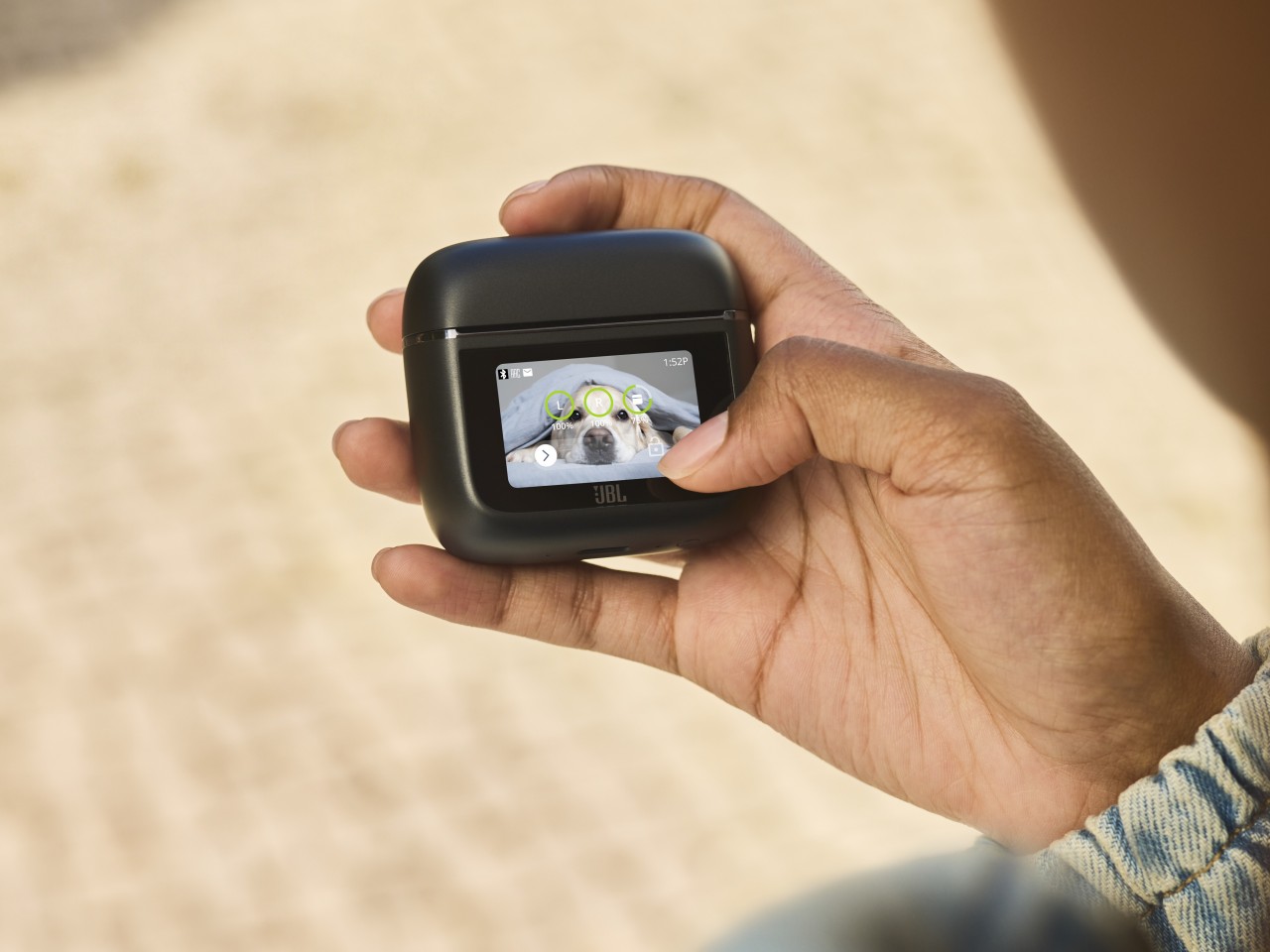
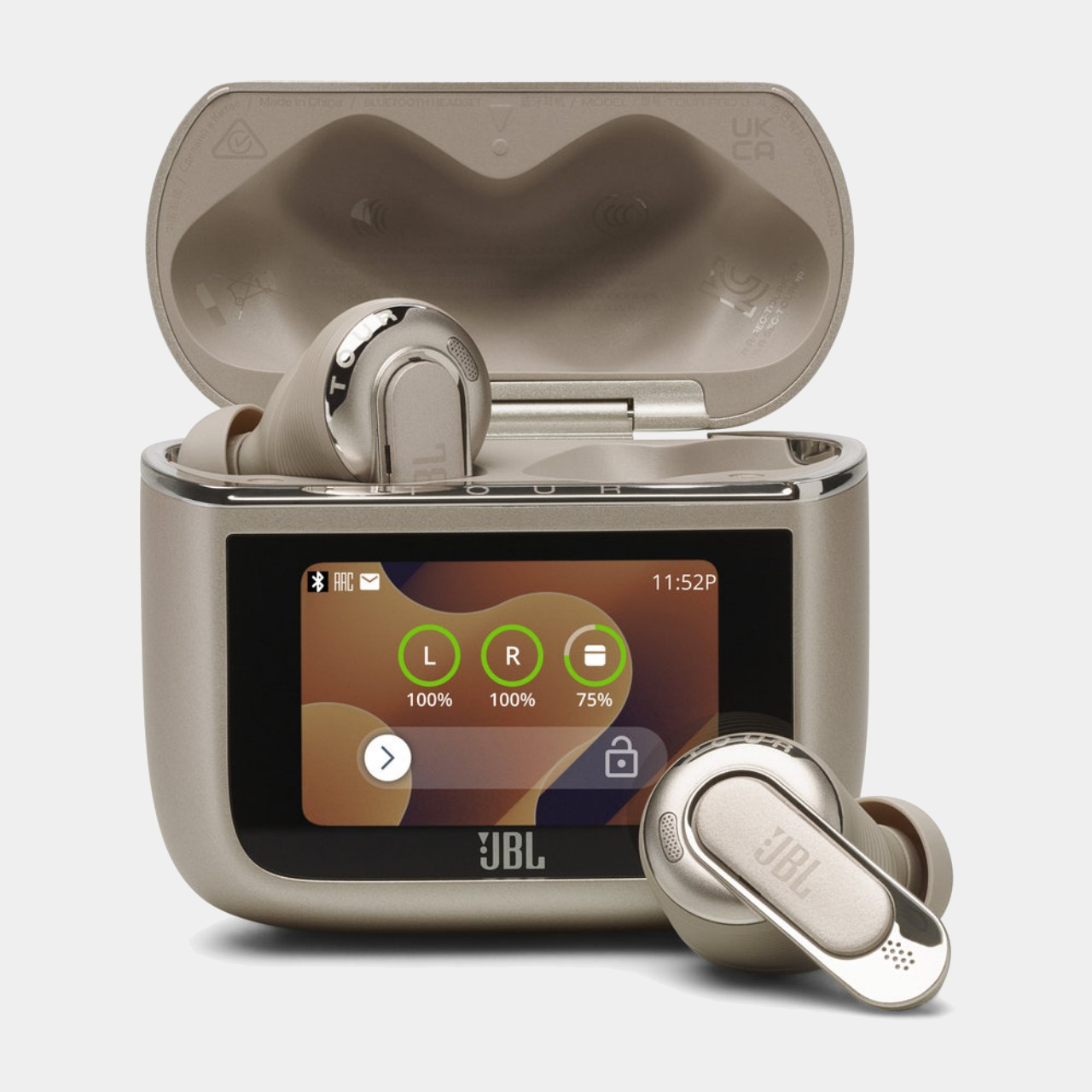
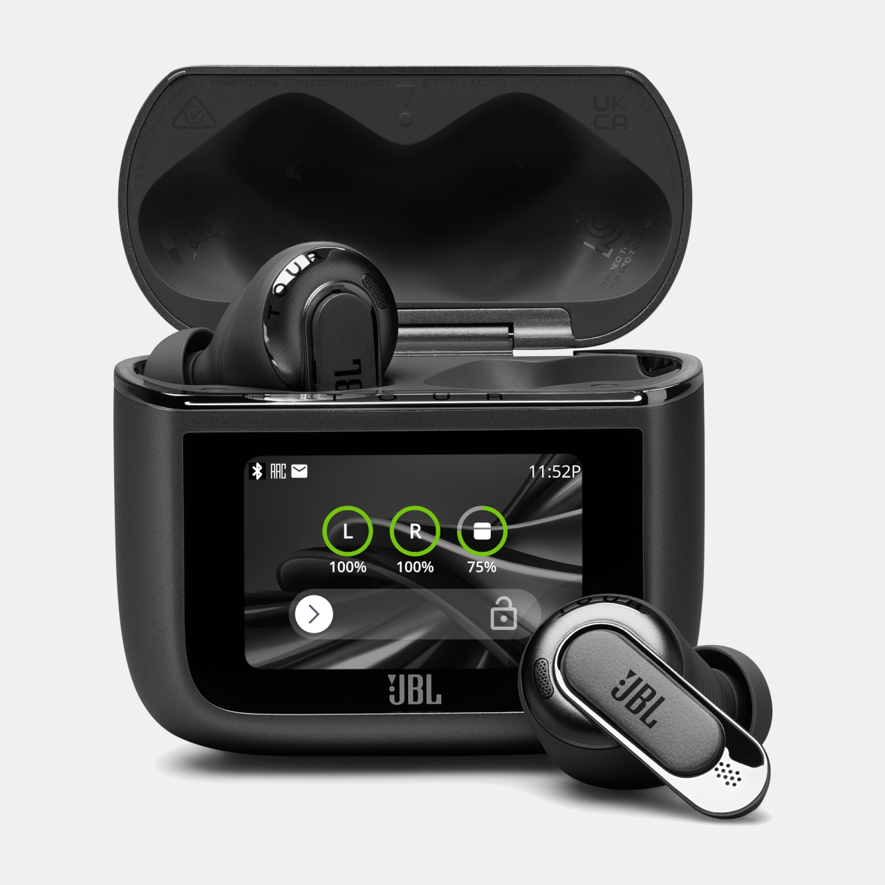
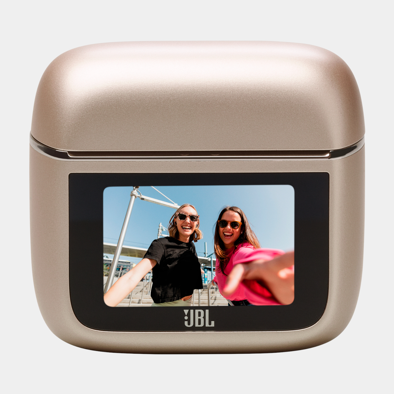
True Wireless Stereo or TWS earbuds continue to evolve every year, but their charging cases have mostly been nothing more than portable battery packs. In 2022, JBL showed that there’s so much potential in those pebble-shaped devices when it slapped a touch screen on them. That may look fancy and cool, but some might think it’s also just a gimmicky feature. It is, however, just the tip of the iceberg, because the second-gen screen-toting Smart Charging Case that comes with the new JBL Tour PRO 3 definitely offers more, proving that there’s plenty of room for improvement and creativity if you’re willing to also pay the literal price.
A touch screen on an earbuds charging case is admittedly more of a nice convenience than a killer feature. It allows you to control playback, screen calls, and view media information without having to pull out your phone. It’s definitely an eye-catching design that made JBL’s earbuds look like they’re from the future, but the capabilities of the next-gen charging case can be qualified as a necessity, especially for globetrotters and frequent flyers.
The JBL Tour PRO 3’s second-gen Smart Charging Case can function as a wireless audio transmitter, practically replacing the role of a Bluetooth dongle. Simply plug the case into a USB or analog socket and have the audio stream to the earbuds instantly and with lower latency than Bluetooth. This feature was made with in-flight entertainment systems in mind, giving travelers more flexibility and peace of mind, knowing they don’t have to rely on fickle and unstable Bluetooth dongles ever again.
The Tour PRO 3 charging case is also one of the first few to support the new Auracast technology. The case becomes the source of an audio broadcast, allowing other Auracast-compatible earbuds, earphones, and speakers to share and enjoy the same tunes. You can also join other Auracast broadcasts by tapping on the case. Of course, there’s also a measure of privacy with a password to keep random people from joining your party.
The JBL Tour PRO 3 earbuds themselves won’t be overshadowed by its charging case, boasting a new head tracking technology that makes audio sound like they’re coming from outside your head and stays fixed in place no matter how much you swing or turn your head. For all these advanced features, however, the buds will set you back around $334, which isn’t exactly a small amount. The JBL Tour PRO 3 will arrive in mid-September bearing Black and “Latte” colorways, though availability in the US has not been announced yet.
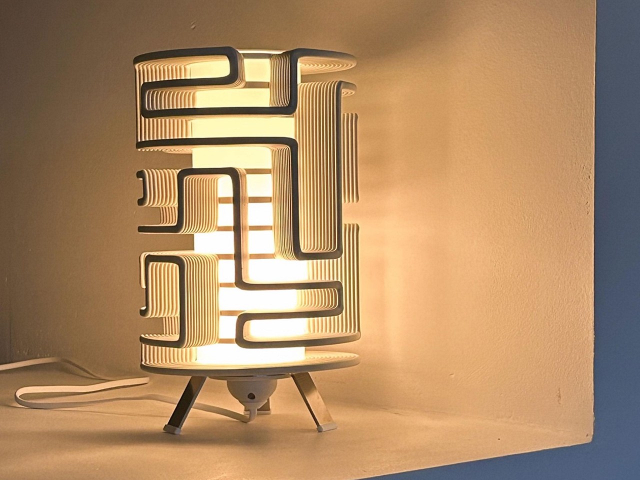
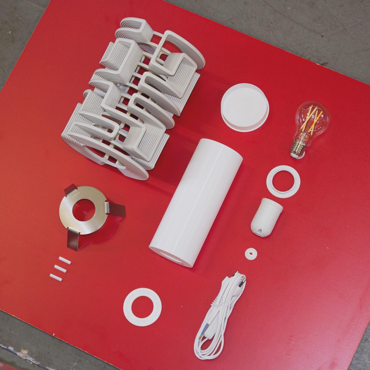
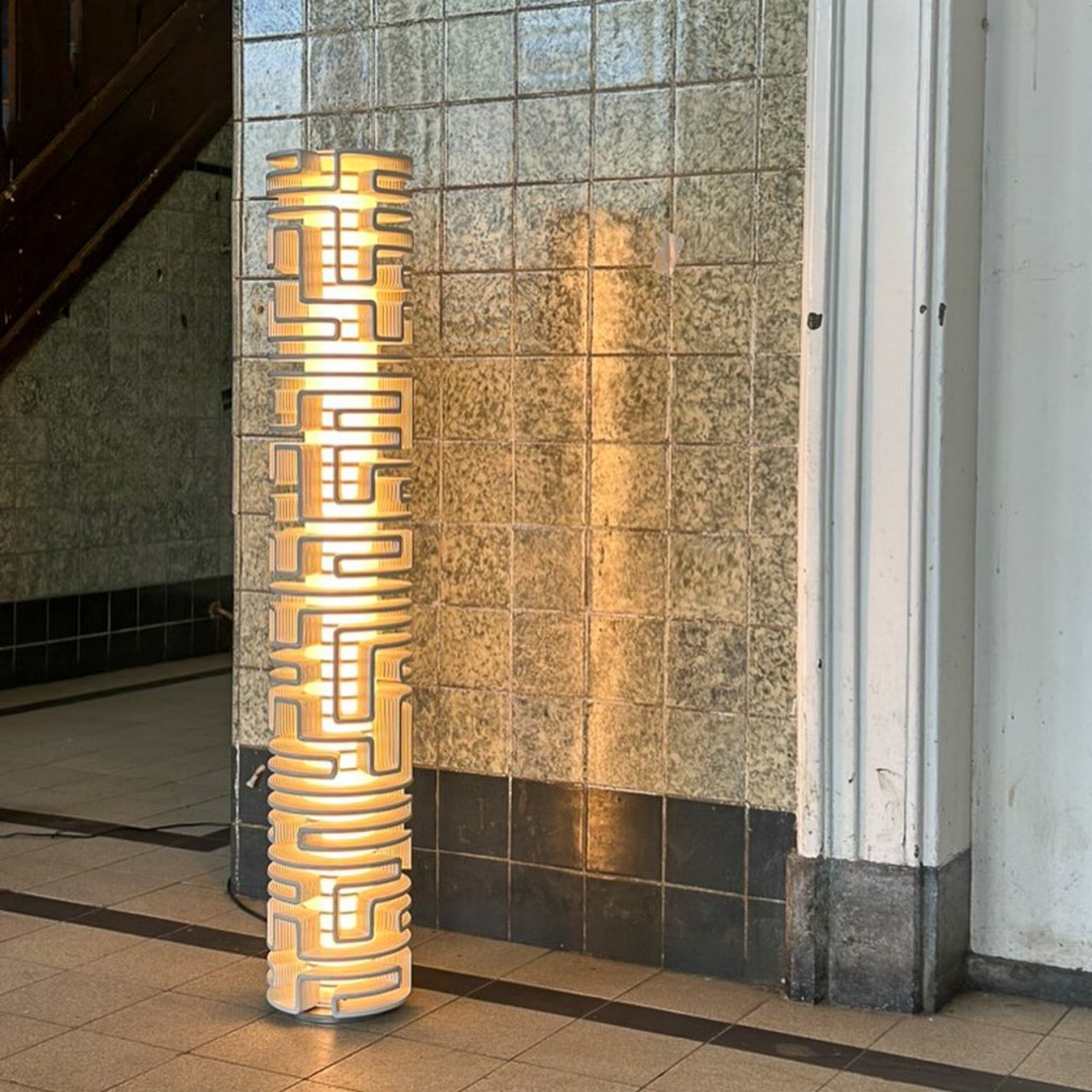
3D printing is a truly revolutionary technology that blasted open the floodgates of creativity and design. It gave almost everyone a powerful tool to realize their dreams and experiment with their ideas. These machines also made it easier to have more flexibility in the execution of designs, like adding an element of randomness to each output. That’s the kind of uniqueness that each of these Maze Lamps brings to your room, catching your attention with its unique lines and snaking paths, creating a play of light and shadow even when the lamp is turned off.
Most people probably think of 3D printers as extras large boxes that sit on desks, applying layer upon layer of melted plastic to complete a small shape. In reality, there are different kinds of 3D printers and different types of printing, and while the most popular machines are designed for use by individuals or small businesses, it didn’t take long for industrial-grade ones to pop up. This kind of printer offers a bit more flexibility in terms of movement and can cover a wider area as well.
The Maze Lamp design takes advantage of this capability by having an industrial 3D printer lay out the lines over a rotating axis. Normally, what you’d get is a cylindrical shape that looks like it was made from a spindle of extra-large spaghetti as the plastic material coils around and around the slowly spinning base. But if you move the nozzle forward, backward, and sideways while it spins, you can create more interesting patterns that look like the lines of a maze. Stack those lines on top of each other and you get a three-dimensional maze on a cylinder.
What makes this process even more special is that the pattern of these lines is random. No two Maze Lamps will ever have the same design, making each piece a one-of-a-kind item. For programmers and designers, this kind of procedurally generated pattern adds a unique characteristic to every iteration. As a bonus, the material used by the 3D printer is made from plastic shredded from discarded refrigerator doors, giving our own waste a beautiful new lease on life.
Thanks to the three dimensional patterns printed around the core, the Maze Lamp entices viewers whether the light is on or not. The light shining from the casts an eerie glow, almost like some otherworldly artifact found hidden in some ancient Aztec temple. On its own, the lamp becomes a sculptural art piece, not unlike a totem that represents the aesthetics and the technology of civilization that made it.
Home security devices can give us peace of mind, but they don't always come cheaply. That's why we're excited to see Ring's Pan-Tilt Indoor Camera finally go on sale. The device, which launched at the end of May, is down to $60 from $80 — a 25 percent discount. The only catch: the sale is just available on the black and white models, leaving the Blush, Charcoal and Starlight options at full price.
Ring's Pan-Tilt Indoor Camera offers all the basics with two-way talk and motion alerts but is also the company's first foray into a motorized base, with the device providing a 360-degree look at what's happening inside your home. Plus, it has a tilt range of 169 degrees and displays its view in color HD video. If you're staying in a home with one in it or have visitors, you can activate the built-in hardware kill switch and slide a shutter over the camera — this should also disable any audio.
Right now, you can also get the Ring Video Doorbell for 40 percent off, down to $60 from $100 — just shy of its record low. The doorbell lets you hear, see, and speak with anyone at your front door, with the camera displaying a 1080p HD visual on your computer or phone. It comes with a rechargeable battery and is available in Satin Nickel or Venetian Bronze.
This article originally appeared on Engadget at https://www.engadget.com/deals/rings-new-pan-and-tilt-security-camera-drops-to-60-in-its-first-discount-141551723.html?src=rss
The new Audi RS3 is a remarkable feat of automotive engineering, seamlessly blending a captivating design with unrivaled performance. With its motorsport-inspired aesthetics and a formidable five-cylinder engine, the RS3 is crafted to enthrall both the eyes and the senses. This article provides an in-depth exploration of the key features, pricing, and availability of this […]
If there's one thing that's guaranteed in the world of social media, it's that platforms are going to copy each other's features. However, the newest iteration of this is still surprising, to say the least. Instagram has announced a new music feature that allows you to attach a song to your profile a la Myspace.
Instagram has copied MySpace, a platform that peaked long before Instagram ever existed, and arguably was thrown into decline by the rise of Instagram's parent company.
So, how does this new feature work? You can choose a song by going to edit profile and clicking "Add music to your profile." You can then choose a song or search in the For You section. From there, pick the 30 seconds of the song you want to feature and it will remain on your profile until you pick a new one or decide Myspace features are better left in the past. Don't worry if you're scrolling in public as songs won't start playing now the second you go on someone's profile — click the play button to hear it.
Instagram
Instagram teamed up with singer Sabrina Carpenter to promote the feature, with fans able to hear a clip of her new song "Taste." exclusively on her profile (though the album comes out tomorrow). Earlier this year, Instagram's parent company, Meta, teamed up with another pop star, Taylor Swift. She created a Threads account alongside the release of her new album, The Tortured Poet Society, in April. The first group of people to share her post received a customized badge on their profile.
This article originally appeared on Engadget at https://www.engadget.com/social-media/instagram-copiesmyspace-140049134.html?src=rss
The Meta Quest 3 has received a significant update with version 68, introducing various new features and improvements. These updates enhance user experience through UI changes, media controls, system settings, and more. Let us take a closer look at each to learn more about these new features and how they affect the performance and immersion […]
For the first half of Android’s existence, Google was happy simply being in charge of the OS while other manufacturers built a massive ecosystem of devices. Things changed in 2016 with the launch of the original Pixel, a phone that married the company’s hardware and software designs. But even that combo wasn’t enough to immediately catapult Google’s flagship to the front of the pack. However, between the continued evolution of its devices and former major players like LG and HTC getting out of the game, Google has become the third-largest Android phone maker in the US, just barely behind Motorola.
Enter the Pixel 9, which sports a slick new design, a brighter screen, better cameras and even more sophisticated software tricks. In many ways, this thing feels like it best represents Google's vision for what a smartphone should be and it’s here to claim its title as the default Android handset.
Design and display
I usually hate making this comparison, but it’s hard to ignore that the Pixel 9 looks a lot like an iPhone. Similar to recent Apple handsets, the base ninth-gen Pixel features flat sides with rounded corners and a smooth matte finish. Its front and back panels are made out of Gorilla Glass Victus 2, which when combined with the phone’s recycled aluminum frame results in a device that Google says is two times more durable than before.
The big difference though is the Pixel 9’s rear camera module. Gone is the edge-to-edge bar we’ve become familiar with over the previous three generations and in its place is a simple pill-shaped visor. Compared to Apple’s arrangement — which still looks like the top of a stove to me — Google’s design is the essence of simplicity. There are two lenses on the left and a flash on the right, with some additional components like a tiny microphone and a single-zone laser-detect autofocus system scattered throughout. Sure, it’s a bit tall and bulky, but because it largely spans the width of the device, it means the phone doesn’t wobble when you rest it on its back. Points to Google for a more elegant solution.
Photo by Sam Rutherford/Engadget
In front, the Pixel 9 sports Google’s latest 6.3-inch OLED Actua display, which offers an even higher peak brightness of 2,700 nits (versus 2,000 nits for the Pixel 8). Granted, that’s a few hundred less than the 3,000 nits on the Pixel 9 Pro and Pro XL, but even when viewed side-by-side, you’d be hard-pressed to notice a difference. As before, the Pixel 9 has a variable refresh rate that jumps between 60Hz and 120Hz to help save on battery while Google has tweaked little details like evening out the phone’s bezels so that they are the same size all the way around. Altogether, it’s an excellent display with accurate colors and rich tones. I’ve got to give Google credit, because over the past few years, Pixel displays have made major leaps to the point where they can now hold their own against both Apple and Samsung.
One final small but very welcome upgrade is a new ultrasonic fingerprint scanner hidden beneath the Pixel 9’s displays. It’s even more reliable than the optical sensor used before and, in my testing, it’s unlocked the phone nearly instantly every single time.
Performance
Photo by Sam Rutherford/Engadget
Google’s Tensor chips are often maligned for focusing more on efficiency and AI processing than general performance. But I think a lot of that noise comes from people who care more about benchmarks than how fast a phone operates in the real world. In my experience, the Pixel 9 and the Tensor G4 delivered everything I wanted with ample haste. Switching between apps happens in a flash, while scrolling feels incredibly smooth. Even relatively demanding games like Zenless Zone Zero ran well, with only the occasional hiccup. Unless you are really pushing it by running a bunch of super resource-hungry apps at the same time, the Pixel 9 can handle the stress.
New software and AI features
When Google introduced its big suite of AI-powered features on the Pixel 8 last year, it felt like the company was trying to live up to its own self-fulfilling prophecy on the proliferation of machine learning. But with the launch of even more AI-based tools alongside the Pixel 9, Google’s strategy is becoming much clearer thanks in large part to the new Pixel Screenshots and Pixel Studio apps.
Photo by Sam Rutherford/Engadget
The thing I like most about the Pixel Screenshots app is that it enhances the way people already use their phones. When you’re doomscrolling and you come across something fun or interesting, what do you do? You either share it immediately or save it for later, often by taking a screencap. That’s where the Screenshots app comes in. By using AI to analyze the contents of a pic, you can easily retrieve it later with a quick search.
My favorite use case is for recipes. Previously, I would find an interesting dish and leave it open in a browser tab, which always felt like a clunky workaround. But now, I can just screenshot it and feel confident about finding it in the future. And unlike Microsoft’s Recall feature in Windows 11, Google’s Screenshots app only looks at the stuff you capture manually instead of automatically recording everything you do, so it feels less intrusive.
For those who want to create their own content, Pixel Studio lets you use AI to generate images by typing in a handful of prompts. It’s basically a free version of Midjourney built just for Google’s phones and I feel like I’ve only begun to explore its potential. It can turn people’s faces into cute little stickers that you can copy into pictures or give you inspiration on how to decorate your room. The possibilities are endless.
Photo by Sam Rutherford/Engadget
Then there are a handful of smaller but still very useful tools like the Pixel Weather app, which features AI-generated summaries to help you plan your day. Instead of checking the hourly forecast and looking at every stat and figure, you can quickly read a couple of sentences to see when the UX index will peak or if there’s a surprise thunderstorm headed your way.
Meanwhile, other features like Gemini Live let you ask questions and bounce ideas off of Google’s most powerful AI assistant in a more natural way (you know, if you’re into that kind of thing). Phone conversations also sound better thanks to improvements to Clear Calling, which cuts down background noise. If you’re distracted or don’t feel like paying attention, you can use the new Call Notes feature to transcribe everything before giving things a closer look later. There’s even a Satellite eSOS feature that’s free for the first two years, which lets you call for help when you don’t have service. Thankfully, I haven’t needed to test it out myself, though for anyone who’s curious, Google offers a demo experience that’s slated to go live on August 22.
Cameras
Photo by Sam Rutherford/Engadget
Superb image quality has long been one of the Pixel family’s calling cards and it’s getting even better on the Pixel 9 thanks to two new cameras. The main wide-angle lens features a new 50MP sensor while the ultrawide lens is powered by an updated 48MP cell, the latter of which can be used to shoot close-up macros.
In situations with good light, the Pixel 9 outperformed the more expensive Samsung Galaxy S24 Ultra. Colors were generally brighter and Google’s processing typically preserved more details. One of the most impressive examples was a backlit shot of a Transformer, where the Pixel 9 captured a photo with much richer hues and better focus while the S24U struggled, producing a shot with muddy colors and a surprising amount of noise.
At night, Google’s superb Night Sight mode reinforced the Pixel’s lead in image quality, capturing brighter and more well-exposed photos. The only time Samsung’s phone came out on top was in a single low-light shot of a flower, because even though the S24U’s pic was a touch oversharpened, it was still better than the overly soft result I got from the P9.
Of course, you can’t have a new Pixel with some fresh camera features to go with it. This time, we’ve gotten a range of improvements including Auto frame which uses AI to cleverly recompose images and fill in the missing parts where needed. Or you can use Reimagine to create more fantastical pics by replacing elements (foregrounds and backgrounds work best) with whatever you can think of. Panorama mode can also be used at night now and while it takes some practice to get the best results, even on my first attempt in a less-than-ideal location, I got a neat-looking shot of the NYC skyline.
If you zoom in, the results don't really hold up. But from afar, the Pixel 9's Reimagine feature can create some fantastical photos like this one with an AI-generated starry night.
Photo by Sam Rutherford/Engadget
Then there’s Add Me, which lets you take multiple group shots with different people holding the camera to create a single composite image with everyone in the shot. Now, no one has to be left out simply because they’re the designated photographer that day. It’s surprisingly easy to use and great for introverts like me who don’t want to ask a stranger for help. But you have to stay still or else things can get wonky. Perhaps the coolest thing about this feature is that you can also use it to clone yourself multiple times in the same image, which is a really fun, if unintended, use case.
My one gripe is that I wish Google had included support for Zoom Enhance on the Pixel 9. It would be really nice to have a tool to sharpen blurry or cropped photos available on the base model, especially since, unlike its more expensive Pro siblings, it doesn’t have a dedicated telephoto lens.
Battery life and charging
Photo by Sam Rutherford/Engadget
Thanks to a larger 4,700mAh cell (up from 4,575mAh) and improved power efficiency, Google claims the Pixel 9 has 20 percent longer battery life than the previous model. But I found that it fared even better, lasting 27 hours and 32 minutes on our video rundown test. Not only is this the best we’ve seen from any Pixel to date, it also tops the OnePlus 12’s time of 26:40 for the best longevity of any phone we’ve tested.
Unfortunately, despite Google having just released a new 45W power adapter (sold separately), the Pixel 9’s wired charging speed remains the same at 27 watts. You also get Qi wireless support (but not Qi2) at up to 15 watts and reverse wireless power sharing when you want to help out a friend with a device that’s short on juice.
Wrap-up
For so many years, non-Pro Pixels have existed as an also-ran next to Samsung’s base Galaxy S phones, primarily for people who appreciate Google’s software wizardry and regular feature drops. But with the Pixel 9, Google has upped its hardware design while once again doubling down on what it does best. It has a gorgeous screen, class-leading cameras and a more refined appearance, plus more AI-powered tools than anyone else. Pretty good ones at that. You also get fantastic software support including seven years of OS and security updates.
Photo by Sam Rutherford/Engadget
Aside from a couple of omissions like no support for Qi2 magnetic wireless charging and Zoom Enhance, the Pixel 9 has everything you want and need from a high-end Android handset. Google’s software — which was already a major plus — is becoming a pillar of dominance. That said, owners will need to be more proactive about embracing these features to get the most out of their devices. AI still succumbs to hallucinations and errors (a lot of the new tools are still in preview phase), so many features remain far from foolproof. But the foundations for a wide range of powerful tools are at your disposal. At this point, the big question is, at least in the $800 price range, why buy anything else? In some respects, Google might even be its own biggest competitor, because for those who aren’t as enthusiastic about AI, you can save some money and get a Pixel 8a for $499. But for everyone else, while Samsung might still have a lead in total sales, the Pixel 9 should be the go-to flagship Android phone.
This article originally appeared on Engadget at https://www.engadget.com/mobile/smartphones/google-pixel-9-review-the-go-to-android-smartphone-133005548.html?src=rss