10 (More) Best Designs From 2025 That Prove We Want The Future To Look A Lot Like The Past

If Part 1 of this list proved that nostalgia is having a moment, Part 2 is here to show you that 2025 wasn’t only about looking backward. Sure, we are obsessed with what came before, but the best designs this year didn’t just resurrect the past, they remixed it with enough modern intelligence to feel genuinely new. This is where things get interesting: when designers stop treating retro as a costume and start using it as raw material. The result is products that feel familiar enough to trust but fresh enough to justify their existence in a world already drowning in stuff.

So here are the next 10 designs that made 2025 unforgettable. Some lean hard into nostalgia. Others push so far forward they feel like prototypes from 2030. A few manage to do both at once, which might be the most 2025 thing possible. Whether you spent this year glued to design blogs or just trying to keep your head above water, these picks represent the moments when form, function, and cultural timing aligned perfectly. Let’s dig into the second half of what made this year worth paying attention to.

1. Poke-Nade Monster Ball by Takara Tomy & The Pokémon Company

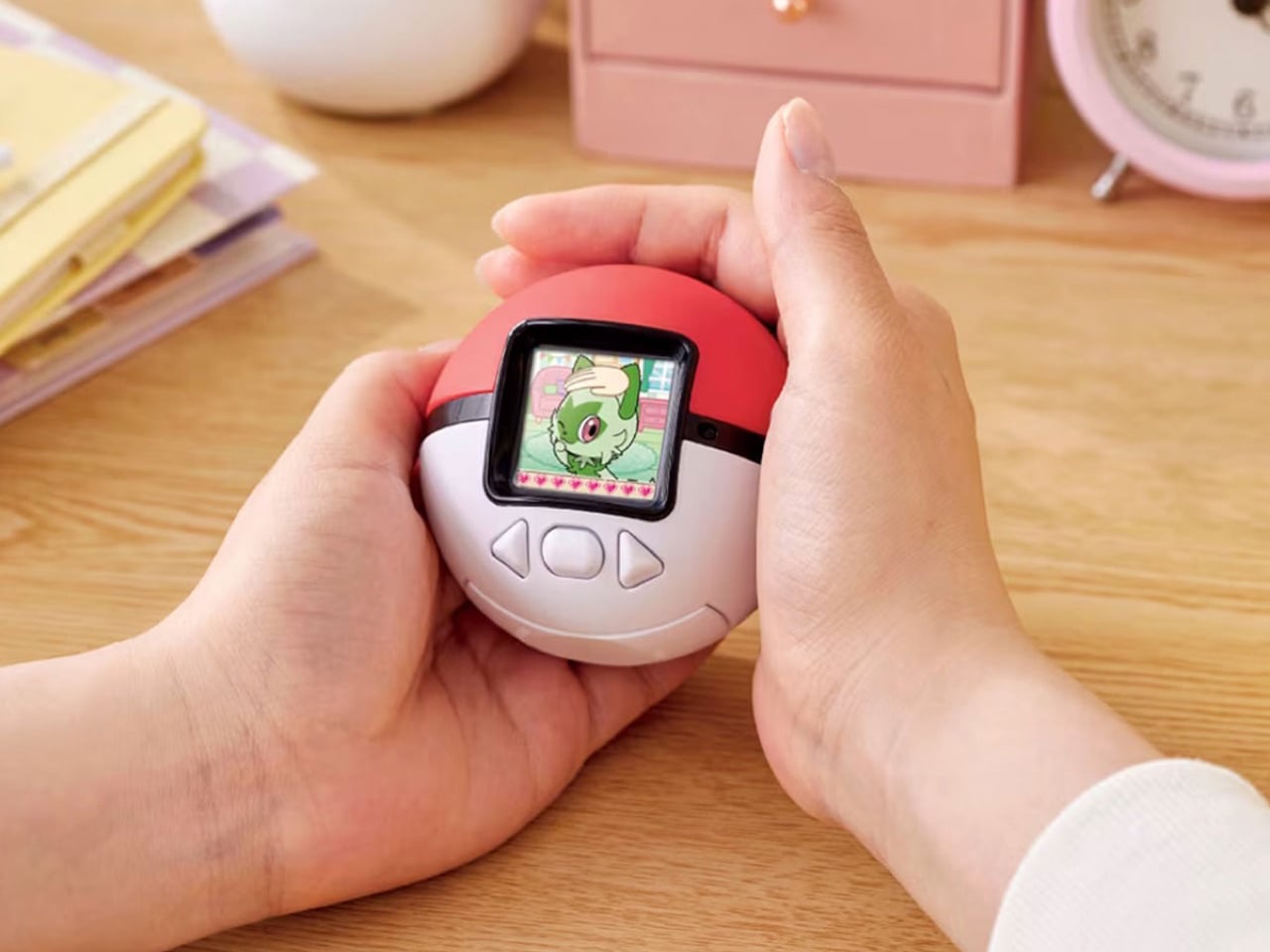
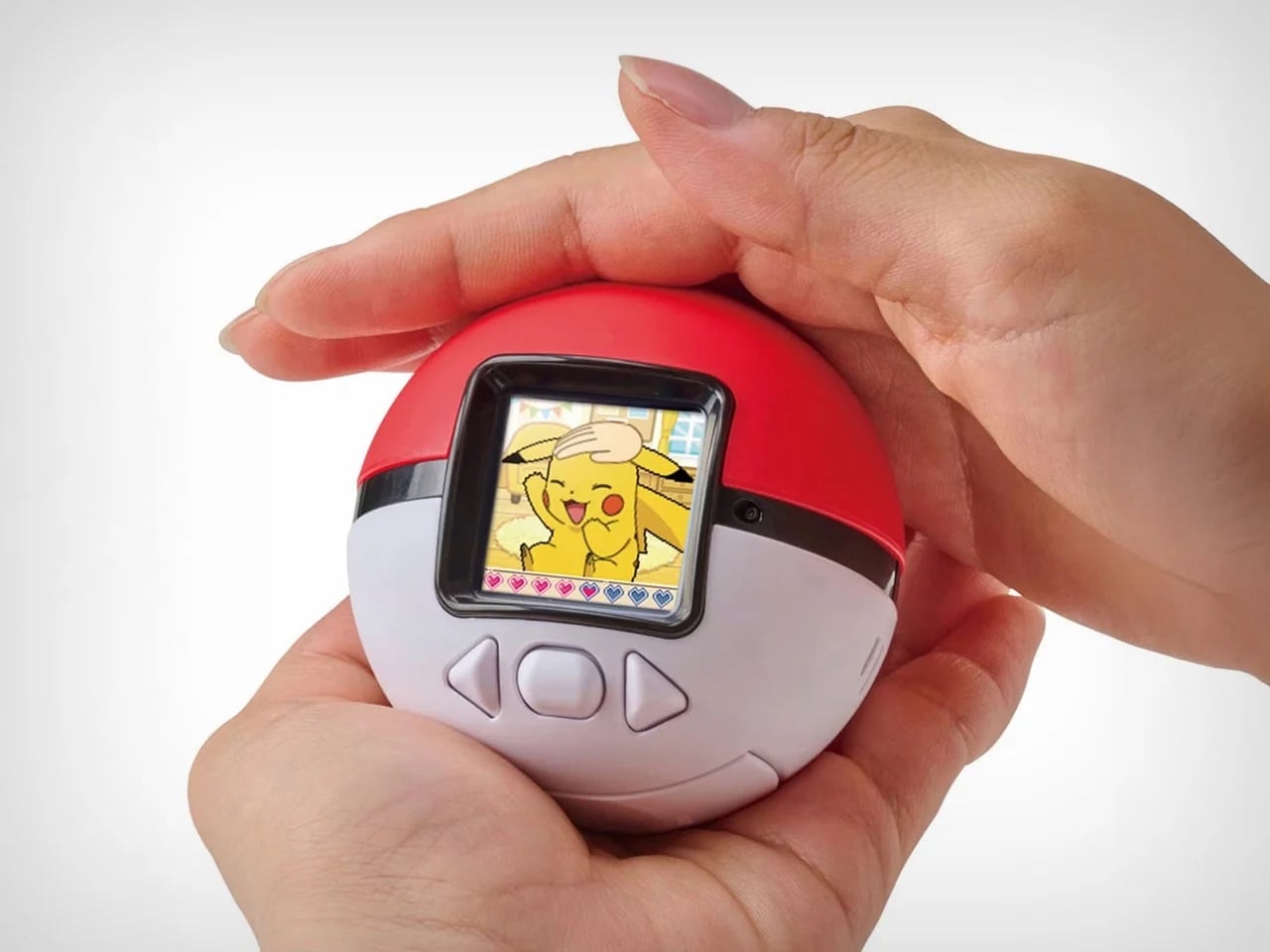
Nostalgia is a fickle mistress! She shows up when you least expect her, whispers about the good old days, and convinces you to spend money on things that have no business existing in 2025. Case in point: Pokemon just dropped the Poke-Nade Monster Ball, which is essentially a Tamagotchi disguised as a Pokéball, and millennials are losing their collective minds over it. This is not groundbreaking technology. This is not solving any real problems. This is pure, weaponized nostalgia, and it is working exactly as intended.

The device takes everything we loved about late-90s virtual pets and wraps it in Pokemon branding so potent you can practically hear the theme song playing. A color LCD screen sits inside a touch-sensitive shell shaped like an actual Pokéball, letting you stroke, tap, and physically interact with your digital companion. Pet it gently and it reacts with happiness. Tap persistently and it falls asleep. The gestures unlock deeper animations as your friendship level grows, which is a clever evolution of the old Tamagotchi button-mashing routine. But let’s be honest, the innovation here is minimal. What they are really selling is the emotional real estate Pokemon and Tamagotchi occupied in our childhoods, repackaged with a slightly better screen and some capacitive touch sensors. And you know what? That is enough. Because nostalgia does not need to innovate. It just needs to remind you of a time when feeding a pixelated creature between math classes felt like the most important responsibility in your life. Pokemon knows this. They counted on it. And judging by how fast these things are selling out, they were absolutely right.

2. Wi-Fi HaLow (with 9.9 mile connectivity) by Morse Micro

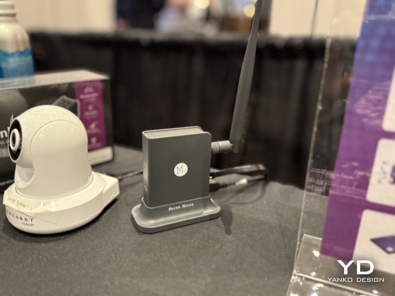
And to counteract that, here’s some serious tech innovation from the beginning of the year that grabbed eyeballs. While most brands relied hard on nostalgia, Morse Micro decided to solve a problem that has plagued connectivity since WiFi was invented: range. The Wi-Fi HaLow system delivers connectivity across a 9.9-mile radius using sub-GHz radio waves, which means it can punch through walls, penetrate obstacles, and maintain signal strength over distances that would make standard Wi-Fi routers give up and go home. Traditional Wi-Fi operates on crowded high-frequency bands that struggle beyond a few dozen meters and get blocked by anything denser than drywall. HaLow operates at lower frequencies with significantly better propagation characteristics, turning your home network into something closer to a neighborhood utility than a room-specific convenience.

The implications go way beyond streaming Netflix from your driveway. You could theoretically connect to your home network from the grocery store, maintain smart home control from miles away, or create IoT networks that span entire campuses without repeaters or mesh nodes cluttering every hallway. Industrial applications become viable where they were previously impossible, rural connectivity suddenly looks feasible without expensive cellular infrastructure, and the whole concept of what a local network means gets redefined. This is not retro. This is not nostalgic. This is pure forward momentum, the kind of innovation that makes you wonder why we spent decades optimizing the wrong frequencies when the solution was sitting in a less congested part of the spectrum the whole time. If 2025 taught us anything, it is that sometimes the best way forward has nothing to do with where we have been.

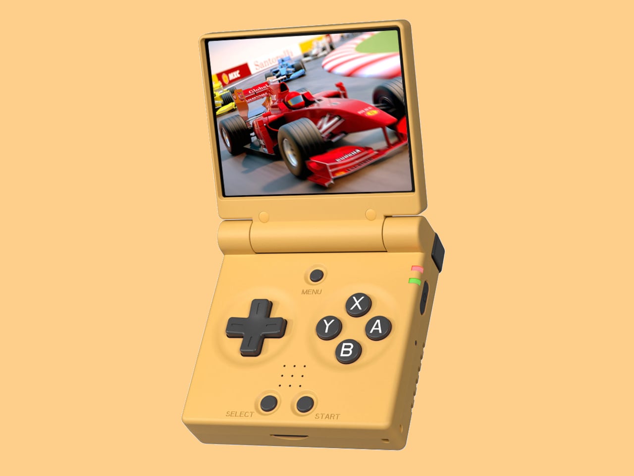
3. Nintendo Wii U Revival by Brenden Sullivan

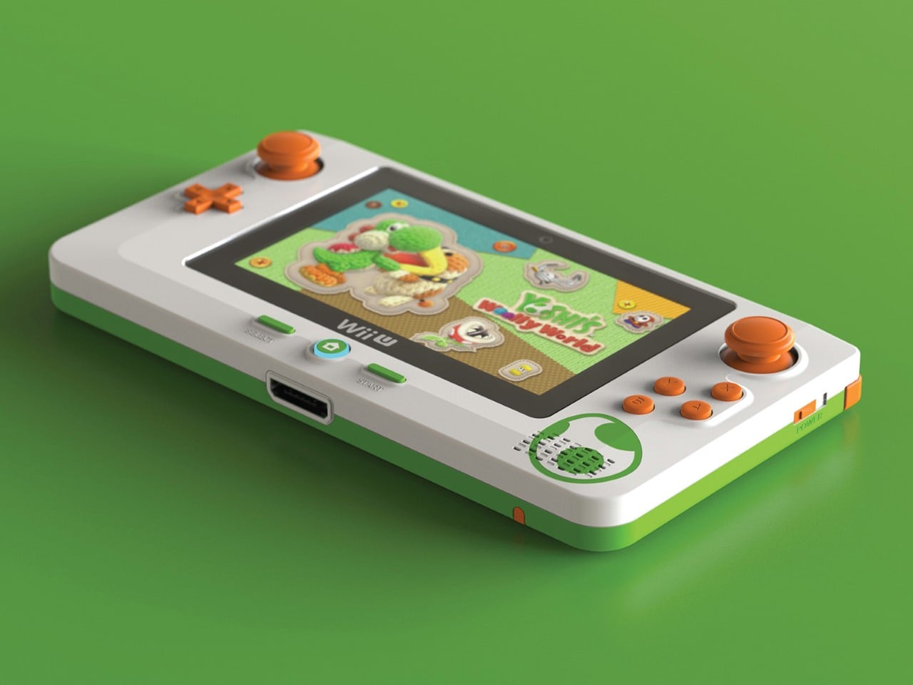
The Wii U was Nintendo’s most spectacular failure in recent memory, a console so confusing in its messaging and underwhelming in its execution that even hardcore fans pretend it never happened. Yet here comes a concept that asks: what if we took the one genuinely clever idea from the Wii U, the gamepad with the built-in screen, and rebuilt it for the Switch 2 era? This Wii U revival concept imagines a companion device that pairs with Nintendo’s next console, offering dual-screen gameplay, touch controls, and the asymmetric multiplayer experiences that made the Wii U interesting for about five minutes before everyone forgot it existed. It is nostalgia for hardware that barely had time to build nostalgia in the first place, which makes it either brilliantly contrarian or deeply misguided depending on how charitable you are feeling.

What makes this concept work as a 2025 artifact is that it refuses to let a good idea die just because the original execution flopped. The Wii U’s tablet controller was ahead of its time in some ways and catastrophically behind in others, but the core premise, that asymmetric information and split-screen interactions could create new gameplay dynamics, never got a fair shot. This concept takes that kernel and strips away everything that made the original clunky: the limited range, the single-controller restriction, the confusion about whether it was a handheld or a console accessory. By positioning it as an optional sidekick to the Switch 2 rather than the main event, it fixes the branding disaster while keeping the innovation. It is nostalgia weaponized correctly, not as pure recreation but as salvage operation, pulling the worthwhile parts from the wreckage and giving them a second chance in a context that might actually appreciate them.

4. No.1/1000 Titanium Fractal Vise by Titaner

Most tools are designed to disappear into workshops, utilitarian objects that do their job without demanding attention. Titaner’s titanium fractal vise does the opposite. It announces itself as both precision instrument and sculptural object, with a body machined from solid titanium and a fractal pattern that serves actual structural purposes rather than just looking cool. The geometry distributes clamping force efficiently while reducing material weight, which means the mathematical beauty is not decorative, it is load-bearing. Limited to a small production run, each vise is CNC-machined to tolerances that make it as much a collector’s item as a working tool, the kind of thing that sits on a workbench and makes visitors ask questions before they realize it actually functions.

What makes this a 2025 design rather than just expensive engineering porn is the way it represents a larger shift in how we think about tools and objects. We are moving past the idea that functional items need to be aesthetically neutral, that beauty and utility occupy separate categories. This vise proves you can have museum-grade craftsmanship in something designed to grip metal and take abuse. It is the intersection of maker culture, precision manufacturing, and the growing appreciation for objects that justify their cost through both performance and presence. There is no nostalgia here, no retro callback, just an argument that everyday tools can be extraordinary if we stop accepting mediocrity as the baseline. It is innovation in the form of asking why more things are not built this well, and then actually building one to prove the point.

5. WP200 Pro Modular Smartphone by OUKITEL

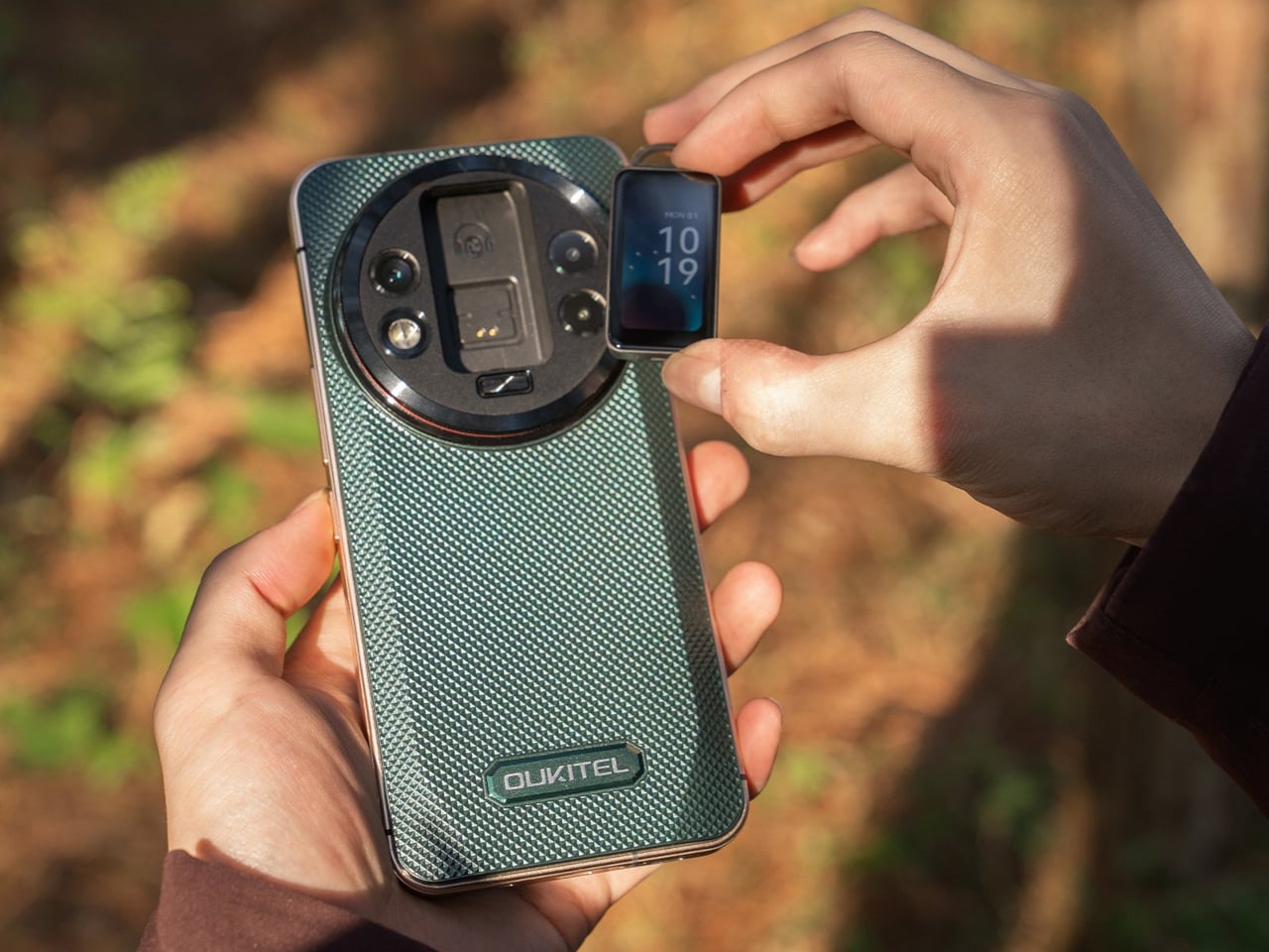
Modular smartphones have been promised, prototyped, and abandoned so many times that most people stopped believing they would ever work. Then the rugged WP200 Pro from OUKITEL shows up with a detachable display that does not just disconnect, it transforms into entirely different devices. The screen pulls away from the phone body and can be reconfigured as either a smartwatch strapped to your wrist or an earbud clipped to your ear. The phone itself continues functioning with a secondary display underneath, so you are not sacrificing core functionality when you repurpose the main screen. It is the kind of absurdly ambitious design that sounds like vaporware until you see the mechanical hinges and magnetic connections that make it plausible.

This is innovation trying to solve a problem nobody asked for but might actually appreciate once it exists: the fact that we carry multiple screens doing similar jobs when one good screen could rotate between contexts. Why own a phone, smartwatch, and wireless earbuds when one modular system could cover all three? The rugged construction suggests this is built for field work, outdoor use, or situations where carrying multiple fragile devices makes no sense. It is the opposite of nostalgia, there is no retro aesthetic here, no callback to simpler times, just aggressive forward-thinking that asks whether our current device ecosystem is as optimized as we assume. Whether it ever ships is anyone’s guess, but as a statement of intent, it proves that some designers are still more interested in what comes next than what came before.

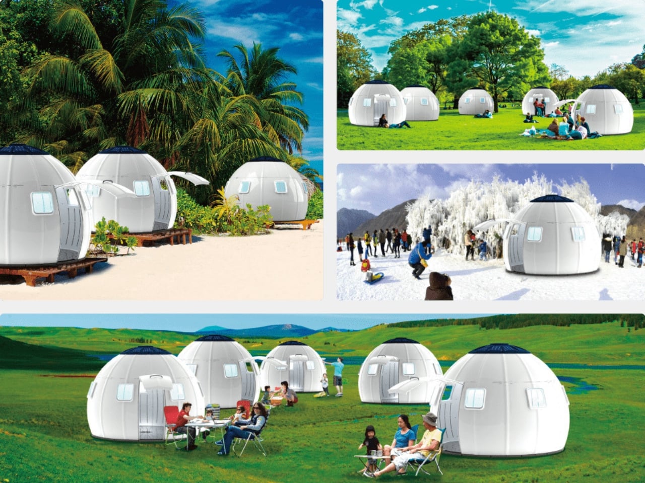
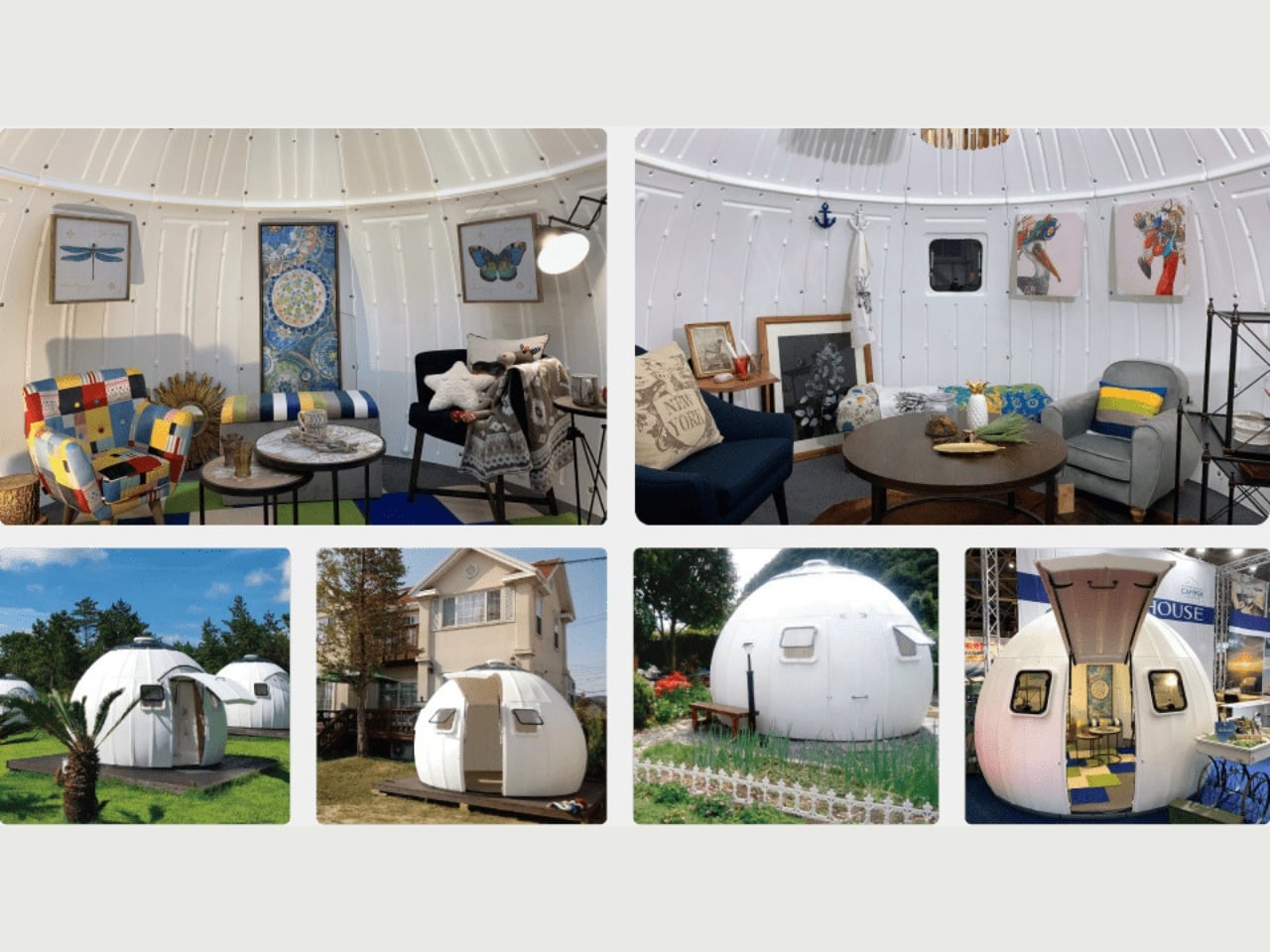
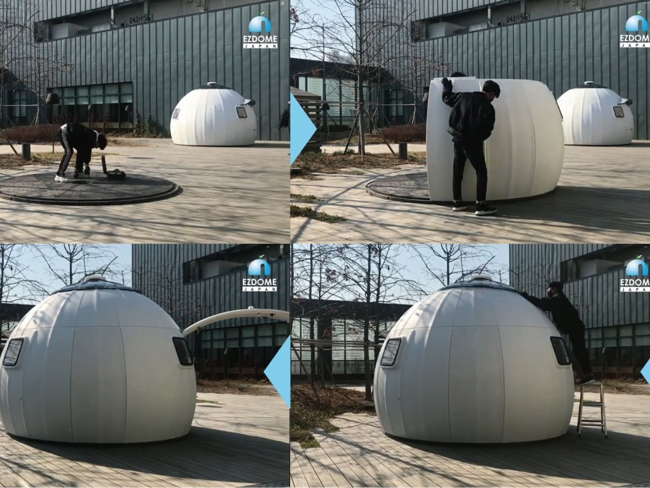
6. Kangourou Tiny Home by Quadrapol

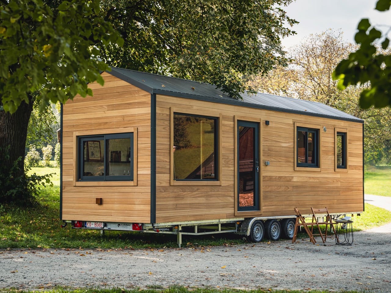
Tiny homes have been sold as this romantic solution to housing affordability and minimalist living, but they come with one universal design flaw that nobody wants to admit: climbing a ladder to your bed every night gets old fast. Especially if you have kids, aging parents, mobility issues, or just a baseline desire to not break your neck at 3am during a bathroom trip. This family-friendly tiny home named Kangourou redesigns the entire layout to put every sleeping space on the ground floor, which sounds simple until you realize how much spatial gymnastics that requires in a structure measuring under 400 square feet. The designers pulled it off using sliding partitions, convertible furniture, and clever vertical storage that keeps the ceiling height usable without forcing anyone to sleep in what amounts to an attic crawlspace.

What makes this relevant to 2025 is that it represents tiny home design finally maturing past the Instagram aesthetic phase. For years, tiny homes prioritized looking good in photos over actually functioning as long-term residences, which is why so many ended up as glorified vacation rentals rather than permanent housing solutions. This design prioritizes livability, accessibility, and the reality that families need private sleeping spaces that do not require ladder proficiency. It is not flashy. It is not trying to reinvent architecture. It is just solving a known problem with enough intelligence that it stops being a problem, which might be the most underrated form of innovation. If the tiny home movement wants to be taken seriously as housing rather than lifestyle content, this is the direction it needs to go: less emphasis on clever lofts, more focus on whether you would actually want to live there past the honeymoon phase.

7. Pexar Starlight 15.6″ Picture Frame by Lexar

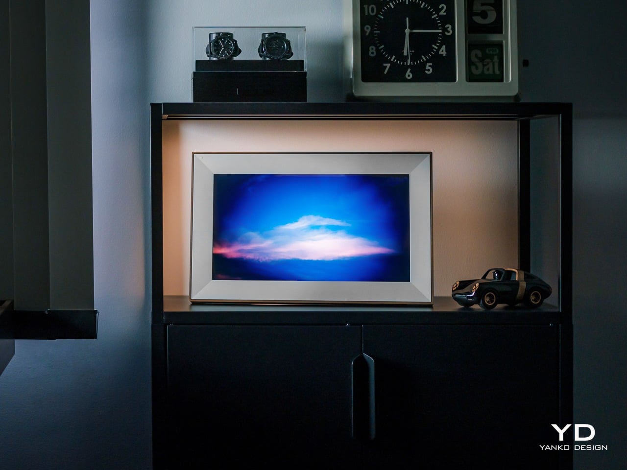
Wizarding photographs in Harry Potter had one feature that always felt unfair: they moved, waved back, captured the full motion of a moment instead of freezing it into stillness. Muggles have been trying to close that gap ever since, and digital picture frames are basically our best attempt at making photos feel alive without actual magic. The Pexar Starlight takes that idea and adds ambient backlighting, turning a 15.6-inch display into something that sits between traditional frame and mood lighting. Photos cycle through with adjustable brightness that shifts based on time of day, so your memories glow softly in the evening and stay crisp during daylight hours. It is designed to blend into home decor rather than scream “tech gadget,” which is harder than it sounds when you are essentially mounting a screen on the wall.

What separates this from the dozens of other digital frames cluttering the market is the execution of details most brands ignore. The matte finish reduces glare without killing color vibrancy. The frame itself comes in multiple finishes so it does not look like every other black-bezeled rectangle. Setup happens through a companion app that actually works instead of requiring a computer science degree to navigate, and photo uploads can be automated from cloud storage so you are not manually curating every week. The backlight feature is the real differentiator, creating depth and warmth that makes photos feel more like displayed art than screensaver content. It is not trying to replace your phone’s photo library. It is trying to give your best shots the kind of presence they deserve, somewhere between nostalgia object and functional decor, which is exactly where digital frames should have been aiming all along.

8. CAMIO Wearable by BQEYZ

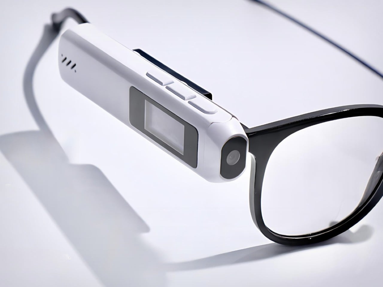
Meta’s smart glasses cost several hundred dollars and lock you into their ecosystem, their frames, their design language, and their gradual feature rollout that always feels like paying for a beta test. Meet CAMIO, a $79 snap-on module from an upstart competitor that takes a different approach: it clips onto any pair of glasses you already own and turns them into recording devices with a tiny camera, built-in storage, and wireless connectivity. You keep your prescription lenses, your favorite frame style, your existing investment in eyewear. The module just adds the capture functionality without forcing you to replace everything. It records video, snaps photos, and syncs to your phone over Bluetooth, handling the basics without trying to be a full augmented reality platform or AI assistant.

The genius here is recognizing that most people do not want to replace their glasses, they just want their glasses to do more. Meta’s approach requires buying into their hardware completely, which is a tough sell when you have frames you like or prescriptions that need specific lenses. This module treats smart features as an add-on rather than a replacement, which dramatically lowers the barrier to entry both financially and practically. It is not going to match Meta’s polish or integration depth, but it does not need to. It just needs to capture moments hands-free and stay out of the way when you are not using it. For seventy-nine dollars, that is a value proposition that makes sense in a way premium smart glasses still struggle to justify. Sometimes the best innovation is not building something entirely new, it is building something that works with what people already have.

9. Small House On A Corner Lot by KOMINORU Design

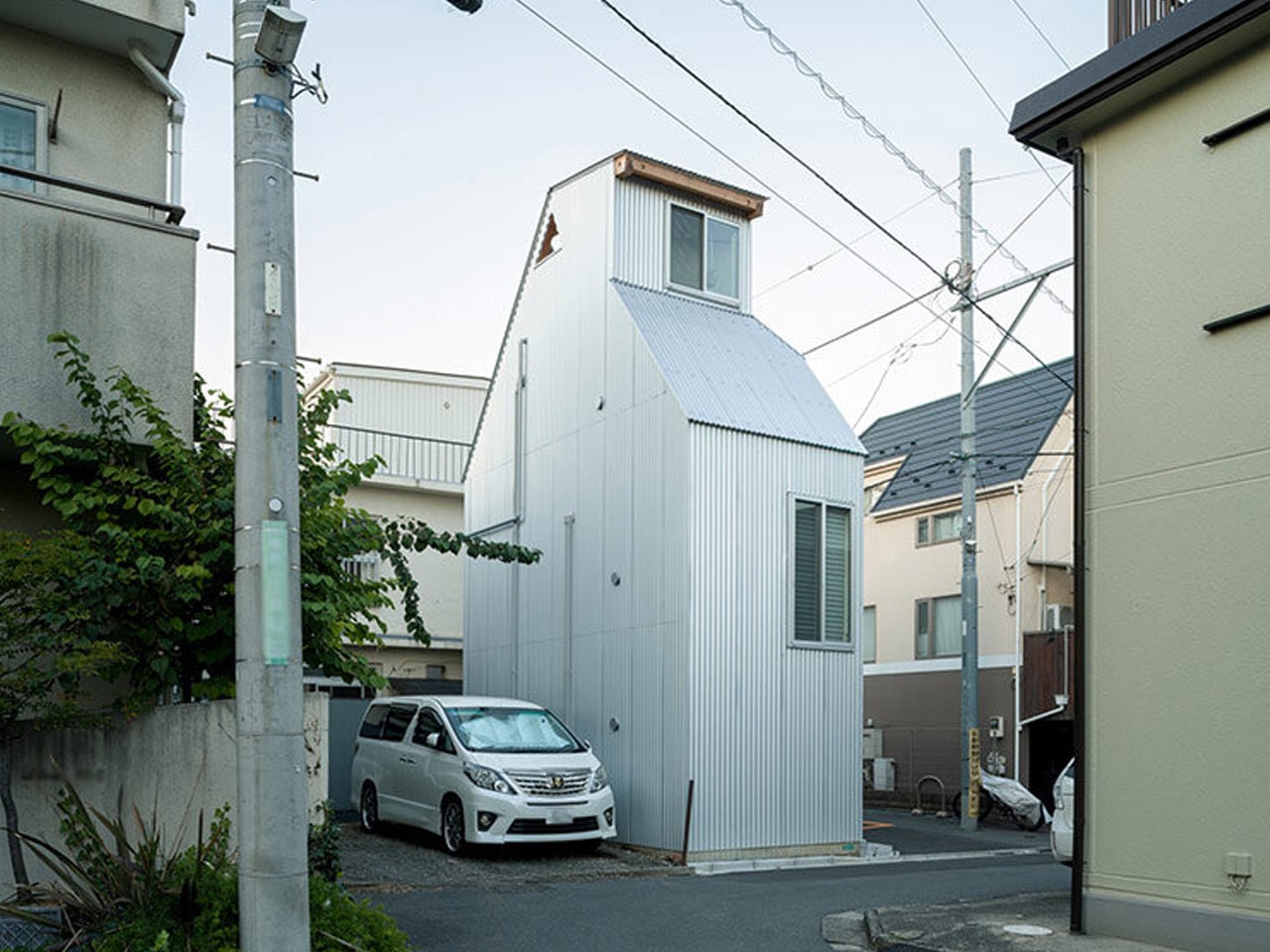
Tokyo real estate operates on a completely different logic than most cities. Space is so expensive and scarce that architects have spent decades perfecting the art of making tiny footprints feel livable, even generous. This Japanese tiny home takes those spatial compression techniques and pushes them further, creating a dwelling that maximizes every cubic inch without feeling claustrophobic or compromised. The design uses vertical layering, multifunctional furniture, and strategic transparency to make a structure barely wider than a parking space feel like a complete home rather than an elaborate closet with plumbing.

What sets this apart from typical tiny home design is the cultural context. Japanese architecture has been optimizing small spaces for centuries, long before minimalism became a lifestyle trend or tiny homes became YouTube content. This design pulls from that tradition: sliding shoji-inspired partitions that reconfigure rooms on demand, sunken floors that create separation without walls, storage integrated into every surface so nothing feels like dead space. Natural light floods in through carefully positioned windows that also provide ventilation and visual connection to the exterior. The result is a home that feels intentional rather than constrained, where every design choice serves multiple purposes and nothing exists just for show. It is a masterclass in efficiency that does not sacrifice comfort, proving that small spaces stop being a limitation once you design specifically for them instead of trying to cram traditional layouts into compressed square footage. If urban density is the future, this is the blueprint for making it actually desirable.

10. Saros Z70 by Roborock

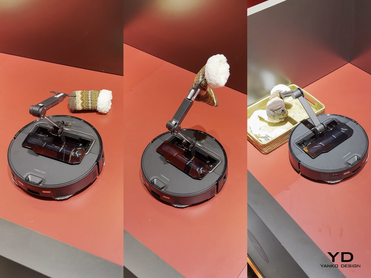
Robot vacuums have gotten really good at one thing: vacuuming. They map your floors, avoid obstacles, empty themselves, and generally handle the task they were designed for with increasing competence. But they have always had one glaring limitation: if there is a sock on the floor, a charging cable, a kid’s toy, anything that is not flat dirt or debris, the vacuum just routes around it or gets tangled and calls for help. The Roborock Saros Z70 fixes this with the most obvious solution nobody thought to mass-produce until now: it adds a robotic arm. A literal articulated arm that extends from the vacuum’s body, grabs objects off the floor, and moves them out of the way so it can continue cleaning underneath. Socks, shoes, small towels, cables, anything under a certain weight gets picked up and relocated to a designated drop zone.

This is innovation that feels overdue the moment you see it. We have had the mechanical capability to build grabber arms into consumer robots for years, but nobody committed to the engineering challenge until Roborock decided the robot vacuum category had gotten boring enough to need disruption. The arm uses vision recognition to identify objects, assess their weight and shape, and determine whether they are safe to grab, which prevents it from trying to lift furniture or drag your laptop across the room. It is not perfect, weight limits and object recognition will have edge cases, but it represents a fundamental expansion of what a cleaning robot can do. Instead of just reacting to obstacles, it actively manipulates its environment to complete its job. That is a step change in capability that makes every previous robot vacuum feel like it was solving only half the problem. If this actually ships at a reasonable price point and the arm proves reliable, it will instantly make the entire existing market feel outdated, which is exactly what genuine innovation is supposed to do.

The post 10 (More) Best Designs From 2025 That Prove We Want The Future To Look A Lot Like The Past first appeared on Yanko Design.

This Dome Shelter Packs Flat and Deploys in Under 2 Hours

When disaster strikes, shelter is everything. But what if you could pack an entire house into a kit and assemble it in just over an hour? That’s exactly what Japanese company TCL Co. has achieved with the Ezdome House, a geodesic dome shelter that’s just won a spot in the prestigious Good Design Award 2025 Best 100.

At first glance, the Ezdome looks like something out of a sci-fi movie. Picture a smooth, white spherical structure that wouldn’t look out of place on Mars. But this isn’t just a design flex. It’s a carefully engineered response to one of Japan’s most pressing challenges: how to give people dignity and safety when natural disasters turn their lives upside down.

Designer: TCL Coc

Japan knows disaster intimately. Earthquakes, typhoons, torrential rains, they’re all part of the landscape. And while the country has gotten incredibly efficient at emergency response, the traditional evacuation shelter model has always had glaring problems. Think crowded gymnasiums with zero privacy, people sleeping shoulder to shoulder on cold floors, and the constant risk of infectious diseases spreading through cramped spaces. The system works for survival, but it’s hardly humane.

That’s where the Ezdome completely flips the script. Two adults can assemble one of these dome shelters in about 60 to 90 minutes without any special skills or tools. The structure arrives as a flat-pack kit of interlocking panels, 38 pieces plus a transparent roof dome that lets natural light flood in. Each panel is made from high-density polyethylene, the same tough, non-toxic material used in everything from cutting boards to industrial piping. It’s impact-resistant, handles extreme temperatures like a champ, and the double-layered walls provide both insulation and structural integrity.

The dome shape isn’t just aesthetically pleasing (though it definitely is). It’s geometry working overtime. Because there are no square corners eating up space, every inch of the 7.1 square meter interior is actually usable. The curved walls create better air circulation, and the spherical structure distributes stress evenly, making it remarkably stable in high winds or aftershocks. When you’re trying to provide emergency shelter, efficiency like that matters enormously.

But here’s what really sets the Ezdome apart from typical disaster relief tents: dignity. Each dome is a private, lockable space. It’s not just a roof over your head, it’s a temporary home where families can maintain some semblance of normalcy during the worst moments of their lives. There’s room to stand up, move around, and actually breathe. For people who might be displaced for weeks or months, that psychological difference is massive.

The Ezdome has already proven itself in real-world disasters. After the devastating Noto Peninsula earthquake hit Japan on New Year’s Day 2024, these domes were rushed to evacuation centers in Wajima. They’ve also been deployed internationally, providing shelter after earthquakes in Turkey, Syria, Morocco, and Myanmar. Relief workers consistently praise how quickly they can be set up without requiring specialized construction knowledge, a crucial advantage when time literally saves lives.

What’s fascinating is how the Ezdome’s design philosophy extends beyond disaster relief. Because these structures are so modular and adaptable, they’ve found applications in glamping sites, as backyard studios, and even as pop-up medical clinics or community gathering spaces. This versatility means they can sit in storage during peacetime, ready for deployment, but also generate value through other uses. It’s smart, sustainable design thinking that recognizes infrastructure doesn’t have to be single-purpose.

The price point, about 1.32 million yen (roughly $9,000 USD) for the basic set, positions these as serious infrastructure investments rather than disposable emergency supplies. Municipalities and organizations can stock them, use them for disaster preparedness training, and know they’ll still be functional years down the line. The material doesn’t rot, rust, or degrade like traditional building materials.

In an era where climate change is making extreme weather events more frequent and more severe worldwide, innovations like the Ezdome feel increasingly essential. We’re going to need smarter, faster, more humane ways to shelter displaced people. The traditional disaster relief playbook isn’t cutting it anymore. What TCL Co. has created isn’t just a product. It’s a reimagining of what disaster response can look like when design prioritizes human dignity alongside practical function. That’s why it earned its spot among this year’s top designs. Sometimes the most important innovations aren’t flashy or revolutionary. They’re simply better answers to problems we’ve tolerated for far too long.

The post This Dome Shelter Packs Flat and Deploys in Under 2 Hours first appeared on Yanko Design.

This 3D-Printed Lamp Was Designed to Feel Like Mom’s Hug

There’s something quietly revolutionary happening in design right now, and it doesn’t involve flashy colors or radical shapes. Instead, it’s about something far more intimate. Hu Yuanlin’s HER Floor Lamp proves that the most innovative designs often emerge from the most personal places, bridging the gap between cutting-edge technology and deep emotional resonance.

The story behind HER is achingly simple yet profoundly universal. While studying abroad, Hu found himself missing his mother’s presence, that comforting silhouette that represents home and safety. Rather than simply enduring that longing, he transformed it into something tangible. The lamp’s gracefully curved form echoes the protective stance of a maternal figure, creating what he calls a “quiet emblem of safety and peace at home”. It’s a reminder that the objects we surround ourselves with can do more than illuminate rooms or look aesthetically pleasing. They can hold memories, evoke emotions, and provide companionship.

Designer: Hu Yuanlin

What makes HER particularly fascinating is how it marries this emotional depth with technological innovation. The lamp isn’t just symbolically sustainable through its emotional longevity. It’s literally made from recycled materials, with its segmented lampshade 3D-printed from recycled PETG sourced from old eyeglass frames and disc cases. This choice transforms what might have become waste into something beautiful and functional, proving that sustainability and design excellence aren’t mutually exclusive.

The technical execution deserves attention too. The crystal-clear shade refracts light in ways that create flowing shadows and an atmosphere of serenity. It’s not harsh or clinical despite its modern manufacturing method. Instead, the lamp combines streamlined structural design with organic, leaf-like details that express natural vitality within a minimalist framework. This balance between the organic and the technological, between warmth and precision, feels distinctly contemporary.

HER has already garnered significant recognition in the design world. The lamp won a 2025 Red Dot Design Award, one of the most prestigious accolades in the field, while Hu was still a student. That’s no small achievement. It signals that the design community is hungry for work that doesn’t just look good in a portfolio but carries genuine meaning and innovative thinking about materials and manufacturing.

The timing feels right for a design like this. We’re living in an era where people increasingly crave authenticity and connection, where the sterile perfection of mass-produced items often feels empty. Meanwhile, technology like 3D printing has matured to the point where it can produce objects with both technical sophistication and artistic nuance. HER exists at this intersection, using advanced manufacturing to create something that feels handcrafted and personal.

There’s also something poignant about a lamp designed to evoke maternal presence. In our hyper-connected yet often isolated modern lives, especially for those living far from family, objects that provide emotional anchoring become increasingly valuable. HER doesn’t just light a room. It occupies space with a presence, standing sentinel like a protective figure. It’s the kind of design that transforms a house into a home, that makes a lonely apartment feel less empty.

What Hu has achieved with HER suggests exciting possibilities for the future of product design. As 3D printing technology becomes more accessible and sustainable materials more refined, designers have unprecedented freedom to create forms that would be impossible through traditional manufacturing. More importantly, they can create limited runs or even custom pieces that maintain deeply personal narratives without sacrificing quality or sustainability.

The lamp has already been exhibited at events like TCT Asia 3D Printing and Shanghai Design Week, introducing it to broader audiences and manufacturing partners. It’s moving from student project to commercial reality, which means more people might soon have the opportunity to bring this piece into their homes and lives. HER Floor Lamp reminds us that great design doesn’t need to shout. Sometimes the most powerful statements are quiet ones, standing in the corner of a room, casting gentle shadows, and making us feel a little less alone.

The post This 3D-Printed Lamp Was Designed to Feel Like Mom’s Hug first appeared on Yanko Design.

Samsung’s two new speakers will deliver crisp audio while blending into your decor

Samsung is adding two brand new speakers to its audio lineup, along with updated soundbars boosted with AI features. While not as inconspicuous as the Samsung Frame, the new WiFi speakers, called the Music Studio 5 and 7, were designed to blend into your living room's atmosphere with their minimalist design. However, if you're looking for a more convenient option, Samsung also updated its flagship HW-Q990H soundbar, while also introducing the more affordable choice of the HW-QS90H.

Samsung built the Music Studio 5 with a four-inch woofer and dual tweeters, pairing them with a built-in waveguide to deliver better sound. To customize the sound, Samsung added its new AI Dynamic Bass Control that can make bass sound better without any distortion. You can even control the "gallery-inspired" speaker via voice or Bluetooth and it's compatible with WiFi casting and streaming services.

The Samsung Music Studio 5 speaker in black
Samsung

For an upgraded option, the Music Studio 7 comes with a 3.1.1-channel spatial audio that has top-, front-, left- and right-firing speakers to give a more immersive 3D audio experience. You can calibrate the sound even further with the Samsung Audio Lab Pattern Control Technology and the same AI Dynamic Bass Control feature seen with the Music Studio 5. Samsung says the Music Studio 7 can play Hi-Resolution Audio with up to 24-bit/96kHz audio processing and can either be used as a standalone speaker or paired with other Samsung audio devices.

The Samsung Music Studio 7 in a living room.
Samsung

To round out its new audio offerings, Samsung debuted the HW-QS90H, or its All-in-One Soundbar, with a 7.1.2.-channel system that features 13 drivers, nine of which are wide-range speakers. The new soundbar's built-in Quad Bass Woofer system means you can achieve deeper bass without a separate subwoofer. The All-in-One Soundbar even features Samsung's Convertible Fit design that can handle being mounted on a wall or placed on a table, and a gyro sensor that can automatically adapt channel distribution depending on its orientation, like we saw with the QS700F.

Samsung even refreshed its flagship HW-Q990H soundbar this year and introduced to it the Sound Elevation feature that makes dialogue sound more natural and Auto Volume, which regulates a consistent volume across its channels for a more balanced sound. All of Samsung's latest soundbars and speakers will be on display at CES 2026.

This article originally appeared on Engadget at https://www.engadget.com/audio/speakers/samsungs-two-new-speakers-will-deliver-crisp-audio-while-blending-into-your-decor-230053770.html?src=rss

OpenAI is hiring a new Head of Preparedness to try to predict and mitigate AI’s harms

OpenAI is looking for a new Head of Preparedness who can help it anticipate the potential harms of its models and how they can be abused, in order to guide the company's safety strategy. It comes at the end of a year that's seen OpenAI hit with numerous accusations about ChatGPT's impacts on users' mental health, including a few wrongful death lawsuits. In a post on X about the position, OpenAI CEO Sam Altman acknowledged that the "potential impact of models on mental health was something we saw a preview of in 2025," along with other "real challenges" that have arisen alongside models' capabilities. The Head of Preparedness "is a critical role at an important time," he said.

Per the job listing, the Head of Preparedness (who will make $555K, plus equity), "will lead the technical strategy and execution of OpenAI’s Preparedness framework, our framework explaining OpenAI’s approach to tracking and preparing for frontier capabilities that create new risks of severe harm." It is, according to Altman, "a stressful job and you'll jump into the deep end pretty much immediately."

Over the last couple of years, OpenAI's safety teams have undergone a lot of changes. The company's former Head of Preparedness, Aleksander Madry, was reassigned back in July 2024, and Altman said at the time that the role would be taken over by execs Joaquin Quinonero Candela and Lilian Weng. Weng left the company a few months later, and in July 2025, Quinonero Candela announced his move away from the preparedness team to lead recruiting at OpenAI. 

This article originally appeared on Engadget at https://www.engadget.com/ai/openai-is-hiring-a-new-head-of-preparedness-to-try-to-predict-and-mitigate-ais-harms-220330486.html?src=rss

Miyoo Mini Flip Shrinks Retro Gaming into a 2.8-Inch Folding Square

Retro handhelds have exploded in the last few years, from chunky bricks to tiny keychain consoles, and a lot of them still feel like little Linux boxes with buttons bolted on. The Game Boy Advance SP’s clamshell still lives rent-free in people’s heads, that satisfying snap when you close it, and the way it fits into a pocket without scratching the screen. The Miyoo Mini Flip is a modern answer to that memory, scaled for pockets and commutes.

The Miyoo Mini Flip is a folding version of Miyoo’s tiny emulation handheld, now with an upgraded hinge for better durability. Closed, it is a 2.68‑inch square about 0.79 inch thick, small enough to disappear into a jeans pocket or bag. Open it up, and you get a full control deck and a 2.8‑inch screen, turning idle minutes into quick sessions of 8‑bit and 16‑bit comfort food without needing to commit to a full setup.

Designer: Miyoo

The 2.8‑inch IPS panel runs at 750 × 560 with a 4:3 aspect ratio, which lines up nicely with most classic consoles. The marketing calls it “3× pixel perfect,” hinting at clean integer scaling for certain systems, so sprites and tiles look crisp instead of smeared. Wide viewing angles and decent colour make pixel art and old racing games feel surprisingly alive on such a small canvas, bright enough to play outdoors or on a dimly lit train.

The control scheme mixes classic D-pad, ABXY face buttons, Select and Start, a Menu key, and L/L2 and R/R2 shoulder buttons tucked along the back edge. Volume and power live on the sides, with a front speaker and a TF card slot underneath. The layout feels like a mashup of modern controllers and old handhelds, giving thumbs familiar landmarks without overcomplicating a device that is meant to be grabbed and played.

The hardware is a Cortex‑A7 at 1.2 GHz, 128 MB of RAM, Linux under the hood, 2.4 GHz Wi‑Fi, and a 3.7 V 2500 mAh battery. It is tuned for NES, SNES, GBA, PS1, and similar eras, not chasing Switch-level performance. The bundle usually includes a 64 GB microSD card and USB‑C cable, so you are not hunting for storage or adapters before you can start tinkering with ROMs and emulator settings.

The hinge‑enhanced durability callout addresses early batches where people worried about wobble and wear. Closed, the Flip feels like a small, dense square you can toss into a pocket, backpack, or travel pouch without babying it. Marketing leans into travel, outdoor, waiting, and “back childhood” scenarios, which is exactly where a device like this shines, filling dead time with a few more runs of your favourite platformer or racer.

The Miyoo Mini Flip stands out beyond the emulator list. The clamshell form, upgraded hinge, sharp 4:3 IPS screen, and toy-like colours make it feel like a considered object, not another PCB in a shell. Retro games live as a small ritual in a pocket rather than a full setup on a desk, and this little folding square hits a very specific, very charming note without demanding much more than a microSD card and a willingness to revisit Super Mario World one more time.

The post Miyoo Mini Flip Shrinks Retro Gaming into a 2.8-Inch Folding Square first appeared on Yanko Design.

Here’s the first real look at the Retroid Pocket 6 running PS2 games

The Retroid Pocket 6 may have gotten off to a rocky start, but the gaming handheld is officially completed and going to see its first shipments soon. The handheld maker revealed the final product shots of the Retroid Pocket 6 in black and orange on X. Along with in-person product pics, Retroid revealed gameplay videos of its handheld, running emulation of PlayStation 2 games.

For those looking to relive some classic Nintendo or PlayStation titles, the Retroid Pocket 6 offers a great entry point into the retro handheld world since it can emulate games up to Nintendo Switch and PS2. However, Retroid did have some initial blowback about its design and decided to go back to the drawing board. Following the early criticisms, Retroid decided to add an option for customers to choose between having the D-pad or a thumbstick at the top of the handheld's left side.

The Retroid Pocket 6 in orange with asymmetrical thumbsticks.
Retroid

The problems persisted for Retroid, as the handheld maker had to then cut short the early bird pricing thanks to the widespread memory shortage. Instead of offering the handheld for $209 until January, Retroid removed the discount in late December, leaving new buyers paying the full retail price of $229. However, the internal specs remained the same, with a Snapdragon 8 Gen 2 processor, up to 12GB of memory and up to 256GB of storage that's expandable with a TF card slot.

Despite the hiccups, Retroid looks ready to start shipments of its latest retro gaming handheld as evidenced by the new photos and videos. According to the website, the first batch of Retroid Pocket 6 preorders are due to start shipping in January. Second bath preoders are still available on Retroid's website, which are expected to get to customers in March.

This article originally appeared on Engadget at https://www.engadget.com/gaming/heres-the-first-real-look-at-the-retroid-pocket-6-running-ps2-games-193624145.html?src=rss

Tesla’s $350 Pickleball Paddle Is Peak Design Absurdity

When your car company starts selling pickleball paddles, you know we’ve officially entered a new dimension of brand expansion. Tesla, the same company that brought us electric vehicles and the occasional flamethrower, has teamed up with Selkirk Sport to create the Tesla Plaid Pickleball Paddle, a limited-edition piece of sports equipment that costs more than some people’s monthly car payments.

Let’s talk about that price tag first. At $350, this paddle is basically the Hermès Birkin of the pickleball world. For context, professional tennis players like Carlos Alcaraz swing rackets that cost $299. But here we are, in a timeline where a paddle designed to hit a plastic ball over a net somehow commands a higher price than equipment used at Wimbledon. The paddle sold out in under three hours during its initial release, which either says something profound about consumer behavior or absolutely nothing at all.

Designers: Tesla and Selkirk Sport

So what exactly are you getting for that eye-watering price? According to Tesla and Selkirk, this isn’t just some branded merchandise with a logo slapped on it. This is apparently a genuine engineering collaboration that involved actual wind tunnel testing. Yes, the same aerodynamic technology that helps Tesla vehicles slice through air resistance has now been applied to your weekend hobby. The paddle features an elongated form with an open-air throat design and rounded, edgeless perimeter, all calculated to reduce drag while increasing your reach on the court.

The specifications read like something from a tech blog rather than a sports equipment catalog. We’re talking about a two-ply carbon fiber face, a full-foam core, and Selkirk’s patent-pending InfiniGrit Surface designed to generate spin. There’s also a MOI Tuning System integrated into the design, because apparently moment of inertia is now a critical concern when you’re playing a sport that was invented in someone’s backyard. The paddle weighs between 7.8 and 8.1 ounces, measures 16.4 inches by 7.5 inches, and comes USAP approved, which means it’s actually legal for official tournament play.

But here’s where things get interesting from a design perspective. This collaboration isn’t just about Tesla lending its name to boost sales. Selkirk’s co-owner and Director of Research and Development has emphasized that Tesla’s aerodynamics expertise was key in determining the paddle’s overall shape. The elongated form and sharp edgeless style weren’t arbitrary aesthetic choices but the result of actual testing in Tesla’s facilities. In a world where most sports equipment collaborations are purely cosmetic exercises, there’s something almost refreshingly nerdy about bringing automotive engineering to a paddle sport.

The secondary market has predictably gone wild. The paddle spawned a thriving resale ecosystem on eBay almost immediately, because of course it did. When something is both expensive and artificially scarce, collectors and resellers descend like moths to a very expensive flame. The paddle dropped again in an even more limited quantity recently, ensuring that the hype cycle continues churning.

From a pure design standpoint, the Tesla Plaid Paddle represents an interesting collision of worlds. It’s where automotive engineering meets recreational sports equipment, where brand extension becomes an engineering challenge, and where price points lose all connection to reality. The paddle looks sleek in its black and red colorway, clearly drawing visual cues from Tesla’s Plaid mode branding. It’s undeniably cool looking, and there’s genuine innovation in applying aerodynamic principles to paddle design.

But it’s also kind of ridiculous. Pickleball, for all its recent popularity surge, remains a sport most people play on converted tennis courts at their local park. Bringing wind tunnel testing and automotive-grade engineering to that equation feels simultaneously impressive and completely absurd. It’s the design world equivalent of using a sledgehammer to crack a walnut, except the sledgehammer costs $350 and you can’t even buy one because it sold out in three hours.

Whether this paddle actually improves your game or just your Instagram aesthetic is almost beside the point. What it really represents is how far we’ve come in blurring the lines between technology, sports, fashion, and brand identity. And honestly? That’s kind of fascinating.

The post Tesla’s $350 Pickleball Paddle Is Peak Design Absurdity first appeared on Yanko Design.

Stardew Valley players on the Nintendo Switch 2 get a free upgrade

Stardew Valley is truly the gift that keeps on giving. Fans of the farm life simulator, specifically those who already own it for the Nintendo Switch 2, can download a free upgrade that introduces new features and multiplayer modes.

If you have Stardew Valley on the Switch 2, you can download the Upgrade Pack that introduces mouse controls to make it easier to place furniture and organize your inventory. The upgrade also adds local split-screen co-op for up to four players and online multiplayer that maxes out at eight players. On top of the co-op modes, the free content pack includes Game Share compatibility, meaning only one player needs a copy of Stardew Valley to share it with three others.

This Upgrade Pack may not have as much content as a numbered update, but some players are already reporting bugs. According to user accounts, the online multiplayer mode isn't working, while other reports noted that some crafting recipes had inaccurate material requirements or quantities. In a post on X, Eric Barone, the game's developer who's better known as ConcernedApe, said that he's taking "full responsibility for this mistake" and that the development team "will fix this as soon as possible." Later that day, Barone posted that online co-op should be fixed on both the Nintendo Switch and Switch 2 versions, adding that "we are investigating and will follow up with patches as needed" for the remaining issues.

On top of addressing the bugs from the latest Upgrade Pack, Barone and the rest of the development team are also working on the upcoming 1.7 update for Stardew Valley, while Haunted Chocolatier is still under development.

Update, December 28 2025, 10:45AM ET: This story has been updated to reflect Barone's latest update that online co-op has been fixed.

This article originally appeared on Engadget at https://www.engadget.com/gaming/nintendo/stardew-valley-players-on-the-nintendo-switch-2-get-a-free-upgrade-174849697.html?src=rss