This $170 Retro Dock Solves the Mac Mini M4’s Biggest Port + Connectivity Problem With Style

Apple’s Mac mini M4 is absurdly powerful for its size, but connecting anything to it requires a patience-testing game of dongle Tetris. The Wokyis M5 fixes this the fun way, wrapping your diminutive desktop in a retro Macintosh shell that’s actually packed with ports and storage. Yes, the naming is confusing since there’s no Mac mini M5 yet, but the compatibility story is straightforward: this works with the M4, M2, and M1 Mac minis, plus any Mac with Thunderbolt 3/4/5 ports.

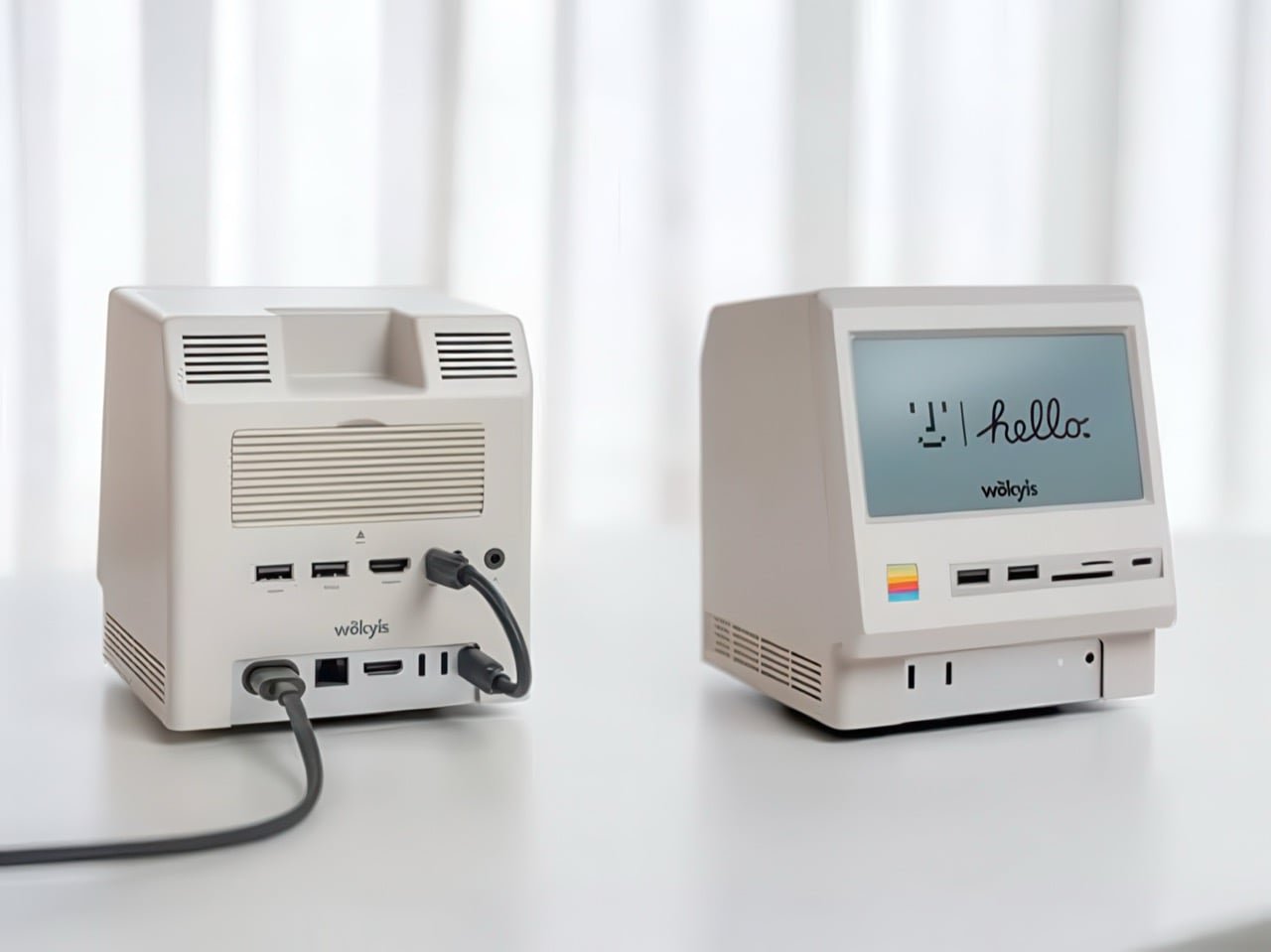
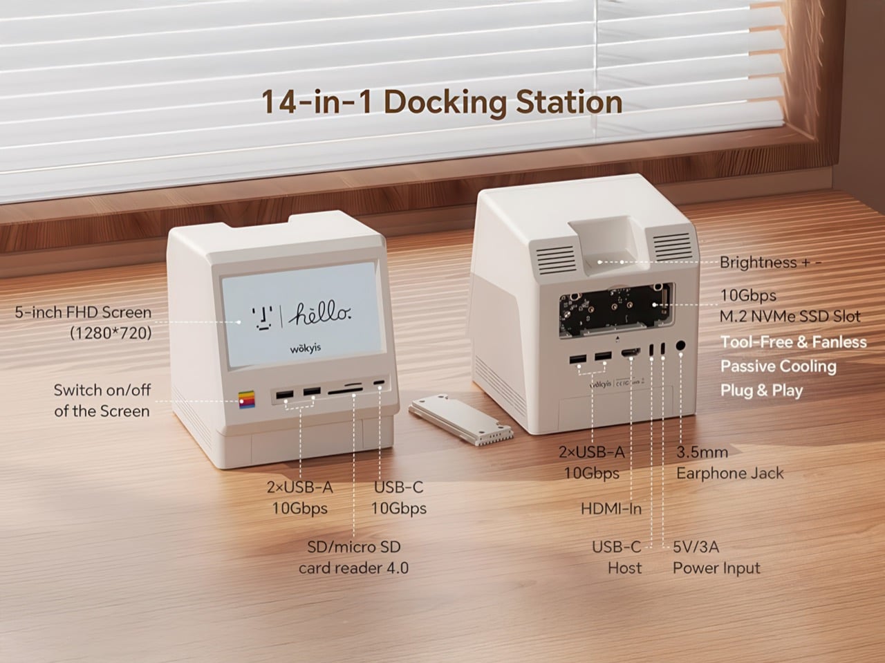
Inside that beige plastic homage to computing history, you’ll find legitimately fast 10Gbps connectivity on both USB-A and USB-C ports, card readers that hit 312MB/s with UHS-II cards, and a tool-free M.2 enclosure with included thermal pads for proper heat management. The 5-inch screen displaying “hello” works as a proper 720p panel for desktop widgets, music lyrics, photo frames, or system stats. Testing shows the SSD enclosure delivers around 900 MB/s with quality NVMe drives, which is respectable for a hub in this price range. The design lets you access the Mac mini’s own ports through a removable bottom panel, so nothing gets sacrificed in the name of aesthetics.

Designer: WOKYIS

Click Here to Buy Now

Photographers and video editors know the Mac mini M4’s port limitation intimately. Three Thunderbolt 4 ports and two USB-A ports sound adequate until your monitor claims one, your external SSD takes another, and you’re suddenly rationing connectivity like it’s a finite resource. The front panel of the M5 solves this with two USB-A 10Gbps ports, one USB-C 10Gbps port, and SD plus microSD slots that handle UHS-II speeds at 312MB/s. Offloading a 128GB card from a photo shoot takes minutes instead of the geological timescale you’d experience with slower readers. You do this without unplugging anything or performing cable gymnastics behind your monitor.

The M.2 enclosure accepts NVMe drives from 2230 to 2280 form factors and supports up to 8TB of storage. Pair it with a Samsung 990 EVO Plus and you’ll see read and write speeds hovering around 800 to 900 MB/s, which translates to genuinely usable performance for 4K editing timelines or RAW photo libraries. Wokyis ships two thermal pads in the box: a thicker one for single-sided SSDs and a thinner variant for double-sided drives. The passive cooling approach works because there’s actual thought behind the thermal management rather than hoping convection does all the heavy lifting. No fans means no noise, which matters when you’re recording voiceovers or working in a quiet space.

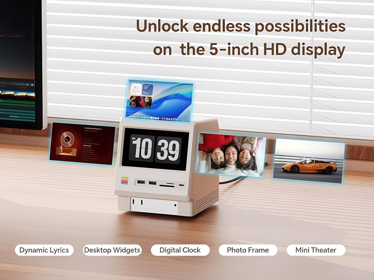
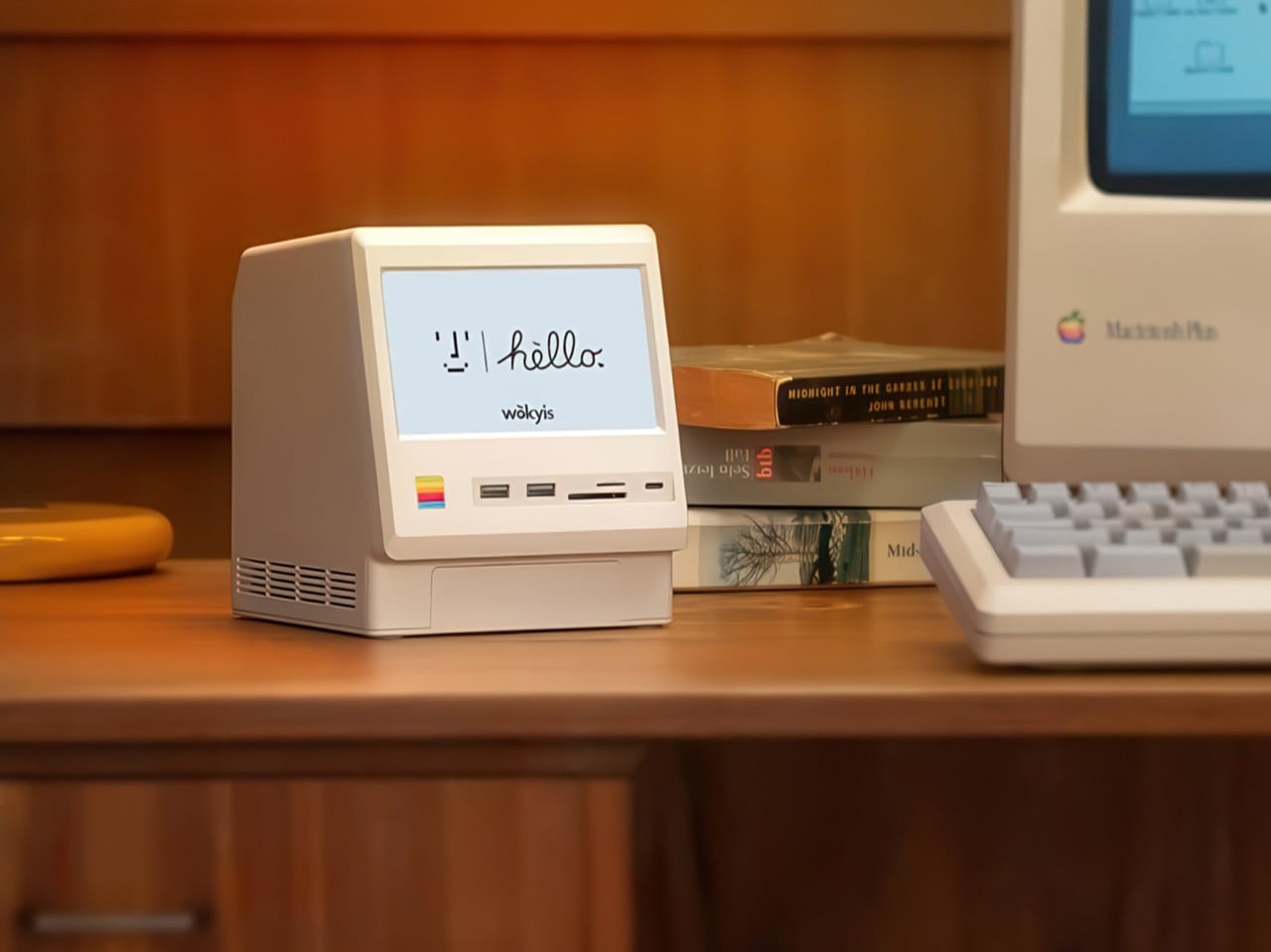
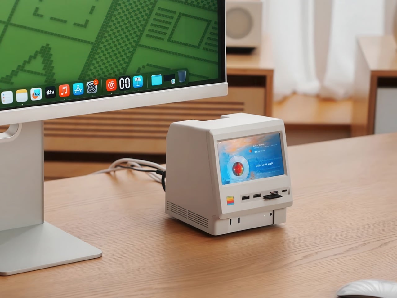
That 5-inch display hits 1280×720 resolution at roughly 290 PPI, putting it squarely in Retina territory for normal viewing distances. Text renders crisp, colors track accurately for casual use, and brightness handles typical indoor lighting without struggle. You can feed it content through the HDMI-in port or the USB-C host connection depending on your setup preferences. People are running Spotify controls on it, system monitoring dashboards, security camera feeds, even Slack notifications. The dedicated power button on the front means you can kill the screen when you don’t need it running, which beats having a perpetually glowing display burning into your peripheral vision at 2 AM.

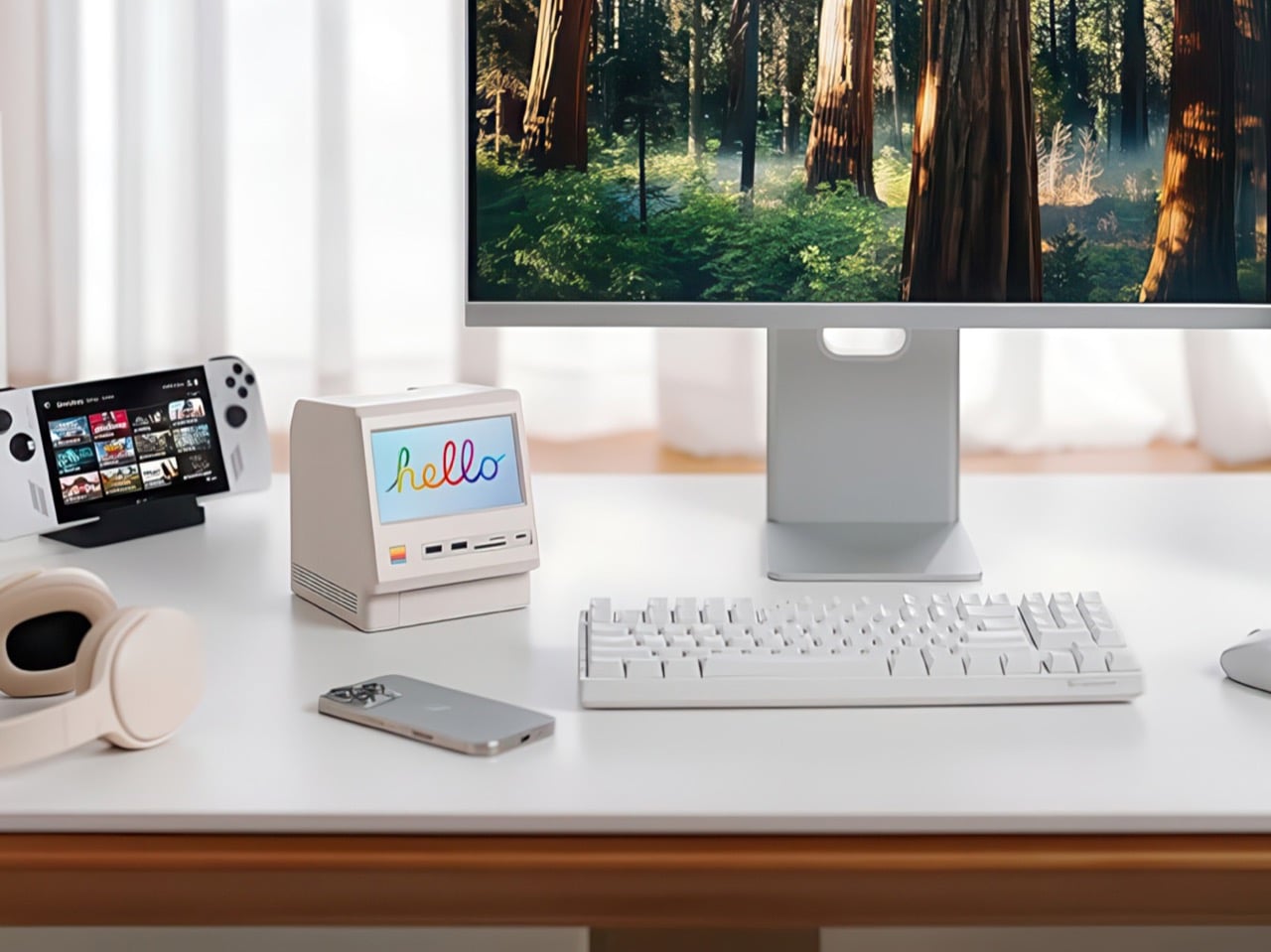
Wokyis nailed the proportions by treating the original Macintosh as inspiration rather than a blueprint to slavishly recreate. The beige matches Apple’s classic off-white perfectly, the ventilation grills reference the original’s cooling design, and that rainbow stripe sits exactly where your brain expects it. The dimensions wrap the Mac mini M4 specifically, with a removable base plate that keeps every native port accessible. You’re adding capability on top of what Apple gave you rather than trading functionality for aesthetics. The Mac mini slides in, locks down, and you’ve suddenly got a setup that looks like it time-traveled from 1984 while performing like it’s from 2025.

Generic USB-C hubs from Anker or CalDigit run $80 to $150 and offer similar port counts with zero personality. None of them include an SSD enclosure or a display. The M5 at $169.99 lands in a weird value proposition where you’re paying a modest premium for design that actually makes you happy to look at your desk. The 80Gbps Thunderbolt 5 version exists at $389 if you’re pushing enormous video files or running external GPUs, but that’s specialist territory. The 10Gbps model handles what 90% of users throw at it. Ships in two days direct from Wokyis or grab it from Amazon if you’ve got Prime and prefer that refund safety net. Either way, you’re getting a dock that makes the Mac mini M4 better at its job while looking fantastic doing it.

Click Here to Buy Now

The post This $170 Retro Dock Solves the Mac Mini M4’s Biggest Port + Connectivity Problem With Style first appeared on Yanko Design.

Akai’s MPC XL groovebox is the most powerful device the company has ever made

Akai just revealed its most powerful standalone groovebox, the MPC XL. For the uninitiated, the MPC has been around since the 1980s and pretty much defined hip hop from that era. The line has continuously iterated to keep up with the times and the XL looks to be the baddest of them all.

First of all, it offers four times the processing power of previous MPCs, which is enough to load up to 32 virtual instruments at the same time. This is assisted by a full 16GB of RAM, which is a whole lot in this era of AI tomfoolery. The XL can handle 16 audio tracks simultaneously. In my experience with previous units, this is more than enough for a full song.

It runs on a proprietary OS and features a 10-inch OLED touchscreen for making adjustments. There are also dozens of knobs and buttons to play with, including 16 knobs that integrate with the display for real-time feedback.

The XL features a step sequencer, but this is an MPC. The real star attraction are those 16 drum pads. These pads can be set to trigger samples and hits, but can also be programmed to initiate effects and do all kinds of other stuff. Each pad has four quadrants, one for each corner, and they are all fully adjustable.

Looking for even more nuanced control? There are two assignable touch-strips and plenty of short-cut keys. It has built-in microphone preamps, phono inputs for sampling, instrument inputs and numerous other connectivity options. This is a true flagship in every sense of the word. It's also very, very large.

The MPC may have started as a hip hop machine, but newer models are useful for any genre of music. To that end, it comes with an extensive collection of plugins, samples and effects. These even include some plugins made by rival company Native Instruments.

The software can handle stuff like stem separation, time-stretching and more. The workflow has been heavily inspired by modern DAWs, with a full arrangement view available on that OLED.

The MPC XL is a standalone unit, so it doesn't need a computer or anything like that. The power requirements here, however, don't allow for batteries. This thing has to be plugged in, much like Native Instruments' Maschine+. It's available right now and costs a whopping $2,900. This is a serious machine with a serious price tag, just like Roland's recently-released TR-1000 drum machine.

This article originally appeared on Engadget at https://www.engadget.com/audio/akais-mpc-xl-groovebox-is-the-most-powerful-device-the-company-has-ever-made-183952483.html?src=rss

When Your Childhood Pen Becomes Your Living Room Centerpiece

You know that clear plastic pen you’ve chewed the cap off a hundred times? The one that’s probably rolling around in your junk drawer right now? Well, someone just turned it into a lamp and it’s kind of genius. Seeing design variations of products that are different from each other is a refreshing take especially if it’s done right.

Italian design brand Seletti teamed up with designer Mario Paroli to celebrate the 75th anniversary of the BIC Cristal pen in the most extra way possible. They blew it up to 12 times its original size and transformed it into a floor lamp, pendant light, and wall-mounted fixture. Because apparently, nothing says “happy birthday” quite like making something absurdly large and hanging it from your ceiling.

Designer: Mario Paroli for Seletti

The BIC Lamp debuted at Maison & Objet 2026, and it’s exactly what you’d imagine if you scaled up that iconic ballpoint pen you’ve been using since elementary school. The transparent barrel is there, the hexagonal body is there, and yes, the caps come in those three classic colors: black, blue, and red. The only thing missing is the mysterious teeth marks we all somehow ended up making during boring classes or meetings.

What makes this collaboration so charming is how it taps into universal nostalgia. The BIC Cristal isn’t just any pen. Since 1950, when French-Italian entrepreneur Marcel Bich acquired the patent for the ballpoint mechanism from Hungarian-Argentine inventor László Bíró, this little writing tool has lived in every pencil case, backpack, and desk drawer imaginable. It’s been clutched by artists and writers, and it’s earned spots in the permanent collections at New York’s Museum of Modern Art and Paris’s Centre Georges Pompidou. For something so ordinary, it’s surprisingly extraordinary.

Seletti’s art director Stefano Seletti explains their approach perfectly: “We transform a universally and instantly recognisable shape that lives in everyone’s memory, into something completely new”. And that’s the magic here. The lamp doesn’t reinvent the wheel or try too hard to be clever. It just takes something we all recognize and makes us see it differently. The design uses carefully selected materials that echo the original pen, but instead of ink flowing through that clear barrel, you get LED technology lighting up your space. It’s functional, playful, and surprisingly versatile. Whether you mount it on a wall, suspend it as a pendant, or place it as a floor lamp, the BIC Lamp brings that same pop-culture irreverence Seletti is known for.

The lamp works because it doesn’t take itself too seriously. It’s design with a wink, a nod to our shared experiences with this humble writing instrument. How many times have we frantically searched for a pen, only to find three BIC Cristals that may or may not work? How many have we borrowed and never returned? The pen is part of our daily rituals, so familiar we barely notice it anymore. By supersizing it and giving it a new function, Paroli and Seletti invite us to reconsider everyday objects around us. Good design doesn’t always mean creating something entirely new. Sometimes it means looking at what’s already there and asking, “What if?” What if the pen we’ve used for decades became something else? What if we celebrated its simplicity by making it impossible to ignore?

The BIC Lamp transforms a desktop essential into a domestic icon, proving that the best design ideas often come from the most unexpected places. It’s memory-driven design at its finest, taking something ordinary and making it extraordinary simply by changing its scale and purpose.

The post When Your Childhood Pen Becomes Your Living Room Centerpiece first appeared on Yanko Design.

Earth is having some issues, so let’s enjoy the Webb telescope’s new nebula image

Sometimes, you just need to give your mind a little vacation. And these days, outer space sounds like as good a destination as any. Thankfully, the James Webb Space Telescope (JWST) is here to give us a dazzling new image of the Helix Nebula.

Discovered in the early 19th century, the Helix Nebula resides in the constellation Aquarius. (Cue The 5th Dimension.) At about 655 light-years away, it's one of Earth's closest planetary nebulae. When zoomed farther out, it's easy to see why it's been nicknamed the Eye of God or Eye of Sauron. This 2004 image from the Hubble telescope illustrates that.

An eye-like nebula in space
A wider view of the same nebula from 2004
NASA / ESA / C.R. O'Dell (Vanderbilt University) / M. Meixner / P. McCullough / G. Bacon ( STSI)

What we're seeing in the nebula is, in a sense, a moment of death that lays the groundwork for a new birth. The dying star (out of frame in the closer new image) sheds its outer layers. As expelled gas and dust cool, they provide raw material that could someday form new stars and perhaps planetary systems.

The new image from Webb's NIRCam (Near-Infrared Camera) provides a much closer, higher-resolution view.

Pillar-like reddish knots in the Helix Nebula

Those pillars you see are called cometary knots, and this image is our best view of those to date. "Here, blistering winds of hot gas from the dying star are crashing into colder shells of dust and gas that were shed earlier in its life, sculpting the nebula's remarkable structure," the ESA wrote in its press release.

The knots' colors represent temperature and chemistry. Hints of blue indicate the hottest gas (energized by ultraviolet light). The yellow regions, where hydrogen atoms form molecules, are farther from the nebula's nucleus (and therefore cooler). On the edges, reddish-orange regions depict the coolest material, where gas thins and dust begins to form.

This article originally appeared on Engadget at https://www.engadget.com/science/space/earth-is-having-some-issues-so-lets-enjoy-the-webb-telescopes-new-nebula-image-181049901.html?src=rss

Digital Cookbook Stand Weighs Ingredients and Checks Temperature

Recipe apps live on screens while the physical tools that actually make food better are scattered across drawers and cupboards. Your phone is propped against a mug, your scale is buried somewhere, and you are guessing at temperatures because the thermometer is never where you left it. Most digital cooking tools ignore the reality that kitchens are crowded, messy spaces where the tools you need for precision are rarely connected to the guidance telling you what to do.

Zuso is a modern culinary guide that treats the cookbook as both an object and a service. It combines a sculpted countertop totem with a tablet interface, and the totem hides a built-in scale and a docked thermometer. The idea is to make the tools you need for precision part of the same product that is walking you through each step, instead of treating measurement and guidance as separate problems.

Designer: Reino Studio

The totem can live on the counter without looking like a piece of lab equipment. Its vertical form, circular scale pad, and slender thermometer wand read more like a small appliance or even a decorative object than a gadget. Because it is designed to be seen rather than stored, it is always ready when you start cooking, which quietly removes the friction of hunting for tools you know are somewhere in the back of a drawer.

Instead of switching between apps, scale, and a separate thermometer, you drop ingredients directly onto the base and see the weight on the tablet, or slip the wand into a pan and watch the temperature update next to the step you are on. It turns precision into the default behavior rather than an extra step you take only when you feel like being exact, which makes recipes that rely on grams or specific temperatures feel less intimidating.

The tablet interface mirrors the physical design, with rounded cards, generous white space, and a calm palette that matches the totem’s presence. Recipe steps, video tutorials, and timers are laid out in a way that respects the fact that your hands are often busy or messy. Zuso feels like one object split into hardware and software, not an app that happens to be running on a random tablet next to a generic stand.

The broader platform, weekly planners, grocery lists, chef profiles, and skills sections, carries the same visual and interaction language from the counter to planning or learning. The totem and tablet feel like a hub for how you cook, not just a place to look up tonight’s dinner, with the same calm, intentional design running through every layer.

Zuso treats cooking as a ritual worth designing for, not just a problem to solve with another app. By giving the scale and thermometer a sculptural home and tying them directly to a thoughtful interface, it turns the act of following a recipe into something more deliberate and less chaotic. Good product design in the kitchen is not just about adding screens. It is about making the right tools feel like part of the same story instead of orphaned objects you have to remember exist.

The post Digital Cookbook Stand Weighs Ingredients and Checks Temperature first appeared on Yanko Design.

Roland’s Go:Mixer Studio is an affordable but capable mixer for budding recording engineers

Roland just unveiled the Go:Mixer Studio, a powerful entry in the company's line of audio interfaces. This one promises to be a portable and affordable way to create high-quality recordings with a smartphone or PC.

The biggest news here are the 12 input channels and six output channels. This means that users can record multiple instruments at once and even run the signal through outboard gear if so desired. There are two XLR inputs on the back with phantom power, an instrument jack, stereo ¼-inch line-in jacks, an aux input, TRS MIDI ins and outs, two headphones jacks and stereo line outs for connecting monitor speakers.

It records up to 24-bit/192kHz audio, which will certainly get the job done. The device comes with built-in effects for mangling audio on the fly. Each audio input also has a dedicated EQ and compressor directly on the channel.

It connects via an app that's available for iOS, Windows and MacOS. The iOS app actually lets users capture both video and multitrack audio at the same time, which should be a boon for streamers and content creators of all stripes. The Windows and MacOS apps allow for complete control of the mixer remotely.

As for the unit itself, there are several big knobs to adjust parameters and a color display. It's also really small and light, making it easy to pack away in case of an unexpected recording session. The device can even be mounted on a mic stand.

The Roland Go: Mixer Studio is available right now and costs $300. The Roland Go line of audio products has been around for years, but this one seems like a major step up.

This article originally appeared on Engadget at https://www.engadget.com/audio/rolands-gomixer-studio-is-an-affordable-but-capable-mixer-for-budding-recording-engineers-163927262.html?src=rss

This Footstool Finally Fixes WFH Posture by Rocking Like a Toy

We’ve all been there. You’re deep into hour three of sitting at your desk, and suddenly you realize your feet are doing that weird thing where they’re contorted into some unnatural position that definitely wasn’t what your body had in mind. Maybe they’re tucked under your chair at an odd angle, or perhaps they’re desperately stretching for that one sweet spot on the floor that somehow feels less terrible than all the others.

Here’s the thing about traditional footstools: they’re rigid. They sit there in one fixed position, forcing you to adapt to them rather than the other way around. It’s like having a friend who only ever wants to meet at the same coffee shop, never considering that maybe, just maybe, you’d like a little flexibility in your life. Enter OTTO, a footstool by designer Woonghee Ma that takes its inspiration from the most unlikely source: the roly-poly toy. You know the one. That round-bottomed toy from childhood that always bounces back upright no matter how hard you knock it over. In Korea, it’s called Ottogi, which is where this clever little piece gets its name.

Designer: Woonghee Ma

The genius of OTTO lies in its convex base. Instead of planting itself stubbornly on the ground like every other footstool, it rocks. It moves. It responds to the way your body actually behaves when you’re sitting for long stretches. As you shift your weight and adjust your position throughout the day (because let’s be honest, no one sits perfectly still), the footstool moves with you, naturally settling into whatever position feels most comfortable in that moment.

Think about it: your body is constantly making tiny adjustments. Your legs shift, your posture changes, you lean forward to focus on something on your screen, then lean back when you’re thinking. Why should your footstool stay frozen in place while all this is happening? OTTO essentially becomes a dynamic support system rather than a static obstacle.

What really sells this design is how deceptively simple it looks. The structure consists of just four components: a circular table top, plywood legs with organic cutouts, a bowl-shaped footrest, and a bracket to hold everything together. The legs feature these beautiful curved openings that give the piece an almost sculptural quality, like negative space art that happens to be functional furniture. The top and footrest come in a bold coral-red that pops against the natural wood tone of the legs.

Assembly is refreshingly straightforward. Attach the legs to the bracket, set the top plate and footrest in place, and you’re done. No Allen wrenches, no confusing instructions with illustrations that look nothing like the actual parts, no leftover screws that make you question your entire assembly process. It’s designed to be easy to put together and just as easy to move around your space.

But here’s where OTTO gets even more interesting: versatility. Sure, it’s a footstool. But that top surface? Perfectly functional as a side table for your water bottle, phone, or that coffee cup that’s perpetually within arm’s reach. Need to hold some supplies while you’re working on the floor? OTTO’s got you. Want a low stool for kids or a casual seating option when friends come over? It can do that too.

The design speaks to a larger shift happening in how we think about furniture, especially in the work-from-home era. We’re moving away from rigid, single-purpose pieces toward objects that adapt to our needs rather than forcing us to adapt to them. OTTO embodies this philosophy beautifully. It’s not trying to correct your posture through force or rigid positioning. Instead, it works with your natural movements, offering support that feels intuitive rather than prescriptive.

There’s also something deeply satisfying about the aesthetic. The combination of natural plywood and that vibrant coral creates a look that feels both Scandinavian-minimal and playfully modern. It’s serious enough for a professional home office but fun enough that it doesn’t feel stuffy or overly corporate.

We’re now spending more time than ever sitting and staring at screens so maybe what we need isn’t more rigidity. Maybe what we need is furniture that understands that bodies move, preferences change, and comfort isn’t one-size-fits-all. OTTO gets it. And honestly? That roly-poly toy inspiration is pretty brilliant. Who knew the secret to better sitting was something we learned in kindergarten?

The post This Footstool Finally Fixes WFH Posture by Rocking Like a Toy first appeared on Yanko Design.

Hyundai’s STARIA Electric Camper reimagines adventure beyond the grid

Hyundai is serious about its ambitions of providing off-the-grid, liveable mobility for adventure seekers, and that’s proo enough with their latest STARIA Camper concept. Based on the STARIA Electric 11-seater MUV unveiled at the Brussels Motor Show, the zero-emission camper walks right into the trails of the Lightship AE.1 electric travel trailer, Colorado Campworks NS-1 camping trailer, and the Camp365 Model T camper.

The STARIA minivan is the perfect canvas for a camper revamp, as Hyundai wants to cater to the rising demand for electric mobility for living on the road. The concept is a direct invitation for the community of travelers whose feedback will decide the fate of the camper in the European market. Depending on the demand for electric vehicles that can satisfy the everyday usability, loaded with travel amenities, the camper version of the vehicle could make it to the production lines.

Designer: Hyundai

The electrically operated pop-top version of the van will trim down the capacity of the normal MUV to four people, who can comfortably make it their adventure vehicle. The South Korean giant will offer the STARIA with an extendable Fiamma awning that has built-in LED lights. The second row powered seats come with the flexibility to lie flat to make up the sleeping space. During the daytime, the hidden indoor table swings out in front of the second row seats to be used as a place to work offline or have meals.

Further back to the third row, there is another table that slides out to create an outdoor dining area. It resides in the trunk area, which doubles as a storage compartment, and also aids in loading cargo and sliding it further inside. For maximum space utilization, the space behind it hides another compartment that has a detachable shower head for on-the-go showers. On the driver’s side wall holding the kitchen, along with the sink and top-loading fridge. Over this section is a single lid that closes flat to give the riders a continuous shelf to prepare meals. There’s a portable induction cooker or a stove (Hyundai hasn’t specified clearly) that runs on the electric battery, so cooking should be sorted.

The utilitarian approach on the inside continues to the pegboard wall right above the corner section of the worktop. It is used for hanging the utensils and other everyday essentials. This section extends on the corners to make space for storing clothes and other household amenities. The additional power to run all the modern appliances comes from the 520-watt composite solar charging panel, providing 2.6 kWh of electricity. One can operate a 36-liter refrigerator, a portable shower, and the cabin temperature control system for complete autonomy for adventure seekers.

Privacy is a key feature in the STARIA Camper with electronically adjustable smart glass that’s touchscreen controlled via a module for adjusting the amount of tint. To make the vehicle more suited for heavy-duty adventure needs, it’ll have a structurally improved front and rear suspension system and sound-absorbing material. The STARIA Electric has a range of around 400 kilometers, so we can expect the camper version to hit the same numbers, given there is a solar panel that could charge the battery when not utilized by the smart electrical equipment.


The post Hyundai’s STARIA Electric Camper reimagines adventure beyond the grid first appeared on Yanko Design.

Why the Samsung Galaxy S26 is the Ultimate Smartphone Upgrade

Why the Samsung Galaxy S26 is the Ultimate Smartphone Upgrade

The Samsung Galaxy S26 series has quickly become one of the most anticipated smartphone launches of 2026. With a steady stream of leaks and rumors, excitement is building around its enhanced charging capabilities, display improvements, battery upgrades, expanded color options, and launch timeline. If you’re considering upgrading your smartphone, the Galaxy S26 lineup promises to […]

The post Why the Samsung Galaxy S26 is the Ultimate Smartphone Upgrade appeared first on Geeky Gadgets.

Posted in Uncategorized

Meta’s Oversight Board is looking into transparency around disabling accounts

Meta has a lot of work to do when it comes to limiting hate speech on its platforms. Now, its Oversight Board is looking into the company's decision to ban an account for, among other things, posting visual violent threats and harassment against a journalist — and it wants the public's advice. 

In the year prior to the ban, Meta referred five posts due to violations of its hateful conduct, bullying and harassment, violence and incitement and adult nudity and sexual activity community standards. In addition to the posts harassing the woman journalist, the user also shared "anti-gay slurs against prominent politicians and content depicting a sex act, alleging misconduct against minorities." 

Meta's internal review experts decided to permanently disable the account due to the consistent violations and calls for violence. This action was taken despite the number of strikes not reaching the ban threshold — Meta's guidance states that even seven strikes only get users a one-day ban. However, its account integrity page lays out examples of when it will disable accounts, including violating its community standards through "risk of imminent harm" to an individual. 

The Board is now looking for insight from the public until 11:59PM PT on Tuesday, February 3. The Board is specifically seeking comments from individuals who can "contribute valuable perspectives" on the following topics: 

  • How best to ensure due process and fairness to people whose accounts are penalized or permanently disabled.

  • The effectiveness of measures used by social media platforms to protect public figures and journalists from accounts engaged in repeated abuse and threats of violence, in particular against women in the public eye.

  • Challenges in identifying and considering off-platform context when assessing threats against public figures and journalists.

  • Research into the efficacy of punitive measures to shape online behaviors, and the efficacy of alternative or complementary interventions.

  • Good industry practices in transparency reporting on account enforcement decisions and related appeals.

This instance marks the first time the Board has looked into Meta permanently disabling an account. It stated that this "represents a significant opportunity to provide users with greater transparency on Meta’s account enforcement policies and practices, make recommendations for improvement, and expand the types of cases the Board can review."

This article originally appeared on Engadget at https://www.engadget.com/big-tech/metas-oversight-board-is-looking-into-transparency-around-disabling-accounts-145757717.html?src=rss