HMD Skyline is a Nokia Lumia throwback with repairability at its core

The Nokia brand was famous for its innumerable smartphone designs, some of which have stood the test of time and are being revived today. Although not as old as those, the Nokia Lumia with its blocky silhouette, curved sides, and raised 2.5D screen is just as distinctive, becoming the DNA of the product line until its demise. HMD Global, who now eagerly wants to remind everyone that its name stands for “Human Mobile Devices,” is bringing back that iconic form but with a twist. The HMD Skyline might be a blast from the past, but it is also the most forward-looking of its kind thanks to its strong self-repair spirit.

Designer: HMD

The Skyline is notable for two things. The first is, of course, is design that is both dated yet ironically fresh to people’s eyes today. The more geometric block is almost in line with art trends today, and its neon pink colorway definitely shouts for attention. Given the retro design craze gripping multiple industries, its arrival couldn’t be more timely.

This juxtaposition also shows itself in the HMD Skyline’s other strength: its easy repairability. Sure, it’s not as easy as popping off the back plate with a fingernail and swapping out batteries in a snap, but it’s still worlds apart compared to most smartphones today, including its mid-range buddies. There’s only one screw to lift the back panel, which you can gently pry off with plastic cards or guitar picks, then other connectors can be easily unscrewed or lifted. It’s probably the least risky process around when it comes to replacing the screen. And all that while still having an IP54 dust and water resistance rating.

Images courtesy of: iFixit

The irony is that HMD is positioning this Gen 2 repairability as an attractive feature for Gen Z users who, it claims, are more likely to keep their phone if they can repair it themselves. That said, this is also the generation that lives for the latest and greatest designs, convenient services, and near-instant gratification from social media. Then again, it’s also the maker culture, so there might be some DIY DNA running through their veins as well, waiting to be awakened.

The HMD Skyline’s specs are a bit less impressive, but it’s actually almost a miracle that some of them are even there. The 6.55-inch 1080p, for example, is capable of 144Hz refresh rates, and its 4,600mAh battery supports magnetic wireless charging. There’s a massive 108MP camera teamed up with a 50MP telephoto shooter and a 13MP wide-angle camera. The Snapdragon 7s Gen 2, however, clearly marks it for the mid-range class. All things considered, the $500 Android phone isn’t as bad a deal, especially if you’re truly into retro designs that you plan on maintaining for a very long time.

The post HMD Skyline is a Nokia Lumia throwback with repairability at its core first appeared on Yanko Design.

Xiaomi MIX Fold 4 Hands-on Review: Thin in Size, Big in Everything Else

Despite what naysayers claim, there foldable phone market is showing no signs of disappearing or even slowing down. After all, we’ve barely scratched the surface of what these form-changing devices can truly become, especially when it comes to design. The book-style large foldable has been around for years, yet every generation still has some improvement to offer, whether it’s in durability, performance, or size. “Thin” is a description not often associated with this kind of smartphone, a kind that once felt like two phone slabs placed on top of each other. The Xiaomi MIX Fold 4 is challenging that preconceived notion with what is one of the thinnest foldables in the market, and we were able to get a hands-on experience to see what the fuss is all about.

Designer: Xiaomi

Blurring the lines between Foldables and Ordinary Phones

Next to the price tag and durability, one major concern that people have with foldable phones is their sizes. Admittedly, the earliest design iterations didn’t have the benefit of hindsight, but they were rather bulky and heavy when folded, a far cry from the regular phones we carry in our pockets. On its fourth generation, Xiaomi is really pushing the limits of foldables with a design that is getting really close to what people have become used to with non-foldable phones.

The Xiaomi MIX Fold 4 is crazy thin when laid open flat at 4.59mm, and with a 9.47mm thickness when folded close, it’s just 1mm shy of traditional phones. It’s also only 226g light, which is slowly getting closer to our definition of “normal.” Xiaomi credits no less than three technologies for this feat, like using lightweight yet durable carbon fiber materials in a few key parts. That said, the cover screen’s 21:9 aspect ratio still falls under the “tall and narrow” shape that has made many foldables like this a bit awkward to use. Aside from that, however, it’s really refreshing and delightful to hold such a thin and lightweight device.

More (Power) for Less (Space)

There are several consequences to shrinking the space inside a phone, from having less room for the battery or constricting airflow and affecting cooling. That’s even more problematic for foldable phones that have split their components, especially the battery, on two sides. You’d expect that a thinner foldable would have fewer features, but Xiaomi managed to surprise us yet again.

It’s already expected that the MIX Fold 4 will have the latest Snapdragon 8 Gen 3 processor and high-end memory, but getting a 5,100mAh battery that’s larger than its thicker predecessor is pretty impressive. Xiaomi didn’t skimp on the screens either, both with nearly identical capabilities, save for their sizes and aspect ratio. Unfortunately, our brief experience with the large foldable did disappoint us with a visible crease, a design flaw that’s already being squeezed out of other foldables. To be fair, though, you get used both to the appearance and even the feel of the crease so your mind begins to filter out its presence.

Big in Photography

Whatever improvements Xiaomi made when it came to making the MIX Fold 4 extra-thin goes out the window when you see how thick the camera bump is, almost as thick as the (unfolded) phone itself. The raised box has a somewhat asymmetrical design where the lower edge curves down ever so slightly. There’s a grid pattern on the glass surrounding the cameras, and it’s actually a texture that you can feel with your finger. It’s a nice touch, but one that seems a bit out of the left field.

You will, however, forgive that slight design oddity when you witness the results of the four cameras on the MIX Fold 4’s back. There’s a 50MP main shooter with all the bells and whistles you’d expect, and it’s joined by not one but two 50MP telephoto cameras, one with a floating-style lens used for portrait and macro photography, the other with a periscope-style lens with 5x optical zoom. The ultra-wide camera has a 12MP sensor that’s admittedly just a small step higher than the typical measly 8MP. It still needs rigorous testing for verification, but what we’ve seen so far is enough to consider that large camera bump well worth the sacrifice.

Final Thoughts

Almost everyone (except Apple, of course) is making a foldable phone these days, and the competition is heating up as more players join the race. It’s no longer enough to just have the latest specs or a durable hinge, you also need to push the envelope of design and performance to catch up with non-foldable flagships. With one of the thinnest and lightest designs in this segment and a quad-camera system that could be on par with the latest and greatest, the Xiaomi MIX Fold 4 is inching closer to that ideal where there will be very little reason to opt for a non-foldable phone.

While we had to part ways with the MIX Fold 4, be sure to be on the lookout for our review of the Xiaomi MIX Flip, the brand’s first foray into the land of compact clamshell foldables.

The post Xiaomi MIX Fold 4 Hands-on Review: Thin in Size, Big in Everything Else first appeared on Yanko Design.

OnePlus Nord 4 Design Story: Metal Unibody for an Emotional, Burdenless Experience

With the way how cameras on the back of the phones seem to be dancing around, or how every new model has some innovative glass-etching process, you’d think that the smartphone design field is bursting with activity and changing at every turn. You’d be partially correct, at least if only external appearances are concerned. In one important aspect, however, phone design has somewhat stayed still, held back by the demands of technology. Phones these days are either made up of glass and plastic covers on top of metal or plastic frames, with all-metal designs almost just a footnote in history. As one that never settles for anything less, OnePlus embarked on a bold and ambitious quest to design the first and so far only 5G phone with a metal unibody, a journey that took them back not only through the history of smartphone design but also through the history of human innovation.

Designer: OnePlus

Mobile Innovation, Material Stagnation

It wasn’t always the case that smartphones had a singular formula when it came to materials. It wasn’t too long ago that OnePlus itself launched a metal unibody design in the form of the 2017 OnePlus 5 and OnePlus 5T. Since then, however, smartphones have moved to those glass-metal or plastic sandwiches and there hasn’t been a full unibody design ever since. Ironically, the reason for that is one of the biggest innovations in the mobile industry: 5G networks.

OnePlus 5

OnePlus 5T

The speed and power of 5G placed heavier demands not just on hardware but also on design, specifically on how radio waves are transmitted through the phone’s body. Wireless signals already have a difficult time passing through metal, and even more so for 5G, forcing phone designers to either have plastic strips on the frame’s edges or simply ditch the all-metal design altogether. Unfortunately, it almost seems as if the industry as a whole is no longer interested in solving this puzzle, but OnePlus has risen to the challenge to provide its loyal users with a no-compromise option that will speak to their hearts through their fingers.

Metal Matters

Since the beginning of human history, especially when it came to trade, metal has played an important role not just in building up civilization but also as a symbol of prestige and luxury. Metal has always had this dual character of being a durable and malleable worker’s tool as well as a premium material for jewelry, decorations, and art. It is this long history that has endeared French designer Mathieu Lehanneur to metal. Famed for his nature-inspired metal-based works, Lehanneur was chosen to design the distinctive Paris 2024 Olympic Torch, perfectly symbolizing not only the aspirations of the Olympics itself but also the poetry in nature found in this year’s location for the event.

Mathieu Lehanneur, Designer of the Paris 2024 Olympic Torch

“I love materials that get their own history,” says Lehanneur as he explains his fascination with metal, “and metal’s history actually starts from the Earth, from the very planet itself. At the same time, it is also a part of human invention and skill, thanks to its ability to be transformed. I love the flexibility of the material, being able to create something that appears like a single piece of metal, a unibody design like the Olympic torch.”

It is that same trait that has allowed OnePlus to craft a seamless and unified metal shell for its latest design, the OnePlus Nord 4. The material delivers a lustrous look and a premium feel, something that users today are craving more than just features and specs. More importantly, however, this metal unibody design was made to address the flaws and concerns that smartphone makers have with mixing the material and current technologies, opening the door to fresh new designs that go beyond limitations imposed by hardware.

OnePlus Nord 4: Metal for the 5G Era

Choosing metal for the new Nord was both logical yet also difficult. It presented an opportunity to uplift the user experience but also put hurdles that needed to be sufficiently overcome lest it actually become a burden to that same user experience. Fortunately, the creative minds over at the OnePlus Industrial Design Studio got together to solve these issues to deliver a fashionable product without compromises.

Ryan Ruan, Head of OnePlus Industrial Design Center, shares the many challenges the team had to face and eventually solved to create the OnePlus Nord 4. In the early stages of the design, it was already clear that the higher thermal conductivity of metal would be a concern. “That’s why we chose the power-efficient (Qualcomm) Snapdragon 7+ Gen 3 and designed a heat dissipation system that uses 17,900 sq. mm. of high-density crystalline graphene and a steel vapor chamber to ensure that even in extreme temperatures, the phone can still operate normally,” the designer explains. This serves to minimize the impact of heat on the metal surface and keep the phone performing optimally.

Wireless charging is another feature that is absent on phones with metal covers, and, unfortunately, there is still no way around this limitation. That said, the desire for this feature is more of a symptom of a much deeper cause. “Ultimately, users are pursuing high charging efficiency and a better user experience overall. Wireless charging is just one of the solutions, but we provide another solution,” according to Ruan. That solution is the OnePlus Nord 4’s extra-large 5,500 mAh battery and super-fast 100W SuperVOOC charging, minimizing not only the charging time but also the number of times you even need to charge the phone.

As for that tricky 5G antenna problem? OnePlus re-designed the phone’s internals to not only maximize battery space but also improve the signal strength. More importantly, the new U-shaped antenna design at the bottom of the internal chassis ensures that there is no degradation of wireless signals when you hold the phone at the sides with the so-called “Death Grip.” In other words, there will never be a wrong way to hold the Nord 4.

The Future of Burdenless Design

“When you choose a device, a product, or an art piece, it’s not only a question of specs or functionality but also a question of emotion, what you can feel from an object,” says Lehanneur. This relationship between object and person is especially true with today’s smartphone users who no longer pick just from a list of features but based on, as the designer describes it, “a question of how you want to be part of this object and how you want it to be a part of your life.” In that regard, Lehanneur expressed his delight in the Nord 4’s metal unibody design, and not just because it was made of metal. The Mercurial Silver colorway, in particular, has this visual effect where you can feel a relief or embossed surface even when there’s none. Lehanneur compares it to the “guillochage” design of luxury watches that provide beautiful visual and tactile experiences in a simple yet striking manner.

It’s a kind of detail that isn’t lost on OnePlus users who Ruan describes as “very playful, very young, and very personalized, pursuing designs where they can express themselves.” That is why early on, OnePlus designers decided to have a very different metal unibody design for the Nord 4 that distinguishes it from the 4G era OnePlus 5 and 5T. The dual-tone design of this generation’s “Nordtones” expresses that spirit of dynamism and vibrancy, while still trying to appeal to a broad range of tastes. It allows the Nord 4 to establish an emotional connection with users and allow them to express themselves in more unique and personalized ways.

A metal unibody is definitely a bold design to use for a phone, but it’s one that looks to the past glories of smartphone history while also safeguarding its future. “Metal is probably one of the most sustainable materials because it can live endlessly,” says Lehanneur. Unlike plastic that loses a part of its substance every time it’s recycled, metal can be recycled again and again. The recycled metal used in the Paris Olympic Torch, for example, could have very well come from a car in the past. In a way, that is also one way that metal carries its history, creating an interesting narrative with each lifetime.

In the same vein, metal wasn’t just a material choice for OnePlus but a representation of the brand’s design philosophy and ideals. “OnePlus is founded on the belief that while form should always perform a function, good design is what ultimately defines the user experience,” says Ruan. Choosing a metal unibody design, despite its numerous challenges, demonstrates the battle cry that launched OnePlus into stardom: Never Settle. “Our aim is to always strike the ideal balance between modern, elegant design and fast, smooth performance while providing users with a burdenless experience.”

Be sure to look out for our review of the OnePlus Nord 4 that will cover not just the design but also the overall value of this bold metal unibody phone.

The post OnePlus Nord 4 Design Story: Metal Unibody for an Emotional, Burdenless Experience first appeared on Yanko Design.

realme 13 Pro is coming with ultra clear camera powered by HYPERIMAGE+ AI

Smartphone cameras have gotten quite powerful, that they might have hit a wall when it comes to hardware. Although they have reached mind-blowing 100 megapixels, sensors have also gotten a little too large for the ever-thinning smartphones. To make up for that slump in optical solutions, manufacturers are turning to software, specifically everyone’s favorite AI special sauce, to produce astounding images and experiences that wouldn’t have been possible with hardware alone. That said, AI alone won’t be enough either, so at its AI Imaging Media Preview Event in Bangkok, realme unveiled a new AI photography architecture that harnesses both powerful optics and powerful algorithms to bring mobile photography to the next level.

Designer: realme

realme’s new HYPERIMAGE+ AI photography architecture, which it claims is a first for the industry, leverages three layers to create its seemingly magical imaging feats. It stands on a solid foundation of powerful hardware, delivered by a new Sony LYT-701, a 50MP sensor with OIS, and a 50MP Sony LYT-600 paired with a periscope-style telephoto lens that lets it zoom in up to 3x without any loss in detail. The hardware alone would have been enough to handle any photography task even in challenging lighting situations, so you can imagine how much more impressive the results would be with help from AI.

HYPERIMAGE+ also utilizes both on-device AI imaging algorithms as well as cloud-based AI image editing to go beyond what the hardware is capable of. HyperRAW, for example, brings image processing capabilities to the high-quality RAW domain, boosting image quality and dynamic range to faithfully recreate light and shadows. AI Pure Bokeh helps in the separation of foreground, midground, and background elements, applying pixel-level segmentation and targeted optimization to create realistic portrait photos, all within seconds. An in the event that the cameras weren’t able to capture enough resolution for rich details, AI Ultra Clarity enhances the image to still produce crystal clear and stunning images.

Oplus_131072

Of course, all these benefits of AI would be meaningless if it doesn’t get into the hands of those who need it the most. Young users, in particular, are always craving stunning photos, striking videos, and unforgettable memories, pushing the boundaries of what their smartphones are capable of. They are, therefore, the perfect audience for this ultra clear camera with AI, and are exactly who the upcoming realme 13 Pro+ will be aiming for. realme’s AI-empowered flagship is set to launch soon, though details are still scant and will be provided closer to the launch date.

The post realme 13 Pro is coming with ultra clear camera powered by HYPERIMAGE+ AI first appeared on Yanko Design.

Smartphone enclosure concept helps develop good relaxation habits

As powerful and as useful as our smartphones might be, they can also be stumbling blocks not only for productivity but also for mental health. Incessant notifications and the fear of missing out (FOMO) add to the stress and anxiety of the modern world. Of course, ditching your smartphone is no longer an option these days, which is why several designs try to meet the problem halfway, many utilizing minimalist interfaces or drab gray screens to limit our smartphone interaction. Those, however, only solve one part of the problem, leaving many people still unused to taking breaks or relaxing. This concept design for a smartphone accessory tries to do exactly that, keeping your phone safely away from your reach while also helping you get into the habit of taking good breaks from time to time.

Designer: Jeongmin Ham

The most basic strategy people use to avoid distractions from their phones is to put it away, either at a distance or inside a drawer, creating some friction or obstacle to getting the phone instantly. While it can be an effective strategy for some, it’s also a missed opportunity for the smartphone to do something, well, smart. Short of using it as a timer, which can also lead to temptations, it can perhaps be utilized for some other function while keeping its normal distracting features at bay.

FIKA is a concept design for an accessory that does exactly that, keeping your smartphone from distracting you but also putting it to good use in training you to take breaks and use those breaks wisely. It is pretty much a cage or enclosure where you put the phone in, blocking complete use of the device except for a small circular window to a part of the screen. This is the only place where you’ll be able to see the phone’s guidance on how to take a break properly, somewhat like guided meditation apps that have become quite popular these days.

The idea for FIKA is to not just simply put your phone away to avoid distractions but also to develop good habits of taking breaks. And while different people take breaks differently, not everyone has an idea of how to do so properly, so FIKA can suggest certain actions like breathing exercises. Over time, the reminders and the case might not even be needed anymore, as you would have developed the habit and willpower to do it on your own.

The concept design sadly leaves a lot of questions unanswered, like how one will be prevented from just fishing out the phone without some locking mechanism. It also doesn’t mention how the circular window actually works, whether it is just a hole that leaves a part of the phone’s screen exposed or if it’s a touch-sensitive surface that “passes” touches through to the phone inside. Still, the core idea is interesting enough to warrant further thought, especially in an age where people’s mental and physical health has been in decline due to smartphones and overworking.

The post Smartphone enclosure concept helps develop good relaxation habits first appeared on Yanko Design.

Pixel 9 and Pixel Watch 3 launch date set for mid-August

It seems that some companies are moving up their schedules this year. Samsung has officially confirmed that its Galaxy Unpacked Summer edition will happen a few weeks earlier compared to last year’s event, setting the date for the 10th of July. Google, however, isn’t going to be outdone and is actually taking an even earlier date, more than two months in advance, in fact. Although details are still a bit scant at the moment, Google has more or less announced that its next product launch is being held in August instead of October, enough reason for fans to be excited and, at the same time, perhaps a bit perplexed at the sudden change in cadence.

Designer: Google

Pixel 9 Pro XL render

Picking a launch window for a product is actually a very complicated process. Companies have to take into consideration multiple factors, including the timeline of component manufacturers, their own previous products, as well as the movements of their rivals. For a few years now, Google has traditionally made October its stronghold while Samsung picked late July or early August and Apple has consistently used September for its own purposes.

Pixel 9 renders

Now Google is seemingly throwing caution to the wind and will launch its next new products on August 13th, two months earlier than usual. There are a few theories being pushed forward as to why the tech giant decided on such a drastic change, including how there won’t be significant hardware upgrades that would require waiting for components to arrive first. The favorite speculation, however, is that Google wants to put a heavy focus on AI just as it did at I/O 2024 last May. Not only will it need to get the word out early, it also needs to do it before Apple’s own “Apple Intelligence” iPhone debut in September.

Pixel Fold 2/Pixel 9 Pro Fold renders

Regardless of the reason, Google’s product lineup is expected to be packed this year with no less than three Pixel 9 models, four if you include the Pixel 9 Pro Fold, formerly known as the Pixel Fold 2. Google’s own teaser pretty much confirms the big design change that will happen this year, with the iconic visor giving way to a rounded rectangle bar across the width of the phone’s back. It will definitely be a divisive change, just as the visor design itself proved to be controversial despite being quite distinctive.

Also expected to land next month are new Pixel wearables, including the Pixel Watch 3 and a long overdue Pixel Buds Pro successor. Based on rumors, the Pixel Watch 3 will not have any big design changes compared to its previous two predecessors, while details on the design of the Pixel Buds Pro 2 are almost non-existent. Either way, it seems that these two device lines haven’t made inroads in the design department, leaving a few Pixel fans probably a bit less enthusiastic about upgrading to them.

The post Pixel 9 and Pixel Watch 3 launch date set for mid-August first appeared on Yanko Design.

Vivo X Fold 3 Pro Foldable Phone Review: Putting the Competition on Notice

PROS:


  • Elegant, thin, and light design

  • Impressive photography performance

  • Premium specs, including a high-capacity battery

CONS:


  • Lack of dust protection might cause concerns

  • A bit pricey

RATINGS:

AESTHETICS
ERGONOMICS
PERFORMANCE
SUSTAINABILITY / REPAIRABILITY
VALUE FOR MONEY

EDITOR'S QUOTE:

With premium features wrapped in a thin and premium design, the Vivo X Fold 3 Pro is worth its equally premium price tag.
award-icon

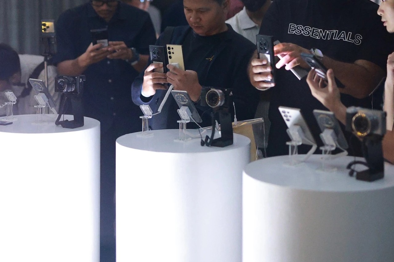
The foldable phone market has diversified over the past years, no longer a rat race between two giants. Many brands have jumped into the fray, each adding their own piece to complete the puzzle. Whether it’s imaging or durability, new foldables are addressing the concerns and doubts that consumers have about the viability of this kind of product. One thing that hasn’t exactly changed for the better is the price tag attached to these foldable phones, even years after rumors of cheaper options, at least of the non-clamshell kind. Rather than downgrade the experience to also push down the price, however, it might be more effective to offer a design that makes sense for a four-digit figure. That seems to be the premise behind the “pro-foldable” Vivo X Fold 3 Pro, so we take it for a good spin to see if it’s truly worth its weight in gold.

Designer: Vivo

Aesthetics

There is a certain elegance to the Vivo X Fold 3 Pro’s simple design. Gone are the extraneous lines and shapes, leaving only the essential elements of a stylish phone. By no means is it boring or plain, especially given the visual texture on the Solar White and Eclipse Black colorways, just that the design doesn’t distract you beyond the first brush nor does it hold your attention hostage.

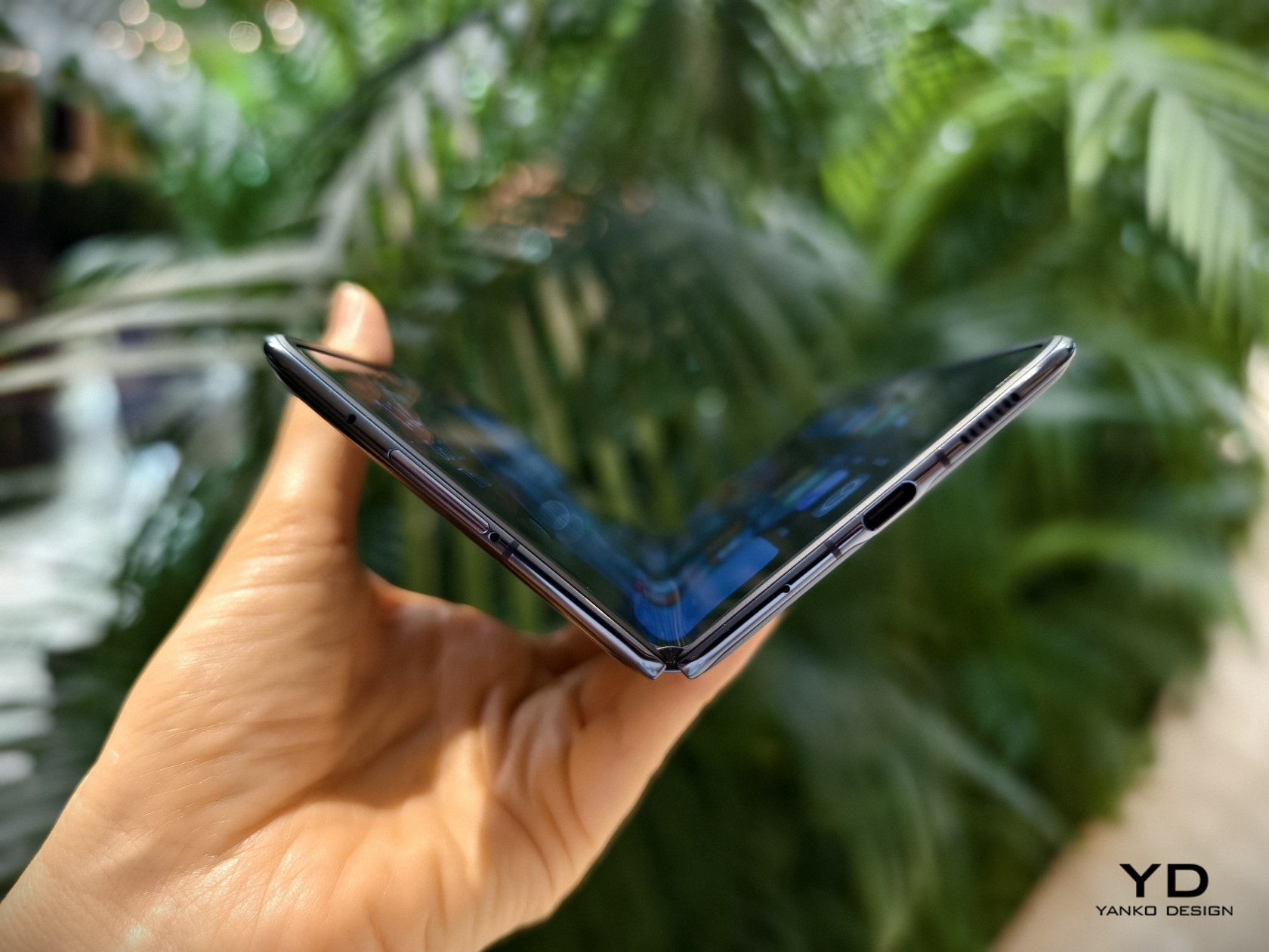
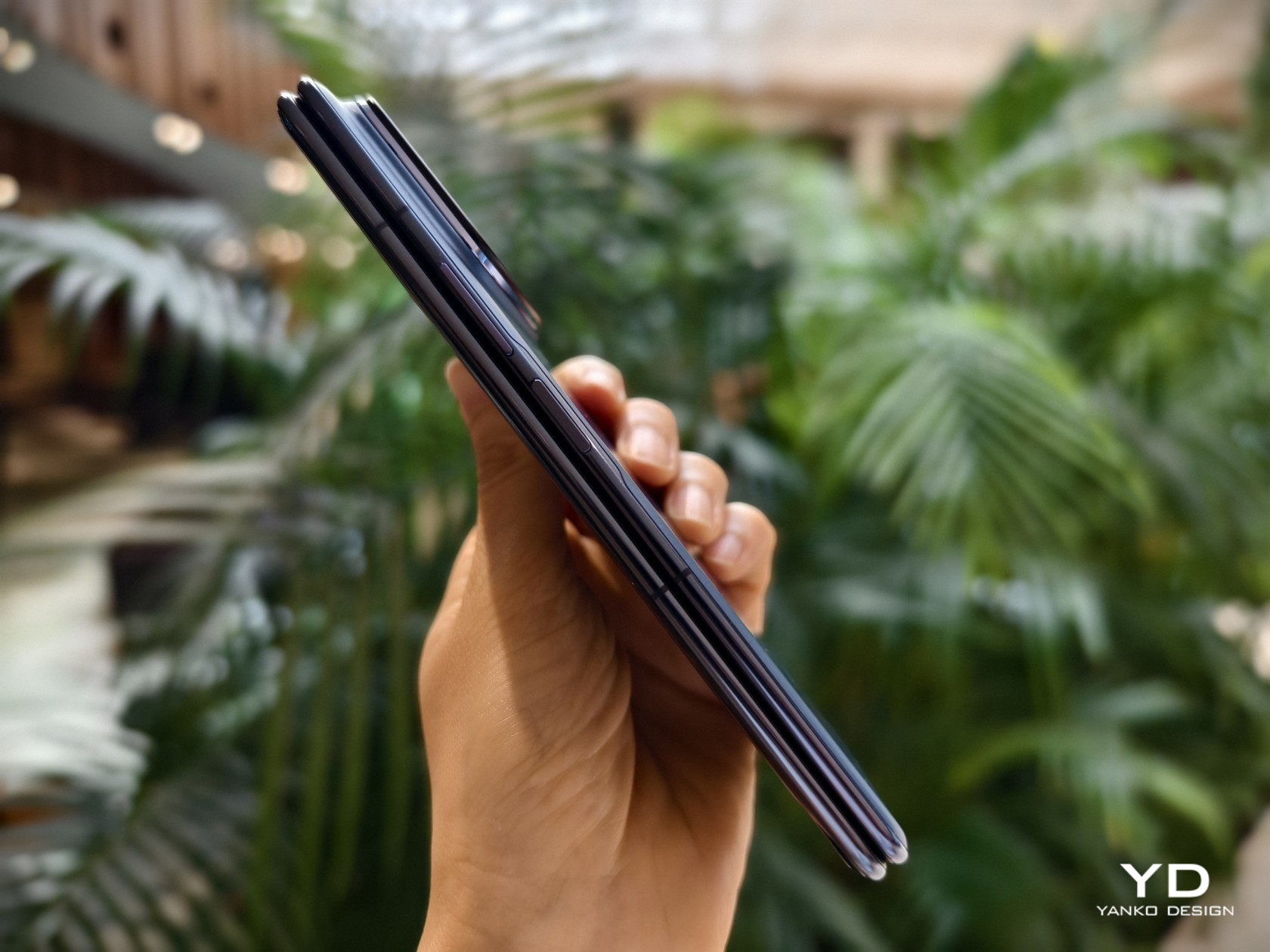
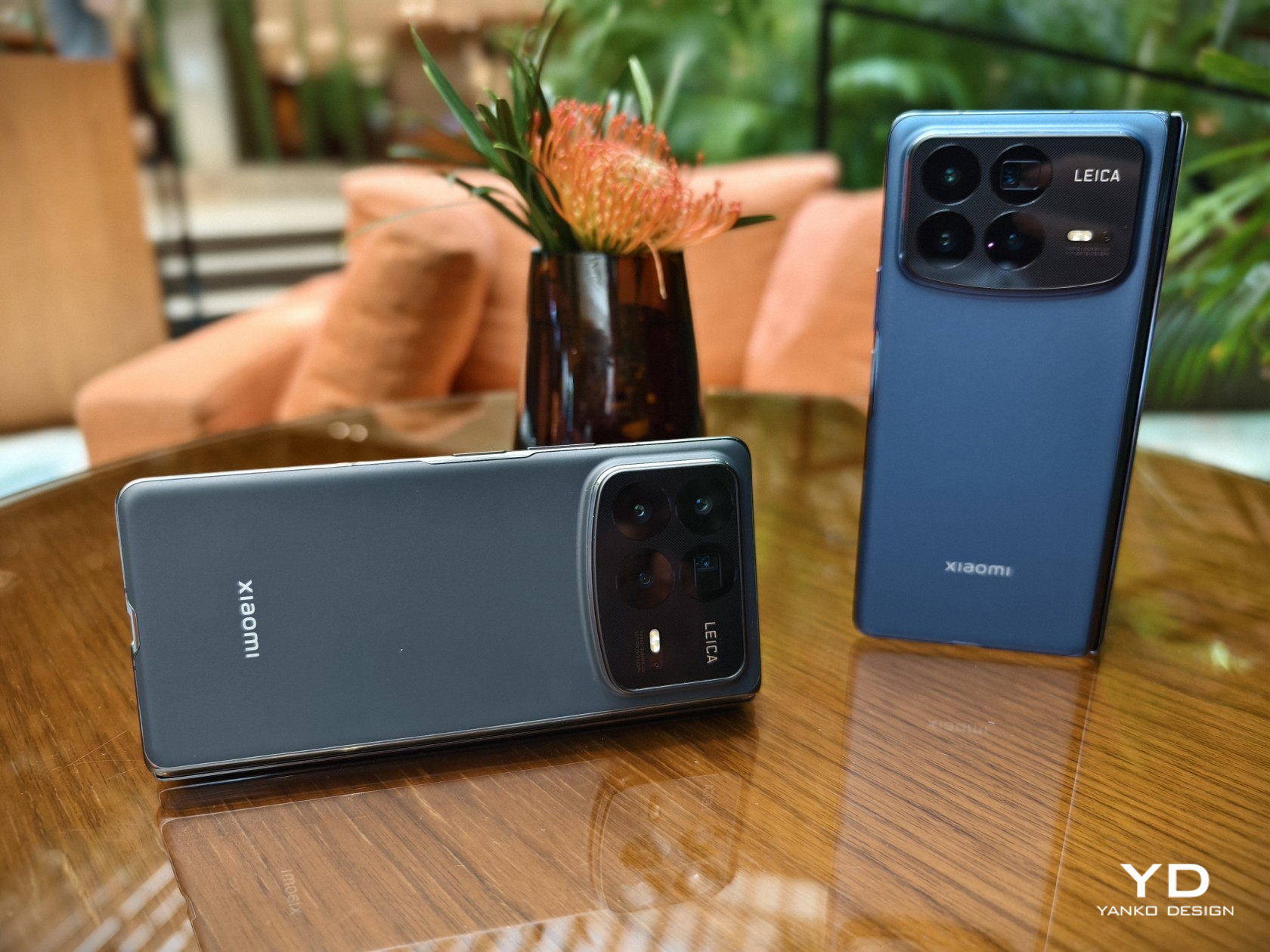
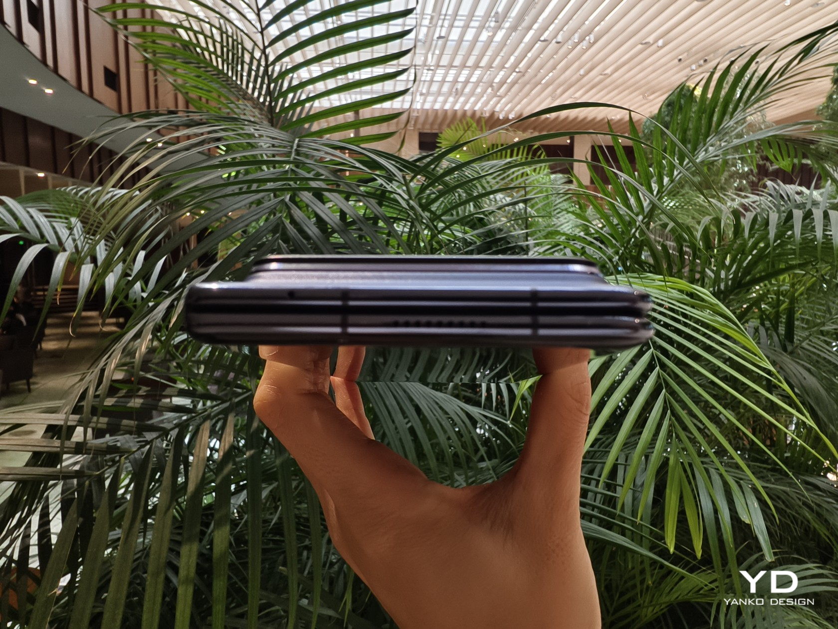
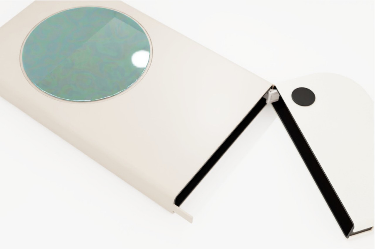
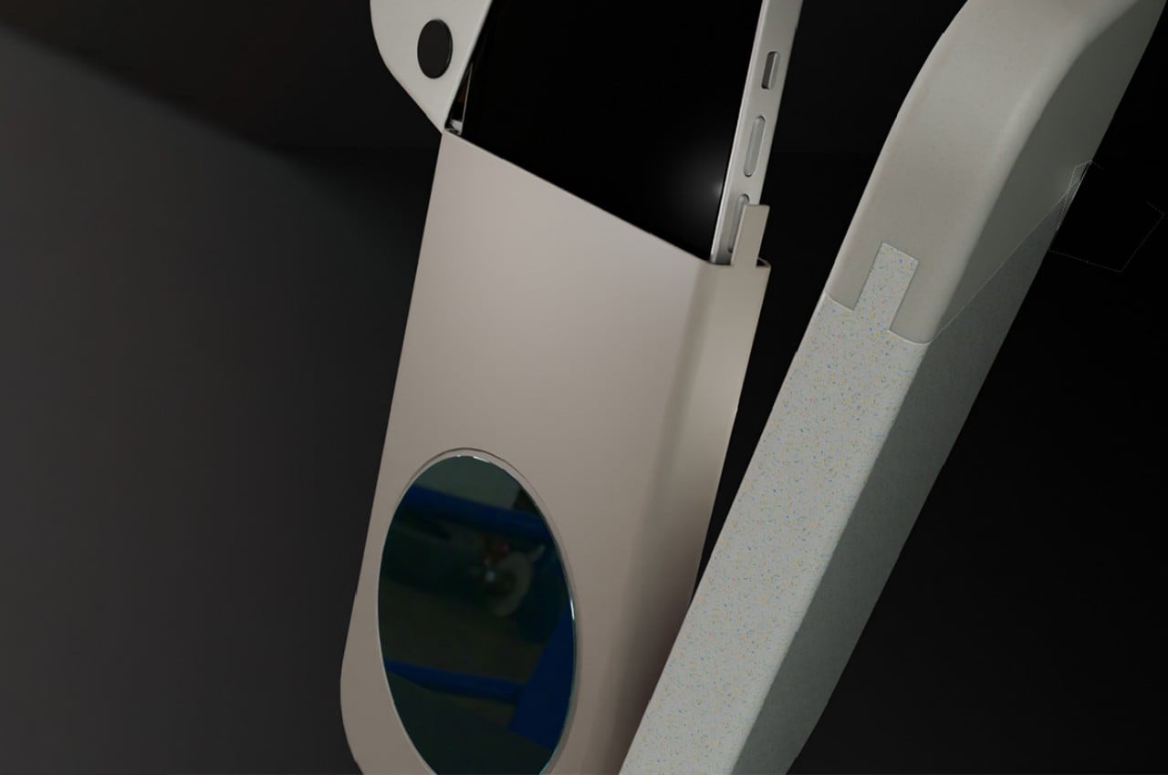
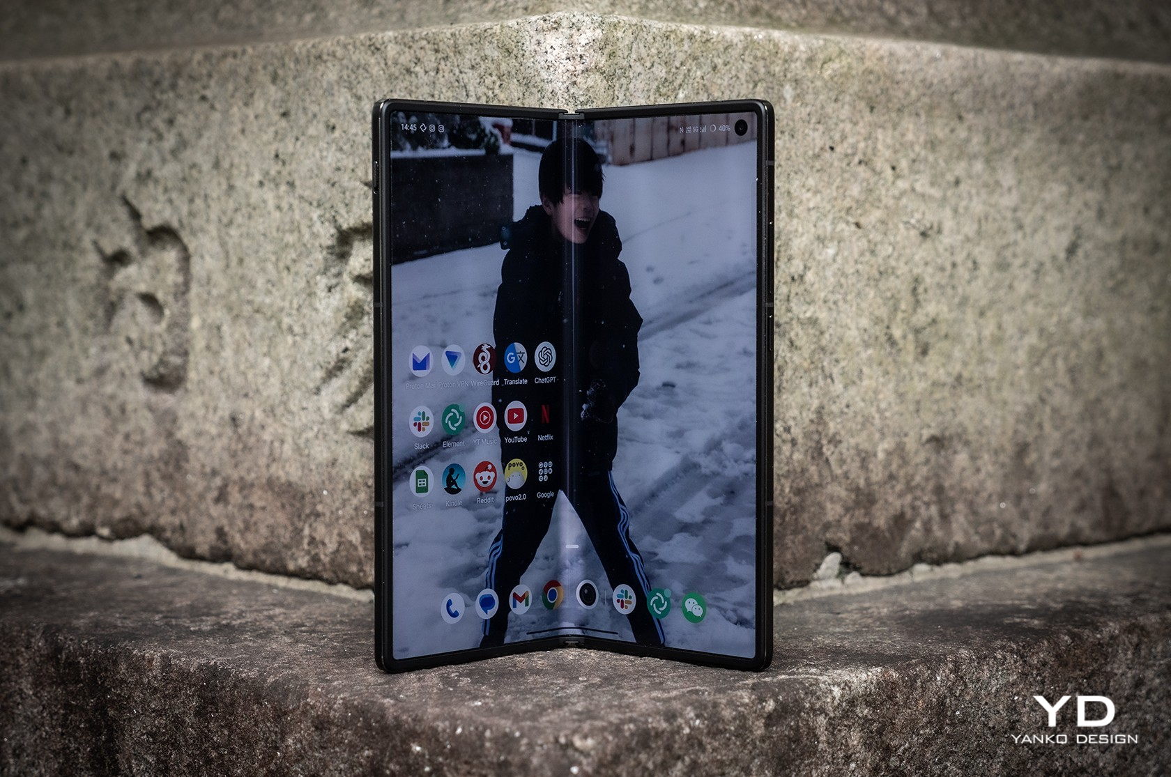
The phone is incredibly thin and, as we’ll see later, light, especially when unfolded flat at only 5.2mm thick, disregarding the equally thick camera bump. When folded, it does reach 11.20mm, though that’s not that far from the dimensions of regular slabs of metal and glass. In other words, you no longer look like you’re hiding two phones in the same pocket.

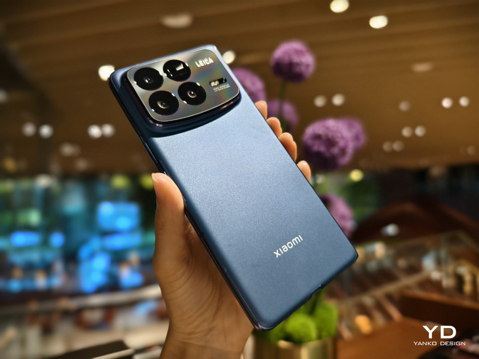
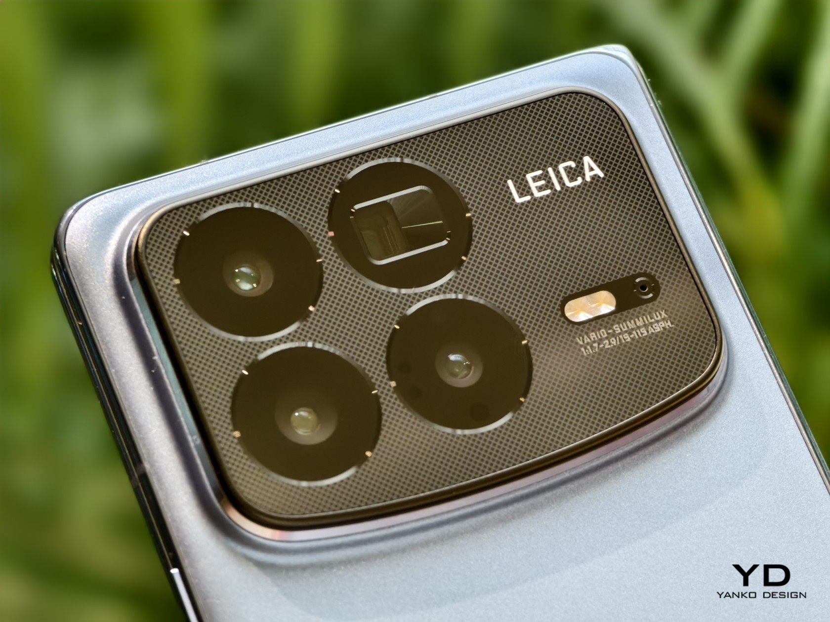
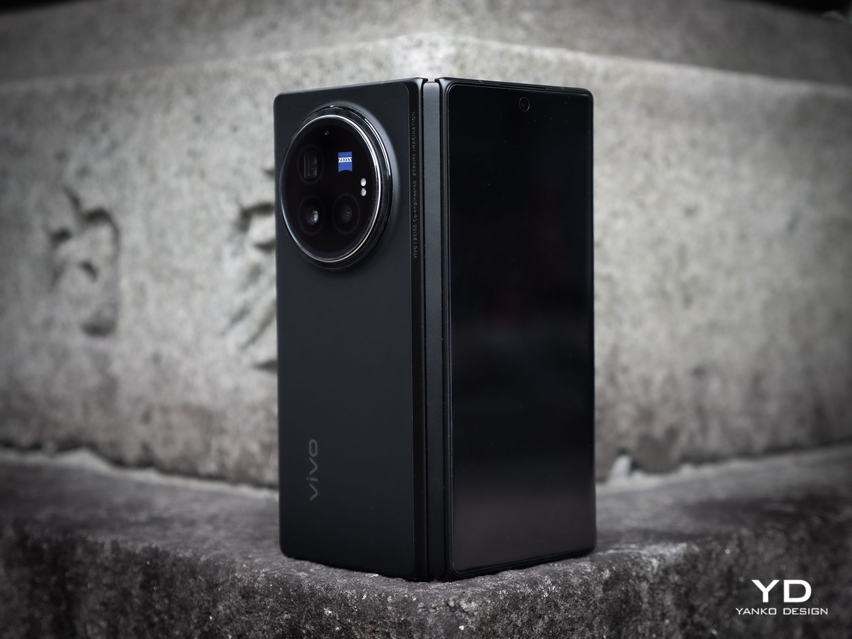
That aforementioned camera design, however, will be a bit divisive. On the one hand, it doesn’t look that awkward with a centrally positioned large circle that seems to mimic the lens of a traditional camera. On the other hand, it is still a very large circle on the back of the phone, which has some repercussions when it comes to handling the phone. Some would also consider such a large design element an eyesore, though it thankfully offers some significant benefit to its unavoidable presence.

Ergonomics

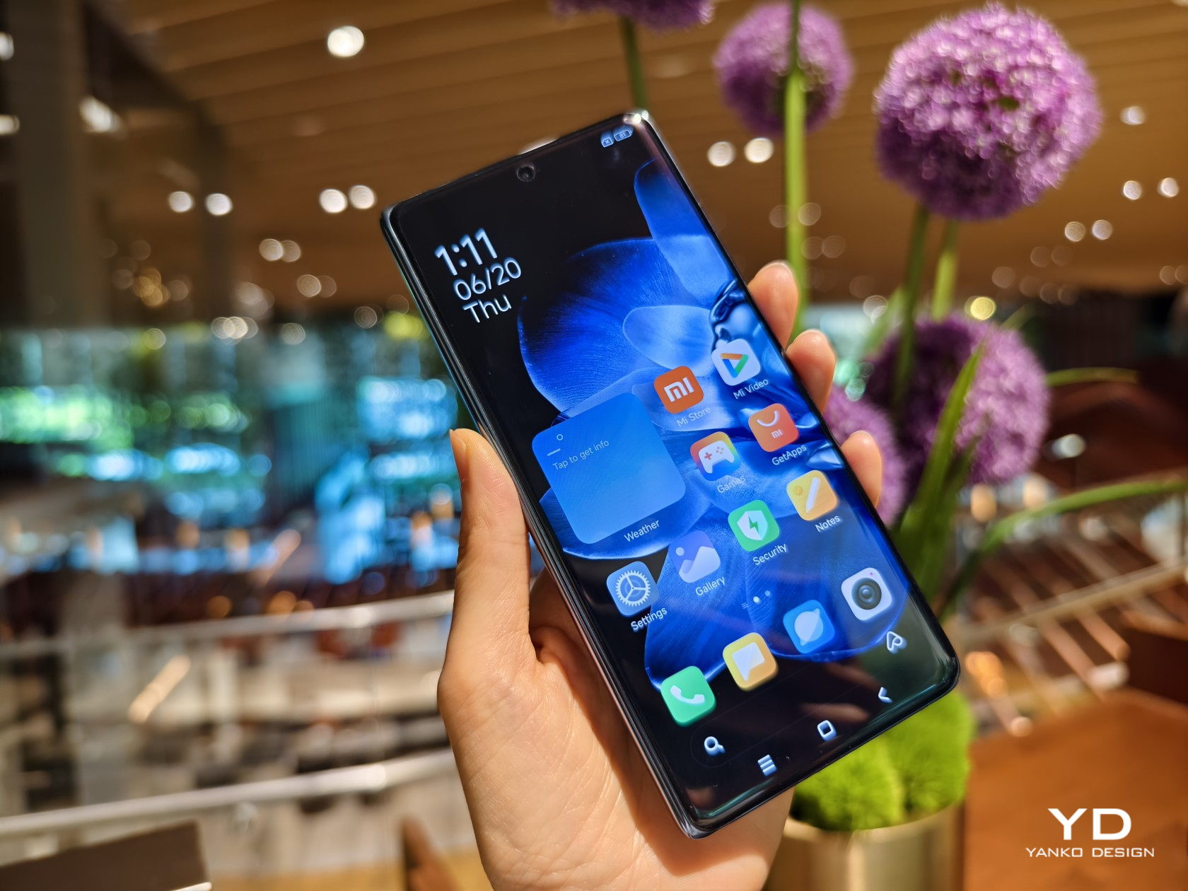
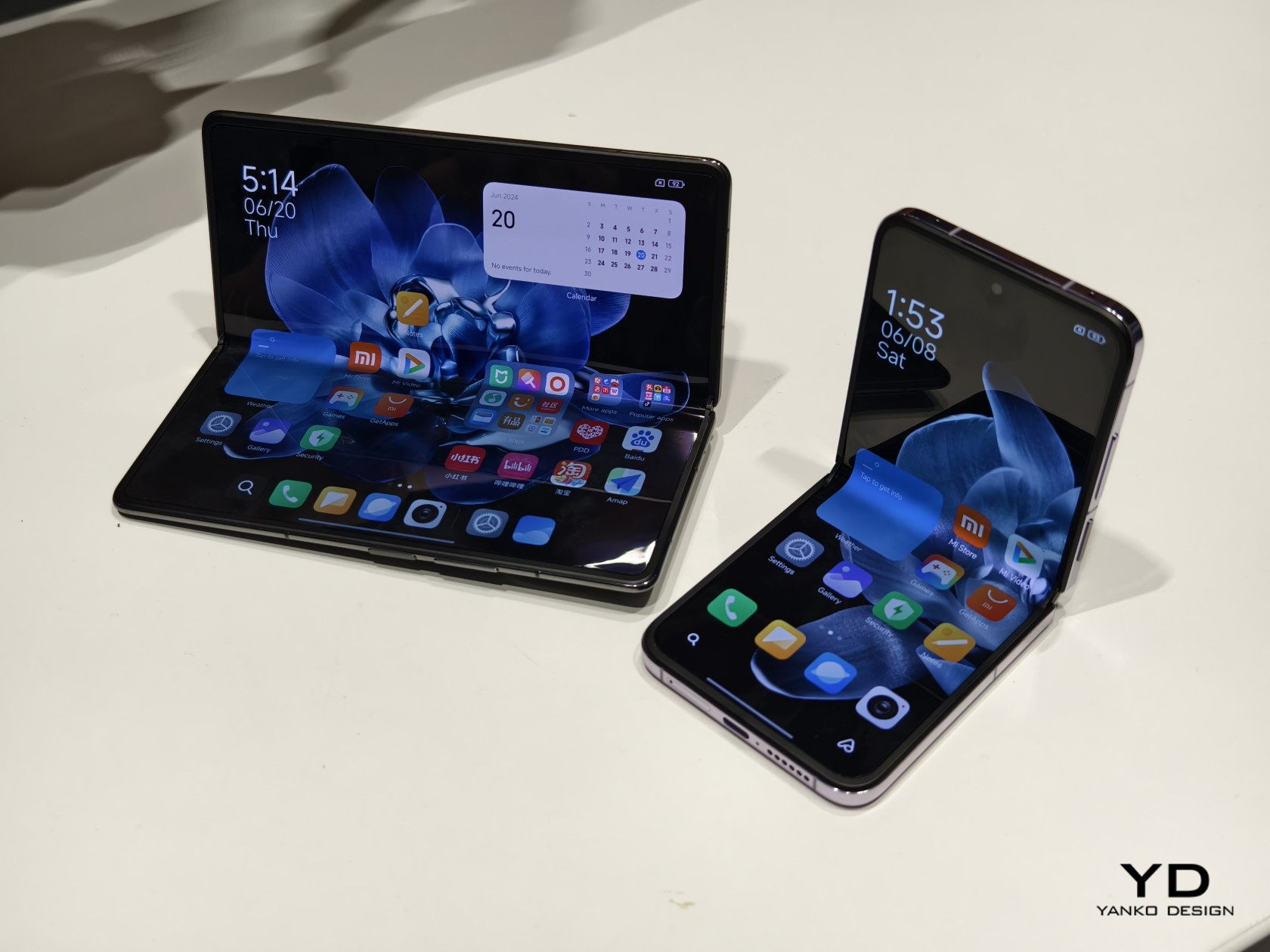
At only 236g light, the Vivo X Fold 3 Pro is pretty much on par with many premium flagships of the non-foldable kind, especially with “ultra,” “pro,” or “max” in their names. That makes this foldable phone feel comfortable to hold, especially when you consider how large their screens are. The external screen, in particular, has a 21:9 aspect ratio, which also puts it closer to regular candy bar designs. It’s still tall and narrow, though not as narrow as Samsung’s notorious design.

While the weight and shape of the phone lend it well for convenient and comfortable handling, there are a few features that may trip up a few users. Primary is that camera bump that could hinder the movement of your fingers on the back. Conversely, it also creates a protrusion that rests on your finger, helping avoid accidental drops. Either way, expect the phone to wobble on a desk when unfolded and lying flat on it. The alert slider, which gives a quick physical way to mute or unmute the phone, is also placed close to the top, which means you can’t easily reach it using the same hand you’re holding the phone with. They’re not huge deal-breakers, just small nitpicks that, when taken together, could take out the enjoyment of using the phone every day.

Performance

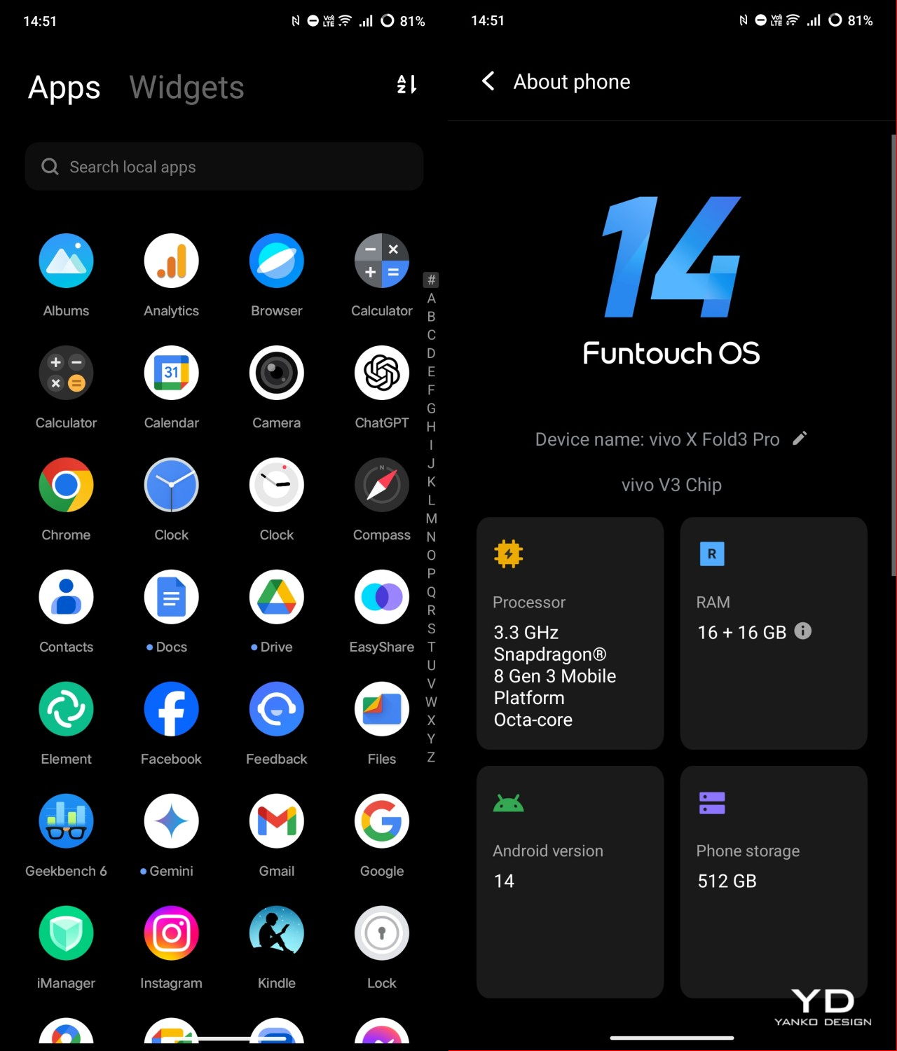
Vivo definitely didn’t pull punches when it came to making sure the Vivo X Fold 3 Pro could match other flagships this year. In some ways, it might even surpass them. Running on the current-gen Qualcomm Snapdragon 8 Gen 3 and paired with a generous 16GB of RAM, it can handle anything you throw at it with aplomb. In synthetic benchmarks, it can stand head-to-head with the Galaxy S24 Ultra, and it might even surpass the upcoming Galaxy Z Fold 6 if Samsung continues to keep memory down to 12GB max.

Battery is another department where Vivo is leading the race, cramming an unbelievable 5700mAh capacity inside such a thin and light device. This phone is guaranteed to last half a day, at least on “regular” and mixed usage, and thanks to 100W charging, it will only take an hour to get it back to full. There’s also fast 50W wireless charging, but you’ll need Vivo’s special charger to achieve that speed.

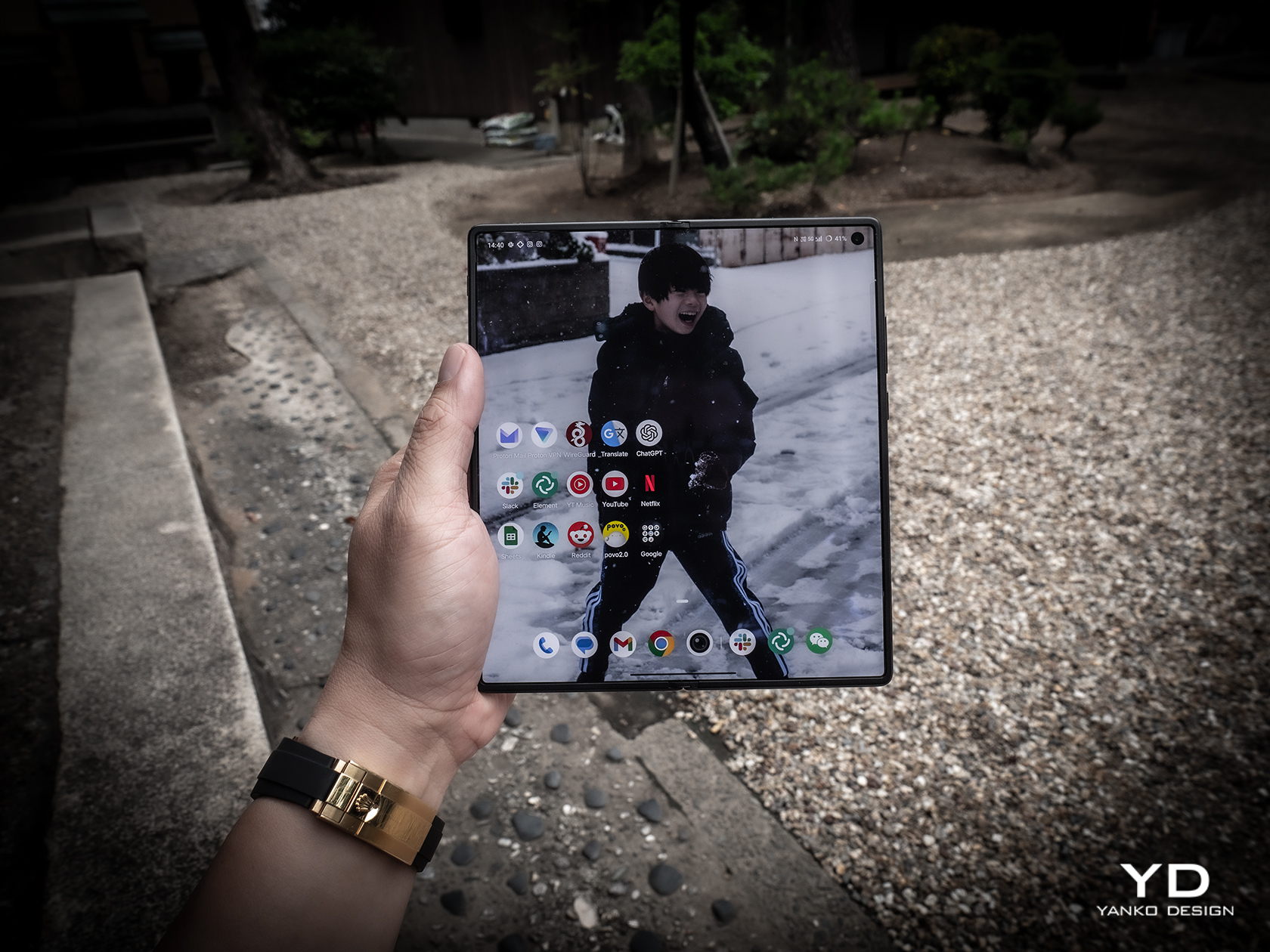
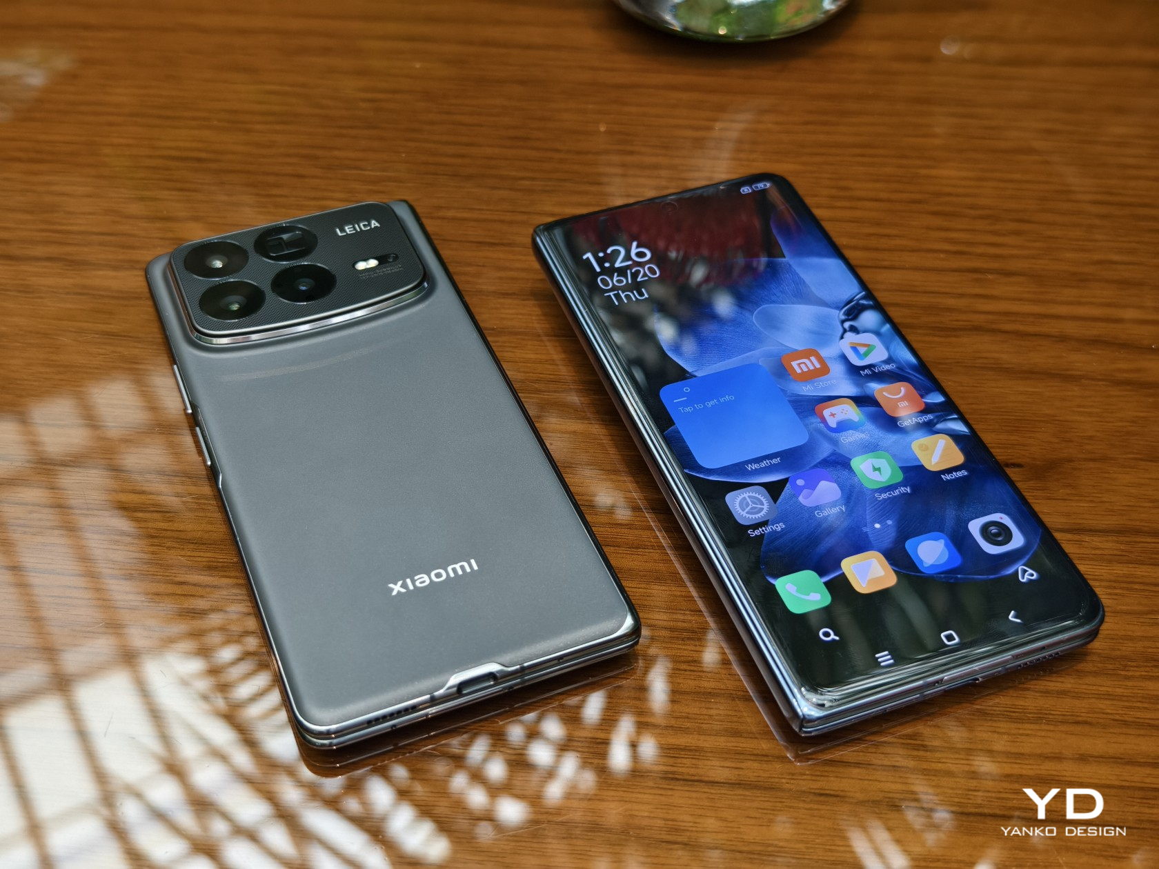
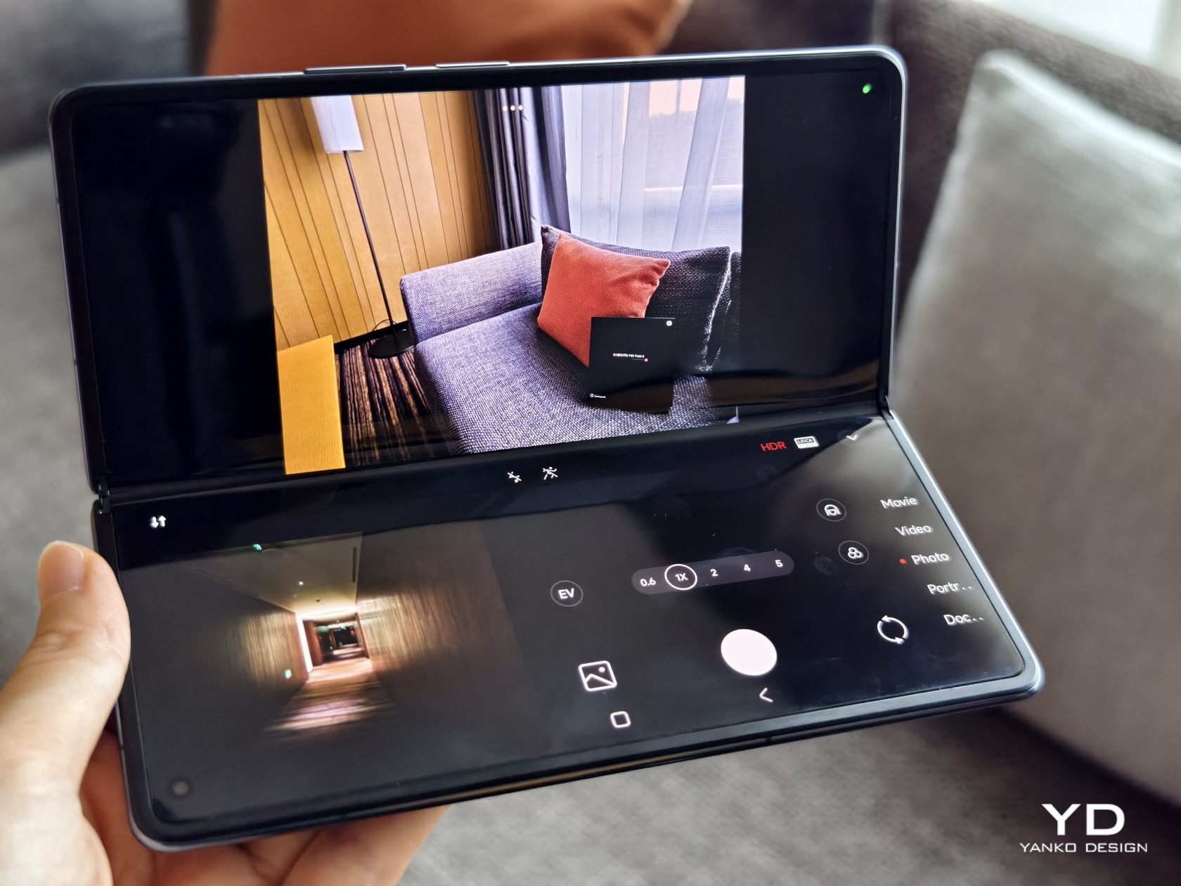
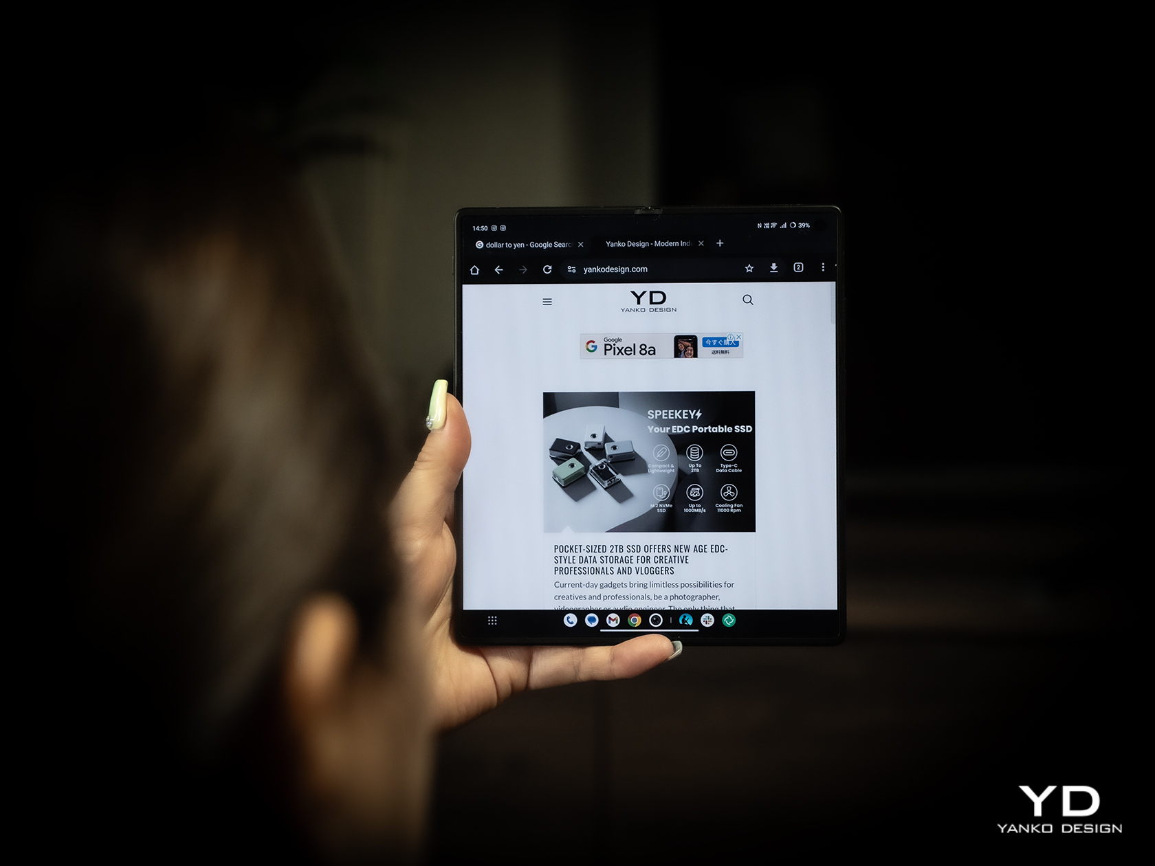
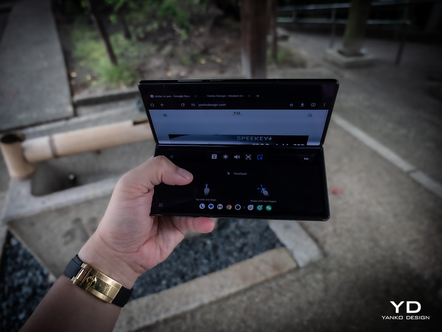
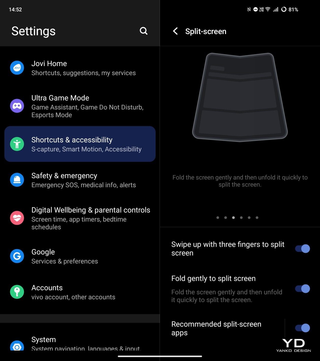
Both the external 6.53-inch 2748×1172 and internal 8.03-inch 2480×2200 screens are at the top of their class, showing vivid colors and exceptional brightness that make the phone a joy to use outdoors on either side of the fold. Thanks to Vivo’s engineering, the crease on the internal foldable display is barely visible. That hinge allows the fold to hover between 60 to 180 degrees without collapsing, creating that tiny laptop-like experience that you may or may not love. Vivo does have a “flex mode” to take advantage of that angle, as well as other features that only make sense for foldable phones. Quickly folding and then unfolding the phone again triggers the split screen feature where you can pick a second app to open side-by-side with the current one. It’s a bit gimmicky and probably won’t make owners feel comfortable about the longevity of that hinge.

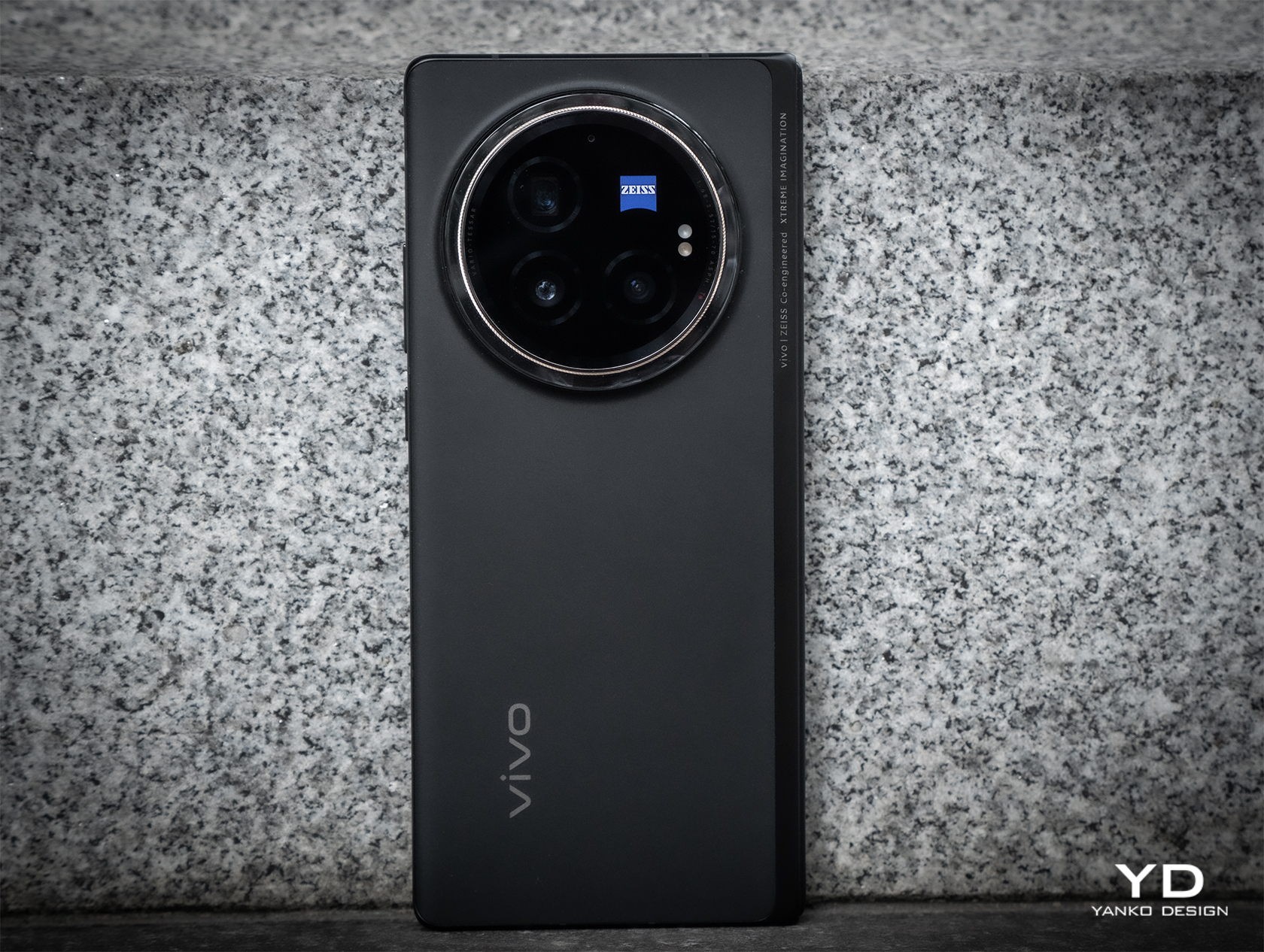
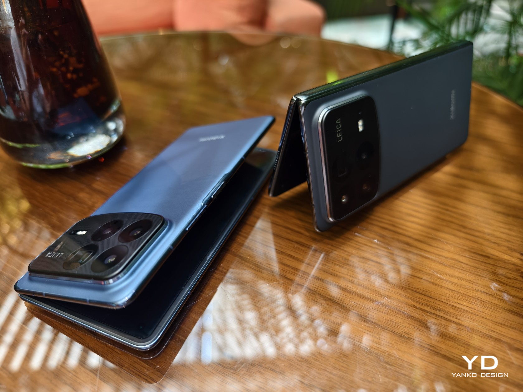
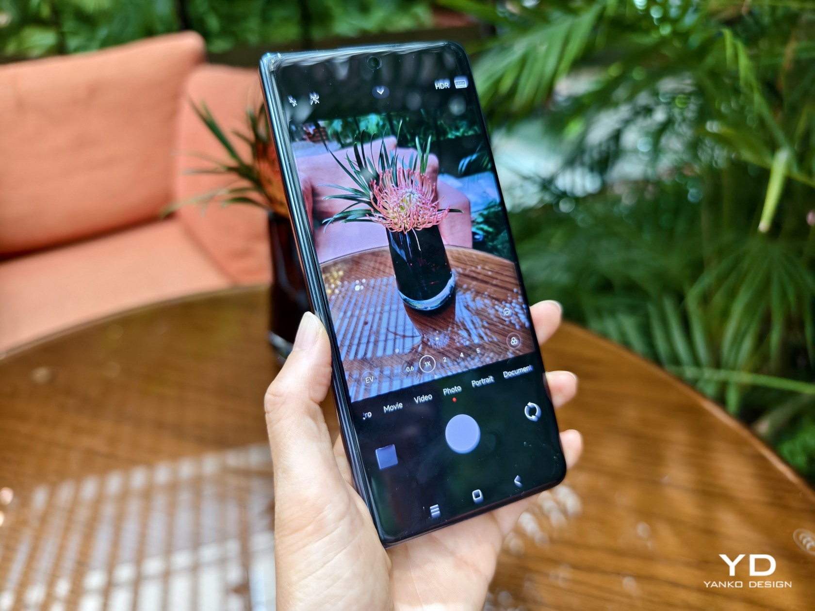
The large bump on the back of the Vivo X Fold 3 is easily justified by the rather beefy sensors it houses there. Leading the pack is a 50MP wide sensor with autofocus and OIS, and it is joined by a 64MP telescope camera with a periscope lens, also with AF and OIS. The 50MP ultra-wide shooter sadly drops the optical image stabilization but still manages to perform well.

All in all, the foldable delivers impressive photos and videos, especially with the Vivo V3 dedicated imaging chip in action. Details are rich and colors are accurate, and you can also pick the mode of vividness that best conveys the message you want the photo to send. The camera system is also co-engineered with ZEISS, which not only means the famed ZEISS T* coating but also different presets that mimic the output of the optics maker’s most famous lenses. It’s definitely great to see foldable phone cameras finally stepping up to the challenge, though the price in design and literal cost will be something people will need to consider before making a purchase decision.

Sustainability

Vivo is one of the few smartphone manufacturers that are taking big steps in going green, though that is sadly not directly seen nor felt on the Vivo X Fold 3 Pro. Instead, we can only look to the company’s wider sustainability efforts, particularly in running its business on green energy and doing its part in replenishing the planet’s greenery.

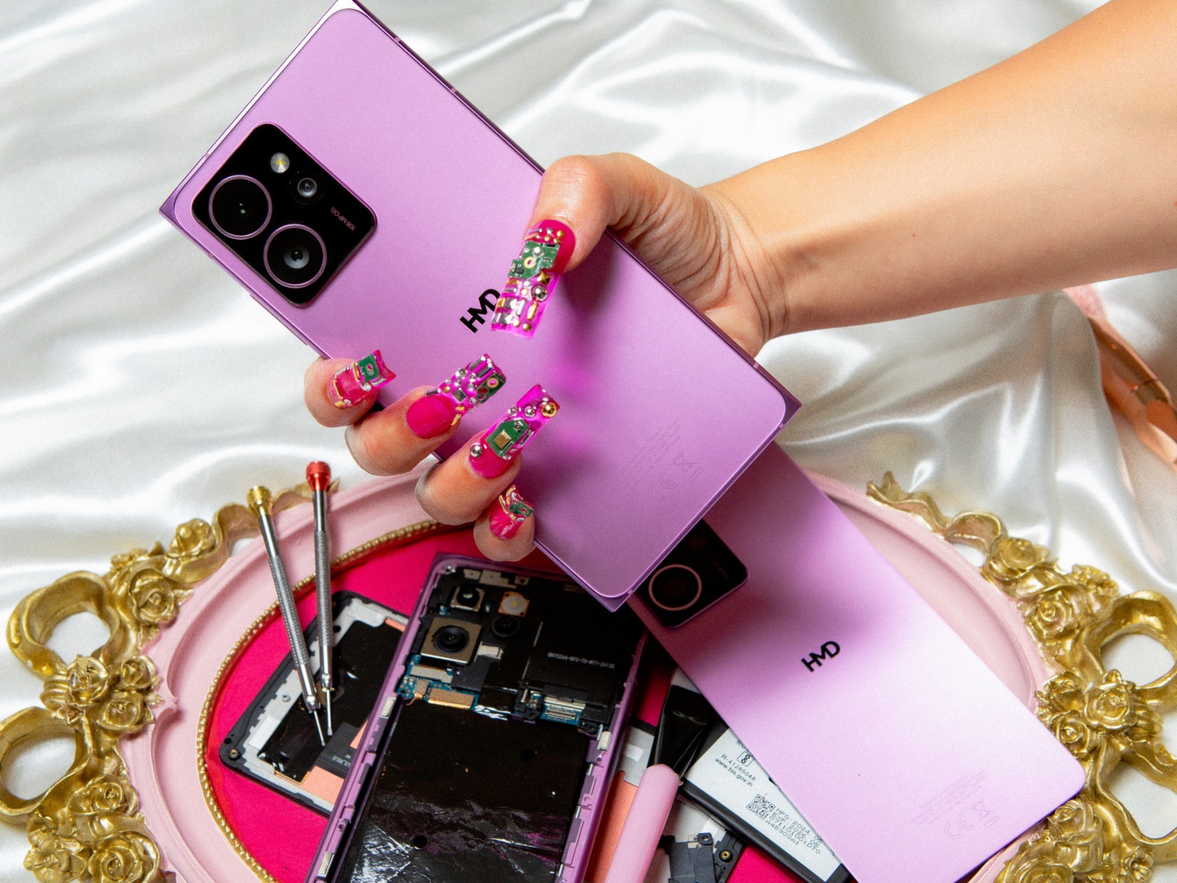
What it does promise with its newest foldable, however, is that it’s not going to end up in the trash or even recycling centers quickly. Durability has been one of the biggest concerns consumers have with foldables, so it’s not surprising that Vivo spent a lot of resources on ensuring the Vivo X Fold 3 Pro will be as reliable as more traditional smartphones. Those measures include a light yet ultra-durable carbon fiber hinge, protective Armor Glass for the cover display, and glass-like UPE fiber for the back panel. The phone is also rated IPX8, which is great for water protection but not so much for dust, raising worries that these tiny particles could inflict fatal damage on the sensitive internals of the phone.

Value

It’s pretty clear that Vivo spared no effort in equipping the X Fold 3 Pro with the best of the best in smartphone technologies this year. On normal smartphones, that would be a given, but such features on a foldable raise the stakes and the prices higher. At around $1,600 to $1,900, depending on where you get it, it’s not exactly an easily accessible product, especially when you consider it’s not available in some global markets.

The Vivo X Fold 3 doesn’t exist in a vacuum, however, and when you consider that its peers ask for nearly the same figure, you begin to see some of the advantages the foldable phone has. It’s definitely not lacking much, and it cuts quite a striking figure with its slim profile and lightweight body. Suffice it to say, there’s a reason it has “Pro” in its name, and it’s that same reason you’ll need to pay a premium for it.

Verdict

Samsung and Huawei kicked off the foldable phone race, and although almost six years have passed, the prices for these products have barely gone down. What makes matters worse is that in some cases, the prices have remained the same or even increased but have very little to show for it. If you’re going to charge a premium for a product, you should be making sure the product is actually premium.

That’s the kind of promise that the Vivo X Fold 3 Pro offers, cutting almost no corners in the name of delivering the best foldable experience with current industry technologies, not those from two or three years ago. It’s not an easy promise to make, especially when you consider the need to also make the design slimmer and lighter, but Vivo seems to have actually pulled it off. For that feat alone, the Vivo X Fold 3 Pro definitely deserves your consideration, even with that hefty price tag.

The post Vivo X Fold 3 Pro Foldable Phone Review: Putting the Competition on Notice first appeared on Yanko Design.

Galaxy S25 Ultra design rumor claims it will lose its distinctive boxy look

Since 2011, Samsung has been launching two flagships a year, one under its premium Galaxy S brand and another with the Galaxy Note name. The latter has mostly been defined by its large screen and S Pen stylus, though now large screens or phablets are the norm rather than the exception. By now, the Galaxy Note is pretty much history, but it seems that it might be making a comeback in an unexpected and perhaps unwelcome way. We’re still half a year away, but rumors about the Galaxy S25 Ultra have already started to attract attention, both good and bad, especially on how its design will be throwing away what has made it look unique in exchange for what is both a throwback to the past and a nod to its stylus-less siblings.

Designer: Samsung (via @Wvisioncreation)

Galaxy S24 Ultra

Although Samsung retired the Galaxy Note name, its legacy lived on in the Galaxy S Ultra series. Not only does it have an S Pen stowed inside its body, it also retains the design that set the previous Galaxy Notes apart from the Galaxy S phones. Specifically, it had a rather boxy design, especially when viewed from the front. Not only are the top and bottom edges flat, the corners are also sharp and angular, a design that you’ll rarely see on other phones these days.

Galaxy Note 20 Ultra

According to the first rumors to come out for Samsung’s 2025 flagship, the Galaxy S25 Ultra will be losing that design DNA. The design is described as having more rounded corners, similar to the Galaxy Note 7 from 2016 with one important exception. The screen is still flat, something that Samsung did for the first time in this year’s Galaxy S24 Ultra, rather than the heavily curved display of yesteryear’s Galaxy Notes. In not so many words, it’s going to look like the Galaxy S24 and Galaxy S24+, and presumably the Galaxy S25 and Galaxy S25+.

Galaxy Note 7

On one hand, this change makes sense from a branding perspective, especially if you consider how the Galaxy Z Fold and Galaxy Z Flip are also transforming. Samsung’s foldables are becoming edgier, so to speak, taking on an appearance similar to the Galaxy S24 Ultra. The company, therefore, needs to differentiate the two product lines, and making the Galaxy S25 Ultra look like its siblings from the same Galaxy S line makes the integration of the Galaxy Note complete.

Galaxy S24+

On the other hand, response to the rumored change has been generally negative so far. That boxy and squarish design has become the visual identity of the Galaxy S Ultra, especially for fans of the Galaxy Note. In fact, they probably wish the Galaxy S to adopt the design rather than the other way around, if only to set Samsung’s flagship apart from the sea of phones with flat edges, flat screens, and rounded corners.

Galaxy S24 Series

The post Galaxy S25 Ultra design rumor claims it will lose its distinctive boxy look first appeared on Yanko Design.