SpaceX’s latest Starship mission reached low-Earth orbit
...with some small hiccups along the way.




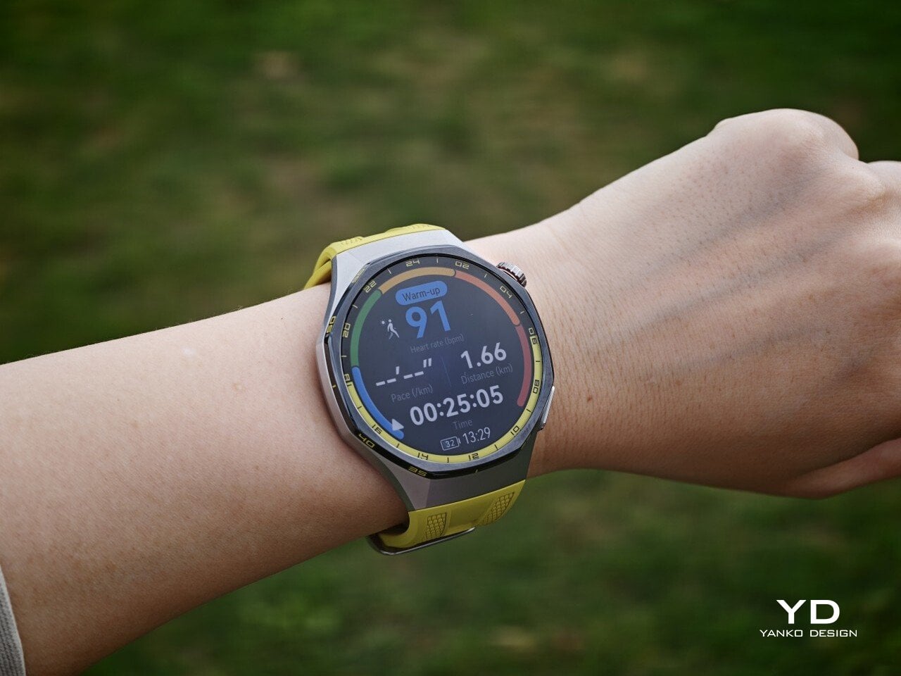
The Watch GT 7 Pro 46mm shows Huawei sticking to a proven formula and sharpening it further. It is not a bold leap, but it is a confident and well-rounded one.
Huawei has spent the last few years turning wearables into one of the strongest parts of its consumer business. The company has performed especially well in China, with that momentum also carrying into overseas markets. As a result, Huawei has grown into one of the biggest names in smartwatches, offering a lineup that covers different styles, price points, and user needs.
Within Huawei’s smartwatch lineup, the GT series is the company’s sports-focused range. The new GT 7 series stays true to that identity, building on the formula that has made the lineup popular. The GT 7 Pro is not a major leap over the GT 6 Pro, but it feels like a more polished and refined take on the same core idea.
Designer: Huawei
The Watch GT 7 Pro 46mm stays largely in line with the design language of its predecessor, keeping the same sporty character that defined the GT 6 Pro. Its octagonal case continues to give it a distinctive look, helping it stand out from the many conventional round smartwatches on the market. At the same time, Huawei balances that sportier shape with a polished finish, so the watch still feels premium rather than overtly rugged.
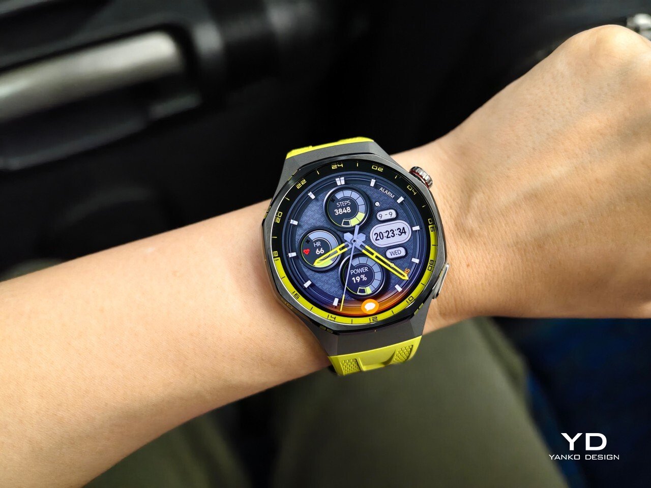
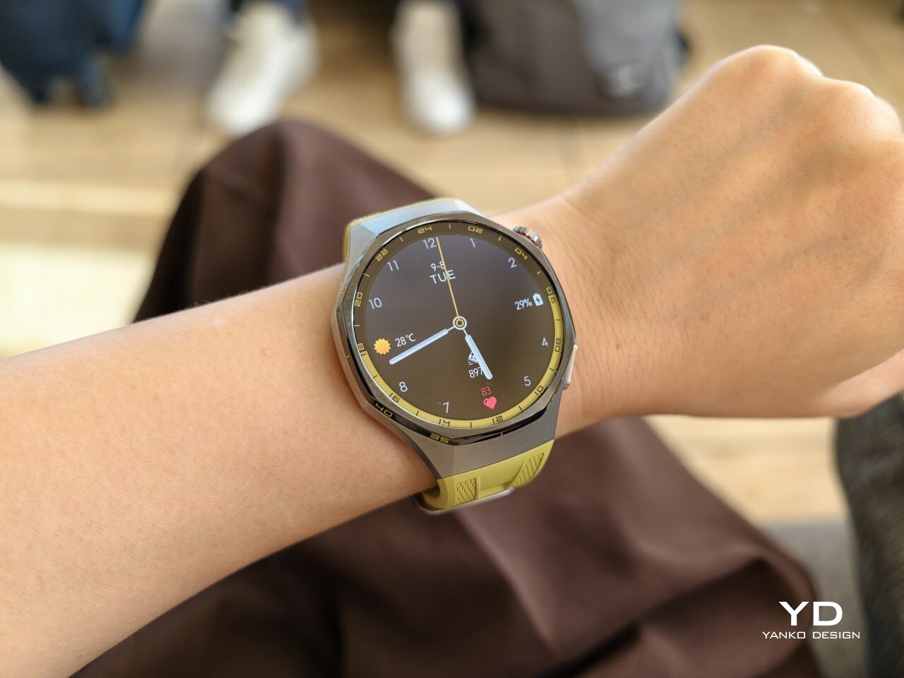
The front of the watch keeps that same balance. Its 1.47-inch AMOLED display sits beneath sapphire glass, which adds a more upscale touch while also improving durability for everyday wear. Around the display, Huawei uses 24-hour markings that strengthen the watch’s sporty identity and give the face a more instrument-like look.
Huawei is offering the GT 7 Pro 46mm in yellow, green, and black, and each one gives the watch a distinct personality. The yellow version I received is easily the boldest of the three, pairing a silver case with a black bezel and a bright lime yellow strap. Matching yellow accents around the bezel and on the watch face make it feel the most energetic and overtly sporty of the lineup.
The green version takes a more outdoorsy approach. It keeps the same overall design but swaps in a muted green strap and matching accents, giving the watch a look that feels active without being as loud as the yellow model. The black version, by contrast, is the most understated. With its darker finish and strap combination, it gives the GT 7 Pro a stealthier and more versatile appearance that should appeal to buyers who prefer something cleaner and easier to wear every day.
Despite its sporty, fairly bold design, the Watch GT 7 Pro 46mm is comfortable to wear for long stretches. At 56g and 11.2mm thick, it has enough presence to feel substantial on the wrist, but it never comes across as overly bulky in daily use. Huawei has also done a good job with weight distribution, which matters more than raw dimensions when you are wearing the watch through workouts, sleep tracking, or a full day out.
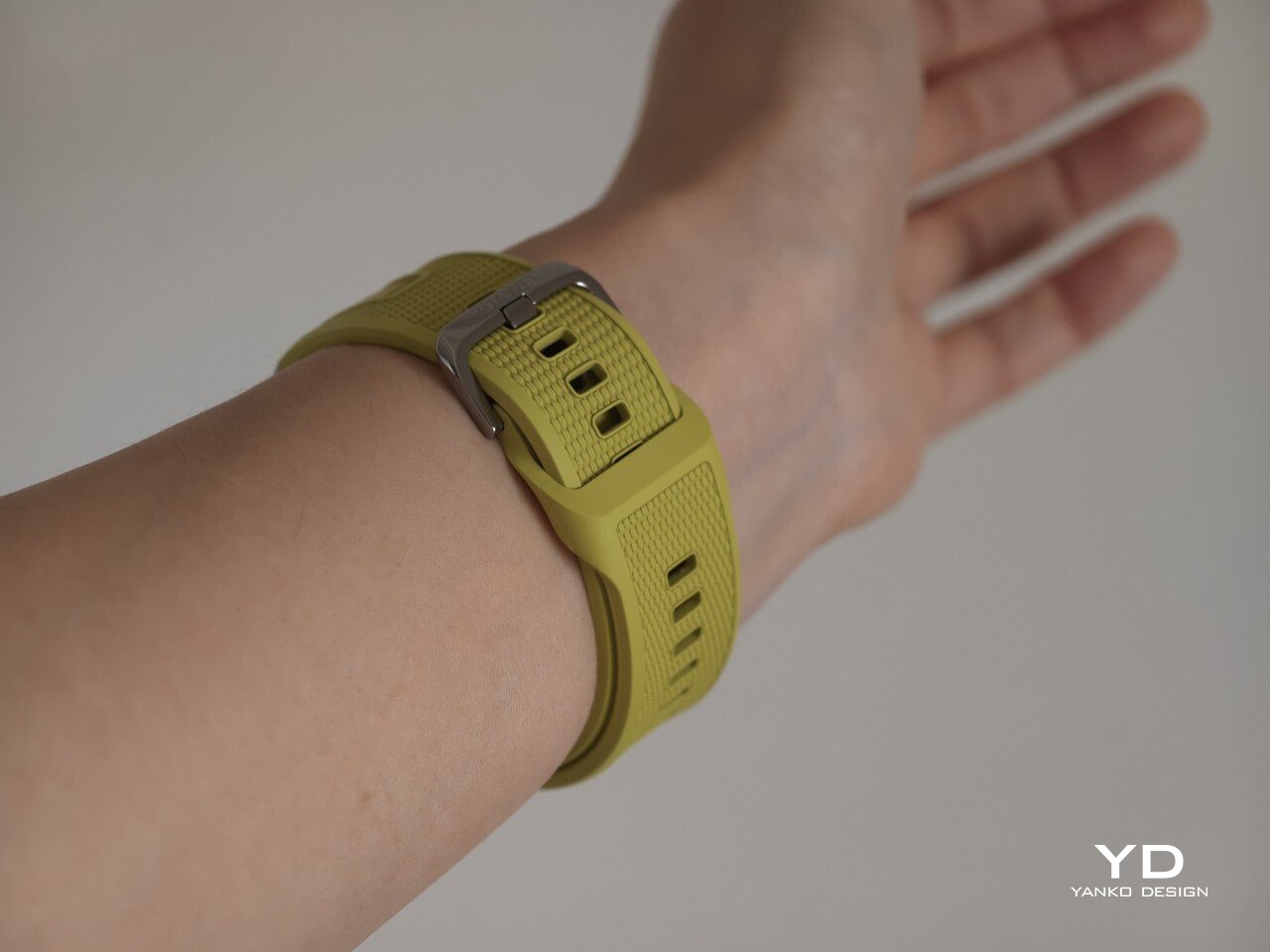
The strap has also been revised. Huawei calls it the Easy Cross Strap, and the key change is that the loose end tucks underneath instead of threading through a traditional belt loop. According to Huawei, this makes the watch easier to wear day to day while also creating a snugger fit that can help improve the consistency of health tracking. The elastomer strap feels soft enough for extended wear while still staying secure during exercise. It is detachable and uses a 22mm fitting, but because it is secured with pins, swapping it out is less straightforward than with a standard third-party strap.
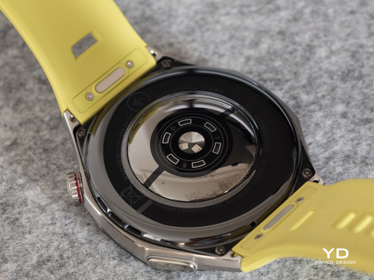
Huawei’s control layout is familiar and easy to get used to. The buttons sit within easy reach, and the rotating crown adds a more tactile way to move through menus. That makes the watch feel more natural to use when you are on the move and do not want to rely entirely on touch input. Combined with the curved case and integrated strap design, the GT 7 Pro feels built not just to look sporty, but to wear like it too.
The Watch GT 7 Pro 46mm features a 1.47-inch AMOLED display, and it is one of the first things that stands out about the watch. Huawei claims a peak brightness of 3,000 nits, and in use the panel looks sharp, bright, and vibrant. Watch faces have plenty of visual punch, while menus and health data remain easy to read at a glance. Huawei has been consistently strong in this area, and that continues here with a screen that feels right at home on a watch in this class.
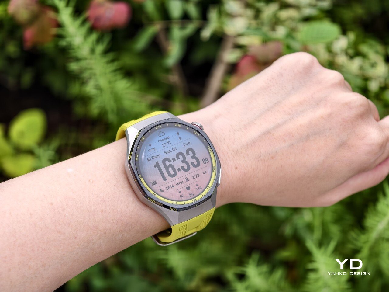
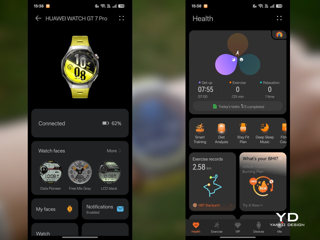
Out of the box, the GT 7 Pro runs HarmonyOS 6.1 and supports both Android and iOS devices, which immediately makes it more flexible than some ecosystem-bound alternatives. The software itself is easy to navigate, with clean menus, smooth animations, and a layout that does not take long to learn. It is not trying to overwhelm you with complexity, and that works in its favor on a smartwatch that is meant to balance fitness features with everyday usability.
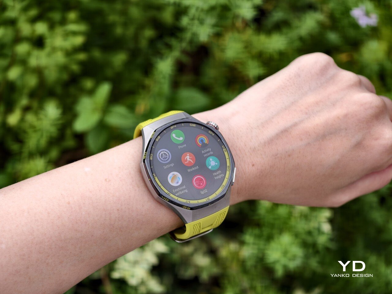
Health and fitness remain at the heart of the experience, which is exactly where the GT series has built much of its appeal. Huawei includes a broad set of tracking features here, covering the usual essentials such as heart rate, sleep, blood oxygen, stress, and workout monitoring, while also adding more unusual tools like the Diabetes Risk Study and Coronary Heart Disease Study. The latter, however, was not available on my test unit during the review period.
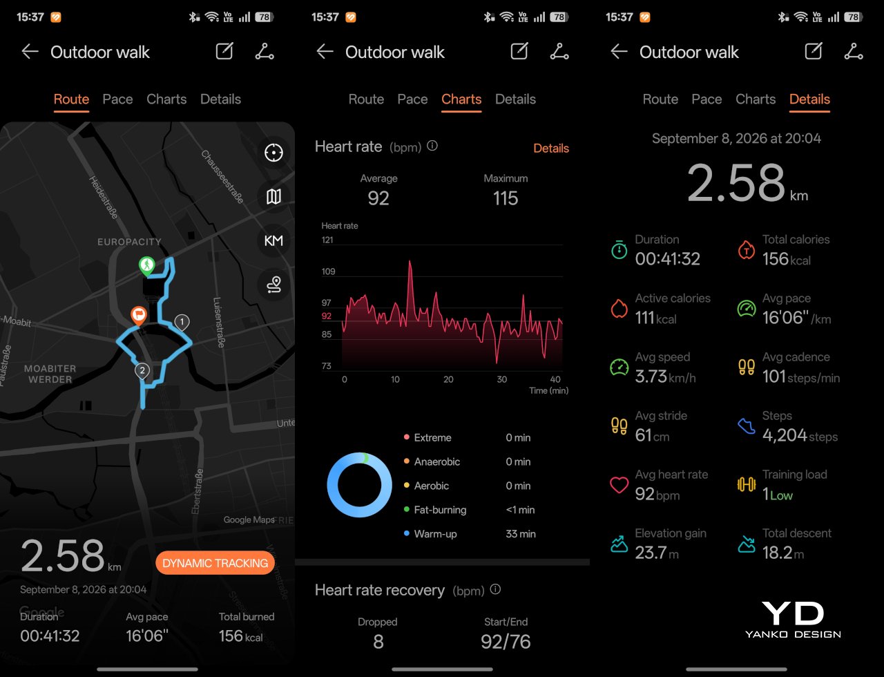
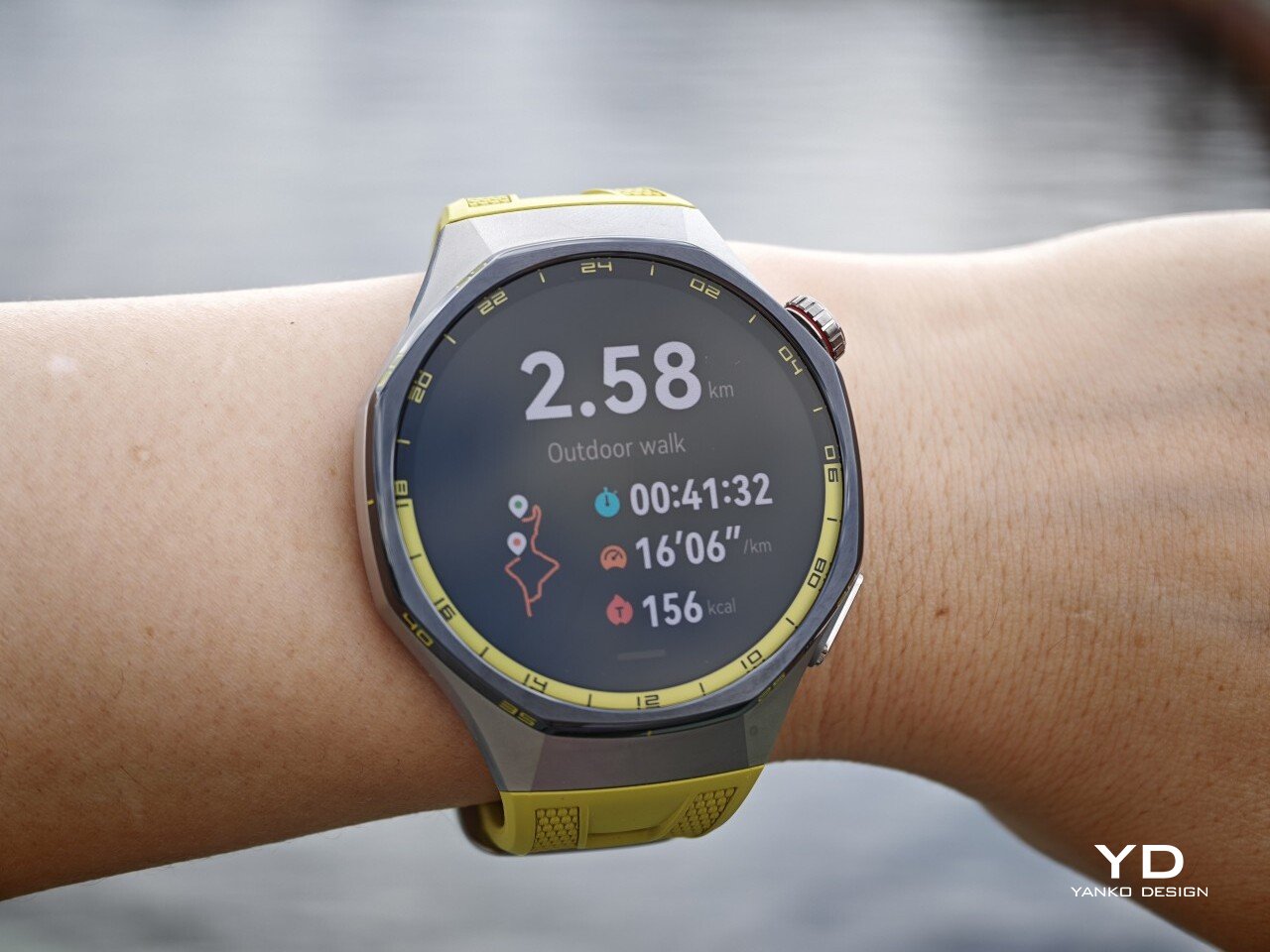
On the fitness side, the watch offers more than 100 workout modes, reinforcing its role as a serious sports-focused smartwatch. Huawei has also expanded its support for winter sports, with dedicated indoor and outdoor skiing as well as snowboarding modes. These can track data such as maximum speed, average incline, total descent, and run count, making the watch more useful for users who want something beyond basic activity logging. It also supports downloads for more than 3,000 ski resort maps worldwide, complete with details such as slope names, difficulty ratings, and lift station locations.
Since ski season is still months away where I live, I was not able to test those winter sports features properly. My hands-on time was limited to more routine activities like outdoor walks, yoga, and casual cycling. Even within that narrower scope, the watch performed well. GPS tracking was accurate in my testing, even when I passed under railway bridges and near buildings, where signals can sometimes become less stable.
Battery life is one of the GT 7 Pro’s biggest strengths. Huawei rates it for up to 21 days at the upper end, up to 12 days under typical use, up to 7 days with the always-on display (AOD) enabled, and as much as 51 hours in trail running mode. Those are ambitious figures, but in my time with the watch, its endurance was genuinely impressive.
I took it with me on a nine-day trip after charging it to 100 percent, and by the end of the trip it still had 19 percent battery remaining. During that time, I had all health tracking features on, AOD turned on, and used it for a couple of indoor and outdoor walking sessions as well. That makes the result more impressive, because the watch was not simply sitting idle for most of the trip. In day-to-day use, that kind of endurance makes a real difference, especially on a sports-focused smartwatch where frequent tracking can drain smaller batteries much more quickly.
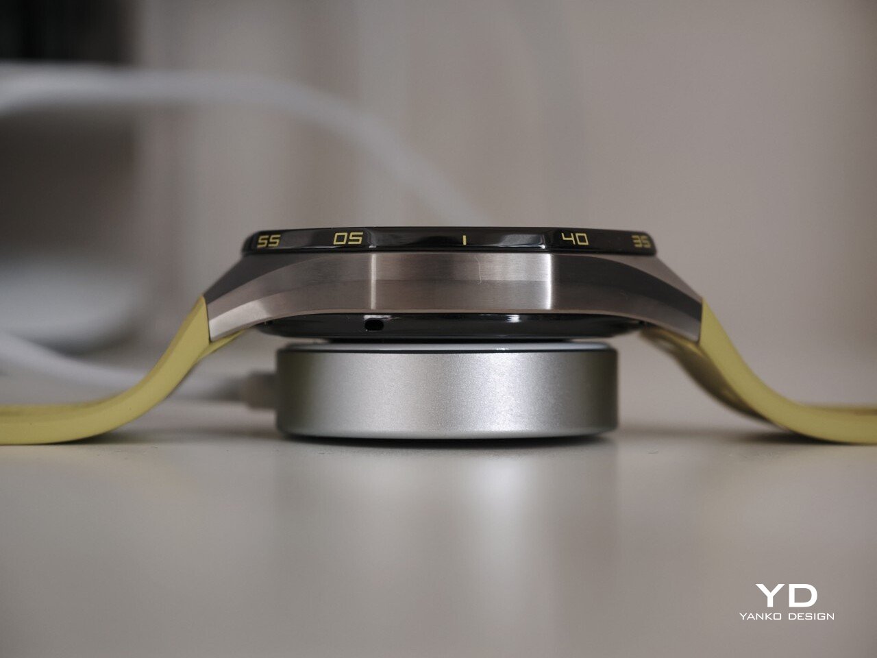
Charging is handled through a proprietary magnetic wireless charger included in the box, and it is fairly quick. Because of the watch’s shape, though, it does not sit flat on the charger, which can be a mild annoyance in everyday use. It hovers slightly, and I often found myself checking to make sure it was still charging after the initial confirmation screen disappeared. It also feels like time for Huawei to move from USB-A to USB-C, as the included cable already feels a bit dated.
The Watch GT 7 Pro also puts some emphasis on durability. It carries both IP69 and 5ATM ratings, giving it a solid level of protection against dust and water exposure. That makes sense for a watch positioned around sports and outdoor use, where it is more likely to be exposed to sweat, rain, splashes, and more demanding day-to-day conditions.
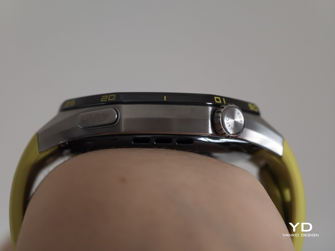
Huawei also uses sapphire glass over the display, which adds another layer of reassurance. Sapphire is known for its strong scratch resistance, and it also helps the watch feel more premium in the process. Taken together, these details give the GT 7 Pro a tougher, more dependable character without pushing it fully into rugged-watch territory. That said, sustainability is less of a focus, with no clear mention of recycled materials or other environmental measures.
At £379, or roughly $510, the Watch GT 7 Pro is priced like a premium smartwatch, so it has to offer more than just a nice design. For the most part, it does. You are paying for a watch that gets the basics right, with strong battery life, a durable build, a comfortable fit, and a health and fitness feature set that feels broad enough for most users.
The value proposition really comes down to what you want from a smartwatch. If you care most about app support and deeper smart features, there are rivals that make a stronger case. But if your priorities are battery life, fitness tracking, and a watch that looks and feels good on the wrist, the GT 7 Pro makes more sense. It is not a dramatic step up from the GT 6 Pro, so current owners may not feel much pressure to upgrade. Still, for anyone coming from an older device, it feels like a well-rounded package that knows exactly what it is.
The Watch GT 7 Pro 46mm is not the kind of upgrade that changes everything, but it does not need to be. Huawei has taken a formula that already worked and polished it further, keeping the GT series focused on the things it has consistently done best. The result is a smartwatch that looks distinctive, wears comfortably, lasts a long time on a charge, and offers more than enough health and fitness features for most users.
It is not without trade-offs. Third-party app support remains limited, and Huawei’s pinned strap design also cuts down your band options compared with a standard 22mm quick-release system. Still, if you want a premium sports-focused watch that feels dependable, lasts well beyond a few days, and fits easily into everyday use, the GT 7 Pro gets a lot right. It is not a radical step forward, but it is a solid and well-rounded one.
The post Huawei Watch GT 7 Pro Review: Refined, Not Reinvented first appeared on Yanko Design.