The lampshade has had one job since Edison’s era: surround the bulb, soften the glare, direct the light. It exists in service of something else, always subordinate, always secondary. Nobody really looks at a lampshade. They look at the light it produces. Raphael Klug decided that was a problem worth solving.
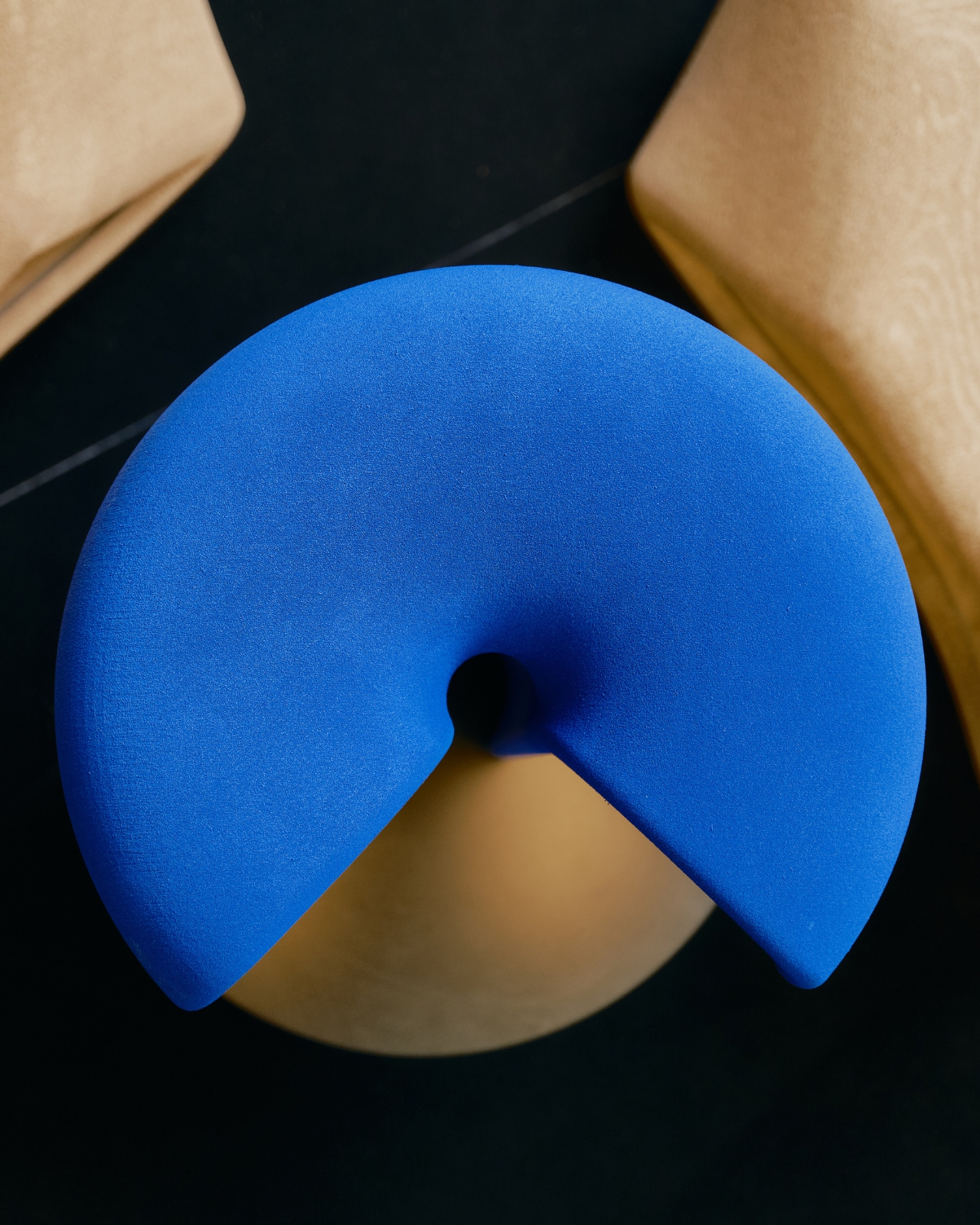
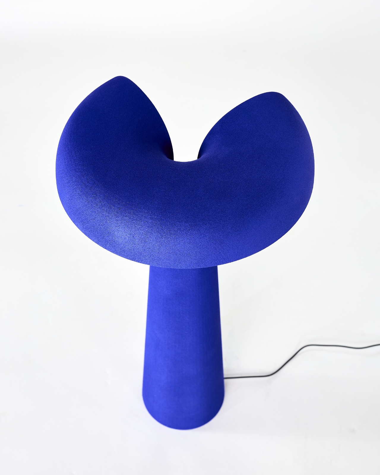
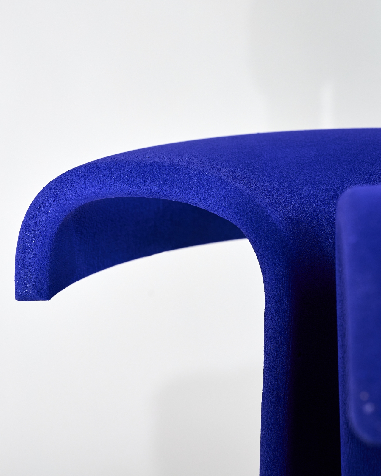
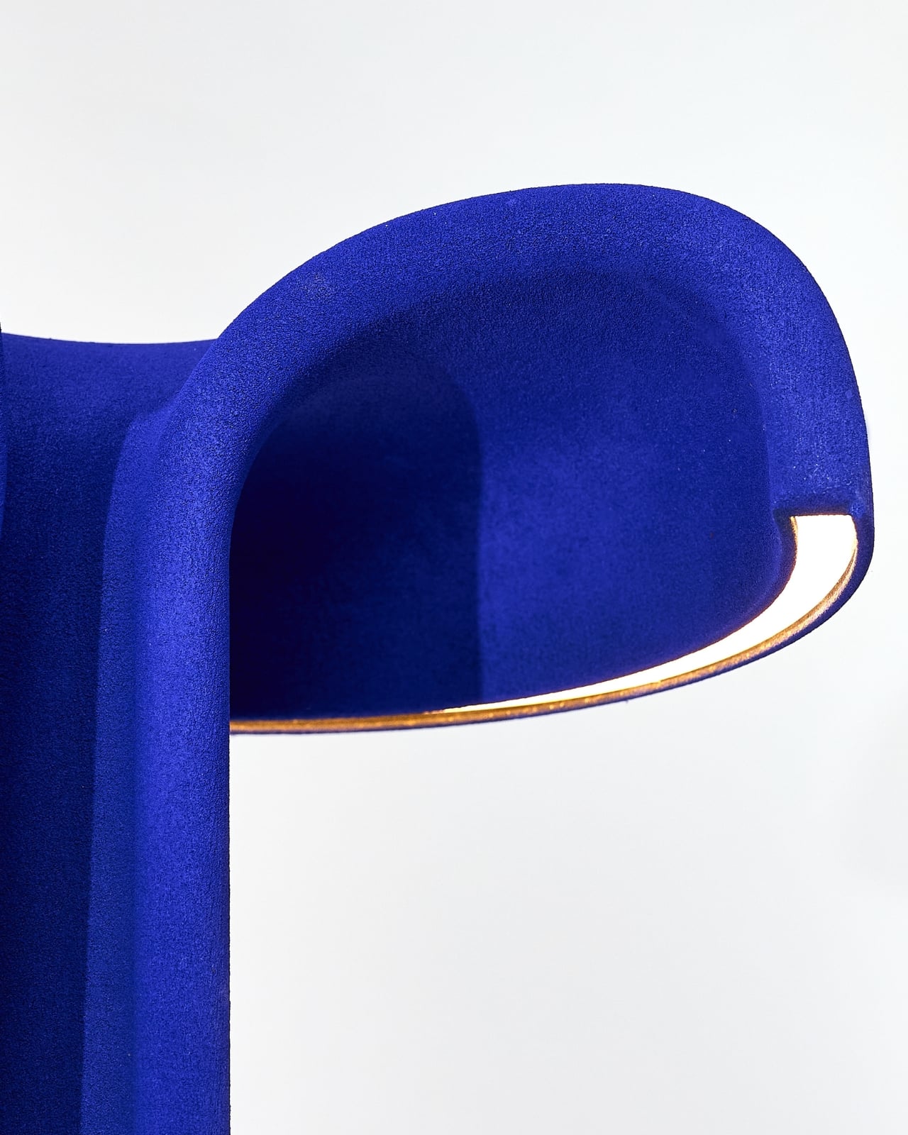
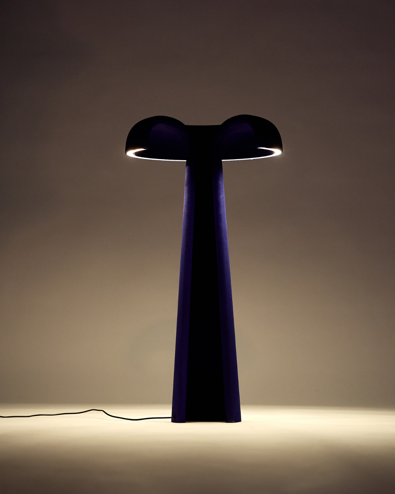
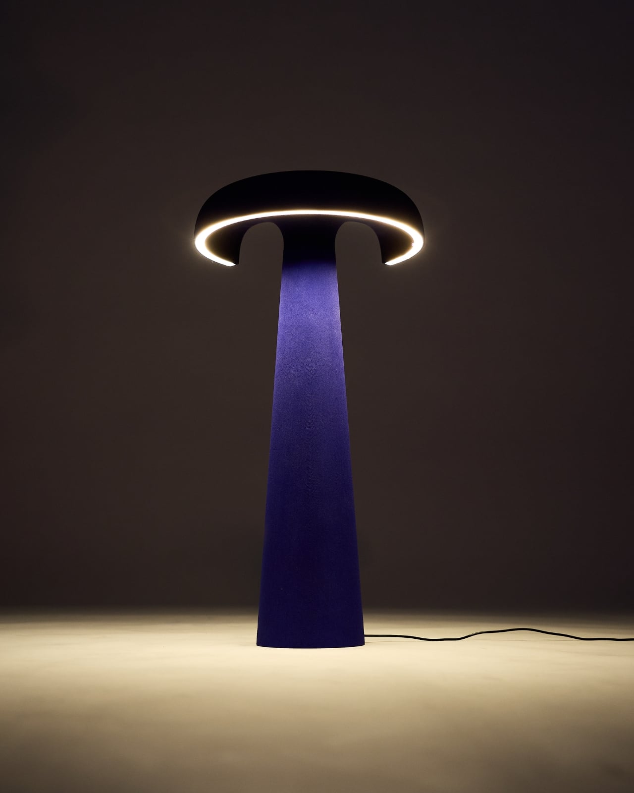
His Loop Lamp doesn’t hide the light source inside the shade. It moves the light entirely to the outside, leaving the shade hollow, open, and unapologetically empty. The shade stops being a vessel and becomes a volume. A form. An object in its own right. And when you see it in person, the effect is genuinely disorienting in the best possible way.
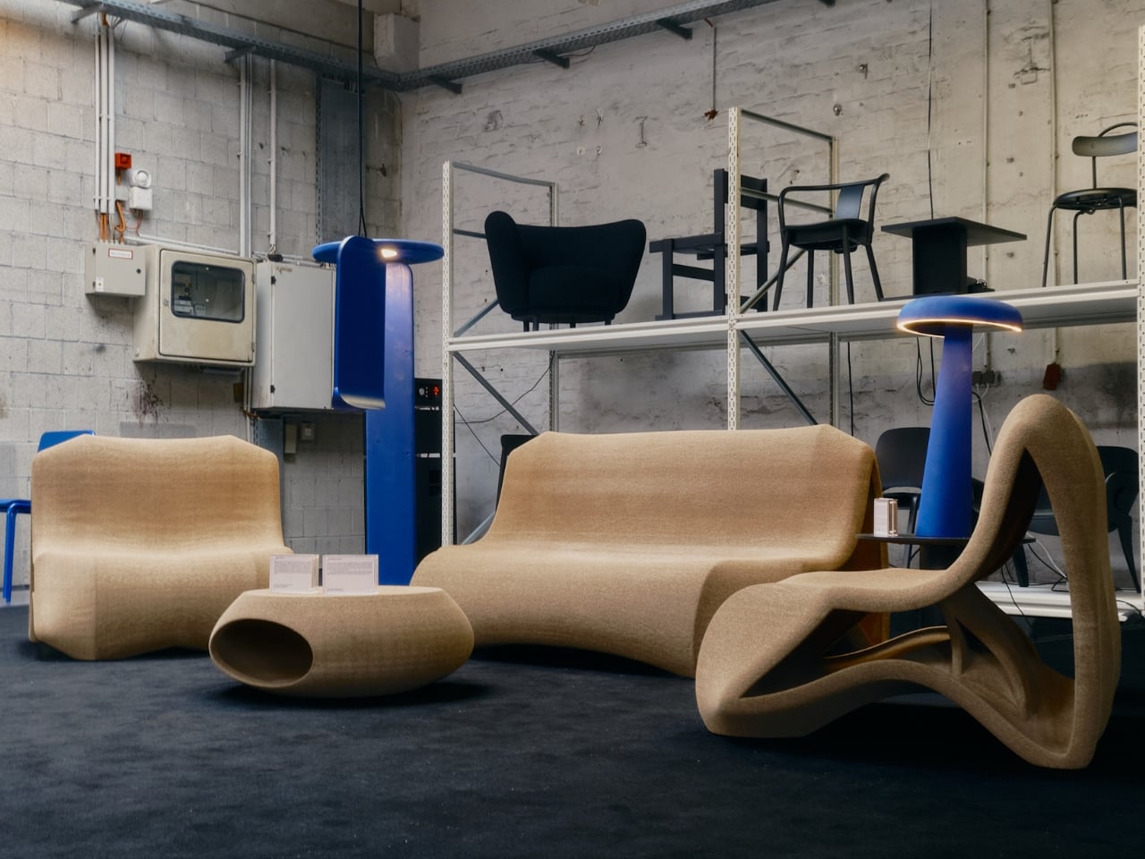
Designer: Raphael Klug (photography by Lisha Imani Hülser)
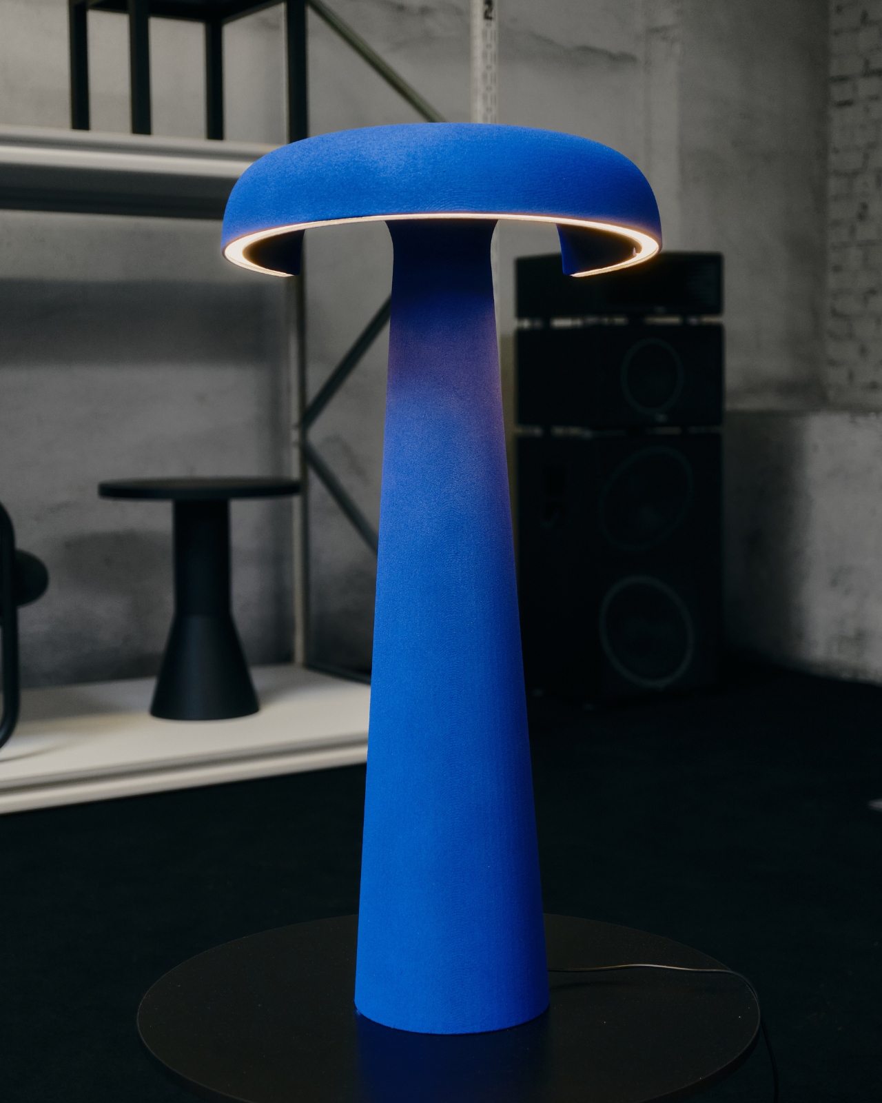
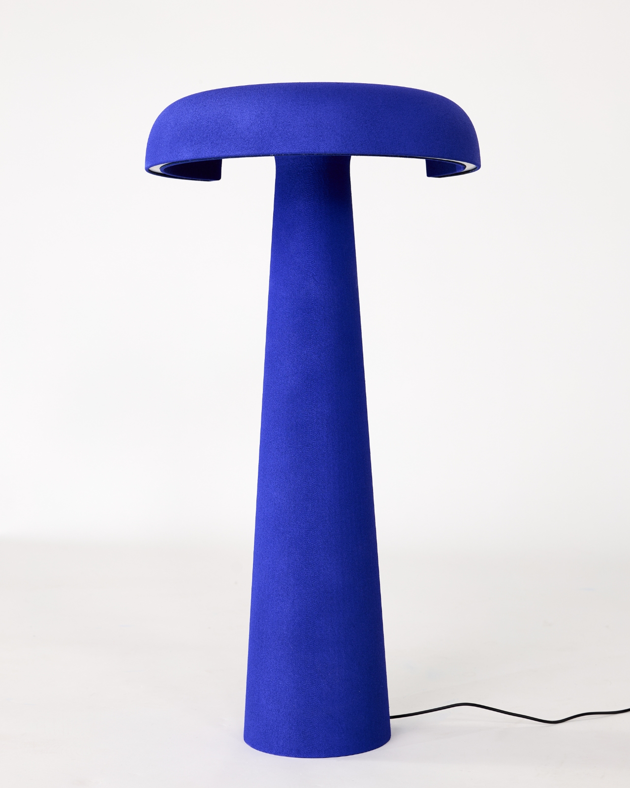
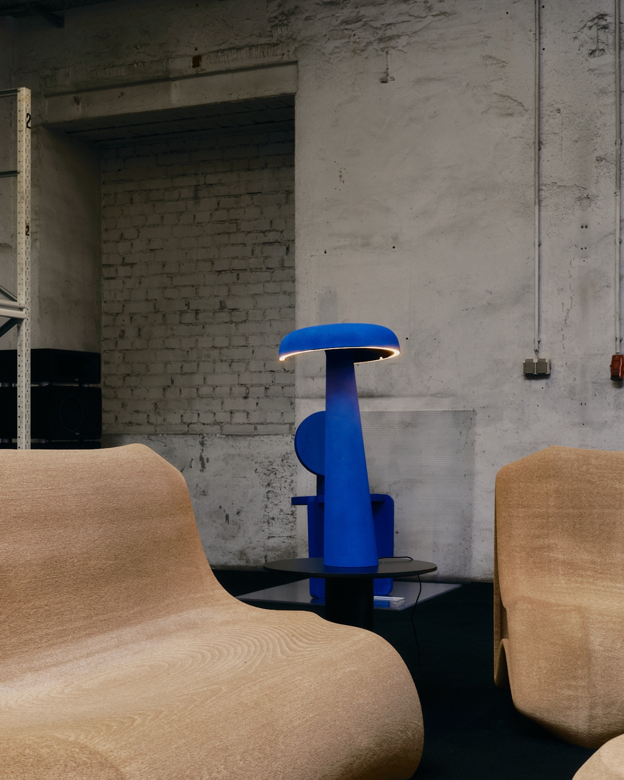
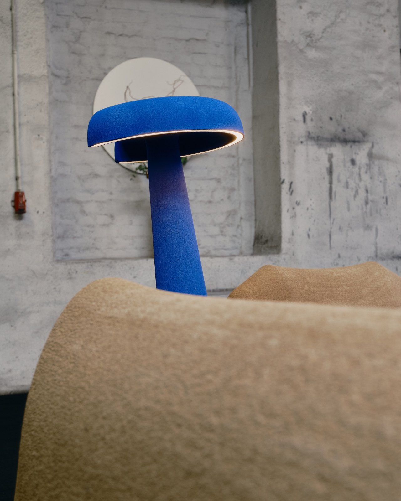
From the front, the Loop Lamp reads almost like a figure. The tapered column rises from the base, and the wide disc-like top floats above it with a thin ring of warm light glowing along the inner rim. The shade and the body connect in a way that feels less industrial and more sculptural, somewhere between a ceramic vessel and a modernist monument. You’d be forgiven for walking past it at an exhibition and thinking it was art before realizing it’s a lamp.
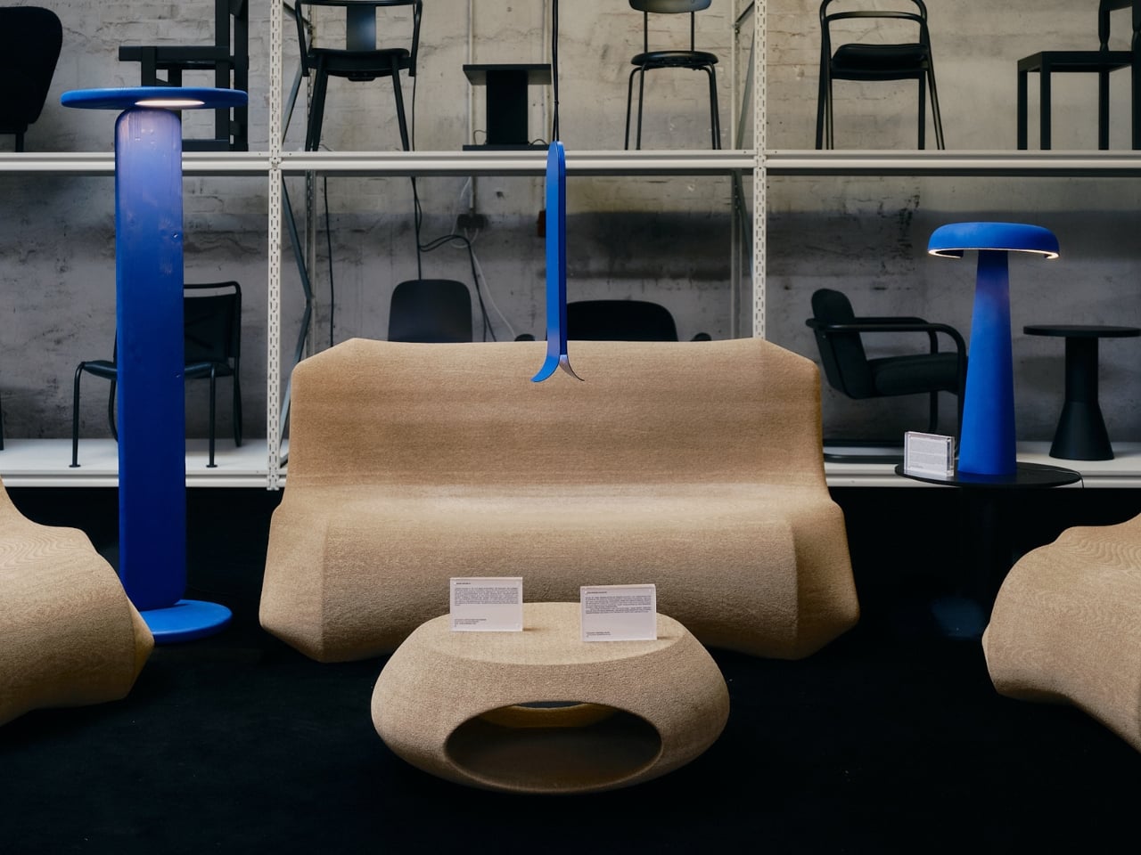
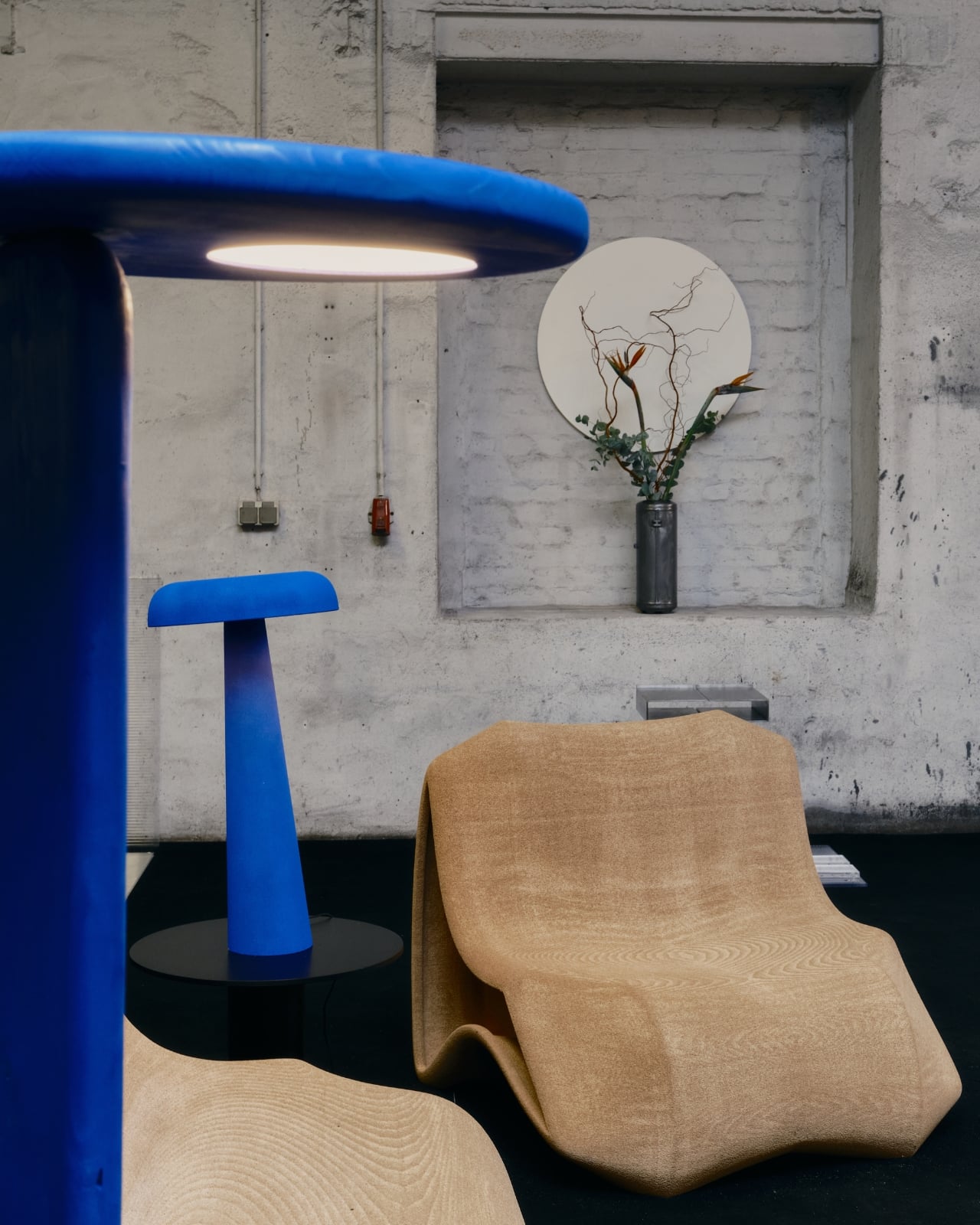
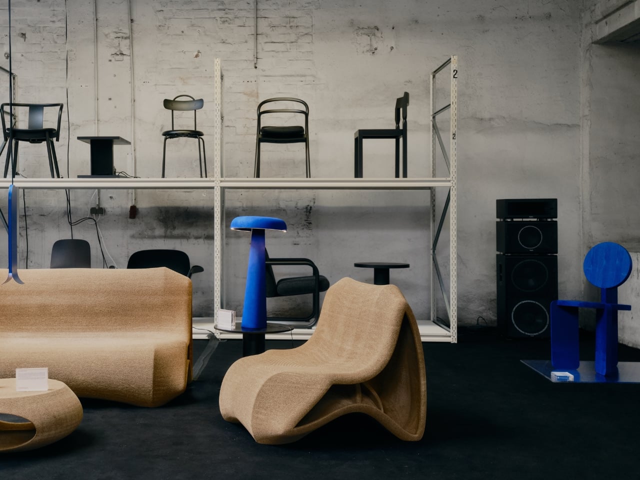
Seeing it installed alongside other furniture makes its presence even more apparent. The electric blue colorway, that deep, almost Klein-blue intensity, does a lot of the heavy lifting aesthetically. It photographs beautifully, which probably explains why it’s been circulating on design feeds. But there’s more going on here than a striking color palette.
What Klug has done is reframe the conceptual role of a familiar object. The shade, usually ignored, becomes the focal point. The light source, usually the star, steps offstage. It’s an inversion that sounds simple when you explain it but takes real design conviction to pull off without the result feeling like a gimmick. The Loop Lamp doesn’t feel like a gimmick. It feels considered, precise, and strangely inevitable once you understand the idea.
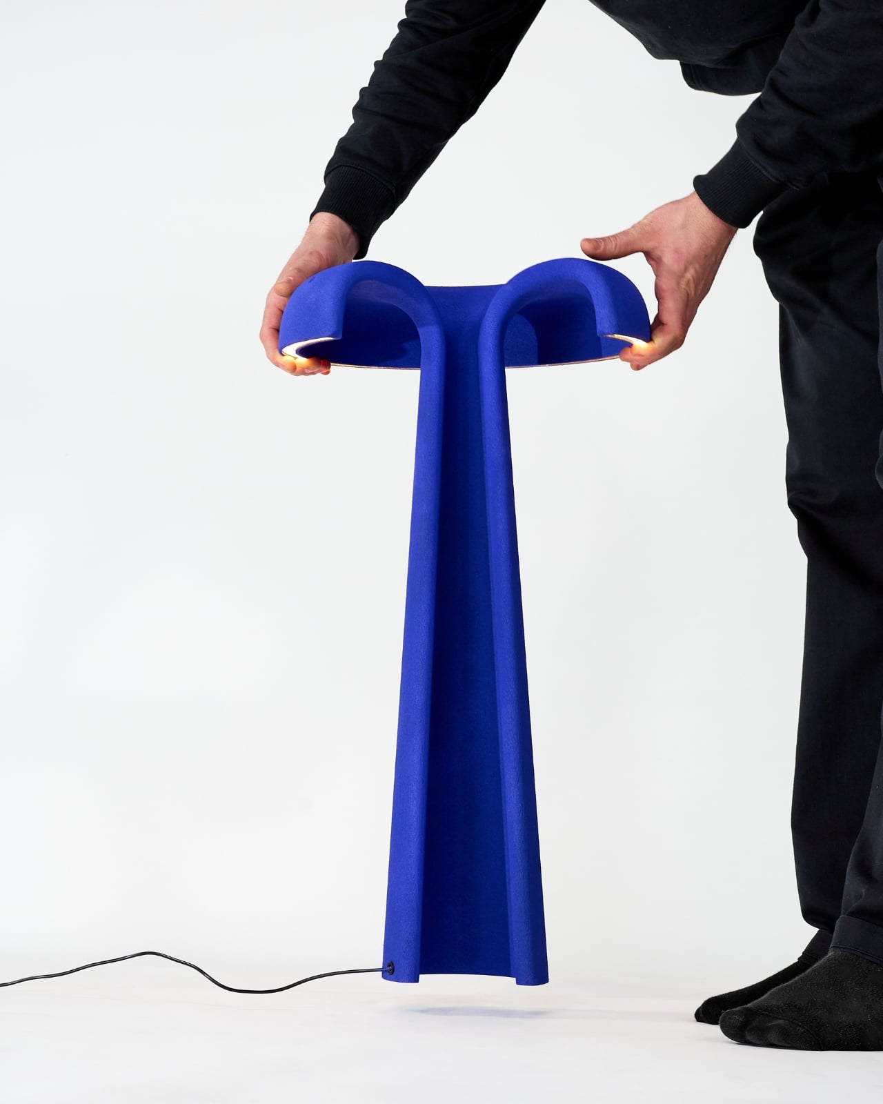
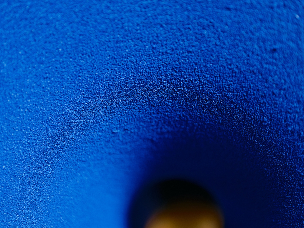
The material story adds another layer. The object was additively manufactured from quartz sand, produced in collaboration with Sandhelden, a company that specializes in 3D printing with natural sand-based materials. This isn’t just a process footnote because it shapes the object’s texture in a way that conventional molding couldn’t replicate. The surface has a slight granularity, almost matte and tactile, which contrasts beautifully with the ring of light. Under certain angles it absorbs shadow rather than reflecting it, giving the lamp a density that heavier materials don’t always achieve.
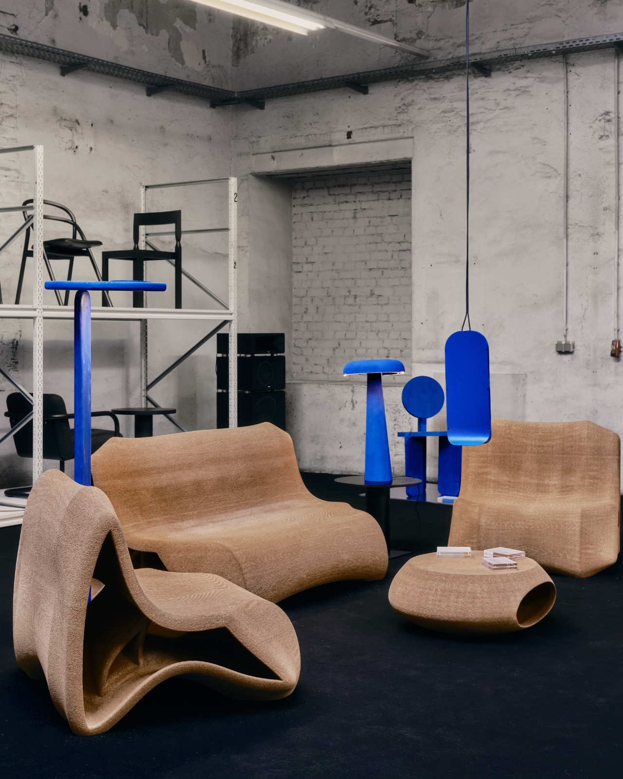

3D printing with sand also means that scale and material can shift in ways that traditional manufacturing makes difficult. Klug has already noted that the concept opens possibilities for other scales and materials, and I find that genuinely exciting to think about. A table version. A pendant version. A version in translucent composite that catches light entirely differently. The floor lamp is the proof of concept, and it’s a convincing one.
Design conversations lately tend to swing between two poles: objects that are purely functional and stripped of personality, and objects so decorative they forget to work. The Loop Lamp sits comfortably outside both camps. It functions exactly as a floor lamp should, casting a warm, ambient ring of light at the right height for a living space. But it also asks a genuine question about form, expectation, and what an object is allowed to be beyond its primary purpose.
That question is what makes it worth paying attention to. Designers interrogating the rules of familiar objects isn’t new, but doing it with this level of restraint and material intelligence is less common. Klug didn’t add more to the lampshade. He took away its responsibility and, in doing so, gave it an identity. That’s a harder thing to do than it looks. And the Loop Lamp makes it look effortless.
The post The Lamp That Turned a 100-Year-Old Rule Upside Down first appeared on Yanko Design.