These Keycap-Inspired Rectangular Headphones Make Nothing’s Design Look Boring

We knew Nothing was launching headphones this year, most of us imagined glyphs on them, but Nothing pulled a fast one by choosing a different design direction to stand out amongst a sea of headphones. Instead of the conventional circular or capsule-shaped cups, they unveiled rectangular headphones that took the world by surprise. A lot of us (me included) had reservations on the design, but if anything, the rectangular format was unique enough to really make an impact. The problem? I didn’t associate that design language with Nothing as a brand.

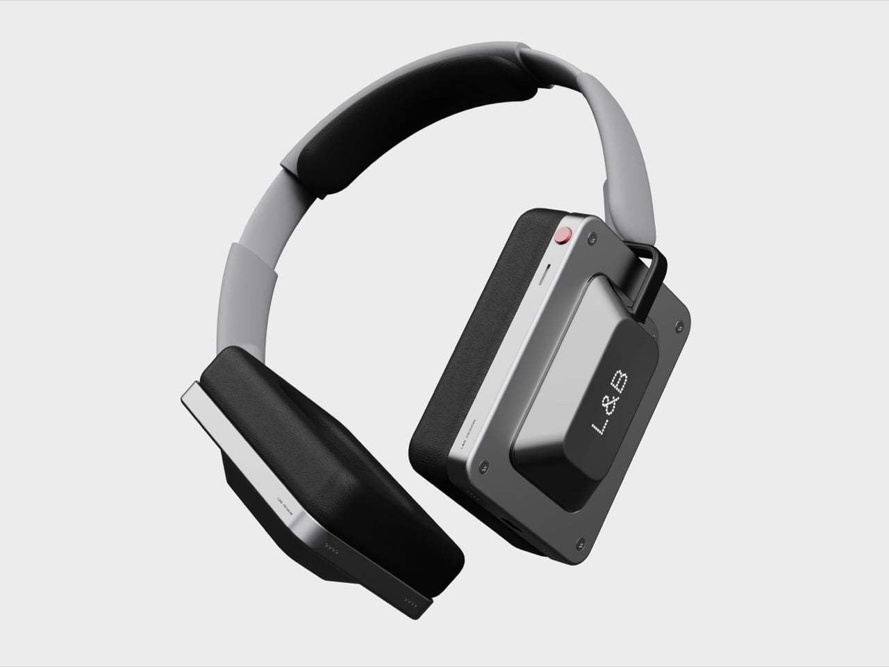
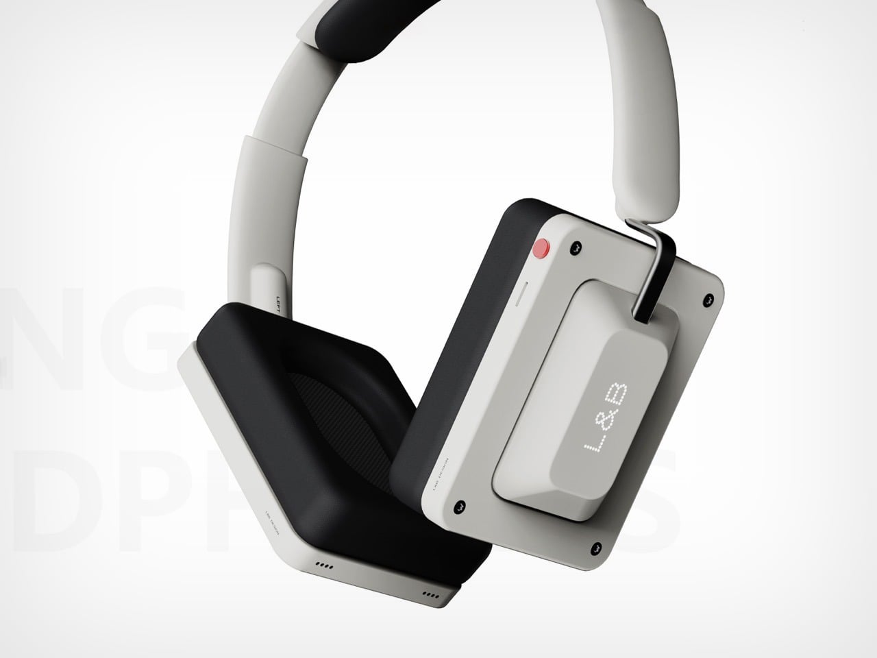
Now, if we’re designing headphones that are just meant to be different, these keycap-inspired headphones really take the cake. Designer Tougou Daciqeng calls it “Cross-border integration of tactile design and auditory technology”, which is just fancy designspeak for ‘we drew a parallel between two senses – touch, and sound’. The result is a pair of headphones that welcome your ears, but also your eyes and hands. That keycap-inspired can on the outside just begs your fingers to touch touch it, sometimes even attempt pressing it.

Designer: Tougou Daciqeng

The result is a fun design language that I don’t attribute to Nothing, but I definitely do to a brand like Teenage Engineering. Fun, funky designs, vibrant and subdued color options, and a silhouette that feels unmistakable. Teenage Engineering doesn’t lean into hyper-ergonomics, everything they make has this industrial, engineering-driven touch, resulting in very soft curves that often punctuate otherwise straight lines and geometric forms.

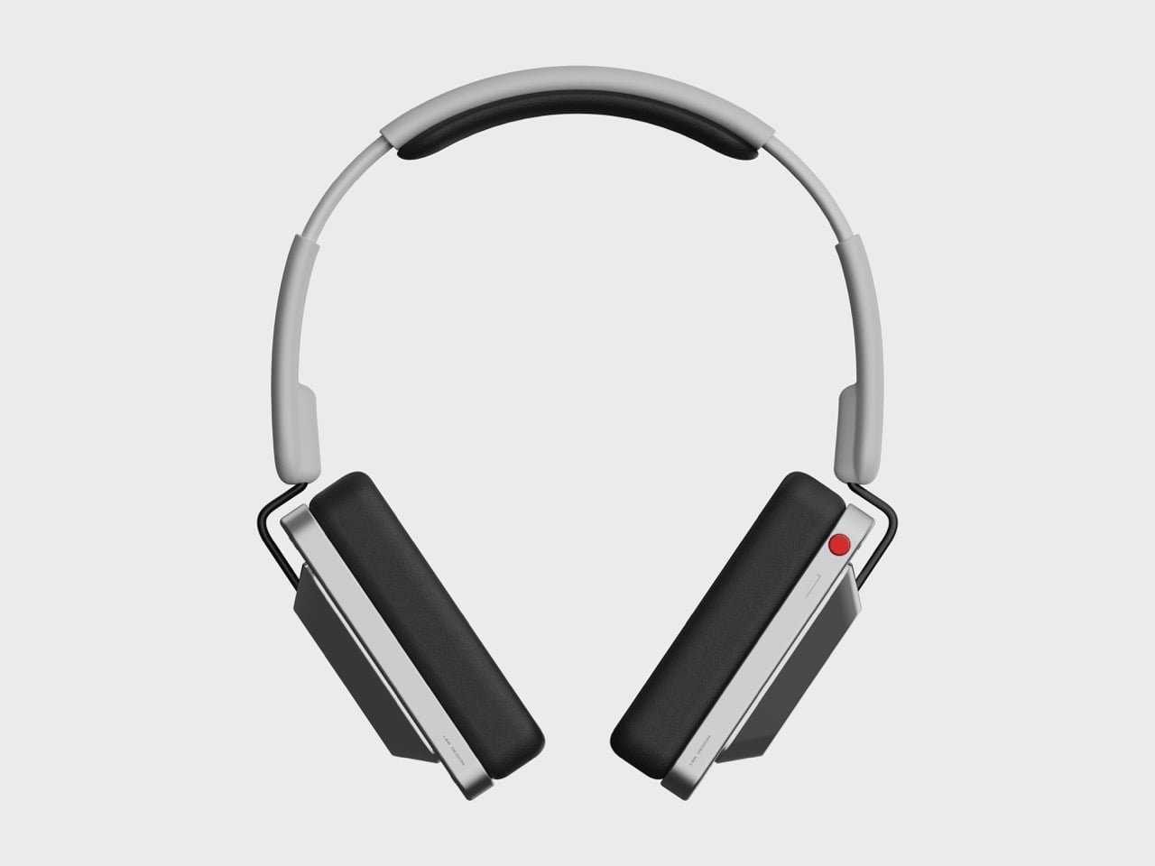
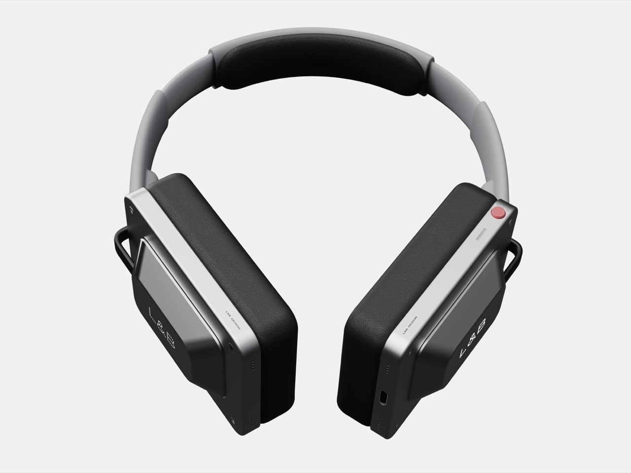
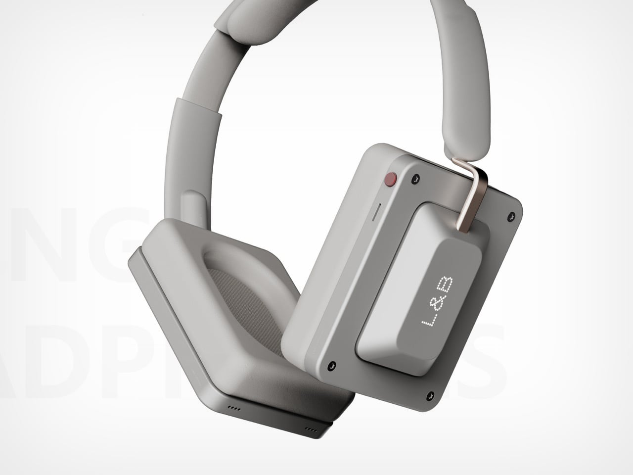
The beauty of such a pair of headphones lies in not its sound, but its appearance. Sure, sound is arguably the most important feature of a headphone, but what we’re looking at here is purely conceptual, so we’ve only got visuals to go by. To that end, the Keycap Headphones are a visual masterclass. They come with rectangular earcups, but the cutout is still elliptical, allowing them to fit around your ear snugly.

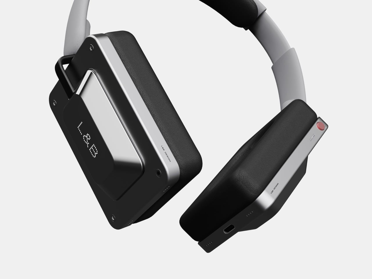
Everything else revolves around that key-shaped surface on the sides. Styled like a Cherry key (although a little different and a lot larger), this surface lets you control the playback through taps, swipes, etc. I’d have preferred a nice clicky key, but we work with what we’ve got. There’s one button on the top of the right earcup for powering on and off the earphones. Everything else can be done through the faux keys on the sides.

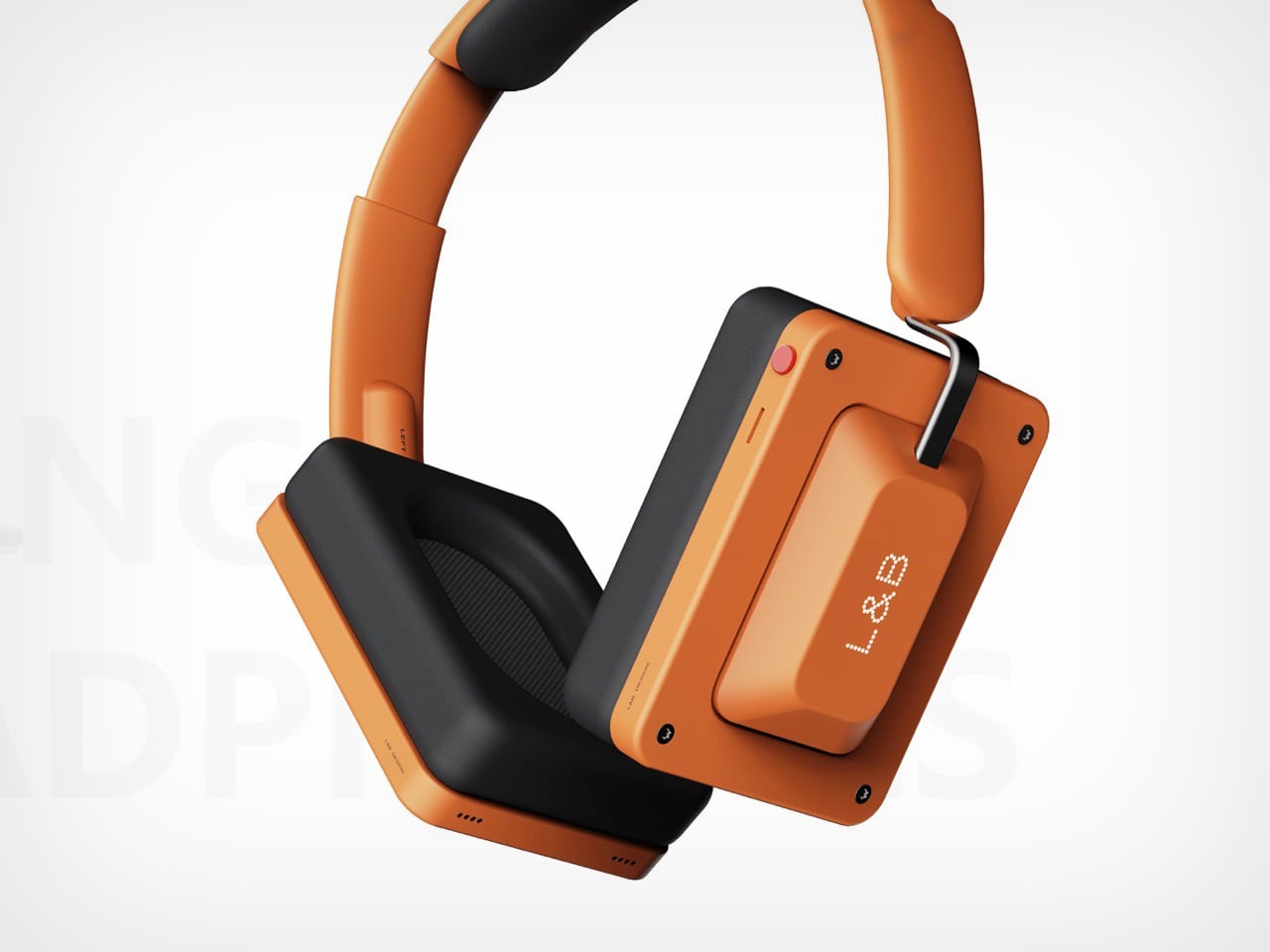
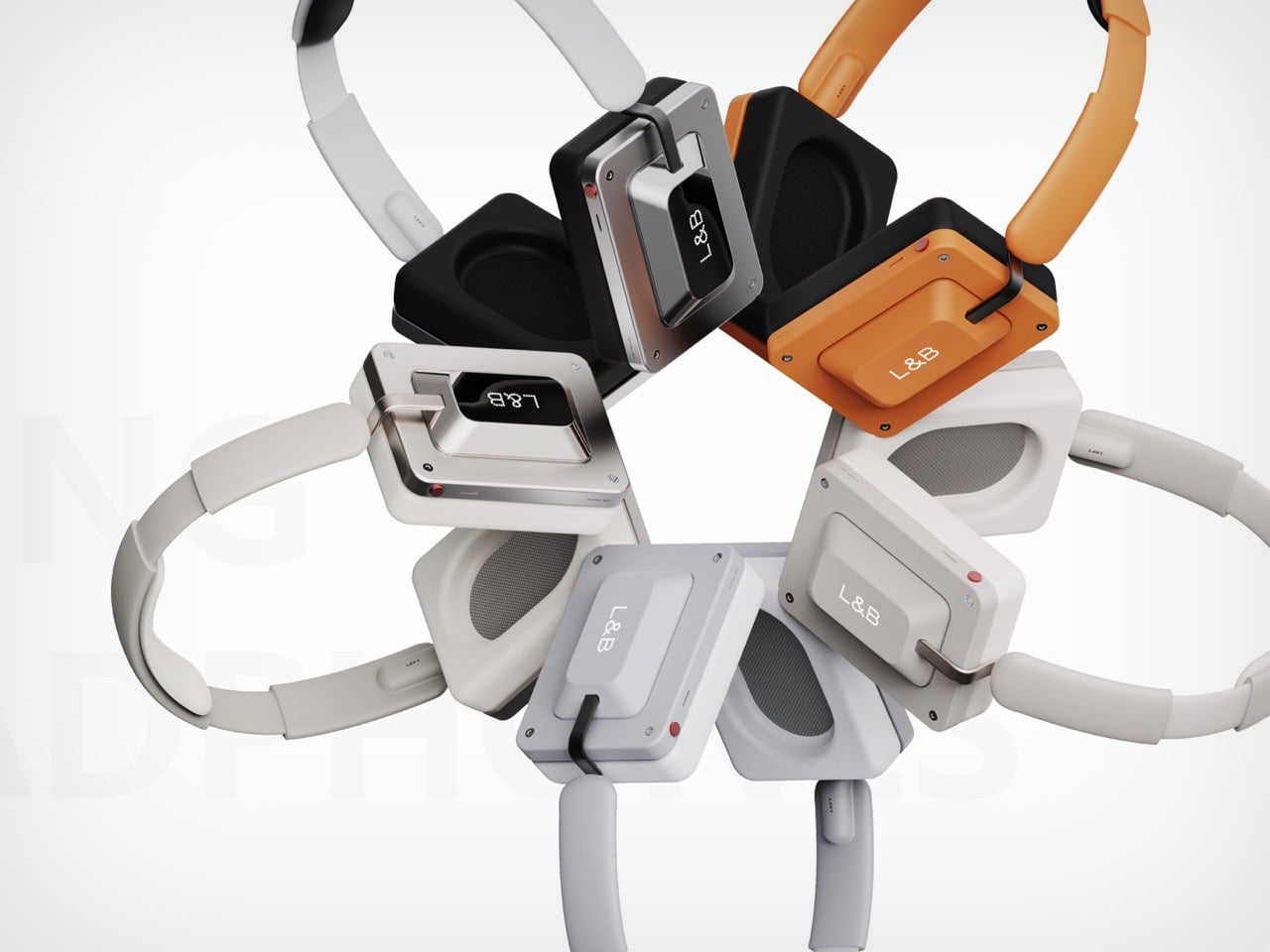
The designer definitely gets that a clicky key would be better than a touch surface, which is why they’ve built haptics into the earphones. Press the surface and a click plays through your ear, giving you a satisfactory sensory experience that affirms a key press. The rest of the headphones are fairly uncomplicated. A telescopic headband, a fairly repairable design thanks to exposed countersunk screws on the cans (for that industrial aesthetic), and USB-C charging on the bottom. The headphones come in 5 color variants too, including two metallic finishes, a retro off-white and a classic grey, and finally a fairly CMF-ish orange that’s definitely going to grab a few eyeballs.

The post These Keycap-Inspired Rectangular Headphones Make Nothing’s Design Look Boring first appeared on Yanko Design.

Nearly one-third of teens use AI chatbots daily

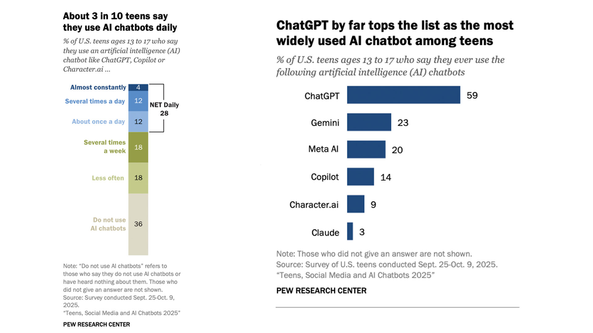
AI chatbots haven't come close to replacing teens' social media habits, but they are playing a significant role in their online habits. Nearly one-third of US teens report using AI chatbots daily or more, according to a new report from Pew Research. 

The report is the first from Pew to specifically examine how often teens are using AI overall, and was published alongside its latest research on teens' social media use. It's based on an online survey of 1,458 US teens who were polled between September 25 to October 9, 2025. According to Pew, the survey was "weighted to be representative of U.S. teens ages 13 to 17 who live with their parents by age, gender, race and ethnicity, household income, and other categories."

According to Pew, 48 percent of teens use AI chatbots "several times a week" or more often, with 12 percent reporting their use at "several times a day" and 4 percent saying they use the tools "almost constantly." That's far fewer than the 21 percent of teens who report almost constant use of TikTok and the 17 percent who say the same about YouTube. But those numbers are still significant considering how much newer these services are compared with mainstream social media apps. 

The report also offers some insight into which AI companies' chatbots are most used among teens. OpenAI's ChatGPT came out ahead by far, with 59 percent of teens saying they had used the service, followed by Google's Gemini at 23 percent and Meta AI at 20 percent. Just 14 percent of teens said they had ever used Microsoft Copilot, and 9 percent and 3 percent reported using Character AI and Anthropic's Claude, respectively.

The survey is Pew's first to study Ai chatbot use among teens broadly.
Pew Research

Pew's research comes as there's been growing scrutiny over AI companies' handling of younger users. Both OpenAI and Character AI are currently facing wrongful deaths lawsuits from the parents of teens who died by suicide. In both cases, the parents allege that their child's interactions with a chatbot played a role in their death. (Character AI briefly banned teens from its service before introducing a more limited format for younger users.) Other companies, including Alphabet and Meta, are being probed by the FTC over their safety policies for younger users.

Interestingly, the report also indicates there has been little change in US teens' social media use.  Pew, which has regularly polled teens about how they use social media, notes that teens' daily use of these platforms "remains relatively stable" compared with recent years. YouTube is still the most widely-used platform, reaching 92 percent of teens, followed by TikTok at 69 percent, Instagram at 63 percent and Snapchat at 55 percent. Of the major apps the report surveyed, WhatsApp is the only service to see significant change in recent years, with 24 percent of teens now reporting they use the messaging app, compared with 17 percent in 2022.


This article originally appeared on Engadget at https://www.engadget.com/ai/nearly-one-third-of-teens-use-ai-chatbots-daily-200000888.html?src=rss

The Webb telescope spots a supernova from 13 billion years ago

The James Webb Space Telescope and other international observatories have spotted a 13-billion-year-old supernova. On Tuesday, the European Space Agency (ESA) announced the sighting of a gamma-ray burst from a star that exploded when the Universe was only 730 million years old. The Webb telescope even detected the supernova's host galaxy.

Before this observation, the oldest recorded supernova was from when the Universe was 1.8 billion years old. That's a difference of more than a billion years.

You can see the gamma-ray burst in the image below. It's the tiny red smudge at the center of the zoomed-in box on the right.

Webb image shows hundreds of galaxies of all shapes and sizes against the black background of space. Toward the center-left is a large white spiral galaxy that is almost face-on. To the right of this is a large box, which zooms in on an area at top right. Within the box is a faint red dot at the center, with the label GRB 250314A.
The tiny red splotch in the center of the crop box is the oldest thing you've seen.
NASA, ESA, CSA, STScI, A. Levan (IMAPP)

"This observation also demonstrates that we can use Webb to find individual stars when the Universe was only 5 percent of its current age," co-author Andrew Levan wrote in the ESA's press release. "There are only a handful of gamma-ray bursts in the last 50 years that have been detected in the first billion years of the Universe. This particular event is very rare and very exciting."

Researchers learned that the 13-billion-year-old explosion shared many traits with modern, nearby supernovae. While that may not sound shocking, scientists expected a more profound difference. That's because early stars likely had fewer heavy elements, were more massive and didn't live as long. "We went in with open minds," co-author Nial Tanvir said. "And lo and behold, Webb showed that this supernova looks exactly like modern supernovae."

Detection was an international relay race. First, NASA's Neil Gehrels Swift Observatory noted the X-ray source's location. (That helped Webb to make subsequent observations that determined its distance). Then, the Nordic Optical Telescope on the Canary Islands in Spain made observations indicating that the gamma ray might be very distant. Hours later, the European Southern Observatory's Very Large Telescope in Chile estimated its age: 730 million years after the Big Bang. All of this happened in under 17 hours, according to the ESA.

The team behind the observation has been approved to spend more time with Webb studying gamma-ray bursts from the early Universe — and the galaxies behind them. "That glow will help Webb see more and give us a 'fingerprint' of the galaxy," Levan predicted.

This article originally appeared on Engadget at https://www.engadget.com/science/space/the-webb-telescope-spots-a-supernova-from-13-billion-years-ago-194327489.html?src=rss

Samsung Wallet to gain support for digital Porsche keys

Owners of the Porsche Macan and upcoming Porsche Cayenne Electric will be able to unlock and start their cars with their Galaxy phones, Samsung has announced. The cars, alongside other Porsche models, are gaining support for Samsung Wallet's Digital Key feature, which lets users wirelessly control their car over a secure UWB or NFC connection.

Digital Key support will be available in Europe in December, before rolling out globally, "aligned with the launch timeline of Porsche vehicles," Samsung says. Samsung Wallet is available on Samsung devices as old as the Galaxy S20, Note 20, Galaxy Z Fold 2 and Galaxy Flip 5G, and is included on the majority of the company's new phones. Like similar features on Google's Pixels and Apple's iPhones, Digital Key allows Porsche owners with a supported Galaxy phone to unlock, lock and start their car directly from their phone. If your phone is ever taken, you can also remotely lock or delete a Digital Key to keep your car safe.

Samsung added Digital Key support to select Volvo and Polestar EVs in February 2025. The feature first became available in 2021, and is one of several ways the phone maker imagines people will use Samsung Wallet. Beyond digital car keys, the app can also store credit and debit cards and be used to transfer money with a tap.

This article originally appeared on Engadget at https://www.engadget.com/mobile/smartphones/samsung-wallet-to-gain-support-for-digital-porsche-keys-193000085.html?src=rss

PlayStation’s 2025 Wrap-Up is here, so you can see how many hours you’ve sunk into Death Stranding 2

Sony's 2025 PlayStation Wrap-Up is now available. The recap, which is similar to those from music streaming services, sums up gaming habits from throughout the year. It shows players how many hours they used their PS4 or PS5, what games they played the most, preferred genres, trophy counts and more.

These digital cards are shareable on social media, which is kind of the whole point. Nothing says "bragging rights" more than offering definitive proof of how long you spent on a couch grinding in Clair Obscur: Expedition 33 or wandering the wasteland in Death Stranding 2.

An example.
Sony

This year, the recap provides insight into how much players interacted with accessories like the PlayStation Portal and PS VR2. It also details the "most used DualSense wireless controller design."

The 2025 Wrap-Up will be available until January 8. Once completed, players also get a "unique glass-themed avatar." It's only available for adults.

The PlayStation Wrap-Up has been around since 2017, though it ran into some issues with accessibility in 2024. Spotify introduced the basic idea with Wrapped back in 2015. Since then, the concept of a shareable year-end streaming list has spread like a virus. Just about everyone does it now, from Apple Music to Nintendo and even YouTube. We love to reflect on things we recently experienced, don't we folks?

This article originally appeared on Engadget at https://www.engadget.com/gaming/playstation/playstations-2025-wrap-up-is-here-so-you-can-see-how-many-hours-youve-sunk-into-death-stranding-2-191508693.html?src=rss

The Pebble Index 01 Strips the Smart Ring Down to a Single Gesture of Capture

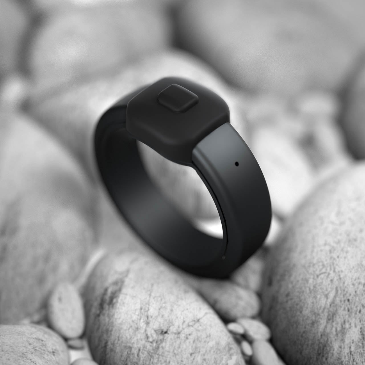
A ring that does nothing but listen. In a category defined by biometric excess, the Pebble Index 01 arrives with radical minimalism: one button, one microphone, no display, no haptic motor, no health sensors whatsoever. Eric Migicovsky, the designer who created the original Pebble smartwatch before selling it to Fitbit, has returned with a device that treats subtraction as its primary design gesture. The result is a stainless steel band that costs $75 and exists for exactly one purpose: catching thoughts before they vanish.

The Form Language of Refusal

Where contemporary smart rings pile sensors beneath the surface, the Index 01 presents a deliberately quiet silhouette. The body arrives in stainless steel with three finish options: a matte black that absorbs light, a polished silver that catches it, and a polished gold that warms skin tones. Sizing spans from 6 to 13, covering the full range of adult finger dimensions. Submersion tolerance extends to one meter of depth, accommodating daily encounters with water but drawing the line at sustained swimming. A single tactile control rises slightly from the band surface, positioned where the thumb naturally falls during a closed fist. The metal arrives cool against skin, then gradually matches body temperature until the ring becomes thermally invisible.

This external button represents the entire interaction vocabulary. Press and hold to record. Single press for a customizable action. Double press for another. The tactile click either happens or it does not. Migicovsky designed this mechanical simplicity to eliminate the software failure states that plague capacitive touch surfaces. A button pressed is a button registered. The interaction model carries the directness of a light switch, with none of the ambiguity that haunts gesture-based interfaces where a swipe might be a scroll or a tap might be a hold.

Material Decisions and Lifecycle Architecture

The battery architecture reveals the sharpest design trade-off. The power source borrows from audiological medicine: silver oxide chemistry, the same electrochemical foundation that enables hearing aids to operate for extended periods without user intervention. Under typical usage patterns, this chemistry sustains the Index for roughly twenty-four months. The cells accept no recharge. When electrochemical capacity exhausts, the object transitions from functional tool to recyclable material, and the replacement cycle begins at the standard retail threshold.

Migicovsky frames this as liberation from charging infrastructure. No dock to pack for travel. No percentage to monitor across the day. No dead device at the moment of need. The battery simply works until it does not. Pebble accepts spent units for recycling, though the environmental calculus of disposable electronics remains uncomfortable regardless of end-of-life handling. The choice prioritizes reliability over sustainability, a trade-off that will resonate with users who have missed critical moments because a rechargeable device died at the wrong time.
Onboard storage accumulates voice data during periods of wireless disconnection. The device operates autonomously at the moment of capture, holding content until the paired phone returns to communication range. This independence from continuous connectivity means the critical instant of thought preservation never depends on signal strength. Total storage capacity approaches fourteen hours of compressed audio before the power source reaches depletion.

The component inventory reads like an exercise in restraint: a single mechanical switch, a voice-optimized transducer capable of cutting through ambient noise, and nothing else. The absence of a vibration motor removes one failure point. The absence of a screen removes another. The absence of haptic feedback removes a third. Migicovsky constructed this architecture around a singular reliability thesis: fewer components mean fewer opportunities for malfunction.

Privacy Embedded in Architecture

The conversion pipeline executes entirely within the paired phone’s processor. Voice becomes text through a speech recognition system distributed under open licensing. A secondary language model, also running locally, sorts each capture into categorical bins: reminder, timer, or unstructured thought. The data path terminates at the device boundary. No packet crosses to external infrastructure. No server receives the content. The application code itself lives in public repositories, enabling inspection of every function that touches the user’s recorded cognition.

This transparency represents a structural commitment rather than a policy promise. The architecture makes privacy violation technically difficult rather than merely prohibited. Over 100 languages receive support for transcription, and the app retains both raw audio and text transcription as a practical backup for moments when ambient noise garbles the speech-to-text conversion.

The Cognitive Friction of Remembering

Three months of prototype wear revealed Migicovsky’s personal rhythm: between ten and twenty capture events per day, most compressed into windows of three to six seconds. Micro-utterances preserved before cognitive decay erases them. The friction point he identifies sits between idea formation and idea preservation: the gap between thinking something and writing it down often exceeds the retention window of working memory. The ring attempts to close that gap by reducing the capture gesture to a thumb press.

No phone to extract from a pocket. No app to open. No interface to navigate. The ring lives on the finger, perpetually ready, requiring only mechanical activation. Recording duration extends to five minutes for longer thoughts, though Migicovsky’s own usage suggests most captures are momentary. This design philosophy treats the human mind as the bottleneck rather than the technology. The device does not attempt to augment cognition. It simply catches output before it disappears into the noise of the next distraction.

The absence of a display removes the temptation to glance. No notifications pull attention away from the present moment. The ring offers no visual feedback during recording, only the physical sensation of the button depression and the knowledge that somewhere inside, a microphone is capturing sound. This sensory reduction forces trust in the device rather than verification of it.

Market Position Through Aggressive Restraint

The market already contains an alternative philosophy. Sandbar’s Stream Ring arrives at a quarter-thousand-dollar entry point, layers a subscription model at ten dollars per month for full functionality, and frames itself as a conversational AI presence worn on the hand. Delivery timelines stretch into the following summer. The Index inverts every variable: seventy-five dollars during the preorder window, ninety-nine after the March 2026 ship date, zero recurring fees, complete feature access from activation.

The value proposition rests entirely on whether memory capture alone justifies a ring on the hand. For users who want biometric tracking, the Index offers nothing. For users who want AI interaction, the device provides only a side door accessed through a specific gesture, and Migicovsky admits this feature will not work consistently. The honesty is refreshing in a category saturated with overpromise.

The organization behind the Index operates with five employees and no external capital. Migicovsky constructed this structure deliberately after the original Pebble trajectory concluded with a Fitbit acquisition that generated minimal founder returns. The Index embodies an opposing growth philosophy: constrained scale, margin sustainability from the first unit sold, price points accessible without the pressure of venture expectations demanding hyperbolic expansion curves.

Designing for Disappearance

The Index 01 succeeds or fails based on its ability to vanish from conscious attention. A health-tracking ring demands engagement: it provides data that requires interpretation. The Index asks only to be worn and pressed. The interaction surface shrinks to a single gesture repeated throughout the day.

Whether this reduction represents design clarity or feature poverty depends entirely on the user’s relationship with their own thoughts. Some people remember what matters. Others watch ideas dissolve before they can act on them. For the second group, the Index offers external memory that requires no charging ritual, no subscription fee, and no data uploaded to distant servers. The stainless steel band catches light. The button waits under the thumb. Somewhere inside, a microphone stands ready. The design statement is the emptiness itself: a ring that does almost nothing, executing that nothing with perfect reliability.

The post The Pebble Index 01 Strips the Smart Ring Down to a Single Gesture of Capture first appeared on Yanko Design.
192 Sliding Blocks Let Anyone Sculpt This Pavilion Into New Shapes

Most architecture, even the wildest parametric forms, is fixed the day it opens and stays that way until it is renovated or demolished. Michael Jantzen points out that exciting spaces are often “fixed in time” while people’s needs and desires keep shifting. The Malleable Space Pavilion is a small, clear argument for buildings that can change as easily as furniture, where space becomes something you can push, pull, and rewrite whenever you want.

The Malleable Space Pavilion is an experimental interactive structure made from a very simple kit of parts. Two tall gray support columns anchor the design, and 192 white horizontal elements, 96 per side, are mounted on tracks between them. In the default state, they form two opposing blocks with a narrow canyon between them, a calm, almost minimalist object sitting in a field that reads more like land art than a building you can enter.

Designer: Michael Jantzen

Every white element can slide in and out independently, letting visitors pull pieces to create steps, ledges, and overhangs. Jantzen describes configurations ranging from symmetrical simplicity to chaotic complexity, and the same hardware can read as a tunnel, a grotto, or a solid bar depending on how far the elements are extended. Space is literally carved out of the blocks in real time, turning a static object into a responsive spatial machine.

One moment, you walk into a symmetrical canyon with terraced walls and a rectangular skylight, the next you find yourself in a jagged, pixelated chamber where light leaks through irregular gaps. The elements double as benches and low roofs, so you can pull out a seat or shade with the same gesture. The pavilion becomes a place to sit, play, and experiment rather than just pass through, with every configuration suggesting new ways to occupy the same footprint.

Pushing and pulling the elements is performative; visitors become visible agents of change. The stepped profiles feel like editing a low-resolution 3D model, but at a human scale and with your hands instead of a mouse. The pavilion records those actions as a temporary composition, so every group leaves behind a different spatial drawing until someone else comes along and rewrites it, turning the structure into a constantly evolving collaboration between architect and occupants.

Jantzen believes that a more advanced architecture is one that can be changed in time, and this pavilion sits within his series of transformable structures. Questions remain about full-scale mechanics, durability, and accessibility, but the value here is conceptual clarity. The project makes adaptability tangible and playful, turning a big conversation about flexible buildings into something you can push, pull, and sit on, rather than leaving it abstract and theoretical.

The Malleable Space Pavilion treats architecture less like a finished sculpture and more like an instrument waiting to be played. Instead of a single author deciding what the space should be, every visitor gets to compose their own version for a while. For a design culture used to talking about responsive environments in abstract terms, there is something refreshing about a pavilion that simply hands you the handles and lets you reshape it yourself, making change the default rather than the exception.

The post 192 Sliding Blocks Let Anyone Sculpt This Pavilion Into New Shapes first appeared on Yanko Design.
Skyrim arrives on the Switch 2

You can add the Switch 2 to the (long) list of platforms where you can play The Elder Scrolls V: Skyrim. The bad news: It costs $60 to play the 2011 game optimized for Nintendo's 2025 hardware. The good news: It costs less (or nothing) if you own one of the versions for the original Switch.

The (digital-only) Switch 2 port is the Anniversary Edition of Skyrim, released in 2021. That includes the base game and three expansions (Dawnguard, Dragonborn and Hearthfire). You'll also find hundreds of Creation Club items, like quests, weapons, armor, spells and dungeons. The Anniversary Edition's Zelda crossover content (Master Sword, Hylian Shield and Champion's Tunic) is also there. So, at least there's plenty of content.

The game also offers technical upgrades for the Switch 2 hardware. It has enhanced resolution, DLSS anti-aliasing, faster load times and general performance optimizations. There's also mouse support, motion controls and Amiibo support. The trailer below gives you an idea of what to expect.

In an interview with Nintendo Life, Bethesda Creative Director Matt Carofano said the Switch 2 port was "an easy development process and actually pretty quick" to make. He described the team's motivation for porting it as bringing back "one of our most beloved games to the Switch 2 and see how we can improve it and make it the best experience for that console."

Okay, cool, but I'm gonna go on a limb and say money was also a factor. That’s because, if you don't already own Skyrim for the OG Switch, you'll have to fork over a whopping $60 in the Nintendo Store for the 14-year-old game. Meanwhile, if you own the standard version of Skyrim for the original Switch, you’ll pay $20 to upgrade. Finally, if you have the Skyrim Anniversary Edition on the OG Switch, you can install the new version for free.

If you own the Switch 1 version, first install that on Switch 2 and start the game. When you see the eShop banner advertising the new version, press Y to access the store and upgrade. You can do that with both digital and physical versions of Skyrim for Switch 1.

This article originally appeared on Engadget at https://www.engadget.com/gaming/nintendo/skyrim-arrives-on-the-switch-2-175200223.html?src=rss

Microsoft Flight Sim 2024 now has a Stranger Things expansion

Microsoft Flight Simulator 2024 just got a fairly bizarre expansion inspired by the Netflix show Stranger Things. If you've ever wanted to fly over a fictional Indiana town in the 1980s, this is the update for you.

That's right. The game now lets folks fly over Hawkins, Indiana and check out more than 40 iconic locations from the series, including Starcourt Mall, the junkyard, the government lab and, of course, the upside down.

Inexplicably, this isn't just a joyride. There's an actual game here, with five helicopter-based missions that have players arranging supply drops, rescuing characters and chasing bad guys. Murray Bauman, portrayed by Brett Gelman, is on hand to assign missions and engage in banter.

This is a free update and it's available right now, so get out there and blast that one Kate Bush song over and over (and over.) As for Stranger Things, the second part of season five drops on December 25, followed by the series finale on January 1. Microsoft Flight Simulator 2024, which first came out last year, recently launched for PS5.

This article originally appeared on Engadget at https://www.engadget.com/gaming/microsoft-flight-sim-2024-now-has-a-stranger-things-expansion-173944325.html?src=rss

This Tiny Water Purifier Rethinks Design for Small Spaces

There’s something refreshing about design concepts that actually understand how we live. The SAI Lite water purifier from Superset Design is one of those rare concepts that doesn’t just look good in renderings but actually makes sense for real kitchens. Especially if that kitchen happens to be, like mine, not exactly spacious and can be cluttered at times.

The name SAI comes from the Korean word for “narrow space,” which tells you everything you need to know about the design philosophy here. This concept is the successor to the original SAI Pro, and the team took an already compact design and stripped it down even further to its absolute essentials.

Designer: Superset Design

Create your own Aesthetic Render: Download KeyShot Studio Right Now!

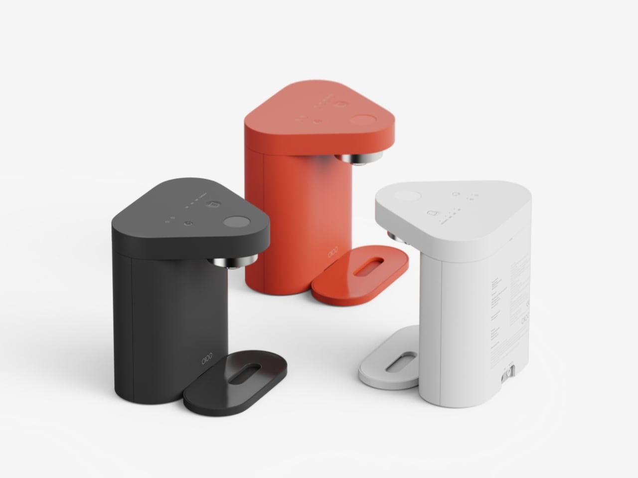
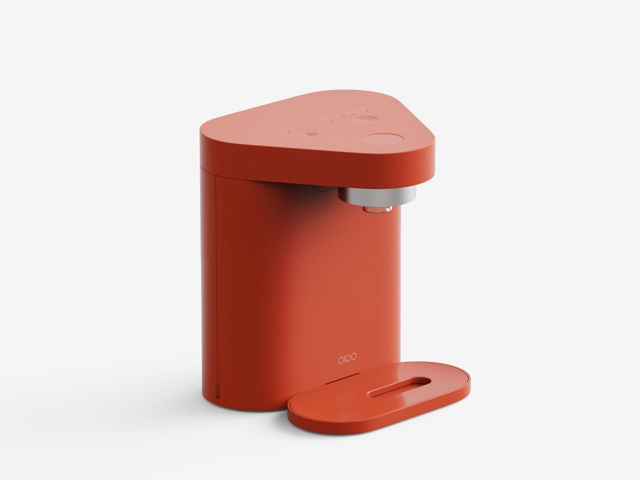
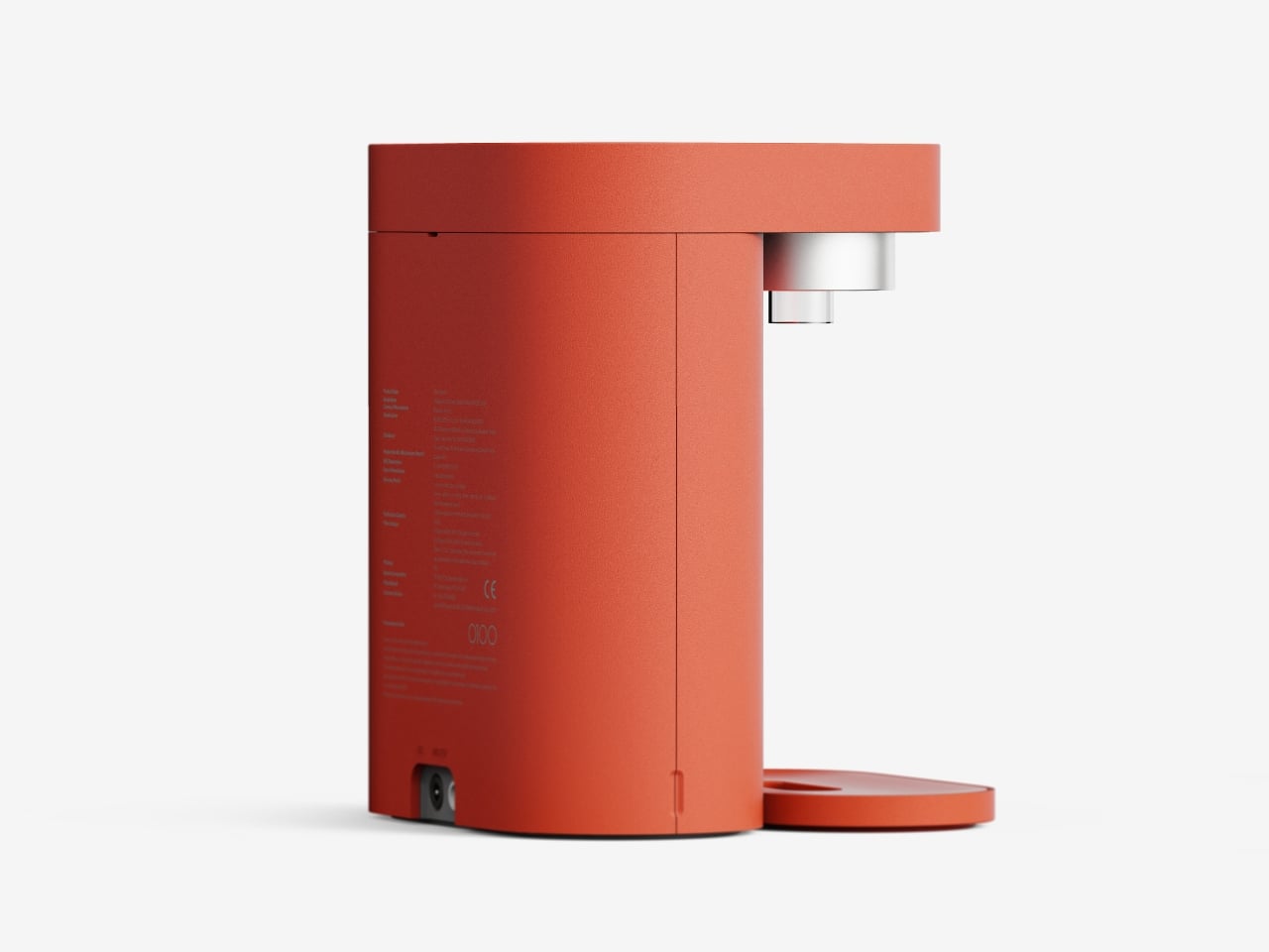
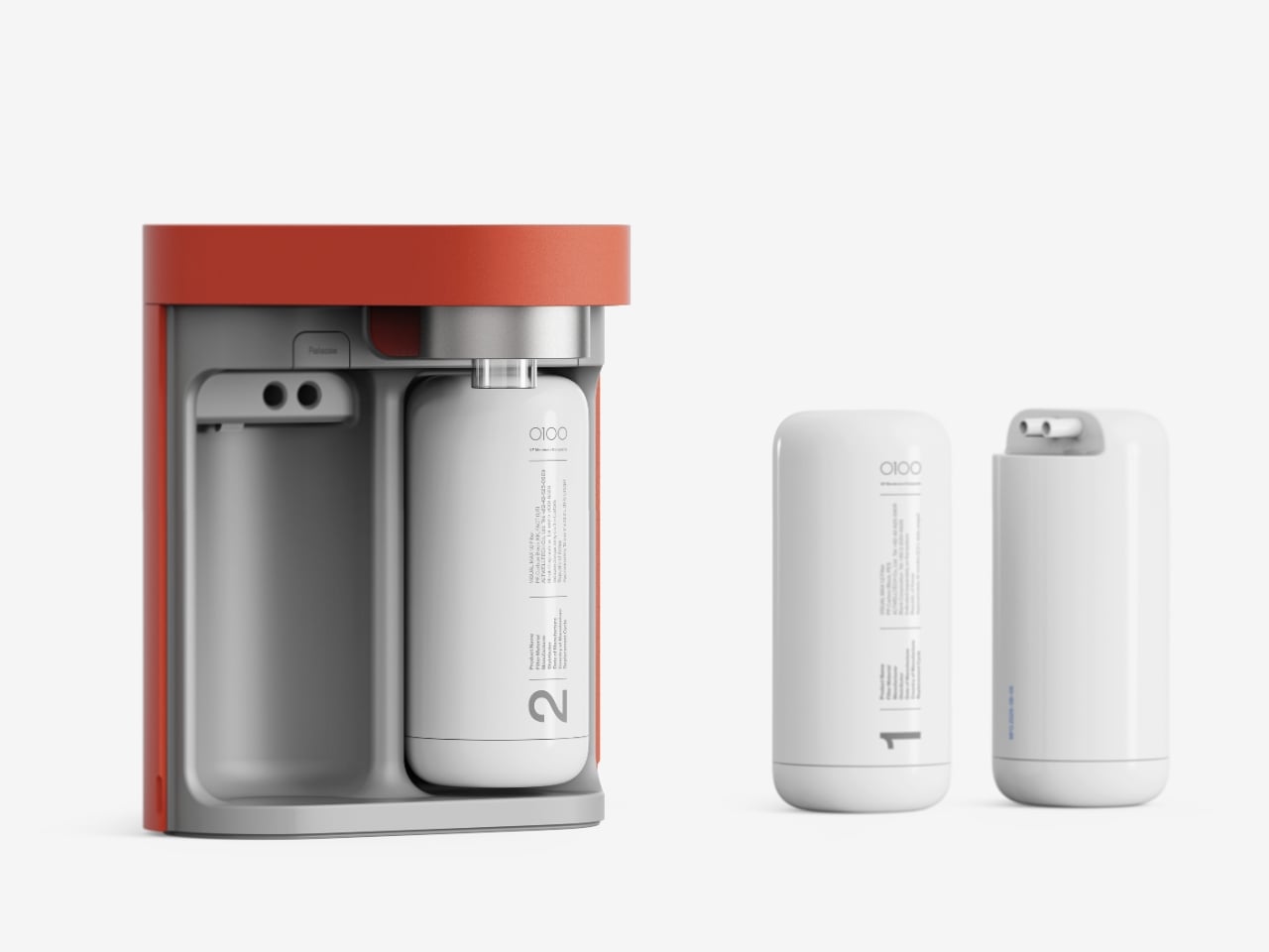
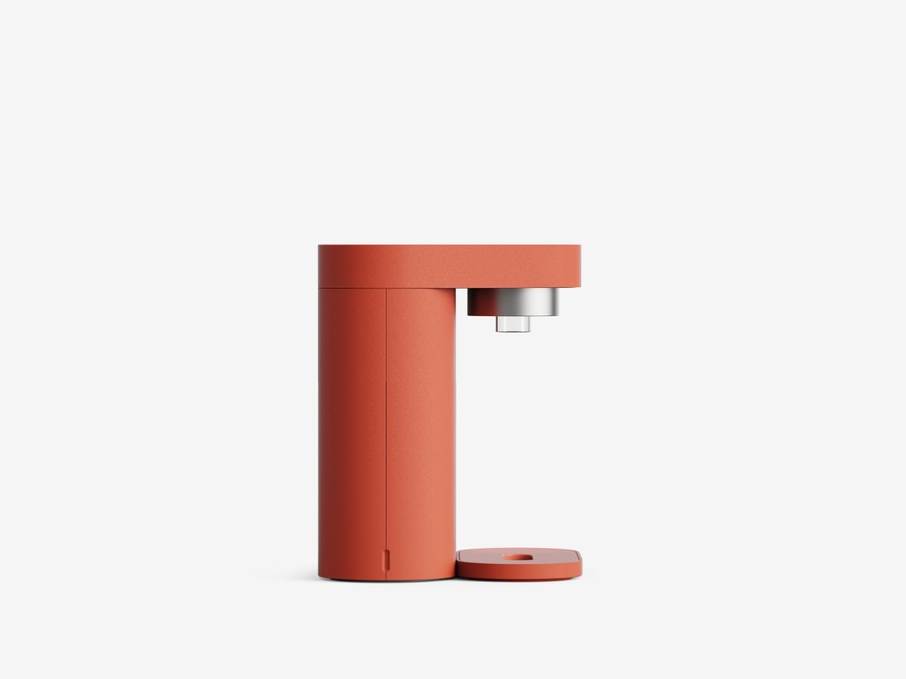
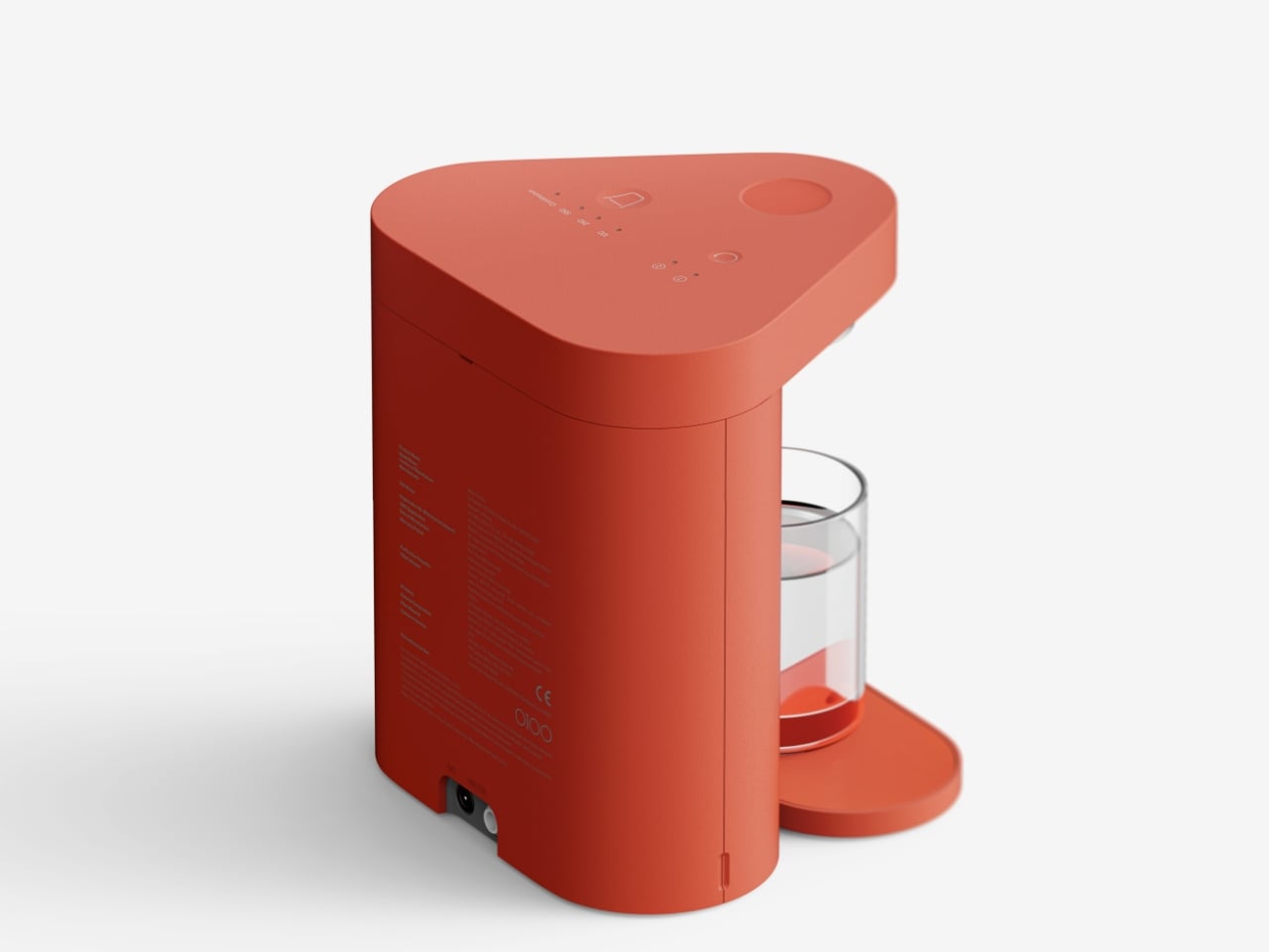
What caught my eye first is that distinctive rounded triangular shape. It’s not just designers being quirky for the sake of it. That form comes directly from the internal layout of two filters and a control module arranged in the most spatially efficient way possible. The footprint literally doesn’t get any bigger than the diameter of those two filters, which means you’re not sacrificing counter space for empty air.

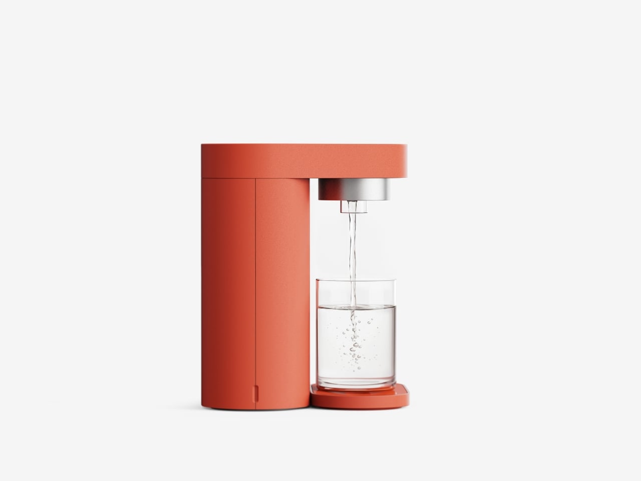
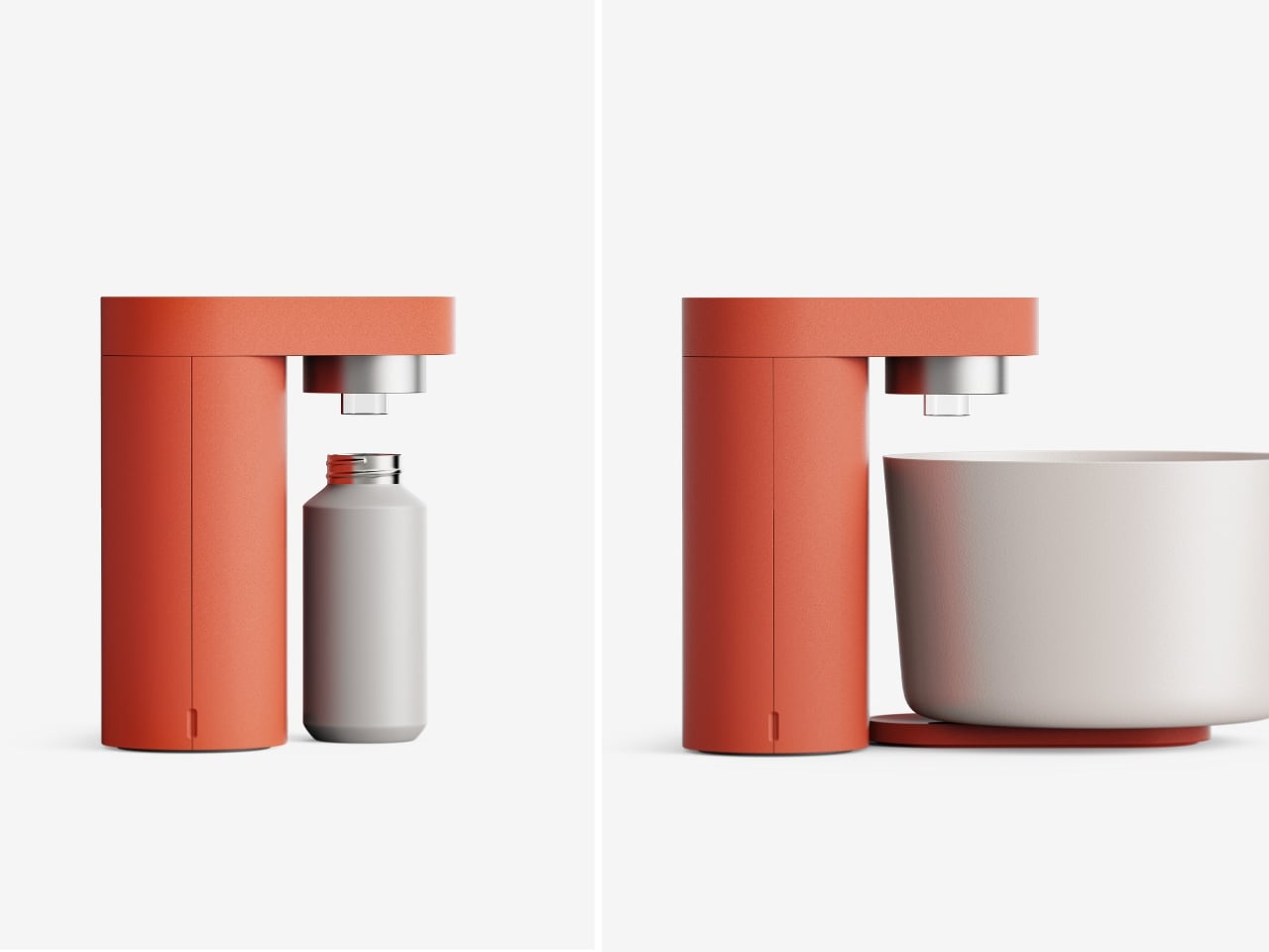
Here’s where the thinking gets really smart. Instead of designing a water purifier that can accommodate every possible container you might own, the team at Superset Design asked a better question: what do people actually use in small apartments and single-person households? Spoiler alert, it’s not giant stockpots and mixing bowls. It’s cups, tumblers, small pots, and maybe a water bottle. So that’s exactly what this concept was designed around.

This is the kind of practical thinking we need more of in product design. Too often, appliances are built for some idealized version of how we’re supposed to live rather than how we actually do. SAI Lite flips that script. The height is calibrated for the vessels you’ll realistically fill every day, creating proportions that feel balanced and purposeful rather than arbitrarily compact.
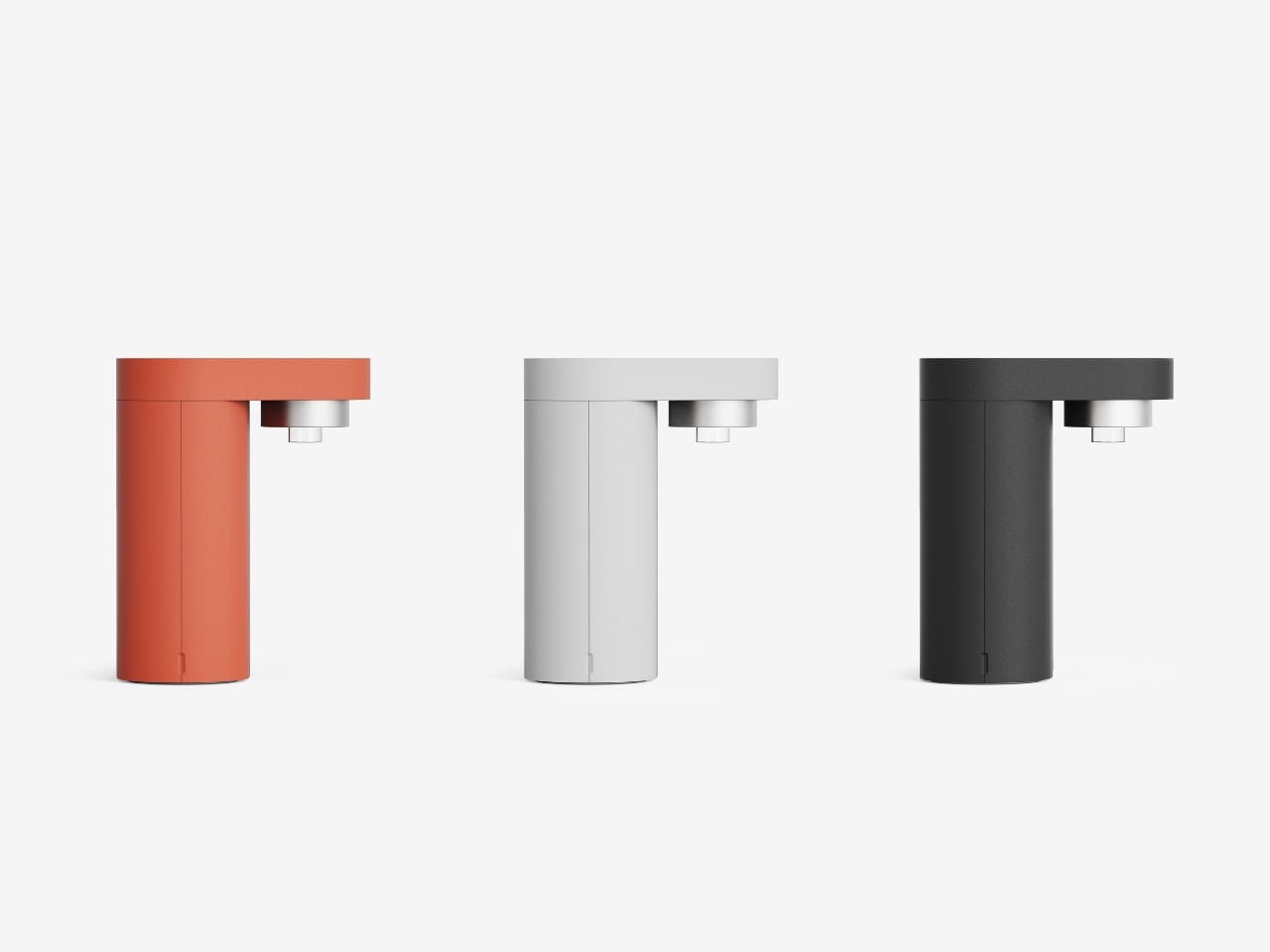
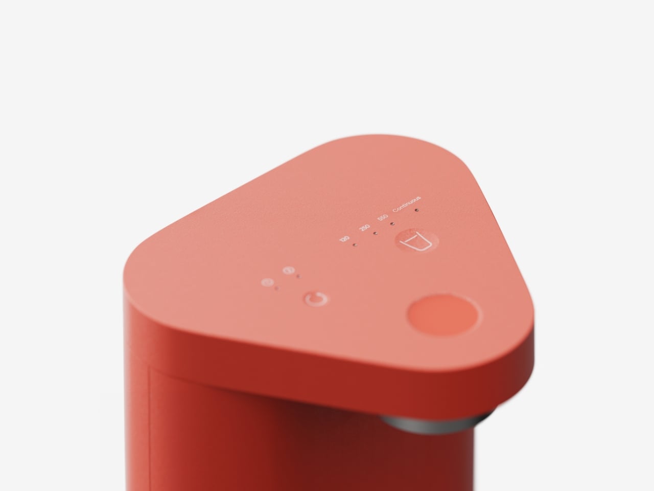
The interface concept deserves attention too. On the top surface, you’ll find three main controls: a filter replacement reset button, a water capacity control, and the dispensing button. But instead of cluttering the surface with every possible setting, the designers proposed something called Progressive Disclosure. Functions you only need during initial setup or rarely touch are tucked away behind a long press or an extra interaction layer. The result is a control surface that looks clean and feels immediately intuitive when you’re just trying to fill your morning coffee cup.

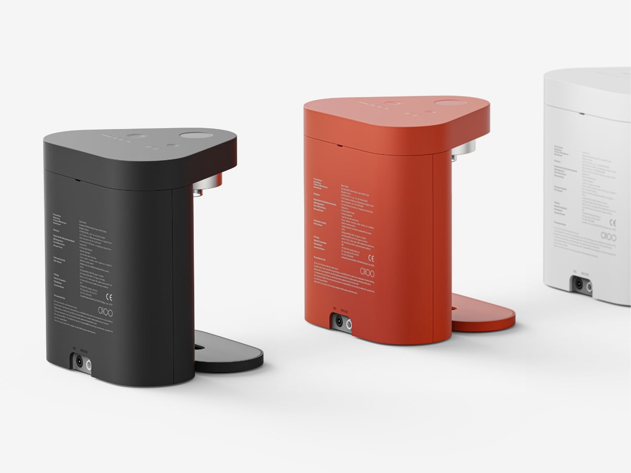
This approach to interface design is something we see in good software all the time but rarely in physical products. It respects the fact that most of the time, you want to do one simple thing: get water. Everything else can wait in the background until you actually need it. The aesthetic is minimalist without being cold. That terracotta orange finish gives it personality and warmth, and the smooth, rounded edges make it feel approachable rather than intimidating. It’s the kind of object that could sit comfortably next to your other kitchen essentials without screaming for attention, yet it’s distinctive enough that you’d probably want to keep it visible rather than hidden away.

Looking at the concept renderings, you can see how efficiently everything is packed. The two cylindrical filters sit side by side with the control module, all contained within that triangular envelope. There’s no wasted space, but it also doesn’t feel cramped or difficult to access when you need to change filters. What makes SAI Lite compelling as a design concept isn’t just that it’s small. Plenty of products are small. What makes it work is that every decision, from the shape to the height to the button layout, stems from a clear understanding of the actual problem it’s solving. This is design that respects your space, your daily habits, and your time.

There’s something genuinely appealing about seeing designers propose objects that know exactly what they are and do that one thing exceptionally well. SAI Lite isn’t trying to be everything to everyone. It’s conceived for modern living spaces where every inch counts and simplicity isn’t just aesthetic, it’s essential. Whether this concept makes it to production or not, it’s the kind of thoughtful design thinking that pushes the industry forward. It challenges manufacturers to reconsider who they’re actually designing for and what those people truly need in their daily lives.

The post This Tiny Water Purifier Rethinks Design for Small Spaces first appeared on Yanko Design.