These Old Bike Frames Upcycled Into Armchairs Are The Coolest Thing You’ll See Today

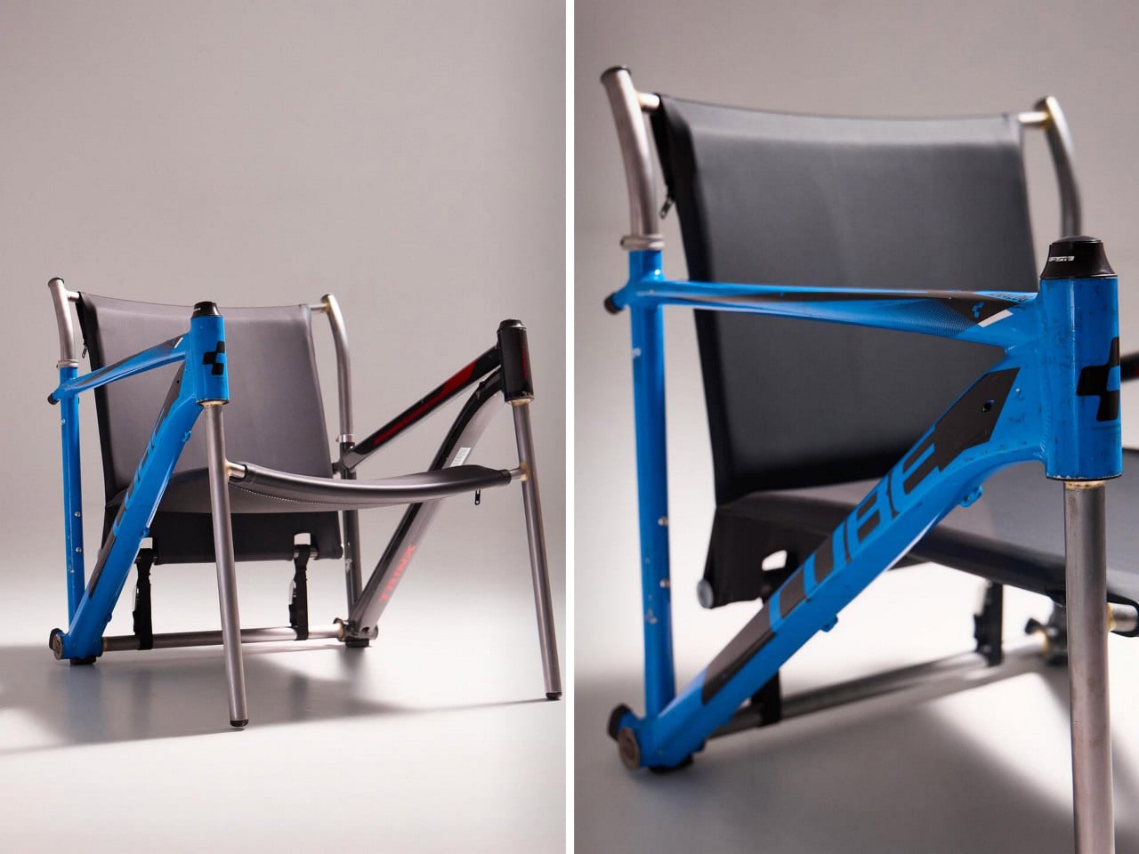
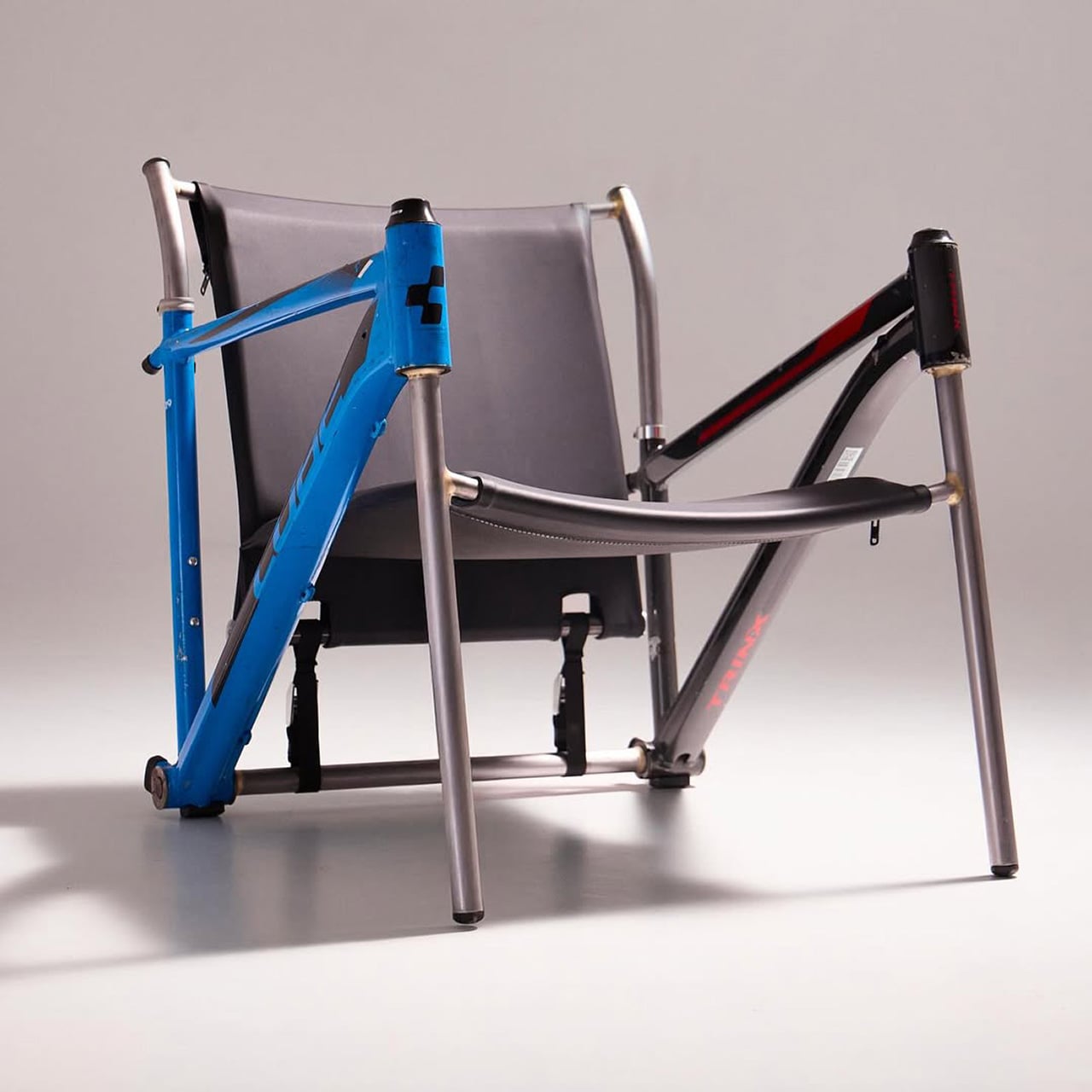
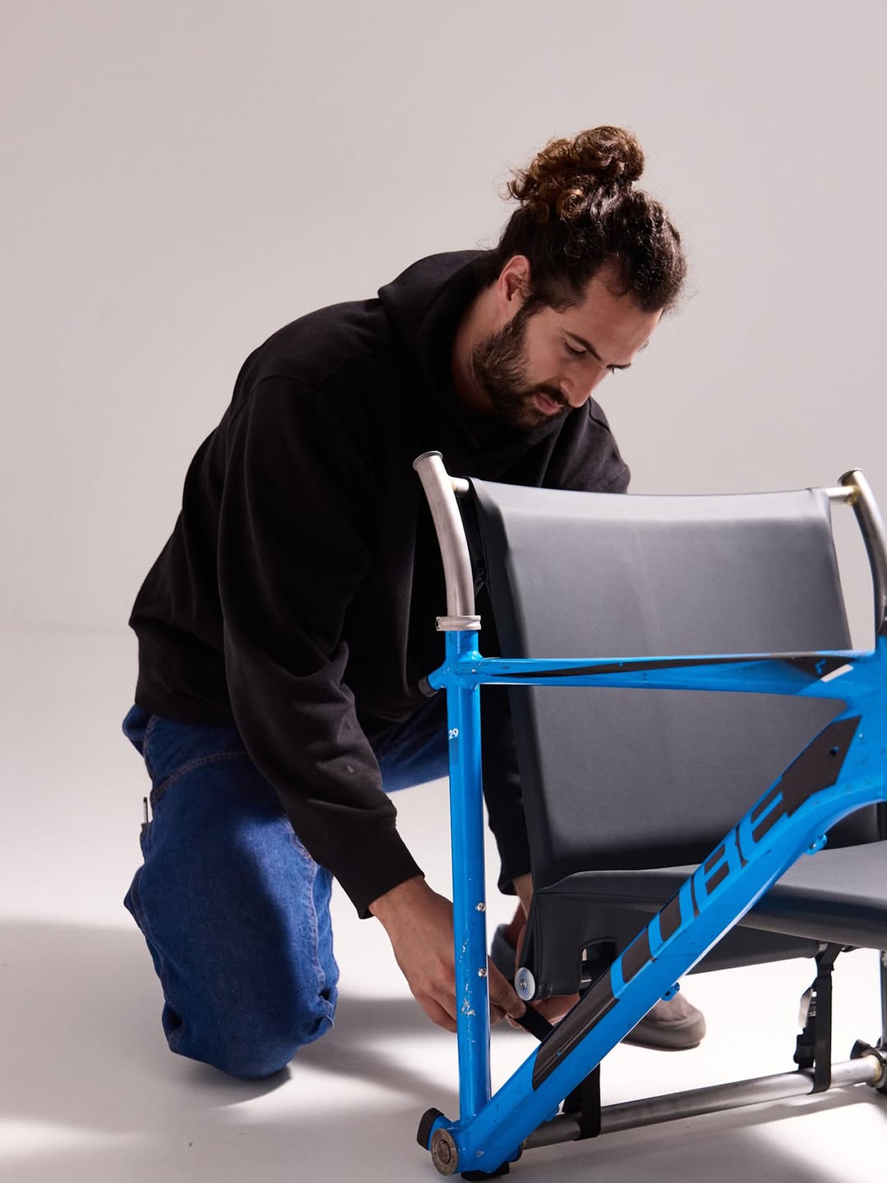
Most upcycling projects ask you to forget what something used to be. Omri Piko Kahan’s bike frame chairs ask the opposite. The geometry is still unmistakably a bicycle frame, the head tube, the top tube, the triangulated rear triangle, all of it present and accounted for, just oriented sideways and asked to hold a person instead of propel one. Kahan, an industrial designer based in Israel, builds lounge chairs from pairs of retired frames, and the whole point is that the donor material remains fully readable, repurposed without being disguised.

Structurally, the approach is clean and considered. Each frame pair is positioned symmetrically, fork and chainstay ends touching the floor as legs, the top tube running horizontally as an armrest. A slung seat and backrest in leather or canvas complete the form. The result has the relaxed posture of a Barcelona chair and the material honesty of something that was clearly built, not styled.

Designer: Omri Piko Kahan
Bicycle frames are absurdly overbuilt for what Kahan is asking them to do. A modern aluminum road frame is engineered to survive repeated impact loads from a rider pushing 300 watts through rough tarmac, and it does that while weighing somewhere between 1,000 and 1,400 grams. The structural surplus in that kind of engineering is enormous, which is why two of them positioned as a chair frame and asked to support a seated adult is, from a load-bearing standpoint, almost comically within spec. The geometry does the rest. Bicycle frames already resolve forces through triangulated sections, and a lounge chair asks for exactly that kind of lateral and compressive stability.
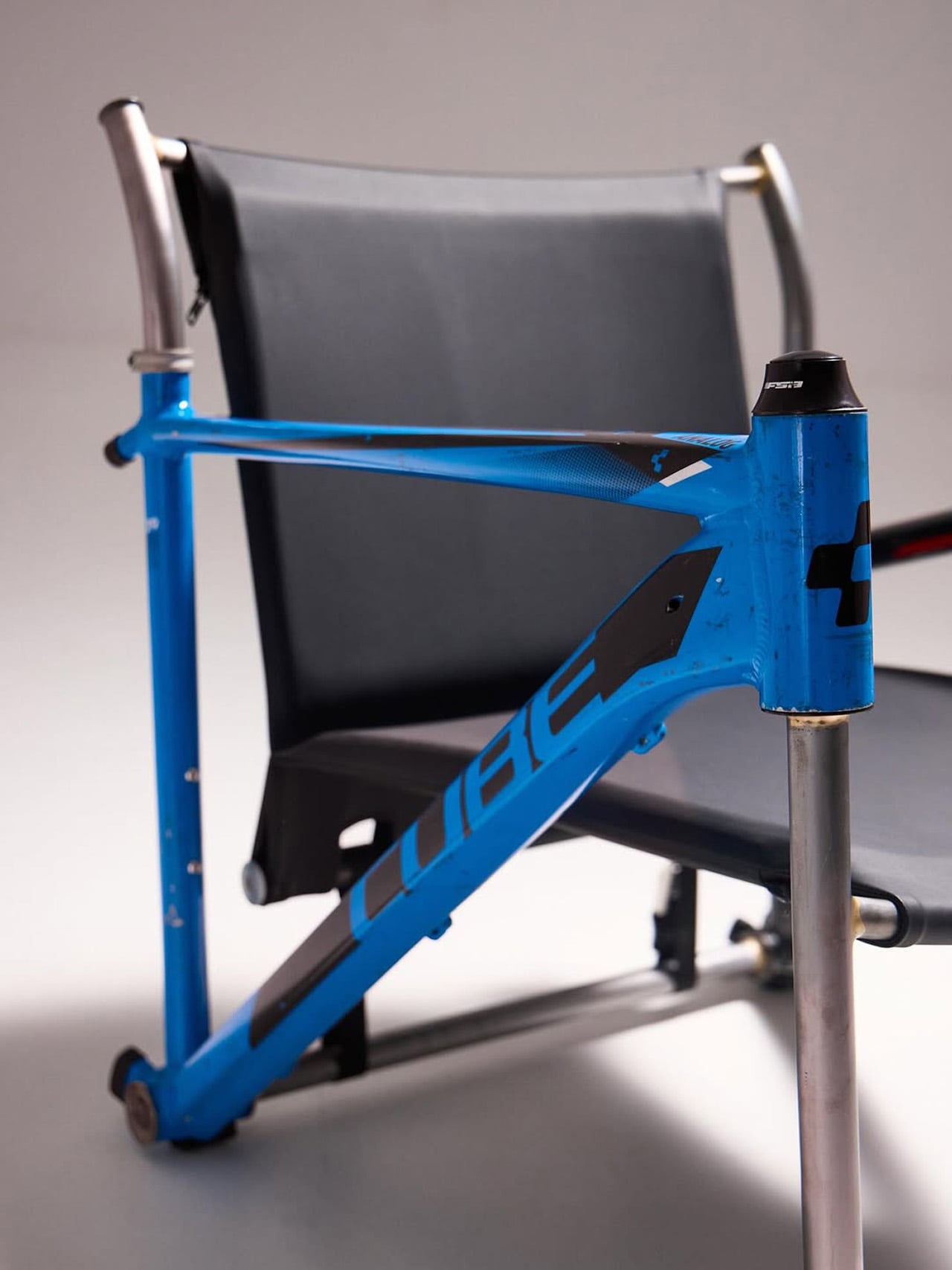
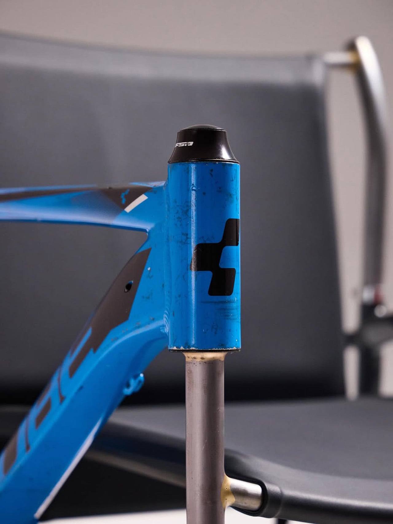
What Kahan has figured out is the orientation problem. Flip a frame on its side and the existing tube angles don’t automatically produce a useful chair geometry. The fork legs and chainstay ends need to hit the floor at the right height relative to each other, the top tube needs to land at armrest height, and the whole thing needs to produce a seat rake that doesn’t pitch you forward or swallow you whole. The matched top tube angles across both frames in the Cube and Trek build suggest this took real iteration, because they align with a precision that reads as deliberate rather than lucky. Filed fillets at the junctions and a custom setback upper support holding the sling confirm someone was paying close attention to finish quality.
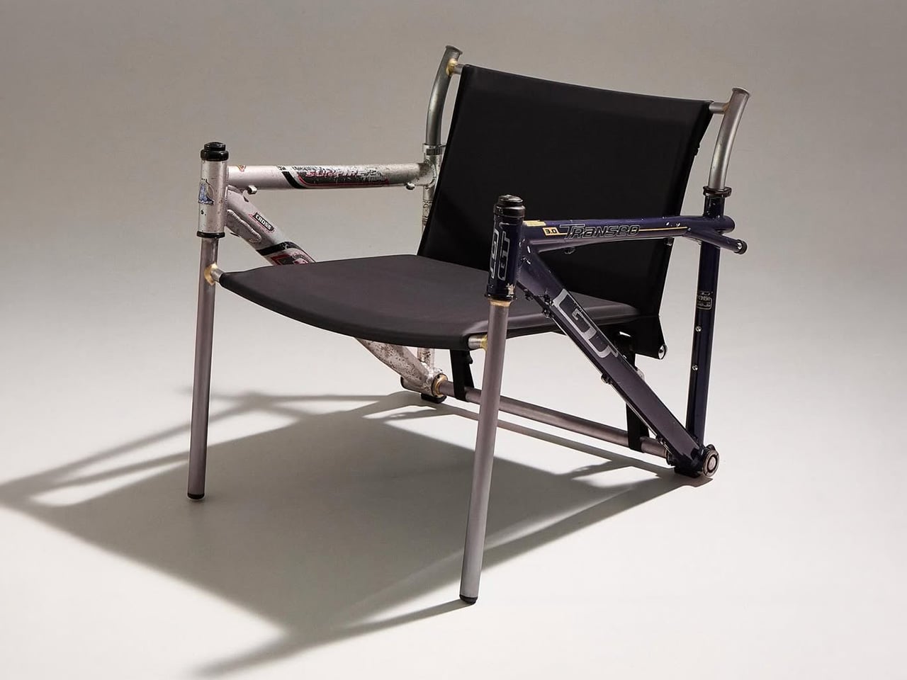
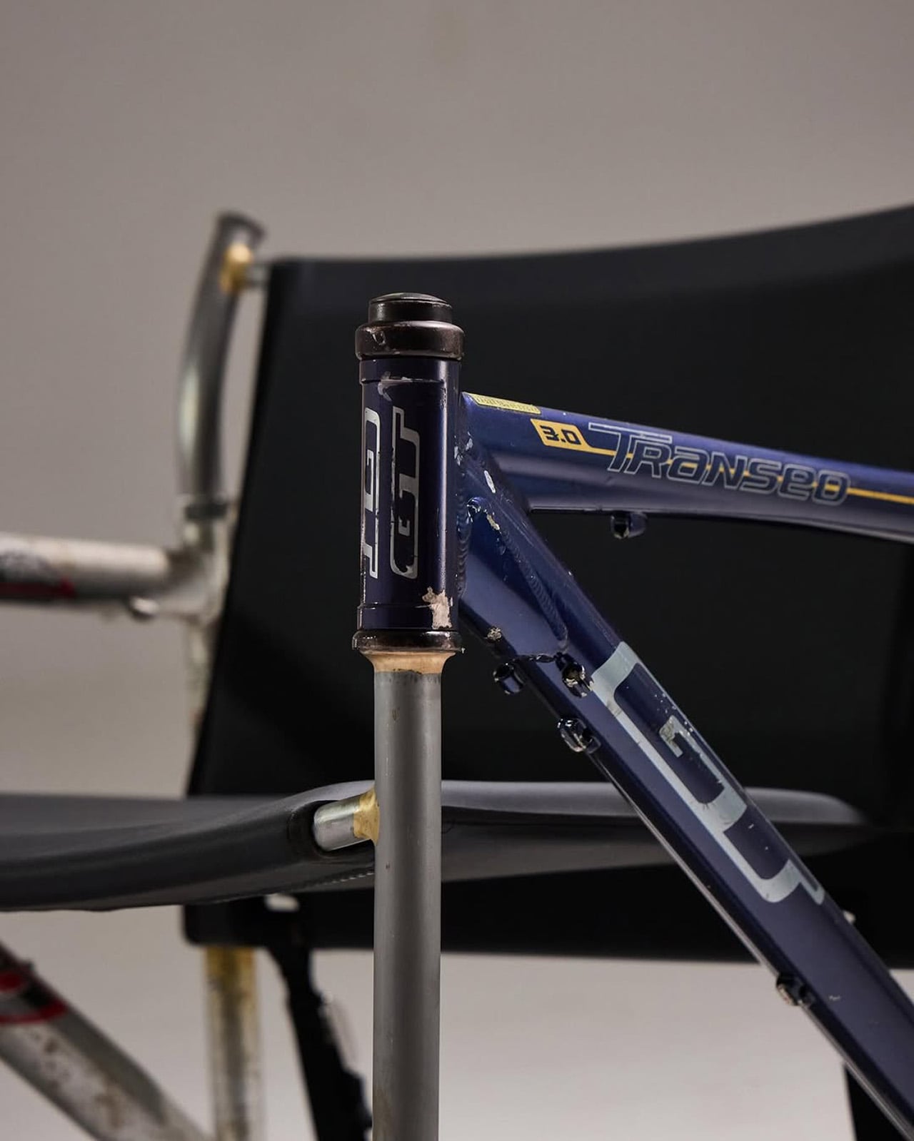
The two builds photographed so far, one pairing a blue Cube road frame with a Trek, another combining a GT Transeo 3.0 with what appears to be a Supreme-branded MTB frame, show how much the donor bikes drive the final character of each piece. The GT build in particular has a longer wheelbase geometry that gives the chair a wider, more reclined stance than the Cube version. Kahan is taking custom orders, with pricing worked out per commission, which makes sense given that no two donor frame combinations will produce the same structural or ergonomic outcome.
The post These Old Bike Frames Upcycled Into Armchairs Are The Coolest Thing You’ll See Today first appeared on Yanko Design.
A Transforming Table-Chair That Turns Tradition into Space-Saving Intelligence

At a time when living spaces are shrinking while expectations from them continue to expand, this design presents a thoughtful response that is both rooted in tradition and aligned with contemporary needs.

Emerging from the context of rising housing pressures in Taiwan, where compact homes are increasingly becoming the norm, the project addresses a fundamental question: how can furniture adapt to limited space without compromising comfort or experience? Rather than treating furniture as static, single-purpose objects, the designer reimagines them as dynamic systems capable of transformation.

Designer: Che-Chia Hsu

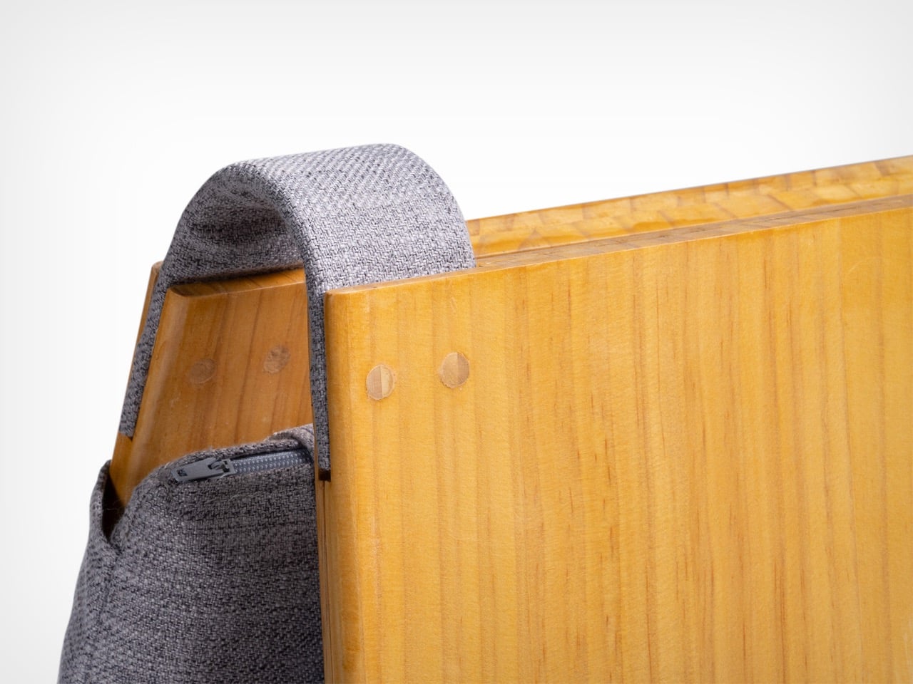
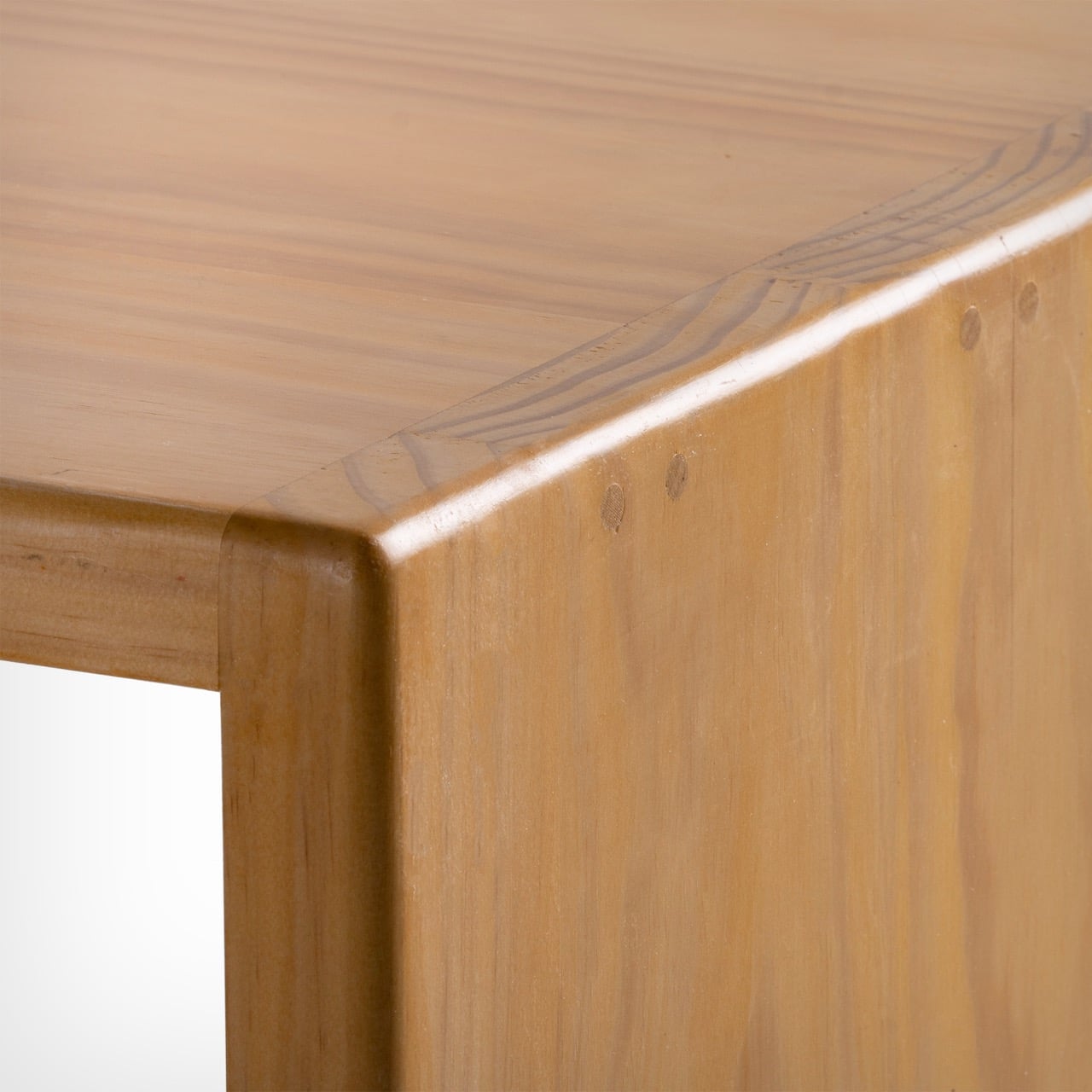
At the heart of this piece lies a deep engagement with traditional Chinese woodworking techniques, particularly the precision of tenon joints. These joints move beyond being structural solutions and become expressions of calculated craftsmanship, where geometry, material behavior, and human interaction converge. The result is a construction that feels both minimal and robust, relying on accuracy instead of excess.

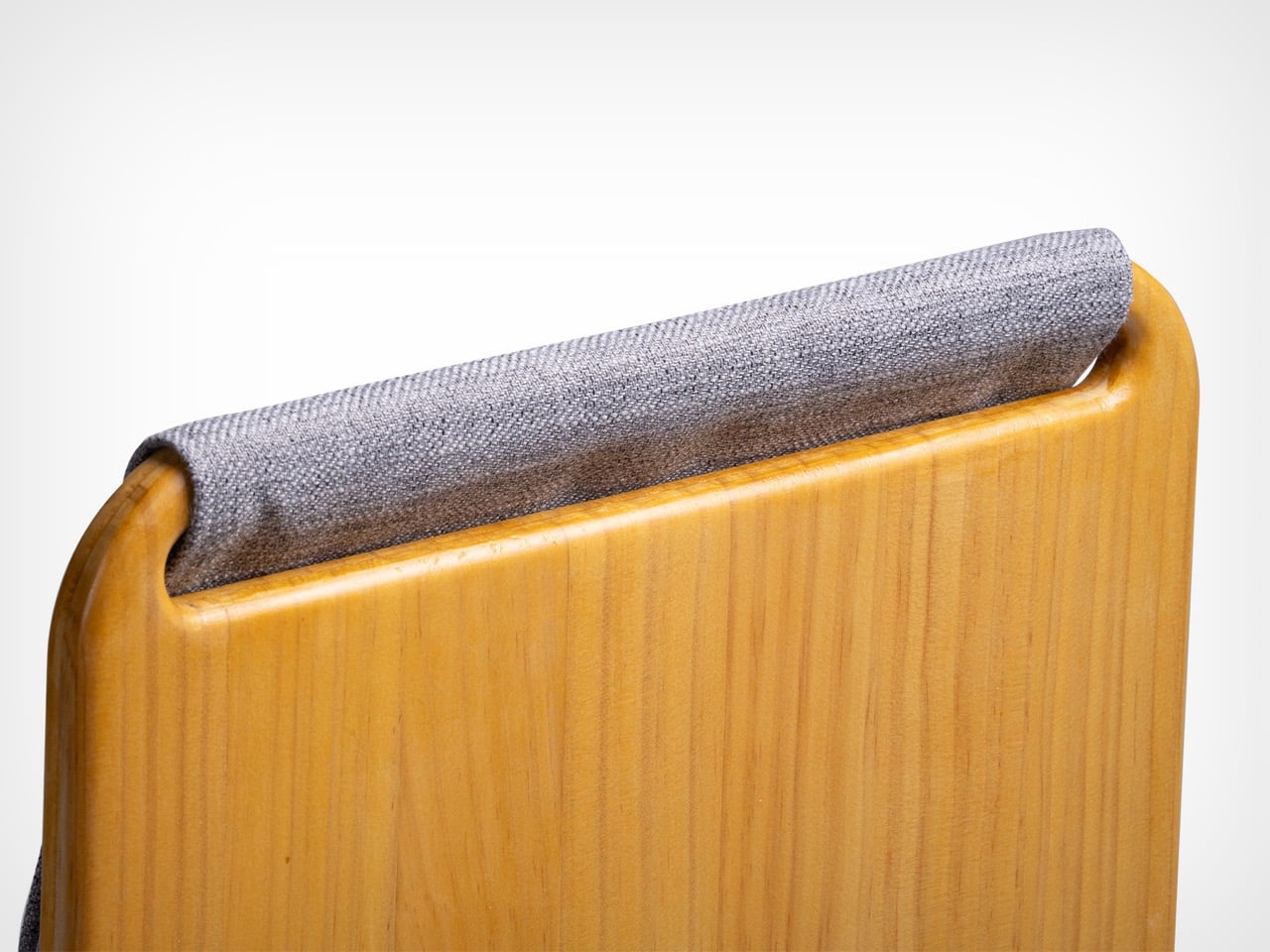
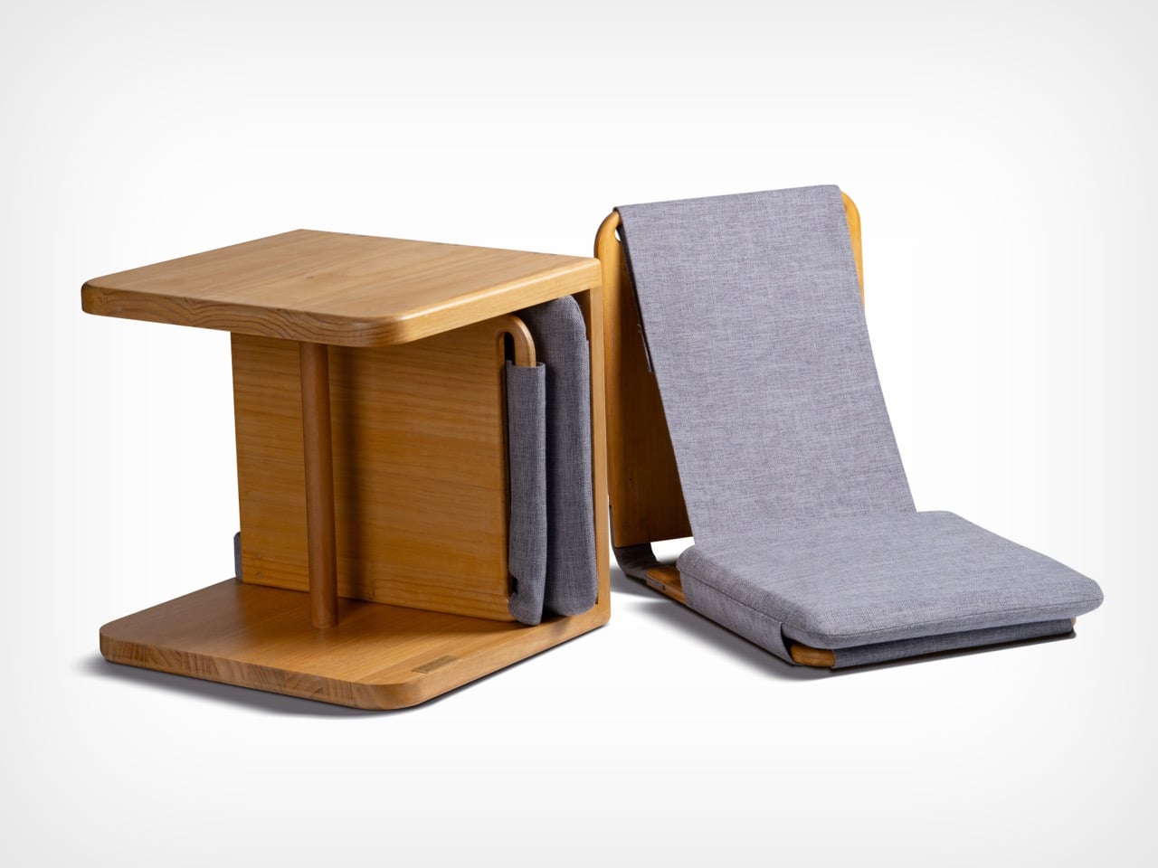
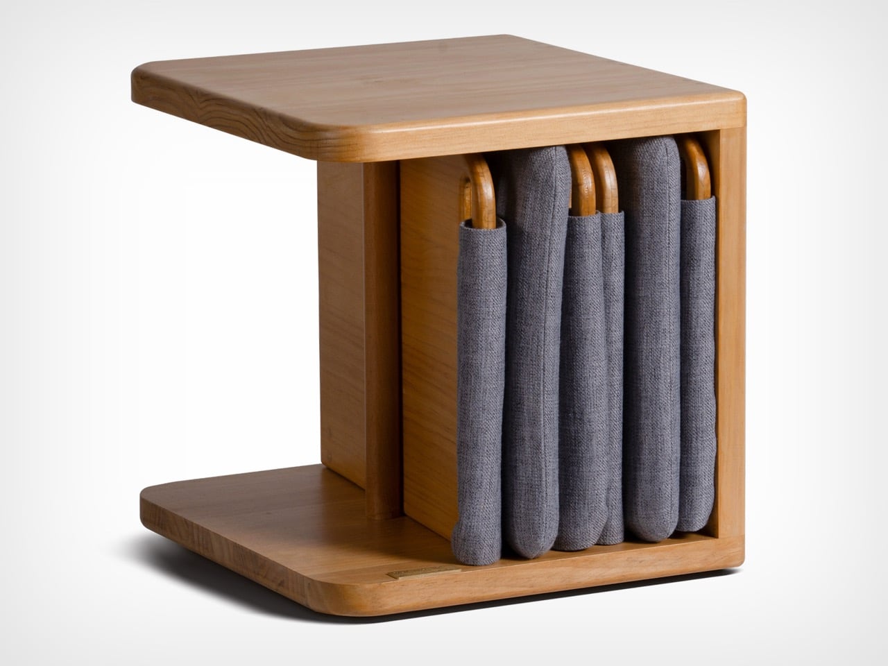
The furniture set is designed to integrate storage and seating within a compact footprint. A chair is concealed within the table and can be pulled out, unfolded, and expanded into a functional seat. The process is intuitive: the chair is extracted, the seat and backrest are opened, and the backrest angle is adjusted using velcro. The transformation is smooth and unobtrusive, allowing the object to shift roles effortlessly.

What distinguishes this design is its reliance on the user’s own body as part of the structural system. Instead of depending entirely on rigid supports, the chair uses the tension generated by the sitter to stabilize the backrest. This introduces a subtle interaction between user and object, where the act of sitting becomes integral to how the design performs. The experience feels efficient, responsive, and quietly intelligent.

Material choices reinforce this balance between function and experience. Lightweight pine wood panels provide durability while ensuring ease of movement. Paired with gray cotton linen fabric, the design introduces a tactile softness that enhances comfort. The fabric is breathable and visually understated, complementing the natural warmth of the wood. Together, these materials create a calm, cohesive aesthetic suited to contemporary interiors.

The development of the project reflects a layered and rigorous process. The designer began by studying traditional joinery techniques through literature, followed by hands-on training under a woodcraft master. This immersion enabled a deeper understanding of the craft beyond theory. Building on this foundation, the designer explored ways to translate these techniques into a modern, functional context through research and experimentation.

What emerges is a design that treats constraint as a starting point rather than a limitation. The piece brings together traditional knowledge and contemporary living patterns, shaping an object that adapts, responds, and participates in everyday use. It reflects a way of designing where space, material, and human interaction are considered together, resulting in furniture that feels considered, purposeful, and in tune with the realities of modern living.

The post A Transforming Table-Chair That Turns Tradition into Space-Saving Intelligence first appeared on Yanko Design.
A Transforming Table-Chair That Turns Tradition into Space-Saving Intelligence

At a time when living spaces are shrinking while expectations from them continue to expand, this design presents a thoughtful response that is both rooted in tradition and aligned with contemporary needs.

Emerging from the context of rising housing pressures in Taiwan, where compact homes are increasingly becoming the norm, the project addresses a fundamental question: how can furniture adapt to limited space without compromising comfort or experience? Rather than treating furniture as static, single-purpose objects, the designer reimagines them as dynamic systems capable of transformation.

Designer: Che-Chia Hsu

At the heart of this piece lies a deep engagement with traditional Chinese woodworking techniques, particularly the precision of tenon joints. These joints move beyond being structural solutions and become expressions of calculated craftsmanship, where geometry, material behavior, and human interaction converge. The result is a construction that feels both minimal and robust, relying on accuracy instead of excess.

The furniture set is designed to integrate storage and seating within a compact footprint. A chair is concealed within the table and can be pulled out, unfolded, and expanded into a functional seat. The process is intuitive: the chair is extracted, the seat and backrest are opened, and the backrest angle is adjusted using velcro. The transformation is smooth and unobtrusive, allowing the object to shift roles effortlessly.

What distinguishes this design is its reliance on the user’s own body as part of the structural system. Instead of depending entirely on rigid supports, the chair uses the tension generated by the sitter to stabilize the backrest. This introduces a subtle interaction between user and object, where the act of sitting becomes integral to how the design performs. The experience feels efficient, responsive, and quietly intelligent.

Material choices reinforce this balance between function and experience. Lightweight pine wood panels provide durability while ensuring ease of movement. Paired with gray cotton linen fabric, the design introduces a tactile softness that enhances comfort. The fabric is breathable and visually understated, complementing the natural warmth of the wood. Together, these materials create a calm, cohesive aesthetic suited to contemporary interiors.

The development of the project reflects a layered and rigorous process. The designer began by studying traditional joinery techniques through literature, followed by hands-on training under a woodcraft master. This immersion enabled a deeper understanding of the craft beyond theory. Building on this foundation, the designer explored ways to translate these techniques into a modern, functional context through research and experimentation.

What emerges is a design that treats constraint as a starting point rather than a limitation. The piece brings together traditional knowledge and contemporary living patterns, shaping an object that adapts, responds, and participates in everyday use. It reflects a way of designing where space, material, and human interaction are considered together, resulting in furniture that feels considered, purposeful, and in tune with the realities of modern living.

The post A Transforming Table-Chair That Turns Tradition into Space-Saving Intelligence first appeared on Yanko Design.
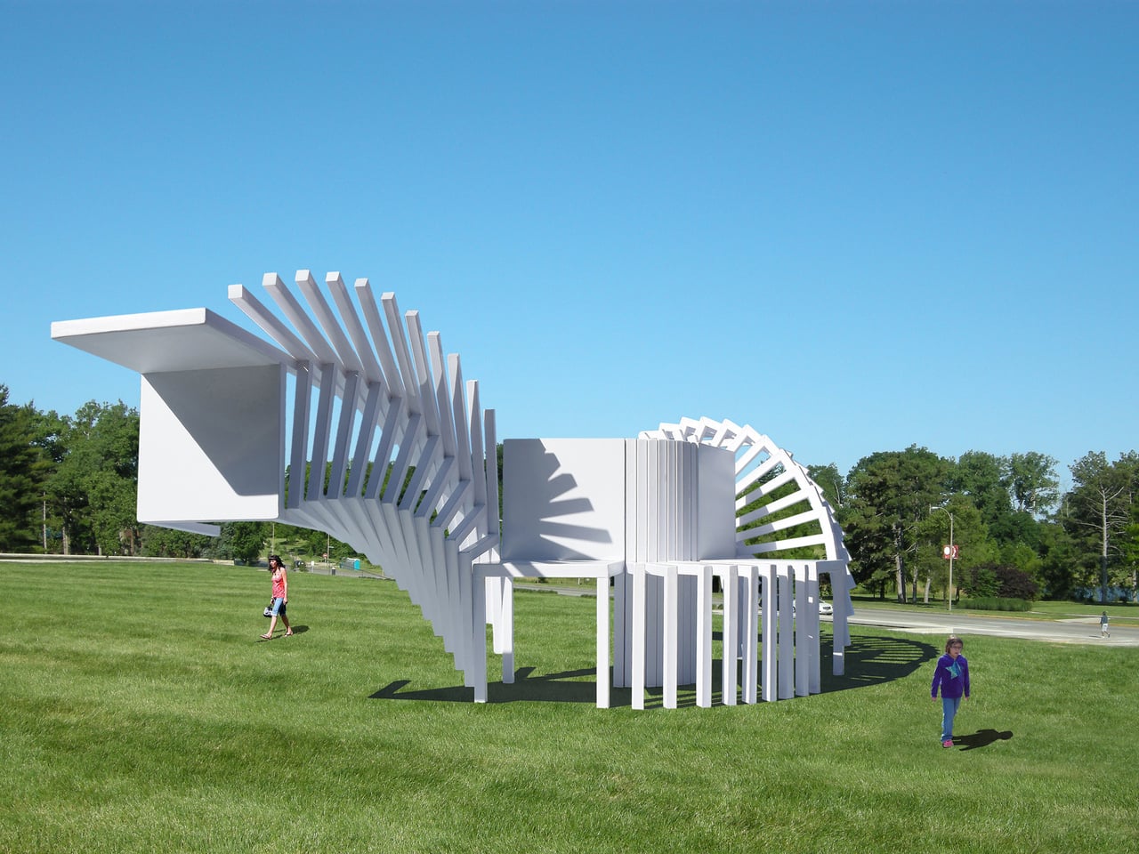
These Steel Chairs Are Too Big to Sit In: Walk Through Them Instead

Most public art earns its place on a pedestal and stays there. It asks you to look, maybe photograph it, and walk away. The relationship between viewer and work rarely extends beyond that brief transaction. That’s been the convention for a long time, but there’s a growing push for installations that don’t just occupy public space but actually do something within it.

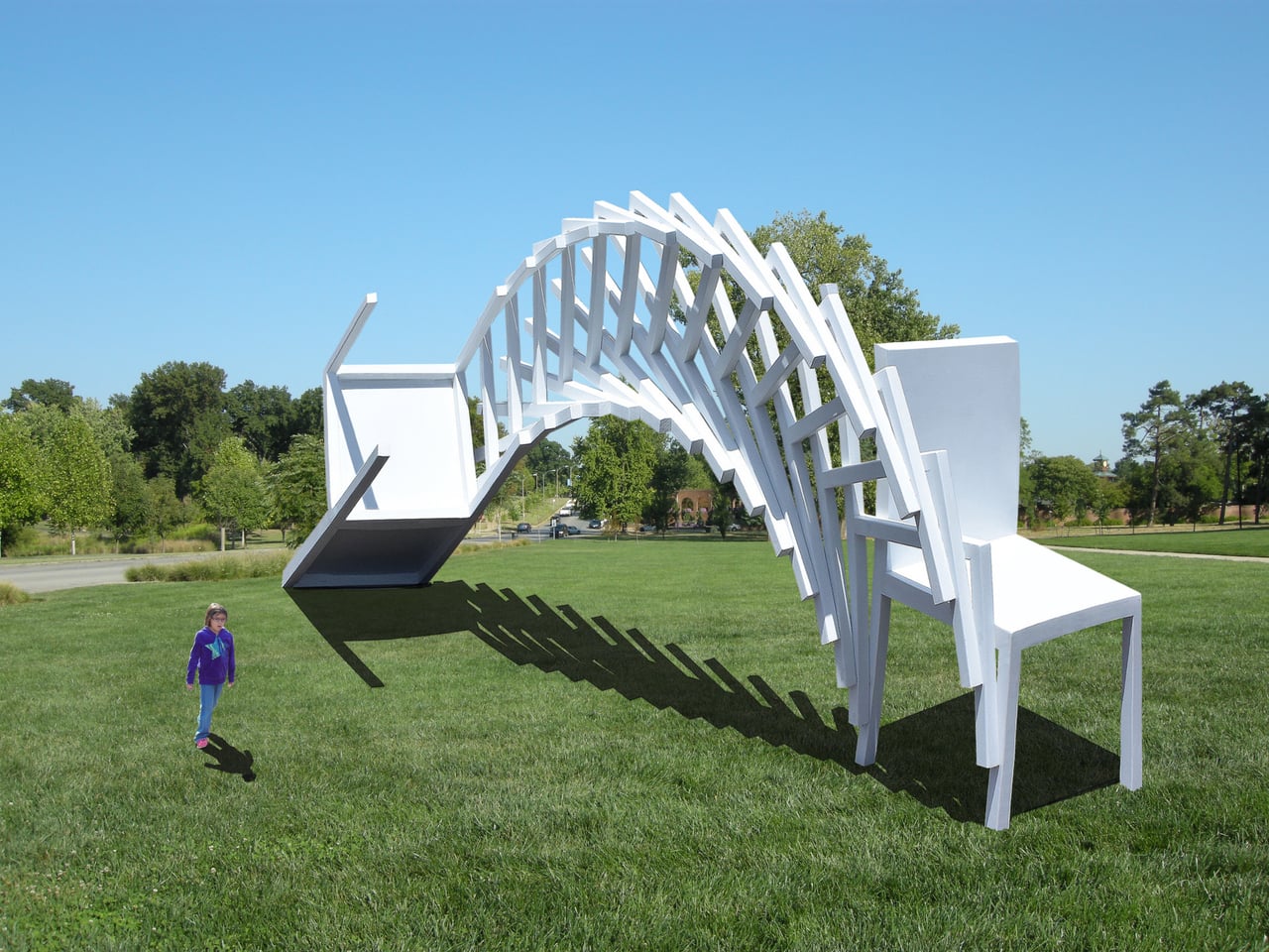
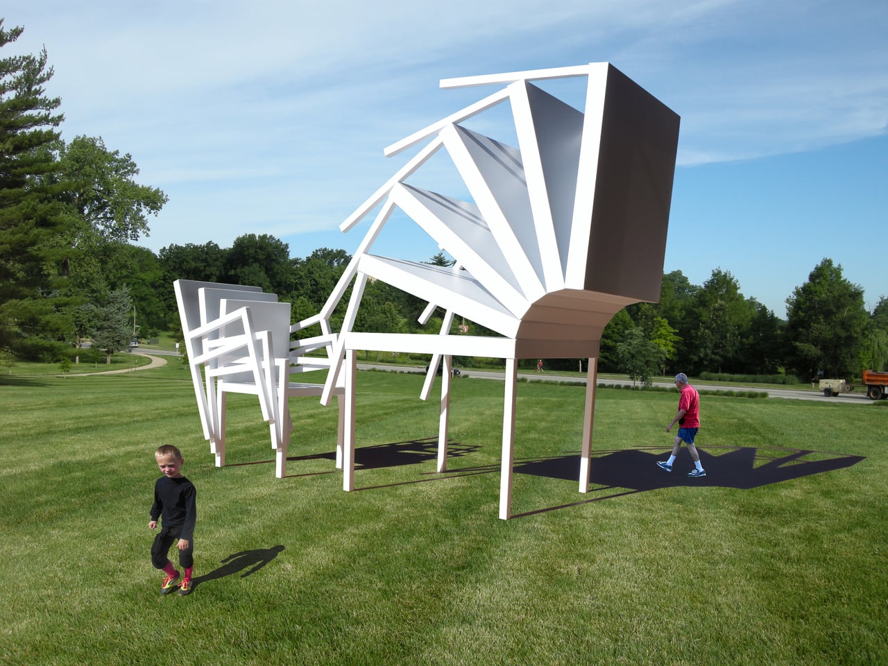
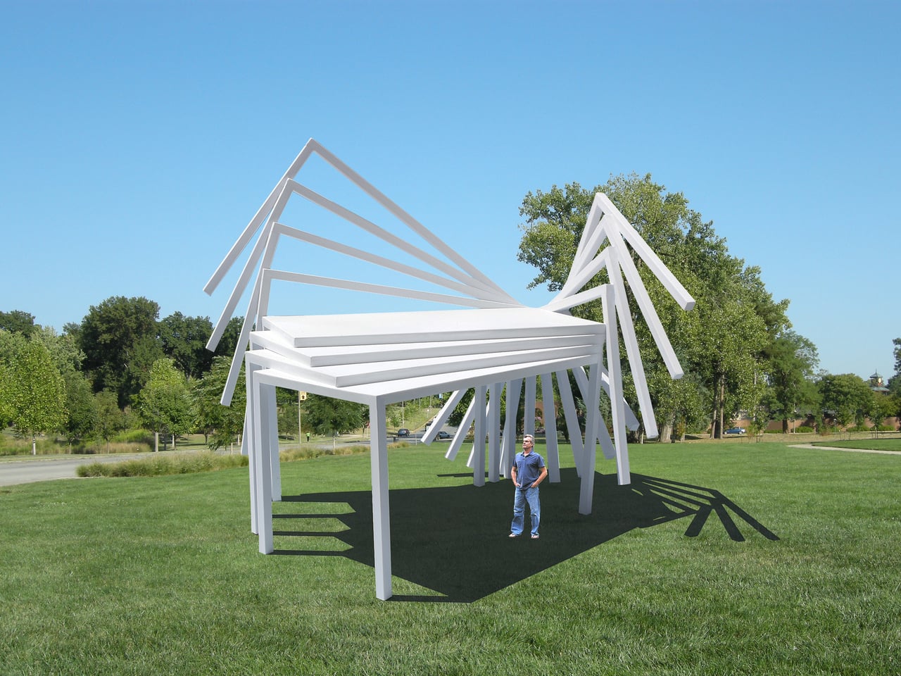
Michael Jantzen has been exploring that tension for years. His Moving Furniture series applies a simple idea to ordinary chairs and tables: take each object’s form and repeat it in progressive intervals as if capturing it mid-movement, then connect those moments into a single piece. The result is something you can still sit in or set a drink on, even if it no longer looks quite built for that.

Designer: Michael Jantzen

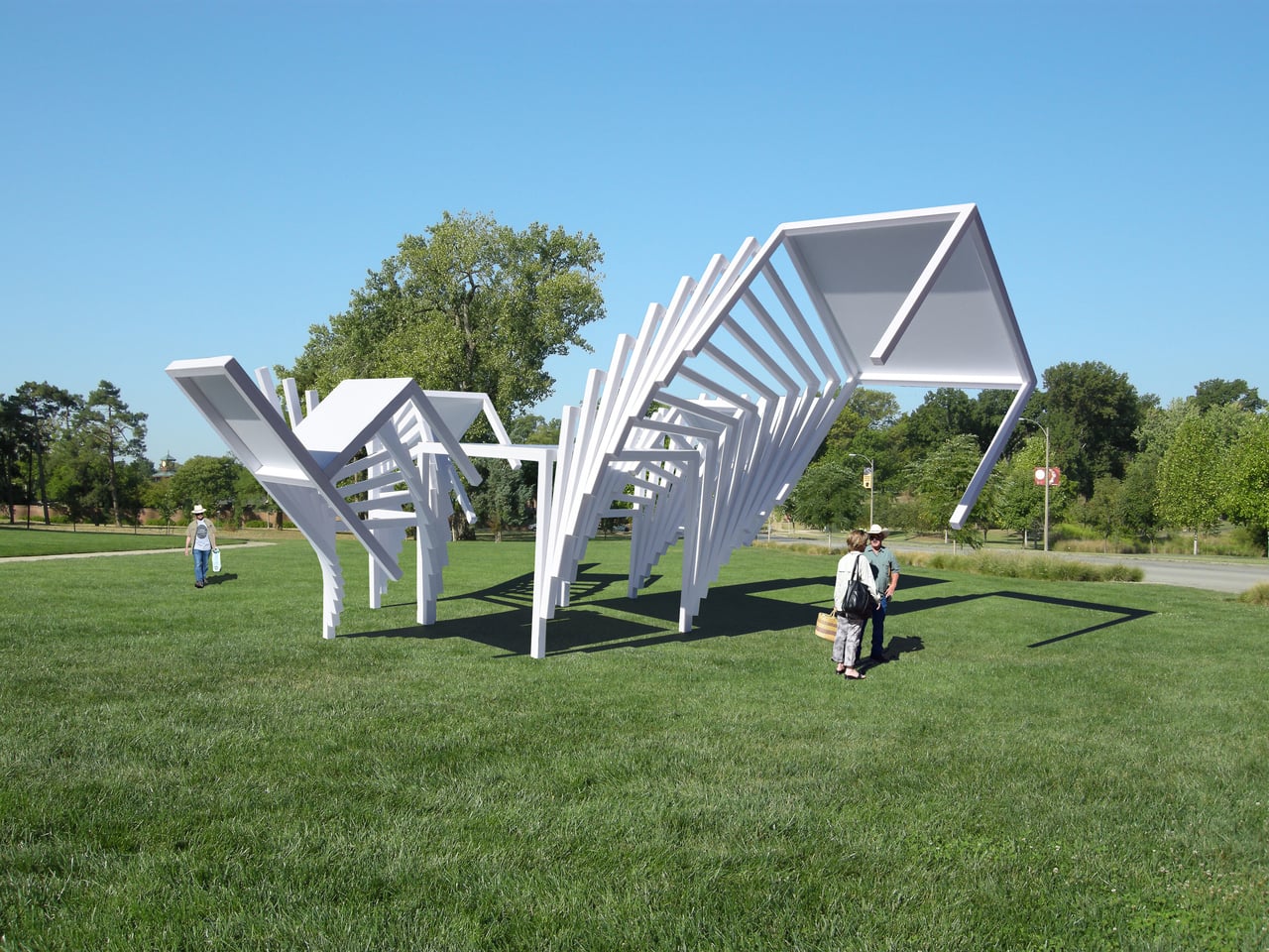
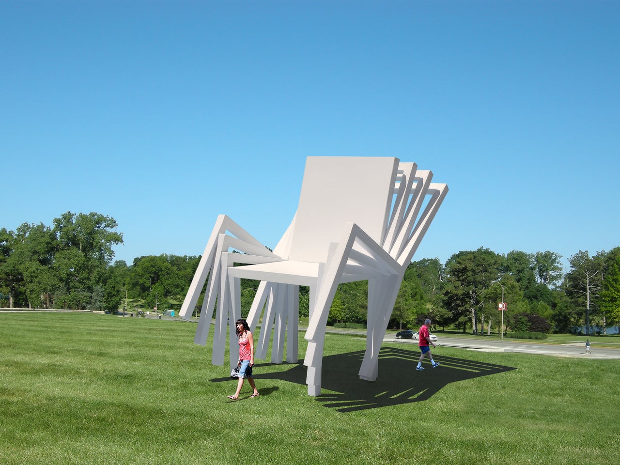
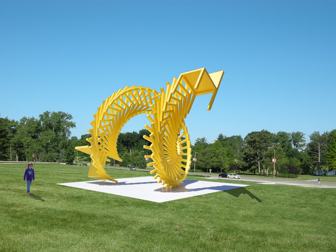
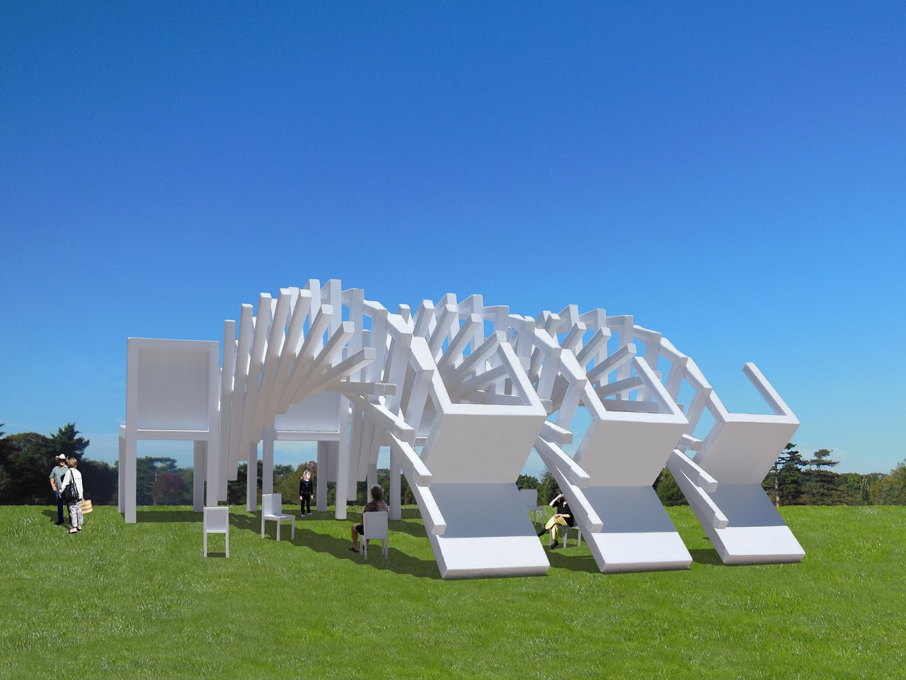
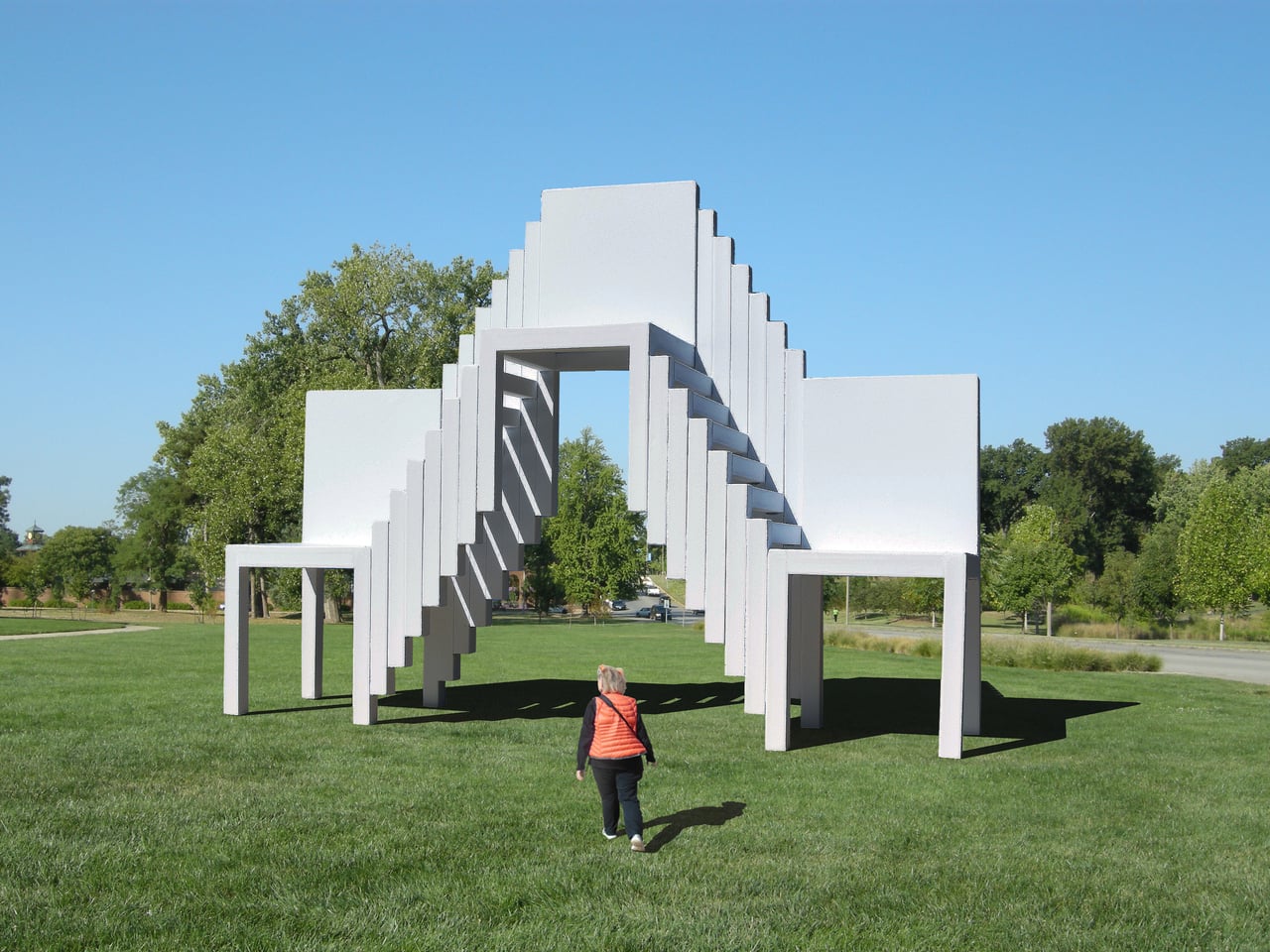
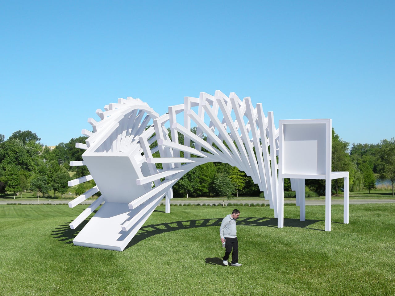
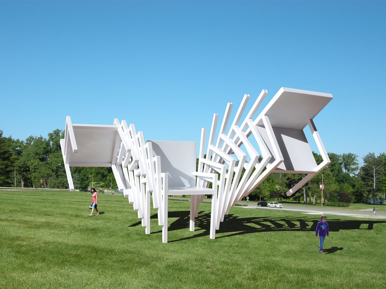
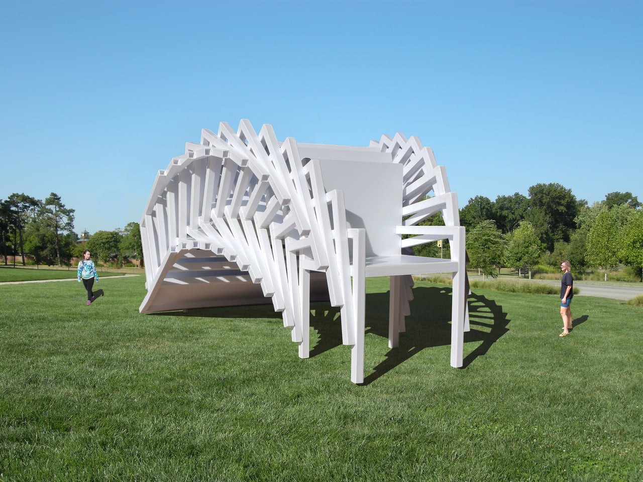
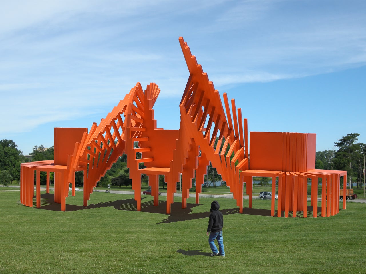
Monumental Moving Furniture takes that same concept into architectural territory. Built from painted steel, the series consists of abstracted chair and table forms, each generated by moving the original object through space and time and locking its path into a chain of connected segments. At this scale, what started as a reference to everyday objects feels closer to a building than a piece of furniture.

The method behind each piece is consistent. A chair or table is set in motion through space and time, with each interval frozen and joined to the next. Some pieces move only part of the original form; others shift the whole thing. The result is a structure that stops belonging to any single discipline and starts reading as furniture, sculpture, and architecture at once.

Despite being too large to sit in, these sculptures aren’t purely decorative. Each is large enough to walk under and through, giving it a practical function as a pavilion and shelter. That’s not something most public art can claim. Instead of asking people to observe from a polite distance, these structures pull you in, turning a passive encounter into something more physical and immediate.

The series covers both chair forms and table forms, each treated with the same sequential abstraction. Individual pieces have also been grouped into configurations that suggest more complex structures, as if each were a building block for something larger. Painted in vivid, solid colors like white, orange, and yellow, each structure commands attention from a distance and rewards a closer look once you’re standing beneath it.

Public spaces deserve more than objects to look at. They deserve things to experience. Monumental Moving Furniture earns its place on both counts, offering structures large enough to shelter visitors while giving them something genuinely puzzling to engage with. These forms don’t demand reverence. They invite curiosity, exploration, and the kind of slow, circling attention that good public space has always been designed to encourage.

The post These Steel Chairs Are Too Big to Sit In: Walk Through Them Instead first appeared on Yanko Design.
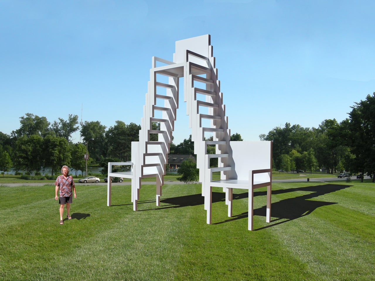
These Steel Chairs Are Too Big to Sit In: Walk Through Them Instead

Most public art earns its place on a pedestal and stays there. It asks you to look, maybe photograph it, and walk away. The relationship between viewer and work rarely extends beyond that brief transaction. That’s been the convention for a long time, but there’s a growing push for installations that don’t just occupy public space but actually do something within it.

Michael Jantzen has been exploring that tension for years. His Moving Furniture series applies a simple idea to ordinary chairs and tables: take each object’s form and repeat it in progressive intervals as if capturing it mid-movement, then connect those moments into a single piece. The result is something you can still sit in or set a drink on, even if it no longer looks quite built for that.

Designer: Michael Jantzen

Monumental Moving Furniture takes that same concept into architectural territory. Built from painted steel, the series consists of abstracted chair and table forms, each generated by moving the original object through space and time and locking its path into a chain of connected segments. At this scale, what started as a reference to everyday objects feels closer to a building than a piece of furniture.

The method behind each piece is consistent. A chair or table is set in motion through space and time, with each interval frozen and joined to the next. Some pieces move only part of the original form; others shift the whole thing. The result is a structure that stops belonging to any single discipline and starts reading as furniture, sculpture, and architecture at once.

Despite being too large to sit in, these sculptures aren’t purely decorative. Each is large enough to walk under and through, giving it a practical function as a pavilion and shelter. That’s not something most public art can claim. Instead of asking people to observe from a polite distance, these structures pull you in, turning a passive encounter into something more physical and immediate.

The series covers both chair forms and table forms, each treated with the same sequential abstraction. Individual pieces have also been grouped into configurations that suggest more complex structures, as if each were a building block for something larger. Painted in vivid, solid colors like white, orange, and yellow, each structure commands attention from a distance and rewards a closer look once you’re standing beneath it.

Public spaces deserve more than objects to look at. They deserve things to experience. Monumental Moving Furniture earns its place on both counts, offering structures large enough to shelter visitors while giving them something genuinely puzzling to engage with. These forms don’t demand reverence. They invite curiosity, exploration, and the kind of slow, circling attention that good public space has always been designed to encourage.

The post These Steel Chairs Are Too Big to Sit In: Walk Through Them Instead first appeared on Yanko Design.
A Stool With Six Legs Just Made Four Feel Outdated

The humble stool has barely changed in centuries. Four legs, a flat seat, done. It exists in every cafe, classroom, kitchen island, and co-working space on the planet, reliably doing its one job and nothing else. So when a designer comes along and asks what happens if you add just one more leg, the answer should probably be “nothing interesting.” And yet here we are, talking about SQOOL.

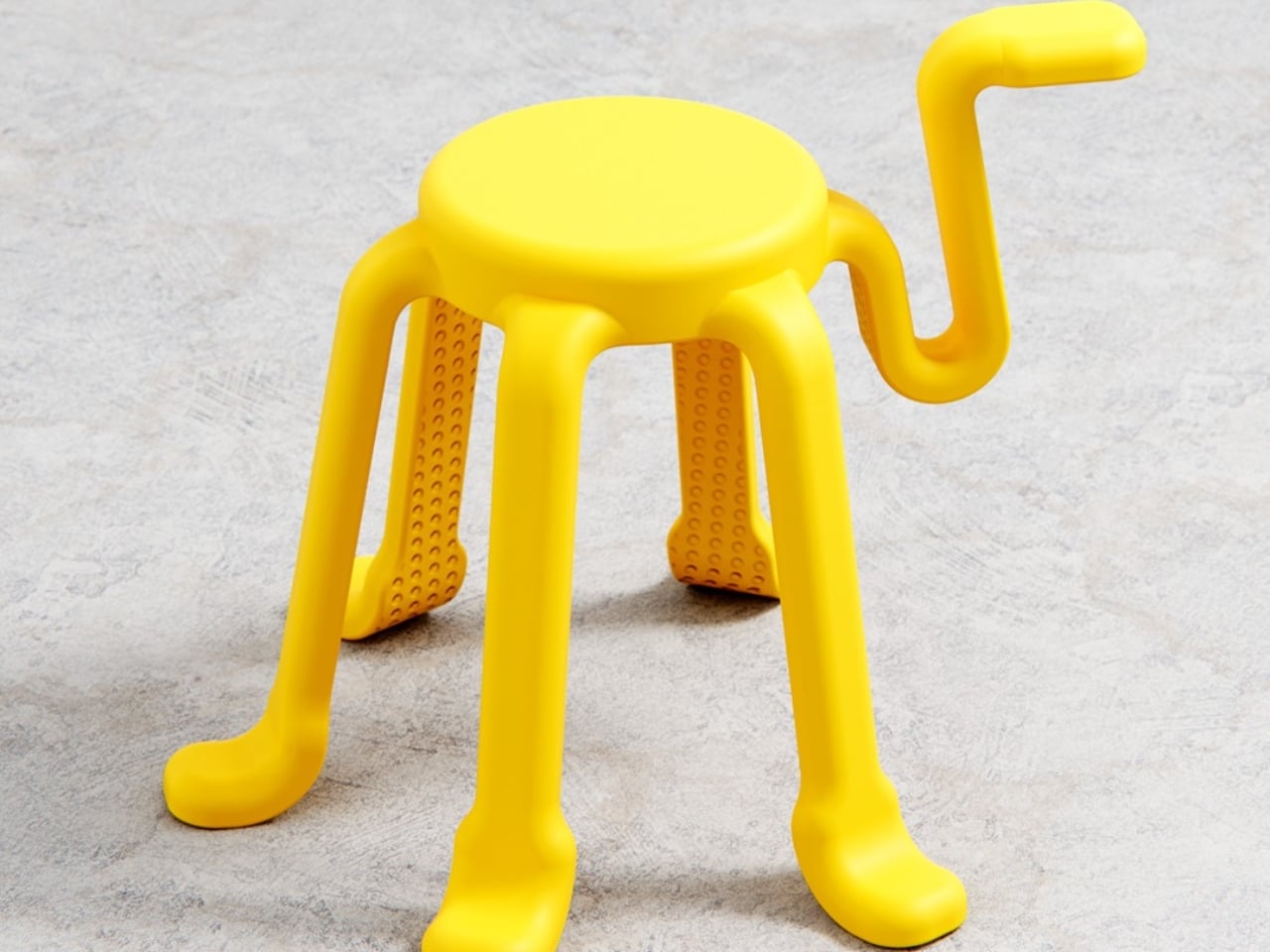
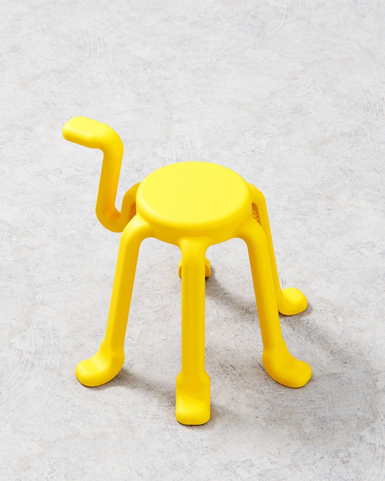
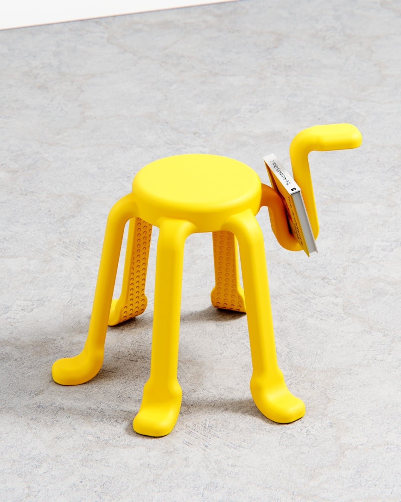
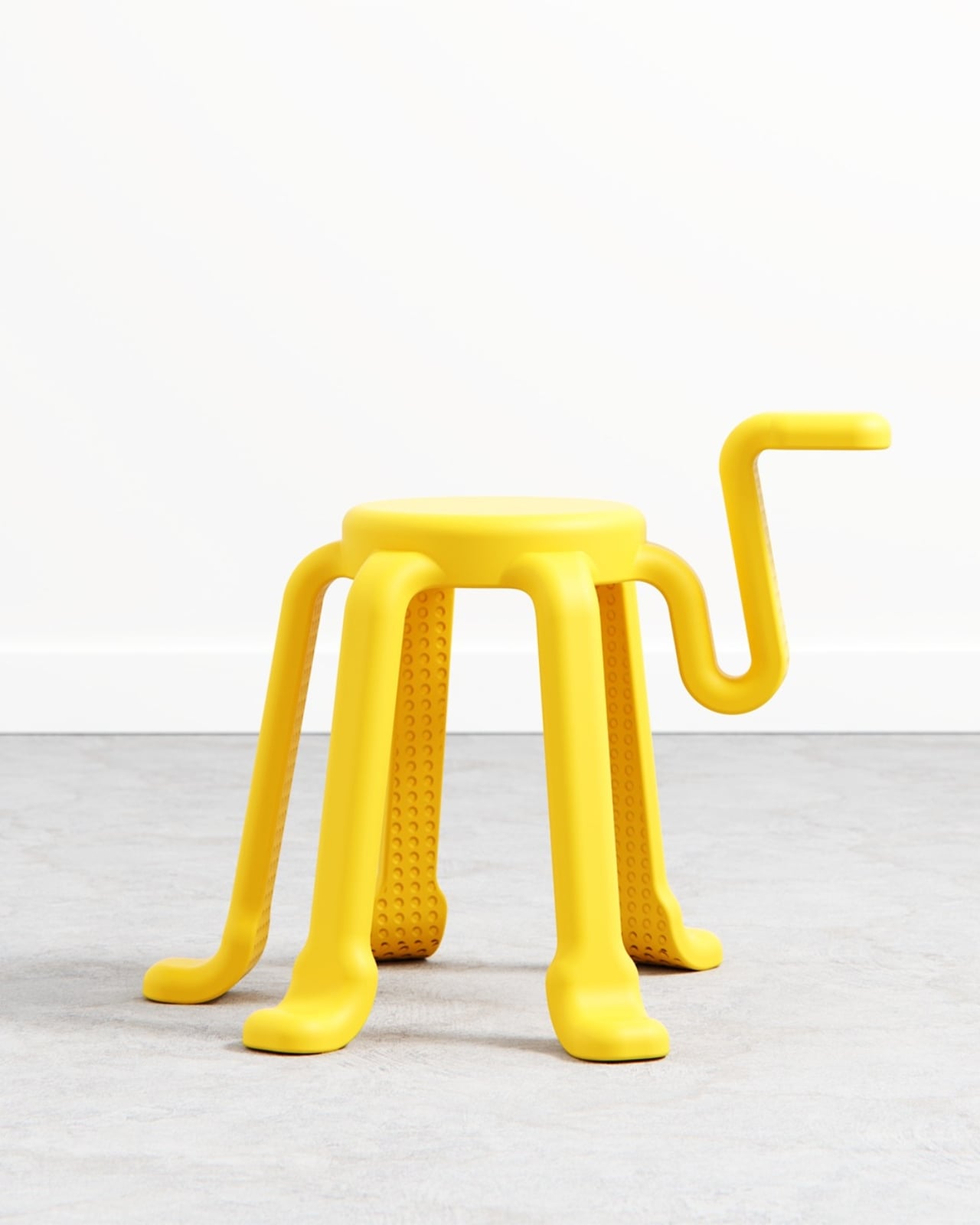
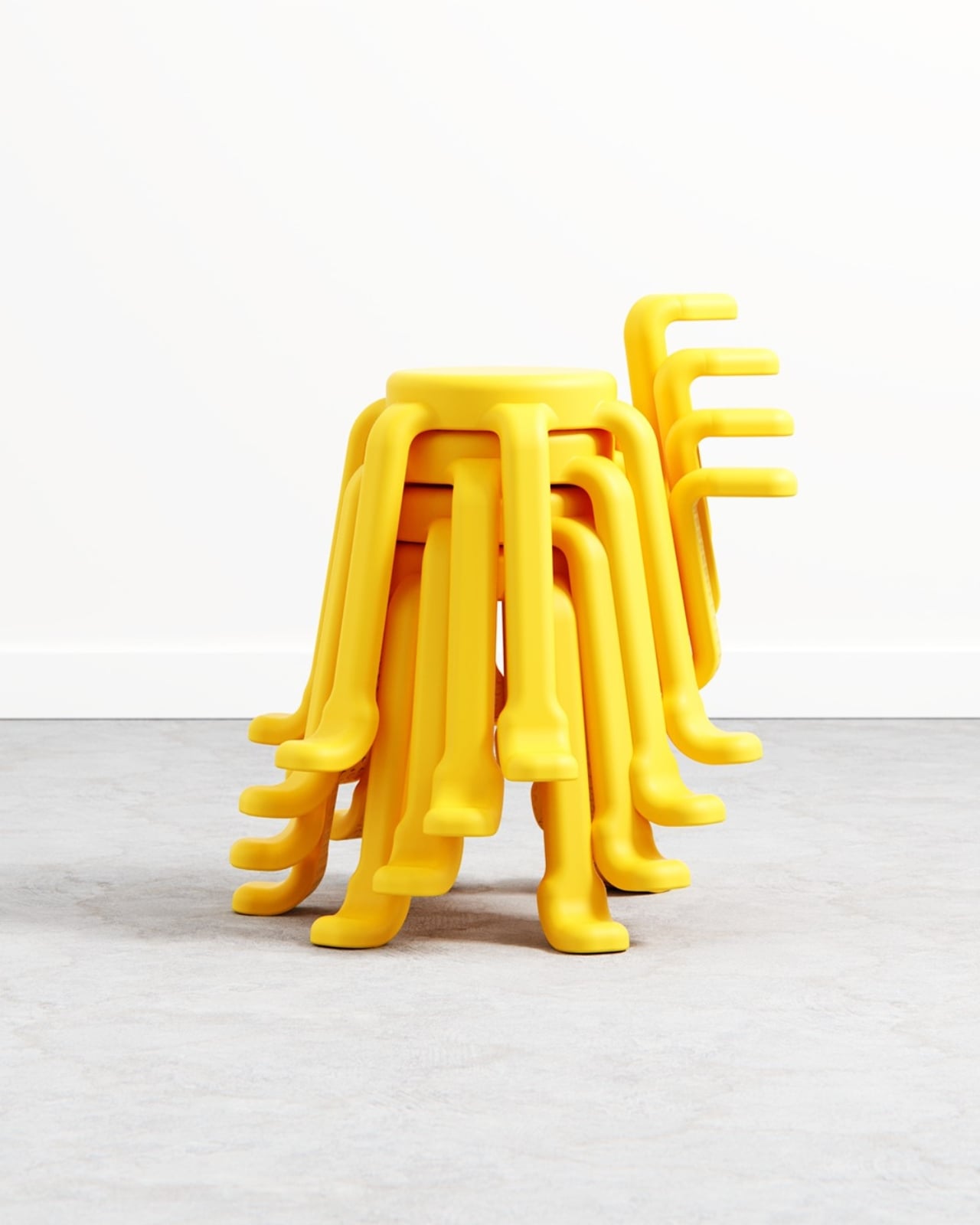
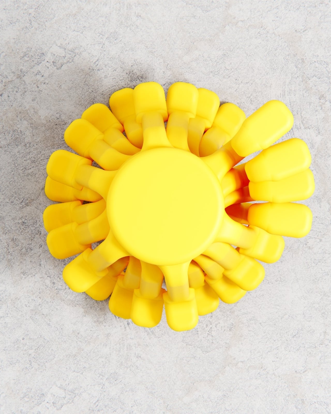
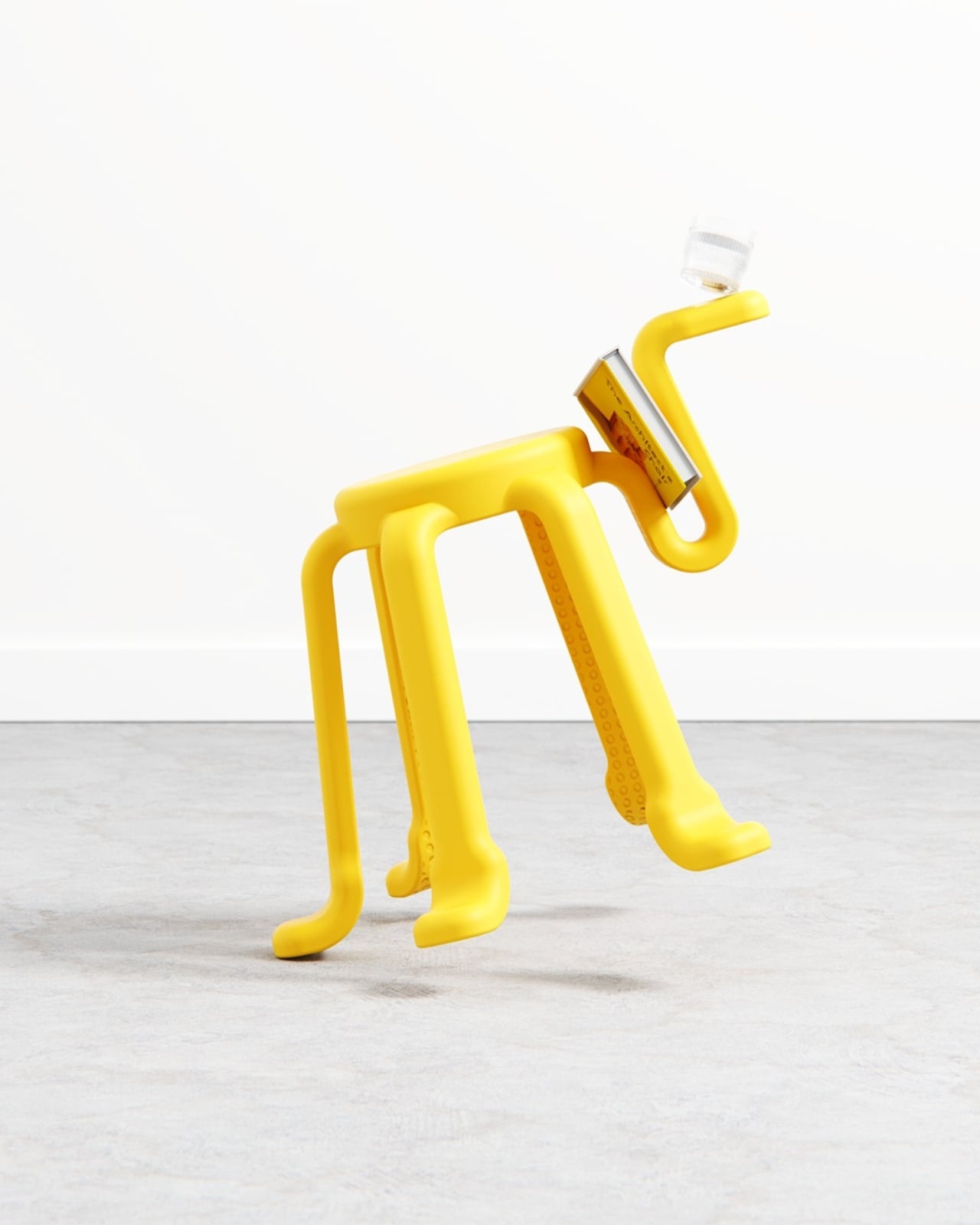
SQOOL is a 2025 personal project by Liam de la Bedoyere of Bored Eye Design, a UK-based independent studio that describes itself as creating work that’s anything but boring. At first glance, the stool reads almost like a creature. Six curved legs splayed outward with little rounded feet, a compact circular seat on top, and that one rogue arm reaching upward and curling into a hook. It looks like a cheerful yellow squid that decided to get into the furniture business, and I mean that entirely as a compliment. The photographs make it look alive. Depending on the angle, it shifts between dog, bug, and some friendly unnamed species you’d encounter in an animated film.

Designer: Liam de la Bedoyere (Bored Eye Design)

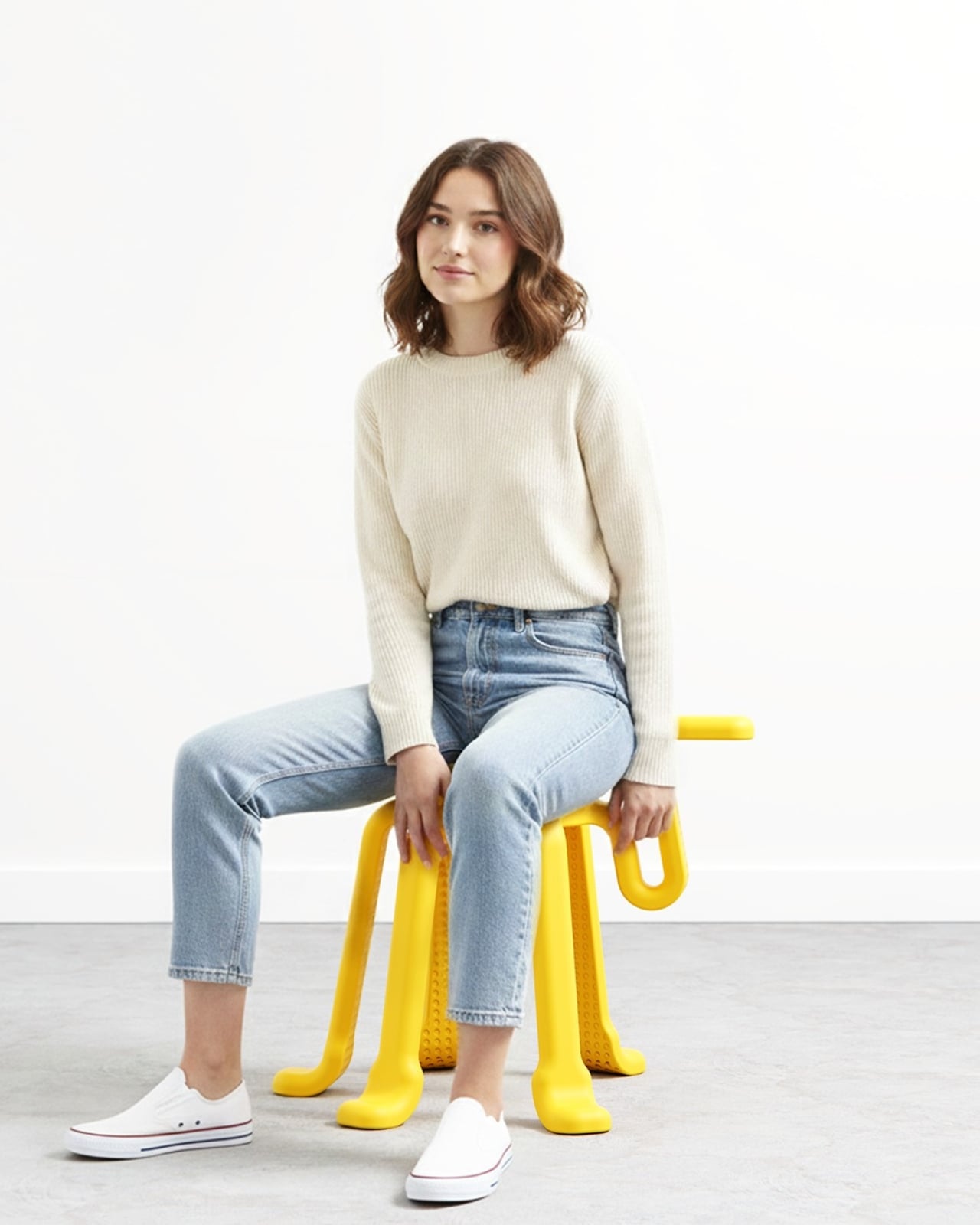
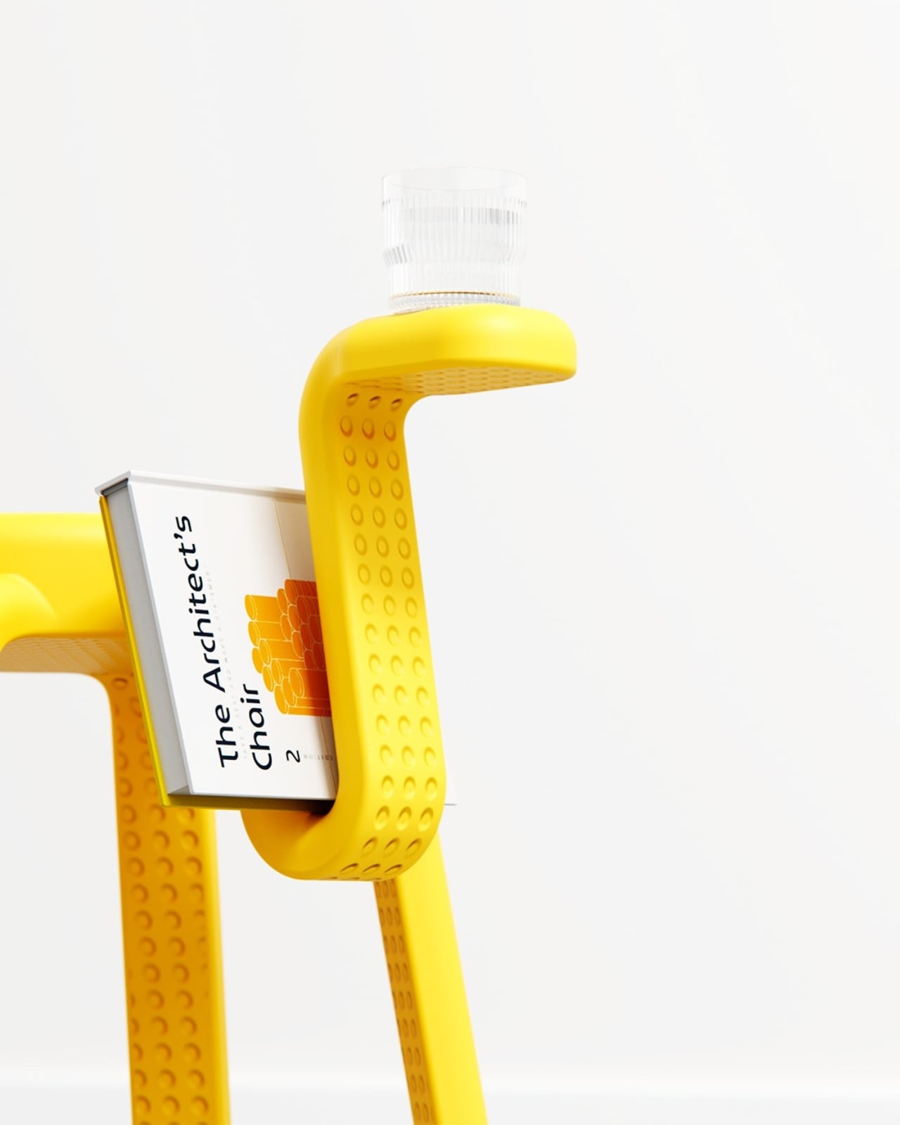
The concept is deceptively simple. Five legs provide complete stability, the same geometric logic you’d get from a traditional four-legged stool, just with an added sense of security and visual rhythm. The sixth leg is the interesting one. Freed from any load-bearing duty, it becomes something else entirely: a handle for carrying the stool, a hook for a bag or jacket, a rest for your coffee cup, a cradle for a book. The images show it doing all of these things casually, as if the stool has always known it could.

What makes SQOOL feel genuinely considered rather than just whimsical is how that extra function was thought through. The sixth arm doesn’t just stick out awkwardly. It curves deliberately, creating a shape that invites the hand to reach for it. People apparently do this instinctively, discovering its utility through touch rather than any printed instruction. That kind of design, where the object teaches you how to use it without saying a word, is harder to pull off than it looks.

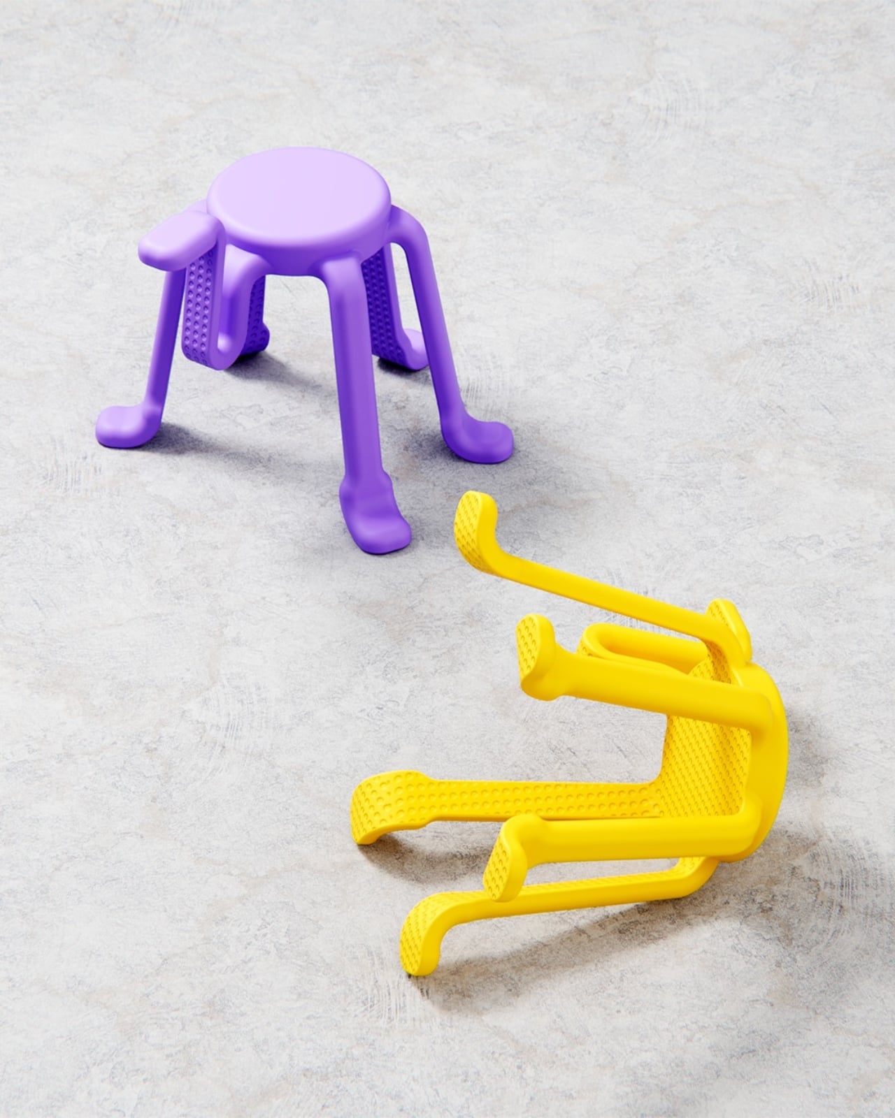
The stacking detail is also worth noting. Getting six legs to nest cleanly on top of each other is a real engineering puzzle, and de la Bedoyere solved it by shaping each leg with enough taper and spacing to allow the stools to slide into each other gracefully. Seen stacked in a column, they look spectacular. Like a sculpture you’d walk past in a gallery and immediately photograph. Which means SQOOL is doing double duty even when no one is sitting on it.

The color choices lean fully into the stool’s playful register. The saturated yellow is hard to miss, and a soft lavender variant appears in some renders, equally confident. These aren’t accent tones chosen to recede politely into a neutral interior. They’re chosen to assert presence. SQOOL isn’t trying to disappear into a corner. It wants to be part of the room, part of the conversation, maybe even part of your grid. That’s not a criticism at all. Personality in furniture is genuinely underrated, and design objects that commit fully to their own character tend to age better than the ones trying to be neutral.

Bored Eye Design’s portfolio shows a consistent interest in objects that are curious and approachable, things that reward a second look and feel good to handle. SQOOL fits neatly into that sensibility. It’s playful without being infantile, practical without being dull, and memorable without leaning on novelty for novelty’s sake. The name alone, a blend of “stool” and something else entirely, already tells you what kind of designer de la Bedoyere is.

The question with any concept project is always whether it would survive production. I think SQOOL could. The logic holds up. The form has already been thought through with stackability in mind, which is usually where playful concepts fall apart. A stool this considered, this expressive, and this genuinely useful deserves more than a render portfolio. It deserves a production run.

The post A Stool With Six Legs Just Made Four Feel Outdated first appeared on Yanko Design.
This Lounge Chair’s Shape Is Precisely Why Two of Them Make a Sofa

Modular seating tends to be either complicated or a compromise. The sectional sofa has never really solved the fundamental problem that living situations change, people move, and the enormous L-shaped configuration that worked in your last apartment probably doesn’t fit your new one. Furniture that adapts to circumstance sounds like an obvious idea, but the designs that actually pull it off cleanly remain surprisingly rare.

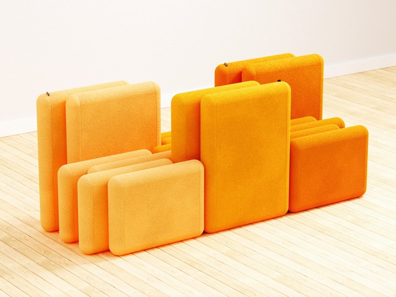
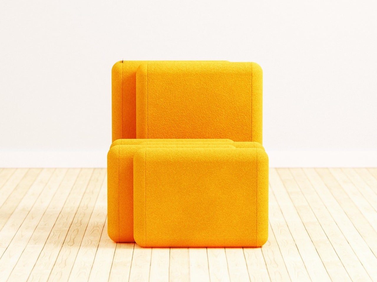
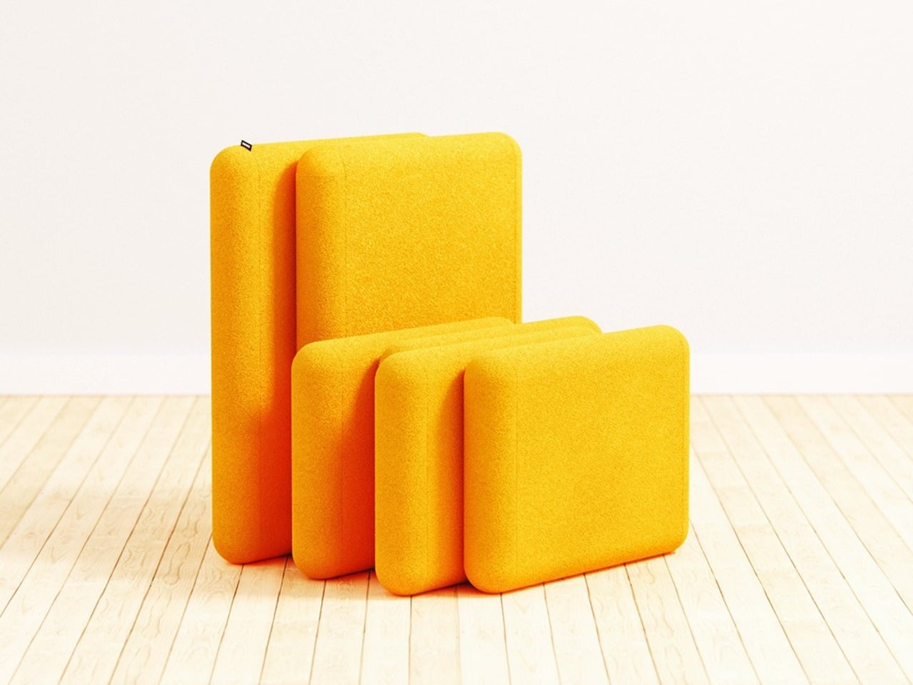
Liam de la Bedoyere, the designer behind Bored Eye Design, takes a direct approach to the problem with Bunch, a modular seating concept that begins from a deceptively simple premise. Each unit is a fully functional lounge chair on its own. The idea, however, is that it was designed from the beginning to combine with others, and the way it does that is where the concept gets genuinely interesting.

Designer: Liam de la Bedoyere

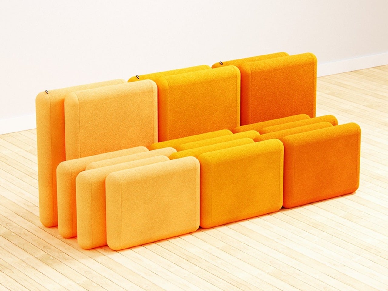
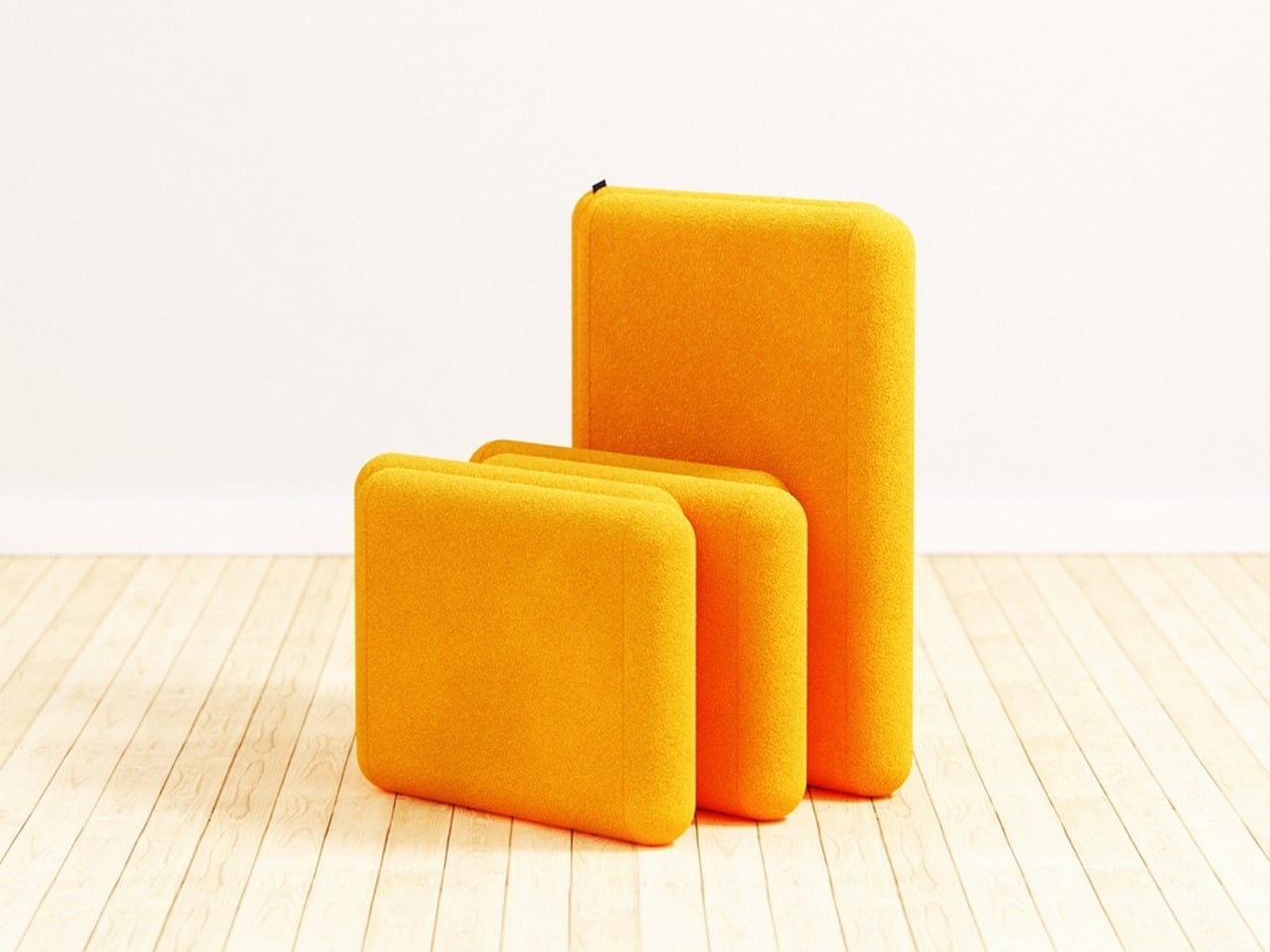
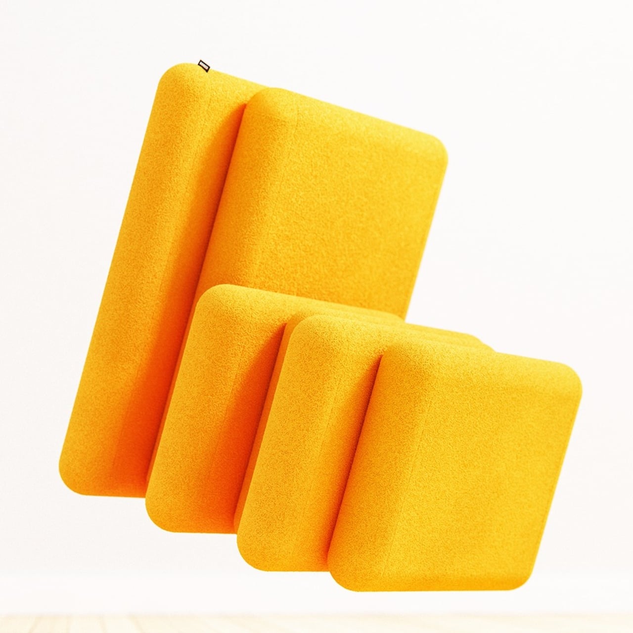
The mechanism is in the staggered relationship between the two parts of each chair. The backrest sits elevated and set back, while the seat extends forward, creating a stepped profile from the side. That offset is precise enough that when a second chair is placed alongside it, the seat of one slides naturally into the space left open by the recessed back of the other. No connectors, no assembly, just geometry.

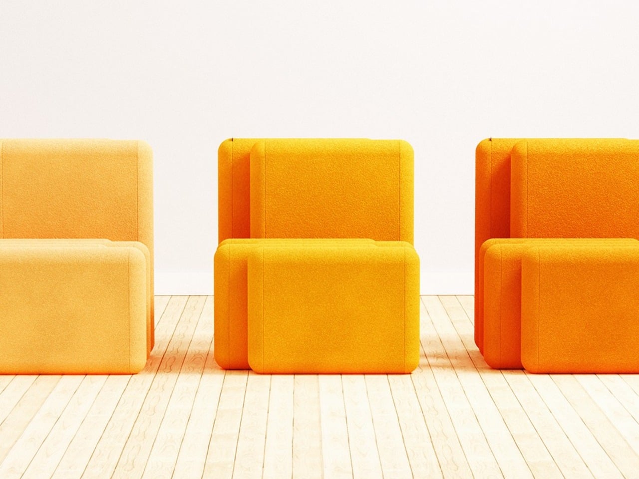
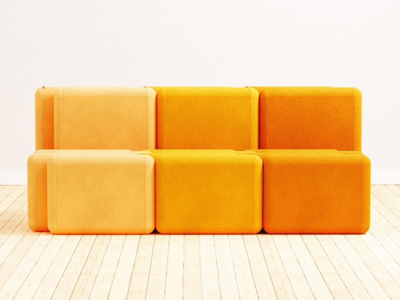
The result, when two or more units are pushed together, is a sofa that reads as a continuous and intentional piece rather than a row of chairs touching each other. The staggered rhythm carries across the joined units, producing a silhouette that looks considered rather than accidental. It’s the kind of configuration that takes a moment to understand, but once you do, it feels like it couldn’t have worked any other way.

The standalone chair holds up on its own terms, too, and isn’t just a sofa segment that happens to function independently. It sits directly on the floor with no visible legs, giving it a relaxed lounge quality. The proportions keep the form compact enough to live in smaller spaces, which matters when the concept is something you might realistically buy gradually, one unit at a time.

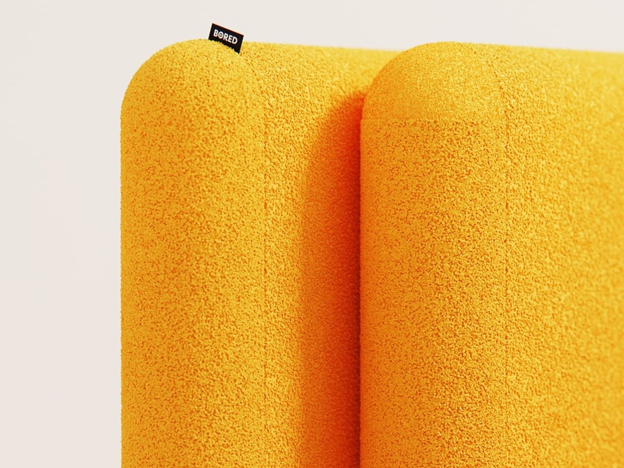
Both the backrest and the seat share the same rounded-rectangle silhouette, upholstered in a thick, textured fabric with the warmth of bouclé. That material, combined with the legless, floor-hugging profile, gives the chair a deliberately unhurried quality, the kind of object that makes a room feel slightly slower and more settled than it did before.

The scalability is part of the appeal. Two units make a small sofa, three make a longer one, and the concept seems to extend indefinitely. When units in different tones are combined side by side, the color contrast adds a visual layer that a single chair doesn’t have. There’s also something honest about a design whose best version requires more than one, an admission that’s built directly into the name.

The post This Lounge Chair’s Shape Is Precisely Why Two of Them Make a Sofa first appeared on Yanko Design.
This Side Table Has No Legs: Its Two Storage Units Are the Structure

Side tables rarely demand much attention. They hold a drink, a lamp, or a book, and that’s essentially all anyone expects from them. The more ambitious ones add a drawer or a second tier, but the core formula stays the same. It’s one of those furniture categories where function has long settled into convention, quietly waiting for someone to rethink the structure itself.

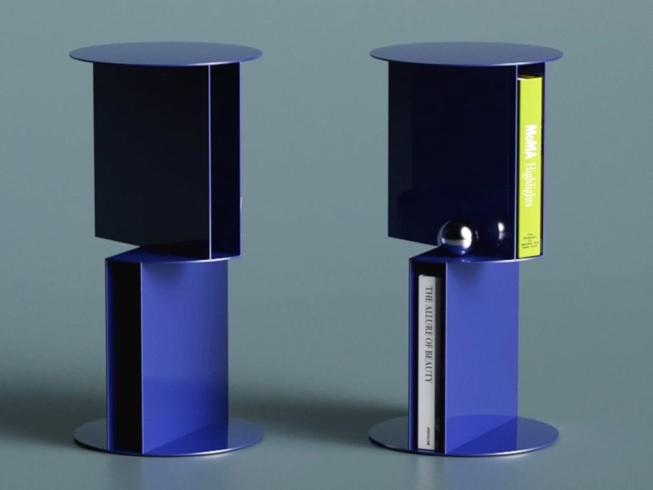
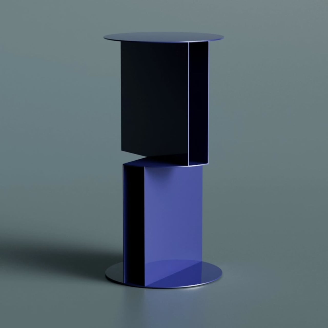
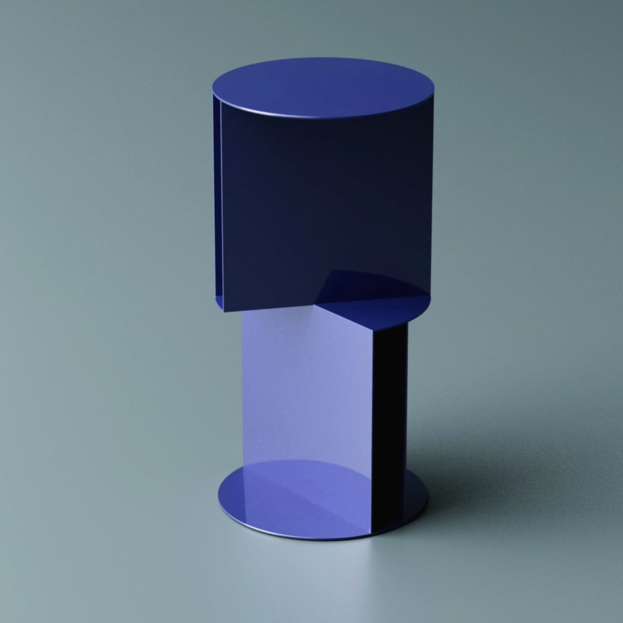
Designer Deniz Aktay has been doing exactly that kind of rethinking through his designs. His latest concept, the Torque High Side Table, takes the structural question seriously, proposing a pedestal that isn’t really a pedestal at all. The table’s support comes entirely from two metal storage units that carry the weight of the design, both literally and visually, stacked and rotated against each other.

Designer: Deniz Aktay

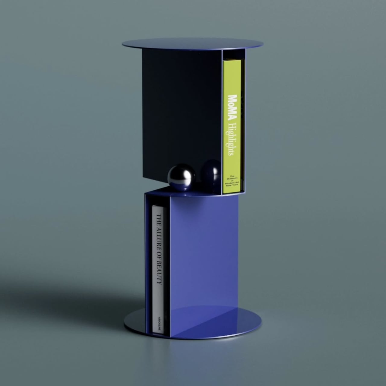
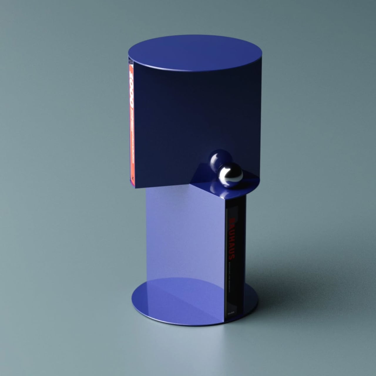
The idea of torque, that mechanical tension created by rotation, becomes the organizing principle here. Each storage unit opens in a different direction, offset against the other to create the visual friction the name implies. It makes the structure feel active, as if the table is caught mid-turn. The two-tone blue colorway reinforces that, with a dark navy upper section against a brighter blue lower.

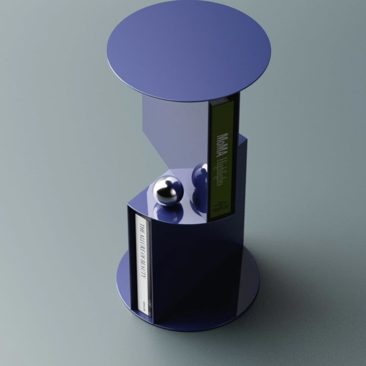
That rotation also creates something practically useful. Where the two units meet, a small shelf platform projects outward between them, adding a third storage level beyond the two main compartments. It reinforces the visual logic of the twist while giving you somewhere to set smaller objects. Three storage spots from a single structural idea is a tidy outcome for a table of this size.

Books sit naturally in each compartment, held upright in the curved enclosures without needing brackets or dividers. Each section holds a small collection without effort, turning what might otherwise be a purely decorative object into something you’d interact with daily. That balance between use and visual statement is where this kind of furniture concept tends to either land well or feel entirely theoretical.

The storage-as-structure approach means the Torque table looks interesting from every angle. There are no legs, no base panel, and no conventional framing hardware. The two open-faced volumes do all the work, with a circular disc on top forming the table surface and a matching flat disc at the bottom serving as the foot. Everything between them is either storing something or making a structural point.

Aktay has built a body of work around this kind of thinking, concepts that start with a formal problem and arrive somewhere genuinely practical. The Torque High Side Table fits that approach well. It doesn’t need to announce its cleverness because the structure speaks on its own, and anyone who tucks a book into one of the compartments and sets a cup on top will feel the logic in it.

The post This Side Table Has No Legs: Its Two Storage Units Are the Structure first appeared on Yanko Design.
The Anello Chair Is 3 Design Eras in One Piece of Wood

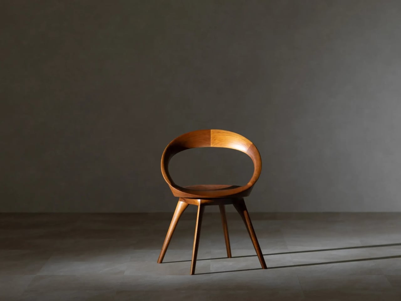
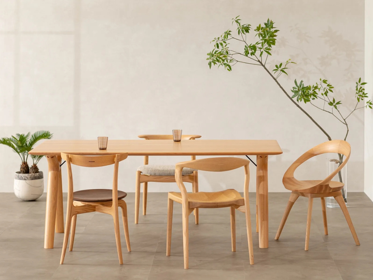
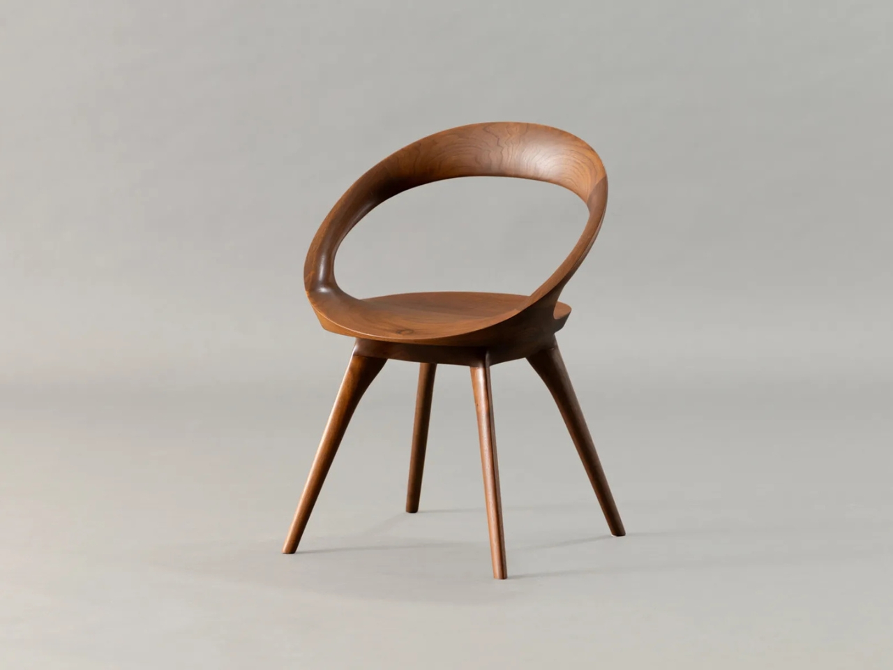
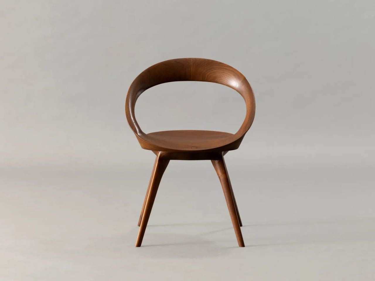
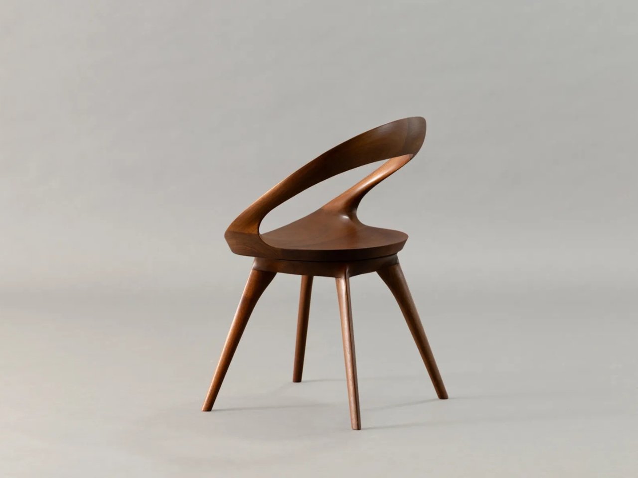
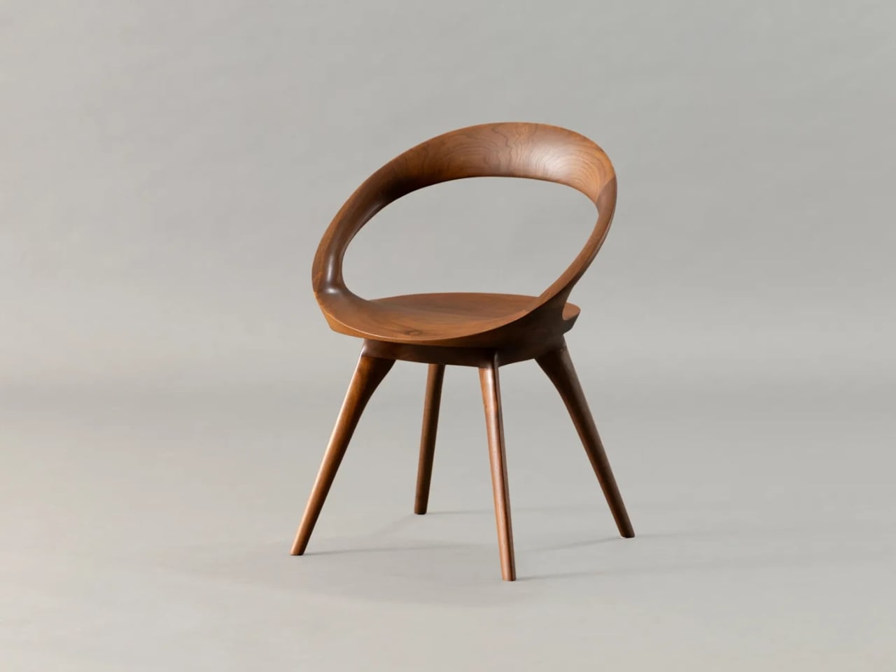
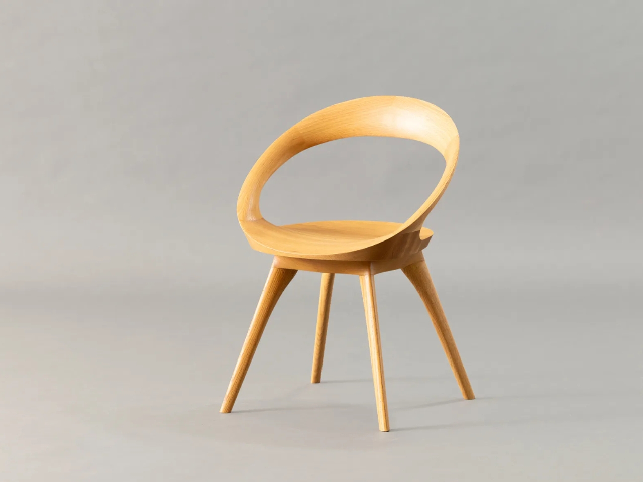
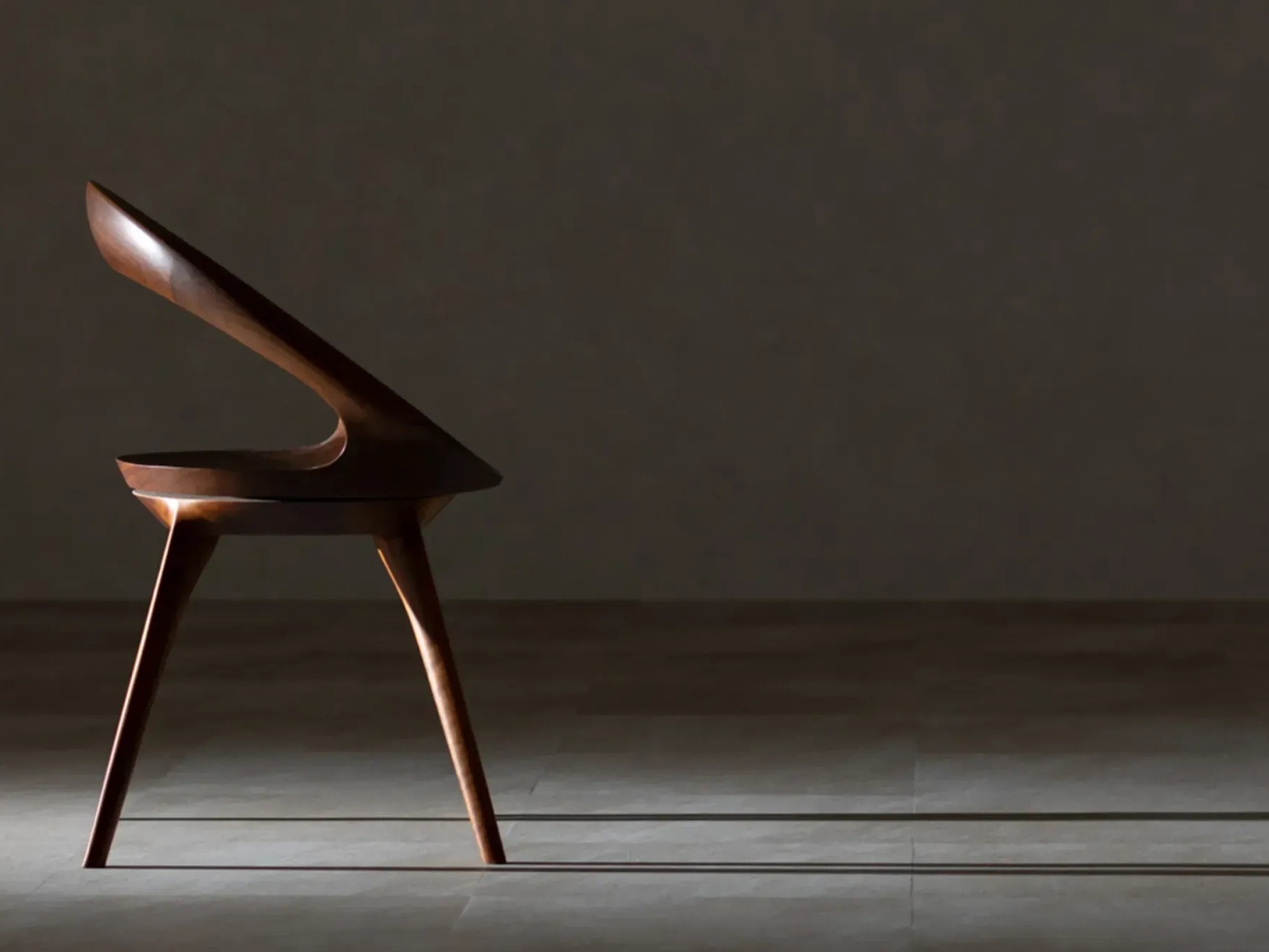
The Anello chair by Kiritsu Mokko does not shout for attention. It sits quietly with a circular backrest that seems to float around a sculpted wooden seat, looking like a piece slightly out of time. Not in a dated way. More like it arrived from a place where three very different design traditions decided, once and for all, to stop competing and just become one thing.

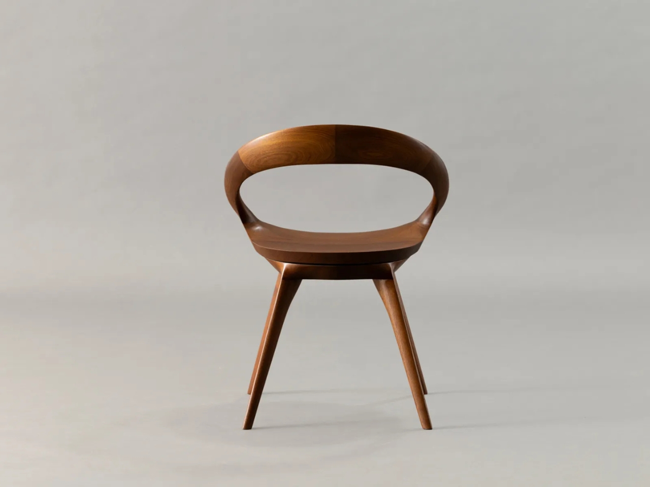
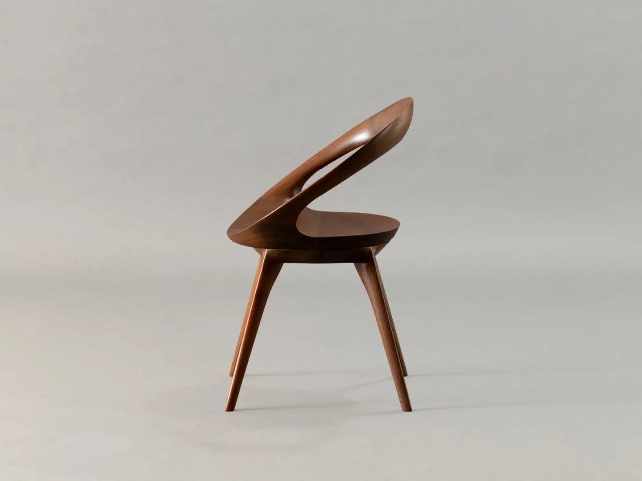
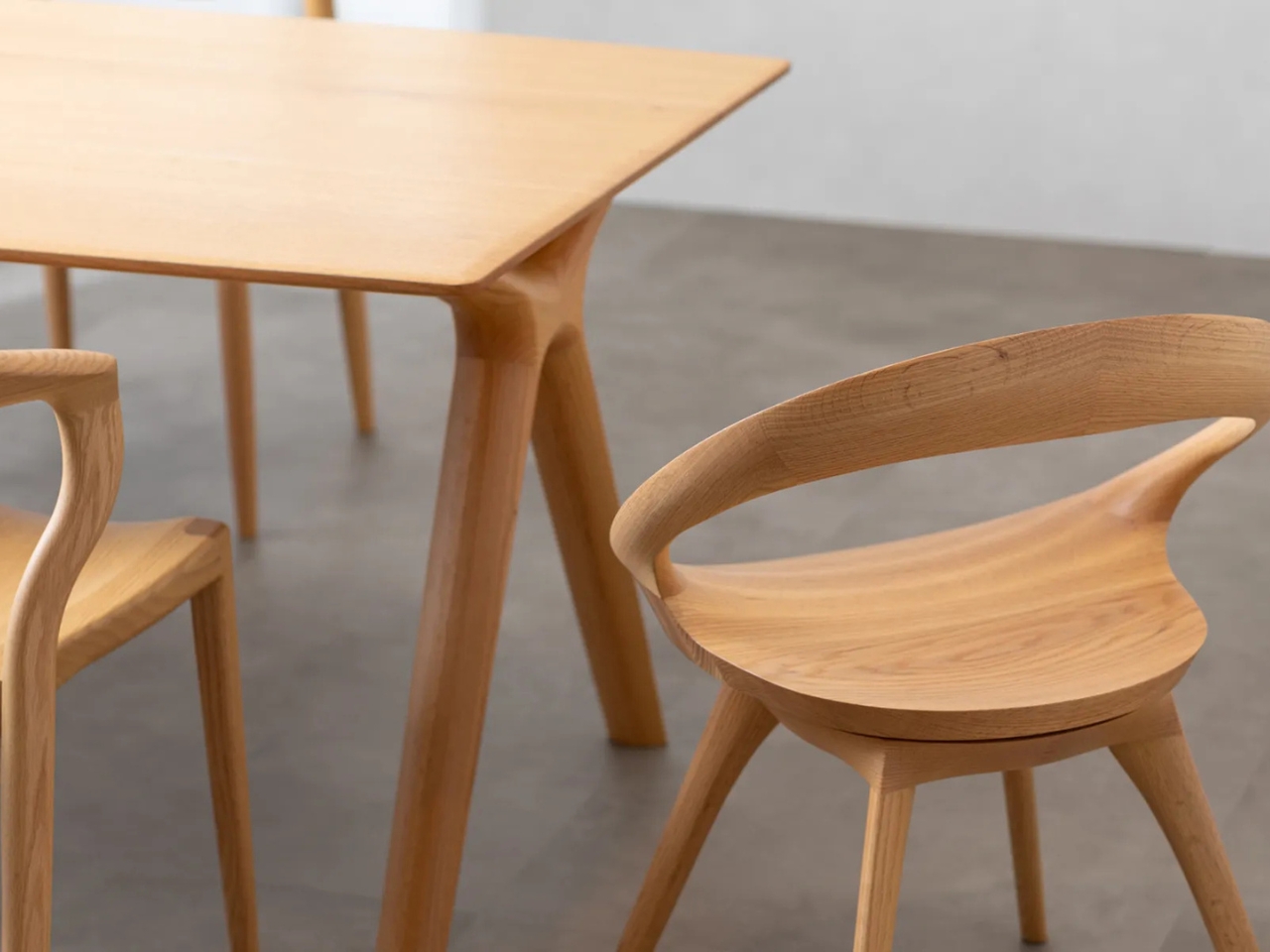
Kiritsu Mokko has been making furniture in Shizuoka Prefecture, Japan, since 1949. That is a long time to study wood. And the Anello, which loosely translates to “ring” in Italian, is a direct expression of that accumulated knowledge. The circular back is not a simple ring slapped onto a base. It is constructed by carefully joining pieces of solid wood, with the grain matched so deliberately that the joints nearly disappear into the form. The result is a curve that looks almost impossible in wood, as though someone forgot to tell the material what it could and could not do.

Designer: Kiritsu Mokko

The design language is genuinely hard to place, and I think that is the entire point. From certain angles, the Anello looks like it belongs in a 1960s living room, all rounded forms and quiet futurism, the kind of chair Kubrick might have placed in a scene just for its shape. From another angle, it reads as straightforwardly Danish Modern, with clean proportions, warm wood tones, and that particular kind of seated elegance that Scandinavian design spent decades perfecting. And then you look at the joinery, the patience baked into every curve, and it becomes unmistakably Japanese. Not Japanese in a superficial, “inspired by” way, but in the deeper sense of a culture that treats materials with a respect that borders on reverence.

The seat swivels. That detail is easy to miss because Kiritsu Mokko was careful to hide the mechanism, keeping the chair’s silhouette completely uninterrupted. No visible hardware, no break in the form. You can rotate in place and the chair still reads as a single, continuous object. That kind of restraint is its own design philosophy, the idea that if a feature does not serve the visual integrity of a piece, it should be invisible. This is not a new concept in Japanese design, but seeing it executed this cleanly is always a reminder of how much the rest of the furniture world is leaving on the table.

It comes in walnut and oak, which matters more than it might seem. These are not just material options. They are two entirely different emotional experiences of the same chair. The walnut version has a richness that pulls the Anello toward something more intimate and sculptural. The oak reads lighter, more architectural, almost Scandinavian by default. Either way, the solid wood construction means this is not a piece designed to be replaced in five years. It is made with the assumption that you will still have it in thirty.

I will admit that the Anello is the kind of chair that makes me think about how little faith the mainstream furniture market has in its customers. Most of what fills showrooms today operates on a kind of planned impermanence, pieces designed to look good in a photograph before you buy them and mediocre in a room after you do. The Anello is the opposite of that. It is a chair that probably photographs well but is genuinely intended to be lived with.

A piece of furniture that synthesizes Space Age optimism, Scandinavian warmth, and Japanese precision without feeling like a design school exercise is genuinely rare. The Anello pulls it off not because it was trying to be three things at once, but because Kiritsu Mokko has been doing this long enough to trust the materials to speak for themselves.

The post The Anello Chair Is 3 Design Eras in One Piece of Wood first appeared on Yanko Design.
This Lounge Chair Was Designed to Never Be Replaced — Indoors or Out

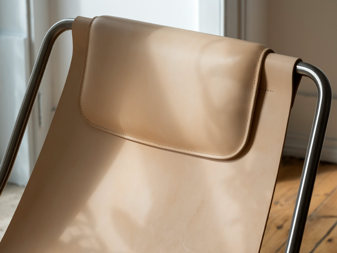
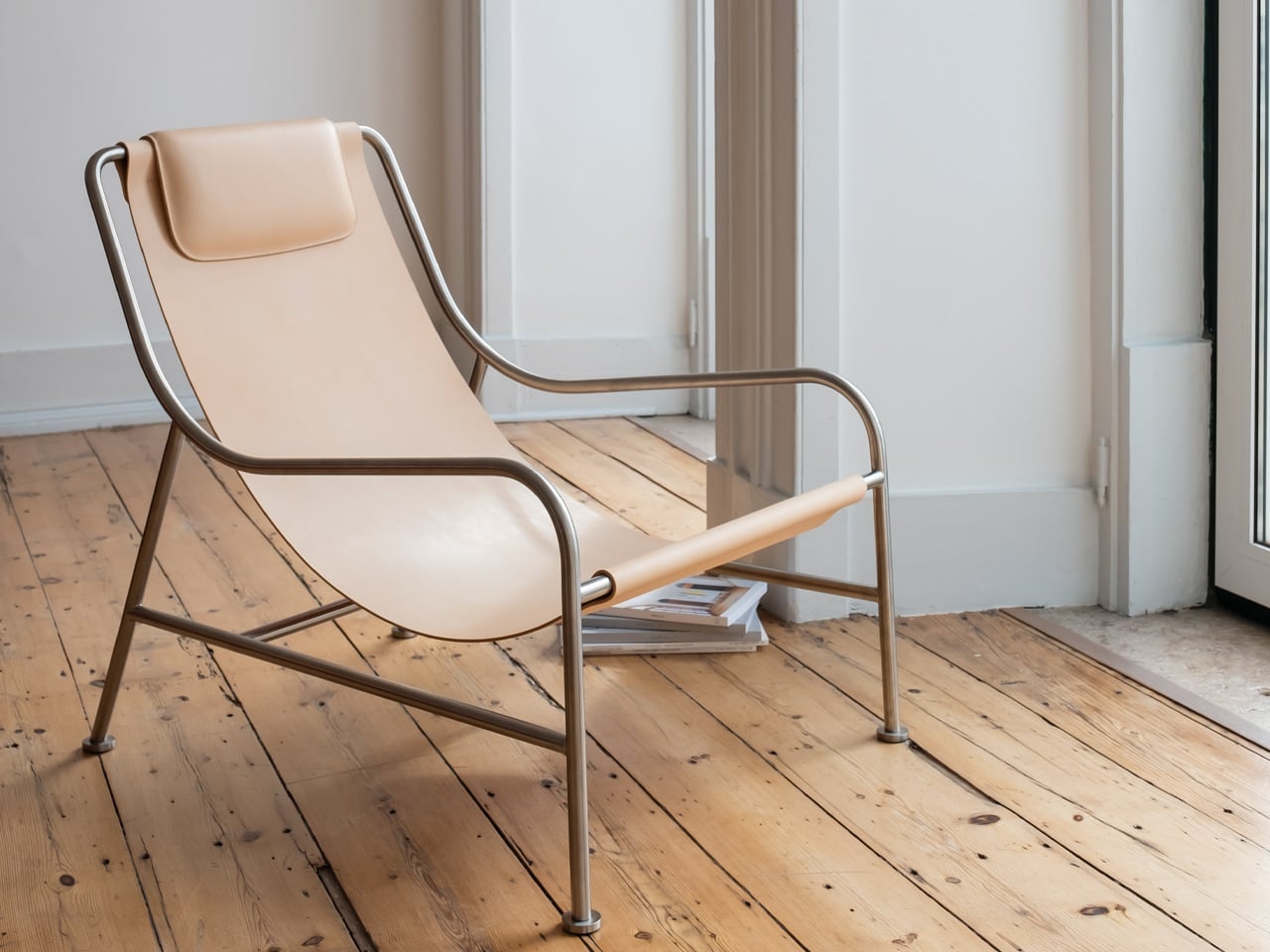
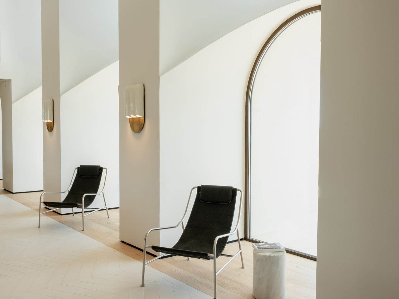
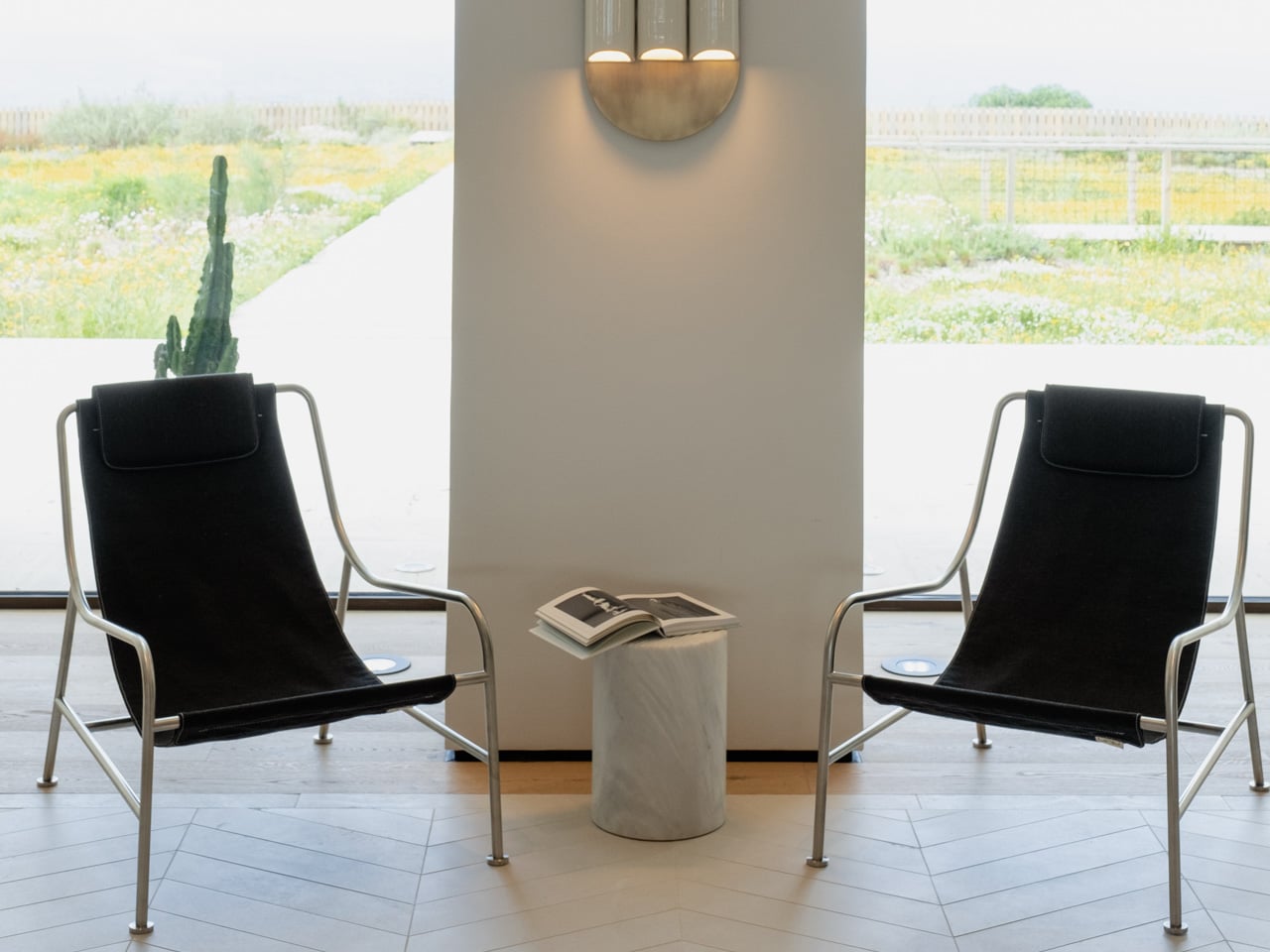
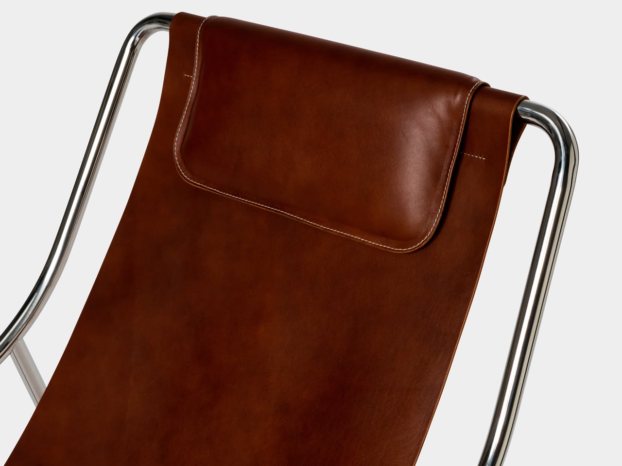
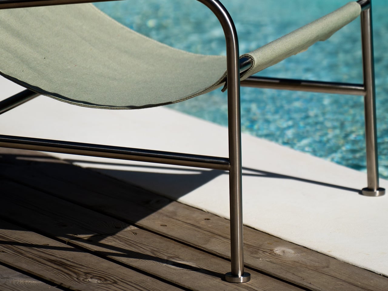
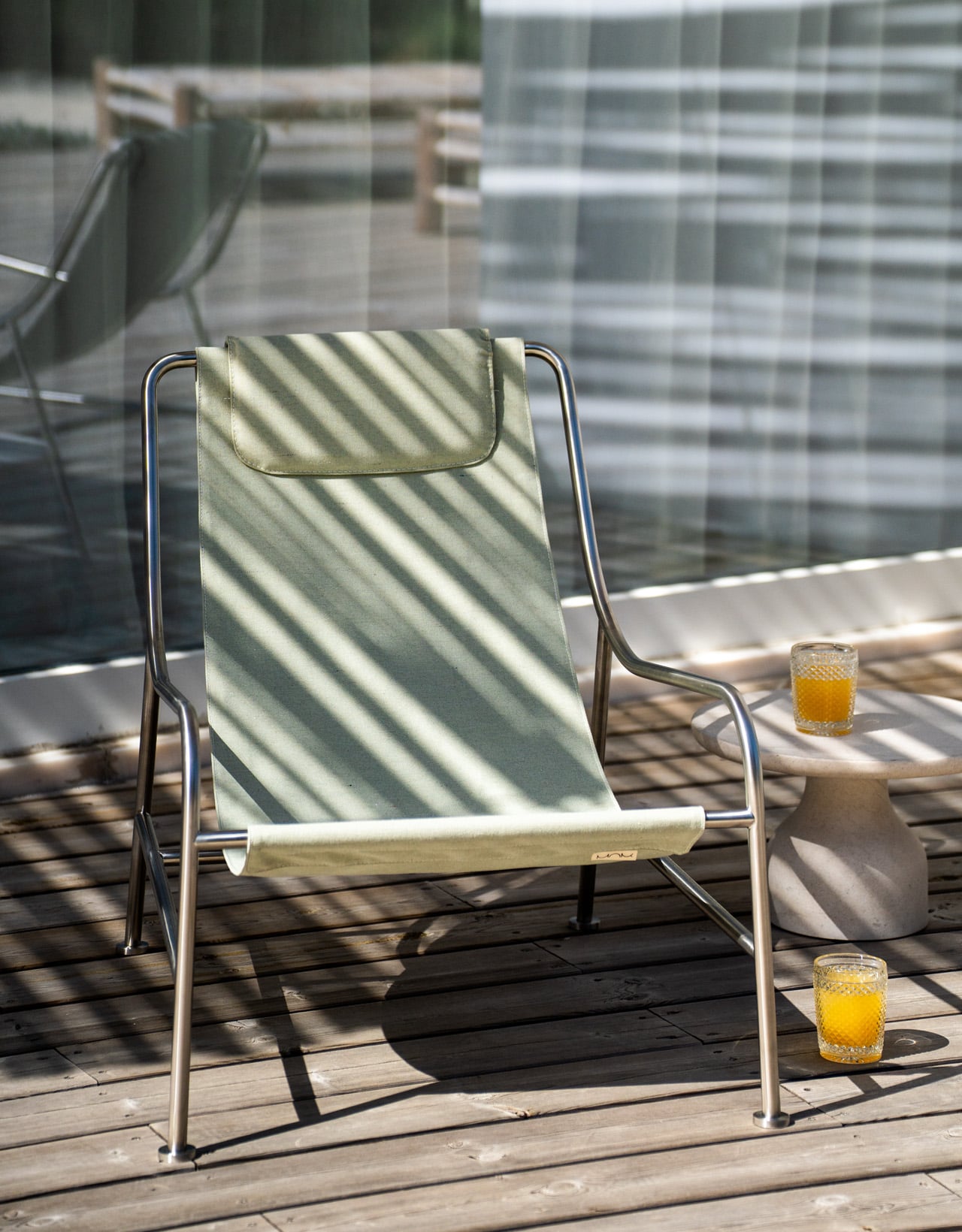
The best furniture doesn’t freeze time. It moves with you. That’s the quiet logic behind the LISBOA Lounge Chair, designed by Keiji Takeuchi for MOR Design. The chair is defined by a kind of lightness, both visual and physical. An open stainless-steel frame, a suspended sling seat, a silhouette that sits low and easy in a room without demanding attention. What’s even more interesting is the system that takes that lightness further: two interchangeable seats, one in textile, one in leather, that can be swapped depending on where you are, how you’re living, and what the space asks for.
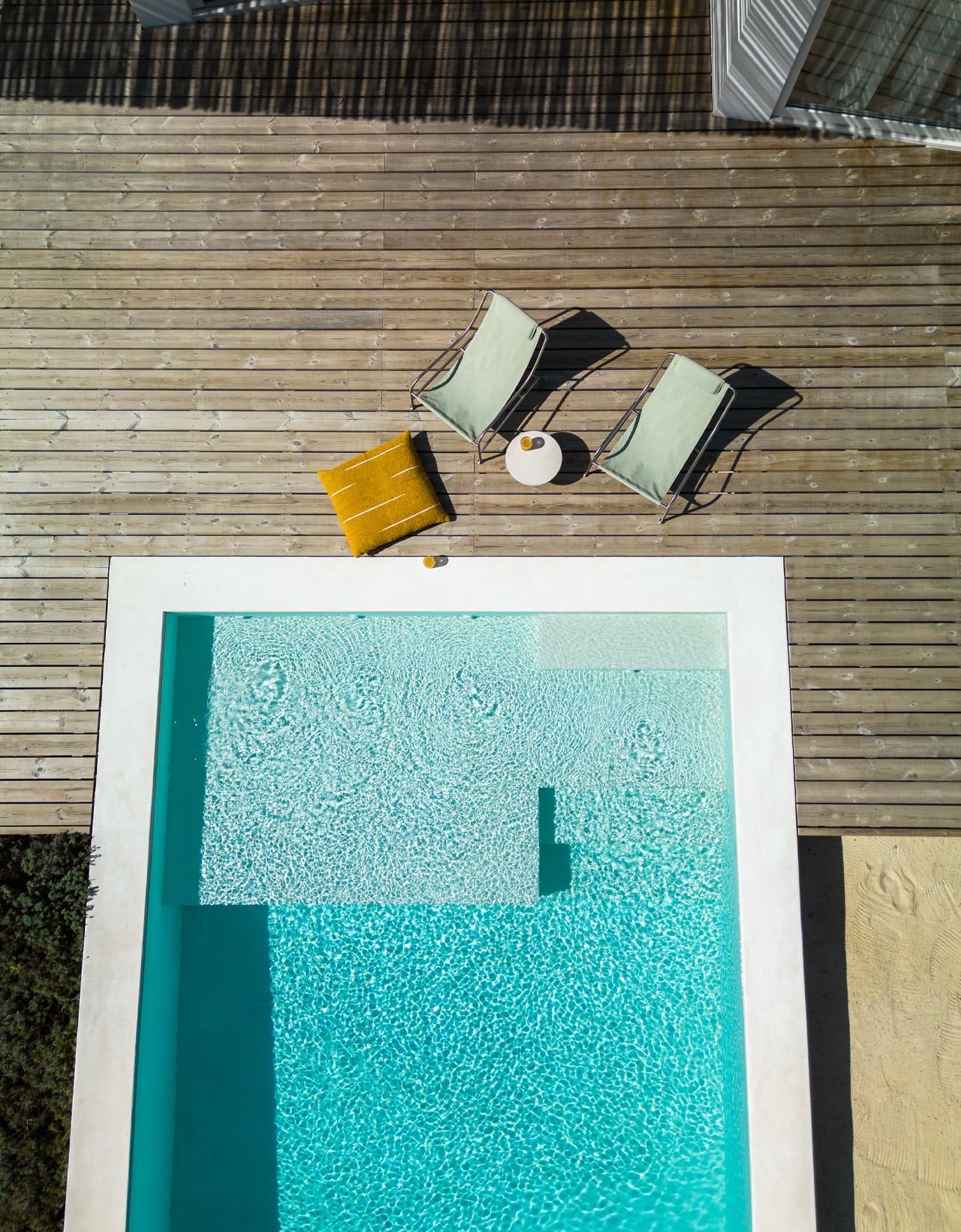
It sounds simple. That’s because it is. The seat detaches cleanly from the frame, which is available in brushed or polished stainless steel. Swap the leather for textile, and the chair moves from a living room to a terrace without missing a beat. The frame stays the same, as does the identity. What changes is the layer of the chair closest to you.

Designer: Keiji Takeuchi for MOR Design

This matters more than it might first appear. Most furniture is bought for a fixed version of your life. LISBOA accommodates the version that’s still becoming. Keiji Takeuchi conceived the chair during the 2020 lockdown, thinking about how people might bring the ease of outdoor living into their everyday interiors. He understood that the boundary between inside and outside had already started to blur. The interchangeable seat system is a direct extension of that thinking. It doesn’t ask you to replace the chair when your context changes. It asks you to change the seat.

For a brand like MOR Design, founded in Portugal with a commitment to material integrity and longevity, this is the logical next step. Beautiful objects should last. But lasting doesn’t mean staying the same. The leather seat reads warm and deliberate in a residential interior. The textile option, weather-resistant and easy to clean, handles a poolside or garden setting just as naturally. Both sit within the same architectural frame, which is what allows the chair to belong in hospitality and contract spaces as readily as it does at home.

LISBOA was shown at Maison&Objet 2026, where the conversation around adaptable, considered consumption is hard to avoid. The chair arrives at the right moment. Not as a statement about sustainability or modularity, but as something quieter: a piece of furniture that knows your life will change, and is already ready for it. It is, as MOR Design puts it, your chair, and your moment.

The post This Lounge Chair Was Designed to Never Be Replaced — Indoors or Out first appeared on Yanko Design.