Galaxy Z Fold8 Wide Leaks Show a Foldable With iPad-Like Proportions

Book-style foldables have had a proportions problem since the beginning. The tall, narrow inner displays most of them unfold to have always felt more like stretched phones than proper mini-tablets, making tasks like reading or taking notes feel a little off. Years of refinement have addressed crease visibility and hinge durability, but the shape of the inner screen has largely stayed the same.

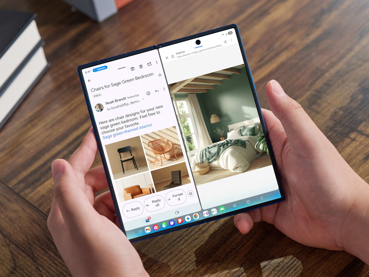
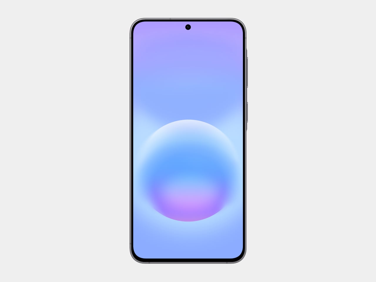
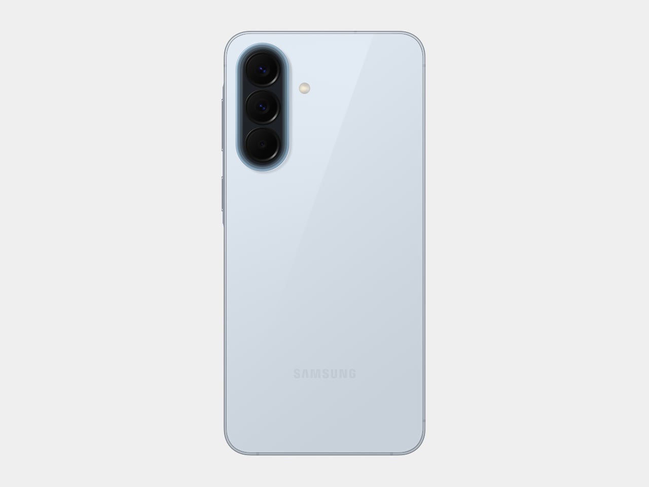
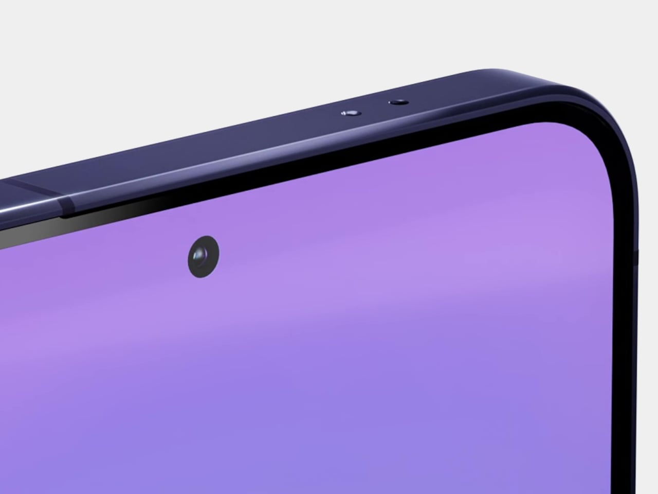
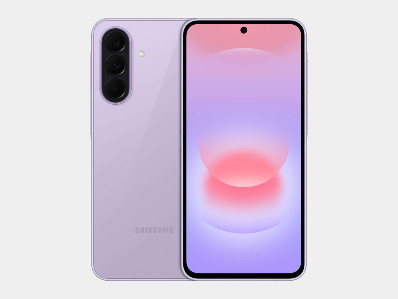
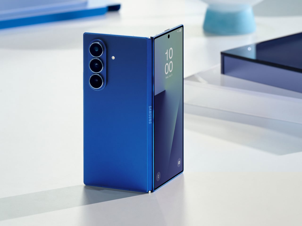
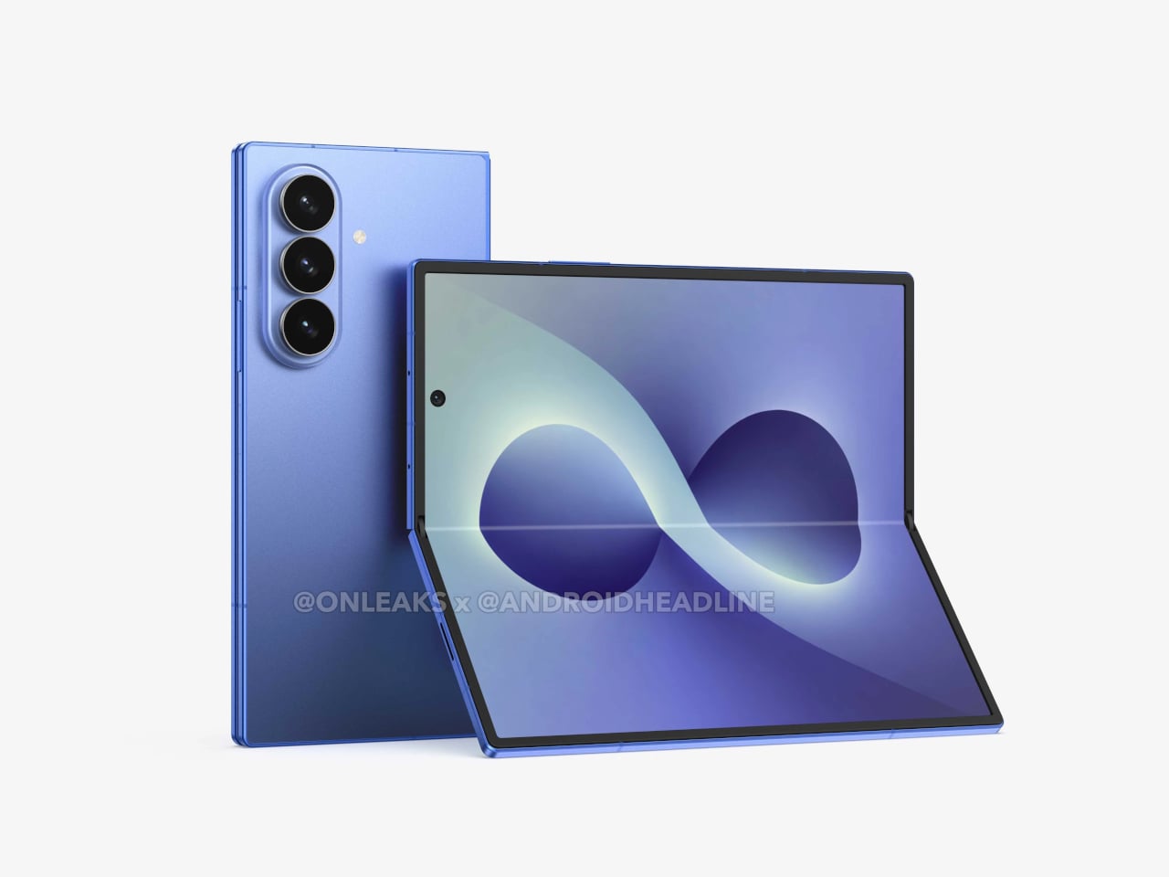
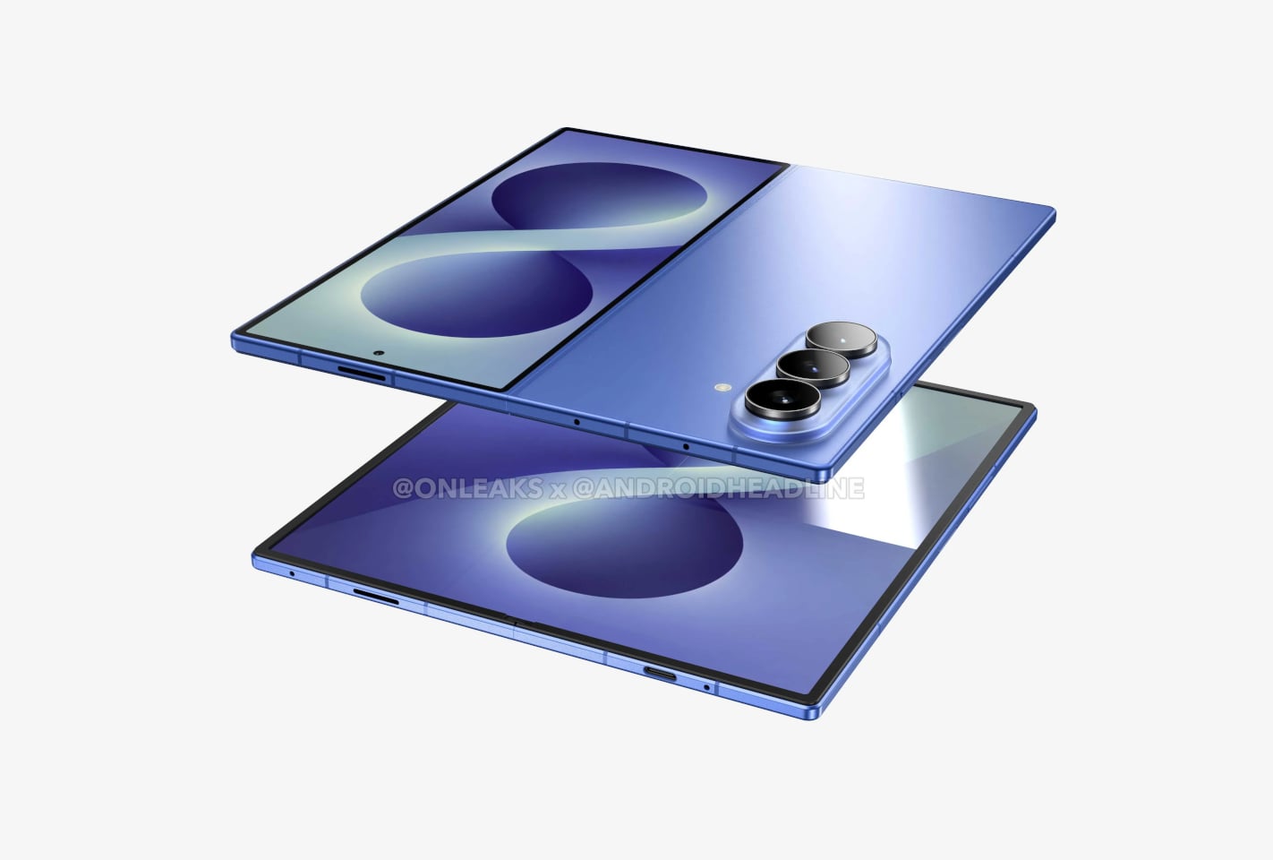
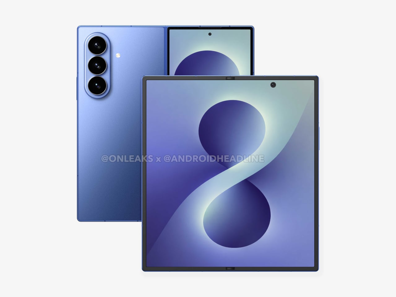
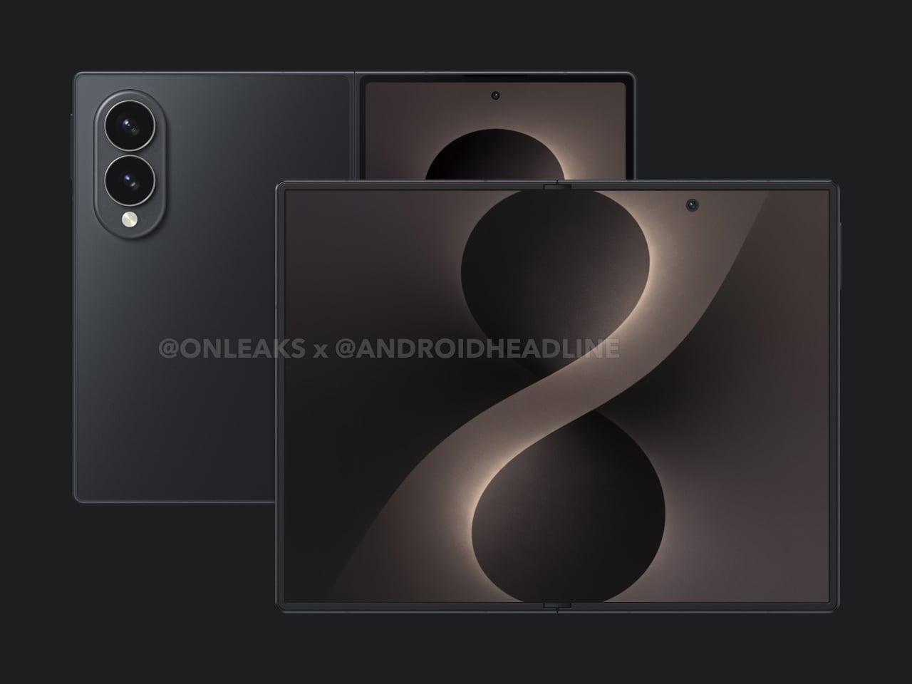
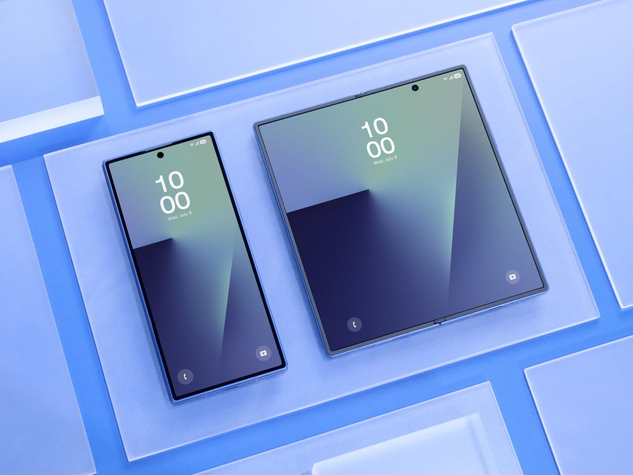
That might be changing, at least according to leaked CAD-based renders spreading on the Web like wildfire. The renders point to a device called the Galaxy Z Fold8 Wide, a book-style foldable that reportedly trades the Fold lineup’s tall proportions for a shorter, wider form factor. Samsung hasn’t confirmed any of this, and the final design could change.

Designer: Steve Hemmerstoffer/OnLeaks (Renders) via AndroidHeadlines
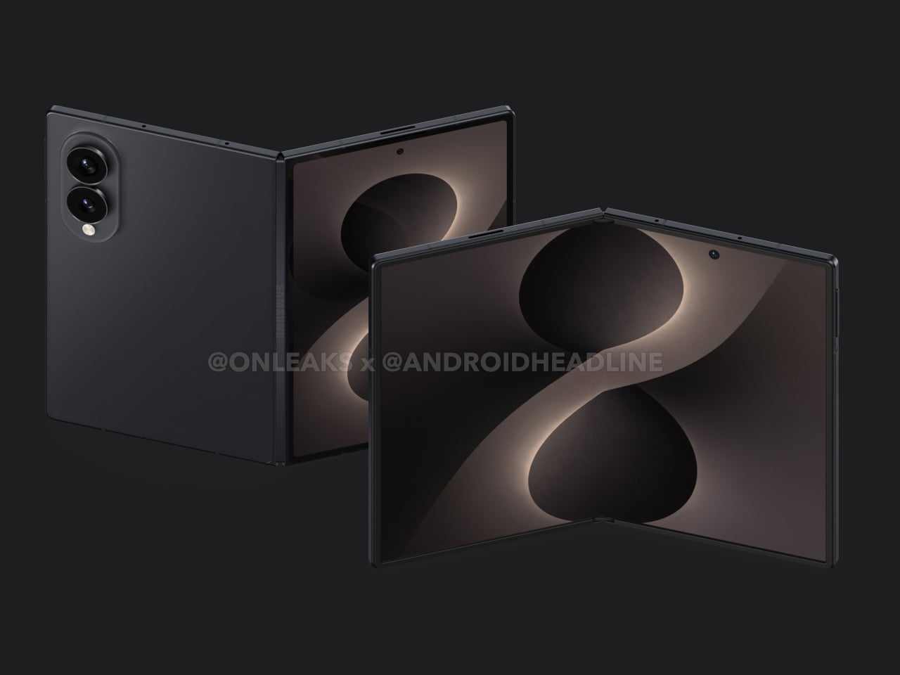
The leaked dimensions put the Galaxy Z Fold8 Wide at 123.9mm x 161.4mm x 4.9mm when unfolded and 123.9mm x 82.2mm x 9.8mm when folded, with the camera bump reaching 14.6mm at its thickest point. Those numbers describe a device that’s noticeably shorter and wider than the standard Galaxy Z Fold8, which reportedly unfolds to a taller 158.4mm x 143.2mm footprint.

The inner screen is reportedly a 7.6-inch display with a 4:3 aspect ratio, far closer to a classic tablet format than anything in Samsung’s current foldable lineup. Unfold it, and instead of a tall phone stretched sideways, you’d have something that feels at home for reading, video calls, or running two apps side by side. That ratio changes how you’d actually use it.
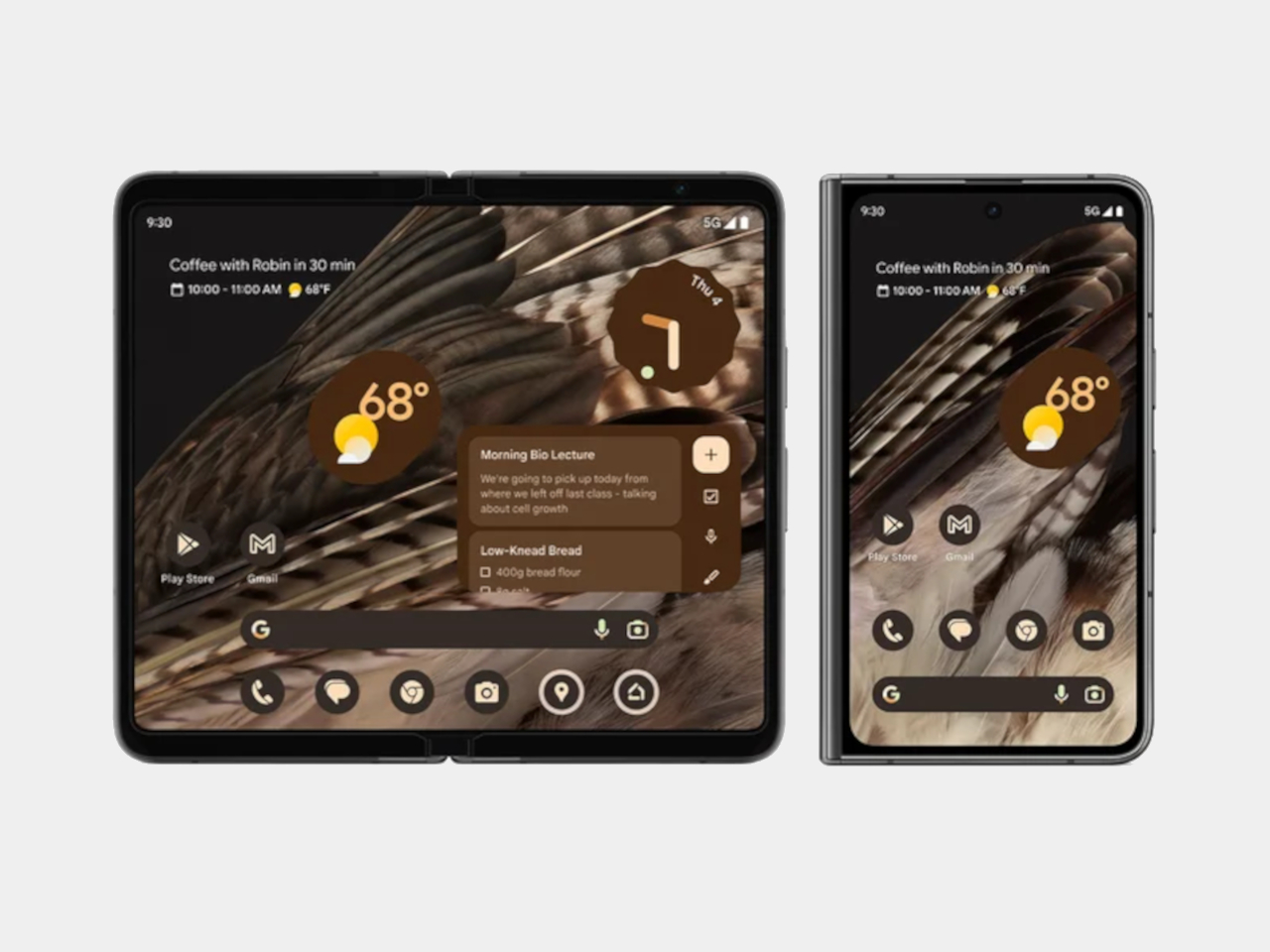
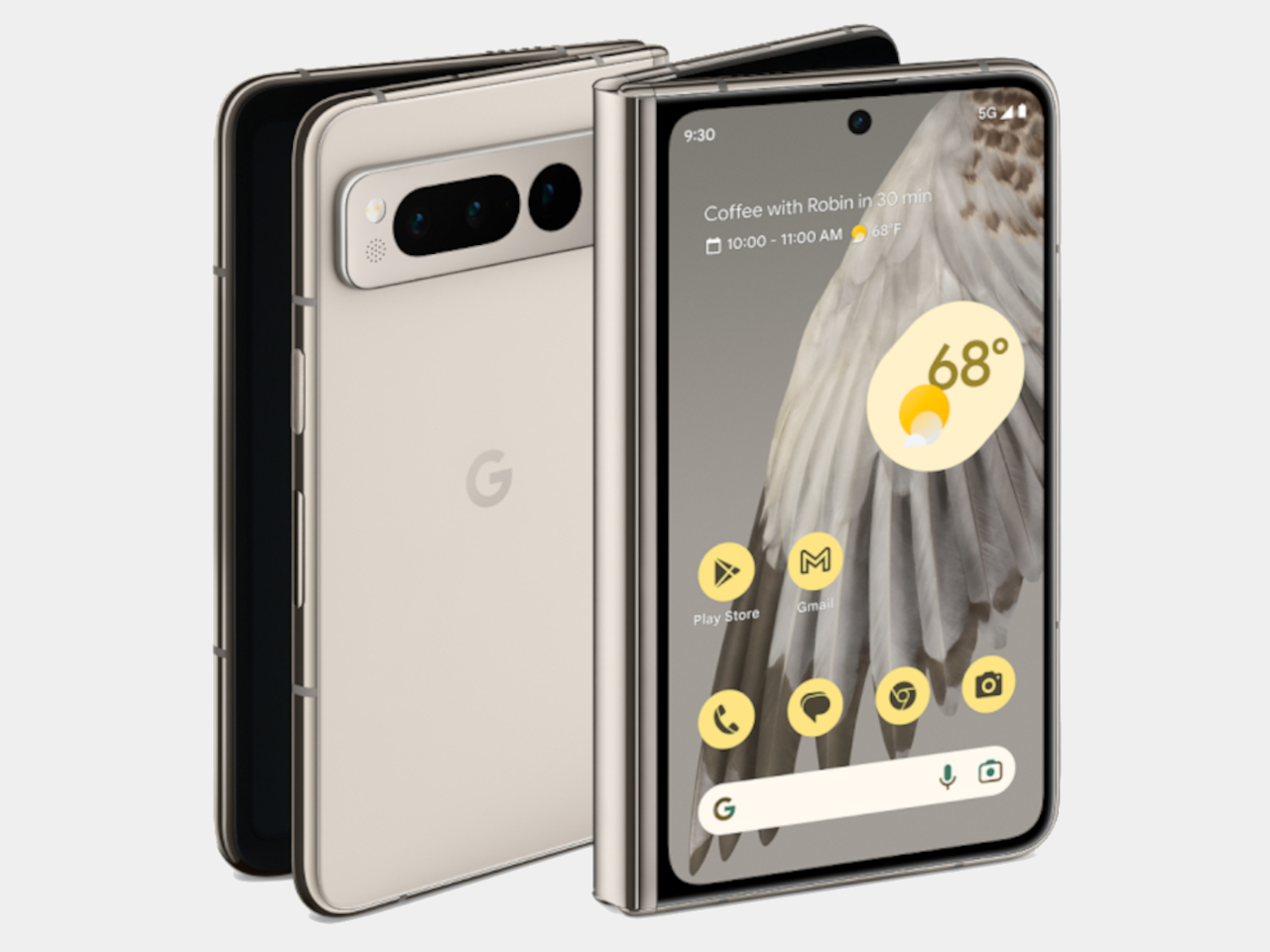
Google Pixel Fold (2023)

Google explored something similar with the first Pixel Fold in 2023, which had a 7.6-inch inner display with a 6:5 aspect ratio and unfolded to 139.7mm x 158.7mm. The Galaxy Z Fold8 Wide’s rumored 4:3 ratio would push the open screen more into landscape territory, and at a reported 9.8mm when folded, it would still be considerably thinner than the Pixel Fold’s 12.1mm.
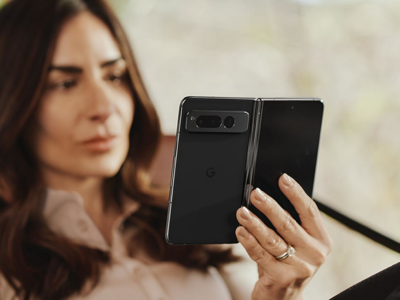
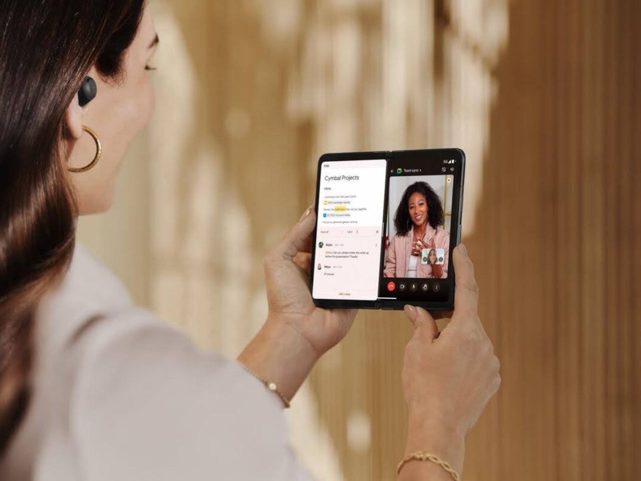
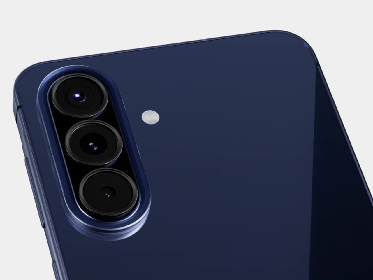
The cover display follows the same logic. At 5.4 inches on an 82.2mm-wide body, it would carry a more usable, phone-like aspect ratio than the narrow cover panels on existing Z Fold devices. The trade-off, per the leak, is a dual-camera rear setup rather than the triple-lens arrangement on the standard Galaxy Z Fold8, which is worth noting for photography-focused buyers.
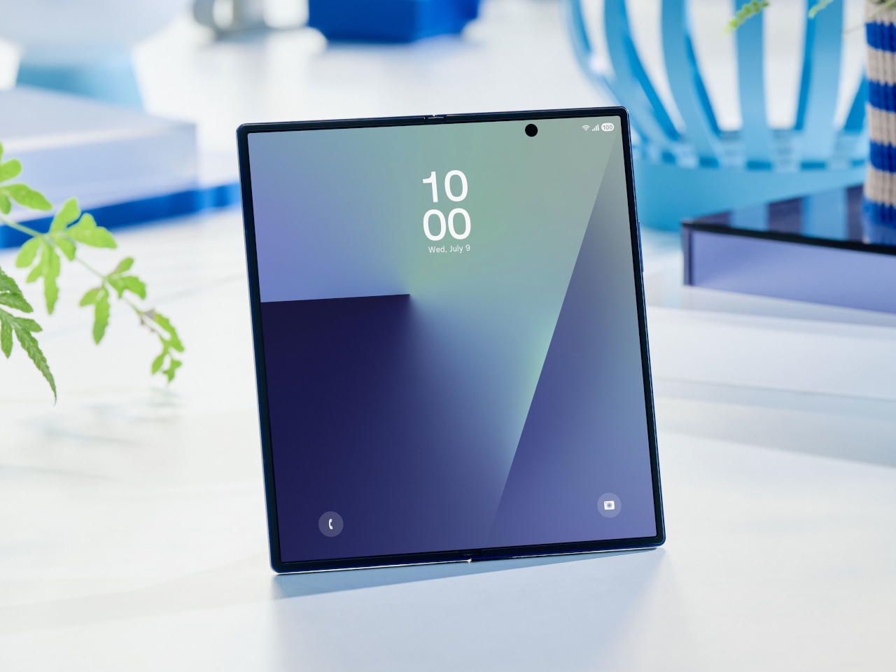
Samsung Galaxy Z Fold7

The timing of these leaks adds context. Samsung is reportedly planning to launch the Galaxy Z Fold8 Wide this summer alongside the standard Fold8 and Flip8, positioning the wider device as a direct answer to Apple’s anticipated iPhone Fold. The rumored internals include a Snapdragon 8 Elite Gen 5 for Galaxy chipset, a 5,000 mAh battery, and 45W wired charging.
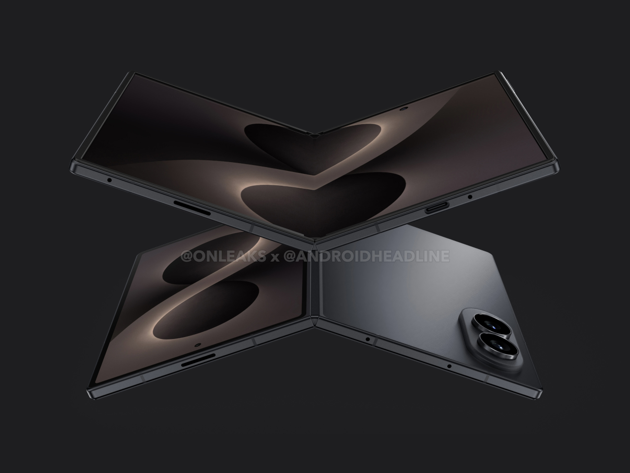
Until Samsung makes an official announcement, none of this is confirmed, and CAD-based renders drawn from supply chain data don’t always reflect what ships. What these leaks do suggest, though, is that Samsung is seriously exploring a foldable form factor that puts the open screen first, with proportions that actually match what a device meant to be used open should look like.

The post Galaxy Z Fold8 Wide Leaks Show a Foldable With iPad-Like Proportions first appeared on Yanko Design.
Samsung’s Galaxy A Phones Now Get IP68 and 6-Year Updates From $449

Mid-range smartphones have been getting very good, very quickly. Most now check the boxes for performance, camera quality, and even design, but the compromises tend to show up later. Software support runs out too soon, water resistance gets downgraded to save costs, or the storage fills up faster than expected. It’s a category where the spec sheet looks promising right up until the parts that actually matter start falling short.

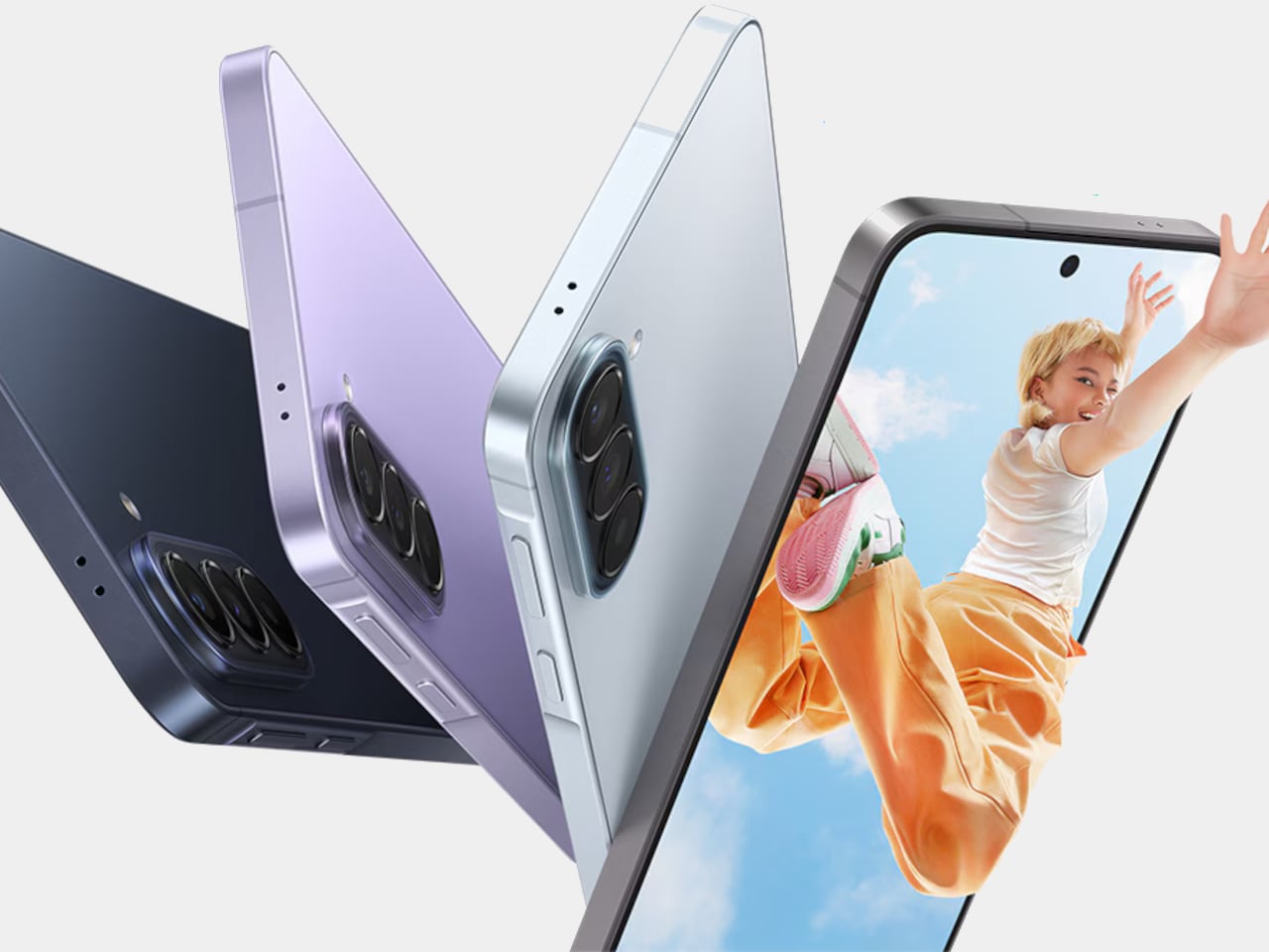
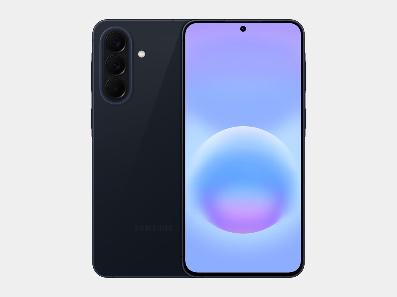
Samsung’s Galaxy A57 5G and Galaxy A37 5G tackle those exact issues. Rather than simply refreshing the hardware, these two phones address the pain points that tend to sour long-term ownership, from shorter software cycles to inadequate protection from the elements. Samsung describes both as the most capable Galaxy A devices yet, and for once, that kind of claim holds up when you look at what’s actually new.

Designer: Samsung

The Galaxy A57 5G leads with a noticeably slimmer build, now at just 6.9mm and 179 grams. A 13% larger vapor chamber helps keep the new Exynos 1680 processor running cool through long gaming sessions or extended recordings. The display also gets slimmer bezels and a bright Super AMOLED+ panel with Vision Booster, so the screen stays readable whether you’re inside at your desk or standing in direct sunlight.

Storage is where the A57 5G makes history for the Galaxy A line. It’s the first A-series phone to offer a 512 GB option, a welcome change for anyone managing a large photo library or shooting high-resolution video regularly. The triple-camera setup, led by a 50 MP main sensor with a 12 MP ultrawide and a 5 MP macro, handles everything from wide-angle landscapes to fine close-up detail.

The Galaxy A37 5G takes a different route to earn its upgrade. Its primary camera now uses a larger 50 MP sensor with support for 10-bit HDR video recording, improving low-light performance and color depth over its predecessor. More significantly, the durability rating jumped from IP67 to IP68, and it now ships with Gorilla Glass Victus+ on both the front and back, which is a notable step up at this price.

Both phones run One UI 8.5 with a broader set of Awesome Intelligence (get it? “AI”?) features. The camera uses AI-based subject and scene recognition to balance skin tones and create cleaner background separation automatically. Circle to Search has also been updated with multi-object recognition, so you can search an outfit, its accessories, and the surrounding backdrop all at once, rather than hunting for each element separately or toggling between searches.

What gives both phones long-term value is Samsung’s commitment to six generations of Android OS updates and six years of security support. Add to that 5,000 mAh batteries and IP68-rated protection across both models, and these are phones clearly meant to outlast the typical mid-range upgrade cycle. The Galaxy A57 5G starts at $549.99 and the Galaxy A37 5G at $449.99 in the US, with availability beginning April 9, 2026.

The post Samsung’s Galaxy A Phones Now Get IP68 and 6-Year Updates From $449 first appeared on Yanko Design.
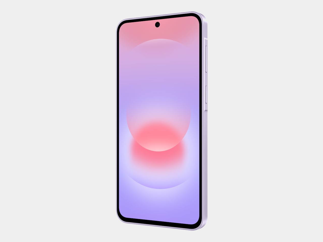
Leaked Honor 600 Pro looks a lot like the iPhone 17 Pro, but with a much bigger battery

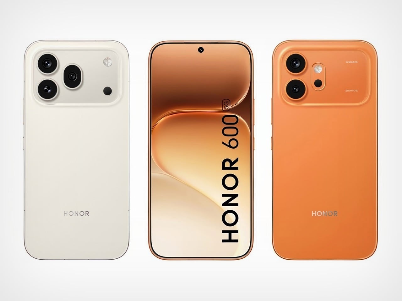
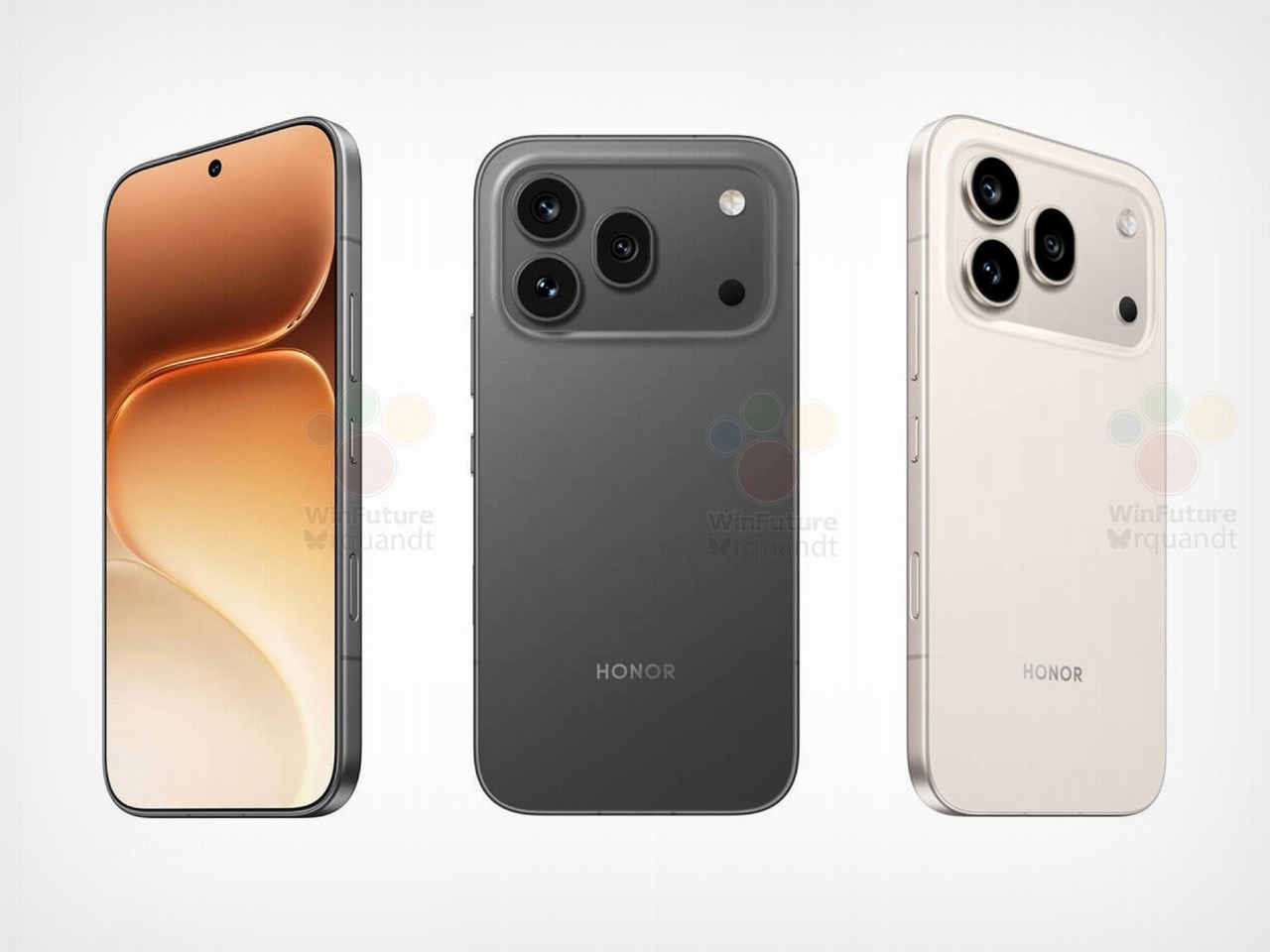
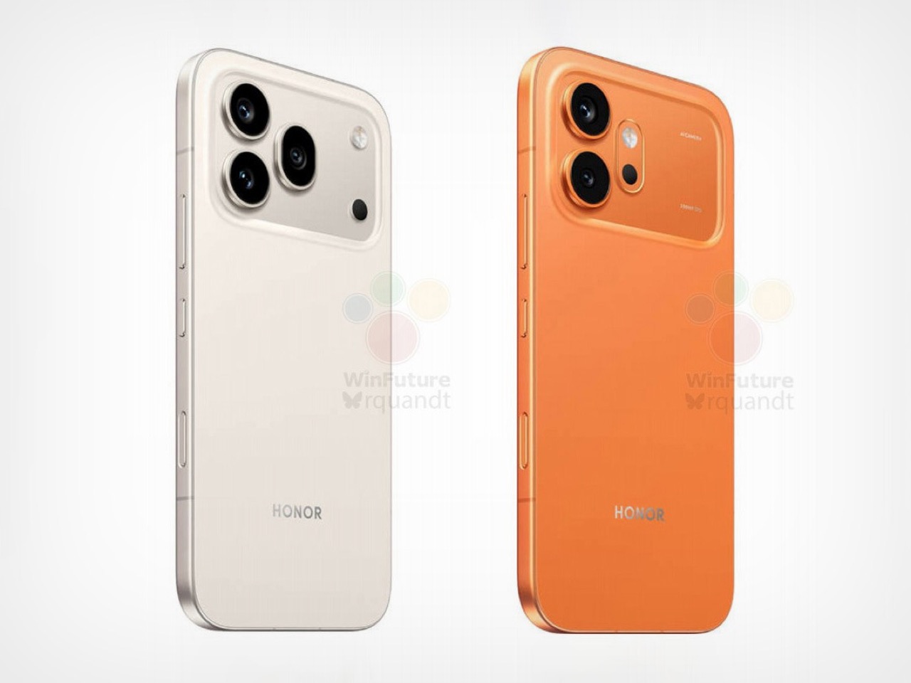
I have to hand it to Honor, they are consistent. When I wrote about the Magic8 Pro Air and its striking similarity to the iPhone Air, I thought we had seen the peak of their “inspiration.” It turns out that was just the warm-up act. The main event has arrived in the form of the Honor 600 and 600 Pro, and this time they have perfectly mimicked the iPhone 17 Pro. The new renders, courtesy of WinFuture, show a design that lifts every key element from Apple’s latest flagship. The full-width camera bar, the arrangement of the lenses, the flat metal frame, and even the color options are all present and accounted for. It’s a remarkable feat of reverse-engineering that feels both impressive and completely shameless.

What makes this strategy so fascinating is that Honor isn’t just making a cheaper clone. They are using the familiar, market-tested design as a vessel for a totally different philosophy. The Honor 600 is expected to ship with a 200MP camera and a 9,000mAh battery, specs that are practically alien to Apple’s ecosystem. It’s a phone designed to look like an iPhone from a distance but to function like an endurance-focused Android powerhouse up close. Honor is essentially telling the world that you can have Apple’s style without having to accept Apple’s compromises, and that’s a powerful message.

Designer: HONOR

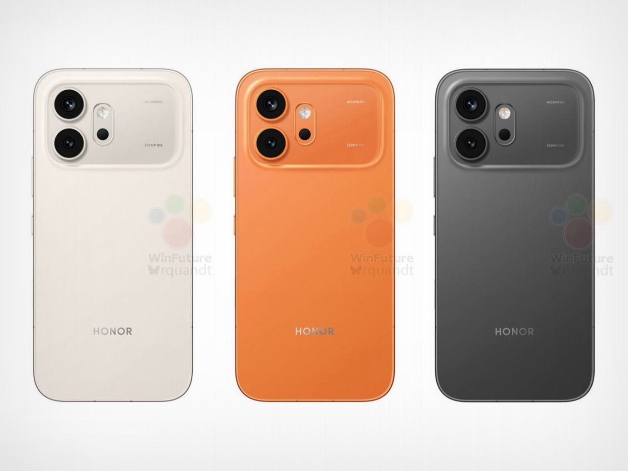
The horizontal camera bar is not just vaguely similar, it’s dimensionally faithful. Both models feature the same raised rectangular module spanning nearly the full width of the device, with lenses, flash, and sensor cutouts arranged in a configuration that directly mirrors Apple’s layout. The standard Honor 600 goes with a dual rear camera setup, with its LED flash and laser autofocus tucked into a separate pill-shaped island below. The Pro model steps it up with a triple-lens arrangement, going all-in on the vertical stack. Even the colorways follow Apple’s playbook closely, with glossy black, metallic gold, and a bright orange finish that lands somewhere between homage and photocopy. Honor’s team clearly studied the iPhone 17 Pro with the intensity of an art student sketching a masterpiece in a museum.

The hardware rumors add even more intrigue to the picture. A 9,000mAh silicon battery in a flagship-tier device is almost unheard of in 2026, delivering the kind of multi-day endurance that the iPhone 17 Pro can only dream about. Both phones also get a 6.57-inch 120Hz OLED display at 1.5K resolution, wireless charging, a 3D ultrasonic in-display fingerprint sensor, and a Snapdragon 8 series chipset. There’s even a dedicated camera button on the side, which is, yes, another very Apple-like touch. Honor is effectively saying: if you love how the iPhone looks but wish it prioritized endurance and camera specs over thinness, we built that phone for you. Whether that resonates with buyers remains to be seen, but the logic behind it is hard to argue with.

The post Leaked Honor 600 Pro looks a lot like the iPhone 17 Pro, but with a much bigger battery first appeared on Yanko Design.
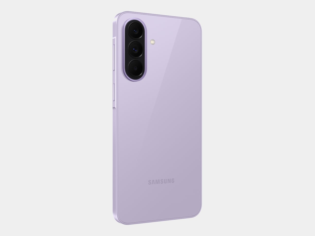
Leaked Honor 600 Pro looks a lot like the iPhone 17 Pro, but with a much bigger battery

I have to hand it to Honor, they are consistent. When I wrote about the Magic8 Pro Air and its striking similarity to the iPhone Air, I thought we had seen the peak of their “inspiration.” It turns out that was just the warm-up act. The main event has arrived in the form of the Honor 600 and 600 Pro, and this time they have perfectly mimicked the iPhone 17 Pro. The new renders, courtesy of WinFuture, show a design that lifts every key element from Apple’s latest flagship. The full-width camera bar, the arrangement of the lenses, the flat metal frame, and even the color options are all present and accounted for. It’s a remarkable feat of reverse-engineering that feels both impressive and completely shameless.

What makes this strategy so fascinating is that Honor isn’t just making a cheaper clone. They are using the familiar, market-tested design as a vessel for a totally different philosophy. The Honor 600 is expected to ship with a 200MP camera and a 9,000mAh battery, specs that are practically alien to Apple’s ecosystem. It’s a phone designed to look like an iPhone from a distance but to function like an endurance-focused Android powerhouse up close. Honor is essentially telling the world that you can have Apple’s style without having to accept Apple’s compromises, and that’s a powerful message.

Designer: HONOR

The horizontal camera bar is not just vaguely similar, it’s dimensionally faithful. Both models feature the same raised rectangular module spanning nearly the full width of the device, with lenses, flash, and sensor cutouts arranged in a configuration that directly mirrors Apple’s layout. The standard Honor 600 goes with a dual rear camera setup, with its LED flash and laser autofocus tucked into a separate pill-shaped island below. The Pro model steps it up with a triple-lens arrangement, going all-in on the vertical stack. Even the colorways follow Apple’s playbook closely, with glossy black, metallic gold, and a bright orange finish that lands somewhere between homage and photocopy. Honor’s team clearly studied the iPhone 17 Pro with the intensity of an art student sketching a masterpiece in a museum.

The hardware rumors add even more intrigue to the picture. A 9,000mAh silicon battery in a flagship-tier device is almost unheard of in 2026, delivering the kind of multi-day endurance that the iPhone 17 Pro can only dream about. Both phones also get a 6.57-inch 120Hz OLED display at 1.5K resolution, wireless charging, a 3D ultrasonic in-display fingerprint sensor, and a Snapdragon 8 series chipset. There’s even a dedicated camera button on the side, which is, yes, another very Apple-like touch. Honor is effectively saying: if you love how the iPhone looks but wish it prioritized endurance and camera specs over thinness, we built that phone for you. Whether that resonates with buyers remains to be seen, but the logic behind it is hard to argue with.

The post Leaked Honor 600 Pro looks a lot like the iPhone 17 Pro, but with a much bigger battery first appeared on Yanko Design.
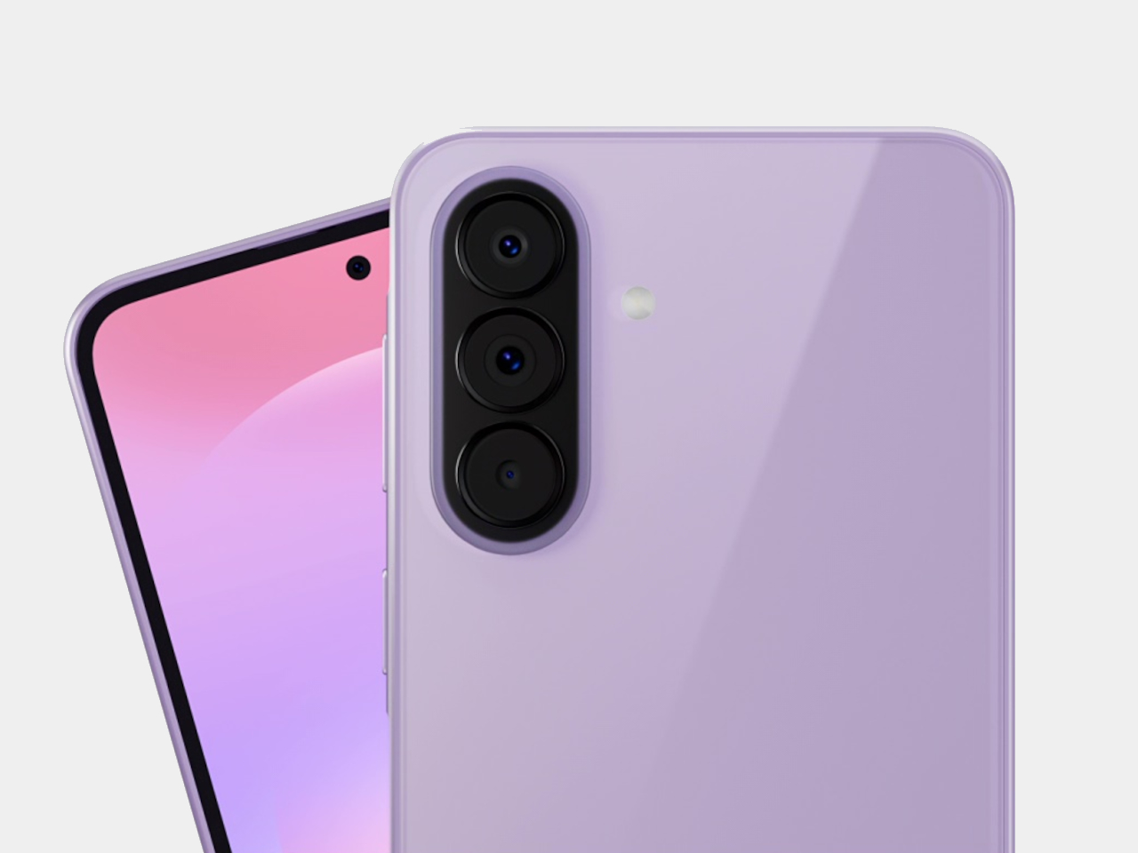
Galaxy Z Fold 8 Renders: Same Look, Bigger Battery, and S Pen Is Back

Foldable phones have reached a point where the form factor itself is no longer the talking point it once was. The big, dramatic “look how it folds” moment has settled into a quieter rhythm of iterative refinement, with each generation tweaking dimensions and chasing thinner profiles. Most buyers know what a modern book-style foldable looks like, and the language of change has shifted from shape to substance.

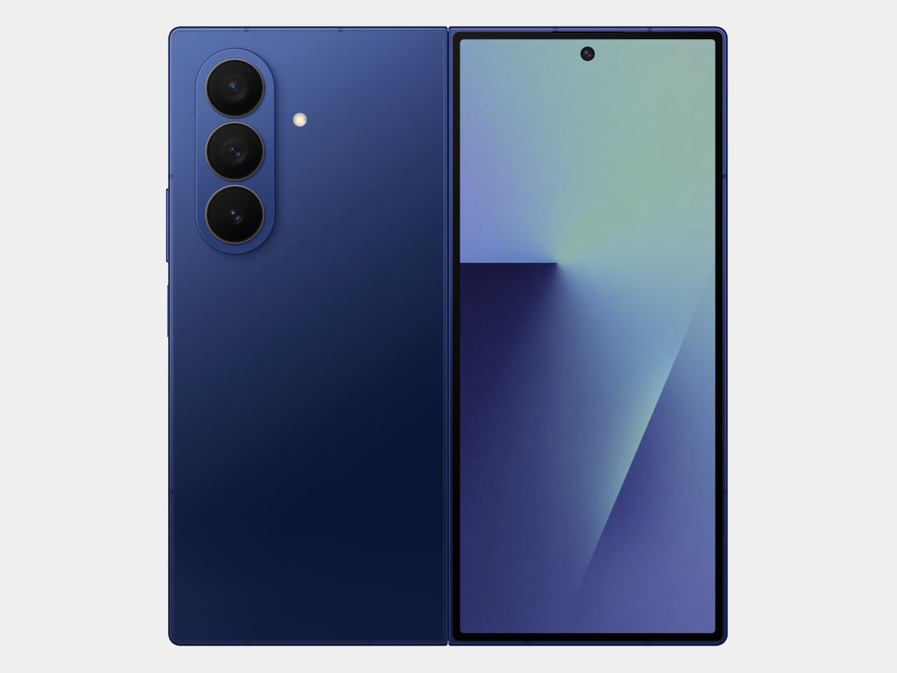
That’s the situation shaping the Samsung Galaxy Z Fold 8 conversation right now. Leaked CAD-based renders show a design that’s nearly indistinguishable from the Z Fold 7 pictured above: same flat sides, same sharp corners, same camera layout. The cover screen sits at 6.5 inches and the inner display at 8 inches, both unchanged. If you handed someone these renders without context, they’d probably just guess it was another angle of last year’s model.

Designer: Steve Hemmerstoffer/OnLeaks (Renders) via AndroidHeadlines

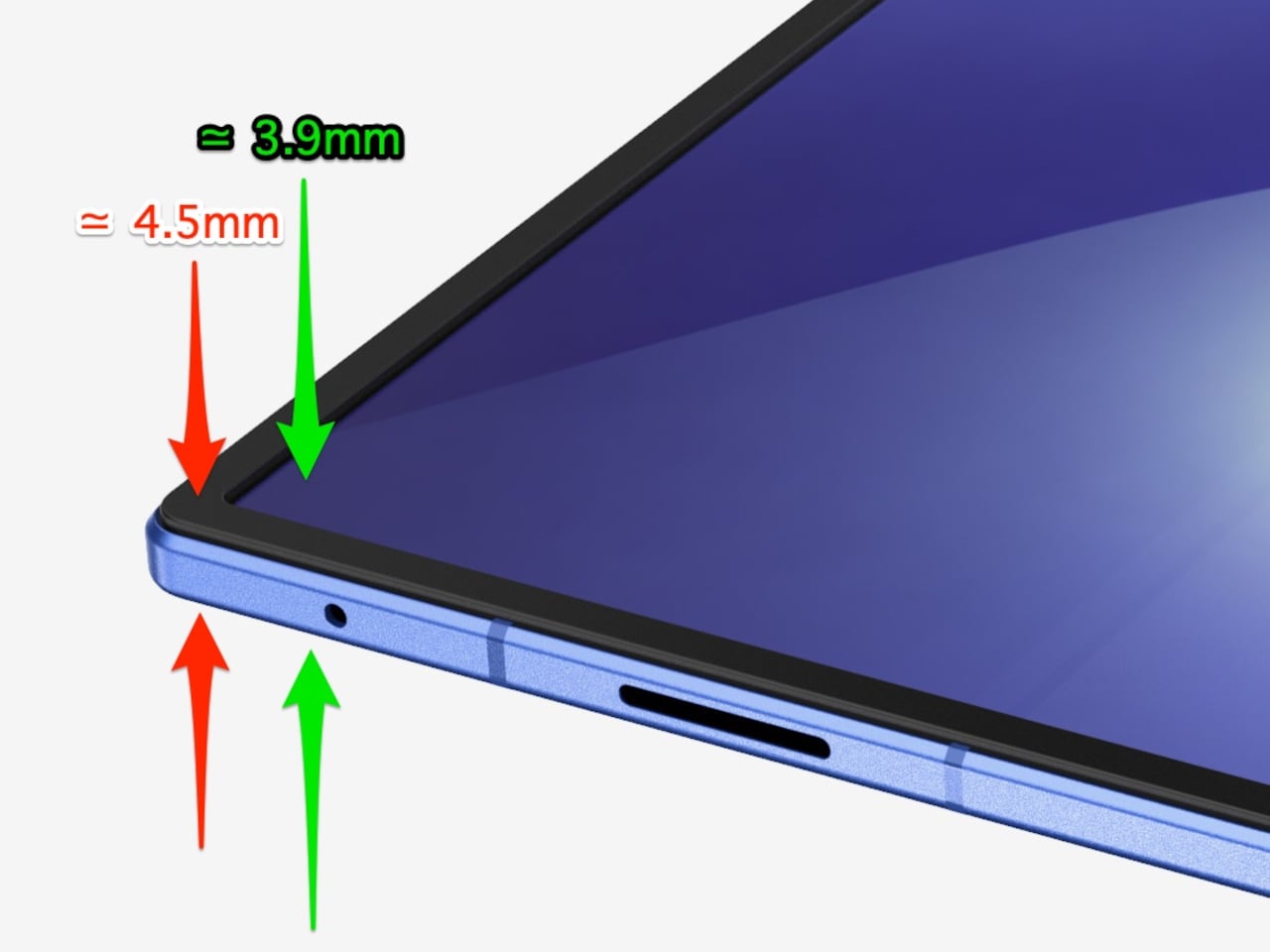
There’s one notable external difference, though, and it actually goes in the wrong direction. The leaked dimensions put the Z Fold 8 at 4.5mm thick when open and 9mm folded, compared to the Fold 7’s 4.2mm and 8.9mm. That’s a slight regression for a phone that went to considerable lengths to slim down the year prior. It’s not dramatic, but for a device that made a point of its thinness, it’s worth flagging. That said, the 4.5mm figure includes the protruding bezels around the display; it’s actually just 3.9mm thin.

The likely reason for that extra thickness is one of the better leaks so far: the possible return of S Pen support. Samsung dropped the stylus from the Fold 7, and that’s been a consistent complaint from the people who actually used it for note-taking or sketching on that wide inner canvas. If the S Pen does come back, a fraction of a millimeter is a fair trade for most of those users.

The battery theory, however, is probably more probable. A jump from 4,400 mAh to a rumored 5,000 mAh would mark the first capacity upgrade since the Galaxy Z Fold 3, and pairing that with 45W wired charging, up from 25W, addresses one of the more persistent frustrations with this lineup. Spending less time near an outlet matters more on a device you’re likely using across more tasks throughout the day.

The camera is also in line for a significant upgrade, according to the same leak. The main sensor is rumored to still be 200MP, and the ultrawide jumps from 12MP to 50MP. That ultrawide improvement in particular has been a long time coming. The gap between the Fold’s main and ultrawide cameras has been noticeable enough that it’s affected how people use the phone outdoors.

All of this is still leak territory, of course, pulled from CAD renders and a specs tipster ahead of what’s expected to be a July 2026 Unpacked announcement. Samsung hasn’t confirmed any of it, and final specs frequently shift between early renders and launch day. The Z Fold 8 is shaping up to be a phone that looks familiar and updates what actually needs updating, but none of that is official yet.

Galaxy Z Fold7

The post Galaxy Z Fold 8 Renders: Same Look, Bigger Battery, and S Pen Is Back first appeared on Yanko Design.
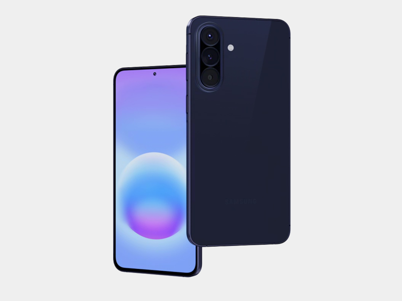
The Anti-Distraction Smartphone That Still Lets You Use Uber and Strava

I pulled out my phone at the airport gate to check my boarding time, then spent the next fifteen minutes scrolling TikTok. I nearly missed my flight. The phone wasn’t lying when it said Gate 23, but somewhere between the lock screen and actually standing up, Instagram happened, then Twitter, then one more reel. We’ve all been that person. The issue is architectural: smartphones were built to be everything machines, and everything machines are terrible at being sometimes machines.

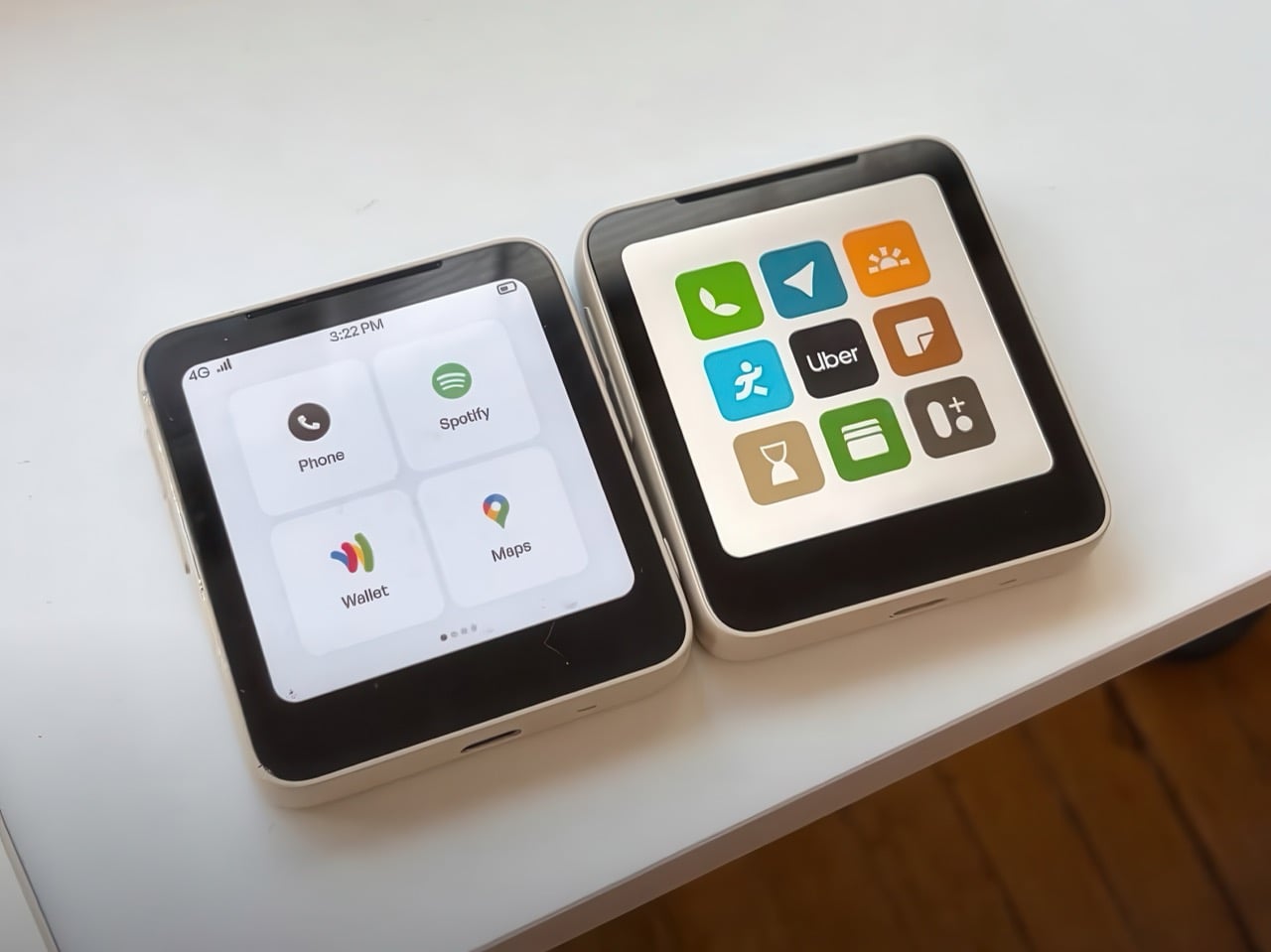
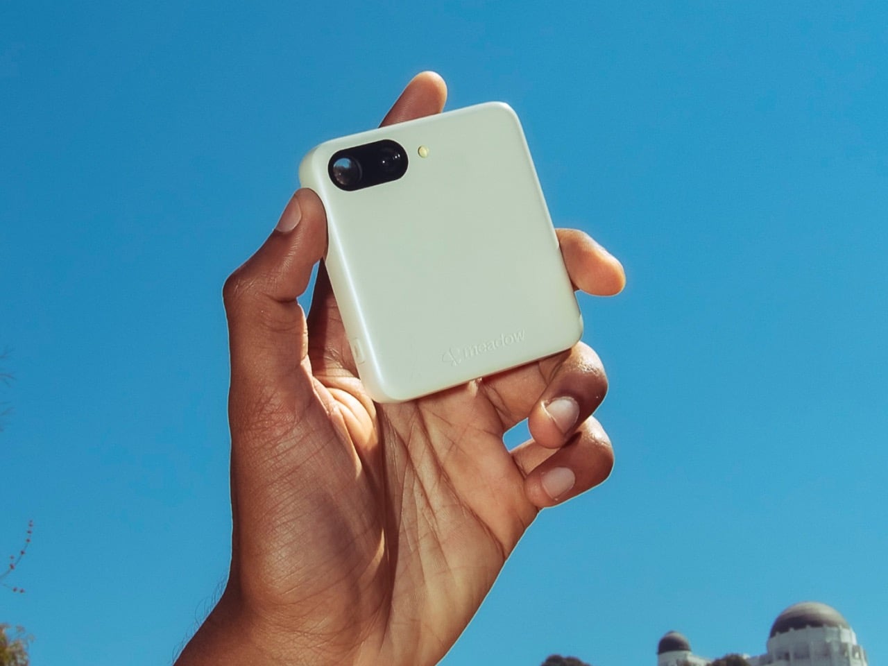
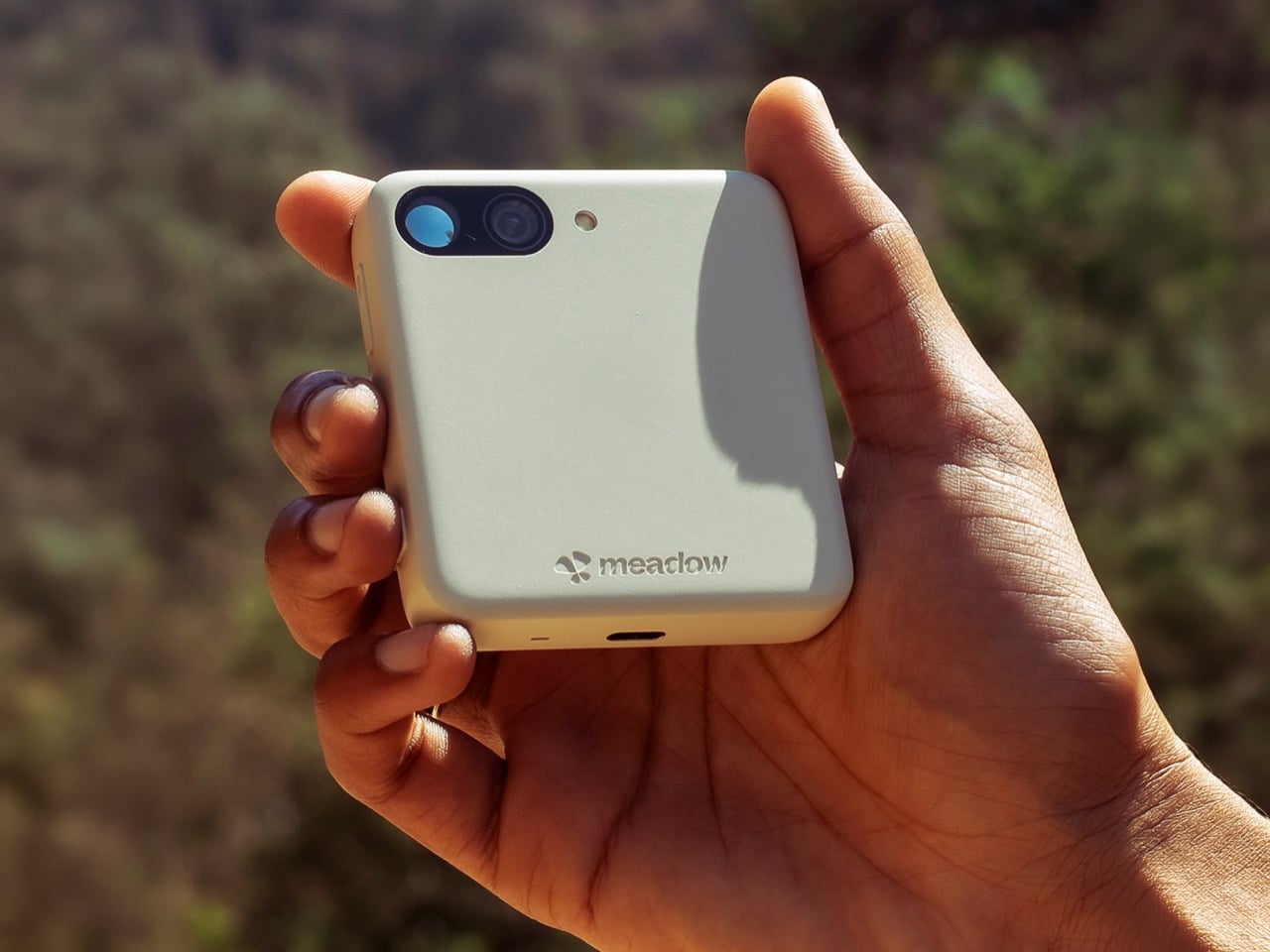
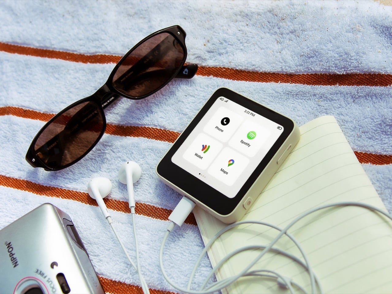
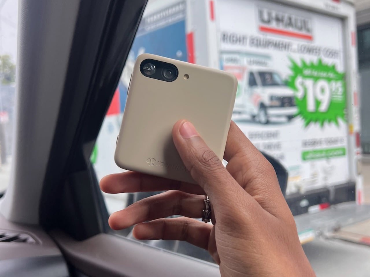
Meadow, a San Francisco startup, thinks the solution sits between the extremes. Their $399 phone launching June 2026 runs a curated set of actually useful apps (Spotify, Uber, Maps, a camera) while completely excluding the attention-draining ones (Instagram, TikTok, email, web browsers). You get a private phone number that only your contacts can reach, a 3-inch screen deliberately too small for binge-watching, and 4G connectivity without the infinite scroll tax. It’s a 4-ounce slab of recycled polycarbonate that wants to get you through your day, then get out of your way.

Designer: Meadow SF, Inc.

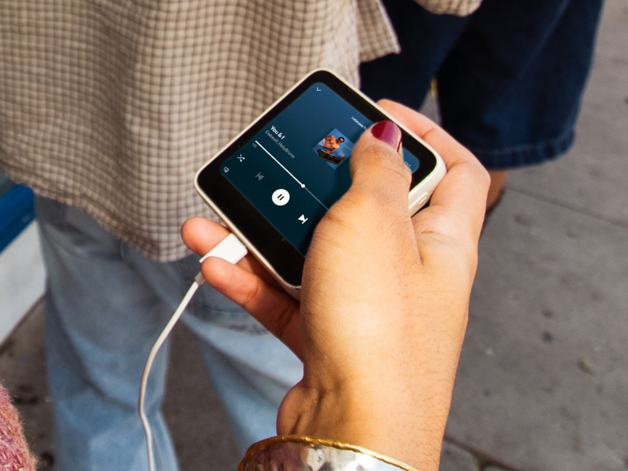
The 3-inch TFT LCD measures roughly 1.3 x 2 inches in total device footprint, making this closer to an iPod nano than a modern smartphone. The screen is big enough to read a map or control Spotify, but small enough that watching a YouTube video feels like punishment. The 13MP ultrawide camera captures memories without turning you into a content creator. The whole package weighs 4 ounces and fits in a coin pocket, which means you can actually forget you’re carrying it.

The minimalist phone market has been wrestling with this problem for years, and everyone keeps arriving at slightly different conclusions. The Unihertz Titan 2 resurrects the BlackBerry Passport form factor with a physical QWERTY keyboard and a 4.5-inch square screen, betting that tactile typing will make you more productive and less prone to mindless scrolling. It works for some people. The Clicks Communicator takes a similar approach but positions itself explicitly as a secondary device, the thing you carry when your real phone stays home. The iKKO Mind One shrinks everything down to credit card size with a rotating camera, targeting travelers who want maximum portability. Mudita’s Kompakt goes full ascetic with an E-ink screen, no app store, and a hardware kill switch that physically disconnects the microphones and camera.

Meadow splits the difference. You get real apps from real services, the ones that genuinely make modern life easier. Spotify and Apple Music mean you’re not stuck with MP3s loaded via iTunes like it’s 2008. Uber and Maps mean you can actually navigate an unfamiliar city without printing directions. Strava means your runs still sync. The camera means you can capture moments. Notes, weather, clock, fitness tracking, all present. What’s missing is the entire category of apps designed to consume your attention rather than assist your life. No browser means no falling into Wikipedia rabbit holes at 1 AM. No email client means work can’t chase you into the evening unless you’ve specifically decided to check it on another device. No social media means no feeds, no reels, no endless scroll.

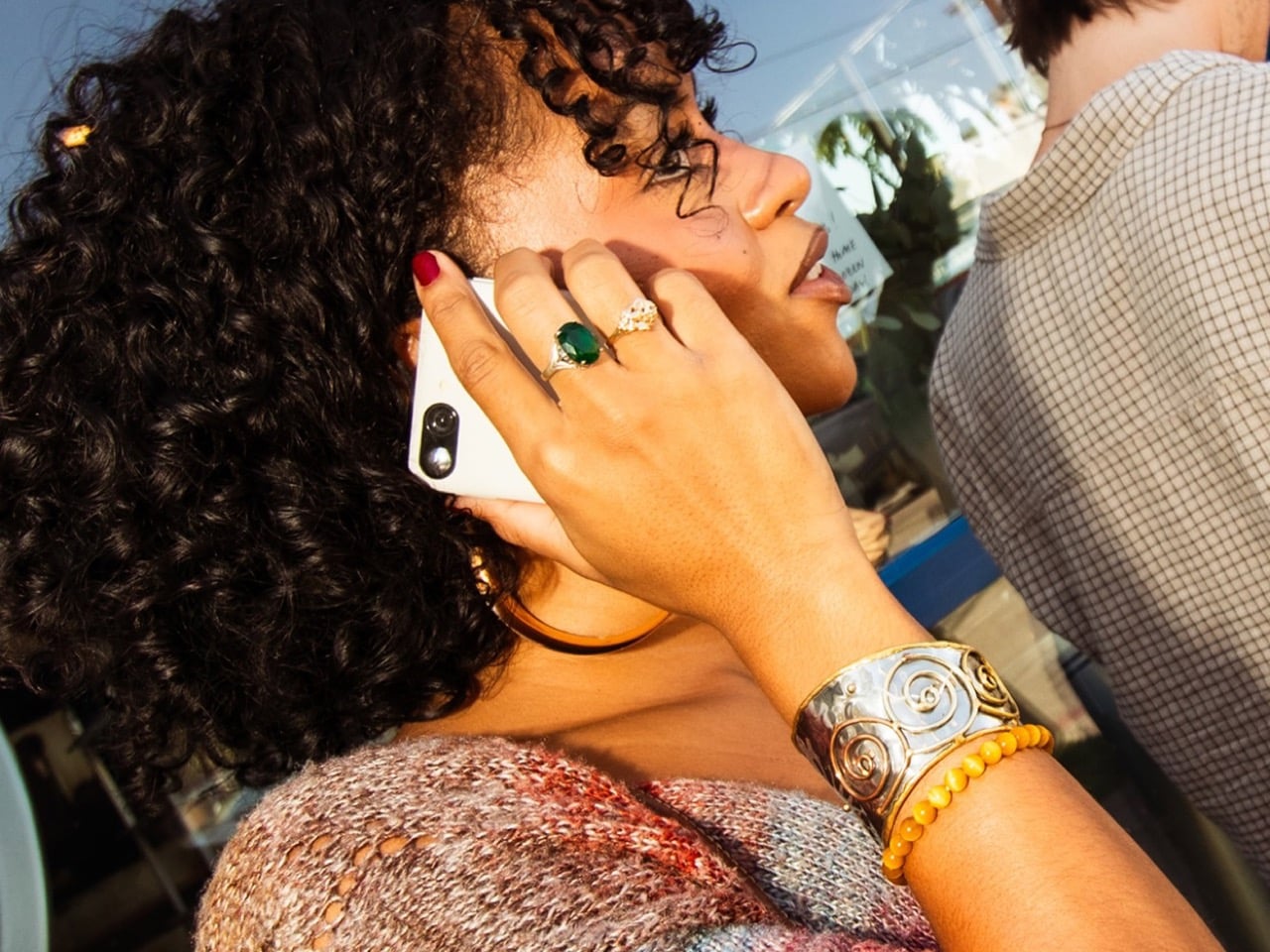
When you activate Meadow, you get a number that functions like an allowlist. Only people you’ve added as contacts can call or text you. Everyone else hits a wall. No spam calls about your car’s extended warranty. No texts from political campaigns. No unknown numbers at dinner. Your main phone can be dead or turned off and you still won’t miss calls that matter, because Meadow routes them through your main number. Setup takes five minutes at home, no carrier calls required. The eSIM activation happens through the Meadow app, and you’re off to the races.

The device ships with 128GB of storage, 6GB of memory, and a battery rated for one to two days depending on usage. Fast charging helps. The included accessories (action case, beach pouch, charging cable) suggest Meadow knows exactly who this is for: people who want to go outside and do things without their phone becoming the main character of the experience. Pre-orders are open now at meadow.so for $399, with shipping starting June 2026 and a nine-month free subscription ($10 per month after that for unlimited calls, texts, and photo storage). The first units hit doorsteps in May according to the delivery schedule, which means summer 2026 could be the season a bunch of people finally stop doomscrolling at the beach.

The post The Anti-Distraction Smartphone That Still Lets You Use Uber and Strava first appeared on Yanko Design.
This E Ink Flip Case Shows the Time Without Ever Waking Your Phone

Smartphone cases have become one of the more predictable corners of the mobile accessory market. Most of them do exactly what you’d expect: wrap around the phone, absorb some impact, and stay out of the way. A few go further with card slots or battery packs, but the core idea hasn’t changed much in years. You’re still waking the screen every time you want a quick glance at the time.

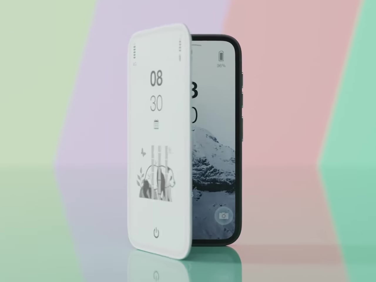
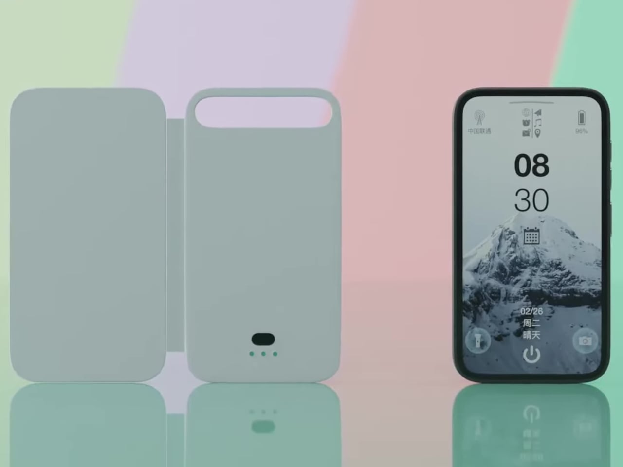
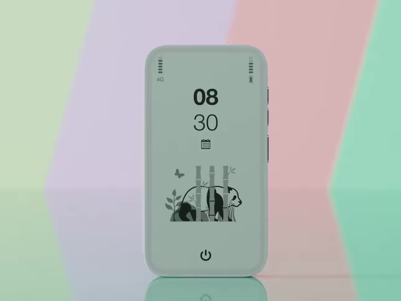
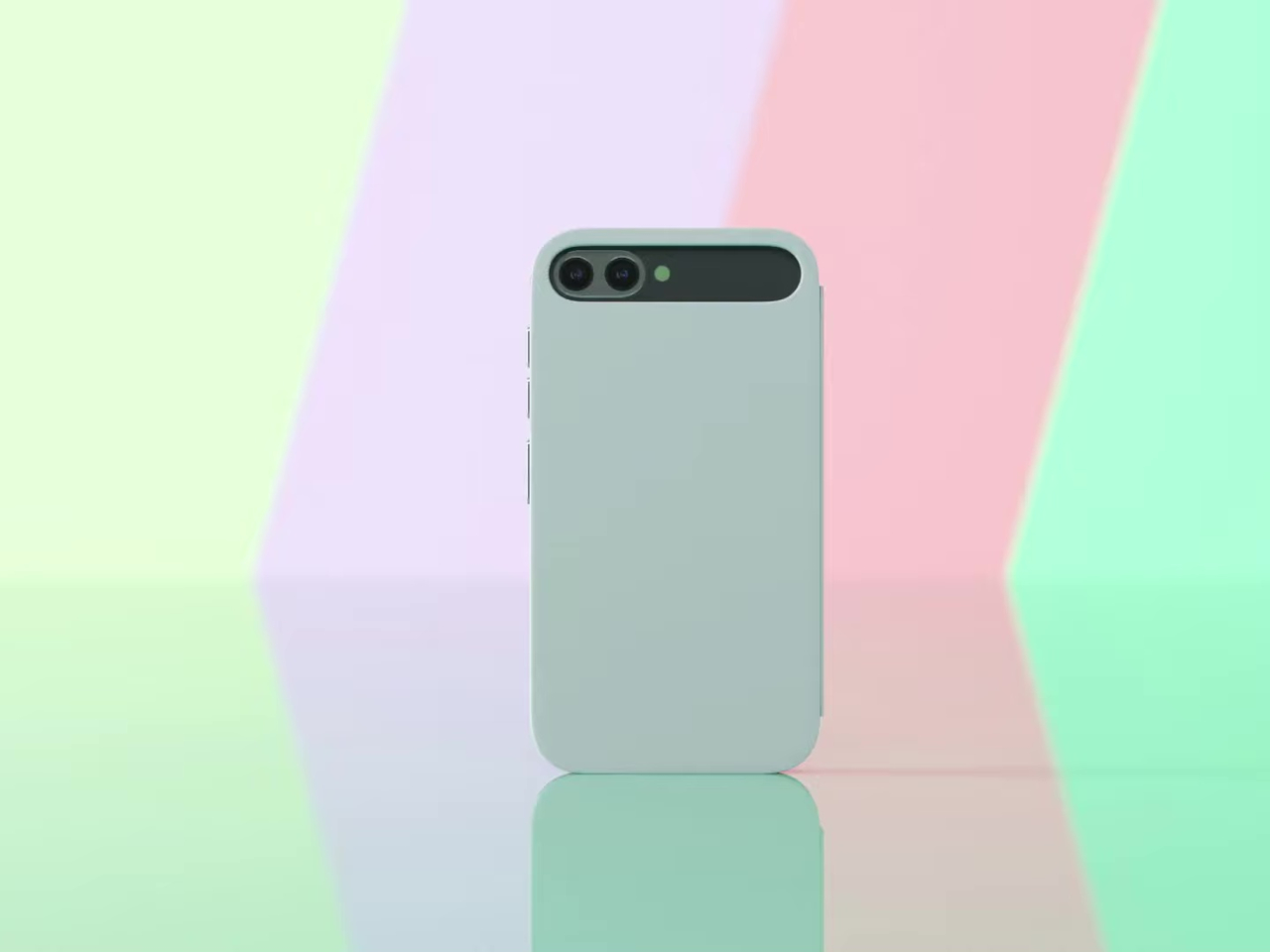
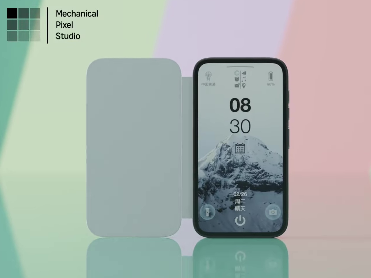
Pixel Dynamics’s E Ink Flip Cover concept takes a simpler approach. It’s a flip-style case with an E Ink screen on the outer panel, so even when the cover is shut, and the phone is locked, you can still check the time, date, battery level, and signal without waking the main display. E Ink only draws power when the image changes, making it a natural fit for an always-on panel.

Designer: Pixel Dynamics

There’s more to the display than status data, though. Beyond the time, date, and connectivity readouts, you can set it to show ambient illustrations that make the cover feel more personal, less like a utility panel, and more like something worth looking at. An E Ink screen isn’t going to win awards for visual richness, but for something that stays visible all day without demanding attention, that’s a reasonable ask.

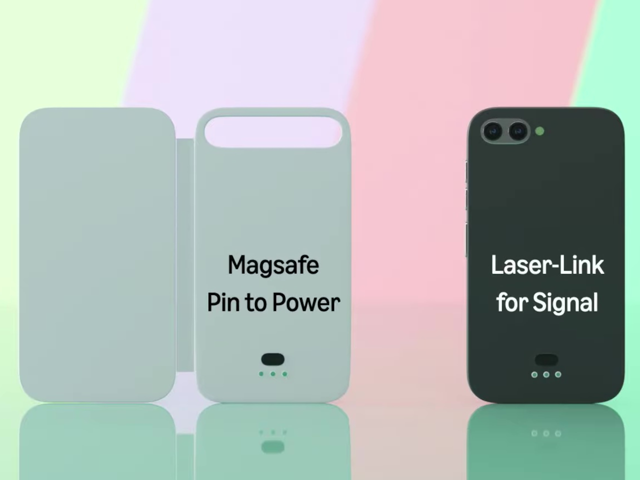
The case attaches to the phone through a MagSafe-style magnetic system, snapping into place without any physical ports. Power is handled through contact pins that draw directly from the phone’s battery, so there’s nothing to charge separately and no second battery bloating the profile. That’s a smart call; one of the quickest ways to kill an otherwise good accessory concept is to make the user manage another charging cable.

Data between the case and the phone travels through what the concept calls Laser-Link, pitched as a higher-efficiency alternative to Bluetooth or NFC. The idea is that replacing radio-based communication with a laser signal gets you faster data transfer with less power overhead and no interference issues. It’s still concept-level technology, of course, so there aren’t any real specs to evaluate, but the thinking behind it is sound.

Put it together, and the pitch is easy to follow. You keep the phone in your pocket or face-down on a desk, and the E Ink panel handles quick glances that don’t need the main screen, saving the battery drain of waking an OLED display dozens of times a day. When you do need the full phone, flipping the cover open gets you there just as fast as any other case.

That said, a few things here are easier to propose than to build. Laser-Link doesn’t have a clear path to production yet, and it raises obvious questions about reliability when the phone and case aren’t perfectly aligned. The E Ink display part is more grounded, since that technology already exists in other accessories.

The phone case hasn’t had a genuine design moment in quite a while, and a concept that starts asking what the outer panel can actively do for you is a reasonable place to start that conversation. It still has a long road before reaching any shelf, but for a category that’s mostly been stuck recycling the same rigid shells, that’s actually not a bad place to be.

The post This E Ink Flip Case Shows the Time Without Ever Waking Your Phone first appeared on Yanko Design.
Huawei Put a Fan Inside the Mate 80 Pro Max, But It Cost a Camera

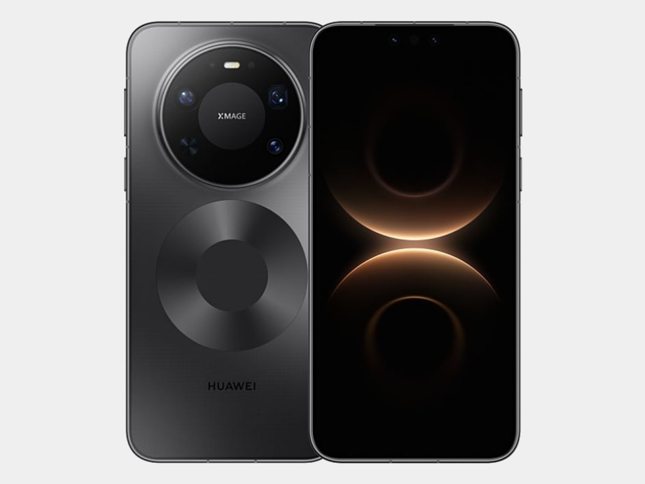
Gaming phones have had active cooling for years, strapping fans and heat pipes to the back like little mechanical tumors. They work, mostly, but they also make your phone look like it needs a pit crew. The Huawei Mate 80 Pro Max Wind Edition takes a different approach, tucking a cooling fan directly inside the phone itself. It is, quite literally, a Fan Edition, and not just in the collector’s edition sense of the word.

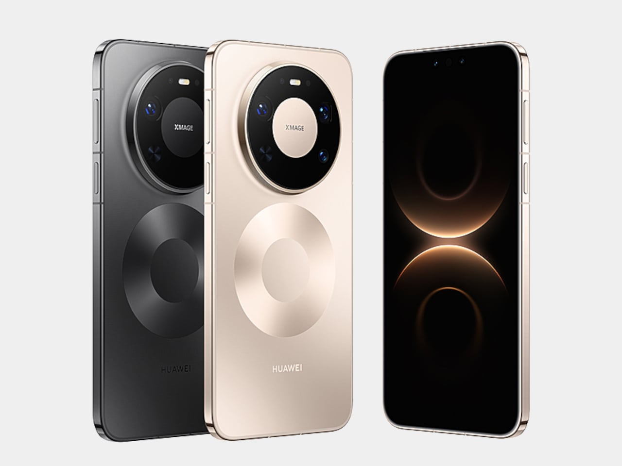
The Wind Edition is a variant of the standard Mate 80 Pro Max, currently listed for pre-order in China through Huawei’s Vmall store. It comes in Polar Night Black and Polar Day Gold, with 16GB of RAM paired with either 512 GB or 1 TB of storage. No pricing has been confirmed yet, and Huawei has yet to formally announce the device, but the listing and early images already make clear what the phone is doing and what it sacrificed to do it.

Designer: Huawei

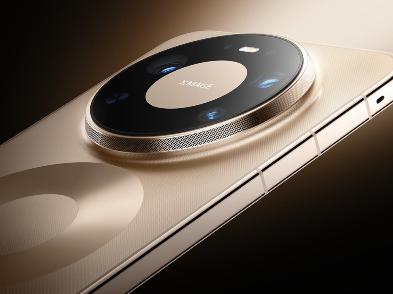
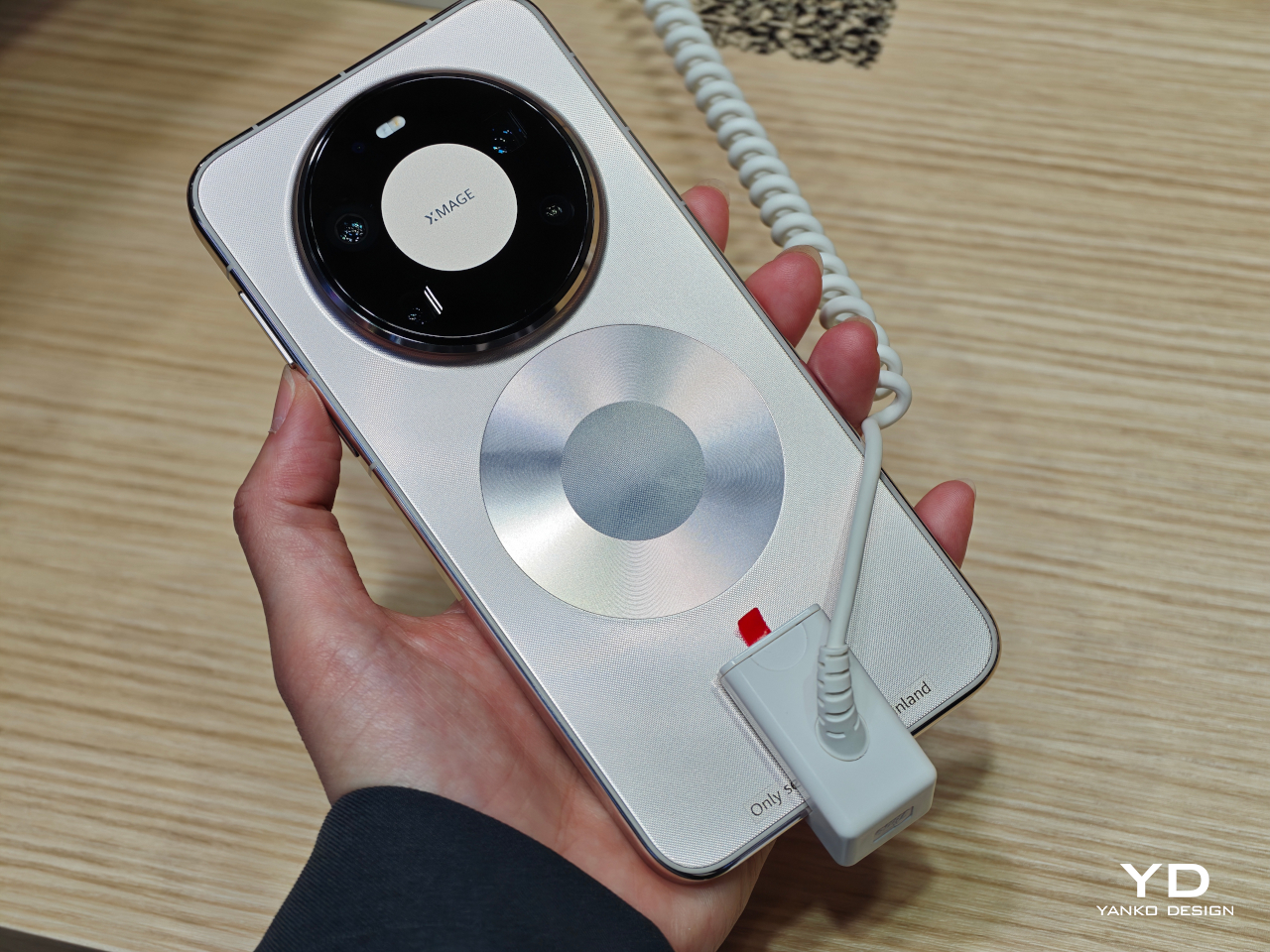
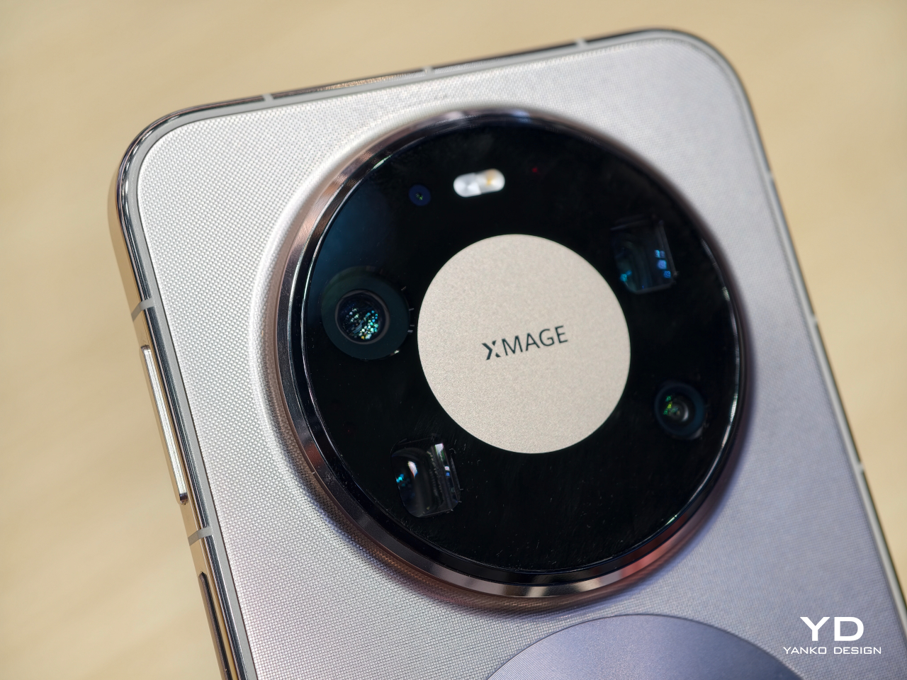
The most obvious change is in the rear camera module. The standard Mate 80 Pro Max has a quad-camera setup; the Wind Edition trims that to three sensors. The space that the fourth camera occupied now goes to the fan mechanism, and the camera ring is noticeably wider to accommodate the ventilation. The perforated ring around the module is not decorative, but it is where the air moves. That trade-off deserves a moment: a flagship phone deleting a camera to make room for a fan.

The rest of the hardware appears to carry over from the standard model, including the 6.9-inch AMOLED LTPO display, the Kirin 9030 Pro chipset, and the 6,000 mAh battery with 100W wired and 80W wireless charging. The fan is intended to help the Kirin 9030 Pro maintain performance during extended gaming or long video recording sessions, where heat buildup would otherwise force the chip to throttle and degrade output.

Active cooling in smartphones is a reasonable engineering response to a real thermal problem, but integrating a moving mechanical part into a device designed to survive drops and dust introduces variables that passive thermal systems simply do not have. Fans collect debris. They wear out. There is a potential failure mode here that no amount of vapor chamber engineering would ever introduce, and that is worth factoring in before committing.

Huawei Mate 80 Pro Max

Huawei Mate 80 Pro Max

Early reports suggest the Wind Edition will initially be sold in limited quantities through select Huawei lifestyle stores rather than the broader retail channel, which positions this less as a mass-market launch and more as a demand test. It is a cautious approach, and probably a sensible one given how different this phone is from anything Huawei has shipped before. Most people curious about it will be watching from the sidelines for now.

The Huawei Mate 80 Pro Max Wind Edition raises a question that no spec sheet can resolve: how much camera versatility is a meaningfully cooler phone actually worth? The downgrade from four sensors to three is a concrete loss, not a rounding error. For someone who pushes the chip through long gaming sessions and has watched their device thermal-throttle under load, the trade-off might make perfect sense. For a photographer who chose the Mate 80 Pro Max for its imaging range, it probably does not.

Huawei Mate 80 Pro Max

The post Huawei Put a Fan Inside the Mate 80 Pro Max, But It Cost a Camera first appeared on Yanko Design.
This E Ink Foldable Phone Concept Punishes Doomscrolling by Design

Most smartphones are designed to be impossible to put down. The screen faces up on every table, the display lights up for every notification, and the cost of checking it one more time is exactly zero. That’s not an accident. The hardware removes friction from compulsive use because removing friction is what makes these devices feel indispensable. The tinyBook Flip concept asks a different question entirely: what if the phone were designed to get out of the way?

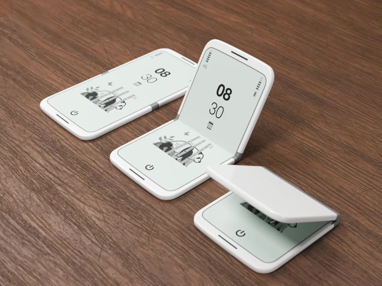
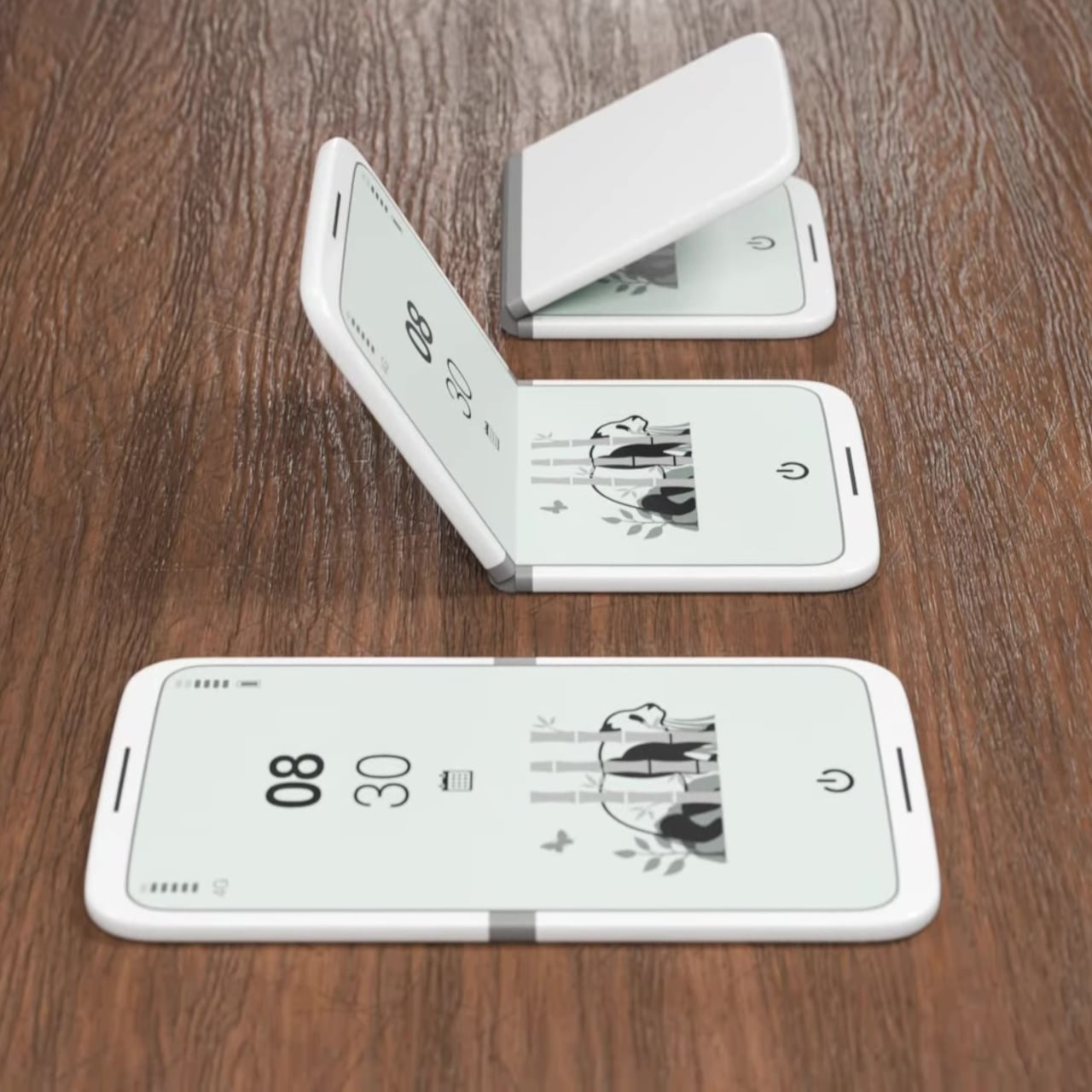
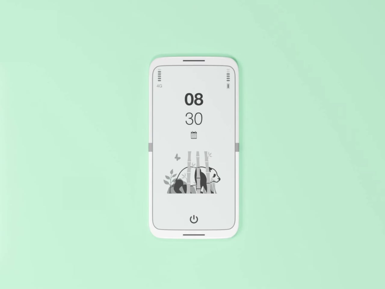
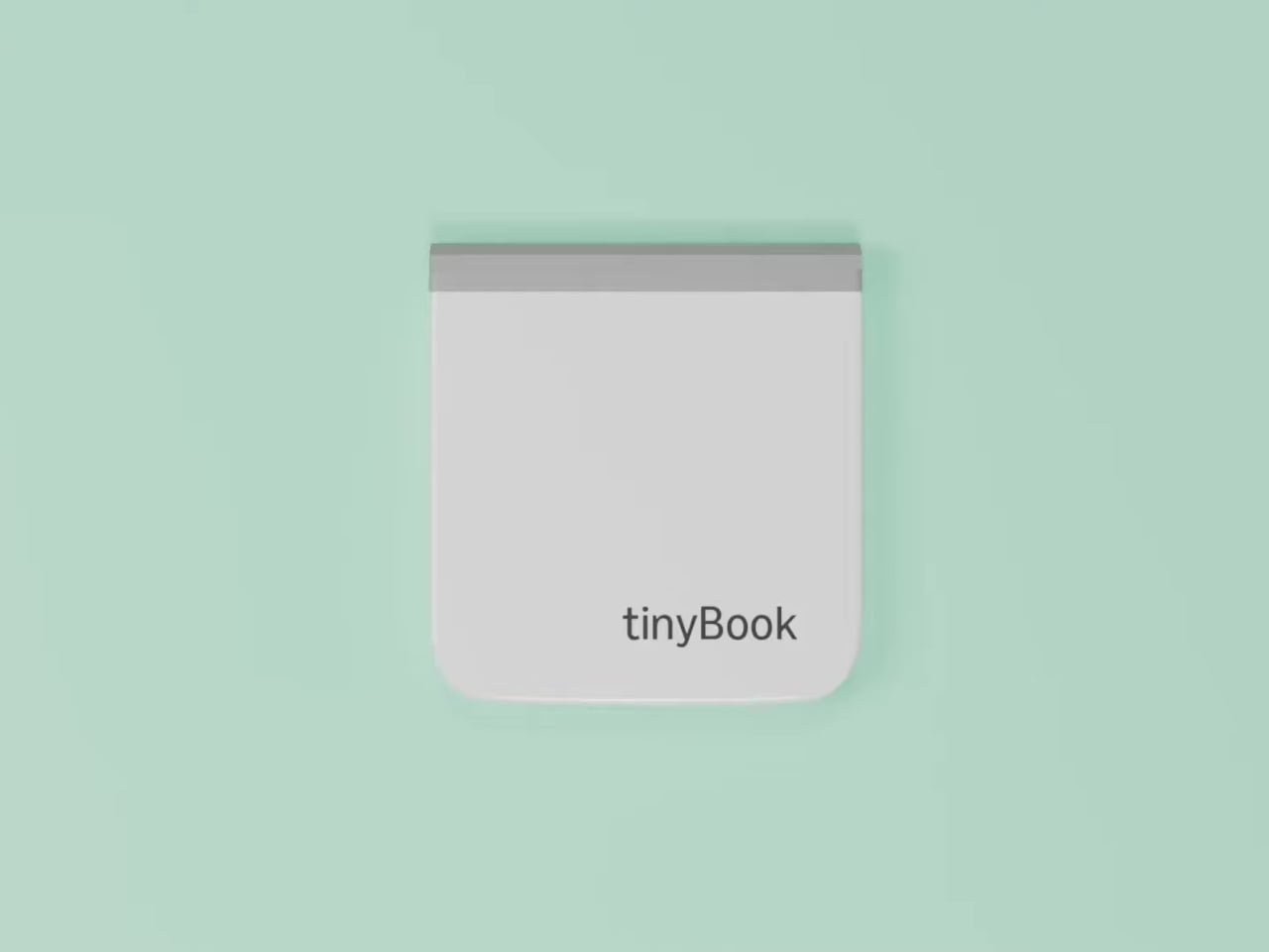
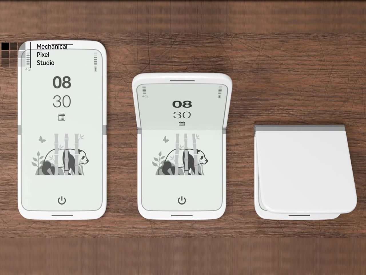
The tinyBook Flip is a vertical foldable phone concept built around a 6.1-inch E Ink display. Closed, it collapses into a compact, near-square form with rounded corners and a matte white finish, something closer in proportion to a folded notecard than a smartphone. The screen disappears entirely when the device is closed shut. No glowing rectangle sitting face-up on the desk, no ambient reminder that there are things to check. Just a small, quiet object.

Designer: Pixel Dynamics

That folded form is doing more work than it might seem. Opening the phone requires a deliberate physical action, and that small added step changes the behavioral math. A reflexive grab becomes a conscious decision. The friction is minimal in absolute terms, maybe two seconds, but two seconds of resistance is often enough to interrupt the loop. The concept treats that interruption as a design feature, which puts it in genuinely different territory from most phones.

The E Ink display adds a second layer of resistance, and this one is less subtle. E ink refreshes slowly, renders in grayscale or muted colors, and handles fast-moving content poorly. Social media feeds become tedious. Short-form video becomes unwatchable. Anything built around color, motion, and rapid visual feedback stops working the way it was designed to. This is precisely the point. The screen’s limitations aren’t engineering compromises left over from an earlier era of display technology; they’re structural properties that make certain behaviors genuinely unpleasant to sustain.

What E Ink handles well is a shorter list, but a coherent one. Text reading, messaging, calendars, and static interfaces are all comfortable at E Ink’s native pace. The renders of the tinyBook Flip show a UI built around exactly these strengths: a large clock face, a calendar widget, and a grayscale illustrated wallpaper. The interface doesn’t reach for capabilities the display can’t support. The phone isn’t trying to do everything; it’s trying to do a narrower set of things without apology.

Foldable E Ink panels aren’t a speculative technology. The hardware exists at the component level and has already appeared in experimental e-readers, though no consumer phone has shipped with one in any meaningful volume. The tinyBook Flip isn’t imagining impossible components; it’s proposing a form factor that manufacturers haven’t yet committed to producing. The distance between those two things is largely commercial, not technical.

There’s also something worth noticing about how the device reads as a physical object in social space. Closed, the tinyBook Flip looks like almost nothing. No visible screen, no status indicators, no glow. A phone that carries no visual weight when it’s not in use sends a different signal than one that’s always broadcasting its presence. Putting it down means it actually disappears from the environment, not just from your hand.

That said, the concept leaves some real friction points unaddressed, and not the intentional kind. E Ink handles camera use, live navigation, video calls, and authentication apps poorly. A foldable hinge adds mechanical complexity and thickness that clean renders tend to obscure. The tinyBook Flip looks resolved in this form, but a production version would have to make tradeoffs that these images don’t show and the concept doesn’t acknowledge.

Still, the more interesting question isn’t whether this specific device could ship. It’s whether a phone that makes itself harder to misuse is a reasonable design goal at all, or whether that’s just a way of describing a phone that most people wouldn’t actually want. The tinyBook Flip lands firmly on one side of that question. Whether the market agrees is a different problem entirely.

The post This E Ink Foldable Phone Concept Punishes Doomscrolling by Design first appeared on Yanko Design.
Samsung and DOMINNICO made a leather bag that doubles as a Galaxy gadget case

Fashion accessories and tech gadgets have always occupied separate drawers, figuratively and literally. The phone goes in a pocket, the earbuds get buried somewhere in the bag, and the bag itself has nothing to do with either of them. It is a small daily inconvenience that nobody really complains about, mostly because nobody has ever offered a better alternative. Samsung and Spanish fashion brand DOMINNICO have decided that the arrangement is worth rethinking.

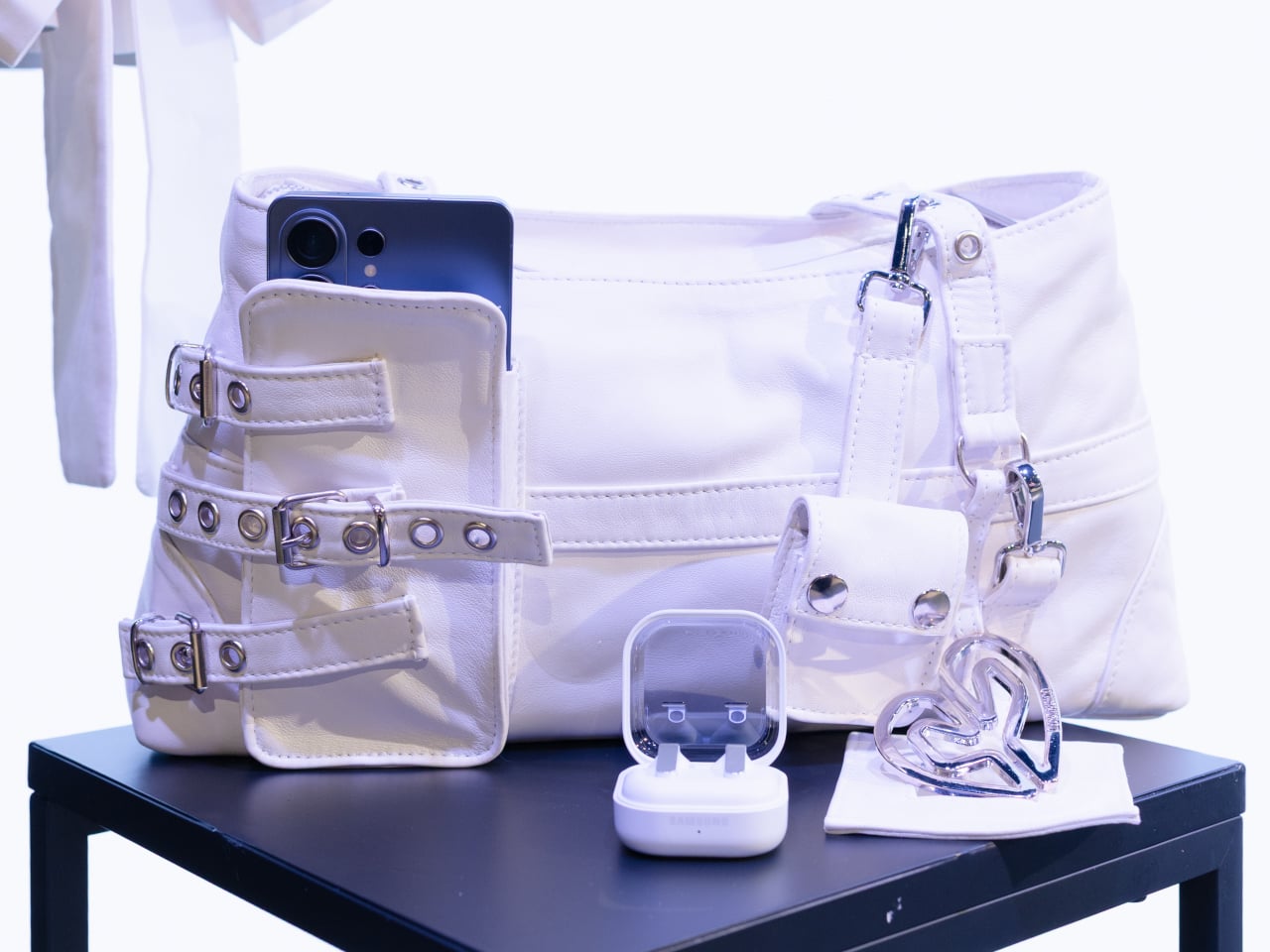
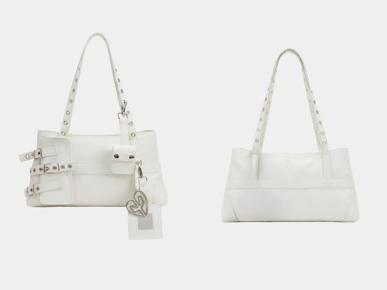
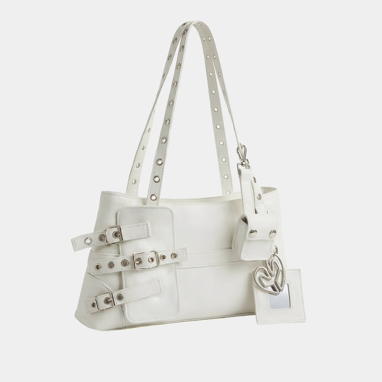
The collaboration produced a handcrafted leather bag that treats the Galaxy S26 Ultra and Galaxy Buds4 Pro as design references rather than just contents. It follows a baguette silhouette in off-white leather, produced in limited quantities under a slow fashion approach. The construction stays deliberately restrained: a zip closure bearing the brand logo, an interior pocket, and silver accents distributed carefully across the piece without overcrowding it.

Designer: DOMINNICO x Samsung

The most direct hardware reference runs along the handles. Silver eyelets line them in a pattern that mirrors the camera module rings on the Galaxy S26 Ultra, pulling one of the phone’s most recognizable physical details into a fashion context. It is the kind of detail that reads as decorative until you recognize where it came from, at which point it becomes something more like a private joke between the bag and the phone sitting inside it.

The exterior front pocket is sized specifically for the Galaxy S26 Ultra, secured with three buckles that make it a visual centerpiece rather than a plain utility slot. The design concept ties back to the phone’s built-in Privacy Display feature: the pocket keeps the device accessible while screening it from view when not needed. Whether that connection feels meaningful or just convenient as a marketing angle is a fair question, though the pocket itself is a genuinely practical addition.
Galaxy Buds4 Pro owners get their own dedicated carry solution through three keyrings attached to the bag. Two are extendable, each fitted with a small mirror that doubles as a functional charm. The third holds a soft pouch sized for the Galaxy Buds4 or Galaxy Buds4 Pro case. A fixed keyring with the DOMINNICO logo in silver completes the set. All three hang visibly from the bag rather than disappearing inside it, which keeps the tech ecosystem part of the aesthetic rather than hidden from it.
The bag was unveiled at CUPRA City Garage in Madrid as part of the Madrid es Moda program, a setting that positioned it squarely within fashion week territory rather than a product launch event. That framing matters because it signals who Samsung is trying to reach here: not the Galaxy power user looking for a rugged carry solution, but the fashion-conscious Galaxy owner who wants their accessories to cohere visually.

Available for preorder through DOMINNICO’s website at €420, the bag sits closer to a fashion collectible than a mass-market accessory. The limited production run and handcrafted construction support that positioning. What remains genuinely open is whether a piece this specific, built around two particular Samsung devices, holds its appeal once the Galaxy S26 Ultra is no longer the current flagship and the collaboration’s novelty has worn off.

The post Samsung and DOMINNICO made a leather bag that doubles as a Galaxy gadget case first appeared on Yanko Design.