This E Ink Flip Case Shows the Time Without Ever Waking Your Phone

Smartphone cases have become one of the more predictable corners of the mobile accessory market. Most of them do exactly what you’d expect: wrap around the phone, absorb some impact, and stay out of the way. A few go further with card slots or battery packs, but the core idea hasn’t changed much in years. You’re still waking the screen every time you want a quick glance at the time.

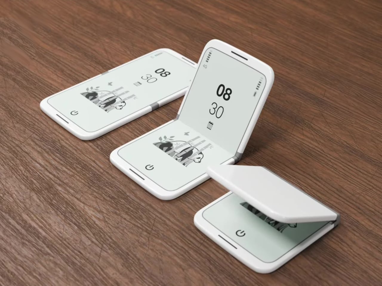
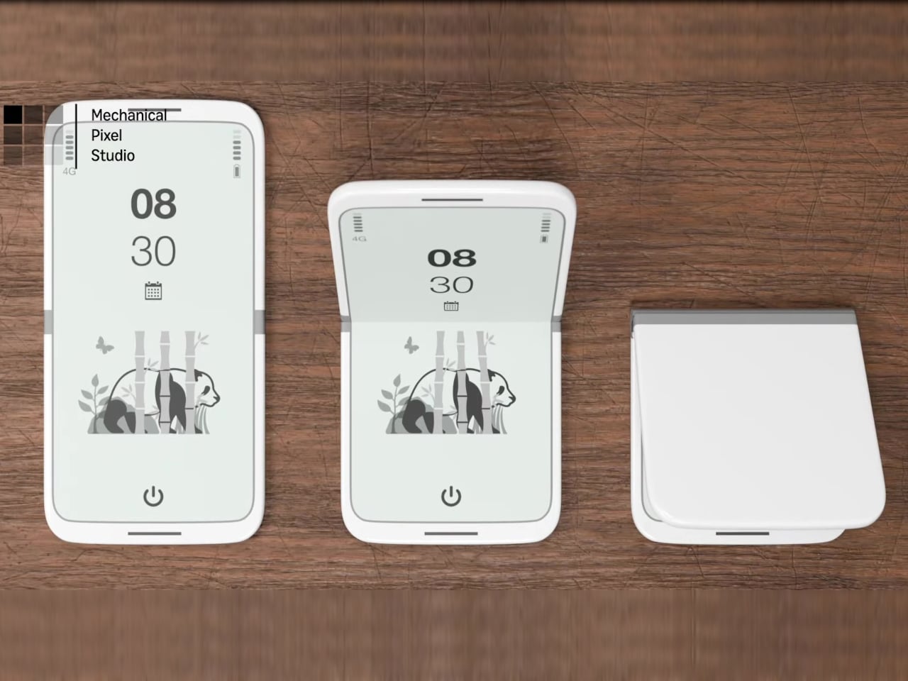
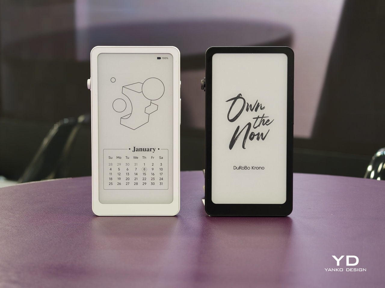
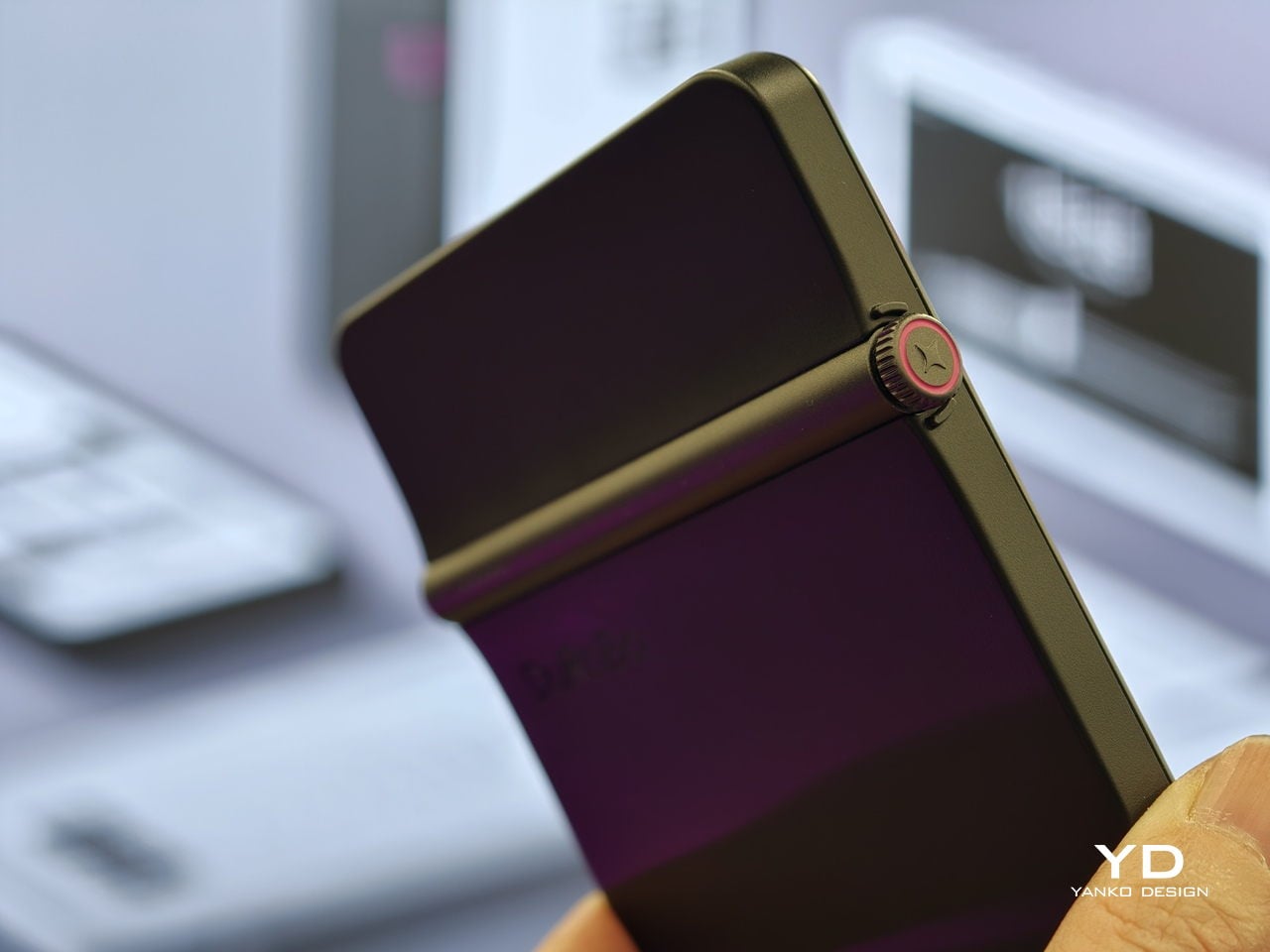
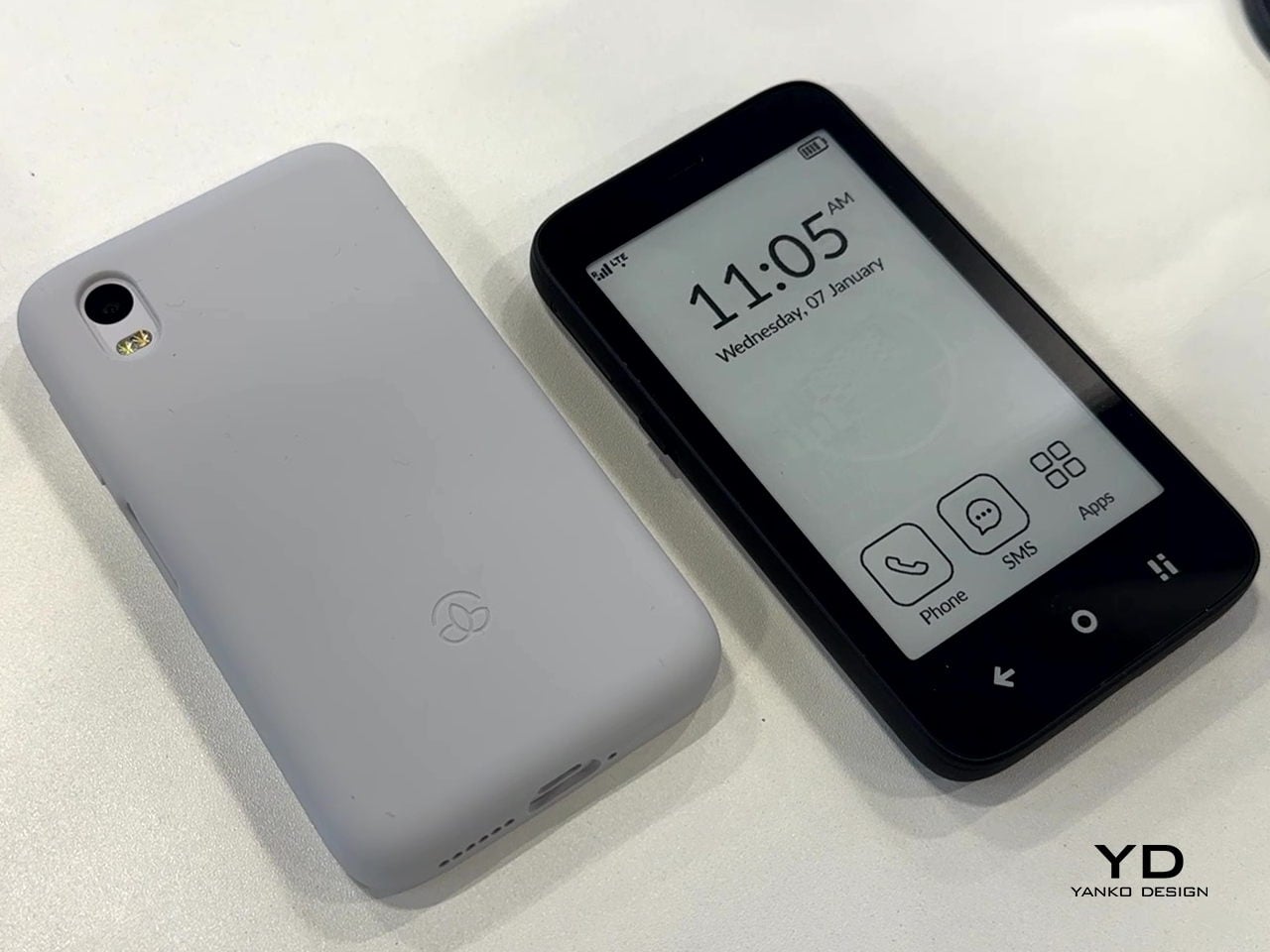
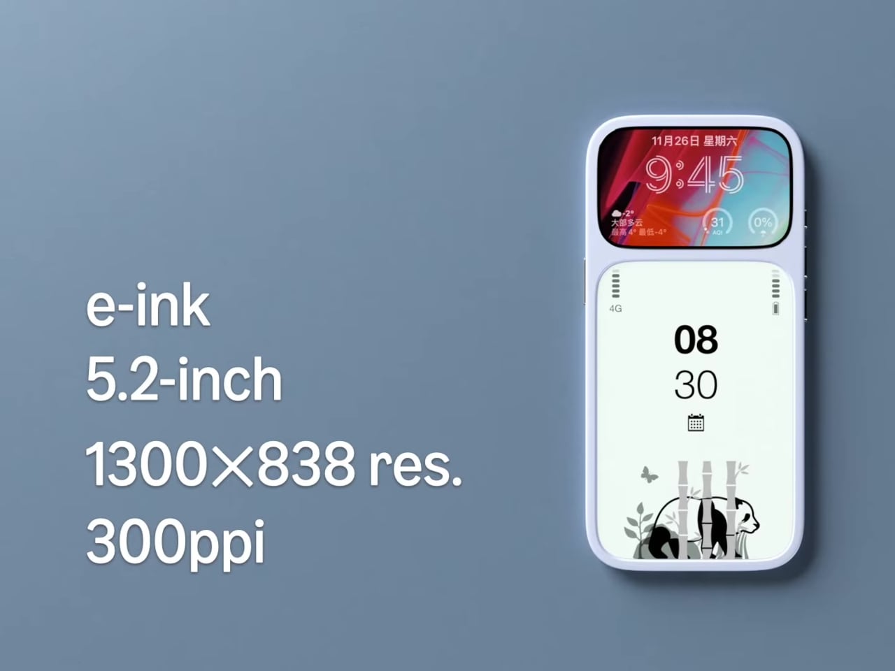
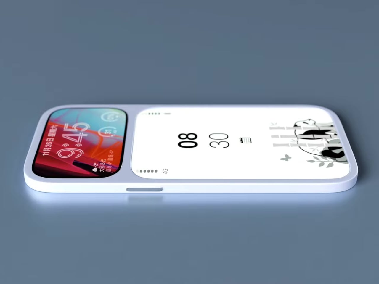
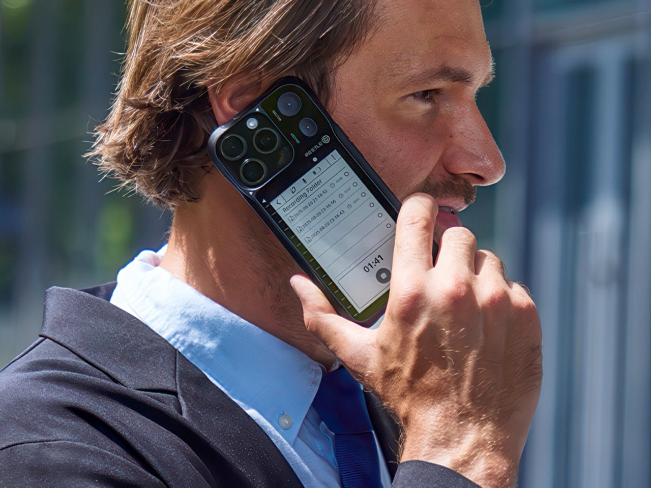
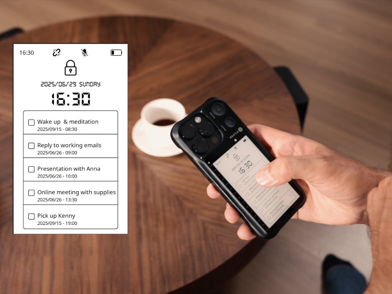
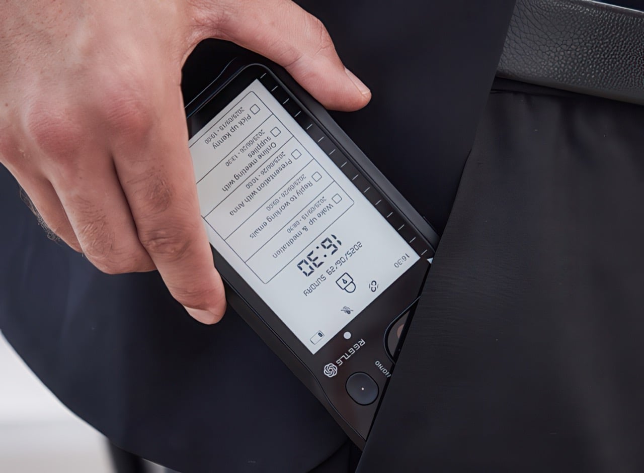
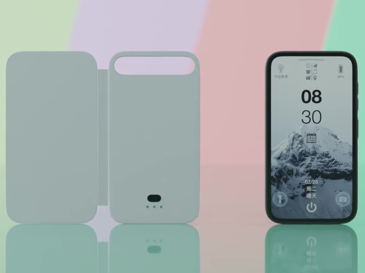
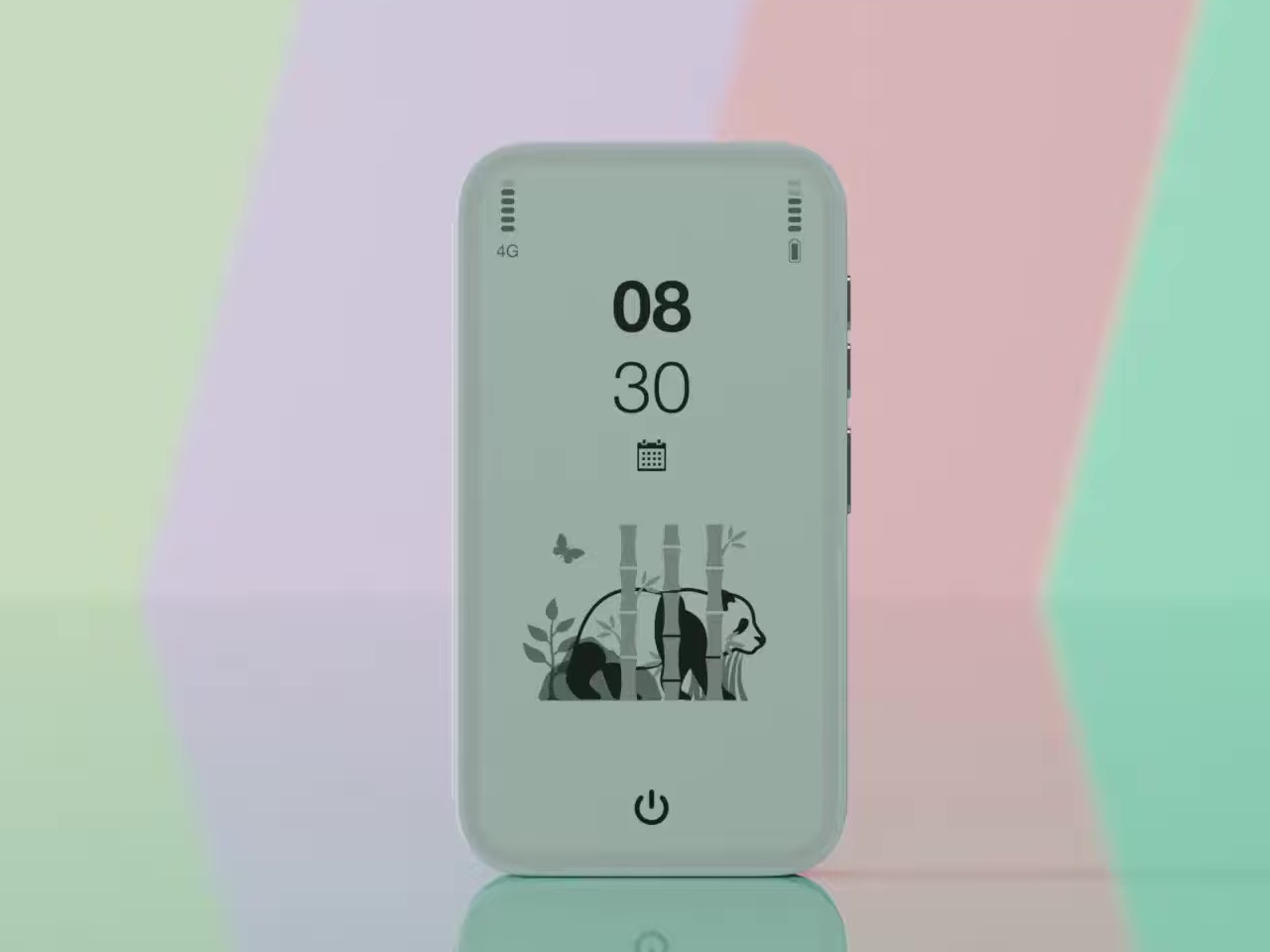
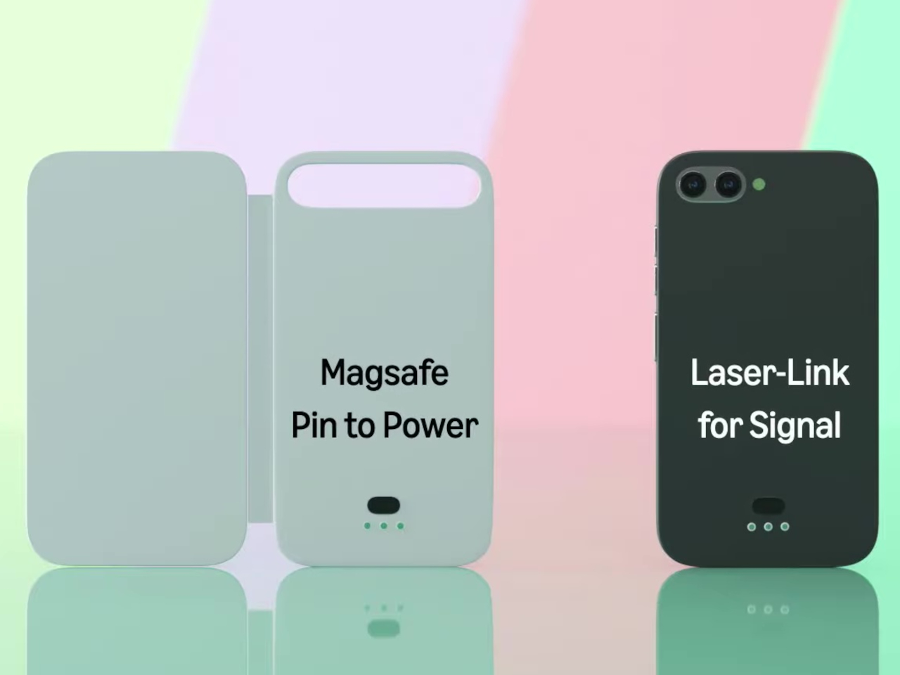
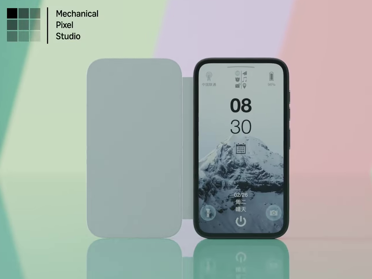
Pixel Dynamics’s E Ink Flip Cover concept takes a simpler approach. It’s a flip-style case with an E Ink screen on the outer panel, so even when the cover is shut, and the phone is locked, you can still check the time, date, battery level, and signal without waking the main display. E Ink only draws power when the image changes, making it a natural fit for an always-on panel.

Designer: Pixel Dynamics

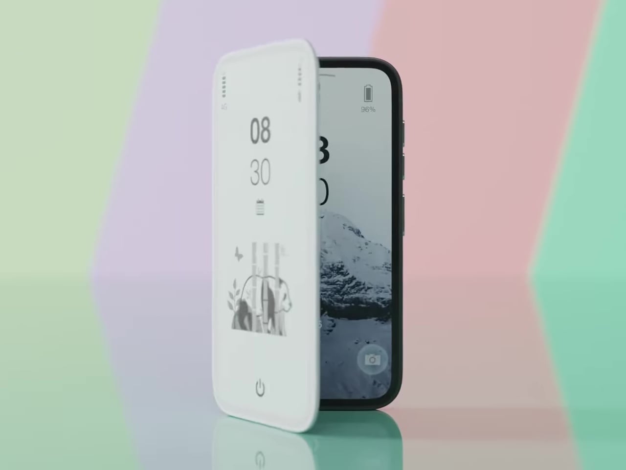
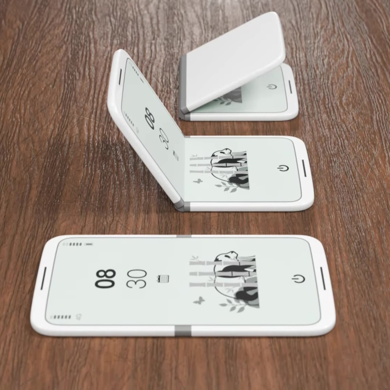
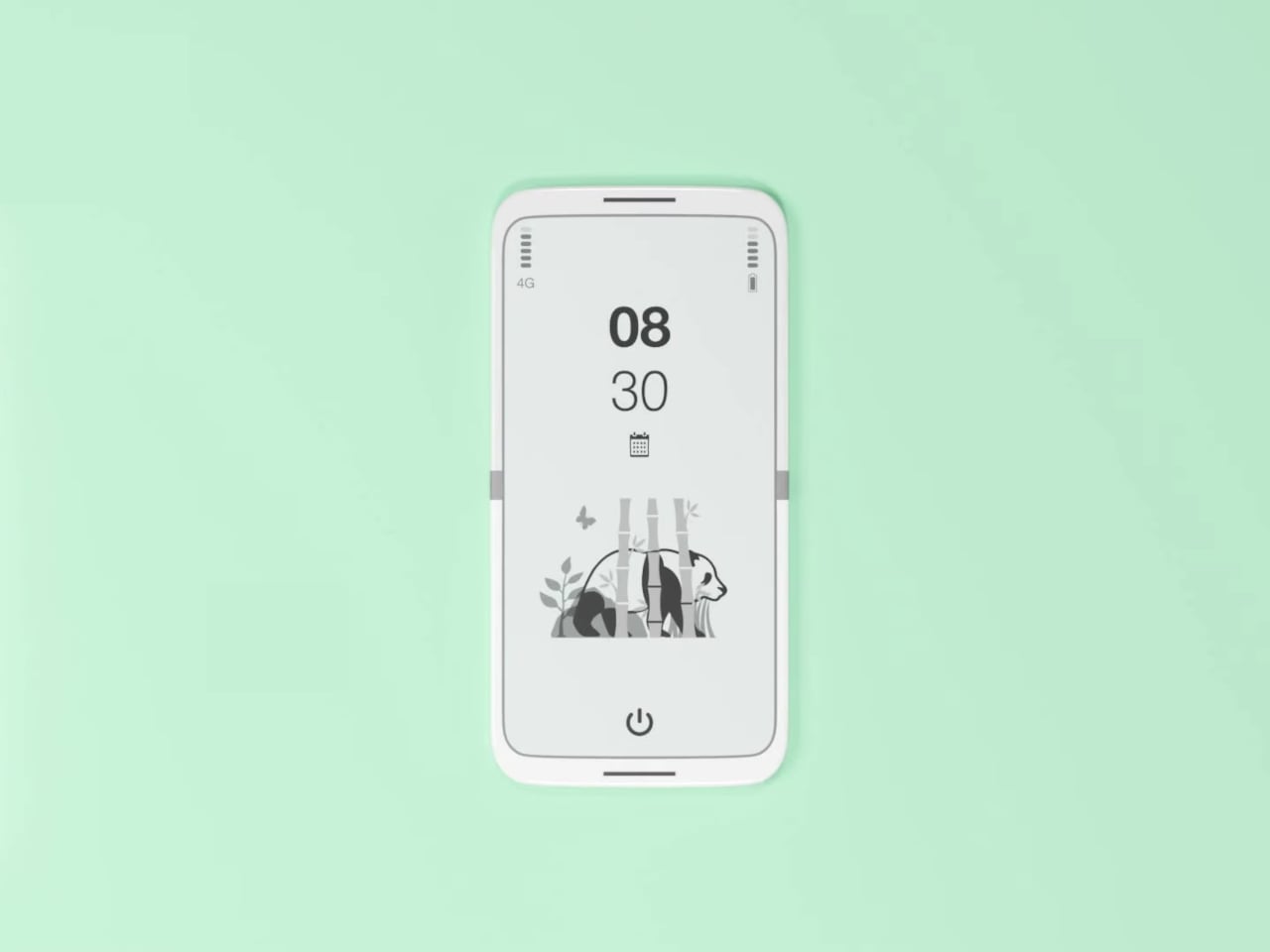
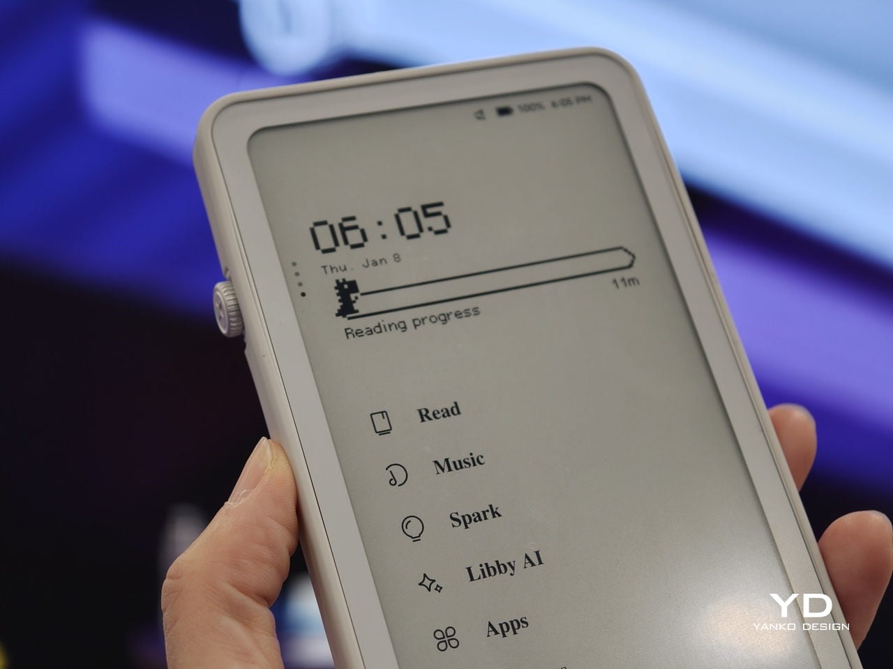
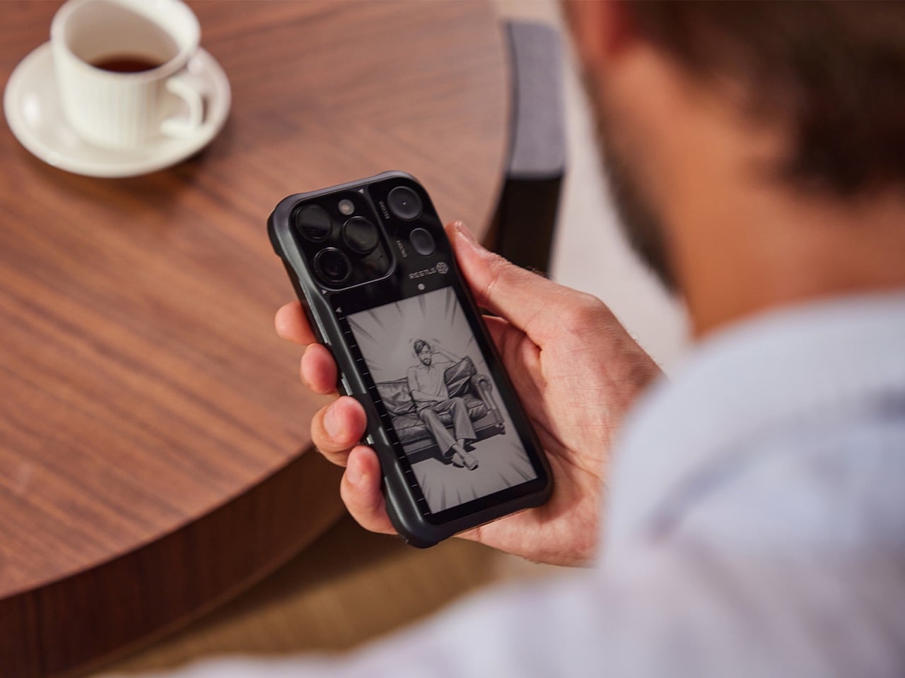
There’s more to the display than status data, though. Beyond the time, date, and connectivity readouts, you can set it to show ambient illustrations that make the cover feel more personal, less like a utility panel, and more like something worth looking at. An E Ink screen isn’t going to win awards for visual richness, but for something that stays visible all day without demanding attention, that’s a reasonable ask.

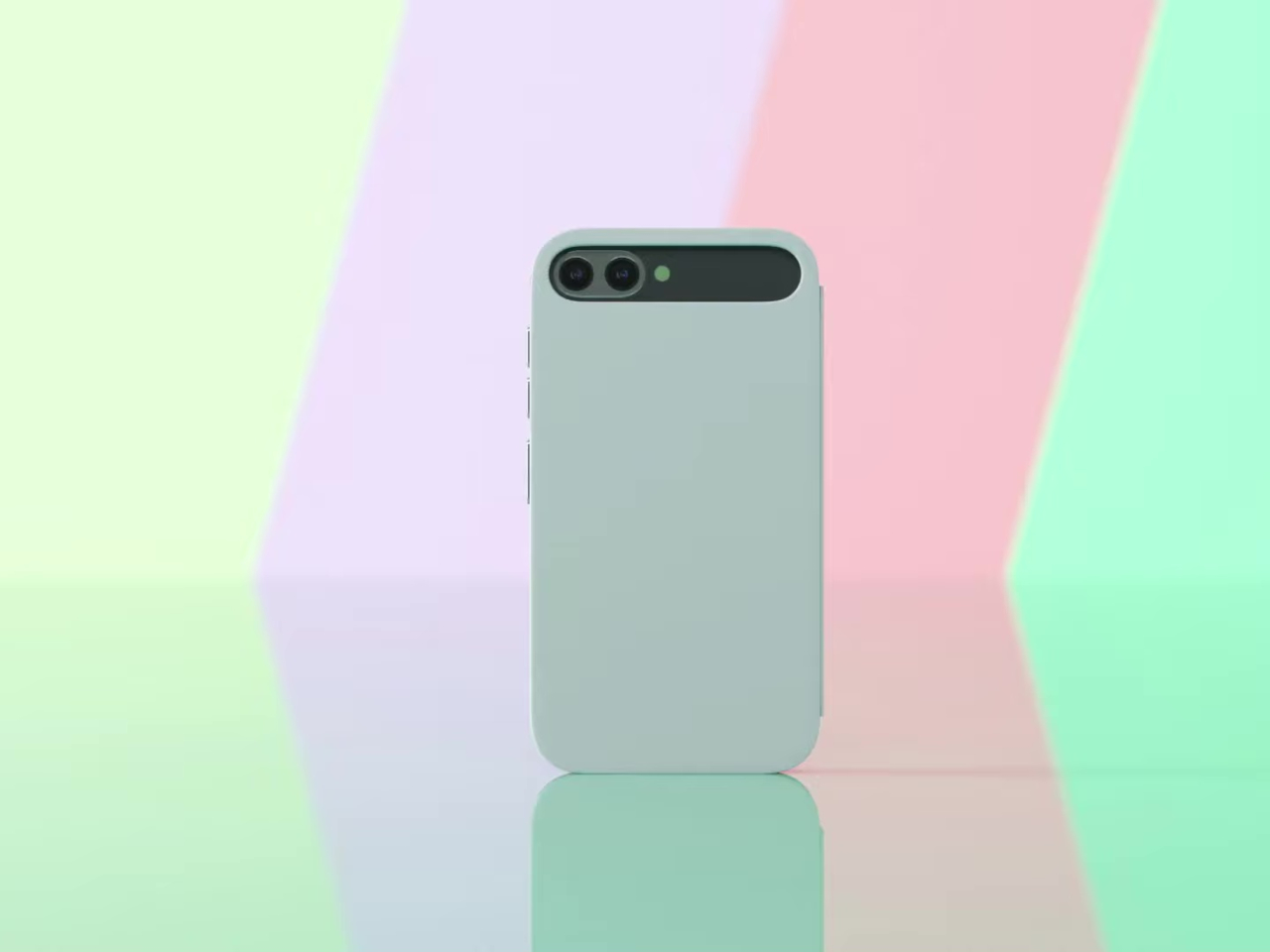
The case attaches to the phone through a MagSafe-style magnetic system, snapping into place without any physical ports. Power is handled through contact pins that draw directly from the phone’s battery, so there’s nothing to charge separately and no second battery bloating the profile. That’s a smart call; one of the quickest ways to kill an otherwise good accessory concept is to make the user manage another charging cable.

Data between the case and the phone travels through what the concept calls Laser-Link, pitched as a higher-efficiency alternative to Bluetooth or NFC. The idea is that replacing radio-based communication with a laser signal gets you faster data transfer with less power overhead and no interference issues. It’s still concept-level technology, of course, so there aren’t any real specs to evaluate, but the thinking behind it is sound.

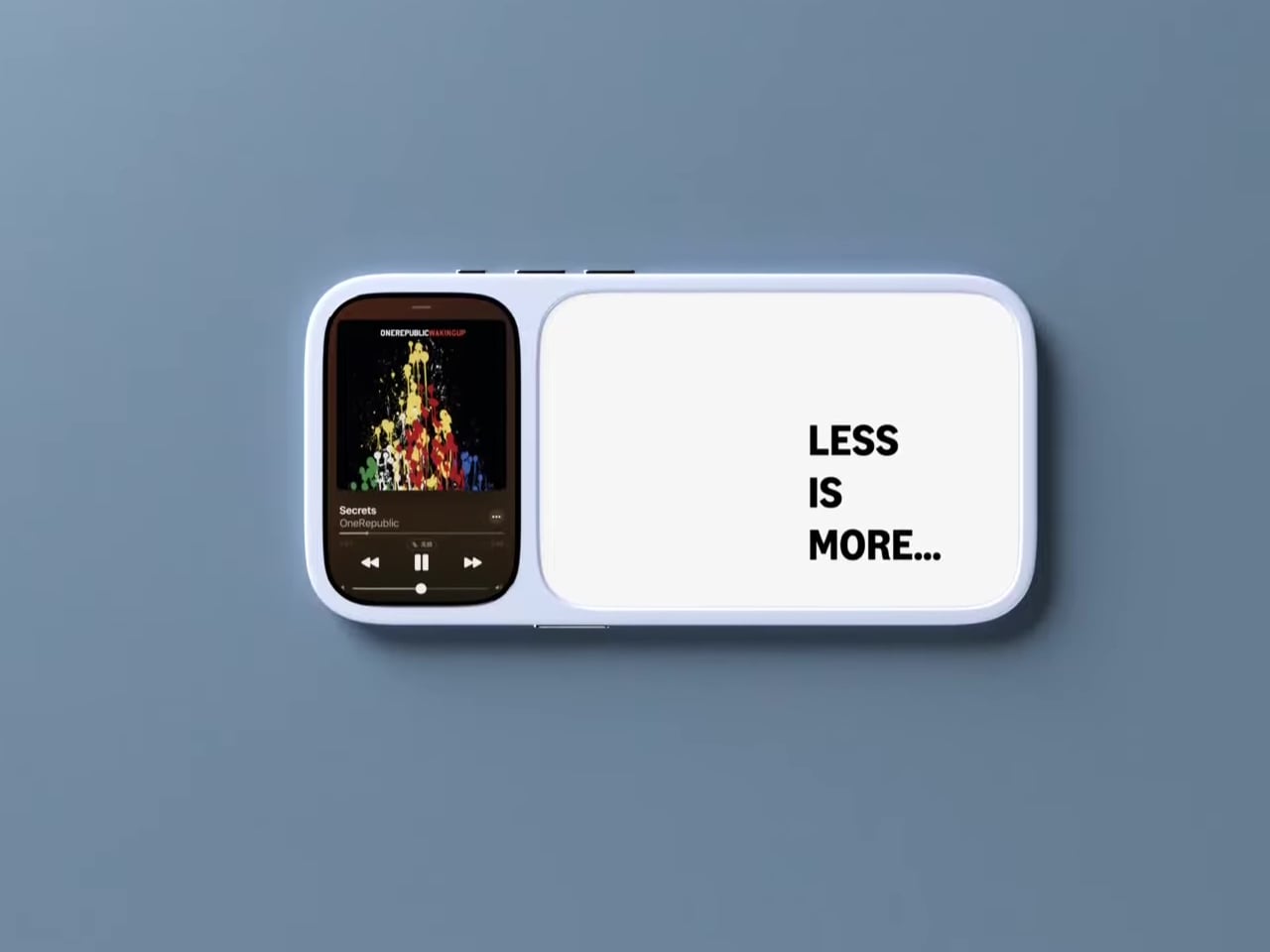
Put it together, and the pitch is easy to follow. You keep the phone in your pocket or face-down on a desk, and the E Ink panel handles quick glances that don’t need the main screen, saving the battery drain of waking an OLED display dozens of times a day. When you do need the full phone, flipping the cover open gets you there just as fast as any other case.

That said, a few things here are easier to propose than to build. Laser-Link doesn’t have a clear path to production yet, and it raises obvious questions about reliability when the phone and case aren’t perfectly aligned. The E Ink display part is more grounded, since that technology already exists in other accessories.

The phone case hasn’t had a genuine design moment in quite a while, and a concept that starts asking what the outer panel can actively do for you is a reasonable place to start that conversation. It still has a long road before reaching any shelf, but for a category that’s mostly been stuck recycling the same rigid shells, that’s actually not a bad place to be.

The post This E Ink Flip Case Shows the Time Without Ever Waking Your Phone first appeared on Yanko Design.

This E Ink Foldable Phone Concept Punishes Doomscrolling by Design

Most smartphones are designed to be impossible to put down. The screen faces up on every table, the display lights up for every notification, and the cost of checking it one more time is exactly zero. That’s not an accident. The hardware removes friction from compulsive use because removing friction is what makes these devices feel indispensable. The tinyBook Flip concept asks a different question entirely: what if the phone were designed to get out of the way?

The tinyBook Flip is a vertical foldable phone concept built around a 6.1-inch E Ink display. Closed, it collapses into a compact, near-square form with rounded corners and a matte white finish, something closer in proportion to a folded notecard than a smartphone. The screen disappears entirely when the device is closed shut. No glowing rectangle sitting face-up on the desk, no ambient reminder that there are things to check. Just a small, quiet object.

Designer: Pixel Dynamics

That folded form is doing more work than it might seem. Opening the phone requires a deliberate physical action, and that small added step changes the behavioral math. A reflexive grab becomes a conscious decision. The friction is minimal in absolute terms, maybe two seconds, but two seconds of resistance is often enough to interrupt the loop. The concept treats that interruption as a design feature, which puts it in genuinely different territory from most phones.

The E Ink display adds a second layer of resistance, and this one is less subtle. E ink refreshes slowly, renders in grayscale or muted colors, and handles fast-moving content poorly. Social media feeds become tedious. Short-form video becomes unwatchable. Anything built around color, motion, and rapid visual feedback stops working the way it was designed to. This is precisely the point. The screen’s limitations aren’t engineering compromises left over from an earlier era of display technology; they’re structural properties that make certain behaviors genuinely unpleasant to sustain.

What E Ink handles well is a shorter list, but a coherent one. Text reading, messaging, calendars, and static interfaces are all comfortable at E Ink’s native pace. The renders of the tinyBook Flip show a UI built around exactly these strengths: a large clock face, a calendar widget, and a grayscale illustrated wallpaper. The interface doesn’t reach for capabilities the display can’t support. The phone isn’t trying to do everything; it’s trying to do a narrower set of things without apology.

Foldable E Ink panels aren’t a speculative technology. The hardware exists at the component level and has already appeared in experimental e-readers, though no consumer phone has shipped with one in any meaningful volume. The tinyBook Flip isn’t imagining impossible components; it’s proposing a form factor that manufacturers haven’t yet committed to producing. The distance between those two things is largely commercial, not technical.

There’s also something worth noticing about how the device reads as a physical object in social space. Closed, the tinyBook Flip looks like almost nothing. No visible screen, no status indicators, no glow. A phone that carries no visual weight when it’s not in use sends a different signal than one that’s always broadcasting its presence. Putting it down means it actually disappears from the environment, not just from your hand.

That said, the concept leaves some real friction points unaddressed, and not the intentional kind. E Ink handles camera use, live navigation, video calls, and authentication apps poorly. A foldable hinge adds mechanical complexity and thickness that clean renders tend to obscure. The tinyBook Flip looks resolved in this form, but a production version would have to make tradeoffs that these images don’t show and the concept doesn’t acknowledge.

Still, the more interesting question isn’t whether this specific device could ship. It’s whether a phone that makes itself harder to misuse is a reasonable design goal at all, or whether that’s just a way of describing a phone that most people wouldn’t actually want. The tinyBook Flip lands firmly on one side of that question. Whether the market agrees is a different problem entirely.

The post This E Ink Foldable Phone Concept Punishes Doomscrolling by Design first appeared on Yanko Design.

Compal turns a laptop palm rest into an always-on E Ink notepad

Most of the unused real estate on a laptop has never really been a problem worth solving. The palm rest just sits there, flat and inert, supporting your hands while the screen above does all the actual work. Compal, the Taiwanese ODM behind a string of forward-looking laptop concepts, decided that was a waste of space and came up with something genuinely different for its AI Book concept.

The AI Book replaces the traditional static palm rest with a touch-enabled E Ink display that supports stylus input, turning dead surface area into a secondary workspace. You could sketch a quick diagram while waiting for a file to export, jot down a phone number without switching apps, or keep a running to-do list visible without dedicating screen space to a sticky-note app. E Ink doesn’t consume power to hold a static image, so that list stays put even after you shut the laptop down.

Designer: Compal

That last detail matters more than it might seem at first. A conventional display goes dark the moment you close the lid, taking your notes with it. The AI Book’s E Ink panel doesn’t, which means whatever you left there is still there in the morning, no login required, no waiting for the machine to wake. For anyone who treats a physical notebook as a memory aid rather than an archive, the behavior feels familiar and immediately sensible.

The concept goes further than a fixed notepad. The E Ink panel has a hinge, allowing it to flip outward when the laptop is closed so it faces up rather than folding in against the keyboard. In that position, it can show notifications, calendar entries, or a stylus sketch without requiring the lid to open. A narrow strip of the panel also stays visible even before flipping, offering a passive, glanceable information band that doesn’t ask anything of the user.

The “AI” branding, though, is harder to defend. Compal explains the name by pointing to the laptop’s ability to display AI-generated content, which describes any screen sold in the last decade. It’s a label that says more about current marketing instincts than about any specific hardware capability, and it does the more interesting E Ink story no favors at all. The palm rest idea holds up fine without the prefix.

As with most Compal concepts, this one comes with the standard caveats: no confirmed specifications, no launch date, no pricing. The company has introduced compelling ideas before, including a modular laptop and one with a rollable display, and neither made it to production in any recognizable form. The more honest question here isn’t whether the E Ink palm rest is clever, because it is, but whether it would actually change how people work, or just become another surface that gets ignored after the first week.

The post Compal turns a laptop palm rest into an always-on E Ink notepad first appeared on Yanko Design.

This $219 Screen Runs 6 Months Per Charge and Wants Nothing From You

Most of the screens that you encounter everyday is always fighting for your attention, always buzzing, glowing, pulsing with red notification badges designed to hijack your focus. The TRMNL X, a 10.3-inch e-ink smart display priced at $219, takes the opposite approach entirely. It just sits there, calm and papery, waiting for you to glance over when you’re ready. And that restraint might be the most radical design choice in consumer tech right now.

TRMNL’s original model was deliberately lo-fi, a smaller 7.5-inch 1-bit screen with no touchscreen and no backlight. It was almost stubbornly analog in spirit. It appealed to developers, minimalists, and those of us tired of all the bright screens. The TRMNL X is the company’s answer to users who loved the philosophy but wanted more screen real estate and polish. And it delivers on both counts without losing what made the original special.

Designer: TRMNL

The display itself is gorgeous in the understated way that only e-ink can be. At 1872 x 1404 resolution with 16 shades of gray, it renders calendars, weather dashboards, news headlines, and artwork with a crispness that feels more like a printed page than a screen. Partial refreshes happen in under 200 milliseconds, which is fast enough that the display doesn’t feel sluggish when cycling through your content. It’s the kind of screen you can stare at for hours without your eyes complaining, which is something no LCD or OLED can honestly claim.

What I find most compelling about the TRMNL X is how much it trusts you. There’s no algorithm deciding what you should see. You configure your own dashboard with plugins pulled from a library of over 850 options, everything from Google Calendar and Reddit feeds to ChatGPT summaries and YouTube subscriber counts. You arrange them in one of eight layout templates, set your refresh interval, and walk away. The device wakes up periodically, pulls a new image from the server, displays it, and goes back to sleep. That’s it. No infinite scroll. No dopamine trap. No dark patterns. Just information you asked for, presented when you want it.

The hardware reflects this same philosophy of quiet confidence. The frame comes in six finishes, from black and white to sage and faux wood, and the front is completely clean with no visible branding. There’s a magnetic USB-C charging connector, a built-in accelerometer for auto-rotation, and a touch gesture bar for quick navigation. Battery life stretches anywhere from two to six months depending on your refresh rate, which means you can genuinely forget it needs power at all. The enclosure is also waterproof and dust-proof, so it can live in a bathroom or a workshop without issue.

But the real personality of the TRMNL X shows in its hacker-friendly DNA. The firmware is fully open source. The case has actual screws, not glue, so you can open it up, swap components, and tinker to your heart’s content. There’s a Qwiic connector for attaching external sensors, and the community on Discord has already built custom integrations for Home Assistant and all sorts of niche projects. In an era when most gadgets are sealed shut and locked down, this level of openness feels almost rebellious.

At $219, the TRMNL X isn’t an impulse buy. But it’s also not competing with tablets or smart home hubs. It occupies a category that barely existed a few years ago: the passive information display. Something you put on your desk or mount on a wall that keeps you informed without pulling you into a screen-time spiral. The fact that it runs for months on a charge and requires almost zero maintenance makes it feel less like a gadget and more like a piece of furniture.

There’s a growing appetite for technology that respects boundaries, that does its job and then gets out of the way. The TRMNL X is a beautifully considered expression of that idea, a screen that proves sometimes the most powerful design choice is simply knowing when to stay quiet.

The post This $219 Screen Runs 6 Months Per Charge and Wants Nothing From You first appeared on Yanko Design.

This 10.3-Inch E-Ink Reader Was Built for Annotating Dense PDFs

Reading seriously on a tablet means fighting the device as much as the text. Notifications creep in, brightness is calibrated for apps rather than paper, and the browser is always one tap away. E-ink devices have been solving that distraction problem for years, but most are sized for novels rather than the dense PDFs, research papers, and annotated books that require space to actually work on.

The PocketBook InkPad One is a 10.3-inch e-ink slate with a stylus, running a Linux-based reading interface instead of an Android tablet OS. The aluminum frame is 5.15mm thin and wraps an E Ink Mobius display, which uses a plastic substrate rather than glass, making it lighter and more resistant to the casual impacts that happen in bags and on desks.

Designer: PocketBook

The key interaction design choice is “Comment Mode,” where finger touch handles page navigation and the stylus handles everything else, highlights, notes, and annotations on the same page you’re reading. That split means you can navigate naturally without accidentally triggering the pen, which matters when 60-page PDFs are the main material. The included PocketBook Stylus 2 is positioned as a reading-first annotation tool rather than a speed-writing device.

The E Ink Mobius panel runs at 1404×1872 resolution and 226 ppi, with SMARTlight adjusting both brightness and color temperature together. Long evening sessions of marking up papers under warm indoor light are where color temperature adjustment earns its presence. Battery life is rated at up to two months on a single charge, backed by a 3700mAh cell.

The open ecosystem is where InkPad One separates from store-locked readers. It supports 25 file formats natively without conversion, including EPUB, PDF, CBR, CBZ, and AZW, plus Adobe DRM and LCP DRM for protected content. Library borrowing via Libby is built in, so you can borrow from a public library and read on the same device where your own PDFs live, without format gymnastics.

Bluetooth 5.0 and built-in Text-to-Speech round out the feature set. TTS reads aloud any text file and resumes from where you stopped, useful when switching from reading to listening during a commute. Audiobook formats including M4A, MP3, and OGG are supported natively alongside the reading library, all synced via PocketBook Cloud and compatible with Dropbox.

InkPad One sits in a useful gap, less locked-in than store-driven readers like Kindle, less Android-cluttered than BOOX or Bigme devices, and bigger than most small e-readers for anything involving dense text and active annotation. It’s a calm, thin tool for people who want to work with what they read rather than just collect it.

The post This 10.3-Inch E-Ink Reader Was Built for Annotating Dense PDFs first appeared on Yanko Design.

Zerowriter Ink Is an Open-Source E-Paper Typewriter Built for Writers

Trying to write on a laptop means fighting a machine that is also a notification box, streaming portal, and social feed. Distraction-free apps help, but they still live inside the same browser-and-tab chaos, surrounded by everything else your computer knows how to do. Some writers just want a device that only knows how to produce plain text and does not care about anything else happening in the world.

Zerowriter Ink is an open-source e-paper word processor that tries to be exactly that. It combines a 5.2-inch Inkplate e-paper display with a 61-key low-profile mechanical keyboard in a slim slab that fits in a 13-inch laptop sleeve. It wakes instantly, shows a clean page, and runs for weeks on a single charge instead of draining down to zero by lunchtime like most laptops.

Designer: Adam Wilk

Picture drafting on a park bench or train, where the high-contrast e-paper screen stays readable in direct sunlight and does not blast blue light. A custom refresh engine keeps typing lag almost imperceptible, so it feels more like a fast e-reader that learned to keep up with your thoughts than the sluggish e-paper most people expect from displays that usually just show book pages or bus schedules.

1

The 60% mechanical keyboard uses Kailh Choc Pro Red switches, and every switch and keycap is hot-swappable. That means you can tune the feel and sound to your taste, or replace a dead switch without tossing the device. It feels more like a compact enthusiast board that happens to have an e-paper screen attached than a sealed writing appliance you cannot repair or modify.

The built-in software offers a drafting mode and a simple word-processing mode, letting you either pour out text or make quick cursor-based edits with arrow keys. On-device file management lets you save and rename documents, and finished .txt files live on a microSD card. When ready to polish, you plug in over USB or scan a QR code to move drafts to your main machine for formatting and revision.

Zerowriter Ink ships completely offline, with no accounts, no cloud sync, and no AI quietly indexing your drafts. Your words stay on the microSD card unless you decide otherwise. At the same time, the ESP32 hardware and Arduino-based firmware mean Wi-Fi and Bluetooth are there for anyone who wants to add sync or other features, either by writing their own build or grabbing one from the community.

The device is definitely not trying to replace laptops. It is trying to give writers a small, reliable space where nothing else happens. It is for people who miss the simplicity of an Alphasmart but want a sharper screen and a better keyboard, and for tinkerers who like the idea of a writing tool they can open up, both in hardware and in code, once the draft is done and curiosity takes over.

The post Zerowriter Ink Is an Open-Source E-Paper Typewriter Built for Writers first appeared on Yanko Design.

DuRoBo Krono Brings an AI-Powered Pocket ePaper Focus Hub to the US

Trying to read or think on a phone never quite works. Notifications interrupt articles halfway through, feeds wait one swipe away from whatever you were concentrating on, and even long reads become just another tab competing for attention. E‑readers tried to solve this, but most stopped at books and stayed locked into one ecosystem. DuRoBo, a Dutch e‑paper specialist, is bringing Krono to CES 2026 in Las Vegas with a different ambition, treating focus, reflection, and idea capture as equally important.

Krono is a pocket‑sized smart ePaper focus hub that has made waves in Europe and is now entering the US market. It wraps a 6.13‑inch E Ink Carta 1200 display with 300 PPI clarity into a minimalist, mechanical‑inspired body that measures 154 × 80 × 9 mm and weighs about 173 g. It is for capturing and shaping thoughts with on‑device AI, ambient audio, and a Smart Dial that feels more tactile than tapping glass.

Designer: DuRoBo

The paper‑like screen, anti‑glare etching, and dual‑tone frontlight make it comfortable for long reads, whether books, saved articles, or PDFs. The compact body feels closer to a large phone than a tablet, which encourages carrying it everywhere as a dedicated space for slower content. The display mimics paper well enough that you can read for hours without the eye strain from backlit screens.

The Smart Dial and Axis bar are the main interaction story. The dial lets you flip pages, adjust brightness or volume, and, with a long‑press, open Spark, Krono’s idea vault. The Axis along the top rear houses eight breathing lights that glow subtly while you read or work, reinforcing the sense of a calm, separate device. The dial and lights give Krono a more analog feel, turning navigation and focus into something you do with your hand.

Spark is where AI enters. Press and hold the dial to dictate a thought, meeting note, or passing idea, and Krono records it, transcribes it with speech‑to‑text, and runs an AI summary that turns it into a structured note. Text Mode lets you refine that note on the e‑paper screen. The whole process happens on‑device, keeping ideas private and the interface calm.

Libby AI is the on‑device assistant that answers prompts and helps with outlines or clarifications without dragging you into a browser. Krono runs Android 15 with full Google Play Store access, powered by an octa‑core processor, 6 GB of RAM, and 128 GB of storage, so it can run Kindle, Notion, or other tools. DuRoBo’s own interface keeps the experience geometric and minimal.

The built‑in speaker and Bluetooth audio are part of the focus story. You can listen to music, podcasts, or audiobooks while reading or writing, turning Krono into a self‑contained environment for commutes or late‑night sessions. The 3,950 mAh battery and tuned refresh algorithms support long stretches of use, not constant app‑hopping, which is what you want from a device that is supposed to be a reprieve from the usual screen.

Krono’s CES 2026 appearance is more than just another e‑reader launch. It is DuRoBo’s attempt to give US readers and thinkers a pocketable device that treats focus, reflection, and idea capture as first‑class design problems. The specs matter, but the real promise is a small, quiet object that can sit between a book and a phone, borrowing the best of both without inheriting their worst habits.

The post DuRoBo Krono Brings an AI-Powered Pocket ePaper Focus Hub to the US first appeared on Yanko Design.

Mudita Minimalist Phone and Alarm Clocks Design a Calmer Day at CES 2026

The day often begins and ends with a smartphone, from checking notifications before getting out of bed to scrolling in the dark when you should be asleep. Even people who care about design and well-being end up with glowing rectangles on every surface, and that constant presence quietly shapes attention, sleep, and mood more than most of us like to admit. The usual fix is another app that promises to help you use your phone less, which is like asking the problem to solve itself.

Mudita has been quietly building devices meant to step in where traditional smartphones can cause the most trouble. At CES 2026, that takes the form of three products: Mudita Kompakt, a minimalist E Ink phone, Mudita Harmony 2, a mindful alarm clock with an E Ink display, and Mudita Bell 2, an analog-style alarm clock with a few carefully chosen digital tricks. Together, they sketch out a different way to move through a day, keeping connections and routines intact while pushing screens out of the moments where you may choose to be “disconnected.”

Designer: Mudita

Mudita Kompakt: A Phone That Does Less on Purpose

Kompakt looks more like a small e-reader than a slab of glass, built around a 4.3-inch E Ink screen that is paper-like, glare-free, and easy on the eyes. It runs MuditaOS K, a de-Googled operating system based on AOSP, with only essential tools on board: calls, SMS, offline maps, calendar, up-to-date weather forecasts, music, notes, a meditation timer, and an e-reader. There is no app store by design, keeping the interface focused on what you planned to do instead of what a feed wants to show you next. But if you do need some very specific functionality, your favorite apps are just a sideload away.

Offline+ Mode physically disconnects the GSM modem and microphones, while also disabling Wi-Fi, Bluetooth, and the camera, turning Kompakt into a sealed, offline device when needed. That hardware-level privacy goes beyond airplane mode, which matters when you want verifiable disconnection. Long battery life, up to six days on a charge, and both USB-C and wireless charging mean it can live on a desk or in a bag without constant topping up.

A dedicated Mudita Center desktop app handles contact syncing, music, and file transfers from a laptop, keeping the phone itself simple and uncluttered, its user experience reflecting its mission. As a primary phone for someone stepping away from feeds, it keeps communication and navigation intact while stripping away most reasons to pick it up mindlessly. As a secondary focus phone for anyone who wants to disconnect from the hustle of a smartphone, it can handle calls and texts without the usual app notifications to help nurture balance and peace of mind.

Mudita Harmony 2: A Bedroom Without a Smartphone Glow

Harmony 2 is an E Ink alarm clock with three physical knobs on top for light, volume, and alarm settings, designed to live where a phone usually sits on a nightstand. The E Ink display is easy to read and uses an adjustable warm backlight that minimizes blue light, so you can check the time at night without a blast of white light or the temptation to swipe through notifications that make it harder to fall back asleep.

The wake-up experience is built around a gradual, ascending alarm that starts softly and increases in volume, paired with a pre-wake-up light that mimics a sunrise by slowly brightening five to fifteen minutes before the main alarm. Harmony 2 offers seventeen melodies, including real nature sounds, and lets you enhance alarms with light or upload custom audio via the Mudita Center app. The goal is to make waking feel less like an interruption and more like a natural transition.

Extra features support a phone-free bedtime, Relaxation mode with customizable sounds and white noise, a Bedtime Reminder to nudge you into a consistent routine, a Meditation Timer with gong sounds, and a Power Nap Mode. With over forty days of battery life and USB-C charging, Harmony 2 can stay on a nightstand without becoming another device you plug in every night, reinforcing the idea that the bedroom can be a low-tech space.

Mudita Bell 2: Analog Mornings with a Few Smart Tricks

Bell 2 is the more analog-leaning sibling, an alarm clock with a clear, minimalist dial and an internal quartz mechanism, but also an E Ink display and a light-enhanced gradual alarm. It offers nine gentle melodies and a pure-tone alarm that starts quietly and grows to a set volume, plus a warm wake-up light that can be activated before the alarm to mimic sunrise, easing you out of sleep without a harsh jolt.

A built-in meditation timer starts and ends sessions with a gong, and the deliberate absence of Wi-Fi or Bluetooth means Bell 2 does not compete for attention or add to the ambient connectivity load in the room. It runs on a 2,600 mAh rechargeable battery that can last up to six months on a full charge, with USB-C for the rare times it needs topping up. It is designed to be set and then mostly forgotten.

Bell 2 has been awarded a Platinum Calm Technology Certification, recognizing products that respect attention and promote well-being. Available in charcoal black and pebble gray, it is meant to blend into different interiors while still feeling like a considered object. In a home shaped by Kompakt and Harmony 2, Bell 2 completes the picture: a simple, focused object that reflects Mudita’s belief that technology can be present without being intrusive.

Mudita at CES 2026: Technology for Mindful Living

Together, Kompakt, Harmony 2, and Bell 2 create intentional, screen-free moments throughout the day; focused time on the go with Kompakt, a calmer evening and wake-up routine with Harmony 2, and a simple, analog-leaning start to the morning with Bell 2. None of these is meant to replace a smartphone entirely. Instead, they offer a considered alternative for the moments when a screen adds little value. This is an approach that stands out at CES, where innovation is often defined by more features, rather than more thoughtful use.

The post Mudita Minimalist Phone and Alarm Clocks Design a Calmer Day at CES 2026 first appeared on Yanko Design.

This Phone Concept Stacks a 3.5-Inch LCD Above a 5.2-Inch E Ink Screen

Modern phones have turned into pocket TVs, huge OLED slabs that are great for video and games but terrible for focus. Most E Ink phones go to the opposite extreme, either dropping color screens entirely or putting an E Ink panel on the back while keeping a full-size color display on the front. This dual-screen concept tries a different take, stacking both screens on the same face, with a small color LCD above a larger monochrome E Ink panel.

The basic layout is a 3.5-inch IPS LCD at the top and a 5.2-inch E Ink panel below, both on the front. The numbers are 1280 × 800 resolution at 120 Hz for the LCD and 1300 × 838 at 300 ppi for the E Ink. The clear back with a single camera and simple branding quietly signals that this phone is not chasing the usual multi-lens, all-screen spec race, instead treating the front as a composition of two very different surfaces.

Designer: Mechanical Pixel

The smaller LCD becomes the “burst of color” zone for time, notifications, music controls, and quick interactions, while the larger E Ink area is reserved for reading, notes, and simple widgets. This creates a hardware-level hierarchy; the calm, monochrome screen is where you spend most of your time, and you consciously move your attention to the smaller, brighter panel when you really need it, which changes the default state of the device from hyperactive to quiet.

The obvious pros are less visual noise, better eye comfort, and potentially much better battery life. E Ink only draws power when it refreshes, so a reading-first layout means the phone can idle for long stretches without burning through charge. For people who mostly message, read, and check calendars, the big E Ink panel could handle most of the day while the LCD stays off or in a low-duty role, extending runtime significantly.

The trade-offs are nothing to scoff at, though. A 3.5-inch LCD, even at 120 Hz, is not ideal for immersive video, complex productivity apps, or touch-heavy games. UI designers would need to rethink layouts for that smaller window, or accept that some tasks are better on a tablet or laptop. The E Ink panel’s slower refresh also limits it to taps and page turns, which is fine for reading but not for fast, gesture-driven interfaces that rely on immediate visual feedback.

This concept uses hardware to enforce a kind of digital minimalism. Instead of relying on focus modes and grayscale filters, it bakes the idea into the front of the phone, a big, calm screen for reading and a small, hyperactive one for everything else. For people who like the idea of a phone that nudges them toward books and away from endless feeds, that stacked layout feels like a surprisingly sharp design argument, where the very shape of the device encourages a different relationship with what lives on it.

The post This Phone Concept Stacks a 3.5-Inch LCD Above a 5.2-Inch E Ink Screen first appeared on Yanko Design.

This E‑Ink Phone Case With An AI Recorder Practically Kills Your Notes And Voice Memos Apps

My ideal phone case has always been two different products at once. Part of me wants a permanent E Ink panel for boarding passes, social QR codes, and a to do list that never disappears behind a lock screen. Another part wants an AI notetaker like the Plaud, with its own mic, its own record button, and reliable transcription. Until now, those wants have fought for the same patch of real estate on the back of my phone. Reetle’s SmartInk I feels like someone finally noticed that clash. Instead of asking me to choose, it fuses the two roles into a single shell. The E-Ink side handles the quiet, persistent information, while the hardware in the case listens, records, and hands everything off to the phone for syncing and AI summaries. In practice, that turns the case from decoration into the main interface for how I capture and review my day.

This approach is what makes the SmartInk I compelling. It treats the phone case as active, functional hardware rather than a passive bumper. The core insight is that the back of a phone is wasted space, a blank canvas that could be doing useful work. By integrating an E-Ink screen, Reetle creates a low-power dashboard for glanceable information. The marketing materials show exactly what you would expect: calendars, QR codes, and checklists living on a paper-like display that is always visible in sunlight. This is a familiar concept, but the execution here feels more deliberate. The screen is not just a secondary display; it is the intended output for the case’s other primary function, which is where things get really clever.

Designer: REETLE

Click Here to Buy Now: $119 $199 (40% off) Hurry! Only 9 Days Left.

Input comes from a dedicated, one-press record button built right into the case’s frame. This is a critical piece of the design, as it removes all the friction of modern recording. There is no need to unlock your phone, hunt for an app, and tap a tiny on-screen icon. You just press the side of the case. That single, simple action captures audio and sends it to the companion app over Bluetooth or Wi-Fi for processing. This is the kind of tactile, immediate functionality that is often lost in software-driven devices. It turns the act of recording from a deliberate, multi-step process into a pure reflex, which is exactly what you want when an important idea strikes.

Once the audio is in the app, the system’s AI gets to work. It transcribes the speech, identifies key points, and can even generate structured to-do lists from a rambling conversation. This is where the workflow comes full circle. Those summaries and tasks can be pushed right back to the E-Ink screen, closing the loop between capture and review. A meeting’s action items can appear on the back of your phone moments after the meeting ends. This creates a powerful, self-contained ecosystem where the case captures the input and the case also displays the output, turning your entire phone into a much smarter notepad.

That E-Ink display is the centerpiece of the whole pitch. It covers nearly the entire back of the phone, acting as a persistent, low-power canvas for whatever information matters most at the moment. The use cases are immediately obvious and practical: a boarding pass that will not disappear when your battery is low, a QR code for your portfolio ready at a moment’s notice, or your daily calendar visible without a single tap. Reetle calls it a “Widget Switching Display,” which suggests a dynamic hub where you can cycle through different views, from a simple to-do list to custom artwork. Crucially, this is also where the AI-generated summaries from your recordings are meant to live, turning a static information panel into an active part of your workflow.

The case has its own power source, offering 10 hours of continuous reading or 10 hours of recording, with a standby time of seven days. That is a respectable battery budget for an accessory, and it recharges via MagSafe passthrough, which seems rather fascinating because it implies that power passes through an E-Ink display into the case – which is fairly game-changing if you ask me. I don’t think I’ve seen any device allow charging right through an existing component sitting between two charging coils. That aside, the Reetle also packs a tempered-glass back and a military-grade protective construction that keeps itself as well as your phone secure from accidental drops.

The entire UX is powered by the Reetle mobile app. This app is the command center, connecting to the case via Bluetooth and managing everything from firmware updates to AI processing. It is where you review your full transcriptions, organize your notes, and customize the widgets that appear on the E Ink display. You can choose which calendar to show, which to-do list to sync, and which images or QR codes to display. The connection uses both Bluetooth and Wi-Fi, which provides flexibility for syncing large audio files quickly when a known network is available. The success of the whole experience rests on this software being intuitive, reliable, and deeply integrated into the phone’s operating system.

What is particularly ambitious is the sheer breadth of compatibility Reetle is promising. The product is not just for the latest iPhone 17 Series. The compatibility list extends back to the iPhone 13 series, and even is compatible with the new iPhone Air (although you’re killing the Air’s appeal by mounting a thick E-Ink case on it>) The plan also includes a massive range of Android flagships from Samsung, Google, Sony, Huawei, Vivo, and others. This indicates a vision for the SmartInk I as a platform-agnostic tool, not just another Apple-centric accessory. Producing perfectly fitted cases for so many different chassis designs is a significant manufacturing challenge, but it shows a commitment to serving a much wider market.

The Reetle SmartInk I is currently on Kickstarter, where it has already flown past its initial funding goal. The early-bird price is set at about $119, with a target shipping date of February 2026. For a product category that has been largely defined by aesthetics and materials, the SmartInk I represents a genuine functional leap. It is a thoughtful synthesis of E-Ink, AI, and hardware design that re-imagines what a phone case can be. It is no longer just a protective shell; it is an active partner in managing your information and capturing your ideas. Heck, it’s probably better than any other AI accessory I’ve seen all year!

Click Here to Buy Now: $119 $199 (40% off) Hurry! Only 9 Days Left.

The post This E‑Ink Phone Case With An AI Recorder Practically Kills Your Notes And Voice Memos Apps first appeared on Yanko Design.