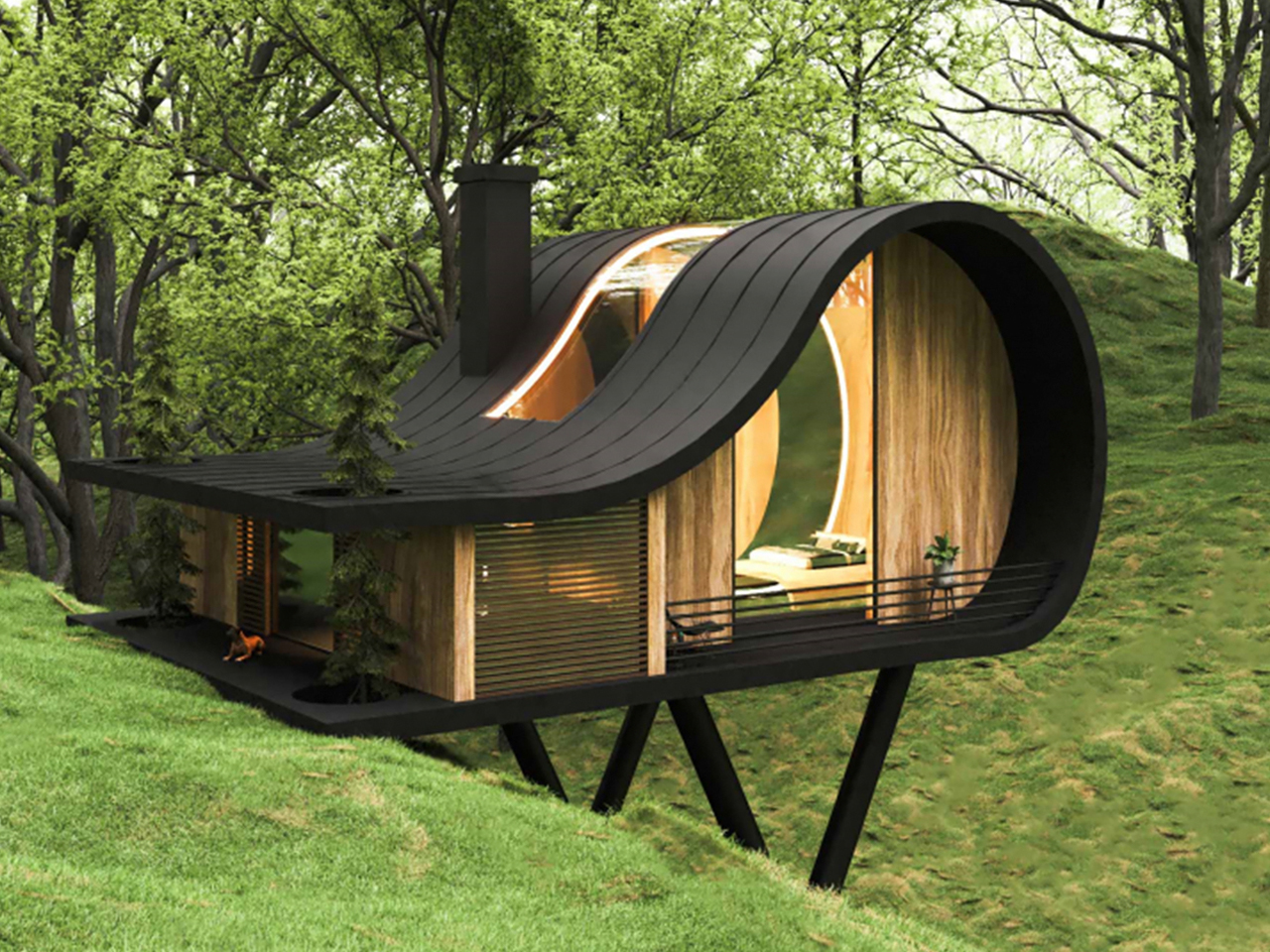
Architectural thinking is steadily shifting away from oversized, underused spaces toward a more intentional design philosophy. Luxury is now defined by the quality of spatial flow, thoughtful proportions, and the authenticity of materials, rather than by sheer scale.
By eliminating the unnecessary, a deeper relationship emerges between the built environment and its natural context. This process of refinement creates homes that feel calm, immersive, and closely connected to their surroundings. Such spaces deliver lasting value through clarity, comfort, and enduring design relevance. The move toward smaller, well-crafted environments reflects a conscious design approach that prioritizes meaning, performance, and long-term experiential value over excess.
1. Light as Architecture
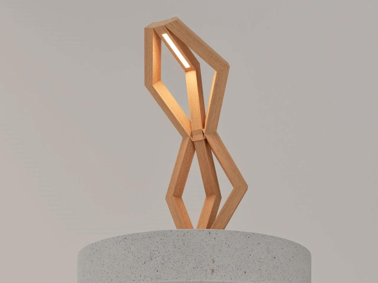
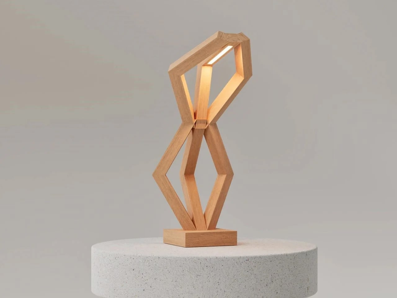
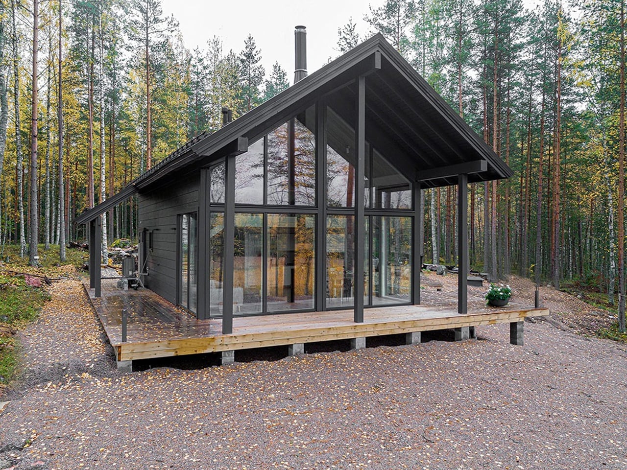
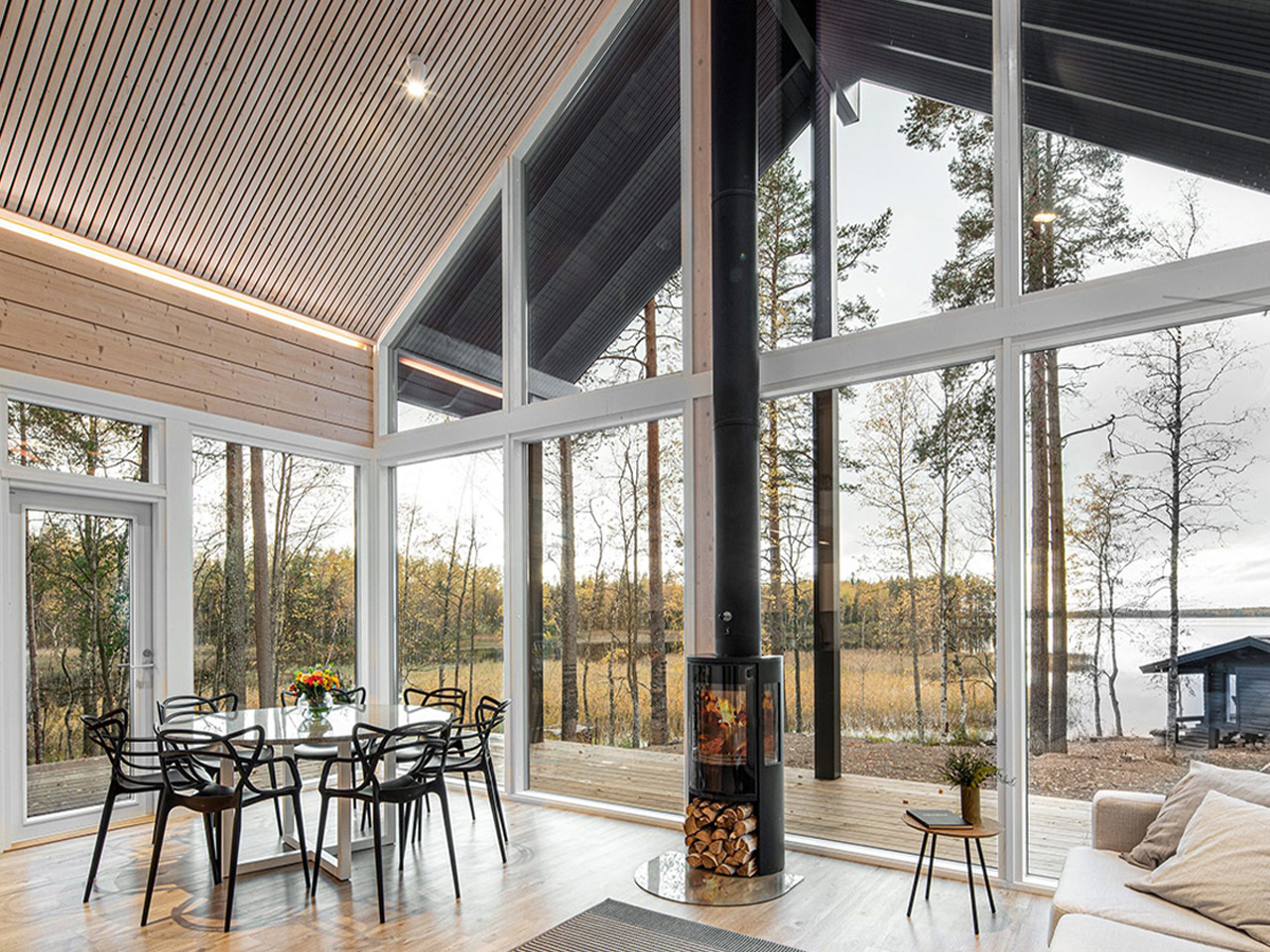
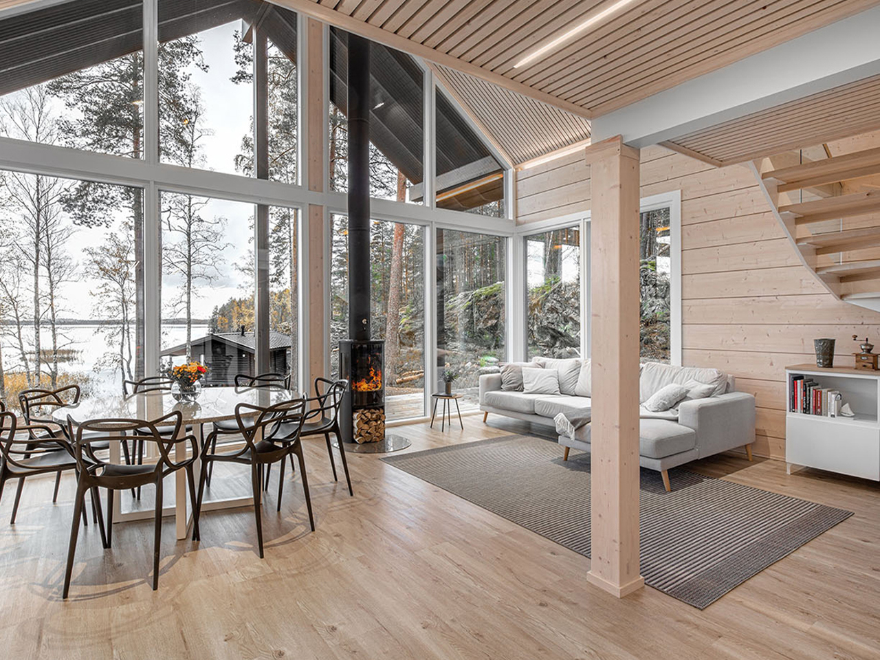
In compact environments, light becomes a primary architectural material rather than a functional afterthought. Careful modulation of daylight and artificial illumination shapes perception, atmosphere, and movement, transforming limited space into a refined and calming sanctuary. The goal shifts from brightness to balance, where light enhances form, texture, and emotional comfort.
Vertical glazing strategies draw in changing natural light, subtly extending spatial boundaries without increasing area. At night, layered lighting is woven into the architecture through recessed coves and low-level washes. This approach softens edges, reduces visual fatigue, and creates a gentle rhythm of movement, allowing the space to unfold gradually through light.
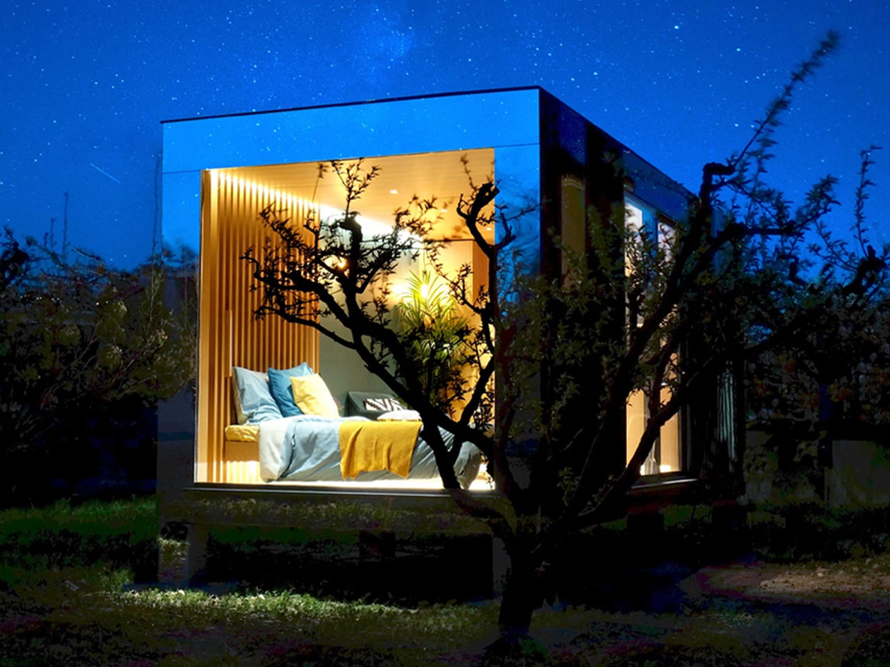
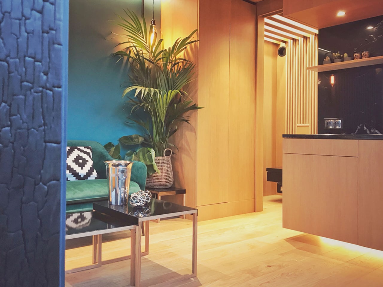
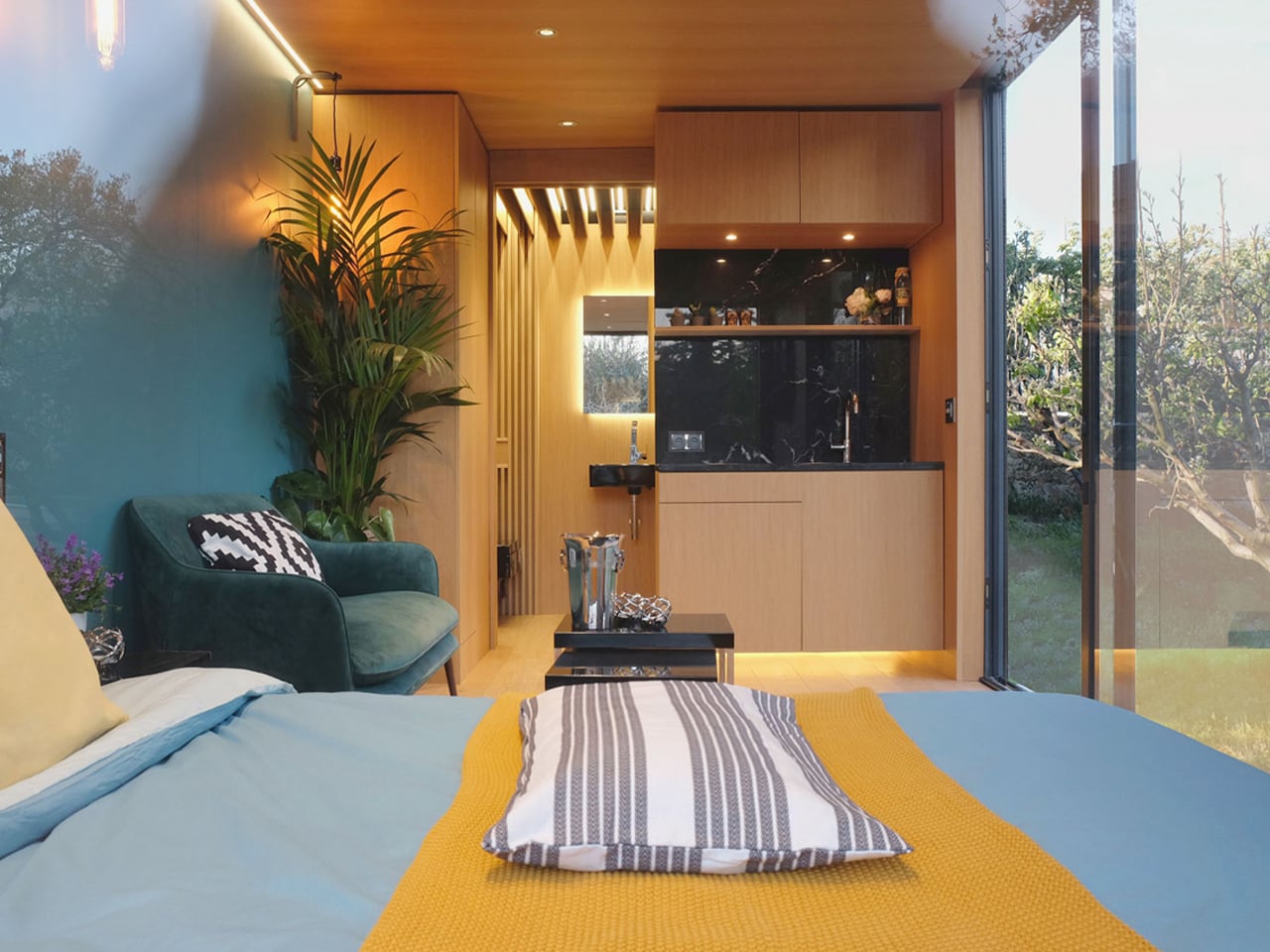
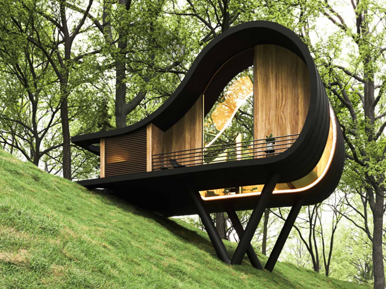
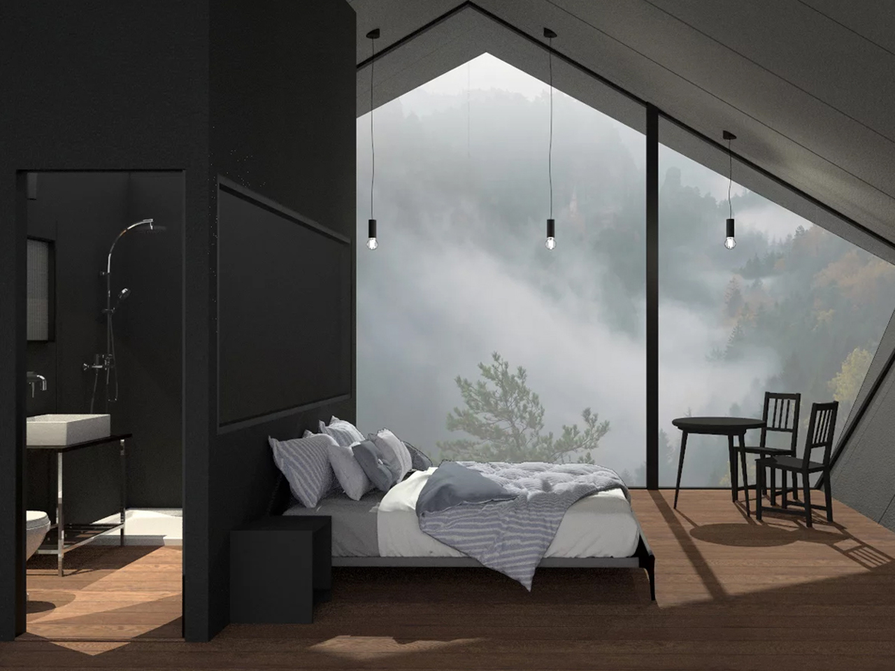
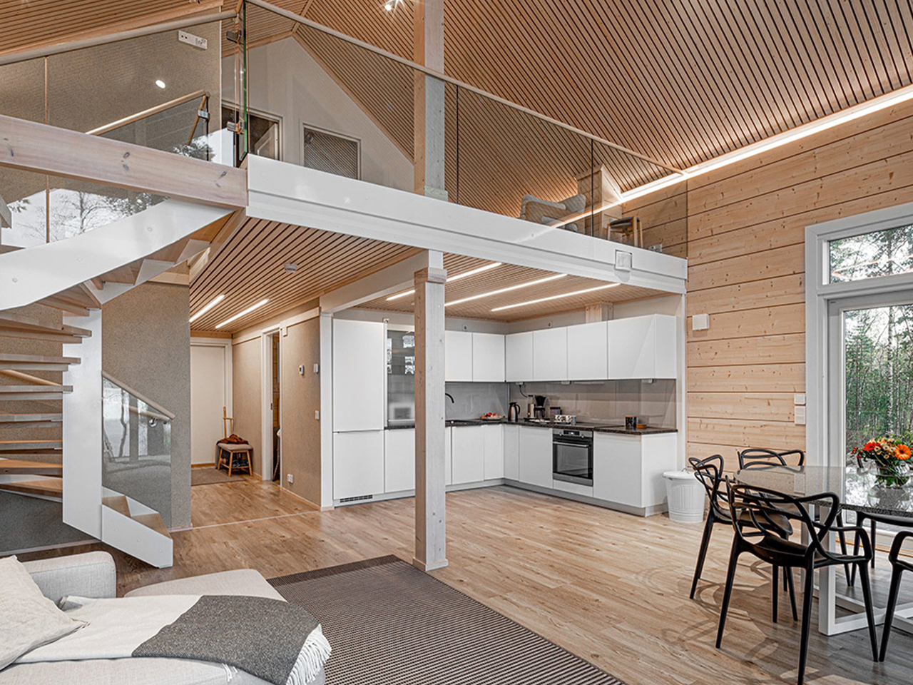
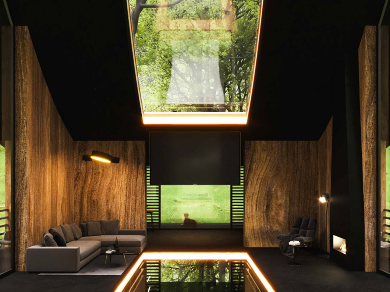
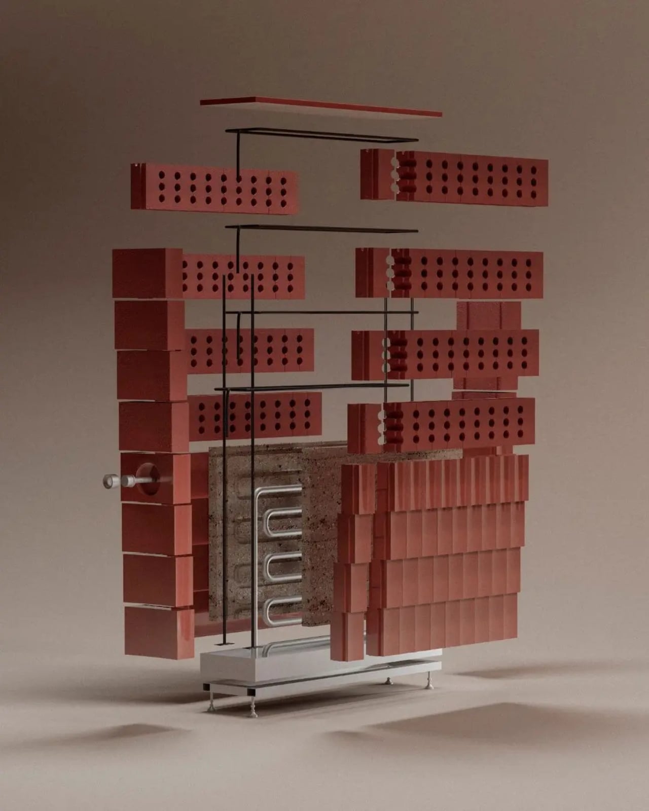
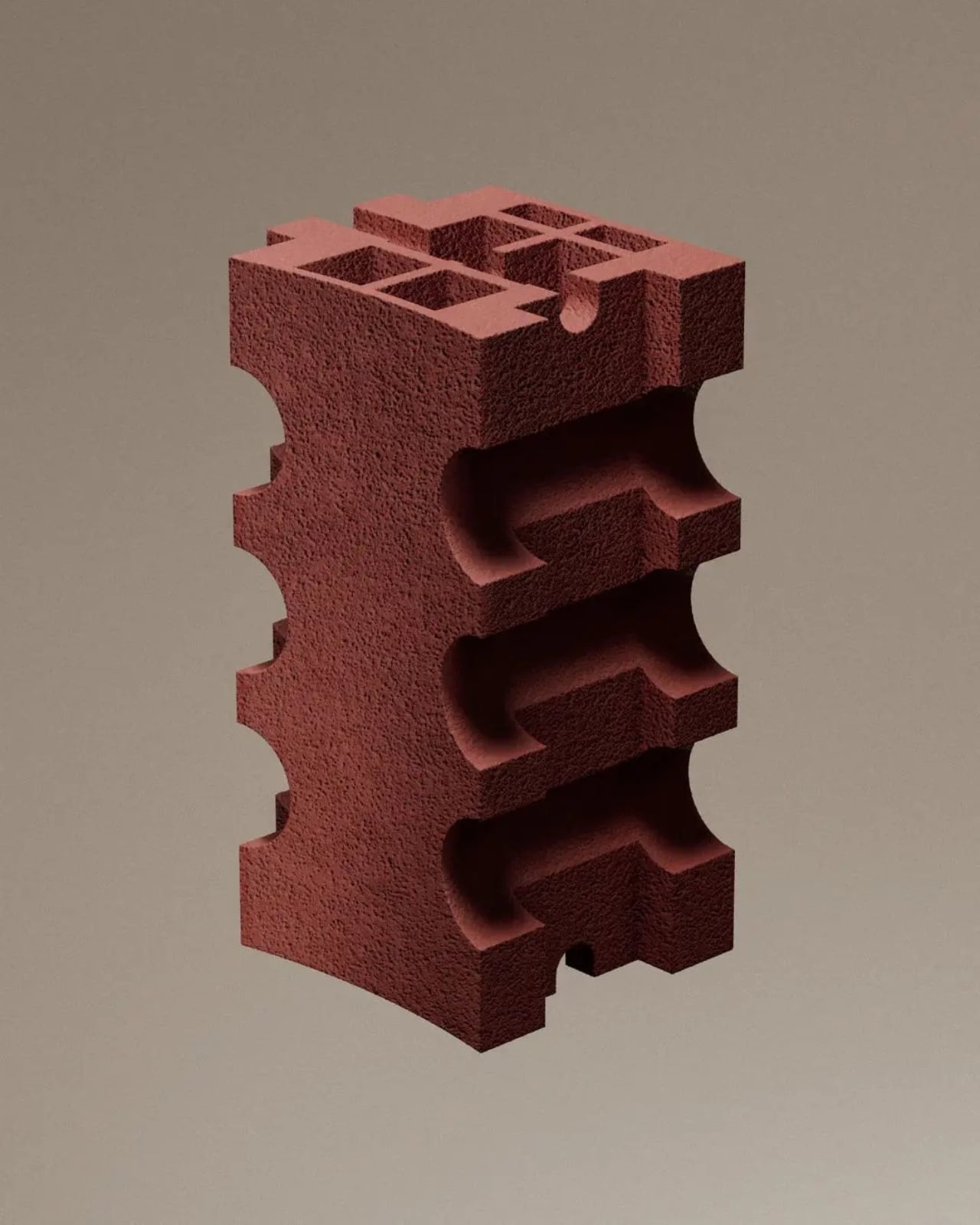
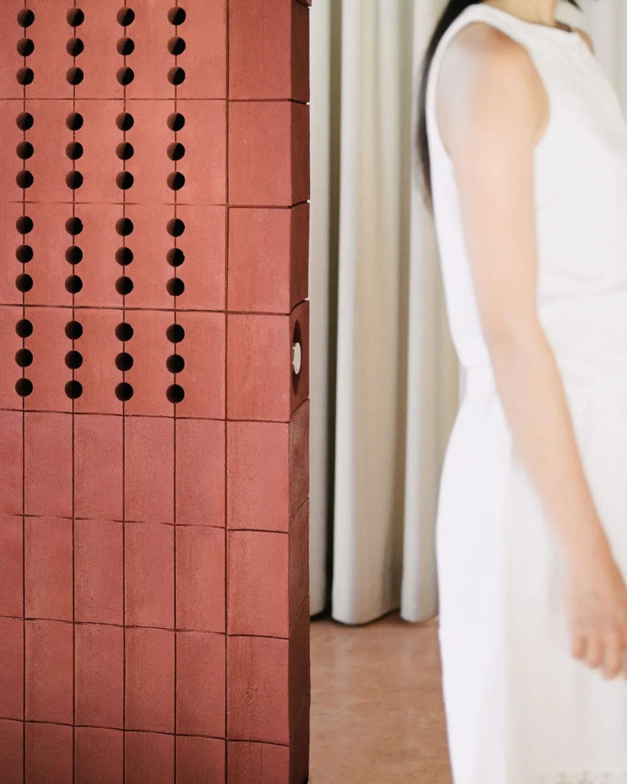
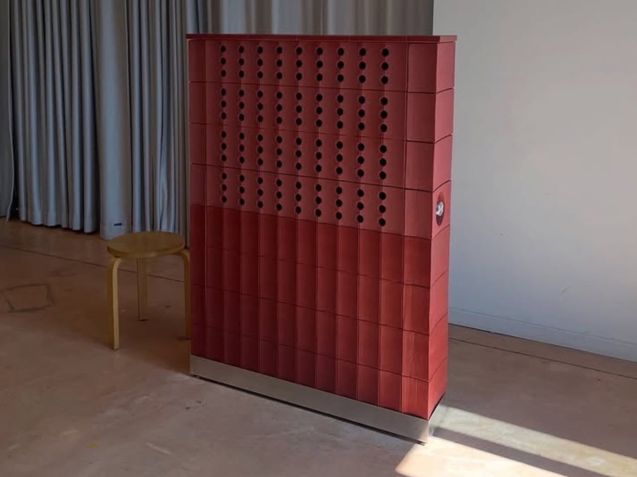
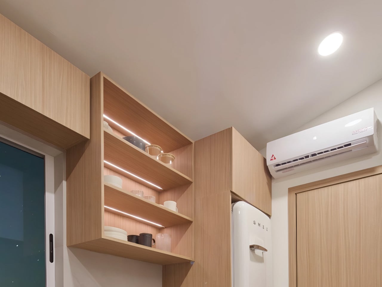
As domestic spaces increasingly accommodate multiple functions, lighting has become central to shaping comfort and usability within the home. Novablok’s Mini Blok addresses this shift through a design that prioritizes natural illumination as a defining architectural element. Fully glazed façades allow daylight to enter from multiple angles, ensuring the interior remains bright and visually open throughout the day. This generous access to light reduces reliance on artificial sources while creating an atmosphere that feels calm, expansive, and closely attuned to its surroundings. The transparency also strengthens the connection between interior and exterior, allowing changes in weather and daylight to influence the living experience subtly.
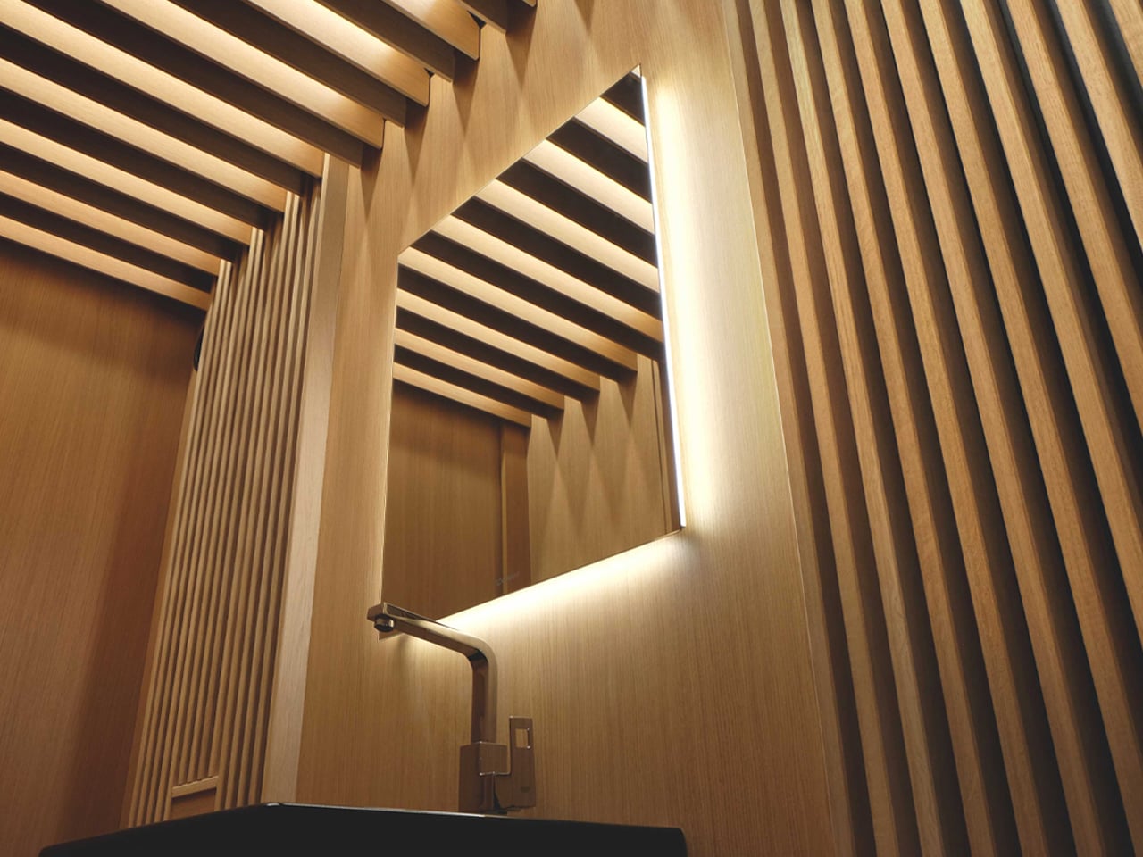
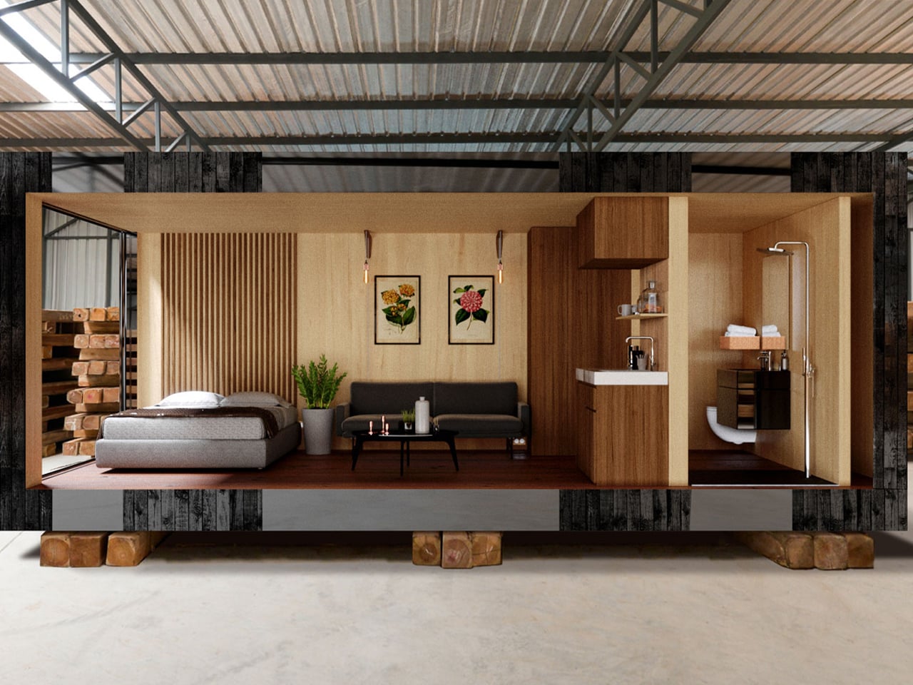
Internally, the controlled simplicity of the structure allows light to move freely across surfaces, enhancing spatial clarity despite the compact footprint. Optional interior finishes in light-toned wood further soften and diffuse daylight, preventing glare while maintaining warmth. Carefully integrated electrical lighting complements natural light after sunset, ensuring the space remains functional without disrupting its serene character. The result is a home environment where light actively shapes mood, rhythm, and everyday living.
2. Precision Over Volume
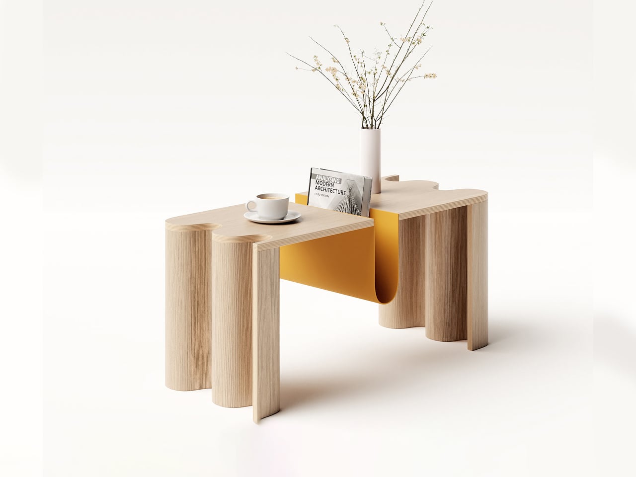
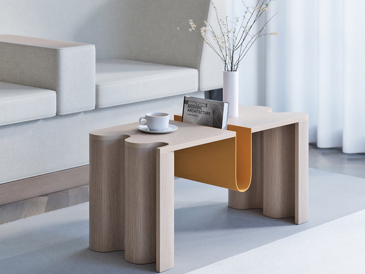
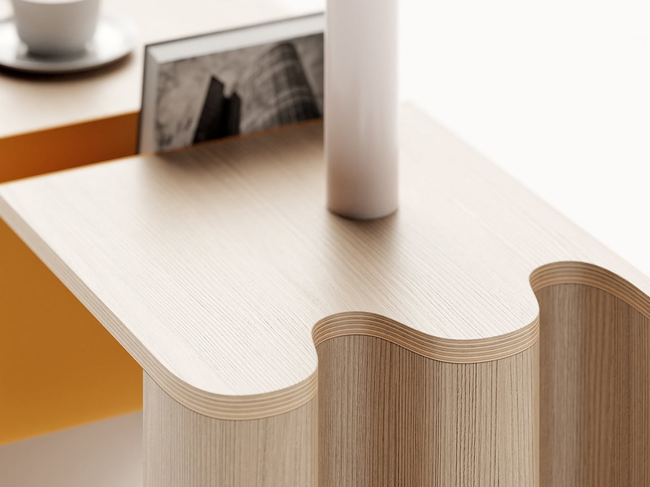
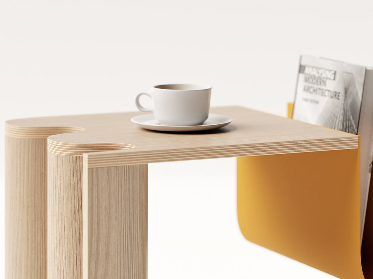
In compact spaces, every dimension carries intention, making precision the core of design value. The focus shifts from creating volume to investing in quality, where materials and details are selected for their long-term sensory and experiential impact. Thoughtful allocation of resources enhances durability, tactility, and visual depth, proving that refinement delivers greater value than scale.
Authentic materials such as natural stone and carefully finished wood replace broad applications of lesser finishes, allowing surfaces to age with character. Clean detailing, including shadow gaps and refined junctions, removes visual clutter. This disciplined approach creates architecture that feels calm, honest, and enduring, where quality itself becomes the strongest return on investment.
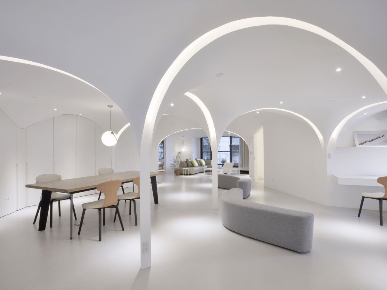
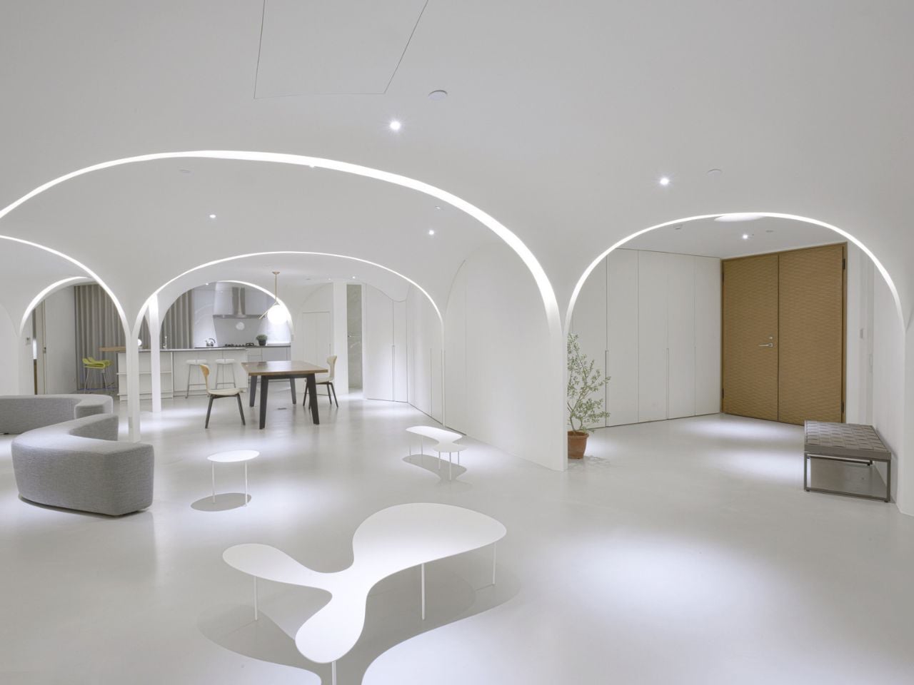
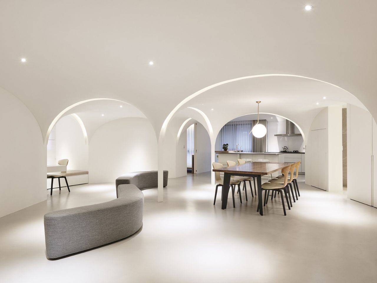
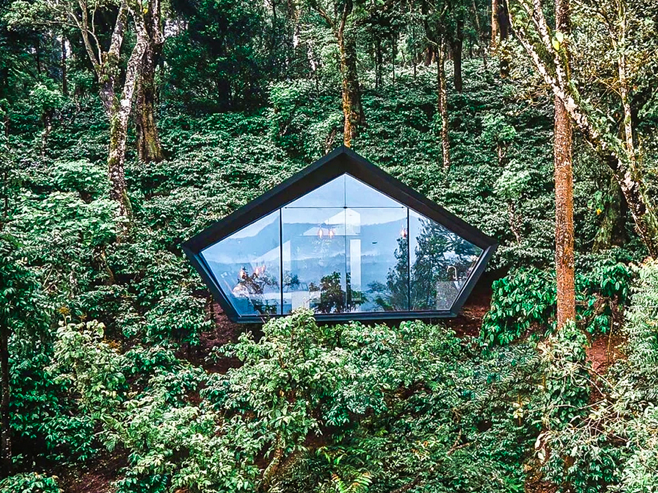
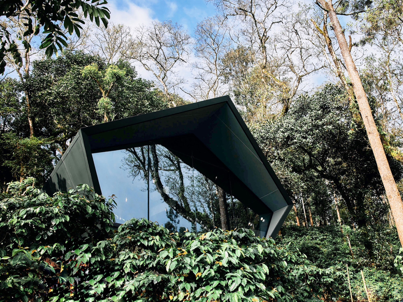
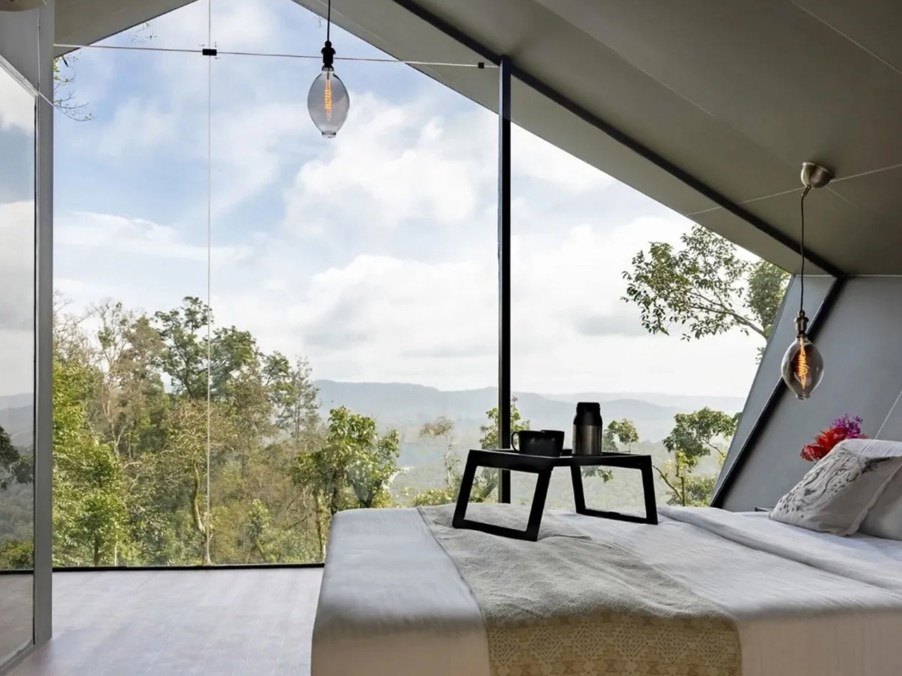
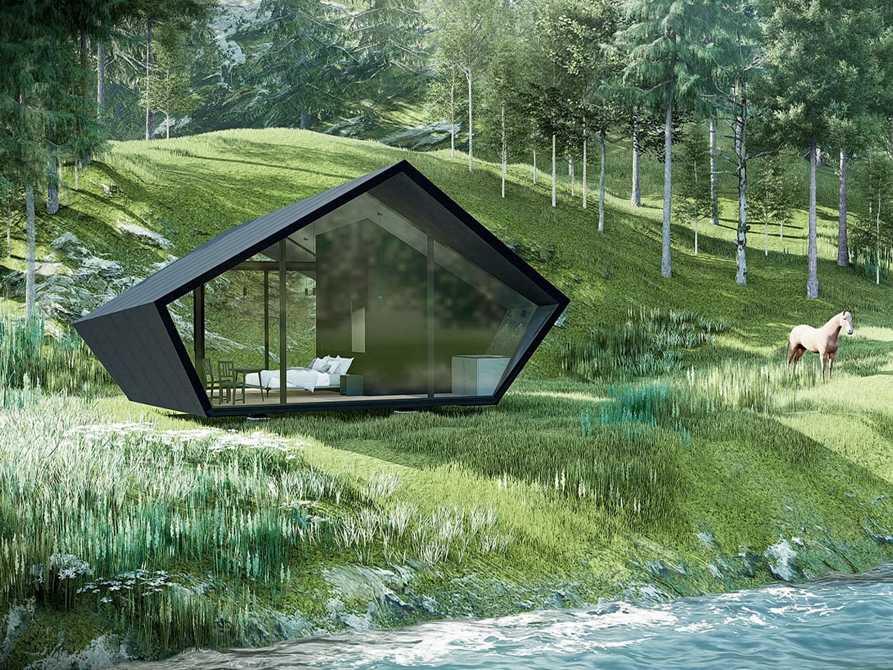
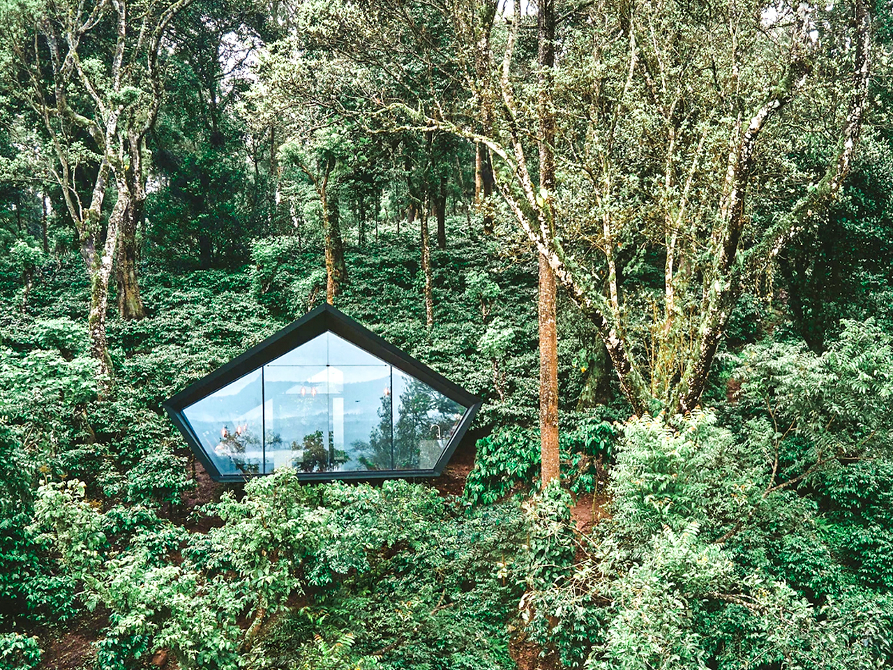
In the dense urban fabric of Taichung City, where apartment layouts often follow rigid, compartmentalized formulas, this residence has been thoughtfully reimagined by Very Studio | Che Wang Architects into a calm and uplifting retreat. The designers transformed a conventional Taiwanese unit – previously defined by interior-facing public spaces – into a light-filled environment shaped by flowing geometries and restrained materiality. Rather than pursuing dramatic visual statements, the project focuses on cultivating a gentler spatial experience, emphasizing comfort, clarity, and sensory balance as core design principles.
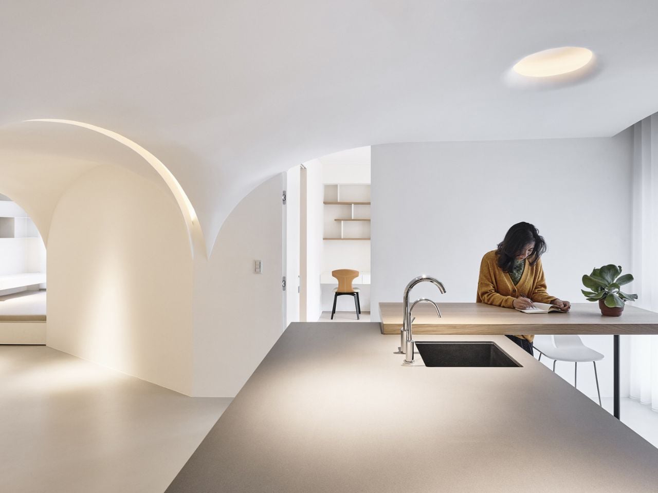
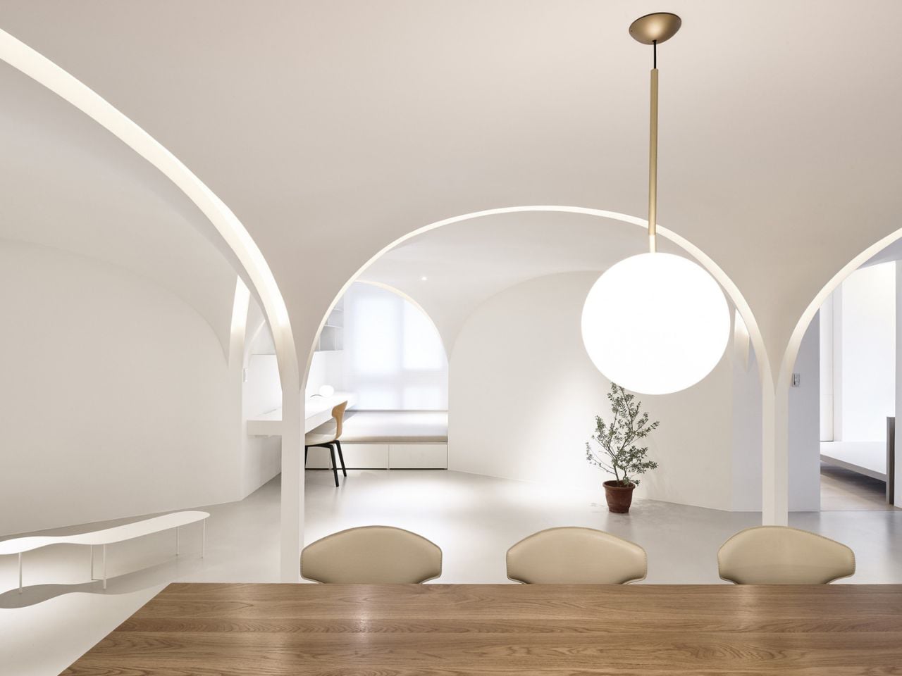
Prior to renovation, the living and dining areas were enclosed at the center of the plan, limiting daylight and ventilation to a single southern opening. The architects overturned this logic by introducing a pentagon-based spatial order that replaced rigid corners with angled walls. This new geometry extends sightlines, softens light, and encourages natural airflow. Openings on multiple sides now allow sunlight and air to circulate evenly, while subtle acoustic and lighting strategies define functional zones. The result is a minimal yet atmospheric home that prioritizes wellbeing through light, air, and thoughtful spatial organization.
3. Adaptive Spatial Flow
In refined, compact homes, flexibility becomes the foundation of spatial planning. Rather than fixed functions, spaces are designed as a sequence of experiences that respond fluidly to changing lifestyles. This “loose-fit” approach allows the home to evolve over time, supporting both privacy and openness without unnecessary expansion.
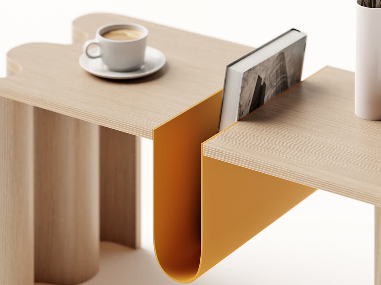
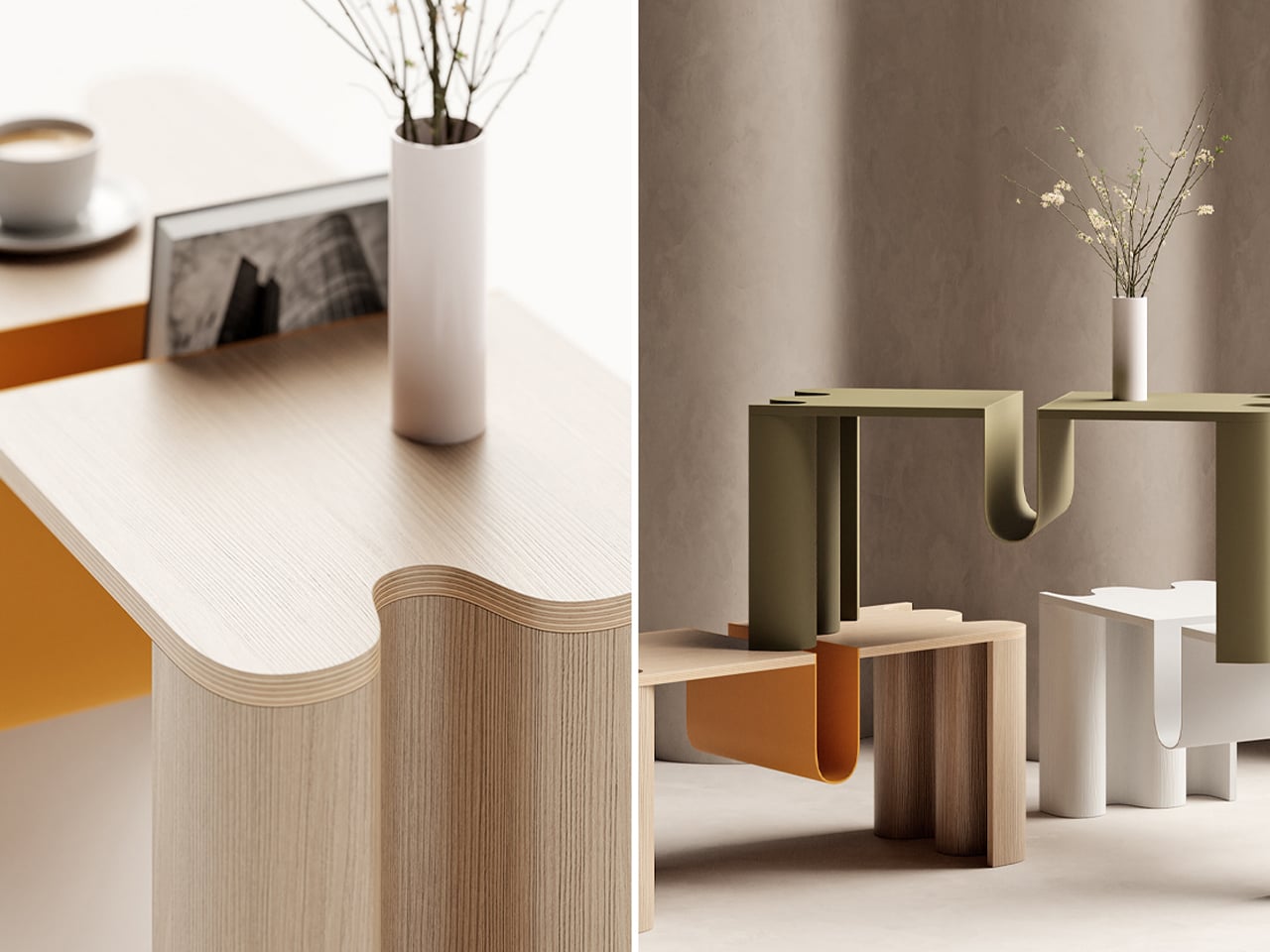
Integrated joinery is treated as architecture, not add-on furniture. Floor-to-ceiling storage defines zones, controls clutter, and enhances environmental performance. At the core, concealed sliding panels and pivoting elements enable spaces to transform effortlessly—from focused work areas to generous gathering zones. This intelligent adaptability maximizes use, reduces material excess, and aligns spatial efficiency with long-term sustainability.
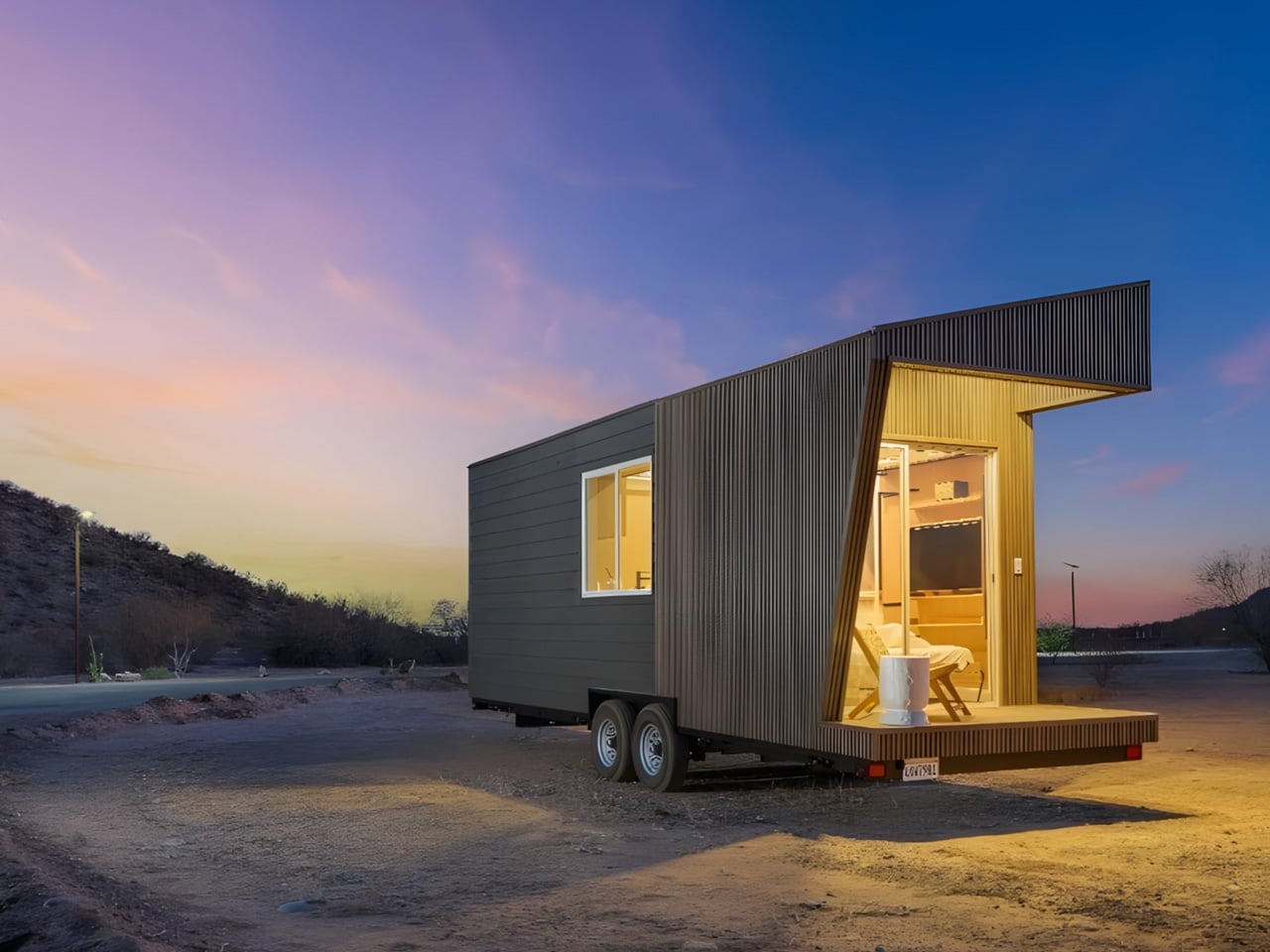
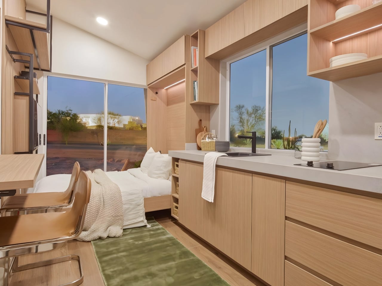
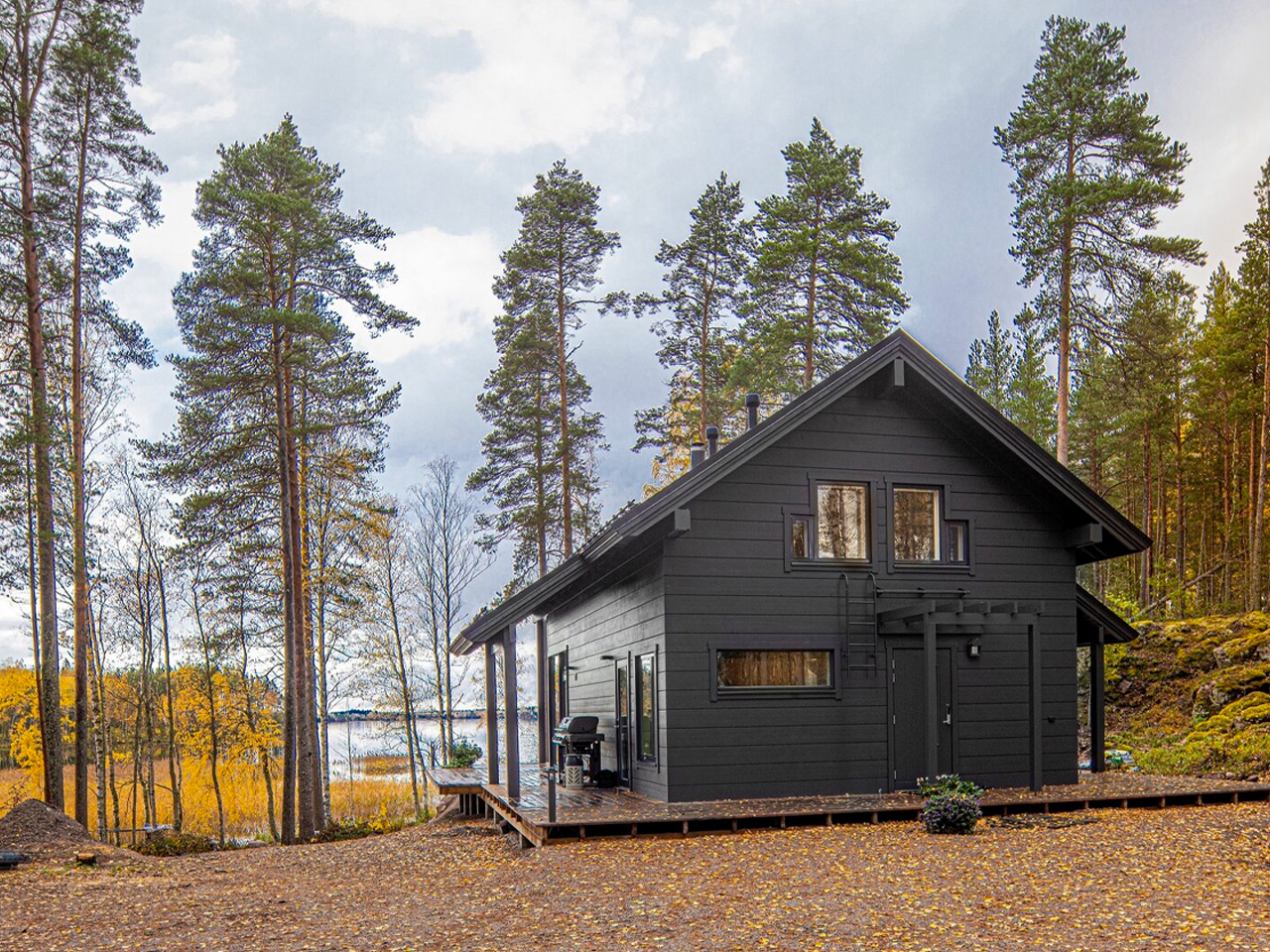
At just 26 feet in length, the Vettel Haus challenges conventional ideas of comfort and scale, yet Tamen Arq’s design for myHAUSING demonstrates how thoughtful architecture can transform extreme compactness into spatial generosity. Clad in engineered wood and built on a double-axle trailer, the home is fully mobile while maintaining a sense of permanence through careful detailing. Inside, abundant natural light enters through precisely positioned windows, dissolving any perception of constraint and allowing the interior to feel open, calm, and well-proportioned despite its modest footprint.

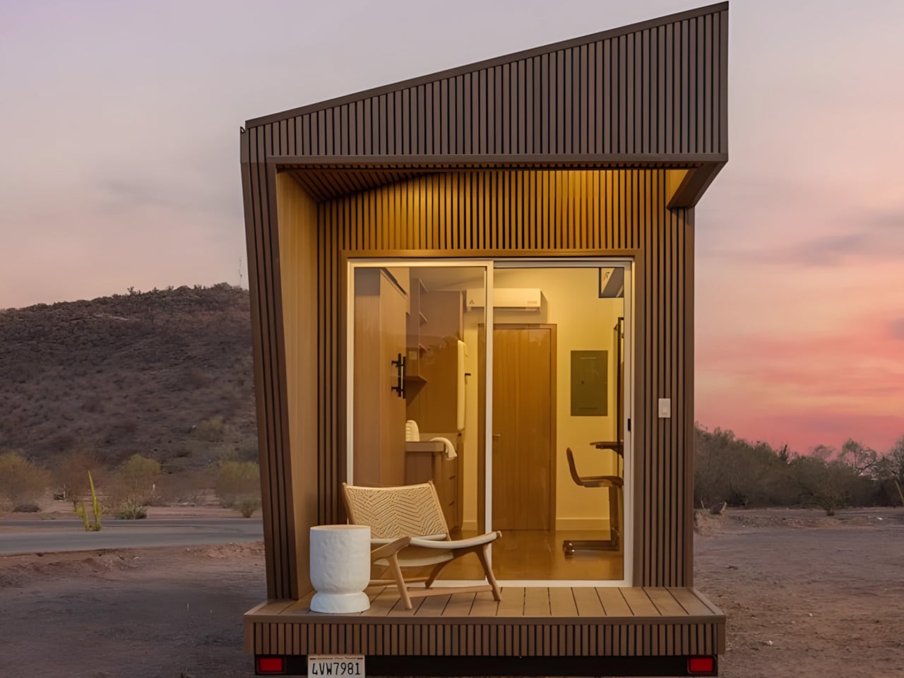
The interior layout is defined by intelligent flexibility rather than compromise. The bedroom seamlessly doubles as the living area, with a bed that functions as seating, integrated shelving that maintains visual clarity, and a discreetly placed television. Two separate entrances enhance circulation and usability, while a covered porch extends daily living outdoors. Concealed storage and custom millwork further support an uncluttered environment, proving that spatial quality is driven by design intelligence, not square footage.
4. The Biophilic Cocoon
Contemporary luxury is increasingly defined by closeness to nature rather than physical scale. More compact homes make it possible to organize living spaces around courtyards, gardens, or carefully composed views, fostering a continuous dialogue between interior and exterior. This approach creates environments that feel immersive, calm, and naturally grounded.
Openings are designed as deliberate frames, drawing the landscape inward and turning everyday views into living compositions. The home becomes an extension of its surroundings, not a disruption. With a smaller building envelope, advanced insulation and passive solar strategies can be applied more precisely, resulting in superior thermal comfort, energy efficiency, and long-term environmental performance.
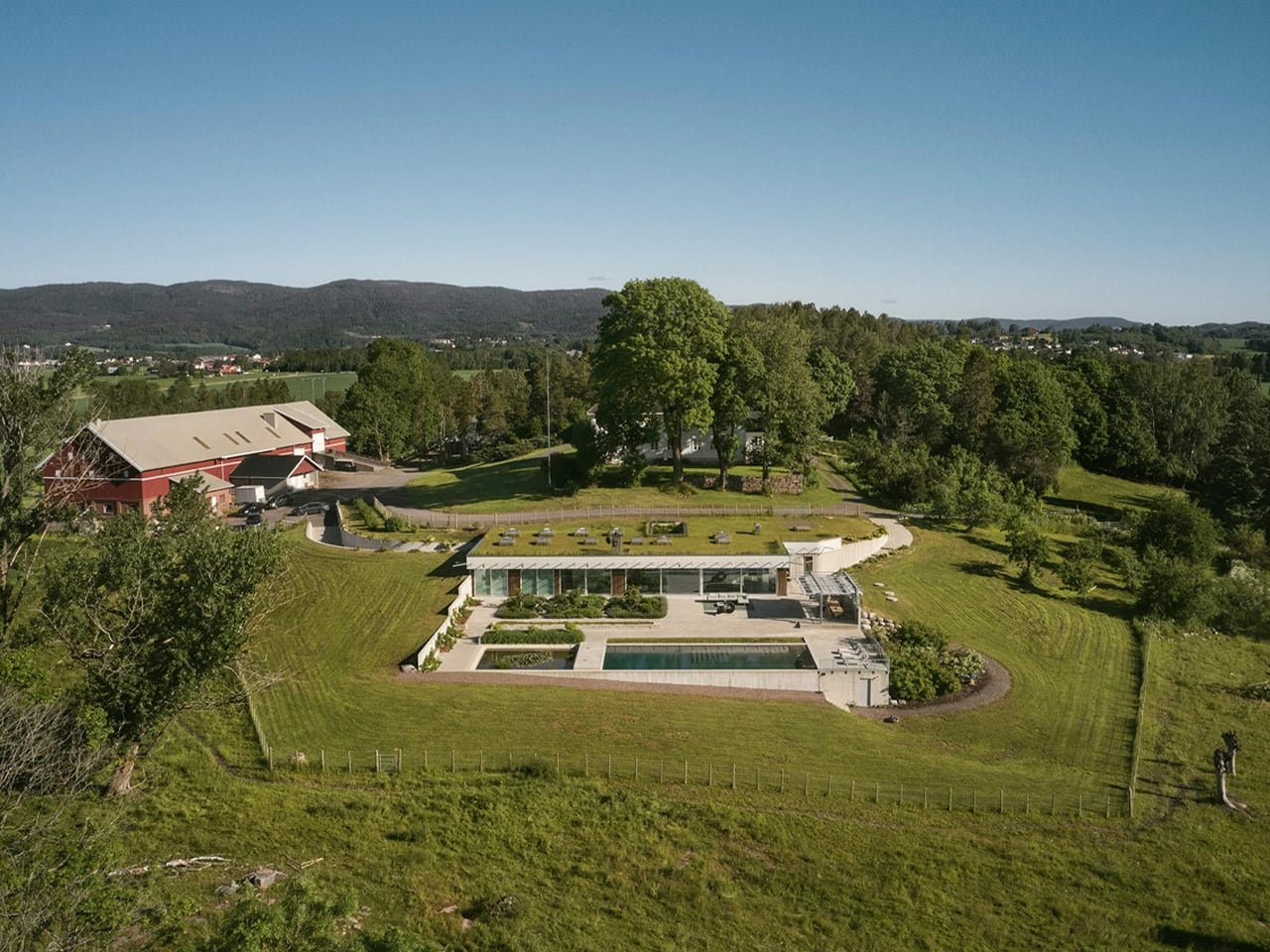
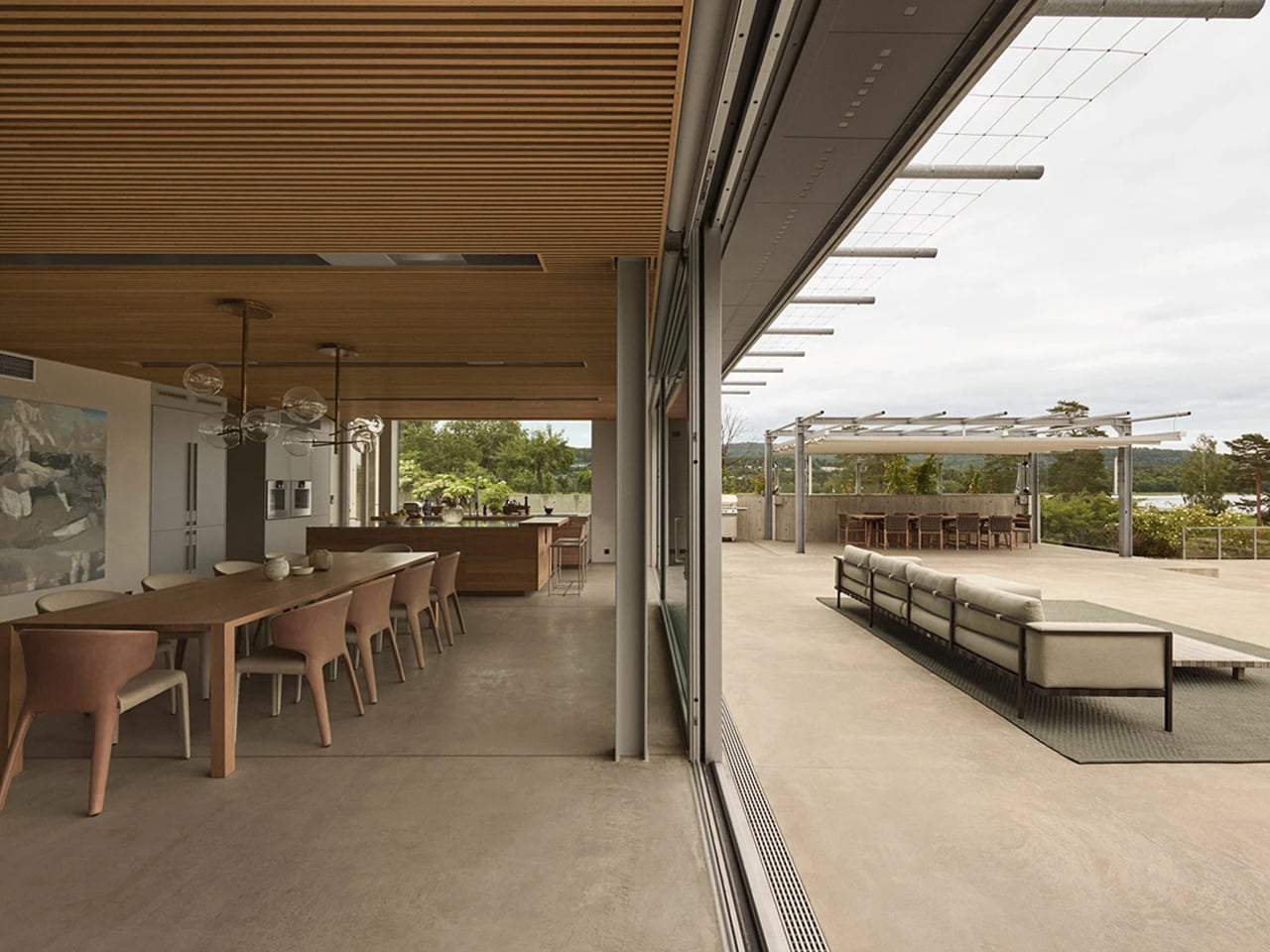
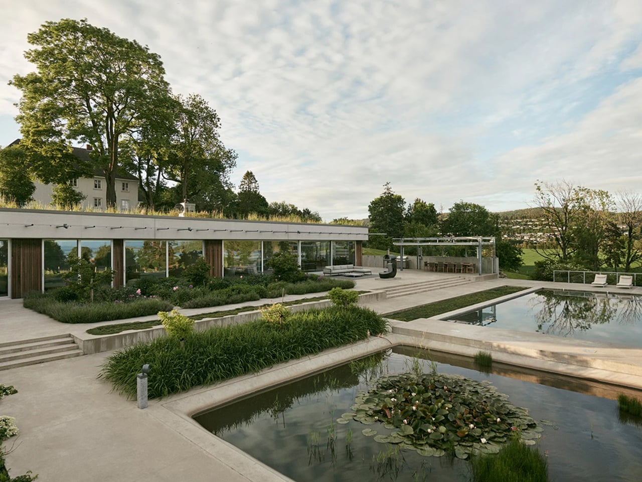
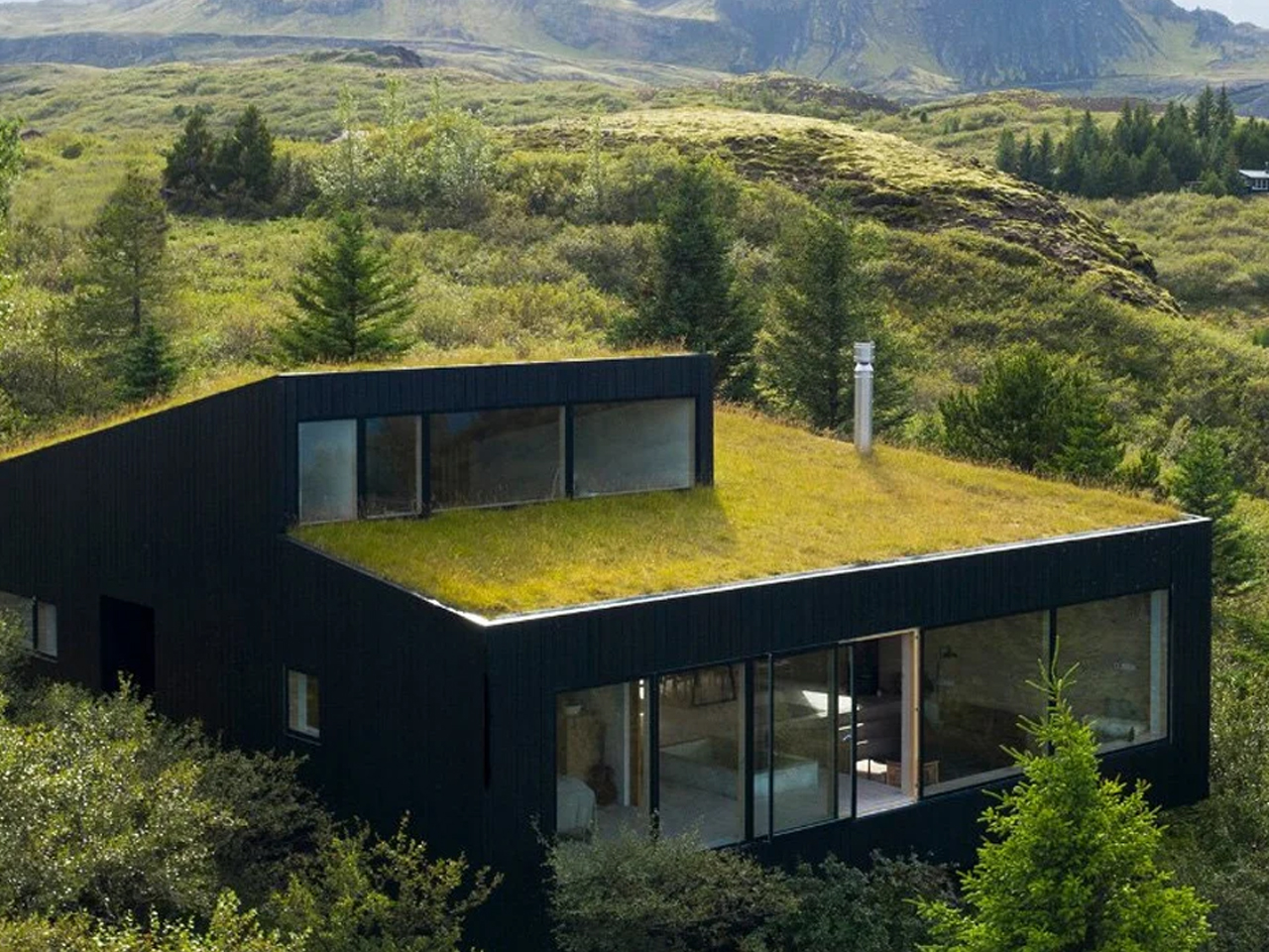
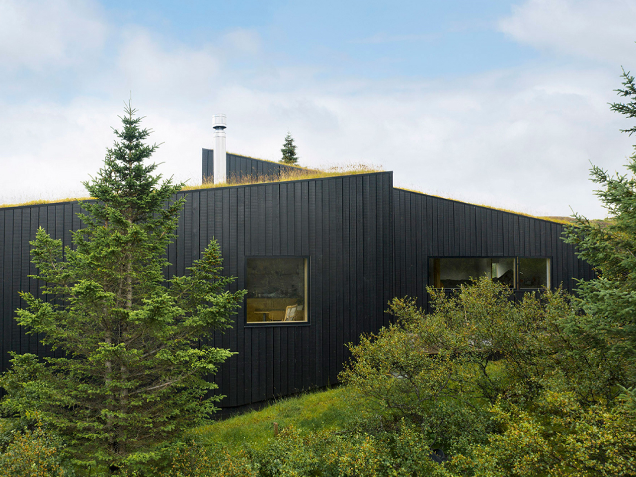
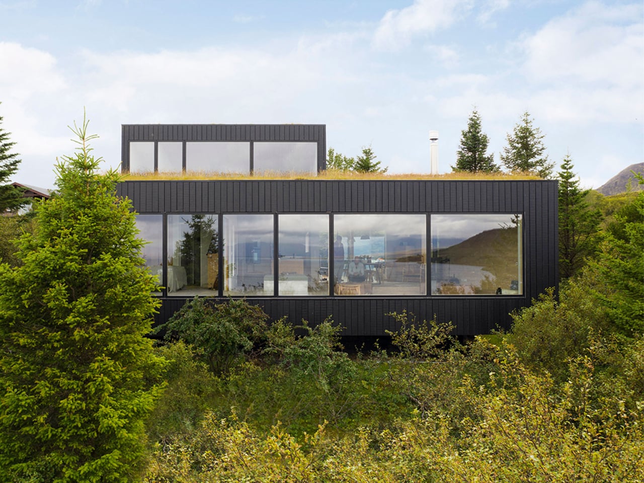
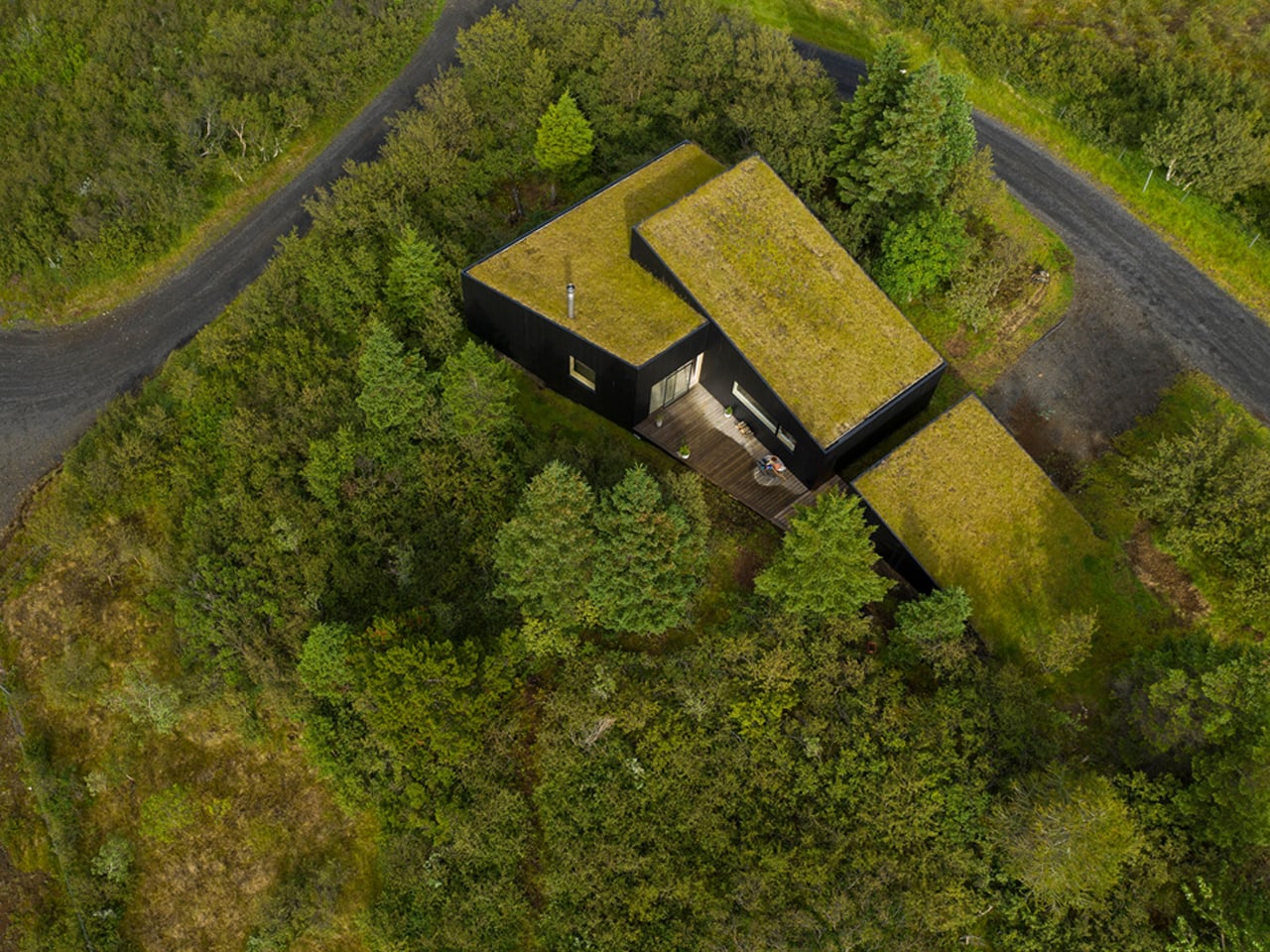
Villa Aa is a biophilic countryside residence in Norway that demonstrates how architecture can exist in quiet harmony with its natural setting. Designed by C.F. Møller, the home draws directly from the landscape, embracing the principles of organic architecture rather than imposing itself on the terrain. A green roof follows the slope of the hillside, allowing the villa to recede almost invisibly into its surroundings. Set within a protected area near the Oslo Fjord, the residence responds sensitively to environmental and regulatory constraints, ensuring the landscape remains largely undisturbed for future generations.
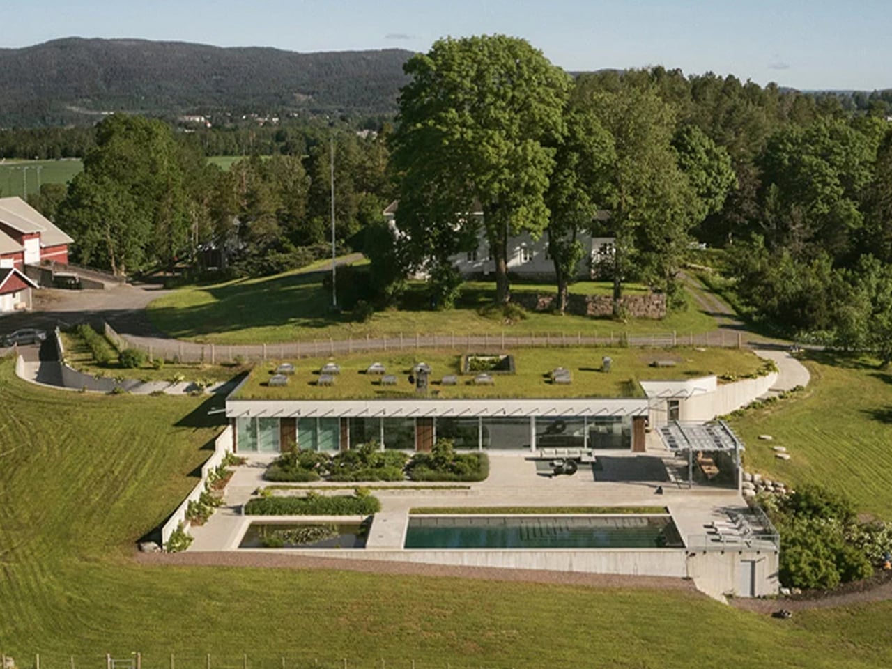
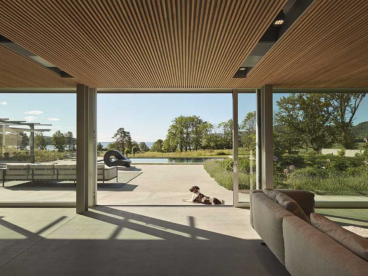
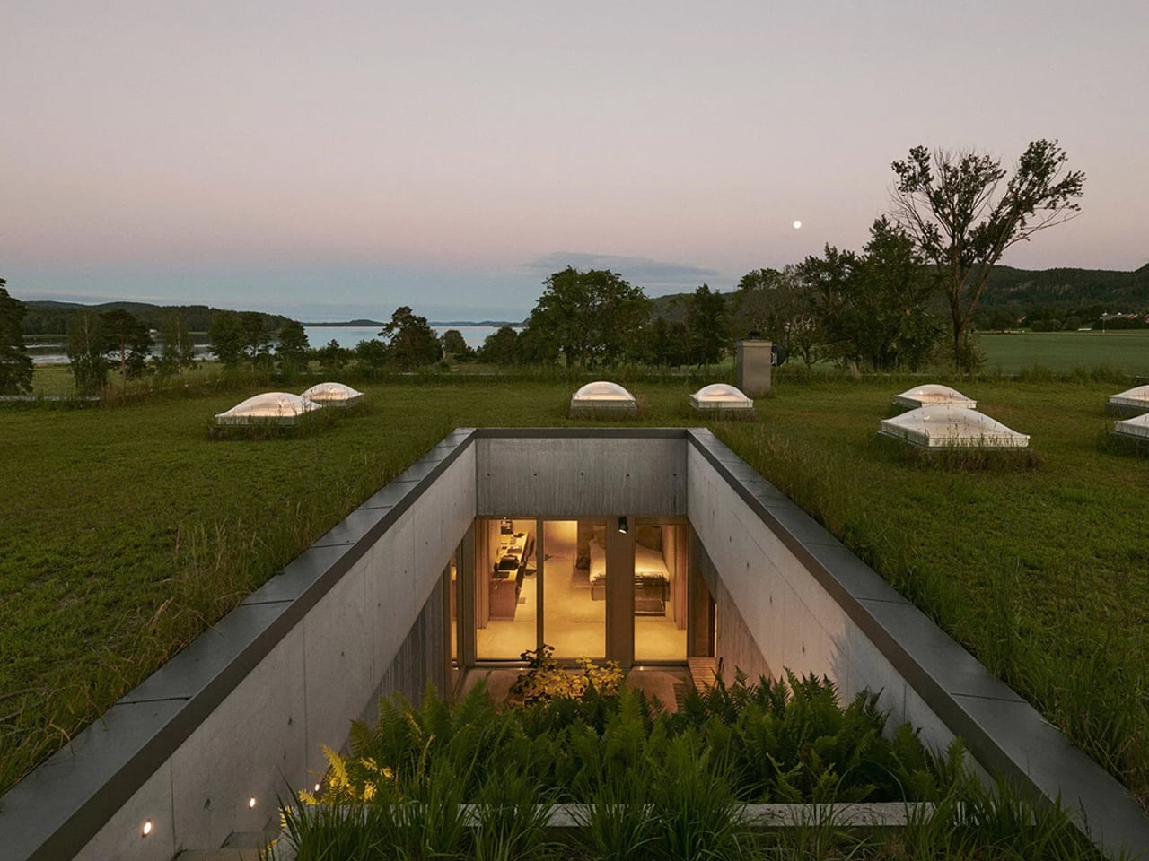
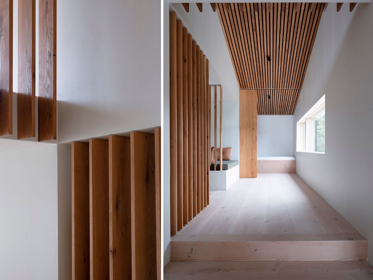
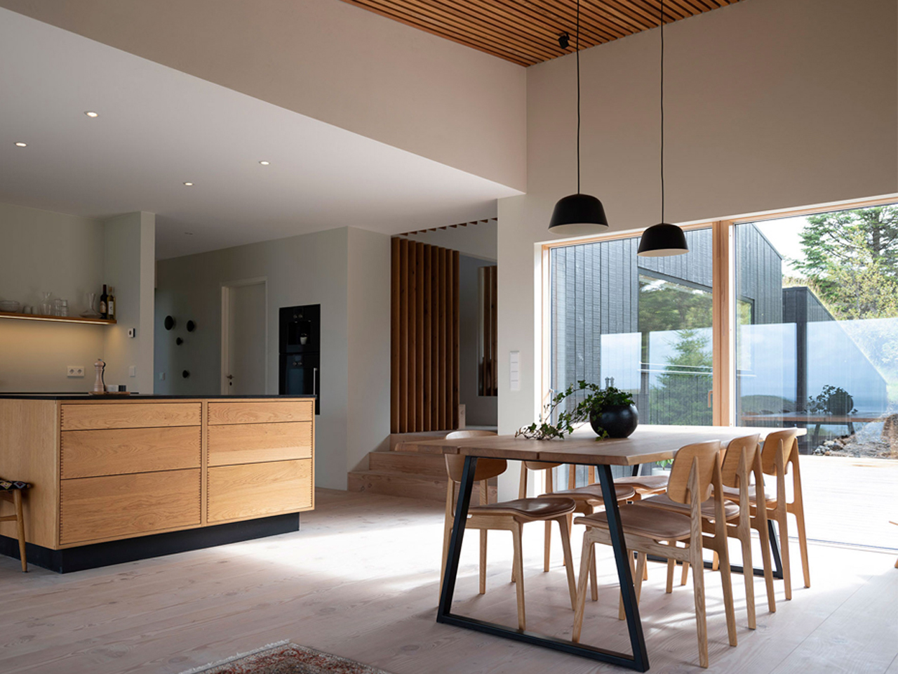
Biophilia continues throughout the interior, where spaces flow seamlessly between garden courtyards, work areas, and living zones. Expansive sliding glass façades dissolve boundaries between indoors and outdoors, framing uninterrupted views of the fjord. Skylights aligned along shared axes connect interior rooms to the planted roof above, while natural materials such as cedarwood, concrete, and steel create a tactile dialogue between the built environment and nature.
5. Minimalism with Depth
Minimalist design gains richness when informed by cultural and philosophical frameworks that value balance, rhythm, and flow. Concepts such as negative space and energetic movement introduce nuance, allowing simplicity to feel intentional rather than reductive. These references enrich the spatial experience, lending contemporary minimalism a quieter yet more resonant character.
Space is treated as an active design element, not an absence. Purposeful voids allow light, air, and life to move freely, creating moments of pause and reflection within the home. This approach supports longevity in design, where forms and materials are chosen for endurance and relevance. Downsizing becomes a thoughtful legacy that is rooted in timeless values with global, lasting appeal.
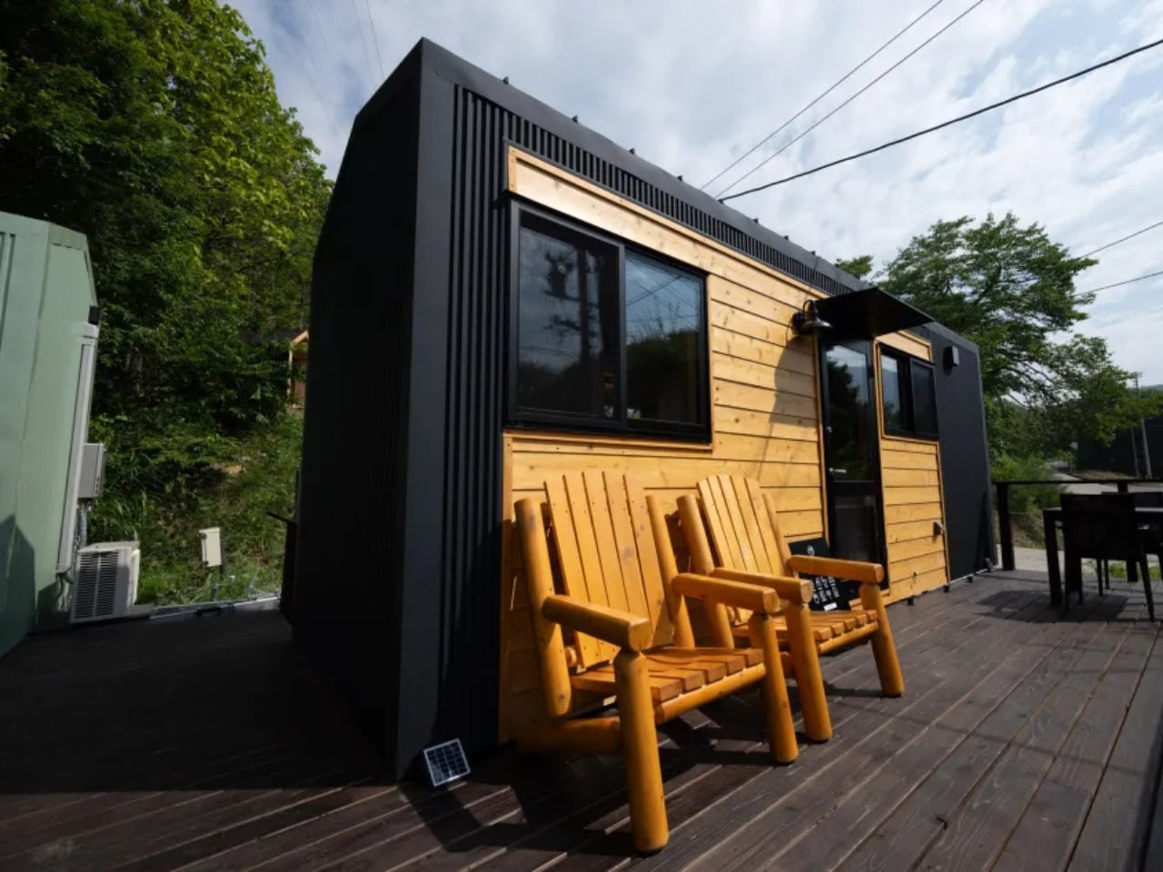
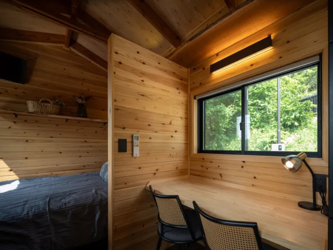
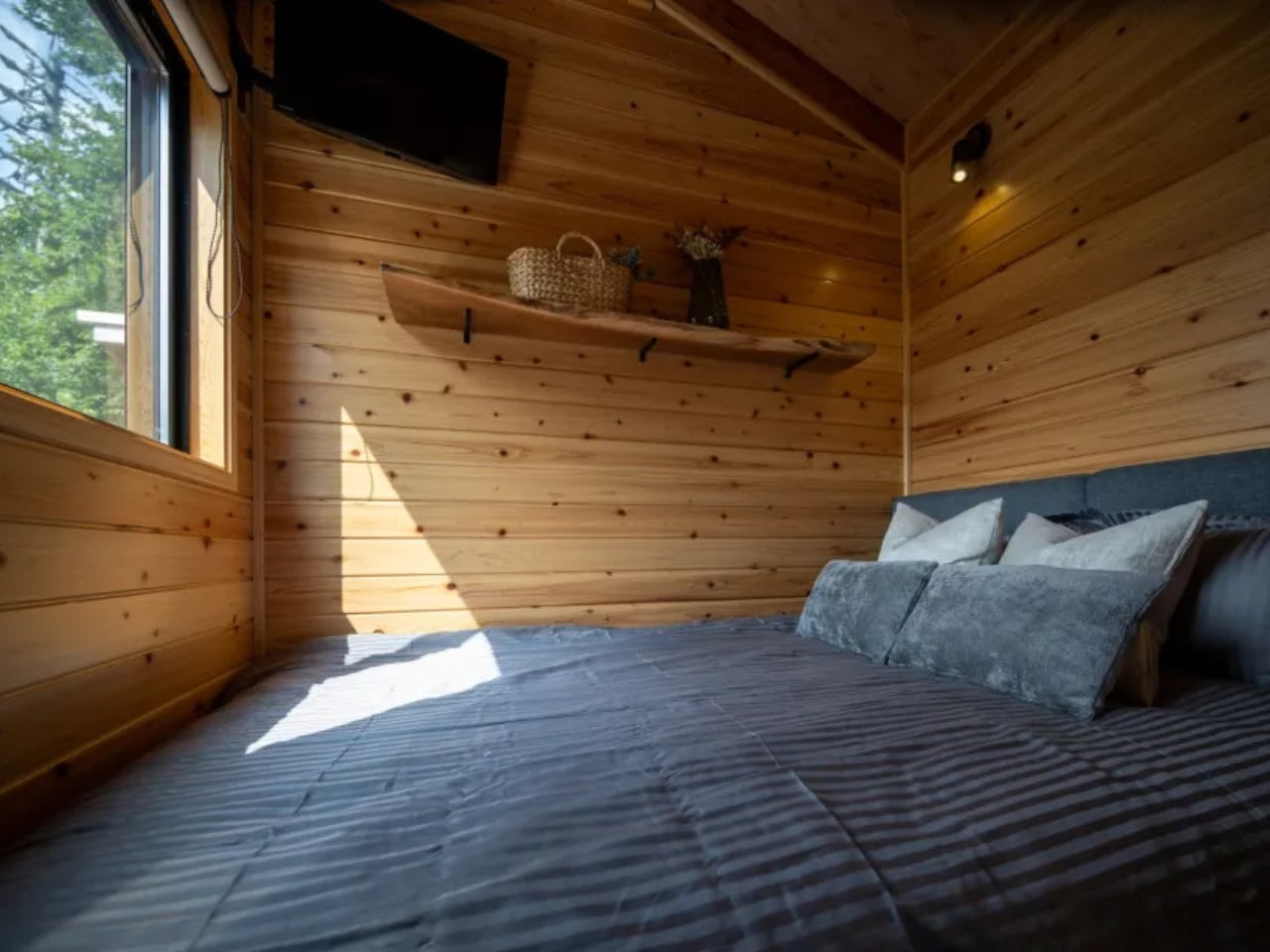
The Mizuho home by Ikigai Collective presents a refined vision of compact living rooted in Japanese minimalism and mindful design. Created as a contemporary tiny house, it blends traditional Japanese aesthetics with modern construction technologies within a carefully considered footprint. Designed for one or two occupants, the home prioritizes simplicity, calm, and efficiency, offering an environment that encourages intentional living rather than excess. Built in collaboration with local craftsmen in Nozawaonsen, the Mizuho reflects a strong commitment to quality, authenticity, and thoughtful detailing throughout.
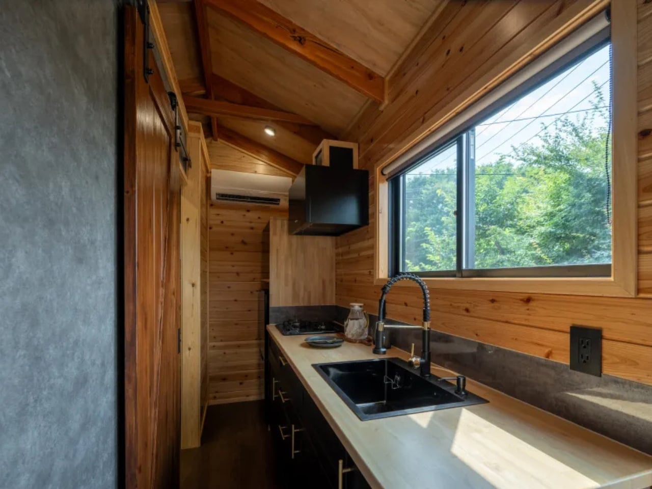
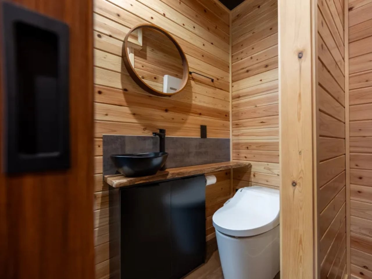
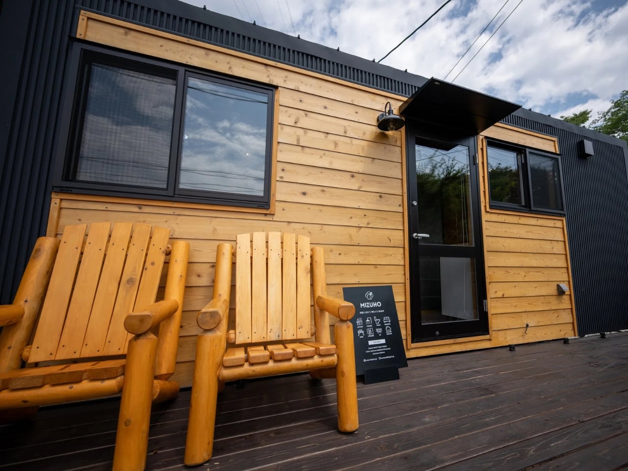
Inside, the open-plan layout allows the living, sleeping, and working areas to coexist seamlessly without feeling constrained. A flexible desk transforms into a dining surface, while integrated storage maintains visual clarity. The compact yet highly functional kitchen and serene bathroom further enhance daily comfort. Durable Galvalume steel cladding, full insulation, and customisation options ensure the home adapts easily to varied climates, making the Mizuho a quietly resilient and deeply considered place to live.
Luxury downsizing reflects architectural maturity, where value is defined by lived experience rather than scale. Through honest materials, precise detailing, and strong biophilic ties, compact homes become meaningful sanctuaries. The power of less lies in intent—creating sustainable, refined spaces that enrich daily life far beyond excess.
The post 5 Homes That Prove You Don’t Need More Space to Live In Style first appeared on Yanko Design.