PROS:
- Very comfortable to wear
- Impressive battery life
- Stylish design
- Good sound quality for open-ear design
CONS:
- No wireless charging
- Struggle with volume in very noisy environments
RATINGS:
SUSTAINABILITY / REPAIRABILITY
EDITOR'S QUOTE:
The Nothing Ear (open) headphones are a worthwhile investment that complements a modern, mindful lifestyle.
Staying connected while being aware of our surroundings is more important than ever in today’s fast-paced world. Initially, I was skeptical about the need for open-ear headphones, assuming they were primarily designed for runners or cyclists. As someone who doesn’t fall into either category, I never considered them a necessity. My go-to audio devices have been in-ear earbuds equipped with Active Noise Cancelling (ANC) features for years. While ANC is fantastic for creating a peaceful personal space, I noticed it led to an unintended consequence: a sense of isolation from the world around me. The ability to block out external noise made me unconsciously perceive the outside world as a distraction, even an irritation.
Open-ear headphones, however, offer a different experience. They allow you to enjoy audio content while maintaining awareness of your surroundings, keeping you grounded and connected to the world. The Ear (open), a new audio device from Nothing, promises to deliver this balance. I tested them for about 3 weeks and took these headphones on recent trips and day hikes, testing them in various settings including buses, trains, and planes, even on an overnight flight. Here’s my comprehensive review of the Nothing Ear (open).
Designer: Nothing
Aesthetics
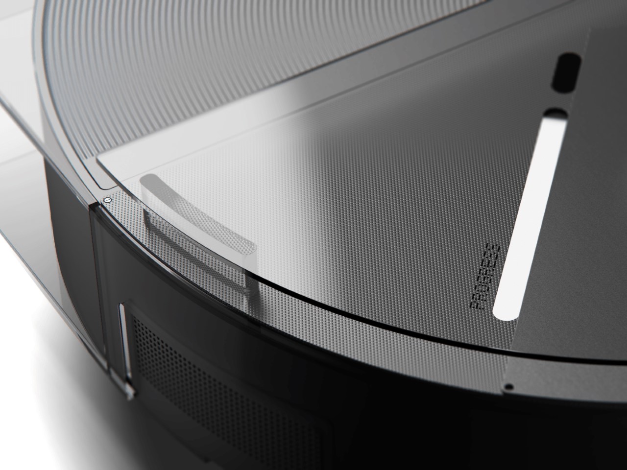
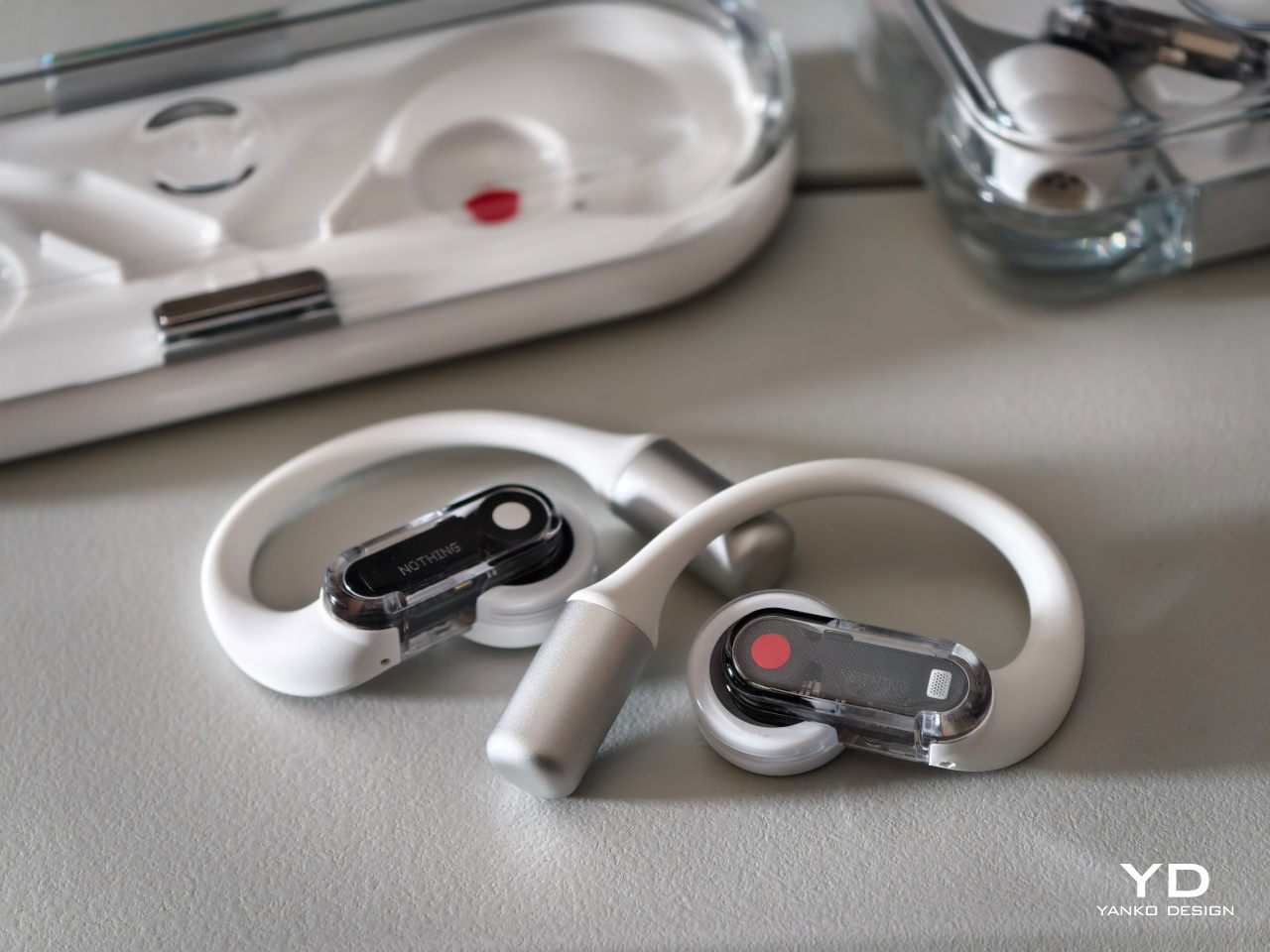
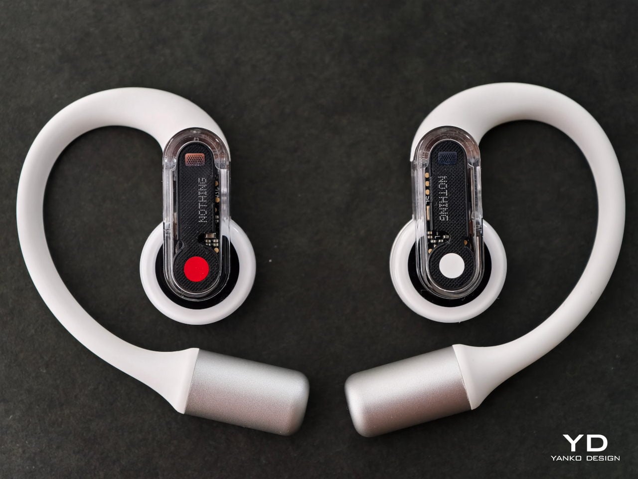
Nothing is renowned for its unique design philosophy, and the Ear (open) earbuds are no exception. They embody the brand’s iconic transparent and sleek aesthetic while featuring rounded shapes that add a touch of softness, perfectly aligning with the device’s philosophy of openness and awareness.
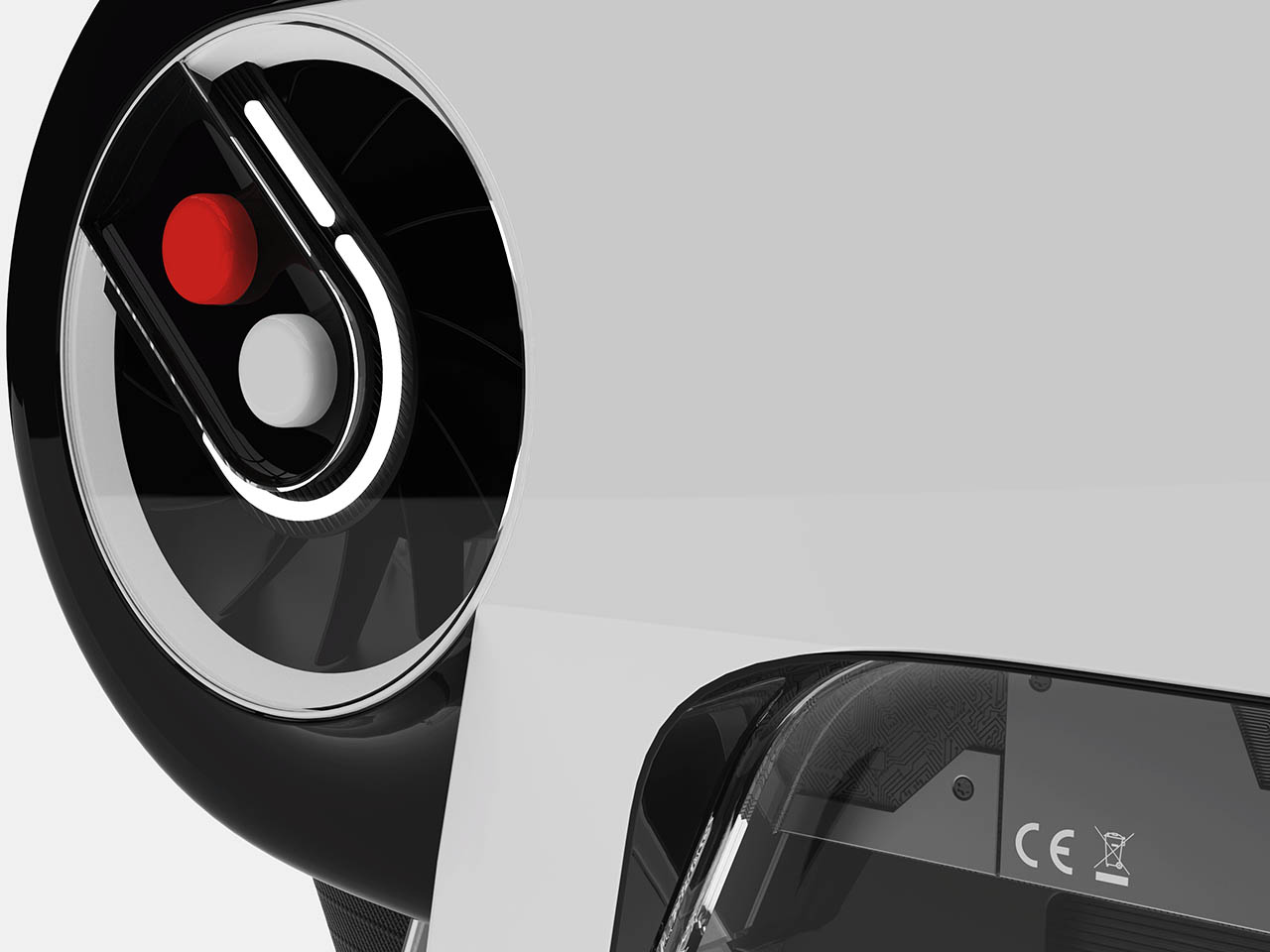
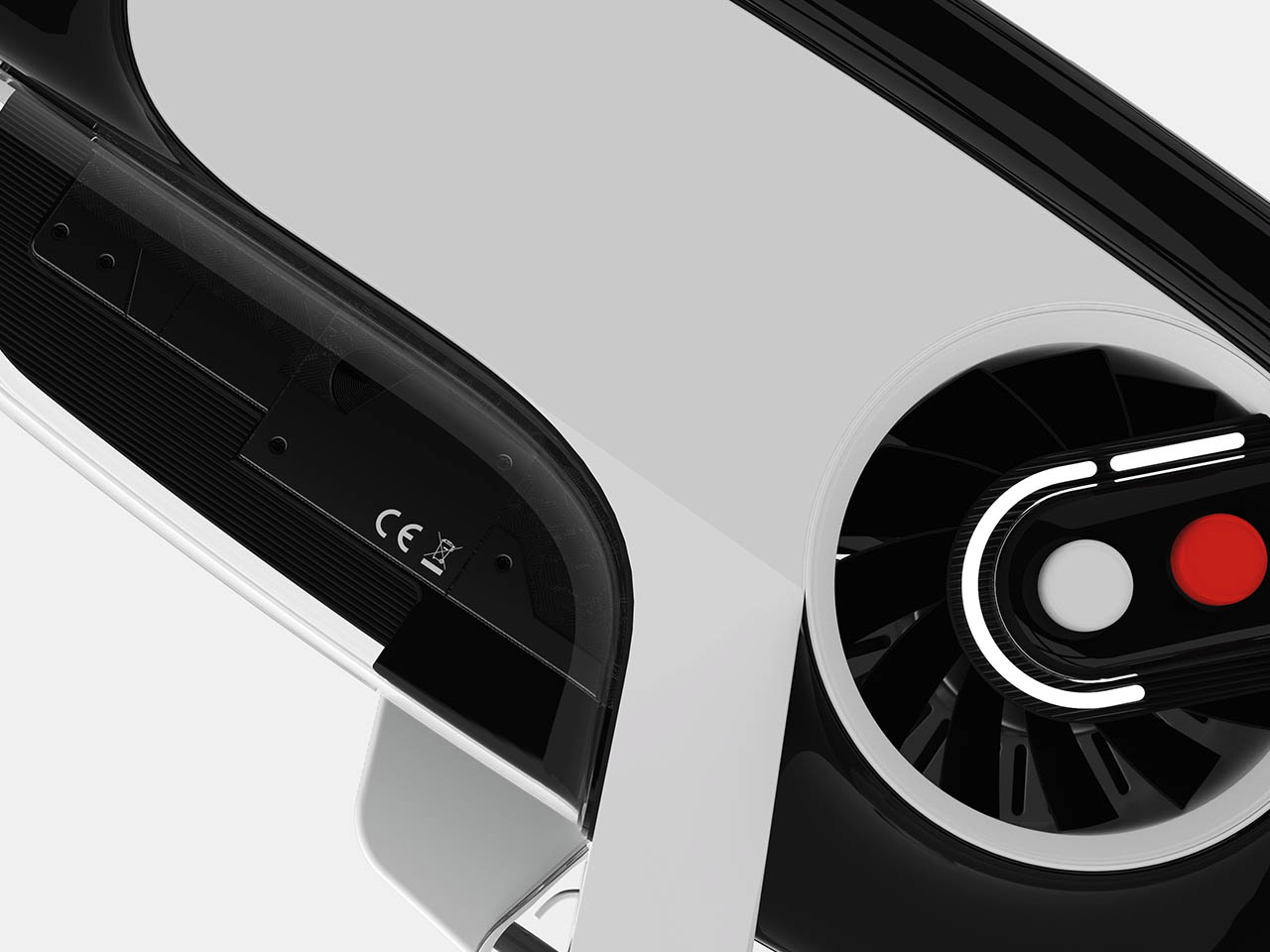
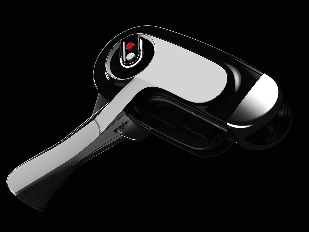
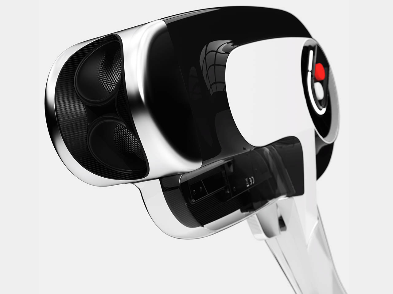
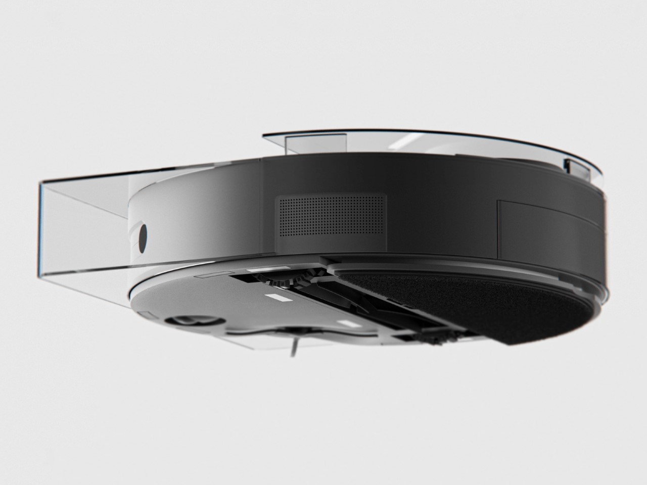
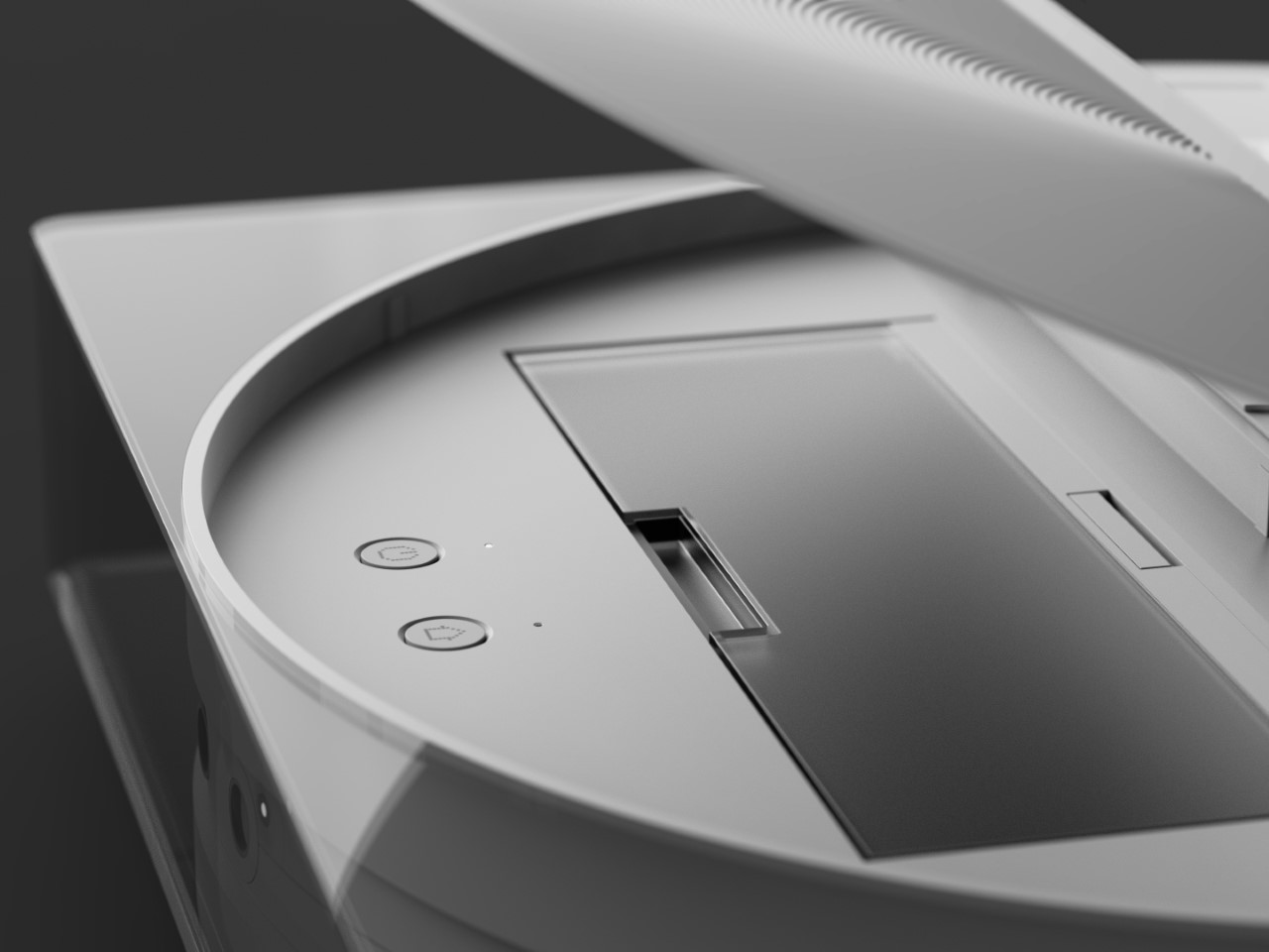
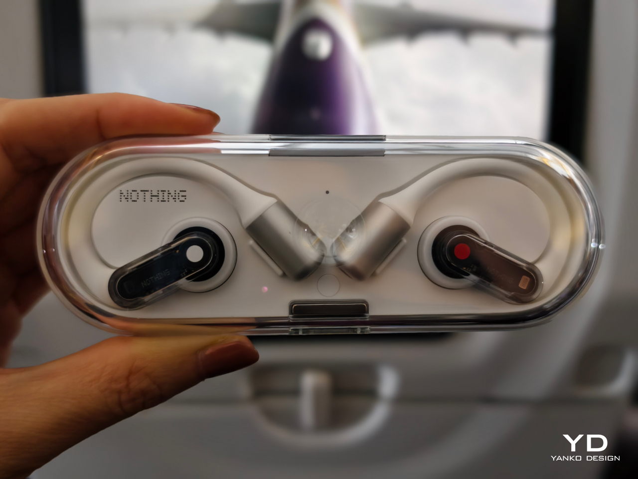
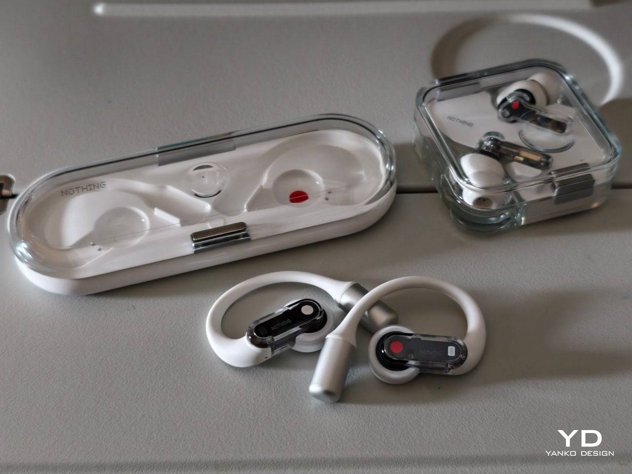
The Ear (open) includes familiar elements, such as a case with a transparent top and a white bottom for a striking contrast, a secure magnetic clasp, a central nub on the case top, and a color-coded system. The left earbud has a red dot, while the right earbud has a white dot, both mirrored on the case for easy storage.
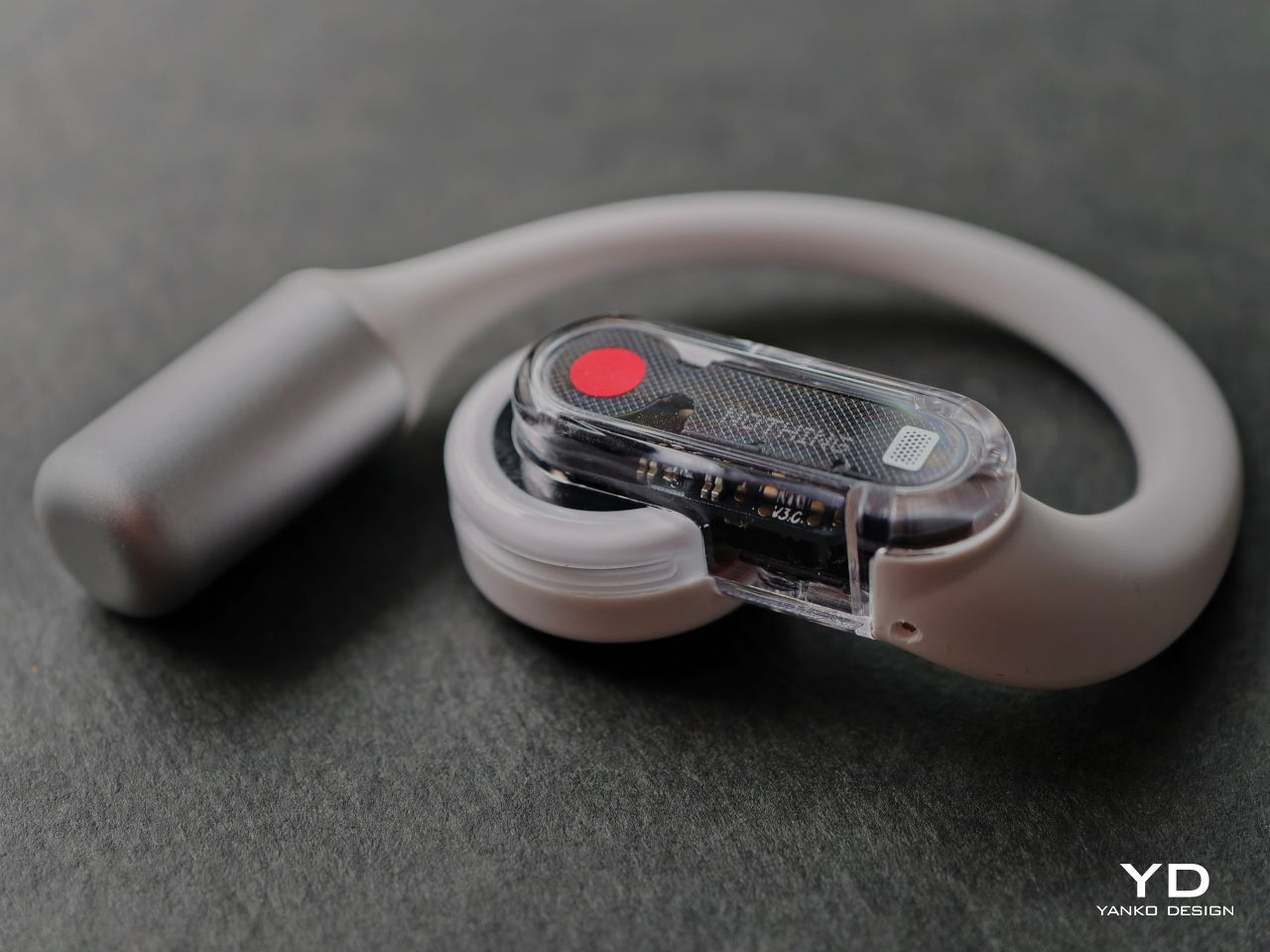
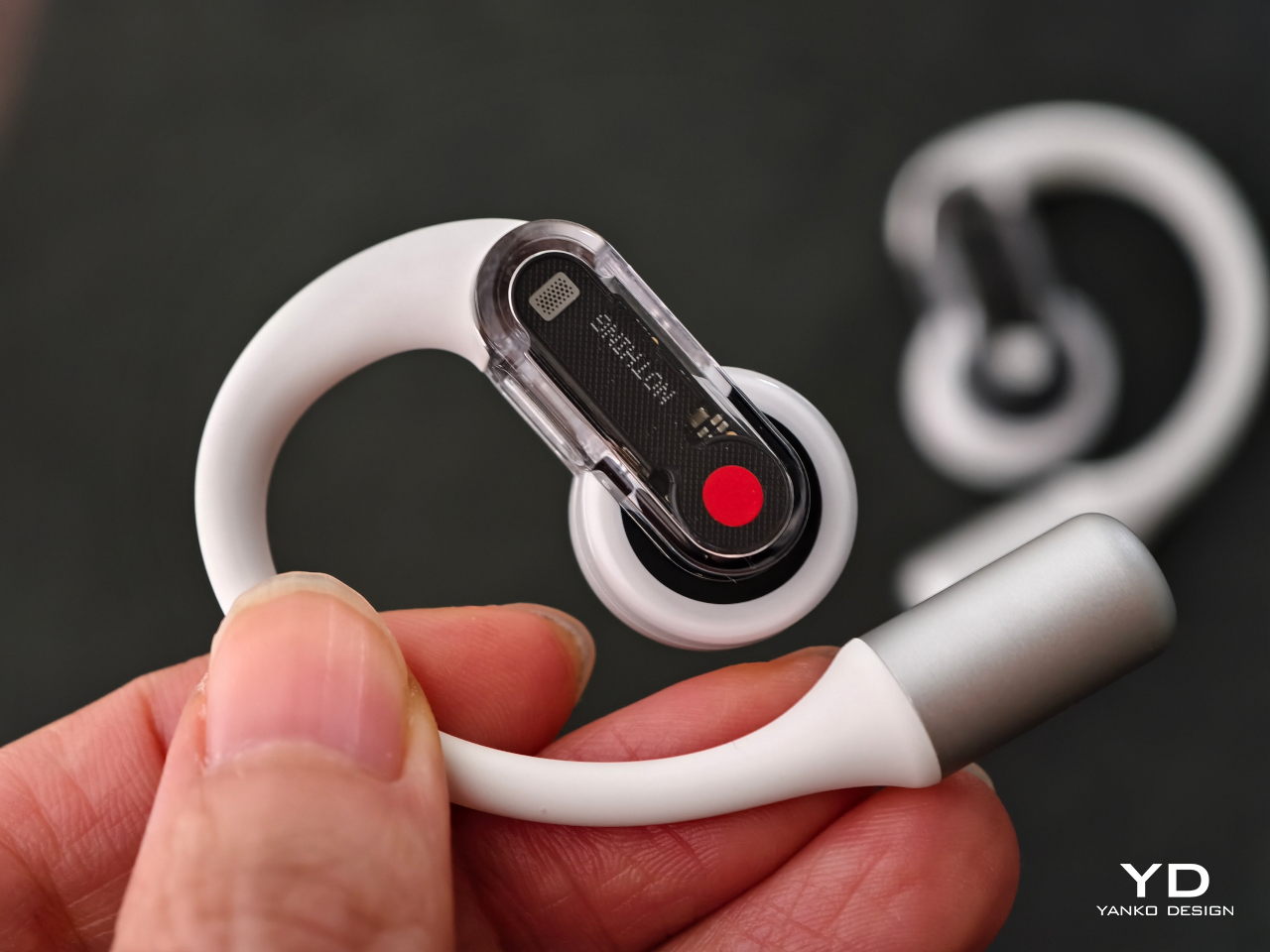
The signature aesthetics extend to the earbuds themselves. They feature an iconic transparent outer casing that reveals the internal components, while silver tips encase the battery and serve as counterweights for enhanced stability. Connecting these components is a flexible arm that contours to the ear for a snug fit.
Ergonomics
For those with smaller ears, finding comfortable earbuds can be a challenge. In-ear earbuds often cause discomfort after prolonged use, and I frequently find myself readjusting them, especially my left earbud, which tends to fall out even when I’m not moving much. The Nothing Ear (open), however, offers a solution to these issues with its thoughtful ergonomic design.
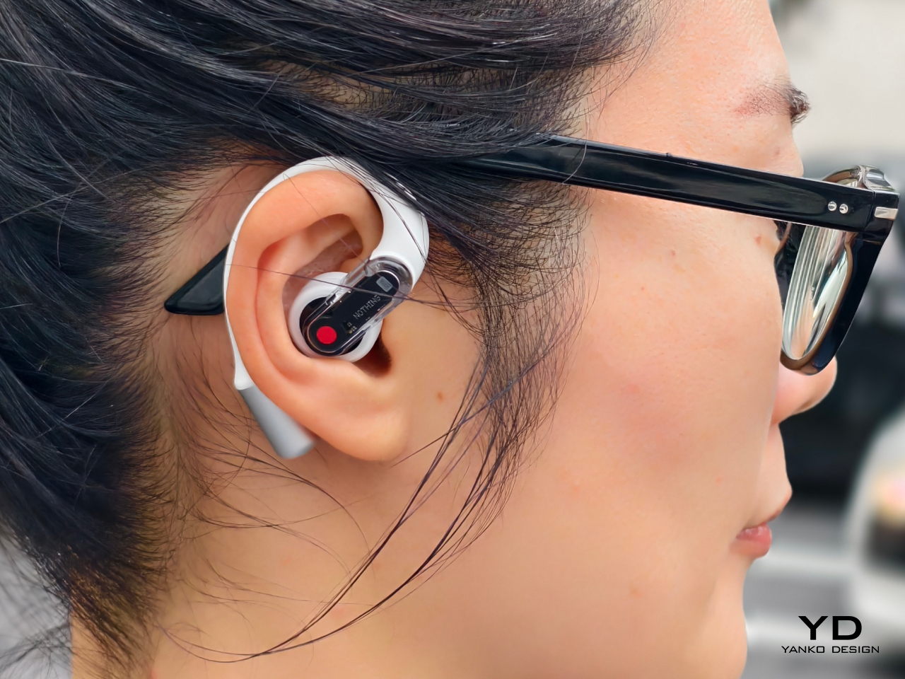
The earbuds sit comfortably on the outer part of the ear, with a soft, silicon-like arm that surrounds the ear, providing stability without the intrusive feeling of in-ear designs. I found them comfortable enough to wear for extended periods, sometimes even forgetting I had them on.
They sit securely in my ears, even when I jog or shake my head, ensuring they won’t slip out during physical activity. Wearing glasses or lying down presents no comfort issues, allowing for freedom of movement. This secure fit and versatility make them ideal for everyday use, whether exercising, working, or simply relaxing.
A notable aspect of the design is the lightweight nature of the earbuds, each weighing only 8.1 grams. This lightness contributes significantly to comfort, ensuring that the earbuds do not exert unnecessary pressure on the ears, even during long listening sessions. One thing to note, though, is that the metal-looking tip can get a bit cold if the Ear (open) is stored in a cool place, which might be uncomfortable in colder climates.
The case itself is also designed with portability in mind, being only 19mm thick. This slim profile makes it easy to slip into pockets or bags without adding bulk, making it an ideal companion for those on the go.
Performance
The performance of the Nothing Ear (open) is generally impressive, particularly in quieter environments. The open-ear design excels at maintaining awareness but doesn’t seal the ear canal, lacking ANC capabilities. This can be a drawback in noisy settings, such as planes or subways, where audio can be difficult to hear.
In such noisy environments, even cranking up the volume might not suffice, leading me to prefer ANC-equipped earbuds for full audio immersion. Despite this limitation, the sound quality of the Ear (open) is commendable. Boasting a 14.2mm dynamic driver, earbuds deliver full sound with good bass, especially for an open-ear form factor.
The microphone on the Nothing Ear (open) is another strong point, delivering clear voice quality during calls. This ensures that conversations are crisp and intelligible, even in moderately noisy environments, making it suitable for both personal and professional use.
Sound leakage is minimized by the thoughtful design of the Nothing Ear (open). This feature helps keep your audio private, ensuring it doesn’t disturb those around you—unless you’re listening at high volume in a quiet place.
The Ear (open) is equipped with Bluetooth 5.3, allowing you to connect to two devices and seamlessly switch between them. This feature is particularly useful for those who frequently use multiple devices. Additionally, with an IP54 rating, the Ear (open) is resistant to dust and splashes, making it suitable for a variety of environments.
One of the standout features of the Ear (open) is its battery life. Nothing claims up to 30 hours of playback, which is supported by 8 hours of use from the earbuds themselves and an additional 22 hours provided by the charging case. This extended battery life ensures that you can enjoy your music or podcasts throughout the day without frequent recharging.
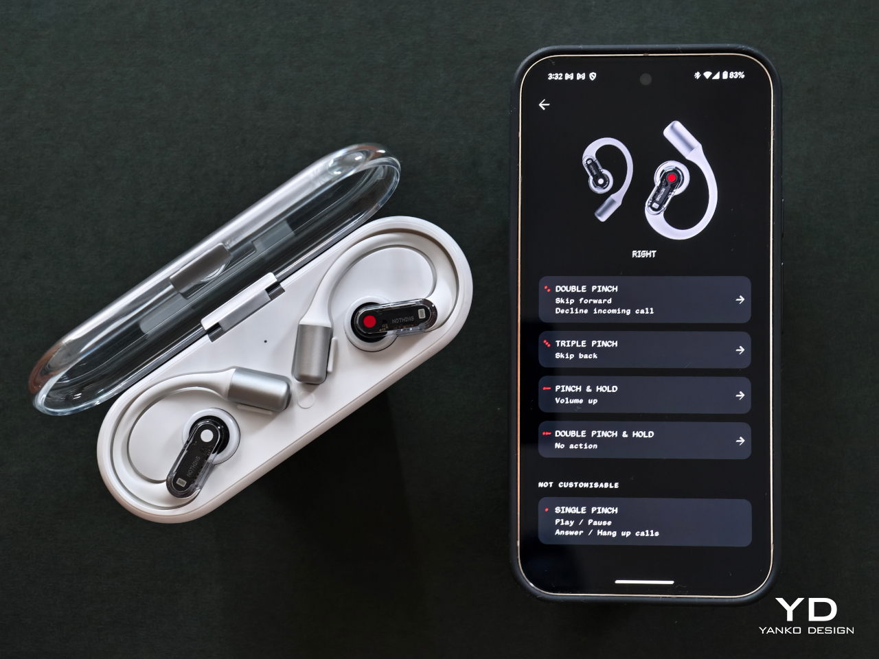
The Ear (open) also offers various pinch controls, including single pinch, double pinch, triple pinch, and pinch and hold. These controls are highly responsive and can be customized through the Nothing app, allowing users to tailor the functionality to their specific needs and preferences.
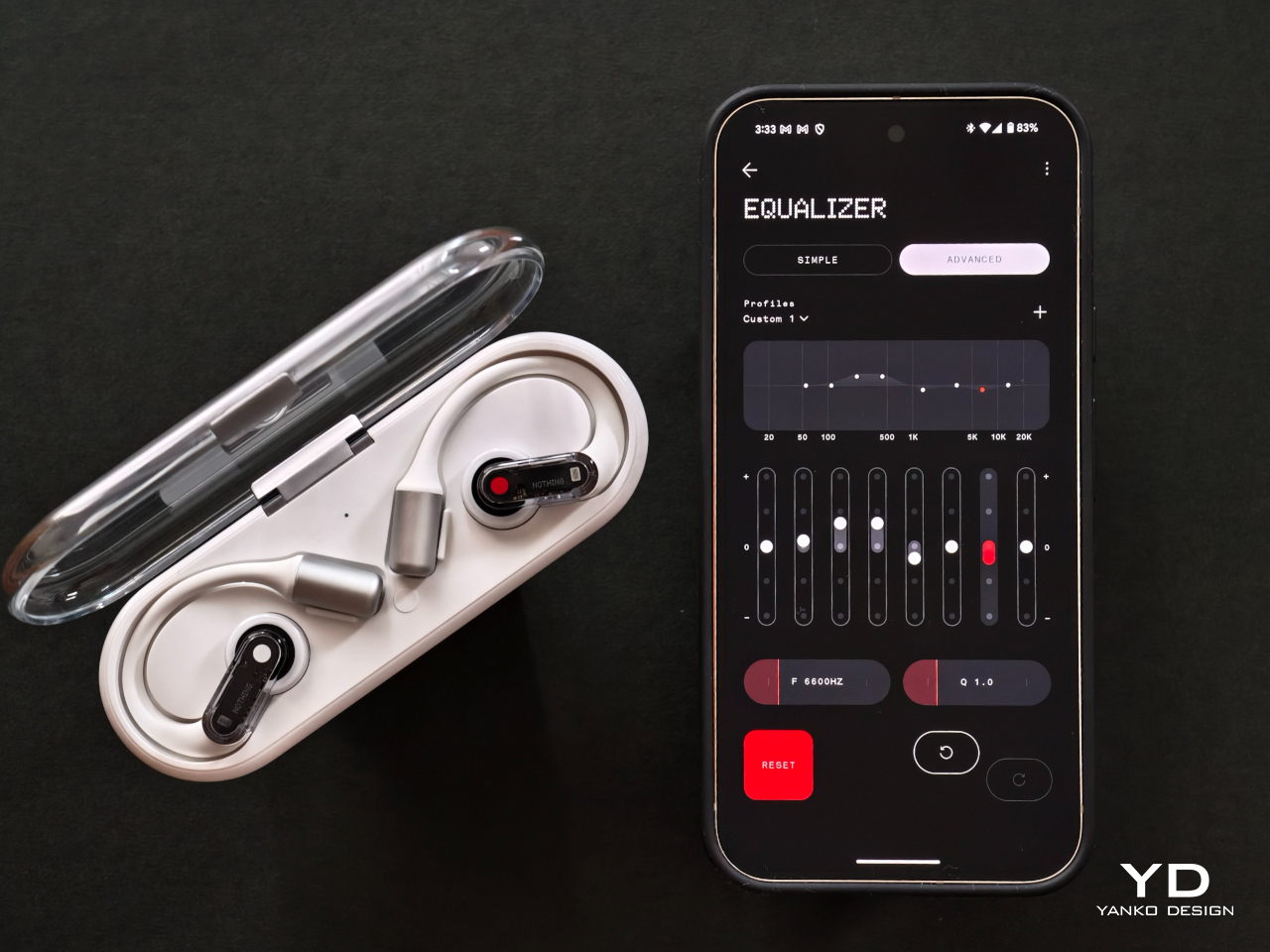
Additionally, the Nothing app offers one of the most advanced equalizer (EQ) features available, with an 8-band EQ that provides unparalleled customization options. This sophisticated EQ allows users to fine-tune their audio experience to match their personal preferences precisely.
Another useful feature for users of Nothing phones is the ability to access ChatGPT directly via the earbuds. This integration allows for seamless interaction and enhances the functionality of the earbuds, making them not just a tool for listening but also for communication and information retrieval.
Overall, while it certainly does not replace ANC earbuds in very noisy settings, the Nothing Ear (open) offers a unique blend of features and performance that cater to a diverse range of listening preferences, enhanced by its advanced EQ capabilities, long battery life, and customizable pinch controls.
Sustainability
Nothing has taken significant steps to ensure the sustainability of the Ear (open) headphones, and their transparency in sharing this information on their product page is truly admirable. This openness not only demonstrates a commitment to sustainability but also shows that the brand values informed consumer choices.
The carbon footprint of the device is relatively low, with emissions of just 3.0 kg CO₂e. This is an important consideration for environmentally conscious consumers looking to reduce their impact on the planet. Additionally, the headphones are manufactured using 100% recycled tin solder paste, which reduces the demand for virgin materials and supports recycling efforts.
Furthermore, Nothing is committed to using 100% renewable energy for the final assembly of the Ear (open). This commitment not only reduces the carbon footprint associated with production but also sets a positive example for the electronics industry, highlighting the feasibility and importance of sustainable manufacturing practices.
The brand’s dedication to sustainability is truly commendable, as it not only benefits the environment but also aligns with the values of consumers who prioritize eco-friendly practices. By making this information readily available, Nothing reinforces its commitment to reducing environmental impact while delivering high-quality audio products, setting a standard for transparency and responsibility in the industry.
Value
The Nothing Ear (open) headphones offer a compelling value proposition for those seeking a balance between audio quality, comfort, and sustainability. Priced at $149, they provide an accessible entry point into the world of open-ear audio technology without compromising on design or functionality.
Considering the thoughtful ergonomic design, robust audio performance, and impressive battery life, the Ear (open) headphones deliver excellent value for the price. Additionally, the brand’s commitment to sustainability—evident in their use of recycled materials and renewable energy for assembly—adds to the overall appeal for environmentally conscious consumers. For users who prioritize both quality and eco-friendliness, the Nothing Ear (open) headphones represent a worthwhile investment that aligns with modern values and expectations.
Verdict
The Nothing Ear (open) headphones present a unique offering in the audio market, blending style, performance, and sustainability. With their open-ear design, they cater to users who value staying connected to their surroundings while enjoying audio content. This makes them ideal for everyday use, especially in quieter settings.
While they may not replace ANC-equipped earbuds in noisy environments, the Ear (open) excels in delivering quality sound and comfort. Their ergonomic design ensures a comfortable fit for extended wear, and the impressive battery life supports long listening sessions without frequent recharging.
The integration of advanced features, like customizable pinch controls and seamless interaction with Nothing phones, enhances the user experience. Additionally, the brand’s commitment to sustainability is commendable, aligning with the values of eco-conscious consumers and setting a positive example in the industry.
With its relatively affordable price tag, the Nothing Ear (open) offers great value for those seeking a balance of audio quality, comfort, and environmental responsibility. For users who prioritize these aspects, the Ear (open) headphones are a worthwhile investment that complements a modern, mindful lifestyle.
The post Nothing Ear (open) earbuds review: Embrace Sound and Surroundings first appeared on Yanko Design.