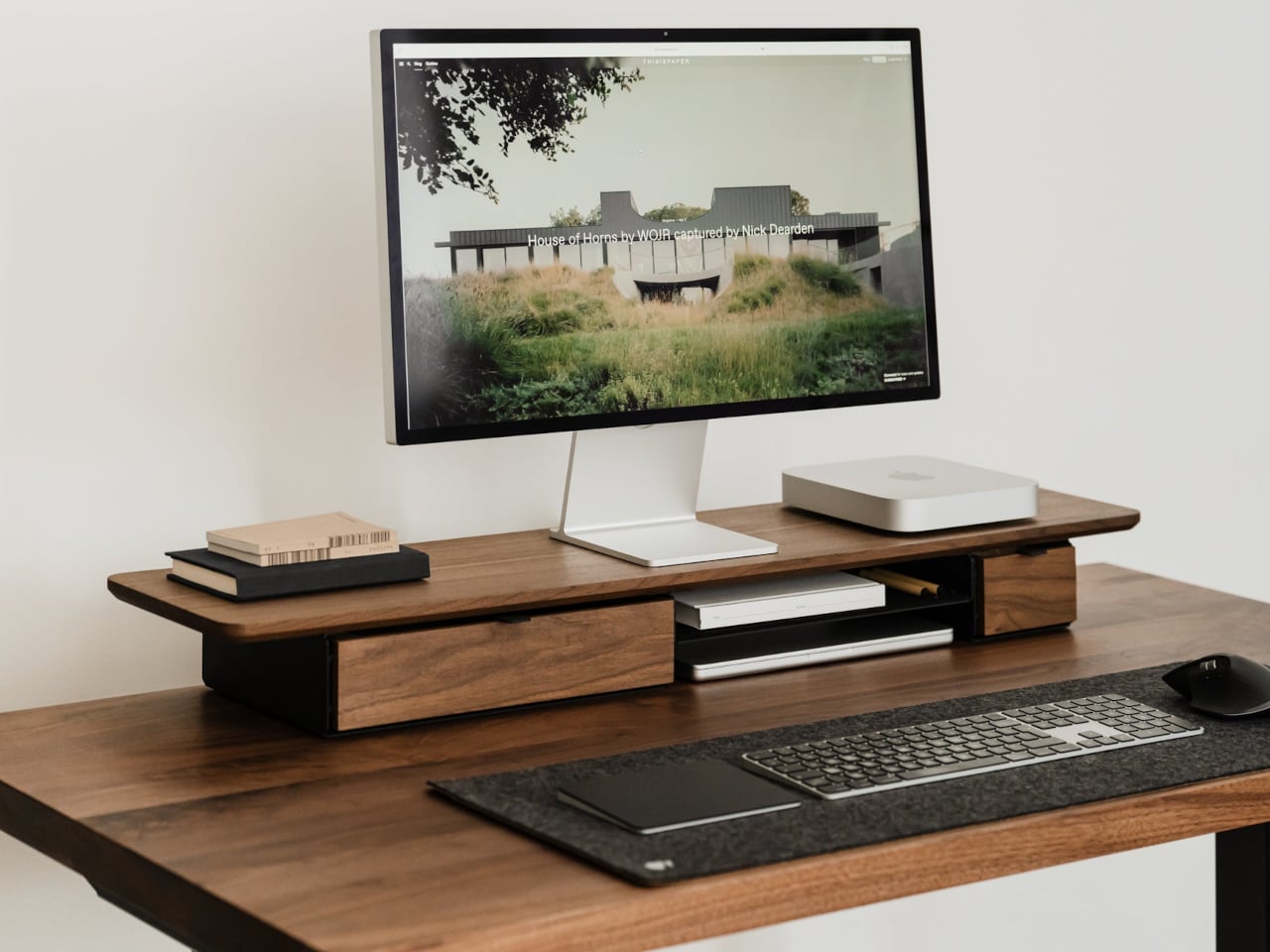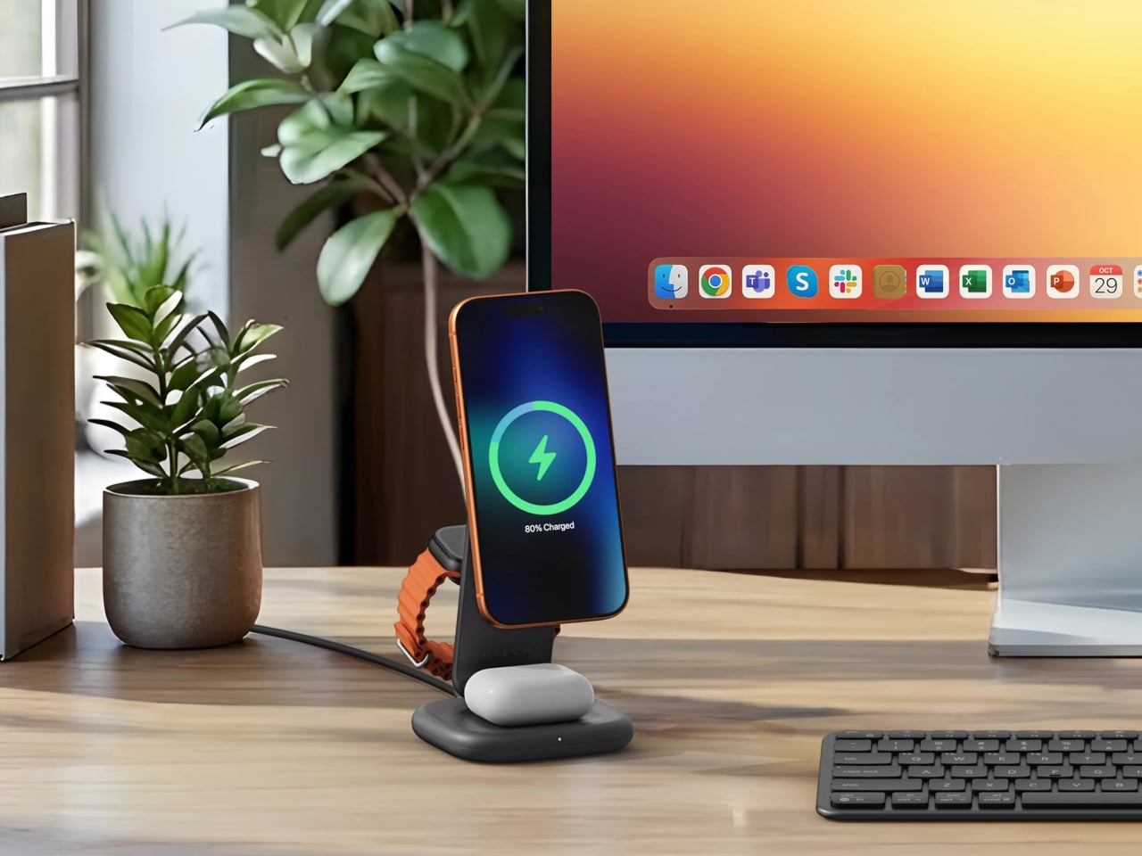
The home office has become the most personal room in the house — and somehow still the hardest room to shop for. He already has the monitor arm, the mechanical keyboard, the cable organizer that never actually organized anything. The things worth giving now aren’t upgrades to what he owns. They’re objects that introduce something genuinely new to how a desk feels, functions, and performs — gifts that earn a permanent spot rather than a polite shelf appearance.
The best home office gifts of 2026 share one quality: they’re genuinely hard to explain without handling them. A pen that never needs ink. A lamp that works anywhere without a single cord. A speaker bar that makes RGB feel like a design choice rather than a gamer’s checkbox. These aren’t novelties with a short shelf life. They’re tools and objects with real staying power — the kind of things you’d buy for yourself if someone hadn’t already beaten you to it.
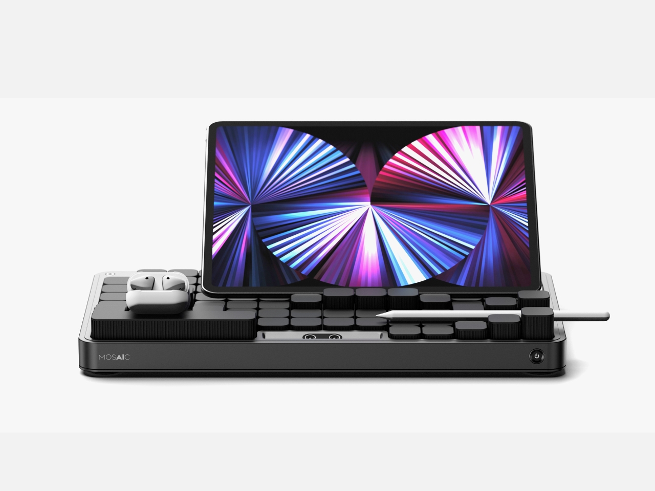
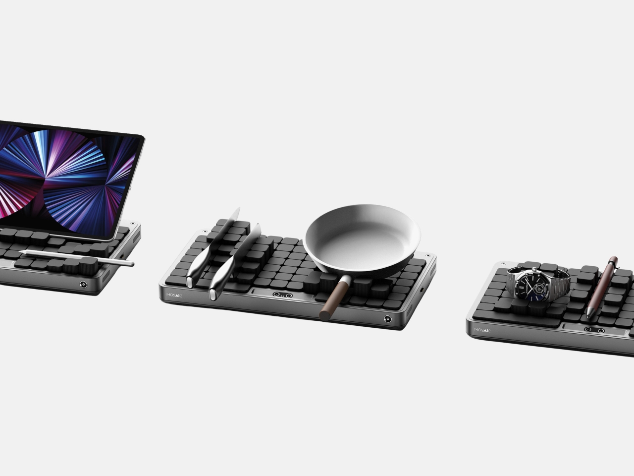
1. Mosaic
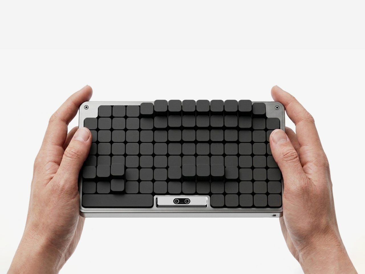
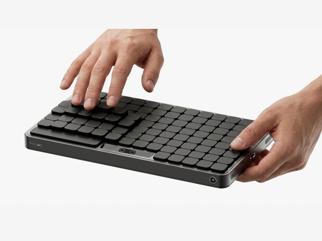
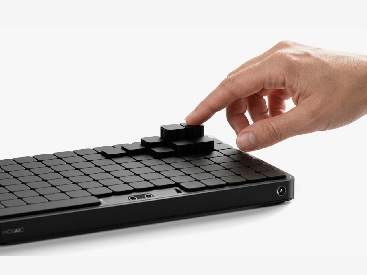
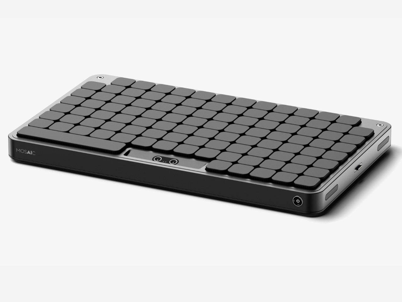
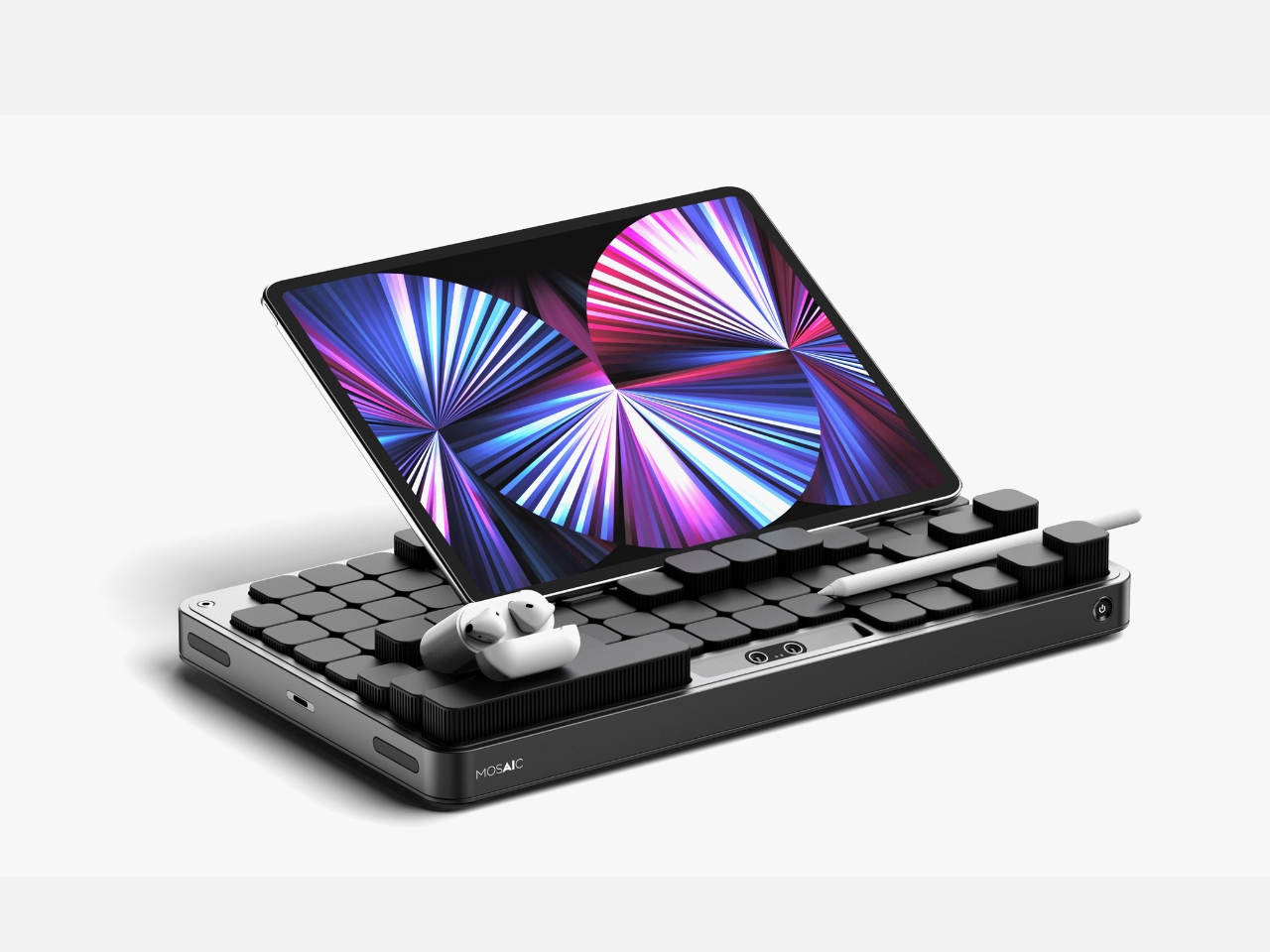
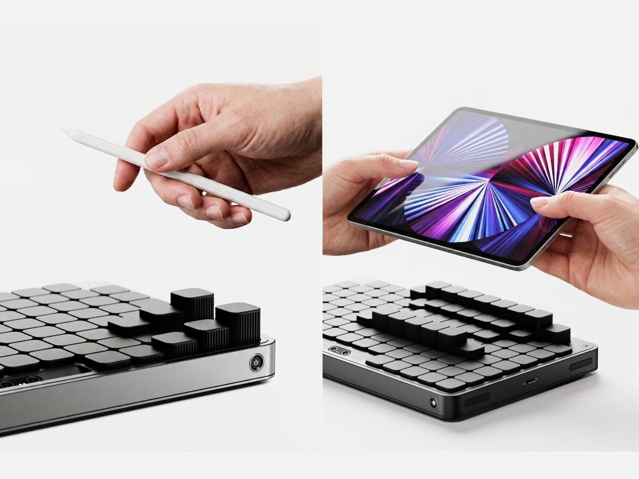
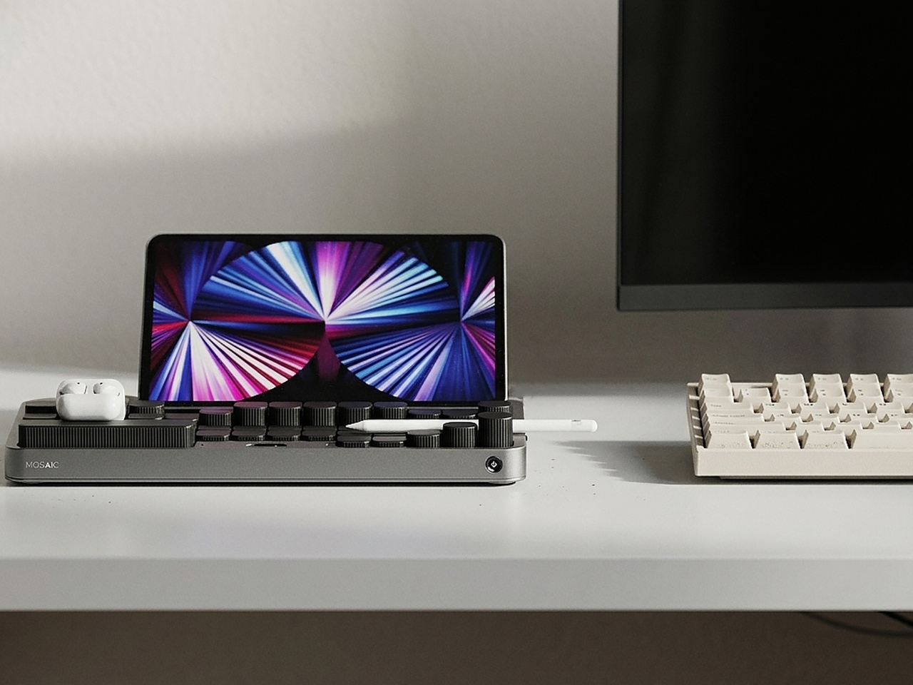
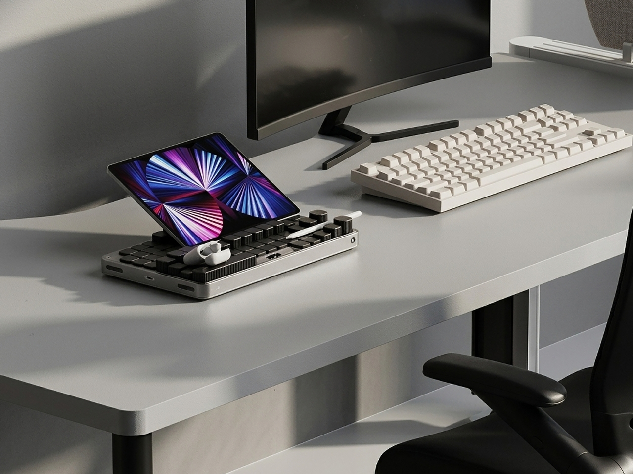
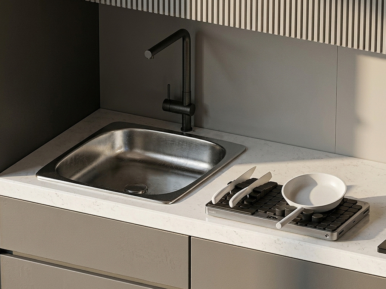
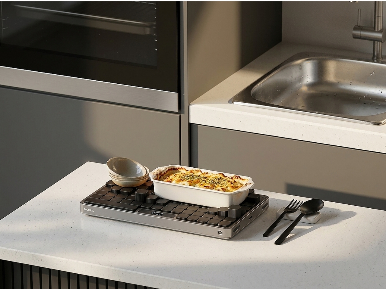
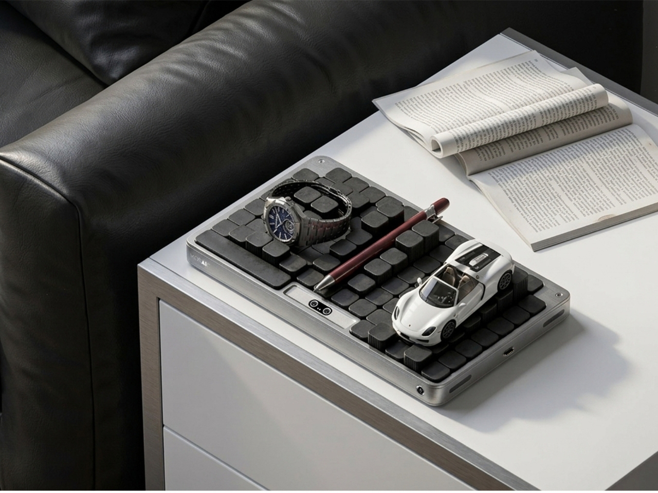
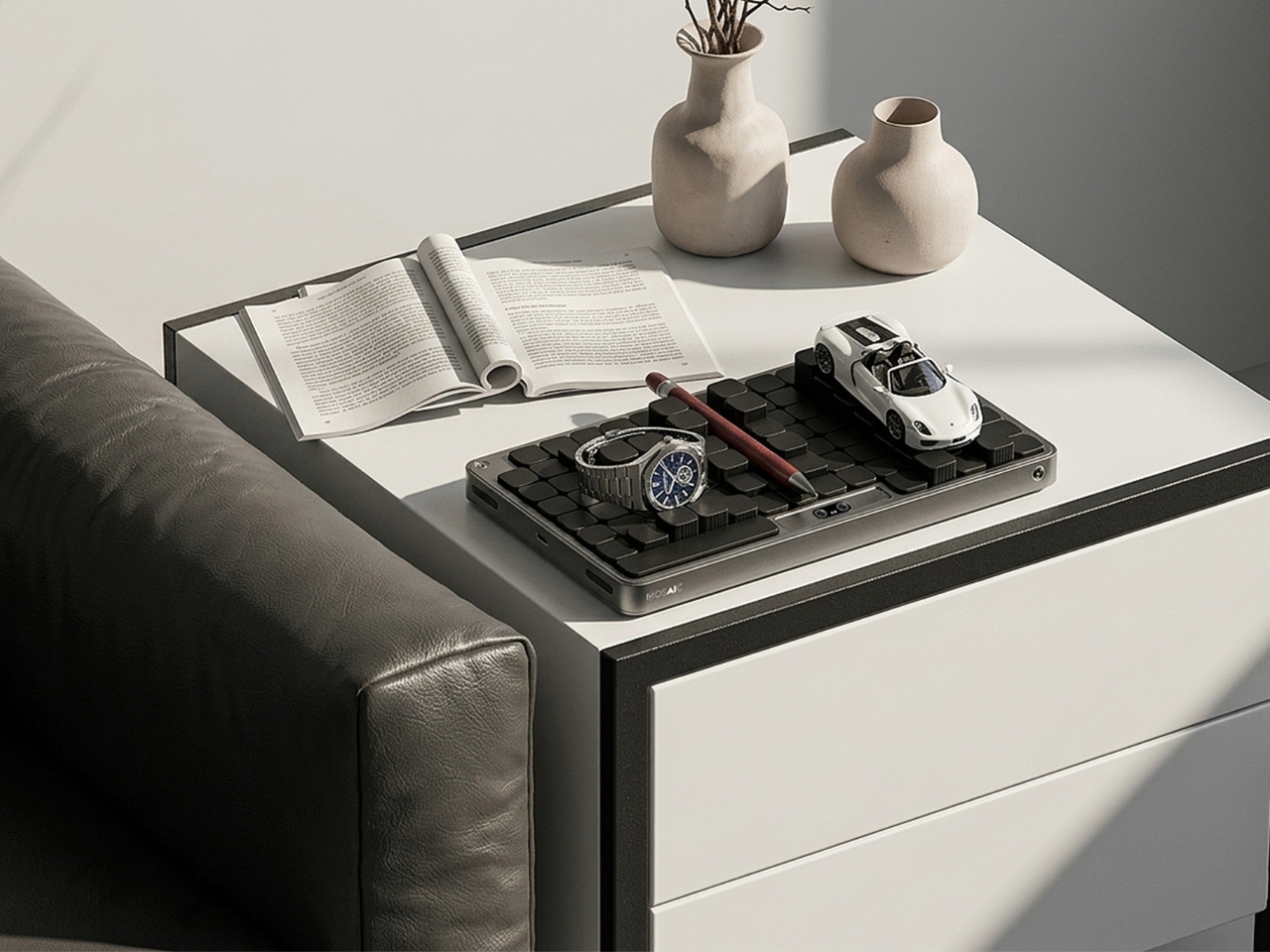
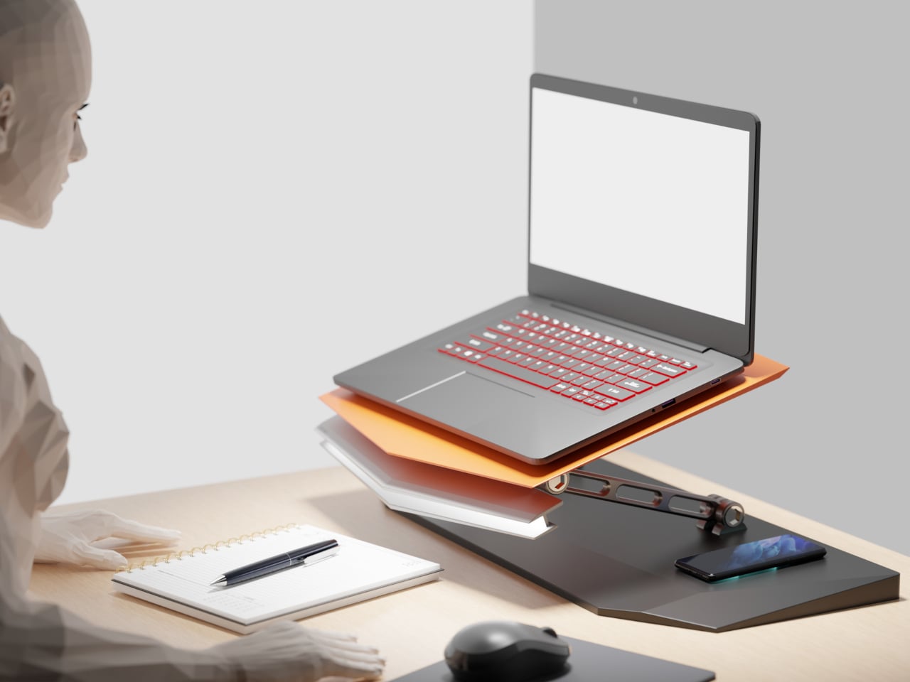
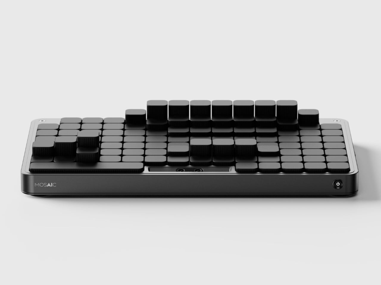
The most striking thing about the Mosaic isn’t what it does — it’s what it undoes. Most desk organizers arrive with a fixed grid of compartments and expect you to adapt, which is exactly why most of them end up abandoned in a drawer within weeks. The Mosaic flips the dynamic entirely, using AI to learn how objects get arranged and rearranged on a real desk over time, then reshaping its modular surface to match those habits rather than a designer’s assumptions about them.
What that looks like in practice is a tray that never quite looks finished — and that’s entirely the point. As a setup evolves, it moves with you, accommodating a new phone dock here, a relocated notebook there, without requiring a full reset. The dark modular surface carries a kind of purposeful architecture that reads as considered rather than cluttered. For anyone who has bought a beautiful organizer only to abandon it two weeks later, the Mosaic is the version that actually earns its permanent place.
What We Like
- Learns and adapts to actual desk behavior instead of imposing a fixed layout
- Modular surface reads as architectural on the desk — purposeful rather than busy
What We Dislike
- AI calibration takes time before it fully understands desk patterns and adjusts accordingly
- Darker aesthetic may not suit lighter or more minimal setups
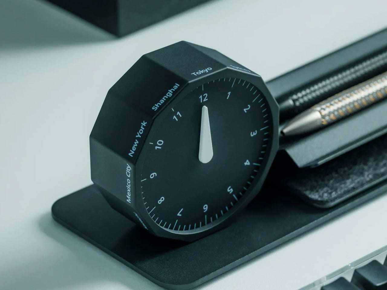
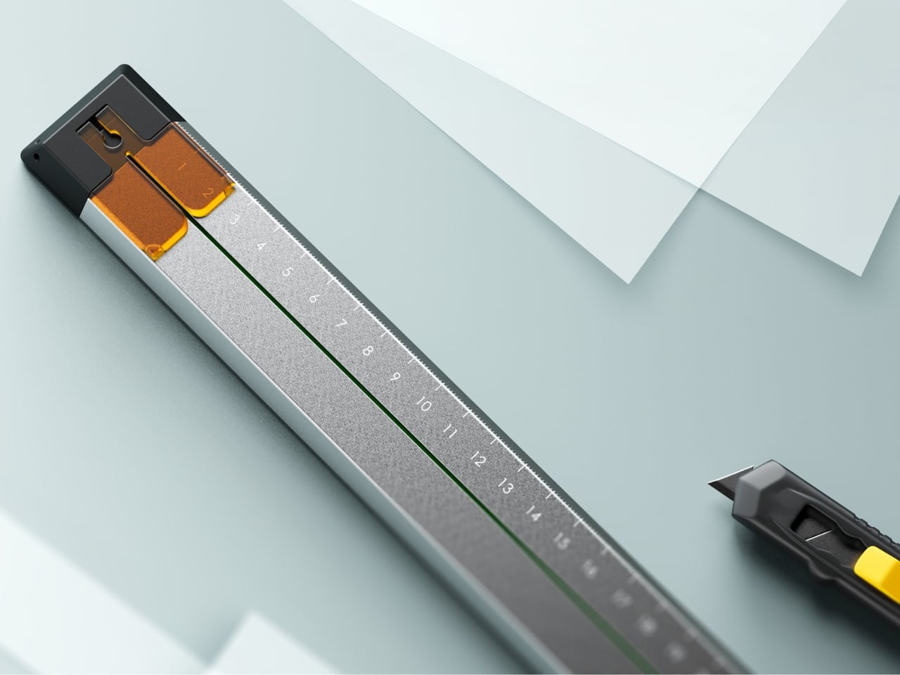
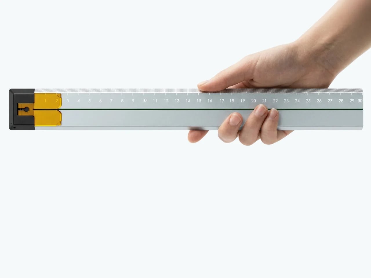
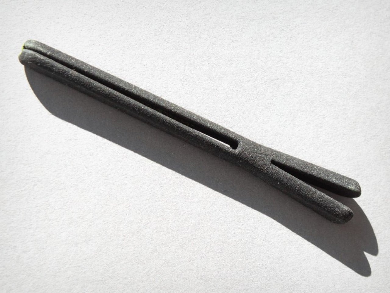
2. Precision Sakura Metal Puzzle
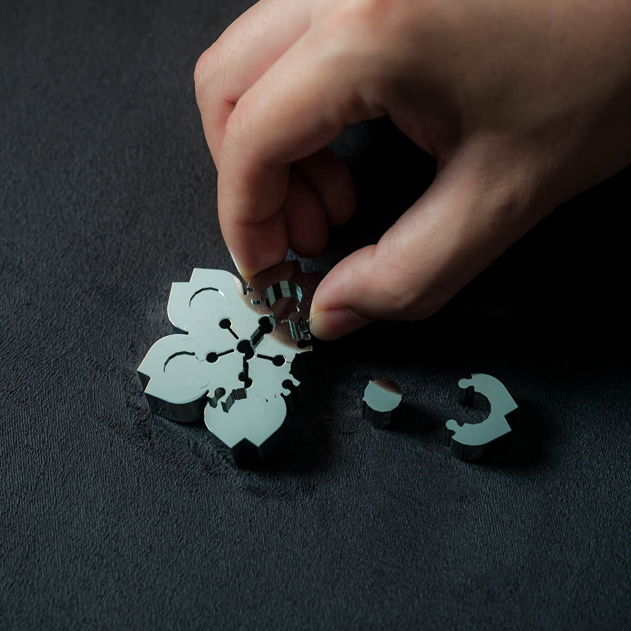
The Precision Sakura Metal Puzzle is the kind of object that earns its spot on a desk by doing almost nothing visible — until you pick it up. Machined to a 0.004mm tolerance, it captures the shape of Japan’s most iconic flower in a set of pieces so similar to each other that distinguishing them becomes its own discipline. No solution is included. The intent was never to finish it quickly. The intent is to spend sustained, satisfying time with something that genuinely demands your attention.
For the person who says he has everything, this is a rare thing: an object that introduces something entirely new to the desk. It works as a precision puzzle and a sculptural display piece simultaneously, the polished metal finish clean enough to hold its own against far more expensive objects. Even unsolved, it belongs on the desk. When you finally do close it, the satisfaction is the kind no app or productivity widget has ever come close to delivering.
Click Here to Buy Now: $299.00
What We Like
- 0.004mm machining tolerance makes every piece feel intentional and genuinely premium
- Functions as desk sculpture whether actively mid-solve or sitting completed
What We Dislike
- No solution included — a real test of patience for anyone expecting a guided experience
- Small scale means pieces are easy to lose on a desk that isn’t kept clear
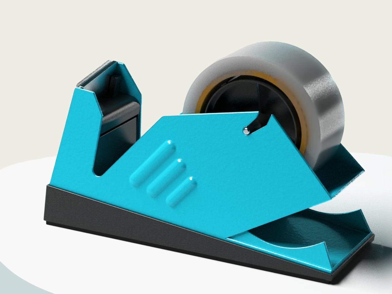
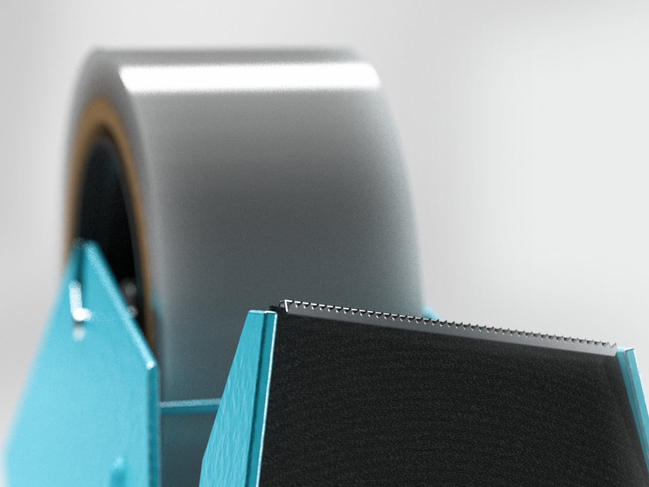
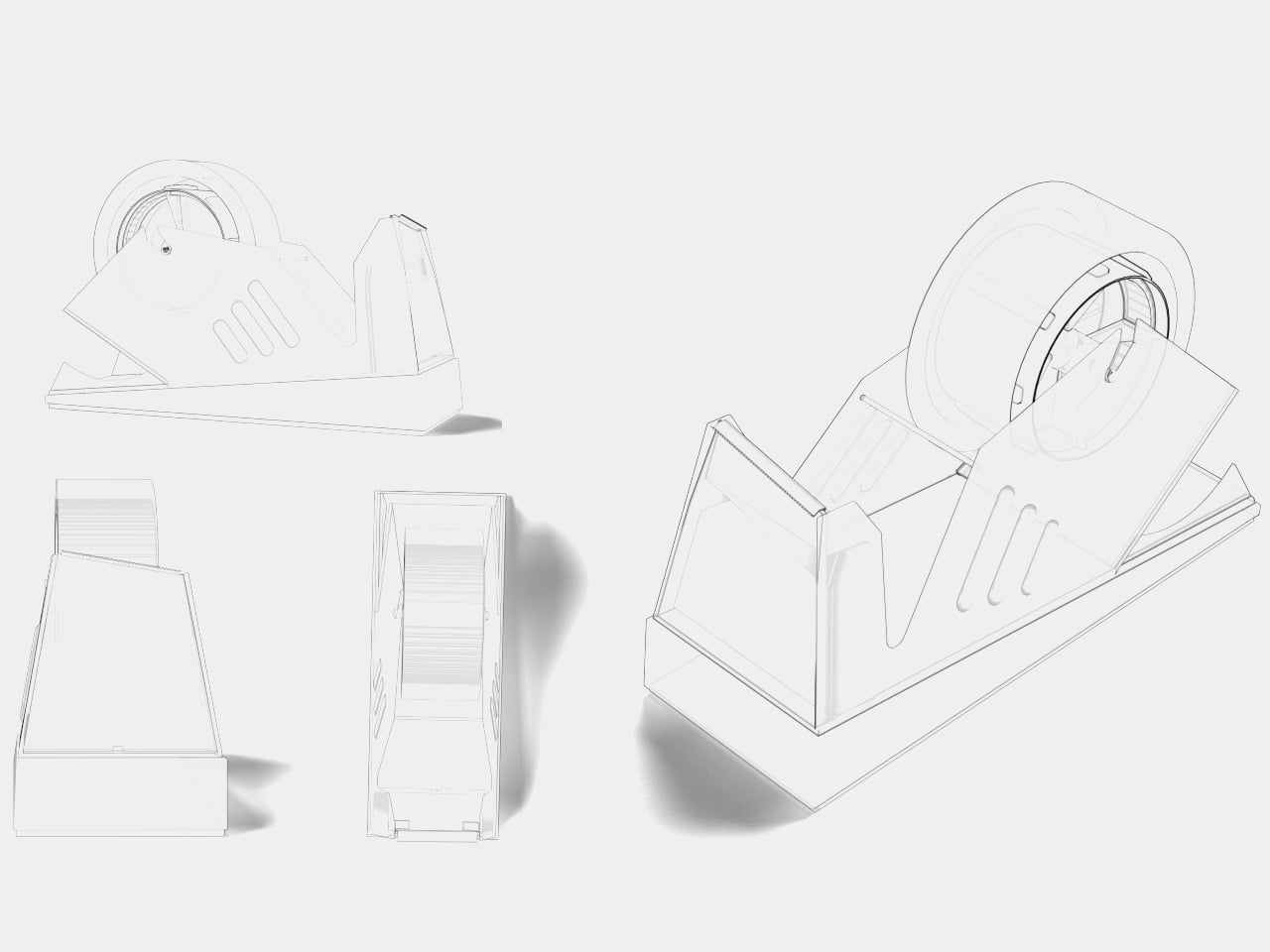
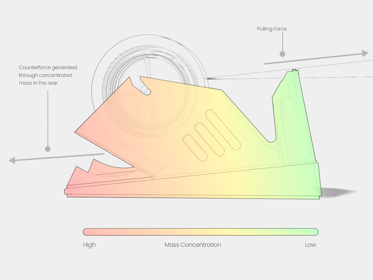
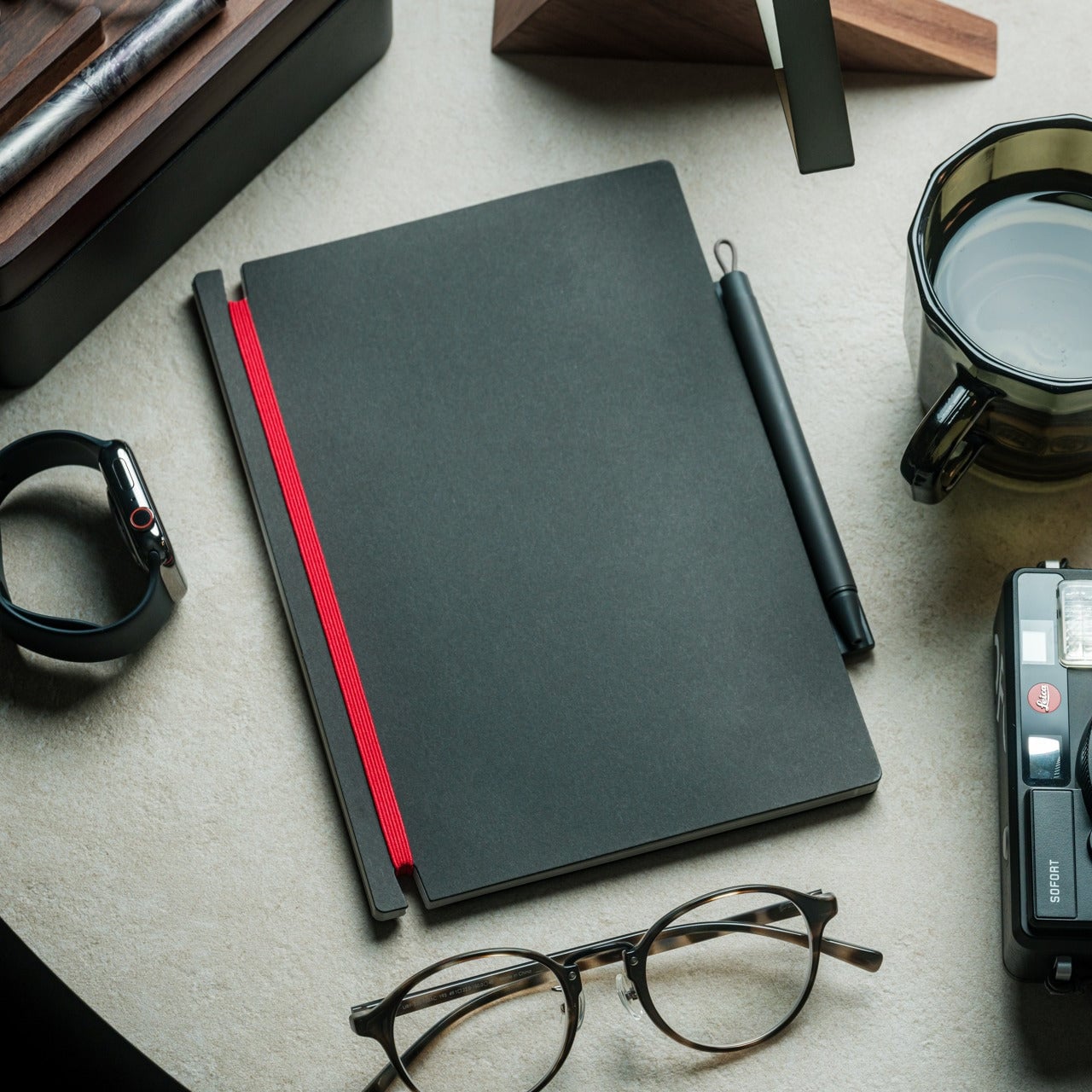
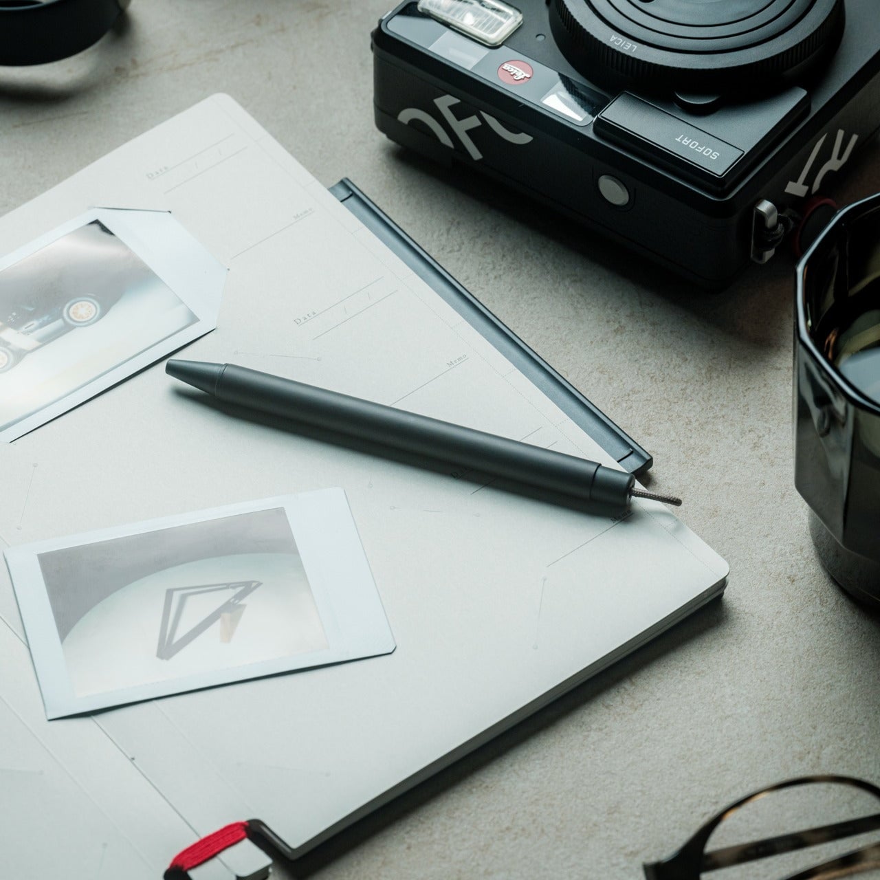
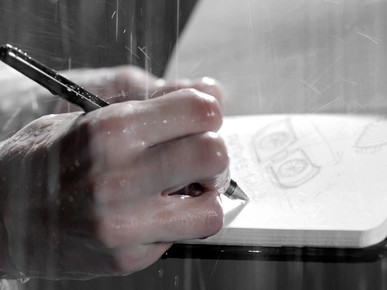
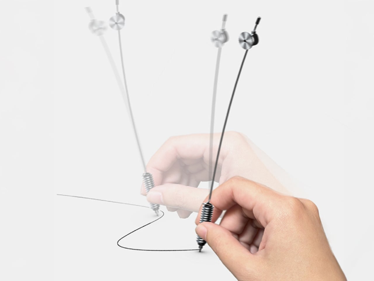
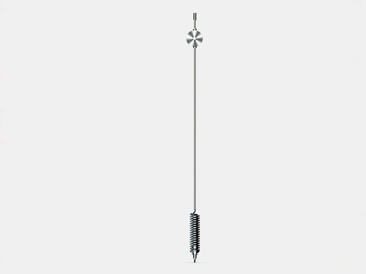
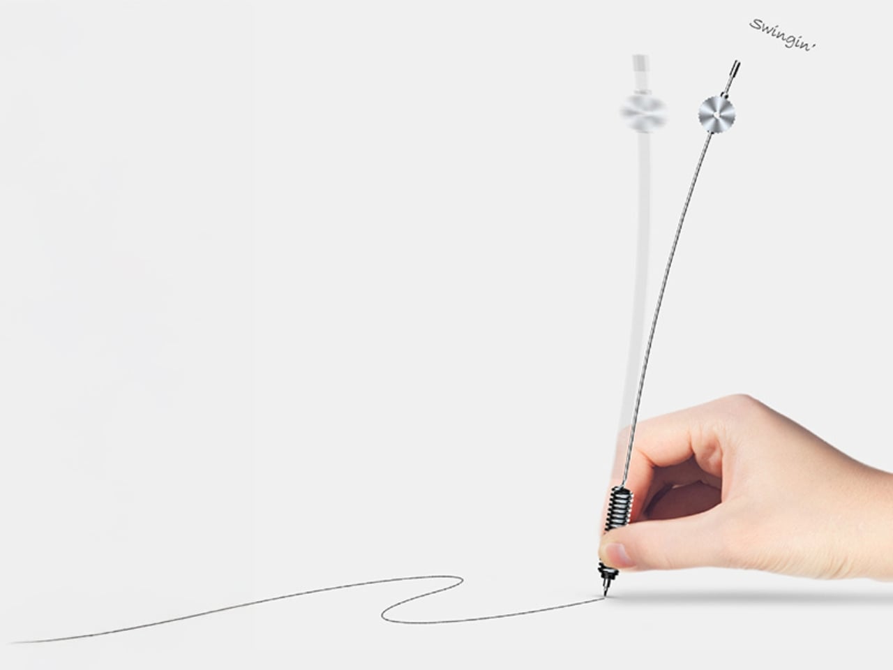
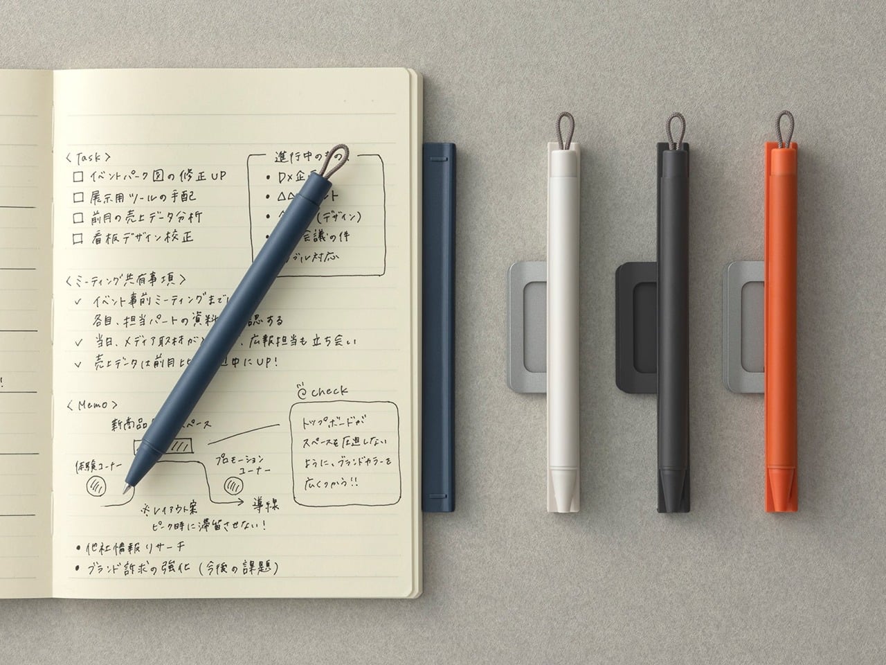
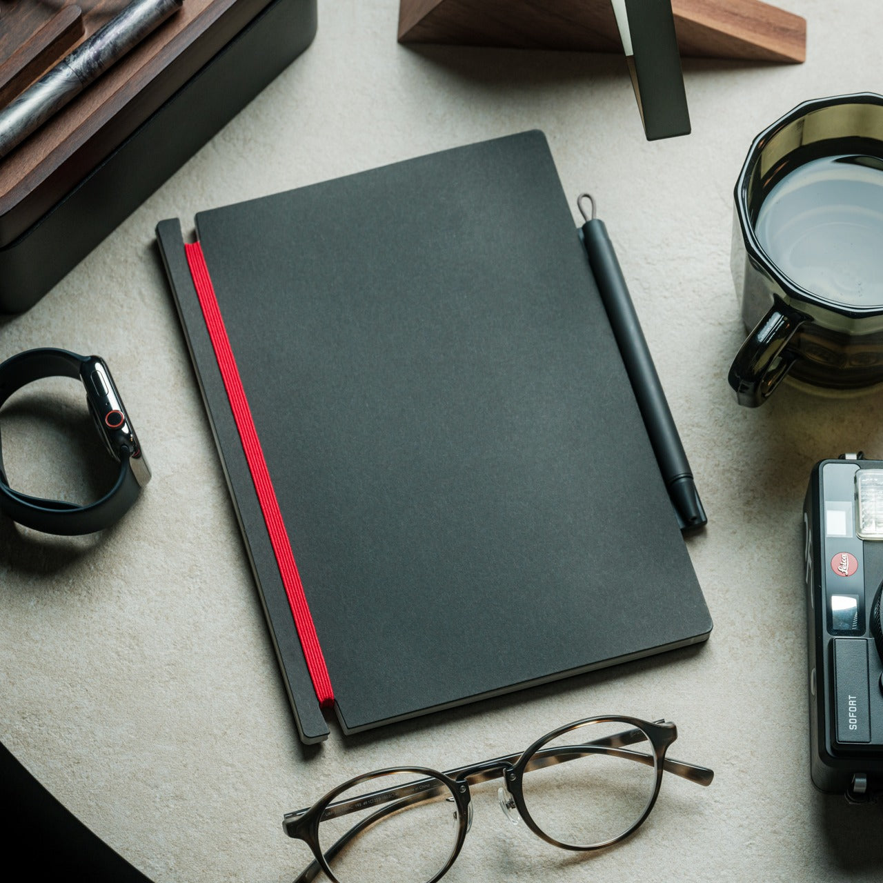
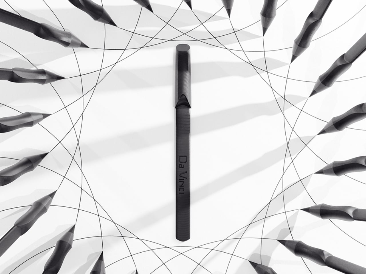
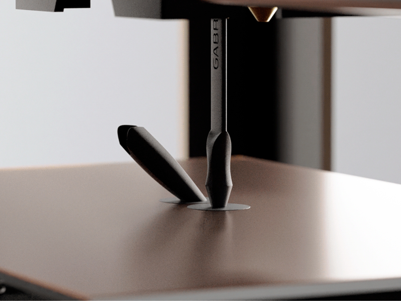
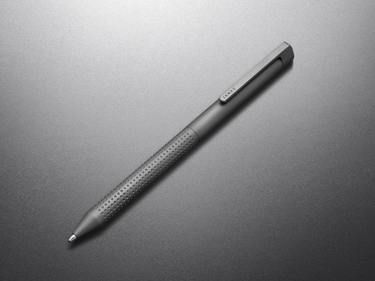
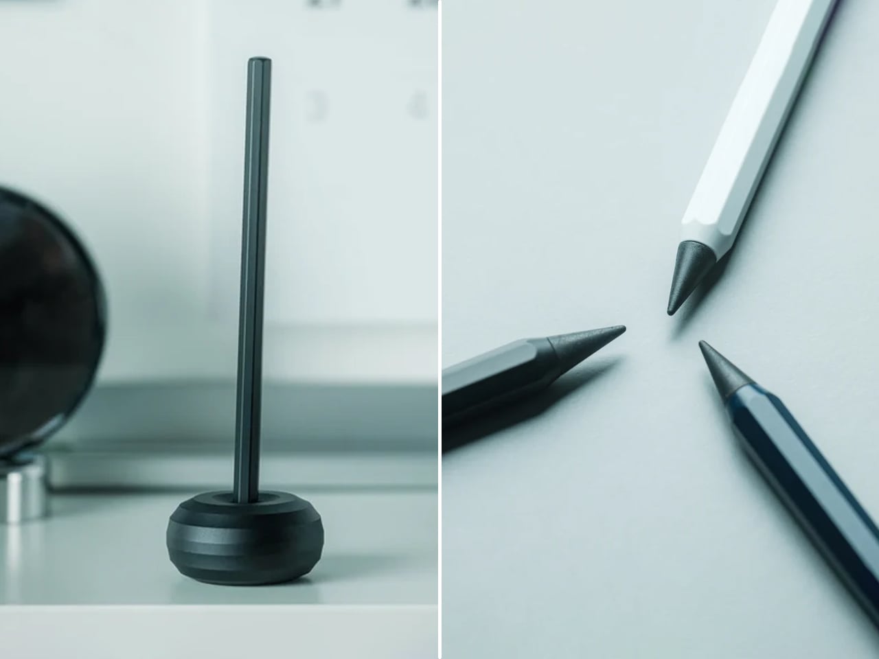
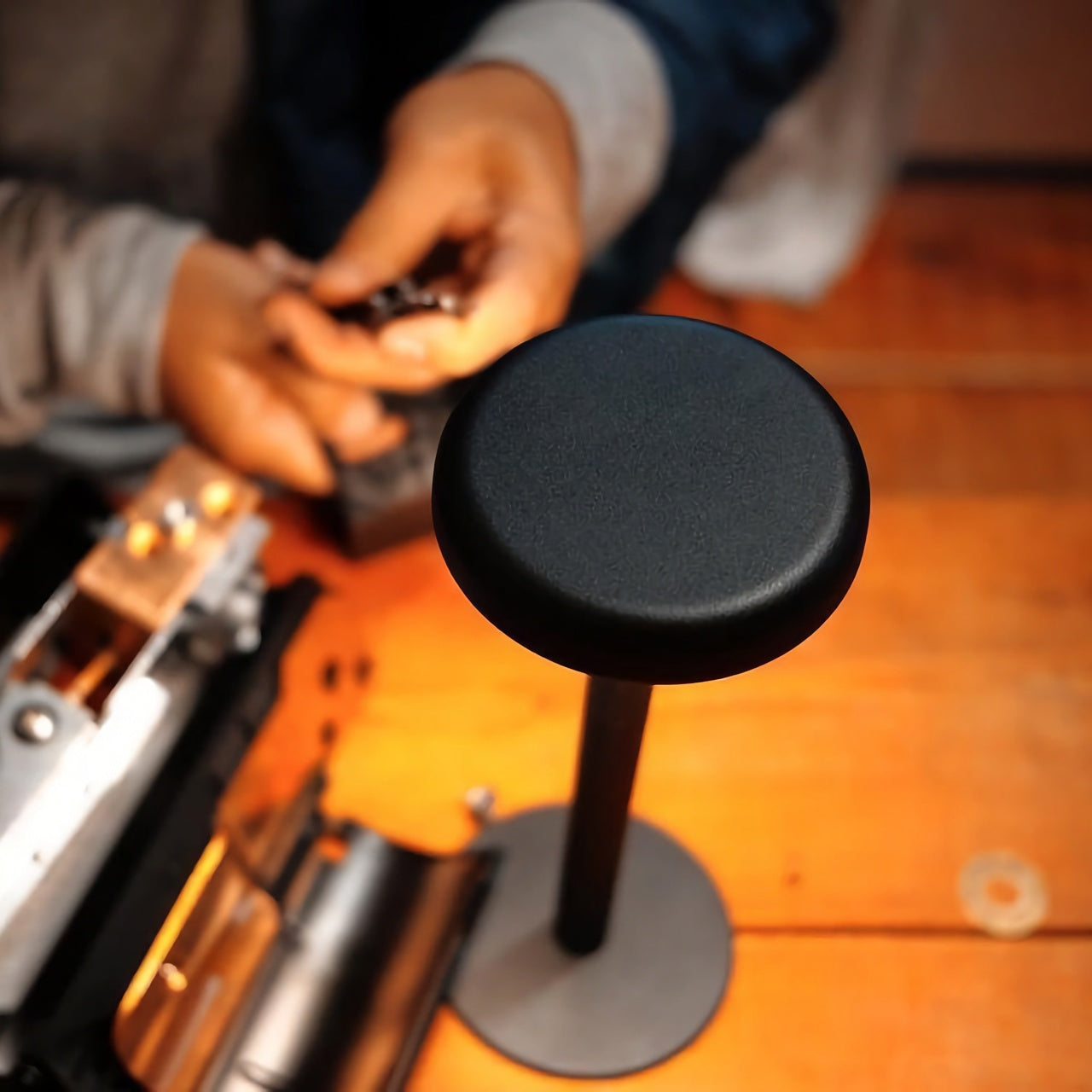
3. Pininfarina Aero Ethergraf
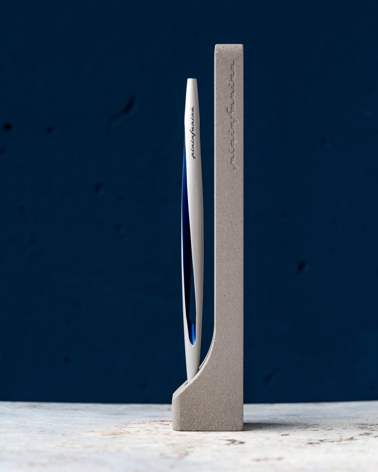
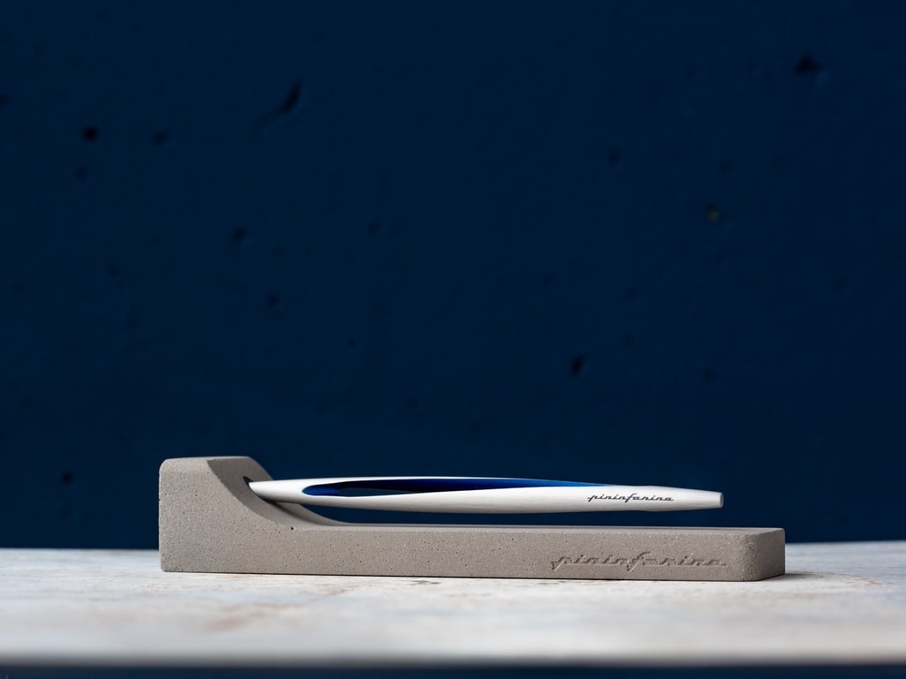
Pininfarina’s name lives in the curves of Ferraris and Maseratis, but the Aero Ethergraf makes a more interesting argument — that restraint is the harder design problem. Made from aerospace-grade aluminum, it weighs 17 grams and measures 160mm, numbers that don’t fully prepare you for how it sits in the hand. The tip is Ethergraf, a patented metal alloy that writes through oxidation, leaving a permanent mark on paper without a single drop of ink. No cartridges. No refills. No maintenance, ever.
It ships paired with a raw concrete stand — a deliberate material contrast that, on a desk, reads as sculpture rather than office supply. Handcrafted in Italy and rooted in a technique older than the modern ballpoint, the Aero makes every other writing instrument on the desk feel temporary by comparison. For a man who already has everything, it’s a quiet, permanent counterargument. Because nothing else quite like it exists on any desk, anywhere.
What We Like
- Ethergraf tip writes indefinitely through oxidation — zero maintenance, zero refills, ever
- Concrete stand creates genuine material tension that turns the pen into desk sculpture
What We Dislike
- Performs best on dedicated paper — not every standard notebook will reveal the tip’s quality clearly
- Concrete stand adds bulk that may feel heavy in a stripped-back minimal setup
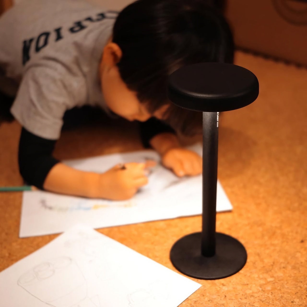
4. Anywhere-Use Lamp
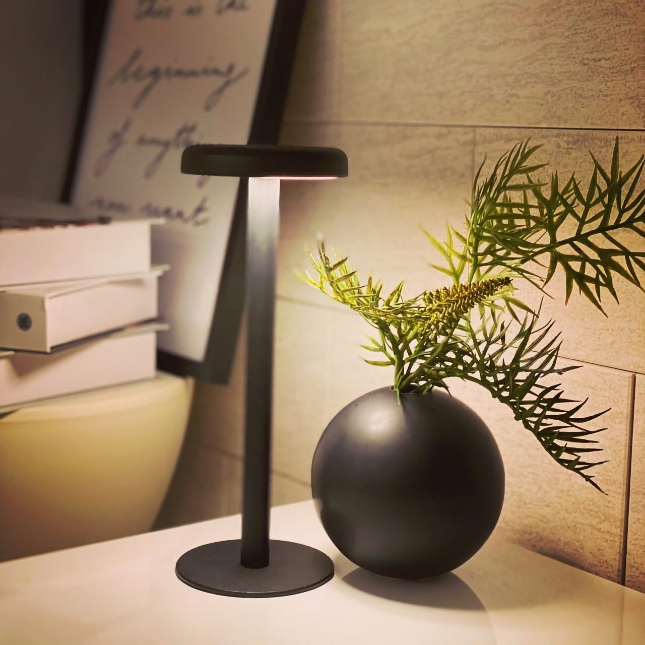
The Anywhere-Use Lamp starts from one honest premise: good light shouldn’t be tethered to a wall. Running on four AA batteries, it removes every cord and cable from the equation, making it as functional in a hotel room, on a bookshelf, or in an outdoor corner as it is on a permanent desk. Six high color rendering LEDs produce warm, soft output that settles naturally into a space without announcing itself as the room’s loudest design decision. The result is light that feels like it always belonged where you put it.
Available in black, white, and an Industrial edition with a scratch-detailed metal base that treats surface wear as character rather than damage, it holds across every desk aesthetic without effort. Pressing any edge of the cap cycles through four brightness levels with a haptic click that makes even that small interaction feel considered. Modular construction means it breaks down flat for a bag. At $149, the Anywhere-Use Lamp is one of the most versatile objects on this list — earning its price through location freedom alone, before you’ve even switched it on.
Click Here to Buy Now: $149.00
What We Like
- AA battery power removes all cord dependency and gives it genuine, unconditional location freedom
- Industrial edition’s scratch-detailed base treats material wear as intentional character, not a flaw
What We Dislike
- AA batteries mean ongoing replacement costs compared to a rechargeable alternative
- Four brightness levels may feel limited for those who prefer more granular control over output
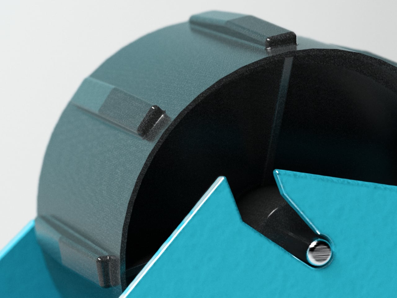
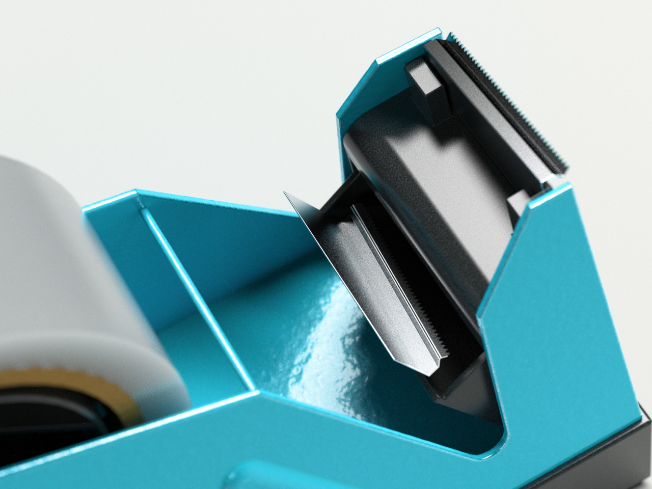
5. Edifier Melo Bar

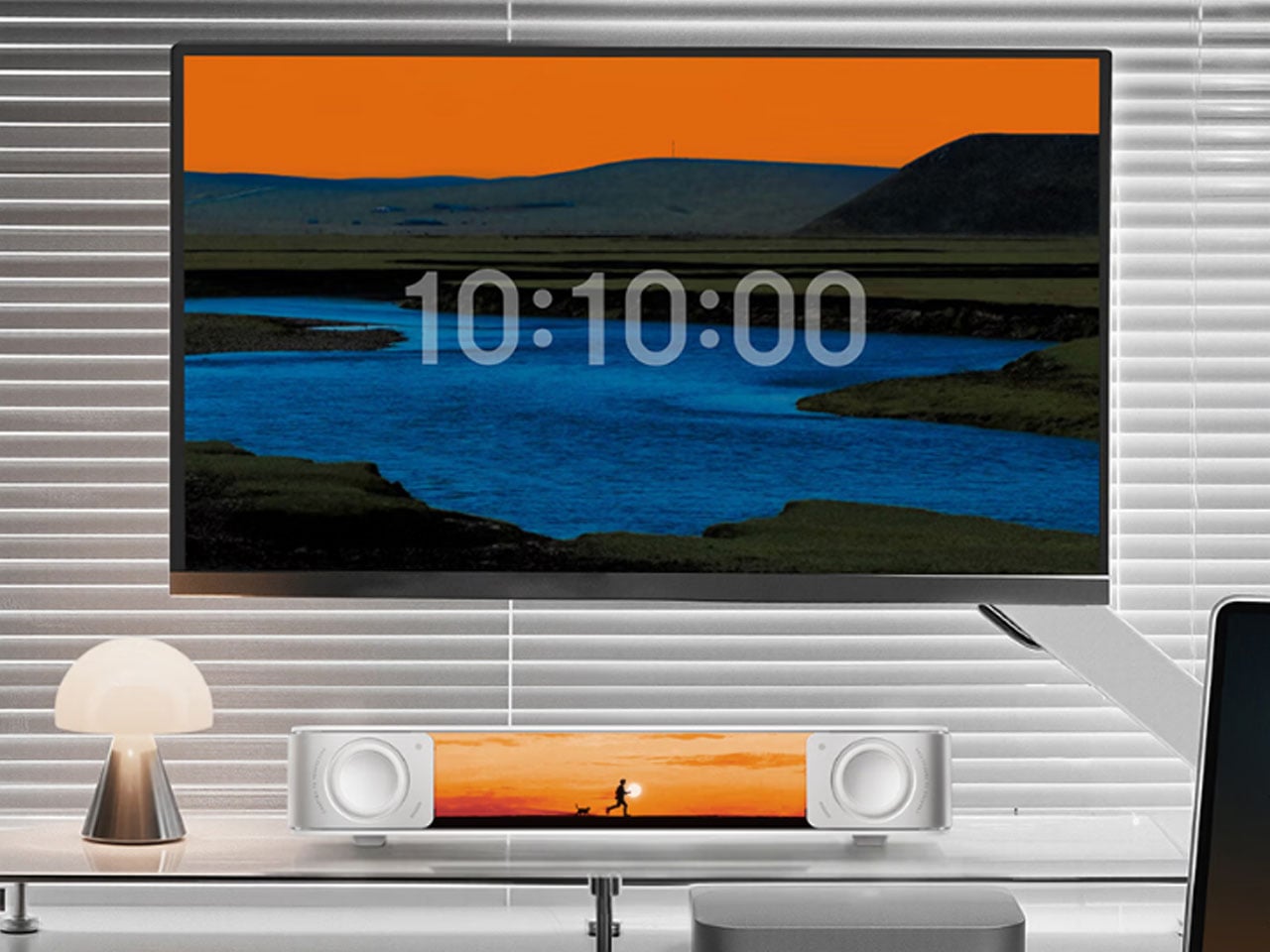
The Edifier Melo Bar does the thing most desk speaker bars never quite pull off — it makes RGB feel like a design decision rather than a hardware checkbox. Three distinct audio modes handle music, gaming, and movie listening, each tuned differently and each backed by near-field sound clear enough to remind you how much you’ve been tolerating laptop audio. The interchangeable front panels are the detail that separates it from every other bar on the market, letting the object adapt to the desk instead of demanding the desk adapt around it.
The light output is deliberately understated for something that supports 16.8 million colors and 15 carefully tuned lighting themes. It frames a setup rather than overwhelming one — adding ambient depth without demanding that the desk revolve around it. For a home office that already has the monitor, the keyboard, and the cable routing handled, this is the piece that completes the sensory experience rather than complicating it. Sound and light are treated as a single designed object. That’s harder to achieve than it sounds, and the Melo Bar gets it consistently right.
What We Like
- Interchangeable front panels let the speaker blend into or intentionally accent any desk aesthetic
- Three dedicated audio modes handle every use case without asking for a compromise
What We Dislike
- RGB-heavy profile may feel redundant on setups that already favor a completely dark aesthetic
- Near-field performance is strongest close to the desk — less effective across a larger open room
The Right Desk Tells You Something About the Person Behind It
Each of these five objects earns its place for reasons that go further than specs. The Mosaic learns. The Sakura puzzle challenges. The Aero Ethergraf lasts forever. The Anywhere-Use Lamp untethers. The Melo Bar performs and illuminates. None of them exist because a spec sheet demanded them — they exist because someone asked what a desk should actually feel like and then had the discipline to build the answer without compromise.
The man who says he has everything doesn’t need another gadget. He needs the object he didn’t know was missing — and all five of these are exactly that. Each carries intention, permanence, and the kind of quiet confidence that makes a desk feel genuinely complete rather than just assembled. Buy one, and it earns its keep. Buy all five, and you’ve given someone the most considered setup they’ve ever worked from.
The post The 5 Best Home Office Gifts for the Guy Who Thinks He Has Everything — He Doesn’t Have These first appeared on Yanko Design.