
What to expect at Meta Connect 2026: New AI glasses, a mixed reality headset and more
There's a lot for Mark Zuckerberg to cover at this year's keynote.
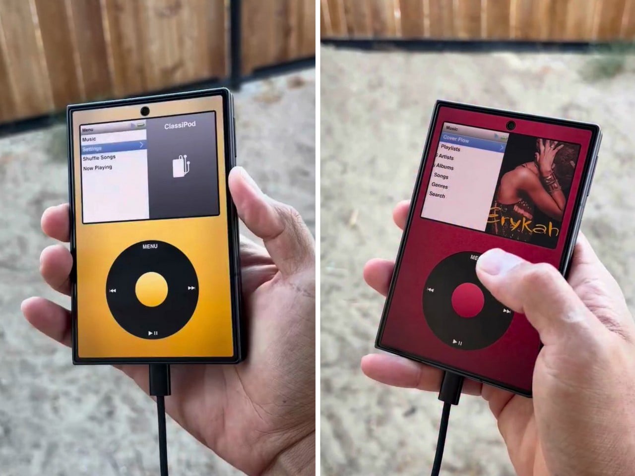
Apple has the opportunity to do something really cool here! An emulator going by the name of Classipod has been doing the rounds on the Google Play Store, letting you run an iPod Classic style interface on any Android phone of your choosing. The only problem is that Apple never really made a 9:20 iPod Classic. Every iPod Classic had a short, stout design and as it stands, there are only two Android phones that currently fit this bill, and both fold.
A video on Instagram showed the Classipod interface on a Galaxy Z Fold8 and I can’t help but feel like this almost exactly looks like the classic iPod. The proportions are damn near perfect, the interface still makes me nostalgic, and those color options absolutely slap! The only real problem is that, like all good things, Classipod came to Android before it did to the iPhone Duo… but if someone from Apple’s software team is reading this (hey Craig!), just go ahead and give us an Apple Music skin that brings back the iPod Classic! Pretty please??
Designer: Adeeteya
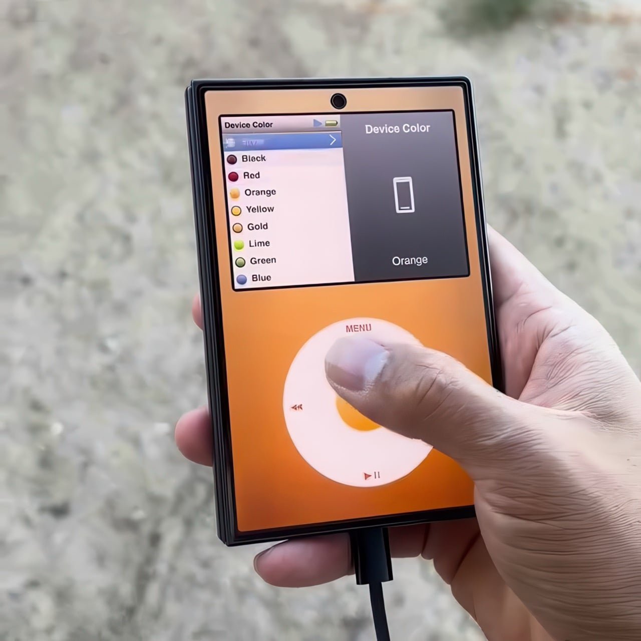
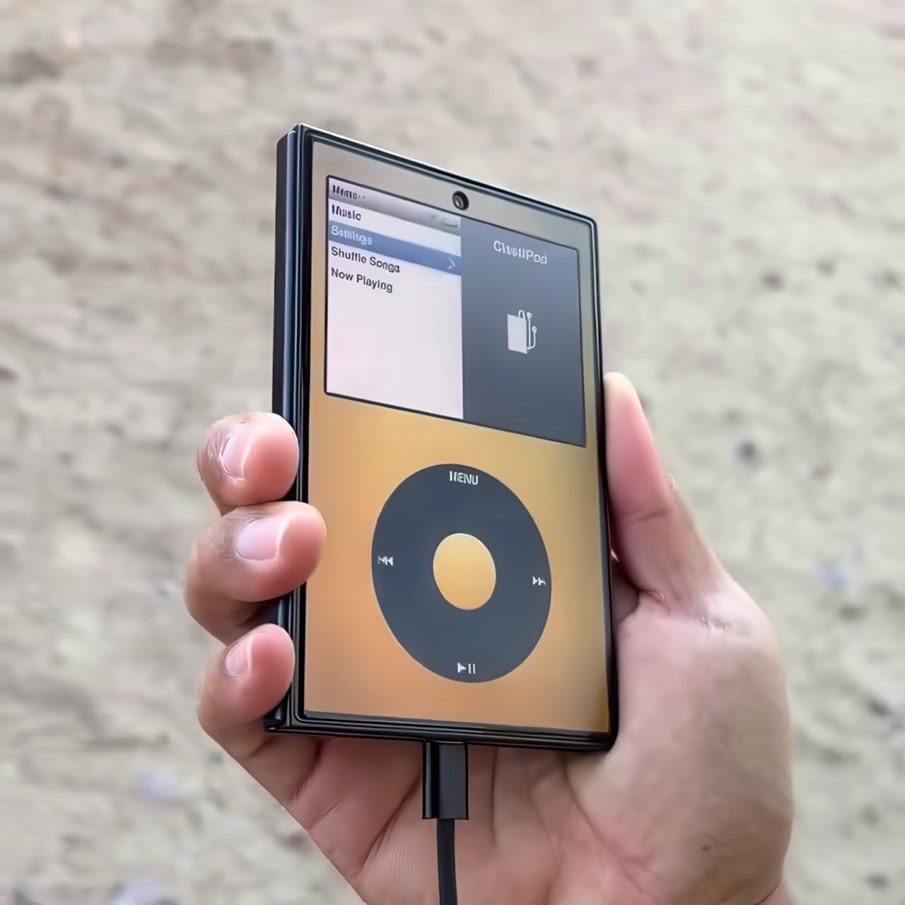
Here’s what I find so funny about running Classipod on a Z Fold8 – sure, it almost matches the iPod Classic’s form factor, but even when folded shut, it’s still thinner than the iPod! I’m talking hinge, two sets of screens, two batteries, an entire processor, cameras galore, all that packed into something that measures 9.7mm thick while the iPod Classic, which is just a tiny screen, battery, SoC, and a massive flash drive, measures 10.5mm in thickness. Then again, the iPod Classic packs an aux input too, which you’ll never see on a foldable phone.
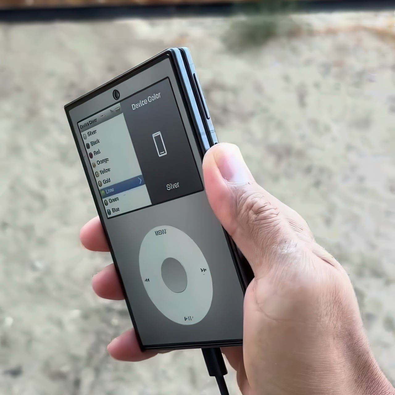
But hold the Z Fold8 in your hand and the Classipod definitely scratches the itch of owning vintage Apple gear. The weight and heft, the analog interface, and that gorgeous jogwheel that is sure to get your muscle memory kicking in instantly. You sideload music so it plays locally (no streaming), and you can do everything, from searching for artists to making playlists. And yes, if you’re asking, the jogwheel has haptic feedback so it actually does feel like the iPod of yesteryears.
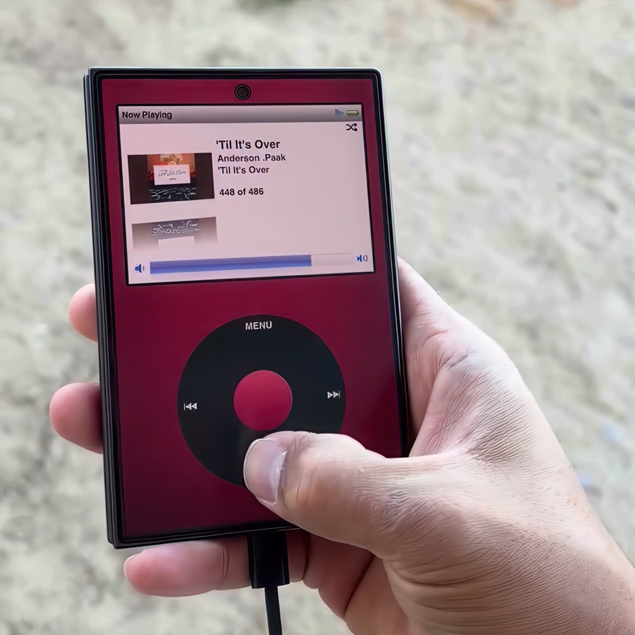
There are a few iPod emulators on the App Store, but none as good as the Classipod. I guess someone could vibecode one overnight and run it on an iPhone Duo soon, but until then, turns out the most faithful recreation of an iPod Classic exists… just on an Android device!
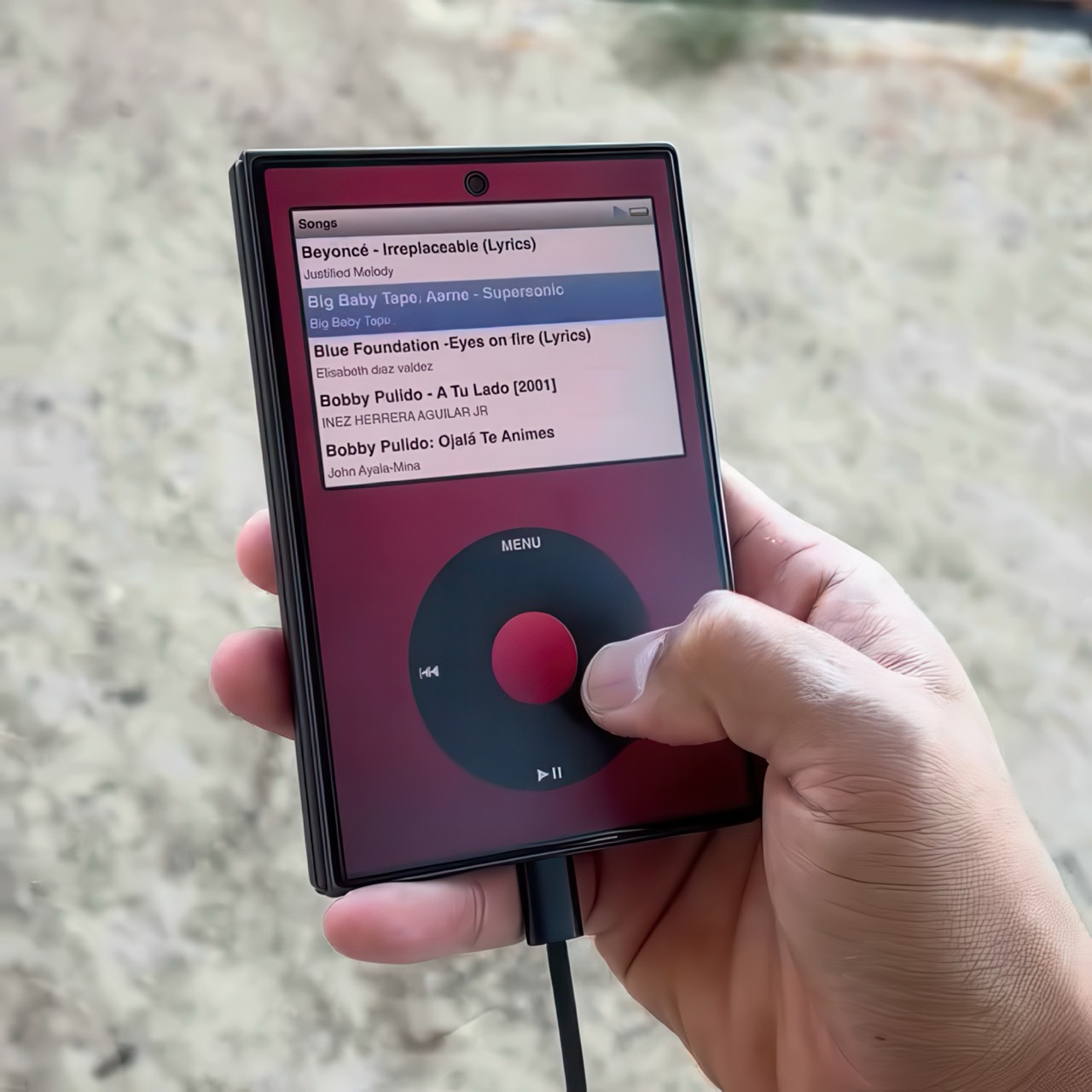
The post iPod Classic emulator for the Samsung Galaxy Z Fold8 finally gets the size and aspect ratio right first appeared on Yanko Design.




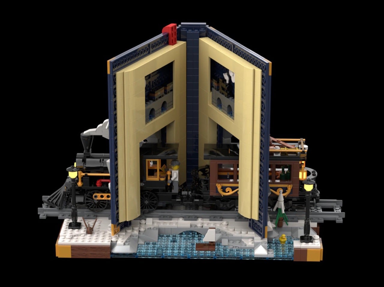
Every kid who grew up with Chris Van Allsburg’s The Polar Express remembers that moment where the story stops behaving like a story. A train just shows up, chugging straight out of the snow and into a kid’s actual bedroom, and suddenly bedtime reading feels a little bit dangerous in the best way. That’s the exact energy LEGO builder CrazyInventor is chasing with Winter Express, and yes, I see what you did there with that title, very smart way to dodge a certain mouse-shaped legal team while still getting the reference across loud and clear. Except here the train doesn’t stop at bursting out of the pages. It runs straight through the whole book, cover to cover, like the story just wasn’t big enough to hold it.
The result looks like someone left a hardback open on a shelf and a Victorian steam engine decided to use it as a shortcut. Gold trim, a red ribbon bookmark, snow dusted across the back cover like a sky full of stars, this thing reads more like a diorama that happens to be shaped like a book than a book that happens to have a train in it. And once you spot the tiny second train hiding inside the pages, you’ll understand why this project cracked 1,000 supporters in about three days flat.
Designer: CrazyInventor

The book itself steals the show before the train even enters the conversation. It’s a navy blue hardback with rounded gold corner guards and matching gold bands running down a curved spine, the kind of cover treatment you’d expect on a leather-bound classic rather than a pile of ABS plastic. A gold plaque on the front reads “Winter Express” in a wood-grain frame, and a red ribbon bookmark hangs off the top edge like someone set the book down mid-chapter and wandered off to make tea. Flip to the back cover and it’s scattered with pale blue round studs, doing double duty as either falling snow or a starry winter sky, depending on how you’re feeling that day.

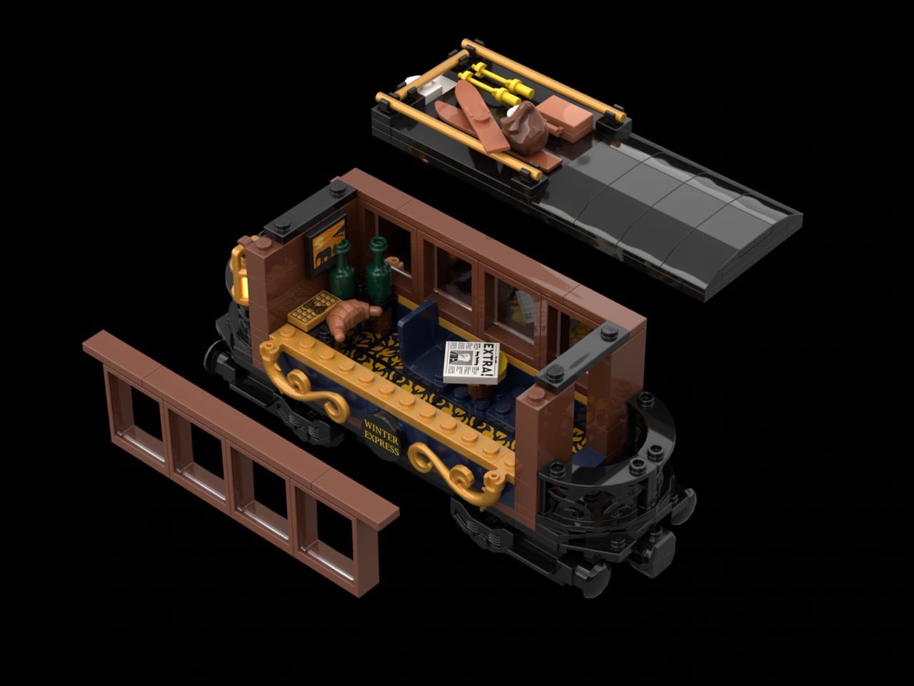
A black and gold Victorian locomotive takes over from there, complete with a glowing headlamp, a cowcatcher up front, and Technic side rod detailing, coming straight out of a snow-capped rock tunnel carved into the front cover. A matching passenger coach trails out the other side through the spine, decked out in scrollwork trim with its own lit lanterns and a roof stacked with skis and sleds. Snowy pine trees, cobblestone tiles, and two working lampposts fill out the base, along with a frozen little pond built from trans-blue tiles.
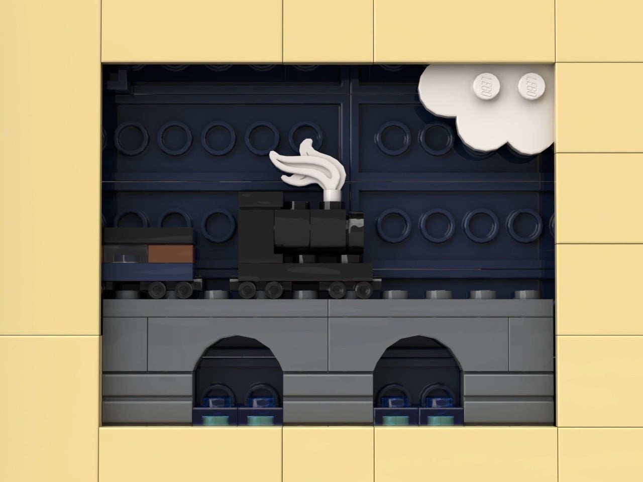
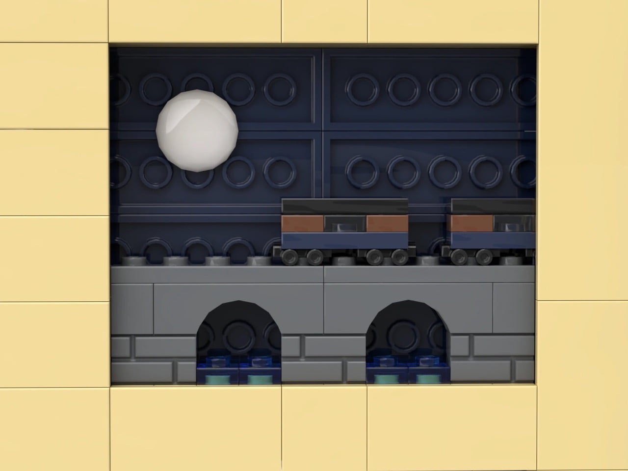
My favorite detail is buried in the pages themselves. Look closely at the tan interior spread and there are cutout windows revealing a second, micro-scale train crossing a tiny stone viaduct, a whole miniature railway hiding inside the book that the big train is currently smashing its way through. It’s a small touch, but it’s the kind of layered thinking that separates a fun MOC from a genuinely great one.
Winter Express landed on LEGO Ideas on September 15 and has already pulled in 1,291 supporters, cruising well past the first 1,000-vote milestone toward the 5,000 mark it needs next. If cozy winter dioramas with a little bit of chaos baked in are your thing, go to the LEGO Ideas page and add your support and watch this one keep climbing.
The post Gorgeous LEGO Book Nook Has a Steam Train Blasting Straight Through Its Snowy Pages first appeared on Yanko Design.
Slim, art-inspired, and tougher than it looks, the TECNO CAMON Slim 5G packs a 6,000mAh battery into a body thin enough to turn heads.

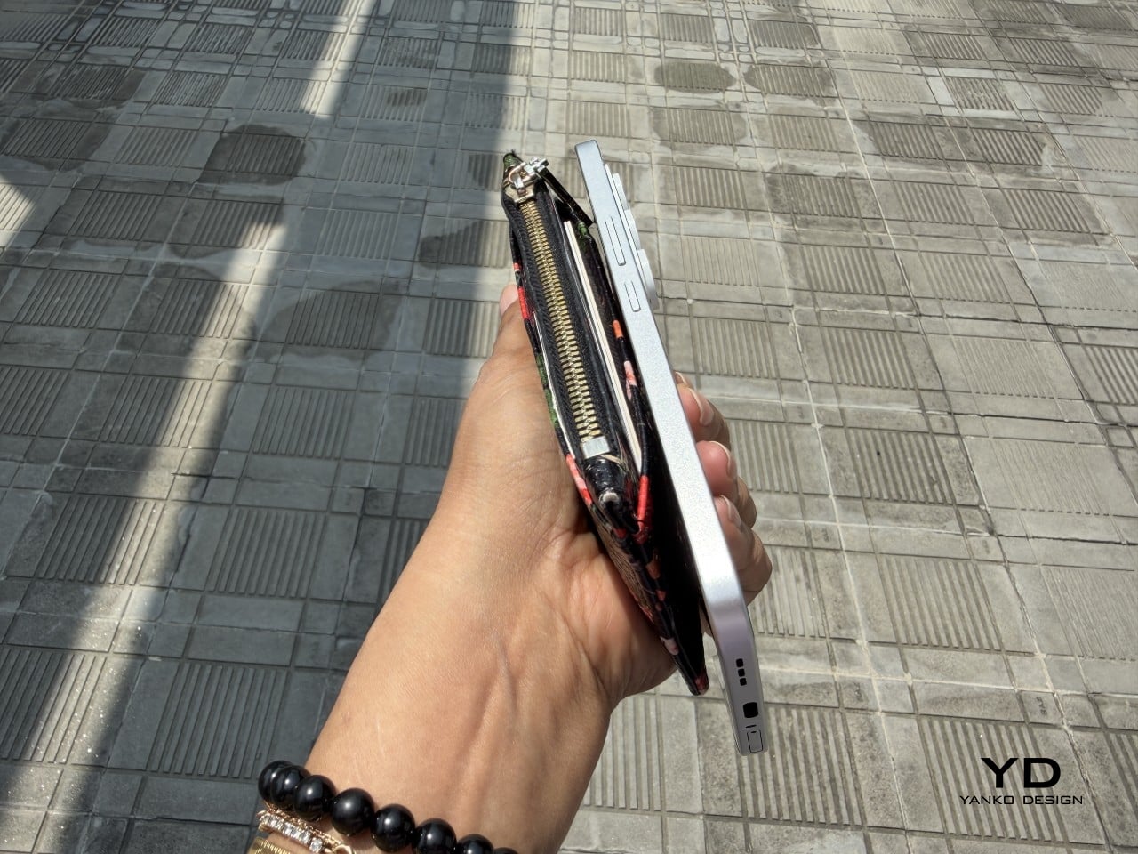
Slim phones have always come with a catch. Shave down the body and something else usually gets sacrificed: usually the battery, sometimes the durability, occasionally both. The TECNO CAMON Slim 5G doesn’t play by that old rulebook. At just 6.39mm thick, it still packs a 6,000mAh battery, 5G connectivity, and a durability rating most phones twice its thickness wouldn’t dare claim.
This review spent real time with the phone away from spec sheets, mostly to see if the design holds up once the initial wow wears off. That meant handling the Neo Mondrian finish TECNO sent for testing, carrying it through a normal week, testing the camera in situations that actually matter, and checking whether the durability claims survive contact with water and everyday clumsiness. The design conversation comes first.
Designer: TECNO
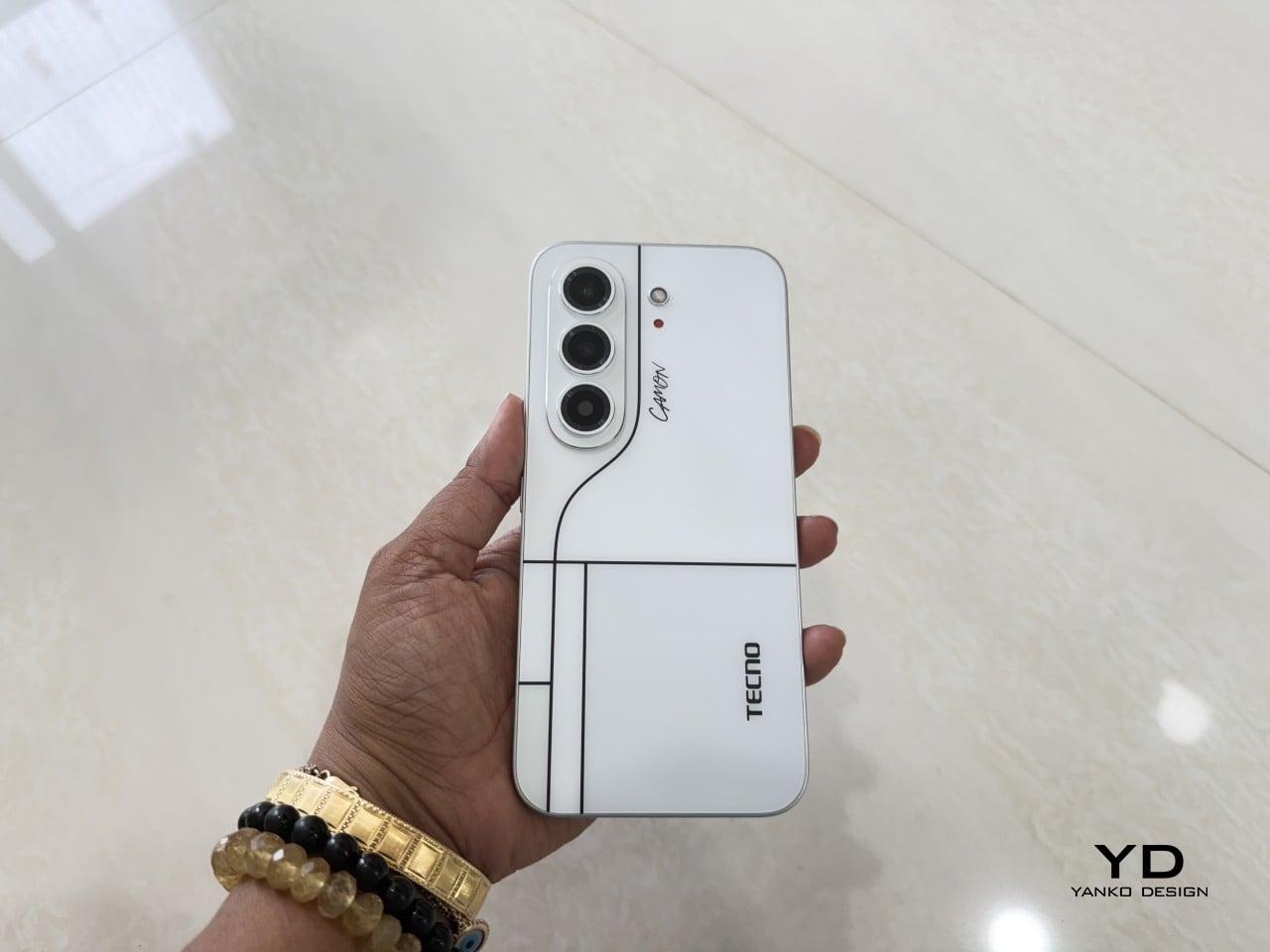
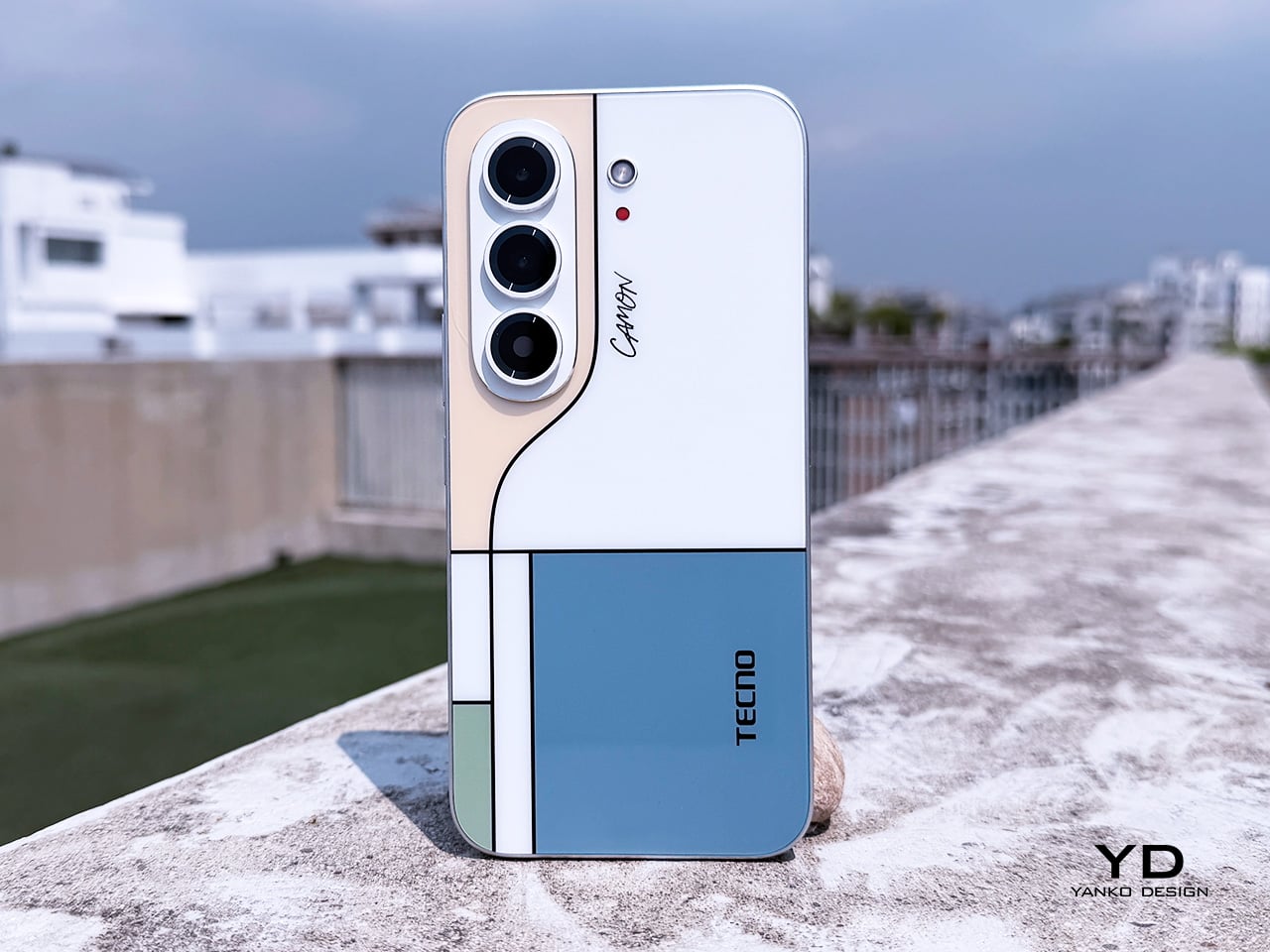
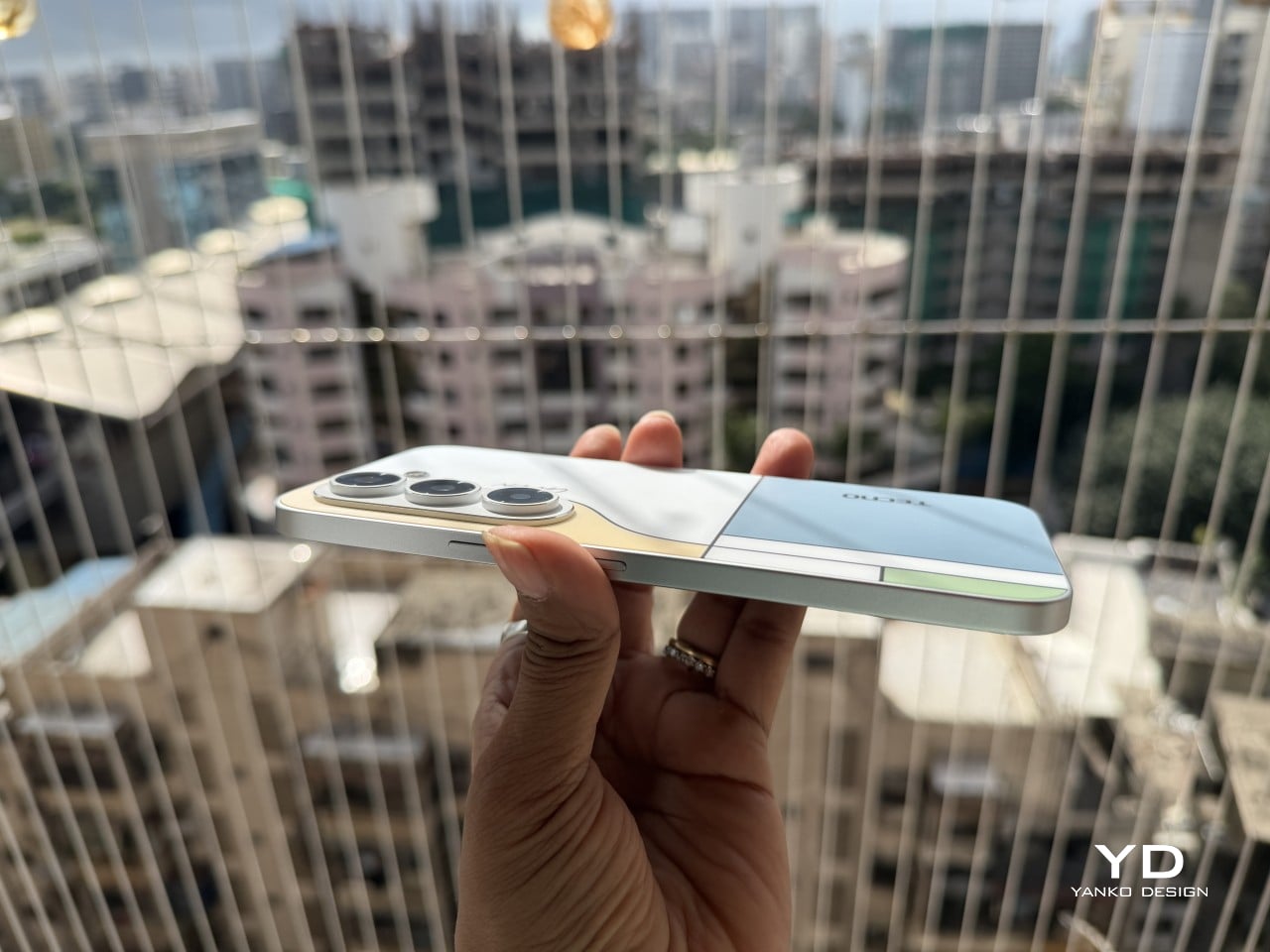
Pull the CAMON Slim 5G out in public and watch what happens. People notice a phone this thin the way they’d notice a watch too elegant for its price tag, usually with a double take and a request to hold it. TECNO carried over the swan-neck curve from the CAMON 50 series, and on a body this slender, that curve reads like a signature rather than a spec sheet footnote.
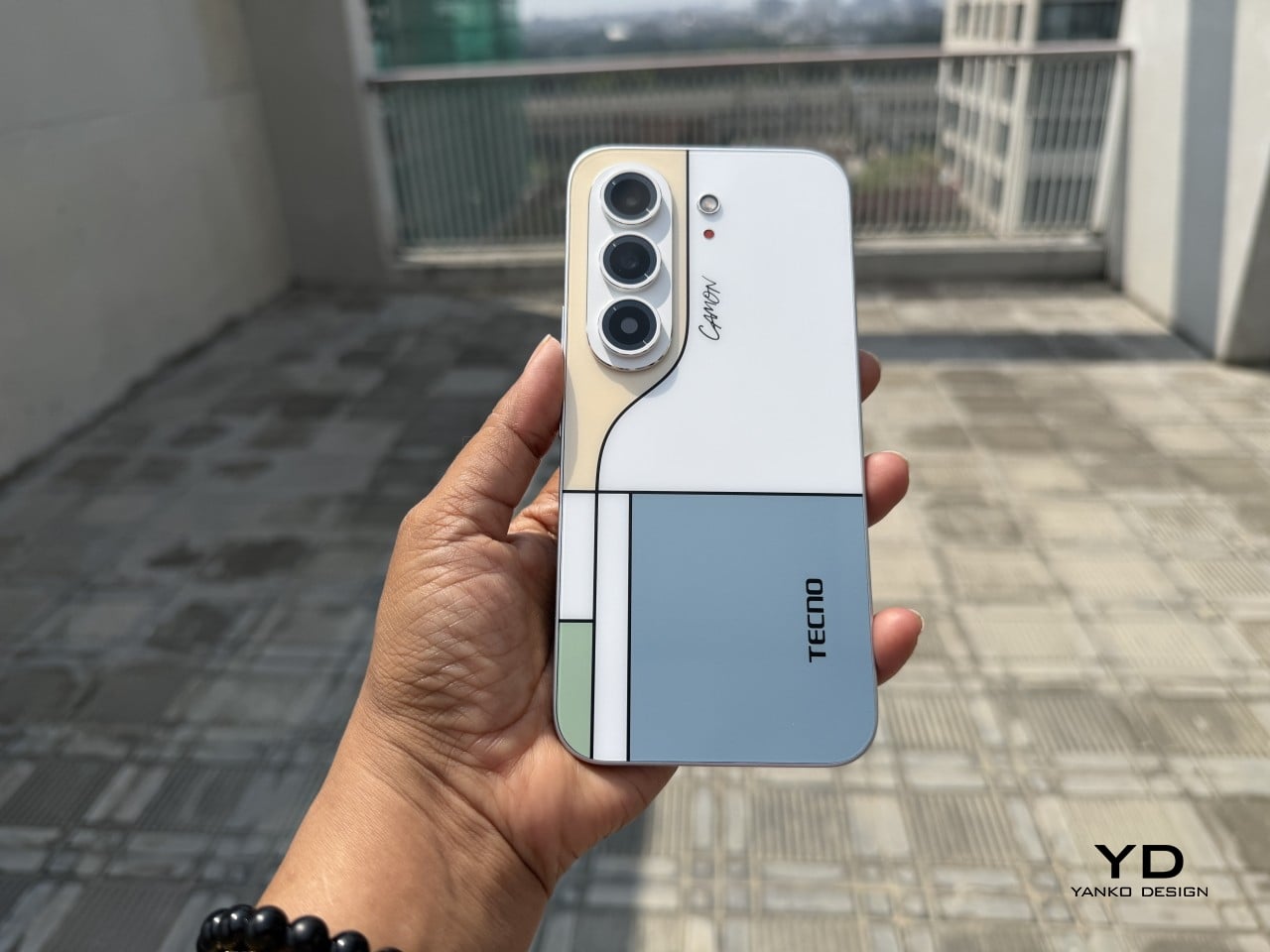
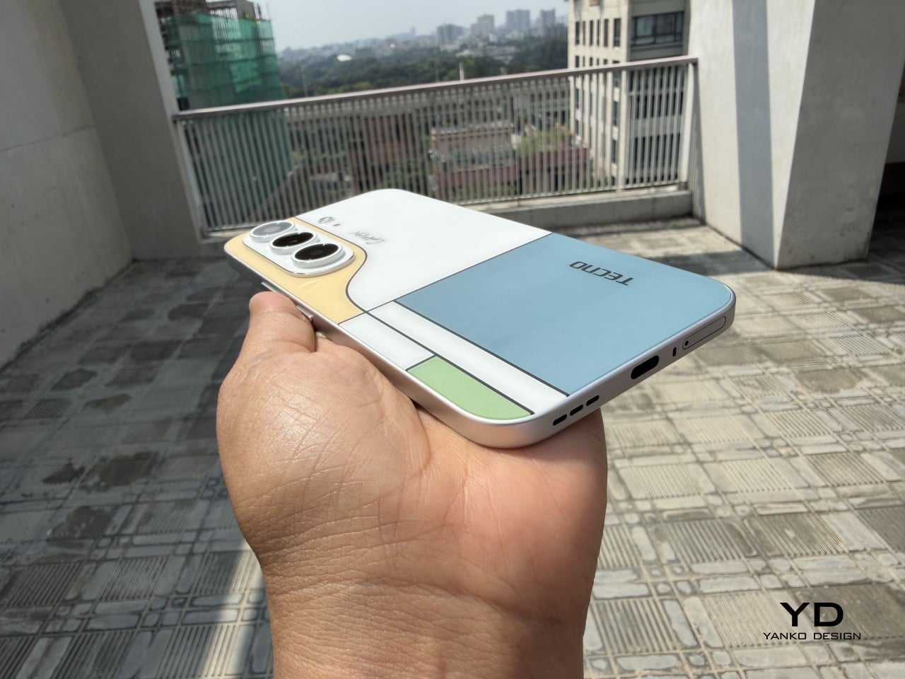
TECNO sent the Neo Mondrian colorway for this review, and it’s the strongest argument for treating a phone back as an actual canvas. Expose the panel to sunlight and yellow, green, and cyan blocks slowly bloom out of white, forming the grid Piet Mondrian made famous a century ago. It’s a photochromic trick, but watching it happen feels less like a gimmick and more like a magic show.
Neo Mondrian isn’t the only finish doing something interesting. Van Gogh Blue uses similar light-reactive techniques to make its swirling nebula pattern look like it’s actually rotating as shadows shift across it, closer to a painting than a phone back. Matisse Black leans into fluorescent green or pink color blocks that echo the artist’s cut-out work, while Burgundy Red blends fiberglass and matte texture into a warm, understated finish. Rebel Pink keeps things simpler, pairing a black body with sharp pink accents for something a little more playful.
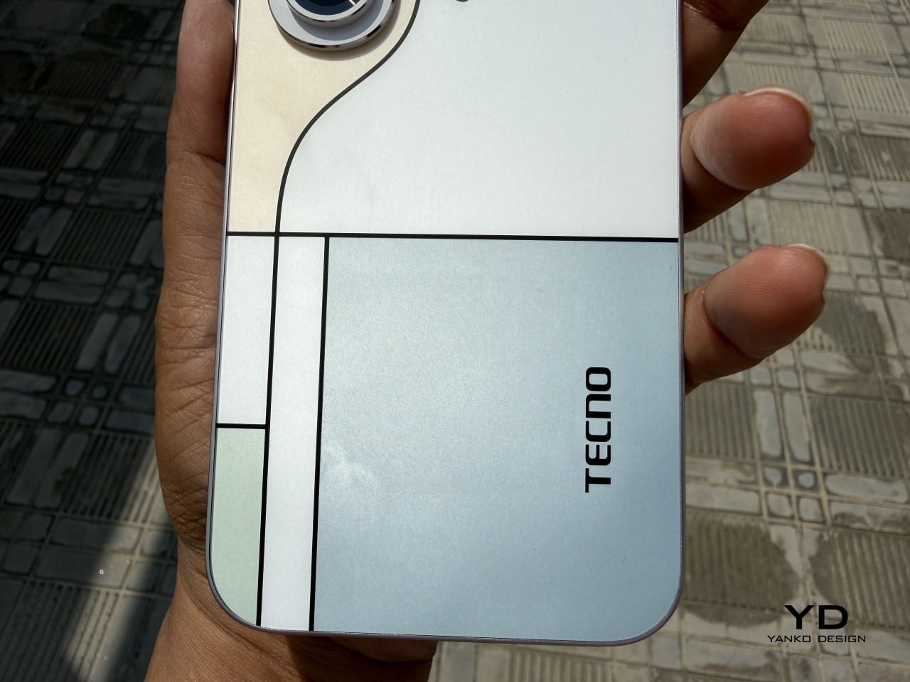
Phone backs used to be an afterthought, something to protect rather than admire, which is why so many people slapped an opaque case on day one without a second thought. That’s changing. As manufacturers invest more in finishes, textures, and light-reactive coatings, more owners are leaving their phones bare, treating the back panel the same way they’d treat a piece of art they paid good money to display.
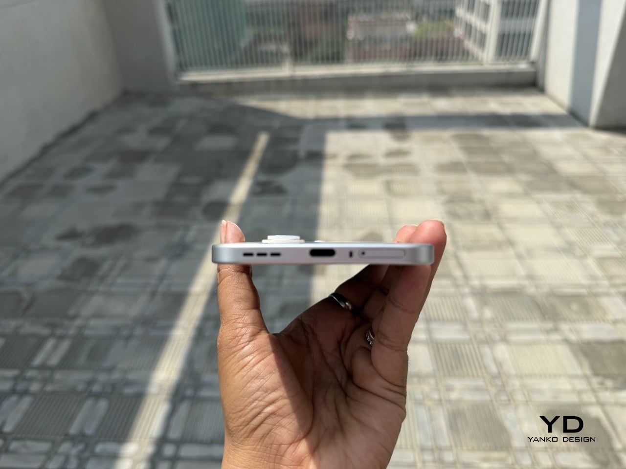
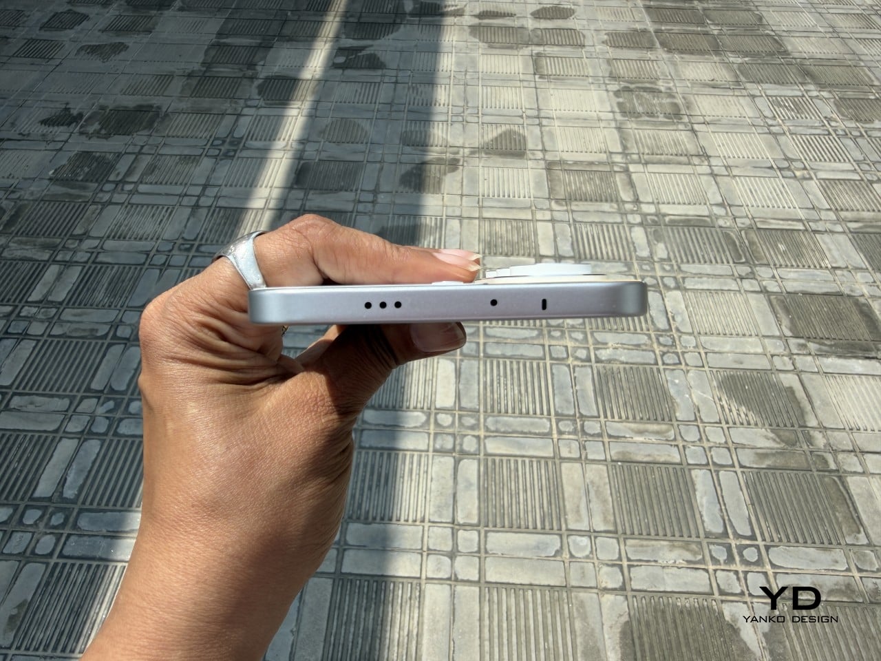
Carrying the CAMON Slim 5G is where the thin body actually pays off day to day. It slides into a front pocket without that telltale bulge, sits flat against a jacket without pulling on the fabric, and feels lighter in hand than the display size suggests. After a few days, reaching for a thicker phone almost feels like picking up a brick by comparison.
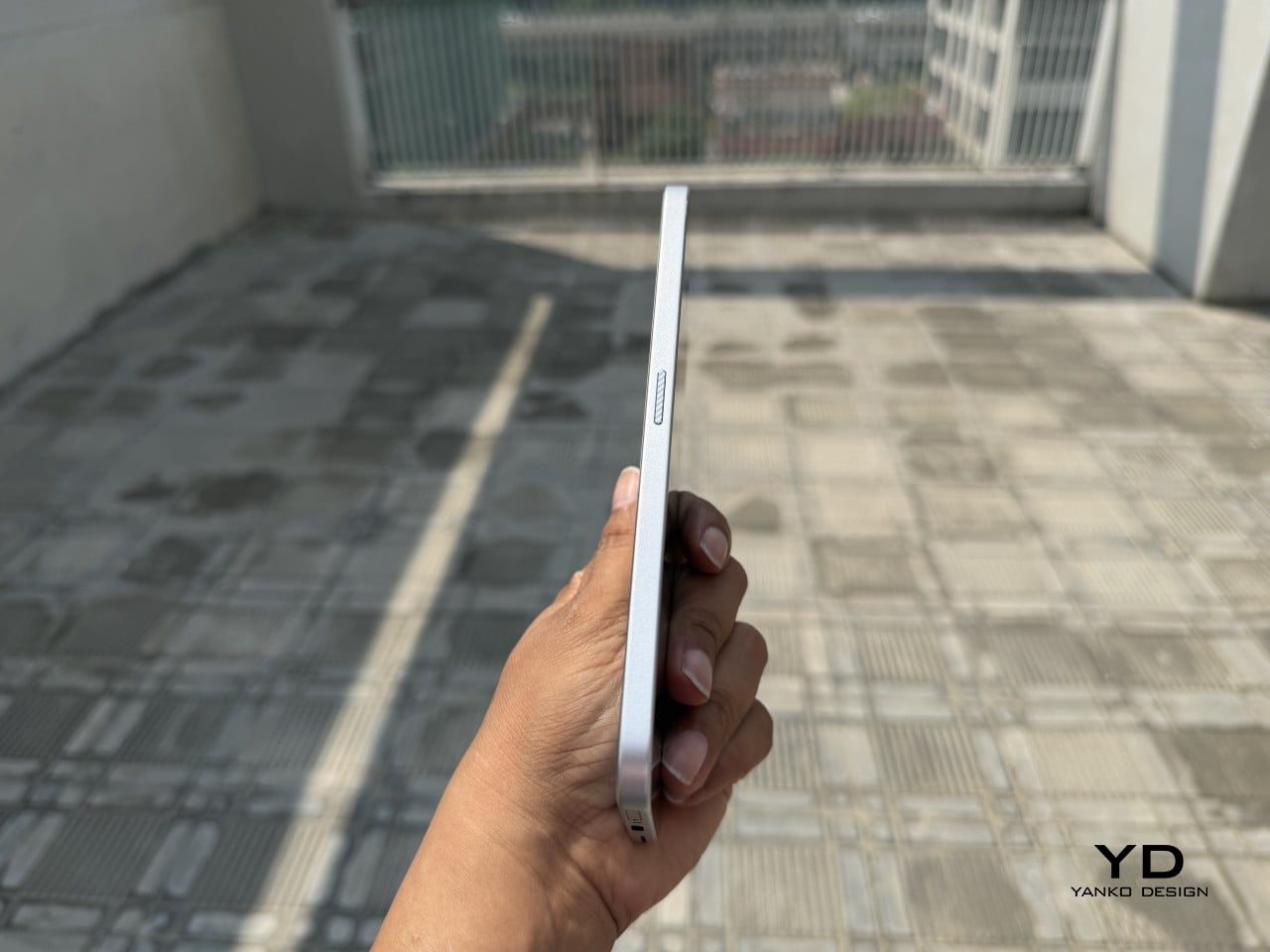
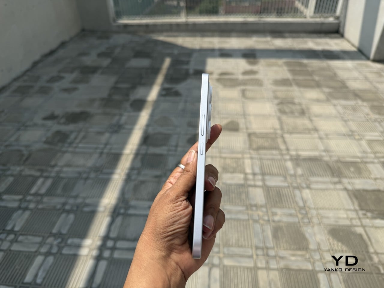
Those flat edges aren’t just a style choice borrowed from boxier design trends. They give fingers something to actually grip onto, instead of sliding off a rounded rim the way slippery slab phones tend to do. The matte texture on the Neo Mondrian panel adds even more confidence, and TECNO’s wet and oily finger recognition keeps the touchscreen responsive when hands aren’t exactly dry or clean.
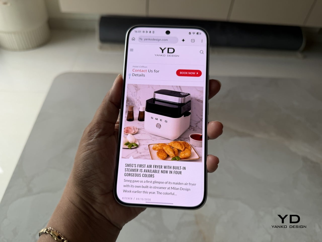
The 6.78-inch AMOLED display runs at 1.5K resolution and 144Hz, and both numbers translate into a screen that looks sharp and feels fast under a thumb. Photos pop with the kind of contrast only AMOLED delivers, video looks great for a lunch break binge, and scrolling through a feed never feels like it’s fighting the hardware. TÜV Rheinland’s low blue light certification is a nice bonus for long reading sessions.
Under the hood sits a MediaTek Dimensity 7300e, a processor built for balance rather than benchmark bragging rights. It handles social apps, photo editing, and everyday multitasking without hiccups, though demanding 3D games will ask more of it than it’s built to give. The 8GB of RAM stretches to 24GB with virtual memory extension, which covers most multitasking habits without needing to close every open app.
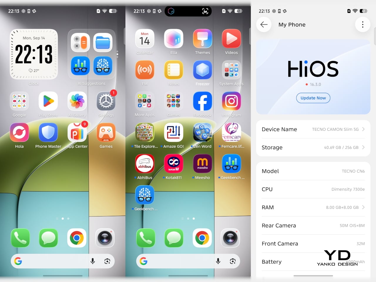

The 50MP Sony LYTIA 700C handles most of the photography workload, and it earns that responsibility. A 1/1.56-inch sensor paired with an f/1.8 lens pulls in plenty of light for evening shots, while the closed-loop ball motor keeps focus locked even when subjects won’t sit still. The 8MP ultra-wide feels more like a footnote, and there’s no telephoto here, but the main camera rarely leaves you wanting one.
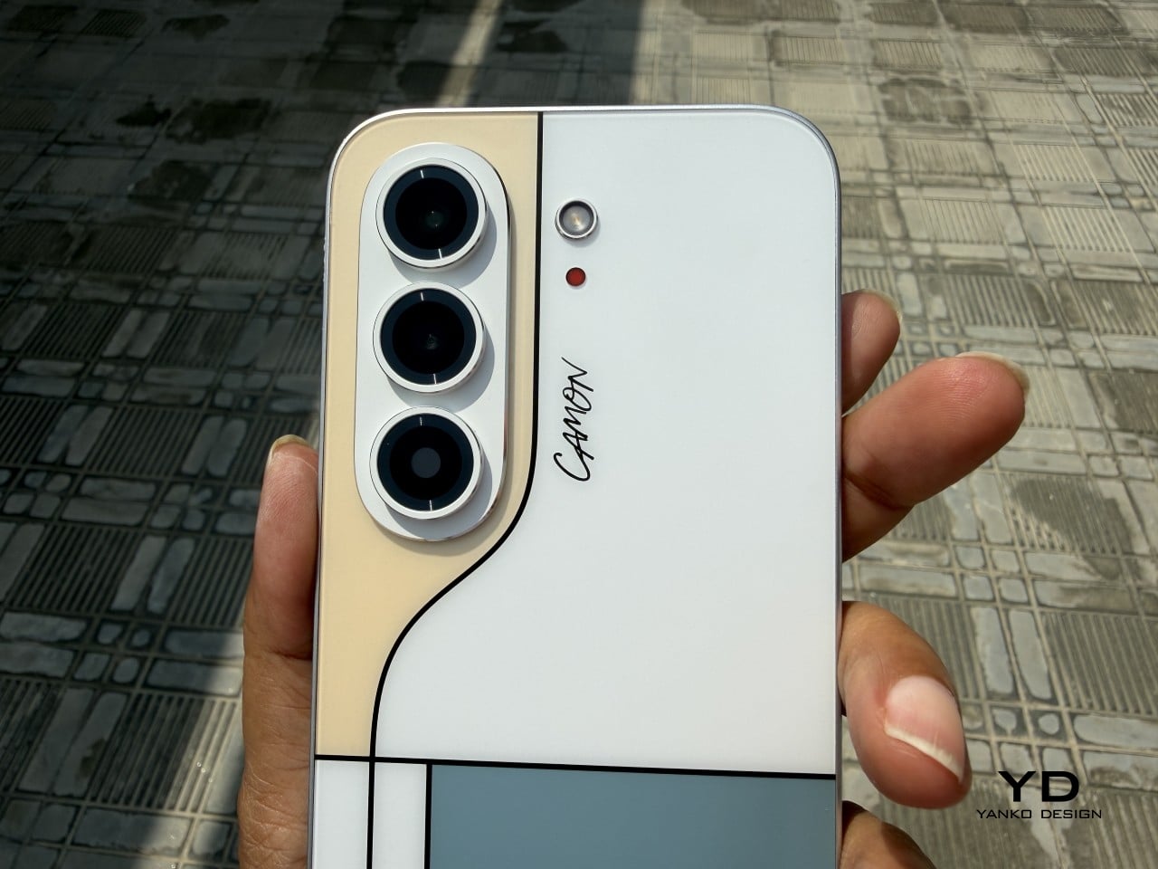
The real showstopper is the 6,000mAh battery, a number that seems almost impossible once you remember this phone measures 6.39mm thick. It comfortably carries a full day of camera use, video, and scrolling without the battery anxiety that usually comes with slim designs. That same waterproofing also unlocks a dedicated underwater photography mode, one that kicks in automatically the moment the phone senses it’s gone for a swim.


TECNO rates the CAMON Slim 5G at IP69K, IP69, IP68, and IP66, a combination that’s rare even among phones that don’t have to worry about staying thin. That covers everything from high-pressure water jets to dust particles to full submersion, which is a lot of technical armor for a phone this delicate-looking. Finding this rating on a 6.39mm body is the kind of detail that quietly impresses.
There’s also a MIL-STD-810 rating covering shock and drop resistance, which pairs nicely with features like Rain Touch and Waterproof Case Touch that keep the screen usable in a downpour or behind a case. This doesn’t read like a feature bolted on at the last minute. It feels like TECNO wanted this phone to survive actual daily chaos, not just look good sitting still on a shelf.
Longevity extends past the hardware, too. TECNO promises three major OS upgrades and five years of security patches, plus a 60-month smoothness certification from TÜV SÜD. That’s a meaningful commitment in a market where phones often get abandoned after two update cycles. A well-built object is worth keeping around, and TECNO seems to be betting that owners will want to hold onto this one for a while.
TECNO hasn’t confirmed global pricing yet, but early indications point to somewhere around $400. At that number, buyers get a phone with genuine art-inspired finishes, a 6.78-inch 144Hz AMOLED screen, a Sony-backed 50MP camera with real stabilization, a 6,000mAh battery, and a durability rating that most phones twice the price don’t bother chasing. That’s a fairly generous list for a phone that costs less than most flagships.
Most phones in this price range make you pick a lane. Go thin, and the battery usually suffers, or the body skips water resistance entirely, or the software support runs out after a couple of years. TECNO’s five-year update promise and its layered durability ratings quietly add up to lower long-term cost, since a phone built and supported to last half a decade doesn’t need replacing as often.

This phone makes the most sense for people who are tired of carrying an identical black slab and want something that says a little more about them. It’s not the right pick for hardcore mobile gamers chasing max frame rates, or photographers who need optical zoom on tap. For nearly everyone else, it covers daily needs while looking like it belongs on a gallery shelf.
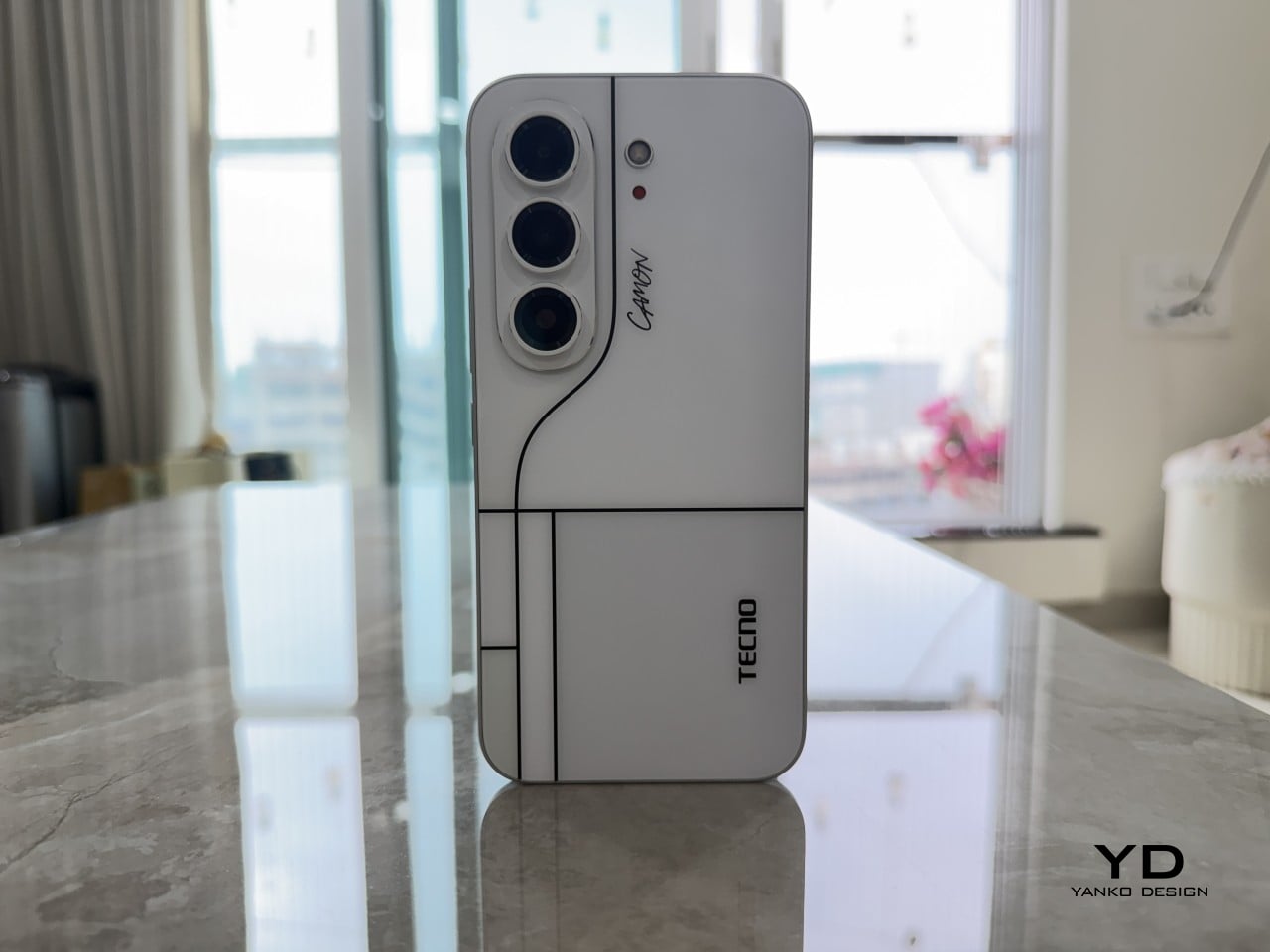
After a few days of actual use, the 6,000mAh battery and the quad-IP rating stop feeling like marketing footnotes and start feeling like the whole point. TECNO built a phone that looks like it belongs in a design museum and still survives a rainy commute or a splash at the sink. The Neo Mondrian panel alone gives it a personality that’s genuinely hard to find anywhere near this price.
Plenty of phones ask you to choose between something beautiful and something dependable, and most buyers have quietly accepted that trade-off as the cost of owning a nice-looking device. The CAMON Slim 5G makes a strong case that the choice was never as necessary as the industry made it seem. It’s a phone that looks good on a café table and still works fine after falling off of one.
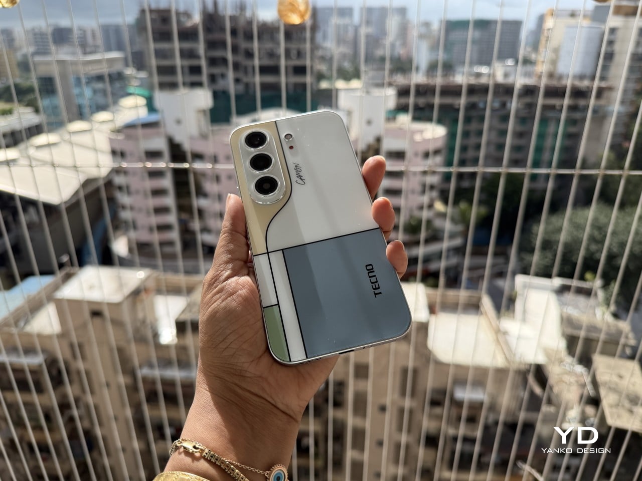
The post TECNO CAMON Slim 5G Review: Thinner than a Pencil, Tough as a Tank first appeared on Yanko Design.



After almost two years of a lull, Bose has finally released a new version of the Ultra Open Earbuds, along with a new pair of fitness-focused open earbuds. While I’m still a sucker for ANC earbuds that isolate me from the ambient world for deep focus moments, Bose’s new Open earbuds are tempting enough to consider for my walks and outdoor activities.
The hardware for the second-generation Open Ultra has been updated for better audio, while the all-new Sports Open Earbuds explore new territory for hardcore active individuals who trust the brand with their audio requirements. Both these open-ear audio accessories take on the competition with a strong set of specifications, features, and pricing to keep everyone interested.
Designer: Bose
The timing of this release is perfect, as the open-ear earbuds are trending amongst individuals who need to be aware of the environment and, more importantly, suffer from occlusion triggered by ANC earbuds. Sure, those buds have transparency mode for situations where you need to hear what’s happening around, but the open-ear options are ideal for runners, cyclists, or public transport users. The two of them will support Bluetooth 5.4 multipoint connectivity for two devices and Google Fast Pair. Both these open-ear buds will be available for pre-order from 19 September, and available from October 1 in Black and White Smoke along with other respective limited edition colors.


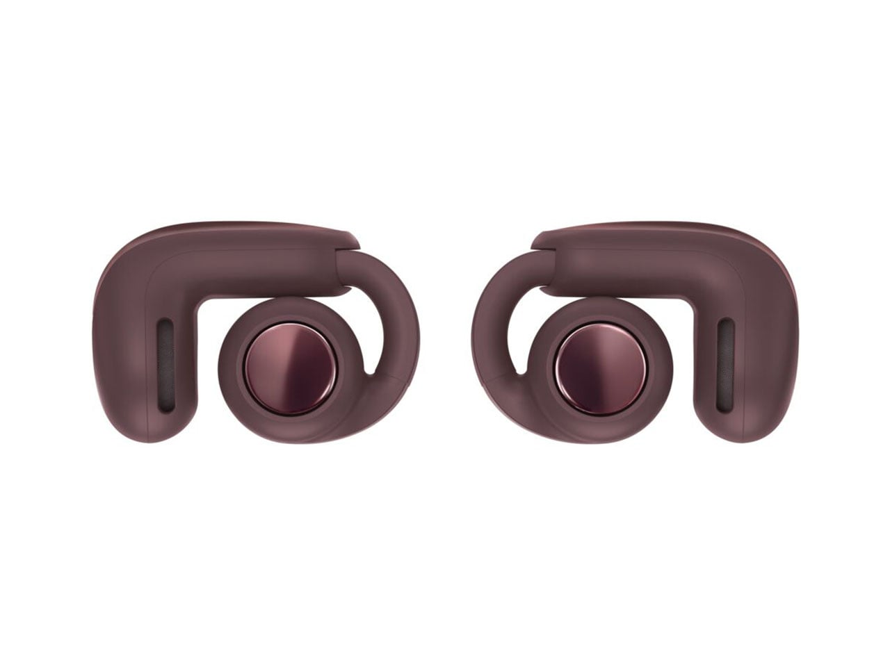
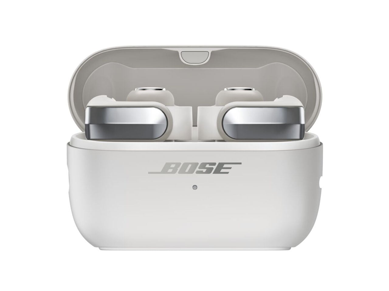
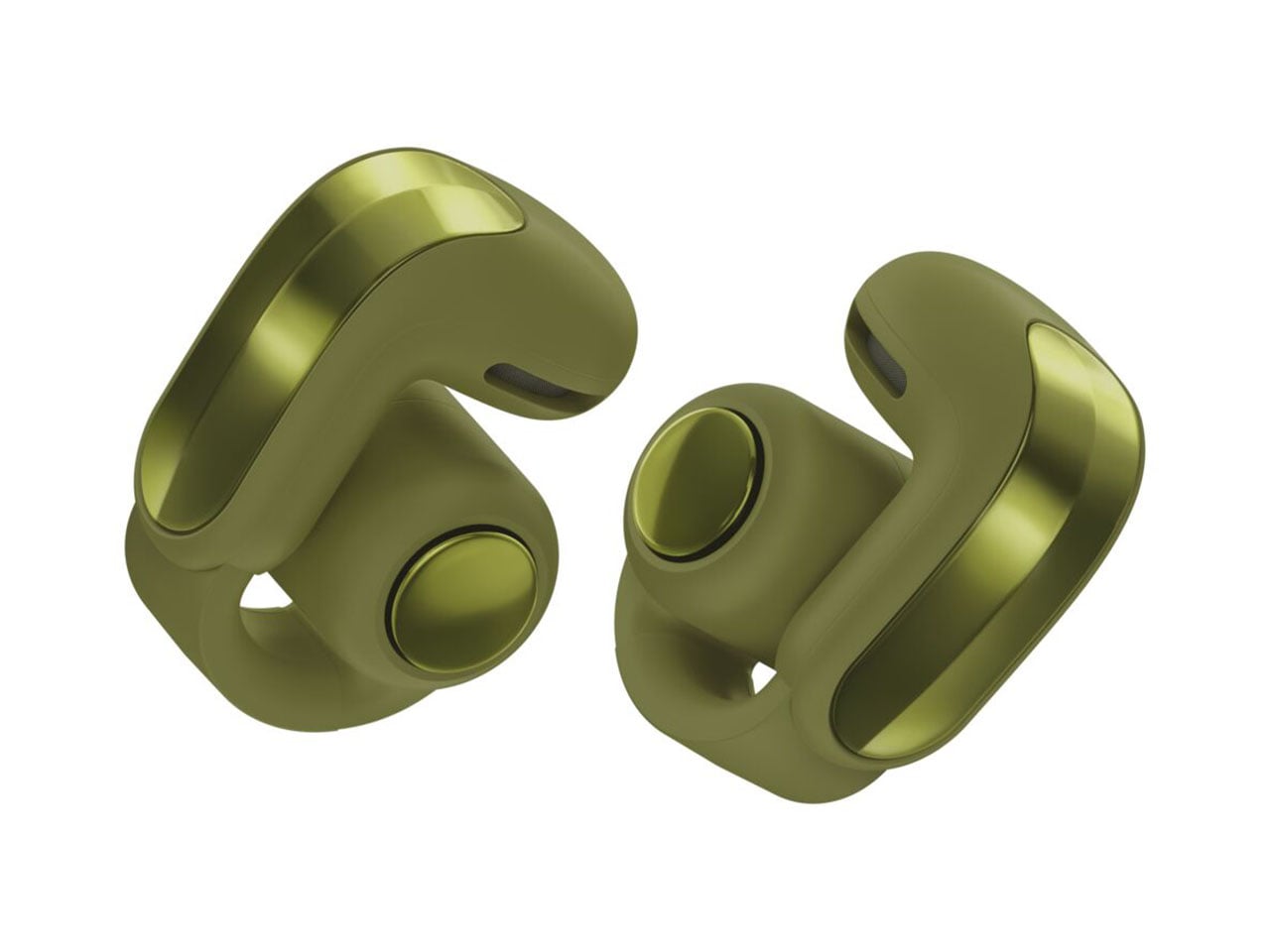
The flagship Ultra Open Earbuds arrive in the second generation to create “more listening moments across active pursuits and everyday life.” The buds are reengineered with better drivers to deliver deeper bass and a higher volume compared to the outgoing version. This has been the major complaint of existing users, and Bose has listened to the feedback and delivered the fix. The look and feel of the buds have been upgraded as they get a refined metallic cap with a beveled finish, while the case also benefits from a renewed design that makes them stand upright. As a welcome addition, the case is now wireless charging compatible. On the buds, you’ll now get 9 hours of battery life, with an additional 19.5 hours on the case. The buds support quick charge to deliver two hours of playback with just 10 minutes of quick charge.

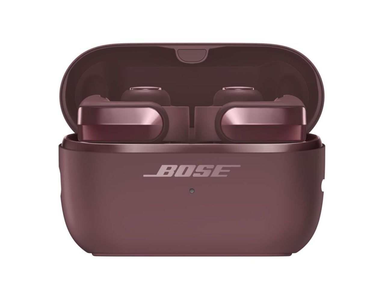
High-quality audio is the main USP, as the open-ear buds get the aptX Adaptive codec and Snapdragon Sound support. For a better calling experience, the buds benefit from the Speech Clarity tech to adjust the listening volume automatically based on the environmental noise. Of course, this is AI-driven to smoothly transition the volume step. For those who love to watch movies and shows in surround sound, there is the Cinema mode that employs Bose’ TrueSpatial tech to envelope you in a 3D sound capsule. Ultra Open Earbuds (2nd Gen) will arrive in limited-edition Olive Green, Cherry Chocolate, and Sky Pink colors for $299.
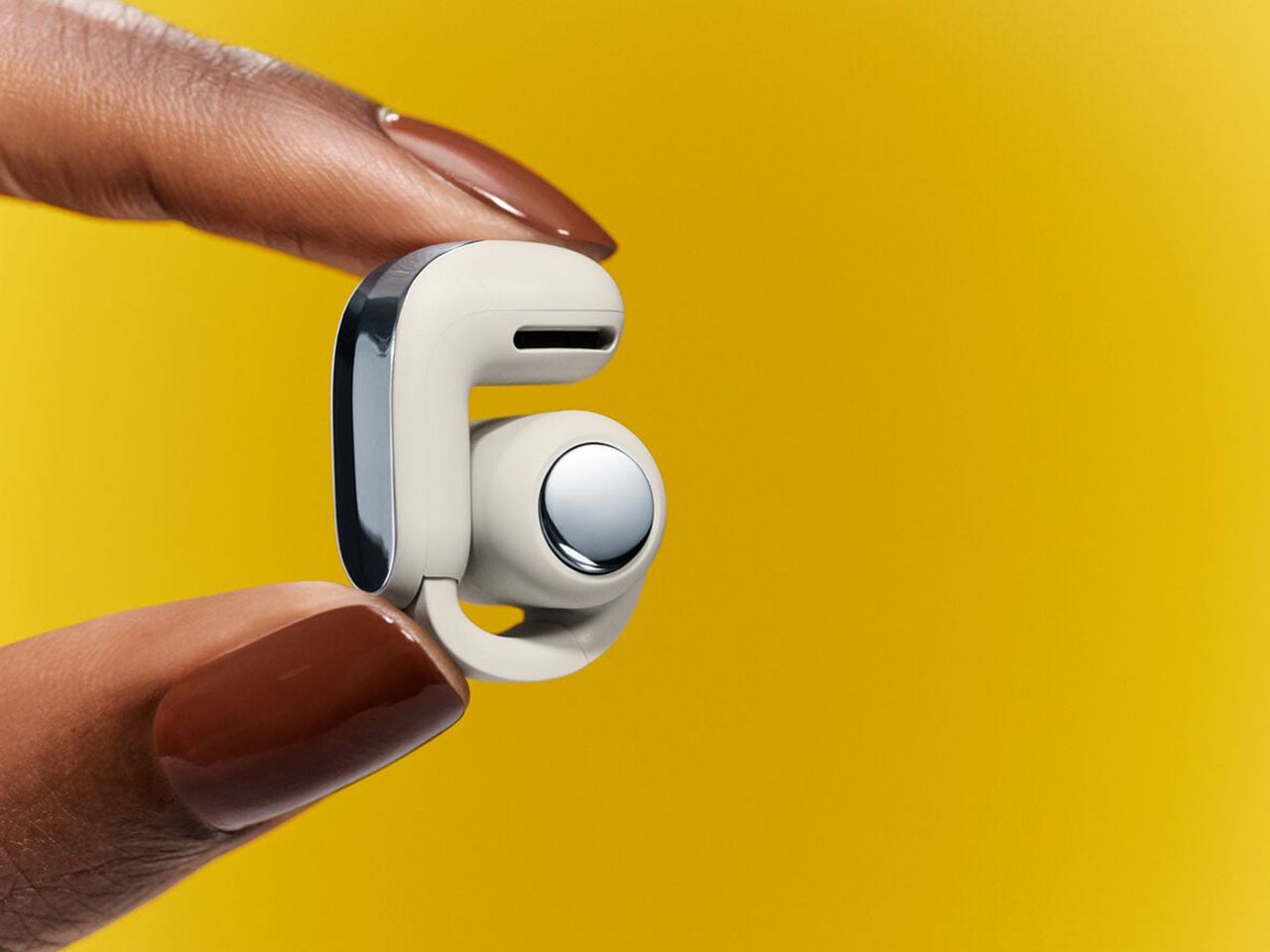
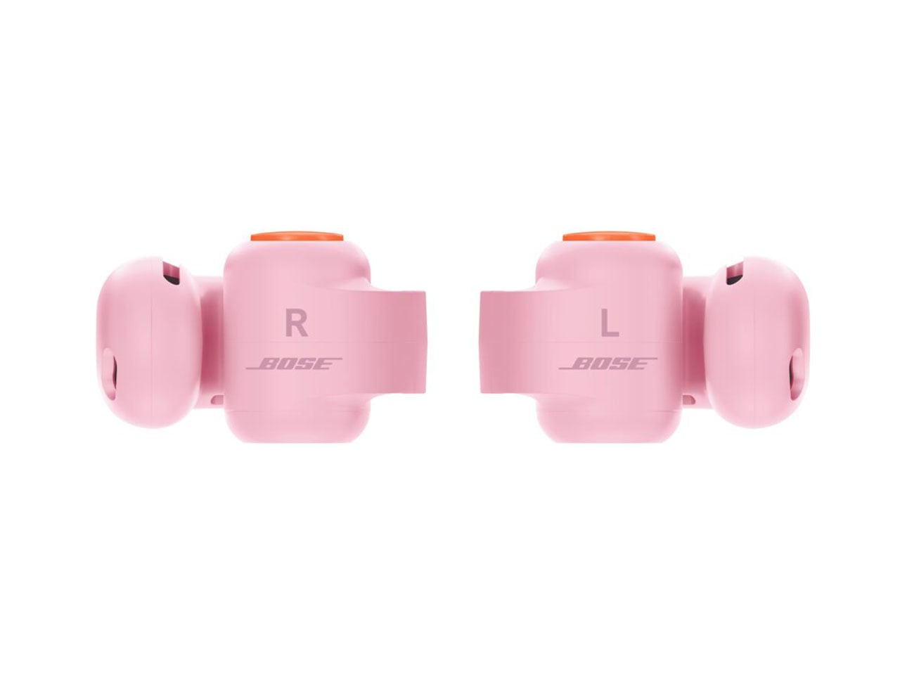
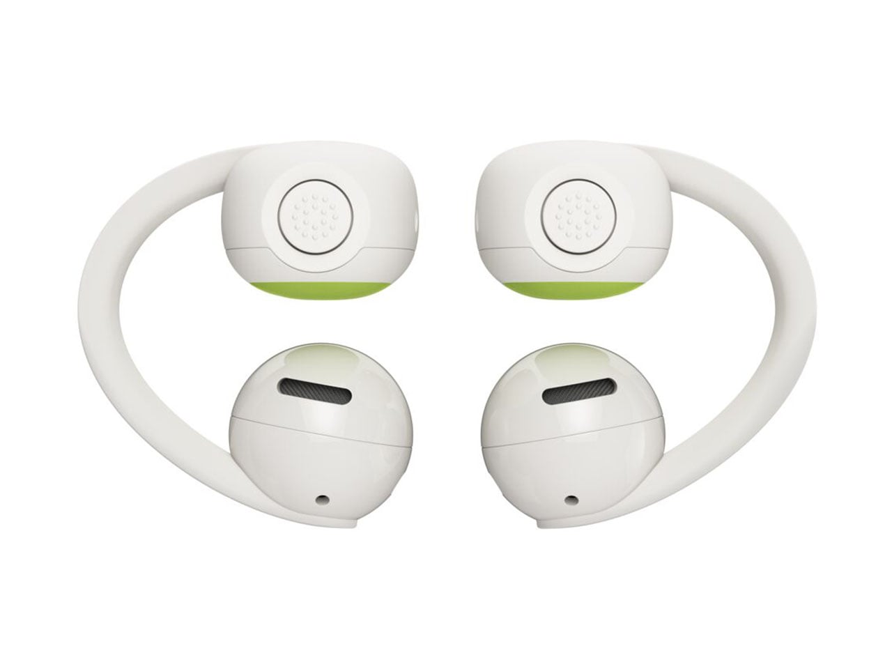
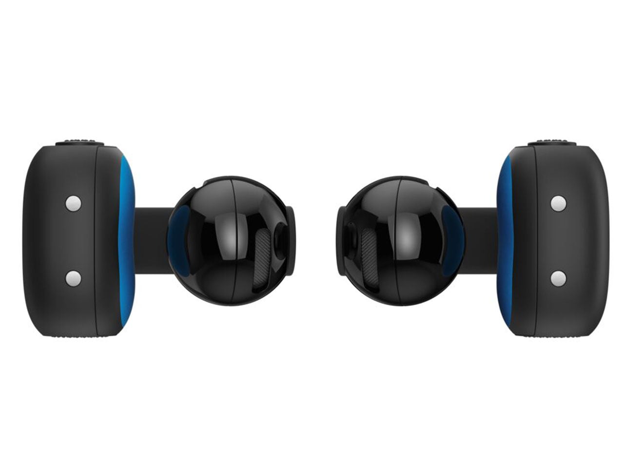
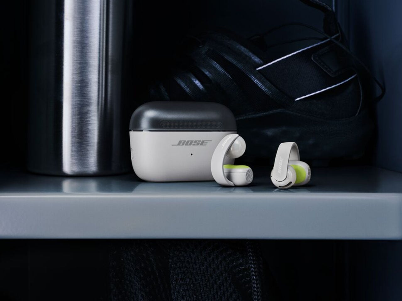
The new kid on the block is the Bose Sport Open Earbuds, which are designed for a secure fit and rated IP54 for dust and splash resistance. Compared to the big brother, these clip-on earbuds sport a more roundish hinge to stay in place even with the most rigorous activities like playing sports, running, or working out in the gym. According to Bose, the Sport Open Earbuds stay in place even with headshakes, cartwheels, and other activities.” For these open-ear wireless earbuds, Bose has opted for the tactile physical buttons since fiddling for touch controls is not practical.

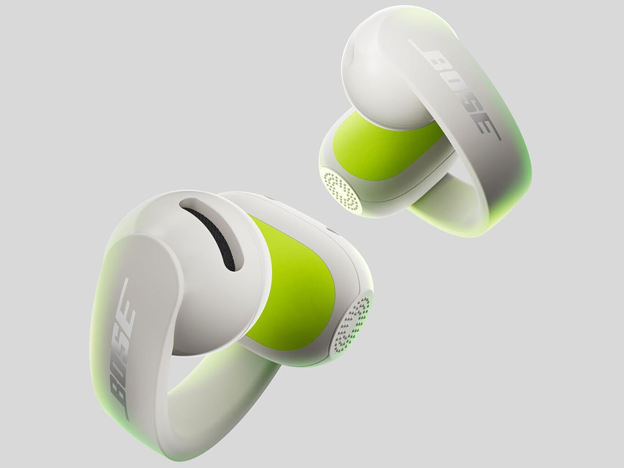
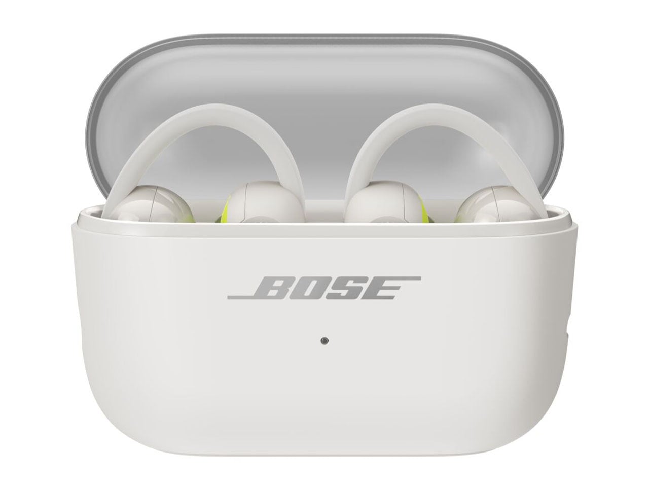
For a sportier design, the earbuds get a translucent case lid that is textured for better grip. Each of the buds weighs 10 grams for all-day wearing comfort and touts 7 hours of listening time, with 29 hours total with the case. The Sport Open Earbuds will be available for $199 in limited-edition Eucalyptus Green, along with the aforementioned color options.


The post Bose Ultra Open 2nd Gen and Sport Open spice-up the clip-on earbuds options first appeared on Yanko Design.