Pocket pens usually ask for compromise. Full size fountain pens usually ask for commitment. Lumink tries to bridge that divide with a titanium body that collapses to pocket size and unfolds into a full-length pen in seconds. The silhouette is crisp and faceted, with a restrained metallic finish that reads as precision tool before it reads as stationery. It is a concept that feels immediately relevant in a world where everyday tools are expected to be portable, tactile, and visually disciplined.
Much of its appeal comes from how clearly the design serves the use case. The faceted barrel prevents rolling and sharpens the pen’s visual identity, the milled titanium clip reinforces its EDC credentials, and the airtight chamber speaks directly to the realities of carrying a fountain pen on the move. Grade 5 titanium gives the body a durability-to-weight ratio that very few materials can match at this scale. Paired with a German Schmidt nib, the whole package feels engineered around readiness and repeat use. Those choices position Lumink at the intersection of EDC gear and serious writing instruments, which is a tighter niche than it sounds.
Designer: EyeQ
Click Here to Buy Now: $69 $99 (30% off). Hurry, only 16/120 left! Raised over $108,000.
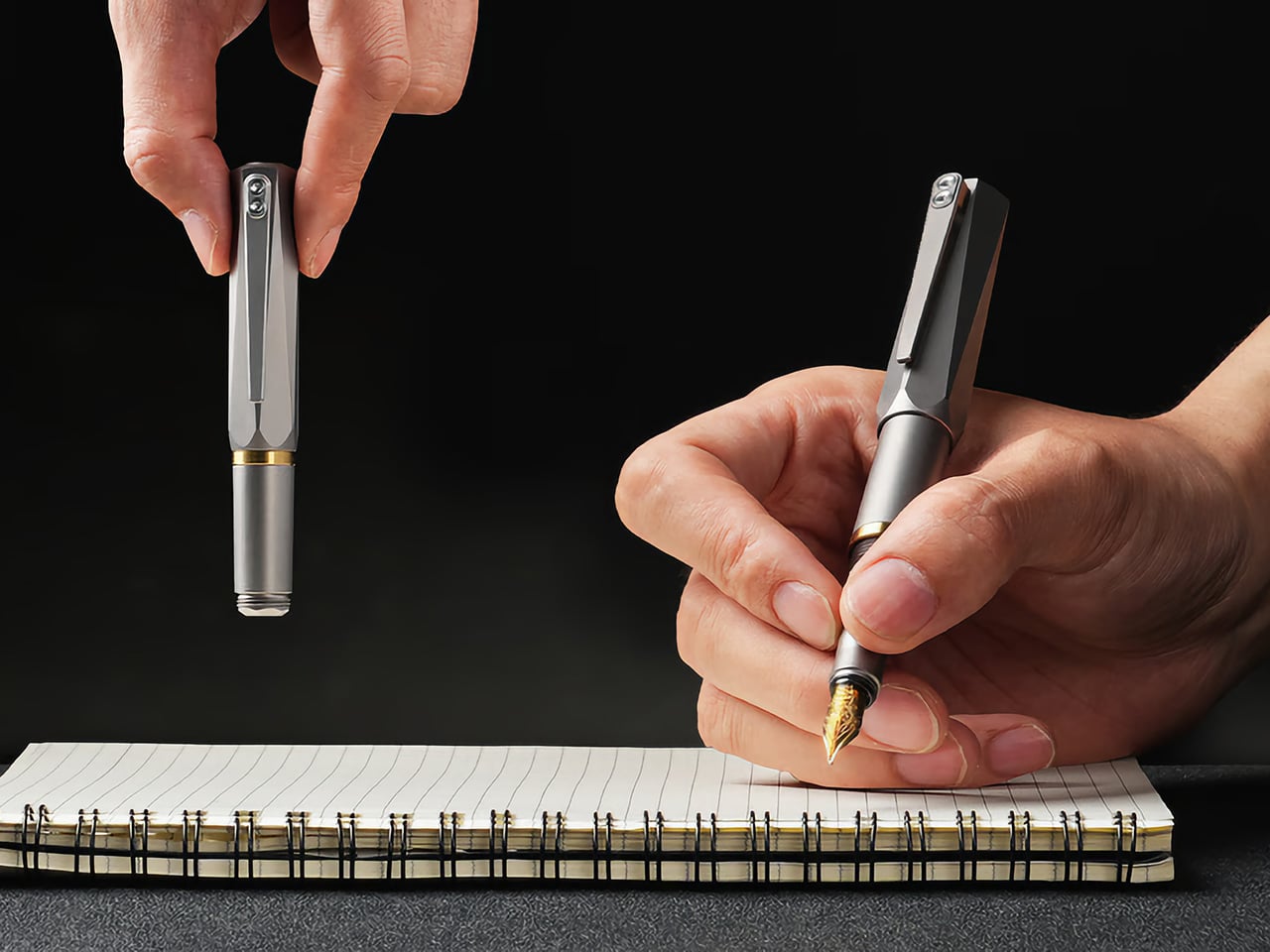
The folding mechanism itself is the main event. It’s not a simple cap that posts on the back; the rear section threads onto the pen, extending the body from a stubby 3.8 inches (96mm) to a very comfortable 5.51 inches (140mm). That pivot point, accented with a brass ring, creates a satisfying mechanical action that feels both precise and robust. This kind of transformability is what draws people to well-made gear. It turns the simple act of preparing to write into a small, tactile ritual, giving the object a character that a static pen, however beautiful, just can’t replicate.

Grade 5 titanium, formally Ti-6Al-4V, produces tensile strength around 950 MPa at a density of 4.43 g/cm3. For non-nerds, it means that it’s harder than steel, while being roughly 40-45% lighter. Aerospace and orthopedic implant manufacturers rely on the same alloy, which tells you the performance tier. Applied to a pen, that combination should produce a carry object that feels substantive in hand without adding real burden to a pocket. Besides, Aluminum dents easily, Titanium resists any form of damage. EyeQ says the Lumink should last you a 100 years. The material, the mechanism, the craftsmanship, it’s all designed to withstand a century of sustained use.


Carrying a fountain pen daily has historically meant accepting certain risks: leaked ink, dried-out nibs, and the grim experience of a pressure-driven blowout mid-flight. Lumink’s threaded isolation system addresses those by sealing the nib section from the reservoir during transport, creating an airtight chamber. The logic is sound: threaded seals operate in environments far more demanding than a shirt pocket. The entire pen is made from metal – not a single plastic part, no glue, nothing that even hints at cost-cutting.


Even the clip uses metal, and features a construction that’s about as carefully considered as the design itself. The clip sits perfectly straight, aligning vertically with the pen to the point of obsessiveness. The reason? Absolute balance. The pen shouldn’t look or feel un-balanced – it should project the confidence that it expects from you, as you use it to write or sign documents. A ball-shaped ceramic insert in the pen clip holds onto book covers, pads, or shirt pockets confidently too, without damaging anything. Slide it into your pocket and the ceramic insert glides smoothly along the fabric, without creasing or damaging it. Meanwhile the clip itself is made from the same titanium as the pen, which means it’ll never bend, warp, or break.
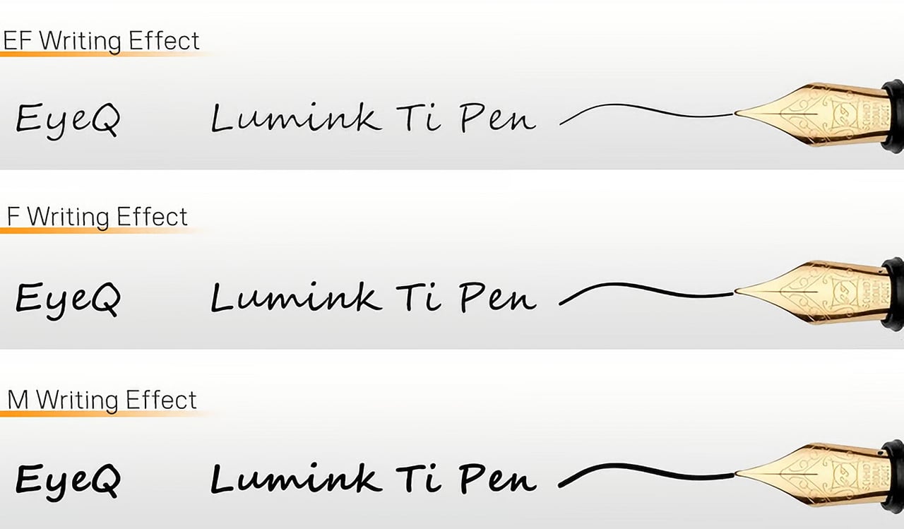
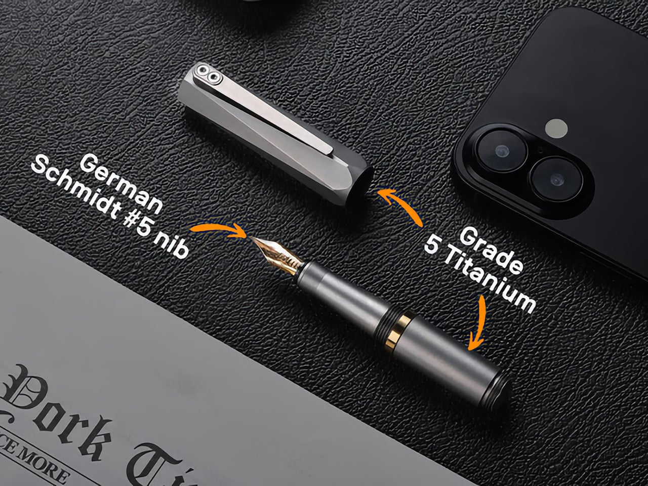
A fancy body is nothing if the writing experience falls flat, so anchoring the pen with a German Schmidt nib was a solid decision. Schmidt is a known quantity in the pen world, a reliable manufacturer whose nibs are used in countless pens far more expensive than this one. It’s the equivalent of a boutique car builder using a proven, well-regarded engine. The nibs are standard, replaceable, and available independently… which means even after a 100 years, you should find yourself with access to more nibs that you can swap in or out whenever you need. The pen’s designed to resist aging.


The three available finishes each cater to a different aesthetic: a raw Sandblasted Titanium for purists, a warm Anodized Gold, and a stealthy PVD Matte Black. The Physical Vapor Deposition coating on the black variant is notably harder than the titanium itself, offering serious scratch resistance, while the sandblasted finish is designed to develop a natural patina with use over time. Early bird pledge tiers started around the $65 mark. You are, after all, paying for Grade 5 Titanium along with Schmidt refills, beyond just the fact that this pen is designed and engineered to perfection. The $65 package includes the pen itself, the Schmidt nib, and a Schneider ink cartridge. You could spring extra for custom engraving, or opt for EyeQ’s leather sleeve for the pen. Personally, a pen that gorgeous shouldn’t be sheathed. It should be flaunted, fidgeted with, and frankly, turned into a heirloom for the next few generations.
Click Here to Buy Now: $69 $99 (30% off). Hurry, only 16/120 left! Raised over $108,000.
The post The EDC Pen Reinvented: Lumink’s Titanium Fountain Pen Folds, Writes, and Lasts a Lifetime first appeared on Yanko Design.