Happy Mobile Monday! We’re thrilled you’ve taken the time to visit us today. As we look forward to tomorrow’s Made by Google event, excitement fills the air for tech enthusiasts and Google fans alike. The tech giant plans to unveil its latest lineup of Pixel products, which promise to dazzle with hardware specs and redefine user interaction through cutting-edge software and AI enhancements. This year, Google aims to enhance how its hardware works with intelligent software, creating experiences beyond basic functionality.
Designer: Google
Tomorrow, Google’s Mountain View campus will buzz with activity as the company reveals the Pixel 9 series, Pixel Buds Pro 2, and the Pixel Watch 3. Each device is expected to incorporate Google’s latest innovations, showcasing the company’s dedication to improving the user experience through design and intelligent software. However, the real star of the show might be Google’s AI capabilities, integrated across these devices to create a seamless and intuitive experience.
A New Era of Pixel Phones
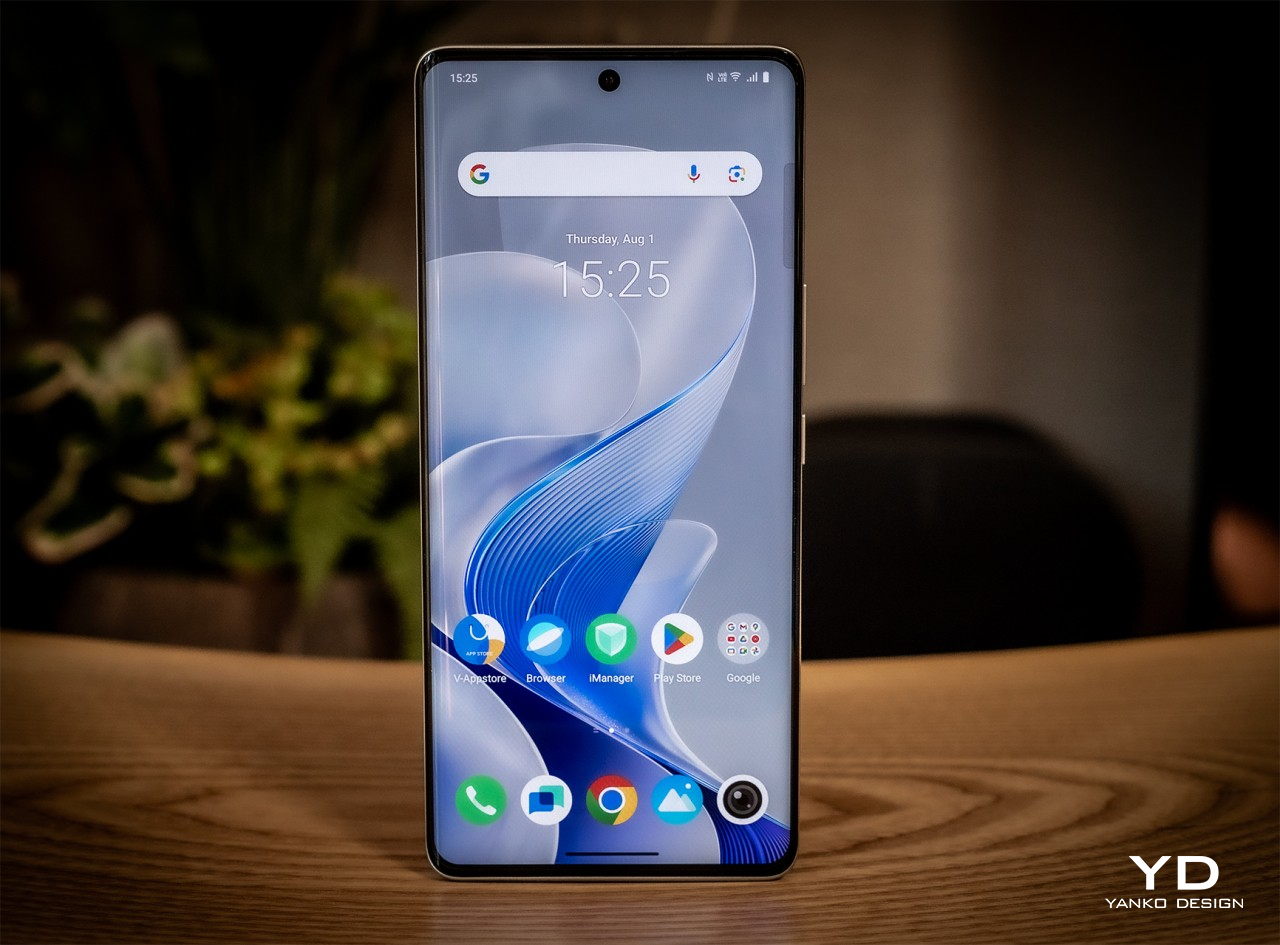
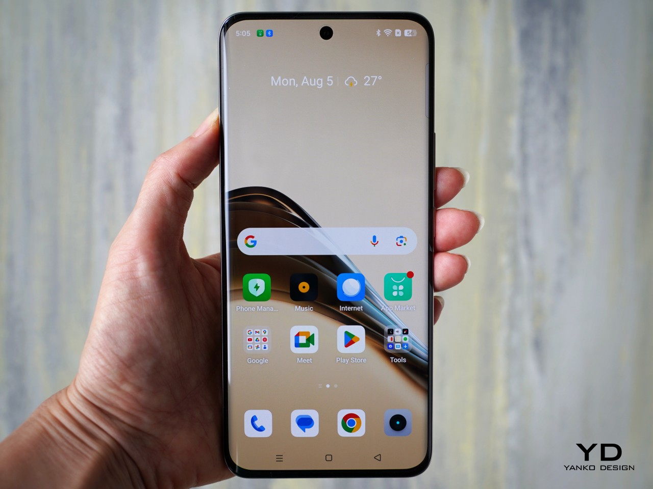
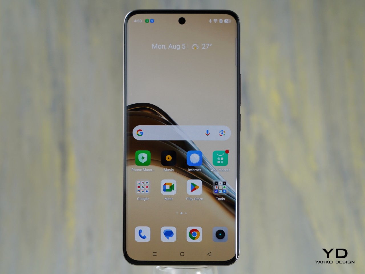
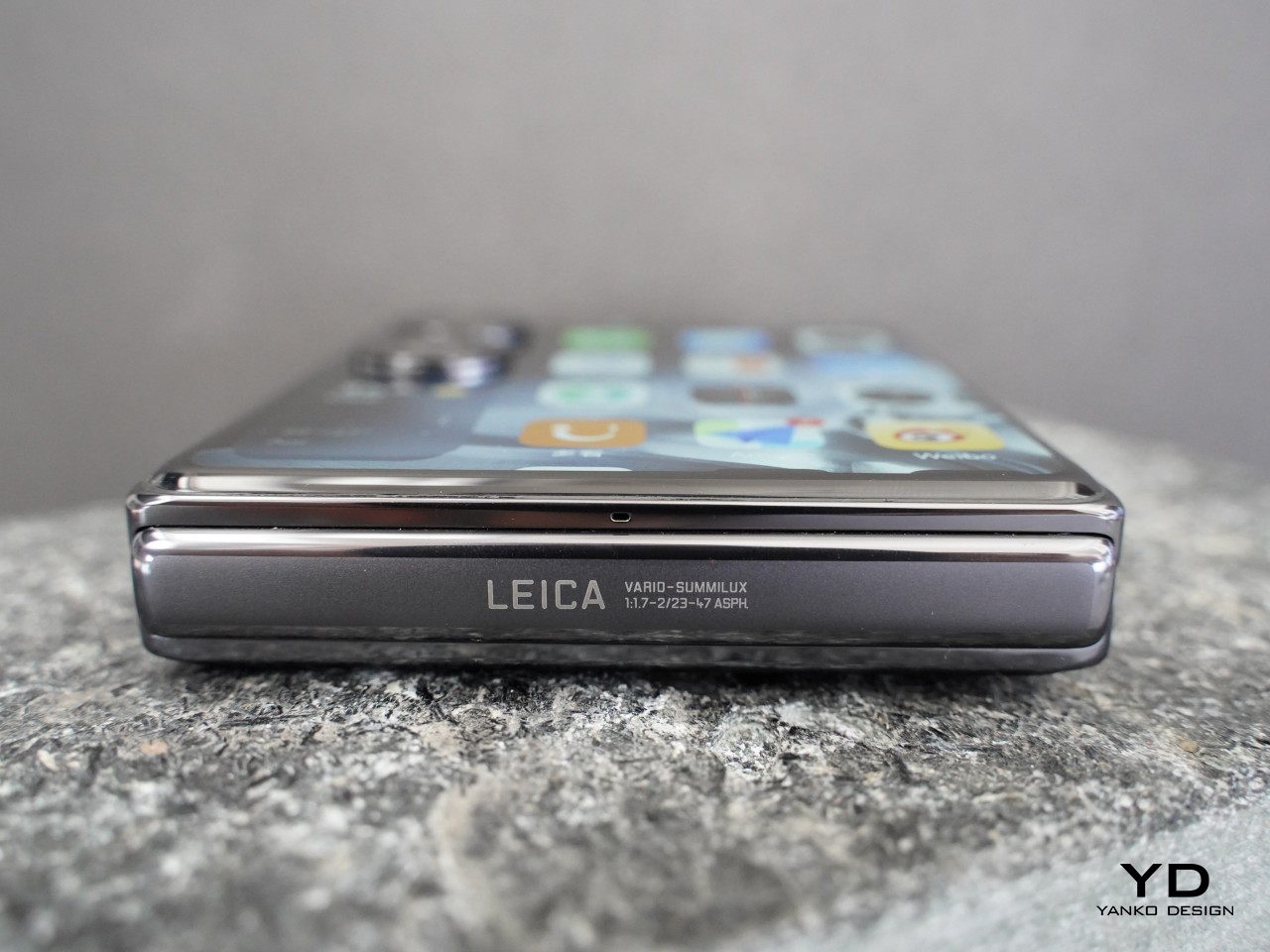
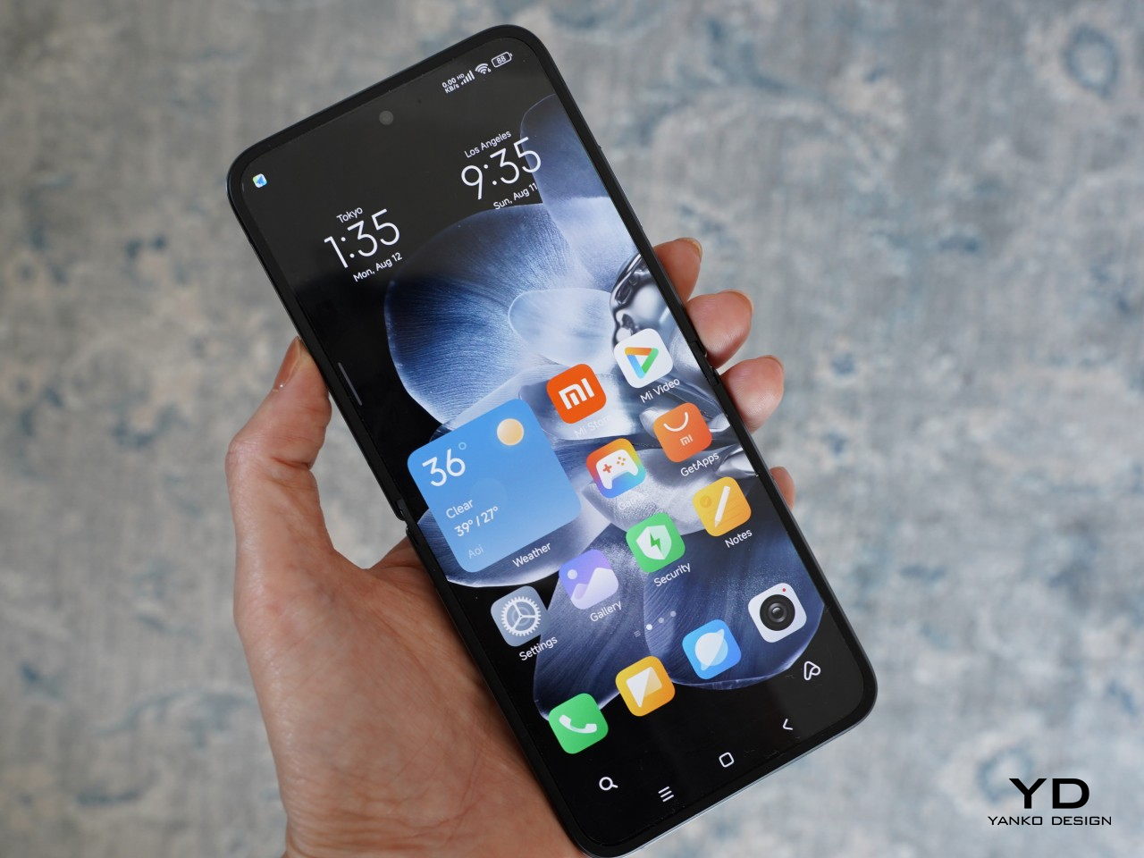
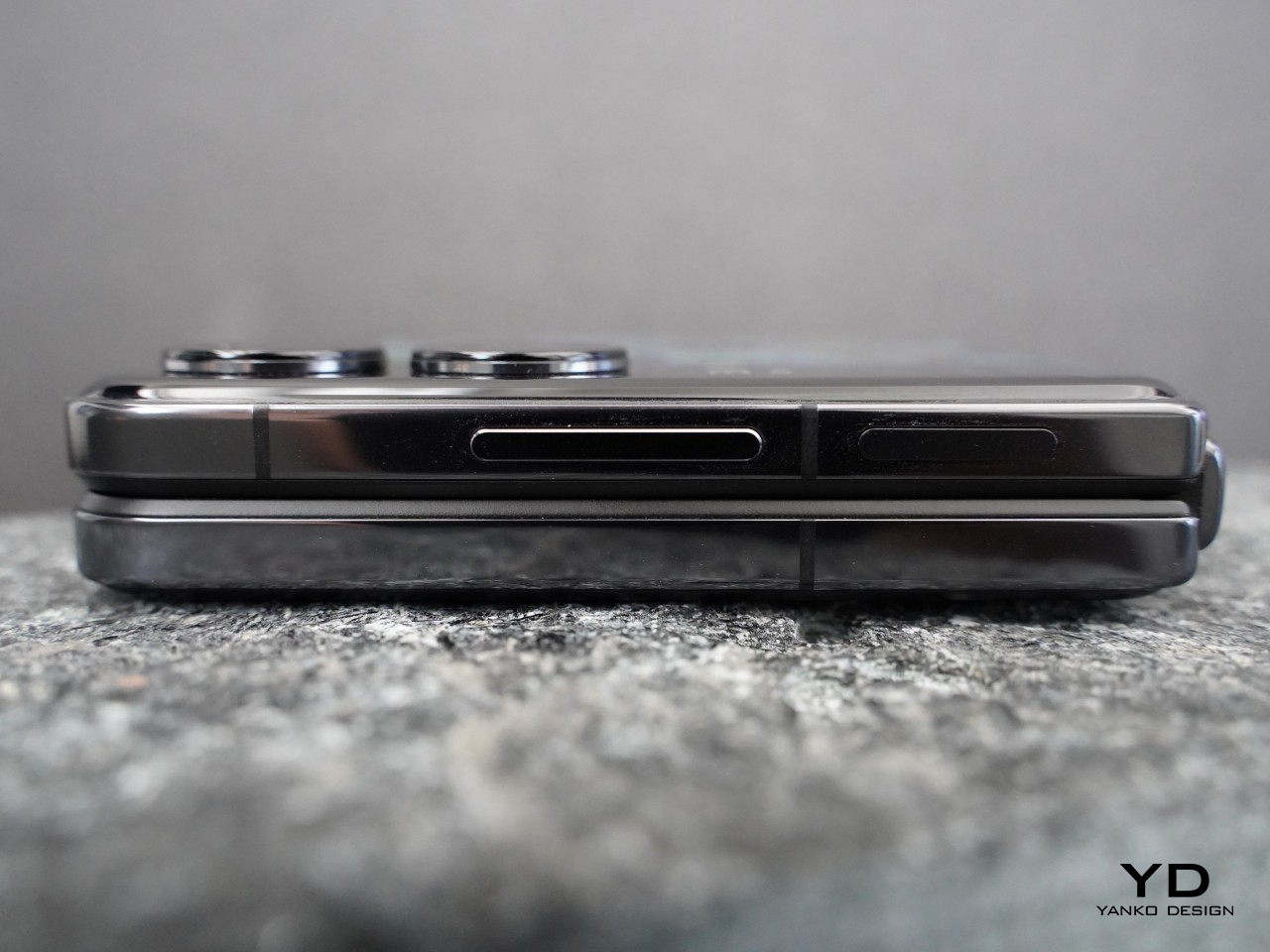
The Pixel 9 series will likely be the centerpiece of tomorrow’s announcements. This year’s lineup includes the Pixel 9, Pixel 9 Pro, Pixel 9 Pro XL, and the Pixel 9 Pro Fold, all powered by the latest Tensor G4 chip. These phones promise impressive specs and deeper integration with Google’s AI, transforming how users interact with their devices. Features like enhanced photo processing, real-time language translation, and AI-powered predictive text are just the beginning.
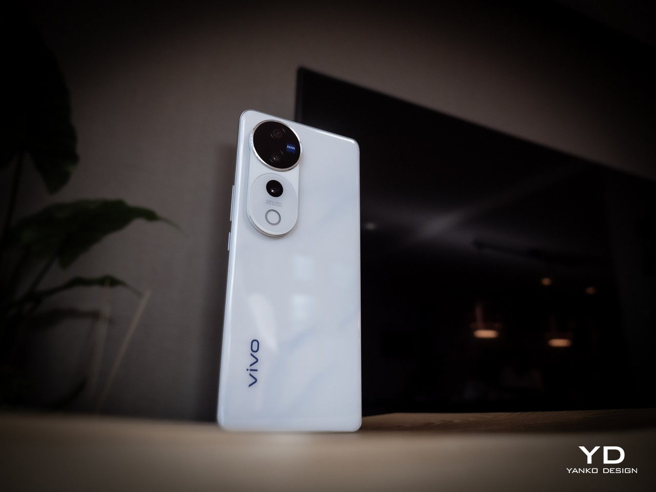
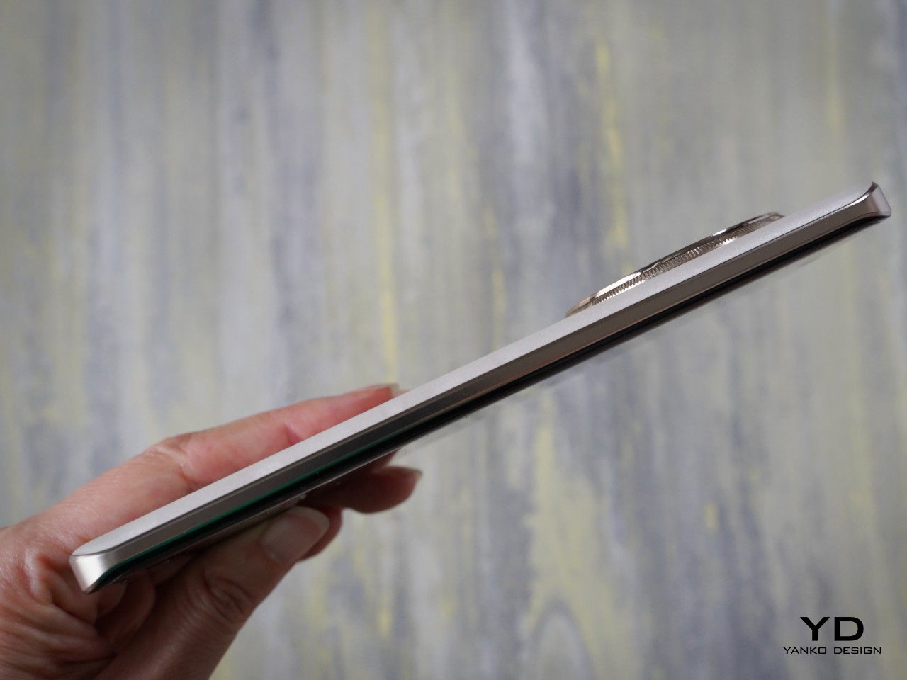
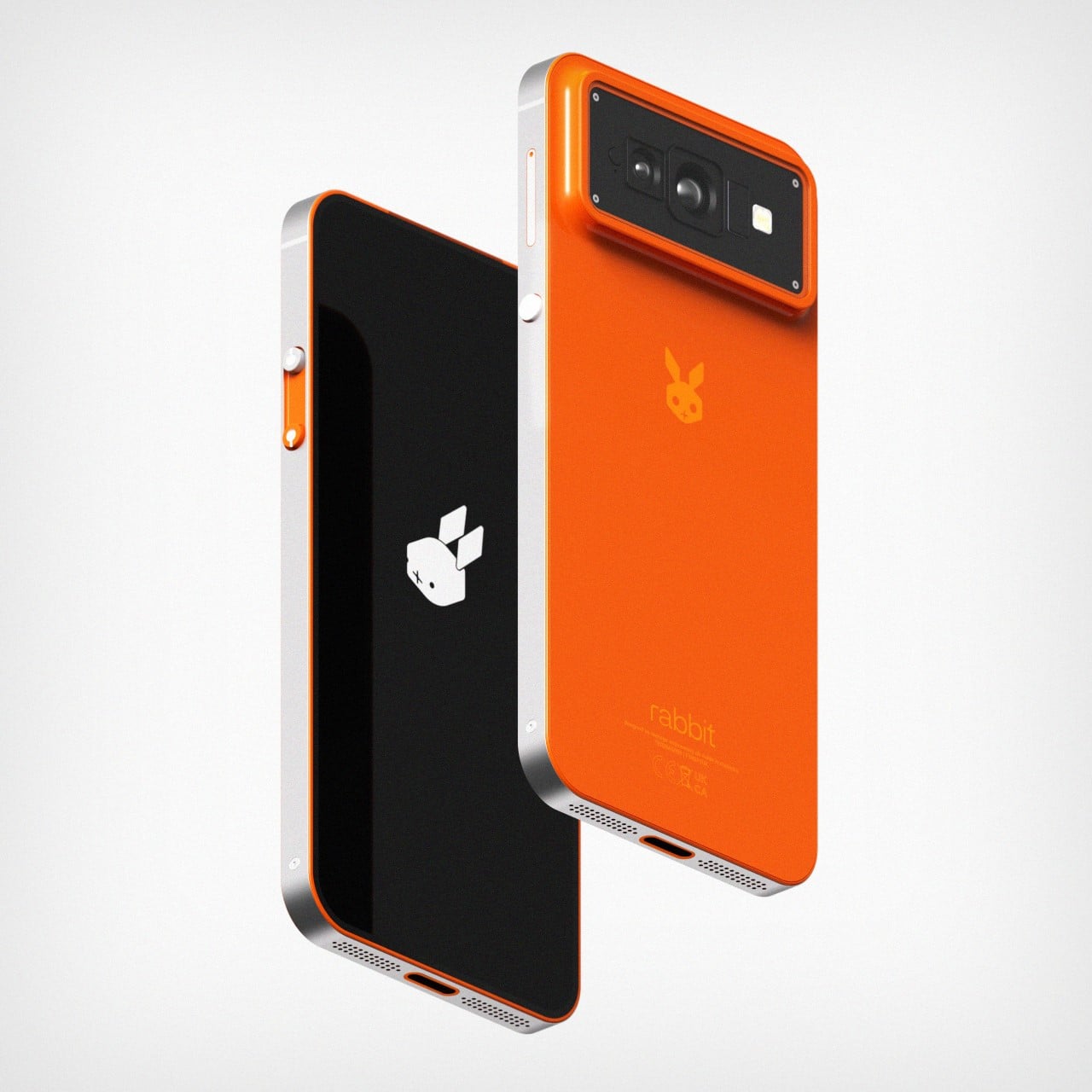
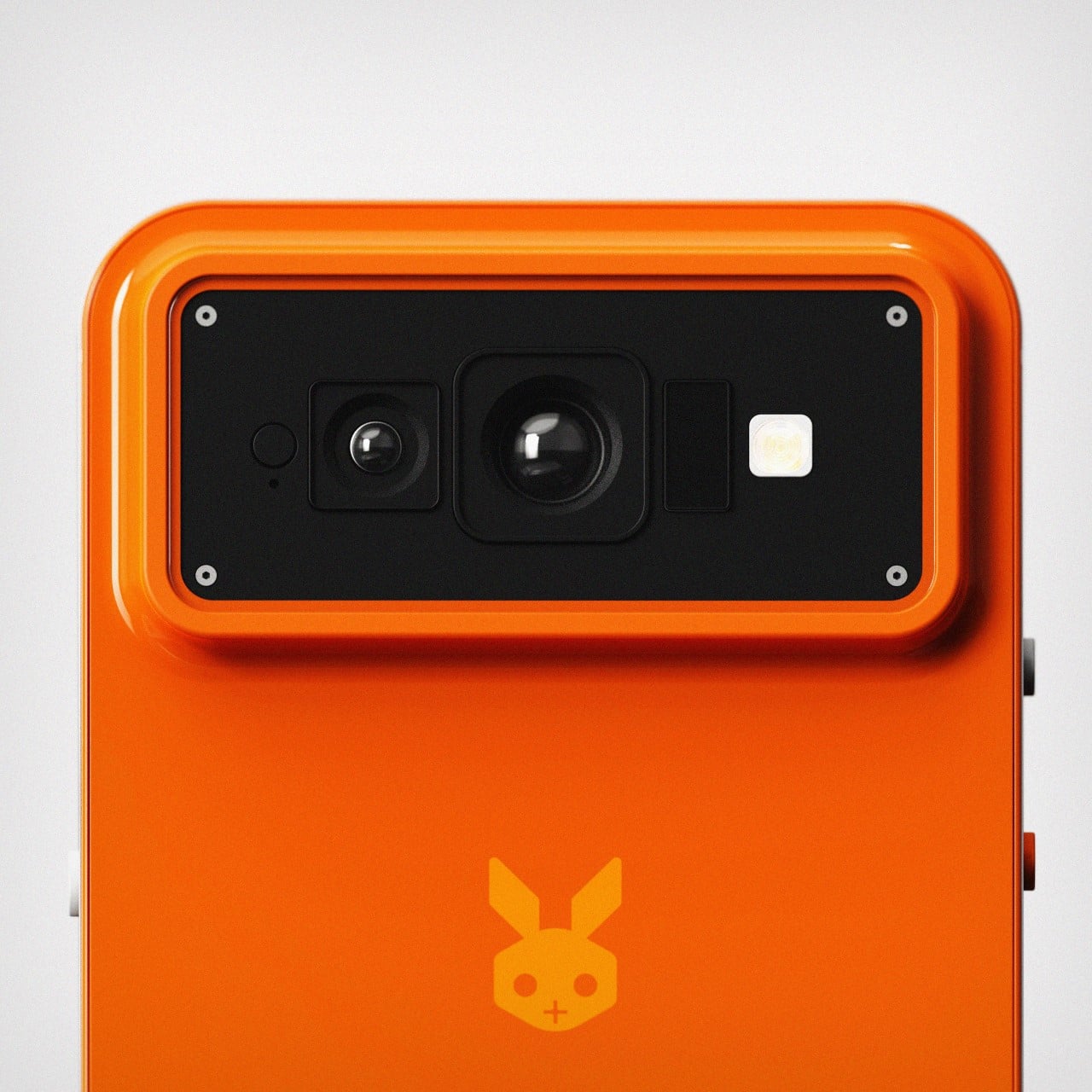
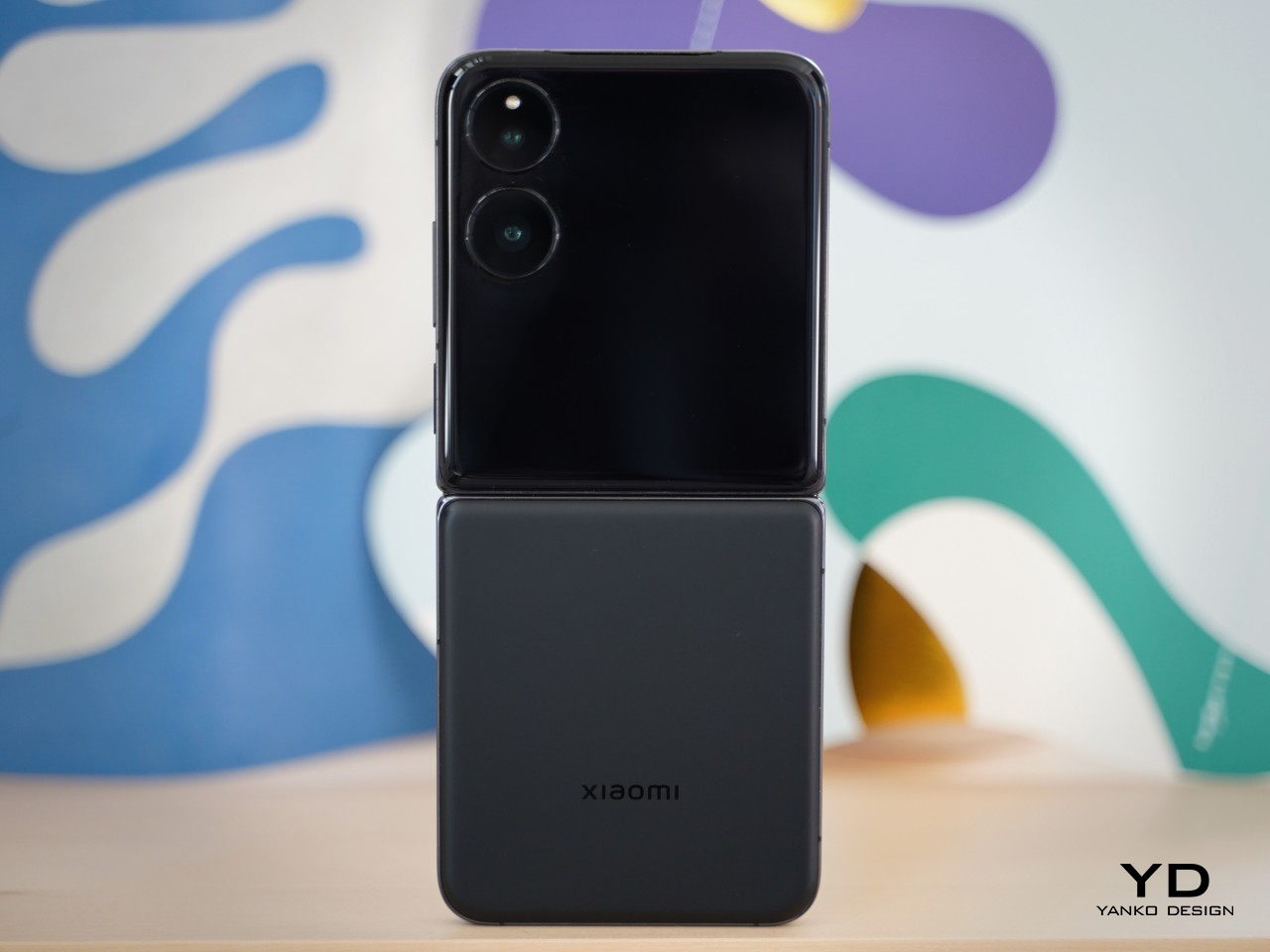
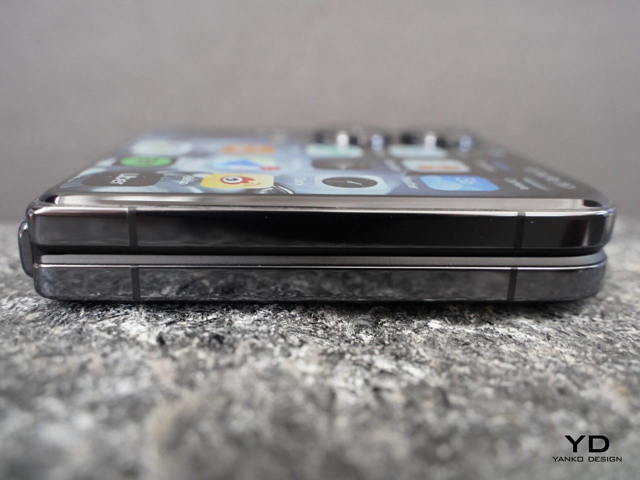
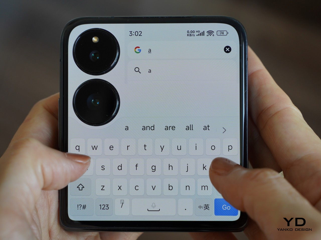
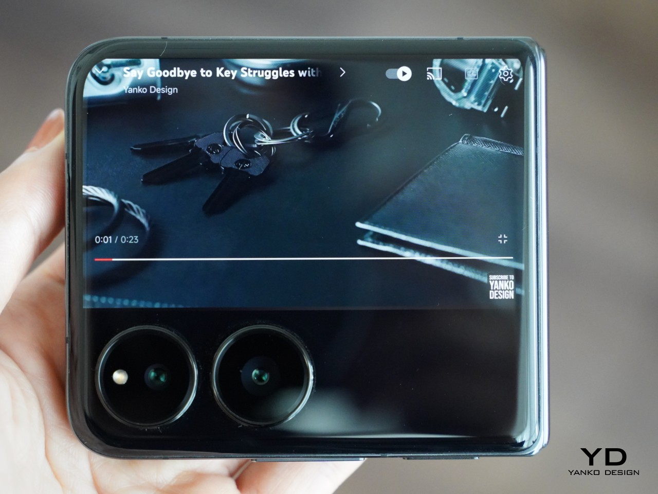
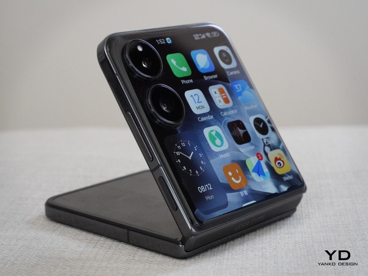
Pixel 9 Pro Fold
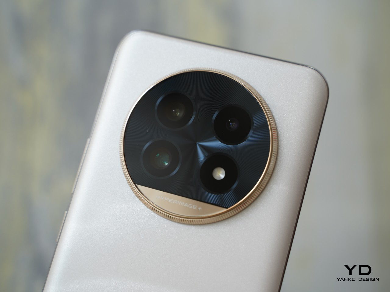
The Pixel 9 and its Pro variants are expected to come with advanced camera systems, making photography a key focus. Rumors suggest improvements in low-light performance, better optical zoom, and new software features that leverage AI to improve image quality and editing capabilities. The Pixel 9 Pro Fold, a significant leap from the previous Pixel Fold, is expected to offer enhanced multitasking capabilities with its larger screen real estate, making it ideal for power users.
Pixel 9 Pro
Next-Level Audio with Pixel Buds Pro 2
Google’s new Pixel Buds Pro 2, debuting at the Made by Google event, promises to be a noteworthy addition to the Pixel ecosystem. According to numerous leaks and rumors, the earbuds will feature wings for a secure grip, maintaining the stemless aesthetic of the current generation, unlike the Galaxy Buds 3 Pro, which has adopted a stem design similar to AirPods. The Pixel Buds Pro 2 display unit has already appeared at a Reddit user’s store, offering a glimpse into the upcoming model.
Google Pixel Buds Pro 2
The new earbuds will be a subtle upgrade to the previous version, with improvements that keep them competitive with options like the Sony WF-1000XM5 and Bose QuietComfort Earbuds II. They will be smaller than the current Pro model, making them comfortable for those with small ears, and the wingtip is slightly larger for a more secure fit. This new design will also be color-matched with options including Raspberry, Mojito, Porcelain, and Haze.
![]()
Additionally, the case will be smaller, making it easier to carry in a pocket. A small speaker mesh at the bottom likely supports the Find My Device feature, ensuring you can locate them quickly if misplaced. These earbuds are expected to integrate seamlessly with Pixel devices, enhancing features like real-time language translation and hands-free control via Google Assistant. The new Tensor A1 audio chip will double the active noise cancellation capabilities, providing a significant upgrade in audio quality for users who need to block out ambient noise.
![]()
Wearable Tech: Pixel Watch 3
The Pixel Watch 3 will also debut, offering users a refined wearable experience. This iteration is rumored to introduce a larger XL model to accommodate users who prefer a bigger display. The watch is expected to feature a brighter display, improved battery life, and ultra-wideband (UWB) technology support, enhancing features like precise device tracking.
![]()
The Pixel Watch 3 aims to build on its predecessor’s health and fitness capabilities, possibly integrating new fitness features developed in tandem with the Pixel Buds Pro 2. Users can look forward to a more comprehensive suite of health monitoring tools, making it a valuable companion for those who prioritize wellness.
![]()
Google AI: The Real Game Changers
While the hardware is undeniably exciting, the software and AI advancements will steal the show. Google plans to introduce Android 15, which includes features designed to enhance security and privacy, such as Private Space and Theft Detection Lock. These features highlight Google’s focus on safeguarding user data while offering new functionalities that make devices smarter and more responsive.

Google’s AI initiative, Gemini, will be showcased with new tools that integrate seamlessly into the Pixel ecosystem. These tools, branded under “Google AI,” will include innovative features like “Add Me,” which allows users to add faces to group photos, and “Pixel Screenshots,” which extract information from screenshots. Integrating AI across devices will create a unified user experience, allowing smoother transitions between tasks and more intuitive interactions.
As Google continues to push the boundaries of what’s possible with AI, these advancements are set to redefine user expectations and establish new benchmarks in the industry. The focus on AI reflects a broader trend in tech, where companies increasingly leverage intelligent systems to deliver more personalized and efficient services.
Join Us for the Excitement
The Made by Google event is an exciting moment for the company as it showcases its latest technology. With the launch of the Pixel 9 series, Pixel Buds Pro 2, and Pixel Watch 3, Google is introducing products designed to make everyday life easier and more connected. As we look forward to these announcements, it’s evident that the future of technology is about creating devices and software that work together effortlessly to improve our daily experiences.
Join us to see these exciting new products up close. The event will be streamed live on Google’s official website and YouTube channel at 10 a.m. PST (1 p.m. EST) on August 13. Yanko Design will be covering the event, bringing you the latest news and insights on Google’s innovations. Don’t miss the opportunity to watch how Google is shaping the future of technology.
The post Made by Google Event 2024: Pixel 9 Fold, Buds Pro 2, and Watch 3 Launch Details first appeared on Yanko Design.


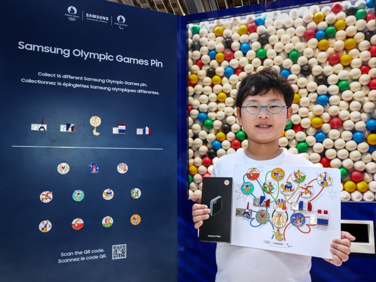
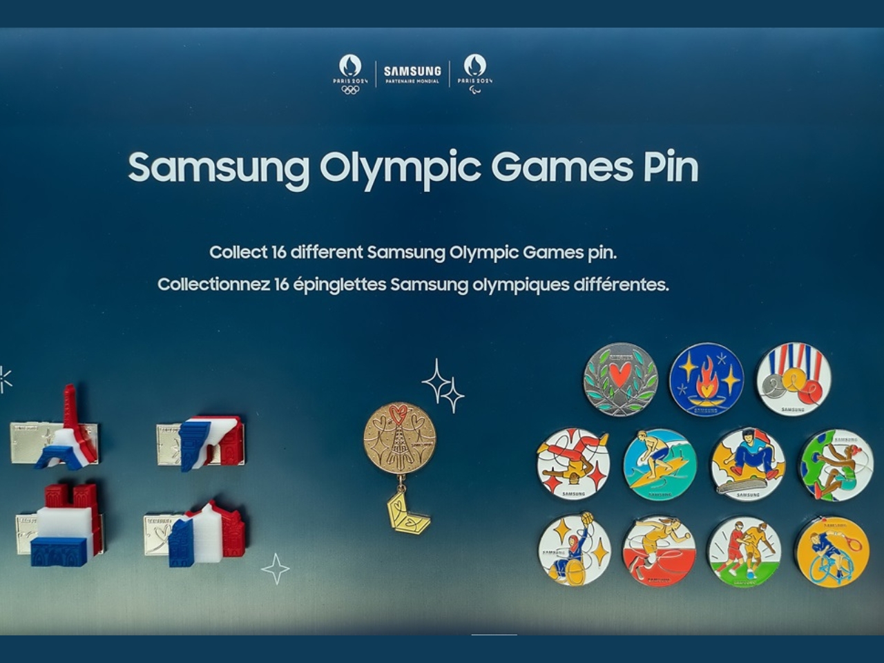
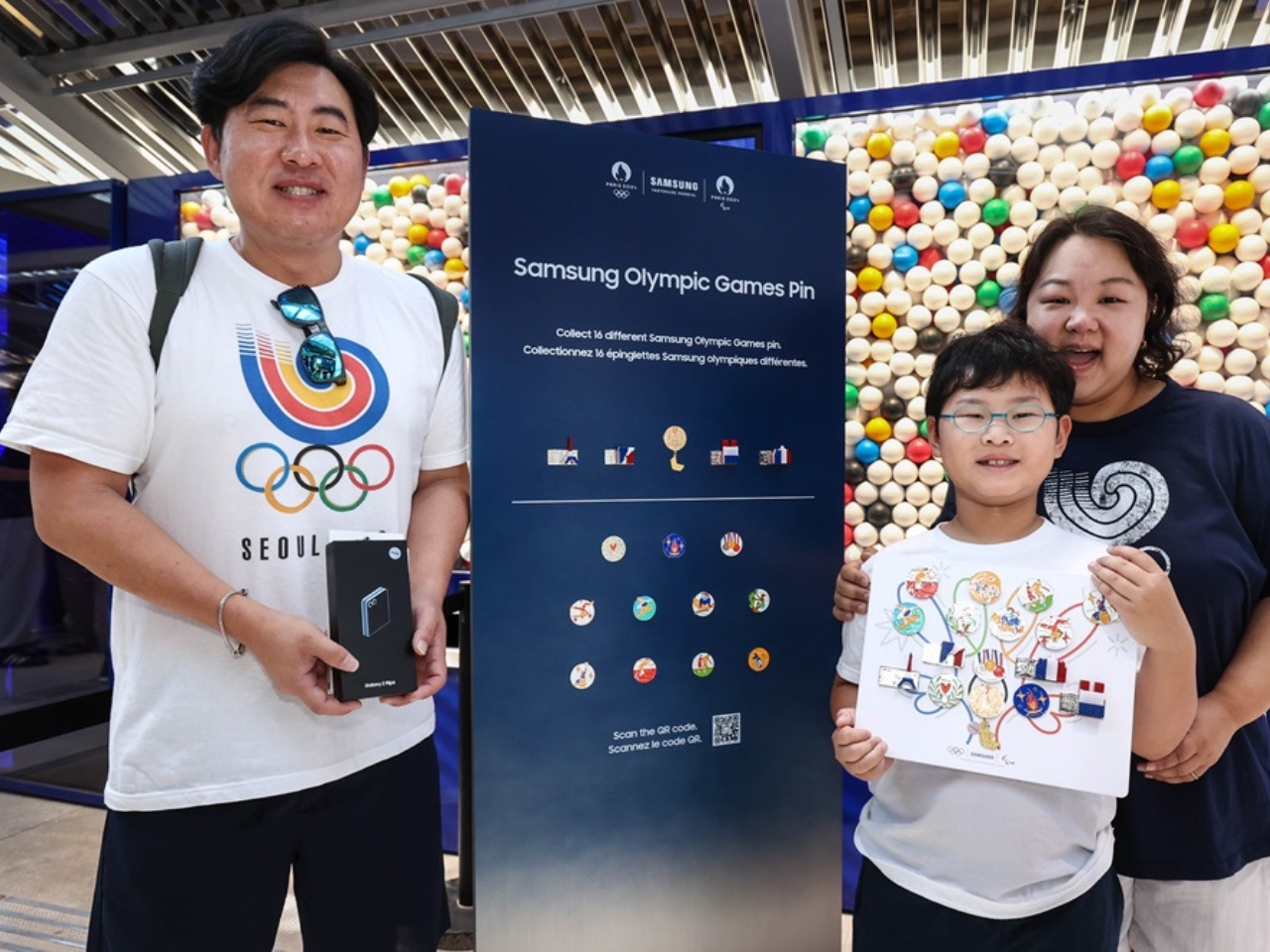
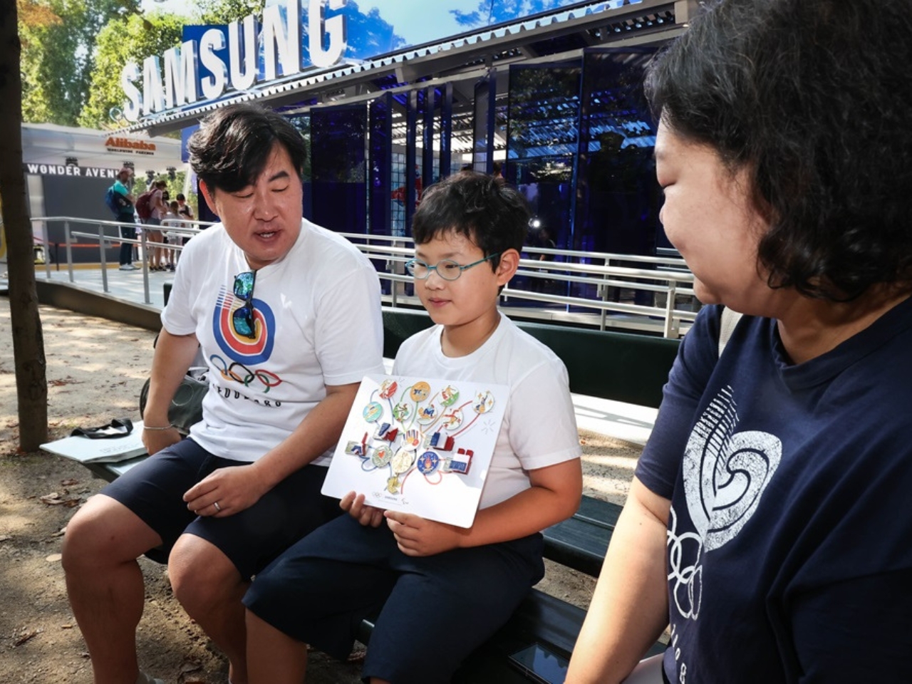
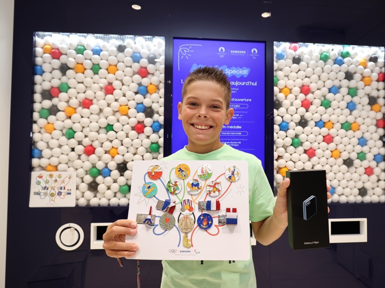
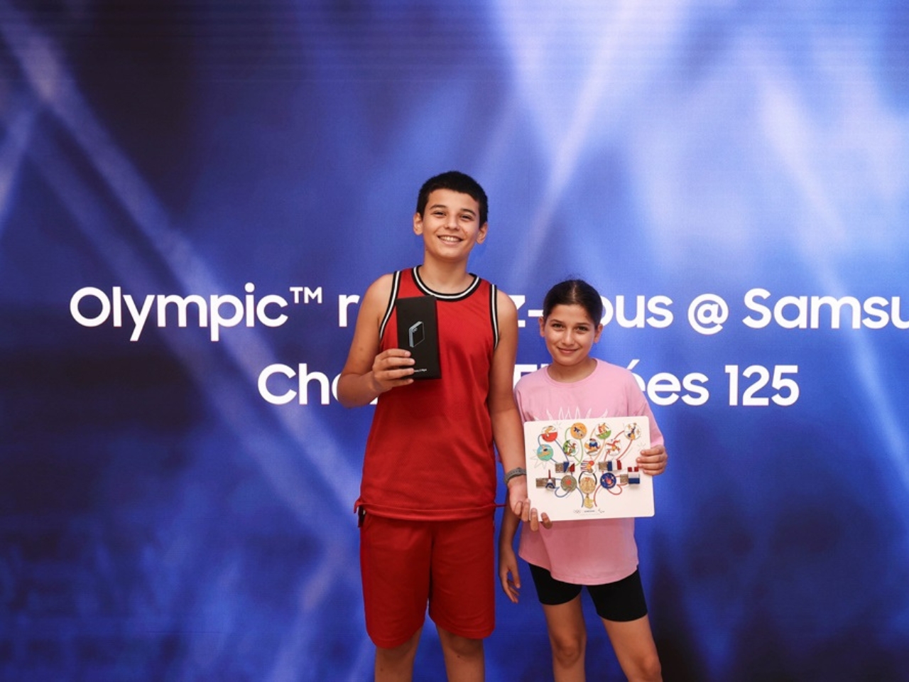
 rendezvous @ Samsung pop-up experiences all over the city. You can even get the chance to get the extremely rare Golden Pin in order to become an official Samsung Olympic Games Pin Master. If ever you’re in Paris, you have until September 8 to play this challenge.