Most Mother’s Day gifts end up in a drawer for three weeks and in a donation box by June. The ones that stay are objects she reaches for without thinking, things that have quietly made themselves at home in her routines. Japanese design has a particular talent for producing exactly those objects. Not because they announce themselves loudly, but because they solve something real with a precision and restraint that earns permanent shelf space.
The five objects here span the kitchen, the bathroom, the bedroom, the living room, and the study. Each was chosen because it carries real design lineage, performs a genuine daily function, and looks far better than anything it currently replaces. None of them requires an explanation or an instruction video. They settle into a home quietly and, over time, make it feel like they were always supposed to be there.
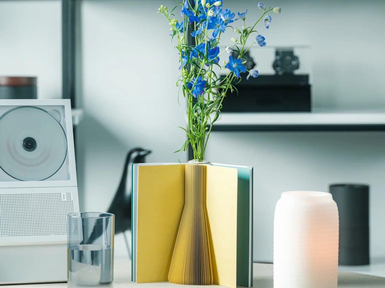
1. Pop-up Book Vase
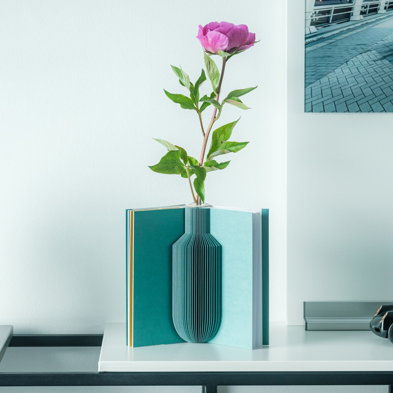

A vase that folds flat when it’s done. That’s the entire argument for the Pop-up Book Vase, and it holds up completely. Open the cover and a three-dimensional paper vessel rises from the page, engineered from 100% natural pulp with a water-resistant coating sturdy enough to hold fresh stems without collapsing. Three different pop-up designs sit on successive pages, so she can change the vase’s silhouette simply by turning to the next one. When the flowers are done, it closes into a book and takes up no room at all.
What makes it earn a permanent place rather than rotate out is the spatial intelligence built into its form. Most vases compete for the shelf space they occupy. This one eliminates that problem by storing flat between uses. Flip the book upside down, and the arrangement transforms, offering a fresh perspective on the same stems. For a home where every surface is already carefully considered, that kind of versatility, without requiring any additional objects, is the kind of thoughtful gift that stays.
Click Here to Buy Now: $45.00
What We Like
- Three built-in pop-up designs offer genuine variety without ever needing a second or third vessel taking up additional shelf space
- It stores completely flat when not in use, a spatial advantage that no ceramic or glass vase can come close to matching
What We Dislike
- The water-resistant coating has limits, and prolonged exposure to water will eventually degrade the paper structure through repeated use
- The whimsical book form may not suit interiors that lean toward strictly raw textures, earth tones, and serious material palettes
2. Hasami Porcelain Mug in Natural

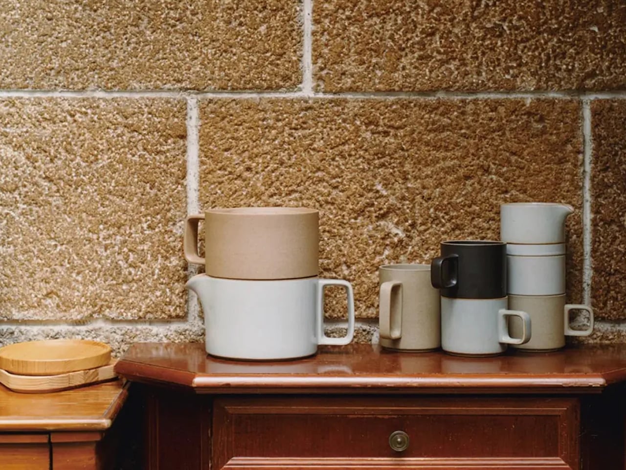
Hasami has produced porcelain continuously since the 16th century, and the Natural mug is the version of that tradition that shows its workings most honestly. Made in Nagasaki Prefecture from a proprietary blend of crushed Amakusa stone and porcelain clay, the exterior is left completely unglazed, giving it a dry, matte surface that warms to the hand quickly and develops a natural patina with regular use. A subtle outward curve at the rim directs liquid cleanly and eliminates the flat-edged drip that straight cylindrical mugs produce without thinking about it. At $32, it is the rare object that costs less than it looks.
What makes it a permanent fixture rather than a seasonal one is how it ages. Most mugs look their best the day they arrive and quietly decline from there. This one moves in the other direction, its unglazed surface accumulating character through daily use, the way good leather or raw wood does. Despite the bare finish, the Amakusa clay body is fired to withstand repeated machine washing and microwave use without surface degradation — a real engineering decision that removes the usual compromise of unglazed ceramics entirely. It stacks flush with the broader Hasami range, so it can anchor a set that grows over years without ever looking mismatched.
What We Like
- The unglazed matte surface develops a genuine patina with daily use, meaning this mug becomes more personal over time rather than simply wearing out
- Microwave and dishwasher safe despite the bare clay finish, which removes the hand-washing compromise that usually comes with unglazed ceramics
What We Dislike
- The unglazed interior is food-safe but absorbs flavor over time, which may not suit anyone who switches frequently between coffee and strongly scented teas
- The natural matte surface marks more readily than a glazed alternative, requiring more mindful handling around oils and pigmented liquids
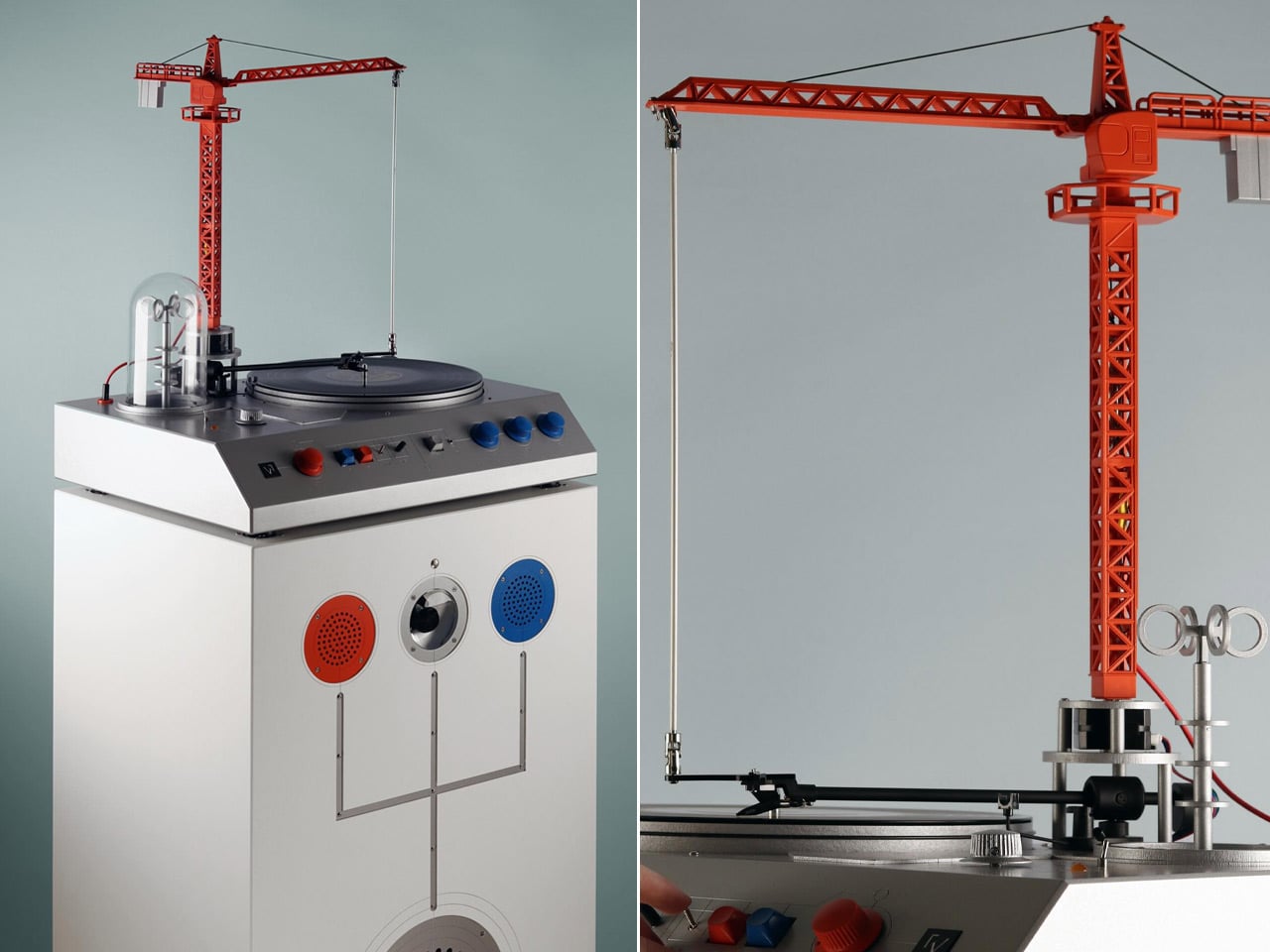
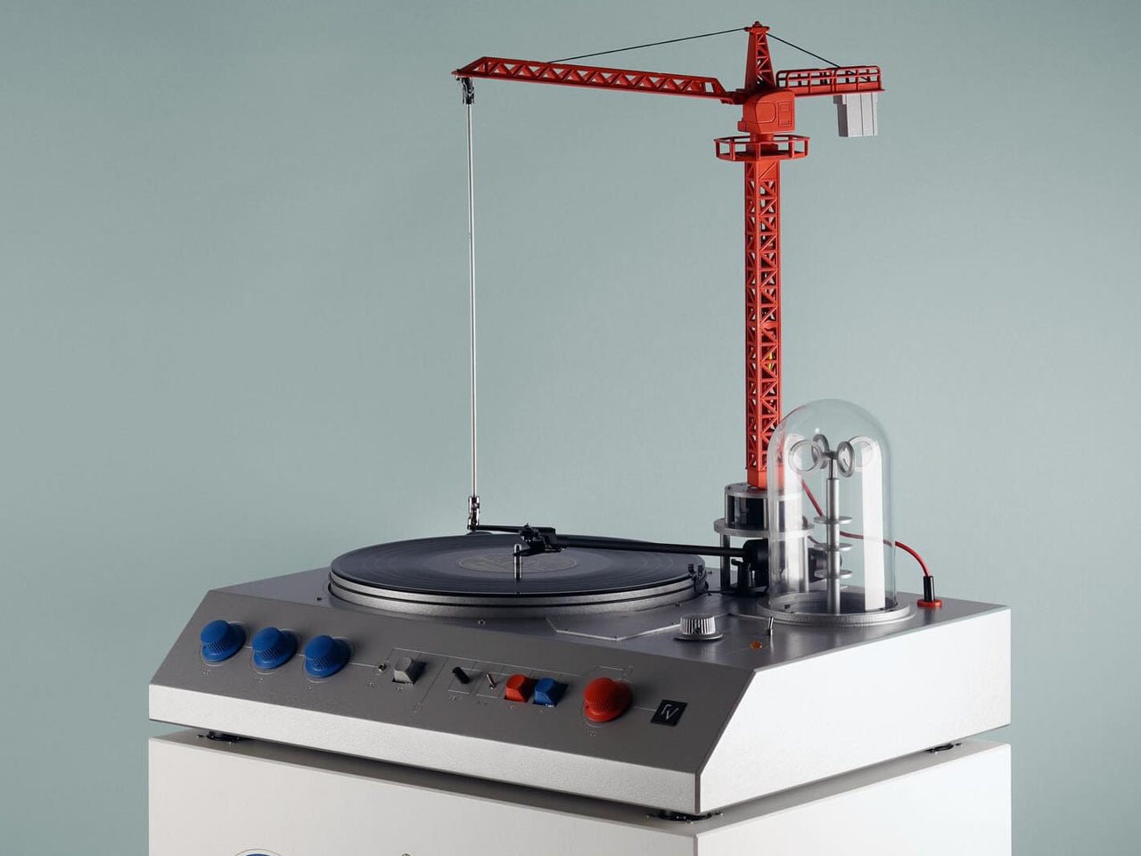
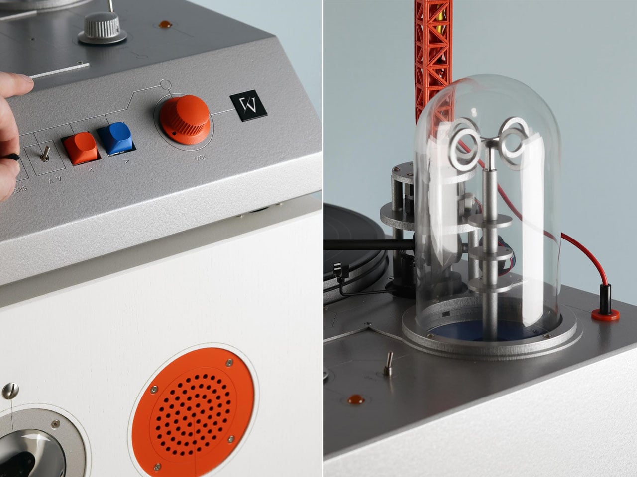
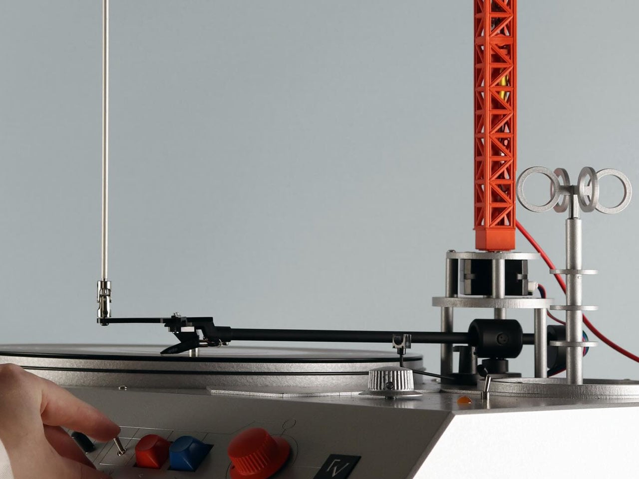
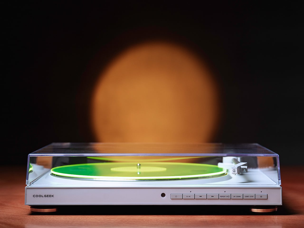
3. Portable CD Cover Player


There is a version of listening to music that streaming has never quite managed to replicate: the one where the album cover is part of the experience. The Portable CD Cover Player brings that version back with a design that treats the jacket art as equal to the audio itself. A dedicated front pocket displays the cover while the disc plays, so the music and its visual identity occupy the same moment at the same time. A built-in speaker and rechargeable battery mean it goes wherever she does — a kitchen counter, a bedside shelf, a weekend away.
What earns it a permanent spot in the home is that it reads as a design object even when it isn’t playing. Wall-mountable with a separately sold bracket, it functions as a framed display between listening sessions, rotating through whatever record she’s currently living with. The minimalist form keeps the album art and the music at the center, with nothing competing for attention around them. For a home that already takes its objects seriously, this player fits without any negotiation.
Click Here to Buy Now: $199.00
What We Like
- The jacket art pocket puts the visual and audio experience on equal footing, restoring something streaming quietly removed from the act of listening
- Built-in speaker and rechargeable battery make it genuinely portable, while wall-mount compatibility means it earns a permanent home when she wants it to stay put
What We Dislike
- The wall mount bracket is sold separately, which adds an extra purchase and a step between unboxing and the full display experience that the design promises
- As a speaker-based player, it suits intimate listening environments best and will not fill larger open-plan spaces the way a dedicated audio system would
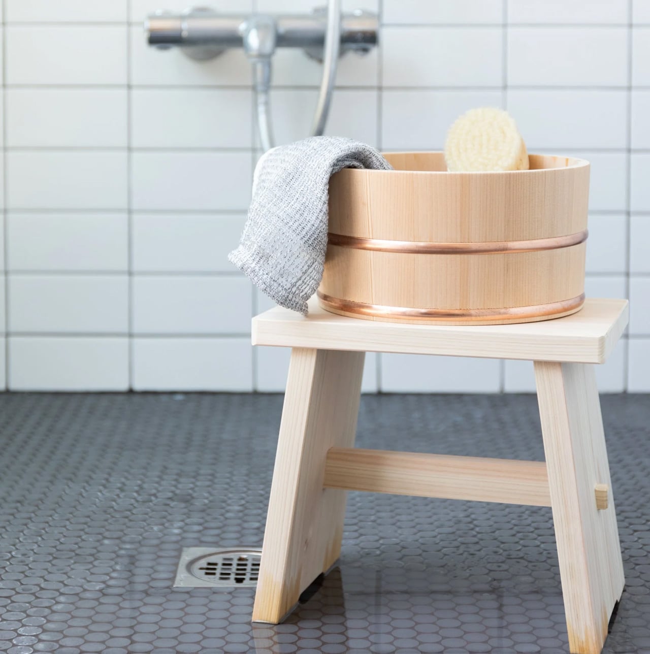
4. Tosaryu Hinoki Bath Stool
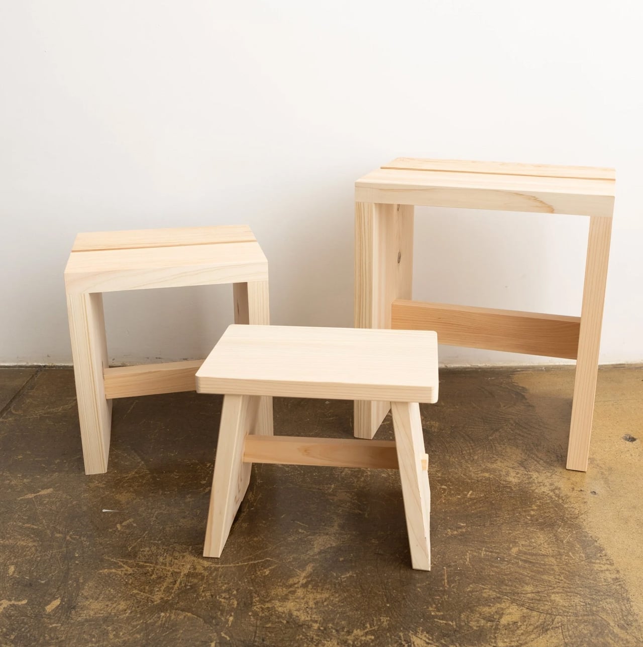
Tosaryu’s woodworkers have been based in the mountains of Kochi Prefecture since the 1970s, working with hinoki cypress from the Shimanto river region. What separates their process from most is time: the wood is dried naturally for three to six months without chemical drying agents, which preserves the aromatic oils that give hinoki its scent and the antibacterial resin that makes it resistant to mold without any applied coatings. Three sizes are available, from the compact Umezawa stool at $90 to the full-height stool, all with ridged surfaces for drainage and slip resistance.
Place one in a shower and warm water activates the wood’s oils, releasing the scent of a Japanese cypress forest into the steam. That is not a marketing description. It is the actual mechanism, and it transforms a daily shower into something closer to a ritual, which is precisely what a gift worth keeping actually does. Tosaryu operates as stewards of local Kochi forests using sustainable harvesting methods. In a bathroom, this stool replaces a generic plastic seat with something that smells like a forest and ages like furniture.
What We Like
- Natural hinoki oils provide genuine antibacterial protection and a real, steam-activated forest scent with no synthetic fragrance or chemical treatment involved at any stage of production
- Tosaryu’s sustainable Kochi forest stewardship means both the craft lineage and the environmental story behind this piece are entirely authentic, not marketing language applied after the fact
What We Dislike
- Hinoki requires thorough drying between uses to prevent cracking, meaning bathrooms without adequate ventilation will shorten the stool’s lifespan considerably over time
- The high stool carries a $25 shipping surcharge at checkout due to its size and weight, which is worth factoring into the decision before settling on a size
5. Riki Alarm Clock


Riki Watanabe established Japan’s first independent design office in 1949, and his work on clocks became the body of work that defined his legacy. The Riki Alarm Clock, produced by Lemnos in Toyama, earned the Good Design Award through choices that look deceptively simple: oversized numerals designed to read clearly from across a room, a completely silent movement with no audible tick, and a single button that consolidates the alarm, snooze, and built-in internal light into one seamless control. The body is beech wood and glass, 4.2 inches across.
Spring is the season when the phone quietly migrates back to the nightstand. The Riki Clock offers a direct, aesthetically grounded alternative. Its silent analog face replaces the notification-laden device on her nightstand with an object that is simply, reliably there. Morning waking becomes a softer experience, shaped by the warm quality of the clock’s internal light rather than the cold glow of a screen. For the bedroom, this is not just a better clock. It is a restructured relationship with the start of every day.
What We Like
- The completely silent movement removes the most persistent complaint about analog clocks entirely, making it genuinely suited to light sleepers and quieter bedroom environments
- Good Design Award credentials and Riki Watanabe’s enduring modernist legacy give this clock a real provenance that makes it worth owning, not just worth receiving as a gift
What We Dislike
- The single-button interface that consolidates alarm, snooze, and internal light may require a brief learning period before it becomes second nature for new users
- Checking the time in low light requires activating the internal light first, adding one small step compared to the passive glow of a standard digital display
The Best Gifts Don’t Try to Impress — They Earn Their Place
The logic connecting these five objects is not a shared aesthetic. It is a shared commitment to earning their permanent place. The Pop-up Book Vase earns its shelf through spatial intelligence. The ClearFrame earns its wall through beauty and ritual. The Hasami mug earns its cabinet through craft and longevity. The hinoki stool earns the bathroom through scent and material. The Riki clock earns the nightstand by replacing something worse.
Japanese design has always understood that small, considered objects carry the longest meaning. This list is not about finding something impressive enough to survive. It is about finding something honest enough to deserve it. Each of these five objects is genuinely useful, made of real materials, and shaped by a design discipline that leaves nothing to add and nothing to improve. That is what belonging in a home looks like.
The post 5 Japanese-Designed Mother’s Day Gifts That Become Part of Her Home — Not the Donation Pile first appeared on Yanko Design.