This One-Mold Stool Just Made Modular Furniture Playful Again

Most of the time, I’m not really particular when it comes to chair design. As long as I’m able to sit on it comfortably and am able to rest my weary body on it, I consider it a perfect piece of furniture. There are times though when the design idea behind it also plays a factor in judging a chair or stool, even though it may not look the easiest place to sit in.

Also, sometimes the best design ideas are the simplest ones. Zhang Wenhan’s UNO collection proves that point beautifully, and honestly, I can’t stop looking at these little sculptural stools. They’re like candy-colored mushrooms that somehow managed to win a Red Dot Award, and I’m completely here for it.

Designer: Zhang Wenhan
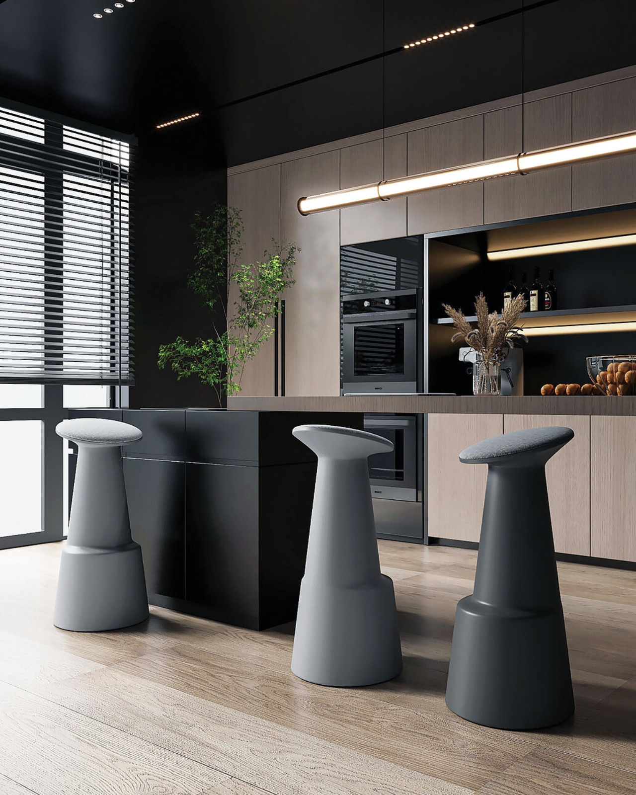
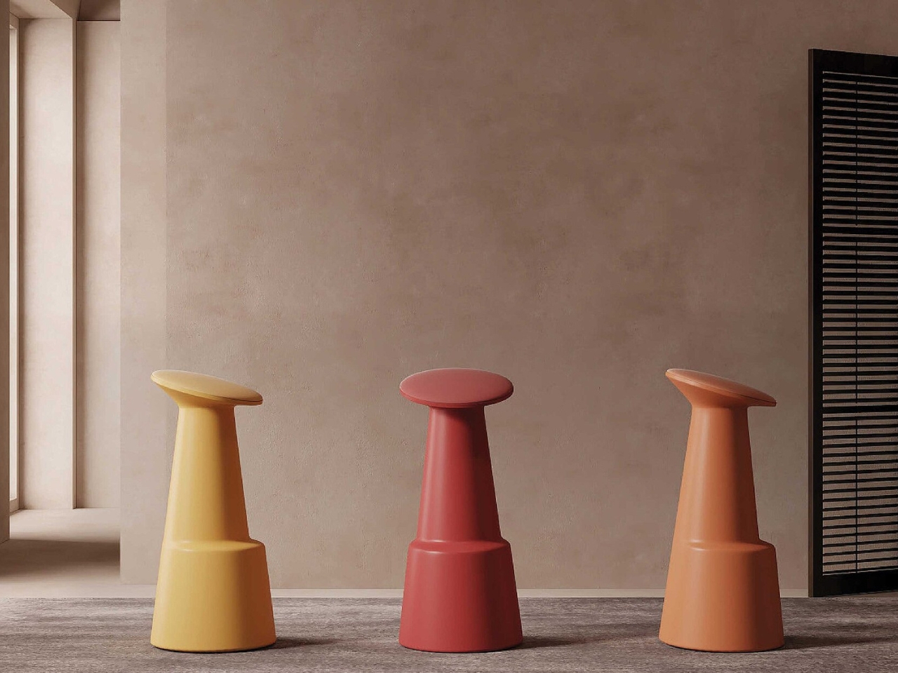
Here’s what makes UNO special: each piece is made from a single injection mould. One mould, one continuous form, no seams, no visible joints. Just a smooth, flowing shape that starts with a wide, stable base and tapers upward into a slightly tilted top surface. That little tilt isn’t just for looks, either. It’s a subtle ergonomic touch that makes these surprisingly comfortable to perch on while keeping that sculptural vibe intact.

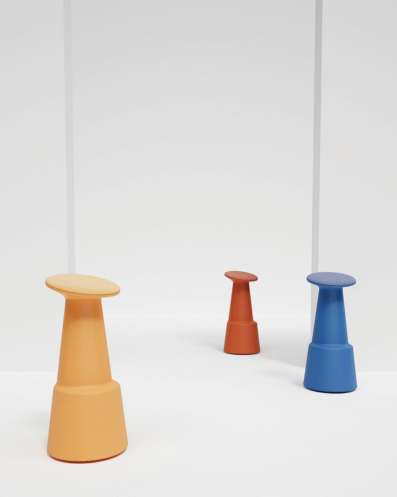
The genius is in how uncomplicated everything is. We’re so used to furniture that requires assembly instructions, allen wrenches, and a weekend afternoon of frustration. UNO flips that script entirely. Each stool arrives as a complete, ready-to-use piece. No hardware, no fuss, no leftover screws you’re not quite sure what to do with. What really gets me excited is the color range. UNO comes in this perfectly curated palette that spans from soft, muted tones to bold, punchy hues. Think buttery yellows, dusty pinks, rich terracotta, and deep blues. The kind of colors that look sophisticated on their own but become genuinely playful when you start mixing them together. And that’s exactly what you’re supposed to do.

The whole concept revolves around modularity and personalization. You can grab a few in complementary shades for a cohesive look, or go wild and create a rainbow arrangement that brings instant energy to any room. Want to switch things up next season? Just rearrange them. Move them from the living room to the patio, cluster them by the entryway, or scatter them around a dining table for extra seating when friends come over.
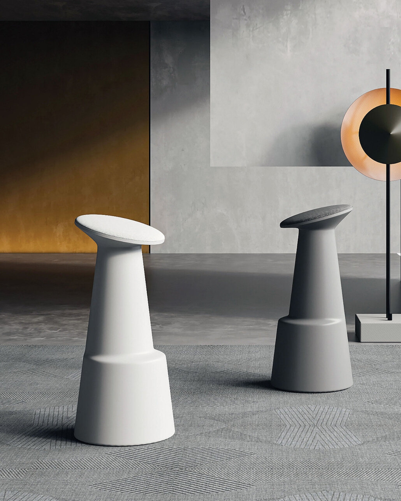
Speaking of indoor-outdoor versatility, that’s another win for UNO. The clean silhouette and balanced proportions mean these stools look equally at home next to your mid-century modern sofa or on your balcony beside some potted plants. They harmonize with vibrant spaces without competing for attention, and they add a pop of personality to neutral rooms without overwhelming the palette. I love furniture that doesn’t take itself too seriously but still maintains a sense of sophistication. UNO nails that balance. There’s something inherently joyful about the shape, almost toy-like in the best possible way, but the proportions and execution keep it firmly in grown-up design territory. It’s the kind of piece that makes visitors smile and ask where you got it.

The injection moulding process is worth appreciating too. This manufacturing method allows for that seamless, monolithic quality that gives each stool its distinctive character. No visible construction, no parts that might loosen over time, just solid, reliable design that’ll look the same years from now as it does the day you bring it home. And can we talk about how these photograph? Every angle is good. That gradual taper creates interesting shadows and silhouettes, making UNO as much a design object as functional furniture. It’s the rare piece that works just as well as a sculptural accent when nobody’s sitting on it.

What Zhang Wenhan has created with UNO is refreshingly straightforward design that doesn’t sacrifice personality or versatility. In a world where we’re constantly told we need smart furniture with built-in charging ports and convertible configurations, there’s something deeply satisfying about a stool that’s just genuinely well-designed. One form, endless possibilities, zero complications. Whether you need extra seating, a side table, a plant stand, or just a pop of color in the corner, UNO adapts without requiring you to adapt to it. That’s the mark of truly thoughtful design, and it’s exactly why this collection deserves all the recognition it’s getting.
The post This One-Mold Stool Just Made Modular Furniture Playful Again first appeared on Yanko Design.
This One-Mold Stool Just Made Modular Furniture Playful Again

Most of the time, I’m not really particular when it comes to chair design. As long as I’m able to sit on it comfortably and am able to rest my weary body on it, I consider it a perfect piece of furniture. There are times though when the design idea behind it also plays a factor in judging a chair or stool, even though it may not look the easiest place to sit in.

Also, sometimes the best design ideas are the simplest ones. Zhang Wenhan’s UNO collection proves that point beautifully, and honestly, I can’t stop looking at these little sculptural stools. They’re like candy-colored mushrooms that somehow managed to win a Red Dot Award, and I’m completely here for it.

Designer: Zhang Wenhan

Here’s what makes UNO special: each piece is made from a single injection mould. One mould, one continuous form, no seams, no visible joints. Just a smooth, flowing shape that starts with a wide, stable base and tapers upward into a slightly tilted top surface. That little tilt isn’t just for looks, either. It’s a subtle ergonomic touch that makes these surprisingly comfortable to perch on while keeping that sculptural vibe intact.

The genius is in how uncomplicated everything is. We’re so used to furniture that requires assembly instructions, allen wrenches, and a weekend afternoon of frustration. UNO flips that script entirely. Each stool arrives as a complete, ready-to-use piece. No hardware, no fuss, no leftover screws you’re not quite sure what to do with. What really gets me excited is the color range. UNO comes in this perfectly curated palette that spans from soft, muted tones to bold, punchy hues. Think buttery yellows, dusty pinks, rich terracotta, and deep blues. The kind of colors that look sophisticated on their own but become genuinely playful when you start mixing them together. And that’s exactly what you’re supposed to do.

The whole concept revolves around modularity and personalization. You can grab a few in complementary shades for a cohesive look, or go wild and create a rainbow arrangement that brings instant energy to any room. Want to switch things up next season? Just rearrange them. Move them from the living room to the patio, cluster them by the entryway, or scatter them around a dining table for extra seating when friends come over.

Speaking of indoor-outdoor versatility, that’s another win for UNO. The clean silhouette and balanced proportions mean these stools look equally at home next to your mid-century modern sofa or on your balcony beside some potted plants. They harmonize with vibrant spaces without competing for attention, and they add a pop of personality to neutral rooms without overwhelming the palette. I love furniture that doesn’t take itself too seriously but still maintains a sense of sophistication. UNO nails that balance. There’s something inherently joyful about the shape, almost toy-like in the best possible way, but the proportions and execution keep it firmly in grown-up design territory. It’s the kind of piece that makes visitors smile and ask where you got it.

The injection moulding process is worth appreciating too. This manufacturing method allows for that seamless, monolithic quality that gives each stool its distinctive character. No visible construction, no parts that might loosen over time, just solid, reliable design that’ll look the same years from now as it does the day you bring it home. And can we talk about how these photograph? Every angle is good. That gradual taper creates interesting shadows and silhouettes, making UNO as much a design object as functional furniture. It’s the rare piece that works just as well as a sculptural accent when nobody’s sitting on it.

What Zhang Wenhan has created with UNO is refreshingly straightforward design that doesn’t sacrifice personality or versatility. In a world where we’re constantly told we need smart furniture with built-in charging ports and convertible configurations, there’s something deeply satisfying about a stool that’s just genuinely well-designed. One form, endless possibilities, zero complications. Whether you need extra seating, a side table, a plant stand, or just a pop of color in the corner, UNO adapts without requiring you to adapt to it. That’s the mark of truly thoughtful design, and it’s exactly why this collection deserves all the recognition it’s getting.

The post This One-Mold Stool Just Made Modular Furniture Playful Again first appeared on Yanko Design.
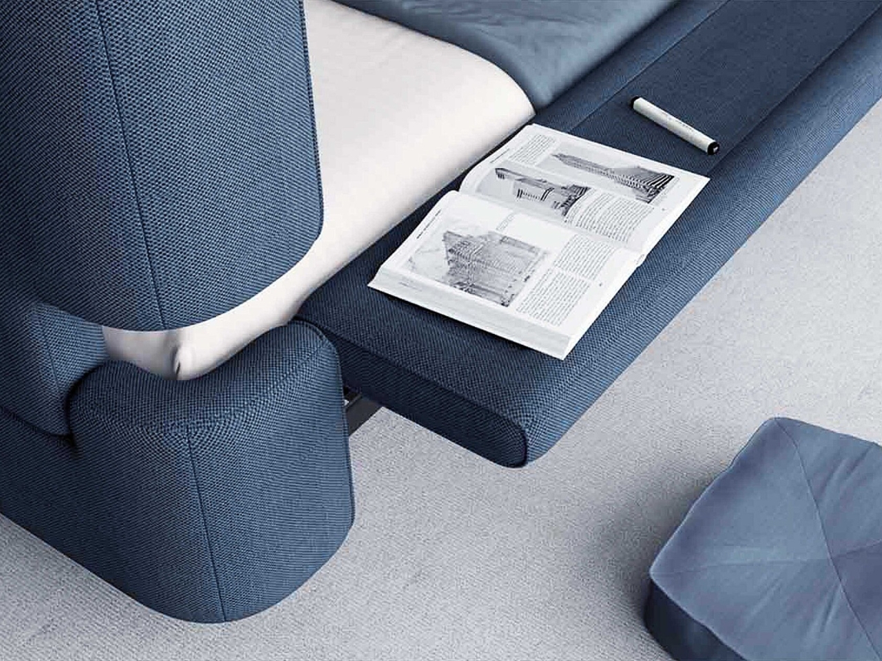
This Whale Bed Goes From Bedroom to Poolside in Seconds

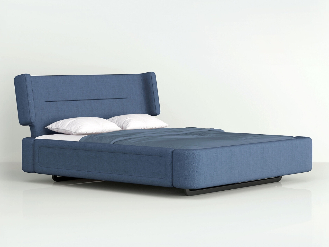
There’s something absolutely magical about furniture that makes you do a double take, and the Whale Bed by designers Zeng Haojie and Chen Zhe is exactly that kind of piece. At first glance, you might wonder if you’re looking at a luxurious lounger or an art installation, but this Red Dot Award-winning design is actually both and so much more.

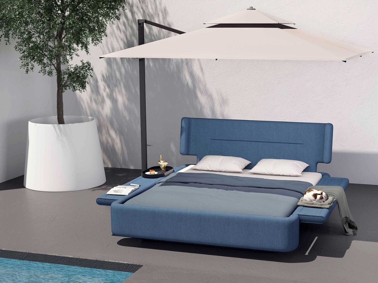
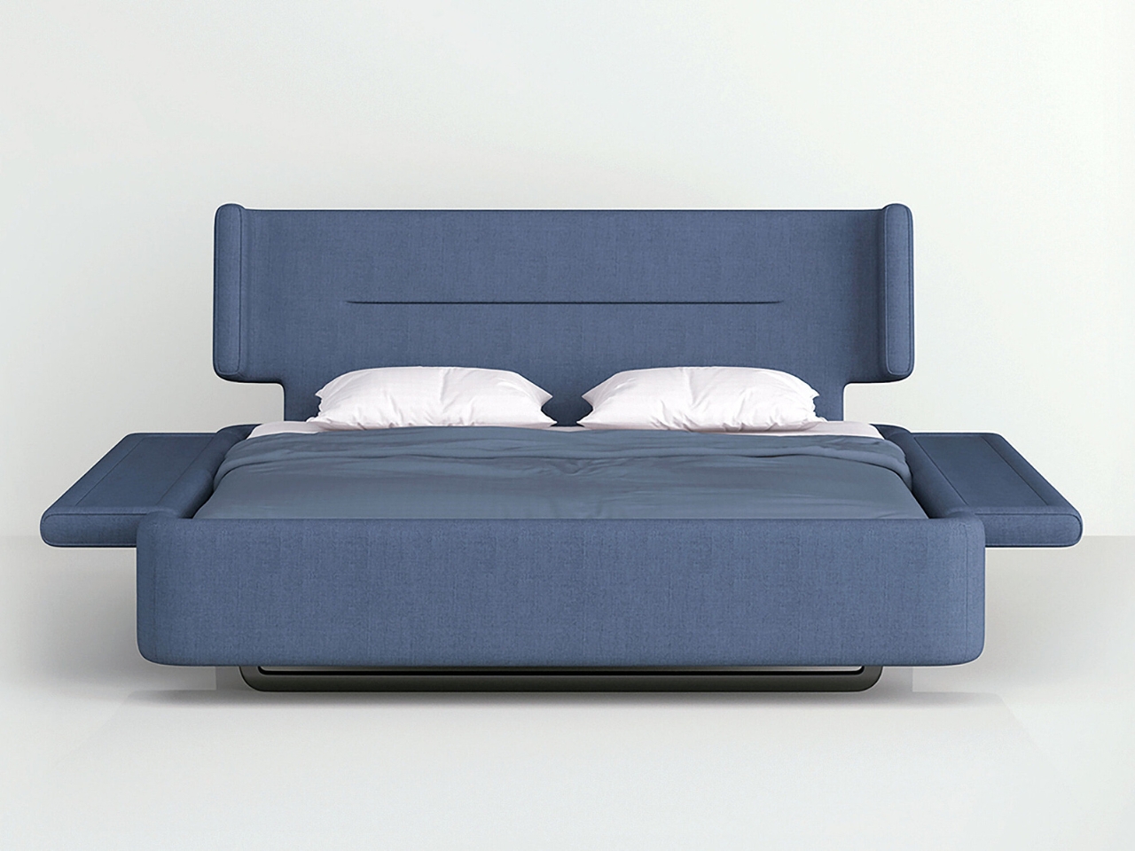
Picture this: a bed that looks like a gentle whale gliding through calm waters, complete with fin-like panels extending from both sides. It’s the kind of piece that makes you want to immediately redesign your entire space around it. But beyond its striking ocean-inspired silhouette, the Whale Bed represents something we desperately need more of in the design world: thoughtful innovation that doesn’t sacrifice style for sustainability.

Designers: Zeng Haojie, Chen Zhe

What makes this design so clever is how it manages to pack multiple functions into one sleek package without going overboard on materials. The adjustable backrest is a game changer, letting you shift between different positions whether you’re reading, scrolling through your phone, or settling in for a Netflix marathon. It’s like having a bed, a lounge chair, and a reading nook all wrapped into one streamlined piece.

Those fin-like panels aren’t just there to complete the whale aesthetic (though they absolutely nail that vibe). They serve as practical side extensions that give you extra surface area for whatever you need. Morning coffee? Check. Favorite book? Done. Laptop for those work-from-anywhere days? You got it. It’s the kind of multipurpose thinking that makes small spaces feel more livable and large spaces feel more intentional.

But here’s where things get really interesting. The Whale Bed is crafted from environmentally friendly plant fiber material, which means you can take this beauty from your bedroom to your backyard without worrying about weather damage or environmental impact. Imagine lounging poolside on this stunning piece, or creating an outdoor sanctuary in your courtyard where the lines between indoor comfort and outdoor freedom completely blur. We’re now increasingly conscious about our carbon footprint and the lifecycle of the products we bring into our homes so the Whale Bed’s approach to reducing material consumption is refreshing. The designers didn’t just slap an eco-friendly label on it and call it a day. They actually reimagined the structure itself to minimize waste during production. That’s the kind of innovation that moves the industry forward.

The color shown in the images, a sophisticated ocean blue, feels like an obvious choice that somehow still surprises. It’s calming without being boring, bold without being overwhelming. You can easily imagine it working in a minimalist Scandinavian-inspired bedroom, a boho outdoor oasis, or even a contemporary loft space. That versatility is part of what makes this design so compelling. What really strikes me about the Whale Bed is how it challenges our assumptions about what furniture should be. We’re so used to pieces being designated for one specific room or purpose. A bed stays in the bedroom. Patio furniture stays outside. But why? The Whale Bed asks us to think differently about how we use our spaces and how our furniture can adapt to our lives rather than the other way around.

There’s also something wonderfully playful about the whole concept. In a design landscape that can sometimes take itself too seriously, a bed inspired by the largest creatures in our oceans brings a sense of wonder and whimsy. It reminds us that sustainable design doesn’t have to be austere or preachy. It can be joyful, imaginative, and utterly desirable. For anyone who’s been watching the intersection of sustainability and design, pieces like the Whale Bed represent where we’re headed. It’s not about choosing between beautiful design and environmental responsibility anymore. The best designers are proving we can have both, and they’re doing it with creativity and innovation that makes us excited about the future of our living spaces.

The post This Whale Bed Goes From Bedroom to Poolside in Seconds first appeared on Yanko Design.
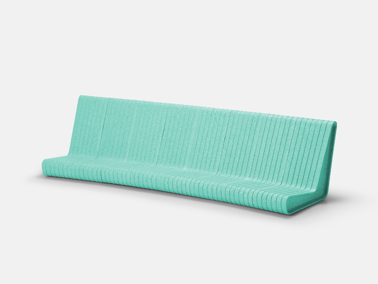
These Lightweight Foam Chairs Could Finally Fix Public Seating

You know that feeling when you’re at an outdoor concert and your back is screaming after 30 minutes on those unforgiving metal benches? Or when you’re at a community event, desperately wishing you could just shift that heavy concrete seating a few feet over? Yeah, BKID Co clearly knows that feeling too, and they’ve designed a concept that could potentially solve it.

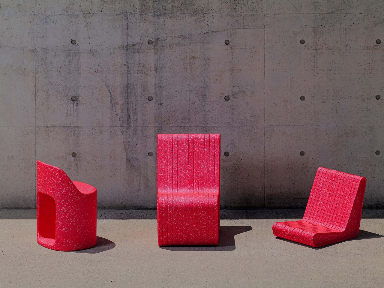
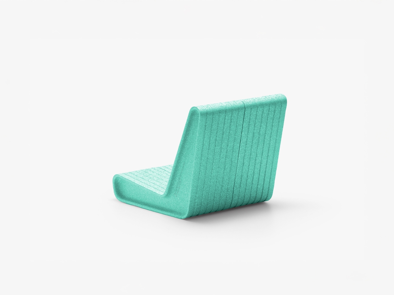
Meet Form&Foam, a conceptual modular seating system that’s basically the opposite of everything we’ve come to expect from public furniture. Instead of being rigid, heavy, and impossible to move without a forklift, these proposed chairs would be soft, lightweight, and surprisingly adaptable. The secret ingredient? EPP material, which stands for expanded polypropylene if you want to get technical about it.

Designer: BKID Co

What makes EPP so special is its trifecta of practical benefits. It’s shock-resistant (meaning it can take a beating and bounce right back), it’s genuinely soft to sit on, and it weighs next to nothing. That last part is crucial because it would transform these chairs from static objects into something more like building blocks for public spaces. Anyone could pick one up and rearrange the seating configuration on the fly.

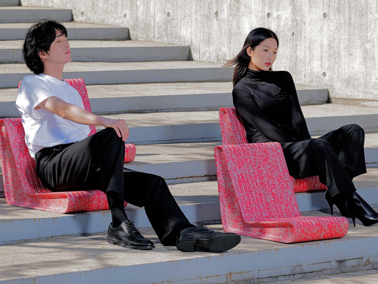
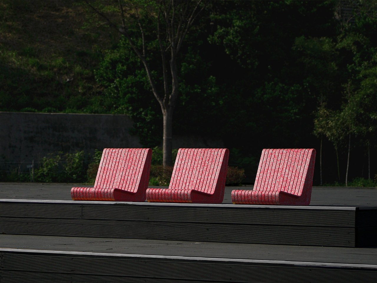
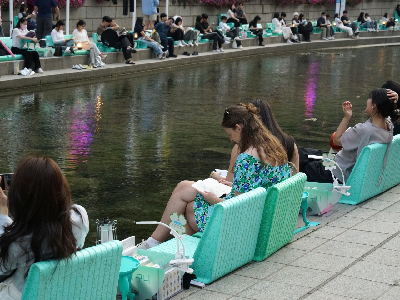
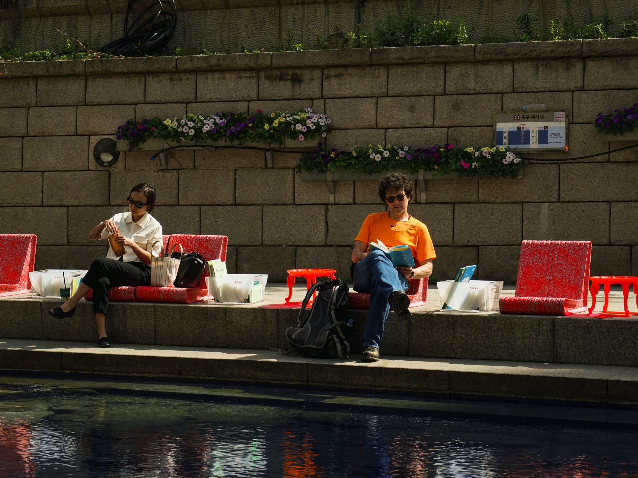
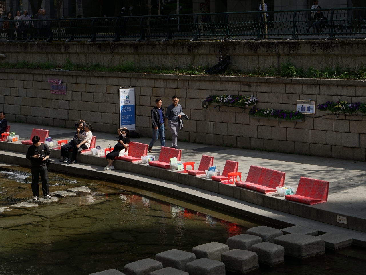
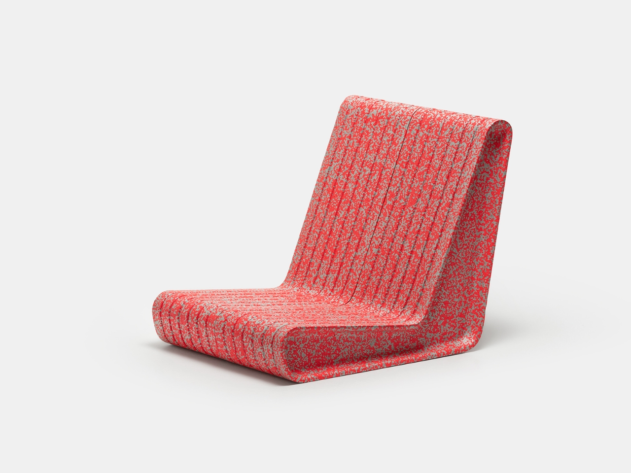
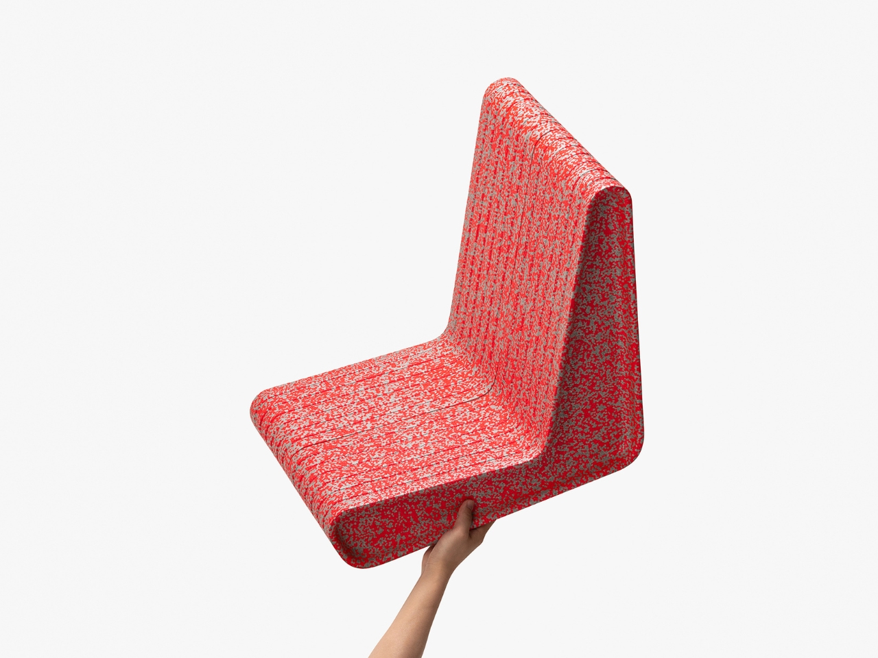
The design comes in multiple variations, but the star of the show is the “Lean” model, which has this wonderfully relaxed recline to it. Looking at the concept images, you can immediately tell this isn’t your grandma’s folding chair. The textured surface has this almost fuzzy, pixelated appearance in vibrant colors (that speckled red is particularly eye-catching), and the form itself curves in ways that actually seem to understand how human bodies work.

Here’s where the concept gets really interesting. BKID Co isn’t just proposing another chair design. They’re imagining an entire philosophy about how public seating should work. The idea is that different events call for different postures and different social dynamics. Their “Sit” chair would encourage upright, formal posture, perfect for city council meetings or lecture-style events. Meanwhile, the “Lean” version invites you to kick back a bit, ideal for casual concerts or relaxed community gatherings.

This isn’t just aesthetic flexibility; it’s behavioral design in action. The furniture would literally shape how people interact with spaces and with each other. Want to create a more formal atmosphere? Bring out the upright chairs. Hosting a laid-back music festival? Break out the lean-back models. It’s public space planning that actually thinks about the humans using the space.

The practical benefits extend beyond just comfort and flexibility. Traditional public furniture has some serious maintenance issues. Wooden benches rot, metal rusts, and concrete cracks. All of that means constant repairs and replacements, which drain municipal budgets. EPP foam, on the other hand, is incredibly durable and weather-resistant. It won’t rust, rot, or splinter. And because it’s shock-absorbent, it’s actually pretty difficult to damage in the first place.

There’s also something refreshingly playful about the design concept. Public furniture tends to be brutalist and unwelcoming, partly by design (hello, hostile architecture). But Form&Foam takes the opposite approach. The soft, tactile quality and bright colors make these pieces feel approachable and friendly. They look like something you’d actually want to sit on, not something designed to make you uncomfortable after 15 minutes.

The modularity factor shouldn’t be underestimated either. These chairs could be arranged and rearranged to create different seating configurations. Line them up in rows for a presentation, cluster them in circles for discussions, scatter them casually for an open-space vibe. The lightness of the material means event organizers (or even attendees) could reshape the space as needs change throughout the day.

What BKID Co has envisioned here feels like a small but significant rethinking of how we do public spaces. It asks why public furniture needs to be permanent, heavy, and uncomfortable when it could be adaptable, accessible, and actually pleasant to use. In a world where urban designers are increasingly thinking about how to make cities more livable and human-centered, concept proposals like Form&Foam feel like a step in exactly the right direction.

Whether this concept makes the leap from design portfolio to actual parks and plazas remains to be seen. But sometimes the most innovative design isn’t about reinventing everything from scratch. It’s about taking something we all use and asking, “But what if it didn’t suck?” Form&Foam asked that question about public seating, and the answer turns out to be pretty compelling.

The post These Lightweight Foam Chairs Could Finally Fix Public Seating first appeared on Yanko Design.
Bene Just Built Office Furniture You Can Reconfigure Without Any Tools

Offices keep buying furniture that looks permanent, which works fine until someone needs the room to do something different. A workshop space becomes a presentation area, a meeting room needs to turn into individual work zones, and nobody wants to wait three days for facilities to show up with screwdrivers. The furniture just sits there looking expensive and immovable while everyone works around it instead of with it.

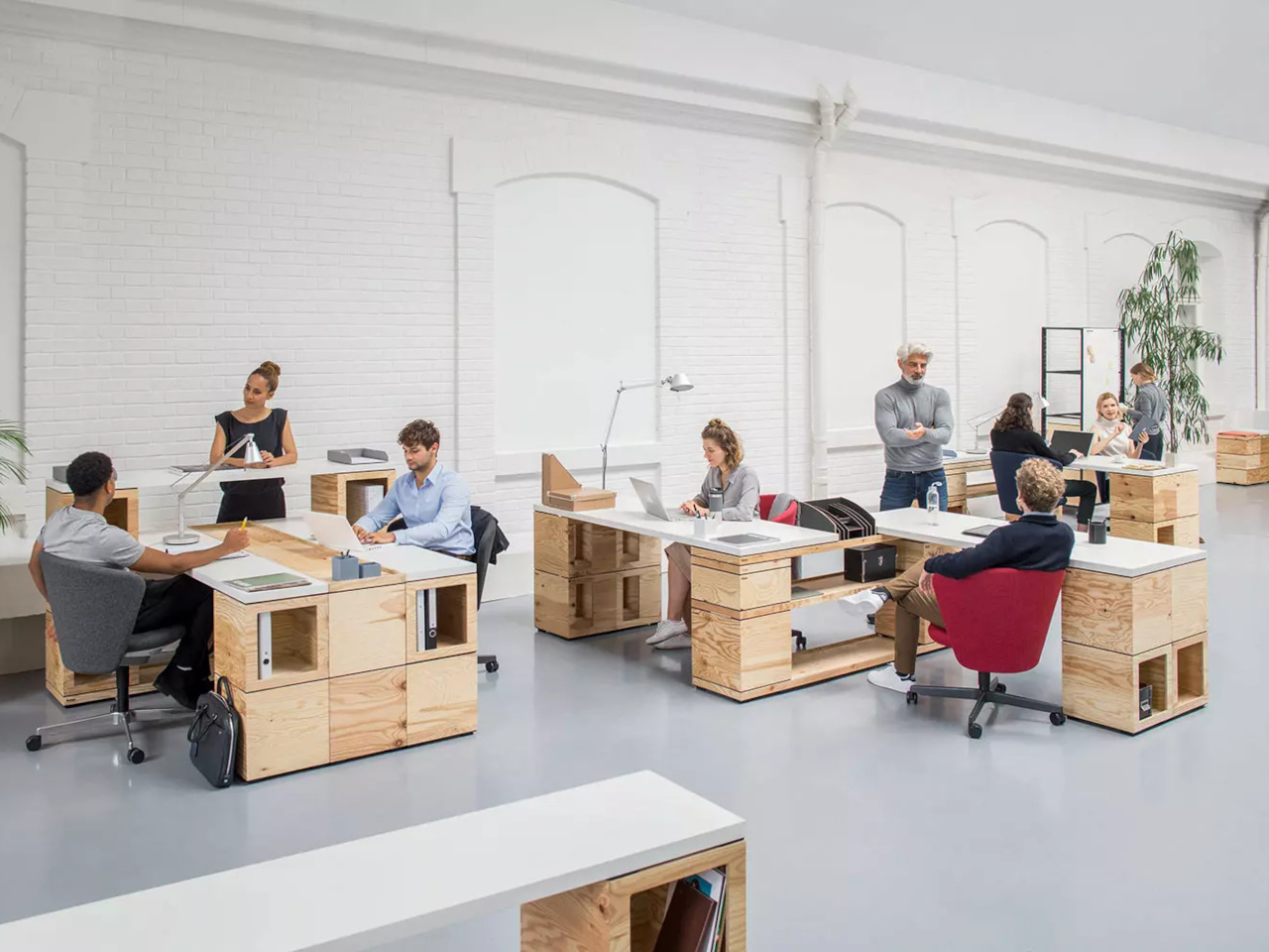
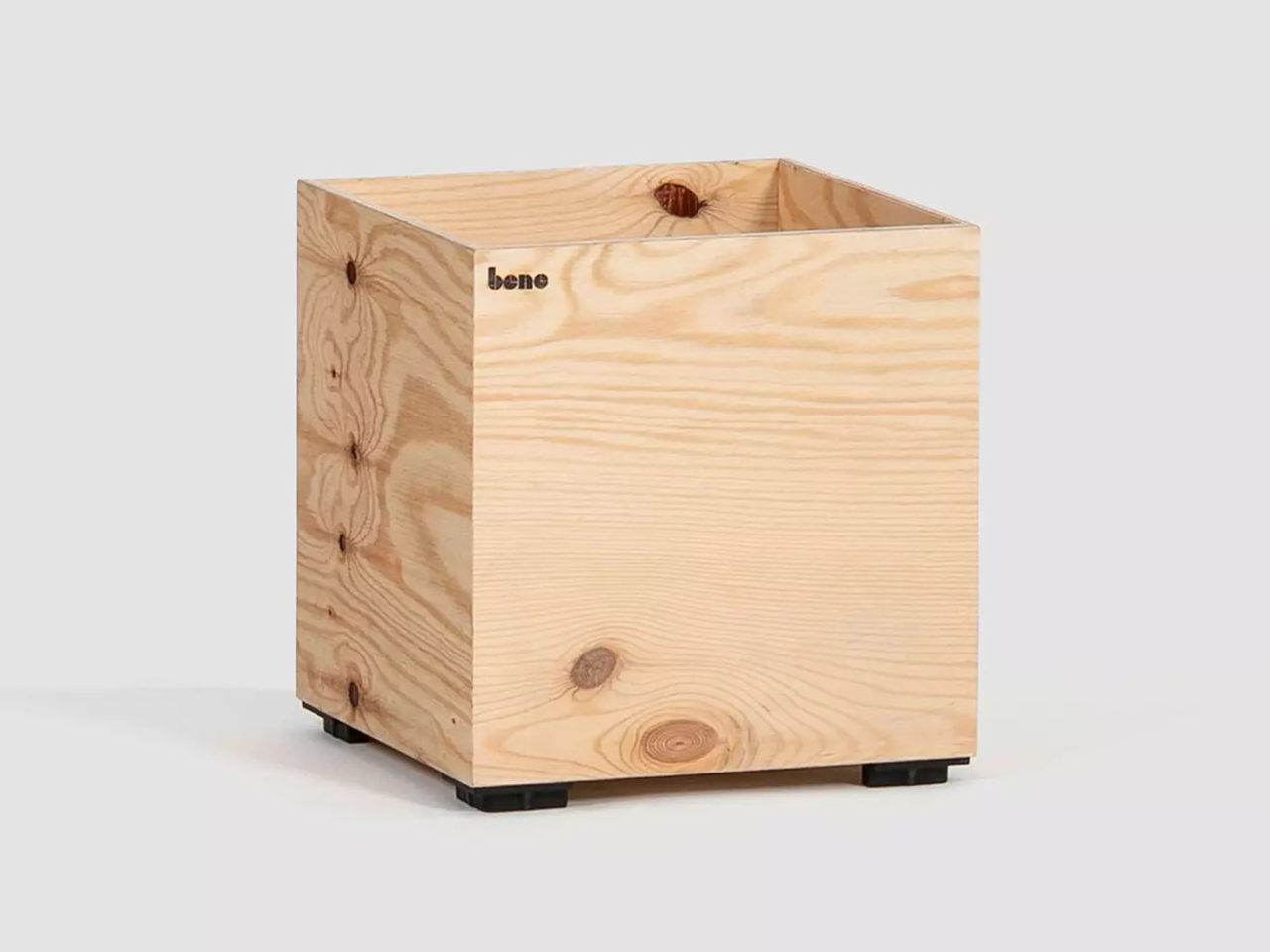
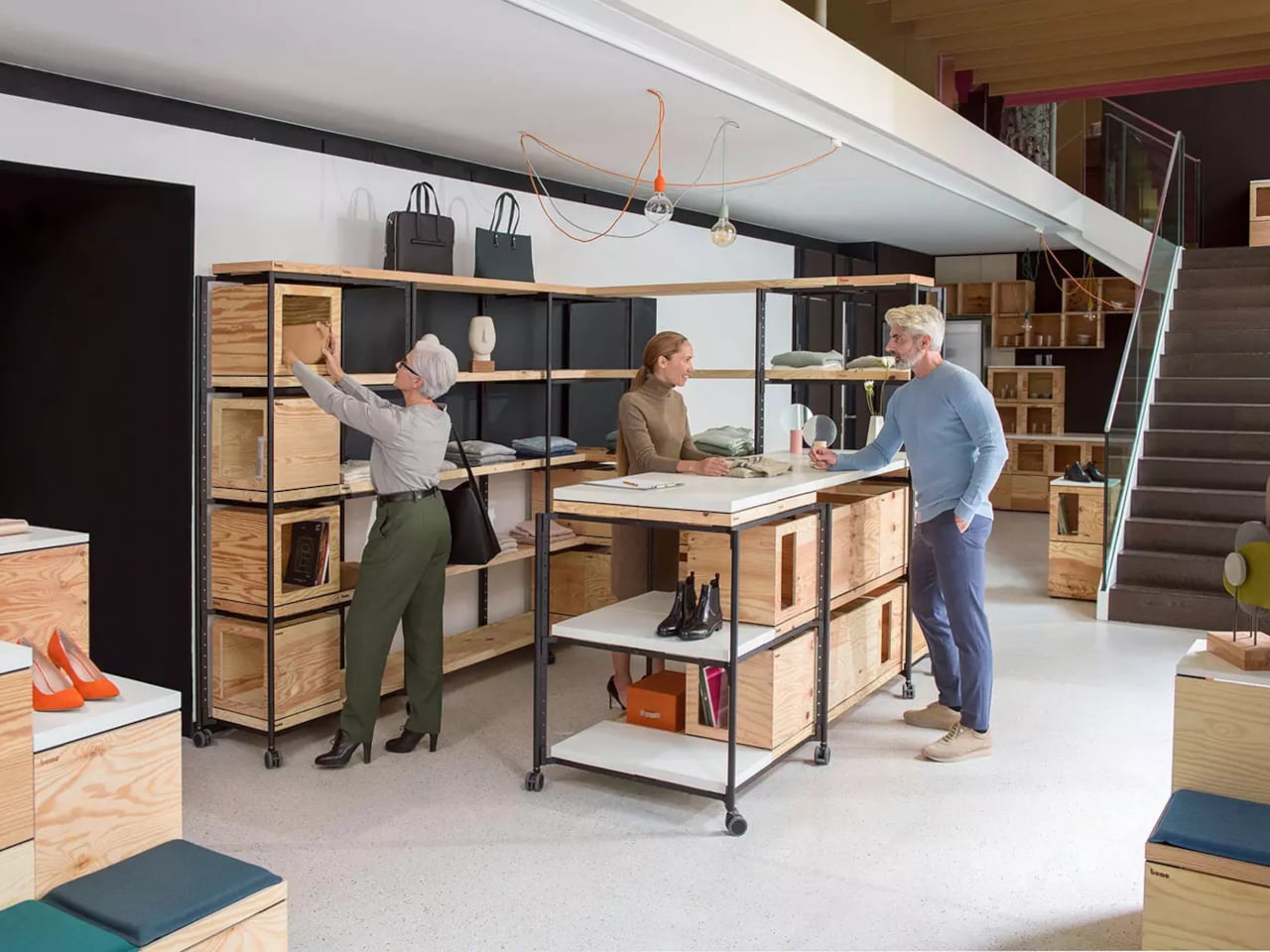
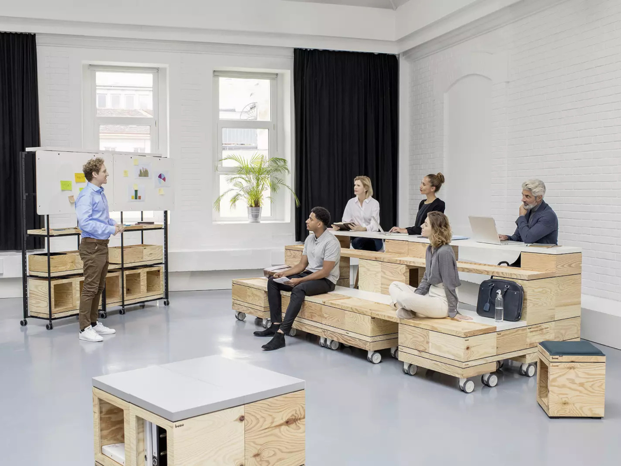
PIXEL by Bene is designer Didi Lenz’s answer, and it looks almost suspiciously simple. Each piece is a 36 x 36 cm cube made from raw pine plywood with visible grain and knots all over the surface. Lenz says it isn’t really furniture, which makes sense when you see people stacking them into benches, flipping them into tables, or just using one as a side storage box with a handle cut into the side.

Designer: Didi Lenze (Bene)

The wood is completely untreated, so every cube looks slightly different depending on which part of the tree it came from. Some have dark knots near the corners, others show lighter grain patterns, and the plywood edges are exposed instead of hidden under veneer. It definitely reads as workshop material rather than corporate office product, which seems to be the whole point. You can see the screws holding the corners together.

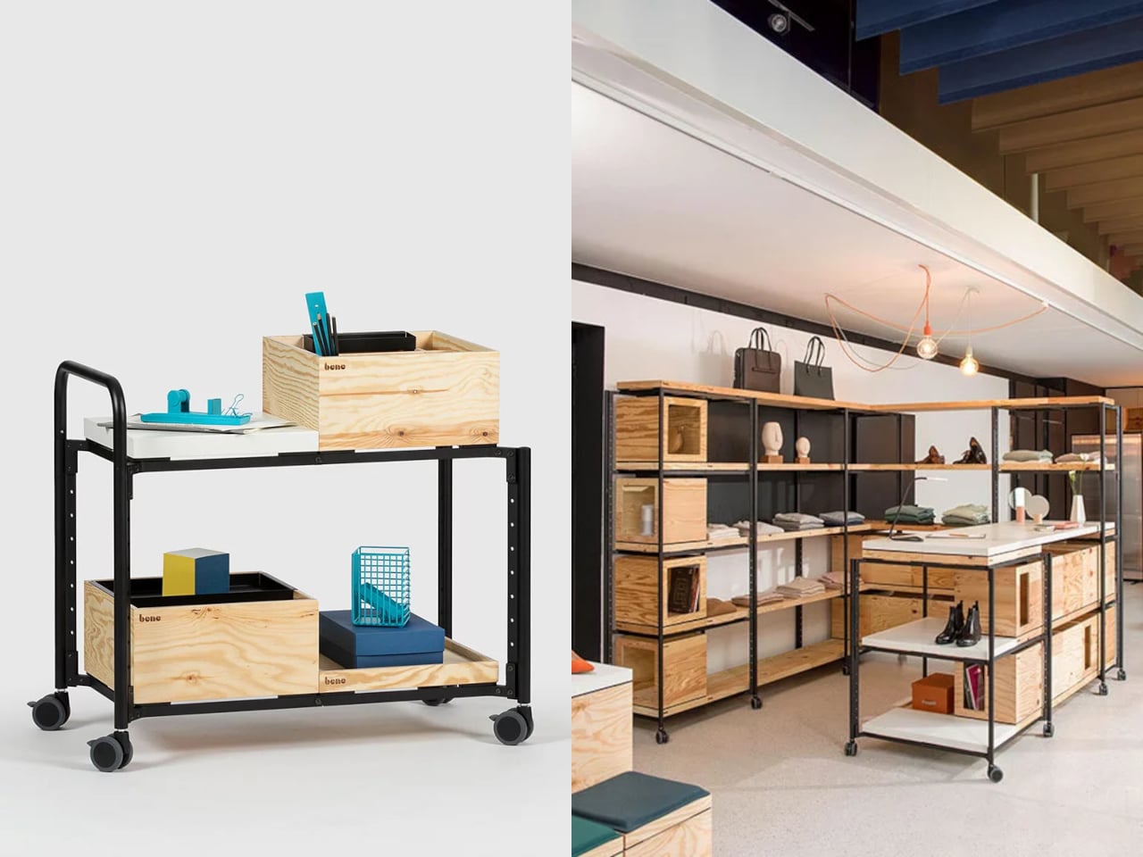
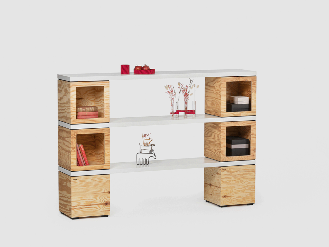
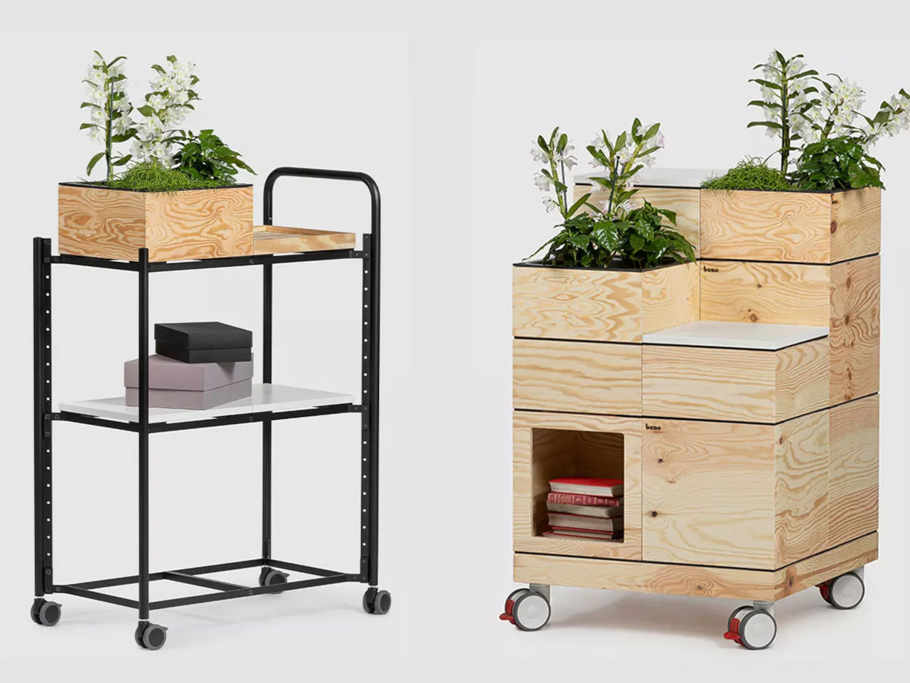
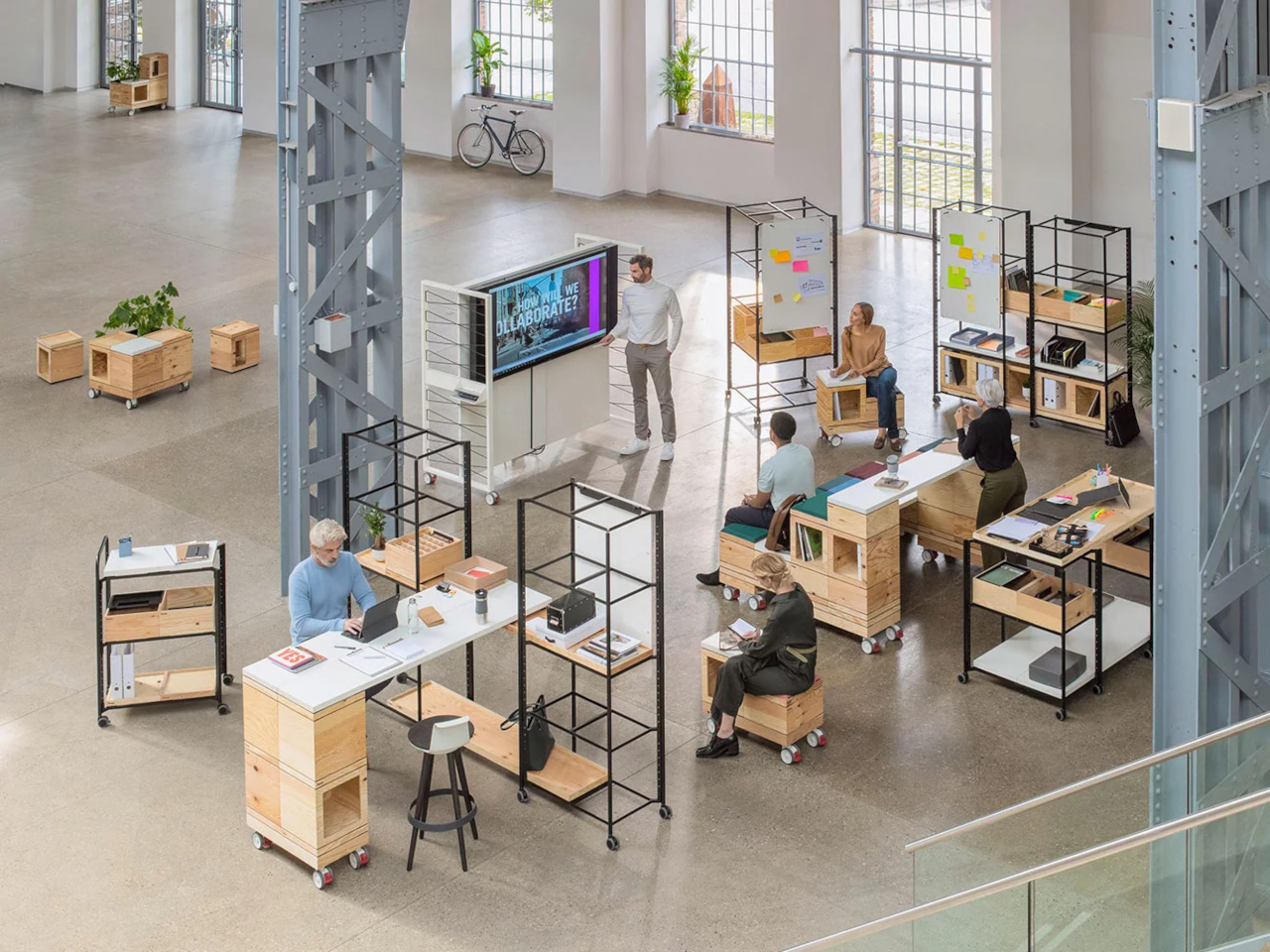
The cubes stack easily because they’re all the same size, and the cutout handles on two sides let you carry them around or fold them over to connect boxes side by side. Add a white laminate top and a stack becomes a work table. Add casters to the bottom, and it rolls wherever you need it. PIXEL Rack adds metal frames that turn stacks into proper shelving or room dividers with slots for whiteboards and plants.

Bene shows photos of teams building entire project rooms by hand. Boxes stacked three high become benches for workshops, racks filled with boxes create semi-transparent walls between work zones, and tops laid across stacks turn into standing height tables. The setups look intentionally unfinished, like someone is still building them, which is probably the aesthetic Lenz wanted. Nothing looks bolted down or precious.

The system works because it assumes people will move things around themselves without asking permission. You need more seating for a presentation, so you grab some boxes from the storage wall and stack them into rows. The presentation ends, and those same boxes become side tables or go back to holding supplies. Heck, they can turn into a bar for an event if you add the right tops.

Raw plywood has obvious trade-offs. It’ll get dinged and stained over time, the surface isn’t smooth enough for detailed work, and the workshop look won’t suit every office brand. The fixed 36 cm dimension means everything is the same height whether you’re sitting, standing, or storing things, which can feel awkward. Some people will look at PIXEL and just see fancy storage crates, which isn’t entirely wrong.

But the system makes sense for spaces that need to change shape constantly. Co-working areas, design studios, classrooms, and pop-up shops can rebuild their layout between sessions without calling anyone. The wood looks honest and approachable instead of intimidating, and you don’t need instructions to figure out that boxes stack. PIXEL by Bene basically gives you building blocks that happen to be office furniture, or maybe it’s the other way around.

The post Bene Just Built Office Furniture You Can Reconfigure Without Any Tools first appeared on Yanko Design.
COMODO Entryway Stool Dries and Deodorizes Shoes While You Sit

Taking off your shoes after a long day often means being greeted by damp insoles and stale smells. Rain, sweat, and dust turn footwear into something you tolerate rather than enjoy wearing, and most people either ignore it or resort to stuffing newspaper inside them and hoping for the best. Drying racks clutter the hallway, and washing shoes every time they get wet is too much work for something you’ll just wear again tomorrow.

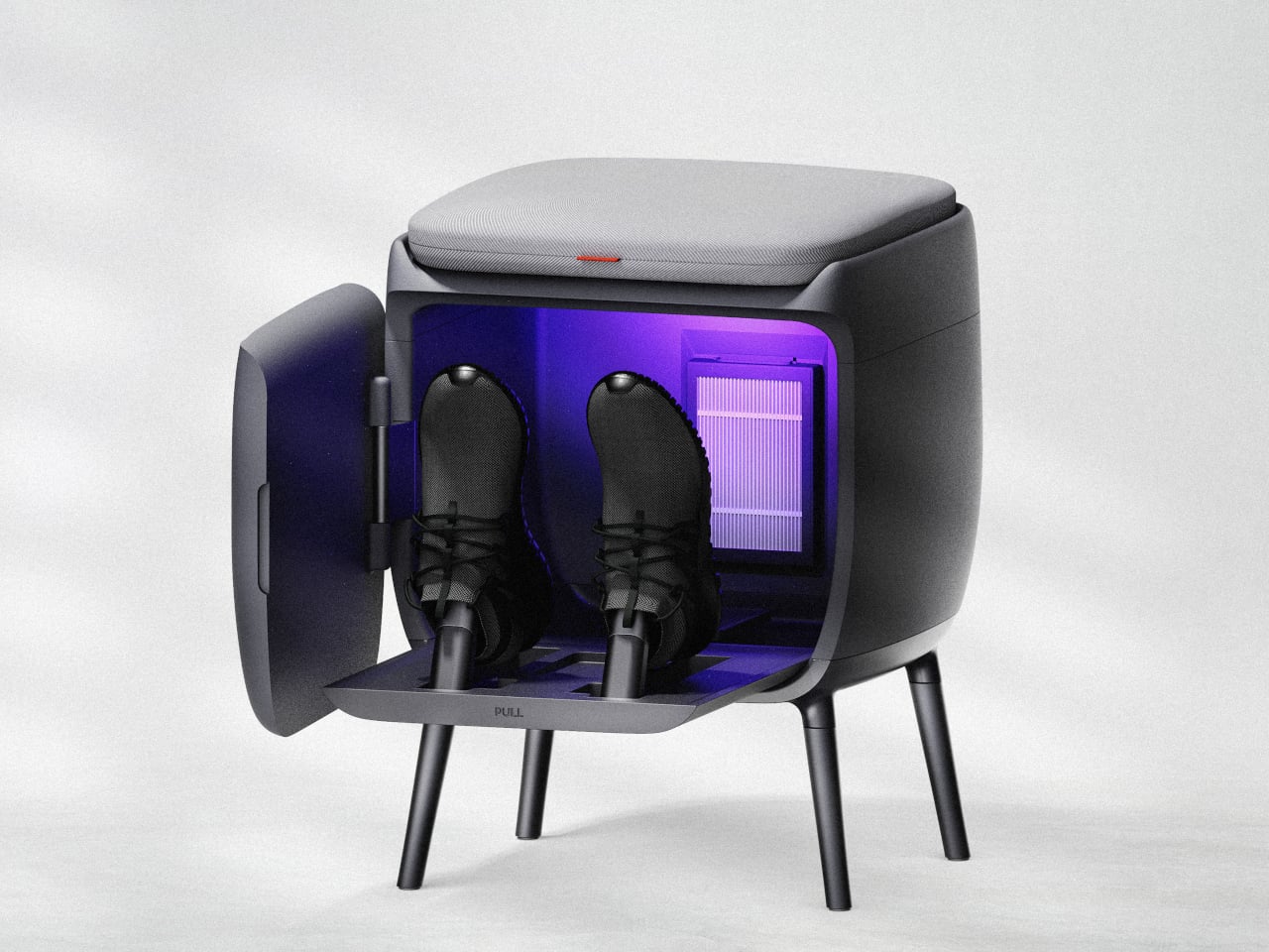
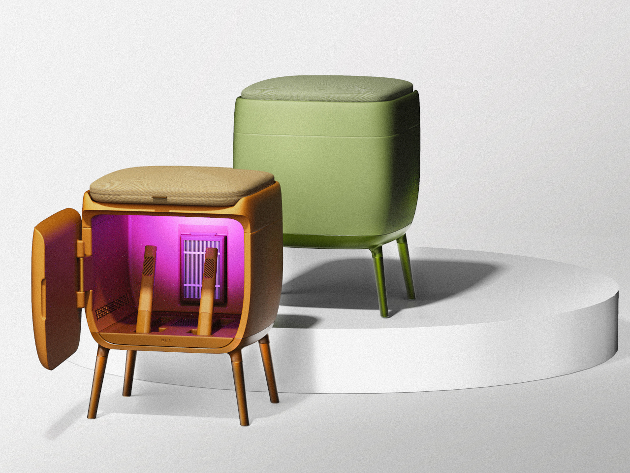
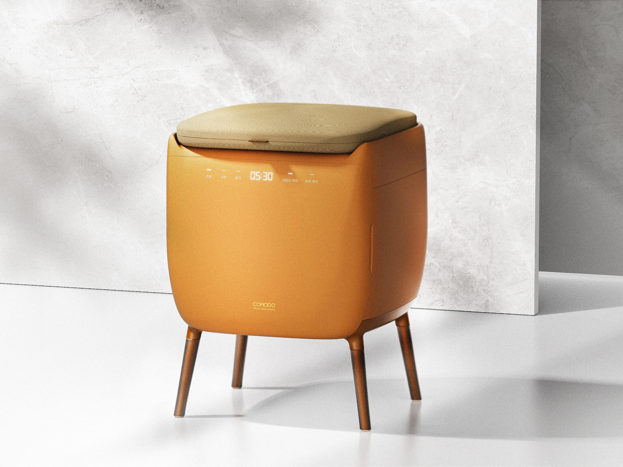
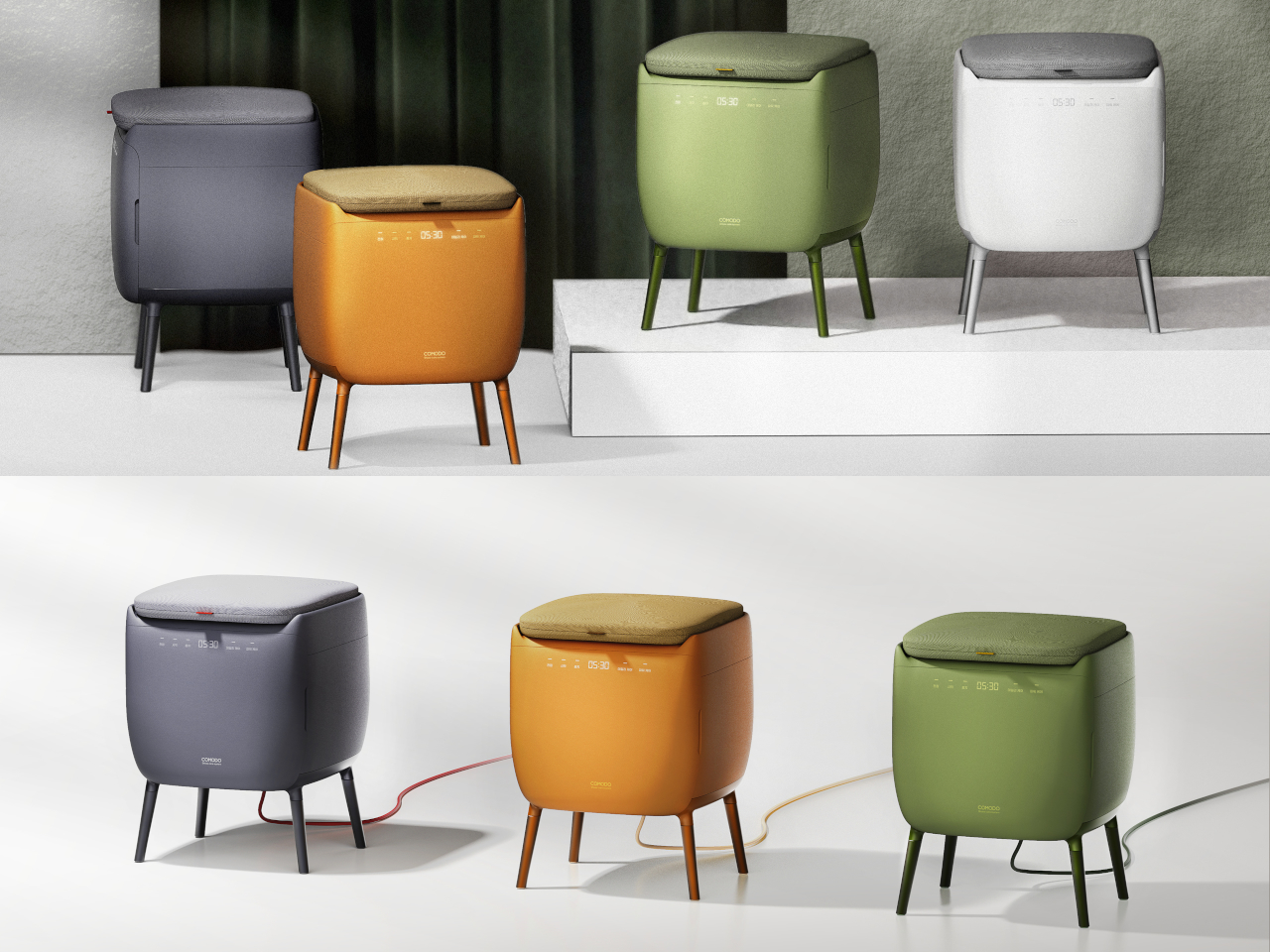
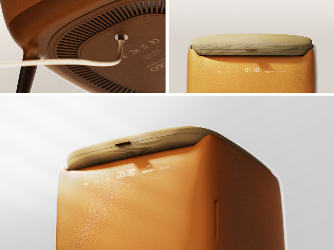
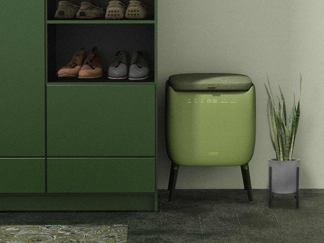
COMODO is a concept that treats shoe care as part of the entryway routine rather than an afterthought. It combines a small upholstered stool with a compact shoe care system inside, so the same object you sit on to put on your shoes also quietly dries, deodorizes, and refreshes them between outings. The name comes from the Spanish word for “comfortable” or “pleasant,” which pretty much sums up the whole idea.

Designer: Hyeona Cho

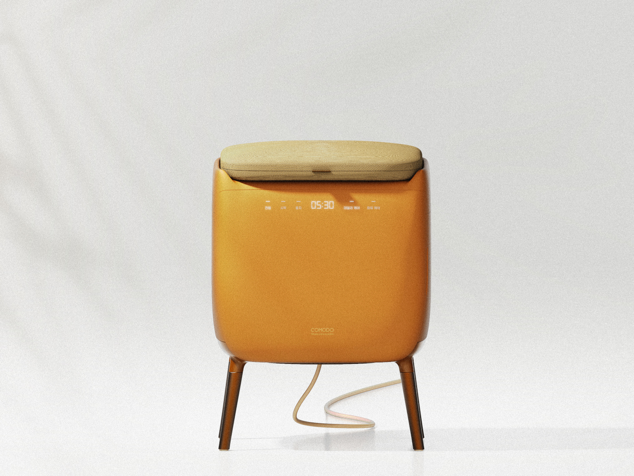
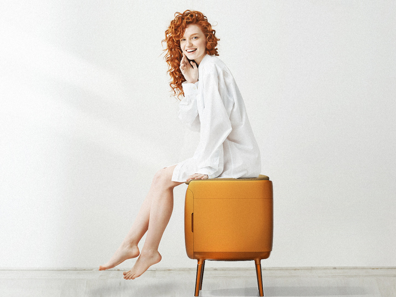
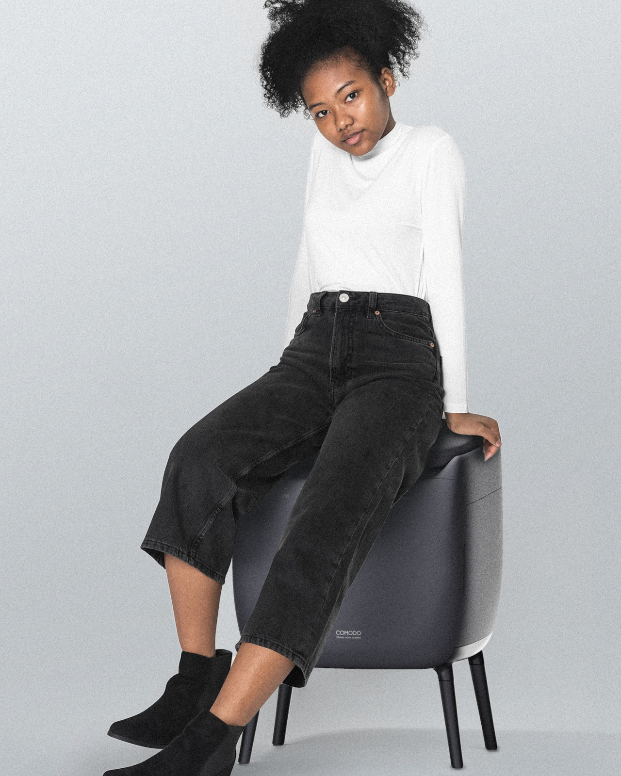
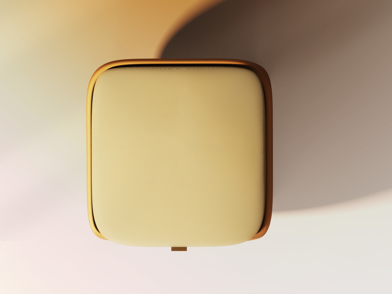
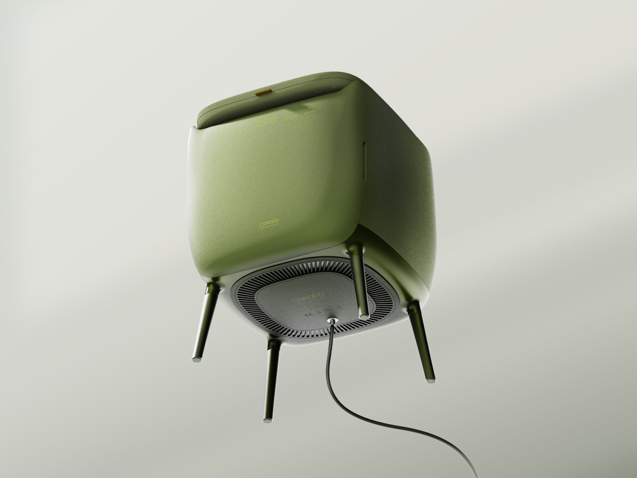
The form is a soft, rounded cube on four slender legs, available in muted colors like charcoal gray, mustard yellow, and sage green. The matte, slightly textured body and cushioned top make it read more like a piece of furniture than an appliance, allowing it to sit next to a shoe cabinet or mirror without looking out of place. It’s the kind of thing you could leave in the hallway without feeling like you’re displaying a gadget.

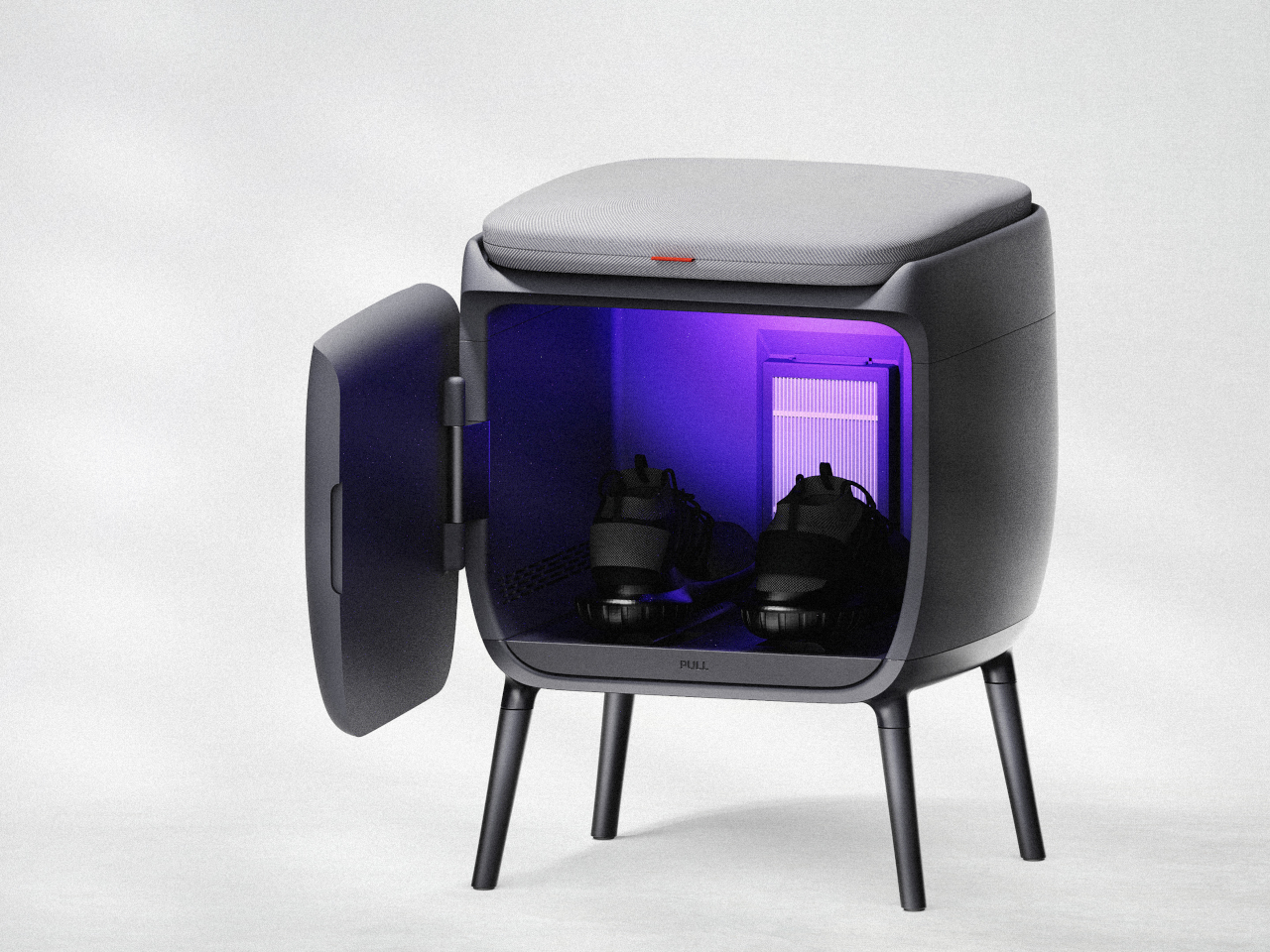
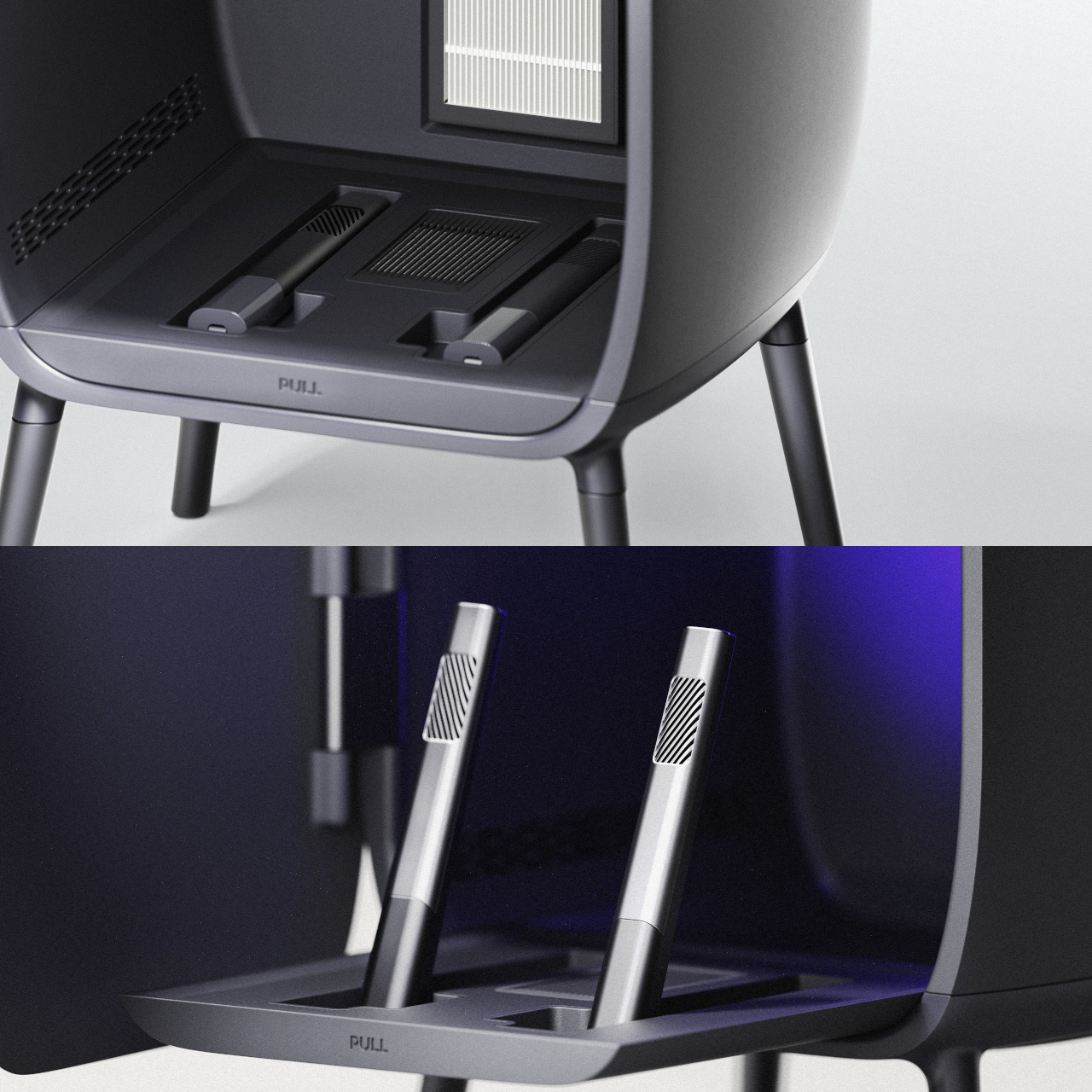
Open the small front door, and you find an interior chamber with what the designer calls an “air shoetree” and vents. Shoes can be placed on angled posts or directly on the floor of the chamber, where warm air circulates to dry them. A HEPA filter and scent filter work together to remove damp odors and add a gentle fragrance, while a UV lamp at the top targets germs on the surfaces.

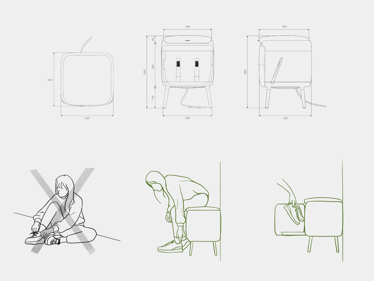
The air shoetree offers some flexibility. Because you can either insert shoes onto the posts or rest them inside the chamber, COMODO can handle different shapes, from sneakers to ankle boots. The base plate slides forward like a shallow drawer, bringing the shoes closer to you and making it easier to place them or even use the raised platform while putting them on.

Of course, COMODO also doubles as a proper seat. Many people still sit on the floor to tie laces or wrestle with boots, which is uncomfortable and hard on the knees. The padded top gives you a seat at just the right height, so you can sit, open the door, pull out the sliding base, and deal with your shoes without crouching or balancing awkwardly.

COMODO imagines an entryway where shoes are not just stored but actively cared for, and where the object that helps you put them on also makes sure they’re dry, fresh, and ready for the next day. It’s a small but thoughtful intervention in the daily routine of leaving and returning home, a gentle reminder that even the most ordinary corners can benefit from a bit of design attention.

The post COMODO Entryway Stool Dries and Deodorizes Shoes While You Sit first appeared on Yanko Design.
DIY Coffee Sand Table Turns a Living Room Surface Into Moving Art

Most coffee tables are static slabs of wood, glass, or stone, maybe with a stack of books on top that never gets read. There’s a growing fascination with kinetic sand tables that draw patterns under glass, turning a surface into something alive. Arrakis 3.0 is a DIY coffee table that brings that idea into a more compact, furniture-friendly form you can actually live with in a normal apartment instead of a gallery.

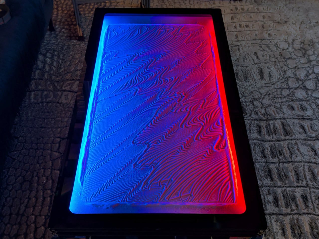
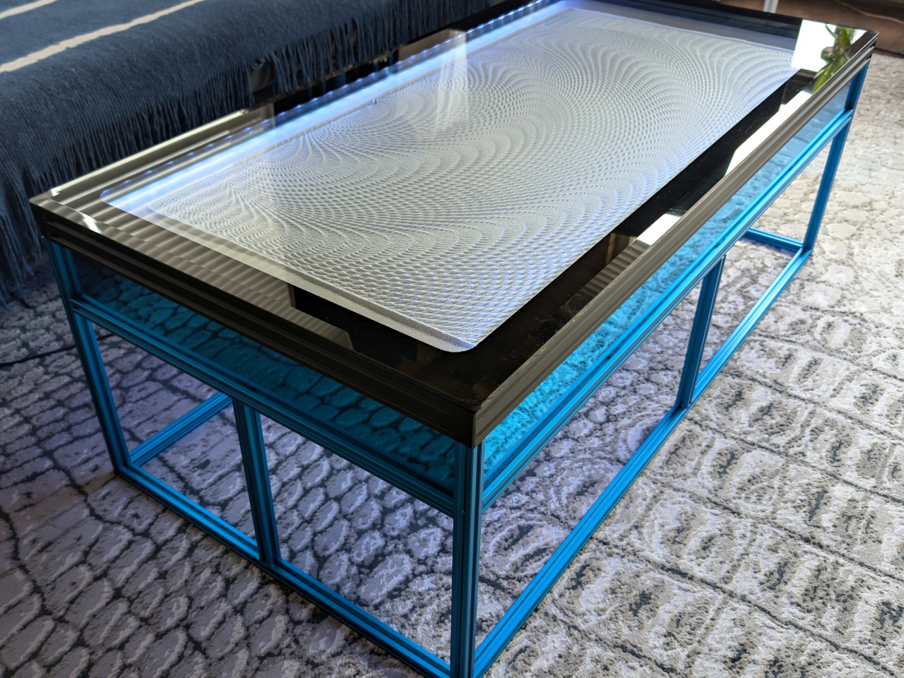
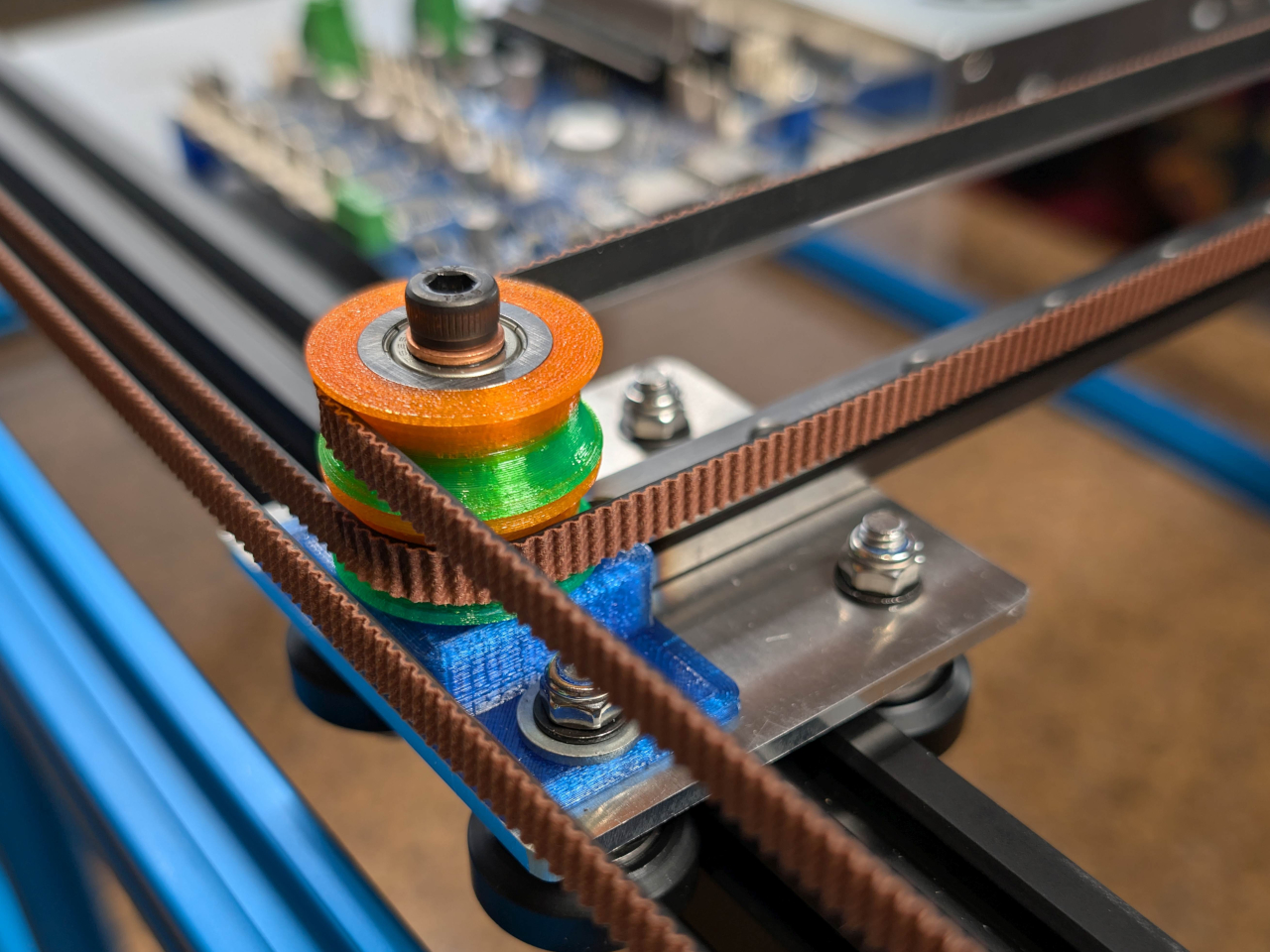
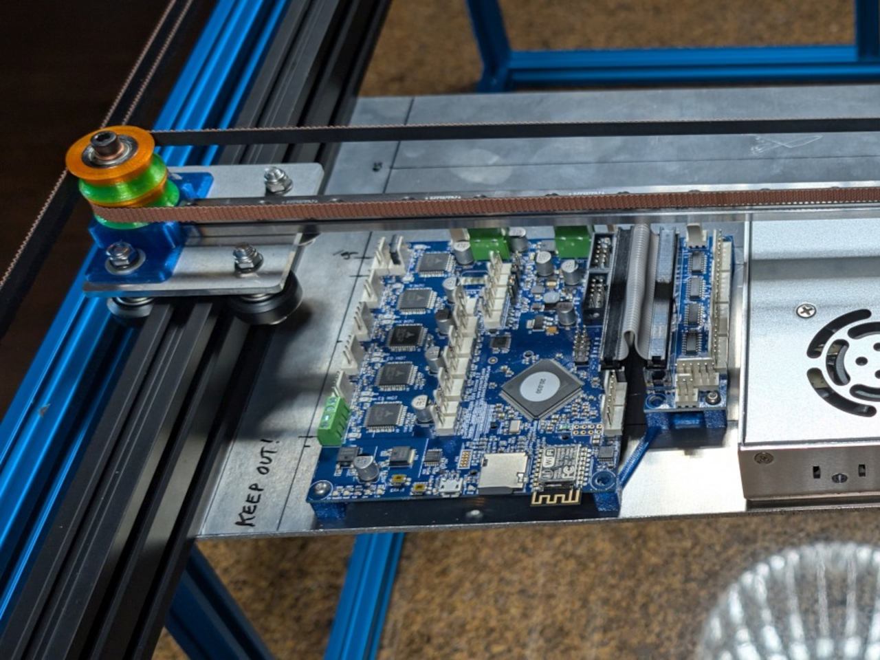
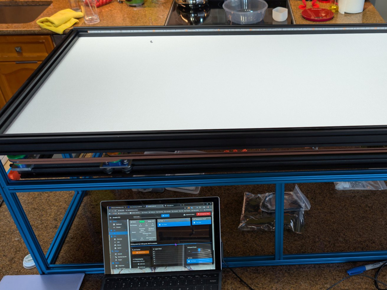
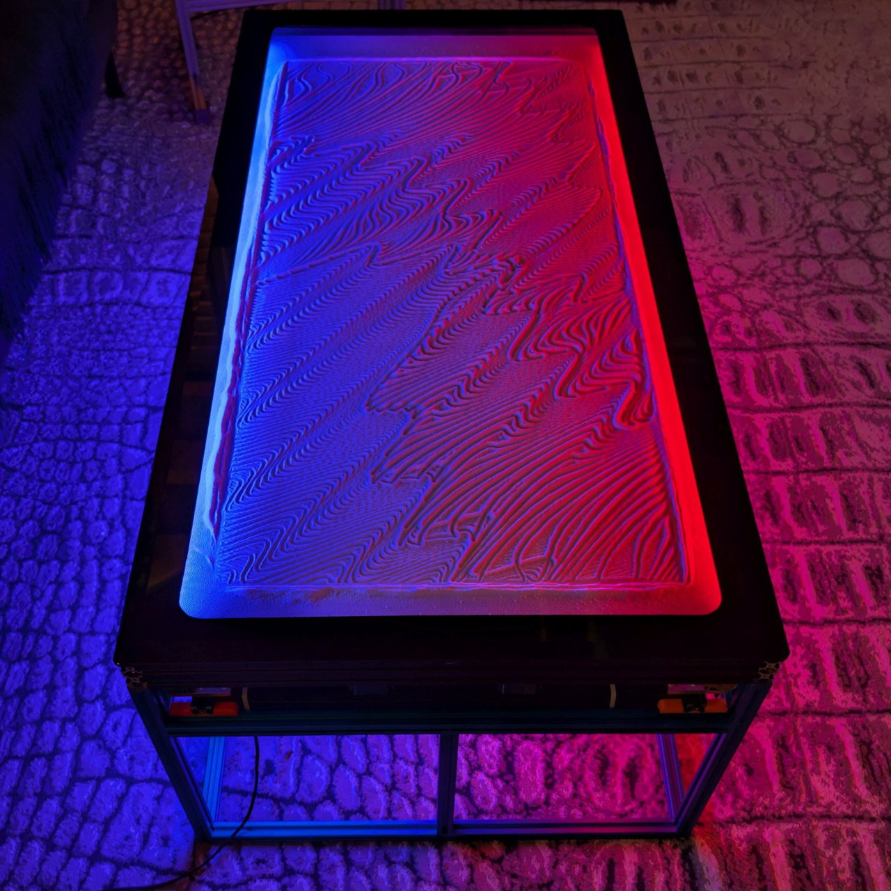
Arrakis 3.0 is the latest iteration of Mark Rehorst’s sand table experiments, this time designed from the start as a practical coffee table. Under a standard 24-by-48-inch glass top, a steel ball slowly traces patterns in a bed of white sand, guided by a hidden mechanism. From above, all you see is a glowing sandbox under glass, constantly redrawing itself while your coffee sits on top.

Designer: Mark Rehorst

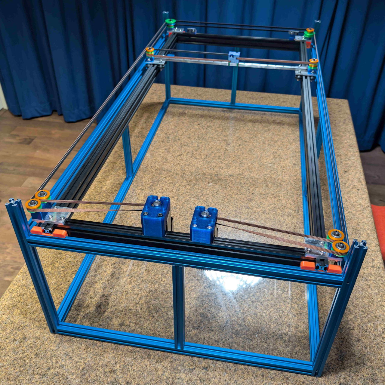
A blue anodized aluminum frame forms the table’s skeleton, supporting a black anodized sandbox that sits neatly inside it. The sand rests on a white base, so the patterns read clearly through the glass. A beveled glass top with a black border floats above, hiding the LEDs from direct view and making the whole thing read as a finished piece of furniture rather than a lab rig you’re still tweaking.

RGB LED strips tucked into the sandbox edges wash the sandbed in color, while additional strips under the frame cast a soft glow onto the floor. In a darkened room, the table becomes a low, luminous object, with the ball’s path slowly emerging and fading. The combination of blue frame, black sandbox, white sand, and colored light gives it a clear visual identity without feeling loud or desperate for attention.

Light blue mirrored acrylic panels fill the gaps in the frame, reflecting the LEDs and sandbed while hiding the mechanical guts. They’re centered in the slots with clear silicone edging, so they sit cleanly and don’t rattle. From the side, you see a band of soft reflection rather than belts and pulleys, which helps the table feel more like intentional furniture and less like an exposed machine.

The ball moves slowly enough that you don’t watch it like a screen, but you notice that the pattern is always changing when you glance down. Over the course of an evening, lines accumulate, overlap, and get erased as new designs start. It’s closer to having a mechanical fireplace or aquarium than a gadget, something that quietly animates the room without demanding attention every five seconds.

Arrakis 3.0 shows how DIY can cross into design territory. By tightening the footprint, standardizing the glass, and wrapping the mechanism in a coherent color and light story, this version feels less like a project and more like a piece you’d actually want to put your coffee on. The moving patterns and soft glow give it a presence that changes the room without overwhelming it.

The post DIY Coffee Sand Table Turns a Living Room Surface Into Moving Art first appeared on Yanko Design.

This Swedish Designer Just Turned Childhood Puzzles Into Furniture

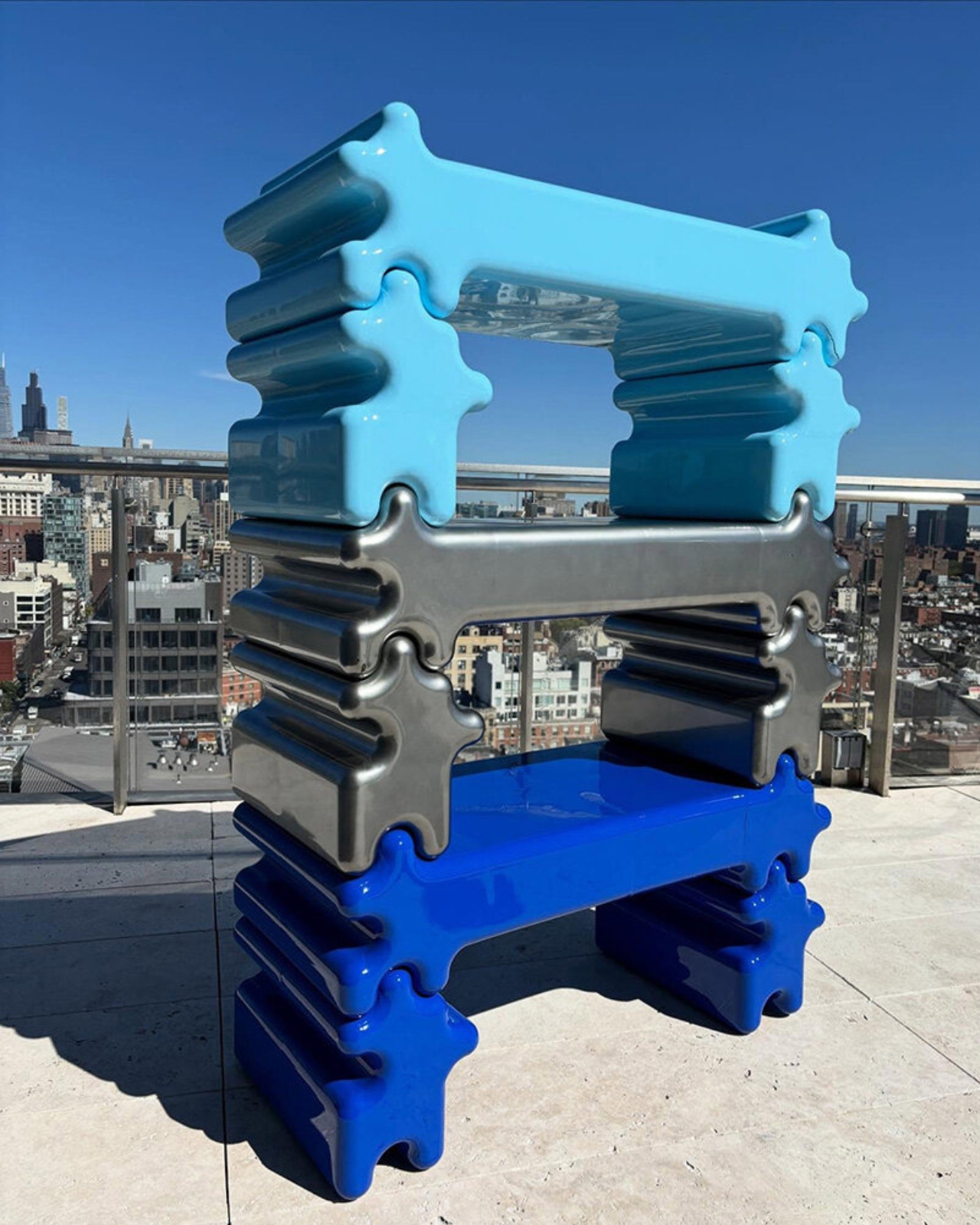
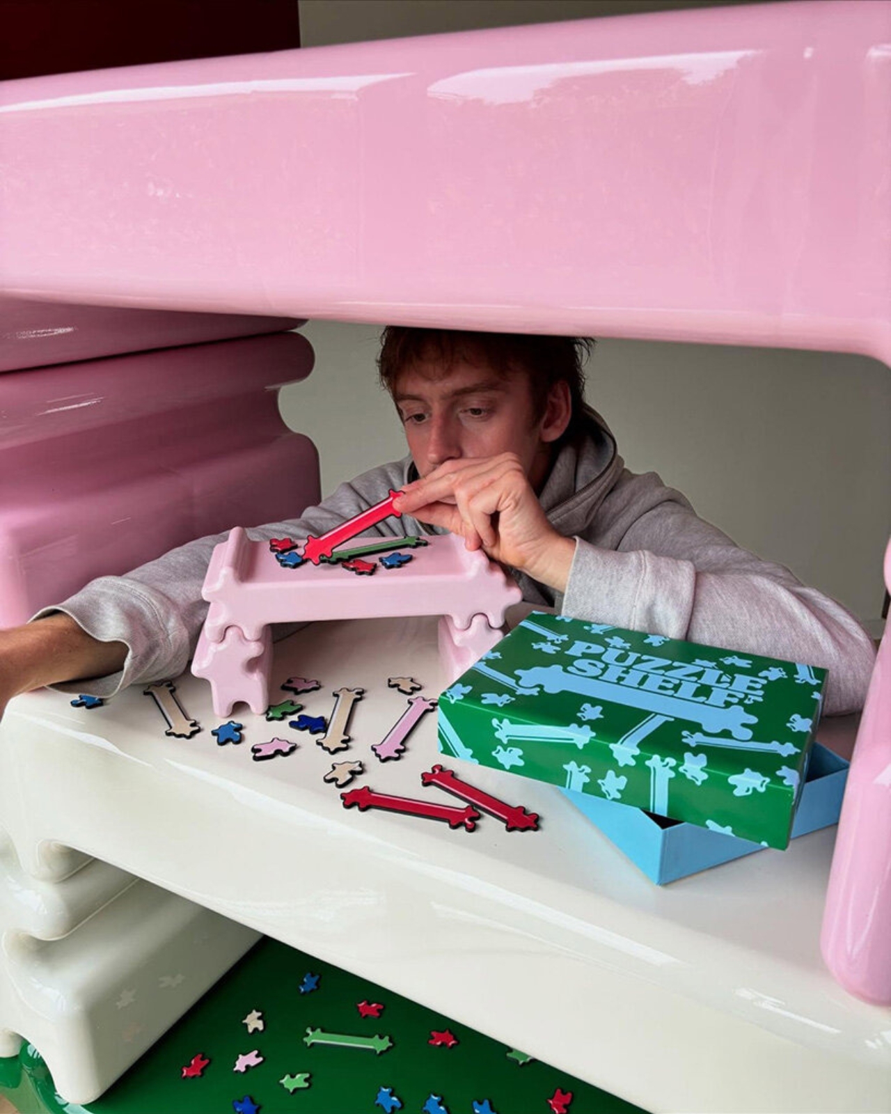
You know that satisfying click when two puzzle pieces finally snap together? Swedish designer Gustaf Westman has blown that feeling up to furniture-size with his latest creation, the Puzzle Shelf, and honestly, it’s the kind of playful design we didn’t know we needed.

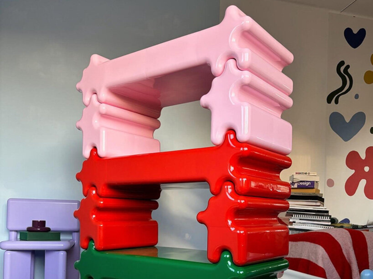
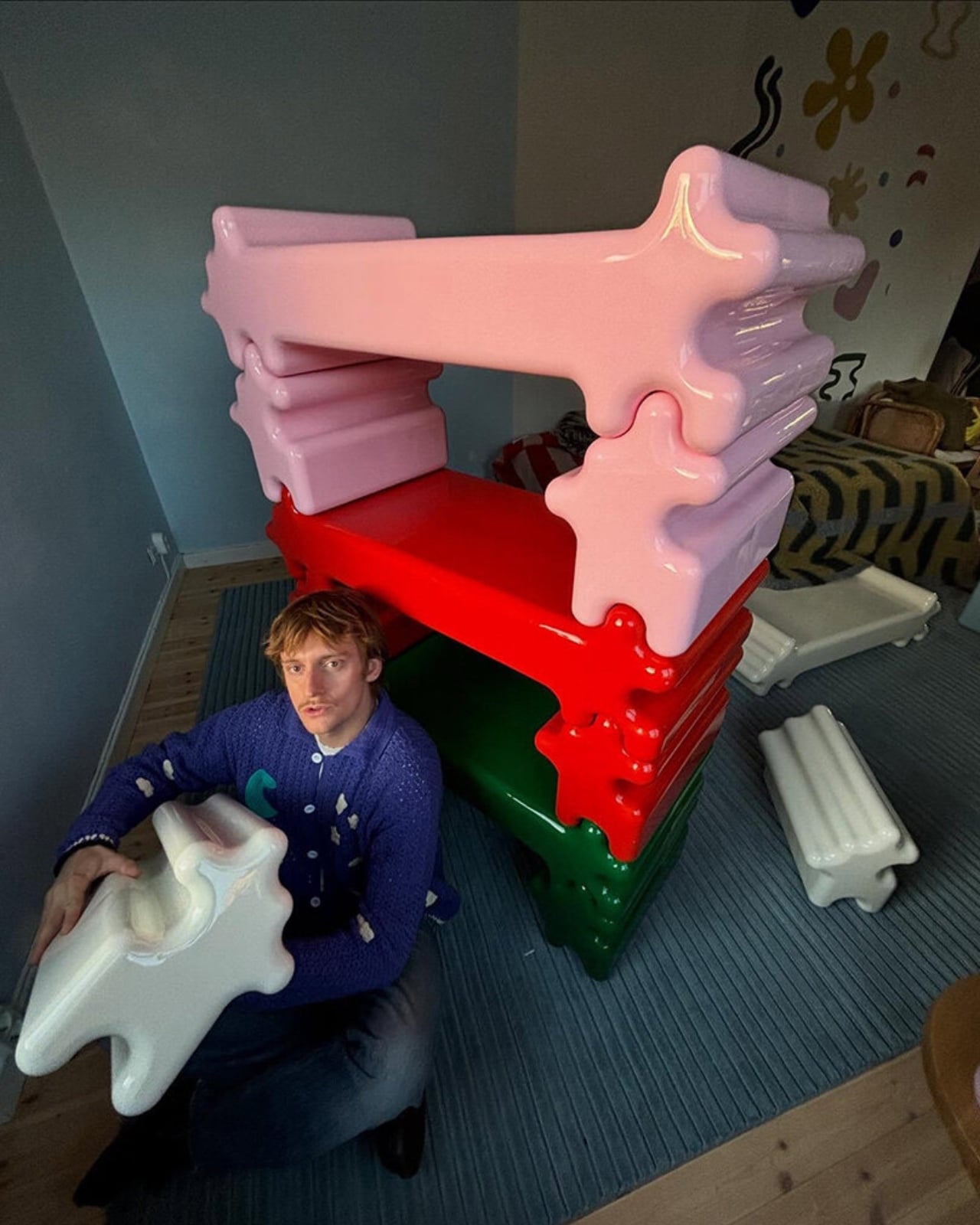
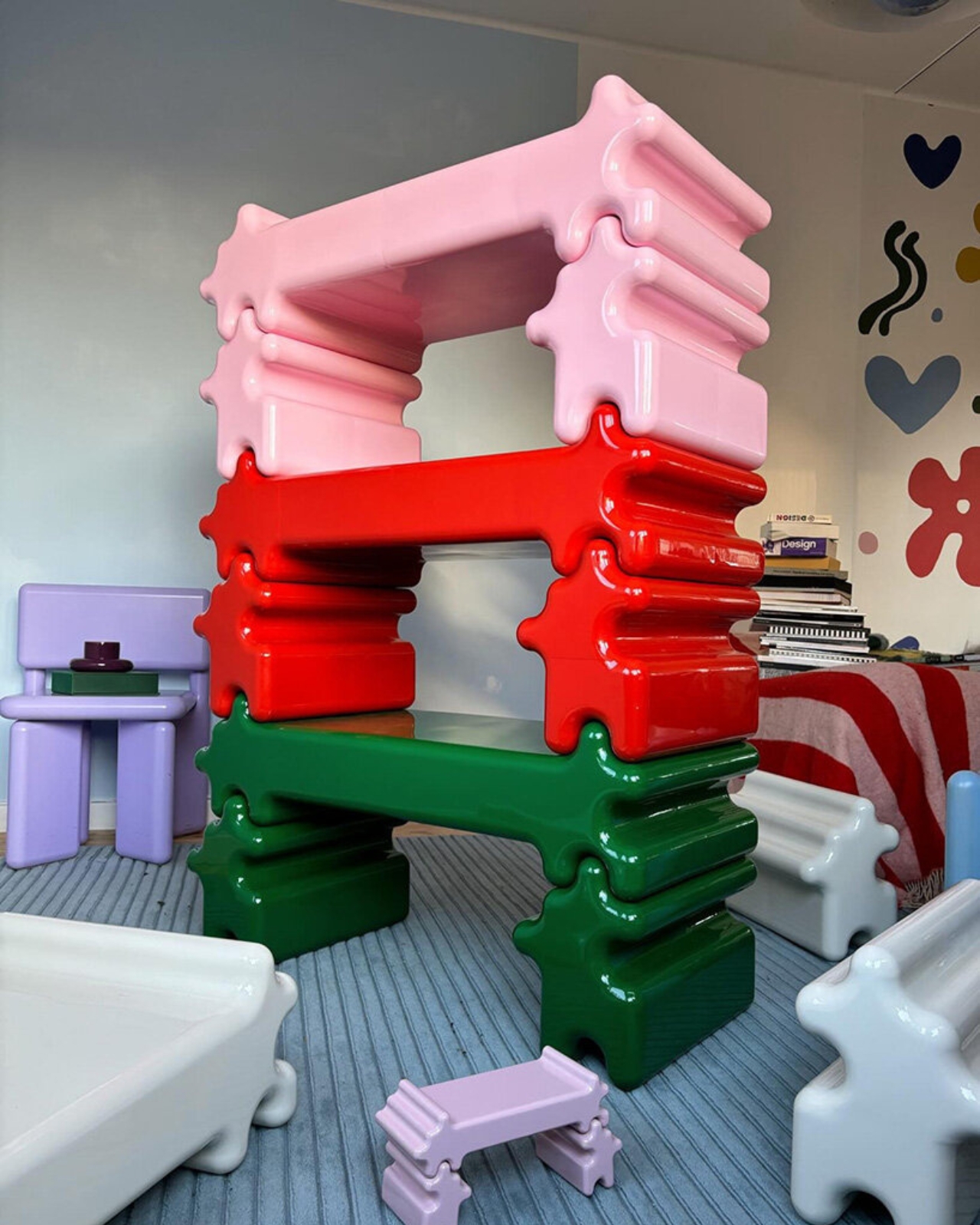
If you’ve been following Westman on Instagram (and you really should be), you’ve probably already fallen for his signature aesthetic: chunky, glossy objects in candy-bright colors that somehow manage to feel both nostalgic and completely modern. Think rounded edges, inflated geometry, and a sense of humor that most furniture seriously lacks. The Puzzle Shelf fits right into this universe while marking something new for the designer. It’s his first venture into modular shelving, and it’s exactly as delightful as you’d expect.

Designer: Gustaf Westman

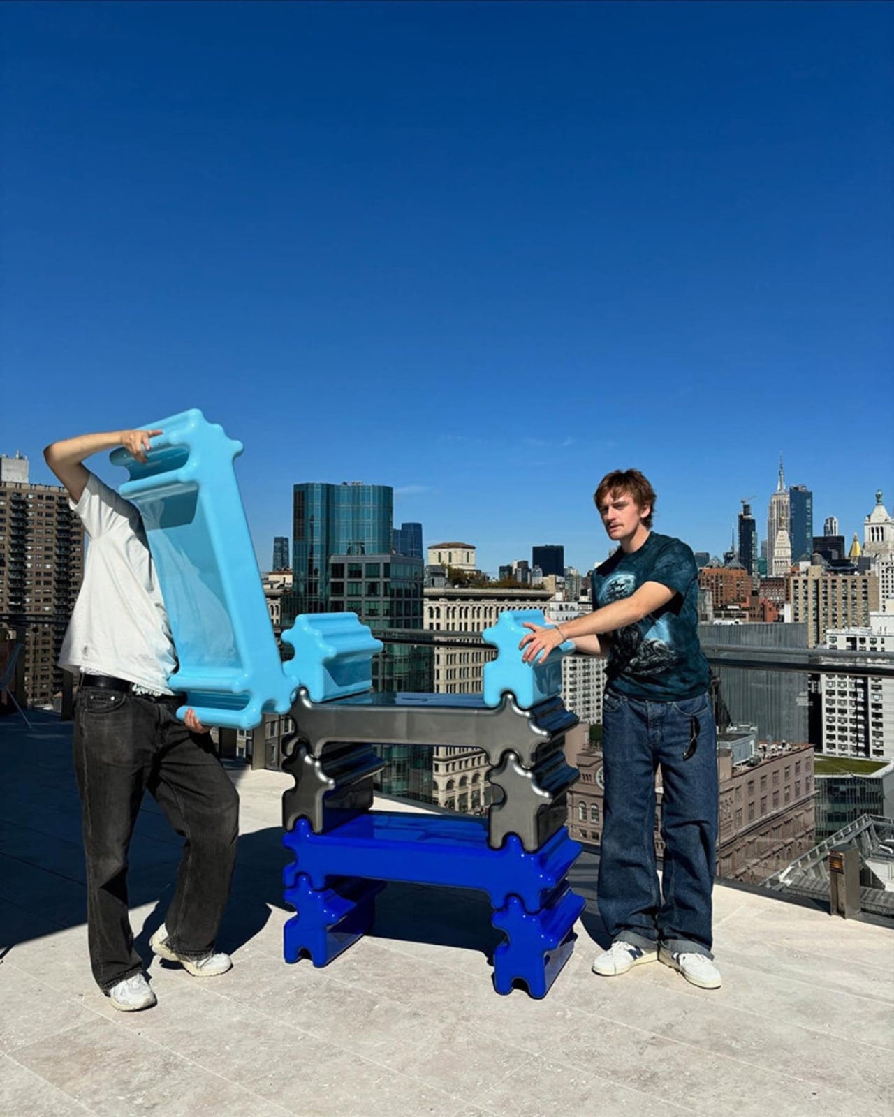
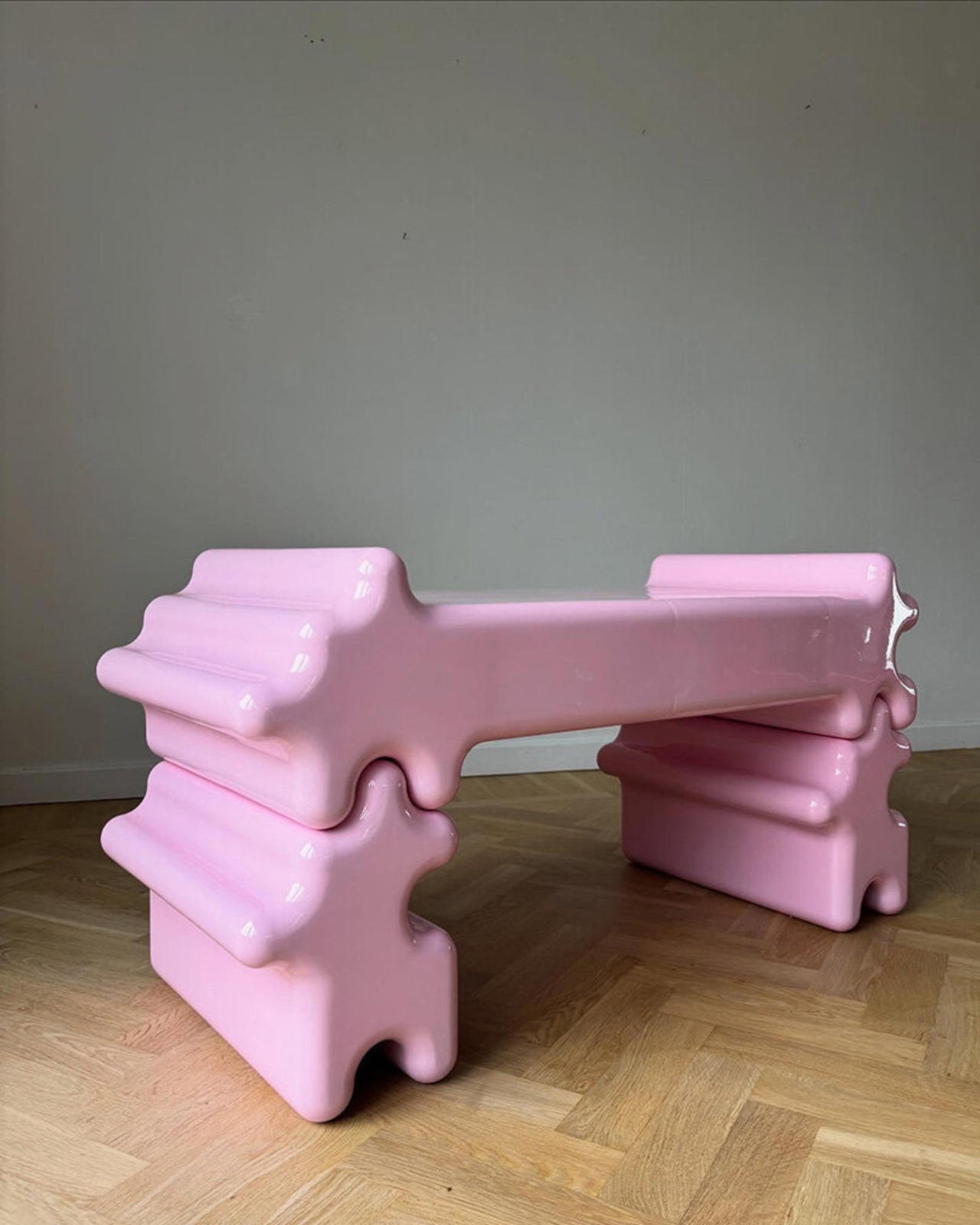
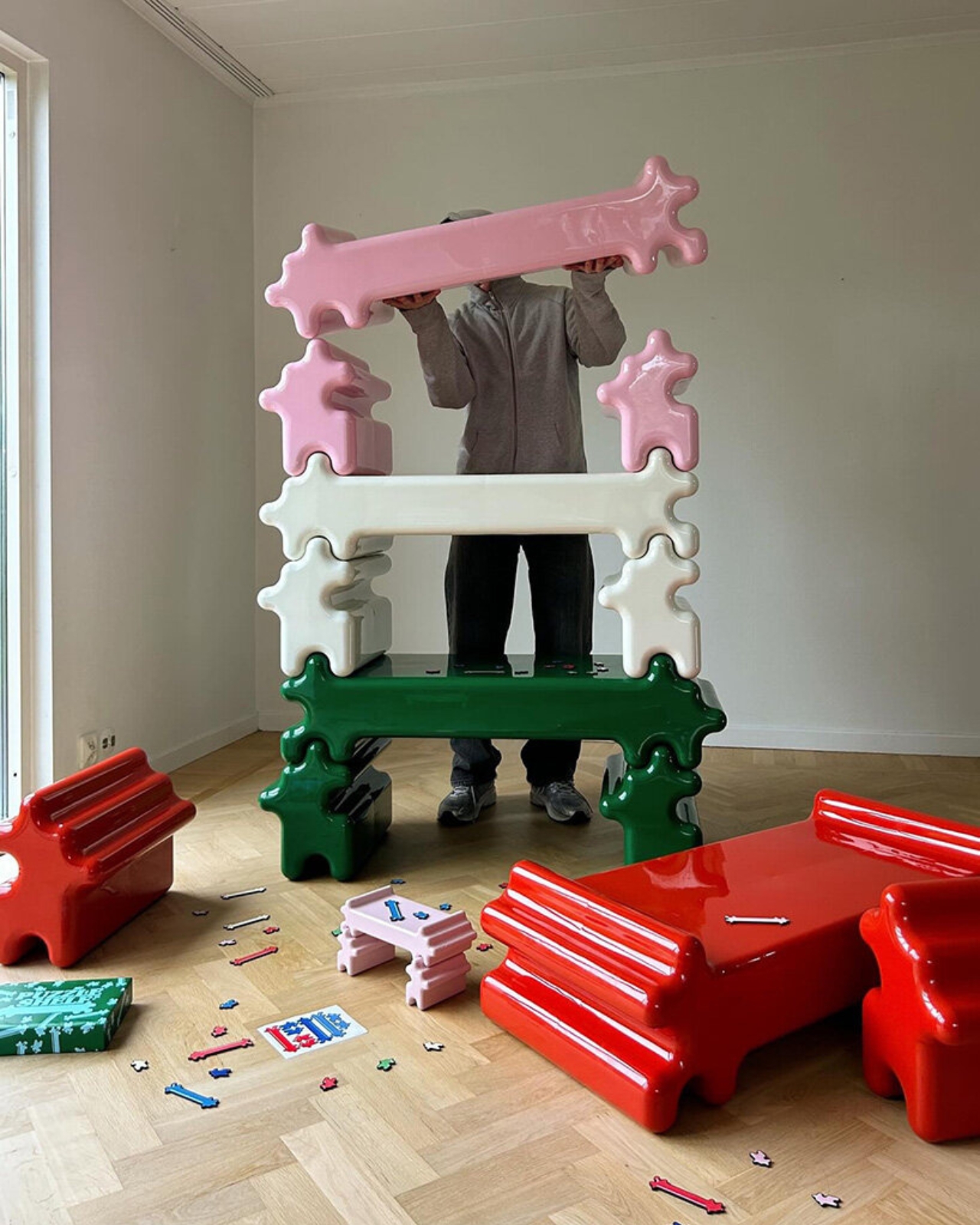
The concept is brilliantly simple. Westman took inspiration from, well, puzzles. Actual jigsaw puzzles. “I usually get inspired by the most random things, and in this case, puzzles,” he explains in a recent Instagram Reel. Each shelf unit features those familiar protruding tabs and recessed slots that slide and lock together without any visible hardware. No screws, no Allen keys, no confusing instruction manuals with cryptic diagrams. Just pure, friction-based satisfaction.

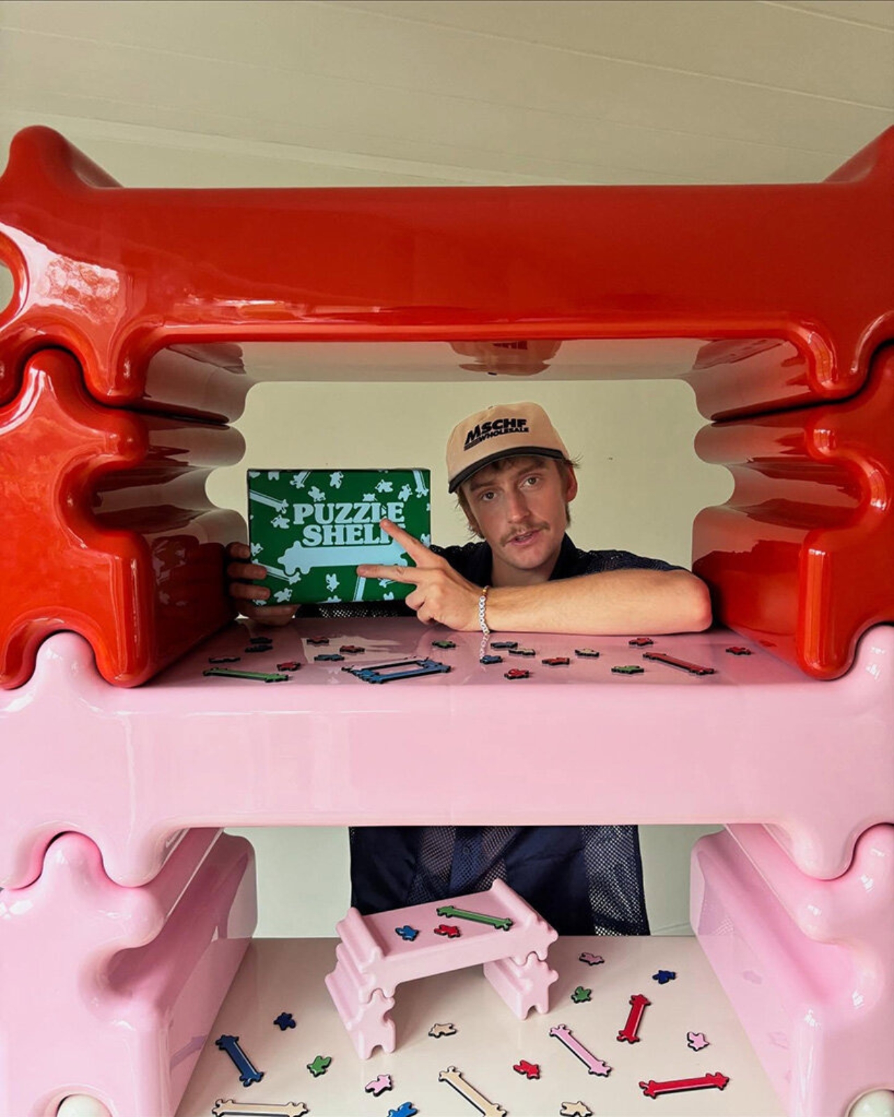
What makes the Puzzle Shelf so compelling is how it transforms something functional into something sculptural. These aren’t just storage units. They’re bone-shaped, oversized blocks that you can stack, rearrange, and play with to create whatever configuration your space needs. Want a tall tower of shelves? Go for it. Prefer something low and horizontal? That works too. The system is completely flexible, giving you the kind of creative control that makes arranging your space feel more like art than organization.

Westman’s design process is also pretty fascinating. Before committing to full-scale production, he tests everything through 3D printed miniatures that mirror the final product almost exactly. It’s a smart approach that lets him work out all the kinks while keeping that essential puzzle functionality intact. The result is a system that actually works the way it promises to, which in the world of trendy furniture, is refreshingly rare.

And can we talk about how these pieces look? The glossy finish and those signature candy hues make the Puzzle Shelf feel like an oversized toy that somehow grew up without losing its sense of fun. It’s the kind of design that makes you smile when you walk past it, which is exactly what good furniture should do. Plus, the generous spacing between levels means you actually have room for your books, plants, ceramics, or whatever else you want to display.

This latest piece comes on the heels of Westman’s collaboration with IKEA earlier this year, a 12-piece collection that brought his playful aesthetic to a wider audience. That partnership showed how his rounded forms and informal approach to design could translate across different price points and product types. The Puzzle Shelf feels like the next logical step, proving that Westman’s chunky universe has plenty of room to grow.

What’s refreshing about Westman’s work is that it never takes itself too seriously. There’s a lightness to his designs, a sense that furniture doesn’t have to be stuffy or precious. The Puzzle Shelf embodies this philosophy perfectly. It’s functional without being boring, sculptural without being impractical, and playful without being juvenile. It invites you to interact with it, to rearrange it, to make it your own. It isn’t trying to revolutionize how we think about storage. It’s just making the everyday act of organizing your stuff a little more joyful, a little more tactile, and a lot more fun. And isn’t that what good design should do?

The post This Swedish Designer Just Turned Childhood Puzzles Into Furniture first appeared on Yanko Design.

This Furniture Trick Makes Flat Wood Look Curved With Zero Waste

Have you ever wondered why ergonomic furniture costs so much? Here’s a secret: creating curves that actually fit the human body is ridiculously complicated. Our bodies are all soft lines and organic shapes, but transforming hard materials like wood into those comfortable contours usually requires serious craftsmanship, expensive machinery, or both. Designer Minhwan Kim just cracked this puzzle in the most elegant way possible, and the design world is taking notice. Layer, his recent furniture project, just won Red Dot’s prestigious “Best of the Best” award for 2025.

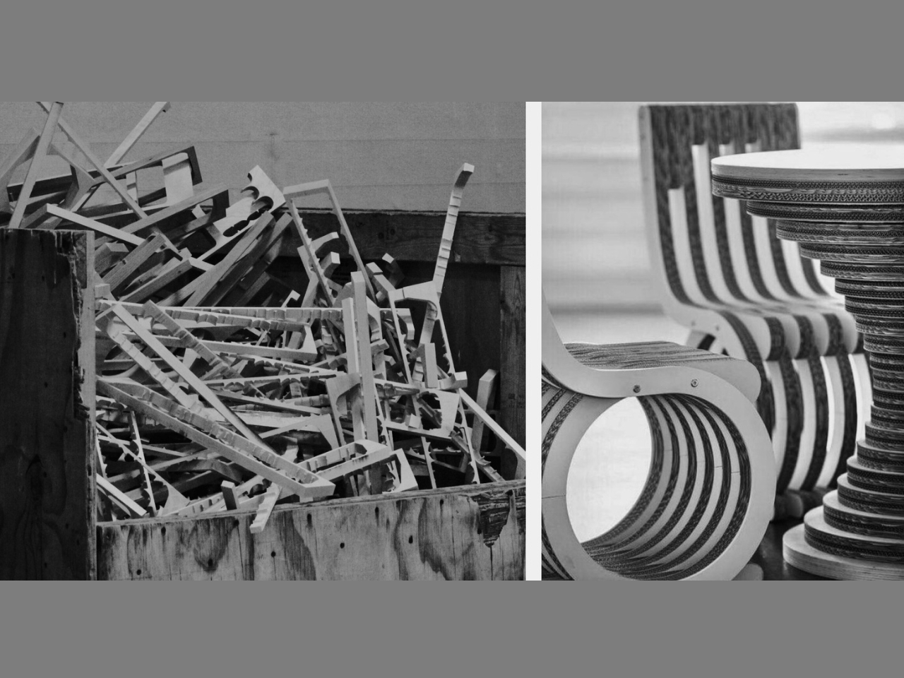
The genius of Layer lies in how it rethinks an old problem. Traditional curved furniture typically means either steam-bending wood (labor-intensive and temperamental) or carving from solid blocks (hello, massive waste). Some designers have experimented with parametric structures, which use flat sheets cut into specific patterns that can be assembled into three-dimensional curves. It sounds perfect in theory, but there’s a catch. These designs often waste huge amounts of material because the cutting patterns don’t efficiently use the available sheet space. You end up with gorgeous furniture and a dumpster full of expensive scraps.

Designer: Minhwan Kim

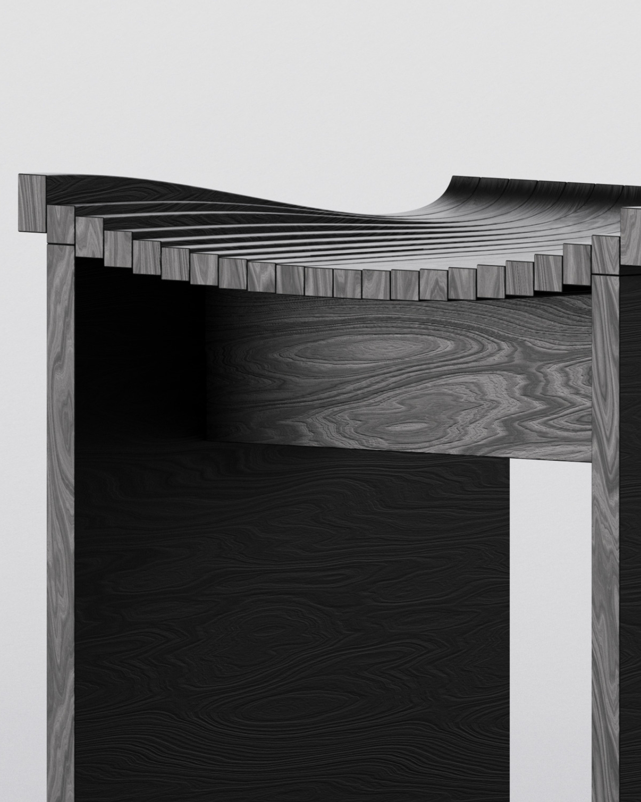
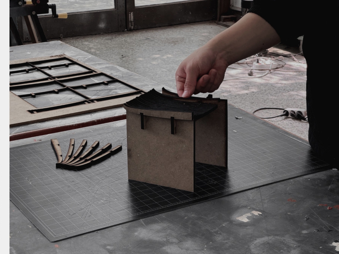
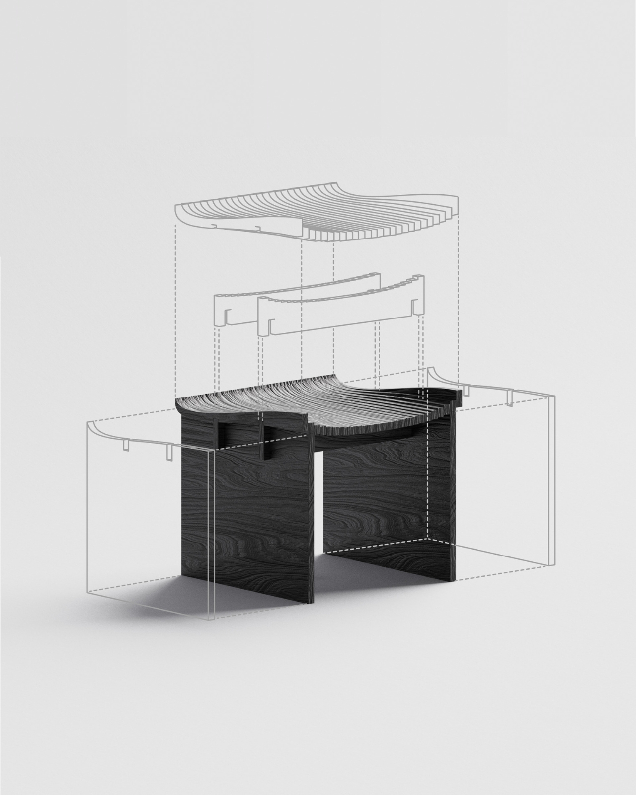
Kim’s approach flips this wasteful equation. Layer uses an optimized parametric system that minimizes material waste while creating furniture that looks like it was sculpted rather than assembled. The process starts by digitally breaking down a 3D curved surface into individual layers. Think of it like those topographic maps that show elevation through contour lines, except here each line becomes a physical piece of wood. These intersection curves are then aligned and processed into solid wood components that stack together to create the final form.

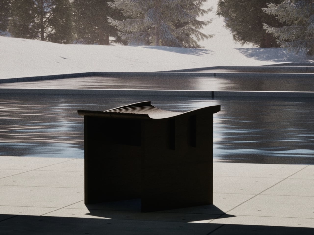
The beauty of this system is visible in the finished pieces. That curved seat you see isn’t molded or carved. It’s actually dozens of thin wooden layers precisely cut and stacked, creating a fluid, organic surface that perfectly supports the human form. The wood grain flows across the surface like waves, emphasizing the layered construction rather than hiding it. It’s functional sculpture that actually works as furniture.

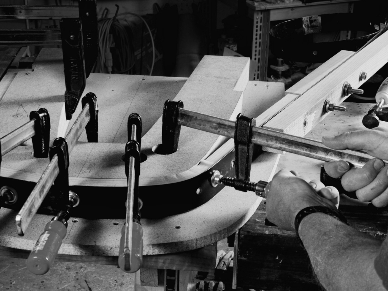
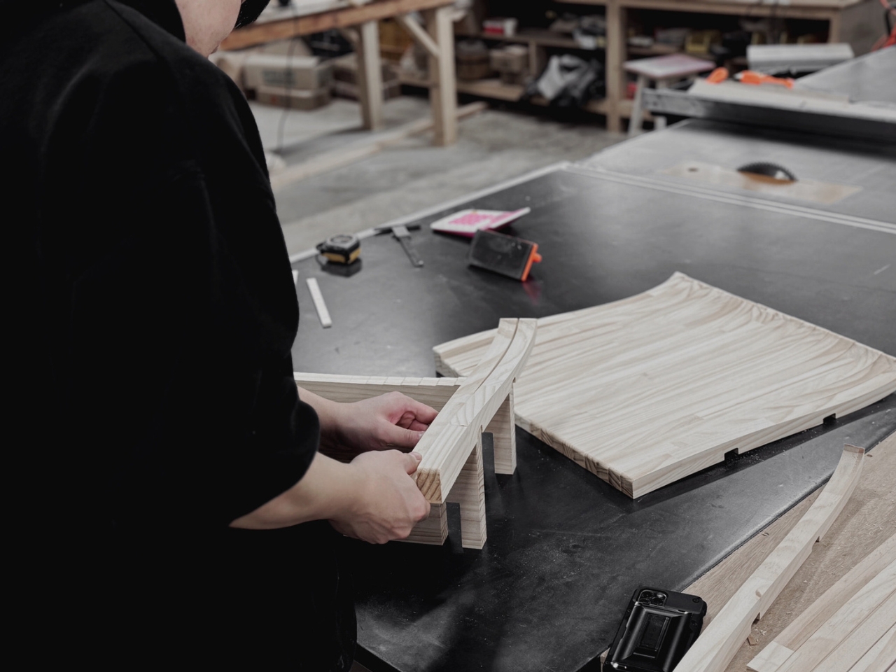
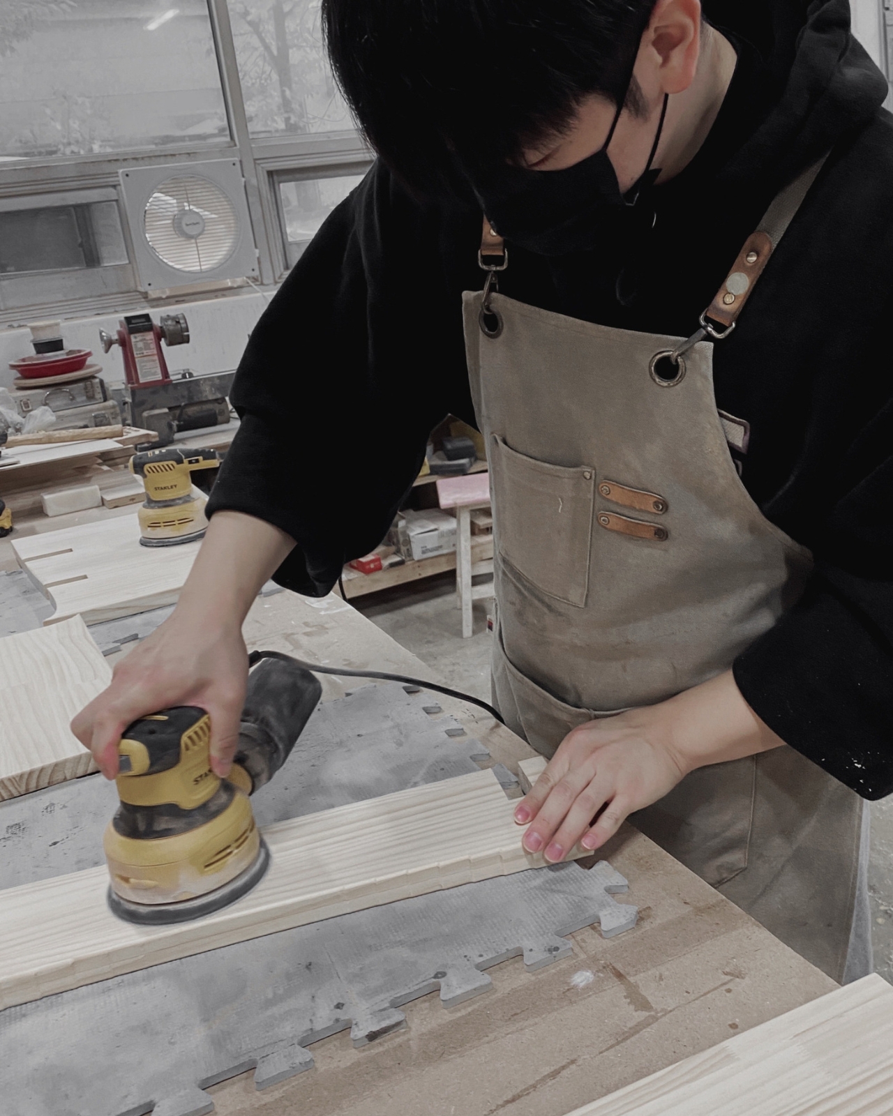
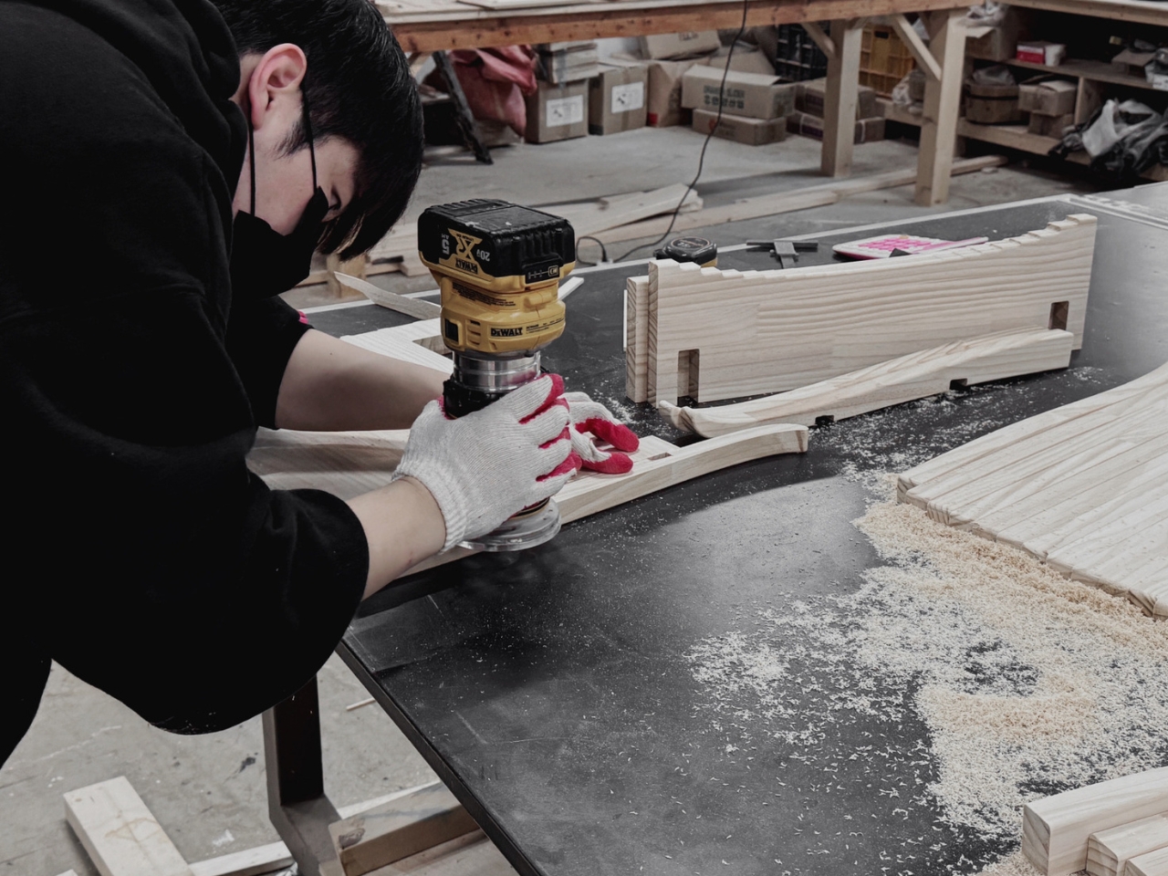
What really makes this project special is how it bridges digital design and traditional craftsmanship. The parametric modeling happens on a computer, allowing Kim to optimize every cut for minimal waste. But the actual fabrication involves real woodworking, real routers and sanders, and actual human hands assembling each layer. You can see this in the workshop photos where curved wooden ribs are being clamped together, sawdust coating the workbench, showing that even cutting-edge design still requires getting your hands dirty.

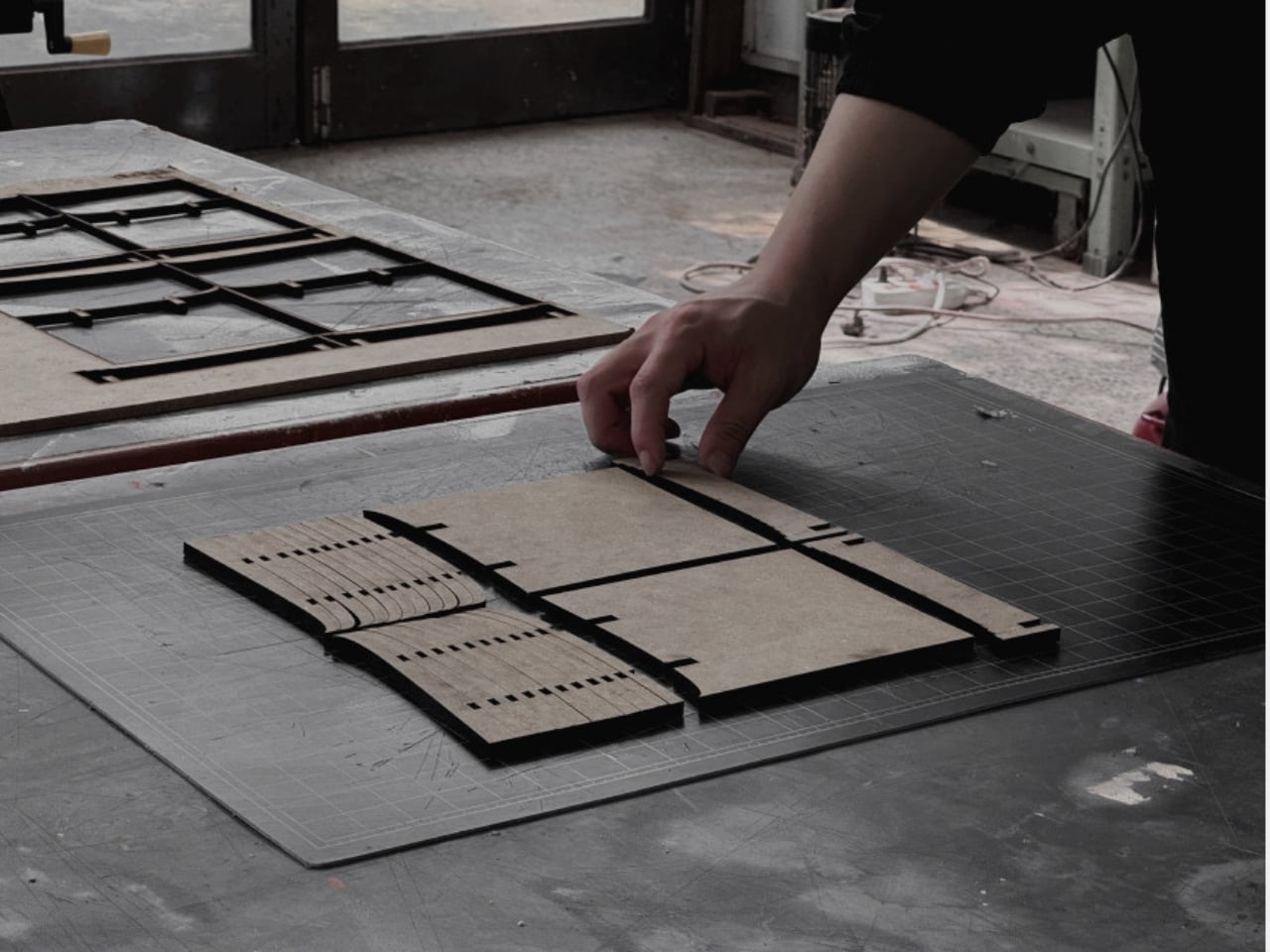
The manufacturing process is surprisingly straightforward once you understand the system. Standard flat plywood sheets get CNC-cut into the calculated patterns. Because the system is optimized, the pieces nest together on the sheet like a jigsaw puzzle, using nearly every inch of material. These flat pieces are then processed into their final curved profiles through careful routing. Finally, they’re assembled layer by layer, each piece fitting into precisely calculated positions until the complete three-dimensional form emerges.

This isn’t just clever for its own sake. In an era when we’re increasingly aware of material consumption and waste, Layer demonstrates how thoughtful design can be both beautiful and responsible. The furniture industry generates enormous amounts of waste, particularly in custom and high-end pieces. By optimizing material usage from the digital design phase, Kim shows that sustainability and aesthetics don’t have to be competing values.

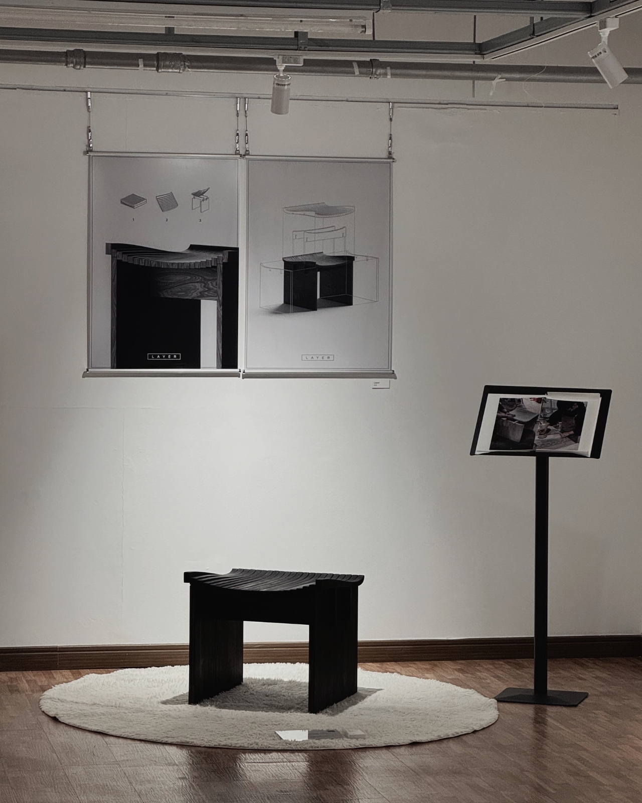
The finished stool in the exhibition space looks deceptively simple. Its dark wood surface curves gently to cradle the body, the layered edge visible like the pages of a closed book. Nothing about it screams “innovative fabrication technique” or “award-winning design.” It just looks like a really nice piece of furniture you’d actually want in your home. And maybe that’s the highest compliment you can give any design: it solves complex problems so elegantly that the solution becomes invisible.

For anyone interested in where design and technology intersect, Layer represents an exciting direction. It shows how computational design tools can enhance rather than replace traditional craft, and how constraints like material efficiency can inspire creative solutions rather than limiting them. Sometimes the most innovative designs aren’t about flashy new materials or radical forms, but about finding smarter ways to work with what we’ve always had.

The post This Furniture Trick Makes Flat Wood Look Curved With Zero Waste first appeared on Yanko Design.

This Floating Bench Defies Gravity (and Your Expectations)

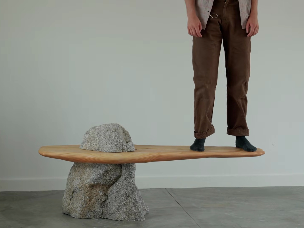
Have you ever looked at a mountain peak piercing through clouds and thought, “I want to sit on that”? Well, Miles Hass from Make With Miles did exactly that, and the result is a piece of furniture that looks like it belongs in a modern art museum but would feel right at home in your living room.

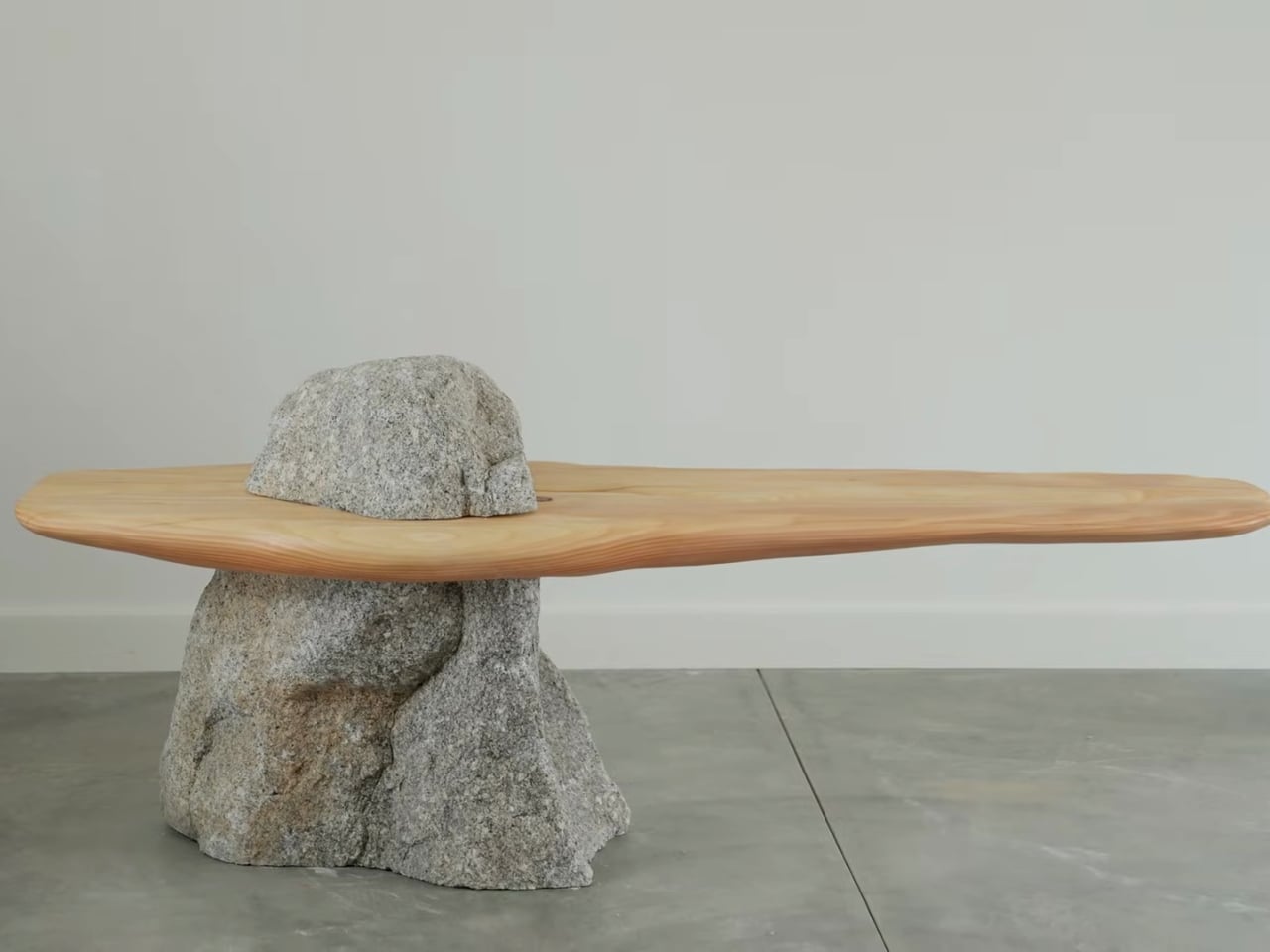
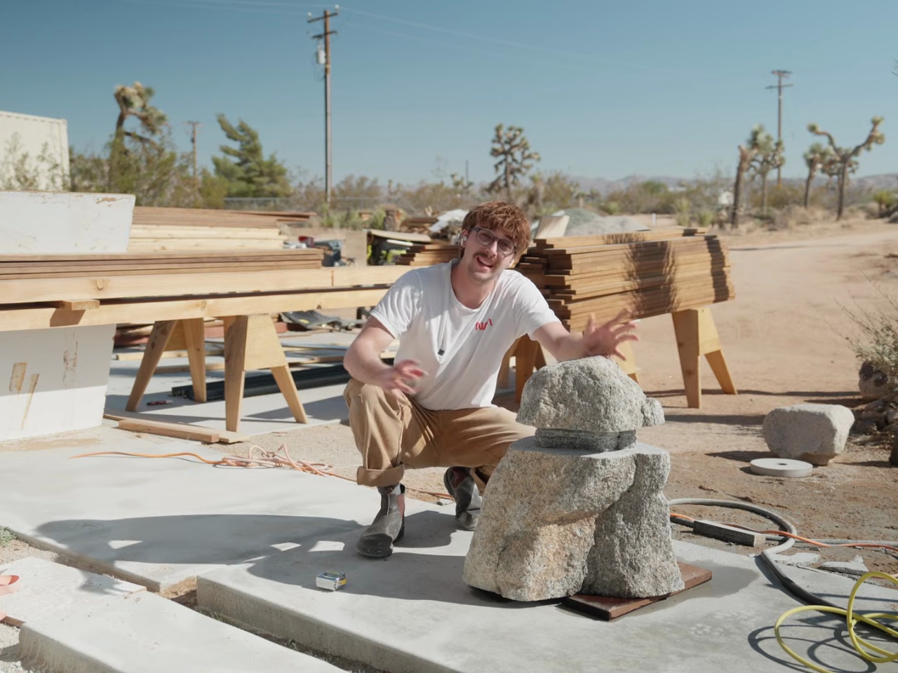
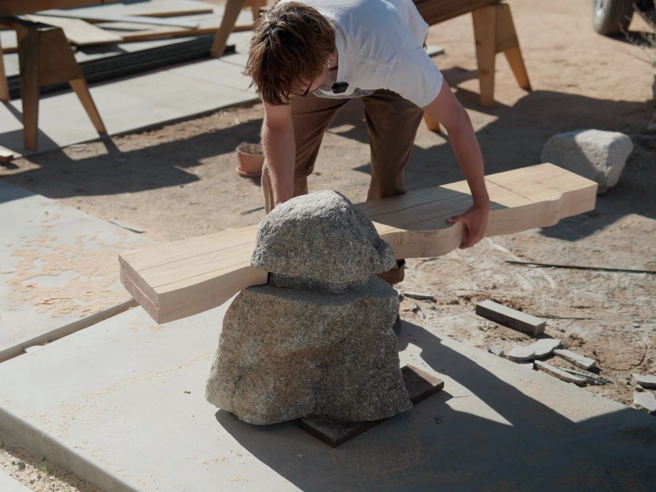
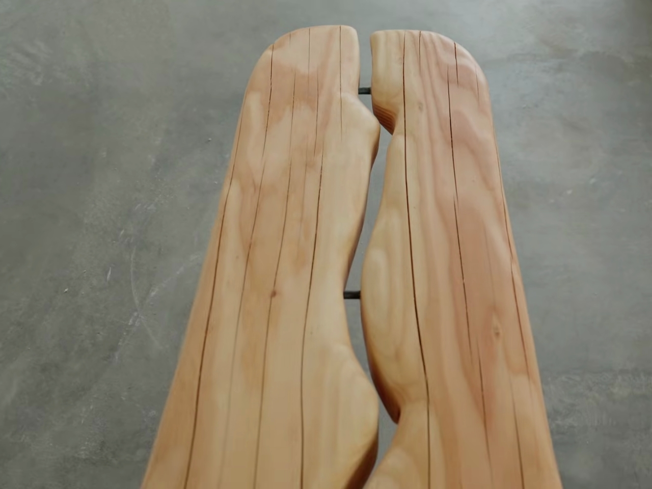
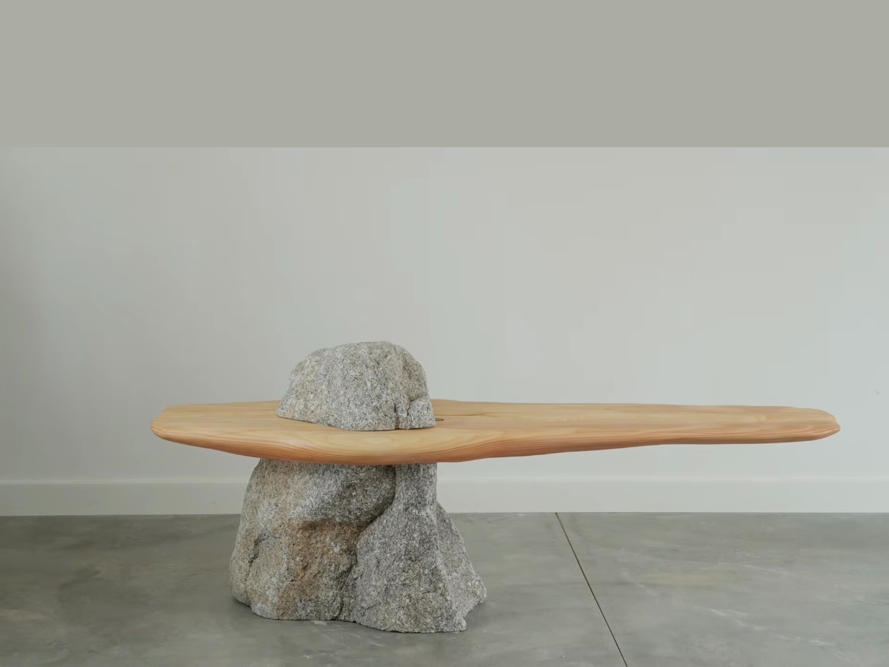
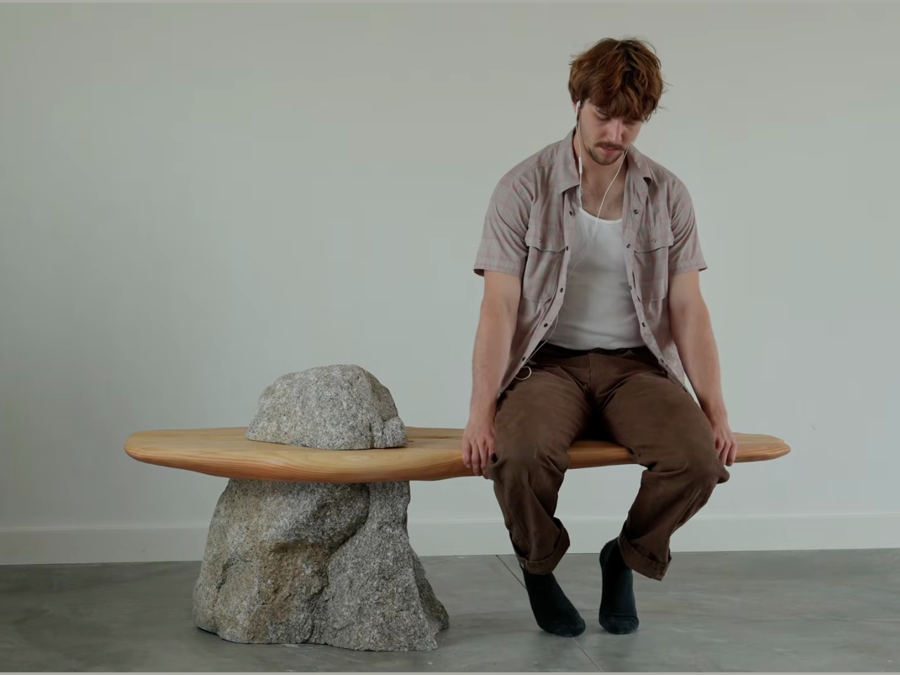
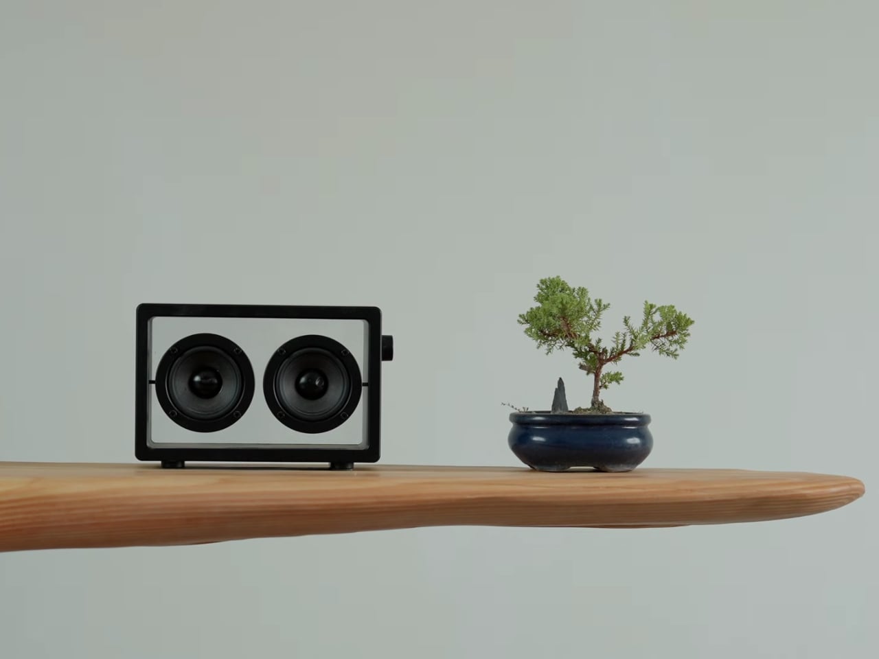
The concept is beautifully simple yet wonderfully complex. A massive rock sits at the base, looking like a mountain rising from the floor, while a wooden bench top appears to float right through it. It’s the kind of design that makes you do a double take because your brain can’t quite process what your eyes are seeing. And that’s exactly the point.

Designer: Miles Hass

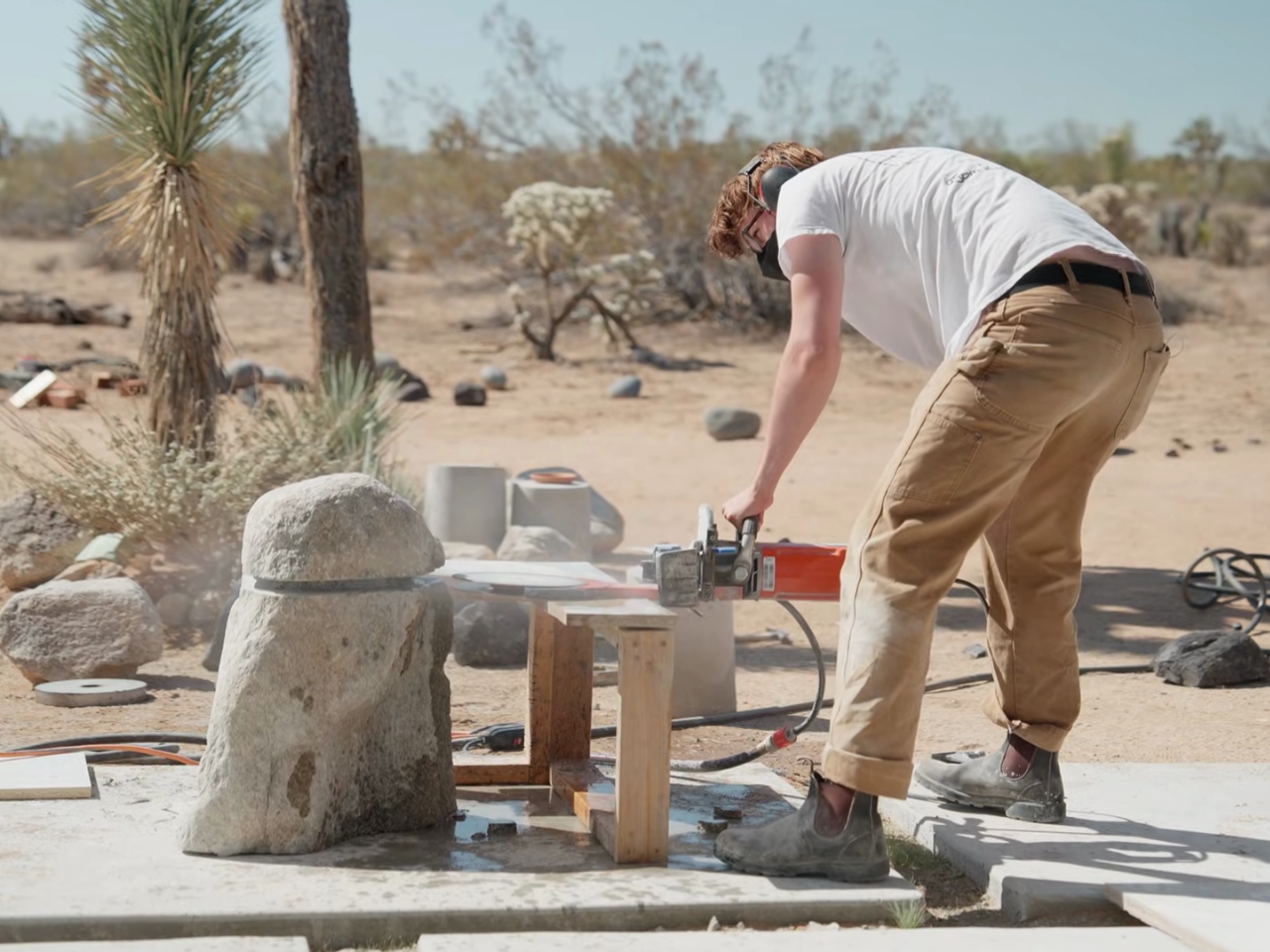
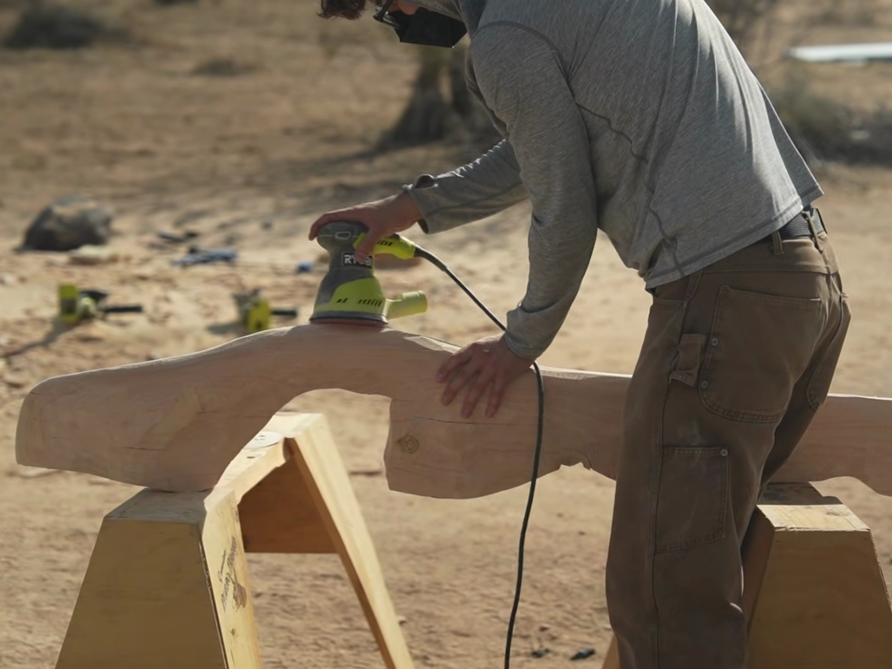
Miles drew inspiration from that dreamy image of mountaintops emerging from clouds, and somehow translated that ethereal feeling into something you can actually sit on. The execution required heading out to Joshua Tree, where he collaborated with fellow maker Ben Uyeda to bring this impossible-looking piece to life. Because apparently, regular furniture shopping was just too easy.
What makes this project particularly fascinating is the challenge it presents. You can’t just slap a piece of wood on a rock and call it a day. The engineering behind making a functional bench that appears to defy gravity while maintaining structural integrity is no small feat. The rock needs to support weight, the wood needs to actually hold someone sitting on it, and the whole thing needs to look effortlessly elegant. It’s like solving a three-dimensional puzzle where one wrong move means your mountain bench becomes a pile of expensive mistakes.

The aesthetic is pure contemporary design poetry. We’re often surrounded by mass-produced IKEA clones so there’s something refreshing about furniture that tells a story. This bench doesn’t just serve a function, it starts conversations. It’s sculptural enough to be art but practical enough to be, you know, an actual bench. That balance is harder to achieve than it looks.

For design enthusiasts, this project represents a growing trend in furniture making where natural elements meet modern sensibilities. We’ve seen epoxy river tables take over Instagram, live-edge everything dominate Pinterest boards, and now we’re watching makers push even further into territory where nature and craft become indistinguishable. The floating bench takes this concept and cranks it up to eleven.

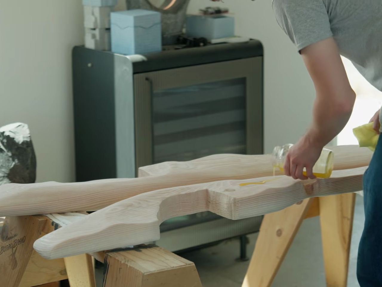
What’s particularly cool about Miles’ approach is that he shares the entire process. We’re used to only being shown the polished final product so watching the actual building process, complete with challenges and solutions, makes the piece feel more accessible. Sure, most of us aren’t going to Joshua Tree to hunt for the perfect mountain-shaped rock and engineer a bench around it, but seeing it done demystifies the creative process and might just inspire someone to try their own impossible project.

The technical aspects are equally impressive. How do you secure wood to rock? How do you ensure the weight distribution won’t cause catastrophic failure when someone decides to plop down with their morning coffee? These aren’t questions with easy answers, and that’s what makes the finished product so satisfying to look at. This bench exists in that sweet spot where art, engineering, and function converge. It’s impractical in all the best ways while still being completely practical. You could put it in your entryway, and it would be the most interesting piece anyone encounters in your home. You could place it in a gallery, and it would hold its own against any contemporary sculpture.

In a design landscape often dominated by minimalism to the point of sterility or maximalism that verges on chaos, Miles’ floating bench offers something different. It’s bold without being loud, natural without being rustic, and modern without feeling cold. And honestly, isn’t that exactly what we want from design? Something that surprises us, makes us think, and still lets us sit down at the end of the day.

The post This Floating Bench Defies Gravity (and Your Expectations) first appeared on Yanko Design.