Nobody Designed a Drum Kit for Beginners. Until Boxboom.

Picking up the drums has always come with a quiet, frustrating tax. Before you’ve played a single beat, you’re already being asked to make a significant financial commitment, figure out where to put a massive piece of equipment, and accept that your neighbors might hate you. For most people, that’s where the dream ends. Not with failure, but with logistics.

Xiaoyu Yu, a graduate from the Umeå Institute of Design’s class of 2026, noticed this gap and did something about it. Her project, Boxboom, is a rental-based, foldable electronic drum kit designed specifically for first-time players. On paper, it sounds straightforward enough. In practice, it reframes the entire conversation about what a beginner drum experience should actually look like.

Designer: Xiaoyu Yu
The existing drum market is oddly shaped. At the entry level, you get cheap kits that feel nothing like playing real drums. At the high end, you get electronic kits that come closest to replicating acoustic feel, but they’re expensive, require serious space, and carry the weight of a long-term commitment for someone who isn’t even sure they like drumming yet. As Yu observed, the market offers little for true beginners. Boxboom identifies that gap clearly: the problem isn’t that beginners can’t learn, it’s that the tools were never really designed around them to begin with.
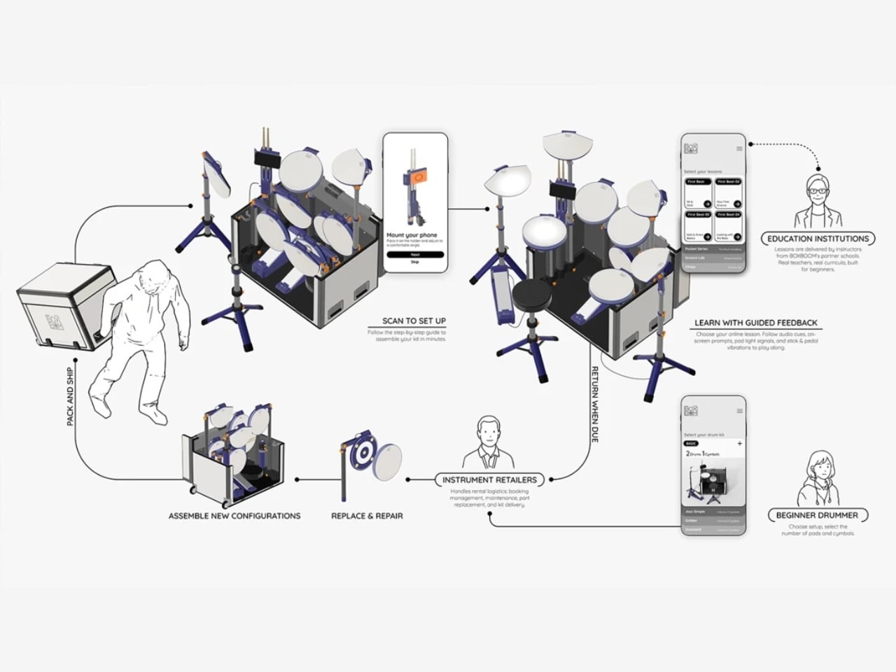
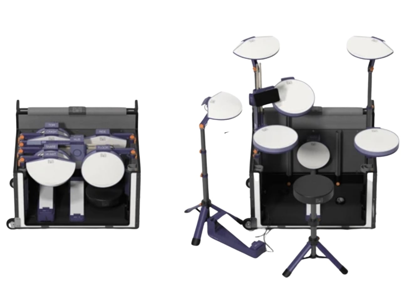
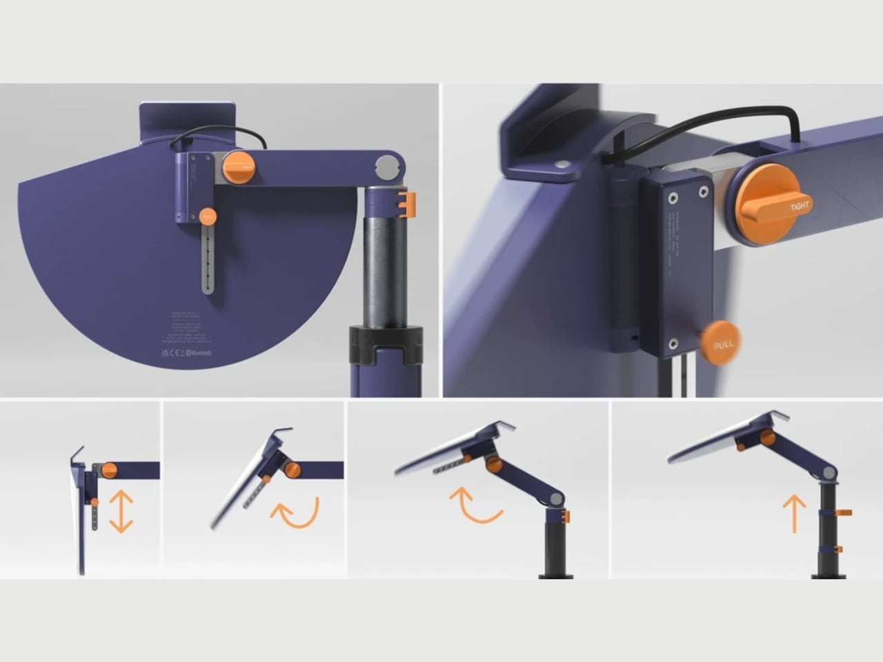
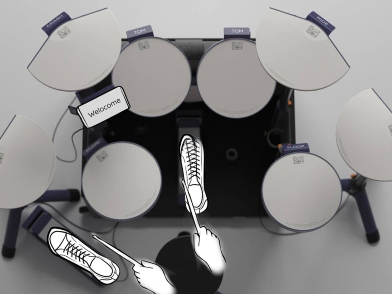
The physical design is worth appreciating on its own terms. Boxboom unfolds from a compact box into a fully functional drum configuration. Modular joints allow for quick setup and flexible arrangement, which means you’re not stuck with one rigid layout that doesn’t suit your body or your room. Parts are designed to be replaced individually, a detail that matters a lot for longevity. When a product is rentable, it has to survive multiple users, multiple moves, and the general roughness of being a learning tool. The design accounts for all of that without looking like it’s trying too hard.
What makes Boxboom more than just a folding drum kit is the service thinking built around it. Yu designed a three-sided ecosystem connecting users, rental shops, and drum training institutions through an online booking and delivery system. You’re not just renting a piece of hardware. You’re entering a structure that connects you to learning, not just to ownership. That shift matters more than it might seem. Ownership, it turns out, is one of the biggest barriers to entry, not a lack of enthusiasm.

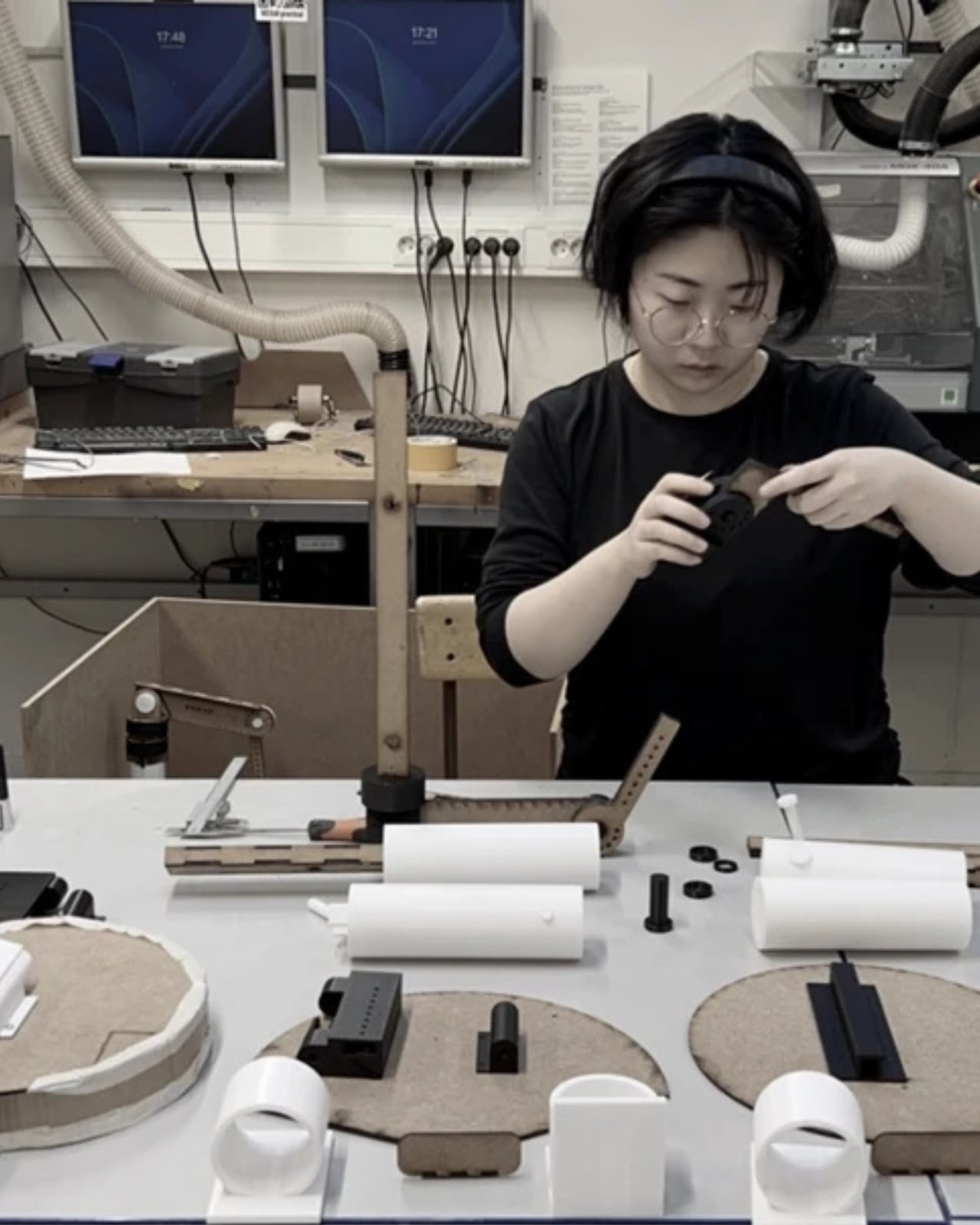
The research behind the project is just as considered. Yu conducted field research at Umeå Music School and Toontrack, a leading drum sound engine company, to understand how beginners experience rhythm and what it genuinely takes for a kit to support early learning. The design process ran from 1:10 scale models all the way to full 1:1 prototypes, testing folding logic and setup sequences until the physical experience matched the idea. A central Hub integrates a phone holder, power panel, and teaching stick storage dock into a single arm. The whole system is organized around one driving question: how can a drum kit itself teach you to play?

That question is what separates Boxboom from the many beginner-focused products that quietly shrink their ambitions and rebrand it as accessibility. Yu isn’t simply lowering the financial barrier. She’s rethinking the relationship between a learner and their instrument entirely. Most musical tools are designed with the assumption that you already know what you’re doing. Boxboom assumes you don’t, and it respects you for exactly that.

Graduation design projects like this tend to get filed away a little too fast. They show up at exhibitions, earn some well-deserved attention, and then disappear before anyone asks whether they could actually become something real. Boxboom feels like it deserves a longer conversation than that. The drumming market hasn’t seen this kind of structural rethinking in a long time, and the problem it’s addressing is genuinely underserved.

Whether Boxboom ends up in production or remains a concept, it already does something worth noting: it makes you wonder why nobody asked these questions sooner. Drums have always been for everyone. The design just hadn’t caught up yet.
The post Nobody Designed a Drum Kit for Beginners. Until Boxboom. first appeared on Yanko Design.

Tablets Sound Bad, So Motorola Just Put 9 JBL Speakers in One

Entertainment tablets have come a long way in terms of screen quality, but audio often tells a different story. Most of them ship with a pair of speakers that merely get the job done, leaving users reaching for headphones or a separate Bluetooth speaker the moment things need to get louder. The gap between how tablets look and how they actually sound has never been more apparent.

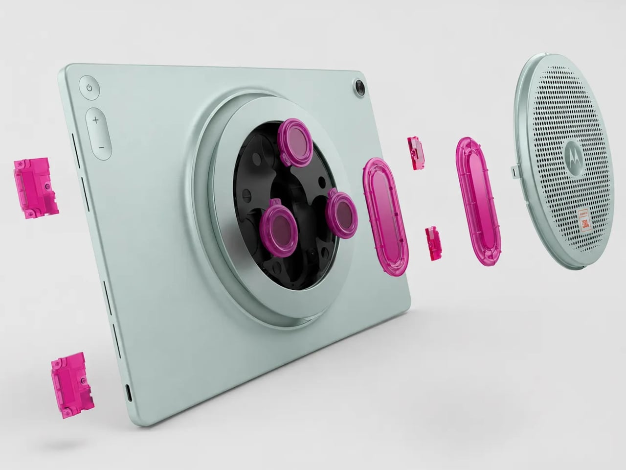
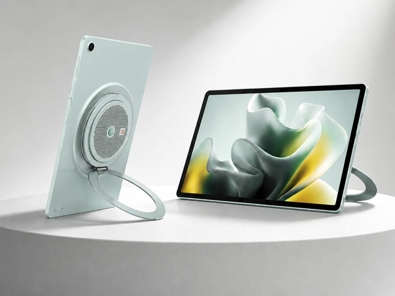
The Motorola Moto Pad 70 Groove is built around a premise that most tablets don’t dare fully commit to: making audio the centerpiece, not an afterthought. It arrives loaded with a nine-unit JBL Pro speaker system, a 12.1-inch 2.5K display, and a 360-degree built-in kickstand, addressing the kind of everyday entertainment scenarios where a standard tablet simply wouldn’t be enough.

Designer: Motorola

The display is well suited for this audio-first identity. The 12.1-inch IPS LCD panel runs at 120 Hz with a 2560×1600 resolution, HDR10 and Dolby Vision certification, and a peak brightness of 800 nits. It’s a smooth, vivid canvas for streaming content, though the real draw is what’s happening on the edges of that screen, where all those speakers live.

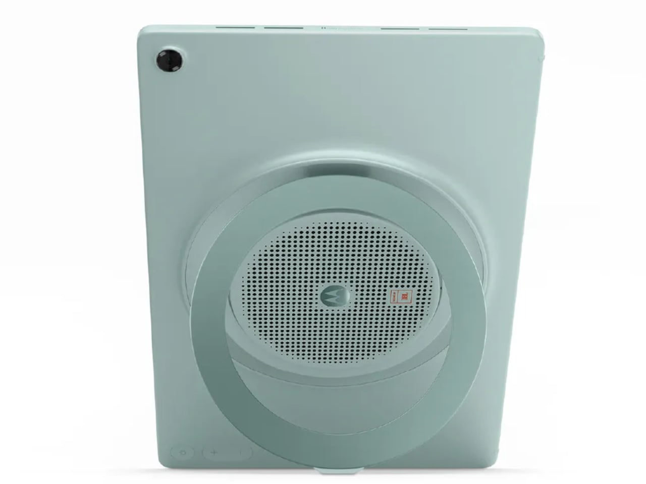
Nine speakers sound like a gimmick until you see what they’re actually made of: four tweeters, three woofers, and two passive radiators, all tuned by JBL and backed by Dolby Atmos. Together, they’re rated to push up to 48W of audio output, which is a lot to ask from a tablet-sized device. It’s the kind of setup that makes you rethink whether you actually need a separate soundbar.

What makes the audio system more interesting is the built-in Bluetooth speaker mode, which turns the Groove into a standalone speaker your phone can control wirelessly. It’s a clever trick for situations where you want music filling a kitchen or a living room during a gathering, without having to keep the tablet actively streaming the content. Dolby Audio further adds Dynamic, Movie, and Music modes for more tailored listening.

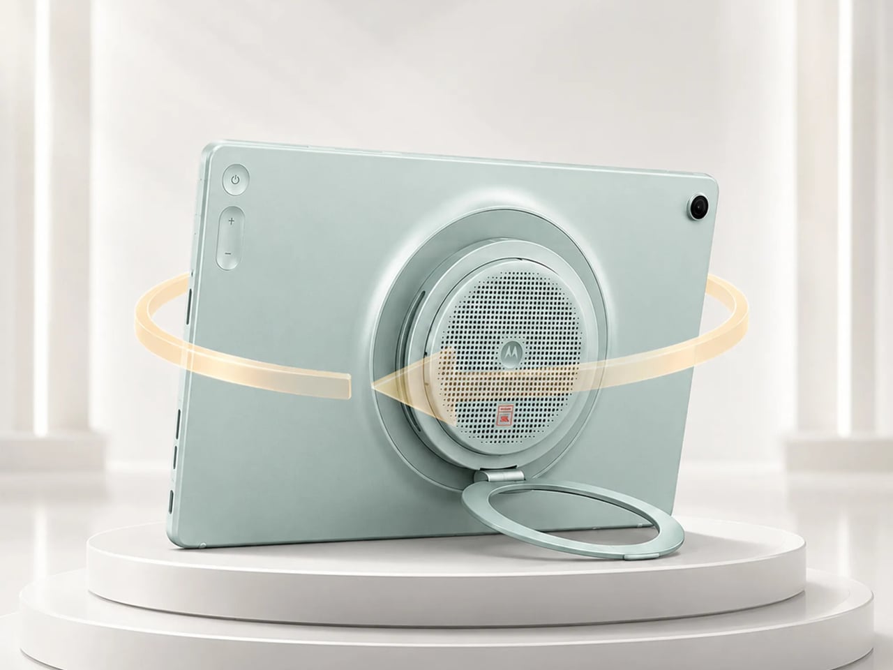
The 360° Kickstand 2.0 adds another layer of flexibility. It supports four positions named Lean, Stand, Theatre, and Hanging, each suited for a different viewing situation. Prop it up on a desk for a video call, tilt it back for a movie in bed, or hang it from a hook when counter space runs out. It’s a practical piece of engineering that doesn’t feel like an afterthought.

Under the hood, a MediaTek Dimensity 7400 chip handles daily tasks alongside 8GB of RAM and 256GB of storage. The 10,200mAh battery keeps extended streaming sessions going, and the 45W TurboPower charging keeps downtime short. The all-metal body in Pantone Blue Surf measures 6.8 mm at its thinnest, though the speaker array at the back raises that to 22.7 mm, creating a distinctive ridge. The Groove ships with Android 16 and Google Gemini out of the box, with Motorola committing to updates through Android 18 and security patches through 2030.

The post Tablets Sound Bad, So Motorola Just Put 9 JBL Speakers in One first appeared on Yanko Design.

The $599 AI Guitar That Finally Makes Playing Easy

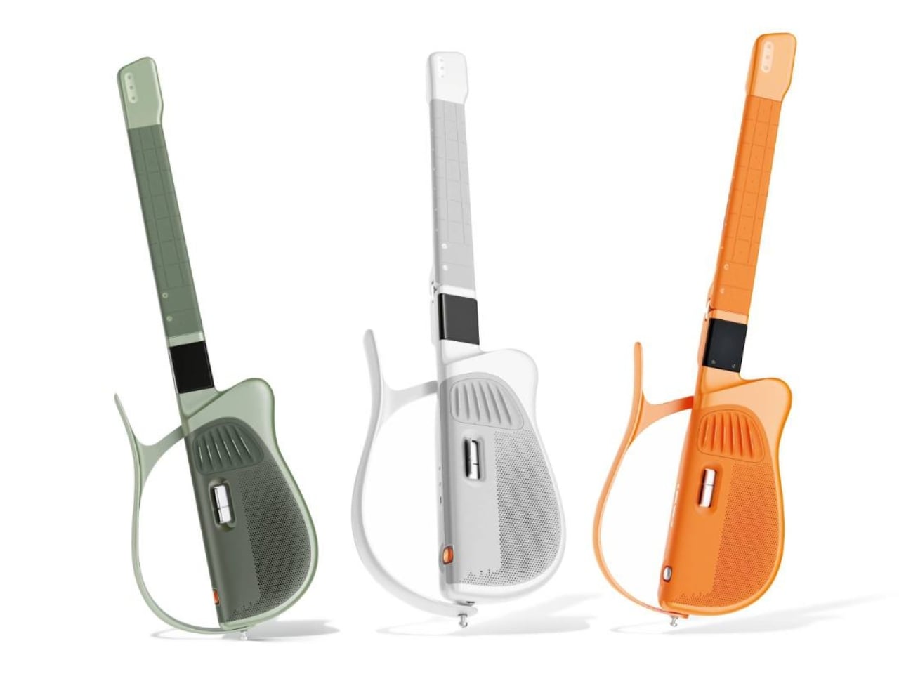
At some point in their life, almost everyone has picked up a guitar, struggled with a C chord for ten minutes, and quietly put it back down. The fingertip pain. The out-of-tune strings. The YouTube tutorial that somehow assumes you already know what a fret is. Learning guitar has always had a steep and slightly humiliating entry curve, and most of us just gave up. The TemPolor Melo-D thinks that’s a problem worth solving, and the design it came up with is genuinely hard to ignore.

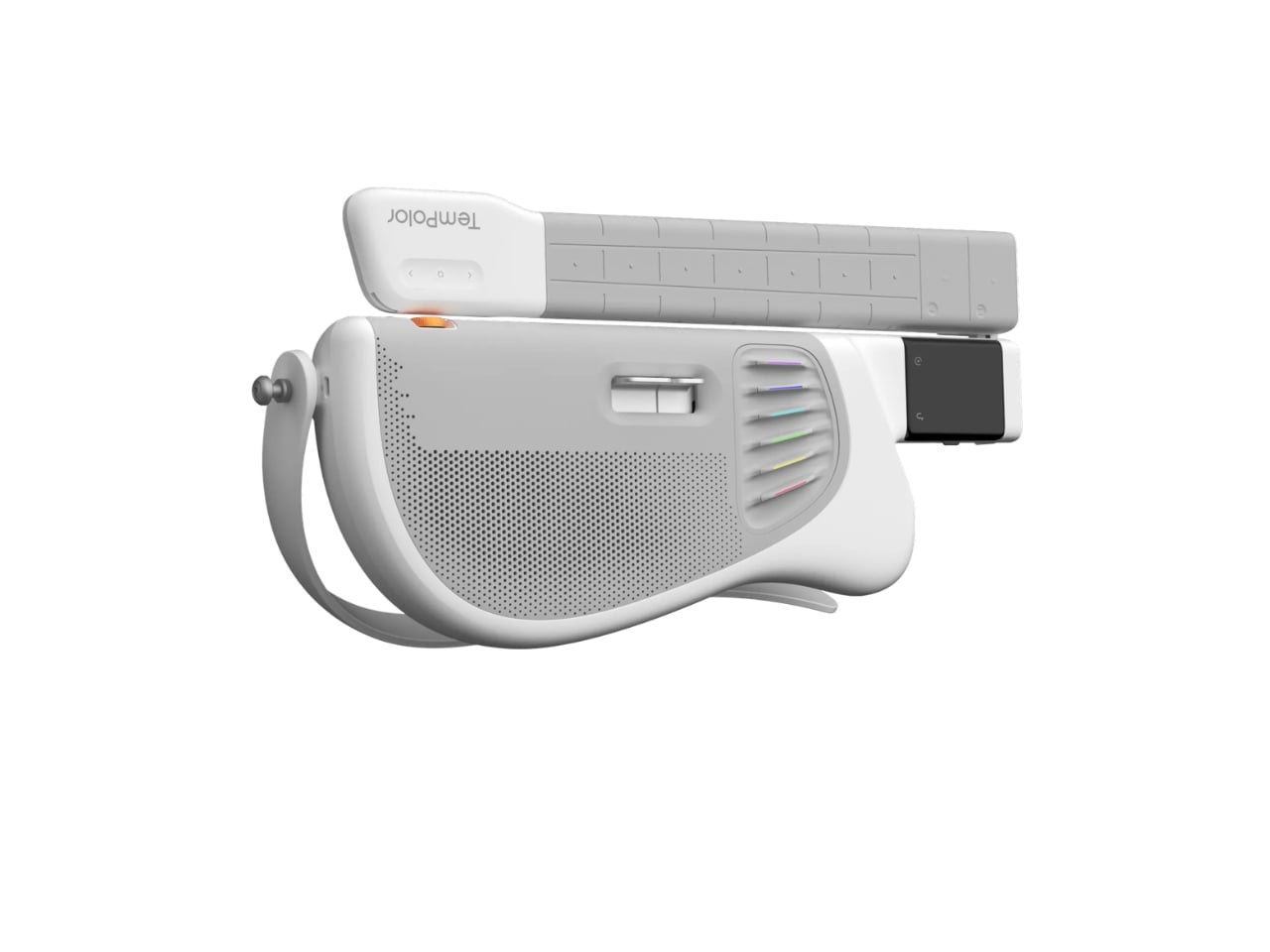
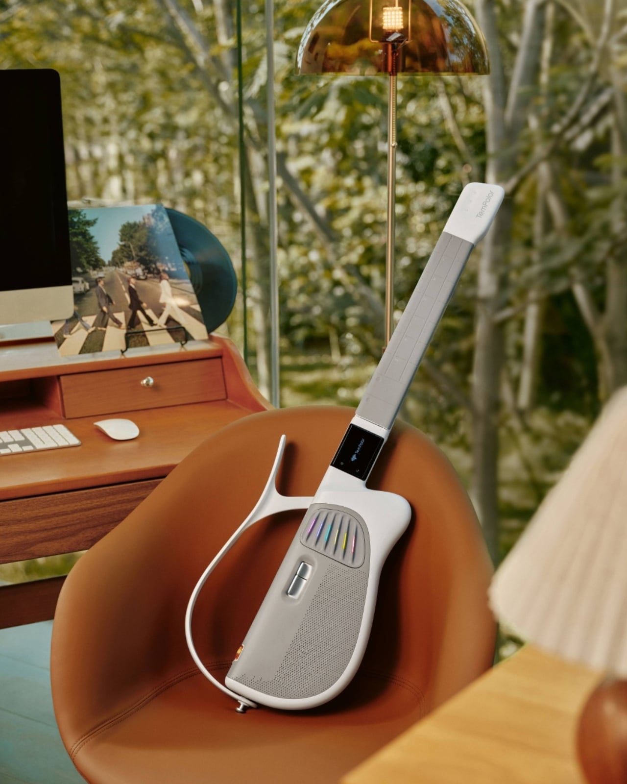
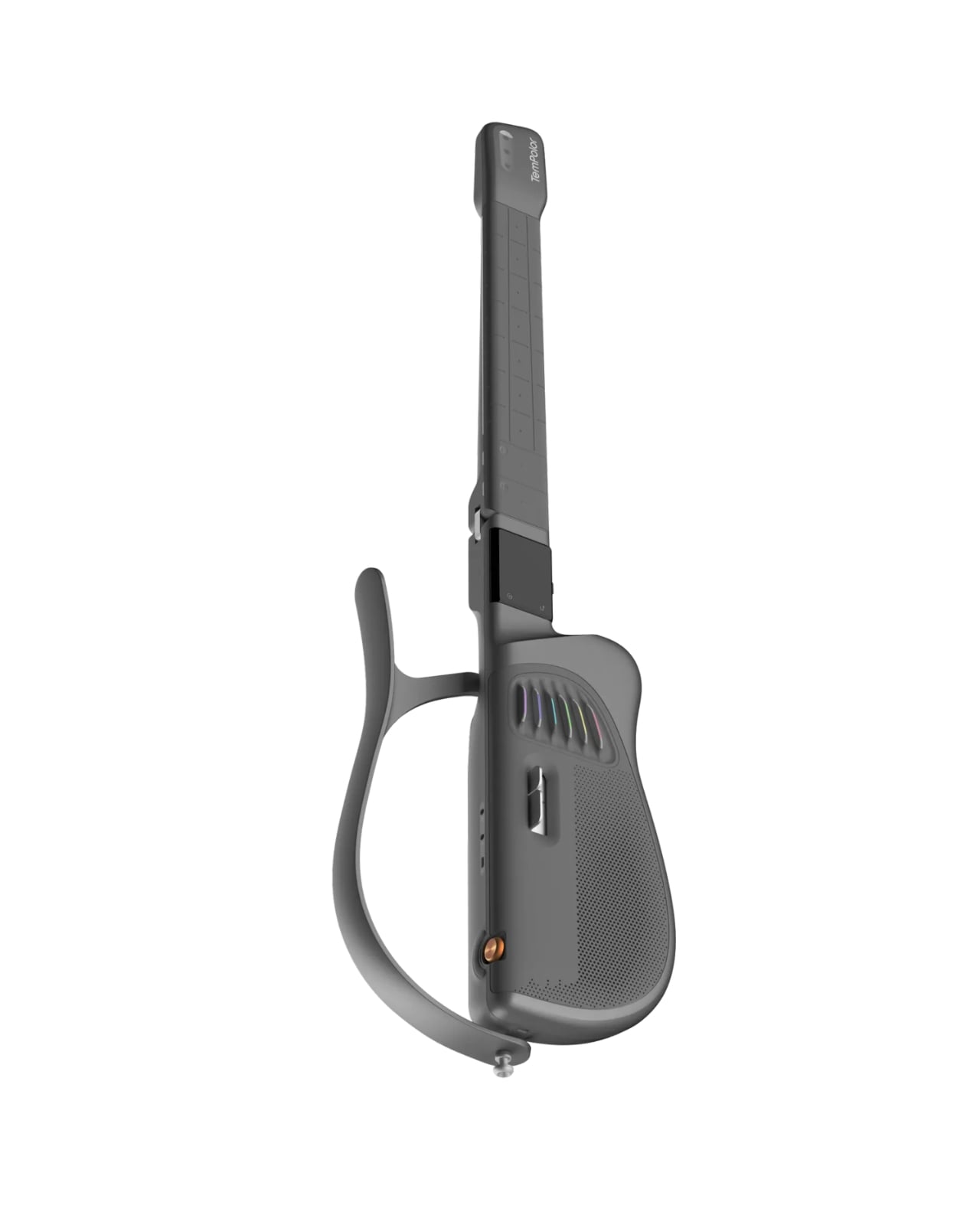
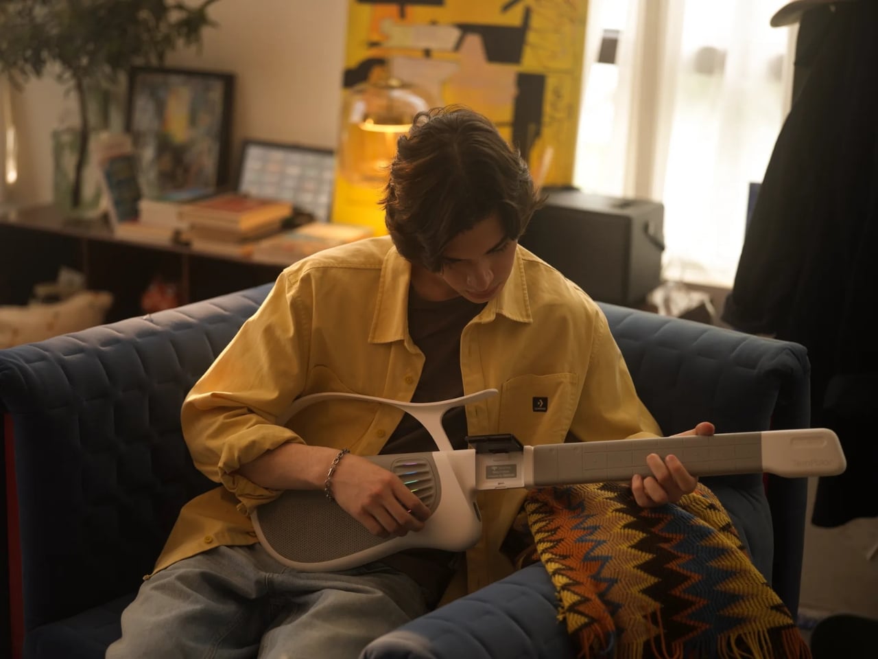
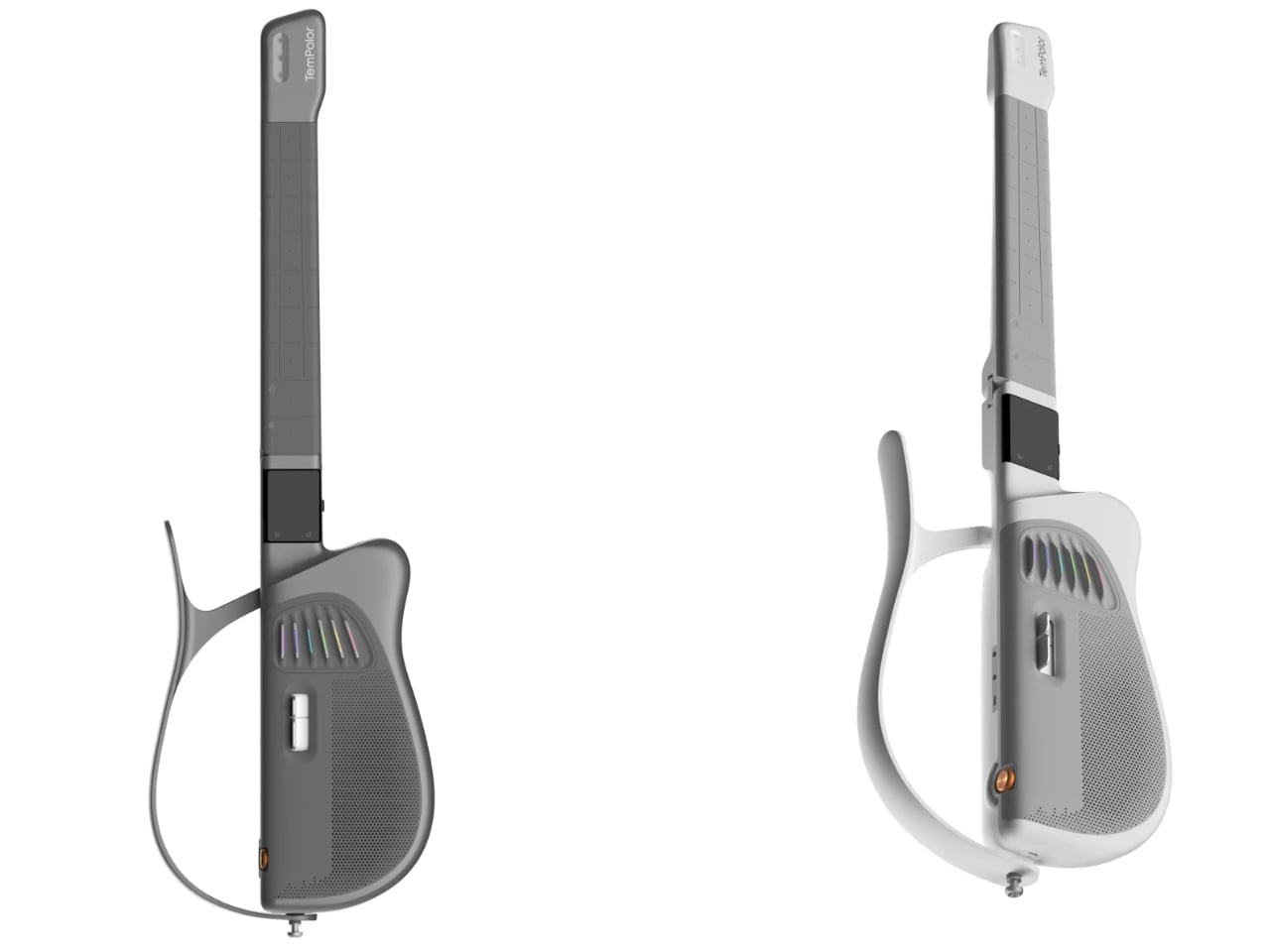
Designed by inDare Design Strategy Limited, the Melo-D is billed as the world’s first generative AI guitar, and even that description barely scratches the surface of what it actually is. On the outside, it looks like a guitar that a product designer and a tech enthusiast co-parented together. The body is sleek, the finish is pearl white, and it has a foldable build that makes it compact enough to take almost anywhere. But the real story is what happens when you turn it on.

Designer: inDare Design Strategy Limited

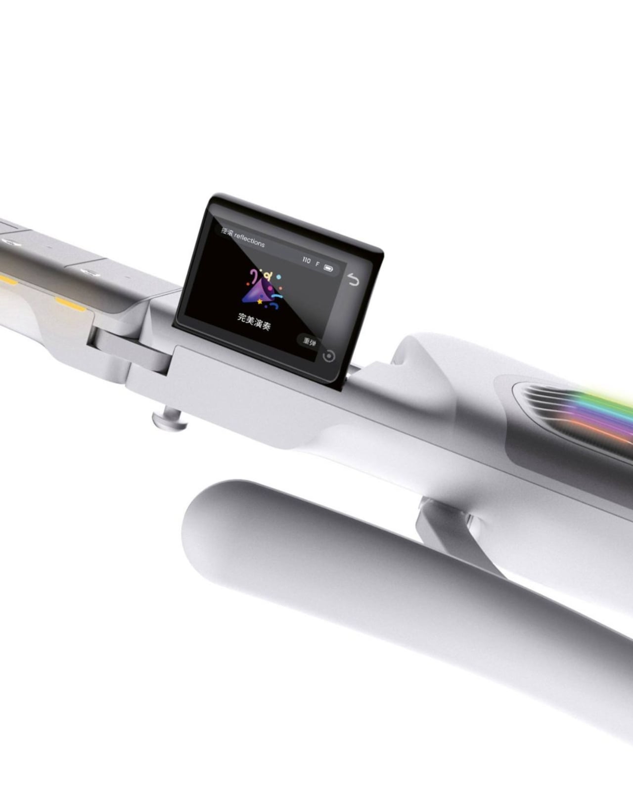
The neck is embedded with LED lights that illuminate exactly which notes to press, removing the guesswork for beginners entirely. A built-in 2.4″ LCD flip screen on the body handles chord guidance and ambient visuals without you ever needing to prop up a phone nearby. These feel like small details, but they represent a real design philosophy: the instrument itself should carry the full experience. You shouldn’t need a separate ecosystem of apps and accessories just to get started.

What makes the Melo-D genuinely interesting is the AI engine running underneath all of it. The guitar operates in three modes: solo, sing-along, and AI creation. In AI creation mode, you can hum a melody and the guitar transcribes it into a guitar solo. You can type a text prompt and it generates a song. Upload an audio file and it converts the music into playable tabs or chord charts. It even generates personalized backing tracks using emotional tags, so the sound starts to feel like yours rather than something borrowed from a practice app.

The “AI everything” wave has made it easy to be skeptical every time a product slaps the word generative onto its marketing. But the Melo-D doesn’t read as a gimmick dressed up in smart-instrument clothing. The six-string silicone system allows for real, note-by-note playing, which means it isn’t just a toy approximating the feel of music. It’s an actual instrument with training wheels you can choose to remove. The goal isn’t to replace the skill of playing guitar. It’s to lower the barrier enough that more people actually get through the door.

inDare’s design work here deserves its own mention. The studio, known for thoughtful human-centered industrial design, brought a lot of restraint to a product that could have easily become overcrowded with features. The foldable form factor, the integrated flip screen, and the silicone strings all feel like deliberate decisions, not afterthoughts. The Melo-D has also earned recognition at the iF Design Awards, which makes sense, because from a design standpoint it reads as a product with a clear and confident point of view rather than a collection of specs looking for a shell to live in.

At $599, it’s available for pre-order now with an expected ship date in September 2026. For a piece of hardware this layered, that number asks you to take it seriously, which feels appropriate for what it’s trying to do.

Learning guitar used to mean a real commitment: years of practice, a teacher, calluses, patience, and a certain willingness to sound terrible for a while. The Melo-D isn’t trying to skip all of that, but it is offering a more honest entry point for people who actually want to try. Whether you’re a complete beginner or someone who has quietly given up on the guitar more than once, it meets you where you are. And sometimes, that’s exactly the invitation you need to actually show up.

The post The $599 AI Guitar That Finally Makes Playing Easy first appeared on Yanko Design.

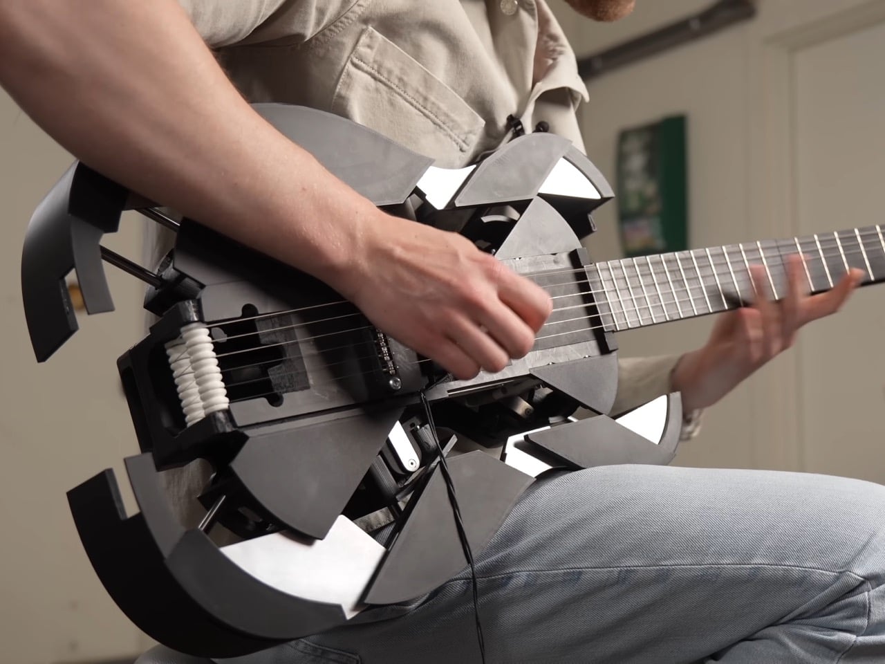
3D-Printed Ukulele Transforms Into an Electric Guitar In Just 2 Seconds

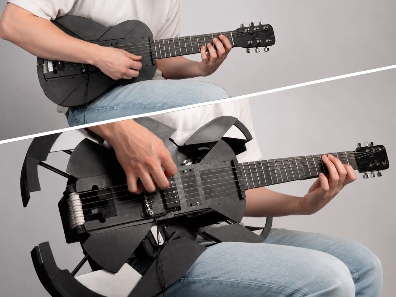
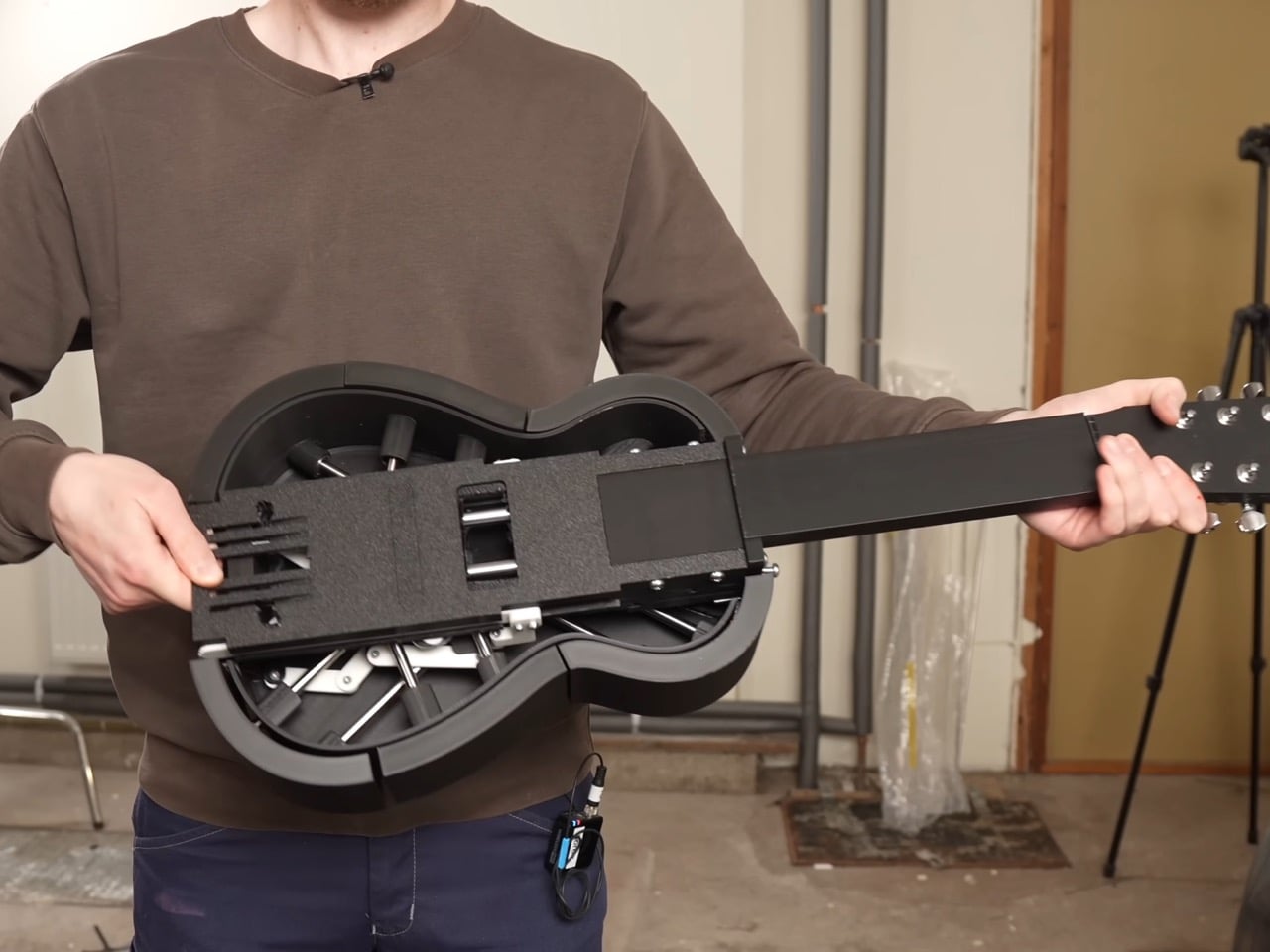
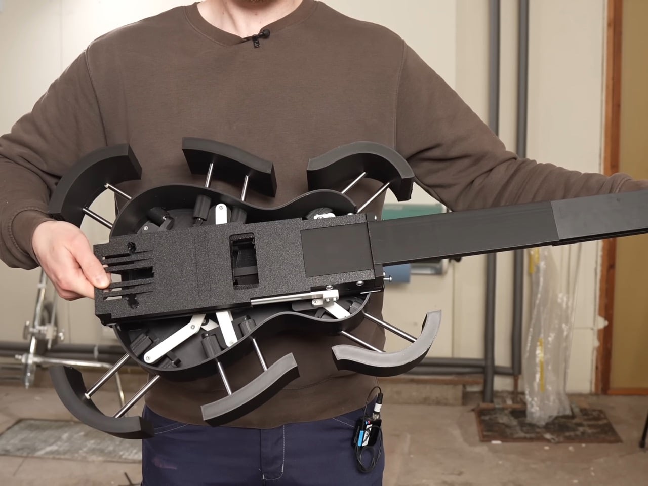
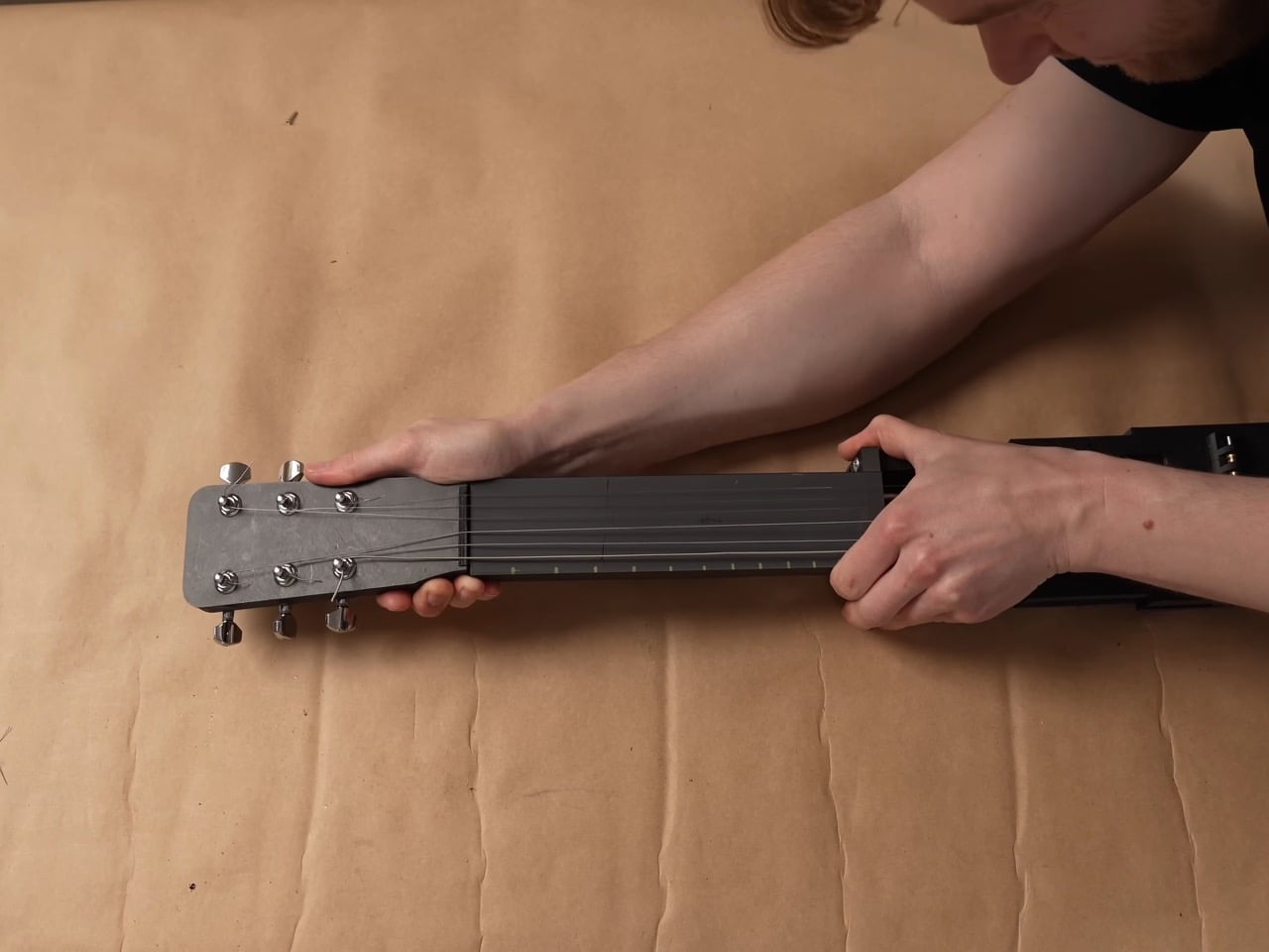
Every kid who grew up watching cars turn into robots has a soft spot for things that are not what they seem. Musician and maker Mattias Krantz never quite grew out of that phase, except instead of turning a truck into Optimus Prime, he set his sights on something smaller and arguably harder to pull off without CGI. He wanted a ukulele that could become a full size guitar on command, without falling apart in his hands. That meant solving three problems at once: growing the neck by roughly ten inches, keeping the strings in tune through that change, and expanding the body into a real guitar shape instead of a symmetrical blob. Each one turned out to be its own small nightmare.

The motivation was refreshingly petty. Ukulele players get less respect than guitar players no matter how good they get, and Krantz wanted to flip that on its head. Getting there took months of failed prototypes and a collaboration with mechanical engineer Adam Damato, who stepped in once the physics of a growing, string bearing neck got too gnarly to solve alone. What began as a joke became a real feat of mechanical design, borrowing tricks from telescoping tools, fishing reels, and an obscure folk instrument. By the end, the ukulele fit in a backpack and unfolded into a stage ready guitar in seconds.

Designers: Mattias Krantz, Adam Damato

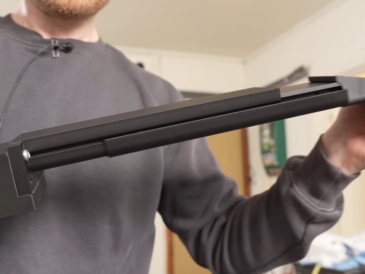
The neck telescopes straight out of the ukulele’s tiny frame, sliding one section into the next until it locks at full guitar length, gaining roughly ten inches without ever detaching from the body. A steel core runs through the sliding sections, and the joints are cut so they interlock and brace against each other the instant the neck reaches full extension. That bracing is what lets it survive eighty pounds of string tension without bowing like a fishing rod. Getting there took two failed attempts first. A folding neck, borrowed from an old instrument called the cithara orbo, worked fine on a full size guitar but was useless on a ukulele, since half a neck sat exactly where a hand needed to grip. The telescoping version solved the length problem right away, but only stopped bending once Damato worked in the steel core and reinforced joints.

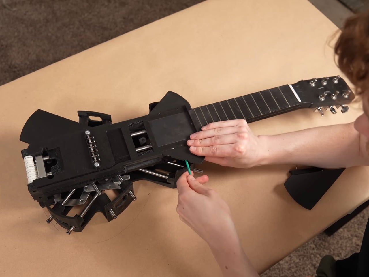
The strings are custom made, roughly twice the length of a normal set, and thread onto strategically placed rollers hidden inside the neck and body. Pull the neck out and the rollers feed slack forward, push it back in and they wind the excess back up, so the same six strings carry the instrument through both tunings without coming off. That roller system only exists because everything simpler failed first. Rubber bands solved the stretch problem but sounded worse than the ukulele they replaced. A fishing reel style rig using rope worked until the rope itself stretched, turning every transformation into tuning roulette, and swapping in non stretch rope traded that for a rope that kept snapping, once badly enough to take the guitar apart. Custom strings, ordered special and worth a twenty day wait, were the fix that finally held.

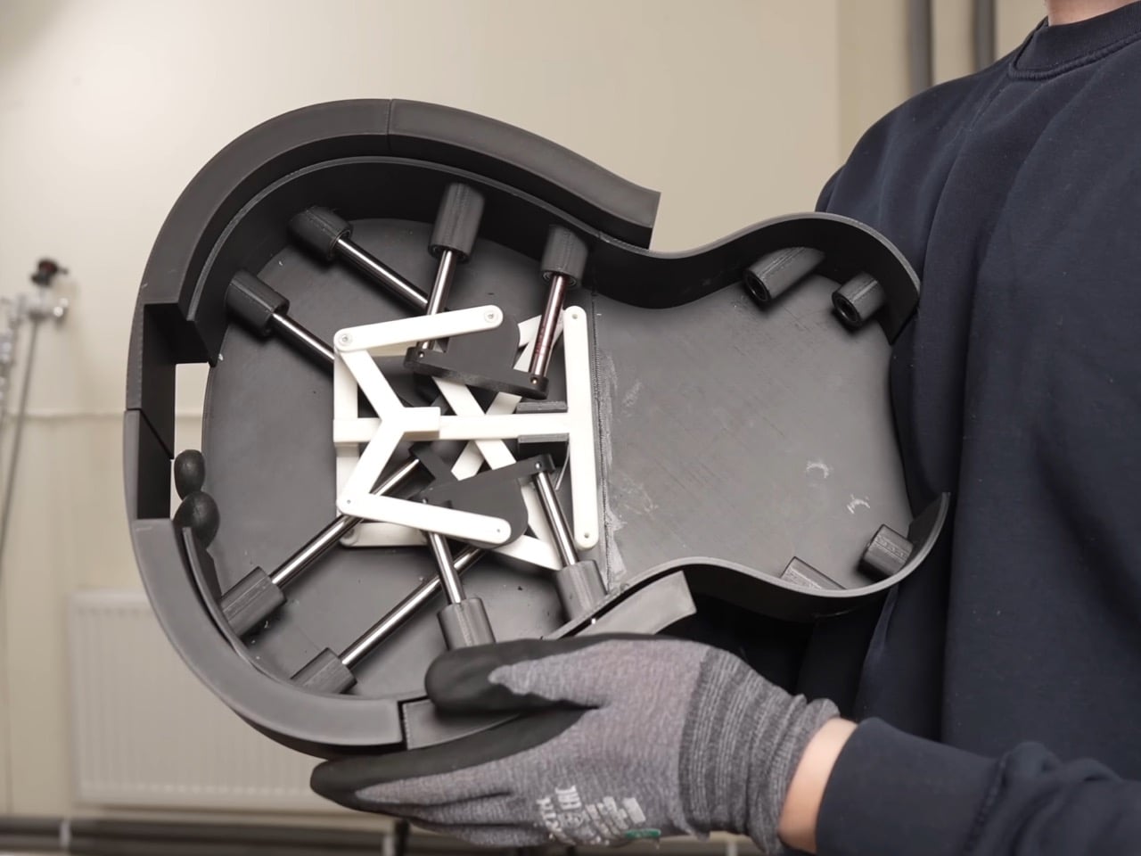
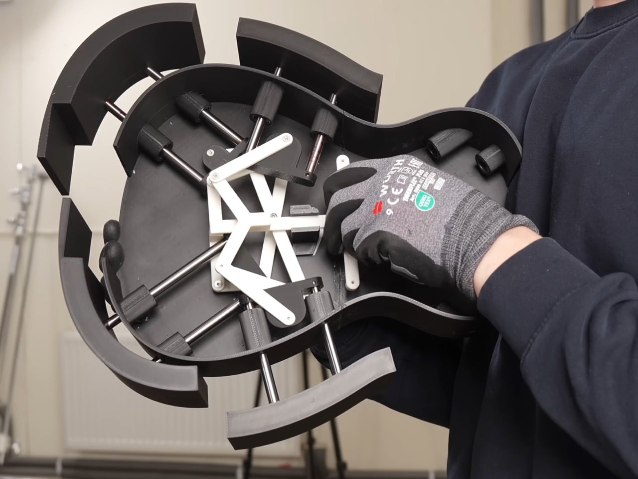
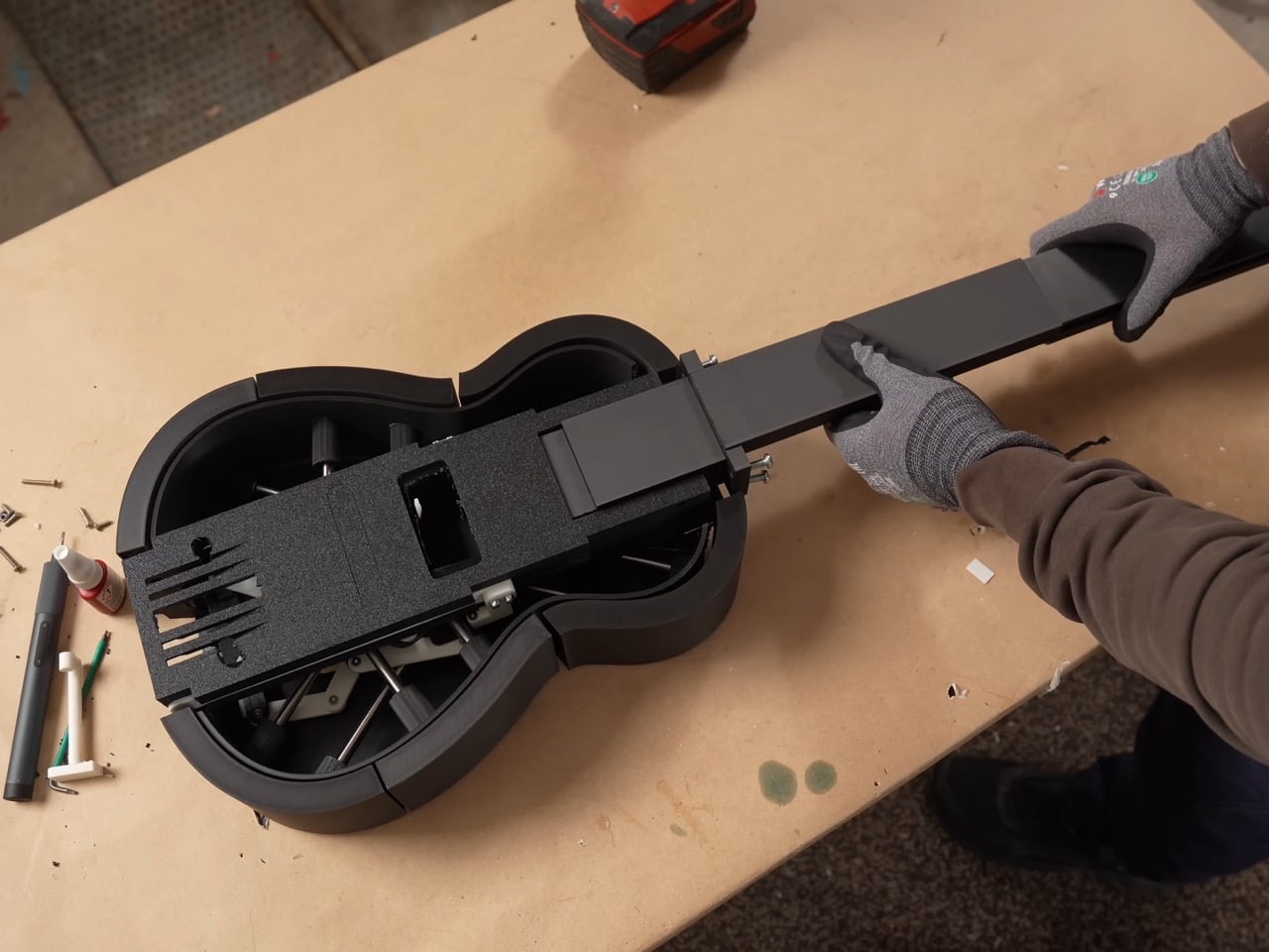
The body expands through six independently moving panels that fan outward from the ukulele’s compact shell, each one traveling a different distance and angle so the outline settles into a real guitar’s curves instead of a bloated circle. An early version of that mechanism grew symmetrically in every direction, fine for something like a banjo but wrong for an instrument with a pinched waist. Getting six panels to move independently instead of in lockstep turned one mechanical problem into six. The first panel alone took three attempts before it worked reliably, and even then only about ninety percent of the time. Adding the rest of the panels made things worse, since a hub inside was quietly blocking outward movement and jamming the whole assembly. Swapping plastic components for metal fixed it, and two days assembling hundreds of parts produced a body that finally held its shape.

None of this would matter if the transformation felt gimmicky in person, but the reception says otherwise. Onlookers at Krantz’s street performances wrote it off as just another ukulele until it unfolded mid song and changed their opinion of him. A band let him bring it on stage, and the transformation held together well enough to draw applause rather than confusion. Transforming gadgets are nothing new, but the engineering here, steel joints, custom rollers, six moving panels, earns real attention over a gimmick label. Krantz and Damato spent months on problems most builders would abandon, and the payoff works under tension, every time.

The post 3D-Printed Ukulele Transforms Into an Electric Guitar In Just 2 Seconds first appeared on Yanko Design.

Gen Z Is Buying Old iPods to Quit Spotify. Fiio’s $50 Hi-Fi MP3 Player Does It Better.

I tried to listen to an album last week. The whole thing, start to finish, like a functioning adult in the 90s. I made it four tracks before a Slack ping, a WhatsApp text, and a push notification from Hinge. By track six I was scrolling through IG. I started with conscientiously listening to an album, and I ended up in a rabbit hole on social media while the music played in the background. My phone is a magnificent piece of engineering that is somehow terrible at the one job I keep handing it.

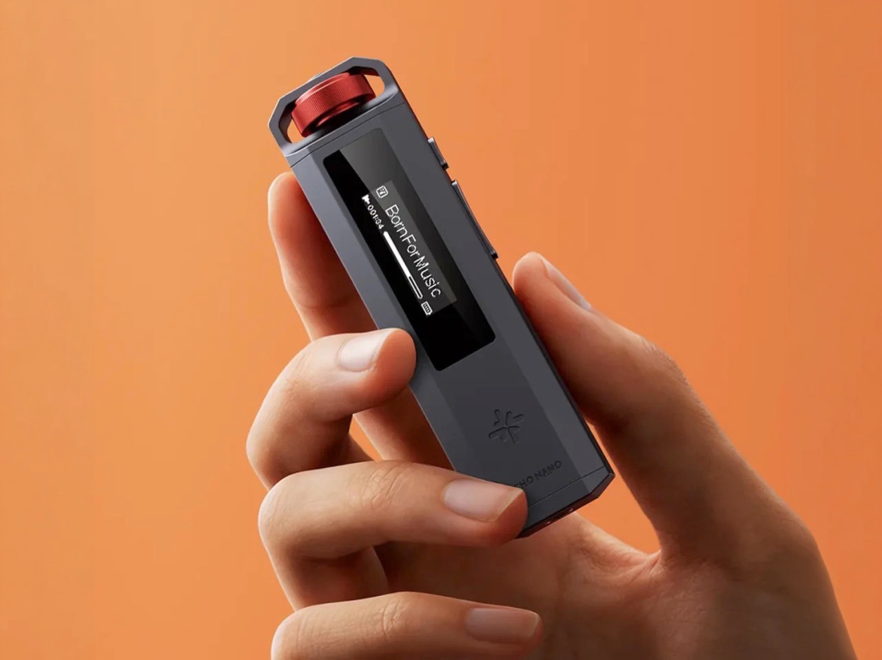
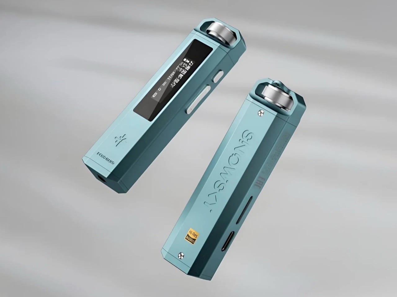
Plenty of people figured this out before I did, and their fix was buying a discontinued Apple product from a stranger online. TikTok has north of 100,000 posts tagged for iPods, refurbished sales have grown as much as 15% a year since Apple killed the line in 2022, and some kids are using them to smuggle music past school phone bans, which is the most resourceful thing I’ve heard all year. The FiiO Snowsky Echo Nano is that same instinct, available new, for $49.99, with a DAC chip nobody was putting in fifty dollar hardware five years ago.

Designer: FiiO (Snowsky)

Click Here to Buy Now

Kathryn Jezer-Morton coined the term “friction-maxxing” in a January essay for The Cut, and it went viral quickly enough to earn her a Wikipedia page inside six weeks. Her argument is that tech spent fifteen years making life easier, providing every song, every movie, every TV show episode at your fingertips for a simple (but steadily increasing) subscription fee. No looking for CDs, no scrolling through files, no visiting sketchy websites to download MP3s It was a simpler alternative, it killed torrenting for a vast population overnight… but Gen Z’s had enough. Friction-maxxing means picking the annoying option on purpose, and the Echo Nano is that philosophy machined out of aluminum. You load your own files. You turn a physical dial. You stare at a 0.91-inch monochrome OLED physically incapable of showing you album art,leave alone a notification. The screen’s poverty is the whole product.

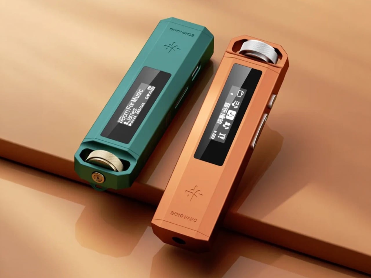
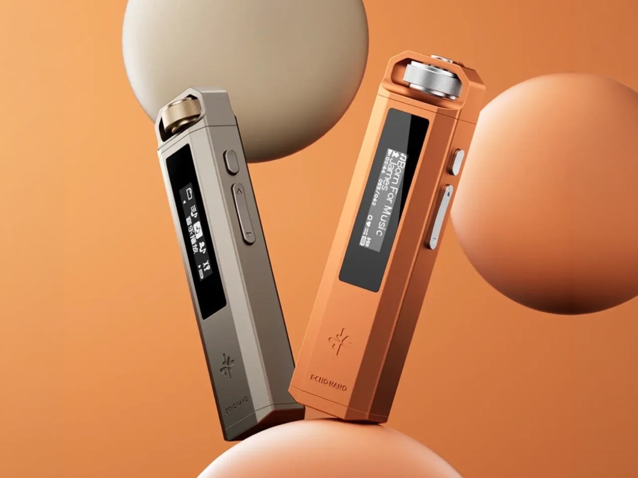
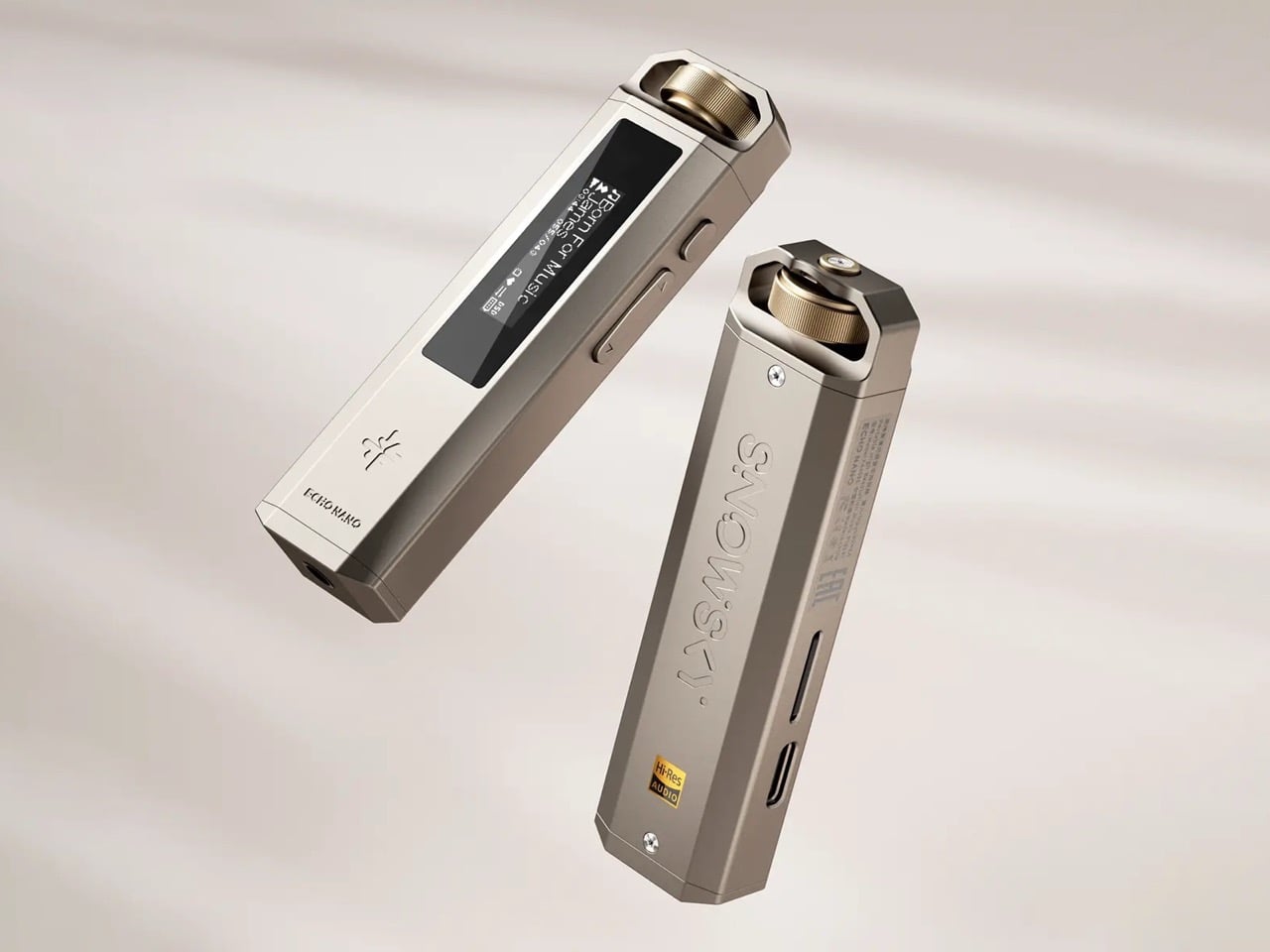
Everyone will call this an iPod, which is kind of understandable and also kind of wrong. The proportions are a vertical stick with a hexagonal cross section and a lanyard bracket built into the top like a tiny roll cage, which is Sony Network Walkman DNA rather than Cupertino’s. Apple built a rectangle for your palm, Sony built something you wore around your neck, and FiiO clearly went shopping in the second closet. The knurled anodized dial handles power, volume, screen, and playback with one thumb, sitting as the only piece of jewelry on an otherwise stern slab of CNC’d aluminum-magnesium alloy. Visible screws at both ends read as a small political statement about whether objects should open. Seven colorways, including a coral and a teal, are the one honest Apple quotation, straight off the iPod Mini.

The 360mAh battery delivers around seven hours, and Reddit’s verdict on that figure has been a collective ‘meh’. Seven hours covers a commute and a workday rather than a weekend, and you will top it up more often than something this small should demand. Weigh that against $49.99 and what the money actually buys, because Spotify and Apple Music run roughly $12 a month, which is $144 a year, indefinitely, for a library you never own. An independent CS43131 DAC, DSD256 hardware decoding, and a dedicated audio-grade crystal oscillator would have meant flagship spending half a decade ago. Storage climbs to 256GB via microSD, and there’s a 3.5mm jack, which at this point qualifies as hospitality.

A used iPod Classic on eBay runs about eighty dollars for a fifteen-year-old machine with a spinning hard drive and a battery on its farewell tour, with higher-capacity units sailing past $150. The Echo Nano costs less, arrives new, charges over USB-C, and does the same single job with better silicon. It also works as a USB DAC for your phone or laptop, a funny hedge for a device sold on escaping your phone, and probably an accurate read of how anyone actually lives. Nobody is abandoning the smartphone. They’re carving out one protected activity and building a small aluminum fence around it, and fifty dollars is exactly the right price for a fence you’re allowed to walk away from.

Click Here to Buy Now

The post Gen Z Is Buying Old iPods to Quit Spotify. Fiio’s $50 Hi-Fi MP3 Player Does It Better. first appeared on Yanko Design.
This $60 Apple Watch Case Is the iPod Apple Never Replaced

There’s a specific kind of nostalgia attached to the original iPod’s click wheel that has very little to do with the music. It had to do with the feeling. Scrolling through a playlist with a thumb, hearing and feeling that resistance, navigating a menu without looking away from the wheel; it was one of the few moments in early consumer electronics where a device felt as good to hold as it did to use. Touchscreens solved a lot of problems, but they quietly retired that particular quality.

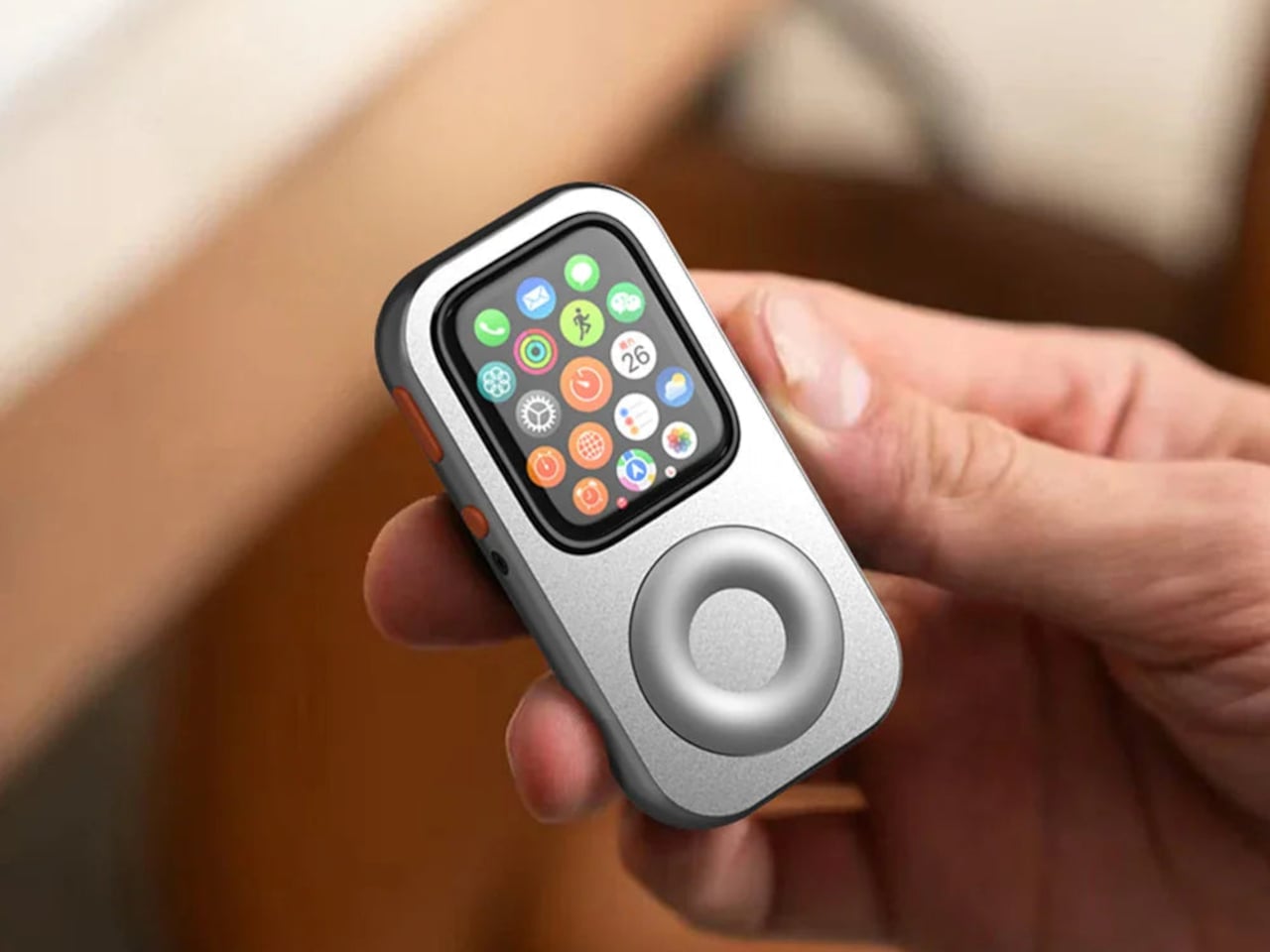
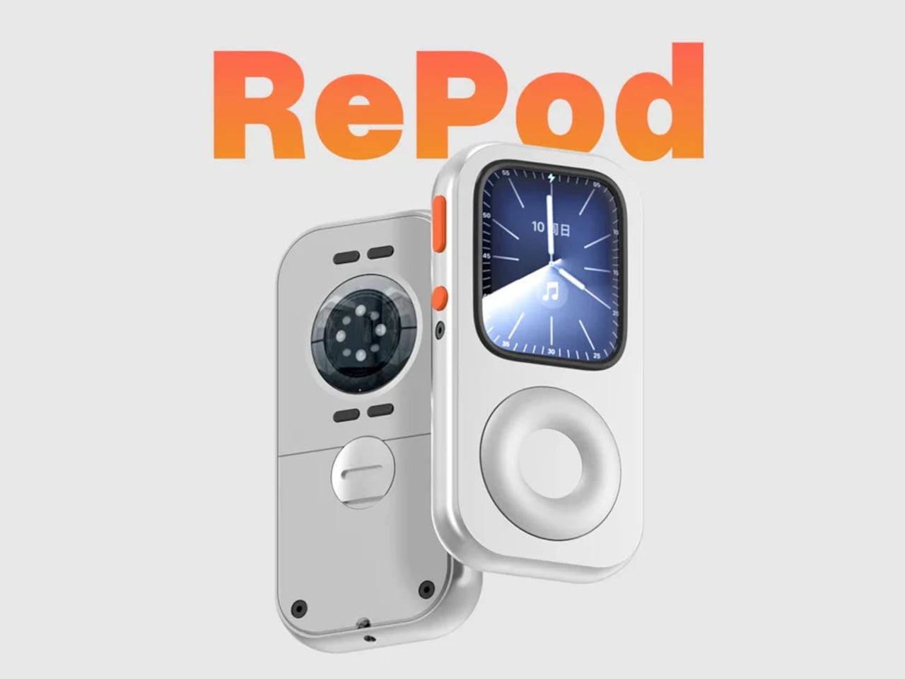
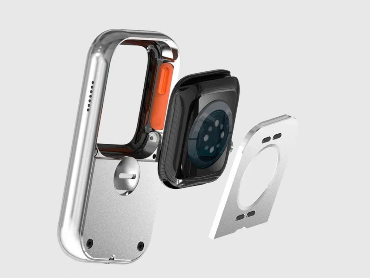
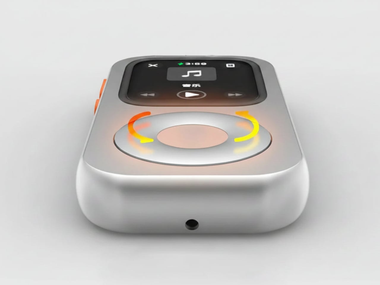
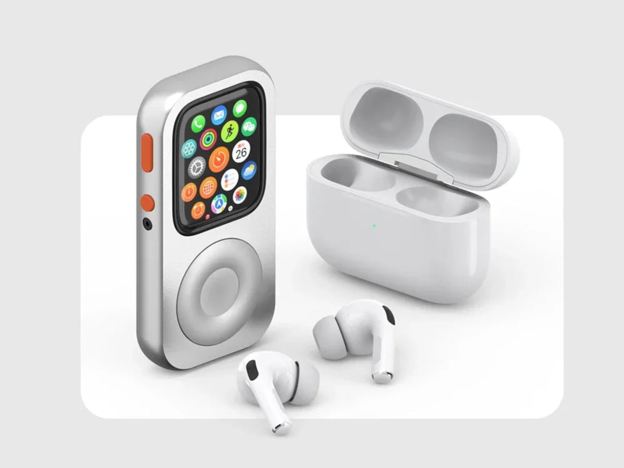
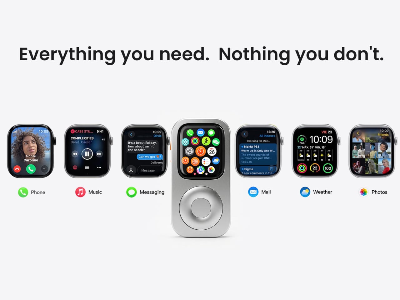
The RePod C1 is a CNC-machined aluminum case for the Apple Watch that rebuilds that tactile experience from scratch. The outer shell gives the watch the proportions and visual language of a classic iPod, and the click wheel around it is mechanically linked to the Apple Watch’s Digital Crown, so turning it actually does something. It’s not decorative. The scroll feedback comes from real physical interaction with the watch’s native controls, which makes the nostalgia feel a bit less hollow than it might have been.

Designer: Techpod

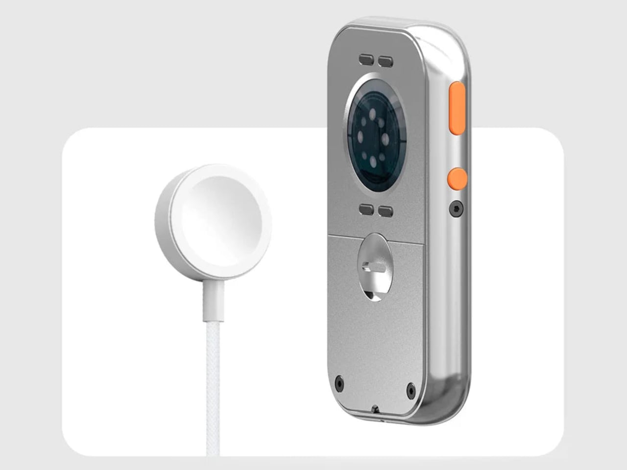
The case doesn’t ask the Apple Watch to give anything up. All of its sensors remain accessible through an open-back design, which means heart rate monitoring, ECG, and NFC for Apple Pay all continue to work normally. Antenna cutouts preserve Wi-Fi, Bluetooth, and cellular connectivity, so messages, calls, and Siri stay intact. The only thing that changes is the shell around the watch and the way it sits in your hand.

That second part matters more than it sounds. One of the more interesting things the RePod C1 does is turn the Apple Watch into a pocket device rather than exclusively a wrist device. Slide it into a pocket during a run, a commute, or an errand where pulling out a phone feels like too much, and the watch does most of what needs doing. Music plays back offline with Apple Music or Spotify Premium, notifications come through, and payments work at the counter. The phone can stay home, or at least in a bag.

Charging works through a built-in magnetic connector that sits flush in the frame, so the case doesn’t have to come off to top up the battery. The aluminum body also helps manage heat during fast charging, which the original iPod obviously never had to think about. The case is available in sizes covering everything from the Apple Watch Series 4 through the Series 11 and both Apple Watch Ultra models, with prices starting at $59.90 for standard sizes and $69.90 for the 49mm Ultra variant.

The iPod itself was discontinued in 2022 after 21 years, and Apple made no announcement about anything replacing it. The click wheel, as a piece of interaction design, has no current first-party home in any product. The RePod C1 doesn’t try to be a real iPod or pretend the Apple Watch needs help. It’s just a case that noticed the gap between what modern devices can do and what they feel like to use, and made a deliberate choice about which side it wanted to be on.

The post This $60 Apple Watch Case Is the iPod Apple Never Replaced first appeared on Yanko Design.

A $129 Music Player Built for People Done With Phone Distractions

Dedicated music players gradually faded from use once streaming apps turned every smartphone into an on-demand jukebox. Carrying a separate device for audio began to feel redundant. That attitude has slowly changed. Growing numbers of listeners, tired of notifications and algorithm-driven queues, have started reaching for standalone players again, ones that let music be the only thing competing for their attention.

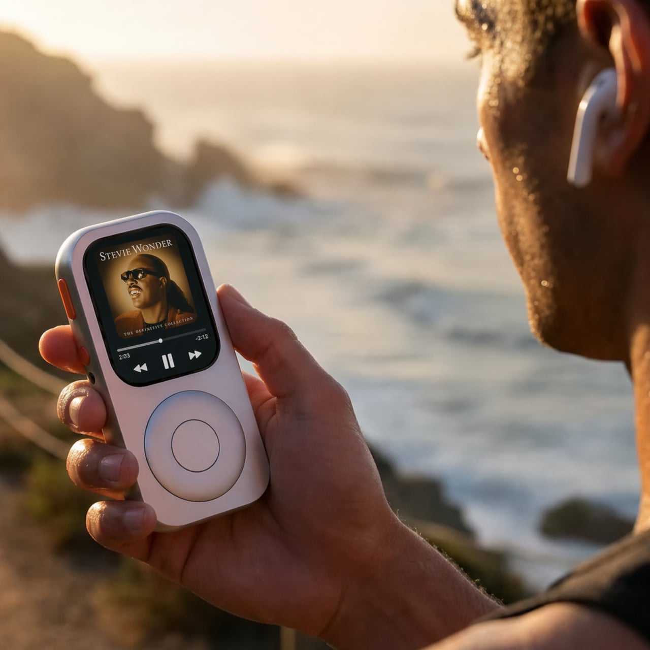
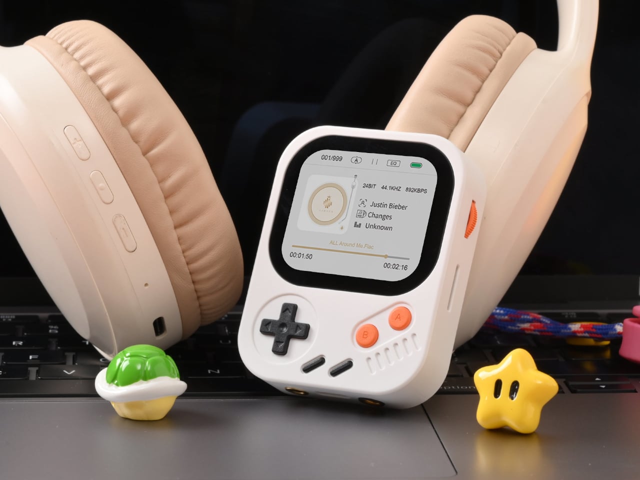
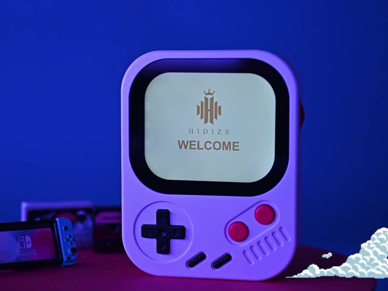
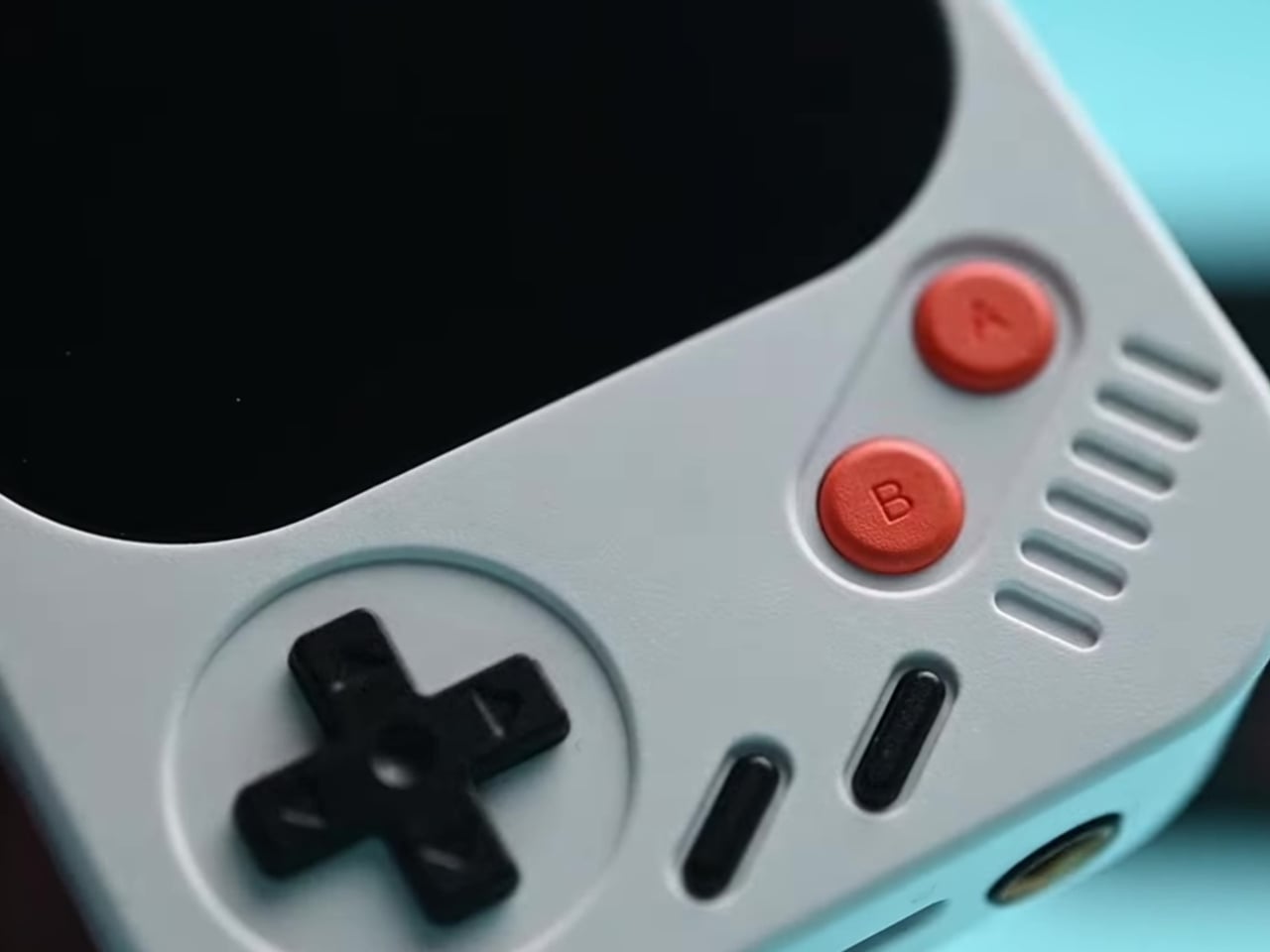
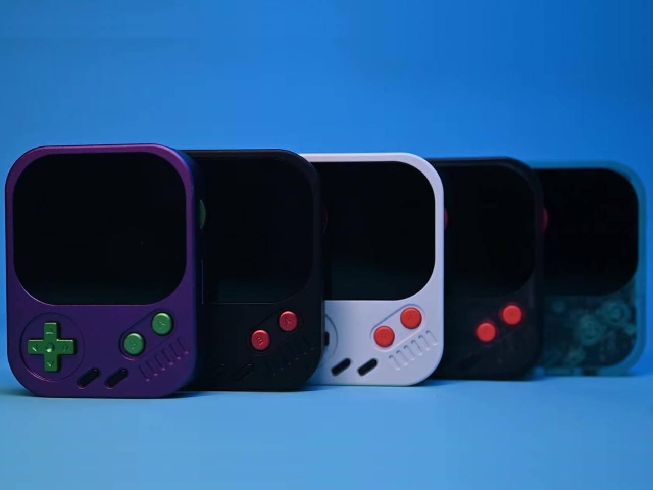
The Hidizs AP30 Music Boy addresses that growing appetite, though it does so in a way that isn’t easy to overlook. Rather than adopting the clean, minimal aesthetic common to most digital audio players, it draws heavily from the visual language of retro handheld gaming. The result is a device that looks playful and compact but carries serious audio hardware inside.

Designer: Hidizs

Physical directional buttons and a 2.0-inch IPS display give the AP30 an immediately tactile quality that touchscreen-only devices often lack. The plastic version weighs just 56g, while the CNC aluminum edition comes in at 80g. A small whale motif on the back adds a quiet nod toward environmental awareness, giving the device one more detail that makes it memorable beyond the spec sheet.

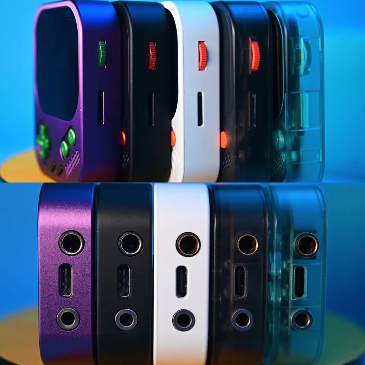
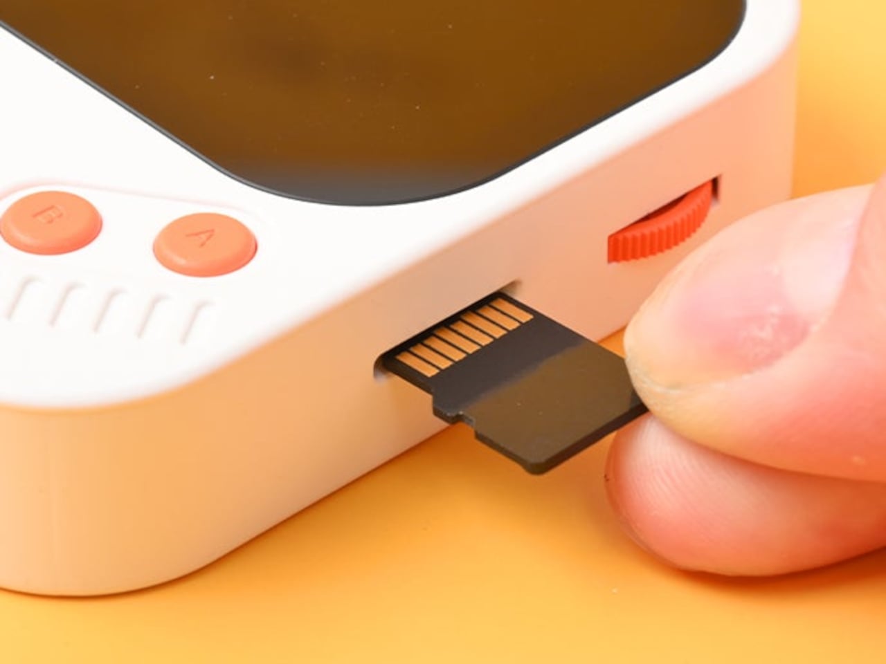
The “wearable” part of the AP30’s pitch has practical implications. It clips to bag straps, hangs from a neck lanyard, or attaches magnetically to the back of a phone via an optional case, keeping it physically accessible during exercise, commutes, or any activity that doesn’t leave a free hand. Storage starts at 128GB built-in and expands to 256GB via a microSD slot.

Behind the gaming console’s exterior is a Cirrus Logic CS43198 DAC paired with an RT6863 amplifier, supporting DSD256, PCM at 24-bit/192kHz, and lossless formats including FLAC, WAV, and ALAC. Everyday headphones connect to the 3.5mm single-ended output, while the 4.4mm balanced connection offers meaningfully stronger output for listeners using higher-end in-ear or over-ear monitors, with room to grow as their setup does.

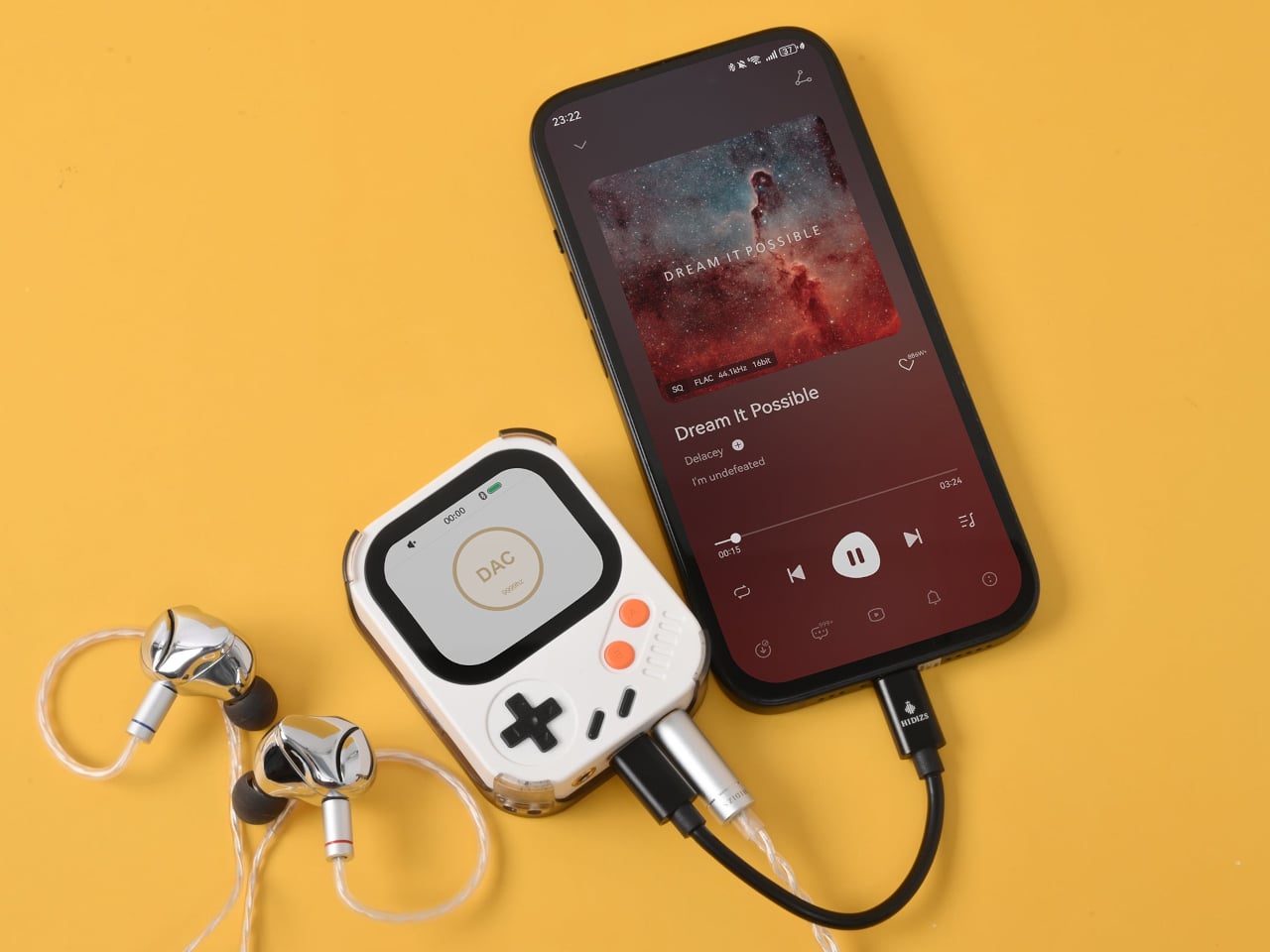
Bluetooth 5.3 with LDAC handles wireless listening without much compromise in audio quality, and the USB-C port doubles as a DAC input for computers and phones. Connect it that way, and the AP30 draws its own power, sparing the host device’s battery. The 1,200mAh cell manages 10 to 12 hours of continuous playback in single-ended mode and charges back to full in about one hour.

HidizsOS, the player’s Linux-based operating system, keeps the interface focused entirely on music rather than apps or streaming services. Customizable EQ presets and switchable digital hardware filters give listeners control over how their music sounds, and a built-in block puzzle game is a fitting Easter egg on a device with this much retro DNA. Both plastic and aluminum editions retail at $129.

There’s no streaming service, no social feed, and no notification waiting to derail the listening session. The AP30 runs on a locally stored library and asks for nothing more than a decent pair of earphones. For anyone who’s ever put a phone on silent just to get an hour of uninterrupted music, it makes a compelling case for carrying two things instead of one.

The post A $129 Music Player Built for People Done With Phone Distractions first appeared on Yanko Design.
These $69 ANC Headphones for kids are so good, I might use them myself: iClever Q950 Hands-on

Designing for children is a unique challenge. Kids are clumsy, impatient, and have a remarkable talent for forgetting to charge their devices. This reality often seems lost on product designers, who shrink adult technology and call it a day. The result is usually a frustrating experience for both parent and child, filled with confusing touch controls and the inevitable silence of a dead battery. It’s a cycle of minor tech annoyances that feels all too familiar in the modern family home.

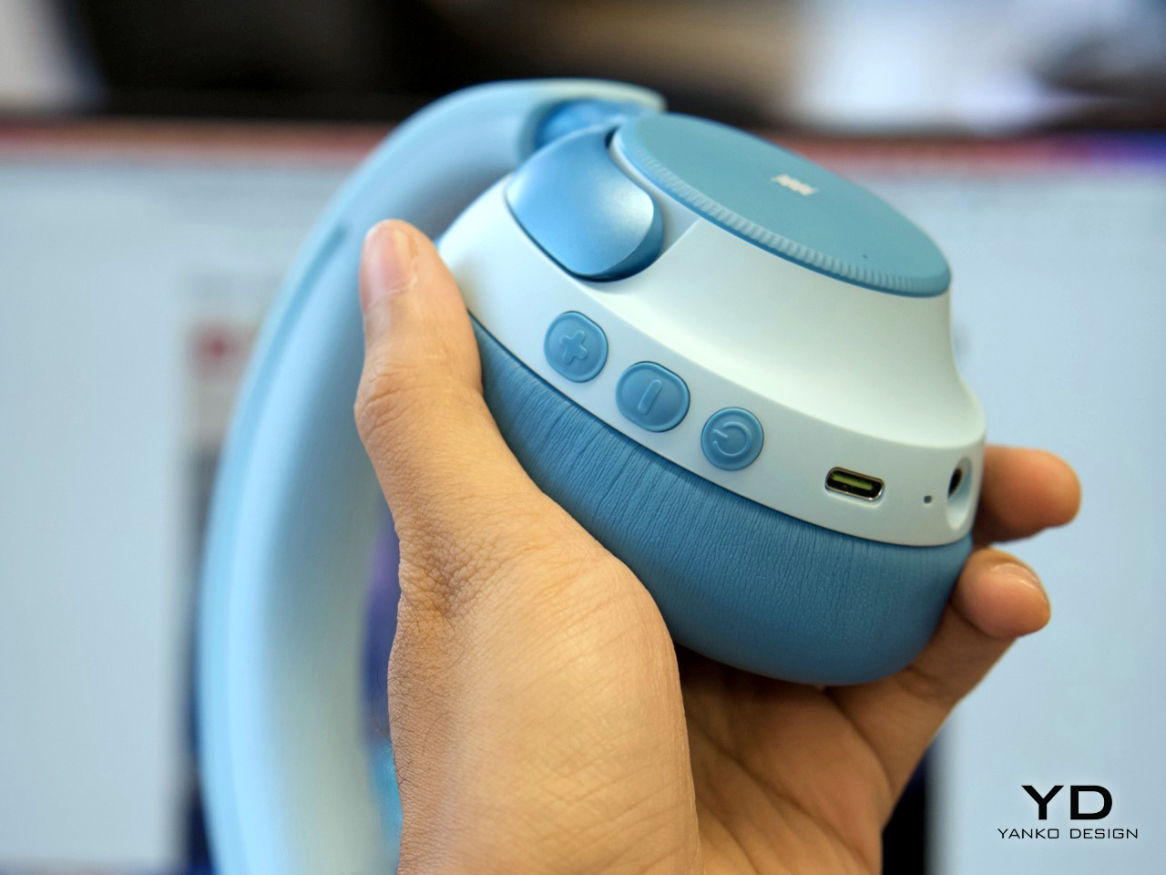
The iClever QuietShield Q950 feels like it was designed by someone who has actually spent time with kids. The controls are large, satisfying physical buttons, a smart choice for small hands that lack fine motor precision. Bluetooth pairing notifications are delivered in a friendly child’s voice, a small detail that makes the headphones feel truly personal. Best of all, the auxiliary input works even when the power is off, providing a practical backup for those very conceivable moments when charging is forgotten. These are the kinds of thoughtful, practical choices that make a product genuinely useful.

Designer: iClever

At $69.99, the Q950 makes a strong first impression. You get the headphones, a matching soft-shell carrying case, a USB-C charging cable, and an AUX cable, which already makes the package feel more complete than many headphones in this range. The case is especially nice, with a clean zippered form factor and enough room for the cables and paperwork in a mesh pocket. It is the sort of inclusion that makes the Q950 feel less like a basic kids’ accessory and more like a proper travel-friendly headphone package.

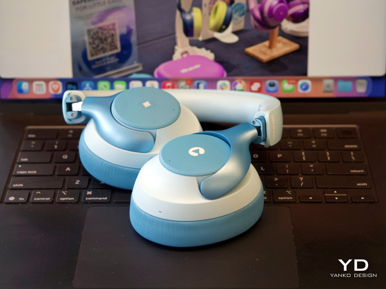
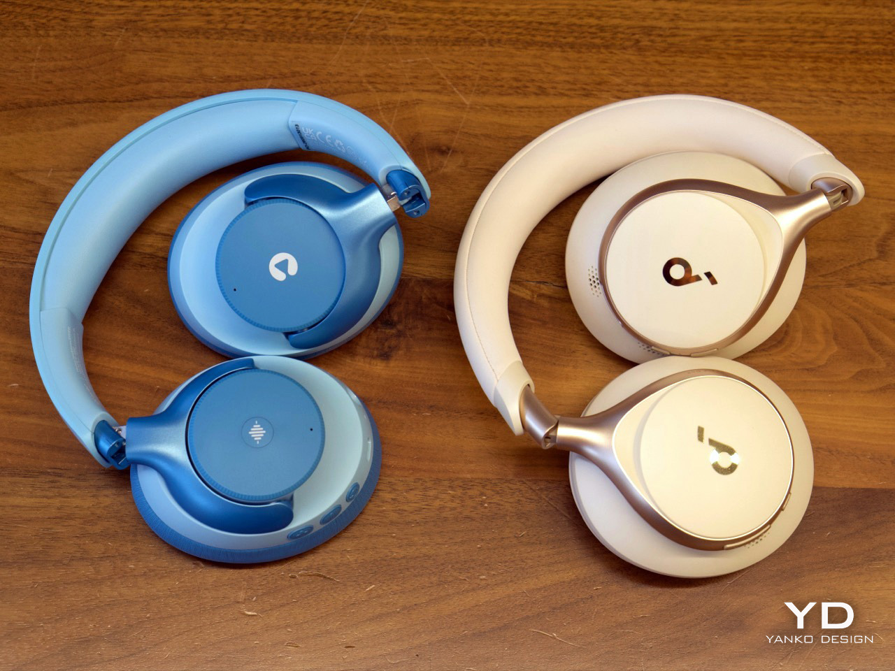
The design itself strikes a nice balance between playful and polished. In the blue finish, the two-tone color treatment gives the Q950 a softer, more approachable look, while the metallic-looking frame pieces that connect the earcups to the headband add a slightly more premium touch. Even though the construction is plastic, nothing about it feels cheap. The headband and earcups are cushioned well, the structure feels solid in hand, and nothing creaks or feels flimsy. I still hope replacement earcups are available, because that would make the product easier to recommend for long-term use, but the initial build quality is genuinely impressive.

That premium feel carries over into the controls. iClever made the right call by skipping touch panels entirely and using dedicated buttons for power, volume, and listening modes. Touch controls can be annoying even on adult headphones, so physical buttons make far more sense for kids. They are easier to find by feel, harder to trigger accidentally, and generally more forgiving. Just as importantly, there is no smart assistant toggle here, no Hey Siri shortcut, and no dedicated button that could accidentally send a child wandering into a voice assistant rabbit hole. They also look cute in a way that suits the Q950’s overall design language.

Bluetooth connectivity worked flawlessly in my time with the headphones. Pairing was quick, the connection stayed stable, and I did not run into any hiccups. Sound quality was also better than expected. To be honest, it held up surprisingly well against my Soundcore Space One in casual listening. I am not going to nitpick too much here because these are headphones for kids, not audiophiles, but there were no complaints on audio quality. They sounded clean, balanced, and perfectly good for movies, educational content, and everyday listening.

The volume does max out a little lower than the average pair of headphones, but that is clearly by design. iClever is positioning the Q950 around an 80dBA safe listening limit, and in practice that lower ceiling feels intentional rather than frustrating. The active noise cancellation helps here, because kids do not need to crank the volume as much in noisy environments just to hear what they are watching. That is the real advantage of pairing hearing protection with ANC instead of relying on a volume cap alone.

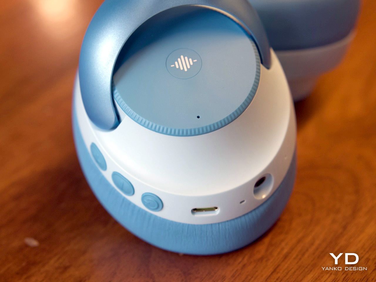
ANC is easy to access through the center button on the earcup, and transparency mode is available too, which is useful for keeping kids aware of their surroundings when needed. That setup feels much more practical than burying everything inside an app. The Q950 also supports wear detection, which worked well overall. There is one small quirk, though. If you place the headphones on a table with the earcups facing downward, the sensor can mistake the surface for your head and assume the headphones are still being worn. It is a minor issue and did not feel like a dealbreaker, but it is the kind of behavior you notice quickly in real use.

One of my favorite details is the AUX support. The headphones work passively over a wired connection even when they are powered off, which is genuinely useful if the battery dies because a kid forgot to charge them. That means the Q950 still works in a pinch instead of becoming dead weight during a flight or car ride. Of course, features like ANC and wear detection do not work when the headphones are off, because they still need power, but wired playback alone is a great fallback to have. If the headphones still have charge and are powered on, iClever says ANC can also work in wired mode.

The company claims up to 60 hours of playback with ANC off and 35 hours with ANC on, which is within the ballpark of what I got with my week’s worth of testing. The presence of AUX backup already removes a lot of battery anxiety.

For $70, the iClever QuietShield Q950 feels like a steal. You get a thoughtful set of features, reliable Bluetooth, effective ANC, a kid-safe volume cap, and a design that feels more premium than expected at this price. More importantly, it feels like a product built around how kids actually use headphones, and how parents actually worry about them.

The physical ANC button lets you toggle transparency

iClever delivers the Q950 in a gorgeous soft-shell case that kids can carry around with them.

The post These $69 ANC Headphones for kids are so good, I might use them myself: iClever Q950 Hands-on first appeared on Yanko Design.
A Design Student Just Imagined the Perfect Vinyl Turntable

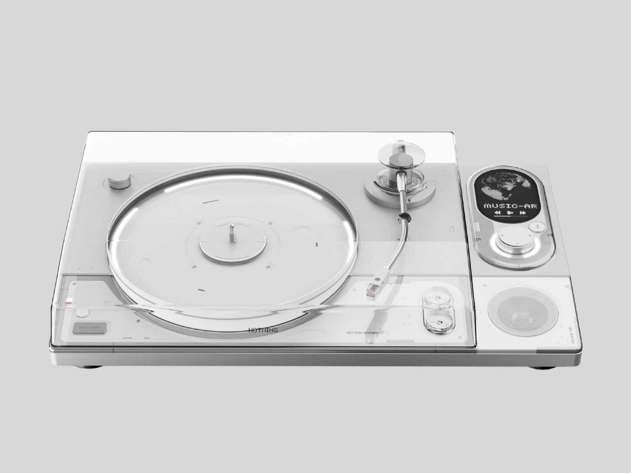
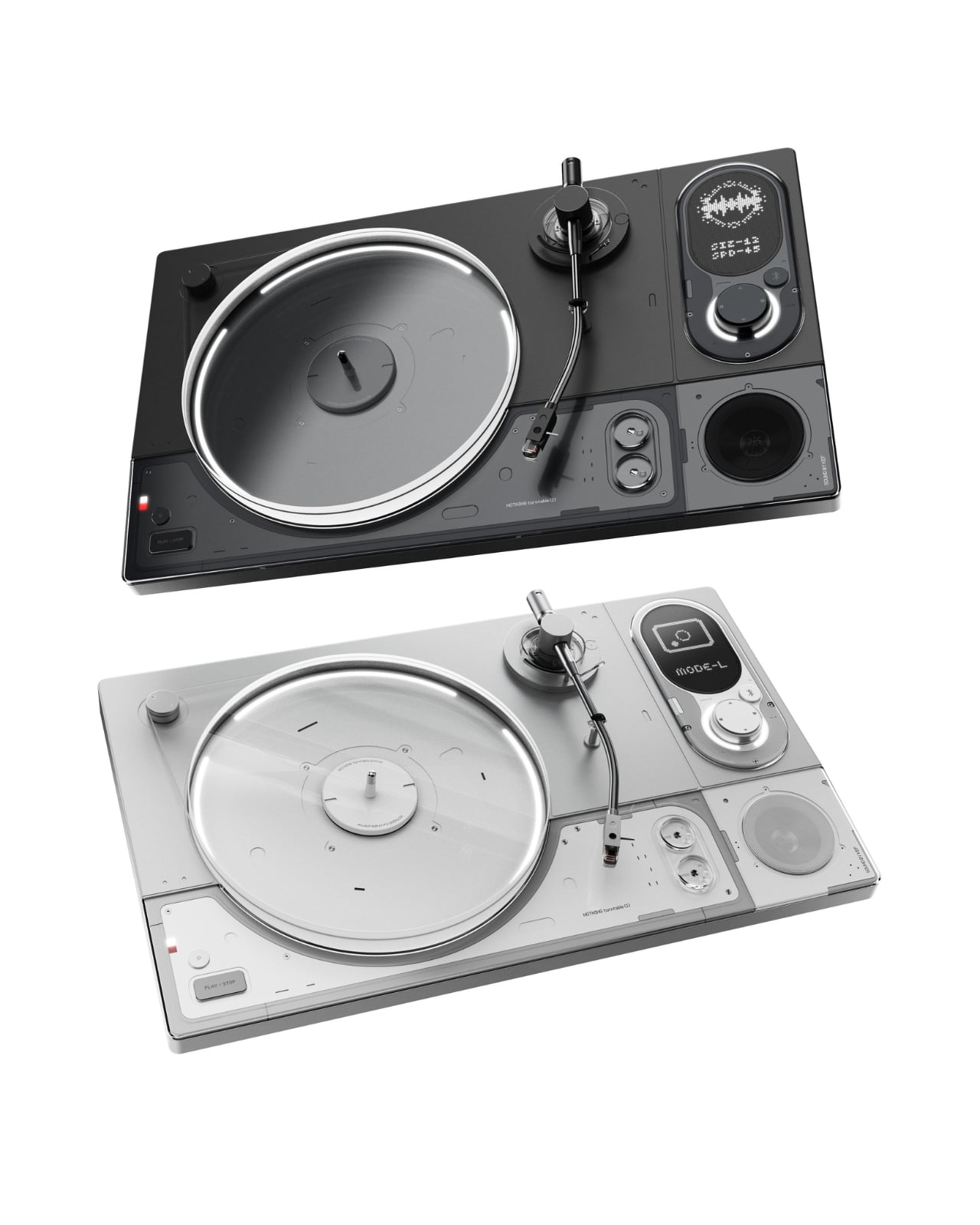
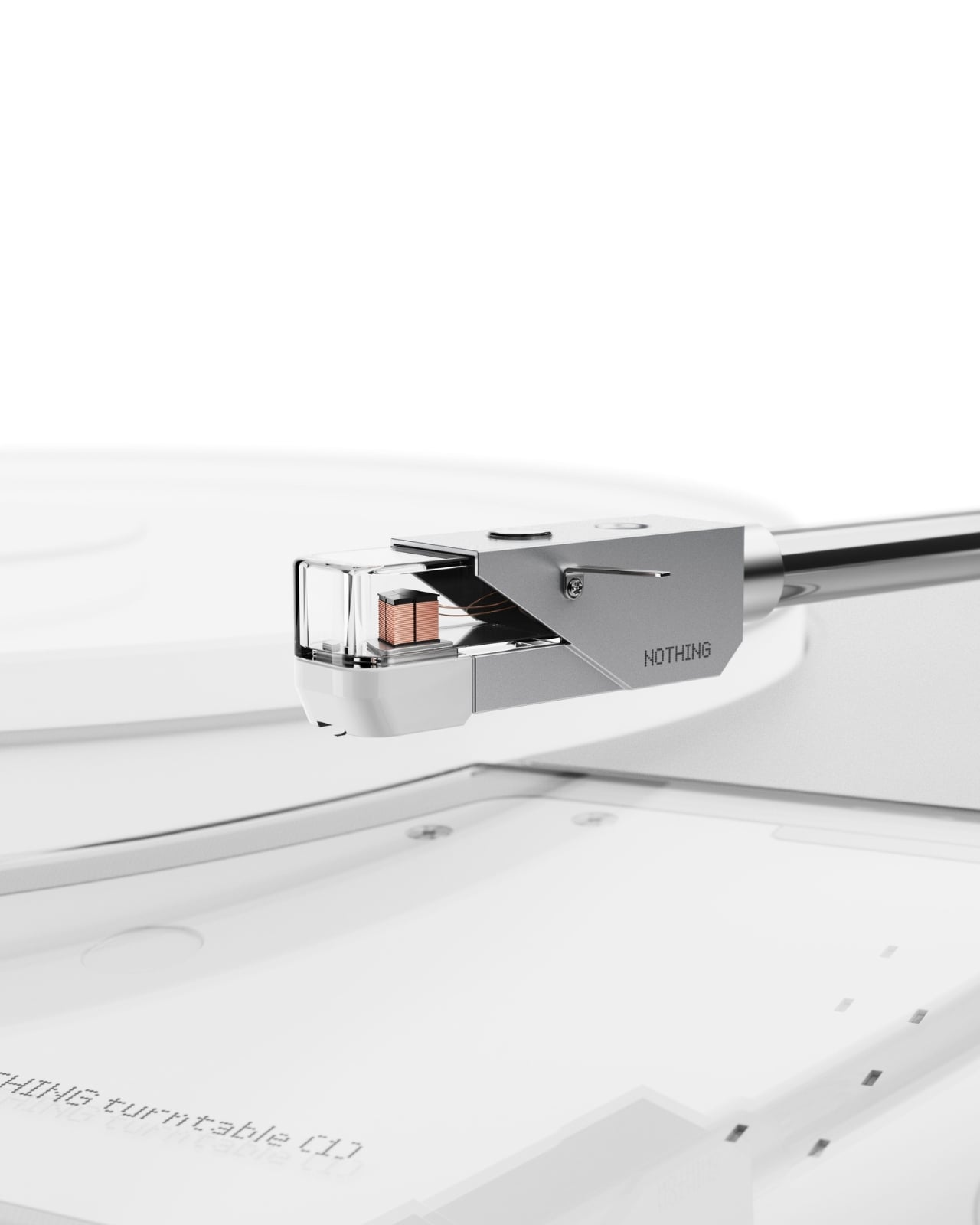
Sungwoo Choi is an industrial design student with one question: what if Nothing made a turntable? The answer is Turntable (1), a personal concept project with no official ties to the brand, and it’s been circulating online as exactly the kind of render that makes you briefly annoyed it doesn’t actually exist.

If you’ve spent any time in the vinyl revival conversation, you know most turntables fall into two camps: the warm, retro-wood-and-brass kind that lean hard into nostalgia, or the cold, purely utilitarian kind that audiophiles swear by but would never put on display. Very few designs ask the question that good industrial design should always ask. Can this be both beautiful and functional, without being precious about either? Choi’s concept does exactly that, in a visual language drawn directly from Nothing’s aesthetic, and it reads more resolved than many products that actually ship.

Designer: Sungwoo Choi

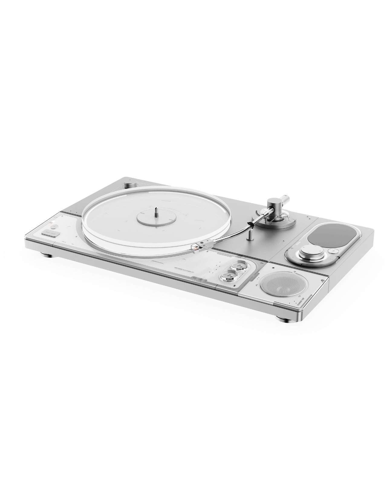
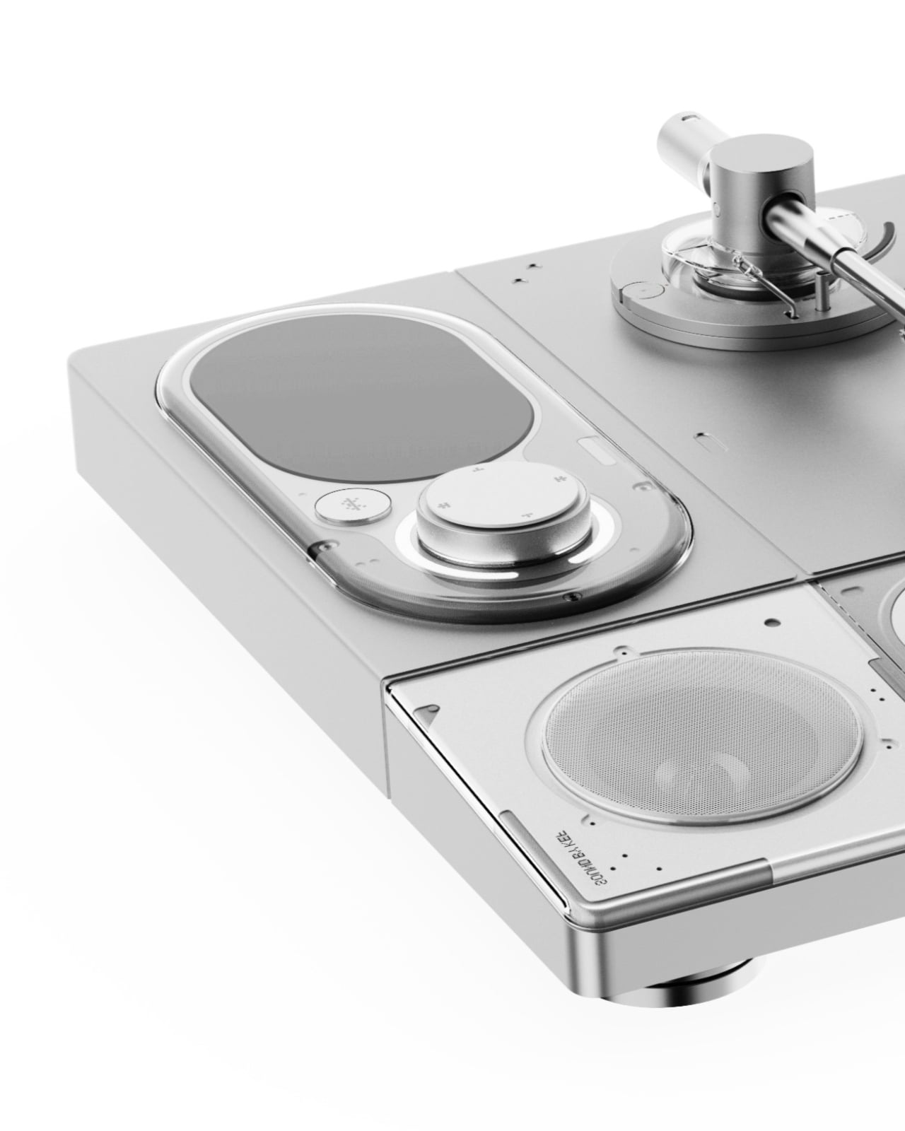
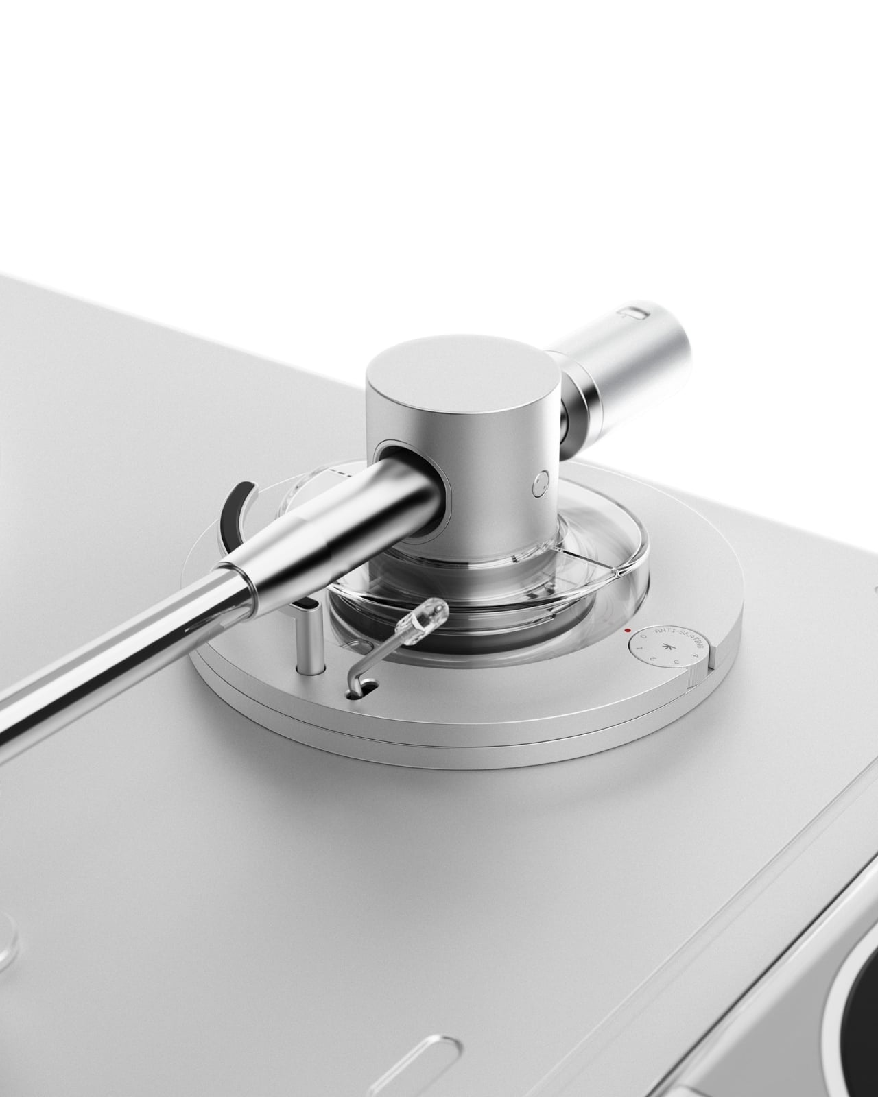
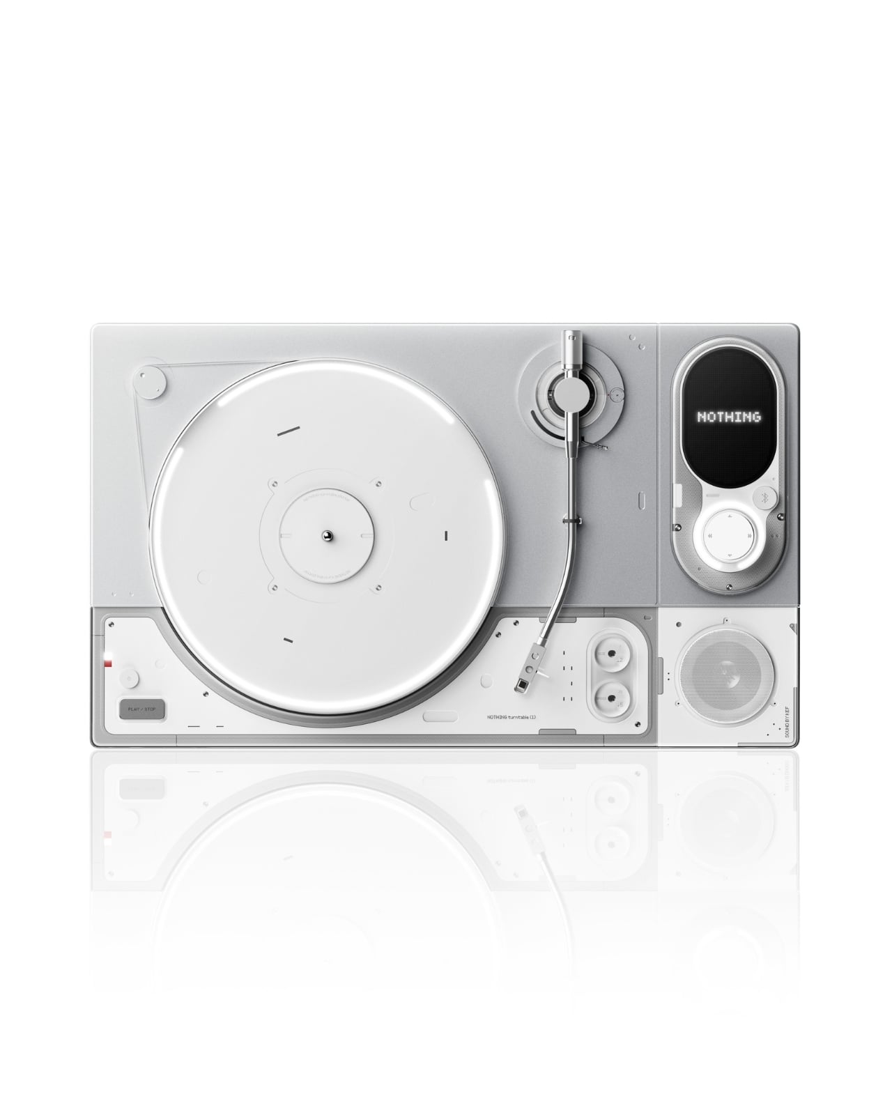
The design is clean in a way that reads as deliberate rather than sparse. The chassis is white with silver-tone aluminum accents, flat and rectangular with gently rounded module insets that divide the deck into distinct functional zones. The platter is rimmed in a transparent acrylic ring that catches light in a way that makes the whole unit feel alive without being showy. The tonearm is machined and substantial, seated on a circular mount encircled by concentric transparent rings, a detail that looks pulled from a scientific instrument. Nothing has built its entire reputation on making the internal visible, on transparency as both a literal and conceptual design choice, and Choi translates that language fluently into a format where seeing the mechanics only deepens the ritual of listening.

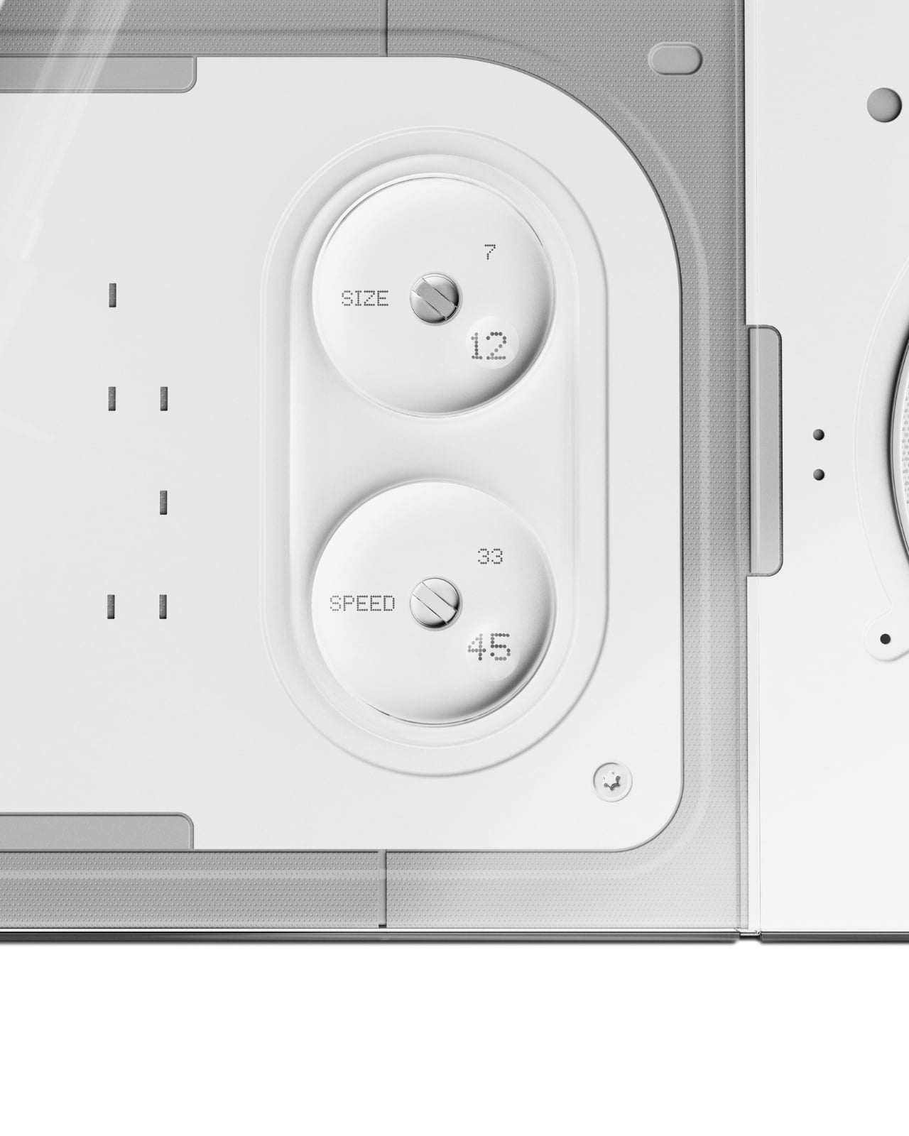
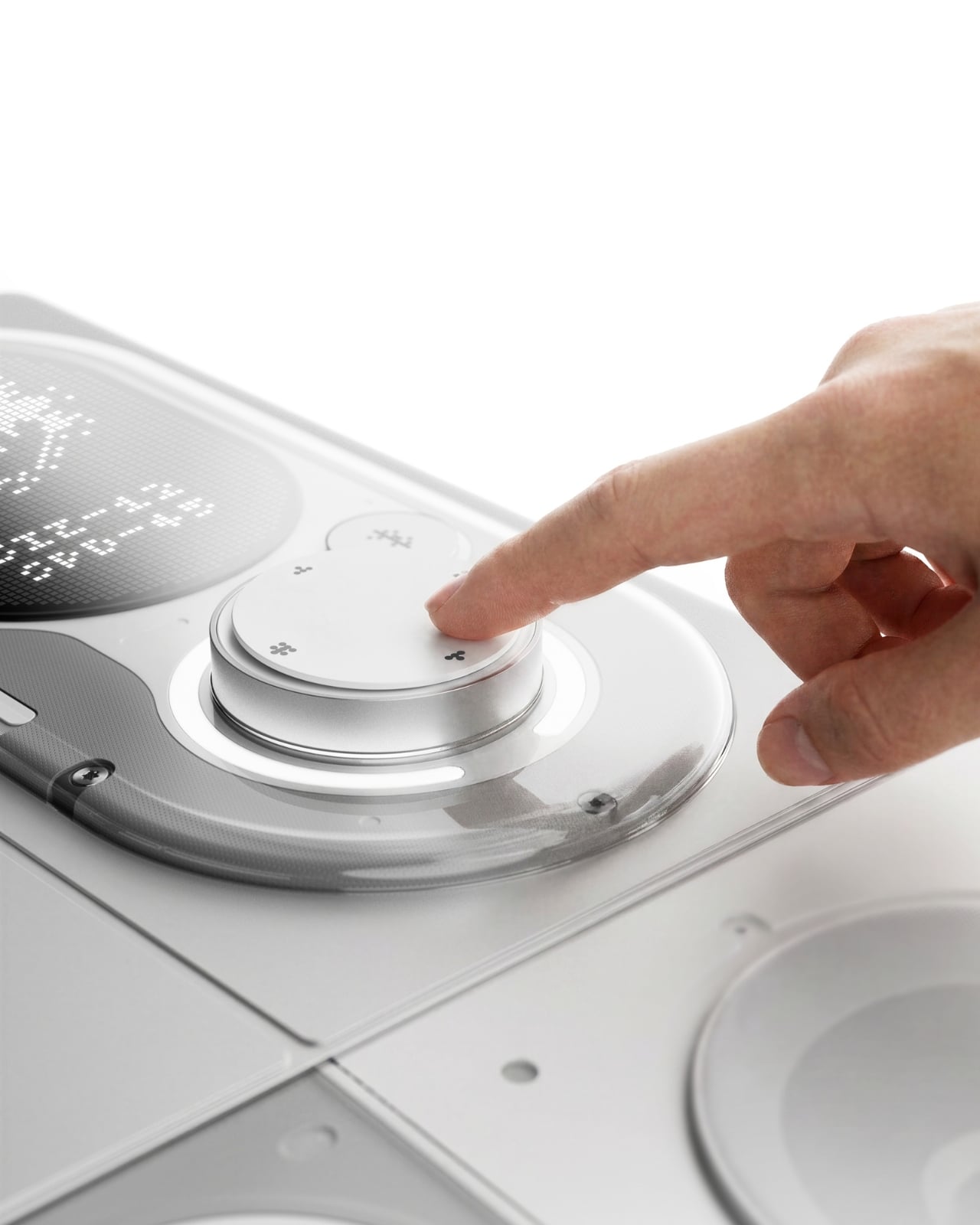
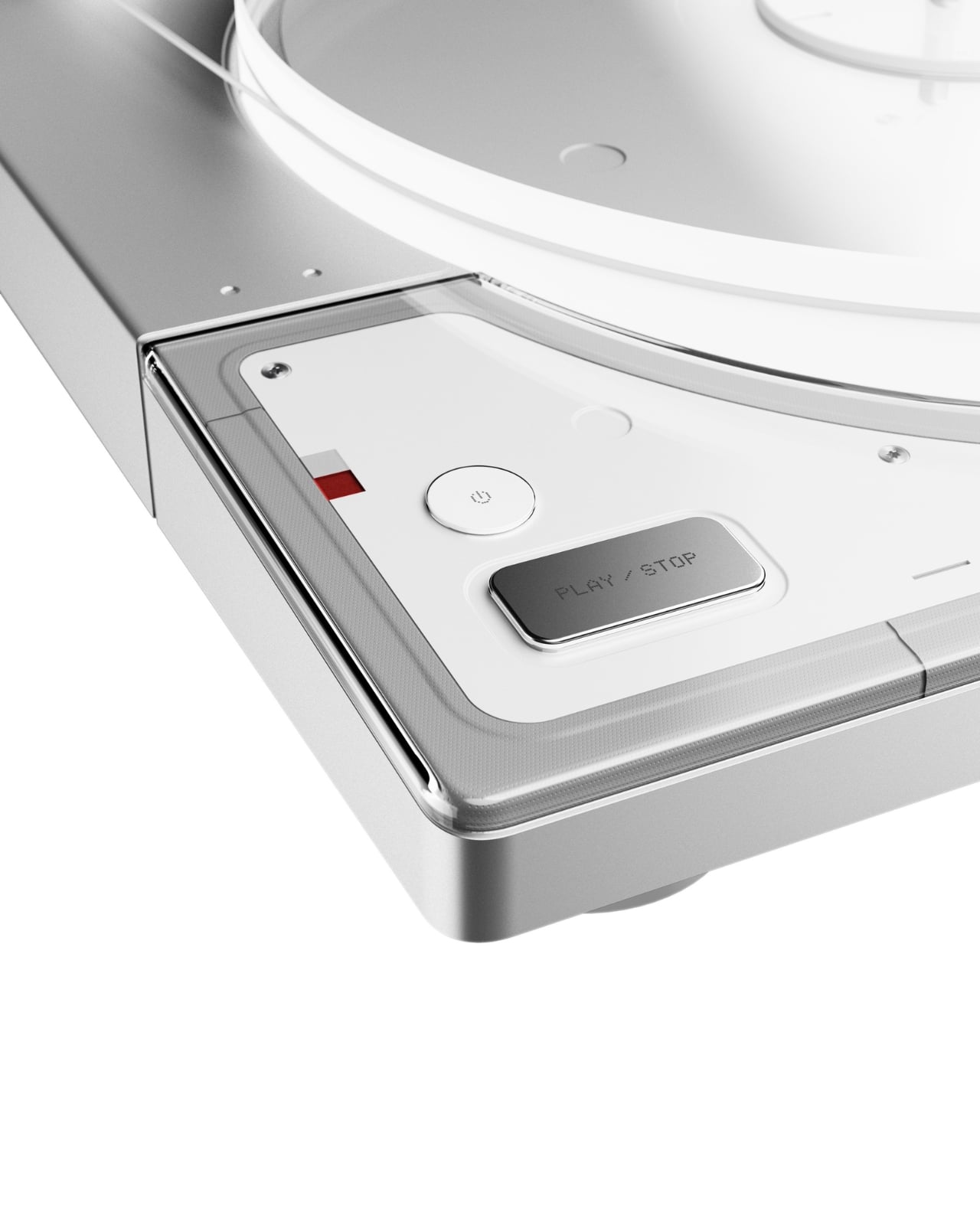
The control layout is where the concept gets genuinely interesting. Size (7/12) and Speed (33/45) dials are housed in a recessed rounded module, labeled with a matter-of-fact clarity that feels more like precision calibration than consumer product design. The volume knob is large and satisfying, surrounded by a clear acrylic trim ring and a small dot-matrix display panel marked “MUSIC-AR,” presumably a nod to some form of augmented reality integration. A flush-mounted speaker sits directly in the deck surface, making Turntable (1) a genuinely self-contained system. A Play/Stop button and a power button occupy the front-facing panel with quiet authority, like the designer knew exactly which controls needed physical presence.

The naming is the detail that does the most work quietly. Turntable (1). Choi borrows Nothing’s signature naming convention deliberately: Phone (1), Ear (1), Ear (stick). The convention carries a specific kind of promise. The (1) implies a (2). It implies a roadmap, a lineage, a commitment to return. By applying it here, Choi isn’t framing this as a one-off fan exercise. He’s imagining an entire product category for a brand that has already proven it can take commoditized consumer electronics and make people genuinely want to look at them.

The vinyl market argument practically makes itself. Records have been in cultural resurgence for well over a decade now, and the market is robust enough to support a premium, design-forward turntable aimed at people who care as much about what sits on their shelf as what comes out of their speakers. Nothing’s core audience, younger buyers who are design-literate and culturally engaged, are the exact crowd that has been rediscovering vinyl. The overlap isn’t a stretch. In retrospect, it feels like an obvious move for the brand.

Choi’s Turntable (1) is a concept, not a product, and carries no official connection to Nothing. That distinction matters. But the best concepts are the ones that make you slightly resentful they don’t exist yet. The work is confident, cohesive, and rooted in a genuine understanding of both the format and the brand he chose to draw from. It’s built on the logic of Nothing’s identity rather than just borrowing its aesthetic surface. It isn’t the spectacle of the render that earns attention. It’s the quality of the thinking behind it. Someone at Nothing should be paying attention.

The post A Design Student Just Imagined the Perfect Vinyl Turntable first appeared on Yanko Design.
This Award-Winning Guitar Ditches the Strings, the Frets, and Most of the Body, and I Kind of Love It

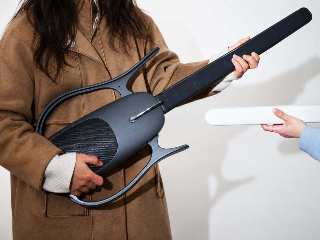
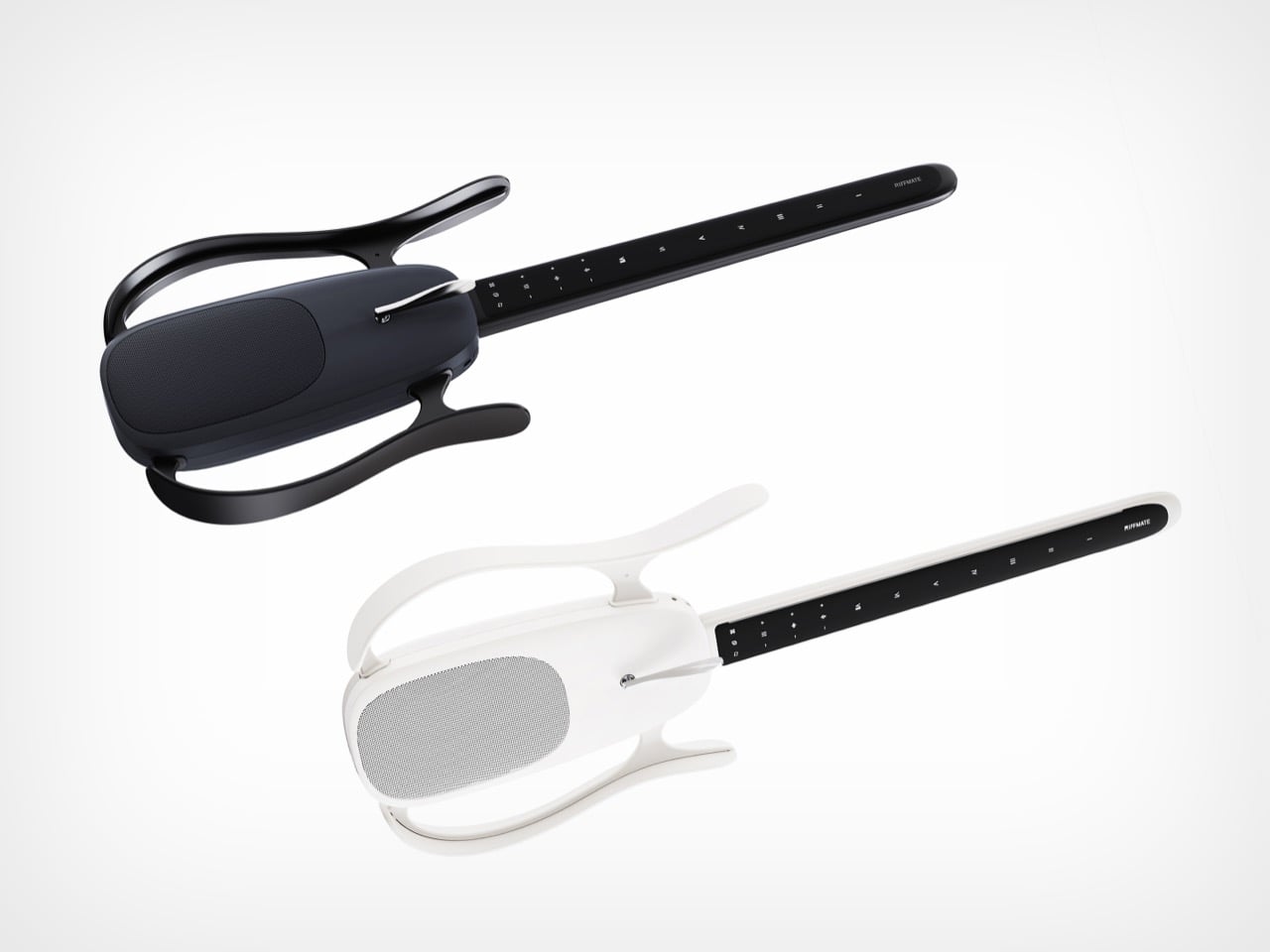
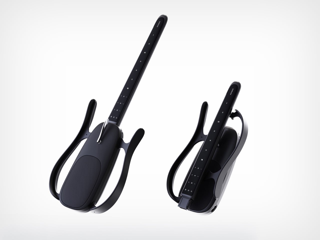
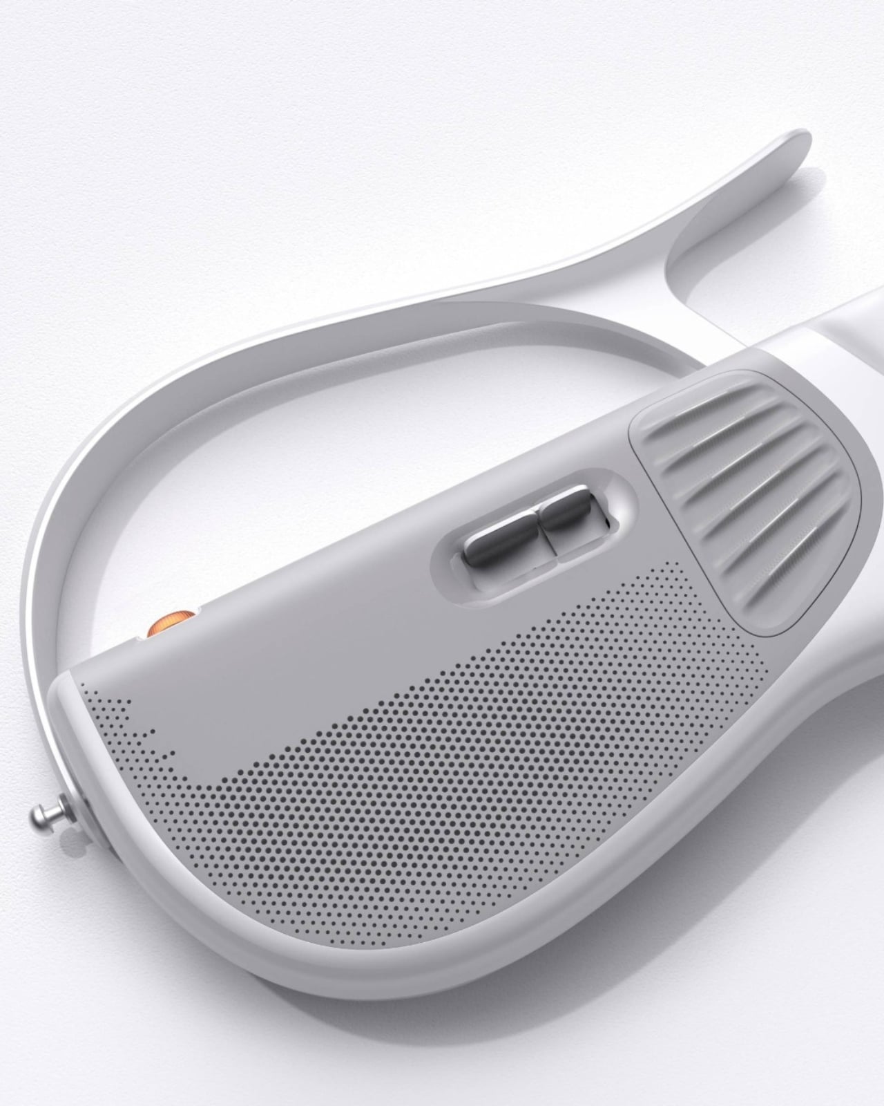
Look at RIFFMATE for a second and try to name what is missing. No strings. No fretboard bristling with metal wire. No solid slab of tonewood. What remains is the silhouette of an electric guitar sketched in mid-air, a skeletal frame that holds the double-cutaway outline everyone recognizes while hollowing out almost everything inside it. Those sweeping arms curving off the body trace exactly where a guitar’s shoulders and horns would sit, and then they float, framing empty space instead of filling it.
It takes real confidence to design an instrument by subtraction, and the RiffmateGT01 pulls it off with a straight face. Built by Shanghai’s Wo Tan Ni Chang Technology with industrial design from LKK Design Beijing, it collapses the guitar into two pieces, a slim touch-strip neck and a central pod holding the speaker, electronics, and acoustic chamber. The neck wears Roman numerals from I to VII where frets used to sit, and you play it by touch rather than by plucking steel. An AI layer shapes the sound and flattens the brutal learning curve that sends most beginners quitting by their fourth barre chord.

Designers: LKK Design Beijing

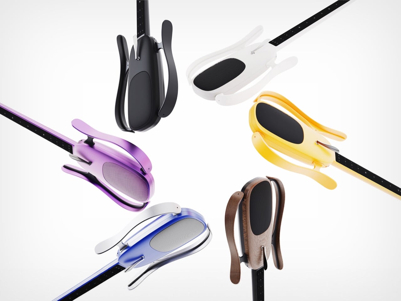
One-key disassembly lets the neck separate from the body, so the whole instrument folds into a small carry-on bag and clicks back together in seconds. Anyone who has wrestled a guitar into an overhead bin understands why that matters more than it sounds. The shells pop off too, which is where the personality lives, with RIFFMATE rendering in matte black, crisp white, a purple gradient, sunshine yellow, a blue-to-silver fade, and a warm walnut finish. Swapping those panels lets owners recolor the instrument or replace a scuffed part, stretching its lifespan instead of sending it to landfill. Modularity turns the guitar from a fixed object into a system that grows and changes with the person holding it.

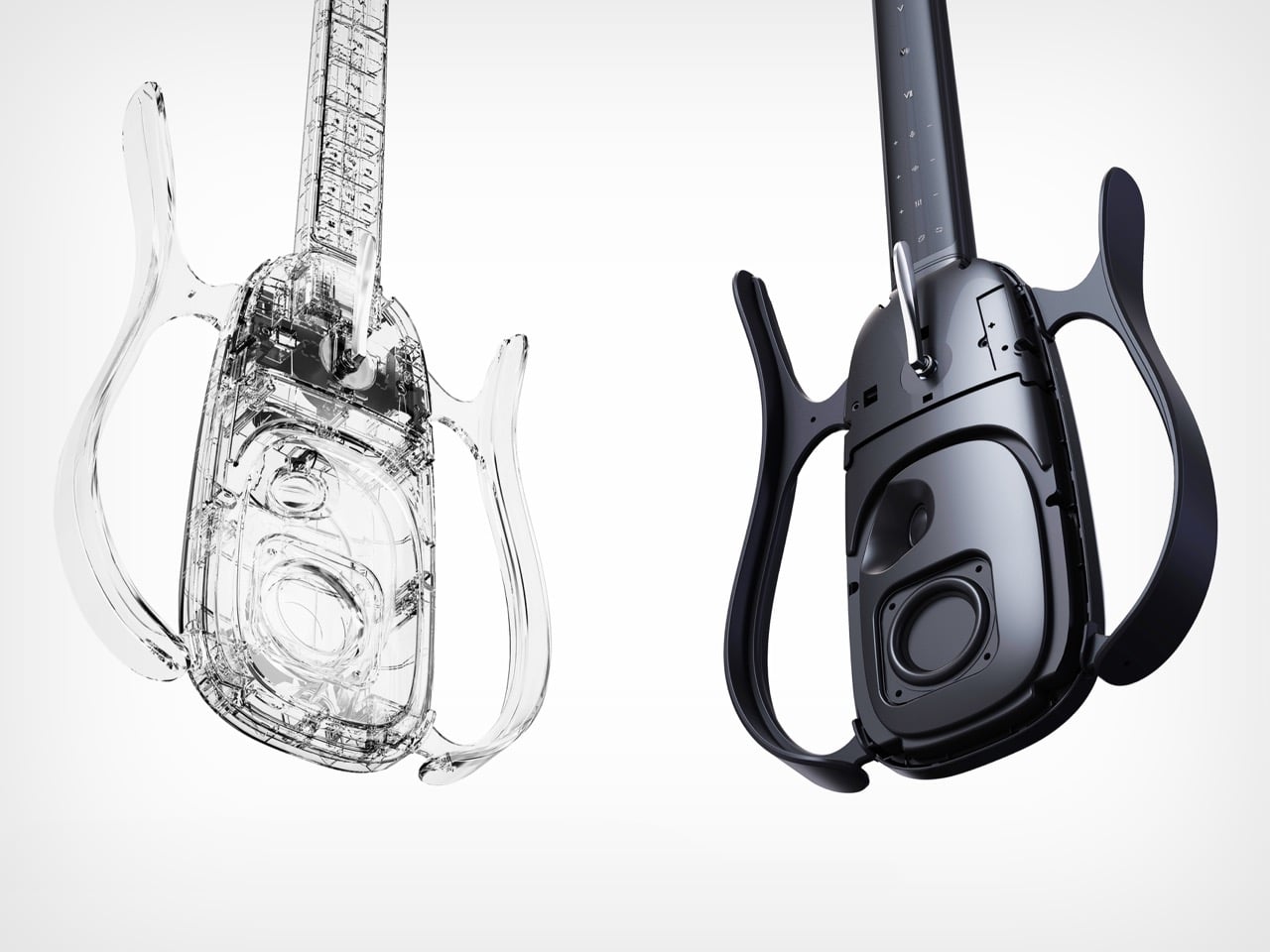
The transparent render exposes a properly engineered acoustic cavity inside that central pod, with dedicated internal channels feeding a front-firing driver. That makes RIFFMATE self-amplifying, able to fill a room without an external amp or a tangle of pedals. The body wears a matte frosted texture over soft, rounded contours, sitting closer to a well-resolved Bluetooth speaker than to a slab-bodied Stratocaster. Those friendly surfaces read as age-agnostic, pitched at a curious ten-year-old and a lapsed forty-year-old guitarist alike. The whole object invites handling, exactly what an instrument built to lower the stakes should do.

Smart guitars have inched toward this moment for years, and LAVA did much of the groundwork by wrapping carbon fiber around a built-in touchscreen and turning the instrument into a full software ecosystem. RIFFMATE pushes that lineage somewhere stranger, questioning whether a guitar needs strings or a body at all, and joining a small wave of stringless designs rethinking the form from scratch. The honest caveat is that this remains award-stage industrial design, so we are judging intent and renders rather than a shipping spec sheet. As a vision, it lands as one of the boldest reinterpretations of the guitar to cross my desk in a while. Whether Wo Tan Ni Chang can build the object as beautifully as LKK drew it is the question worth watching.

The post This Award-Winning Guitar Ditches the Strings, the Frets, and Most of the Body, and I Kind of Love It first appeared on Yanko Design.