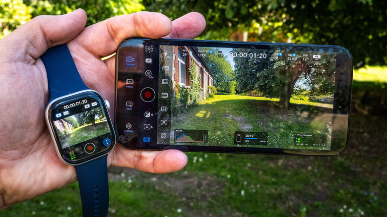
Apple reportedly has a lot of changes planned for the Camera app
iOS 27 may integrate Visual Intelligence into the Camera and make it more customizable.

The race to make flagship phones thinner, smoother, and more visually unified has become one of the defining stories in premium smartphone design. Hard angles and bold silhouettes that once gave each model its own character have been quietly traded for softer frames and tighter lineup coherence. It’s a direction that makes these phones easier to hold and sell, but not always easier to tell apart.
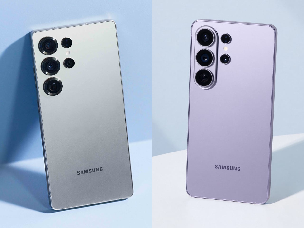
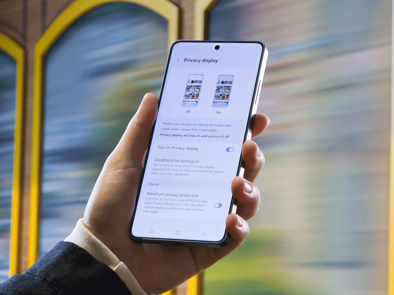
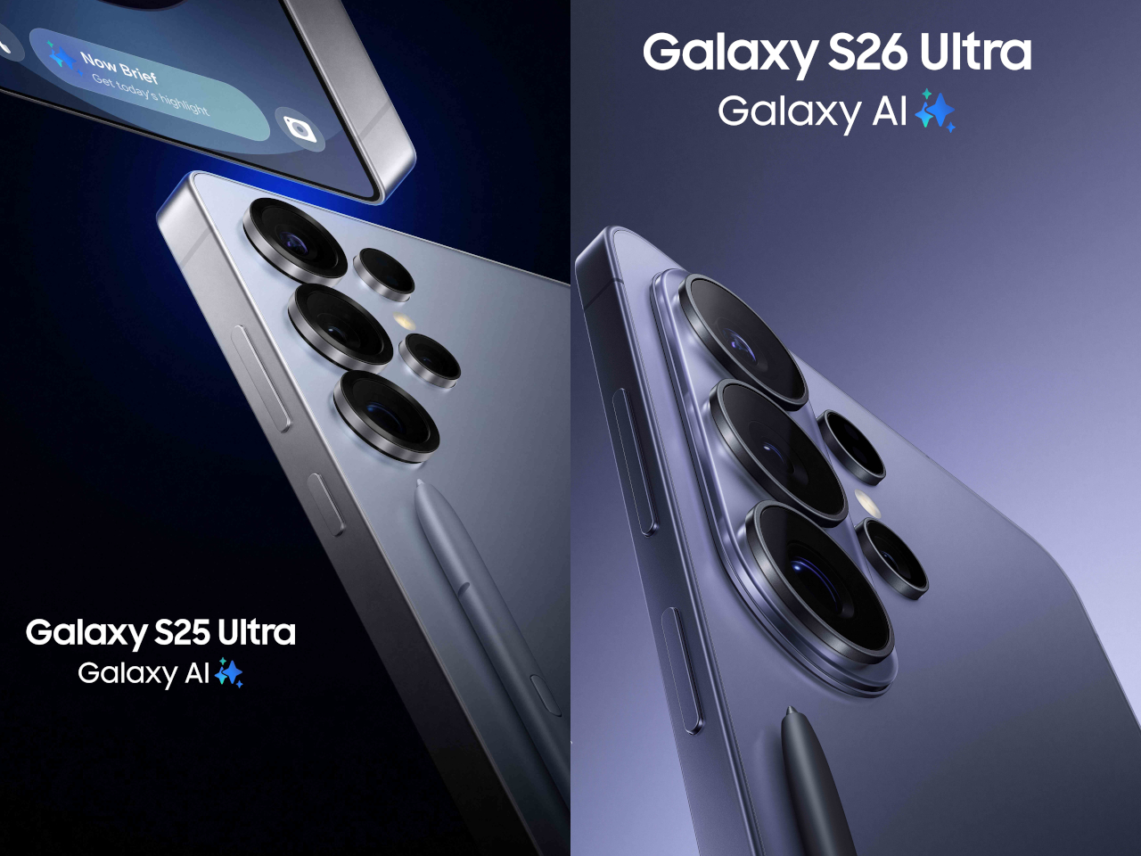
The Samsung Galaxy S26 Ultra, which hit shelves on March 11, 2026, fits squarely into that movement. Samsung pushed the chassis below 8mm for the first time on any Ultra, trimming it down to 7.9mm. Add to that a softer corner radius, an Armor Aluminum frame, and an anti-reflective Privacy Display, and it starts to feel like something more deliberate than a routine generational update.
Designer: Samsung
To understand why that matters, it helps to remember where the Ultra came from. When Samsung discontinued the Galaxy Note in 2021, it didn’t retire the design language that defined it. The Note’s boxy corners, flat sides, and upright proportions migrated into the Ultra line, giving those phones a distinctly tool-like character. The Ultra felt like a device built for serious use, and its shape made that clear.
Galaxy S25 Ultra
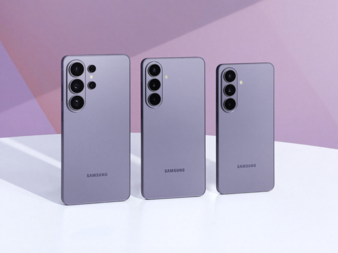
Galaxy S26 Ultra
The Galaxy S26 Ultra leaves most of that behind. Samsung rounded the corners, softened the edges, and made the phone look far more like the standard Galaxy S26 and S26+ than any Ultra model before it. That visual coherence is good design management, but it’s also the moment the Ultra stops looking distinctly like its own thing. It’s harder to spot in a lineup now.
Galaxy S25 Ultra
Those softer edges do make a real difference in how the phone sits in the hand over a long day. When you’re scrolling through a document or holding the device on a commute, the rounded frame distributes pressure more evenly across the palm. The 7.9mm chassis also disappears into a pocket more gracefully than its predecessor, which sounds minor until you realize how often you actually notice it.
Galaxy S26 Ultra
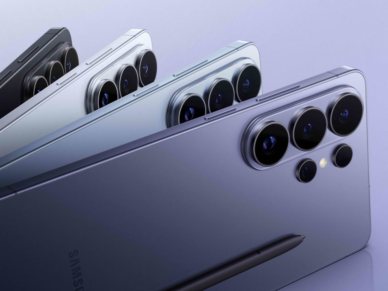
With the silhouette doing less visual heavy lifting, Samsung shifted the premium story into the surface itself. The Armor Aluminum frame carries the finish more evenly from back to edge, giving the phone a cleaner look that doesn’t need dramatic geometry to feel expensive. The anti-reflective Privacy Display adds a different kind of thoughtfulness, letting you check sensitive messages or browse in public without worrying about prying eyes.
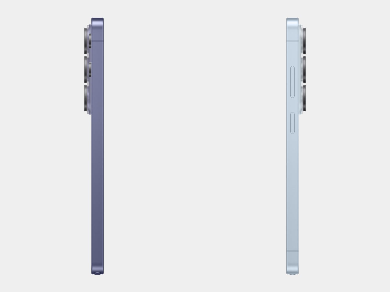
What really puts the 7.9mm figure in perspective is the competition. The iPhone 17 Pro Max measures 8.75mm thick, and while a 0.85mm difference might not sound dramatic on its own, the context here matters quite a bit. Samsung is fitting a built-in S Pen into a phone that still comes in thinner than Apple’s stylus-free flagship, which is an engineering tradeoff worth acknowledging.
iPhone 17 Pro Max
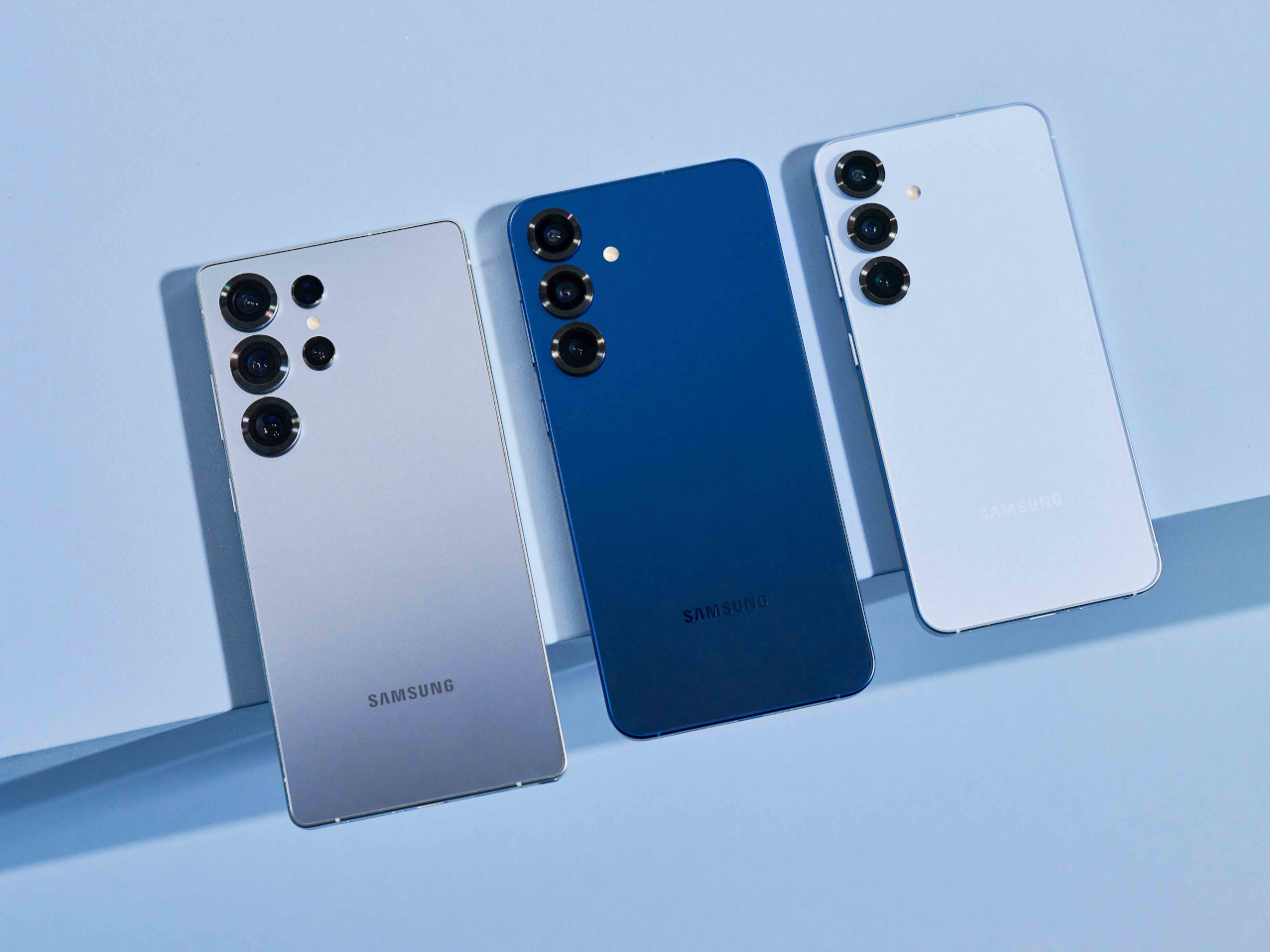
What makes this shift more significant is what it says about Samsung’s intentions for the lineup as a whole. The Galaxy S26, S26+, and S26 Ultra now share the same curvature and visual language for the first time. That’s Samsung quietly admitting that the Ultra doesn’t need to look like a separate category; it’s a flagship, not a relic from a discontinued line.
Two months after launch, the Galaxy S26 Ultra’s design verdict has had time to settle, and the conversation is genuinely split. There’s something complete about how it all comes together now, smoother, thinner, and more coherent. The S Pen remains, but the body no longer insists on its Galaxy Note roots. Whether that reads as maturity or loss probably depends on how long you’ve been following the Ultra.
The post Galaxy S26 Ultra Buried the Note’s Boxy Soul, and Fans Are Split first appeared on Yanko Design.
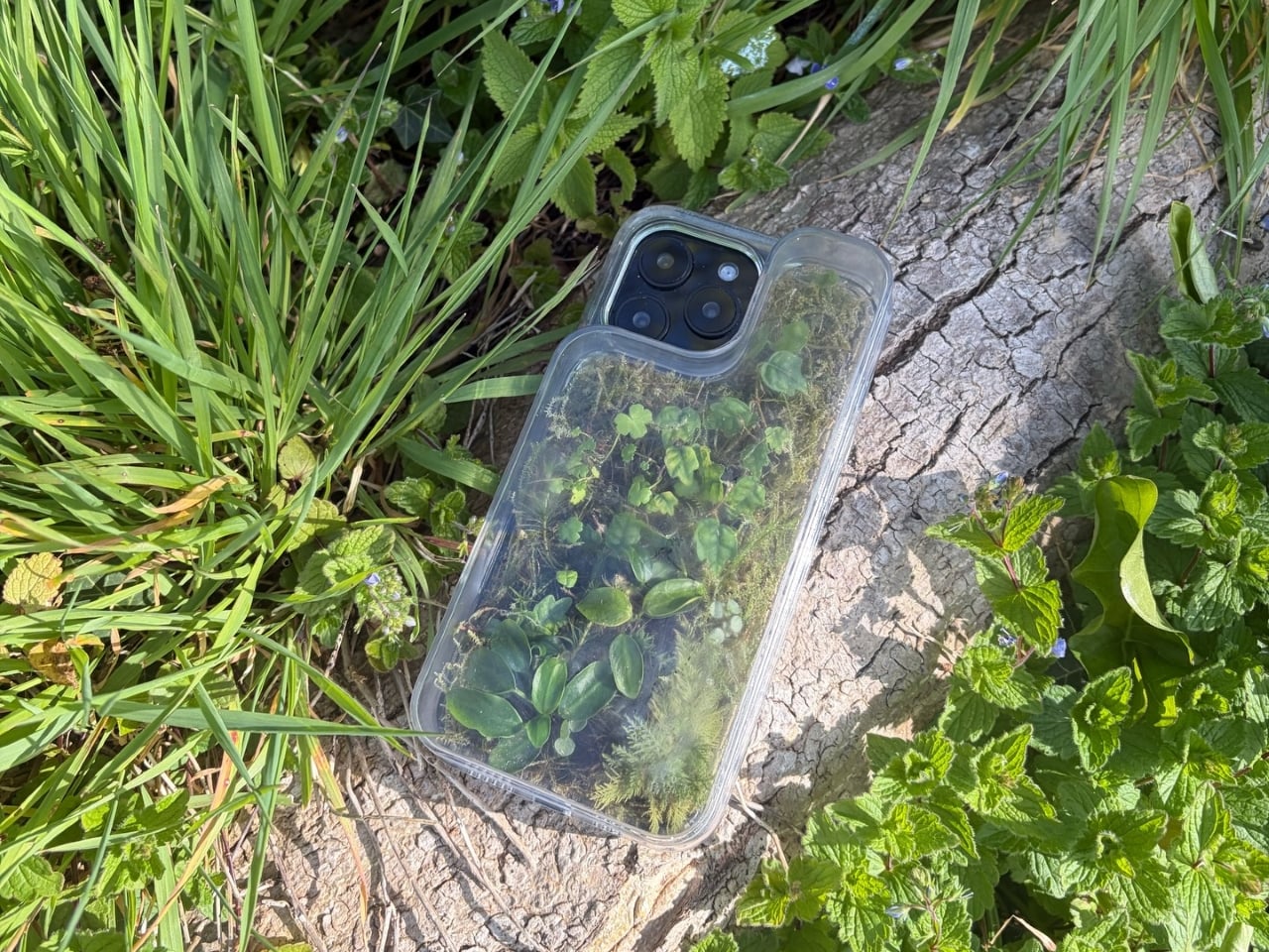
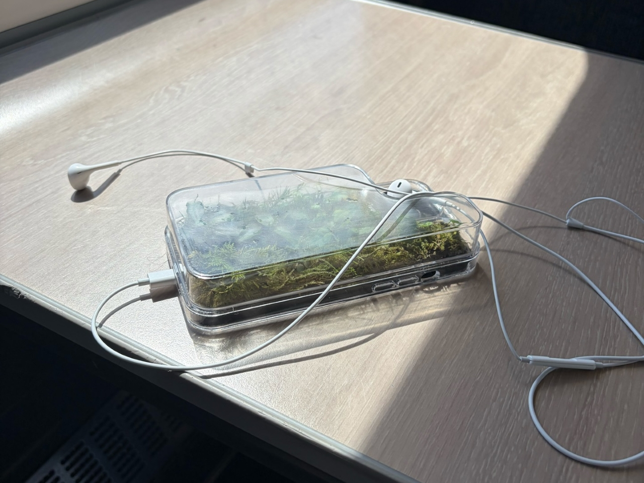
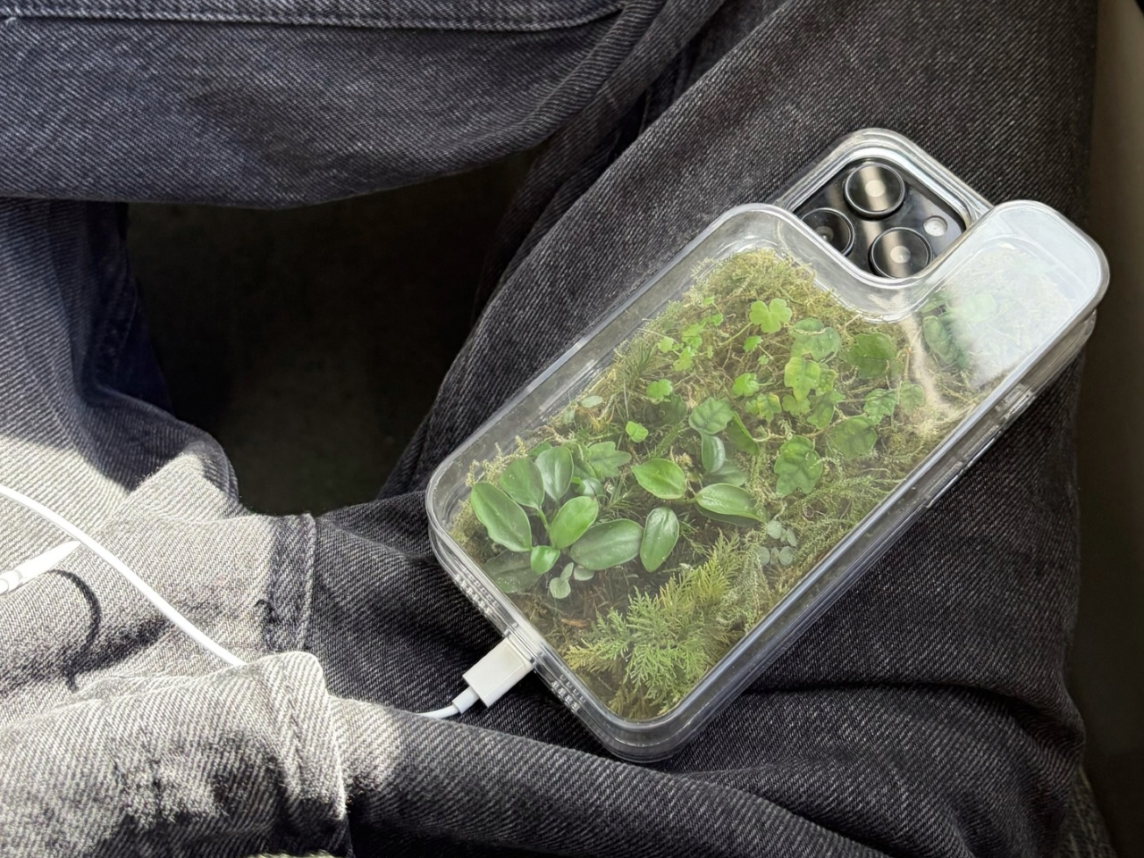
Phone cases have largely settled into two camps: the ones that protect your phone without anyone noticing they exist, and the ones that make a statement with printed graphics, colors, or textures. Neither approach has found a way to make the back of a phone genuinely interesting rather than just decorated. Designer Daniel Idle found a third option that neither camp seems to have considered.
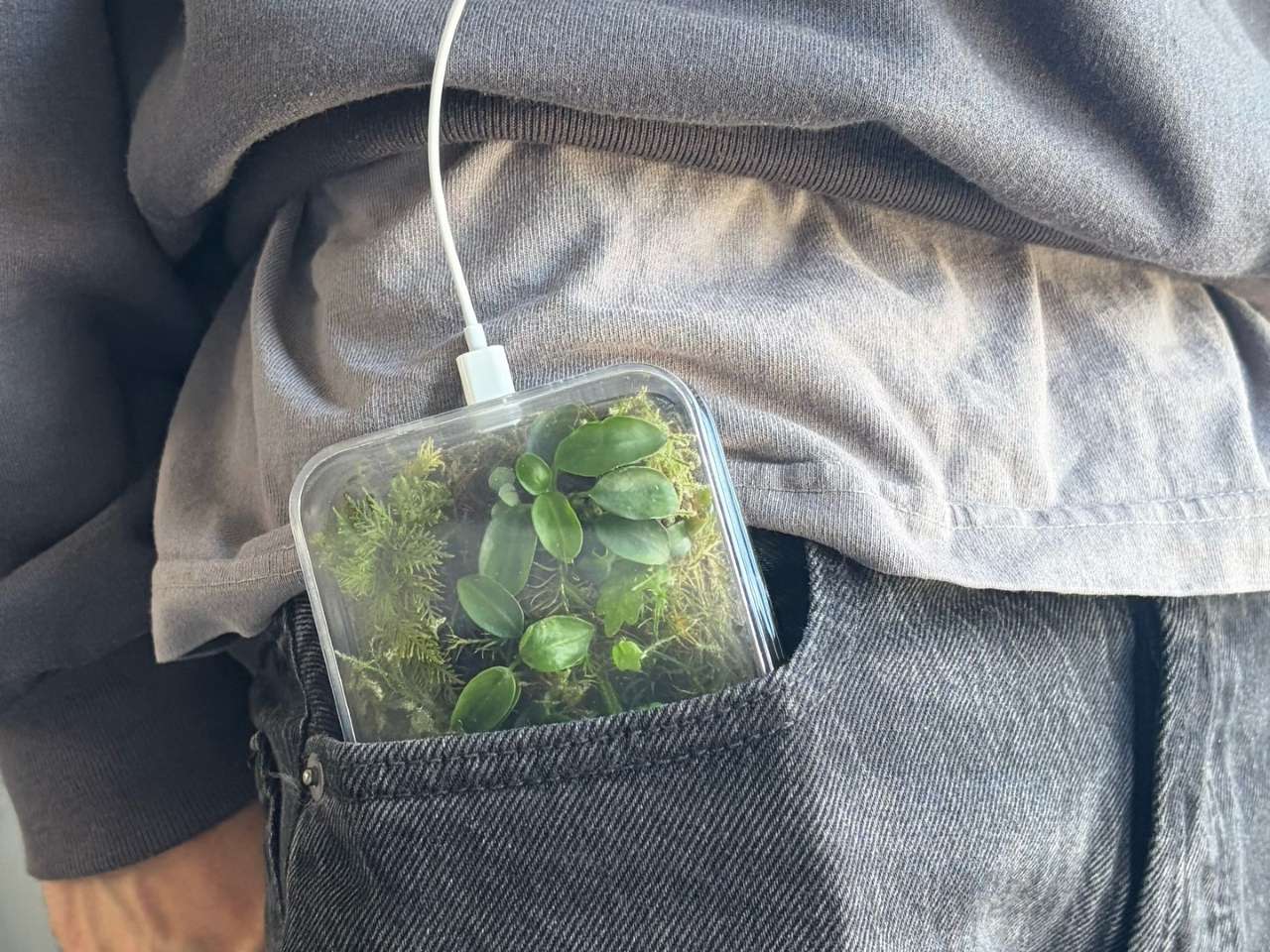
The Terrarium Phone Case is a clear resin case for the iPhone 16 Pro Max with an actual planted environment sealed inside the back cavity. Moss, small-leafed plants, and a stabilized soil substrate are embedded within the transparent shell, creating a thin cross-section of living terrain that you carry around with you wherever the phone goes. It’s a working phone case, a functional terrarium, and an oddly calming thing to have in your pocket all at once.
Designer: Daniel Idle
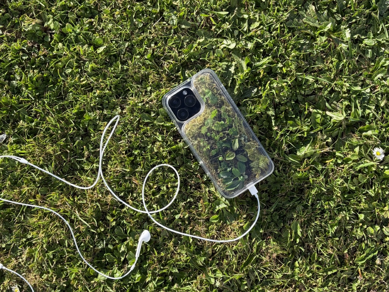
The construction involved 3D modeling and fabrication in clear resin, producing a case with enough depth in the back wall to house soil, roots, and plant matter. The plants are packed using a stabilized substrate that keeps the arrangement intact when the phone is picked up, rotated, tilted, or slipped into a bag. The camera cutout is fully preserved; the charging port at the bottom remains accessible; the phone continues to work exactly as it always did.
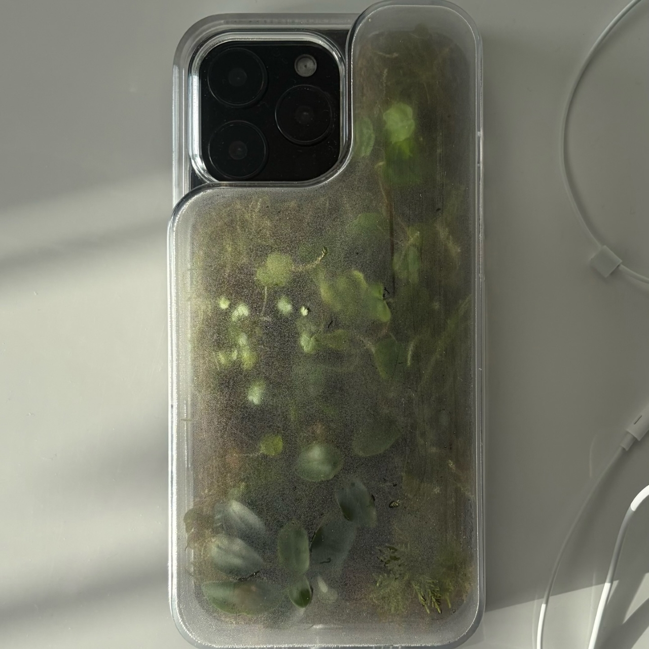
What keeps everything alive inside the sealed cavity is a closed-loop moisture system. The plants and soil generate humidity, which evaporates toward the inner surface of the resin, condenses back into droplets, and cycles down again. Light passing through the clear shell feeds the plants from outside, while the substrate provides gradual nutrient release. The whole thing is, in a fairly literal sense, a miniature ecosystem that sustains itself without any intervention from the person carrying it.
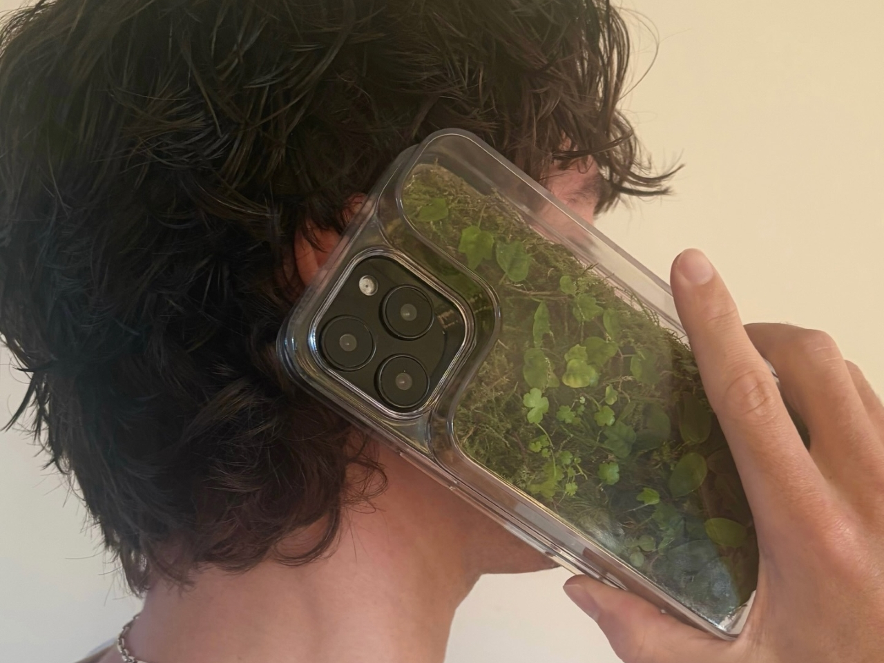
The condensation that forms on the inside of the shell during high-humidity moments is part of the visual appeal rather than a flaw to be engineered away. Seeing that vapor cycle through the case is a reminder that something in there is alive, actively breathing and responding to its environment, in the same pocket or bag as a device specifically engineered to minimize all biological interference.
There’s a running thread through design culture about bringing nature back into objects and spaces that have drifted too far from it. Biophilic design has become a recognizable term for everything from moss walls in offices to plant-filled shelving in apartments. Most of those applications treat plants as decoration layered on top of an existing design. Idle’s approach is different because the plant system isn’t decoration; it’s structural, sealed directly into the object’s body as a core component rather than an afterthought.
Of course, there will be some reservations about putting moisture and soil so close to your phone, which might be resistant to water and dust, but only from brief encounters. Good thing, then, that it’s still a concept project right now. But as a thought experiment about what a phone case could reasonably contain, it lands somewhere between genuinely novel and gently absurd, which is probably the most honest place for a good idea to start.
The post Phone Cases Are Boring, This One Puts a Living Terrarium Inside first appeared on Yanko Design.