When Leica announced the Cine Compact 1, my first reaction landed somewhere between genuine curiosity and mild skepticism. Leica is a camera brand. A camera brand, the kind photographers carry like a quiet badge of honor, the kind that has defined a certain visual language for over a century. And now they want to replace my television?
Here is the thing: Leica has been making projectors since 1926. Before streaming was a concept, before most of us were born, they were already in the projection business. The Cine Compact 1 is not a prestigious camera brand drifting beyond its territory. It is one returning to an old, familiar one.
Designer: Leica
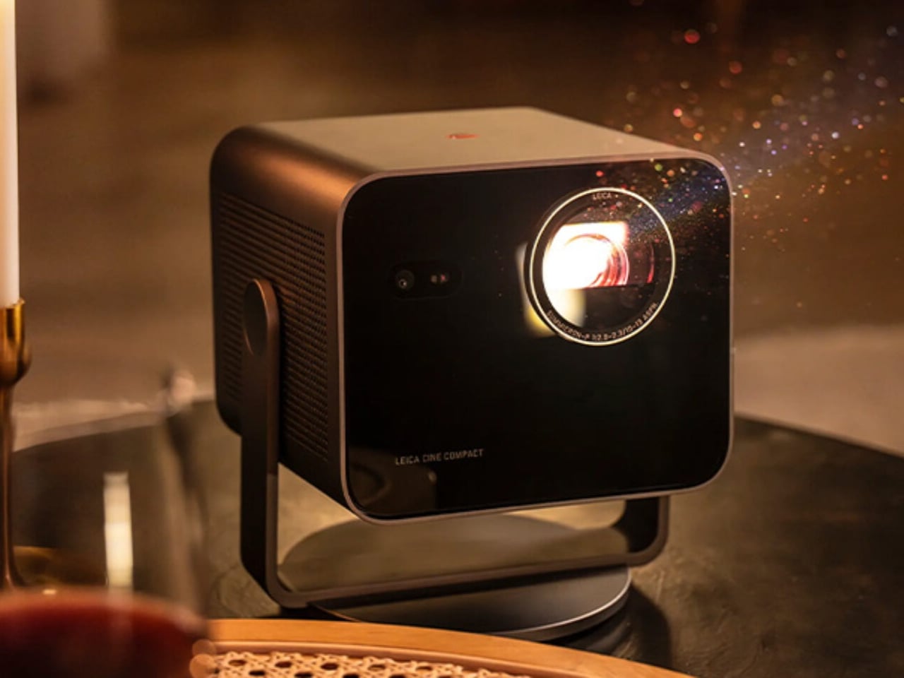
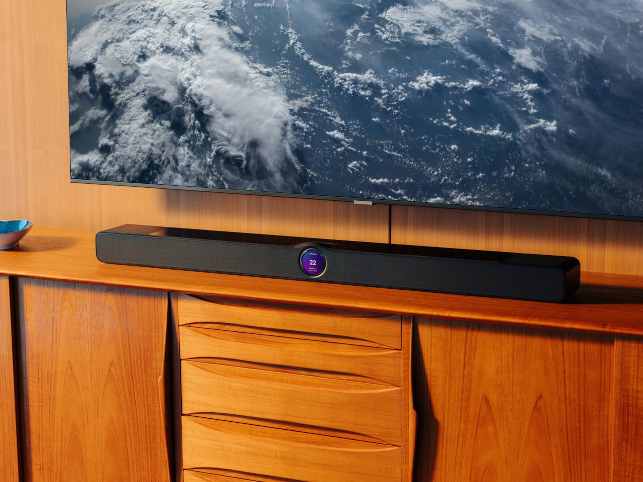
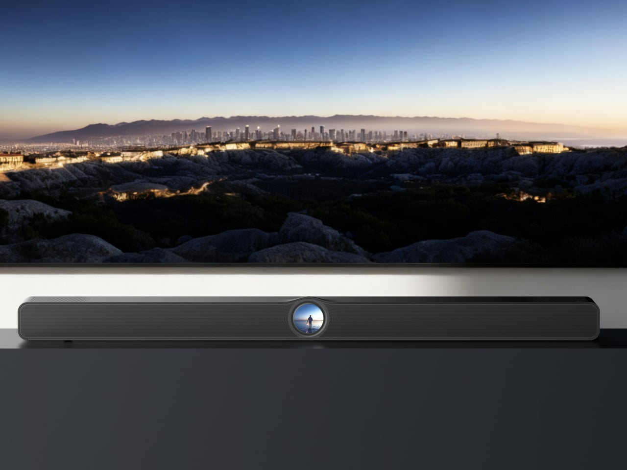
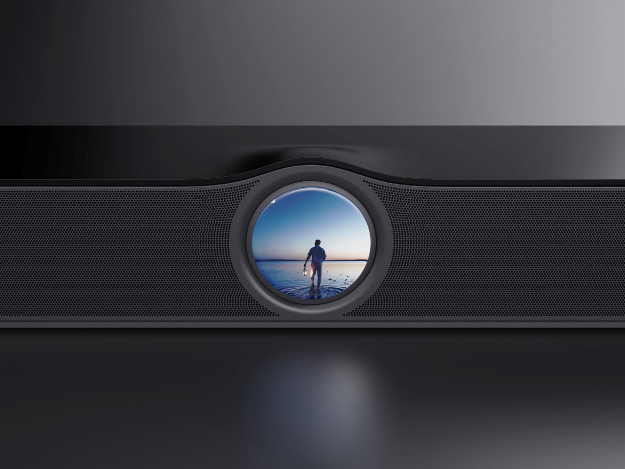
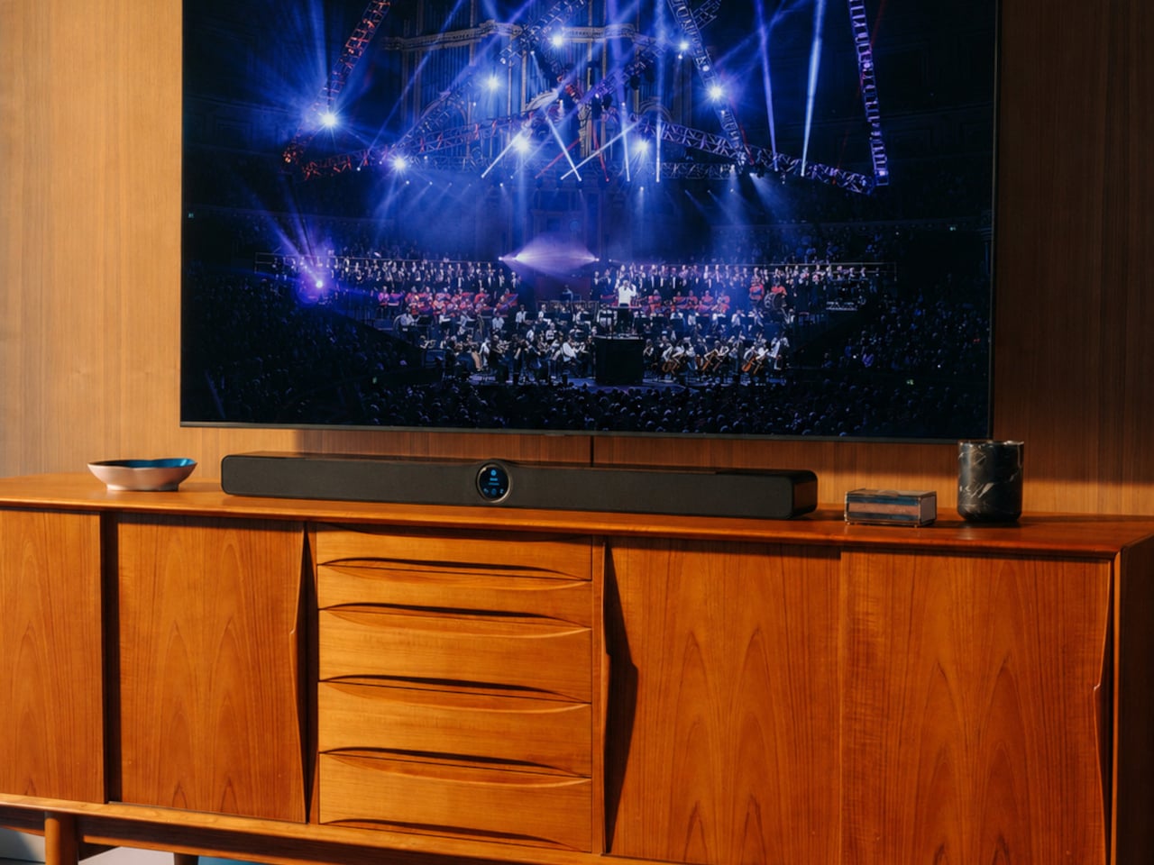
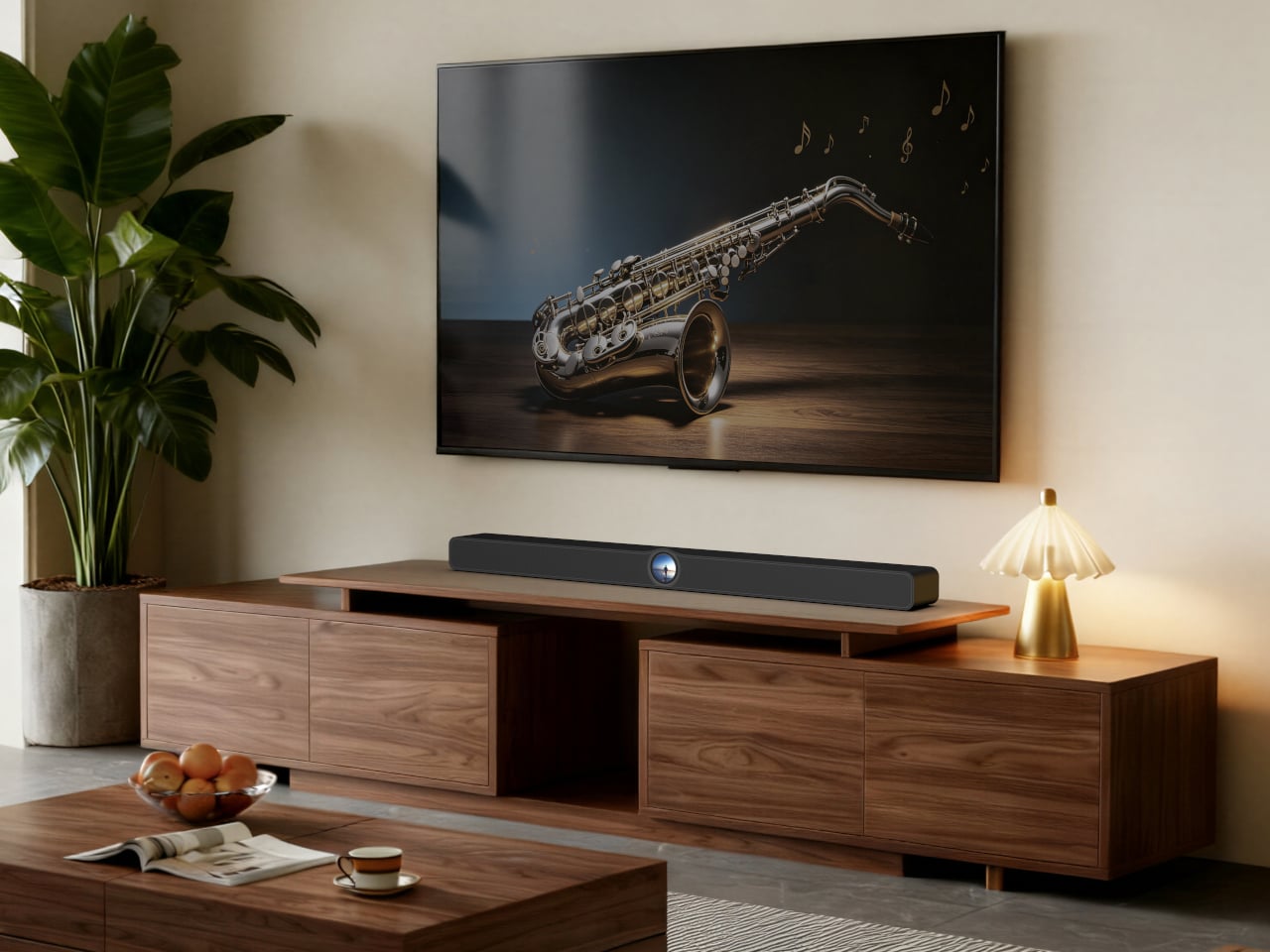
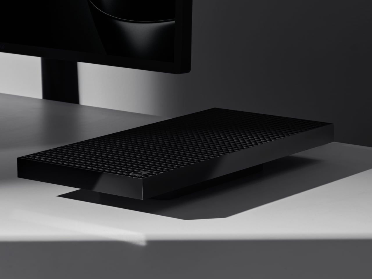
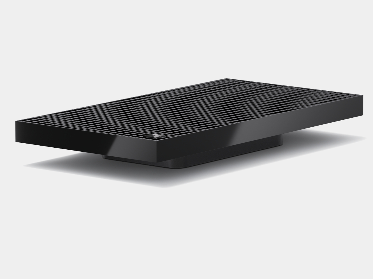
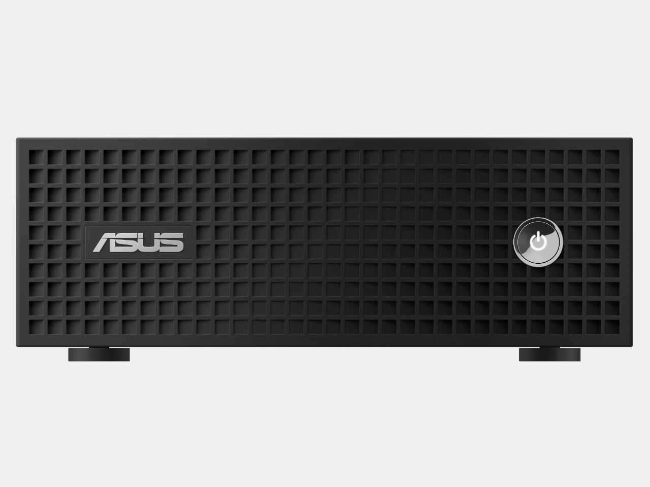
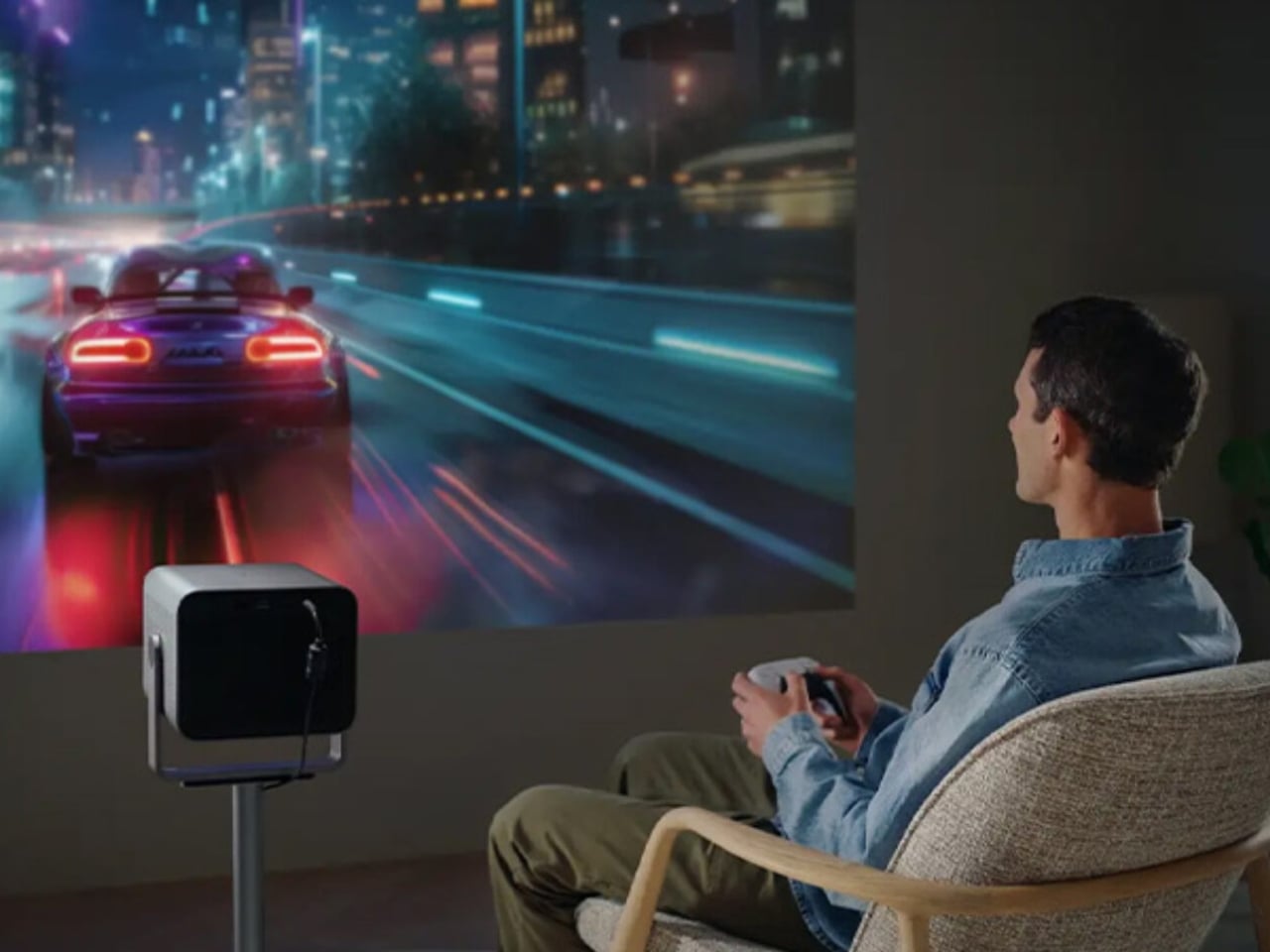
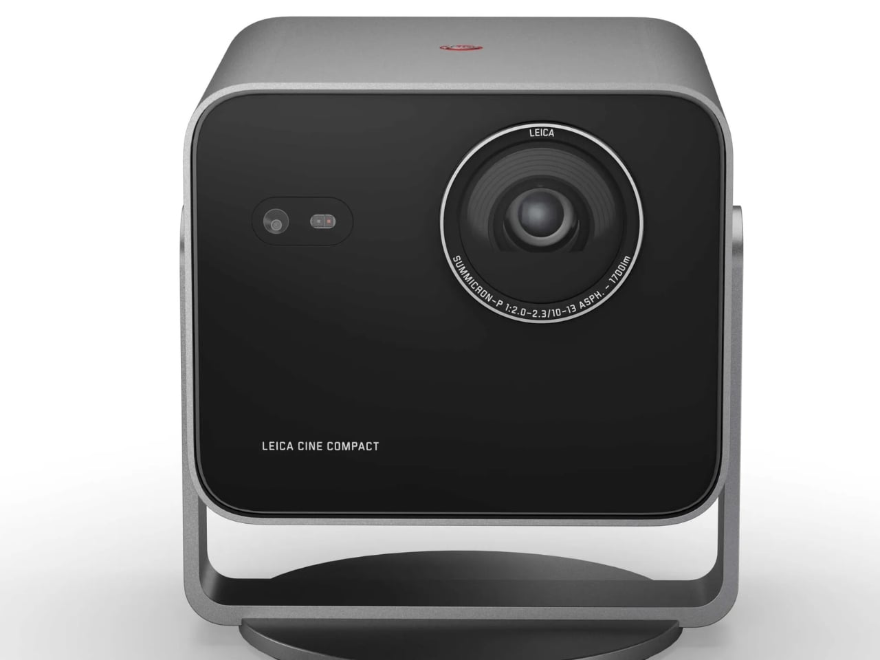
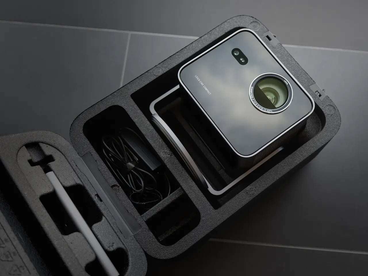
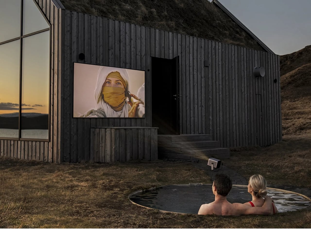
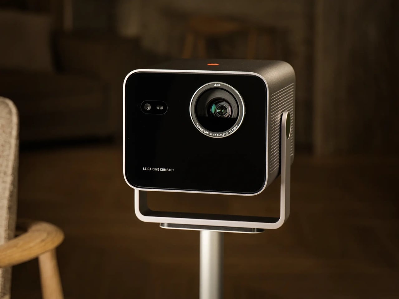
So what exactly is it? At the core, the Cine Compact 1 is a compact mini projector built around a Leica Summicron zoom lens with aspherical elements, a 0.47-inch DMD image chip, and Triple RGB laser technology. It delivers 4K resolution at up to 1,700 ANSI lumens, which is bright enough to produce a usable image in a room that is not completely blacked out. The maximum projection size is 220 inches diagonally, which is an absurd number for something small enough to sit on a coffee table.
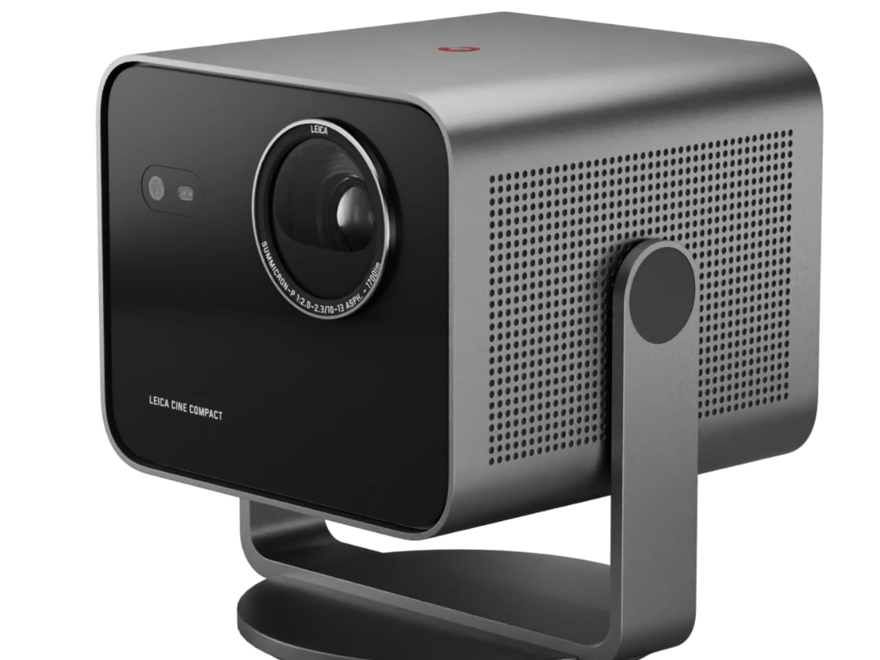
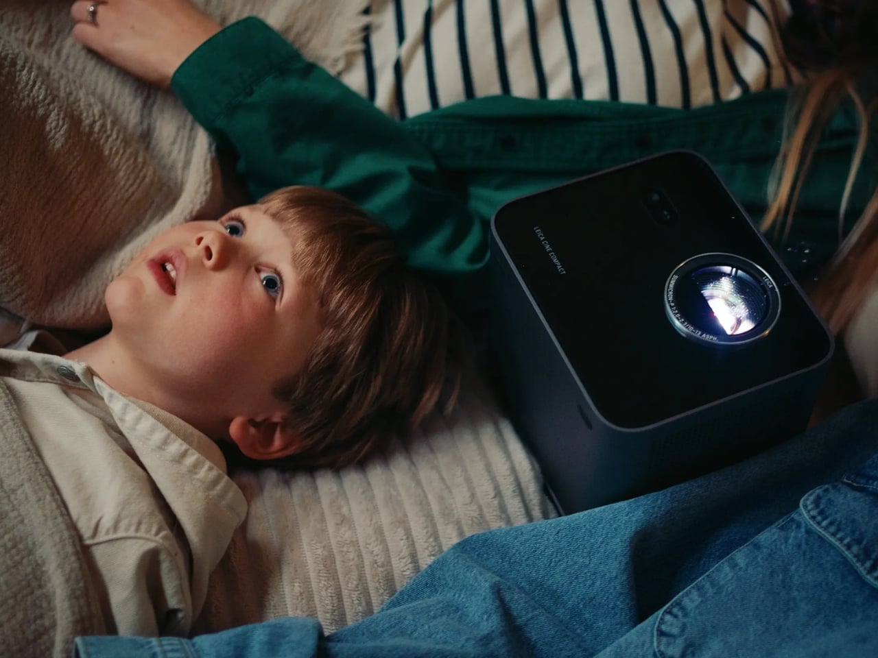
The 360-degree rotation system is the detail I keep thinking about. Most projectors are prisoners of their setup requirements: flat surface, blank wall directly ahead, dedicated space. The Cine Compact 1 abandons that formula entirely. Wall, ceiling, anywhere in between. That flexibility is not just a convenience feature. It actually changes your relationship with watching at home. Ceiling projection during a movie night is a categorically different experience from staring at a flat panel mounted above a console.
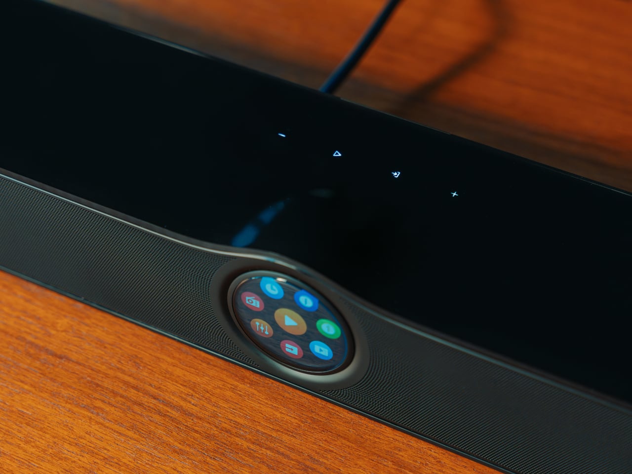
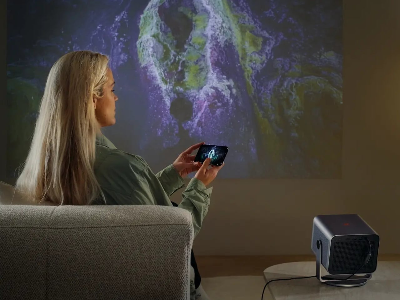
Leica also built in their proprietary image processing technology, called Leica Image Optimization (LIO), to maintain consistent picture quality regardless of projection size or location. Pair that with Dolby Vision for contrast and brightness precision, and Dolby Digital and DTS Virtual:X for audio, and this is not a glorified slideshow device. It is a serious piece of home cinema equipment disguised as a coffee table accessory.
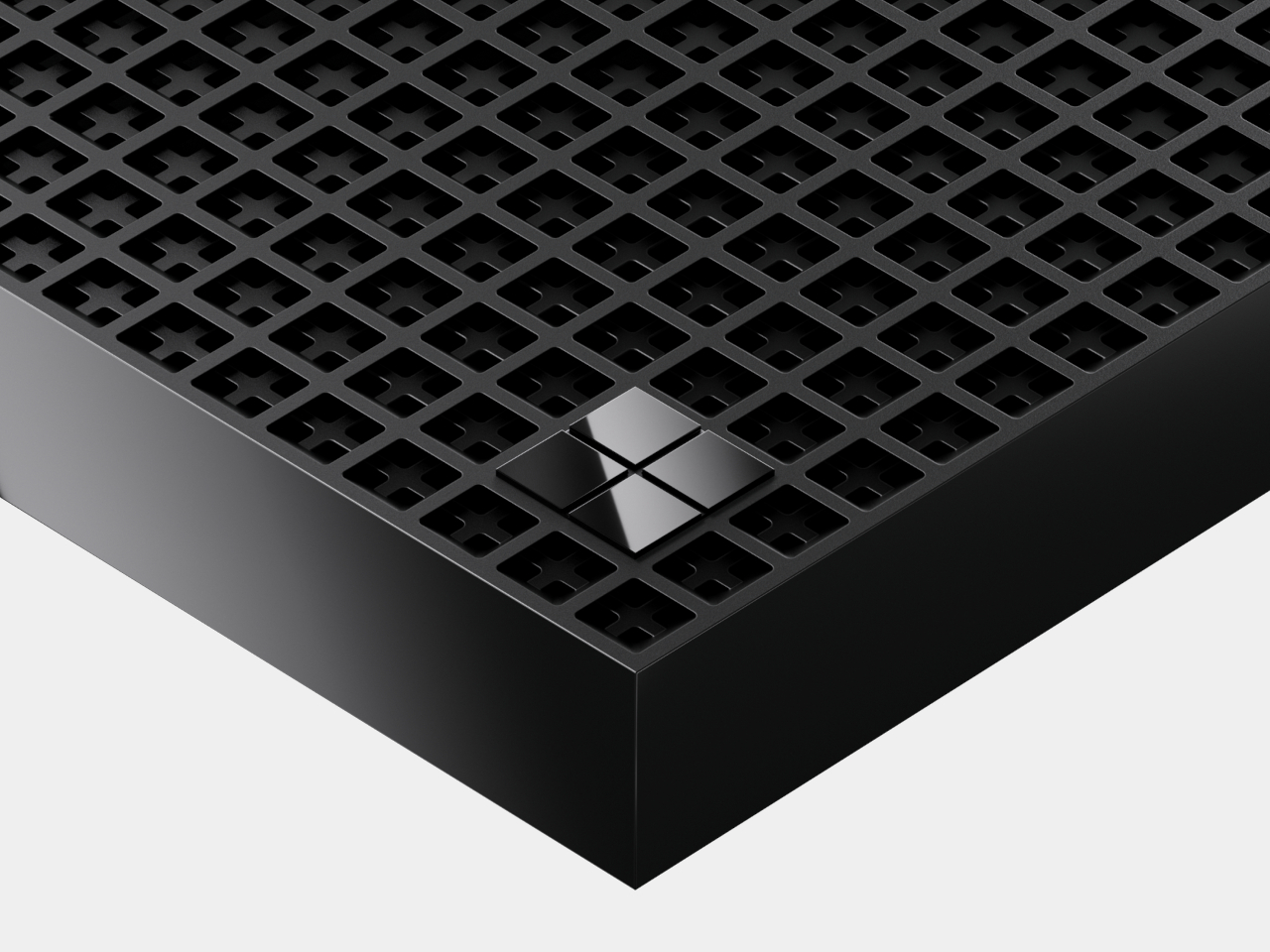
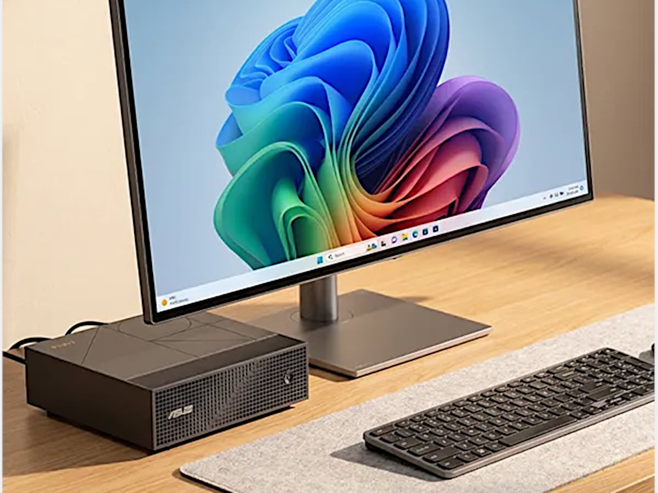
The design is Leica through and through: solid aluminum housing, a glass front, clean lines that read as refined rather than attention-seeking. Even switched off, it looks like it belongs on a shelf rather than something you drag out reluctantly. Its projected lifespan is 25,000 hours, which at a few hours of daily use amounts to decades of service. Smart streaming runs on VIDAA, so most of what you want to watch is accessible without plugging anything extra in.
My honest read on the Cine Compact 1 is that it is designed for a very specific kind of frustration: the one that comes from building your entire living space around a television. We spend years arranging furniture toward screens, painting walls in “TV-friendly” neutrals, negotiating actual square footage with a device that has one function. A projector like this shifts that equation. The screen exists when you need it. The room is yours the rest of the time.
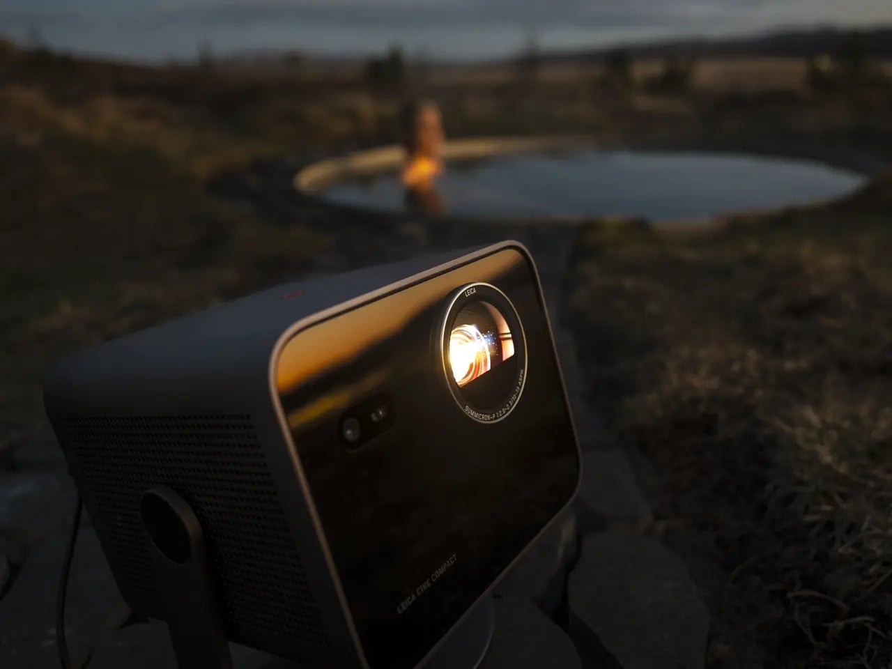
Is it for everyone? No. Projectors still require more thought than a TV on a wall, and Leica’s pricing tends to reflect the brand’s premium heritage. But the people who will love this will love it unconditionally. The design-conscious person who thinks as carefully about how their space looks at two in the afternoon as they do at nine at night. The perpetually mobile person who wants a real cinema experience wherever they land. The person who is simply done negotiating living space with a large black rectangle.
Leica is not chasing a trend here. If anything, they are returning to something they were doing before most modern tech companies existed. The form is smaller, smarter, and more portable. The commitment to image quality behind it is exactly the same.
The post Leica’s 220-Inch Mini Projector Wants to Replace Your TV first appeared on Yanko Design.