This $109 Electric Moka Pot Lives on Your Desk, Not Your Stovetop

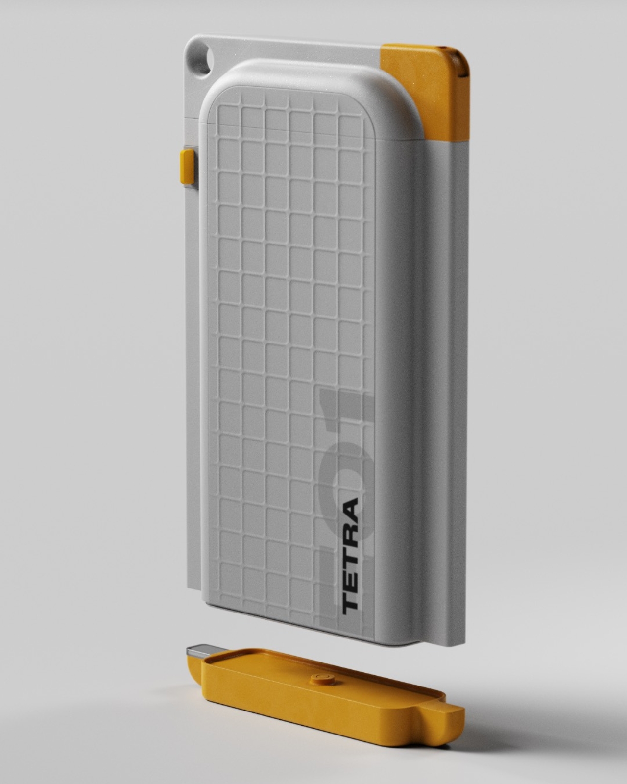
Coffee at work usually means a compromise, a paper cup grabbed between meetings or a lukewarm pot abandoned in the break room. The Flarix Pro steps into that gap as a compact electric moka pot that lives wherever you do your best thinking, quietly promising a richer, more focused cup without sending you on a pilgrimage to the office kitchen. It is a simple proposition, but one that required a complete rethink of a century-old brewing method, trading the romance of the flame for the quiet reliability of a dedicated electric base. The goal is to make good coffee a feature of your workspace, not a distraction from it.

Instead of treating great coffee as a weekend luxury, this little brewer integrates it into your everyday life. Plug it in beside your laptop, fill it with water and fresh grounds, and a few minutes later you have a dense, aromatic moka style coffee that feels closer to a ritual than a chore. This is also in part thanks to its avant-garde Alessi-esque Italian-design form factor. On the hardware front, you’ve got basic electronics wrapped in some clever design details, which essentially rewrites when and where good coffee is allowed to happen. This is not about replacing the café; it is about reclaiming the ten minutes at your desk with something that feels personal and well-crafted. The entire package is an argument for better coffee, right here and right now, without asking you to change your workflow. Think Moka pot reinvented for the modern age, because everything’s about convenience – and nobody likes the idea of leaving their desk to make (or worse, buy) coffee elsewhere.

Designer: CDKM

Click Here to Buy Now: $109 $199 (45% off) Hurry! Only 11 days left.

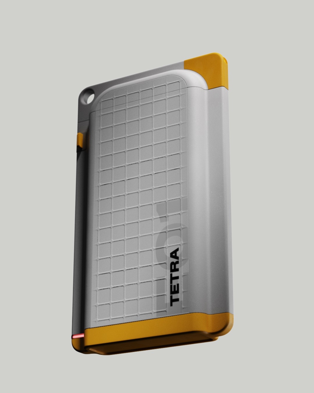
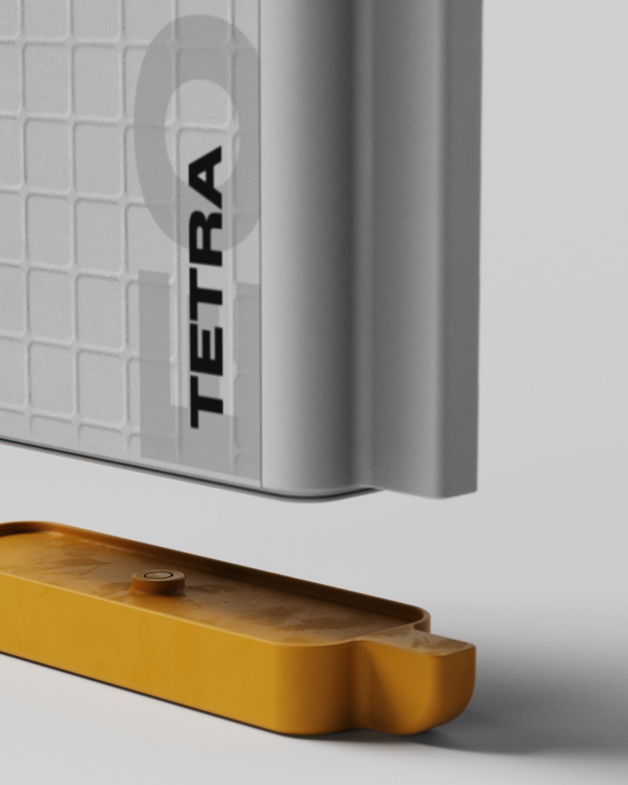
What makes this possible is the deliberate decoupling of the moka pot from the kitchen. By integrating a 365-watt heating element into a self-contained base, the designers have created a brewer that asks for nothing more than a standard wall socket. This modest power draw is key; it is low enough to play nice with office power strips and portable battery stations, making the “brew anywhere” claim feel credible. The unit weighs in at just 978 grams, light enough to be genuinely portable between home and the office. It is a clever piece of engineering that transforms the moka pot from a fixed kitchen appliance into a personal, relocatable coffee station that can follow you through your day.

Of course, putting a pressurized heating vessel on a desk crowded with electronics and paperwork demands a serious approach to safety. The Flarix Pro packs an Italian Albertinari safety valve – a world-class component known for its precise and reliable pressure release, and a critical feature in a device that literally operates on steam pressure. This is paired with a British Strix thermostat, the same kind of controller found in high-end electric kettles, which provides accurate temperature control and boil-dry protection. The system automatically shuts off when the brew is complete, a simple feature that provides enormous peace of mind when your attention is split between your coffee and your deadlines. Al; this is packed in a design that feels playful, unique, and pretty much deviates from the octagonal Moka pot design which feels almost like a template instead of an icon today. This product is fundamentally different, therefore it must look different, is the justification.

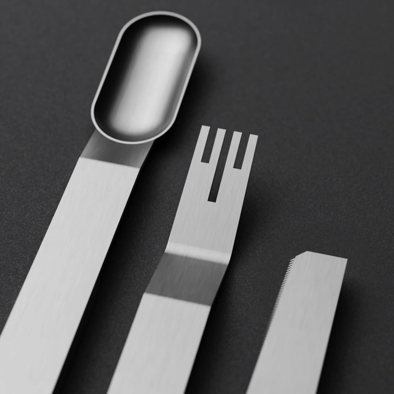
The Flarix Pro packs a patented spring-loaded funnel, which is a genuinely interesting departure from the standard passive funnel found in every other moka pot. This design appears to provide a gentle, consistent compression of the coffee grounds as you assemble the brewer. In theory, this could help create a more uniform coffee bed, reducing the risk of water finding a path of least resistance, a phenomenon known as channeling that leads to a thin, under-extracted brew. It is a small, mechanical detail that could have a significant impact on the final taste and consistency of the coffee, shot after shot.

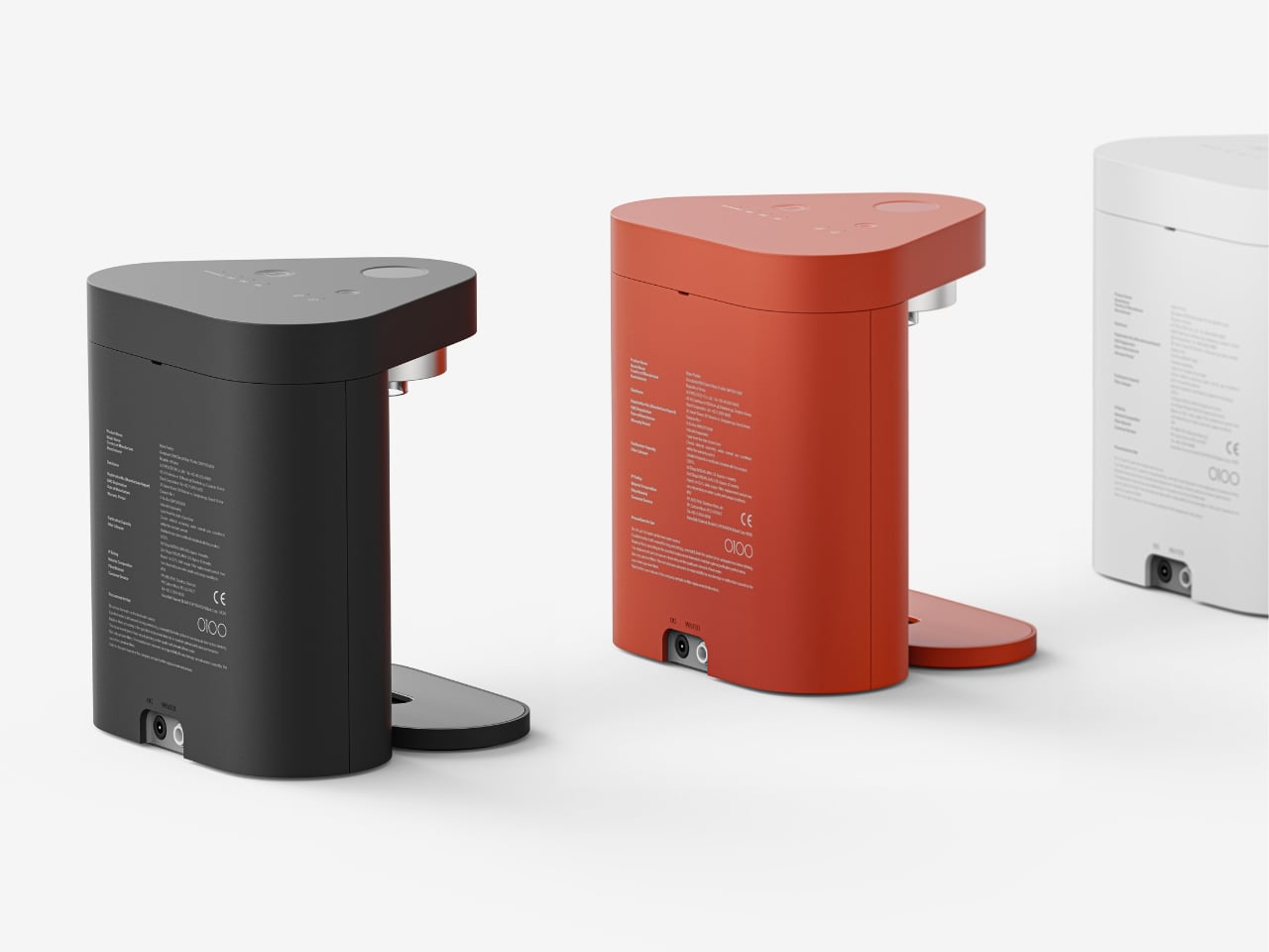
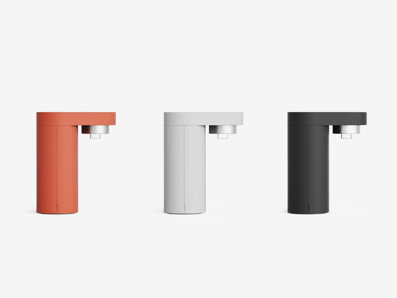
The body is made from food-grade 304 stainless steel, which is durable, easy to clean, and does not impart any metallic taste to the coffee, a common complaint with older aluminum pots. The interior of the water chamber has been sandblasted, creating a matte texture that resists scale buildup and makes cleaning simpler. Even the spout has been carefully considered; its anti-drip design ensures a clean pour, an essential detail when you are serving coffee directly next to important documents or a keyboard. These are the kinds of thoughtful touches that separate a well-designed product from a mere novelty.

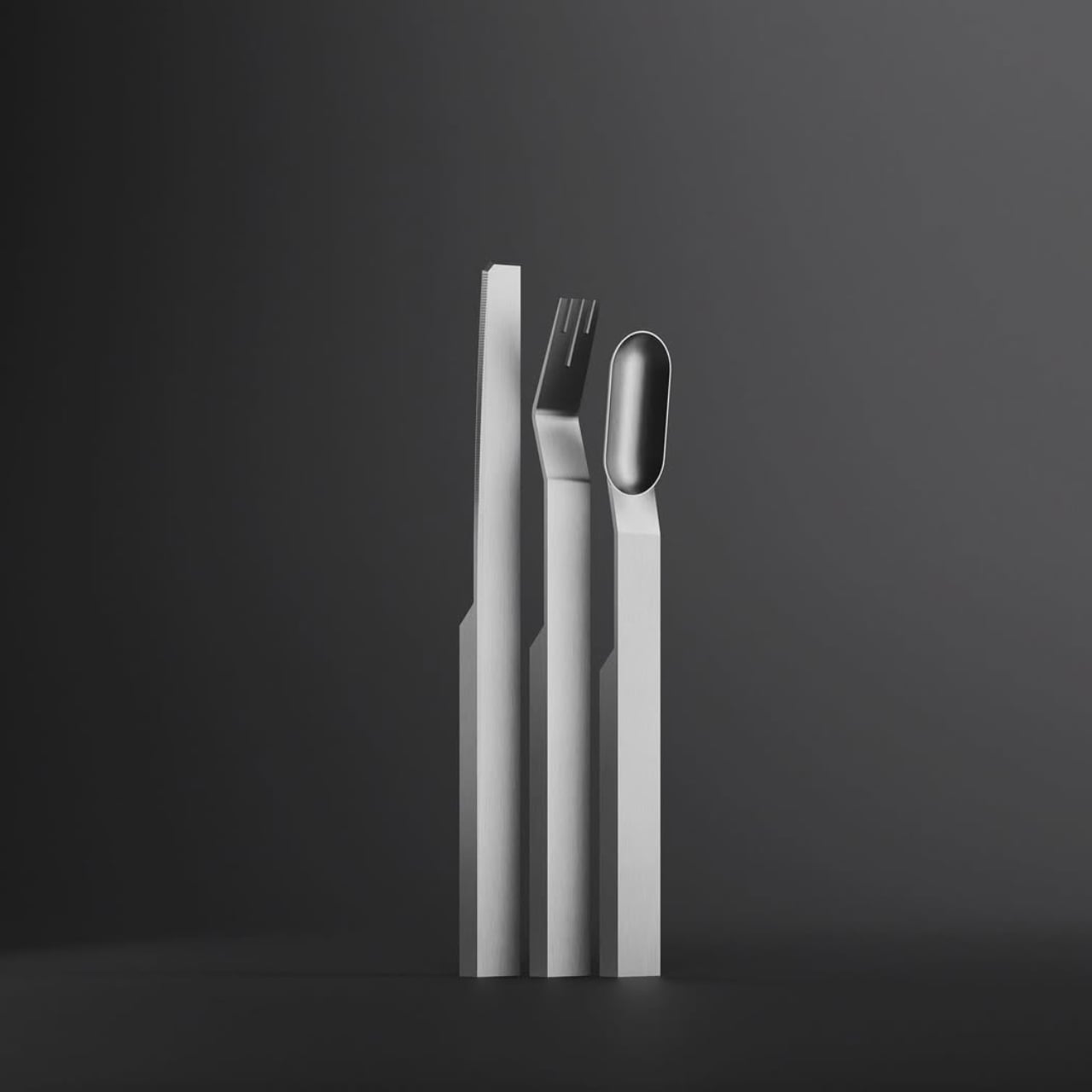
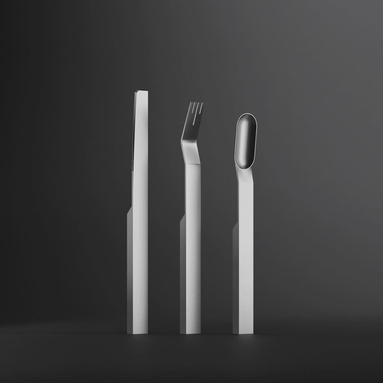
Flexibility is also built into the core design. The Flarix Pro comes with a dual-size filter basket, allowing you to easily switch between brewing two or four shots of moka coffee. This is a practical feature that acknowledges that coffee is not always a solo activity. The water chamber has clear internal markings for both volumes, removing any guesswork from the process. This adaptability makes the brewer suitable for a quick personal coffee break or for preparing a round for a small team meeting. The components are all fully detachable, which simplifies the cleaning process and prevents the buildup of old coffee residues that can ruin the taste of a fresh brew.

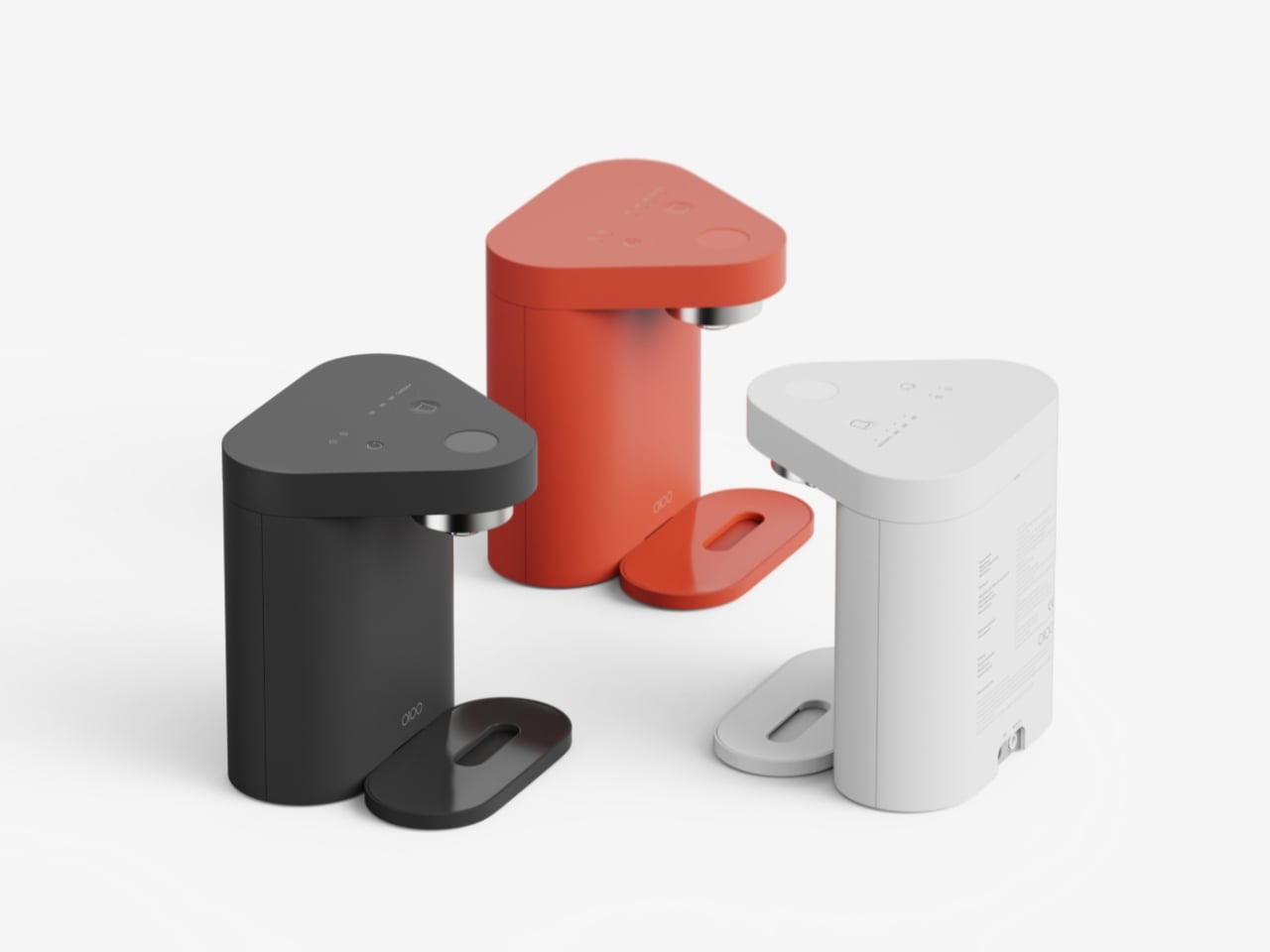
The result is an aesthetic and characteristic revival of the Moka Pot, which has been pretty much banished to the kitchen all its life. The Flarix Pro allows it to step out of its shell, and into any room you’d want to drink coffee in, whether it’s your home office, your workspace (accompanied by a few stares from coworkers, perhaps), your RV, or even your campsite. Although the classic brushed steel finish has my heart, CDKM offers a sky blue and a dark blue variant of the Flarix Pro, with a $109 price tag and global shipping starting February. Upgrade to the $199 perk, however, and you get the entire bundle, which also features milk steaming pitcher, a handheld electric milk frother, a coffee grinder, and an espresso cup + saucer.

Click Here to Buy Now: $109 $199 (45% off) Hurry! Only 11 days left.

The post This $109 Electric Moka Pot Lives on Your Desk, Not Your Stovetop first appeared on Yanko Design.

The Infamous Butter Cookie Tin Finally Gets Its Own LEGO Set (Sewing Kit Not Included)

Every single 80s and 90s kid remembers this tin, or at least some variation of it. You either were a part of the lucky few to open it to find delectable butter cookies inside, or you (like everyone else) popped it open only to be disappointed by finding not baked goods, but sewing equipment. I’m not entirely sure how an entire generation of adults just saw this tin box as the most appropriate storage place for threads and needles, but my house definitely had this box!

Designer Zuzu11 had a similar experience too, but the memory of that tin and the butter cookies inside lingers within his mind even to this day. Inspired by this unlikely cultural icon, Zuzu11 decided to give it its own LEGO set, complete with a beautifully detailed exterior as well as an interior stacked with LEGO cookies! Pop the lid open and you’re greeted by 5 pretty iconic shapes, a plain circle, a crusted circle, a rounded rectangle, a piped swirl, and a pretzel-shaped cookie on the inside. I don’t know about you, but I can practically smell the butter from the screen!

Designer: Zuzu11

Long after I grew up, I decided I wanted to correct the childhood trauma by actually buying a tin for myself and tasting the cookies inside. I don’t remember who ate the cookies in my childhood, all I did was the tin with its eye-catching exterior, and the sewing equipment inside, and one very disappointed child. Even to this day, you could pop over at a grocery store and buy some variant of this cookie tin – nothing much has changed. The branding reads “Royal Dansk” Danish butter cookies, and the packaging is usually a vibrant blue with a farm landscape on the top and a graphic of the cookies on the bottom.

Zuzu11 stayed true to the original, with the exact same color scheme, but omitting the actual branding for 2 reasons – it’s difficult to replicate in LEGO on a small scale, and licensing can often be a complicated affair. Given this LEGO build’s fan-made unofficial nature, it seemed like the best option to just leave out the branding and focus on just the nostalgia.

To that end, this MOC (My Own Creation) is an absolute win. It features two removable lids (an outer and an inner), along with biscuits inside the tin box, wrapped in cups of baking paper. The second lid wasn’t a fixture in the original, but Zuzu11 added it just to recreate the sense of disappointment by having people open it to not find cookies inside! “This build is inspired by the classic butter cookie tin and its surprisingly rich cultural afterlife. What began as a simple container for biscuits slowly evolved into a universal household storage solution, most famously for sewing supplies,” they say. “The idea celebrates both sides of that story: the comfort of the cookies themselves, and the perfectly timed disappointment waiting inside once the lid is lifted.”

“This project transforms a shared childhood experience into a playful LEGO display model. It relies on recognition rather than explanation, humor rather than instruction, and memory rather than realism,” adds Zuzu11. “The result is a piece that feels instantly familiar, quietly funny, and surprisingly universal, a small reminder that sometimes the most memorable surprises were not cookies at all.”

For a massive portion of an entire generation, this box represented a journey from hope to disbelief and disappointment, but there was something always enchanting about the box itself. Nobody ever seemed to want to throw it away after the cookies were over, proving that the packaging was actually more valuable than the baked goods it held!

The drill with LEGO Ideas builds is that they usually rely on relatability and fan-appeal. While LEGO builds its own brick-sets, it has an entire platform dedicated to fan-made builds, where people share their own creations as well as vote for builds they love. MOCs that cross the 10,000 vote threshold then get reviewed by LEGO’s internal team and then get transformed into a retail box set that everyone can buy. If you’d like to capture a bit of childhood nostalgia with this kit, head down to the LEGO Ideas website and cast your vote!

The post The Infamous Butter Cookie Tin Finally Gets Its Own LEGO Set (Sewing Kit Not Included) first appeared on Yanko Design.

This Cutlery Set Celebrates the Machine That Made It

There’s something inherently rebellious about celebrating the process instead of hiding it. But most products are still designed to look effortlessly smooth, polished to perfection, and stripped of any trace of how they came to be. Atelier Andy Carson’s G-Code flatware takes the opposite approach. This cutlery set doesn’t just acknowledge its manufacturing origins, it flaunts them.

The name itself is a clever nod to the digital backbone of modern production. G-code is the programming language that tells CNC machines exactly where to cut, mill, and carve. It’s the invisible blueprint that translates design into reality, one precise coordinate at a time. By naming this flatware collection after that very code, Australian-based designer Andy Carson and his collaborator Sam Collett are making a bold statement: the machine is not just a tool, it’s part of the story.

Designer: Atelier Andy Carson

You can see that story in every angle of these pieces. Each implement in the set, a knife, fork, and spoon, is milled from solid stainless steel bar stock. There’s no stamping, no casting, no traditional manufacturing shortcuts that would smooth away the evidence of creation. Instead, what you get are geometric forms with crisp edges, flat planes, and subtle facets that catch the light in unexpected ways.

The aesthetic is unapologetically industrial, yet somehow it doesn’t feel cold or impersonal. The handles are rectangular and minimalist, tapering slightly as they extend toward the functional end. The fork features an intriguing angular bend that adds sculptural interest while maintaining perfect balance. The spoon’s oval head sits atop its geometric handle like a carefully considered punctuation mark. Even the knife, with its serrated edge, feels more like a piece of architecture than a simple eating utensil.

What makes this design particularly smart is how form and function work together so seamlessly. The weighted handles aren’t just about aesthetics or that satisfying heft you feel when you pick one up. They serve a practical purpose, ensuring that the head of each utensil hovers above the table surface when you set it down. It’s a thoughtful touch that addresses hygiene without requiring a separate knife rest or worrying about sauce staining your tablecloth. This approach challenges the conventions of how cutlery is typically made and what it’s supposed to look like. Most flatware relies on stamping or casting to achieve smooth, anonymous forms that disappear into the background of a meal. G-Code does the opposite. It asks to be noticed, to be appreciated not just as a functional object but as a celebration of precision manufacturing.

There’s a broader conversation happening here about honesty in design. In an era when so much of what we consume is mass-produced but styled to look artisanal, G-Code takes the reverse path. It’s a product that embraces its machined origins and turns them into a virtue. The flat surfaces, the geometric precision, the visible traces of the milling process, these aren’t flaws to be hidden. They’re features to be celebrated.

The monochromatic photography that accompanies the project only reinforces this philosophy. Shot against dark gray backgrounds, the flatware pieces stand like monoliths, their shadows as carefully composed as the objects themselves. The lighting emphasizes every edge, every transition from one plane to another, revealing the complexity within apparent simplicity. It’s worth noting that this isn’t just an exercise in theoretical design. These pieces are meant to be used, held, experienced. The matte finish on the stainless steel provides just enough grip without feeling rough. The proportions are calibrated for comfort. The balance point of each piece feels natural in your hand.

In a design landscape often dominated by either hyper-ornamentation or bland minimalism, G-Code carves out its own territory. It proves that celebrating manufacturing processes doesn’t mean sacrificing elegance, and that industrial aesthetics can coexist with everyday functionality. It’s flatware that makes you think about how things are made, why certain choices matter, and what it means when a designer decides to show their work rather than hide it. For anyone who appreciates when form, function, and manufacturing philosophy align perfectly, G-Code is a masterclass in intentional design. It’s proof that sometimes the most interesting stories are told not by what we conceal, but by what we choose to reveal.

The post This Cutlery Set Celebrates the Machine That Made It first appeared on Yanko Design.

This Flat Bottle Becomes a Kettle When You Need It Most

There’s something satisfying about products that do more with less. You know the feeling: when you discover a gadget that’s been cleverly engineered to solve multiple problems without adding bulk to your life. Tetra, a new travel bottle concept by designer Amal SS, nails that sweet spot between everyday practicality and outdoor functionality in a way that actually makes sense.

At first glance, Tetra looks like a streamlined water bottle dressed in a minimalist gray shell with sunny yellow corner accents. It’s flat, roughly the size of an A5 notebook, which immediately tells you someone thought hard about how this would actually fit in a backpack. But here’s where it gets interesting: that yellow base section? It’s not just decorative. It’s a detachable heating deck that transforms your water bottle into a portable kettle when you need it.

Designer: Amal SS

The modular approach is what sets Tetra apart from the crowded field of travel bottles trying to be all things at once. Instead of permanently integrating heating elements that add weight and complexity to something you might carry daily, Amal SS separated the functions. Need just a water bottle for your commute or gym session? Leave the Thermo-Deck at home and travel light. Heading into the wilderness for a camping trip? Snap it on and you’ve got hot water capability wherever you land.

This kind of thinking feels refreshingly practical in a world where most products seem designed to cram in every possible feature whether you need them or not. The architecture here respects how people actually use things. Your daily hydration needs don’t require heating functionality, so why carry that extra weight around? But when you’re watching the sunrise from a mountaintop or setting up camp after a long hike, having the ability to heat water for coffee or tea without packing separate equipment becomes genuinely valuable.

The design language speaks to durability and thoughtful interaction. Those yellow corner guards aren’t just visual punctuation, they’re protective reinforcement for the spots most likely to take impact when you inevitably drop this thing on a rocky trail or concrete floor. The recessed grip grid textured across the surface gives your hands something to hold onto, even when wet or wearing gloves. Every detail seems considered from the perspective of actual use rather than pure aesthetics, though the clean lines and confident color blocking certainly don’t hurt.

What really catches the eye is how Tetra manages to look tech-forward without screaming “gadget.” The flat profile feels almost architectural, like something that could live comfortably in a design studio or strapped to a hiking pack with equal credibility. The proportions are balanced, the material transitions feel intentional, and those yellow accents provide just enough visual interest without tipping into gimmicky territory.

The A5 form factor deserves special mention because it solves a genuine packing problem. Cylindrical bottles, no matter how well-designed, create awkward gaps and wasted space in bags. A flat profile nestles against laptops, books, and clothing layers much more efficiently. For anyone who’s played Tetris with their backpack contents before a trip, this thoughtful approach to dimensionality will resonate immediately.

There’s also something appealing about products that acknowledge different contexts of use. Tetra doesn’t pretend you’ll need a kettle function at your desk job, and it doesn’t force you to commit to carrying unnecessary weight just to have that option available. The snap-on, snap-off modularity respects your intelligence as a user and trusts you to configure the tool for your actual needs. This kind of flexible functionality reflects a broader shift in how we think about everyday carry items. The best products increasingly recognize that our days aren’t one-size-fits-all, and neither should our gear be. Something that works for Monday’s office routine might need different capabilities for Saturday’s mountain trail. Tetra’s modular design bridges that gap without compromise.

Whether you’re a design enthusiast who appreciates thoughtful industrial solutions, a tech person drawn to smart functionality, or an outdoor adventurer tired of juggling multiple pieces of equipment, Tetra presents an intriguing answer to the eternal question: how do we carry less while being prepared for more? Sometimes the smartest design move isn’t adding another feature. It’s knowing exactly which features to make optional.

The post This Flat Bottle Becomes a Kettle When You Need It Most first appeared on Yanko Design.

Rotating Kitchen Cubes Make Wasting Food Actually Impossible

We’ve all been there. You buy fresh produce with the best intentions, tuck it away in the fridge or pantry, and then discover a wilted mess two weeks later. It’s frustrating, wasteful, and honestly, it happens way more often than we’d like to admit. But what if your storage system actually worked with you instead of against you?

Enter Saveit, a modular food storage concept by designer Yerin Kim that’s making me rethink everything about how we organize our kitchens. At first glance, it looks like something straight out of a design museum with its sleek metal boxes, perforated panels, and pops of color. But the real magic happens when you actually use it.

Designer: Yerin Kim

The system is built around a brilliantly simple idea: rotating storage that follows the FIFO principle (first in, first out). You know how grocery stores stock their shelves so older items move to the front? That’s exactly what Saveit does for your home. The modules feature these clever two-way rotating structures, so when you add new food from one side, the older items naturally move toward the exit point. No more mystery tomatoes rotting in the back of your produce drawer.

What makes this system feel genuinely different is how modular and adaptable it is. The stackable metal units can be configured in countless ways, kind of like edible Tetris. Need more space for root vegetables this week? Rearrange. Stocking up on citrus? Adjust accordingly. The colored sliding trays and hanging hooks accommodate everything from loose potatoes to bunches of bananas, and each component is designed to maximize airflow through those perforated backs, keeping produce fresher longer.

The aesthetic is industrial meets playful, with that brushed metal finish that feels both serious and approachable. Those bright red, green, blue, and yellow accents aren’t just for looks either. They help you quickly identify different food categories or rotation systems at a glance. It’s functional design that doesn’t sacrifice personality.

But here’s what really sold me on this concept: every single part slides out and pops into the dishwasher. Anyone who’s ever tried to clean a traditional produce basket or drawer knows that trapped dirt and sticky residue situation. Saveit eliminates that headache entirely. The removable design means you can actually keep your storage clean without contortionist-level flexibility or a dedicated scrub brush.

The environmental angle here is significant too. Food waste is a massive problem. We’re talking about roughly a third of all food produced globally ending up in the trash, which contributes to greenhouse gas emissions and represents billions of dollars thrown away annually. While Saveit won’t solve food waste entirely, it tackles one of the root causes: poor visibility and organization at home. When you can actually see what you have and the system naturally prioritizes older items, you’re far more likely to use everything before it goes bad. There’s something refreshing about design that solves real problems without overcomplicating things. Saveit doesn’t require an app, doesn’t need to be plugged in, and doesn’t come with a subscription service. It’s just smart, thoughtful design applied to an everyday challenge. The kind of thing that makes you wonder why storage hasn’t worked this way all along.

Yerin Kim’s creation sits at this interesting intersection of sustainability, functionality, and visual appeal that feels very now. It’s the type of design that tech enthusiasts appreciate for its systematic approach, that eco-conscious consumers love for its waste-reduction potential, and that design lovers simply want to display on their countertops. It transforms a mundane task (food storage) into something that actually feels considered and intentional. Whether Saveit moves from concept to production remains to be seen, but it represents a shift in how we think about kitchen organization. Storage shouldn’t be something you work around. It should work for you, making sustainable choices easier and more intuitive. And if it looks this good while doing it? Even better.

The post Rotating Kitchen Cubes Make Wasting Food Actually Impossible first appeared on Yanko Design.

This Smart Griddle Just Combined 4 Breakfast Gadgets Into One Device

Look, we need to talk about kitchen appliances. If you’re anything like me, you’ve got a toaster shoved in one corner, a waffle maker collecting dust in a cabinet, and maybe a sandwich press you haven’t seen since 2019. The countertop real estate struggle is real, and it’s a problem that designer Nikhil Thomas Zachariah just solved with BrioChef.

Picture this: one sleek appliance that houses a griddle, sandwich maker, toaster, and waffle iron all in one sculptural package. Yeah, you read that right. Four appliances, one footprint, and honestly, it looks like something that wandered off the set of a sci-fi movie and decided to make you breakfast instead.

Designer: Nikhil Thomas Zachariah

The design itself is striking. That bold coral-orange body with black cooking surfaces isn’t trying to blend into your kitchen. It wants to be seen, and frankly, it’s earned the right. The form flows in this organic, almost architectural way, with a raised section on the left housing the griddle and sandwich maker, while the right side keeps the toaster and waffle maker ready for action. It’s like someone finally asked, “What if kitchen appliances were actually cool?”

But here’s where BrioChef goes from “pretty cool” to “okay, I’m interested.” Everything is modular. Those cooking surfaces? They pop out with spring-release mechanisms, making cleanup actually manageable instead of that weird scrubbing dance we all do with traditional appliances. The griddle has removable bars that flip between flat griddle mode and sandwich press grooves. The toaster and waffle modules lift right out. All of it is food-grade material that you can clean with whatever you already have under your sink.

The touch display embedded in the surface is another smart move. It’s not just a timer and temperature control (though it does that). It actually walks you through recipes step by step. So if you’ve never made a proper Belgian waffle or you’re not sure how long to press a panini, the appliance literally guides you. It’s like having a patient friend who actually knows how to cook standing in your kitchen at 7 AM, except this friend doesn’t judge you for making a grilled cheese for dinner.

Let’s talk about real-world usage because that’s what matters. Morning rush? Throw eggs on the griddle while your bread toasts. Lazy Sunday? Waffles on one side, bacon on the griddle. Late-night munchies? Grilled cheese in minutes. The versatility here isn’t just a nice feature but the entire point. You’re not just consolidating appliances; you’re opening up possibilities because everything is actually accessible and ready to go.

The thoughtful details pile up when you look closer. There’s an oil and liquid drain built into the griddle section because of course there is. Warning lights tell you when surfaces are hot so you don’t learn that lesson the hard way. The lid design on the griddle and sandwich maker allows waste to be removed while cleaning, which sounds small until you’ve tried to clean out a traditional sandwich press and wanted to throw the whole thing away.

From a design perspective, BrioChef does something that kitchen appliances rarely achieve: it makes you reconsider what’s possible in the space. We’ve been trained to accept that kitchen gadgets are clunky, single-purpose items that we hide away. This challenges that assumption entirely. Why shouldn’t an appliance be modular, beautiful, and smart all at once? The compact footprint means this could work in a tiny studio apartment, a college dorm, or a sprawling kitchen where you just want less clutter. It’s democratizing in that way, meeting people where they actually live and cook rather than assuming everyone has unlimited cabinet space.

Is BrioChef going to revolutionize your entire life? Probably not. But it might revolutionize your morning routine, your countertop organization, and your willingness to actually make breakfast instead of grabbing whatever on your way out the door. And honestly, in a world where most kitchen gadgets are forgettable at best, creating something that’s genuinely useful, thoughtfully designed, and kind of gorgeous? That’s worth paying attention to. Sometimes good design is about solving problems we didn’t even realize we’d been tolerating. BrioChef makes a compelling case that the four-appliance breakfast setup was one of those problems all along.

The post This Smart Griddle Just Combined 4 Breakfast Gadgets Into One Device first appeared on Yanko Design.

This $48 Pizza Axe Just Made Every Round Cutter Obsolete

Let’s be honest, pizza night deserves more than a sad plastic rolling cutter from the back of your drawer. The Pizza Axe transforms an everyday task into something that feels like you’re about to raid a feast hall instead of just dividing up your Friday night pepperoni pie.

This isn’t some gimmicky kitchen gadget destined for the donation pile next year. The Pizza Axe is a legitimate tool crafted with stainless steel and pine wood that handles actual slicing while looking ridiculously cool on your counter. At $48, it’s positioned somewhere between impulse buy and considered investment, which honestly feels about right for something that makes you feel like a Norse warrior every time you want a slice.

Designer: Marcellin

What makes pizza axes appealing goes beyond their obvious visual punch. They tap into our collective fascination with medieval aesthetics while solving a real problem: traditional pizza cutters often struggle with thick crusts or heavily topped pies. An axe-style blade brings more leverage and cutting power to the table, literally. The design typically features a sharp stainless steel blade attached to a wooden handle, creating enough heft to slice through even the most ambitious deep-dish creations.

The Pizza Axe comes with a sheath for storage, which is both practical and slightly absurd in the best way. There’s something inherently funny about sheathing your pizza cutter like it’s a weapon, but it also keeps the blade protected and your fingers safe when rummaging through kitchen drawers. This attention to detail suggests the makers understand their audience: people who appreciate functionality but also want their tools to spark joy, or at least conversation.

What’s particularly clever about the pizza axe trend is how it transforms a mundane kitchen task into performance art. Serving pizza becomes an event, not just dinner logistics. When you pull out an axe to slice your pizza, people notice. It’s the kind of thing that makes your dinner party memorable without requiring you to actually learn how to juggle flaming batons or whatever else people do for attention these days.

The broader pizza axe market has exploded with Viking-themed options featuring intricate engravings, skull designs, and runic symbols. These handcrafted versions can run anywhere from $30 to over $100 depending on materials and customization. The Uncrate version keeps things relatively straightforward, focusing on clean design without excessive ornamentation, which makes it more versatile for various kitchen aesthetics.

Beyond pizza, these tools work surprisingly well for other kitchen tasks. Need to portion a large sheet cake? Chop fresh herbs? Divide up a flatbread? The axe design handles it. Some users report success using them for trimming dough or even as a conversation piece when they’re not actively slicing. The pine wood handle offers comfortable grip and visual warmth that balances the industrial edge of the steel blade.

There’s also something satisfying about owning tools that feel substantial. We’re surrounded by flimsy plastic implements that bend and break after a few uses. The Pizza Axe presents an alternative philosophy: buy something well-made that performs its job and looks good doing it. It’s part of a larger movement toward thoughtful kitchen tools that prioritize both form and function rather than treating them as competing priorities.

Of course, the Pizza Axe isn’t for everyone. Minimalists might find it excessive. People with small kitchens might lack the drawer space for another specialized tool. And if you’re someone who orders delivery exclusively, owning an elaborate pizza cutting implement might feel aspirational in the wrong way. But for people who love cooking, entertaining, or just appreciate objects with personality, it hits a sweet spot between practical and playful.

Ultimately, the Pizza Axe succeeds because it understands that everyday objects don’t have to be boring. Why settle for adequate when you can have something that makes you smile every time you use it? In a world of beige appliances and forgettable utensils, sometimes you need something that reminds you that even routine tasks can have a little drama. And if that drama happens to involve wielding an axe over a margherita, well, that’s just good living.

The post This $48 Pizza Axe Just Made Every Round Cutter Obsolete first appeared on Yanko Design.

This Tiny Water Purifier Rethinks Design for Small Spaces

There’s something refreshing about design concepts that actually understand how we live. The SAI Lite water purifier from Superset Design is one of those rare concepts that doesn’t just look good in renderings but actually makes sense for real kitchens. Especially if that kitchen happens to be, like mine, not exactly spacious and can be cluttered at times.

The name SAI comes from the Korean word for “narrow space,” which tells you everything you need to know about the design philosophy here. This concept is the successor to the original SAI Pro, and the team took an already compact design and stripped it down even further to its absolute essentials.

Designer: Superset Design

Create your own Aesthetic Render: Download KeyShot Studio Right Now!

What caught my eye first is that distinctive rounded triangular shape. It’s not just designers being quirky for the sake of it. That form comes directly from the internal layout of two filters and a control module arranged in the most spatially efficient way possible. The footprint literally doesn’t get any bigger than the diameter of those two filters, which means you’re not sacrificing counter space for empty air.

Here’s where the thinking gets really smart. Instead of designing a water purifier that can accommodate every possible container you might own, the team at Superset Design asked a better question: what do people actually use in small apartments and single-person households? Spoiler alert, it’s not giant stockpots and mixing bowls. It’s cups, tumblers, small pots, and maybe a water bottle. So that’s exactly what this concept was designed around.

This is the kind of practical thinking we need more of in product design. Too often, appliances are built for some idealized version of how we’re supposed to live rather than how we actually do. SAI Lite flips that script. The height is calibrated for the vessels you’ll realistically fill every day, creating proportions that feel balanced and purposeful rather than arbitrarily compact.

The interface concept deserves attention too. On the top surface, you’ll find three main controls: a filter replacement reset button, a water capacity control, and the dispensing button. But instead of cluttering the surface with every possible setting, the designers proposed something called Progressive Disclosure. Functions you only need during initial setup or rarely touch are tucked away behind a long press or an extra interaction layer. The result is a control surface that looks clean and feels immediately intuitive when you’re just trying to fill your morning coffee cup.

This approach to interface design is something we see in good software all the time but rarely in physical products. It respects the fact that most of the time, you want to do one simple thing: get water. Everything else can wait in the background until you actually need it. The aesthetic is minimalist without being cold. That terracotta orange finish gives it personality and warmth, and the smooth, rounded edges make it feel approachable rather than intimidating. It’s the kind of object that could sit comfortably next to your other kitchen essentials without screaming for attention, yet it’s distinctive enough that you’d probably want to keep it visible rather than hidden away.

Looking at the concept renderings, you can see how efficiently everything is packed. The two cylindrical filters sit side by side with the control module, all contained within that triangular envelope. There’s no wasted space, but it also doesn’t feel cramped or difficult to access when you need to change filters. What makes SAI Lite compelling as a design concept isn’t just that it’s small. Plenty of products are small. What makes it work is that every decision, from the shape to the height to the button layout, stems from a clear understanding of the actual problem it’s solving. This is design that respects your space, your daily habits, and your time.

There’s something genuinely appealing about seeing designers propose objects that know exactly what they are and do that one thing exceptionally well. SAI Lite isn’t trying to be everything to everyone. It’s conceived for modern living spaces where every inch counts and simplicity isn’t just aesthetic, it’s essential. Whether this concept makes it to production or not, it’s the kind of thoughtful design thinking that pushes the industry forward. It challenges manufacturers to reconsider who they’re actually designing for and what those people truly need in their daily lives.

The post This Tiny Water Purifier Rethinks Design for Small Spaces first appeared on Yanko Design.

Yelp’s 2026 Design Forecast: The Trends Reshaping How We Live

The numbers tell a story that design magazines have been hinting at for months. Yelp’s latest trend report, analyzing millions of consumer searches between 2023 and 2024, confirms what forward-thinking designers already suspected: the home is becoming a deliberate statement of values, not just a collection of furniture.

Conversation pits are leading the charge. Searches for these sunken living areas surged 369%, signaling a fundamental rejection of the open-plan uniformity that dominated the 2010s. People want intimacy again. They want spaces that pull them together rather than spreading them across vast, undifferentiated square footage. The mid-century roots of this trend run deep, with searches for mid-century furniture climbing 319% and curved furniture up 124%. These aren’t isolated preferences. They represent a cohesive design philosophy centered on human-scale spaces that encourage actual conversation.

The Texture Revolution

Flat walls are dying. Roman clay finishes saw searches explode by 312%, while lime paint climbed 162%. Fabric wallpaper rose 123%, and wall stencils increased 68%. This collective movement toward tactile surfaces reveals a deeper truth about contemporary design priorities.

People have spent years staring at screens. Their homes responded by becoming increasingly smooth, minimal, and digital-friendly. Now the pendulum swings. Hands want something to touch. Eyes want variation and depth. The Roman clay trend is particularly telling because it demands imperfection. Each application creates unique texture, mottled color, and surfaces that change with light throughout the day. This is the opposite of the perfectly smooth drywall that builders have standardized for decades.

The avocado bathroom deserves attention here too. Searches for ’70s bathrooms jumped 124%, with green countertops following at the same rate. Bathroom remodeling searches increased 84%. But this isn’t nostalgia for nostalgia’s sake. Modern interpretations use nuanced jade and sage tones with contemporary fixtures. The color brings warmth. The execution stays current.

Japandi’s Second Wave

The fusion of Japanese and Scandinavian minimalism refuses to fade. Japandi searches climbed 105%, but the supporting data reveals where this trend is evolving. Fluted panels exploded by 459%. Natural stone rose 51%. Biophilic design increased 124%, alongside woven window shades at the same rate and jute rugs at 60%.

This second wave of Japandi moves beyond the surface aesthetics that defined its first popularity cycle. The emphasis shifts toward materiality and texture rather than mere visual simplicity. Fluted panels create rhythm and shadow play. Natural stone introduces geological time into domestic spaces. Woven materials connect interiors to craft traditions that predate industrial manufacturing. The philosophy remains minimalist, but the execution has matured. Spaces built on these principles feel grounded rather than sparse, considered rather than empty.

Travel plays a role in this evolution. As more people visit Japan and experience its design sensibilities firsthand, they return with refined understanding of how restraint and material quality work together. Tourism shapes taste, and taste shapes the search bar.

The Invisible Technology Thesis

Smart home technology is going underground. Searches for smart windows rose 49%, smart lighting increased 32%, and smart appliances climbed 40%. But the real story lies in the concealment searches. Built-in bookshelves surged 124%. Invisible kitchens with hidden storage jumped 68%.

The design community spent years debating whether technology should be celebrated or hidden. The data suggests resolution: people want capability without visual intrusion. They want lights that respond to voice commands from fixtures that look like ordinary fixtures. They want kitchens that function as high-tech command centers but photograph like serene minimalist spaces. Jennifer Aniston’s illuminated onyx sink basin represents the apex of this thinking. The surface glows. The technology disappears.

This invisible technology trend connects directly to the broader texture movement. When appliances hide and screens retract, walls become the primary visual element. Those walls better be interesting. Roman clay and fluted panels fill the visual space that technology once occupied. The home becomes a gallery of surfaces rather than a showroom of gadgets.

Black as Design Strategy

Black countertops rose 123%. Black furniture increased 12%. These numbers underscore a shift toward intentional contrast as a design strategy rather than an afterthought.

Interior design expert Taylor Simon’s “unexpected red theory” has influenced how designers think about strategic color deployment. Black operates on similar principles. A black countertop against light cabinetry creates visual anchor points. Black furniture pieces become sculptural elements that organize surrounding space. The approach requires restraint. Too much black collapses into monotony. Applied surgically, it transforms ordinary rooms into composed environments where the eye knows where to rest.

The contrast philosophy extends beyond color. It manifests in the juxtaposition of textured and smooth, natural and manufactured, vintage and contemporary. Curved mid-century furniture against rectilinear architecture. Woven jute against polished concrete. The design language emerging from this data prioritizes tension and dialogue between elements rather than uniform harmony.

Memory as Material

Shadowbox searches increased 34%. Film lab searches rose 88%. Film developing climbed 54%. Together, these numbers reveal a design trend that treats personal history as raw material.

Custom framing services report growing demand for memory displays that transform scrapbook contents into wall art. Travel mementos, film photographs from analog cameras, keepsakes from significant moments. These aren’t arranged in albums anymore. They’re composed into visual statements that hang alongside purchased art.

This trend intersects with the broader rejection of generic decor. Mass-produced wall art serves a function, but it doesn’t tell a story. A framed collection of Polaroids from a specific trip, ticket stubs from meaningful concerts, pressed flowers from important occasions: these objects carry narrative weight that manufactured decor cannot replicate. The home becomes autobiography.

Where This Leaves Us

The throughline connecting these trends points toward a single thesis: design in 2026 will prioritize meaning over minimalism, texture over sleekness, and personal narrative over trend compliance.

The conversation pit revival matters because it privileges human connection over architectural showmanship. The texture movement matters because it restores sensory richness to spaces flattened by digital life. Japandi’s evolution matters because it demonstrates how design philosophies mature beyond their initial aesthetic expressions. Hidden technology matters because it resolves the long tension between capability and beauty. Strategic contrast matters because it treats composition as seriously as color.

None of these trends exist in isolation. They form a coherent vision of domestic space as refuge, as expression, as carefully curated environment that reflects inhabitant values rather than developer defaults. The search data quantifies what designers intuit. People want homes that feel like themselves, not like everyone else’s Pinterest board. The numbers say they’re willing to invest, to research, to seek professional help in achieving that goal.

The 2026 home will have texture you can feel, spaces that pull people together, technology that serves without announcing itself, and walls decorated with personal history. It will reference the past without copying it. It will embrace natural materials while leveraging smart systems. It will be, in short, deliberately designed rather than passively accumulated. The data says so.

The post Yelp’s 2026 Design Forecast: The Trends Reshaping How We Live first appeared on Yanko Design.