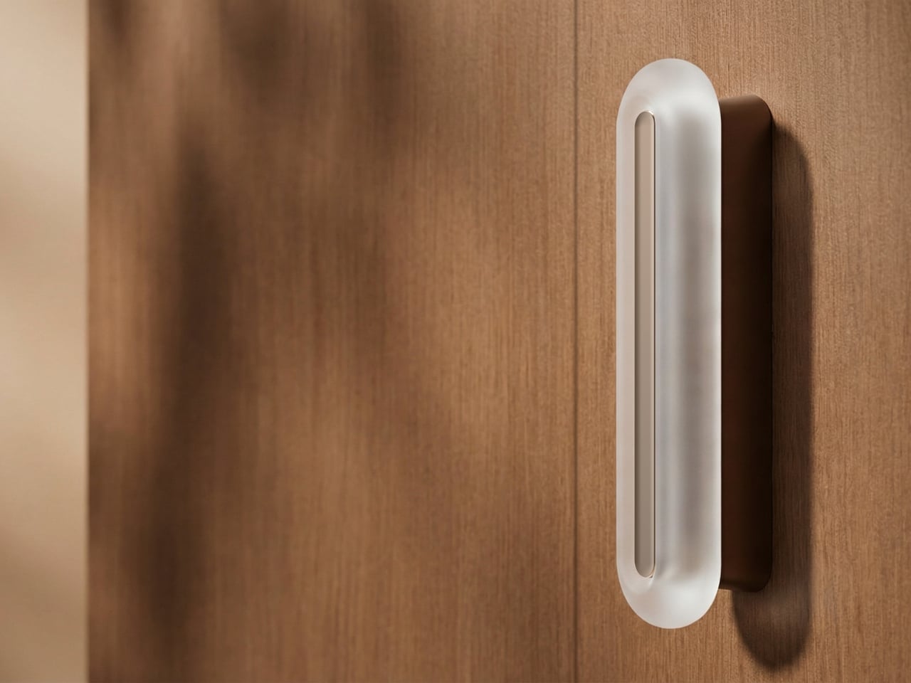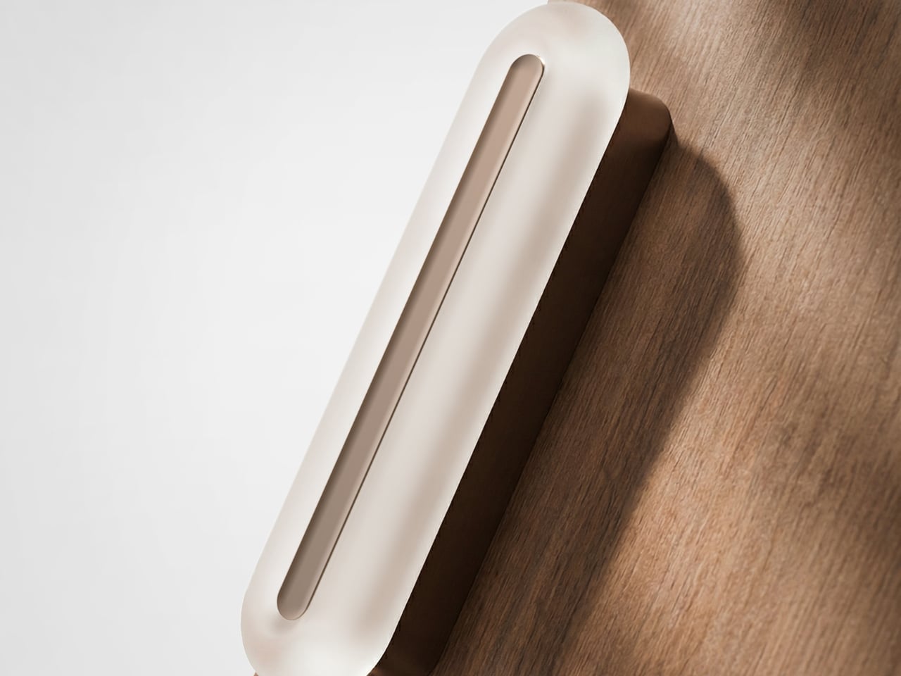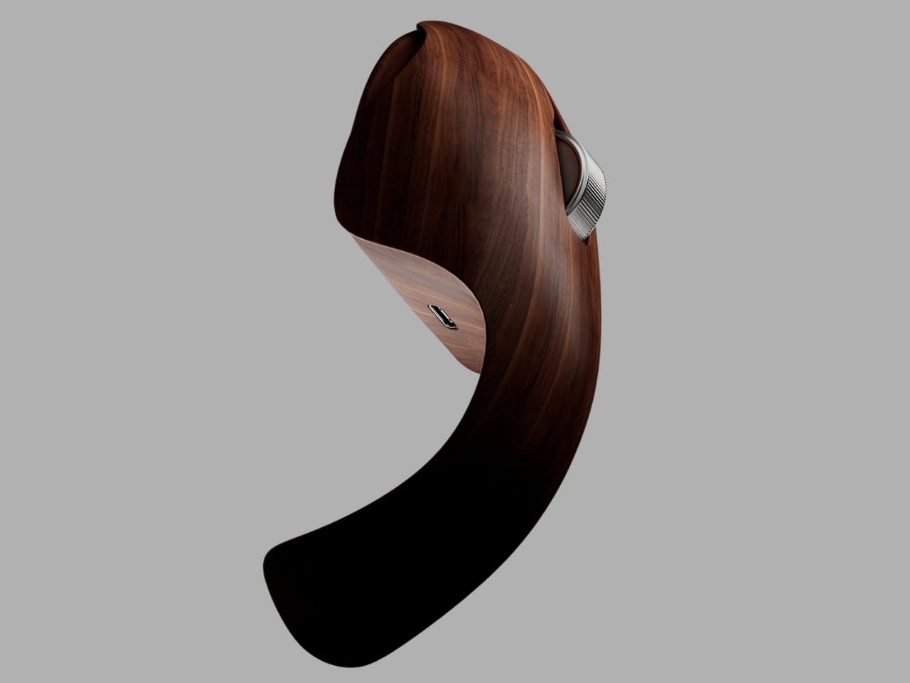
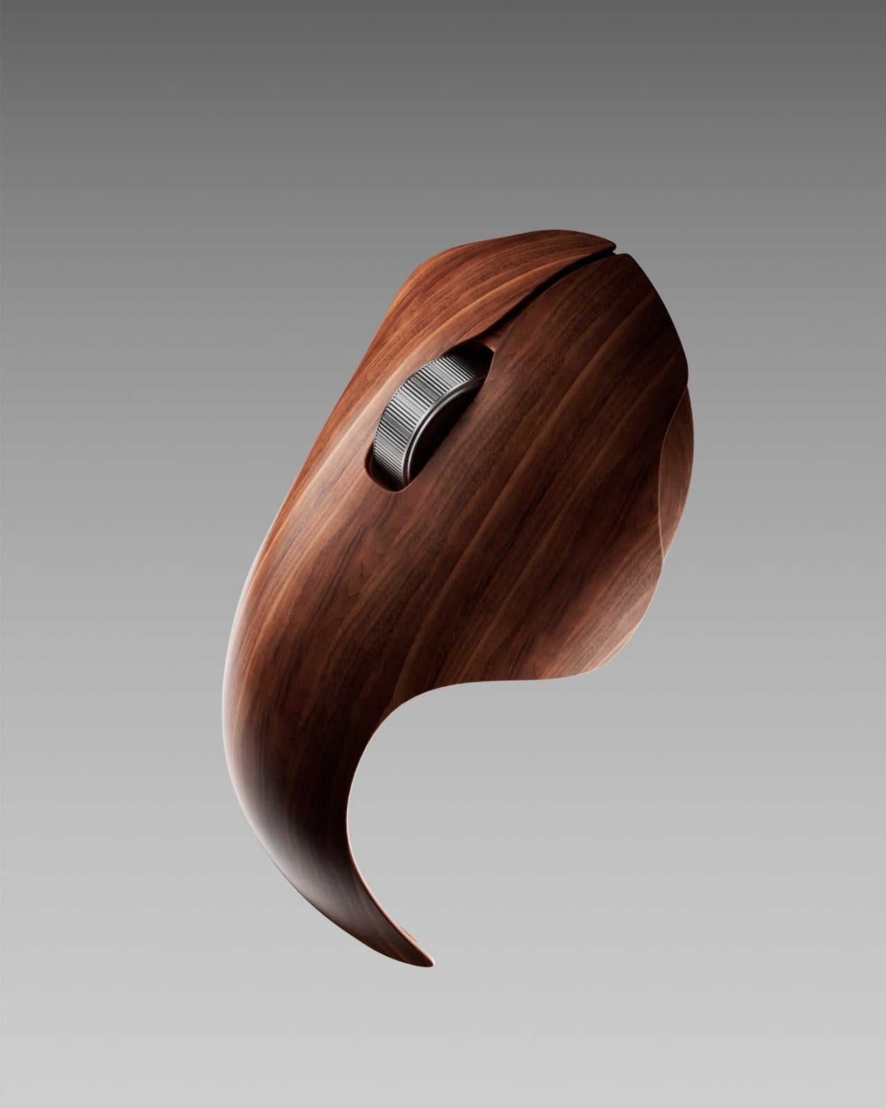
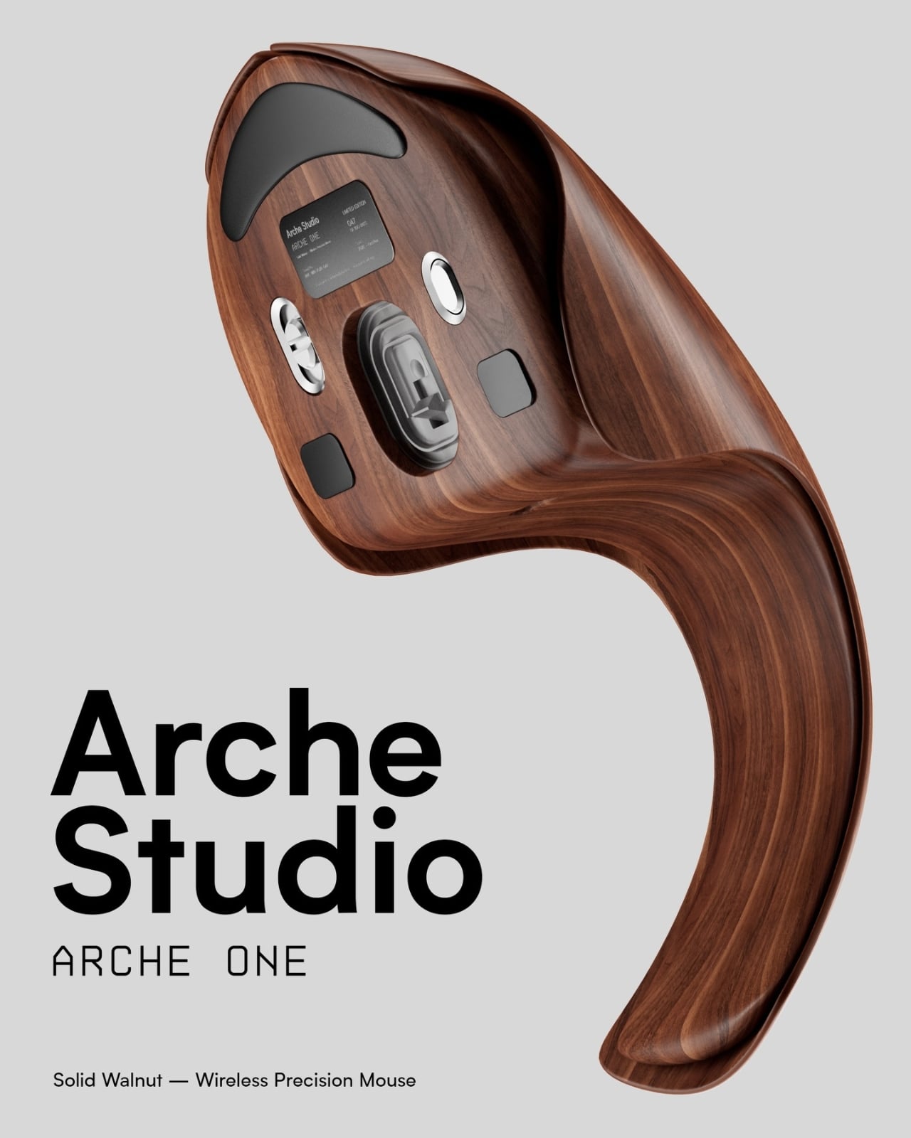
The concept is simple enough to say out loud: a computer mouse wrapped in walnut veneer. But when you actually see what designer Eslam Mohammed has put together with the Arche One, the simplicity of that sentence falls apart quickly. This is not a novelty item with a wood sticker slapped on top. It is a full rethinking of what a peripheral can be, and it is entirely a concept, which somehow makes it more compelling, not less.
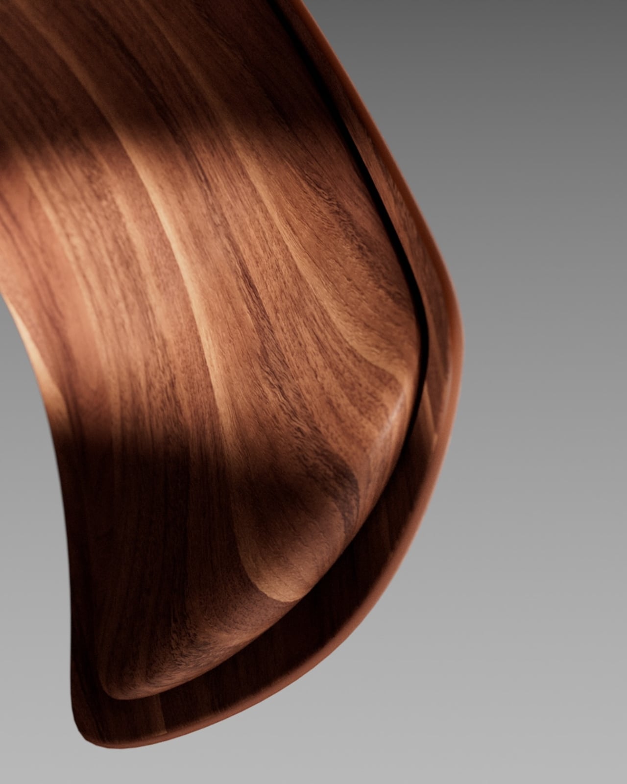
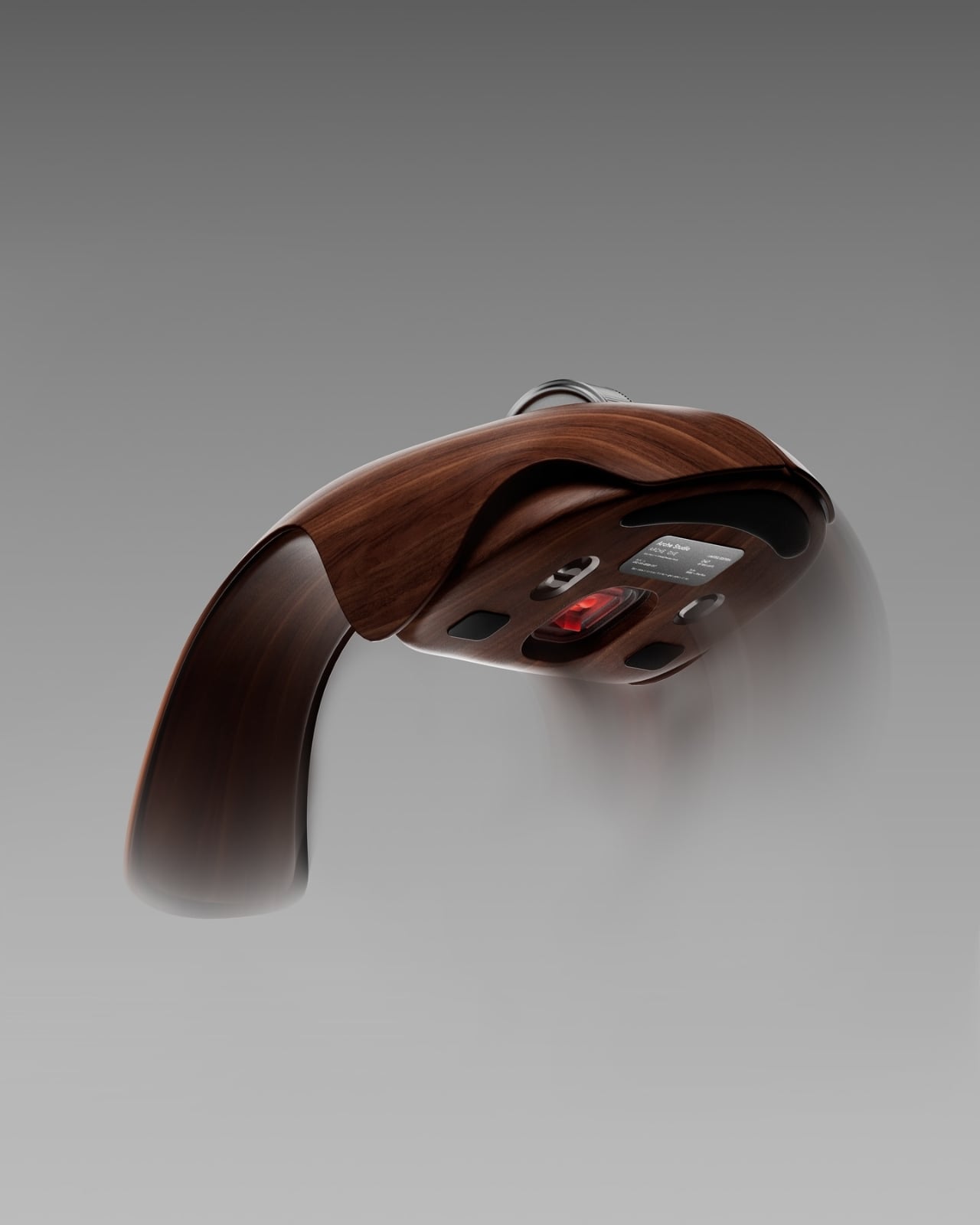
Mohammed built the Arche One as an exploration, not a product pitch. He wanted to strip out the plastic aggression that defines most tech hardware and replace it with something that feels genuinely crafted. The result is a mouse with a long arching tail, a low organic body, and walnut veneer wrapped around every curve without shortcuts. It sits somewhere between a sculptural object and a piece of furniture, and I keep going back to look at it because it makes me realize how low the bar has been set for peripheral design for decades.
Designer: Eslam Mohammed
The gaming mouse world in particular has turned aggressive posturing into an aesthetic. Angular bodies, RGB lighting, the visual vocabulary of speed and dominance. Even the more restrained productivity mice from major brands feel like they were designed to be forgotten, not noticed. What Mohammed is proposing, even if only on a screen, is a different brief entirely: make it feel like an object worth keeping.
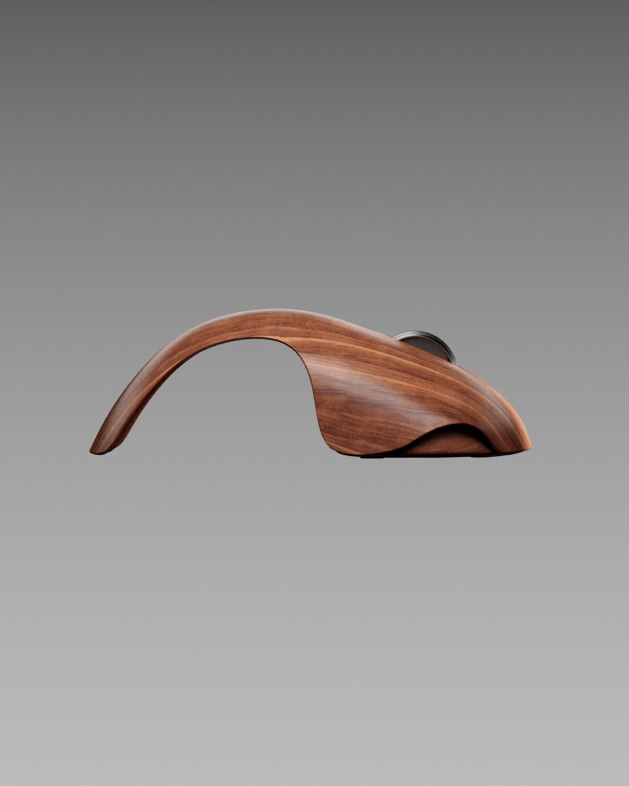
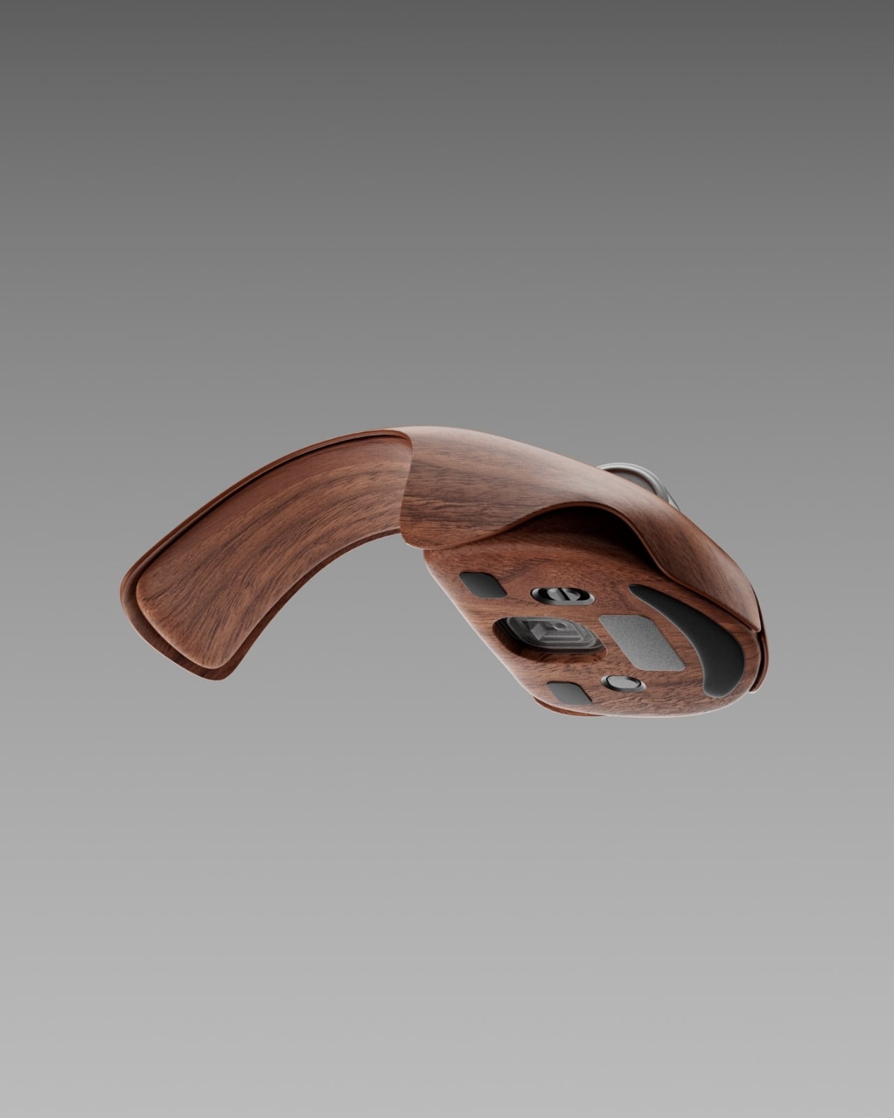
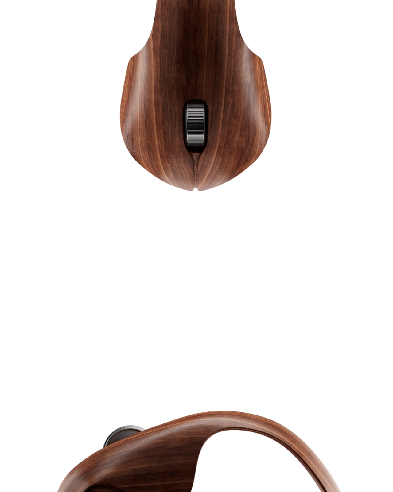
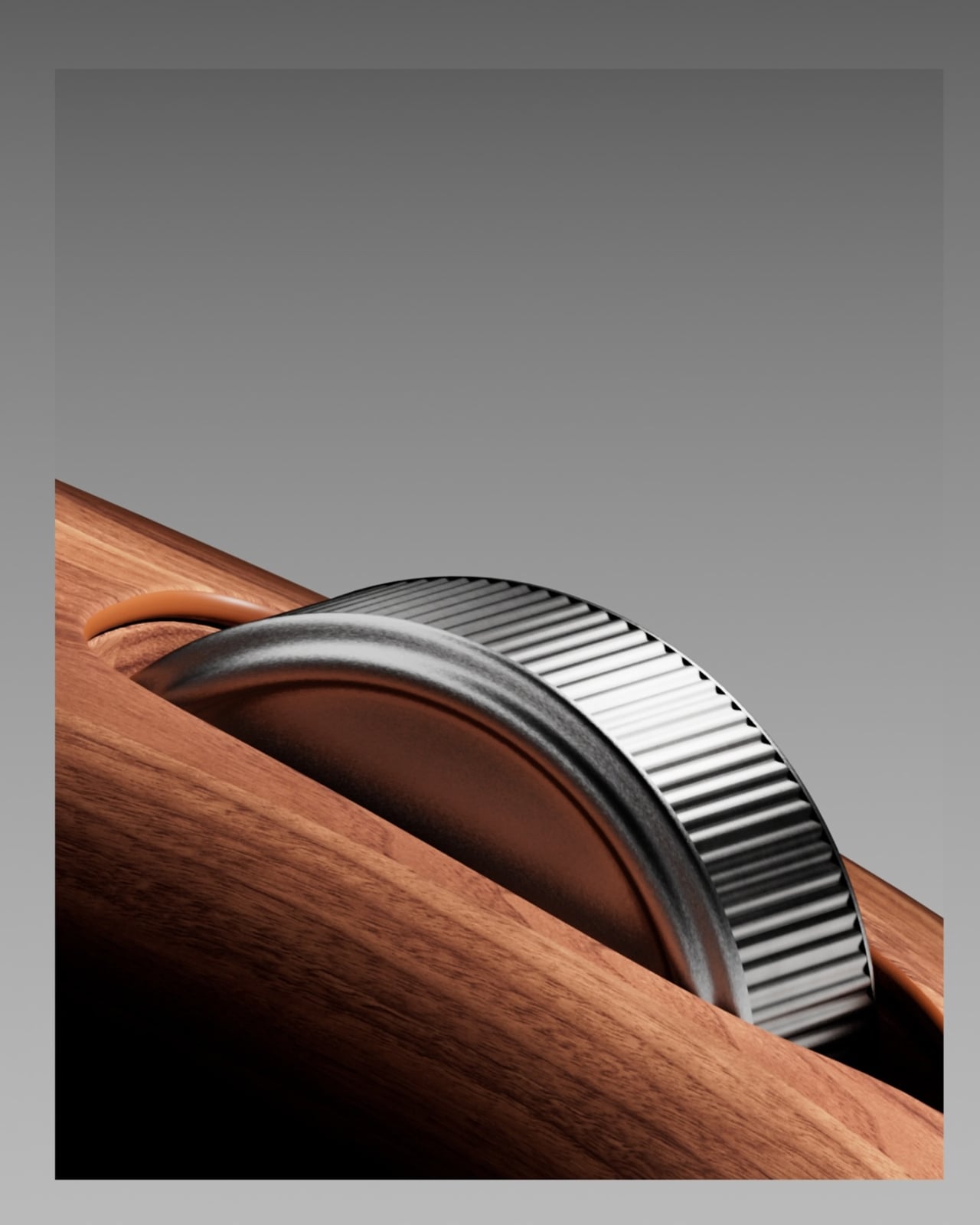
Form came first in his process. The silhouette reads almost like a comma, or an outstretched hand resting on fine wood. The scroll wheel is machined metal, knurled and precise, sitting flush against warm grain. The underside carries a 26,000 DPI optical sensor, Bluetooth 5.3, USB-C connectivity, and a lithium-polymer battery rated at six months. The specs are serious. The material is not a gimmick dressed up as design. It is the design, or at least inseparable from it.
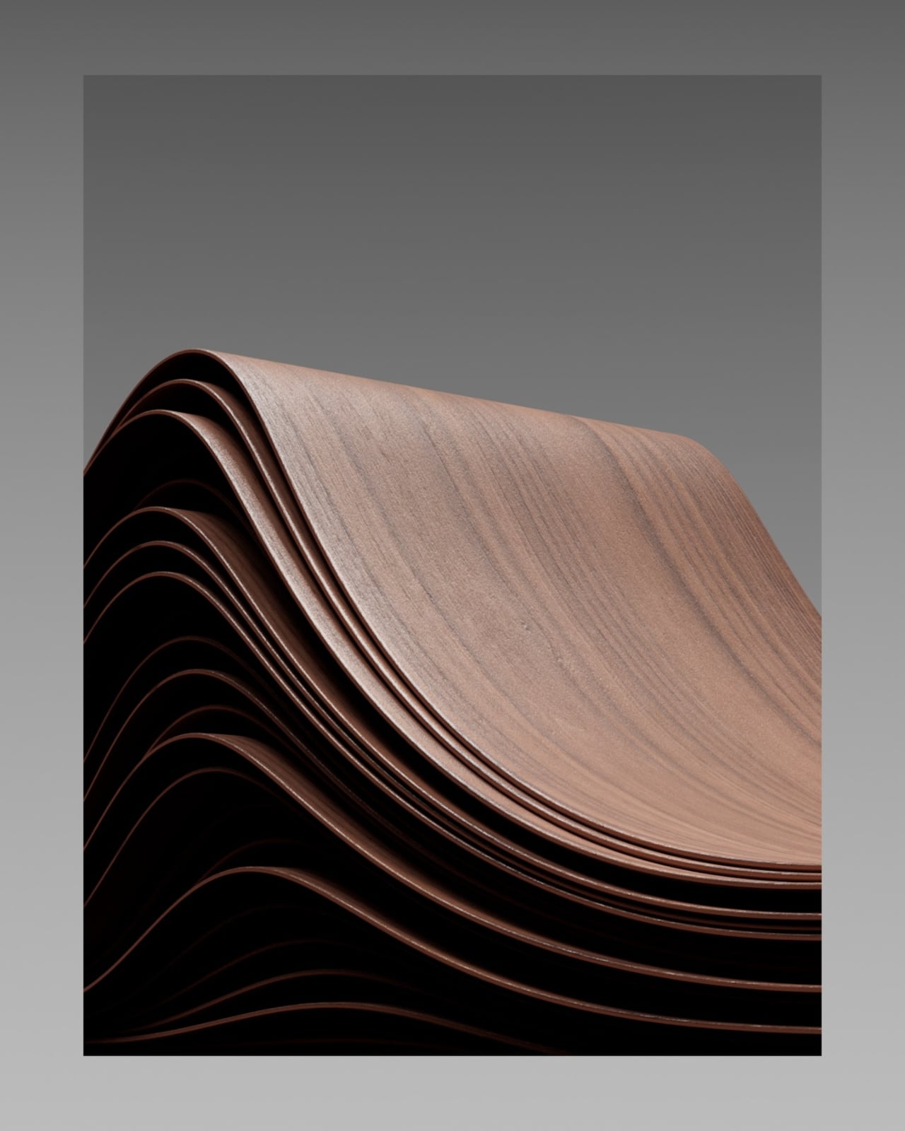
The production approach is worth pausing on because it says something about how contemporary 3D design is evolving. Mohammed used three separate software programs simultaneously rather than forcing a single tool to carry everything. Houdini handled the cutting simulation. Cinema 4D managed the flow of the veneer layers. Blender took care of modeling and animation, and everything went through Octane for rendering. Each tool doing exactly what it was built for, nothing more, nothing less. The result is cleaner, and the renders have a photographic weight that makes you forget you are looking at a concept. The grain catches light the way real wood does. The curves feel like they have mass.
The Arche One is imagined as a limited run of 300 units, each individually finished in hand-applied satin oil, with the note that grain pattern will vary from piece to piece. That last detail is the one that gets me. In a peripheral market built on identical units rolling off assembly lines, the idea of a mouse where no two pieces look exactly the same is almost radical. It borrows the language of craft objects and heirlooms, the kind of things people keep, pass on, and genuinely care about. That is a different conversation than the one tech hardware usually wants to have.
I think about my own desk, and I think most people have at some point looked down at their mouse and felt nothing. It is a tool, purely functional, there to be used and eventually discarded. The Arche One is a question about whether that has to be true. Whether the relationship between a person and the objects they touch every day for hours at a time could carry some weight, some intention, some warmth. That is not a trivial thing to ask.
Maybe this mouse never gets made. That is fine. Concepts do not need to ship to matter. What Mohammed has done here is demonstrate, convincingly and beautifully, that someone asked the right question. The answer is still being worked out. But the asking is more than enough.
The post The Mouse Carved From Walnut That Doesn’t Exist Yet first appeared on Yanko Design.