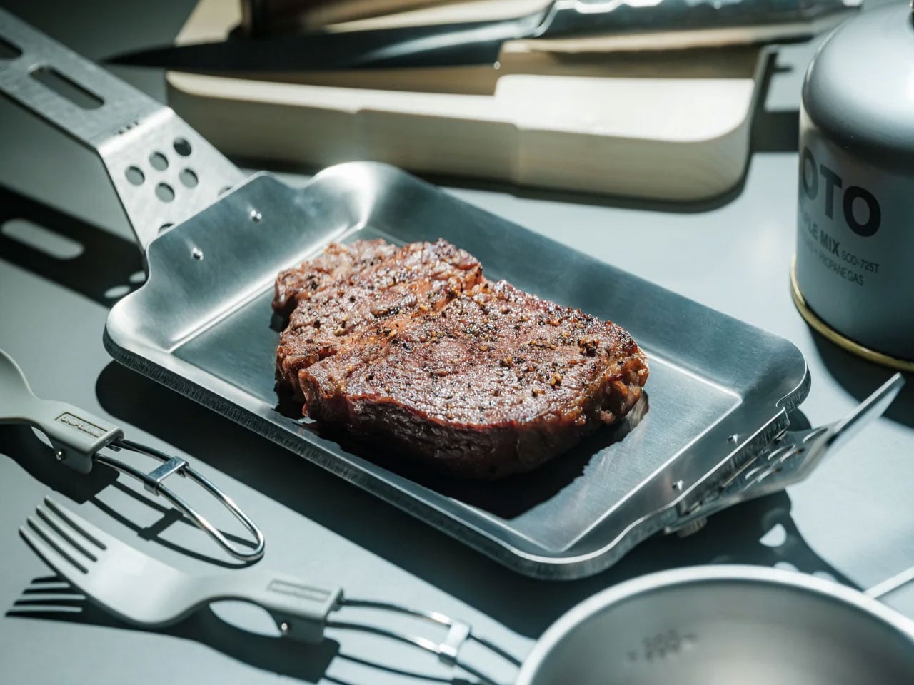
Some grill pans spend their days at the back of a cabinet, too heavy to bother with and too uneven to trust. Then there are the ones that earn a place on the stove every single time. The Compact Modular Grill Plate belongs to the second category. Built with a three-layer steel construction that spreads heat evenly across its entire surface, it closes the gap between a proper kitchen sear and a campfire meal, without making you choose between the two.
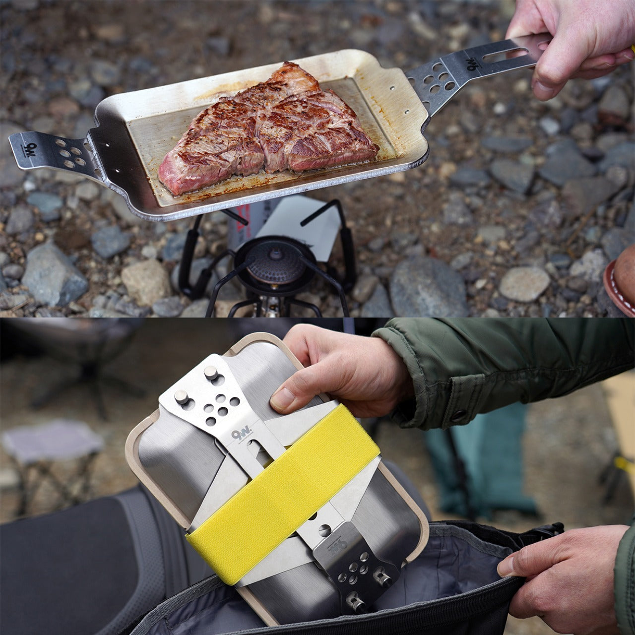
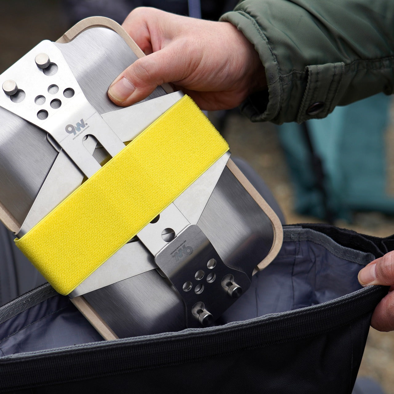
What makes it worth owning is the adaptability. Handles swap out depending on the situation. The plate runs on campfires, gas burners, and induction stoves without modification. When cooking is done, the whole setup packs flat, small enough to fit in a bag without reorganizing everything around it. That level of flexibility does not happen by accident. It is the result of a design that actually solves the problem rather than merely describing it.
Click Here to Buy Now: $100.00
Even Heat, Everywhere
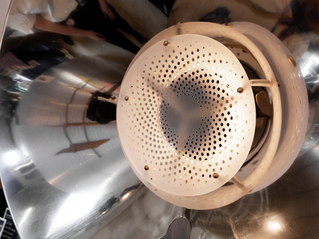
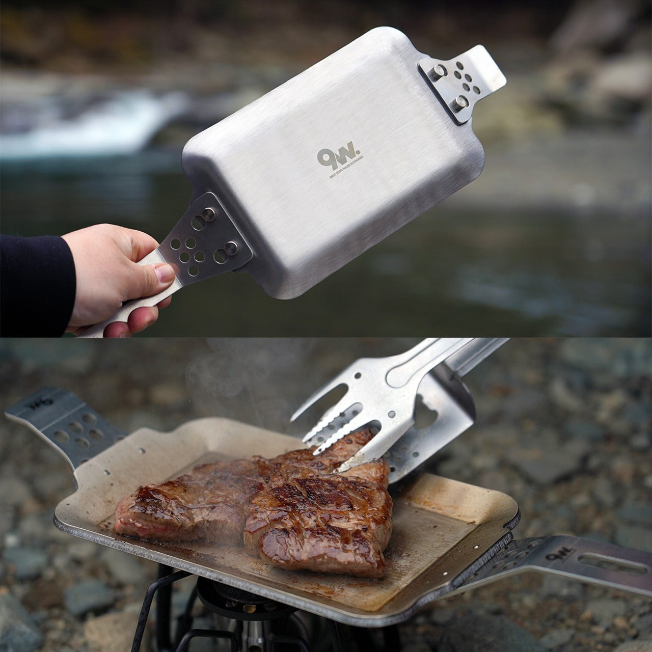
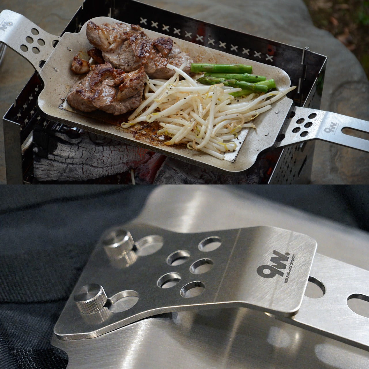
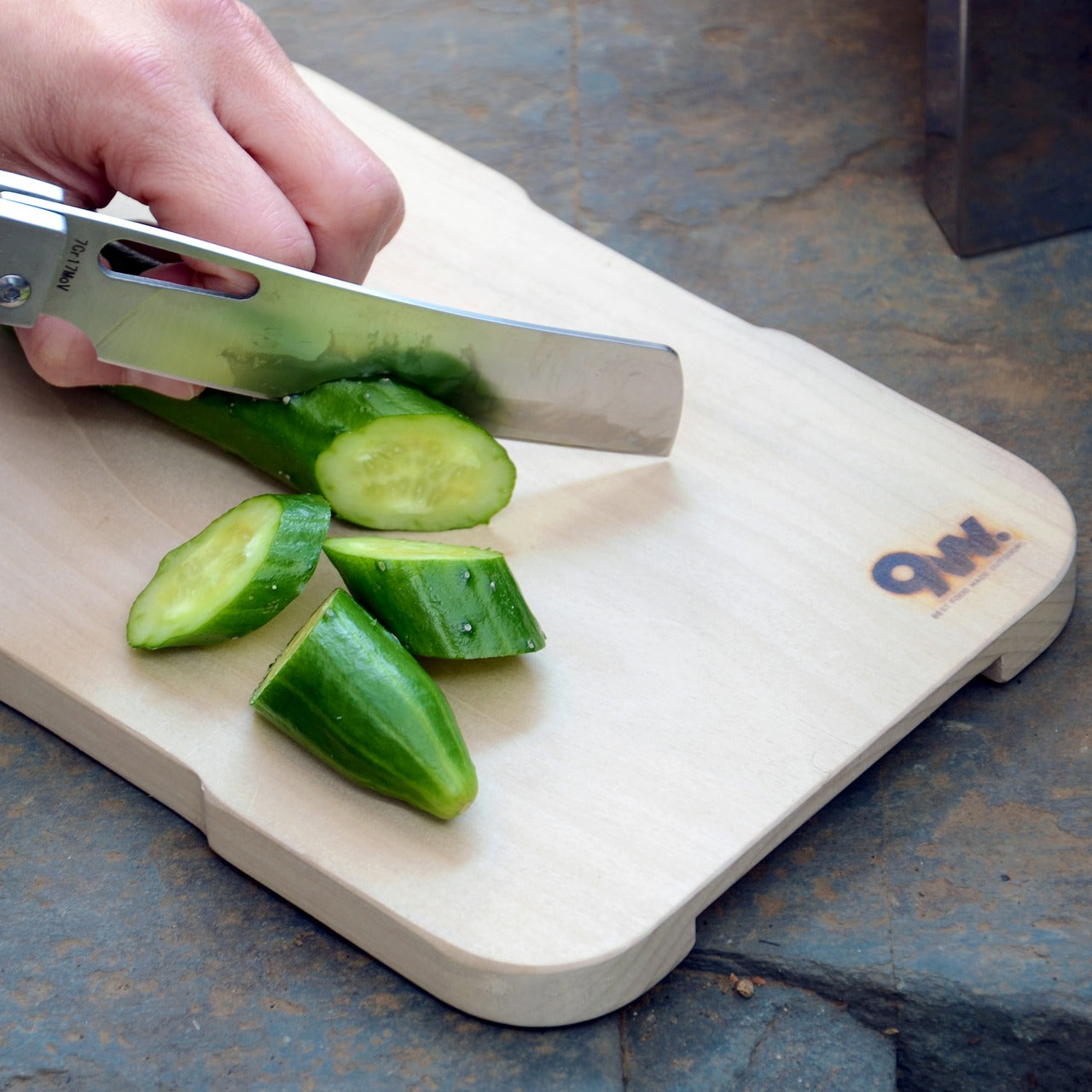
The three-layer steel plate is where the performance begins. Single-layer pans burn where the flame sits and fade everywhere else, which is how a good cut of meat ends up patchy and dry in the wrong places. The layered construction here distributes heat uniformly from the edge to the center, keeping the temperature consistent across the entire cooking surface. The result is a better sear, better moisture retention, and food that actually tastes the way it should. Compatible with campfires, gas burners, and induction stoves, it performs just as well in a small apartment kitchen as it does over an open fire on uneven ground.
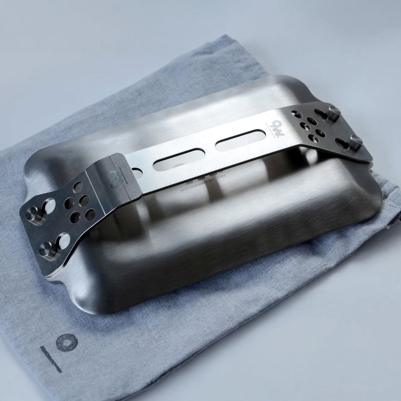
Modular, Compact, Actually Practical
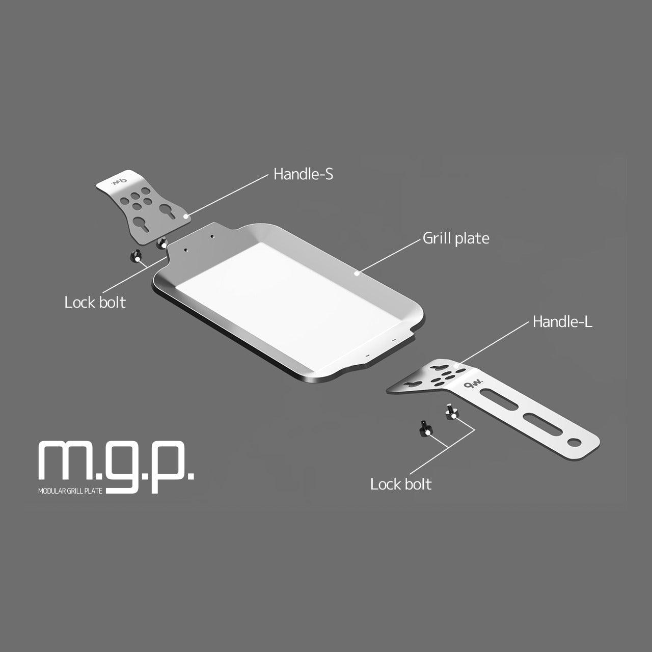
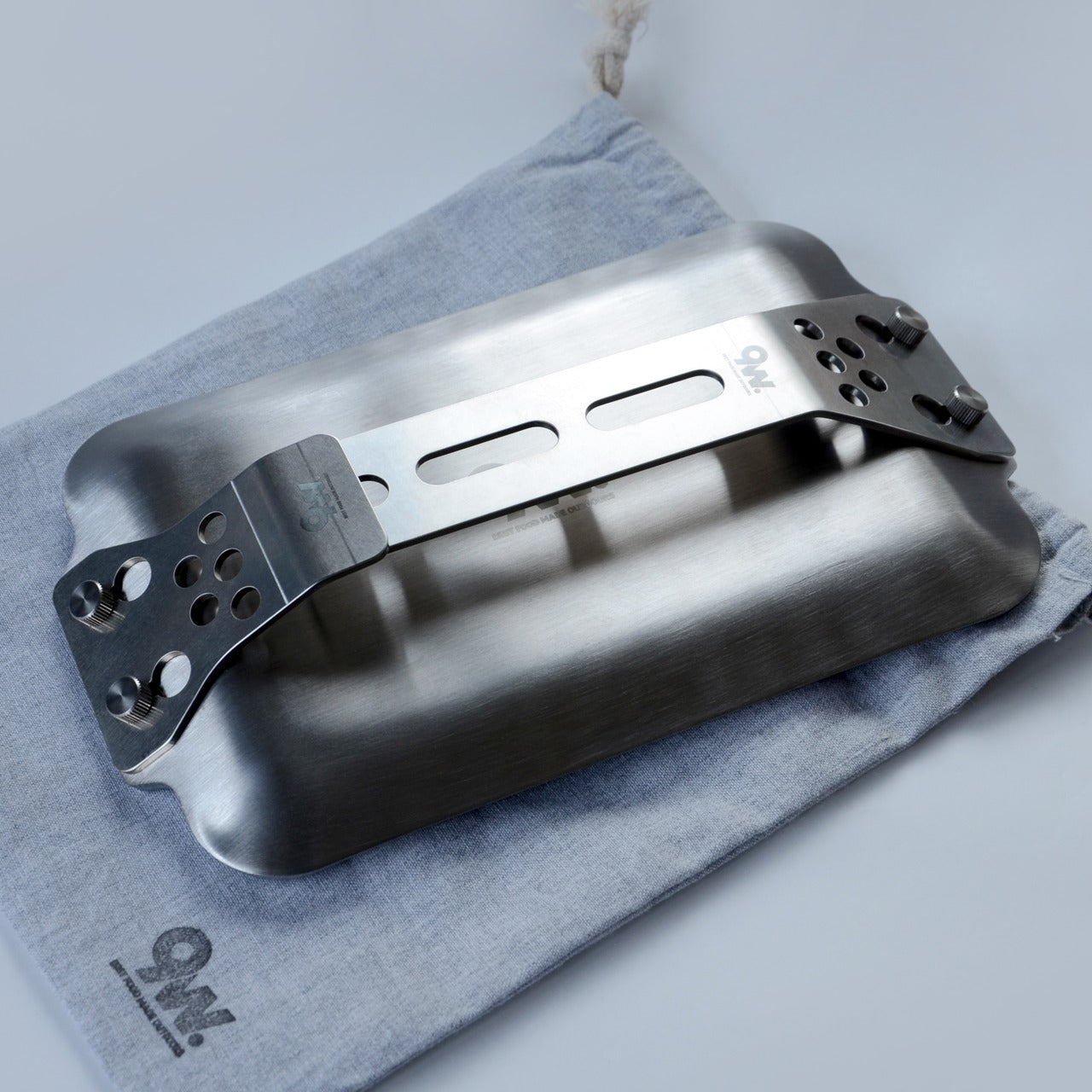
Most portable cookware treats portability as a footnote. The Compact Modular Grill Plate starts there. The handle system swaps out depending on the setting, so the plate adjusts to whatever the cook needs rather than the other way around. Remove the handles for cleaning, and pack everything flat for travel. There is a specific kind of satisfaction in gear designed to disappear when you are done with it, and this plate earns that cleanly. It comes in a Basic set and a Special set for those who want more to work with from the start.
What We Like
- Three-layer heat distribution: a properly engineered cooking surface that keeps temperature uniform for consistent sears and better moisture retention from edge to center
- Multiple heat source compatibility: campfire, gas, and induction in one plate with no adapters and no compromise between settings
- Swappable handle design: takes seconds to change and genuinely adapts the plate to whatever situation the cook is working in
- Compact pack-down: flat storage with handles removed; the kind of practical detail that determines whether gear actually makes the trip
What We Dislike
- No surface treatment specified: the product does not clarify whether the cooking surface has a non-stick finish, which matters for cooking delicate proteins and for cleanup expectations
- Limited set configuration: Basic and Special cover the range well, but there is no option to add a single accessory without committing to a full set upgrade
The Cookware That Goes Where You Go
The Compact Modular Grill Plate was built for cooking that happens outside the ideal. An unpredictable campfire. A countertop induction burner in a small space. A situation where the cookware needs to adapt before you do. It handles all three without changing what it is, which is a rarer quality in portable cookware than it should be.
If what you are currently cooking with makes the meal harder than it needs to be, this is the straightforward fix. Pick up the Basic or Special set and take the guesswork out of the next meal.
The post This Compact Grill Plate Cooks a Perfect Steak Over Any Heat Source & Packs Flat When You’re Done first appeared on Yanko Design.