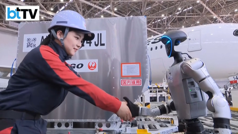
Mark Zuckerberg says Meta is working on AI agents for personal and business use
The CEO wants to make an agent so easy even his mom can use it.
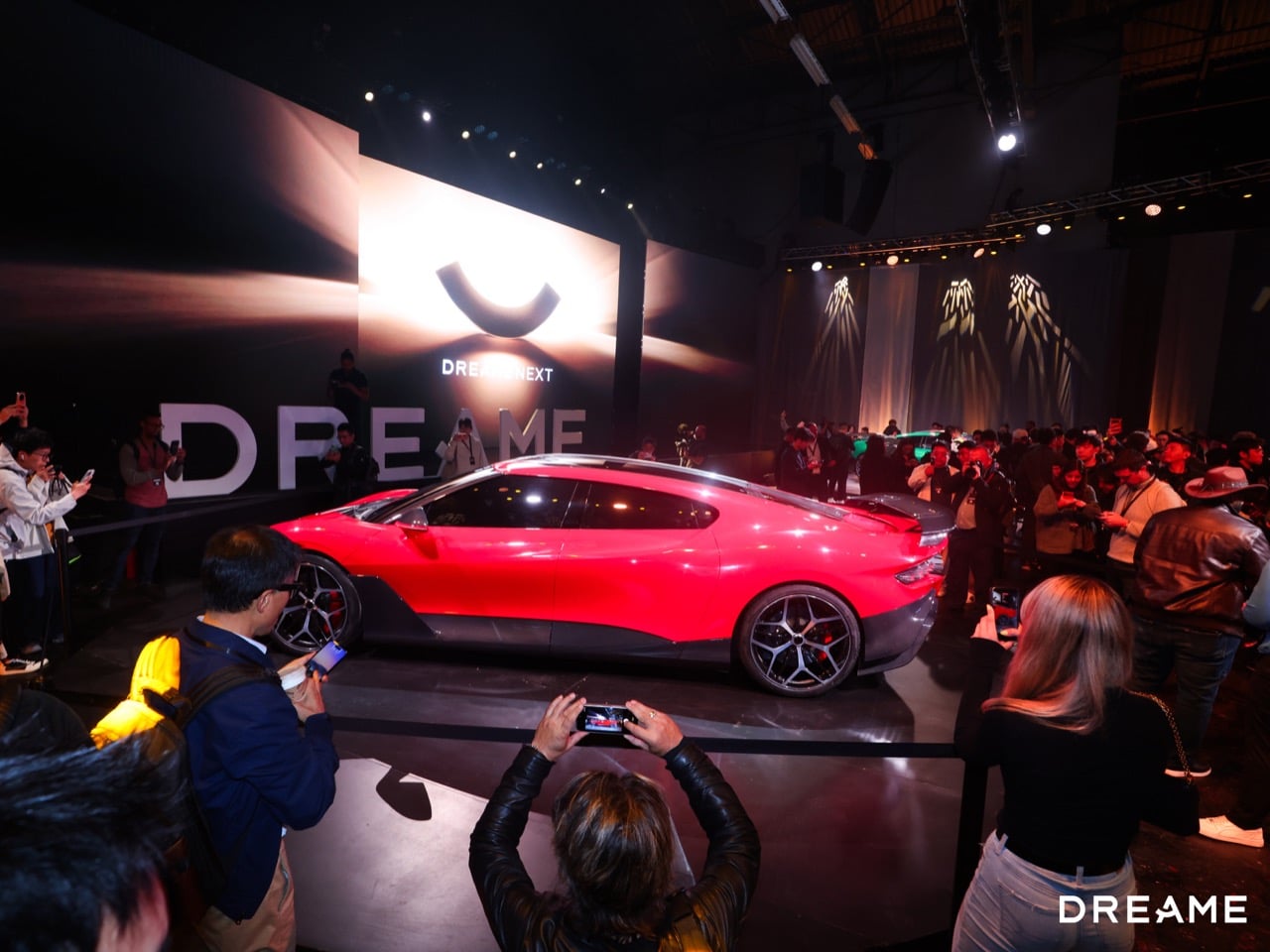
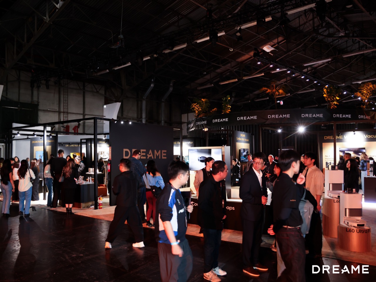
San Francisco just witnessed something wild. Dreame Technology, the company you probably know from robot vacuums that actually work, took over the Palace of Fine Arts for four days and unveiled a product lineup so sprawling it felt like watching a tech conglomerate speedrun a decade of ambition. DREAME NEXT wasn’t a launch event. It was a statement of intent, wrapped in smoke and mirrors and one very literal rocket car.
The Nebula NEXT 01 JET Edition kicked things off on April 27th with dual solid-fuel rocket boosters delivering 0-to-100 km/h in 0.9 seconds. Sebastian Thrun showed up to co-present. Steve Wozniak appeared on day three for the smartphone launch. Dwyane Wade demoed cleaning tech on day two. But here’s the thing about this spectacle: buried underneath the celebrity cameos and rocket-powered stunts, Dreame actually showed off some genuinely clever engineering in the categories where they’ve already proven themselves.
Designer: DREAME

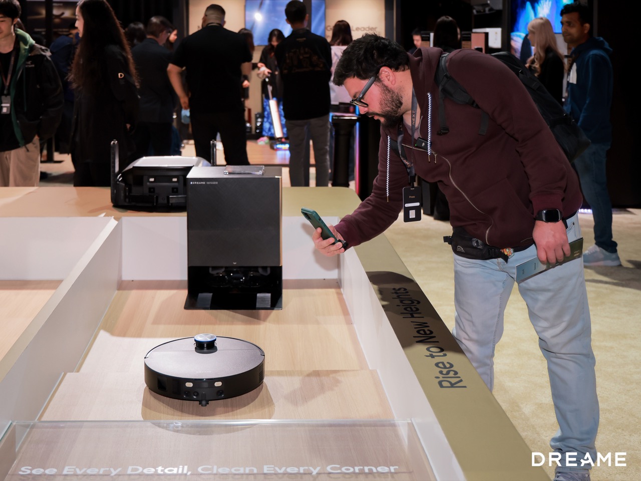
The X60 Pro Ultra Complete introduced Dreame’s second-generation Dual UltraExtend Arm, which is exactly what it sounds like: a robotic vacuum with extending appendages that reach into corners and edges. The mop extends 18 centimeters out from the body, the side brush goes 12 centimeters. The fan motor hits 42 kilopascals at 150,000 RPM, which is absurd suction for a robot this size. It climbs 10-centimeter steps, which means double-layer staircases are no longer a dealbreaker. The stereo vision obstacle avoidance keeps it from ramming into furniture, and the runtime is unlimited because it auto-docks and recharges. This addresses the single biggest frustration with robot vacuums: they miss spots. The extending arms mean actual edge-to-edge coverage without manual cleanup afterward.
The Aqua20 Pro Ultra Roller Complete takes a different approach to the same problem. Instead of extending arms, it brings 160-degree Celsius steam directly to the floor. The built-in steam generator reaches temperature in eight seconds, and the steam loosens dirt before the hot water mop follows through. It’s a multi-dimensional attack on kitchen grease and dried pet paw prints, the kind of stuck-on mess that normal robot mops just smear around. The combination of heat, water, and pressure means fewer passes and cleaner floors.
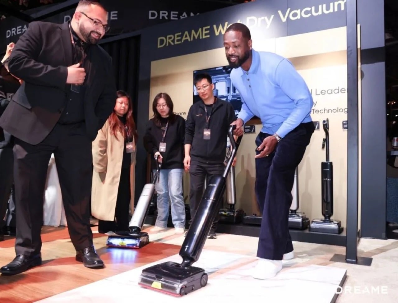
Then there’s the Aero Ultra Steam wet-dry vacuum, which introduces what Dreame calls a Tri-Force Cleaning Solution: 200-degree Celsius steam wash, 194-degree Fahrenheit hot water mopping, and targeted foam wash for pet odors. The suction hits 30 kilopascals, and the body is slim enough at 3.88 inches to slide under most furniture. The runtime goes up to 100 minutes. Wet-dry vacuums have always been finicky because you’re dealing with both dry debris and liquid spills in the same cleaning session, and the separation between air and water matters. Dreame’s using what they call AirHydro Separation technology, an air-shield system that keeps the airflow path isolated from the water recovery path. It means you can switch between vacuuming crumbs and mopping spills without clogging the motor or diluting suction.

The outdoor lineup got similar treatment. The A3 AWD roboticmower uses LiDAR and binocular AI vision for autonomous mapping with no perimeter wires. Four-wheel drive handles 5.5-centimeter obstacles and 80 percent slopes. The cutting height adjusts from 3 to 10 centimeters, and the EdgeMaster system gets within 5 centimeters of boundaries. The All-in Center is what makes this actually hands-off: the mower returns to the base for automatic charging, cleaning, and weatherproof storage. It handles rain, heat, and freezing temps without manual intervention. Most robotic mowers still require you to babysit the charging process or bring them indoors during bad weather. This one just docks and waits.
What Dreame is doing here comes down to three core technologies they’ve been refining since 2015: high-speed digital motors, intelligent algorithms, and bionic robotic arms. The motors hit 200,000 RPM in lab conditions and mass-produce at 160,000 RPM. That’s aerospace-grade engineering applied to household appliances. The robotic arm platform, which started in vacuums, now scales across dishwashers, range hoods, and air conditioners. The AI perception stack learns from 4.05 million datasets across 35 algorithm versions, enabling real-time object detection and scene understanding.
The guest list told the story. When Sebastian Thrun, Steve Wozniak, and Dwyane Wade show up for a cleaning appliance company’s launch event, you’re watching category boundaries dissolve. William Fong put it plainly during the opening forum: “Dreame has the foundational OS for reality.” Julie Zhuo noted that Dreame delivers the kind of freedom people actually want. Sebastian Thrun closed with this: “Dreame is positioned to move from AI software into the physical world.”
Whether refrigerators with hyperspectral sensors and smartphones with modular satellite attachments actually land remains to be seen. But the cleaning tech works because Dreame stayed focused on solving real problems: edges that don’t get cleaned, grease that doesn’t lift, lawns that require constant manual oversight. The rocket car got the headlines. The robot vacuums earned them.
The post DREAME, the Robot Vacuum Company, Just Launched a Rocket Car and 20 Smart Home Products in One Week first appeared on Yanko Design.

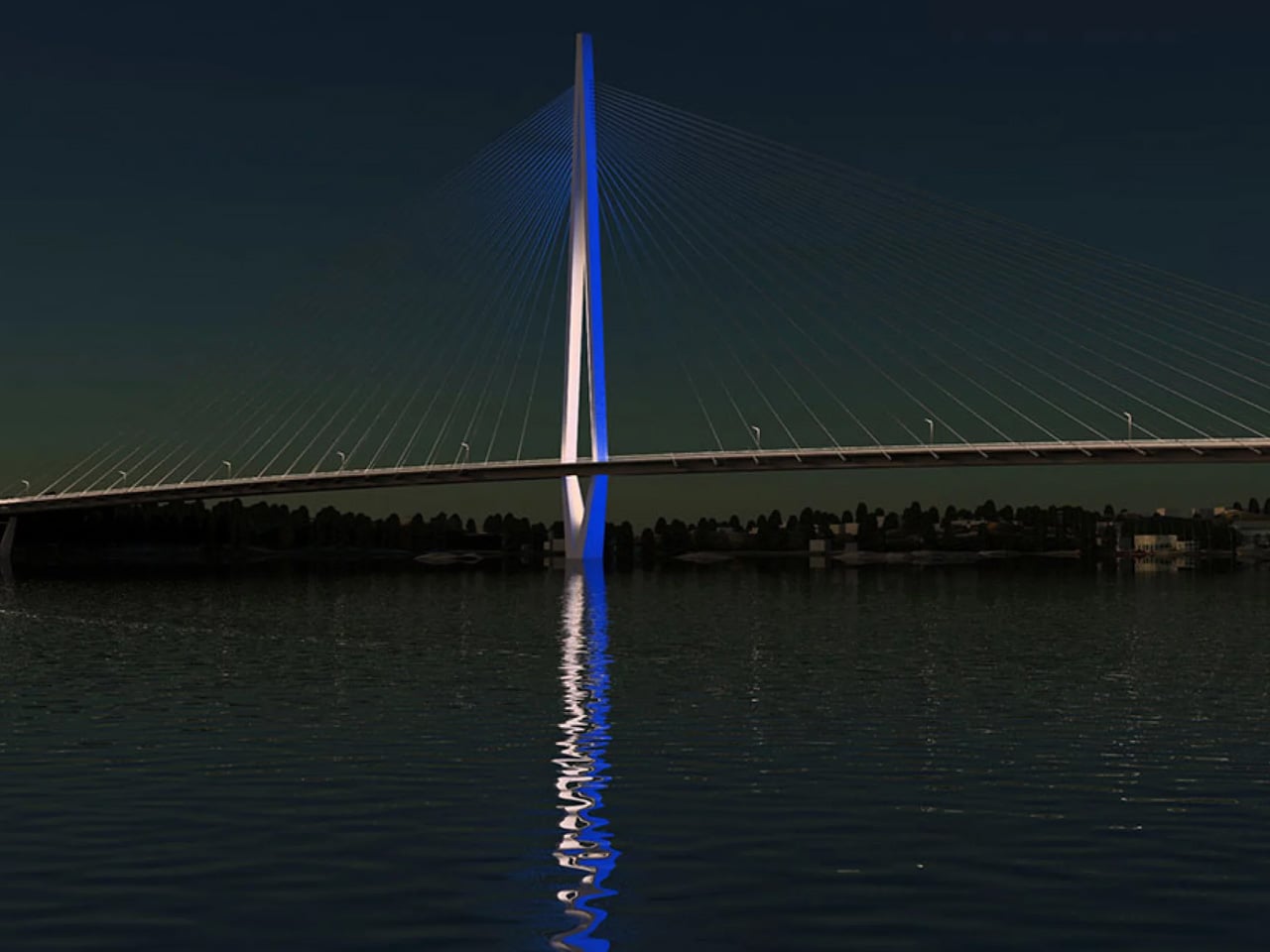
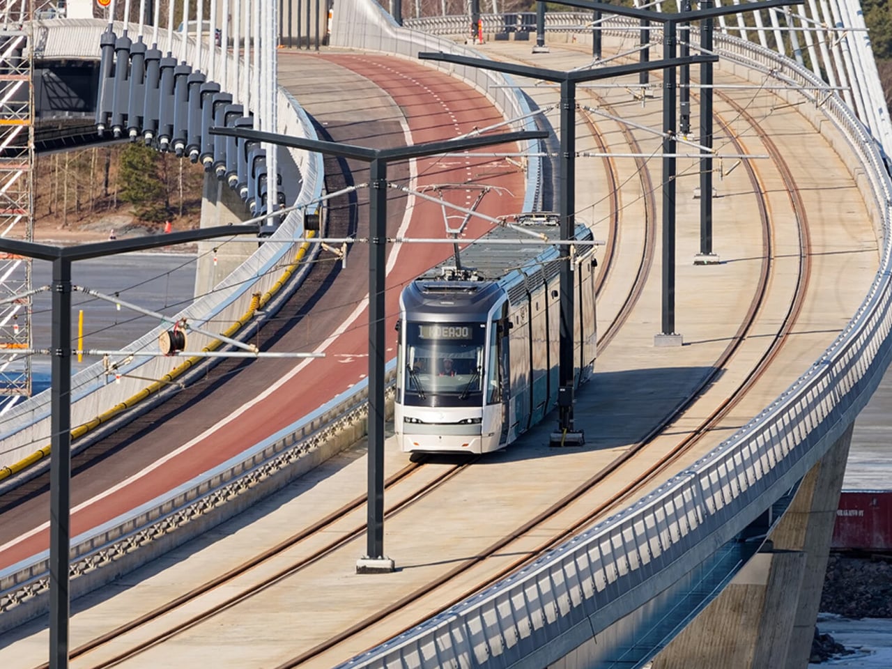
After more than a decade in the making, Helsinki’s Kruunuvuori Bridge has officially opened, and it’s unlike almost anything else built at this scale. Designed by engineering firm WSP Finland and London-based Knight Architects, the 1,191-metre crossing is now Finland’s longest and tallest bridge, and one of the longest in the world, built exclusively for pedestrians, cyclists, and public transport. There’s not a car lane in sight.
The story begins in 2012, when the City of Helsinki launched an international design competition titled “Kruunusillat” or “Crown Bridges.” Out of 52 entries, the WSP and Knight Architects collaboration, under the project name Gemma Regalis, emerged as the winner in 2013. Thirteen years later, that vision is now a physical reality, reshaping the way Helsinki’s inner city is experienced.
Designer: WSP & Knight Architects


The bridge links the waterside residential area of Kruunuvuorenranta to the Nihti district via Korkeasaari island, pulling thousands of residents meaningfully closer to the city centre. Its defining feature is a slender, 135-metre-tall concrete diamond pylon at its centre, flanked by two 260-metre cable-stayed spans. When illuminated, the pylon is visible from across the city, its facade lighting shifting with the time of day and the season, a deliberate addition to Helsinki’s skyline.
The design team’s priorities went well beyond engineering. WSP lead designer Sami Niemelä noted that the team considered “pedestrian and cyclist safety, a comfortable travel experience, and barrier-free accessibility” from the outset. The bridge’s gentle curve was an intentional choice — a winding path lets users visually track where they’re headed, making the crossing feel more intuitive. Lighting was carefully calibrated to minimise light pollution while still ensuring safety after dark, directing light precisely onto walking and cycling surfaces without excessive glare.

Finnish winters were also factored into the structure. The steel cables were engineered with solutions to prevent snow and ice accumulation, a non-negotiable in this climate. With a design life of 200 years, this is a bridge built to outlast generations. The bridge opened to pedestrians and cyclists on April 18, 2026, with more than 50,000 visitors crossing it during the opening weekend alone.
Construction was carried out by YIT and Kreate under the TYL Kruunusillat consortium, with Knight Architects involved from the earliest concept sketches all the way through to completion. The next chapter begins in early 2027, when tram services are scheduled to activate across the bridge, the final piece in making this crossing a fully operational transit corridor for Helsinki.


The post Helsinki’s Kruunuvuori Bridge Is One of the World’s Longest Car-Free Crossings first appeared on Yanko Design.
Hardcore gamers always love accessories that give them granular control over the device’s hardware and functionality. This micro-level tuning can mean the difference between a closely fought loss and a glorious victory. Logitech wants to give serious gamers every little bit of advantage from the gear they own, and that’s where their new G512 X hybrid gaming keyboard excels.
The flagship keyboard features all the latest tech on offer, combined with the highly configurable quality that adapts to the gamer’s preferred style of play rather than the other way around. As per Robin Piispanen, Vice President and General Manager of Logitech G, the brand sees the player’s setup as “something that grows with them as they improve.” To this, M. Lahti, Global Product Marketing Manager at Logitech G, added that the “G512 X is our love letter to the gamers who mod their gear as much as they mod their games.”
Designer: Logitech
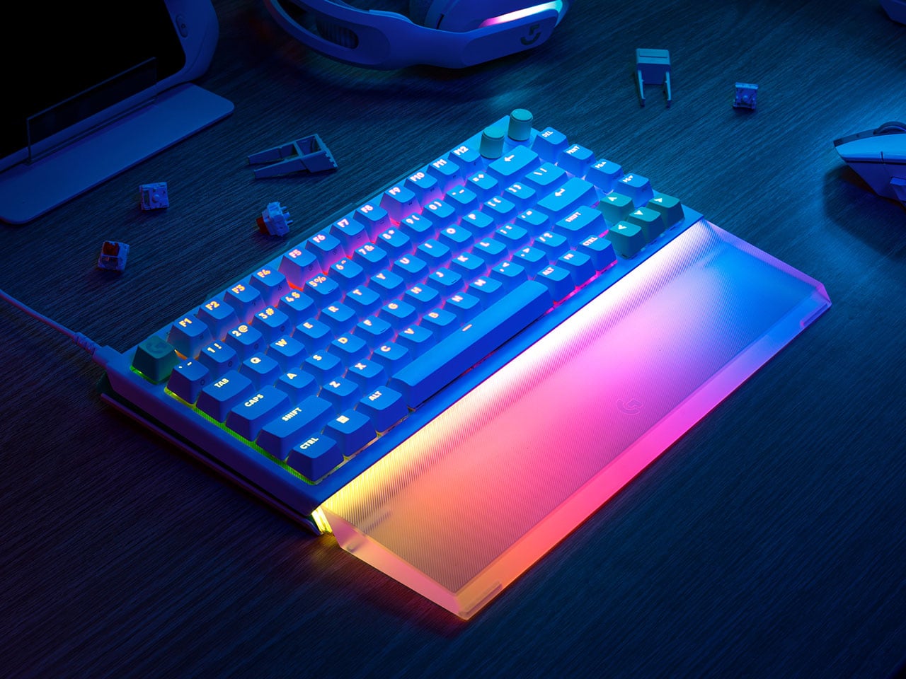
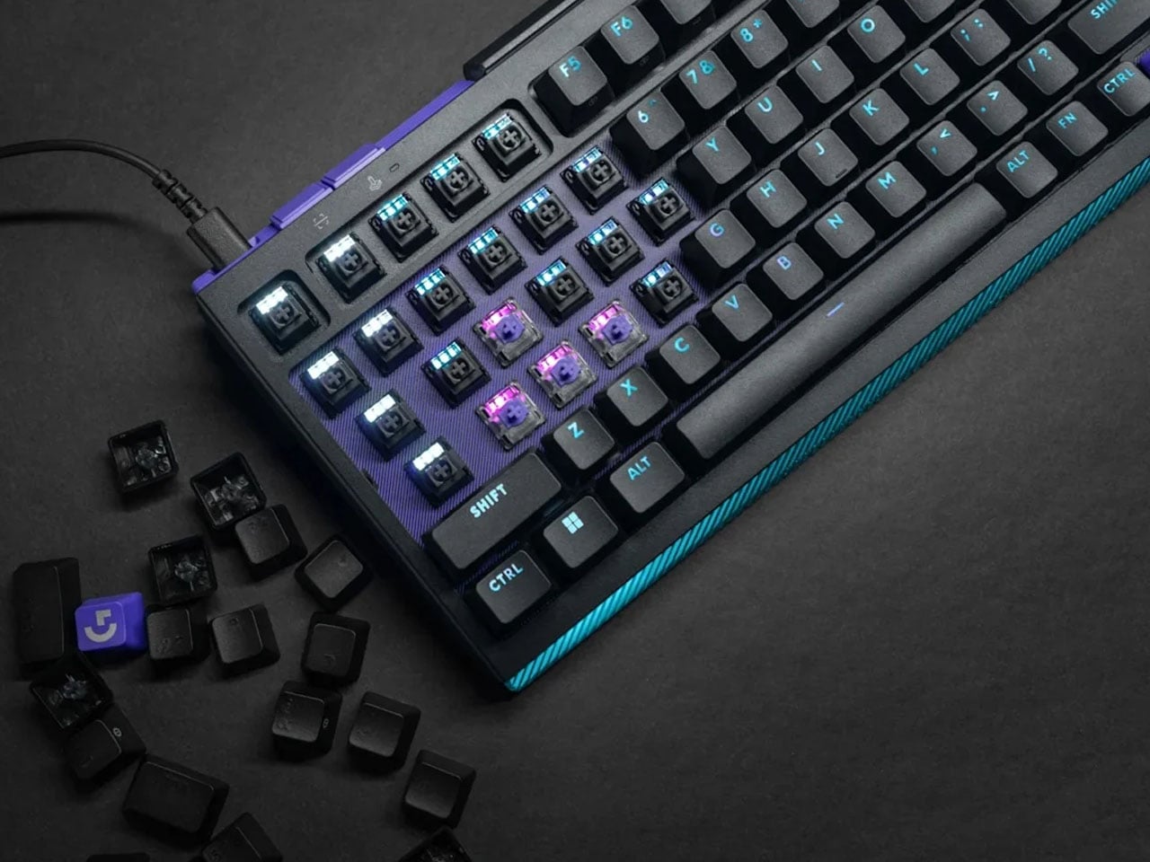
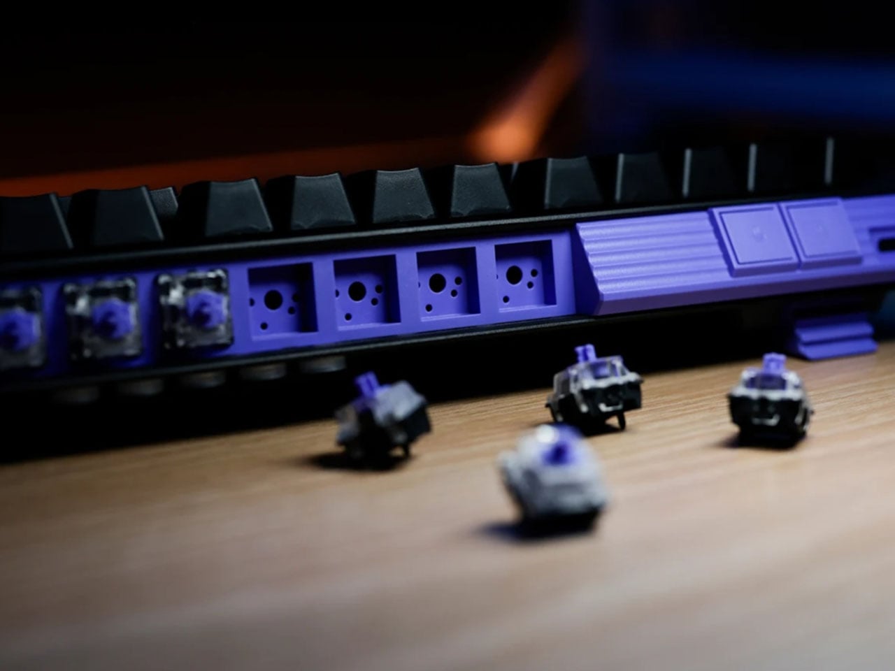
Although Logitech already has magnetic keyboards in its lineup, this hybrid option is the first by the brand to feature TMR switches. The granular hardware control comes courtesy of the 39 “Dual Swap” beds across its chassis, allowing players to create a mix of mechanical and analog switches on a single board. You could, for instance, assign analog input to movement-heavy WASD keys while keeping the rest of the layout equipped with mechanical switches for a more traditional typing feel. Based on usage data, these hybrid zones are intelligently clustered toward the left-hand side, where most in-game actions are concentrated.

This hybrid setup is further enhanced by TMR (Tunnel Magnetoresistance) sensing technology, which improves upon Hall-effect designs with greater precision and consistency. The result is a true 8,000Hz polling rate paired with an ultra-fast 0.125ms response time, effectively eliminating perceptible input lag. In fast-paced FPS scenarios, this level of responsiveness can make a measurable difference, ensuring that every command is executed exactly when intended.

What sets the G512 X apart is its ability to merge analog control with mechanical feedback in a meaningful way. Analog switches allow for variable input depending on how deeply a key is pressed, enabling more nuanced control typically associated with controllers. This becomes particularly valuable in racing and flight simulation games, where gradual acceleration or directional adjustments benefit from pressure-sensitive input. At the same time, mechanical switches retain their crisp, tactile response for standard commands, ensuring familiarity is not sacrificed for innovation.
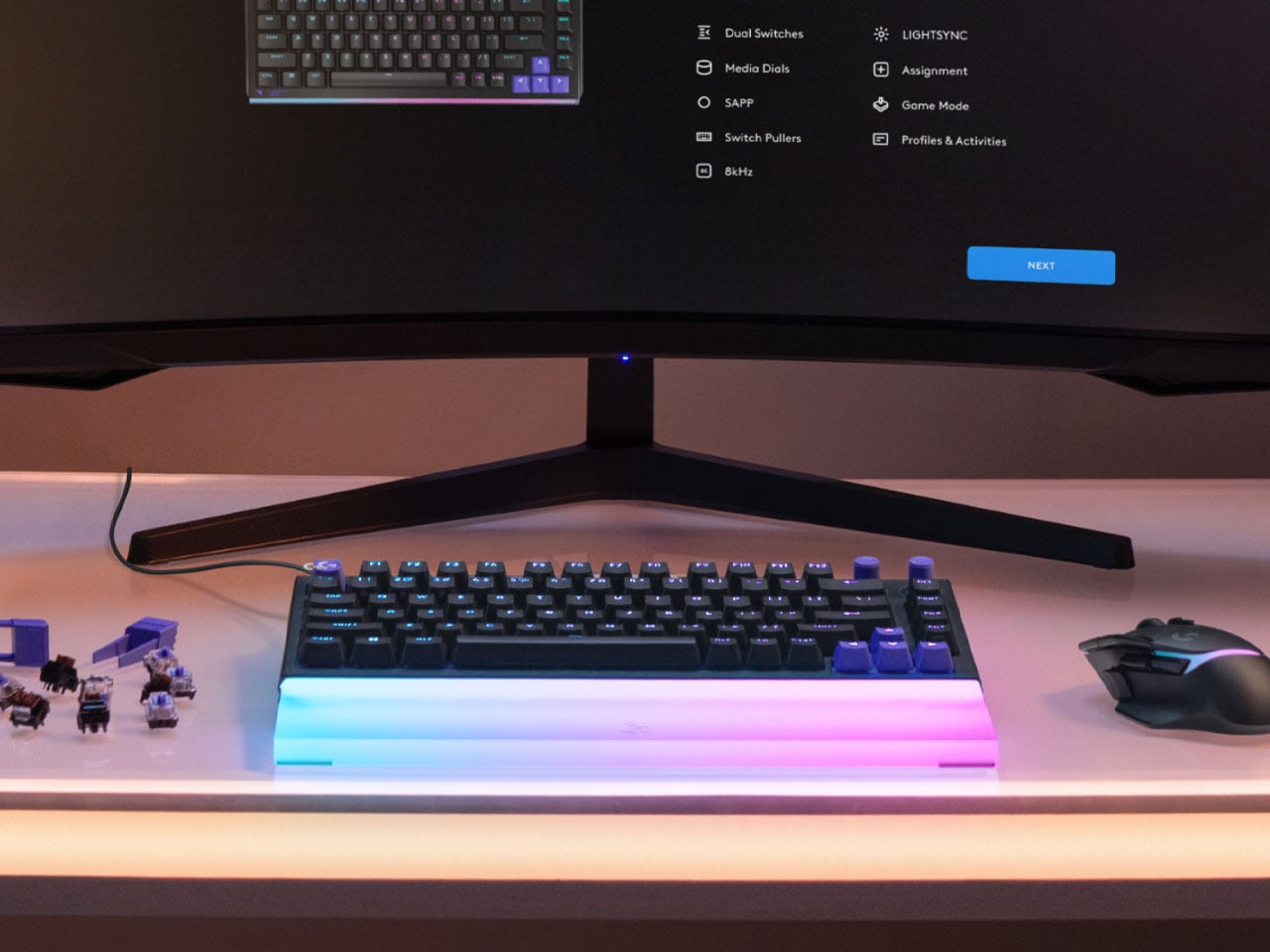
Logitech extends this flexibility into software through G Hub, where users can fine-tune actuation points and assign multiple functions to a single key based on press depth. This effectively adds another layer of input without increasing the physical footprint of the keyboard. For competitive players and enthusiasts alike, it means more control, faster access to commands, and a setup that can be tailored down to the smallest detail.
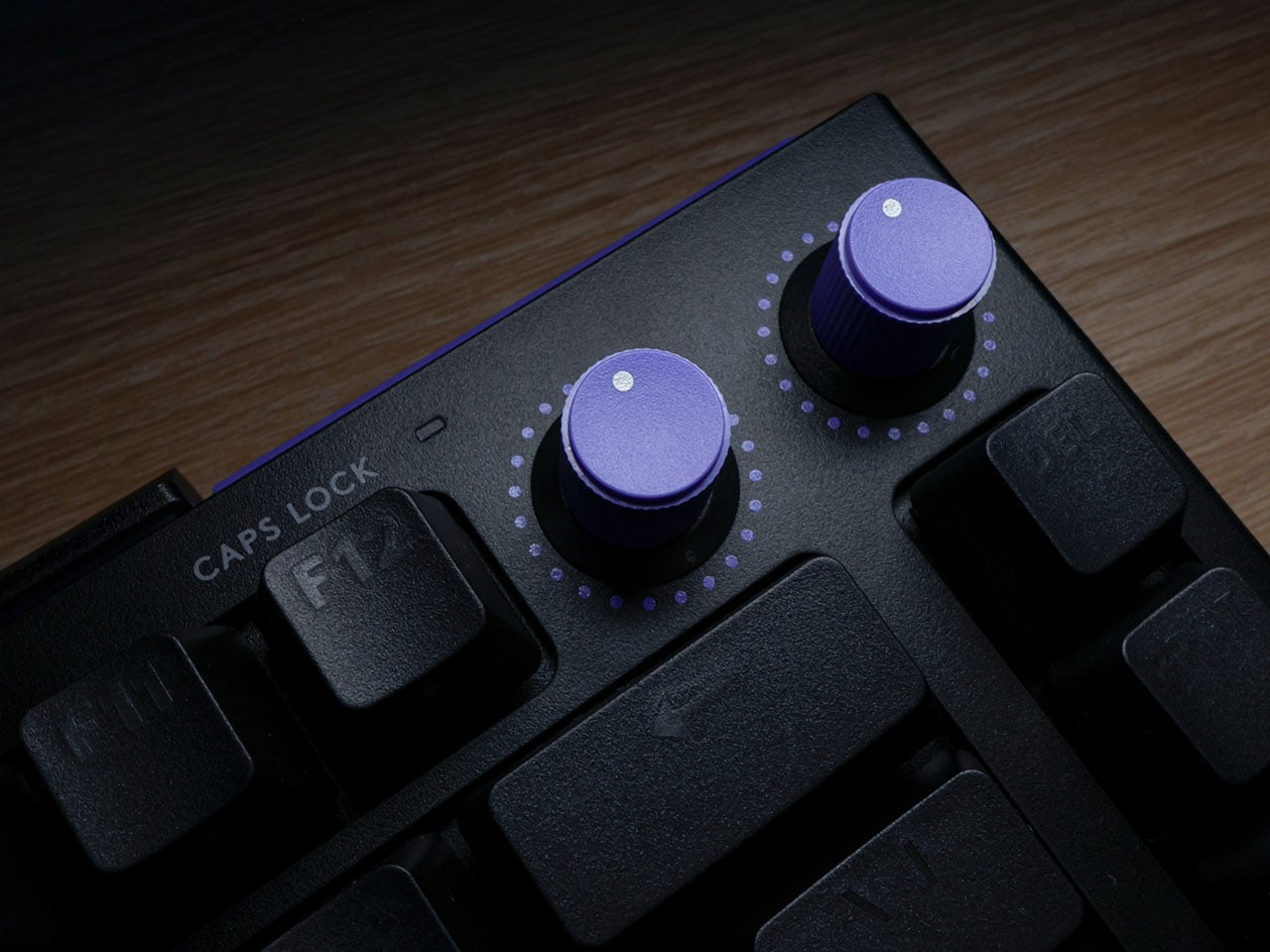
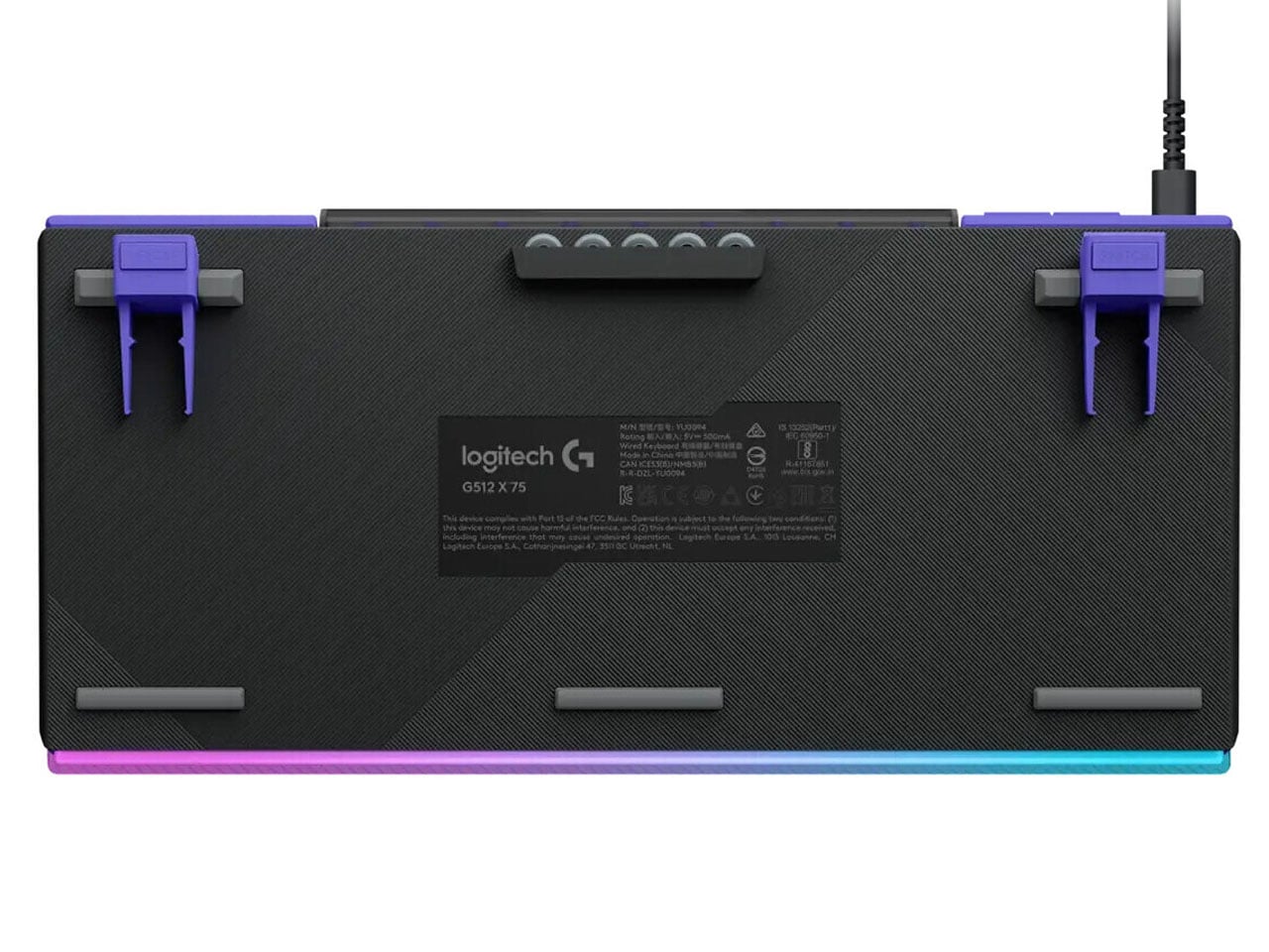
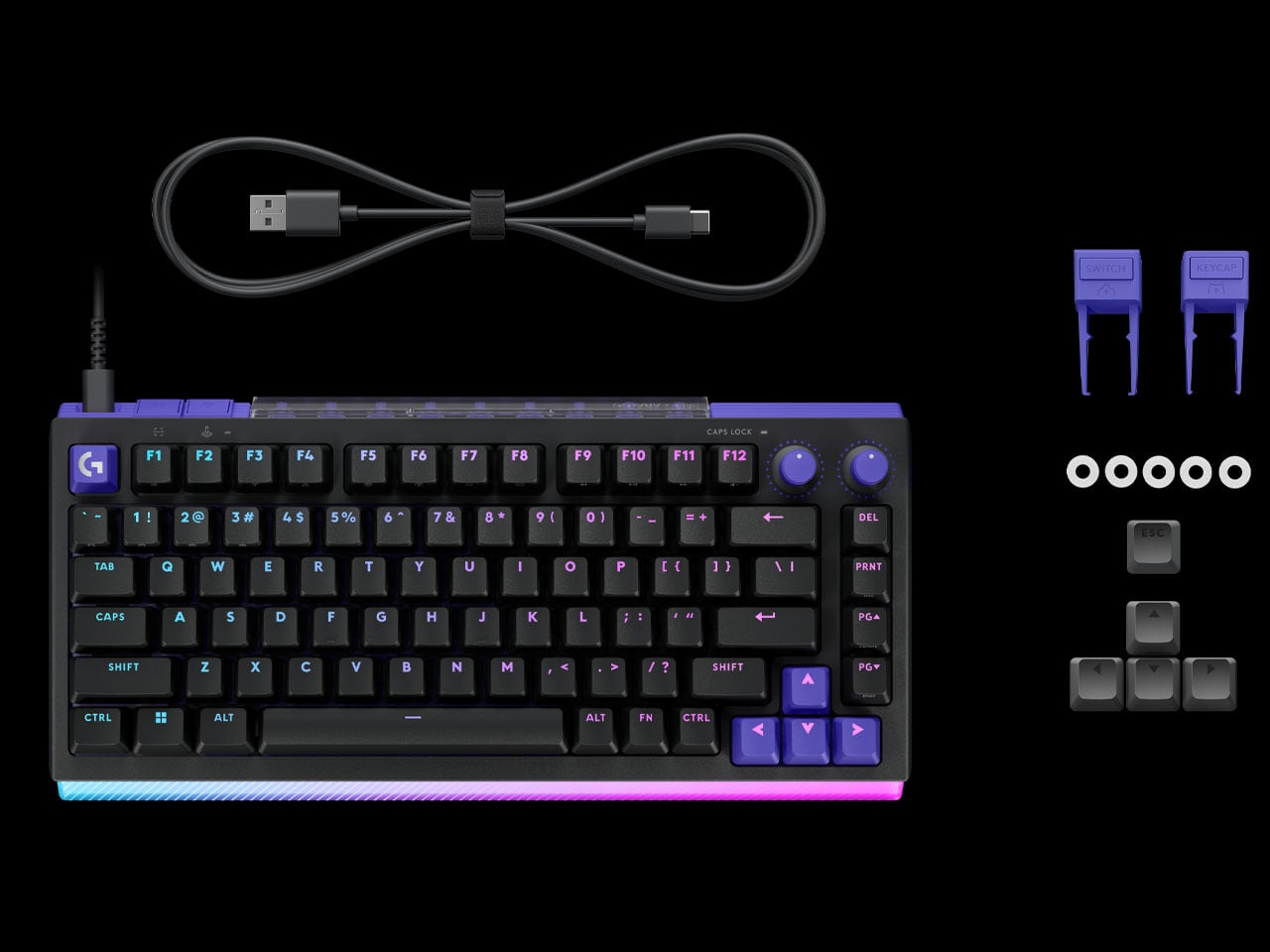
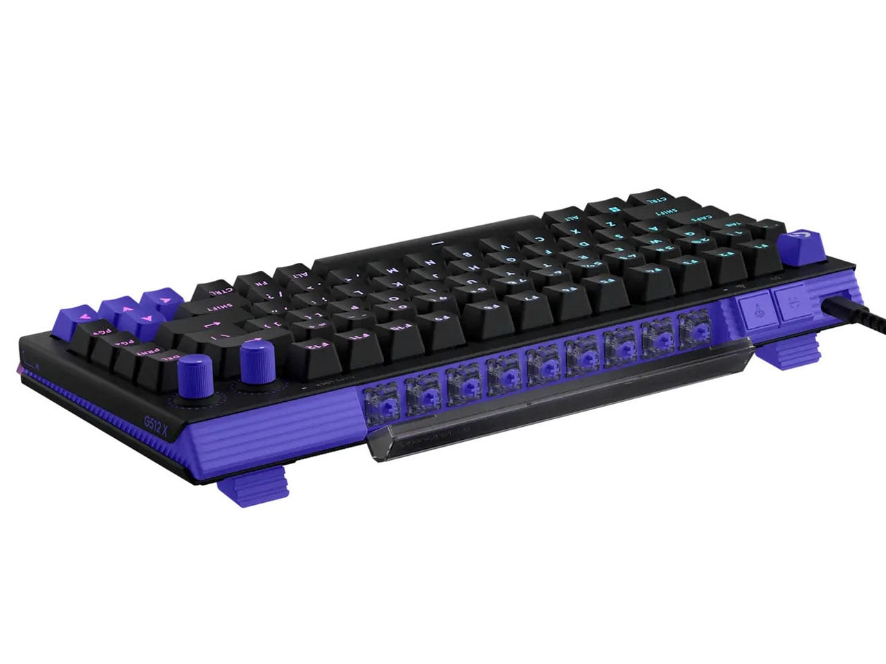
The keyboard’s construction features a durable aluminum top plate that enhances rigidity while maintaining a clean, understated design. Per-key RGB lighting remains fully customizable, allowing users to create personalized lighting profiles or sync effects with gameplay. The keycap pullers, switches, and SAPP rings are housed inside the storage space at the rear, avoiding visual clutter, focusing instead on performance and usability.

Available in both 75 percent and 98 percent layouts, the keyboard caters to different desk setups and user preferences. Whether opting for a compact footprint or a near full-size configuration, users still benefit from the same core features and strategically placed Dual Swap zones. Logitech G512 X keyboard is currently available in both black and white color options on the official website, while retailers will have it on 2 May. The 75-key layout is priced at $179.99, and the 98-key layout costs $199.99. Gamers can also go for the optional acrylic palm rest (sold separately starting at $40) that reflects the RGB lights of the keyboard lightbar and promises better comfort during long gaming sessions.


The post Logitech G512 X gaming keyboard is highly customizable with analog and mechanical switches first appeared on Yanko Design.

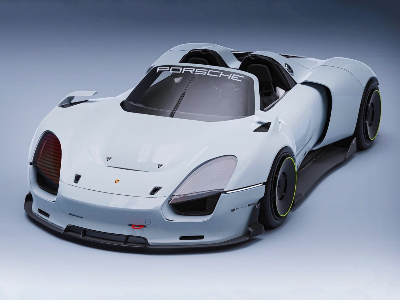
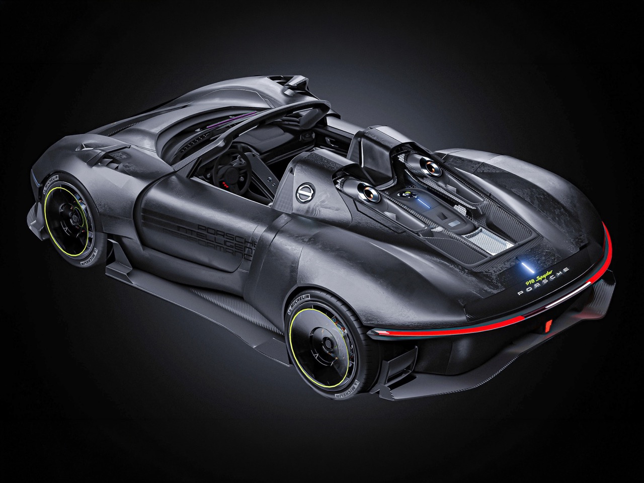
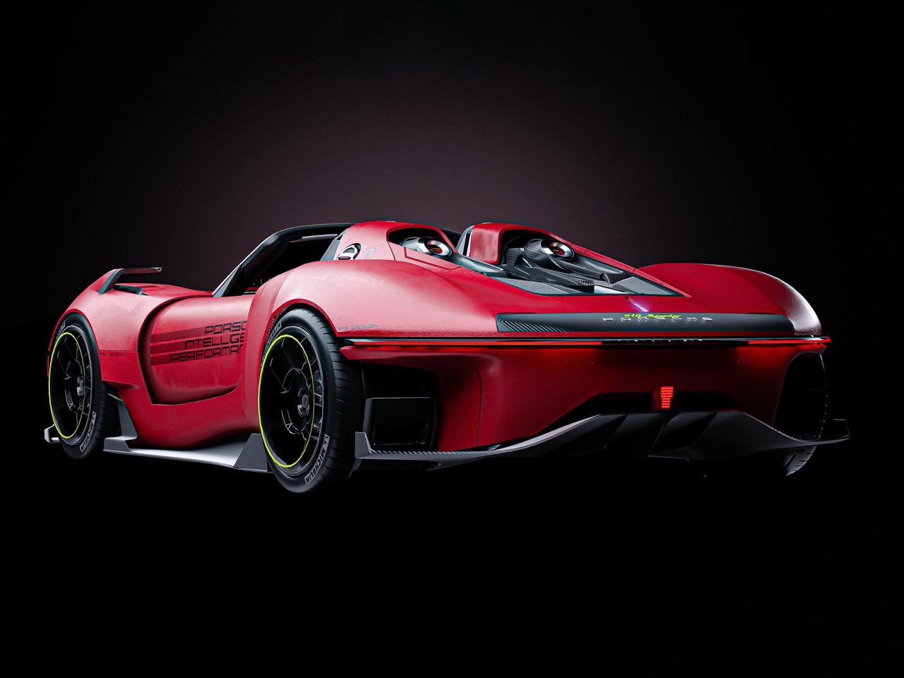
Porsche retired the 918 Spyder nameplate in 2015 after producing exactly 918 examples of their hybrid hypercar flagship, a vehicle that proved electric motors could enhance rather than dilute the driving experience at the absolute top of the performance spectrum. The car’s legacy persists in how thoroughly it shifted the conversation around electrification in high-performance vehicles, making battery packs and regenerative braking legitimate tools for lap time destruction rather than merely fuel economy optimization. Since then, Porsche’s halo vehicle strategy has fragmented across the electric Taycan range and increasingly extreme 911 GT variants, but nothing has directly replaced the 918’s specific combination of hybrid technology and hypercar theater. Independent designer Franklin decided that gap needed filling.
His Next 918 concept, rendered in meticulous detail and shared on Behance, reimagines what a modern Porsche hypercar could look like if the company stopped playing nice and went full gladiator mode against the current generation of track-focused exotics. Where the original 918 balanced supercar aggression with enough civility for real-world usability, Franklin’s interpretation commits entirely to the hypercar brief with a fixed-roof fastback body, massive wheel arches, and surfacing complexity that would require Porsche’s designers to abandon their typical restraint. The renders communicate serious 3D modeling craft, the kind of surface definition and lighting work that separates thoughtful design exploration from quick Photoshop fantasies. This concept asks whether Porsche’s next flagship should evolve the 918’s hybrid philosophy or just embrace pure, uncompromising speed.
Designer: Franklin 郭
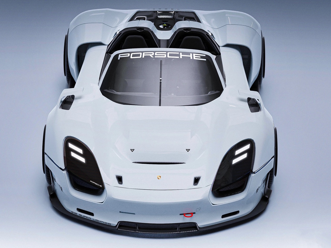
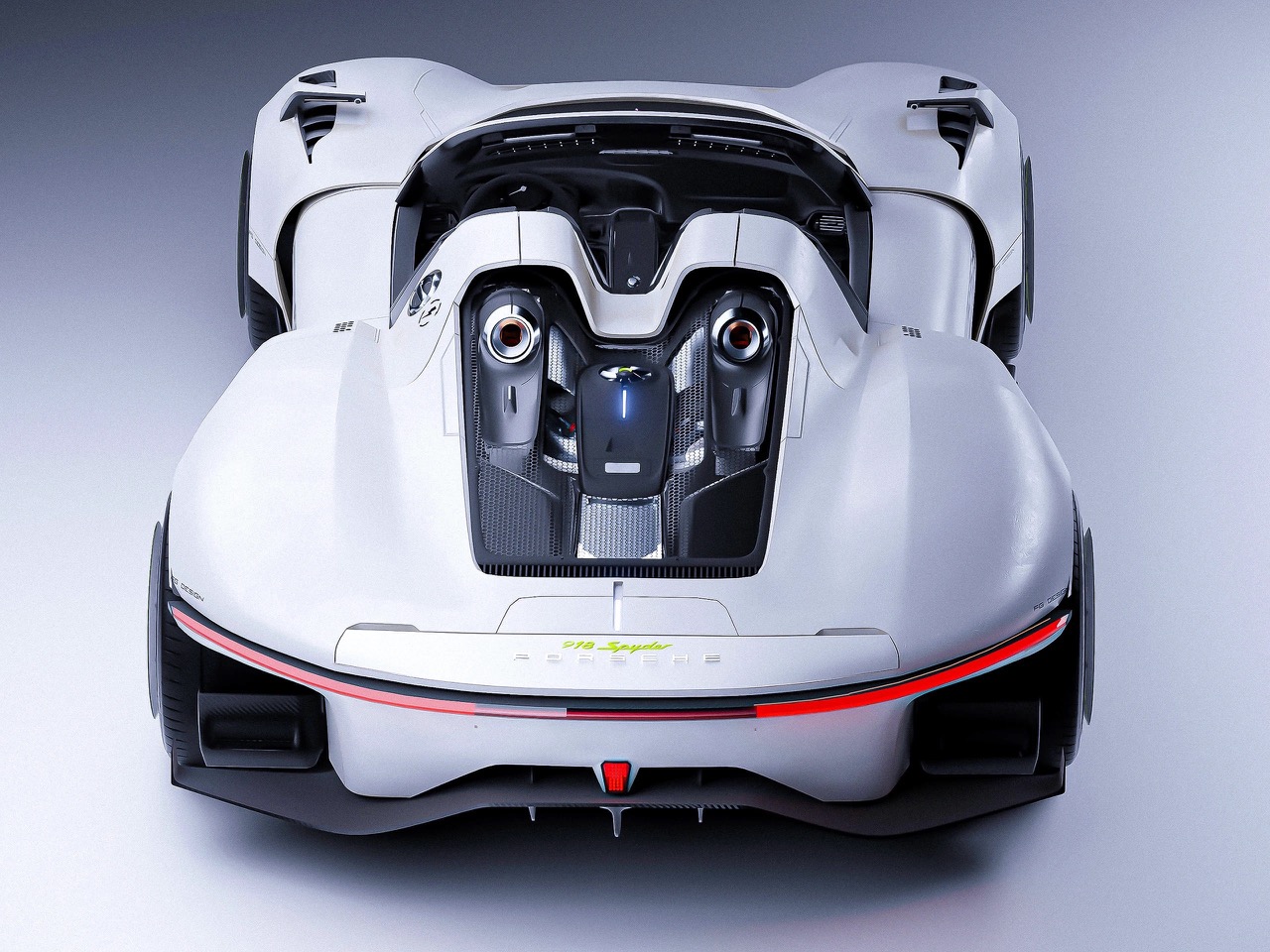
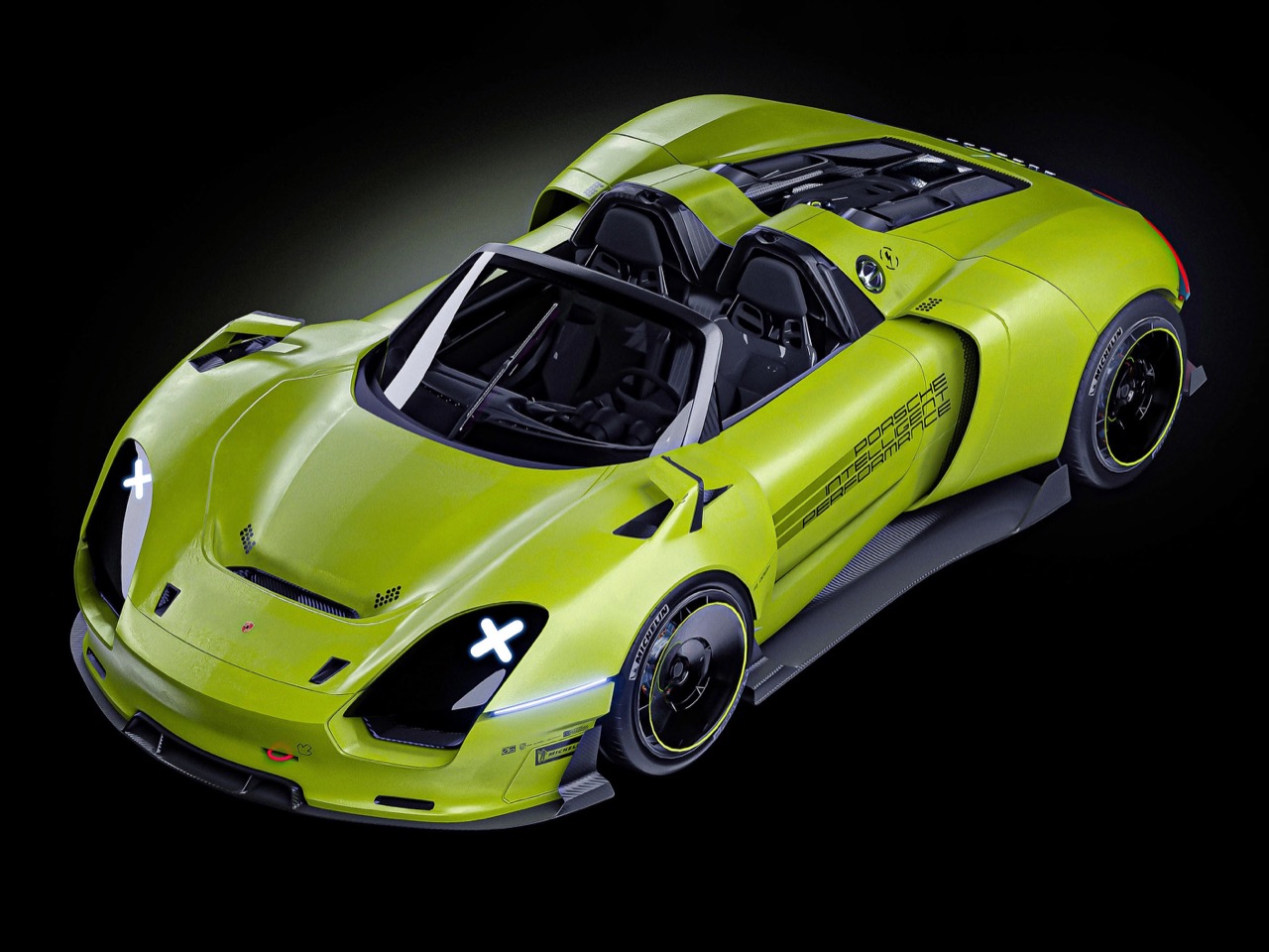
The most dramatic departure from the original 918 is the roofline, which Franklin has transformed from a removable targa configuration into a fixed fastback canopy that accelerates rearward with genuine aerodynamic intent. The greenhouse wraps around the cockpit in one continuous sweep of glass, providing massive visibility while compressing the rear deck into a truncated Kamm-tail form that would generate serious downforce at speed. This design choice alone signals a philosophical shift, the original 918 let you pull the roof panels and enjoy open-air motoring on a coastal highway, but Franklin’s version looks like it would protest anything slower than a flat-out Autobahn run. The fastback terminates in an integrated spoiler element that bridges seamlessly into the tail, below which sits a full-width light bar with layered elements that give it architectural depth rather than the thin LED strip Porsche has been using lately. The diffuser treatment underneath is pure carbon fiber aggression, a multi-element structure with vertical fins that would channel underbody airflow with the kind of efficiency you’d expect from a car engineered to hunt lap records rather than pose in Monaco.
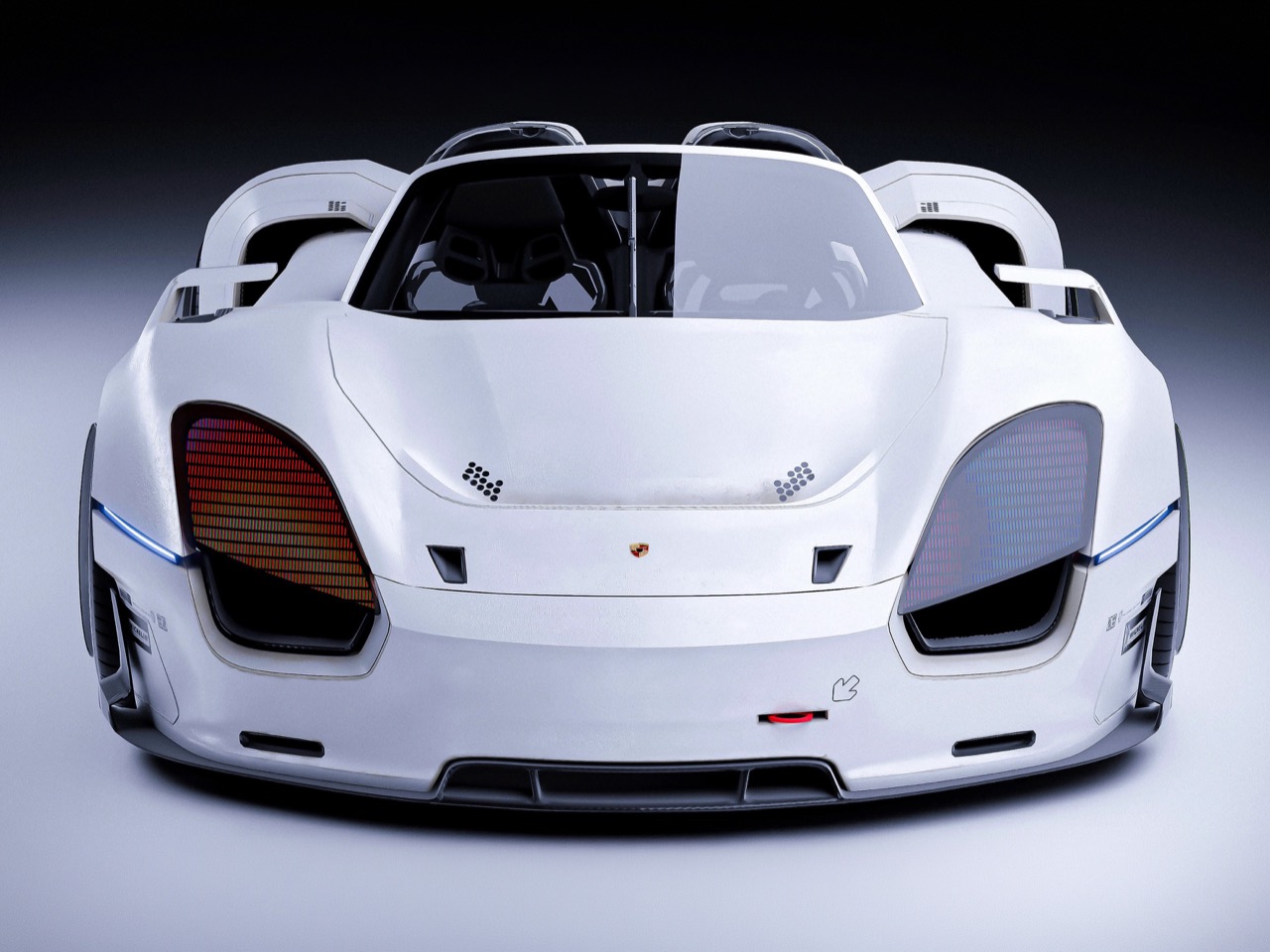
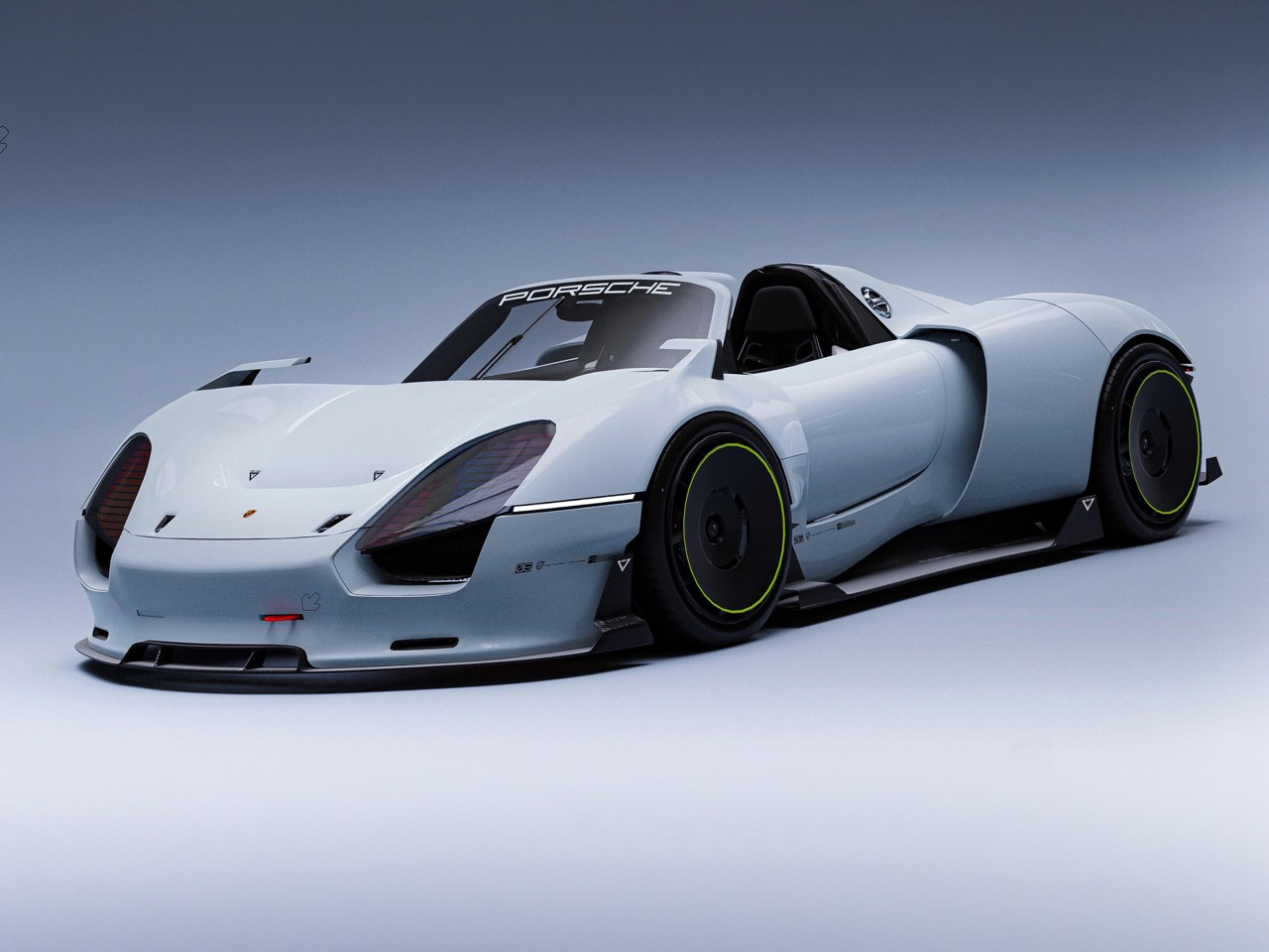
The front fascia borrows Porsche’s current four-point LED signature but expands it into something more architectural, with vertical DRL elements that aren’t just lighting theater but structural dividers segmenting the nose into distinct functional zones. The hood is long and domed slightly at the center, completely free of vents or scoops, a deliberate choice that keeps visual weight low and the proportions classic mid-engine GT. Franklin’s surfacing work is where the concept demonstrates genuine design maturity, the body isn’t cluttered with unnecessary creases or vents, instead relying on a single character line that runs from the front wheel arch through the door shut line and terminates at the rear fender. The wheel arches themselves are sculptural events, three-dimensional forms that bulge outward from the body with sharp, almost origami-like edge treatments where the bodywork folds inward to meet the wheel openings. This creates tension across the entire surface, preventing the forms from reading as soft or generic. The stance is weaponized, no lift, no ride height concession to real-world usability, just a car sitting exactly where it would need to be for maximum aerodynamic performance.
What makes this concept compelling beyond its visual aggression is how it forces the question of what a modern 918 successor should actually be. The original car’s hybrid powertrain made sense in 2013 when proving electrification could work at the hypercar level was still a radical statement, but the landscape has shifted dramatically. Rimac, Pininfarina, Lotus, and even Gordon Murray have all built hybrid or fully electric hypercars that make the 918’s 887 horsepower look almost quaint. If Porsche were to build a Next 918 today, would they chase four-figure horsepower with a tri-motor electric setup, or would they lean into what makes Porsche fundamentally different and build something around a screaming naturally aspirated flat-six paired with electric torque fill? Franklin’s concept doesn’t answer that question because it can’t, the design language works equally well wrapped around either powertrain philosophy. What it does communicate clearly is that the next 918, if it ever exists, would need to compete directly with the Valkyrie, the Senna, the AMG One, machines that have raised the hypercar performance ceiling so high that the original 918’s 6:57 Nürburgring time now sits outside the top ten fastest production car laps. The visual aggression Franklin’s baked into this concept acknowledges that reality.
The post This Porsche 918 Successor Concept Looks More Aggressive Than Anything Stuttgart Would Actually Build first appeared on Yanko Design.