Transforming Jeff Koons’ Balloon Dog into a fully functional lamp required more than good intentions and a licensing agreement. For French design/tech atelier Lexon, more than 50,000 hours of development went into the project, working through the specific challenge of preserving the sculpture’s iconic silhouette while engineering a translucent polycarbonate body capable of housing 400 LEDs and diffusing light cleanly. The result respects the form with a fidelity that goes well beyond cosmetic homage. Lexon, a French brand with 35 years of design experience and more than 250 awards behind it, brought its full technical vocabulary to bear on a project that demanded something genuinely new. The Balloon Dog Lamp Chromatic is the 2026 edition of that effort.
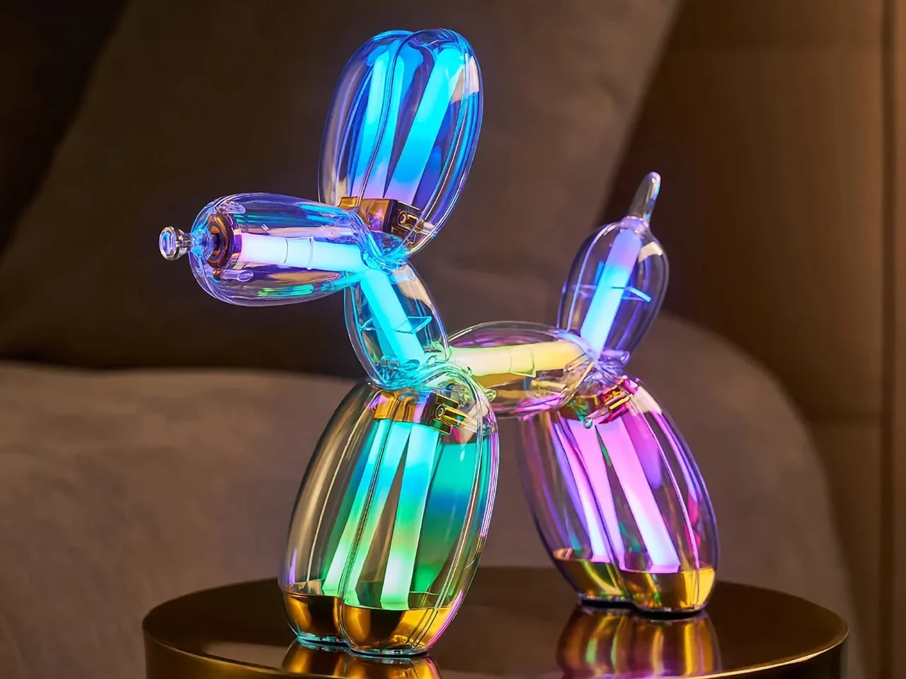
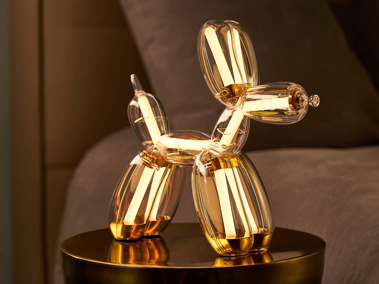
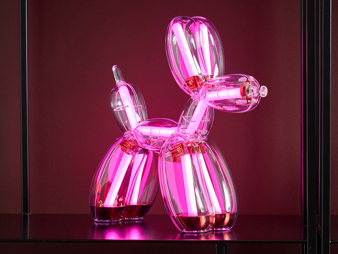
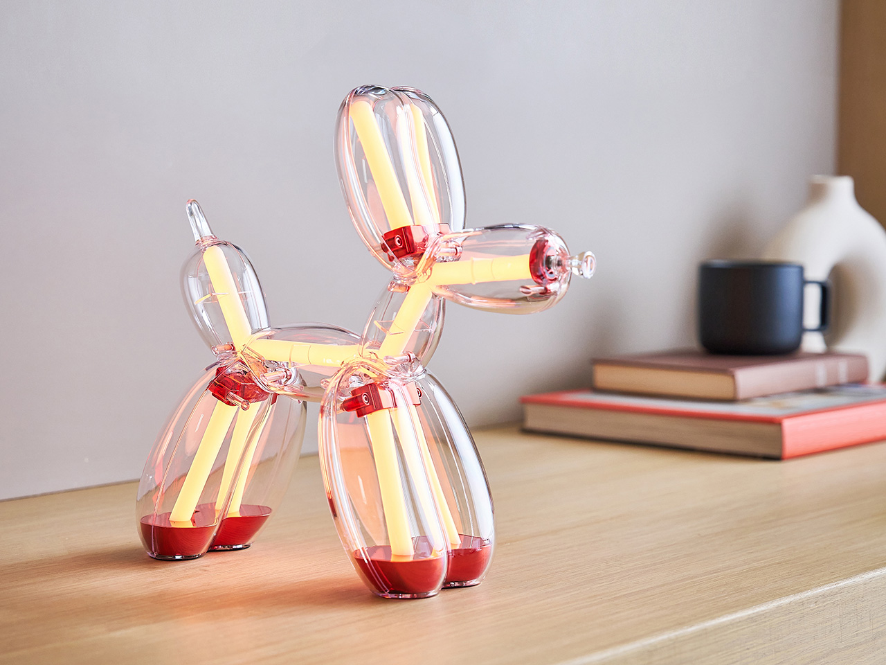
Four colorways define the Chromatic lamp: Platinum, Gold, Blue, and Red, each built from optical-grade polycarbonate chosen for its crystal-clear transparency and the way light moves through it, and anodized metal components that add a pop of color. The colorway identity comes through tinted zones within that transparent body, giving each piece a distinct chromatic character that works even when the lamp’s off. Inside that shell, LEDs operate entirely independently of the body’s tint, cycling through 9 color modes and 9 lighting animations regardless of which colorway body they sit inside. The 2026 edition introduced an additional layer of technical complexity, requiring Lexon to match finishes, tones, and material specifications across both the lamp and speaker product lines while maintaining consistent visual identity throughout. Each piece features Jeff Koons’ engraved signature on the front feet of the sculpture, maintaining a direct physical connection to the artist across all four versions.
Designer: Lexon x Jeff Koons
Click Here to Buy Now: $800. Hurry, limited edition! Pre-orders capped at two pieces per color, per product, per collector.
Jeff Koons has received France’s Légion d’Honneur and the U.S. Department of State’s Medal of the Arts, and his work has been presented at MoMA, the Guggenheim, and the Tate. The Balloon Dog specifically has spent decades accumulating cultural meaning at a pace few contemporary artworks can match. Its form borrows from a children’s party toy, scaled to monumental proportions in mirror-polished stainless steel, yet the conceptual charge it carries never tips into pretension. Koons has always worked around the democratization of beauty and the conviction that joy deserves serious artistic attention. Lexon, whose design philosophy centers on making beautiful objects genuinely accessible, found a natural creative partner in that worldview, and the Balloon Dog Lamp is the physical record of that alignment.
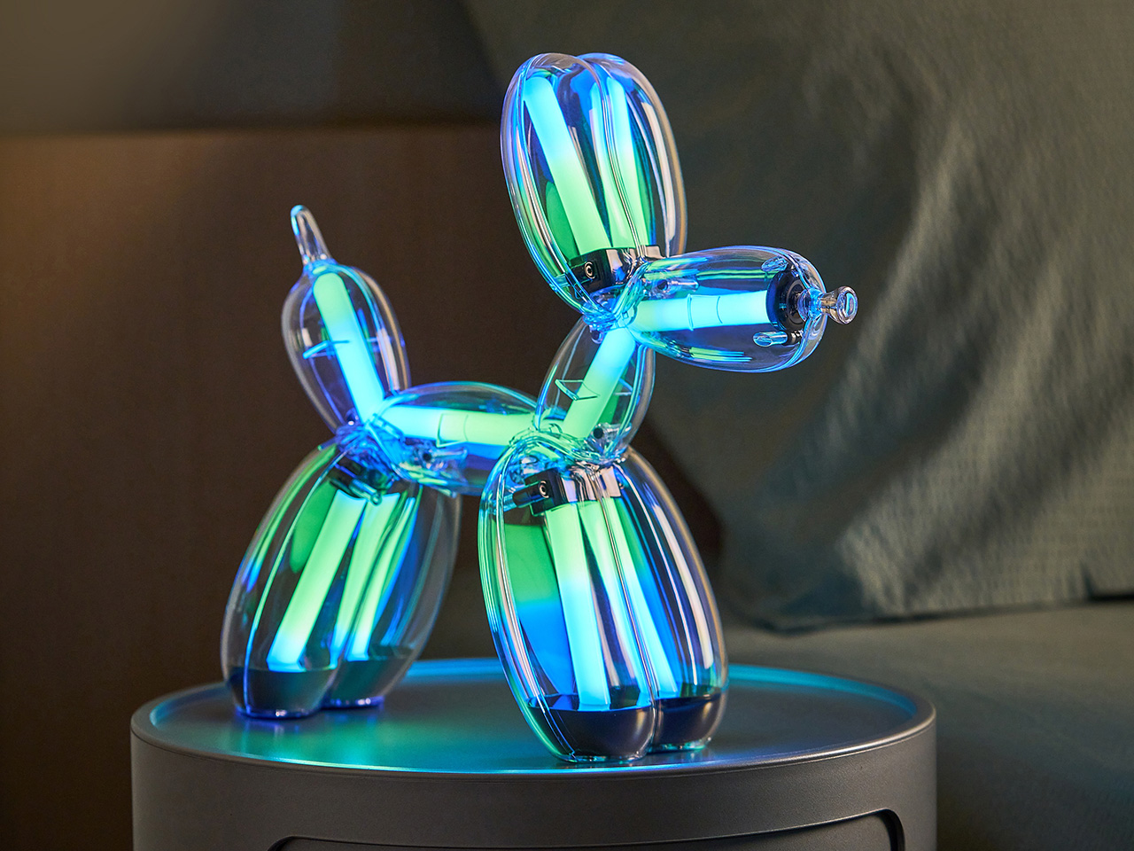
The lighting system offers a wide range of atmospheres offer a behavioral range that goes considerably deeper than a standard color-cycling product. Nine animations, each with their own sub-animations, move from soft warm whites and cool daylight tones through vivid RGB cycles, rainbow sequences, flashing, and strobe, giving the piece a genuinely different character depending on the occasion and the room. Brightness is fully adjustable, and all controls live on the nose of the sculpture, handling color, intensity, and effect from a single tactile point of contact. That decision keeps the lamp’s silhouette completely uninterrupted while making the interaction feel native to the object rather than bolted on. Battery life sits at five hours at 75% brightness, recharging via USB-C, and the lamp’s 29 × 11 × 28 cm footprint and 1 kg weight give it enough physical presence to anchor a space without overwhelming it.
Lexon’s proprietary Easy Sync Bluetooth technology allows an unlimited number of Balloon Dog Lamps to connect and synchronize simultaneously across color, effect, and brightness. That feature transforms what is already a compelling standalone object into the foundation of something considerably more ambitious, particularly for collectors building across multiple colorways. Whether displayed across a room or grouped together, lamps running Easy Sync work in perfect unison, allowing collectors to create immersive multi-piece lighting compositions.
The first Lexon x Jeff Koons edition reached collectors and design enthusiasts across more than 90 countries, a number that speaks to Koons’ global cultural reach and Lexon’s ability to execute a collectible that resonates well beyond the design industry. The Chromatic Collection builds on that foundation with a firm no-reissue commitment across all four colorways and a purchase cap of two units per color per collector, keeping the experience personal and the supply genuinely controlled. Orders are fulfilled on a first-come, first-served basis through monthly shipping slots, with worldwide shipping beginning June 2026. Pre-orders are live now at lexon-design.com. At $800 per piece, the Balloon Dog Lamp Chromatic brings four decades of Koons’ cultural legacy off the gallery wall and onto your side table, where it lights your room, holds its own as a sculptural object, and reminds you every evening that great art and everyday life were never meant to be kept apart.
Click Here to Buy Now: $800. Hurry, limited edition! Pre-orders capped at two pieces per color, per product, per collector.
The post Lexon Turned Jeff Koons’ Most Famous Sculpture Into The Coolest Statement Lamp You Can Actually Own first appeared on Yanko Design.