Seven years ago, Energizer walked into MWC 2019 with a phone that weighed as much as a small paperback novel and measured 18mm thick, all in service of an 18,000mAh battery. The P18K Pop became a symbol of the era’s battery ceiling: raw capacity was possible, but only at the cost of a device that felt like a punishment to carry. The engineering logic was blunt and honest. Lithium-ion cells have a fixed energy density, so the only way to scale up capacity was to scale up size. Energizer took that math to its logical extreme, produced a certified brick, and quietly cancelled the phone before it ever hit shelves. The tradeoff felt fundamental, almost physical, like a law of nature. Then silicon-carbon chemistry started rewriting the rulebook.
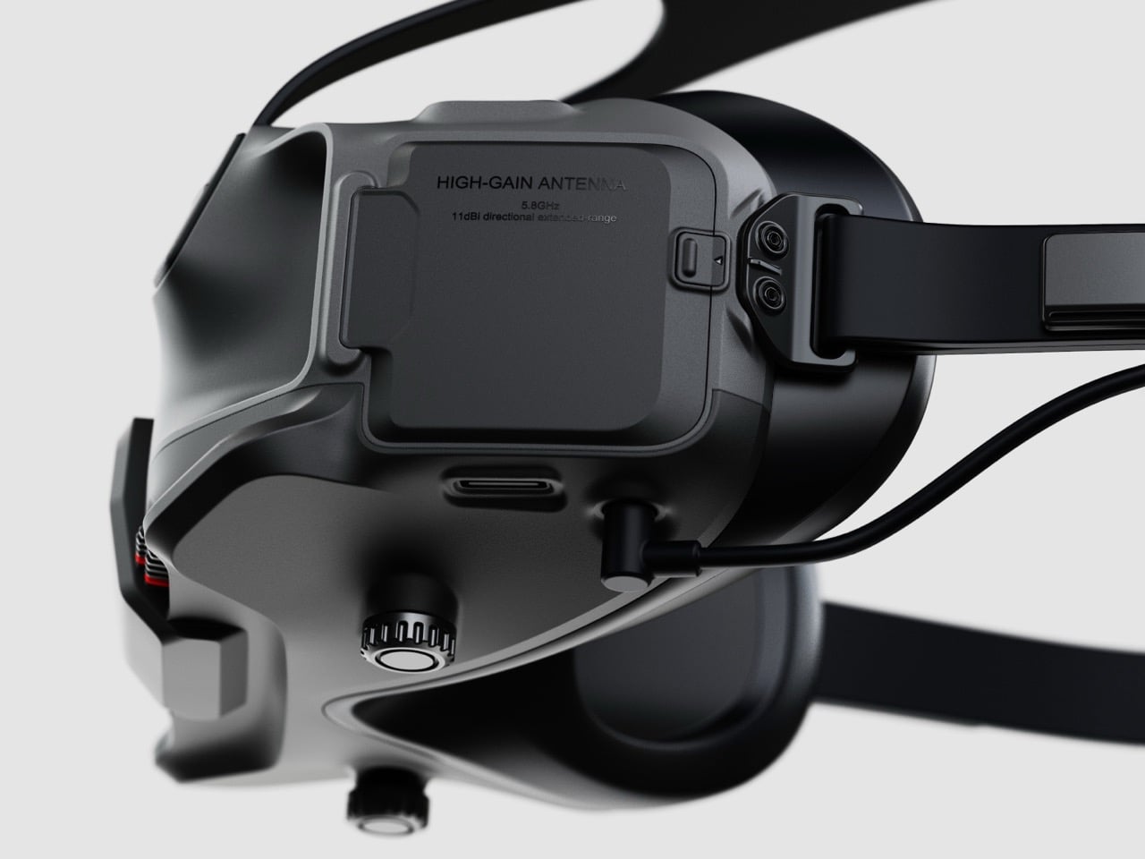
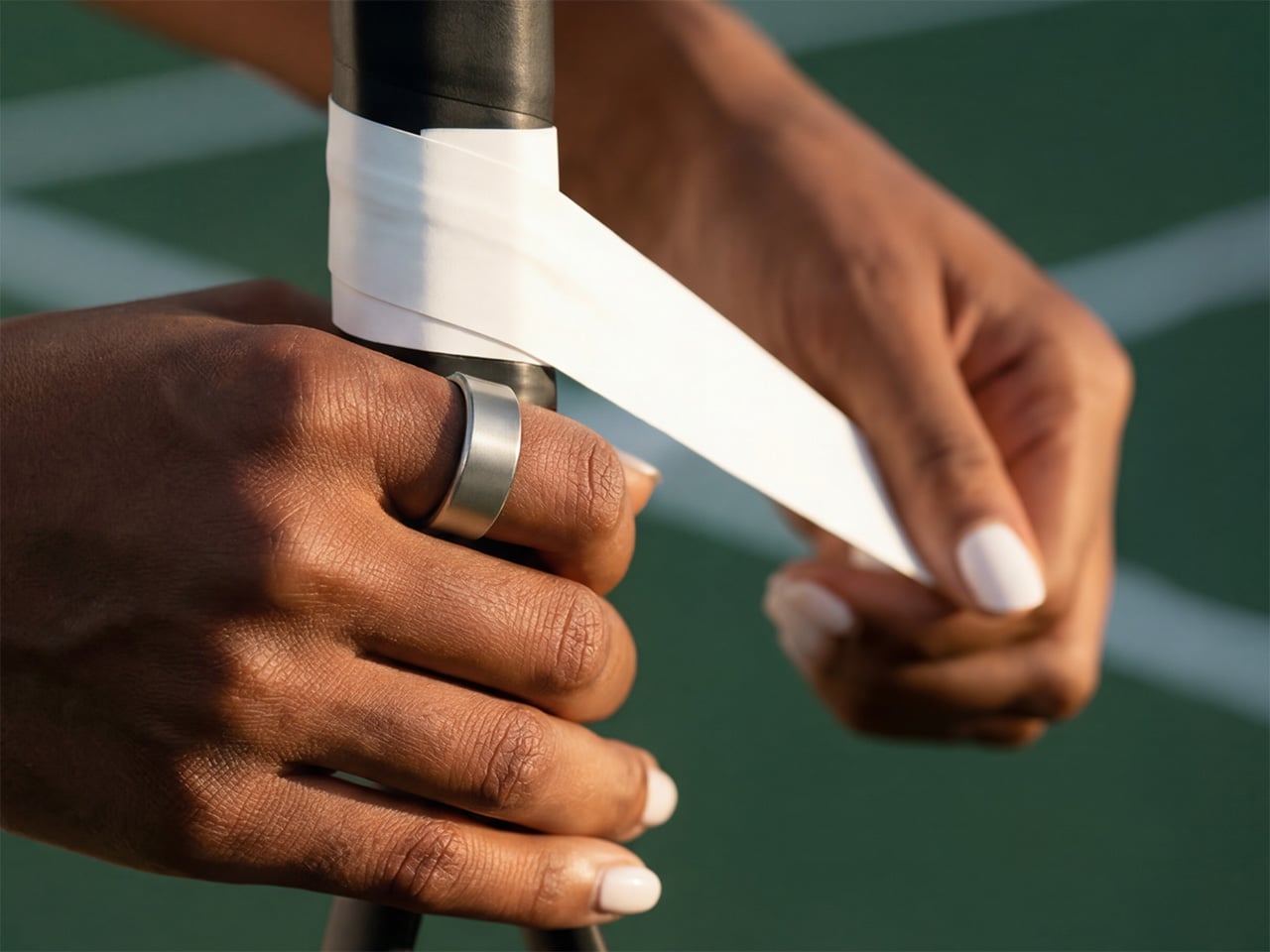
At MWC 2026, we went hands-on with Honor’s Magic V6 foldable and found ourselves staring at battery layers measuring 0.15mm thick, a silicon content of 32%, and a cell that delivered 6,660mAh inside one of the slimmest foldable phones on the market. That same materials platform is reportedly now scaling toward something significantly larger. A new leak on Weibo suggests Honor is testing a phone with a 12,000mAh battery, a figure that would set a new high-water mark for mainstream smartphones, as part of a pipeline that will reportedly expand the company’s 10,000mAh-plus lineup to seven devices total. The Energizer P18K Pop needed 18mm of thickness to reach 18,000mAh. Honor is apparently aiming for 12,000mAh in a phone you would actually want to carry.
Designer: HONOR

Three of the four existing 10,000mAh-class smartphones on the market already belong to Honor, with the only outsider being Vivo’s Y600 Pro at 10,200mAh. The leak doesn’t confirm product names, but rumors point toward the Honor X80, Honor Power 3, and a new WIN 2 series as likely homes for these big-battery ambitions. Oppo, Xiaomi, and Huawei are all reportedly working on their own large-capacity devices, but the approach is measured, one model each, released cautiously to test market appetite. Honor’s strategy reads differently. Seven phones in a single category is a portfolio play, a deliberate push to own the mental real estate around battery life the way Hasselblad owns it around mobile photography.

The 12,000mAh figure carries one genuinely hard engineering question: fast charging. A 10,000mAh cell already strains conventional thermal management at 65W or above, and 120W on a cell that size has historically meant a phone that doubles as a hand warmer. The dual-cell design reportedly being tested on a separate 10,000mAh model in this same pipeline is Honor’s likely answer to that problem, splitting the load across two cells to manage heat and charging efficiency simultaneously. Whether that architecture migrates to the 12,000mAh device as well remains unconfirmed, but the fact that Honor is testing both configurations in parallel suggests the company has thought carefully about the thermal math rather than just chasing the headline number. The Energizer P18K Pop chased the number. Honor appears to be chasing the phone.

The post Honor Is Building a 12,000mAh Phone That Proves the Battery-vs-Thinness Tradeoff Was Always a Lie first appeared on Yanko Design.