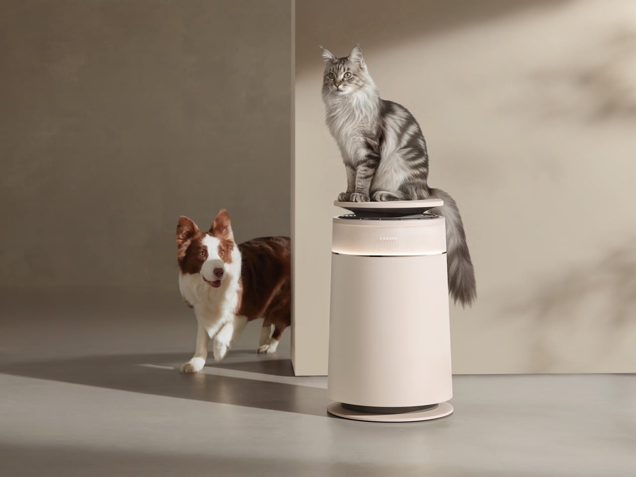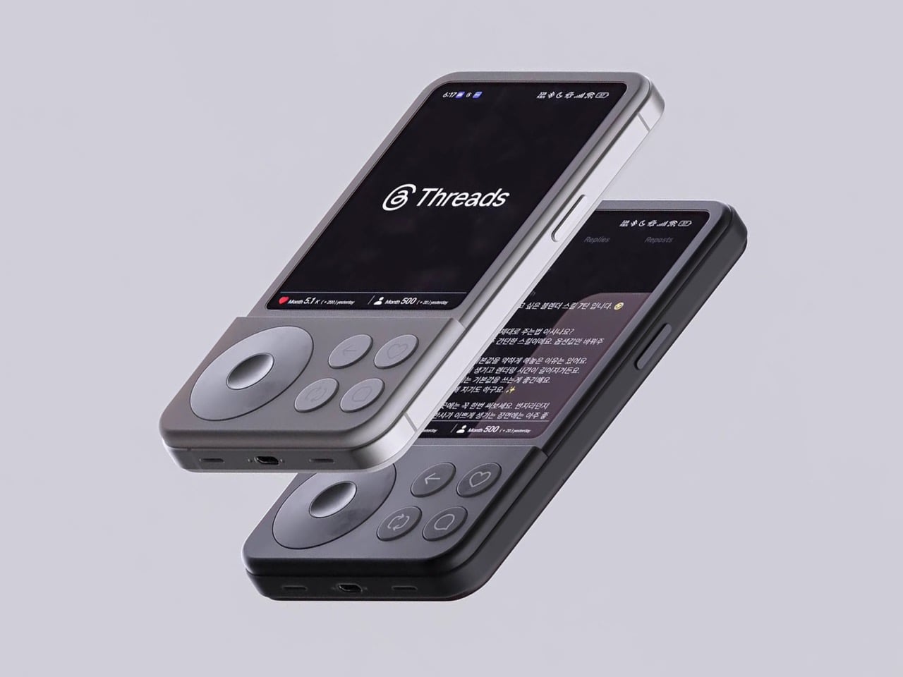
DJI built the pocket gimbal camera market almost entirely by itself, and for years nobody credible showed up to contest it. The Osmo Pocket line became the default recommendation for vloggers, travel creators, and anyone who wanted stabilized footage without strapping a gimbal rig to their wrist, and DJI knew it. Then the US government started making noises about Chinese drone manufacturers, DJI’s core business landed on security watchlists, and suddenly the ecosystem that looked impenetrable started looking like a liability. Canon has been watching all of this, and a newly published April 2026 patent suggests the imaging giant has decided this is exactly the moment to move.
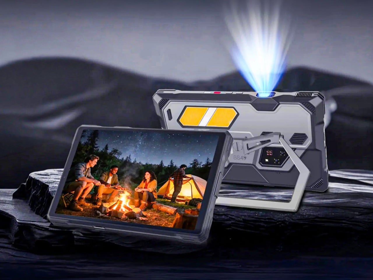
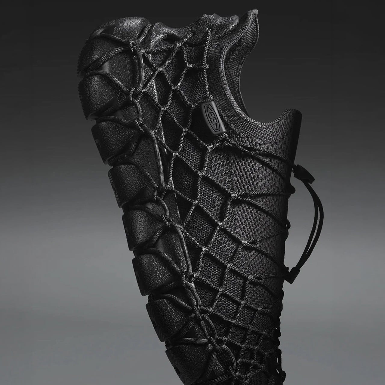
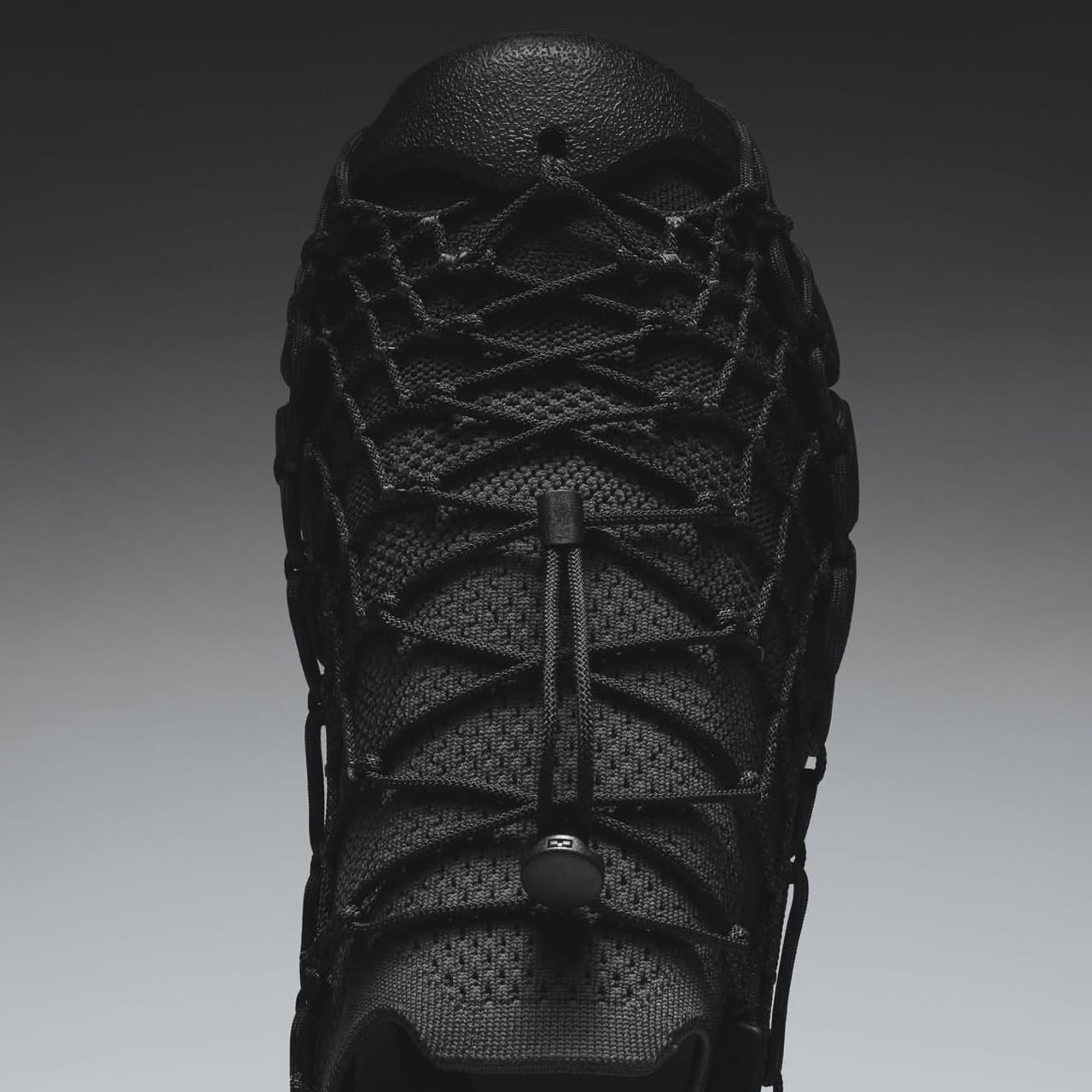
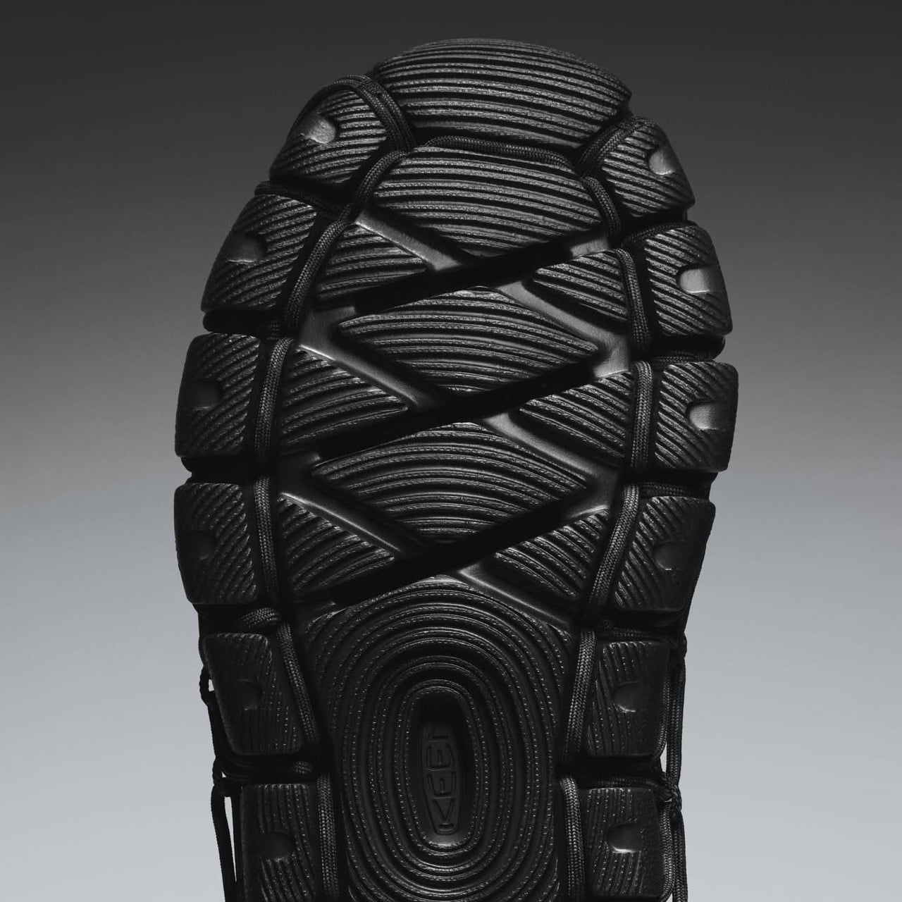
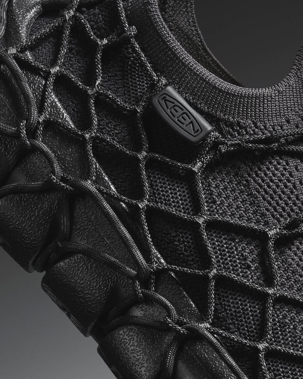
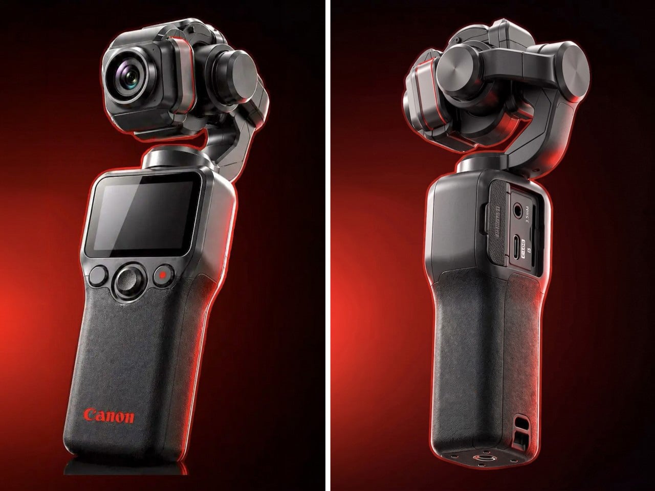
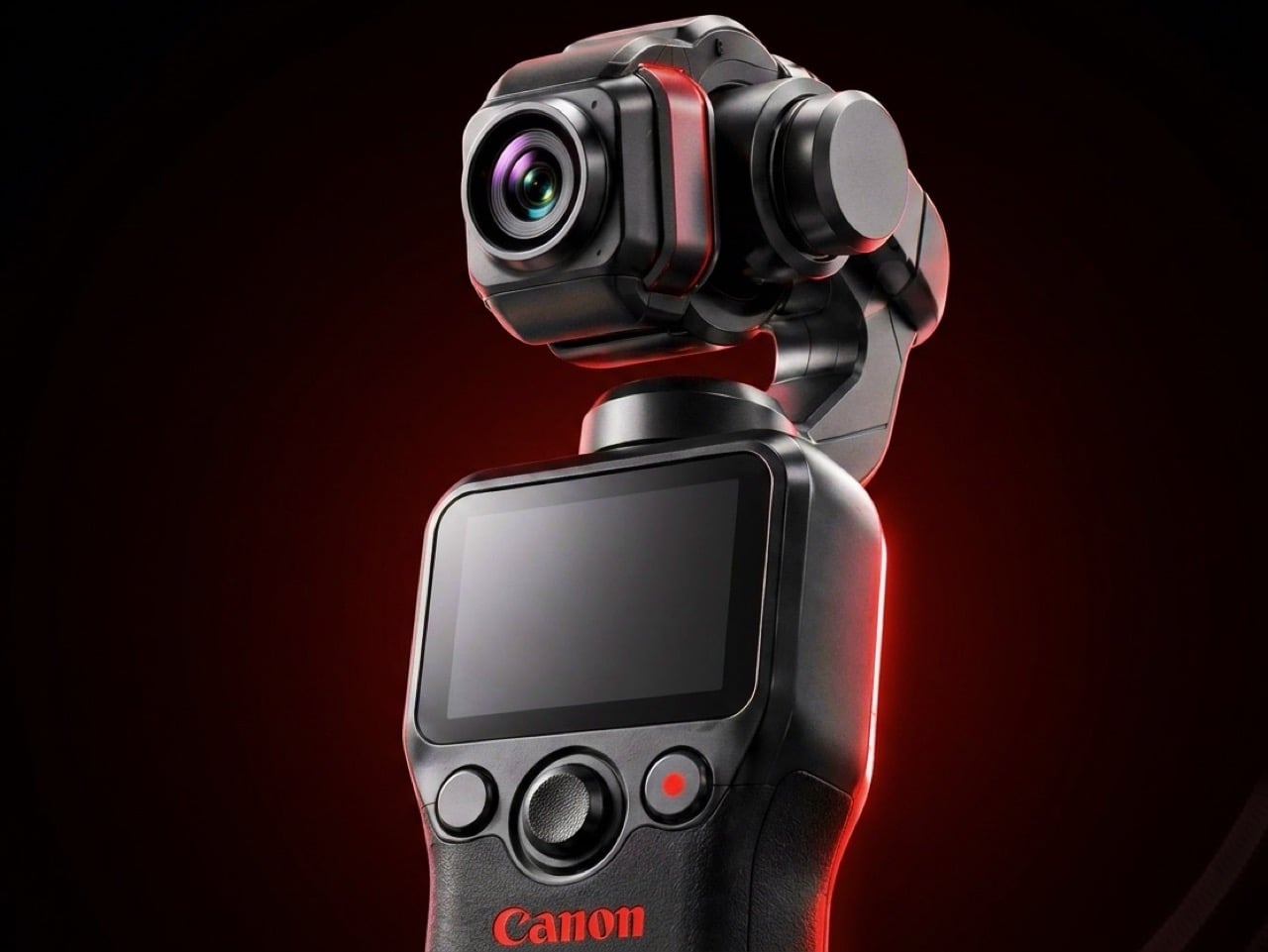
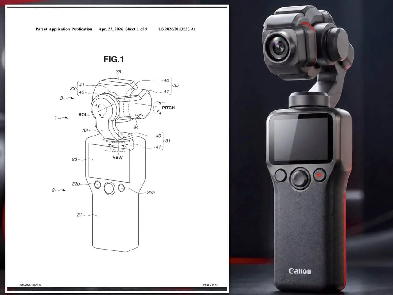
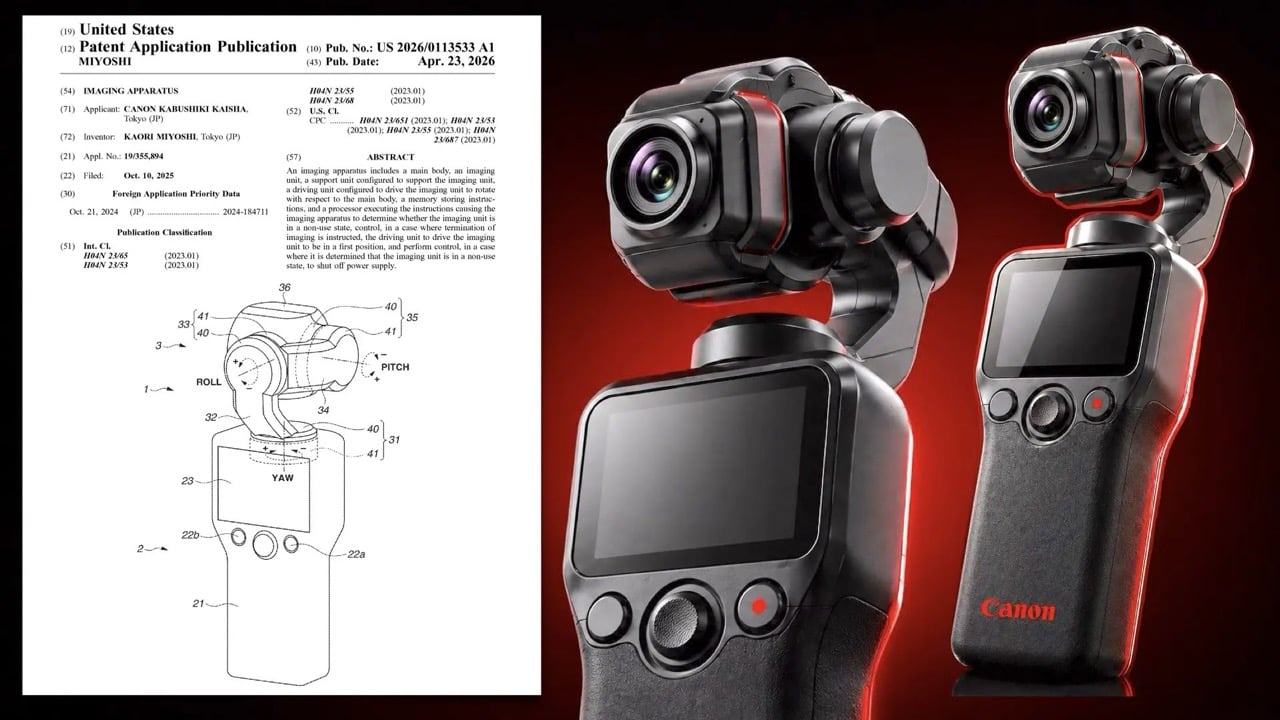
The patent describes a compact handheld camera with a fully integrated three-axis gimbal, a fixed lens, a grip with a screen, and a folding mechanism that protects the stabilizer head during storage. Canon has actually filed three gimbal-related patents since 2021, each one progressively more practical than the last, and this newest filing is the first that reads like an actual product brief rather than a thought experiment. The key engineering detail is a smart shutdown sequence that guides the gimbal into a safe folded position before cutting motor power, using magnetic sensors and image analysis to confirm the camera is no longer in use. It sounds minor until you realize that mechanical wear from limp-motor shutdowns is one of the more quietly frustrating failure modes in the category.
Designer: Canon
That three-patent arc maps almost perfectly onto how Canon typically approaches a new product category. The 2021 filing was the moonshot, an interchangeable-lens gimbal camera with cinema-level mechanical ambition that would have been extraordinary if Canon could have made the economics work. It could not, at least not at a price point a travel vlogger would stomach. The 2025 follow-up introduced an auto-flipping mechanism for continuous shooting without interruption, solving a specific operational frustration rather than reimagining the whole device. This latest filing drops the interchangeable lens entirely and focuses on fixed-lens portability with intelligent behavior baked into the motor control system. That progression from wild ambition to refined practicality is Canon doing what Canon does: taking its time, watching the market develop, and showing up when it has something worth shipping.
The competitive timing could not be more pointed. DJI launched the Osmo Pocket 4 in April 2026 with a 1-inch sensor and 4K at 240fps, confirmed a dual-lens Osmo Pocket 4P with 3x optical zoom, and faces the Insta360 Luna Ultra coming in May with a Leica-tuned dual-cam system and 6x in-sensor zoom. Canon is walking into a category fight that has never been more crowded or more technically advanced. The honest question is whether intelligent power management and Canon’s legendary color science, the warm, true-to-life rendering that photographers have trusted for decades, can compete against DJI’s hardware spec escalation and Insta360’s modular innovation. Canon’s answer, reading between the patent lines, seems to be that smarter behavior and a name creators already trust is a more durable advantage than chasing the highest frame rate number.
None of this guarantees a product ships. Patents are promises Canon makes to itself, not to consumers, and the 2021 interchangeable-lens concept never made it past the drawing board. What separates this filing from that one is the granular specificity of the engineering detail. When a patent document gets precise about magnetic sensor placement, motor position thresholds, and the exact sequence of a shutdown routine, it suggests the people writing it have thought about tolerances and failure modes, which tends to happen closer to a factory floor than a whiteboard. Canon has spent five years doing the homework on this category. The timing, with DJI’s business under regulatory clouds and the content creator market larger than it has ever been, suggests it may finally be ready to hand it in.
The post Canon Is Stealing DJI’s Content Creator Crown With Its Own Osmo Pocket Rival first appeared on Yanko Design.