A Laptop With a Solar Panel Lid Just Showed Up at MWC 2026: Hands-on with Oukitel RG14-P

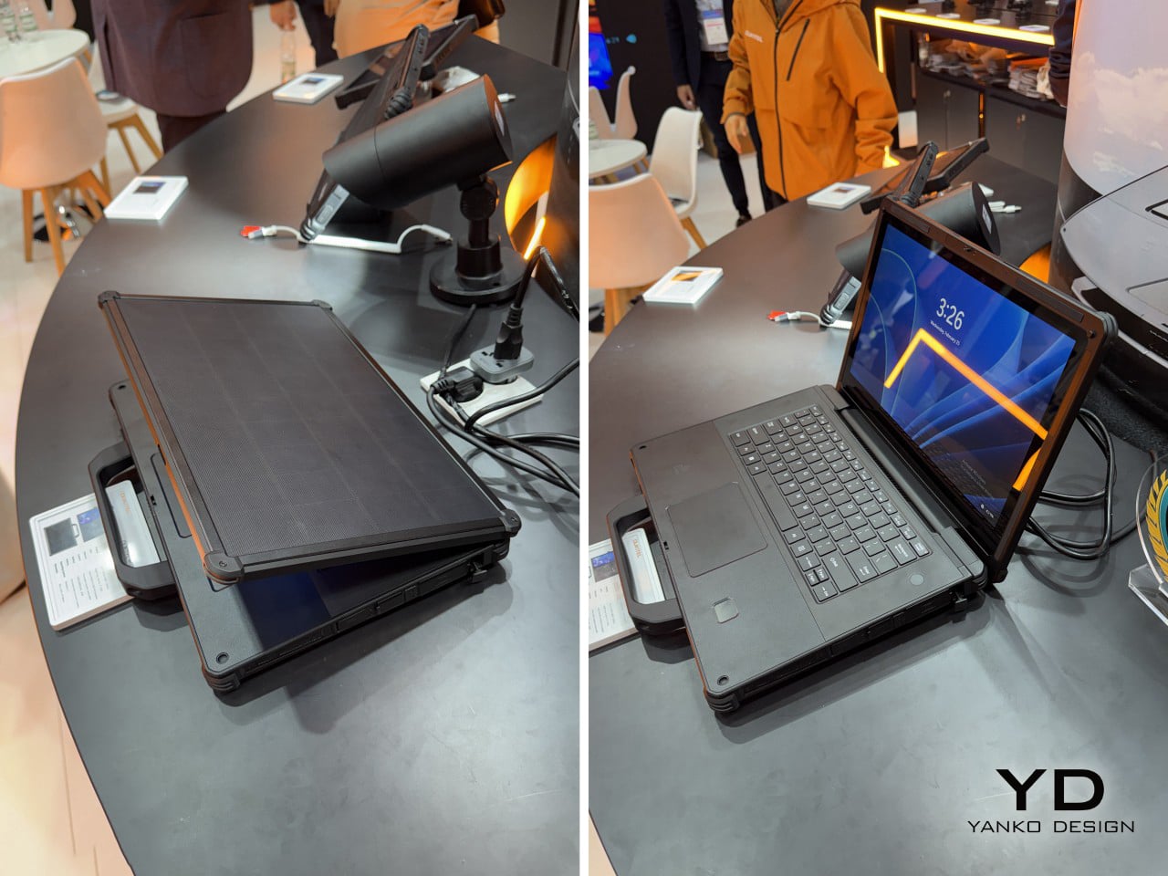
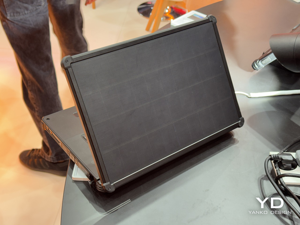
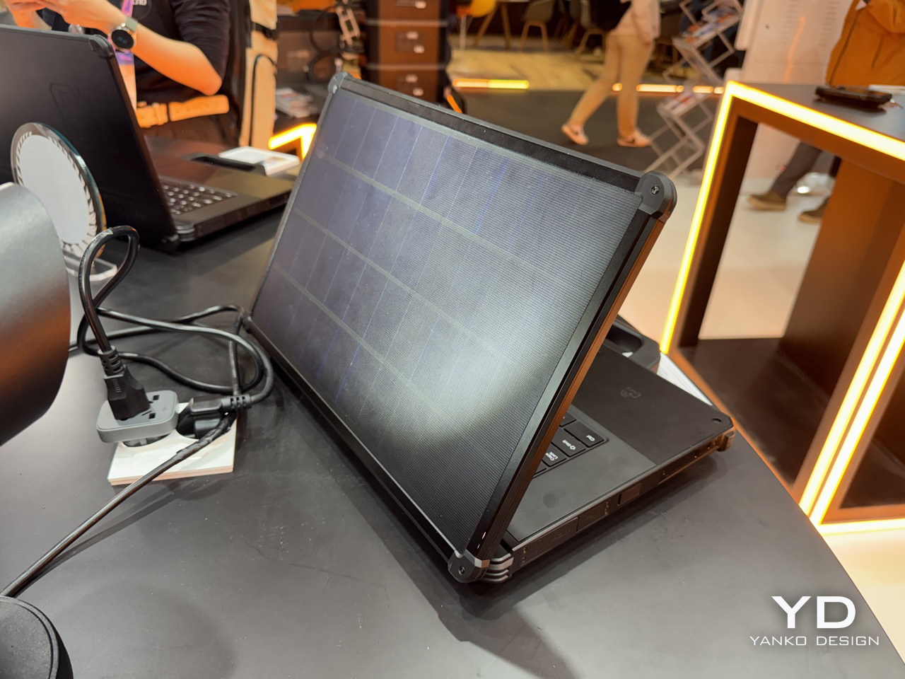
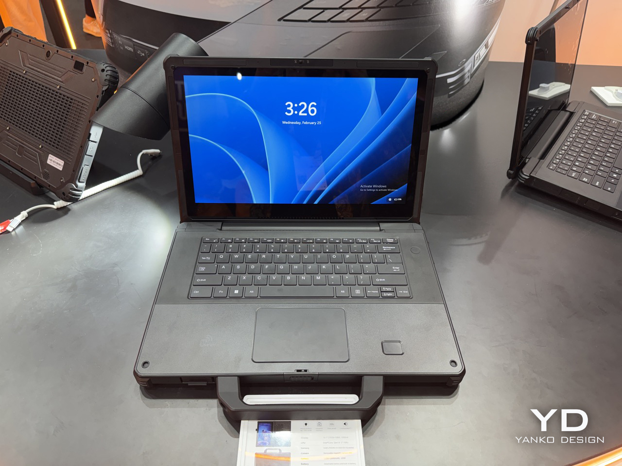
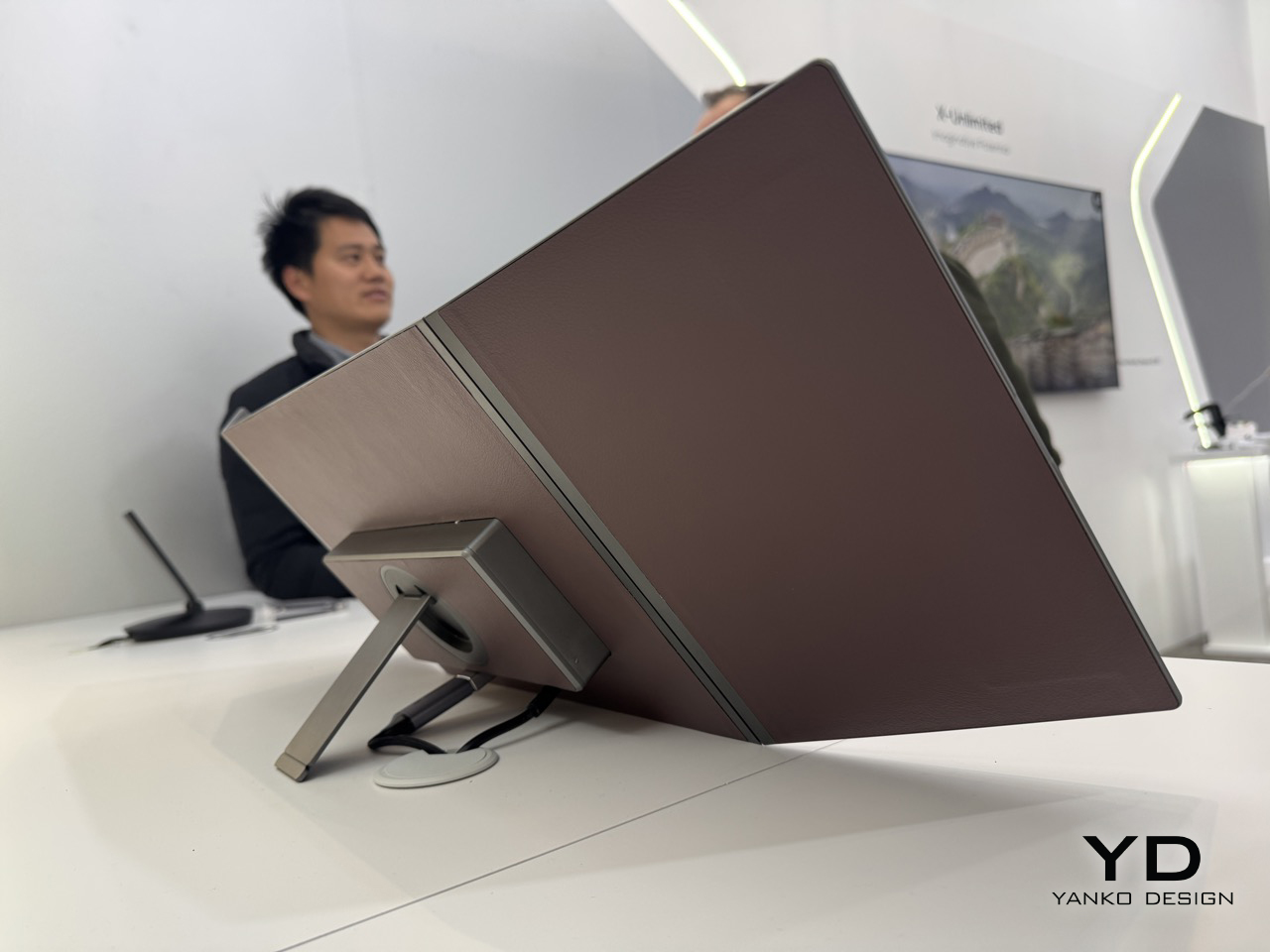
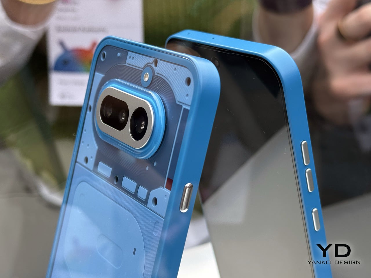
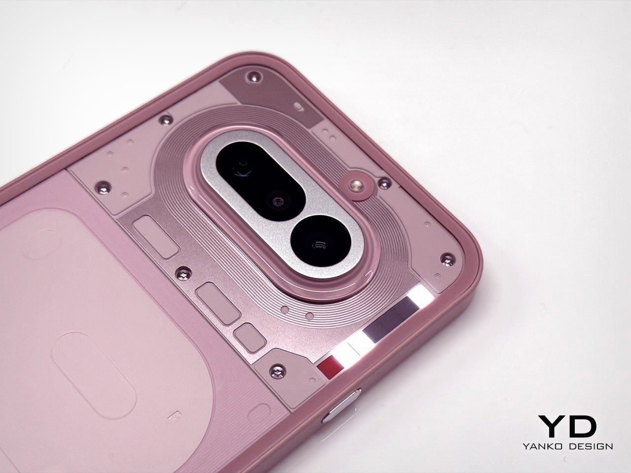
Solar charging on a laptop lid has been a niche curiosity since Samsung tried it with the NC215S netbook in 2011, a machine that needed two full hours of midday sun to buy you a single hour of runtime. Rough trade. The idea largely disappeared after that, surfacing occasionally in concept form, most recently with Lenovo’s Yoga Solar PC at MWC 2025, which packed 84 solar cells into an ultraslim lid at a reported 24.3% conversion efficiency. Lenovo’s version was sleek, consumer-friendly, and still a concept. Oukitel’s RG14-P, shown at MWC 2026 in Barcelona, skips the concept stage entirely and ships the thing.

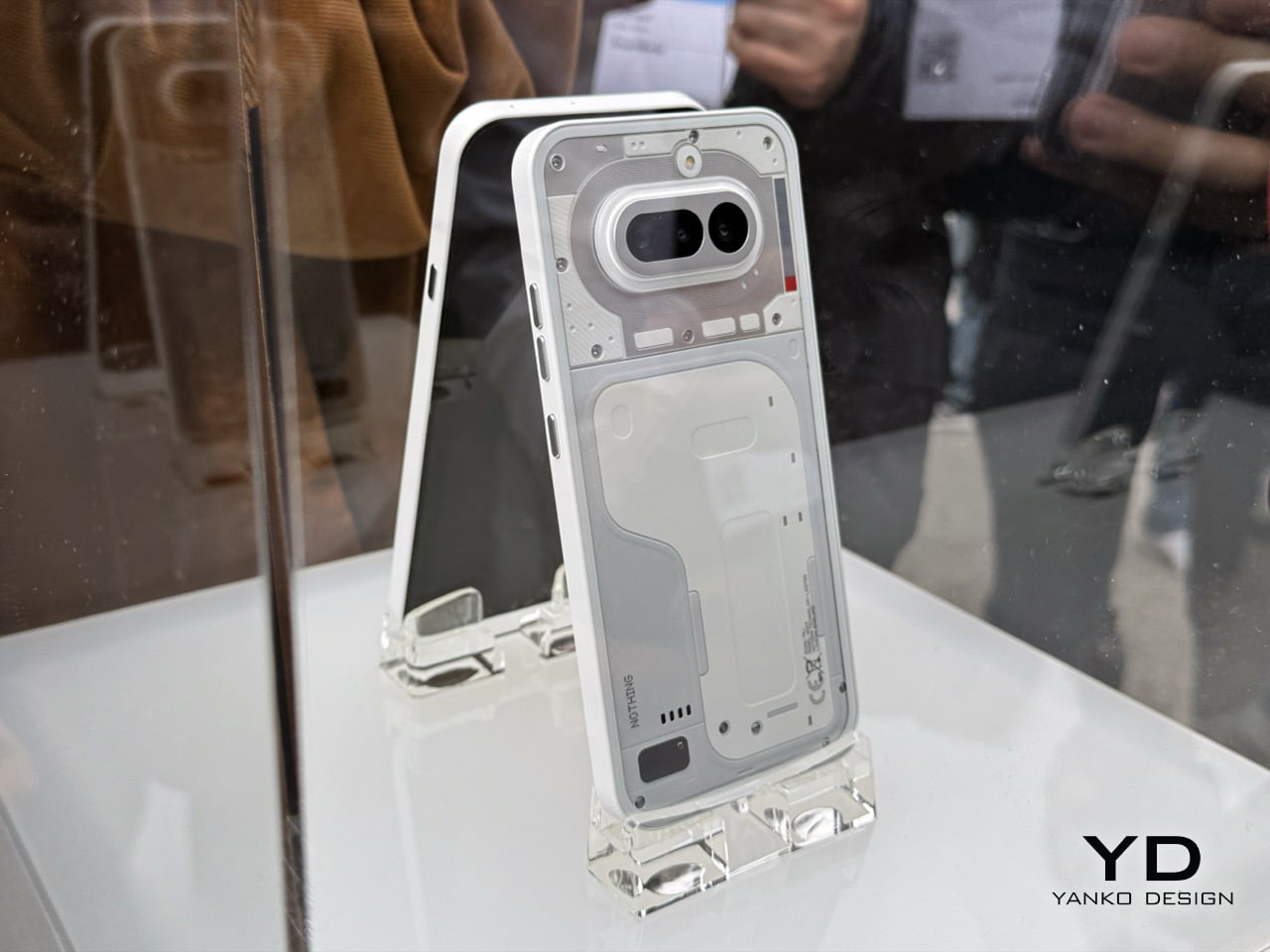
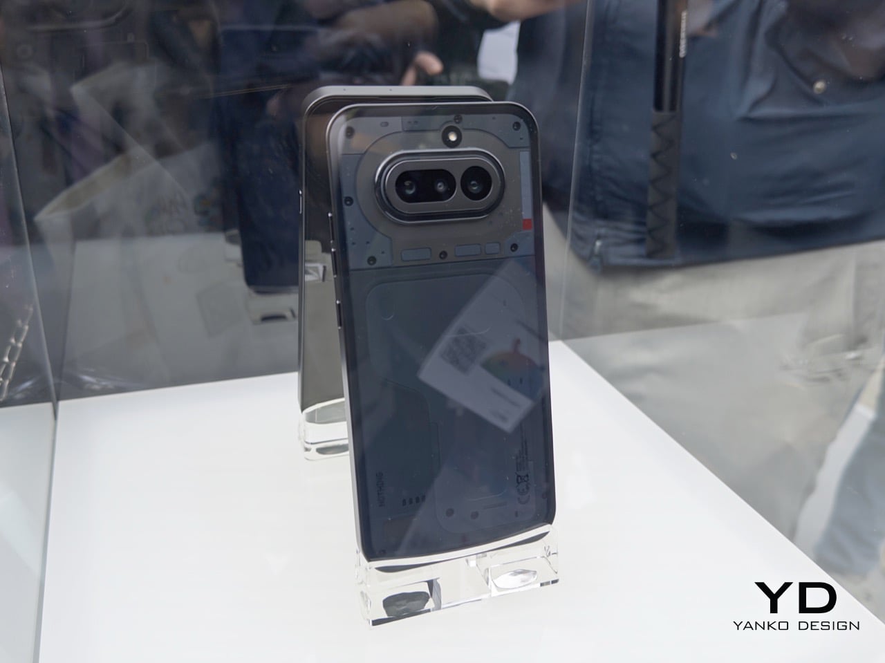
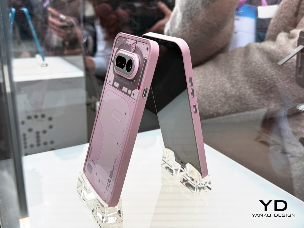
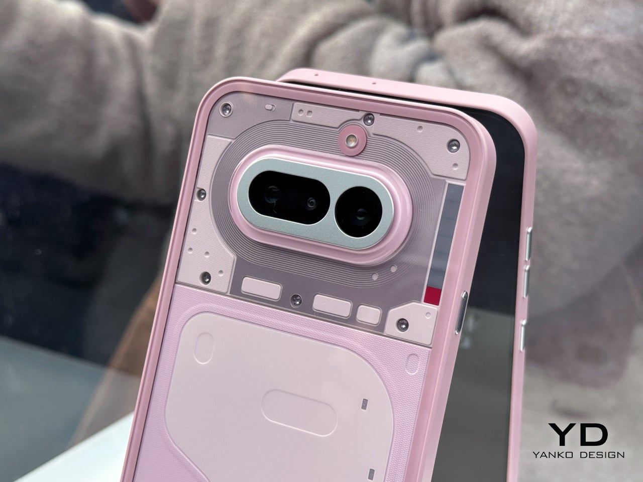
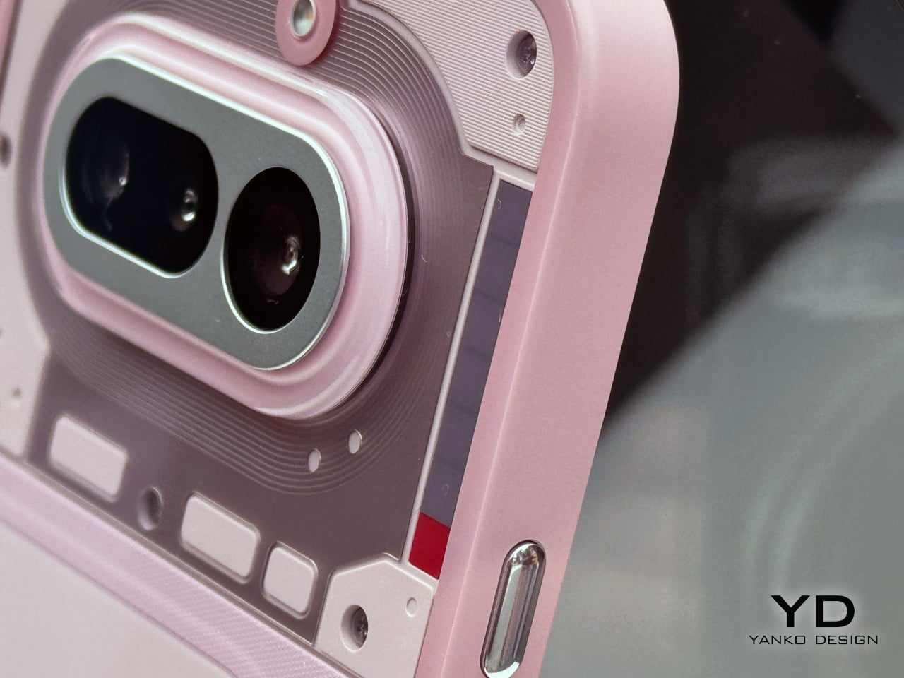
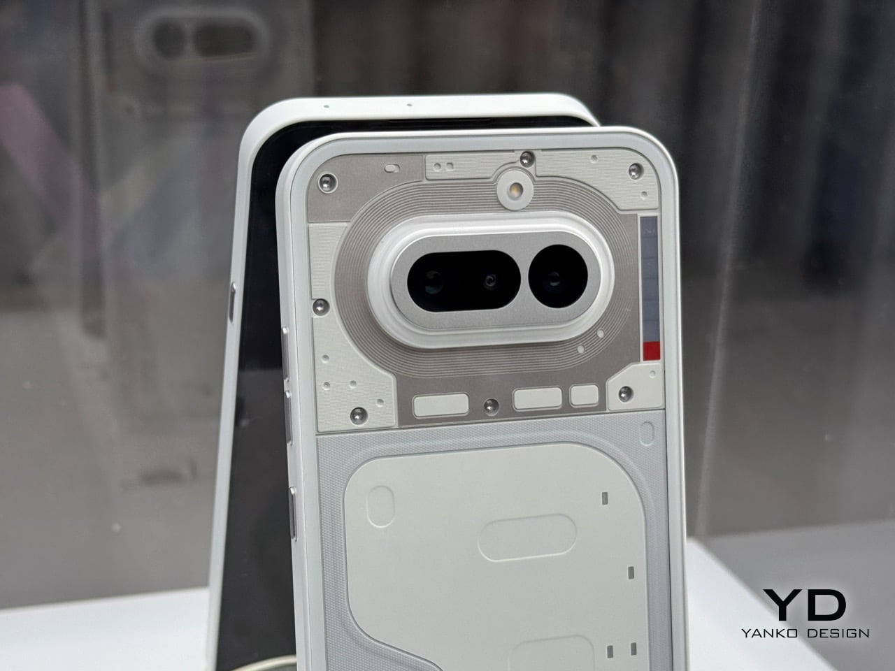
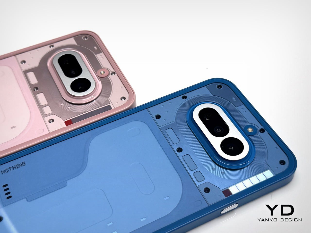
The RG14-P pulls 10W from its photovoltaic lid panel, enough to get the 95Wh dual-battery system to 50% in roughly six hours under optimal sunlight. That number sounds modest until you frame it correctly: this laptop is aimed at field engineers, utility inspectors, and emergency responders working in places where “finding a charging point” genuinely isn’t an option. For those people, six hours to half capacity under open sky is pretty meaningful. The dual-battery architecture pairs a 3,000mAh internal unit with a 5,200mAh hot-swappable external battery, meaning you can pull the secondary and slot in a fresh one without shutting the machine down. That feature gets requested loudly on job sites and almost never shows up.

Designer: Oukitel

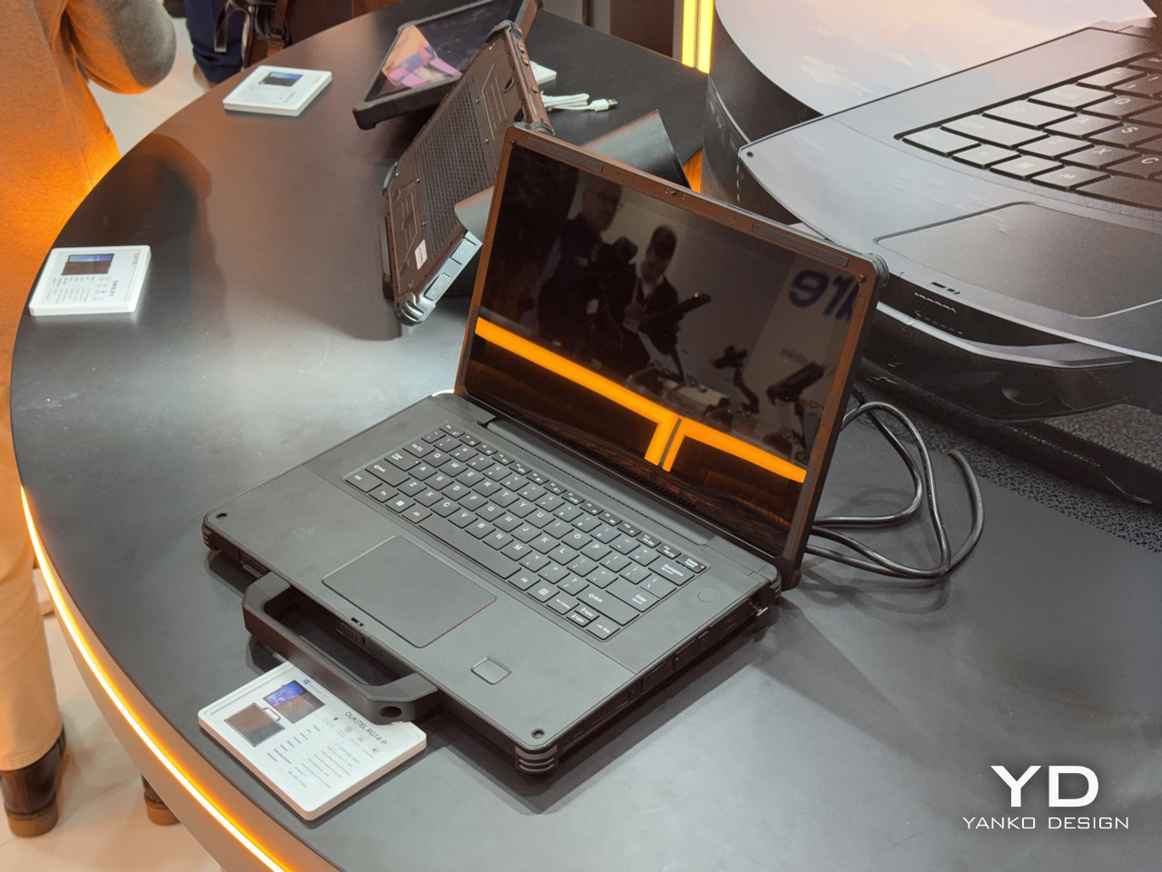
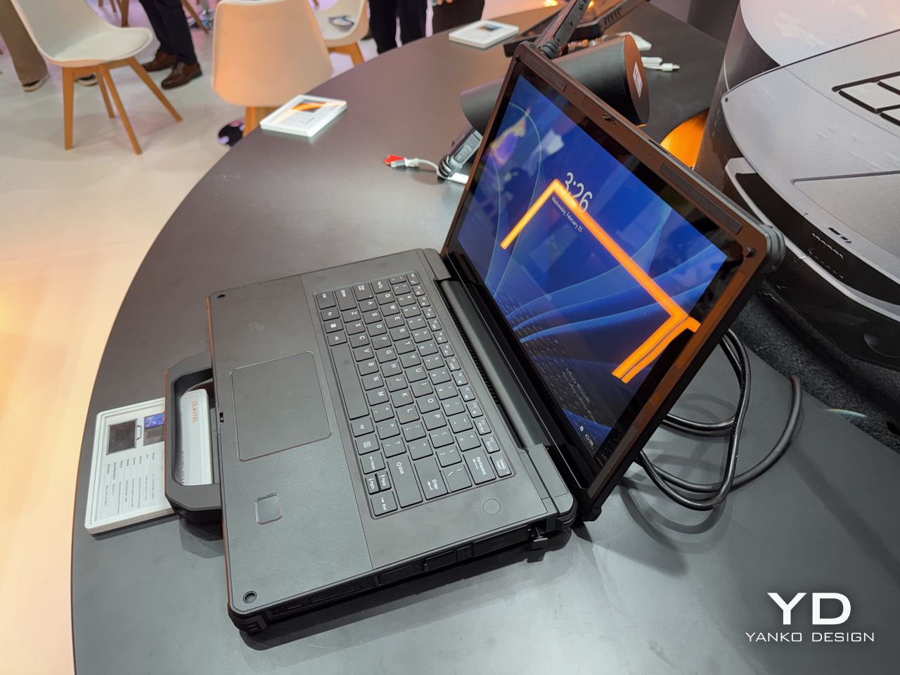
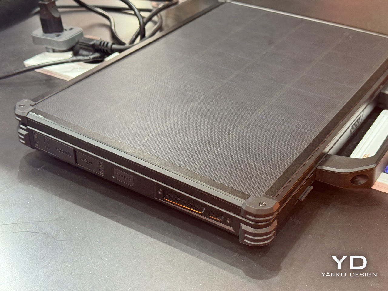
Under the lid, the RG14-P runs a 14th Gen Intel Core i7, 16GB of RAM, and 512GB of expandable storage, which puts it well past basic field terminal territory and into legitimate workstation range. The 14.1-inch touchscreen hits 1,000 nits, which matters enormously when your display is reflecting blue sky back at you. There’s also a 180-degree rotating magnetic camera, dual 5W speakers for noisy industrial environments, 65W fast charging as a backup, and IP68/IP69K certification currently in testing. IP69K specifically covers high-pressure, high-temperature jet spray, the kind of thing that happens near industrial cleaning equipment. The machine weighs 3.7kg, which is heavy, but rugged laptops have always made that tradeoff and nobody who needs one complains about it.

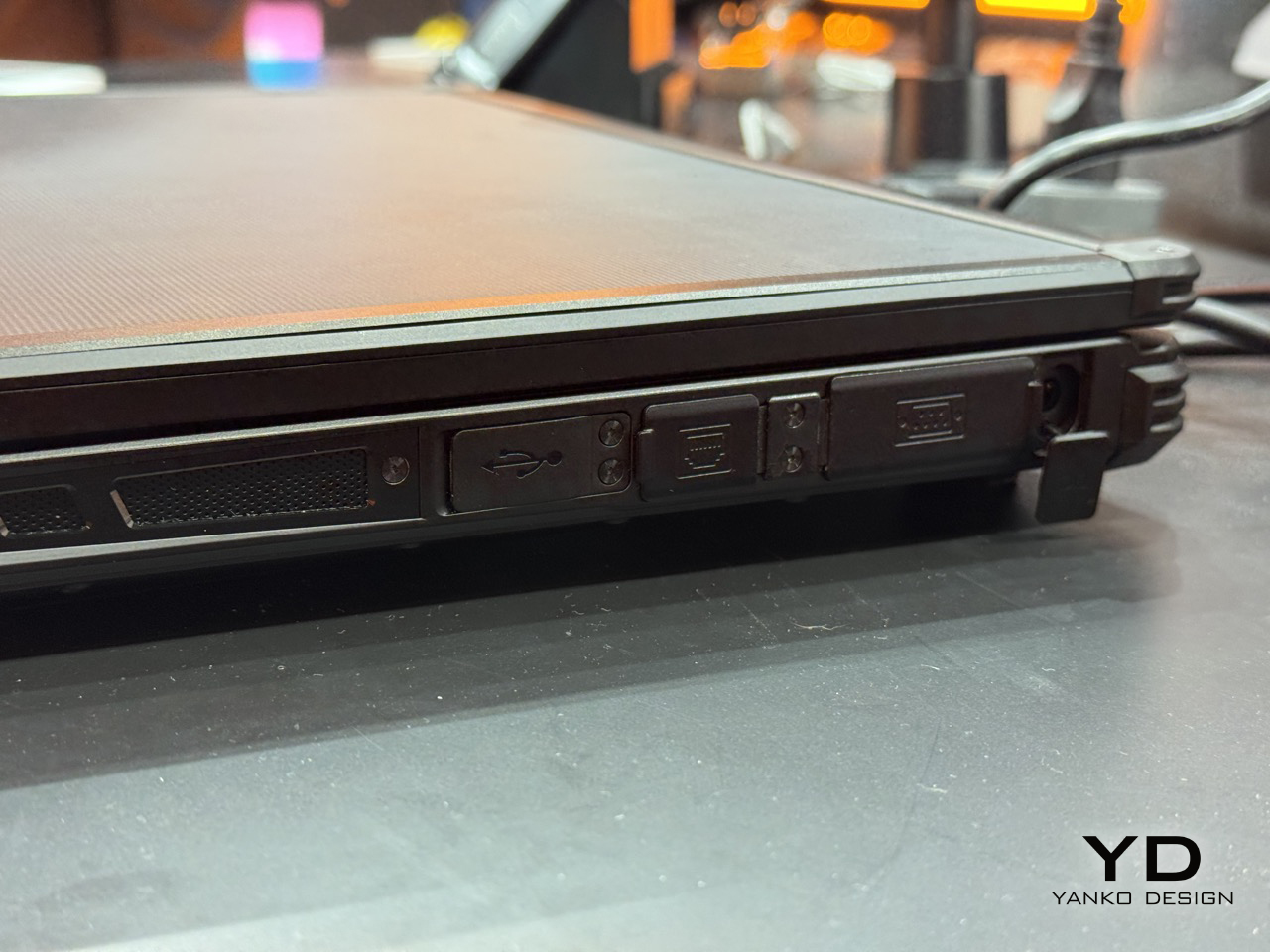
The connectivity stack is old-school in the best way: RS232, RJ45, HDMI, NFC, and fingerprint authentication. RS232 is serial protocol territory, the kind of interface still running on factory floor equipment and field measurement tools that haven’t been updated in a decade. Its presence signals that Oukitel actually mapped out real industrial workflows before finalizing the port selection, rather than building around a mood board. Compare that to where Lenovo has been spending its MWC energy lately: a rollable laptop at CES 2026 and a modular AI laptop concept at MWC 2026 that repositions the ThinkBook as an upgradeable platform. Both are interesting industrial design exercises, but neither one is solving a power access problem. The RG14-P is.

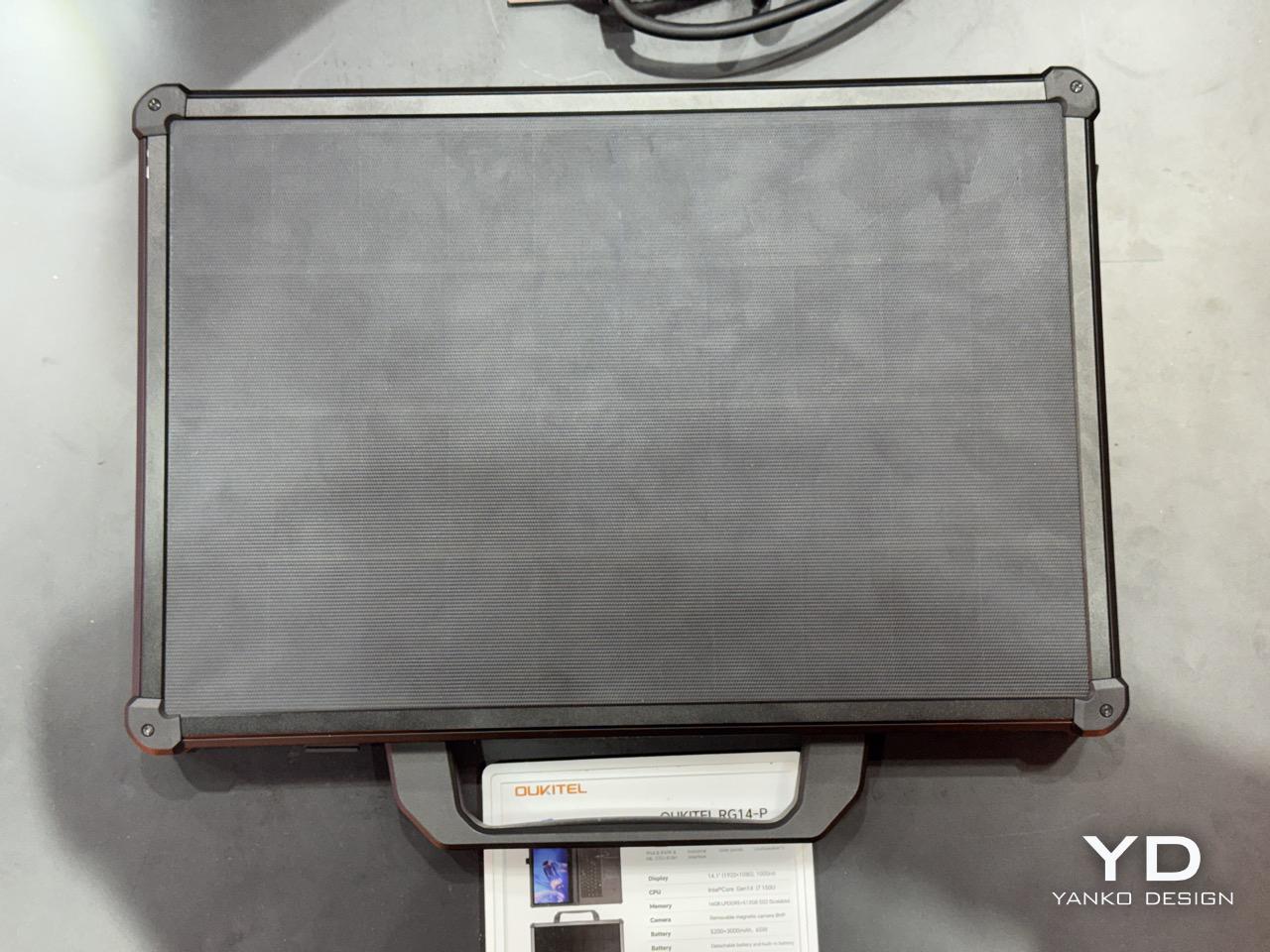
There’s also the RG14-L variant, which drops the solar lid and adds a built-in front camping light panel instead, turning the machine into a workstation and a light source simultaneously for night operations. Carrying less gear into a remote deployment is always a win, and building the light into the device rather than handing you a separate torch is exactly the decision you make when you’ve actually talked to the people using it. Pricing and availability are still unconfirmed post-Barcelona, and the IP68/IP69K certification is still in testing, so the most important durability claims haven’t been independently validated yet. Those are real open questions worth watching. But as a product that wraps the solar laptop concept around a genuine use case, with actual hardware specs and a shipping timeline, the RG14-P makes a far stronger argument for the idea than anything that’s come before it.

The post A Laptop With a Solar Panel Lid Just Showed Up at MWC 2026: Hands-on with Oukitel RG14-P first appeared on Yanko Design.

Meet The World’s First 28″ Tri-Fold Desktop Monitor: Hands-on with TCL CSOT Foldable Display at MWC 2026

The trifold idea has been tested to death on phones. Samsung, Huawei, and a handful of Chinese manufacturers have each taken their shot at folding a smartphone screen into thirds, with varying results. The Huawei Mate XT made headlines in 2024 as the world’s first mass-produced trifold phone, and then Huawei went further and stuffed a foldable display into a laptop. Lenovo tried something altogether weirder: a rollable screen that physically expands sideways, which is clever engineering built around a problem most people don’t have. TCL CSOT walked into MWC 2026 with a different angle entirely, and it landed.

The 28-inch trifold monitor collapses to a 16-inch footprint for transport, which puts it roughly in line with what fits in a standard laptop bag. That 3840×1280 resolution spread across an ultra-wide aspect ratio gives you a panel that, when unfolded, genuinely looks absurd in the best way. The color gamut is DCI-P3 99%, so this is a cinema-grade screen, not a compromised one. What TCL has understood, and what the phone trifold race missed entirely, is that the use case for three folds is far stronger on a monitor than on a handset. Your phone doesn’t need 28 inches. Your desk setup, your hotel room, or your next flight absolutely does.

Designer: TCL

At 4.48mm when unfolded, the panel is thinner than most pencils, which makes the folded thickness even more impressive given the hinge hardware packed into it. The folding radius is R1.8mm, a number that sounds unremarkable until you consider how tight that crease is across a screen this wide, and how much precision engineering goes into preventing stress fractures at that radius. TCL calls the mechanism a waterdrop hinge, borrowed from the same architecture that the better phone foldables use, now scaled up to a 28-inch form factor. The hinge handles seamless transitions between horizontal, vertical, and folded positions, and the integrated rear stand supports multi-angle suspension with stable placement for however you need to prop it. That combination of hinge flexibility and stand design is what keeps this out of the conceptual gimmick category.

Keep it partially folded and you get something that starts behaving like a curved monitor. The two outer panels angle inward, creating a passive wrap effect that a flat ultra-wide simply cannot replicate without having a physical curve manufactured into the panel itself. The 3840×1280 field of view sits noticeably wider than what most monitors deliver below 34 inches on a flat panel, and the slight inward angle adds peripheral depth that genuinely affects how immersive the experience feels. The aspect ratio alone puts you in ultra-wide territory that most desktop users spend real money chasing. It rewards close-range use, the kind of face-in-screen focus you get at a proper workstation, not a portable screen propped on a table.

The IJP OLED (inkjet-printed OLED) process behind this panel is what makes the specs achievable. Inkjet printing deposits organic materials with greater precision and less material waste than conventional vapor deposition, which is part of why TCL can hit DCI-P3 99% at 4.48mm thick without anything feeling like a compromise. Huawei’s foldable laptop used a single crease, which limits reconfigurability to open or shut. Two folds changes the logic completely: fully open for productivity, partially folded for immersion, fully folded for transit. The trifold format finally has a product category where its complexity pays off.

TCL CSOT is not the consumer electronics brand most people recognize from the TV aisle. It is the panel manufacturing subsidiary of TCL Technology, founded in 2009, and it supplies display panels to other companies rather than selling directly to end users. Lenovo already uses TCL CSOT panels in devices including the Moto Razr 60 series and its rollable laptop concept. It’s worth noting that TCL CSOT won’t directly sell this 28″ monitor… but will rather license the technology out to manufacturers who see the merit in such a product existing. Maybe Lenovo’s next laptop could have such a display, who knows… As a result, no release window or pricing has been confirmed, but the production infrastructure is being built in parallel, which is a different situation from a pure prototype with no supply chain behind it.

The post Meet The World’s First 28″ Tri-Fold Desktop Monitor: Hands-on with TCL CSOT Foldable Display at MWC 2026 first appeared on Yanko Design.

Nothing Phone (4a) Hands-on at MWC 2026: Here’s which color NOT to buy…

Nothing has a flair for the dramatic – their MWC setup was no exception. Instead of a stuffy booth, they dropped a mysterious shipping container in an open square. It cranked open to reveal the Phone (4a) in its four colorways, a slick bit of industrial theater that gets people talking. We’d all seen the white and pink versions on YouTube, but seeing them in person alongside the brand new black and blue models changes the calculus entirely. It immediately became clear there are two versions of this phone you should absolutely buy, and two you should probably skip. The reasons are not what you might think, and it all comes down to the subtle interplay of material, color, and finish.

Lined up under glass, the quartet looked impressive. The initial reveal was just that, a visual presentation to let the press get their shots and build some hype. Nothing clearly knew which colors were their heroes; the white and pink that led their digital marketing campaign were positioned prominently. The black and blue felt like they were held back for this physical debut, and it makes sense why. In the controlled lighting of the display, they all looked sharp. But a phone isn’t a museum piece, it’s an object you hold and interact with in countless environments, and that’s where the story took a sharp turn later that evening.

Designer: Nothing

Later that night, the glass came off. At Nothing’s party, they had operational units for everyone to actually handle. First impressions… The device feels solid, and the overall form is a refinement of their established language. As I wrote last week, this is easily Nothing’s most confident design yet; it feels less like a startup experiment and more like a statement from a company that knows exactly what it’s doing. We cycled through the Glyph lights, pairing them with the classic and new generative ringtones, and the effect is still as cool as ever. But my focus was on how the materials felt, and how the colors held up in the real world.

Let’s get right to it: avoid the black. I know it’s the default safe choice for many, but it betrays the entire Nothing ethos. The earlier grey versions of their phones created a beautiful contrast, letting you peer in and appreciate the texture and layout of the components underneath. This new black is just pitch black. In low light, it becomes an amorphous blob, and under direct light, the glass back turns into a smudgy mirror, catching chaotic reflections that obscure any sense of depth. It loses all the nuance and visual intrigue that makes these phones special. You’re left with a simple black rectangle, and frankly, you can get that from anyone.

The blue is a more complicated story, and a more disappointing one. The shade of blue itself is fantastic, a vibrant choice that really stands out. The frame is the culprit here. Nothing uses plastic for its frames, which is fine, but the finish on the blue model makes it look and feel overtly like plastic. It has a certain sheen that reads as “budget-ish,” undermining the otherwise premium and considered design of the phone. While the frames on the white and black models have a finish that elevates them, the blue’s just doesn’t stick the landing. It’s a small detail that makes a huge difference in desirability. Thankfully, it’s a problem that can be solved with a good metal bumper case, if you’re truly set on the color.

This is why the white and pink versions are the ones to get. The white is the quintessential Nothing look; clean, architectural, and it showcases the internal components and Glyph system perfectly. The frame’s finish looks gorgeous and intentional. The pink is the surprise winner. It’s a fantastic, almost salmon-like shade that is both playful and sophisticated, and the finish on its frame works in harmony with the color. It feels fun without feeling cheap. Both of these colors feel like they were the primary focus of the design team, where the material choices and color selection are in perfect sync to create a cohesive and desirable object.

Of course, the phone is more than its colorway. The camera is genuinely impressive for this bracket. I took a few shots in the less-than-ideal lighting of the party, and while the processing takes a beat longer than you’d expect, the results are worth it. I was seriously impressed by the quality coming from the 3.5x lens; it’s sharp and holds detail well. The software felt snappy, and the screen is bright and responsive. It’s a proper smartphone experience, wrapped in a design that still turns heads and starts conversations, which has always been Nothing’s core strength.

This MWC party was just the appetizer for the main course. Nothing is holding another event on March 5th, where the full, official launch will happen. That’s when we’ll get the final specs, pricing, and availability. There is also a persistent rumor that the company will use that event to debut a more powerful Phone (4a) Pro model. Given the confidence on display in Barcelona, Nothing is clearly holding a few cards back for the big reveal. They got our attention with the hardware, now we wait to see the full strategy.

The post Nothing Phone (4a) Hands-on at MWC 2026: Here’s which color NOT to buy… first appeared on Yanko Design.

iPhone 17e Gets MagSafe but No Dynamic Island or Gemini Apple Intelligence… Is It Worth Buying?

Apple has a habit of making its budget phones more interesting than they have any right to be. The iPhone 17e packs the same A19 chip found in the standard iPhone 17 into a $599 body, with a 6-core CPU built on 3-nanometer architecture, a 4-core GPU with Neural Accelerators, and a 16-core Neural Engine optimized for large generative models. Live Translation, Call Screening, Visual Intelligence, and Hold Assist all run natively on a phone that costs $200 less than the base iPhone 17. That’s the real headline, even if Apple hasn’t framed it quite that directly.

The A19 here is a binned variant with a 4-core GPU versus the 5-core in the standard iPhone 17, but graphics performance is still around 30% faster than the A18 in the 16e. The Neural Accelerators embedded in each GPU core are new to this tier and allow Apple Intelligence to run efficiently on-device rather than leaning on cloud processing. For everyday tasks, the performance gap between the 17e and the standard iPhone 17 will be essentially invisible.

Designer: Apple

MagSafe finally arrives on the “e” lineup, and it’s one of the more consequential additions Apple has made to this tier in years. The 16e’s absence from the MagSafe ecosystem was a genuine frustration, and the 17e corrects it with 15W wireless charging, double the 7.5W of its predecessor. The full ecosystem of snap-on chargers, car mounts, battery packs, and wallet accessories now works as intended. Storage starts at 256GB, double the 16e’s entry point at the exact same $599 price. On a phone shooting 48MP stills and 4K Dolby Vision video natively, that extra headroom is genuinely appreciated.

The C1X modem delivers up to twice the 5G speeds of the C1 in the 16e while consuming 30% less energy, matching the connectivity of the more expensive iPhone Air. The single 48MP Fusion camera pulls double duty with an optical-quality 2x telephoto mode, next-generation portraits with adjustable post-capture depth, and improved low-light processing through the A19’s image pipeline. Ceramic Shield 2 brings 3x better scratch resistance than the previous generation, and a new antireflective coating makes the display noticeably more usable outdoors. Battery life sits at 26 hours of rated video playback, with a 50% charge in 30 minutes using a 20W adapter.

The honest part: the notch is still here in 2026, and the 60Hz display is increasingly hard to defend. The Gemini-integrated Apple Intelligence features remain locked to higher-end models for now, so the 17e gets the core AI suite but not the full picture of where Apple Intelligence is heading. For anyone on an iPhone 11 through 13, this is a clear, confident upgrade. For 16e owners, MagSafe and doubled storage are real improvements but may not justify a full cycle. At $599, the 17e is the most accessible entry point into Apple’s AI era, and that counts for more than the notch counts against it.

Pre-orders open March 4, units ship March 11, starting at $599 for 256GB.

The post iPhone 17e Gets MagSafe but No Dynamic Island or Gemini Apple Intelligence… Is It Worth Buying? first appeared on Yanko Design.

If F1 Engineers Designed A Foldable Smartphone: HONOR Magic V6 Hands-On at MWC 2026

Inside the engine of a high-performance car, components endure thousands of violent explosions per minute, resisting incredible friction and wear. The materials chosen for this environment are selected for one reason: absolute, uncompromising durability. One of the most resilient of these materials is silicon nitride, a ceramic used where extreme toughness is the only acceptable standard. It is a substance born from one of the harshest mechanical environments imaginable.

Honor has taken that same material and applied it to the screen of the Magic V6. This decision to borrow from the world of motorsport engineering is a telling one, and it is a philosophy that extends throughout the device. The hinge is benchmarked against the A-pillar of a modern EV, and the battery’s chemistry is pushed to new limits of silicon content. The 2026 F1 season starts in a few days, but apparently we are seeing F1-level engineering in the smartphone world already.

Designer: Honor

Certain objects feel like they should be impossible. A foldable phone that, when closed, is as thin as a conventional flagship, yet contains a battery that is larger than any of its thicker rivals, presents a genuine design paradox. The physics of space and energy density suggest that one of these goals must aggressively compromise the other. You can have a thin device, or you can have a big battery, but the laws of thermodynamics are usually quite firm about not letting you have both.

The Honor Magic V6 manages to exist in this paradoxical space. It resolves the contradiction by treating the inside of the phone like a three-dimensional puzzle, where core components were redesigned and relocated to accommodate its massive power source. This internal architecture is then wrapped in a shell of exotic materials, including that screen coating developed for racing engines and a hinge with the structural integrity of an automotive safety pillar.

The battery itself is the real story here, the anchor for the entire design. To fit a 6660mAh silicon-carbon cell into this chassis, Honor had to completely re-engineer the phone’s internal layout. They customized and moved key components, including the speaker, the NFC module, and even the USB-C port, all to carve out precious fractions of a millimeter around the battery. The result is a cell with 25% silicon content, giving it the highest capacity ever seen in a foldable. This is the kind of obsessive internal space management that you see in high-end watchmaking or, well, motorsport, where every single component is fighting for its place.

Then you learn about the version they are keeping for the Chinese market, and the engineering goes from impressive to just plain absurd. This model gets the next-generation Silicon-carbon Blade Battery, pushing the silicon content to 32% and the capacity to over 7000mAh. It uses a unique stacking technology, with each power-generating layer measuring a mind-numbing 0.15mm thick. This might be the thinnest, most energy-dense battery ever put into a consumer device. It is a quiet technological flex, a statement that Honor is not just competing, but is capable of producing battery technology that feels a generation ahead of what we see elsewhere.

That philosophy of extreme durability extends to the hinge, the component that carries all the mechanical stress of a foldable. The device opens and closes with a satisfying, confident action, backed by a rating for half a million cycles, which is a frankly absurd number. At their keynote experience zone, Honor even had a V6 operating completely underwater, its hinge cycling open and closed without a single issue. This is an interesting, if slightly dramatic, way to communicate long-term reliability. We have all seen foldables that delicately dance around IP ratings and overall durability claims, but this is a clear statement of intent to build something that feels solid and dependable from the first time you open it.

Fitting a 64MP periscope camera into a device this ridiculously thin is another piece of that engineering puzzle. People who own the V5 might not see a massive day-to-day difference in thickness, but in the grander scheme, the ability to shave off millimeters while adding complex optical hardware is where the real magic lies. This focus on miniaturization and strength is not isolated to the V6. We saw the same DNA in their Robot Phone concept, where this hinge technology allowed them to shrink the necessary micromotors by a staggering 70% to achieve its tiny, folding camera design. This is a company obsessed with pushing the boundaries of mechanical engineering.

This hardware obsession serves a very specific software strategy. The team seems to have built the V6 with the assumption that its ideal customer already owns a Mac, an Apple Watch, and AirPods. They have leaned into this, building in one-tap file transfer to macOS, full support for the iWork suite, and even iCloud integration. It’s a bold move, positioning an Android device as the ultimate companion for the Apple ecosystem, all accomplished using open interfaces. It’s safe to say that not only did Honor build a highly-engineered design-forward foldable that’s thinner than any other Android device, they ended up making a foldable phone that Apple users can buy and use LONG before the foldable iPhone comes out!

The post If F1 Engineers Designed A Foldable Smartphone: HONOR Magic V6 Hands-On at MWC 2026 first appeared on Yanko Design.

Nintendo’s Game Boy Jukebox Plays Pokémon Music on 45 Swappable Cartridges


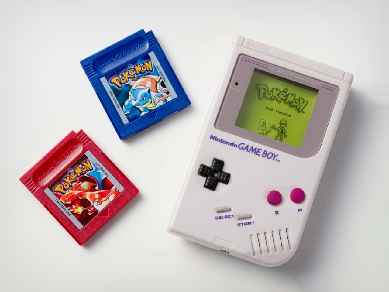
Thirty years after Pokémon Red and Blue launched in Japan, Nintendo is celebrating the anniversary with something that looks almost exactly like a Game Boy — except it will never, ever play a game. The Pokémon Red & Pokémon Blue Game Music Collection: Game Boy Jukebox is a miniature sound toy that slots mini cartridges to play the original games’ iconic 8-bit soundtrack, and it’s already selling out across regions.

The device is a faithful shrunken replica of the original Game Boy, complete with the grey shell, D-pad, A/B buttons, and a screen. None of those controls do anything. All the action happens through the cartridges: pop one in, and the player outputs the corresponding track, whether that’s the hauntingly spare Lavender Town Theme, the adrenaline-spiked Gym Leader Battle music, or the quietly triumphant Pallet Town Theme. All 45 tracks from the original games are represented, covering everything from the Title Screen to the Ending Theme, with Jigglypuff’s Song and the Pokémon Center jingle tucked in between.

Designer: Nintendo

Junichi Masuda, composer of the original soundtrack, was involved in tuning the product. “We took particular care to make the audio sound just like Game Boy,” he said, which goes a long way toward explaining why the format (one cartridge, one song) makes a certain kind of sense. It’s tactile, deliberate, and forces you to actually choose what you want to hear rather than shuffling through a playlist.

That said, the jukebox comes with some genuine limitations. There’s no headphone jack, meaning the music plays out loud only, which caps its utility as background listening. The three required LR44 button cell batteries are included for demonstration but not for ongoing use. And at $69.99 (£59.99 in the UK, 489 yuan in China), it’s priced squarely as a collectible rather than an everyday gadget.

Nintendo is selling the jukebox exclusively through PokémonCenter.com in North America with a one-per-customer limit. The UK has already sold out. Fans in mainland China can enter a lottery-based purchase system starting March 6. Gotta catch ’em all, right?!

The post Nintendo’s Game Boy Jukebox Plays Pokémon Music on 45 Swappable Cartridges first appeared on Yanko Design.

A 113-Year-Old Patent Just Became the Most Creative EDC Pocket Multi-Tool of 2026

MetMo has a very particular way of working. The Leeds-based engineering team finds a mechanical concept from history that was ahead of its time, studies it carefully, then rebuilds it with the materials and precision manufacturing the original inventor could never have accessed. The MetMo Pen went back to an 1892 dual-thread screw. The Fractal Vise revived a gripping technology too complex for most workshops. Both became substantial hits, and if you follow our work, you know we covered them. Their next one follows the same formula, and it might be the most satisfying yet.

Patent no. 1,070,656, filed by J. Anderson in 1912 and granted in 1913, described a double-ended parallel wrench that never quite found its moment. MetMo took that silhouette and used it as a chassis, assigning a specific function to every surface: a hex drive zone at the centre, adaptive parallel jaws drawing directly from their Fractal Vise technology, plier teeth, a V-groove for square drive tools, and an edge nipping point. It’s five tools in one slim body, after a 113-year wait for the right team to come along and finally build it properly.

Designers: Sean Sykes & James Whitfield

Click Here to Buy Now: $134 $167 (20% off). Hurry, only 4/600 left! Raised over $438,000.

The original Anderson patent was a ghost, a clever idea that lacked the context to thrive. You can picture it being made from rough-cast metal with loose tolerances, a tool that worked in theory but was probably clunky in practice. What MetMo does is take that core mechanical logic and run it through a modern filter of CNC machining and advanced metallurgy. The result is a tool that fulfills the original’s promise in a way Anderson himself likely couldn’t have imagined. It’s the same double-ended, central-pivot concept, but executed with a precision that makes it feel entirely new. Coupled with tiny tools and details stuffed into every empty spot MetMo could find.

What’s really clever is how they packed in so much function without making it a brick. A typical multi-tool suffers from compromise, with each function feeling a bit clumsy to accommodate the others. The Pocket Grip avoids this by making existing geometry do double duty. The central pivot, a structural necessity in the 1913 design, is now a perfectly machined 1/4-inch hex drive for standard bits. The jaws aren’t just serrated; they’re divided into a ‘chomping zone’ for aggressive grip, dedicated points for round or flat objects, and even an edge nipping point. Every surface has a purpose, a level of design efficiency that makes the final object feel intentional and integrated.

That’s especially true of the adaptive parallel jaw, which is a direct technological inheritance from their own Fractal Vise. We wrote about that vise when it came out, admiring how its interlocking jaws could conform to almost any irregular shape. MetMo has miniaturized that same logic and engineered it into the Pocket Grip. One jaw remains fixed while the other adjusts, staying perfectly parallel up to a 20mm opening distance. This gives you a clamping stability that a simple pair of pliers could never match. It’s proof that MetMo isn’t just reviving old ideas; they’re building a cohesive design language and iterating on their own innovations.

All of this engineering is packed into a form that is genuinely pocket-friendly. The tool measures just 95.5mm long by 45.5mm wide, and a remarkably slim 10mm thick. The aerospace-grade aluminum version weighs a scant 83.6 grams. These numbers are key to its success as an everyday carry item. But the specs only tell half the story. The other half is the tactile experience, the so-called ‘desk toy’ factor. The smooth action of the TR6x2 drive screw, the satisfying resistance of the knurled brass adjuster, and the balanced weight in your hand make it something you instinctively want to pick up and fiddle with.

The jaws on all versions are machined from 17-4 PH hardened stainless steel, heat-treated to a Rockwell C hardness of 45, with an ultimate tensile strength of 1448 MPa. In simple terms, they are incredibly tough and designed to retain their edge. The body itself comes in three flavors: hard-anodized 7075-T651 aluminum for lightweight durability, Grade 5 titanium for the ultimate strength-to-weight ratio, or a solid stainless steel build for those who prefer a bit of heft. This isn’t a disposable product; the jaws are removable and serviceable, a direct counter-statement to the throwaway culture common in tool manufacturing.

In practice, the Pocket Grip finds its place everywhere. For a model maker or miniatures painter, it’s a precise third hand, clamping onto a base to hold a project steady. For a cyclist, it’s a compact wrench and driver for quick adjustments on the go. Around the house, it’s the tool you grab for that one awkward fitting that nothing else can quite get a handle on. The V-groove is a subtle but brilliant touch, perfect for holding 3-6mm square drive tools like taps and drill bits, adding another layer of utility for detailed work. With the ability to apply over 21kg of clamping force with just finger pressure, it has more than enough power for most daily tasks.

The Pocket Grip is available in three primary configurations based on the body material. The lightweight choice is the hard-anodized aluminum at 83.6g. For those wanting a balance of weight and extreme durability, the titanium version comes in at 103.6g. Finally, the stainless steel model offers the most substantial feel at 141g and includes an upgraded ‘Snip Grip’ with hardened cutting jaws. Pricing starts at £99, positioning it as a premium, investment-grade tool. And MetMo backs that up with what they call a 200-year guarantee, a confident statement that this is a tool built not just for you, but for the person who finds it in your workshop generations from now.

Click Here to Buy Now: $134 $167 (20% off). Hurry, only 4/600 left! Raised over $438,000.

The post A 113-Year-Old Patent Just Became the Most Creative EDC Pocket Multi-Tool of 2026 first appeared on Yanko Design.

What If Artists Designed Wi-Fi Routers?

A Wi-fi router has to hands-down be one of the ugliest appliances to be placed in a modern home. Sure, your thermostat can be concealed, your purifier can be hidden away when not in use, your home gym can fit under your bed. But the Wi-Fi router can’t be moved without some serious repercussions for performance. The router, by virtue of how it works, HAS to be kept in an open environment so it can broadcast the Wi-fi signal everywhere efficiently.

That being said, hardly any companies actually spend time thinking about how home-based Wi-fi should look. Companies like Google and Apple worked fairly hard to ensure their smart speakers fit well into interior spaces, but your router is still this alien-looking device with angular forms, black plastic, blinking lights, and antennas shooting out in every direction looking like a large bug ready to strike. So Cosin Design asks a simple question – what if we merged the worlds of router design with modern art?

Designer: Cosin Design

These Mondrian Routers treat the router’s surface as a canvas for modern art. Inspired by the abstract artwork of Piet Mondrian, the routers translate the geometric artpieces of the Dutch painter onto the plastic appliance’s otherwise cold, boring, and frankly unsightly surfaces. Black or white plastic wasn’t meant for modern homes, especially homes filled with color, texture, and life. Given how routers are almost always centrally located and mounted on walls or placed on high tabletops, visible to every one, Cosin Design’s routers at least try to make a visual statement through art.

Would I put such a router in my house? In fact, this project is an invitation to companies like ASUS, D-Link, Netgear, TP-Link, and others to at least experiment with unique artworks and form factors that delight instead of displease. Huawei launched a beautiful lava-lamp-inspired Wi-fi router just at the end of last year, and it really goes to show how something as essential as an internet connectivity device can speak the language of home decor, instead of looking like something meant to be hidden in a server room.

The post What If Artists Designed Wi-Fi Routers? first appeared on Yanko Design.

This Mercedes-AMG Uhlenhaut Shooting Brake Concept is the Most Beautiful Car You’ll See This Week

There’s a name in Mercedes-Benz history that carries almost mythological weight: Rudolf Uhlenhaut. The engineer and designer behind the legendary 300 SL Gullwing was known to drive the prototype racing versions of the car to work in Stuttgart, casually lapping most professional racing drivers in the process.

The original 300 SL Uhlenhaut Coupe, the racing variant that never made it to public roads, remains one of the most valuable cars ever auctioned, fetching $143 million at a 2022 Sotheby’s sale. So when concept designer Gabriel Naretto decided to name his reimagined Mercedes-AMG shooting brake after the man himself, the pressure to deliver something worthy of that legacy was immense. Remarkably, he pulled it off.

Designer: Gabriel Naretto

The Mercedes-AMG Uhlenhaut Shooting Brake concept arrives draped in obsidian black, and it hits you in layers. From the front, the DNA of the original 300 SL is unmistakable but filtered through a thoroughly contemporary lens. That iconic central grille with the three-pointed star sits framed in warm copper gold, flanked by large air intakes that mirror the same bronze-kissed treatment. The X-shaped daytime running lights cut through the glossy black bodywork like a precision incision, echoing AMG’s current design vocabulary while feeling completely unique to this car. The hood is long and muscular in the classic front-engine GT tradition, but the surfaces flow with a smoothness that feels almost liquid, like someone poured ink over a clay sculpture and let it set.

Then you walk around to the side, and the shooting brake proportions hit you all at once. Naretto has given this concept a fastback-style extended roofline that arcs gracefully rearward before dropping into a truncated Kamm-tail rear, and it works brilliantly. The roofline is outlined by a thin copper pinstripe that traces the greenhouse all the way to the tail, a detail so refined it belongs on a Swiss watch rather than an automobile. “V12” badging sits discreetly on the sill, a knowing nod to the kind of naturally aspirated thunder that the original Uhlenhaut Coupe’s racing engine would have produced. The body itself is devoid of unnecessary creases or character lines, relying entirely on curvature and proportion to generate visual drama, which is an incredibly difficult thing to pull off and an even more impressive thing to actually see rendered this well.

The doors, of course, are gullwing. There was never any other option for a car wearing the Uhlenhaut name. When they swing open, they reveal a cabin wrapped in black leather accented with copper stitching, with deeply bolstered racing seats and a minimal instrument layout that prioritizes the driving experience over digital noise. The steering wheel is small and driver-focused, and while the concept renders don’t offer a full cockpit tour, what’s visible suggests Naretto was thinking about the complete experience rather than just the silhouette.

The taillights are styled as three-pointed star clusters rendered in deep red, a sculptural interpretation of the Mercedes badge that functions as a graphic element rather than just a regulatory necessity. A subtle integrated spoiler sits at the trailing edge of the roofline, and the diffuser treatment below the bumper gives the rear end genuine aerodynamic intent. The AMG-badged multi-spoke wheels in gloss black with copper center caps complete the picture, tying the whole visual package together in a way that feels considered and cohesive from every angle.

Naretto’s concept navigates the tension between historical reverence and forward-looking design just beautifully. He preserved the emotional architecture of the Gullwing, the long hood, the coupe greenhouse, the gullwing doors as ceremony, and then reimagined everything else through the filter of a modern AMG performance car. The shooting brake body style was a masterstroke of a choice, because it gives the car a sense of versatility and intelligence that a pure coupe wouldn’t carry, while also referencing Mercedes-Benz’s own history with practical performance vehicles like the CLS Shooting Brake and the AMG GT 4-Door.

Parked against the Georgian townhouses of what appears to be a Kensington street in those lifestyle renders, the Uhlenhaut concept looks like it belongs to a world where automotive design never stopped being an art form. Rudolf Uhlenhaut himself would probably have driven it to work.

The post This Mercedes-AMG Uhlenhaut Shooting Brake Concept is the Most Beautiful Car You’ll See This Week first appeared on Yanko Design.

Govee’s Pendant Light Is the Temu Sunset Lamp’s Smarter, Grown-Up Cousin

Temu sunset lamp, we had fun. The warm orange glow, the perfect circle on the wall, the way it made any room look like a soft launch music video. But the era of the single-trick ambient light is quietly wrapping up, and Govee’s new Pendant Light is part of what’s replacing it.

This one hangs from your ceiling like it always belonged there, a wide smoked-glass drum shade with the confident silhouette of a proper design fixture. Nothing about the exterior screams smart home gadget. And then you turn it on, and the whole thing comes alive in layers. RGB color pulses along the sides. A warm RGBWW gradient bleeds across the curved interior. Clean white light floods down from the bottom panel for actual task lighting. Three zones, one fixture, and a Govee app full of presets that range from “cozy Sunday breakfast” to “we are absolutely having a party in this kitchen.”

Designer: Govee

Click Here to Buy Now

Three lighting zones make this pendant lamp an ambient gradient you can control. Govee splits the fixture into side, curved, and bottom segments, each independently addressable. The side strip runs RGB for pure color expression and visual drama. The curved middle section runs RGBWW, which is where those buttery gradient transitions happen, the kind that made the sunset lamp so irresistible in the first place. The bottom panel is also RGBWW, tunable from 2700K all the way to 6500K, with 1300 lumens and a CRI of 95. That last number matters because 95 CRI means colors rendered under this light look accurate, which is exactly what you want when you’re plating food or checking whether the steak is actually the right shade of pink.

Matter support ships standard, which in 2025 is table stakes for any smart fixture worth recommending. What that means practically is that the Pendant Light drops into Apple Home, Google Home, Alexa, and SmartThings without friction, no proprietary bridge, no separate hub sitting on your counter. The Govee Home app handles the deeper customization, 80-plus preset scenes, six music sync modes, and a full DIY color editor that lets you set each of the three zones independently. Sync it with up to seven other Govee devices and the whole room moves together. The light also responds to 2.4GHz Wi-Fi, so control is reliable and remote-accessible, not dependent on Bluetooth proximity.

Physically, the fixture weighs 5.29 pounds and the hanging cord adjusts up to 4.92 feet, which gives you enough flexibility to dial in the drop height over an island or a dining table without it feeling either too close or awkwardly ceiling-bound. The smoked glass shell does something clever optically: it reads as dark and sculptural when the light is off, almost like a piece of decorative glass, and then transitions into a glowing gradient object when it’s on. That kind of on/off personality shift is genuinely hard to engineer without the shade looking cheap in one of the two states.

Retail price is $149.99, though it’s been sitting comfortably at $109 on Amazon for months now. At that price, the comparison set shifts considerably. Proper designer pendants with a fraction of this functionality routinely run two to three times higher, and none of them pulse to your playlist.

Click Here to Buy Now

The post Govee’s Pendant Light Is the Temu Sunset Lamp’s Smarter, Grown-Up Cousin first appeared on Yanko Design.