This Is the Tiny House the Short-Term Rental Market Has Been Waiting For

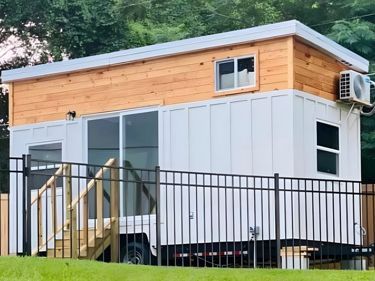
I truly love a well-designed tiny home — one that doesn’t just compress living into a smaller footprint but genuinely rethinks how space can work harder. The Rasa by Simplify Further Tiny Homes is exactly that. Born from three years of hands-on Airbnb hosting experience and 16 active listings, this 20-foot home on wheels isn’t a design exercise. It’s a tested, refined answer to what guests actually need and what hosts actually want.

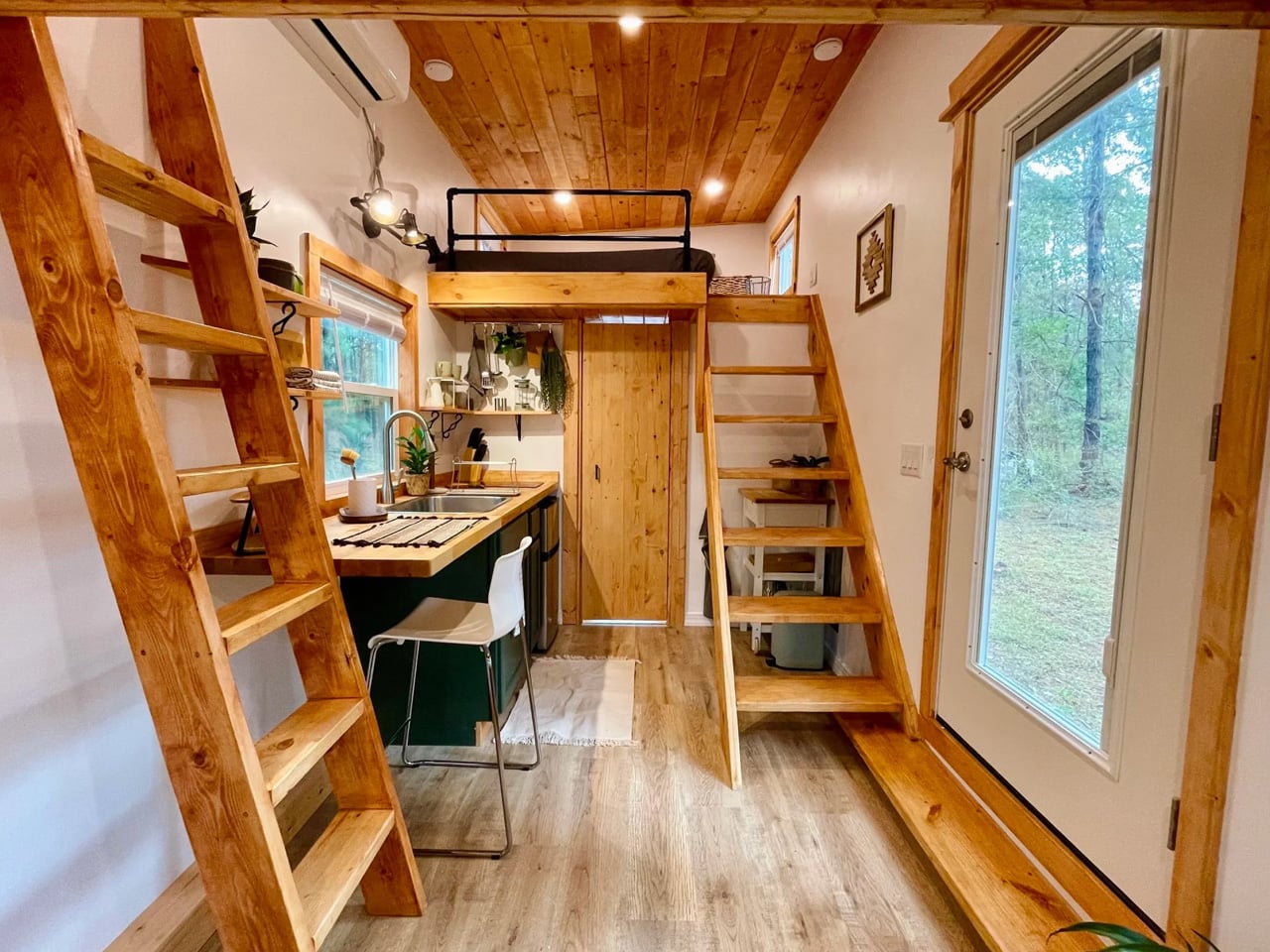
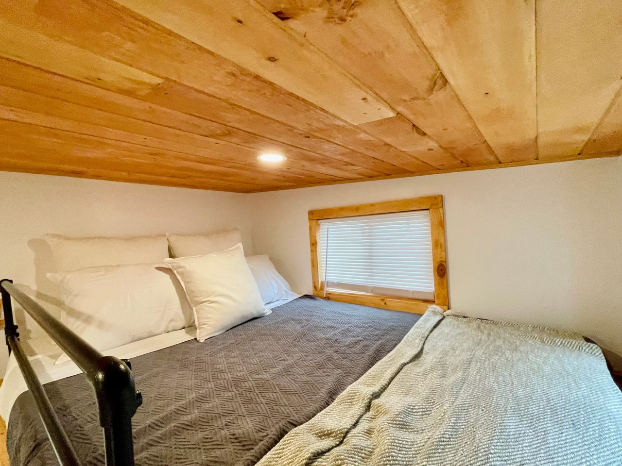
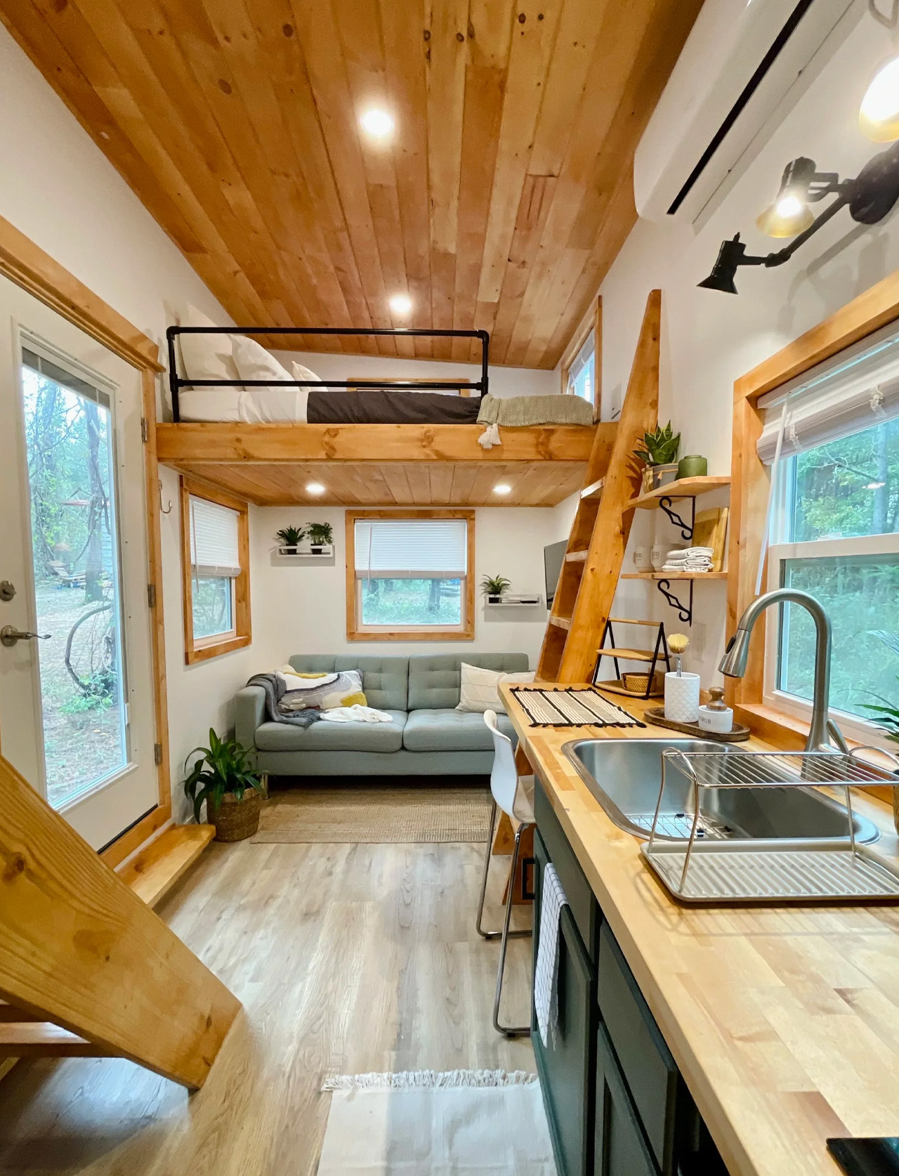
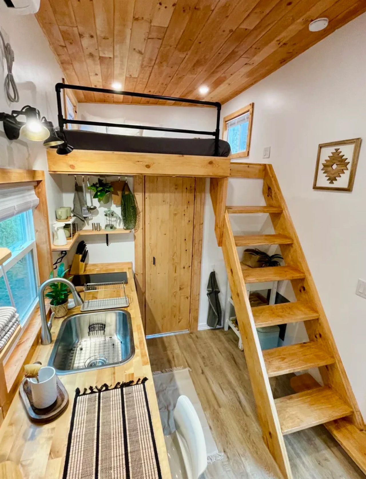
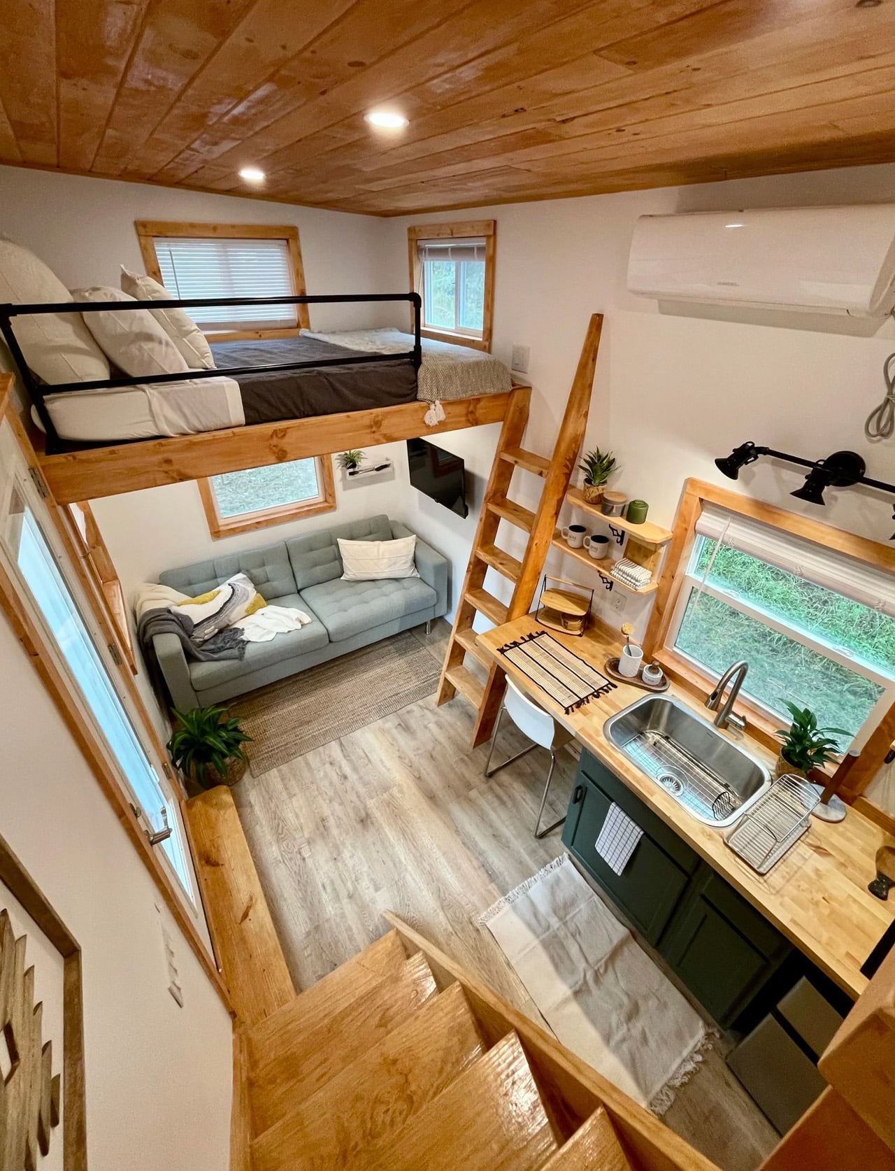
At 224 square feet, the Rasa measures 8 feet wide, 20 feet long, and stands 13 feet 6 inches tall. Those numbers might sound modest until you realize the layout sleeps up to six people across two queen-sized sleeping lofts. A 7×8-foot master loft accessible via open stairs, and a 7×5-foot second loft reached by ladder. The height under the lofts clears 6 feet 4 inches, which means the main living level doesn’t feel compressed; it feels considered. Black metal railings frame the lofts with a clean, architectural edge that keeps the interior from tipping into cabin territory.

Designer: Simplify Further Tiny Homes

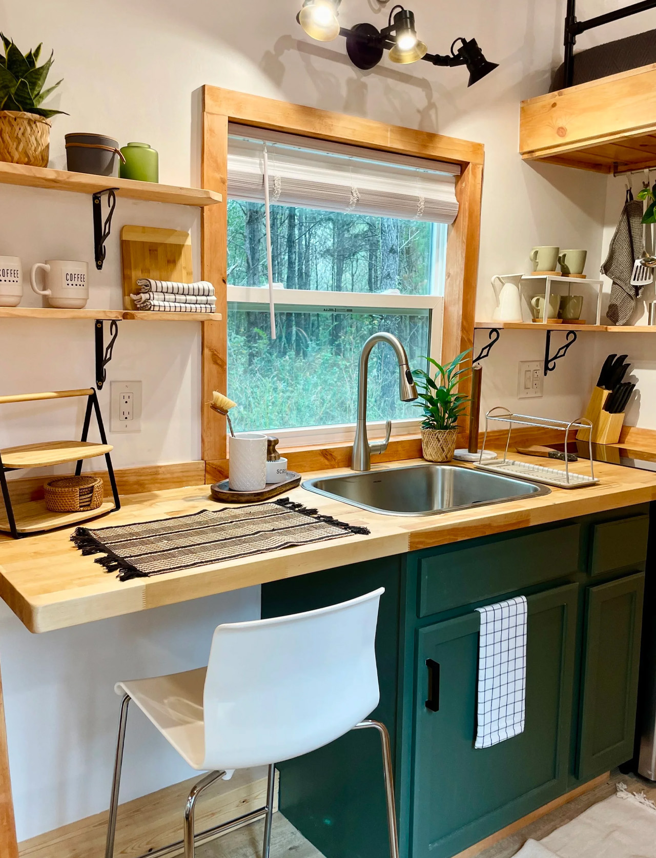
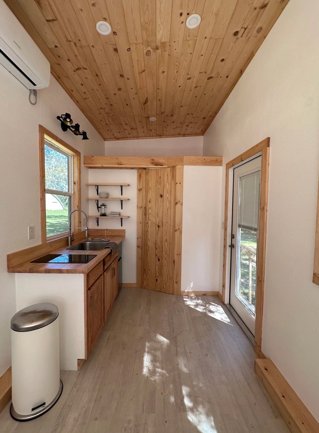
The kitchen punches above its weight. A two-burner electric cooktop, mini fridge, and a pull-down stainless steel sprayer sink cover the essentials without crowding the counter. Built-in barstool seating lines one side, though Simplify Further will swap that out for additional cabinetry if storage matters more than a social kitchen setup. The bathroom follows the same logic: shower stall, vanity, flush toilet, and storage, all functioning without the usual trade-offs that plague tiny home bathrooms. Nothing is squeezed. Everything has a place.

What makes the Rasa genuinely interesting is its design origin story. Simplify Further didn’t sit down with a mood board. They sat down with data. Three years of short-term rental hosting taught them what makes turnover fast, what keeps maintenance low, and what makes guests leave five-star reviews.

The result is a home where minimalism isn’t aesthetic posturing. It’s an operational strategy. Clean lines mean easy cleaning. Durable materials mean fewer call-outs. A NOAH-certified RV chassis means it can legally move, park, and host across a wide range of properties.

Simplify Further has now delivered over 100 tiny homes nationwide, earning a 3-time Best In Show and Best Tiny Home award at the Florida Tiny Home Festival, alongside a BBB Accredited A+ rating. The Rasa is the flagship that makes that reputation legible. It’s a tiny home that thinks like a busi

The post This Is the Tiny House the Short-Term Rental Market Has Been Waiting For first appeared on Yanko Design.

This $30,000 Tiny Home Puts the Bed on the Ground Floor and the Price Below Every Competitor

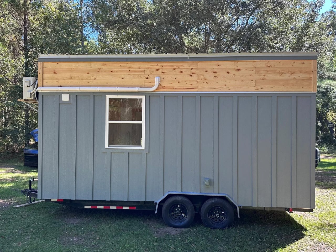
At just $30,000, the Shanti by Simplify Further Tiny Homes might be the most honest tiny home on the market right now. No gimmicks, no inflated square footage promise, just a clean, well-built 20-foot home on wheels that does exactly what it says it will. For a space category that has a habit of creeping toward six figures before you’ve even added a kitchen, the Shanti lands like a breath of fresh air.

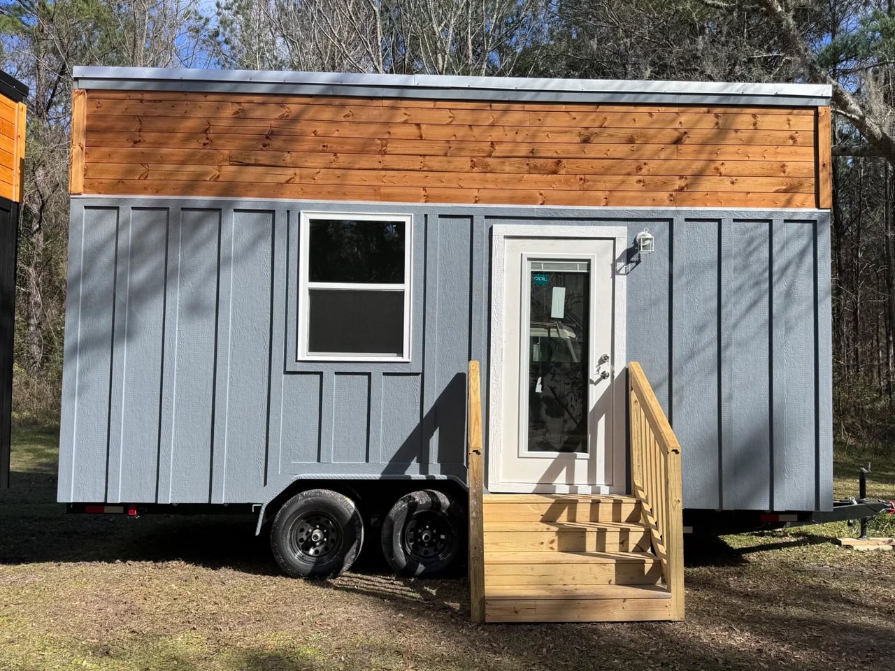
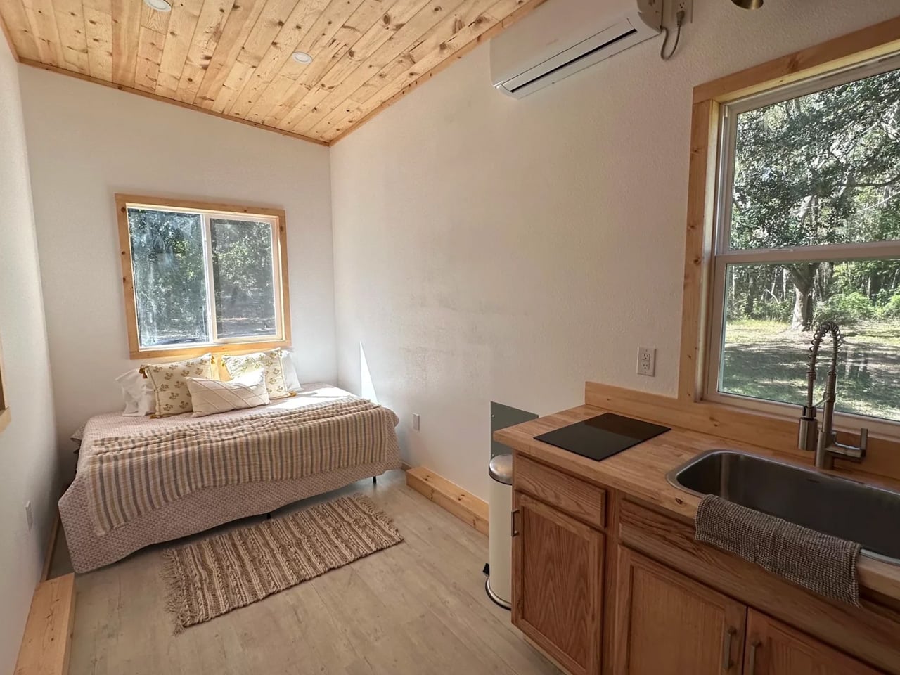
The Shanti measures 8’5″ wide, 20 feet long, and stands 13’6″ tall, translating to 133 square feet of main-level living space. Unlike most tiny homes where sleeping is relegated to a loft you have to climb into every night, the Shanti puts the queen-sized bed on the ground level — a decision that alone sets it apart. The loft exists, but it’s purely for storage, which makes the Shanti a natural fit for older residents, guests, or anyone who’s simply done negotiating with a ladder.

Designer: Simplify Further Tiny Homes

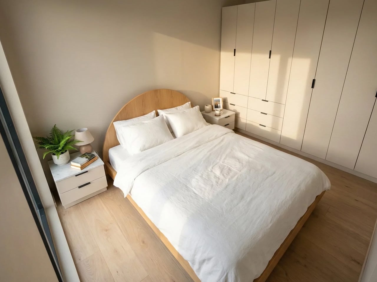
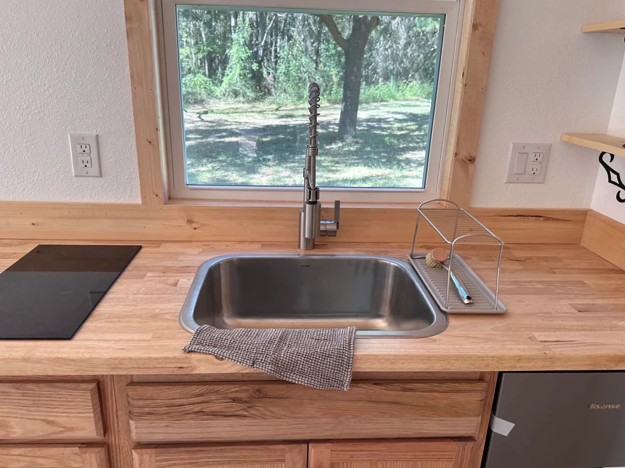
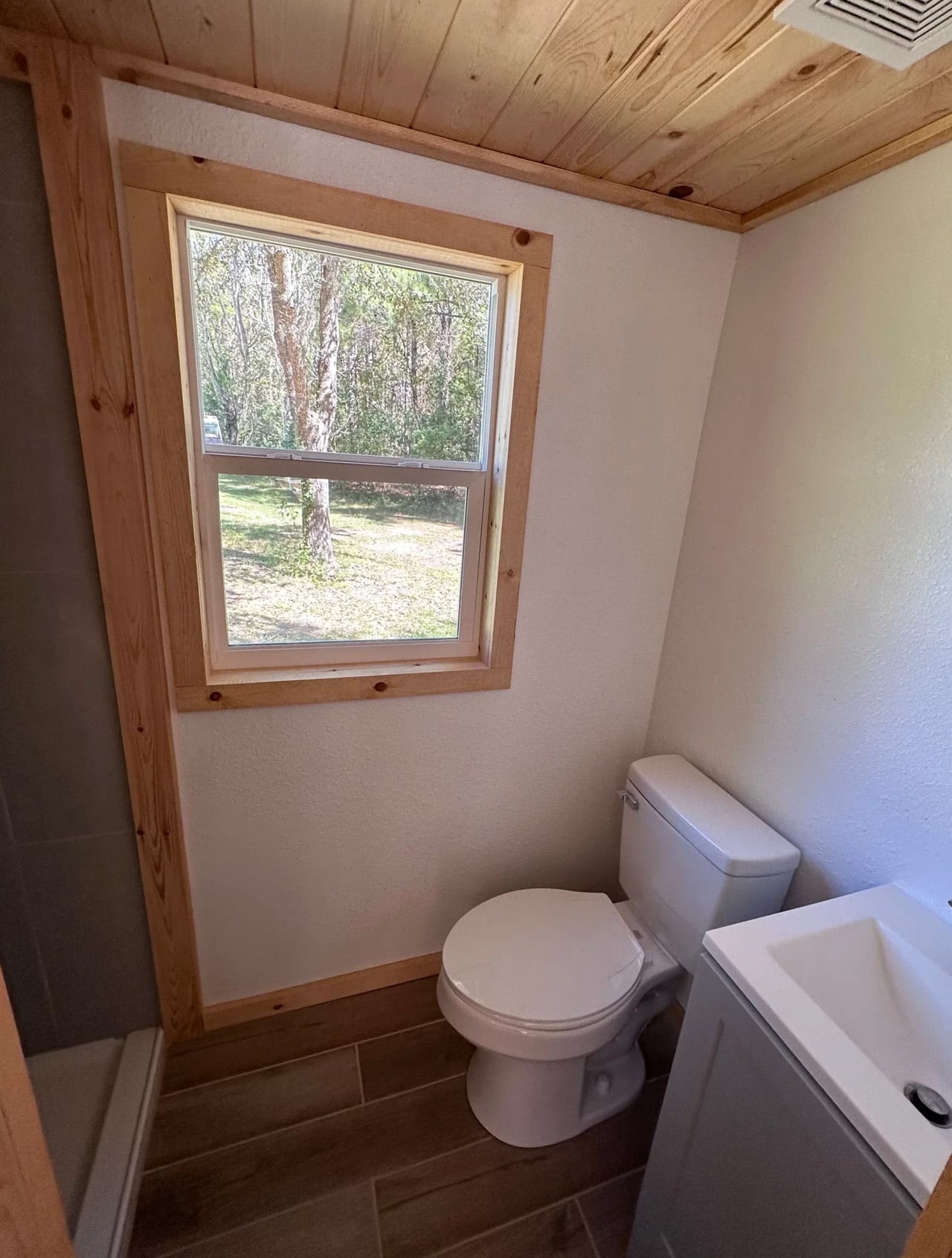
Inside, the layout is deliberately open. A kitchenette, a bathroom with a shower stall, a flush toilet, and a mini sink round out the essentials without overcomplicating the floor plan. Upgrade options include shiplap interior walls, a washer/dryer combo unit, and full furnishing — meaning a move-in-ready Shanti fully finished starts at $35,000, which remains remarkably low for a certified build. The entire structure is NOAH certified as an RV and sits on a hand-built chassis with thick gauge steel, double axles rated at 5,000 lbs each, trailer brakes, and DOT-approved highway lighting — built to travel, not just to sit.

Simplify Further, based out of Lake Butler, Florida, built the Shanti as their very first model, and it’s arguably still their most versatile. The company describes it as a blank canvas, and the use cases back that up: guest house, mother-in-law suite, home office, Airbnb rental, teen housing, healing arts studio, or emergency shelter. Several Shanti units have already been listed on Airbnb near Florida’s crystal clear springs, giving prospective buyers a chance to actually sleep in one before committing.

For a builder that has delivered over 100 tiny homes nationwide and holds a 3-time Best in Show award from the Florida Tiny Home Festival, the Shanti is a quiet statement. It’s proof that the best entry point into tiny living doesn’t have to compromise on quality — it just has to be honest about what space you actually need.

The post This $30,000 Tiny Home Puts the Bed on the Ground Floor and the Price Below Every Competitor first appeared on Yanko Design.

9 Best Travel Gadgets & Gear That Make Summer 2026 Actually Worth Packing For

Transparent display of an OPT90 cassette speaker in a clear case, with 'CASSette SPEAKER' and 'Bluetooth Connection' labels visible.

The best travel packing lists have always been exercises in subtraction. What earns its weight. What survives a summer of trains, guesthouses, and long airport mornings? The objects that endure are the ones designed with enough intention that they feel better used than new. This year, that edit has gotten easier. A handful of products have arrived that understand travel not as a logistics problem but as a mode of living worth designing for.

There is a particular pleasure in a bag that weighs nothing and contains everything you need. The nine objects below represent that standard. They range from a pressure brewer disguised as a travel mug to a titanium pen that barely exists. What they share is the belief that good design removes friction from the day rather than adding features to it. Pack all nine, and you will still have room for a change of clothes.

1. Side A Cassette Speaker
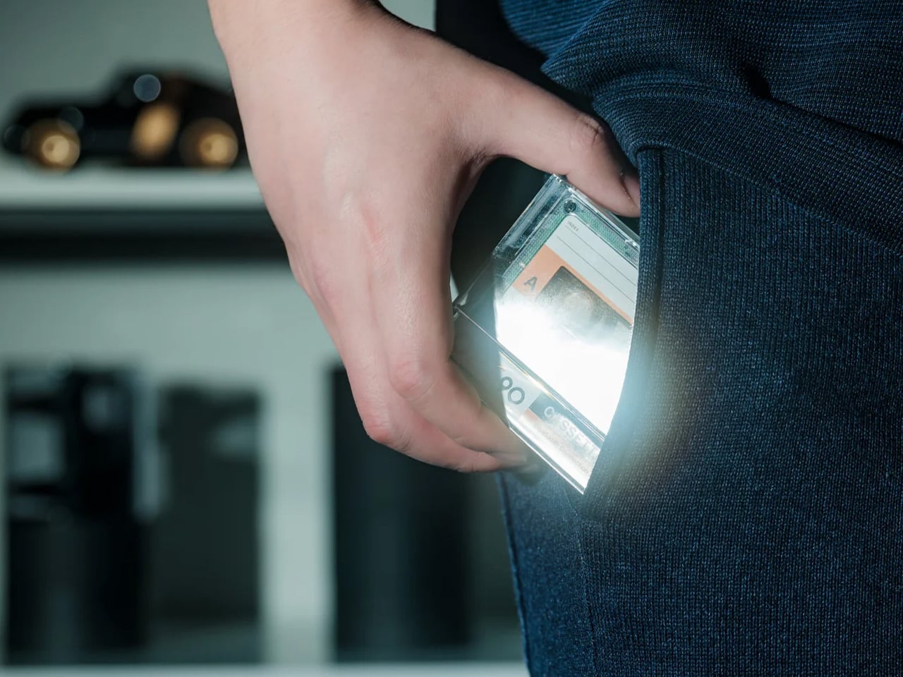
The Side A is a cassette tape that plays music, which makes it one of the quietest pieces of industrial design to land on a travel shelf in years. The form is exact: the dimensions of a 1970s compact cassette, the weight of an afterthought, and a sound quality that has no business coming from something this small. It fits in the coin pocket of your jeans, clips to a bag strap, and starts a conversation with everyone who notices it in a hostel common room or on a beach towel.

For travel, the emotional dimension matters as much as the functional one. The Side A is the object you pull out at a guesthouse in Lisbon or a rented apartment in Kyoto and place on a windowsill while you unpack. It signals something about the kind of traveler you are before you say a word. It runs wirelessly via Bluetooth and charges via USB-C, so the retro aesthetic is purely visual. The ritual of pressing play on something shaped like a tape deck turns any room temporarily yours.

Click Here to Buy Now: $49.00

What We Like

  • The cassette form factor fits in places no other speaker can, including pockets, passport holders, and the side mesh of a water bottle sleeve.
  • Wireless Bluetooth and USB-C charging mean the vintage look carries none of the vintage inconvenience.

What We Dislike

  • Sound projection is directional and intimate rather than room-filling, which large outdoor spaces tend to expose.
  • The compact size means battery life is capped shorter than bulkier travel speakers in the same price range.

2. MokaMax
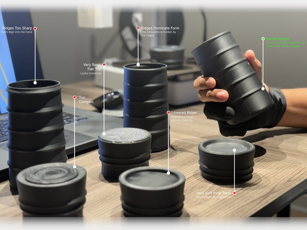
The hotel room coffee situation has not improved. The MokaMax accepts this and brings its own solution: a ridged stainless steel travel mug that contains a full pressure brewer inside its body. You fill the chamber, add grounds, apply pressure through the integrated mechanism, and have something approximating an espresso in under three minutes using nothing but boiling water from the kettle on the credenza. It is a singular piece of design that treats a genuine travel problem with the seriousness it deserves.

The ridged stainless exterior gives it a profile that belongs on the shelf of a Scandinavian kitchenware shop rather than in a carry-on bag. It travels as a sealed container with no separate parts to lose across time zones. The lid doubles as a cup. The whole thing weighs 400 grams fully loaded and fits in the front pocket of most travel backpacks. For coffee people who have tried every in-room alternative and arrived at the same disappointing conclusion every morning, this ends the conversation.

What We Like

  • The integrated brewer and mug in a single sealed body means no separate components, no loose parts, and no compromises across a summer of movement.
  • The ridged stainless exterior is visually distinctive enough to qualify as an object worth owning well beyond its function.

What We Dislike

  • Cleaning the pressure chamber on the road requires access to a proper sink and a few spare minutes that airport transit rarely provides.
  • The 400g weight, while justified, is noticeable in a carry-on where every gram has already been negotiated.

3. AirTag Carabiner

The AirTag Carabiner treats Apple’s tracking disc the way a good frame treats a painting: it makes the object inside worth looking at. Machined aluminum, a clean gate mechanism, and a profile that clips to bag straps, belt loops, and zipper pulls without reading as gear. Most AirTag cases are either cases or carabiners. This one is genuinely both, and the design is considered enough that you clip it on and forget it exists entirely until the moment you need it.

For travel, the peace of mind is architectural. You clip one to your checked bag and one to your day pack, and the anxiety of watching a baggage carousel empty while your luggage doesn’t arrive shifts from dread to information. The form is compact enough that it adds nothing to the weight profile of a bag. The aluminum patinas naturally over months of use into something that looks earned rather than bought. It is the category of object whose value you only understand the first time it does its job.

Click Here to Buy Now: $149.00

What We Like

  • The machined aluminum gate and clean profile make it one of the few AirTag carriers that genuinely improve the look of whatever bag it attaches to.
  • The combination of carabiner utility and tracking function eliminates the need for a separate clip and a separate case simultaneously.

What We Dislike

  • The AirTag itself is sold separately, which means the full experience requires an additional purchase; most listings bury this in fine print.
  • Aluminum gates can feel stiff in cold weather, and the opening requires two hands during the first weeks of regular use.

4. Comes

Siwoo Kim’s Comes is a small AI companion device designed specifically for solo travel, and the premise is more considered than it sounds. It sits in your palm, connects to your phone, and acts as a conversational layer between you and unfamiliar places: translating menus, suggesting detours, and responding to the low-stakes questions that feel embarrassing to search for in public. The design is rounded and quiet, built to stay in a pocket rather than demand a wrist, a screen, or a face to look at.

What makes Comes worth including in any honest travel list is what it refuses to do. It is not a phone. It has no screen. It does not try to replace anything except the particular loneliness of standing in a new city without anyone to ask. For solo travelers who find the performance of looking confident in unfamiliar places genuinely tiring, Comes offers a private layer of support without the social cost of visibly consulting a device. It turns navigation into conversation, which is a different kind of travel entirely.

What We Like

  • The screenless, pocket-sized form means it assists without demanding attention, which is the rarest quality in any device designed for travel.
  • The AI layer is built specifically for travel contexts, making it meaningfully more useful than a repurposed general-purpose assistant.

What We Dislike

  • Connectivity depends entirely on your phone’s data plan, which in rural or international contexts can make the experience inconsistent.
  • The concept is stronger than the current feature set, and early adopters will encounter limits that future firmware will eventually address.

5. Kinto Travel Tumbler
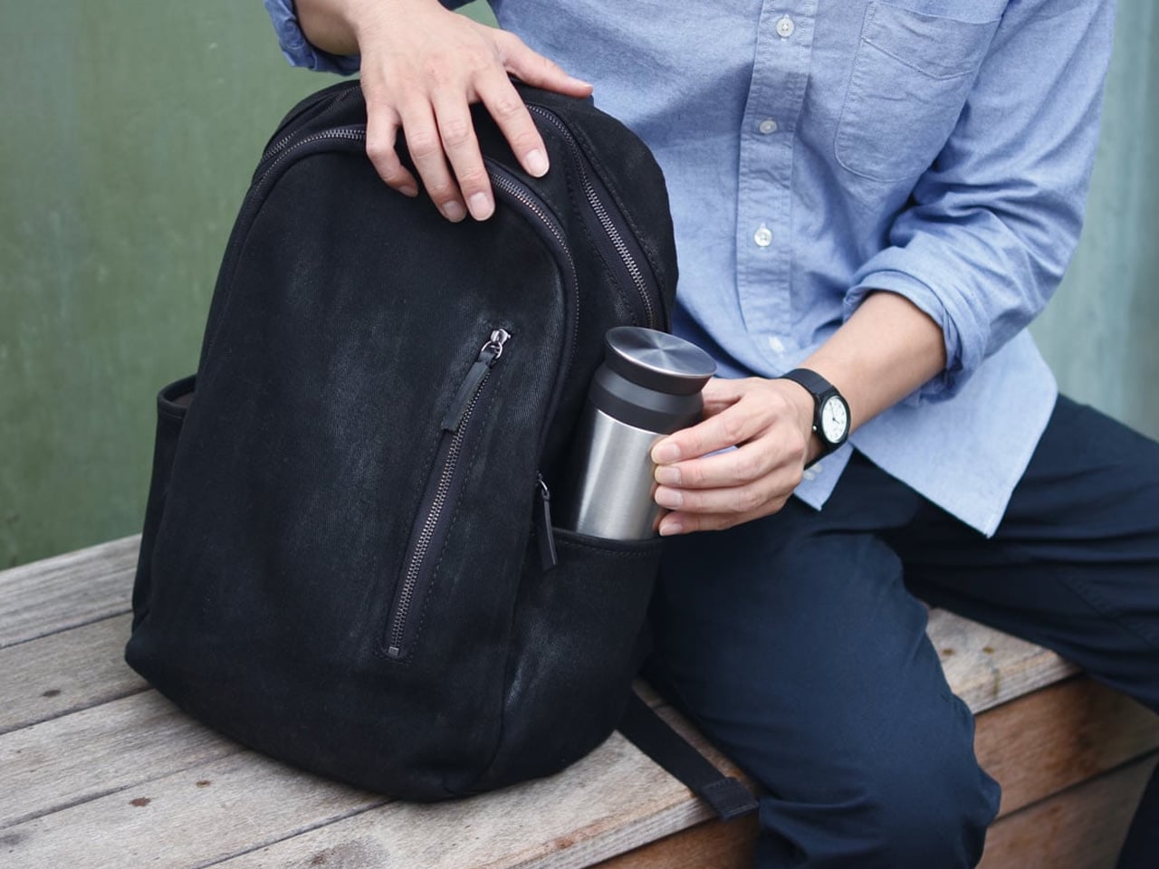
KINTO has been making drinkware in Japan since 1972, and the Travel Tumbler is the product that explains why the brand has a following among people who pay attention to objects. Matte stainless steel, a one-handed screw lid with a silicone seal, and an opening wide enough to drink from without tipping your head back. There is no rubber gasket on the exterior. No logo beyond a debossed stamp. No color options are engineered to attract attention. It disappears into your morning routine and becomes difficult to travel without.

The 500ml capacity is the most considered part of the design. It is enough for a double espresso topped with hot water, or a full cup of whatever the guesthouse kitchen offers, without being the oversized vessel that forces you to drink fast or carry heavy. It keeps liquids at a temperature for six hours in either direction. For a summer of early trains and long afternoons in cities you are still learning, the Kinto becomes the object you reach for more often than any other in your bag.

What We Like

  • The matte stainless exterior and restrained detailing place it closer to Japanese tableware than outdoor gear, which is a genuine category distinction.
  • The 500ml capacity hits the precise middle ground between espresso-sized and inconveniently large for everyday carry.

What We Dislike

  • The screw lid takes slightly longer to open than a flip-top, which becomes apparent when you are holding a tray and a boarding pass simultaneously.
  • The matte finish marks with fingerprints in warmer climates and requires more frequent wiping than a polished surface would.

6. Casabeam Everyday Flashlight
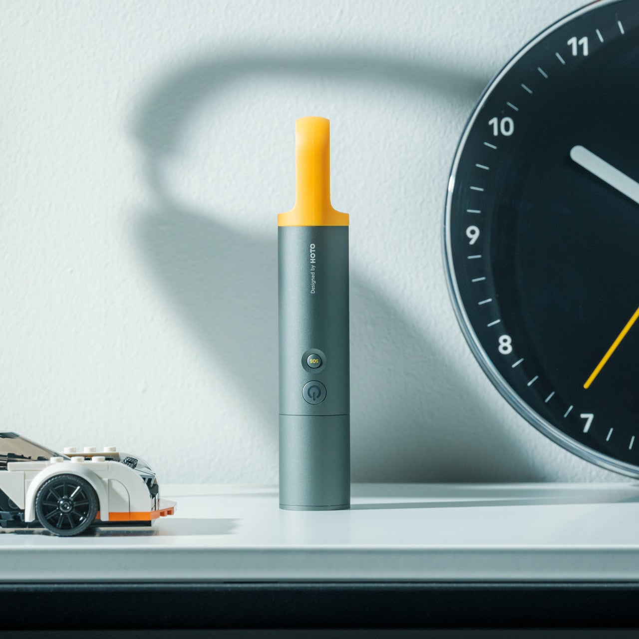
The Casabeam occupies the specific design territory between a tool and an object worth keeping on a desk. The body is machined to a clean cylindrical profile with a pocket clip that doubles as a satisfying fidget mechanism, and the beam output is serious enough for actual use without the tactical overdesign that plagues most EDC lights. It charges via USB-C and remembers its last mode, which sounds minor until you have spent thirty seconds cycling through strobe mode in a dark guesthouse corridor at 2 am.

Travel reveals how often you need a light that is not your phone. Cobblestone streets with broken lamp posts. Power cuts in cheaper accommodation. Reading in a top bunk without waking the rest of the room. The Casabeam handles all of it from a body that fits alongside a pen without adding bulk. The light quality is warm enough to be comfortable and bright enough to be useful. It earns more appreciation the longer you carry it, because it keeps solving problems you had quietly given up on solving.

Click Here to Buy Now: $50.00

What We Like

  • USB-C charging and mode memory remove the two most common sources of friction in EDC flashlight ownership entirely.
  • The machined cylindrical body is refined enough to sit alongside design objects rather than tools without any visual apology.

What We Dislike

  • The warm beam color, while pleasant for ambient use, is less useful for reading text at a distance than a cooler 5000K alternative.
  • The pocket clip was clearly designed for trouser pockets rather than shirt pockets, and the thinner fabric requires deliberate re-positioning.

7. CW&T Pen Type-C Ultra — gnuhr Edition
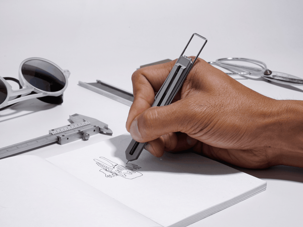
CW&T is a small New York studio that produces objects in limited runs for people who pay close attention to manufacturing. The Pen Type-C Ultra gnuhr Edition is Grade 5 titanium, hollowed and precision-milled to a skeletal profile that removes every gram that does not need to exist. It weighs almost nothing. It looks like it belongs next to aerospace hardware in a design archive. It takes a standard ballpoint refill and writes exactly as a pen should, with no drama and no compromise in either direction.

Traveling with this pen converts the act of writing into something you notice. Filling in a form at a hotel desk, signing a restaurant receipt, sketching a street corner in a notebook: these are the moments when an object of this quality distinguishes itself from everything else in your pocket. It does not perform its material. It simply is the material, in a form tight enough to disappear on a keychain or in the spine of a notebook. For a summer of movement, something is clarifying about carrying a pen that will outlast every passport you own.

What We Like

  • Grade 5 titanium construction and skeletal precision milling place this in a different category from every other writing instrument at any price point.
  • Standard ballpoint refill compatibility means the most beautifully made pen you own is also the easiest to maintain anywhere in the world.

What We Dislike

  • The skeletal body offers minimal grip surface, which becomes fatiguing during longer writing sessions on bumpy transport.
  • CW&T produces in limited runs, so availability can disappear without notice, and restock timelines are rarely predictable.

8. PROOF Wallet
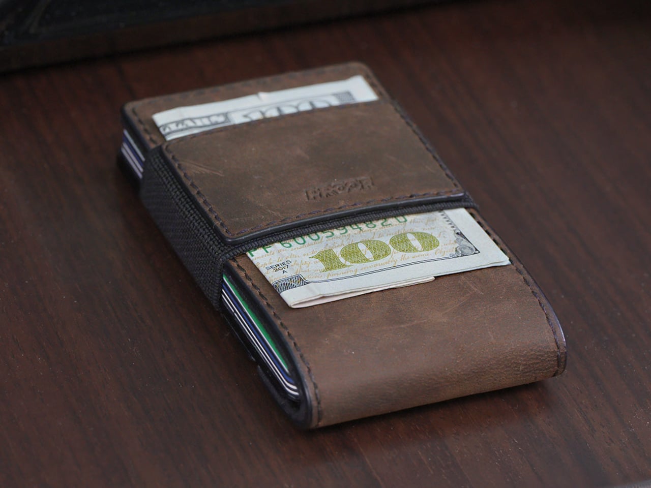
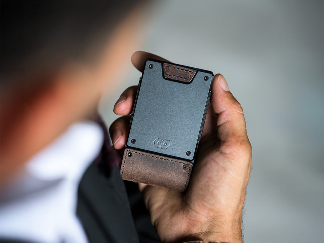
The PROOF Founder pairs an aerospace-grade aluminum plate with top-grain leather and a wide elastic strap in a form that reads as professional rather than tactical. Most minimalist wallets solve their problem by holding less. This one solves it by holding more without growing. The Founder handles anywhere from one to twenty-five cards, with the elastic strap compressing the stack and the leather wrap keeping it contained. It sits flat in a jacket pocket and does not announce itself, which, for travel, where your wallet becomes a daily tool rather than a background object, is the entire point.

The aluminum plate is the structural element that separates this from fabric-only alternatives: it prevents the flex and collapse that plagues elastic wallets after months of use and creates a satisfying resistance when fanning through cards. The leather wrap patinas over a summer into something that looks considered rather than worn. There is no branding on the exterior beyond the material itself. For the kind of traveler who finds the Ridge wallet slightly too aggressive in a formal setting, the Founder is the obvious alternative that nobody else at the table will recognize.

What We Like

  • Aerospace aluminum structure paired with top-grain leather produces a material combination that improves with use rather than degrading with it.
  • The one-to-twenty-five card capacity range makes it genuinely flexible across the context shifts that define summer travel without structural compromise.

What We Dislike

  • The elastic strap shows its age before the leather or aluminum does, and replacement options require contacting the brand directly.
  • The profile, while slim, is wider than card-only holders, which feels unnecessary on short day trips when you carry two cards and nothing else.

9. Traveler’s Notebook
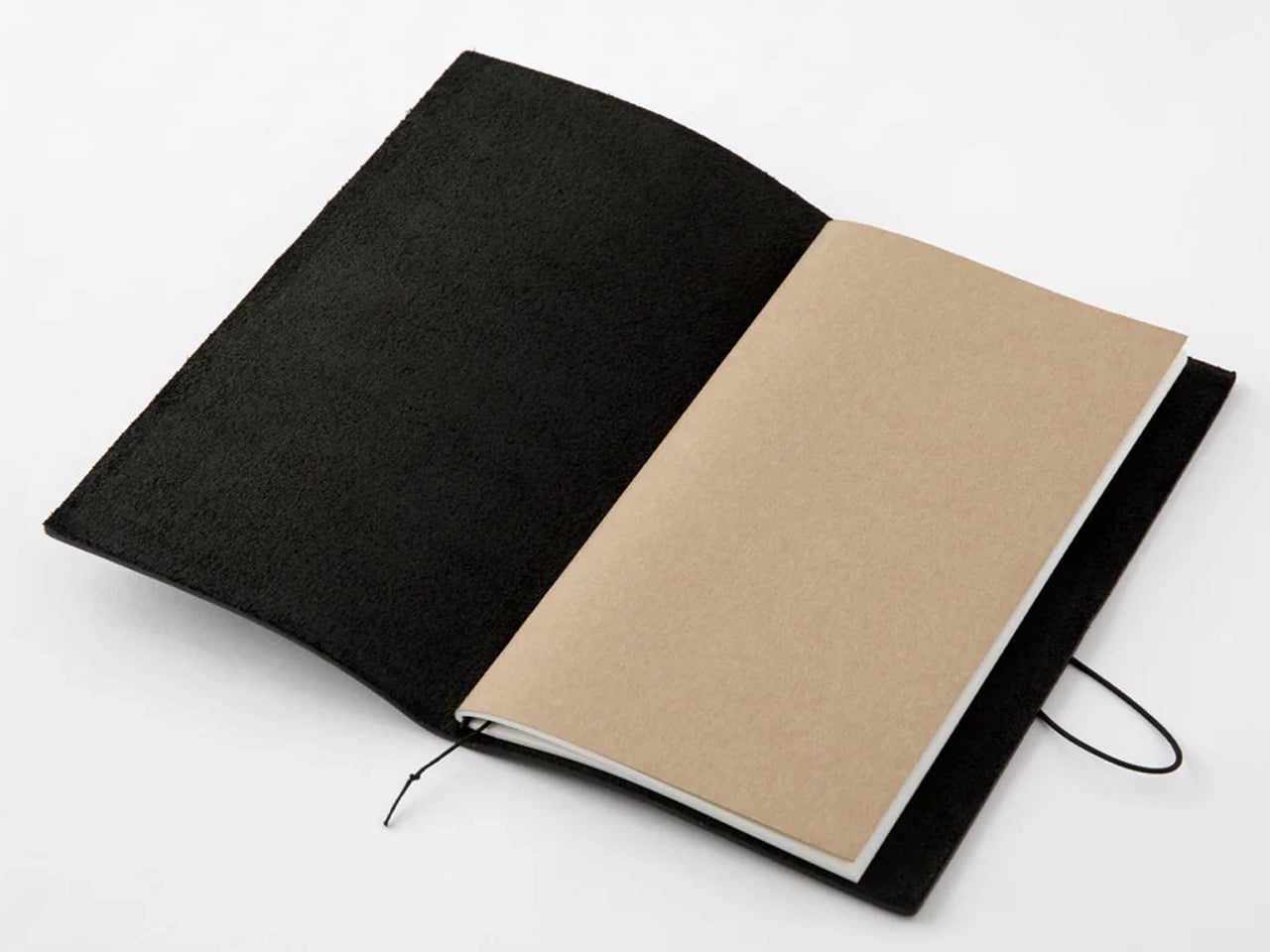
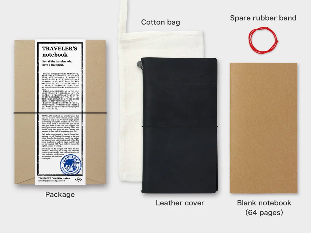
The Traveler’s Notebook has been in continuous production since 2006 and has changed almost nothing about itself, which is as strong an endorsement as any product can receive. The black edition is oiled buffalo leather stretched over a brass clip and elastic cord, aging into something that looks genuinely lived-in after a single trip. The passport size fits a shirt pocket. The paper is cream-colored, fountain-pen-friendly MD stock that resists bleed-through with quiet success. The inside becomes whatever you need it to be: journal, sketchpad, receipt keeper, boarding pass sleeve.

In a list built partly around technology and connectivity, the Traveler’s Notebook earns its place by doing nothing digital. It is the object that captures the parts of a trip that photographs miss: the light on a piazza at seven in the morning, the menu item you want to remember, the address someone wrote down for you on a napkin now tucked into the inner fold. Travel writing done by hand in a book that costs less than a meal has a particular relationship to memory that no app has yet replaced. This is the pocket-sized argument for why.

What We Like

  • Oiled buffalo leather and brass clip construction will outlast every phone, charger, and piece of luggage in the bag by a significant margin.
  • The refillable insert system means the notebook’s physical character accumulates across years while the interior renews for each new destination.

What We Dislike

  • The elastic cord binding requires an initial period of loosening before the inserts sit flat, which new users consistently find frustrating in the first week.
  • The narrow passport format can feel constrained for wider handwriting styles, particularly for left-handed writers working on moving transport.

Pack Less. Pay Attention.

Nine objects across nine categories, and the through-line is identical across all of them. Each one was made by someone who asked a specific question about how a thing should work rather than how it should be marketed. That specificity is what makes a bag lighter, a morning better, and a new city feel less like a problem to manage and more like the reason you left home in the first place.

The best travel gear does not make travel easier in the way a better suitcase wheel makes transport easier. It makes travel richer in the way a good book makes a long flight disappear. These nine objects will not tell you where to go. They will make you pay closer attention once you get there, which is the only travel advice worth taking.

The post 9 Best Travel Gadgets & Gear That Make Summer 2026 Actually Worth Packing For first appeared on Yanko Design.
This Charred Timber Cabin on the Sázava River Was Built From the Ruins of the One It Replaced

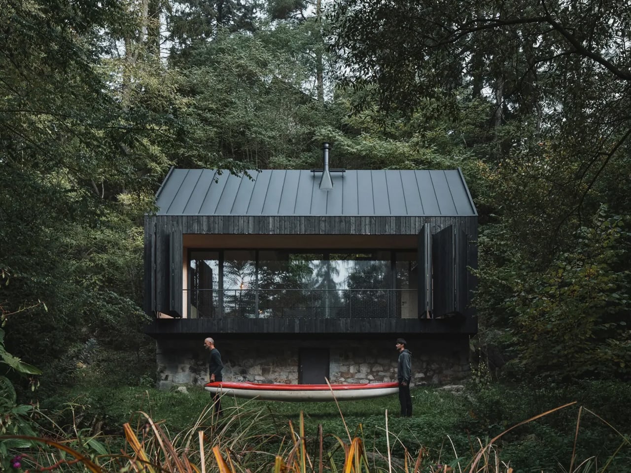
Most architects would have cleared the site and started fresh. Mimosa Architekti did the opposite. Perched on the banks of the Sázava River in Prosečnice, Czech Republic, Between the Rock and the River is a retreat born from ruin, designed to make peace with its past.

The story begins with a fire. The original cabin burned down, leaving behind only its stone plinth — a rugged, load-bearing pedestal that the architects chose not to demolish but to build upon. That decision, more than any other, defines the entire project. The plinth isn’t a footnote; it’s the foundation — both literally and conceptually. It lifts the new timber structure above the floodplain, offering protection from the river’s seasonal moods while granting the cabin an elevated sense of perspective. Slide open the shutter facing the water, and you’re rewarded with an uninterrupted view of the rapids, the boulders, and the kingfishers skimming the surface.

Designer: Mimosa Architekti

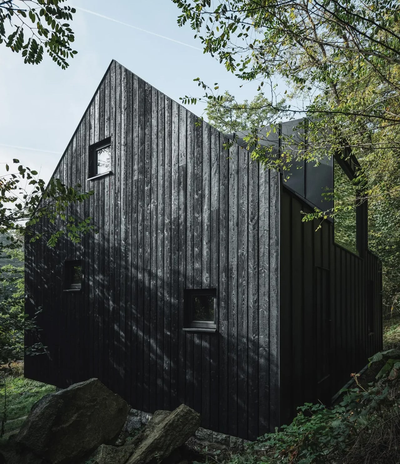
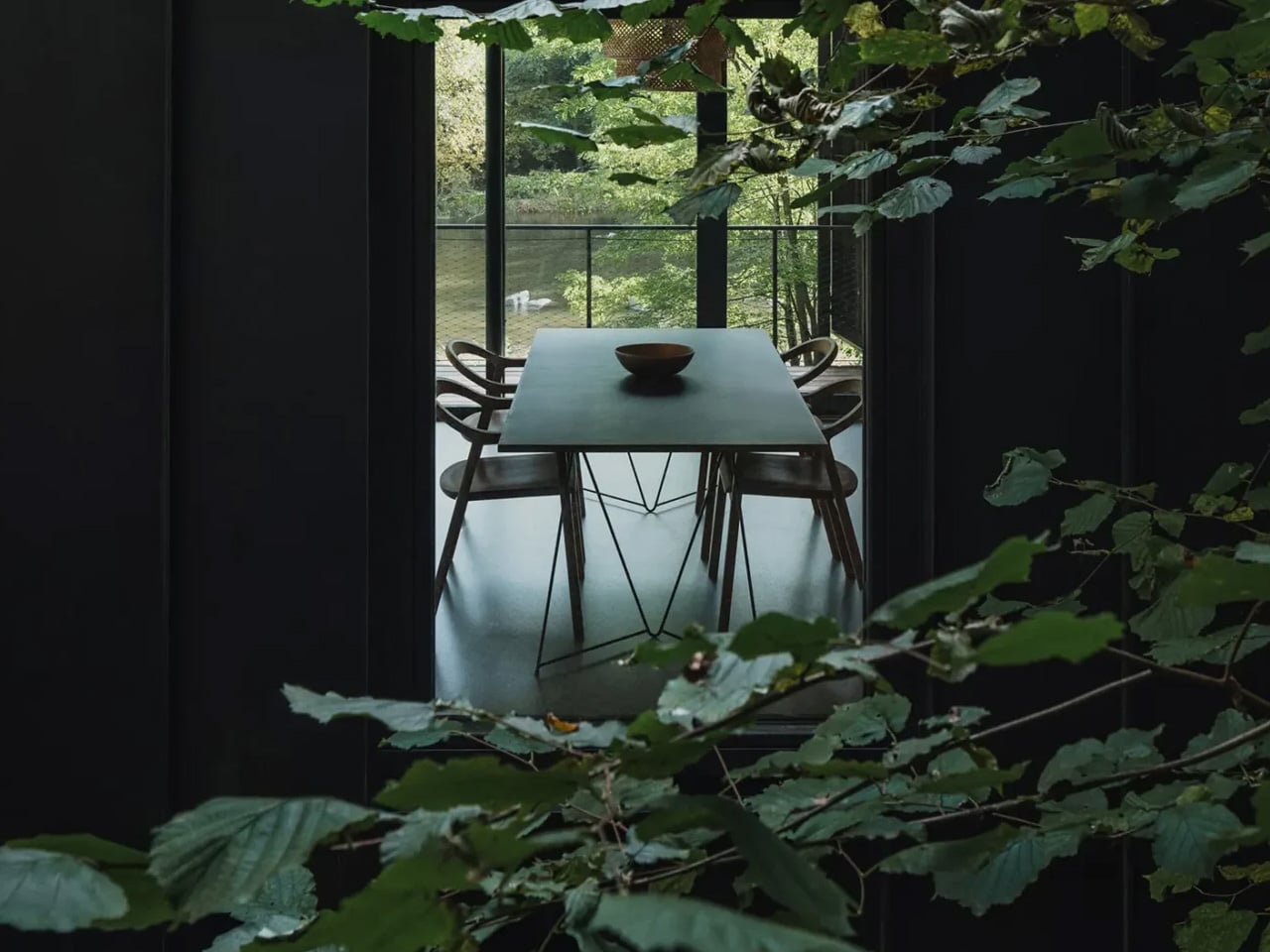
The exterior is wrapped in charred larch cladding — a nod to the Japanese yakisugi technique, where timber is scorched to enhance its durability and resistance to the elements. It’s a material choice that reads as both pragmatic and symbolic. The blackened skin mirrors the charred history of the site, turning an act of destruction into a design principle. From a distance, the cabin appears almost to dissolve into the dense pine forest surrounding it, its dark silhouette blending with shadow and bark.

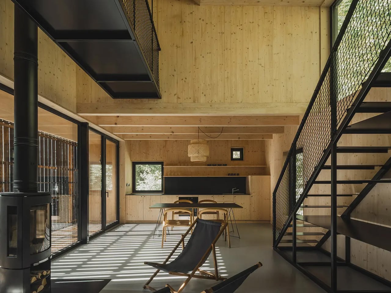
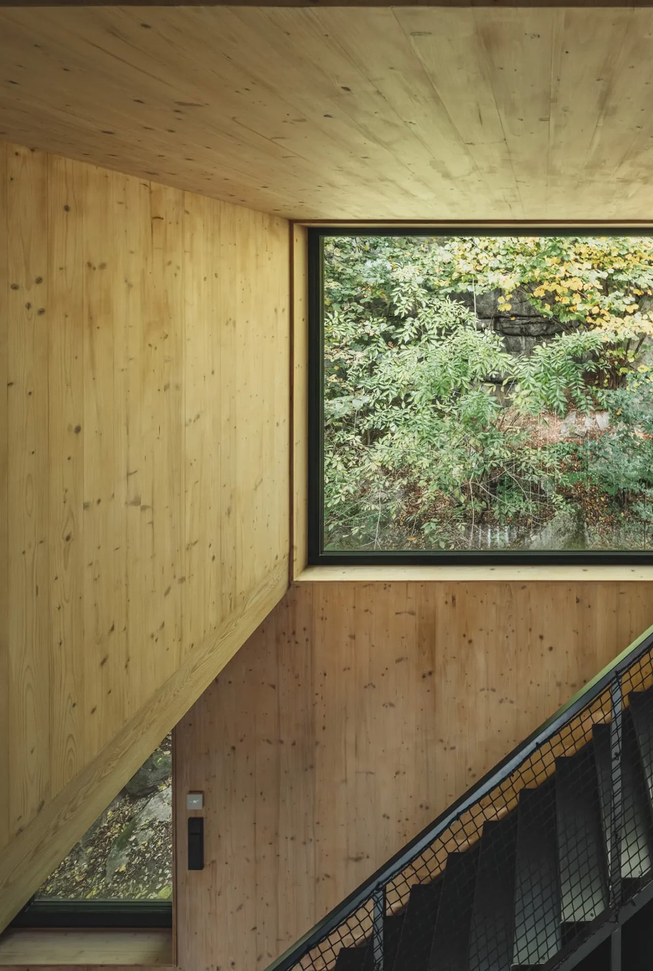
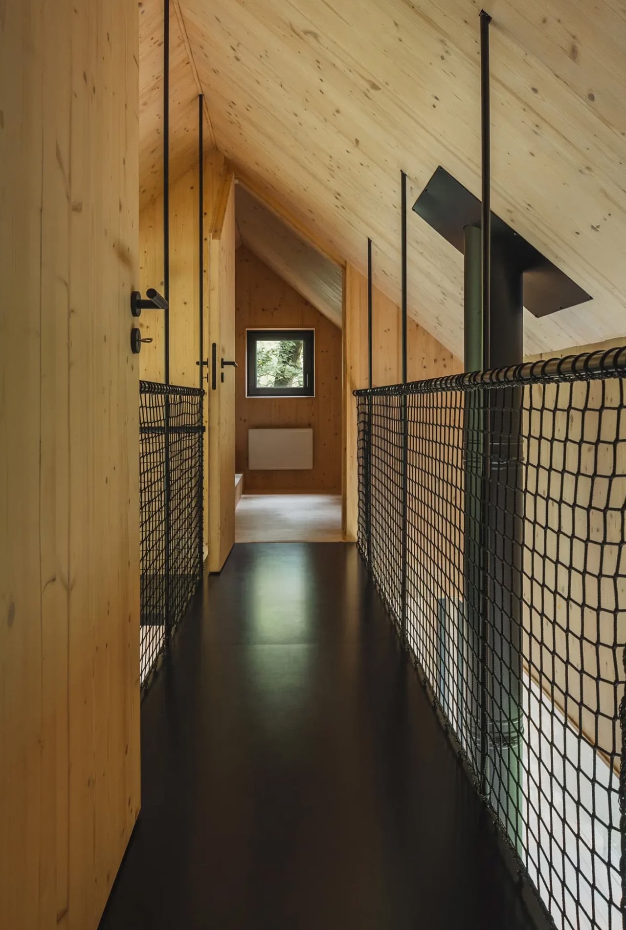
Step inside, and the palette shifts entirely. The wooden frame is clad on the interior with spruce wood panels — warm, pale, and luminous against the darkness of the exterior. The contrast is deliberate: rough and weathered on the outside, soft and considered within. It creates a sense of crossing a threshold, of leaving the exposed landscape behind and entering something more sheltered and human in scale.

The cabin occupies a narrow strip of land between the riverbank and rising cliffs — a site defined by constraint and compression. Mimosa Architekti responded not by fighting the geography but by working within it. The result is a structure that feels inevitable, as though it could only ever exist in this exact spot. Designed in 2020 and completed in 2025, the project took five years to realize — and you can sense that patience in every detail. Between the Rock and the River isn’t a cabin that shouts. It whispers — in the language of scorched wood, old stone, and moving water.

The post This Charred Timber Cabin on the Sázava River Was Built From the Ruins of the One It Replaced first appeared on Yanko Design.

This Moscow Forest Garage Is Really a Sculpture Gallery for Cars

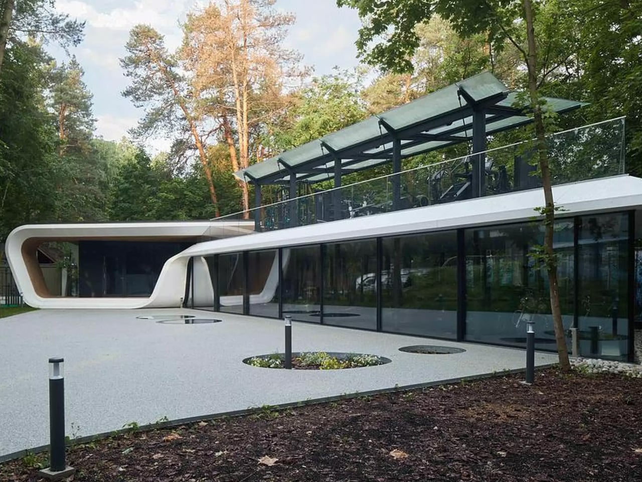
Not every garage is built to store cars — some are built to celebrate them. For them, Russian architecture studio ATRIUM has completed the ‘Garage for Car Collection’— a 200 square meter structure tucked into a wooded private estate on the outskirts of Moscow that treats its automobiles less like machines and more like museum-worthy objects.

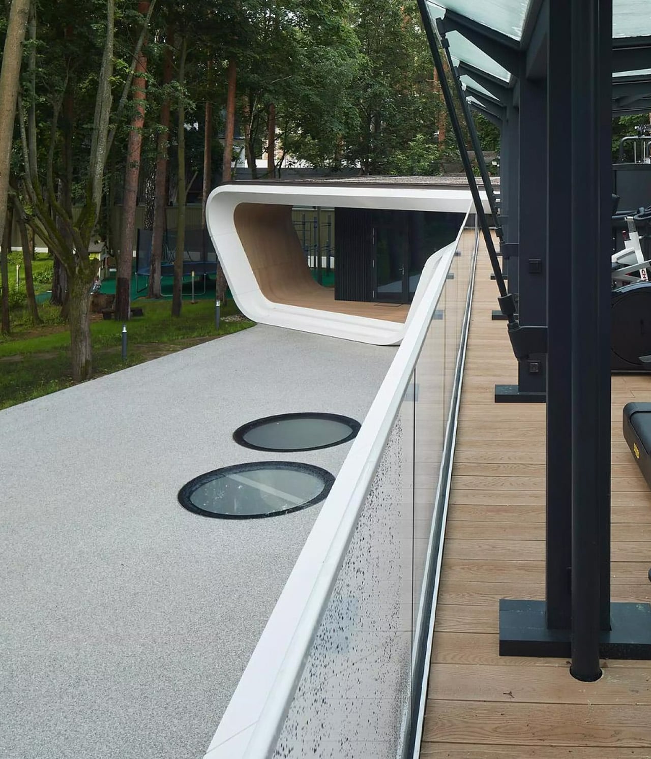
The project is the latest addition to a private estate, ATRIUM, originally designed in the early 2000s, which includes a manor house and guest house. Rather than a standalone commission, this garage continues a deliberate architectural lineage — only this time, the brief called for something far more layered. The building doesn’t just store cars. It functions as a curated vehicle gallery, a home gym, a business meeting space, a lounge, a mud room, and even a ski rack room — all unified under a single, fluid envelope.

Designer: ATRIUM

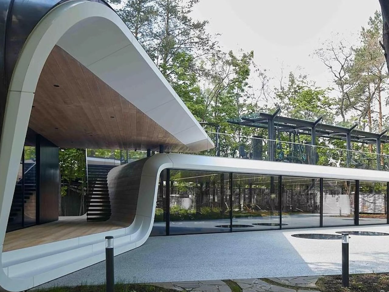
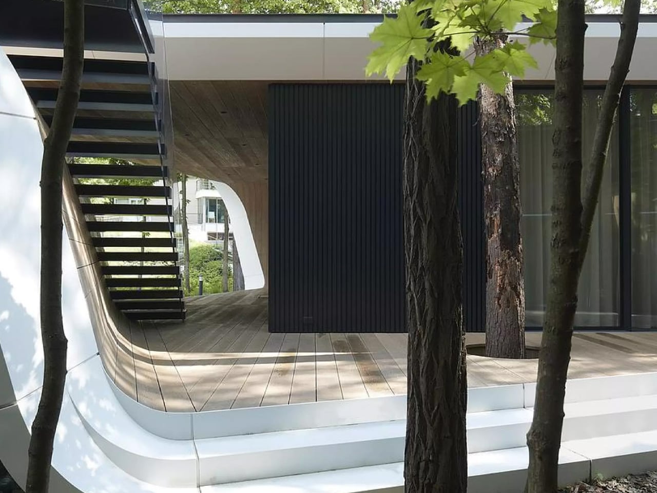
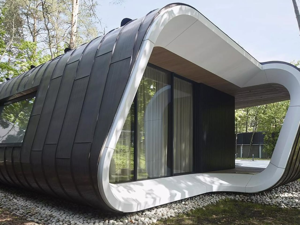
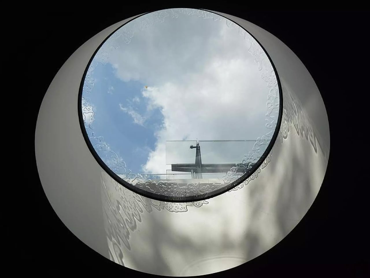
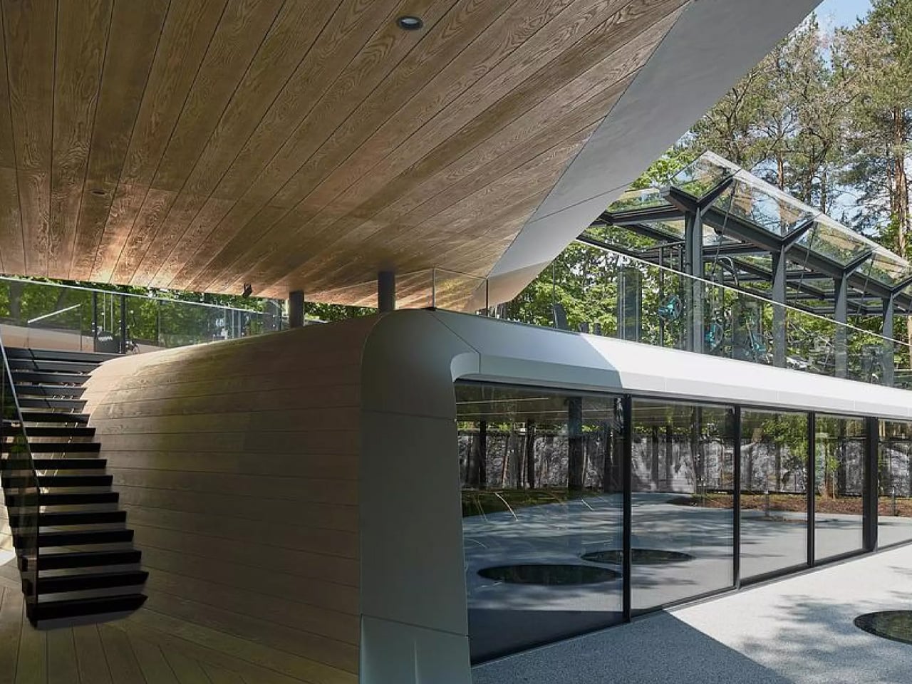
The form that holds all of this together is drawn from the Möbius strip. A continuous ribbon-like gesture wraps around the site, organizing the program across three levels. At ground level, a glazed exhibition space — framed by expansive facades with ultra-thin profiles on the north and south sides — puts the vehicle collection on full display. The ribbon then ascends diagonally to a rooftop outdoor workout terrace, while descending below grade into a gym and office, where discreet ground-level apertures pull in natural light without disrupting the building’s clean exterior reading.

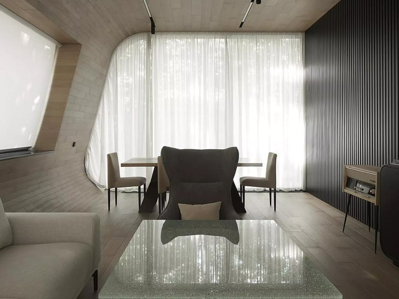
Materiality is where ATRIUM’s precision really shows. The exterior is clad in seamless white Corian — a surface that evokes aerodynamic engineering — while wood and copper warm up the interior spaces. The contrast is intentional: the building reads as something athletic and mechanical from the outside, intimate and refined from within. It’s a space that mirrors the cars it shelters.

What makes the project genuinely remarkable, though, is what wasn’t touched. Every existing tree on the wooded plot was preserved, with the building’s footprint carefully negotiated around the forest. In a field where development and ecology tend to work against each other, ATRIUM treats the surrounding woodland as a collaborator rather than an obstacle. The underground expansion minimizes the building’s visible impact on the landscape, letting the structure feel as though it surfaced from the forest floor rather than was imposed upon it.

Completed in 2024, the project was designed in 2020 by a team led by Anton Nadtochiy and Vera Butko. It has since been named a finalist at the World Architecture Festival 2025 in two categories: Completed Buildings – Transport, and the Small Project Prize — recognition that confirms what the building itself already suggests: the garage, as a typology, has been quietly, elegantly reimagined.

The post This Moscow Forest Garage Is Really a Sculpture Gallery for Cars first appeared on Yanko Design.
5 Best Products For A Minimalist Coffee Table That Does More By Doing Less

The coffee table is the hardest surface in the living room to get right. Put too much on it, and it looks like a staging mistake. Put too little and the room reads unfinished. The minimalist approach settles this by demanding each object justify its place twice — once as something useful, once as something worth looking at. Every product on this list earns on its own terms.

These five objects were chosen because they share a logic rather than a matching aesthetic. A kinetic toy, a modular ceramic, a structural tray, a floating mobile, a handpoured candle vessel — different categories, different price points, one consistent standard. Each one does more than its category suggests, and none of them requires anything around it to look complete. That is the whole point of a surface that does more by doing less.

1. ClearMind Kendama

Wooden yoyo with string resting on a white design magazine page, partly covered by a gray knitted blanket/rug in the foreground.

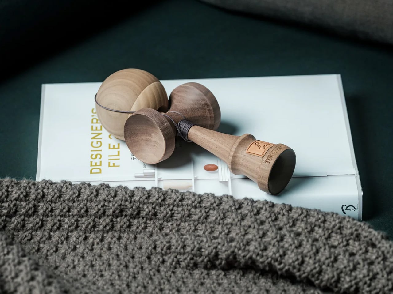
The ClearMind Kendama is the object on this list that will raise the most eyebrows and earn the most genuine conversation. Crafted in Tokyo from solid, unpainted walnut and maple, it’s a Japanese skill toy that sits on a minimalist coffee table the way a chess set sits on a side table — quietly suggesting a way of spending time that isn’t a screen. The two-tone wood grain reads as sculpture when it’s at rest, and the proportions are tight enough that it occupies almost no footprint while contributing significant material presence and warmth to the surrounding surface.

What makes the Kendama work as a coffee table object rather than just a novelty is the quality of its materials and the honesty of its finish. Walnut and maple at this weight don’t look like toys — they look like considered objects, which is exactly what they are. The practice itself is deliberately simple: the ball catches on the cup, the spike, the base plate. Each successful catch requires a small act of focus that pulls you out of passive consumption and toward something genuinely present. On a minimalist table, it functions as an invitation — to pick up, play, put down — and every time it rests, it returns to being a beautiful wooden form that needs no explanation.

Click Here to Buy Now: $59.00

What we like:

  • The unpainted natural wood reads as a sculpture at rest
  • The meditative play pattern offers something no other object on this list provides

What we dislike:

  • The cup-and-ball proportions are an acquired taste for anyone who associates kendamas with children’s toys
  • The string can feel visually busy if left extended rather than gathered

2. Torre Modular Ceramic Vase

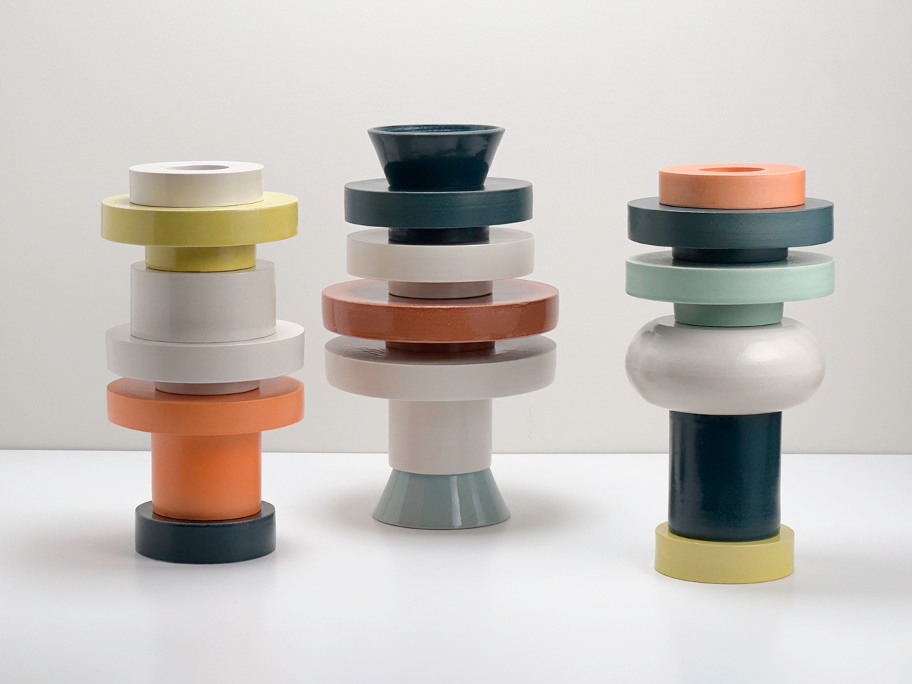
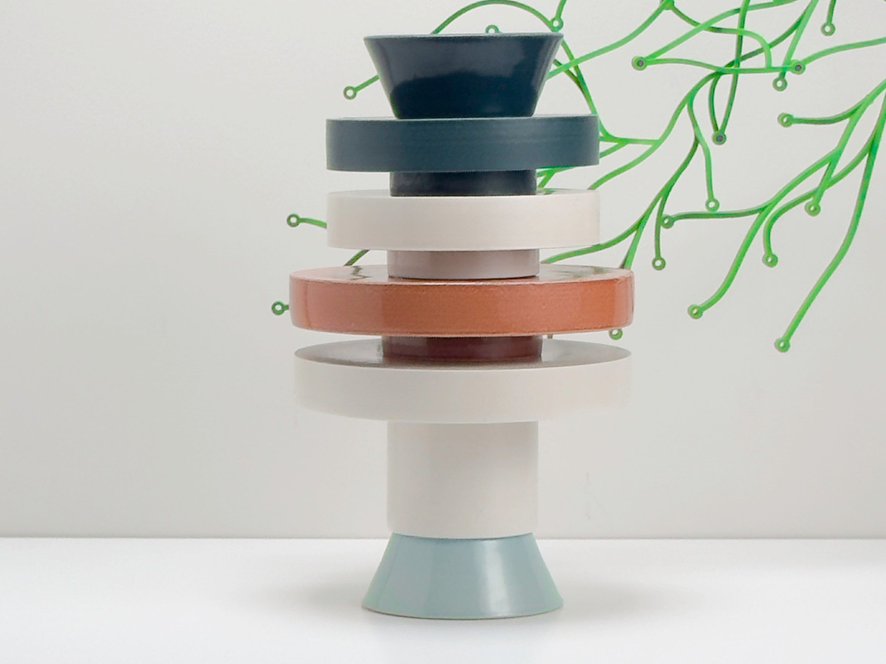
The Torre Modular Ceramic Vase by Scott Newlin for Dudd Haus is the most expensive object on this list by a significant margin, and the one that earns that price most transparently. Each piece is hand-thrown at Powerhouse Arts in Brooklyn and arrives as a set of stackable ceramic modules — two, three, or four components depending on the configuration — that interlock through consistent diameters and lipped rims. The forms are architectural, muted, and deliberately quiet: off-white, sand, stone. On a coffee table, they read as a composed sculpture from any angle, at any height.

What sets the Torre apart from a standard ceramic vase is that it offers a choice every time you approach the table. Stack the modules high for a vertical moment, separate them into a low cluster, or pull one aside entirely and set a dried stem inside the remaining piece. The act of rearranging them is part of the object’s value — it rewards attention in a way that static objects never can. For a minimalist surface, the price demands justification, and it finds it here: the Torre is three objects in one, each configuration as resolved as the last, none of them requiring anything around them to look finished. It is the closest thing on this table to pure design.

What we like:

  • Each reconfiguration creates a genuinely different visual read
  • The hand-thrown ceramic carries natural variation that improves with close attention

What we dislike:

  • At $1,200, it is a significant commitment for a surface object
  • The off-white and sand palette, while intentional, can disappear on lighter table materials

3. Sail Away Tranquility Mobile

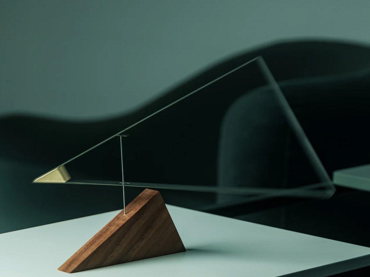
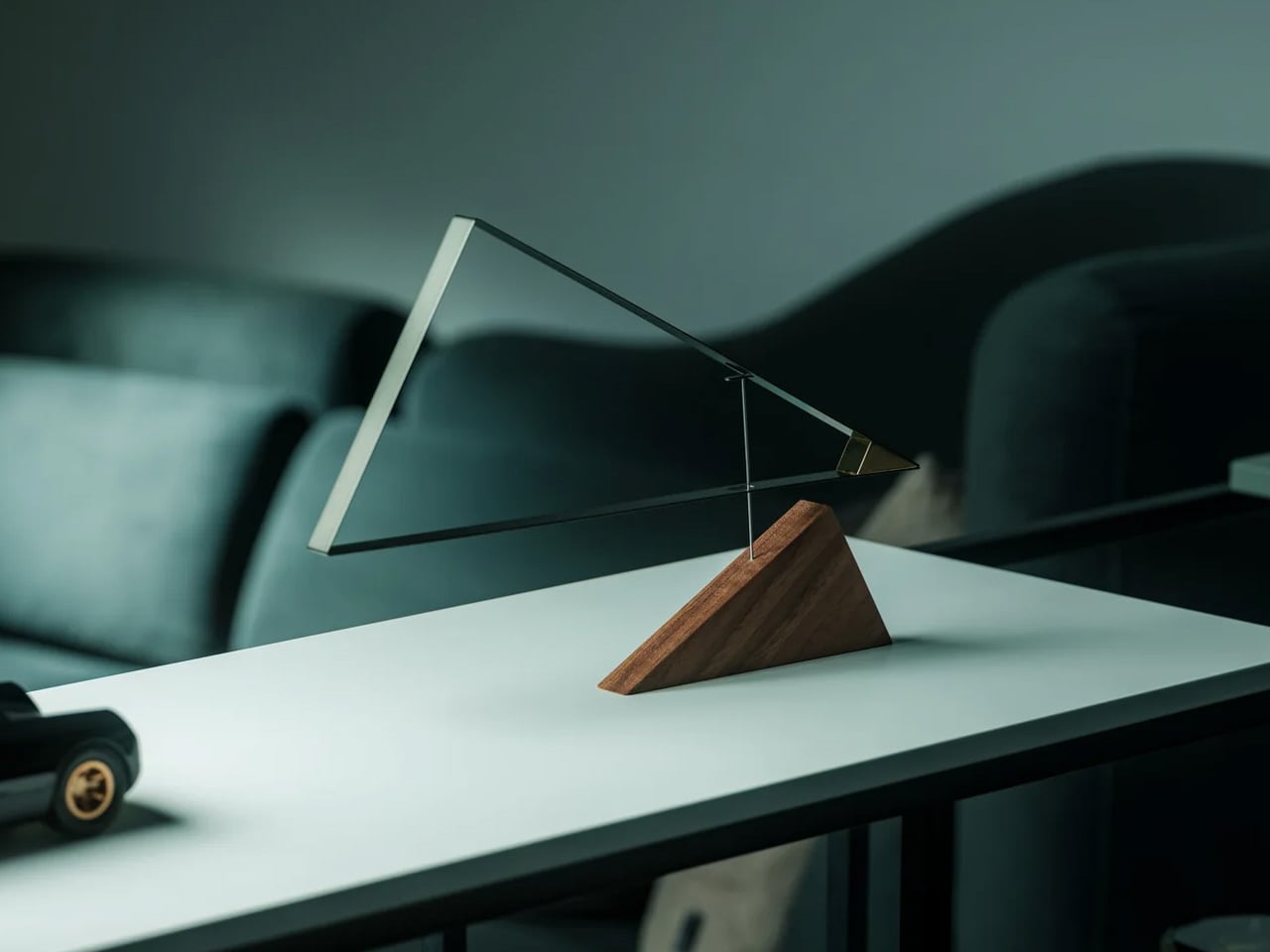
The Sail Away Tranquility Mobile is the only object on this list that moves, and movement is precisely why it belongs here. Three balanced triangular forms — drawn from the geometry of sailboats — hang in calibrated tension and respond to the slightest air current in the room. On a coffee table, it introduces a kinetic quality that no static object can replicate: the table becomes the most animated surface in the living room without adding any visual weight. The proportions are compact enough for a tabletop, the construction is clean, and the physics are genuinely surprising the first time you see it shift in still air.

What makes the Sail Away work as a minimalist object is its restraint. The movement is subtle rather than theatrical — a slow drift rather than a spin — and it never demands attention so much as rewards it, which is the correct register for a surface meant to feel considered rather than performed. At $145, it occupies a different design category from every other object on this list: not sculpture exactly, not functional exactly, but somewhere between the two that feels honest rather than decorative. Set at the far edge of the Platform Tray, it creates a vertical moment that anchors the whole composition without competing with anything around it.

Click Here to Buy Now: $129.00

What we like:

  • The kinetic movement brings a living quality to the table that no static object can match
  • The geometric forms hold their visual logic from any angle

What we dislike:

  • The mobile requires a stable surface — consistent vibrations from foot traffic or sound can overanimate it
  • The string suspension looks considered but feels delicate in a high-use living room

4. Simple Candle Co. Concrete Vessel

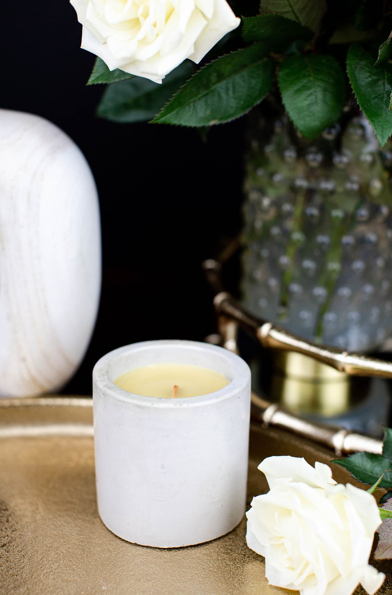
The Simple Candle Co. Concrete Vessel is the most affordable object on this list and the one that punches furthest above its price. Each vessel is hand-poured in small batches from a grey concrete body with a short soy wax wick and no label. The scent runs deliberately clean — white linen, cashmere cedar, or unscented — and the vessel itself is the product as much as the candle inside it. At $20, it brings concrete’s material seriousness to the table at a price that makes it easy to keep two: one lit, one resting, both earning their place on the surface.

The concrete body doesn’t get hot to the touch during burning, which is a practical advantage that most candle vessels at three times the price can’t claim. Burn time runs approximately 25 to 30 hours, and when the wax is finished, the bowl stays. Rinse it out, and it becomes a catch-all for a matchbox, a small stone, a ring. That second life is built into the object from the first glance — the vessel was always the point, and the candle is what justifies buying it for $20 rather than considerably more. Alongside the Kendama’s natural wood and the Torre’s matte ceramic, the concrete introduces a third material that completes the tactile range without competing for visual dominance.

What we like:

  • The vessel earns its place before and after the candle burns
  • The concrete stays cool during use, which is a genuine functional advantage over glass and ceramic alternatives

What we dislike:

  • The scent throw is intentionally subtle and reads as ambient rather than strongly aromatic
  • The hand-pour process means each vessel varies slightly, so a replacement may not match an existing piece exactly

5. Muuto Platform Tray — Grey

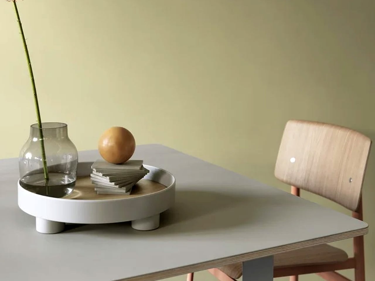
The Muuto Platform Tray is the object that makes every other object on this list look better. Available at Finnish Design Shop for $109 in grey, it’s a round tray with an oak veneer surface and small metal legs that lift it just enough off the table to create a clear visual boundary between the objects inside and the surface beneath. That boundary does more compositional work than it should — it turns a group of objects into a considered arrangement rather than a collection of things that happen to be sitting on the same surface. The grey metal and warm oak read well together, and the form is simple enough to disappear.

In practical terms, the Platform Tray is the anchor. The candle vessel sits inside it. The Kendama rests at its edge. The mobile grounds one end. The tray doesn’t organize these objects so much as it frames them, and the difference between a frame and a container is the difference between editorial and domestic. The oak veneer surface develops warmth over time, and the small legs mean it can be lifted off the table intact when the surface needs to be cleared without disturbing the composition it holds. At $109, it is the least visually dramatic piece on this list and almost certainly the most indispensable one.

What we like:

  • The oak veneer surface brings warmth to a mixed material setup
  • The raised legs separate the composition from the table surface with minimal visual noise

What we dislike:

  • The round form can feel restrictive on a narrow or strongly rectangular table
  • It comes in one size, so there’s no option to scale up for a larger surface

The Only Five Objects Your Coffee Table Needs

Five objects, five categories, one shared logic. The tray frames. The candle grounds. The mobile moves. The Kendama invites you to participate. The Torre rewrites what a vase can be. Together they fill a coffee table without crowding it, and none of them needs the others to look resolved. That is the discipline a minimalist surface asks for, and these five meet it.

The full build comes to $1,444, with the Torre carrying most of that weight. Buy the other four first — at $344 combined, they build one of the strongest minimalist coffee table setups available at that price — and treat the Torre as the object you earn over time. Start with the Platform Tray. Everything else finds its place from there.

The post 5 Best Products For A Minimalist Coffee Table That Does More By Doing Less first appeared on Yanko Design.
Two Concrete Walls and No Electricity Make This Tiny Chapel Unforgettable

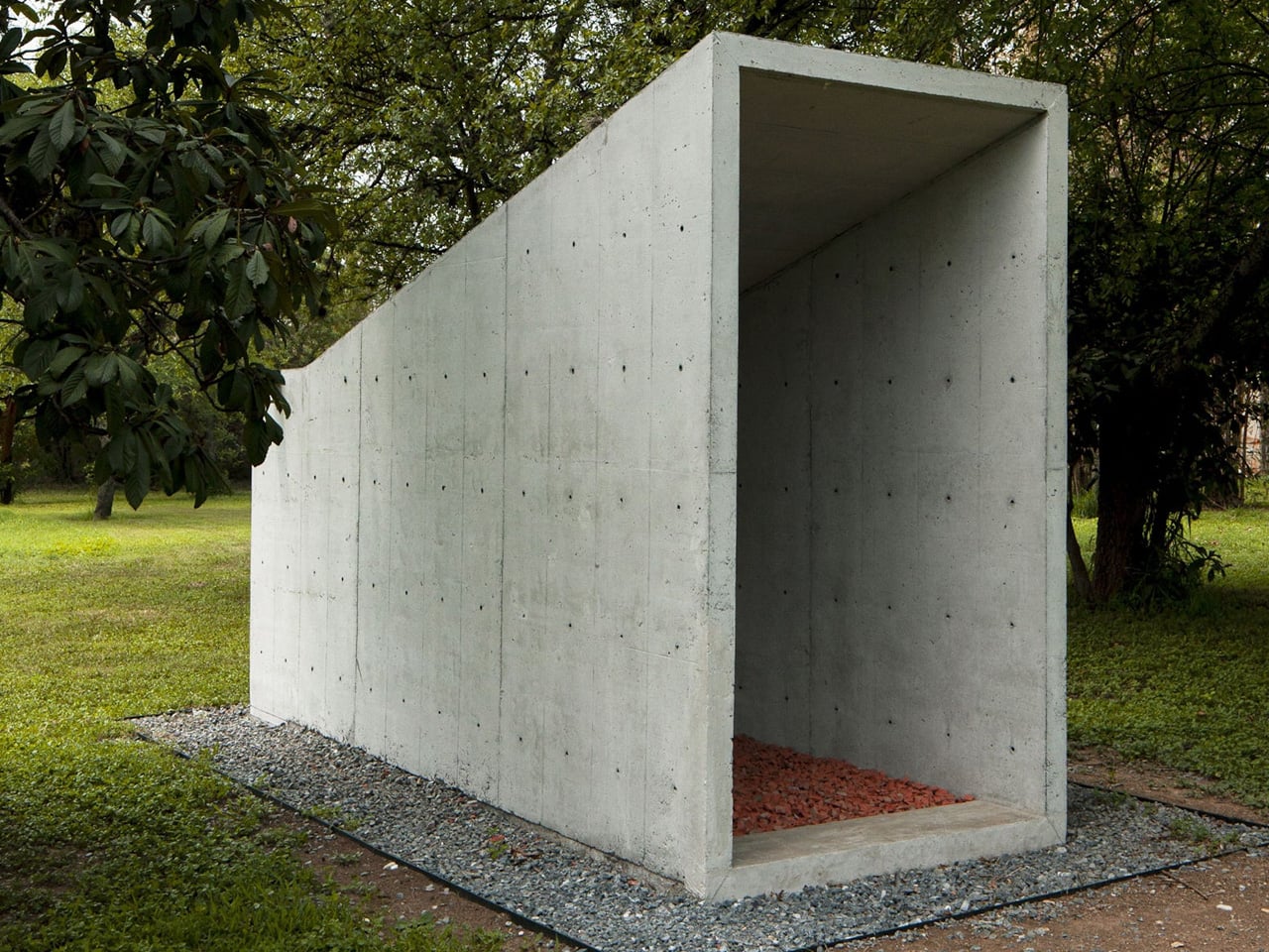
Most buildings erase what came before them. This one didn’t. That’s exactly what Mexican studio S-AR has achieved with its Oratory Chapel in Santiago, Nuevo León, a compact sacred space set within a sprawling garden that breathes new life into a demolished predecessor.

The project began with an act of demolition. A preexisting chapel on the same site was taken down, but rather than discarding its materials, S-AR retained them and worked them back into the new construction. The result is a structure that operates as a continuation rather than a replacement — the old chapel doesn’t disappear; it reassembles itself into something fresh, its fragments carrying forward a spatial and material dialogue between past and present.

Designer: S-AR

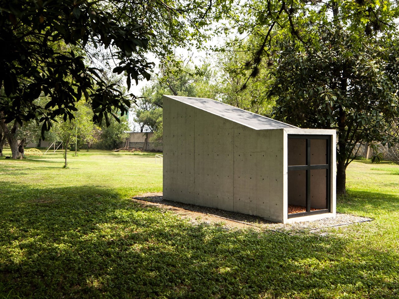
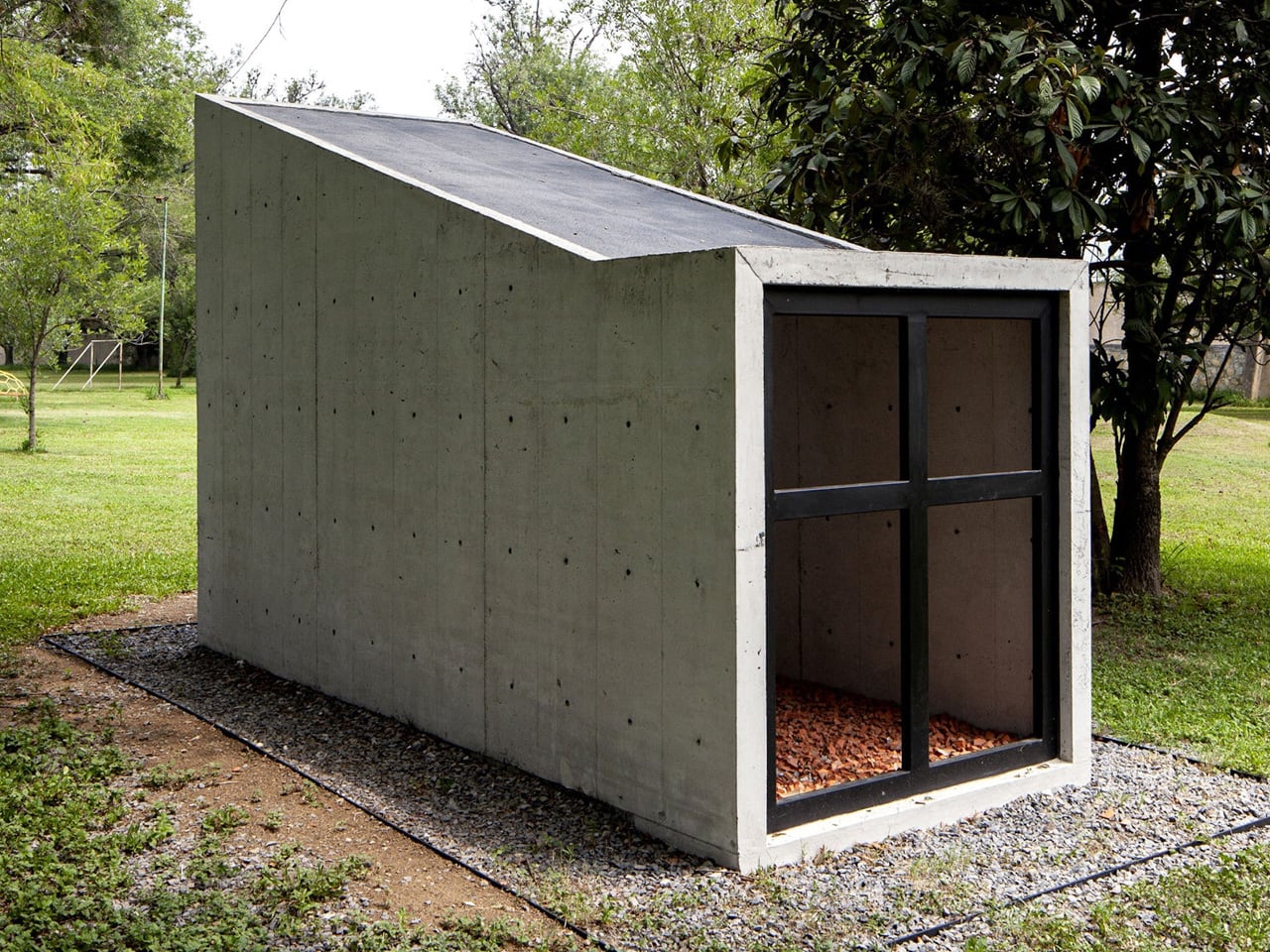
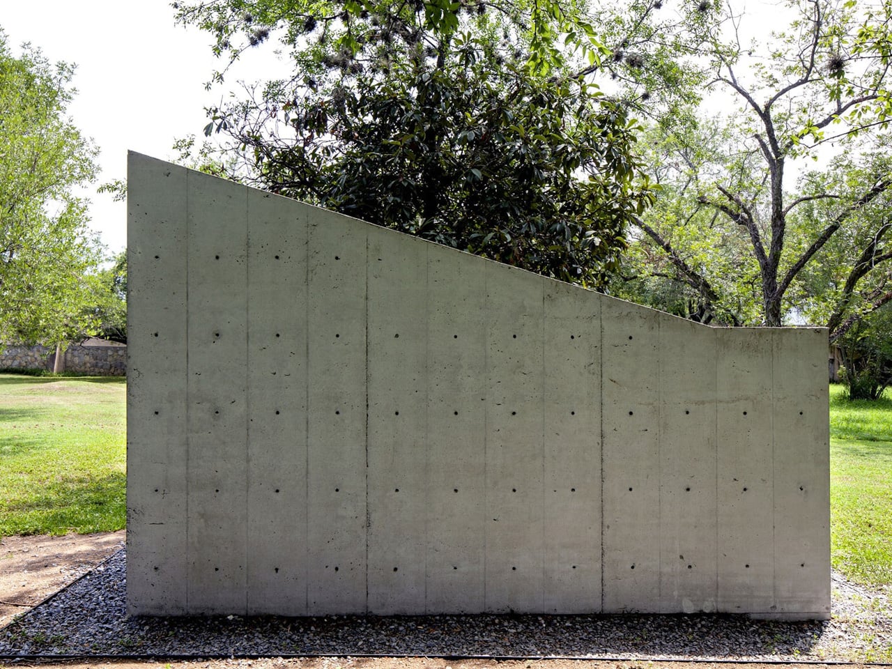
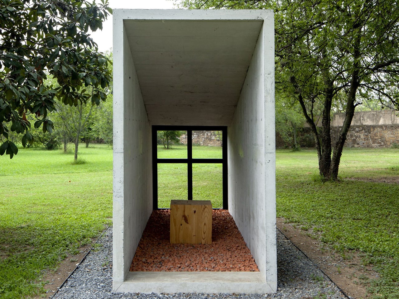
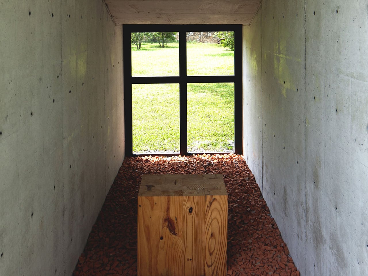
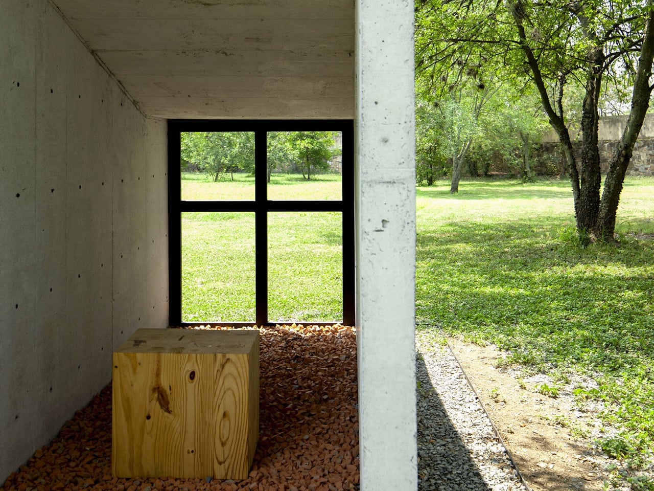
Architecturally, the chapel is a study in precision and restraint. Two reinforced concrete walls, each just 8 cm thick, rise at variable heights along a diagonal axis and support a slab only 6.5 cm deep, forming what reads almost like a tunnel — a narrow, directional passage that channels both movement and contemplation. The formwork follows a 30.5 cm modulation, and the holes left by the wall’s constructive system are deliberately left unfilled, allowing light and air to filter through the structure like something between architecture and screen.

This handling of light is where the chapel finds its spiritual character. Without electricity or artificial utilities, the building relies entirely on natural illumination. Light enters through the voids in the concrete, drifting across surfaces in patterns that shift with the hour and season. It turns the act of sitting inside the chapel into something inherently tied to time — not just sacred time, but the slow, physical time of the garden and the sky surrounding it.

S-AR, the Monterrey-based studio known for its material rigor and contextual sensitivity, has built a reputation for working with concrete in ways that feel more geological than constructed. The Oratory Chapel continues that lineage. Its walls don’t feel poured so much as grown from the site. At just a few square meters, it’s one of the smallest things the studio has made — and possibly one of the most considered.

In an era where sacred architecture often reaches for scale and spectacle, this small chapel in a big garden does the opposite. It compresses everything down to two thin walls, a sliver of a roof, and the light that passes between them. That, it turns out, is enough.

The post Two Concrete Walls and No Electricity Make This Tiny Chapel Unforgettable first appeared on Yanko Design.
This $156K Tiny Home Is Essentially a Tiny Mansion With a Party on Its Roof

The tiny home movement has long wrestled with one stubborn contradiction: how do you downsize without actually feeling like you’ve given something up? Brisbane-based builder Removed Tiny Homes has a compelling answer with the Solace — a wide-body, rooftop-equipped micro-dwelling that reframes what small living can look and feel like.

The Solace sits within Removed Tiny Homes’ newly launched Tiny Mansion collection, a premium lineup designed for people who are genuinely drawn to intentional living but aren’t willing to sacrifice comfort, space, or a little luxury to get there. It’s a category of architecture that’s quietly shifting the tone of the entire tiny home conversation — less rustic escape, more elevated lifestyle choice.

Designer: Removed Tiny Homes

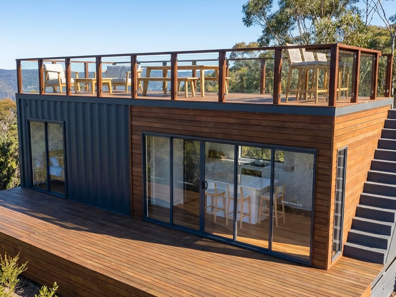
At its core, the Solace is built on a triple-axle trailer and measures 10 meters (32.8 ft) long and 3.4 meters (11.1 ft) wide, making it notably broader than most tiny homes on the market. That extra width is immediately felt inside — the layout is open, breathable, and free of the cramped compromises that often define the category. There are no loft sleeping arrangements here. Instead, the single bedroom is a proper retreat, fitted with a king-size bed and a floor-to-ceiling wardrobe that spans the entire right wall. A private glass entrance door connects the bedroom directly to the outdoors, adding a hotel-suite quality that feels anything but modest.

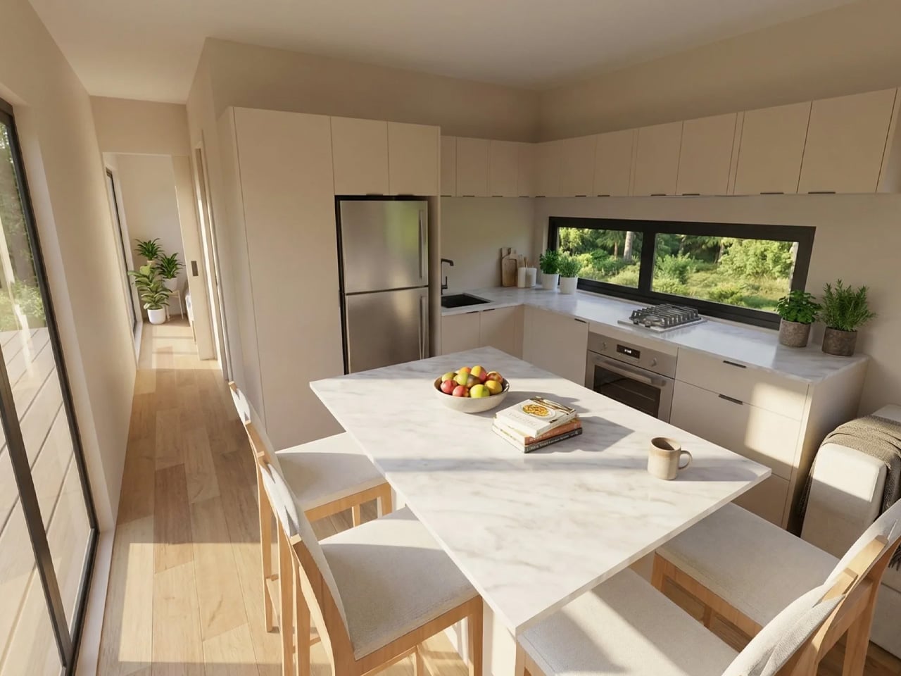
The kitchen and living spaces carry the same thoughtful confidence. Clean lines, full-scale proportions, and modern finishes give the interior a sense of permanence rather than temporariness. The exterior wraps in a combination of corrugated metal and timber, a pairing that reads as both industrial-modern and grounded in natural warmth.

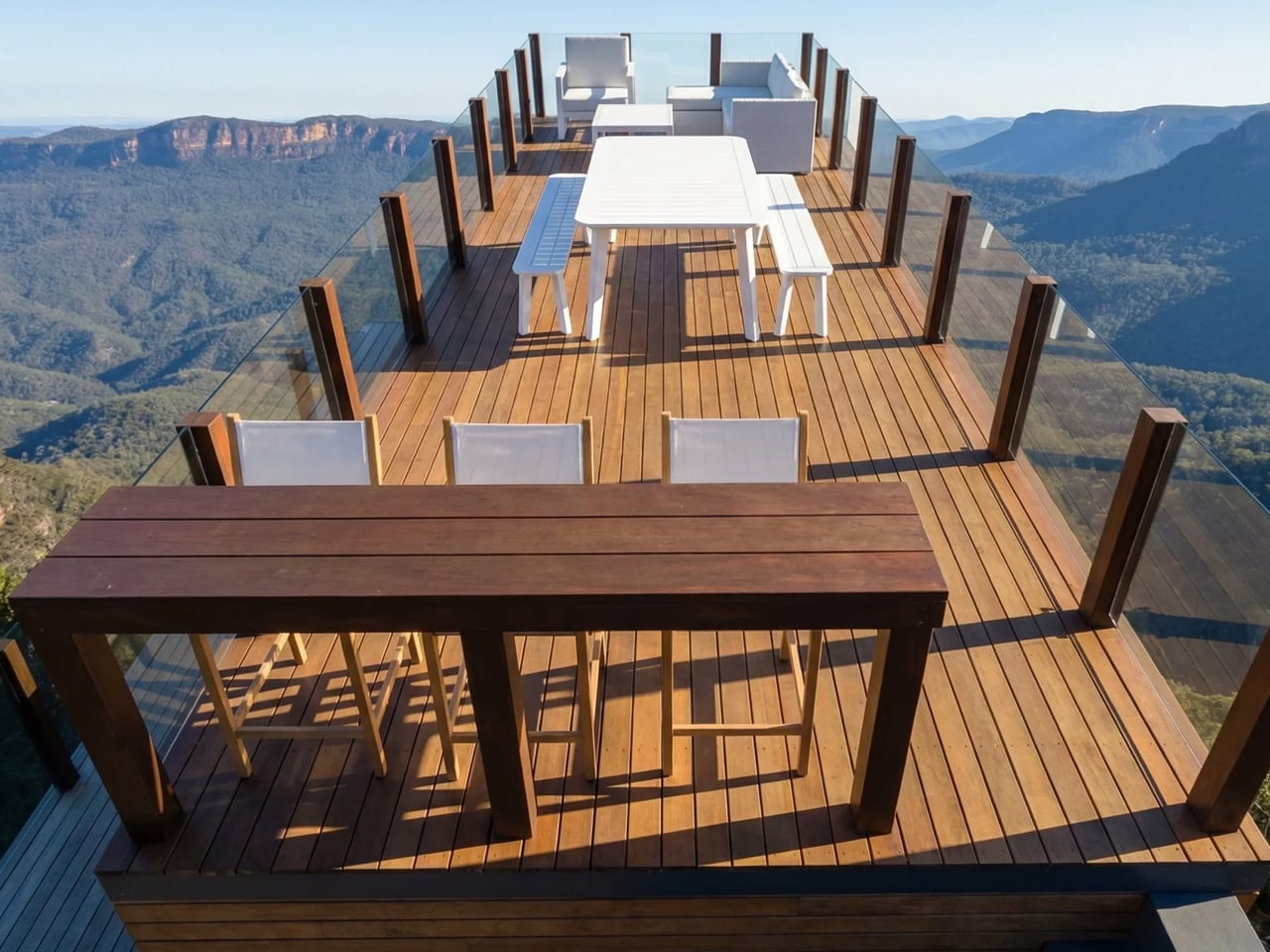
What truly sets the Solace apart is what sits above and below. A large ground-floor deck wraps the front of the home, while an expansive rooftop terrace crowns the structure, generous enough for outdoor dining, lounging, and genuinely hosting guests. It’s a design move that effectively doubles the usable living space without adding a single square foot to the floorplan. That’s smart architecture.

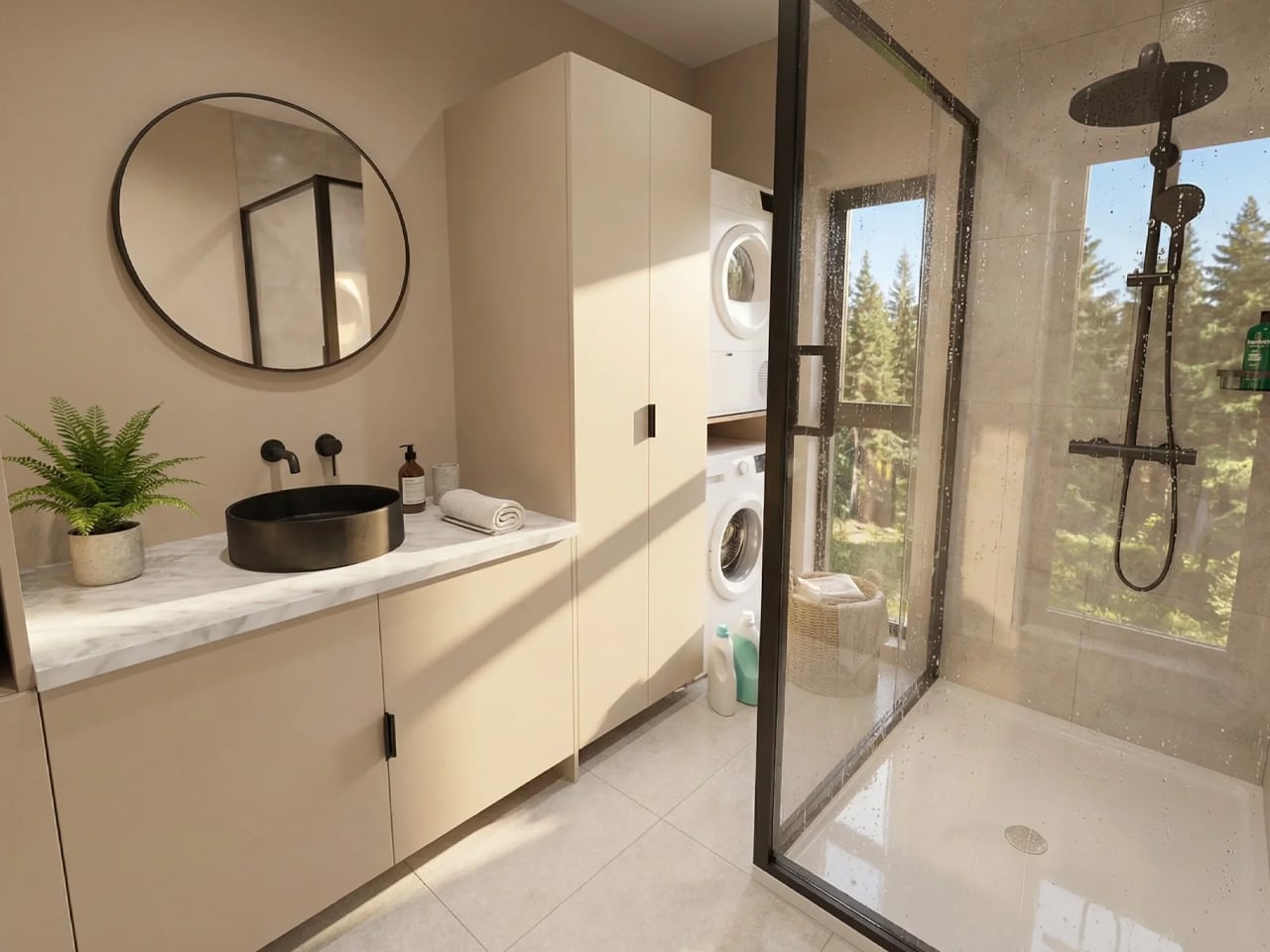
Pricing starts at approximately USD $155,800, with customization options available for those who want to personalize the build. Early buyers can also access a Luxury Living Upgrade Pack, valued at over AUD $30,000, which adds a fully tiled bathroom, optional skylights, and stone kitchen worktops. The Solace doesn’t ask you to romanticize sacrifice. It asks something far more interesting: what if living smaller actually meant living better?

The post This $156K Tiny Home Is Essentially a Tiny Mansion With a Party on Its Roof first appeared on Yanko Design.
5 Gifts for the Person Who Takes Beer More Seriously Than Anyone Else You Know

Some people drink beer. Others study it, serve it with real intention, and actually feel the difference between a proper pour and a careless one. For that person in your life — the one who owns a specific glass for a specific brew and can tell you exactly why foam matters — a six-pack isn’t enough. What they need is something that matches the level of care they bring to every drink.

These five picks range from precision glassware engineered in Japan to a machine that replicates a professional draft tap at home. Each was designed with the same quiet seriousness your beer person applies to every single pour. If they treat drinking as a practice rather than a pastime, these are the gifts that speak their language — objects built with intention for someone who notices the difference between good and exceptional.

1. DraftPro Top Can Opener

There’s a version of drinking from a can, and then there’s the DraftPro version. Designed by award-winning Japanese designer Shu Kanno, this tool removes the entire top of a can with one clean motion, transforming it into something far closer to drinking from a proper glass. The wide-mouth opening lets aroma escape freely and allows the beer’s full range of flavor to come through completely unobstructed. For someone who selects their beer thoughtfully and actually wants to taste what they chose, this simple tool changes the nature of the experience entirely. It’s quiet, precise, and turns the ordinary act of cracking a can into something that feels far more considered and deliberate.

Beyond the drinking experience itself, the DraftPro functions as a capable bar tool in the most compact form possible. With the top removed, ice goes directly into the can for fast chilling on a hot day, or the can becomes the vessel for a quick cocktail with no shaker and no extra glass to clean afterward. It’s lightweight, portable, and compatible with both domestic and international can sizes, so it works wherever the drinking happens to be. The kind of object that earns a permanent place in a bag or kitchen drawer because it quietly solves problems you didn’t know you had until the first time you actually put it to use.

Click Here to Buy Now: $60.00

What We Like

  • Removes the entire top to create an open, aroma-forward experience that genuinely mirrors drinking from a glass
  • Universal compatibility with domestic and international can sizes makes it useful at home or anywhere else

What We Dislike

  • Designed exclusively for cans, with no application for bottles or other containers
  • The fully open-top format may feel less practical or contained depending on the setting

2. Prism Titanium Beer Glass

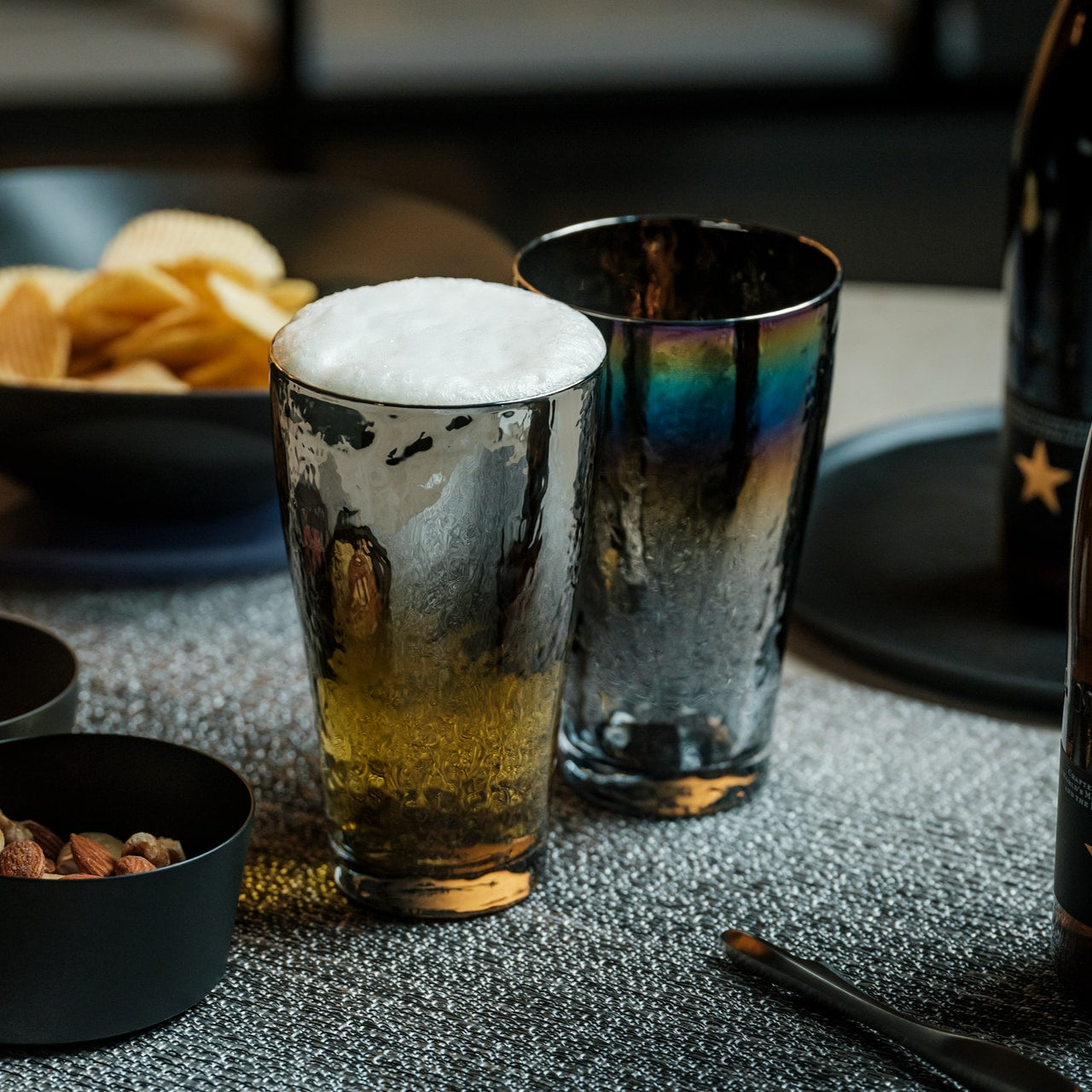
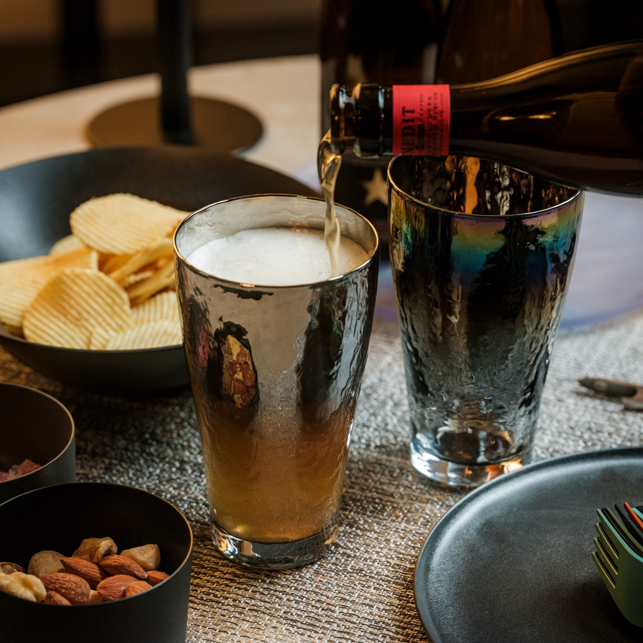
Most beer glasses do one thing: hold the beer. The Prism Titanium Beer Glass does something more carefully considered. Lined with 99.9% pure aerospace-grade titanium, it neutralizes metallic aftertastes and gently breaks down off-notes, leaving only the true, refined flavor of what’s been poured. Its gently flared rim softens texture and guides beer across the palate in a way that feels deliberate rather than incidental. Available in the timeless Silver with its quiet luster, or the Infinite with its shifting aurora of color, each version is finished with symbolic patterns that evoke longevity and prosperity. It’s the kind of glass that quietly resets the standard you hold everything else to.

This is a glass for someone who treats drinking as a ritual rather than a reflex. Clear glass meets softly reflective titanium inside, creating a visual interplay that reveals the beer’s true color with a quiet, elegant glow. The combination of material and shape means what you’re tasting stays as close to the brewer’s original intention as possible, without interference from the vessel itself. Japanese precision runs through every detail, from the balance of it in your hand to the way light plays across its surface at the table. For the person who thinks carefully about what they drink and how, this is the glass they’ve been looking for without quite knowing what to call it.

Click Here to Buy Now: $100.00

What We Like

  • Aerospace-grade titanium lining preserves pure flavor by neutralizing metallic aftertastes and off-notes that would otherwise interfere
  • The gently flared rim simultaneously improves both aroma delivery and mouthfeel for a more complete tasting experience

What We Dislike

  • Premium material and Japanese craftsmanship come at a higher price point than conventional glassware
  • The titanium interior may feel unfamiliar to those accustomed to standard glass or ceramic vessels

3. Hodi

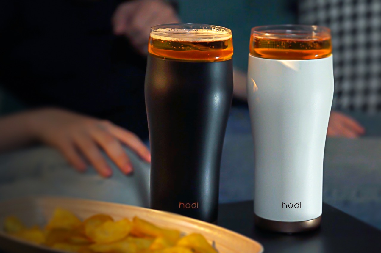
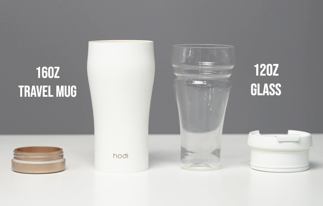
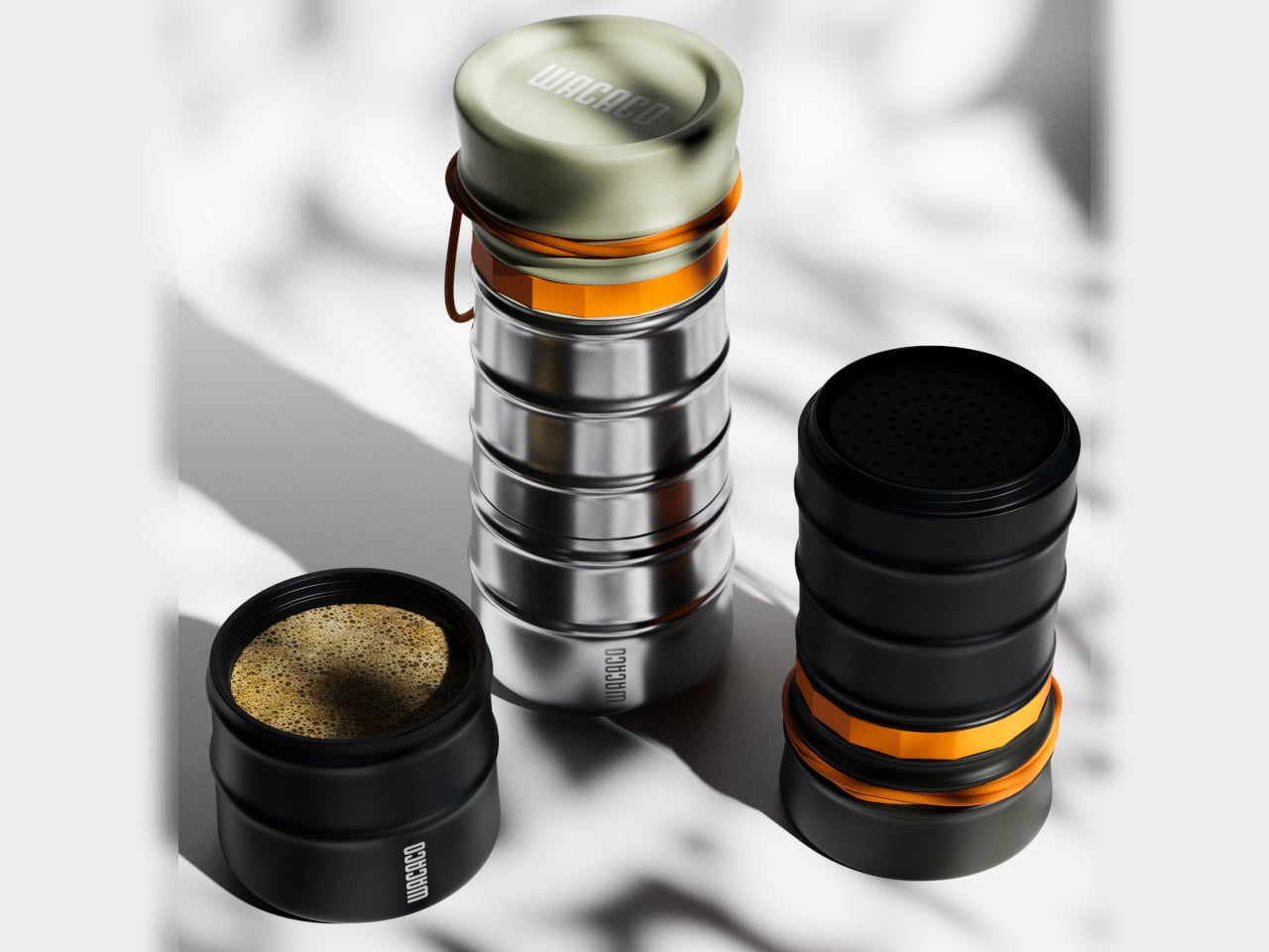
The hodi is what happens when someone asks what a travel mug could genuinely be if it actually tried harder. Its unique two-part design splits into two separate glasses — one for hot drinks, one for cold — while an airtight lid doubles as a snack container and a built-in mesh filter handles all the brewing on the go. Coffee, tea, beer, wine, juice, milkshakes: hodi takes all of it, making it the kind of object a serious drinker carries without compromise.

What makes hodi visually impossible to ignore is the shape. Its curvy, tapered silhouette is directly reminiscent of the iconic Guinness glass — one of the most recognizable beverage vessels ever made —, and that’s entirely the point. Carry it anywhere, and it reads as intentional, not utilitarian. Functionally engineered to handle everything from a cold craft beer to a hot brew, yet portable enough to go wherever a standard travel mug would, hodi doesn’t ask you to trade form for function.

What We Like

  • The two-part split design offers two separate glasses for hot and cold drinks, making it genuinely versatile for every drink in a beer person’s rotation
  • Its Guinness-inspired silhouette carries the visual language of fine glassware into a portable, travel-ready format

What We Dislike

  • The multi-part construction means more components to keep track of and clean after every use
  • Its Swiss Army Knife versatility may feel like overkill for someone who wants a single-purpose, dedicated beer vessel

4. Fizzics DraftPour

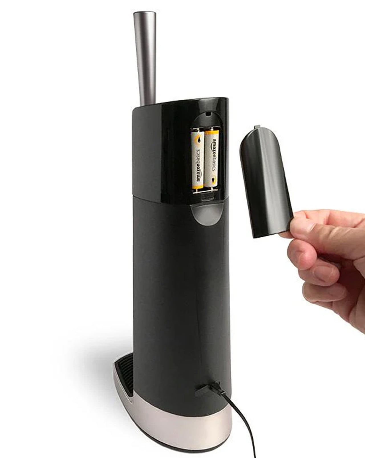
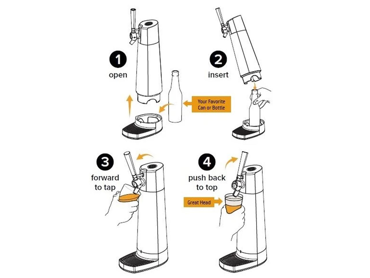
The Fizzics DraftPour does something most people assume requires a full bar setup: it turns any can or bottle of beer into a creamy, nitro-style draft pour without leaving the house. Using patented Micro-Foam technology, it converts the beer’s existing carbonation into uniformly sized micro-bubbles that enhance aroma, flavor, and mouthfeel in a way a straight hand pour simply can’t replicate. It works across every beer style from IPAs and lagers to porters and stouts, and fits cans up to 32oz and bottles up to 750ml. No beer is excluded, and no special additives or gas cartridges are required to get that result at home.

What makes it exceptional as a gift is that it asks nothing extra from the beer itself. No CO2 cartridges, no nitro canisters, no complicated setup. Plug it in or run it on two AA batteries and take it wherever the occasion calls. The technology optimizes all three phases of foam production: nucleation, beading, and disproportionation — the same metrics brewers and cicerones rely on when evaluating the quality of a proper draft pour. For the person who knows what those words mean and cares enough to apply them at home, this is the most meaningful upgrade their home bar has ever seen.

What We Like

  • No CO2 or nitro cartridges required — the machine works entirely with the beer’s own existing carbonation
  • Compatible with all beer styles and most standard can and bottle sizes, making it broadly and consistently useful

What We Dislike

  • Requires a power source via plug or AA batteries, which adds a layer of setup compared to more passive tools on this list
  • Functions as a countertop appliance rather than a compact or easily portable bar accessory

5. Nendo Perfect 3Way Beer Glass

Japanese design firm Nendo built the Perfect 3Way Glass specifically around the flavor and aroma of Sapporo’s Kuro Label draft beer, and the result is one of the most intentional drinking vessels ever produced. The glass is asymmetrical by design, with three distinct zones that each deliver a different mouthfeel when you drink from them. Start at the straight side: the beer travels to the center of the tongue and flows toward the back of the mouth, delivering the initial crisp, clean finish that defines a well-served draft. That first side is the foundation, and what follows on the other two makes this glass genuinely unlike anything else on the market.

Move to the left side, where the curvaceous, wider rim fills the mouth with a mellow, rich aroma and bouquet of liquid. Then shift to the right, where the bulbous shape hits the middle of the tongue and controls the flow for a third, completely distinct sensation. Three sides, three moments, one glass. This isn’t a novelty. It’s a precision instrument for someone who understands that how beer enters the mouth shapes what they ultimately taste. For anyone who takes draft beer seriously, the Perfect 3Way Glass turns a single pour into three separate, considered experiences without ever needing to refill the glass or reach for something else.

What We Like

  • Three distinct mouthfeel zones deliver three genuinely different tasting experiences from a single pour
  • Built with draft beer specifically in mind, making it a meaningful and focused tool for serious enthusiasts

What We Dislike

  • The asymmetrical shape requires some orientation before the full experience lands as intended, which takes practice
  • Conceived around a specific style of draft beer, which may feel limiting for drinkers with broader or more varied tastes

The Right Gift for the Right Pour

The best gifts for a beer person aren’t about quantity. They’re about showing you understand exactly how they think about what they drink — the attention they give to temperature, aroma, foam, and the weight of a glass in the hand. Every pick here reflects that same level of care in how it was designed and what it was built to achieve. One thoughtful gift says more than any case could.

Pick one, and let the presentation carry the message. These aren’t items you grab from a shelf because the occasion demands something wrapped. They’re tools built by craftspeople and designers who understand what it means to give a drink the respect it deserves. For the person who brings that same respect to every pour, that’s a language they’ll recognize immediately — and appreciate far longer than anything else you could choose.

The post 5 Gifts for the Person Who Takes Beer More Seriously Than Anyone Else You Know first appeared on Yanko Design.
The $17,000 Micro Cabin That Makes Every Other Tiny Home Look Overpriced

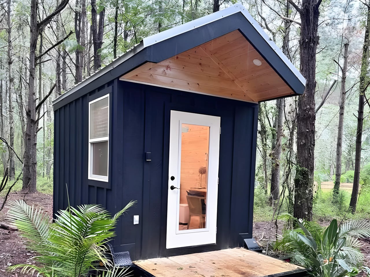
I must admit there is a certain freedom in stripping things back to exactly what you need and nothing more. That’s the quiet confidence behind the Mantra, the newest micro cabin from Florida-based Simplify Further Tiny Homes — and at $17,000, it might just be the most straightforward shelter concept to come along in years.

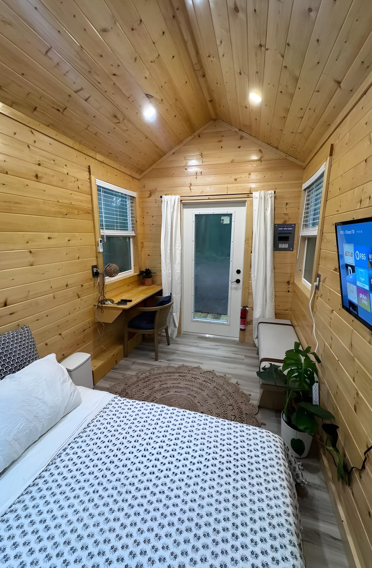
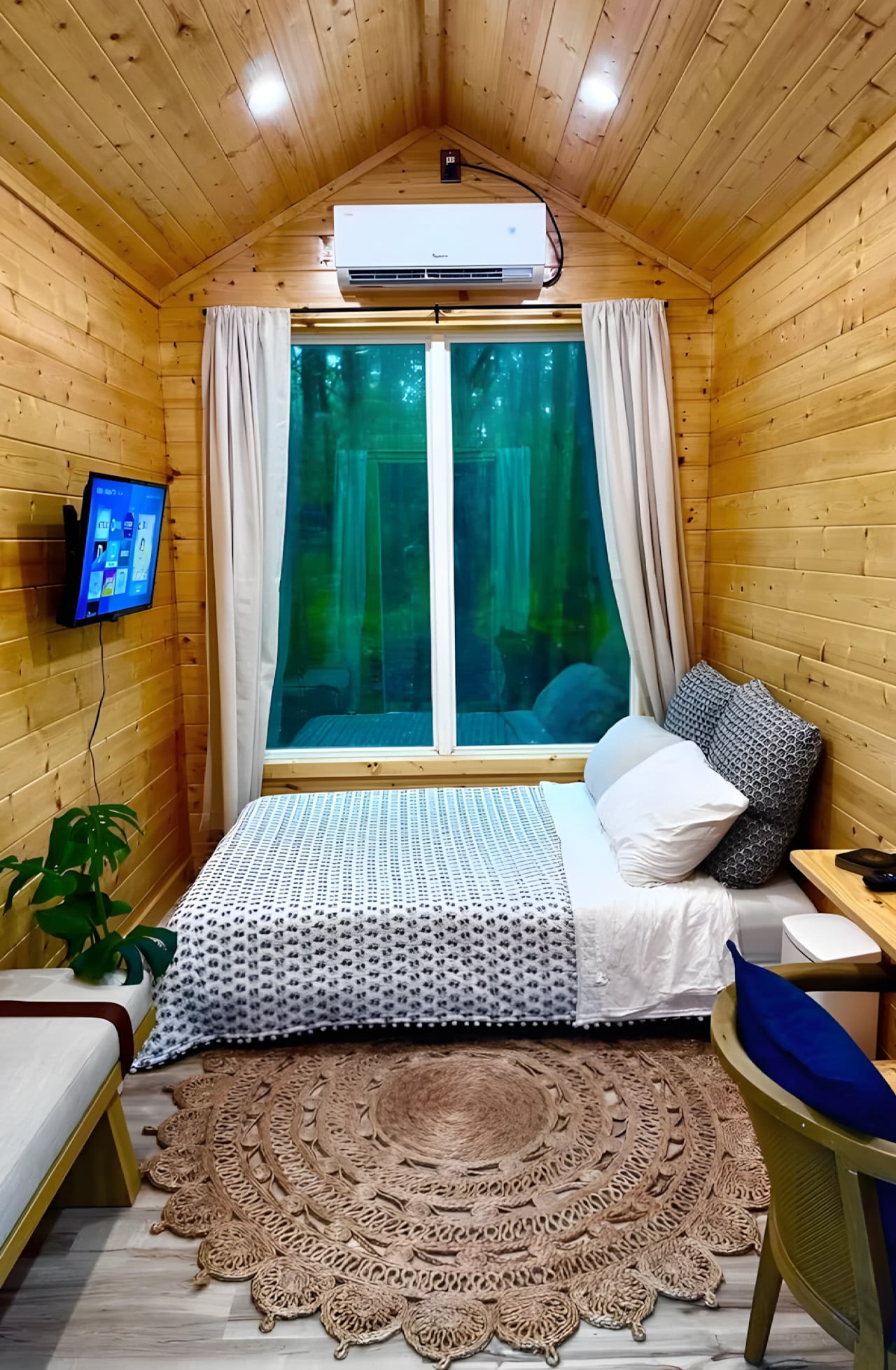
The Mantra measures 12 x 8 feet as a living unit, sitting on a double-axle trailer that brings its full length, porch included, to 16 feet (4.8 meters). The usable interior clocks in at just 98 square feet (9.1 sq m), which sounds tight until you see how it’s been organized. Everything lives in a single open room: a bed that doubles as a daybed, a desk and dining table, seating, a wall-mounted TV, and a mini-split air-conditioning unit. The whole thing sleeps up to two people.

Designer: Simplify Further Tiny Homes

What Simplify Further didn’t include is just as deliberate as what they did. There’s no indoor kitchen, no bathroom — a choice that keeps the footprint honest and the price point realistic. The Mantra was designed for people who want a serious shelter without the serious overhead: a glamping cabin, a backyard guest suite, an accessory dwelling unit, a dedicated work-from-anywhere office. It earns its role by not pretending to be something it isn’t.

On the outside, the cabin wears engineered wood cladding with pine tongue and groove accenting and a metal roof, materials picked for durability and a cabin aesthetic that doesn’t look out of place whether it’s parked in the woods or in a suburban backyard. The double-axle trailer base means it can be moved between sites without a production, which opens up use cases most permanent structures simply can’t compete with.

The $17,000 starting price is the number that tends to stop people mid-scroll, and for good reason. Most tiny houses, marketed as simple and affordable alternatives, have quietly crept into the $80,000 to $150,000 range. The Mantra pushes back on that without sacrificing the things that actually matter: climate control, a comfortable sleeping setup, and a design sensibility that doesn’t feel like an afterthought.
Simplify Further built their name on the idea that design and craftsmanship don’t require excess. The Mantra is that philosophy distilled. It’s not trying to replicate a house in miniature; it’s building something that knows exactly what it is. And in a market cluttered with overbuilt, overpriced micro dwellings, that clarity is worth more than the square footage.

The post The $17,000 Micro Cabin That Makes Every Other Tiny Home Look Overpriced first appeared on Yanko Design.