Gothic Wooden Box Lamp adds a mystical touch to your desk or shelf

Not all lamps are made to shine brightly and quite a number are designed to be more decorative than utilitarian, enhancing a space’s aesthetic while giving a bit of illumination. Some emit a gentle glow that tries to set a certain mood, while others paint a kaleidoscopic display that liven up a room. Some might be luxurious and elegant, while others are fun and whimsical. This DIY project somewhat straddles those two worlds, bringing an unconventional box lamp with gothic-inspired patterns on every face. The end result is a stunning yet subtle light display that seems to bridge the worlds of the magical and the technological right on your very desk.

Designer: Kostiantyn Andriiuk

Programmable RGB lights are quite common these days and they come in different forms, ranging from finished lamps to LED strips you can add to any project. Of course, simply displaying lights is hardly exciting and fails to take advantage of the flexibility that these lights can offer. So why not put these seemingly magical colored lights inside a design that’s exactly meant to convey a sense of mysticism and awe?

This Gothic-inspired lamp does exactly that, not just through the lights alone but from every inch and face of the box. The walnut veneer material, polished with flaxseed oil, gives it a vintage aesthetic as if the lamp was hidden from mortal eyes for decades or even centuries. All but the bottom faces have intricate cutout patterns that not only let the light shine through from the inside but also give it an otherworldly character.

The illusion of the mystical, however, comes from mundane technology. RGB light strips line the insides of the box and can be controlled remotely through software, almost like magic. The box also has hidden touch sensors that allow you to simply tap on a surface to produce the same results, at least for the most basic controls like turning it on or off and adjusting the brightness. With light shining through the extremely thin cutouts of the gothic-inspired patterns, the Box Lamp emits an almost eerie glow that can be appreciated whether outdoors under the sun or, better yet, inside the darkness of your room.

The Gothic Wooden Desk Lamp is something you might be able to create on your own, provided you have the necessary tools available. The hardest part is actually cutting out those complex patterns, which requires a decent laser engraver that can work with thin wooden boards. Fortunately, all that information, as well as the process, is available for free so anyone can design their own magical light box and fancy themselves as a master of the mystical arts.

The post Gothic Wooden Box Lamp adds a mystical touch to your desk or shelf first appeared on Yanko Design.
Mesmerizing sculptural instrument uses water for an otherworldly musical light show

There are plenty of art installations set up around the world, but the majority of them have a “look but don’t touch” policy. After all, “art” is expected to be mostly visual and the risk of damaging a precious, one-of-a-kind masterpiece is just too high. There are, however, other art forms that require your other senses to truly have a complete experience, sometimes involving not just touch but even hearing as well. This sculptural instrument, for example, invites people to dip their hands into glowing drums of water to create a hypnotic audiovisual experience intended to raise their consciousness to higher levels.

Designer: Artur Weber

Inner Waves look nothing like any musical instrument you can think of, except probably for a drum set with too many drums arranged in an almost random fashion around the largest circle in the middle. Like their namesake, though, these are actually small container drums that can hold liquid, in this case, water. Unlike your typical water drum, however, these cylinders have a faint glow on the outside that contrasts with the darkness they hold inside.

As captivating as these eerie glowing drums might be, they’re not designed just for your eyes. After all, you can’t even appreciate the water they hold in the darkness, and so you have to make that leap of faith and plunge your hand or even just a finger inside that darkness. This act rewards you with a brighter light and an ethereal sound that is reminiscent of the tones produced by a theremin. It is also similar to the sound you make when you dip your finger inside a glass of water and then run your fingertip around the mouth of the glass.

This alien sculptural instrument is advertised to link the water inside the viewer’s body with the water within the vessel, a statement that almost has a transcendental message to it. Technically speaking, it most likely uses the vibrations caused by ripples in order to trigger the mechanism that increases the light’s intensity and produces sound. Of course, your brain might not immediately make that connection, making you think that it is indeed your body’s agency that is creating this effect. Either way, the audiovisual art installation has the intended effect of putting your mind in a more meditative state, perhaps contemplating the deeper meaning behind this intersection of art and technology.

The post Mesmerizing sculptural instrument uses water for an otherworldly musical light show first appeared on Yanko Design.

Samsung Galaxy Z Fold 6 Design: What We Know So Far

Foldable phones are one of the more curious members of the mobile tech market. They seem like an answer looking for a problem, though some consider them as something they never knew they needed until they laid hands on one. It’s not exactly a stable market either, but that’s stopping Samsung from pushing out new models every year. 2024 won’t be any different, but the Galaxy Z Fold 6 might be, at least in some ways. Unlike its early days, Samsung seems to be content to move more slowly this time, letting its designs simmer longer even while its hardware grows by leaps and bounds. That’s especially true for its next foldable based on unofficial information, but that also paints a very mixed picture that could leave Samsung playing catch up in the very market it created.

Designer: Samsung

Thin and Square

While foldable phones over great flexibility, they come at the cost of not only complexity and price but also ergonomics. These devices are practically two narrow smartphones joined together, so their combined thickness when folded is also twice that of regular smartphones. The most basic solution would be to make the device thinner, but like with regular smartphones, you’re bound to hit the limits of how thin you can go without compromising durability or safety.

Pushing those boundaries has been one of the biggest obsessions that foldable phone makers have, and it seems that Samsung is joining the fray this year. According to the latest leak, the Galaxy Z Fold 6 will be 11mm thick only when folded shut, a significant diet compared to the 13.4mm thickness of the current Galaxy Z Fold 5. That would make the unfolded form only about 5.5mm thick, which is crazy thin even by regular tablet standards. If true, that hopefully won’t come with compromises to the phone’s structural integrity and battery life.

The profile isn’t the only thing expected to change in the Galaxy Z Fold 6. The external Cover Screen is also tipped to be a bit wider this time around, more in line with the standard aspect ratios of non-foldable phones. In theory, this would make it less awkward to use it as a regular phone when folded, but that also means that the unfolded aspect ratio will be more square than any Galaxy Z Fold before it.

S Pen No Home

Making the Galaxy Z Fold 6 thinner is going to be a dream come true for some fans, but it will also probably disappoint a certain group because of the consequences of that change. If you make a phone thinner, you either have to shrink or reduce the size of other components, for example, the battery, or spread them around wider. Either way, it’s going to be a cramped space inside, which leaves no room for an S Pen silo yet again.

Although the Galaxy Z Fold series has supported Samsung’s Wacom-powered stylus since 2021, the S Pen never really had a proper home inside the device itself. Contrast this with the Galaxy S Ultra series that, inheriting the Galaxy Note spirit, came with an S Pen as part of the package. There might be debates on the ergonomics of such a thin stick, but owners at least had the option of not buying two extra accessories just for that writing and drawing experience.

Yes, two accessories, because you’re likely to buy a compatible case if you’ll be investing in an S Pen Fold Edition. There really is no other convenient alternative to making sure that you don’t lose the stylus in your pocket, bag, or anywhere else. Unfortunately, designs for these cases feel more like works in progress and it seems it will continue to be the case for another iteration.

Camera Shy

The biggest disappointment, however, might come from the Galaxy Z Fold 6’s cameras. The latest word is that the upcoming foldable will sport a 50MP main camera, a 12MP ultra-wide shooter, and a 10MP telephoto camera on its back. The external front camera will be a 10MP selfie shooter while the internal front-facing camera has a 4MP under-display sensor.

Those are very much the same cameras used in the Galaxy Z Fold 4 from 2022, and although we don’t know yet of any hardware or software tweaks that Samsung will make, they’re still disappointing to hear. This is one area where the brand is being left in its competitors’ dust and where the product doesn’t feel deserving of its premium price tag. Some might actually forgive Samsung for putting a large camera bump on the phone’s back compared to reusing the same cameras for the third year in a row.

Of course, all of these are still unofficial information, so we might be pleasantly surprised by a more noteworthy Galaxy Z Fold 6 in August. Given the trends, though, that doesn’t seem to be likely, as Samsung is taking a more iterative approach to design with its large foldables. Maybe it doesn’t feel the heat from its rivals that don’t have the same market reach as the tech giant, but it’s also very close to stagnating and killing off the very trend that it started.

The post Samsung Galaxy Z Fold 6 Design: What We Know So Far first appeared on Yanko Design.

Smart display concept puts a cute face on smart home technology

As our homes start to get more connected to devices and the Internet, the number of screens also starts to increase. In addition to the phones, tablets, computers, and TVs that are already a staple of modern life, there are also smart displays that try to offer visual feedback to the things we usually only hear by voice from an AI-powered assistant. While many smart display designs try to blend in with the rest of the room, it’s really hard to hide a large conspicuous screen that needs to always to in view to be useful. This design concept tries to soften the blow of having such impersonal tech products inside your living space by giving a smart display a rather comical face that makes it feel more alive and a little bit friendlier.

Designer: Kai Xia

Smart displays are pretty much the evolution of voice-controlled smart speakers, giving a visual representation of the information you would normally get only through audio. Of course, it could also be used for other purposes, like displaying photos similar to a digital photo frame, playing videos, or even making video calls. The standard design of these devices, however, has more in common with those speakers or, worse, simply look like tablets slapped onto cylinders and boxes.

The Smart Pad concept tries to liven things up by changing the core design of the smart display. Objectively speaking, the 4-inch screen might actually seem too small for its purpose, but that also means you’re forced to show only the essentials rather than flooding the user with information. The smart display is also shaped like an egg, reminiscent of the old, colorful iMacs or even some vintage CRT TVs. This angles the screen at a comfortable level without having to resort to stands and external mechanisms.

The more important feature of the concept, however, is the cartoon-y face that can be displayed on the small screen. It might be a minor and optional detail, but it lends the gadget a bit of personality, making it feel more approachable and even human to some extent. It makes the Smart Pad feel less like an appliance and more like a companion, putting a face to that disembodied voice we always hear when we talk to such devices.

Of course, it’s also capable of the standard things that smart displays can do, at least in theory. That screen can play videos, display photos, and show information, but it might be less expressive because of its small size. That makes the device more suited for desks and bedside tables rather than living rooms, where seeing the screen up close is more natural.

The post Smart display concept puts a cute face on smart home technology first appeared on Yanko Design.
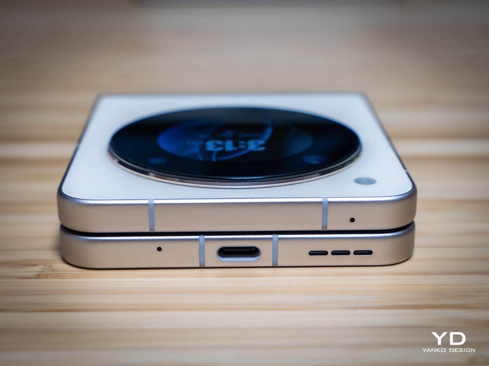
REDMAGIC DAO 150W GaN Charger looks straight out of a cyberpunk game

If there was a design style that fits the gamer aesthetic almost perfectly, it would probably be cyberpunk. Bright RGB lighting, geometric patterns, and panel-like decals give a somewhat futuristic tech vibe to many gaming products, be they devices or even just accessories. That’s true not just for PCs and consoles but, lately, also for smartphones. Gaming smartphones have been trying to grab the attention of mobile gamers with their sometimes over-the-top designs. That, however, mostly applies to the phone itself but rarely to the accessories you use with it. As one of the big mobile gaming brands, REDMAGIC is trying to fill in that gap with a charger that doesn’t just look hi-tech but also promises advanced features as well.

Designer: REDMAGIC (nubia)

Phone chargers are often minimalist yet uninspiring blocks of plastic that get the job done and nothing more. Thanks to advancements in charging technologies, specifically GaN or Gallium Nitride, it has been possible to shrink charger sizes or, more importantly, implement less conventional designs and features. This charger, for example, still comes in a traditional rectangular shape, but its visual and technical features are almost out of this world.

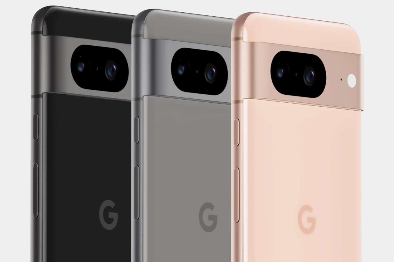
For one, it has those RGB lighting effects that gamers just love, shining in different hues in the dark. This goes perfectly with the transparent design of the charger’s metal chassis, making the REDMAGIC DAO look almost like a miniature desktop PC. Its fanciest feature, however, is the LCD screen that is used to display details like current or charging status as well as dynamic wallpapers to truly bring out a sci-fi feel.

That’s not to say the charger is just all looks, at least not on paper. Its 150W output can charge many devices, including laptops, sometimes even simultaneously. It even has a rare DC out port that can be used for devices or laptops that use connectors other than USB. GaN technology promises that all that power won’t turn the charger into a fire hazard, at least with proper use and care.

As eye-catching as the REDMAGIC DAO 150W GaN charger may look, it also raises concerns about reliability, especially with so many extraneous features. The charger will still continue to work even if the RGB lights or screen doesn’t, but it also means paying for features you may end up never using. Still, the accessory is a nice break from the usual black and white affair that chargers seem to be locked into, and hopefully, other brands will start getting similar ideas in the near future.

The post REDMAGIC DAO 150W GaN Charger looks straight out of a cyberpunk game first appeared on Yanko Design.
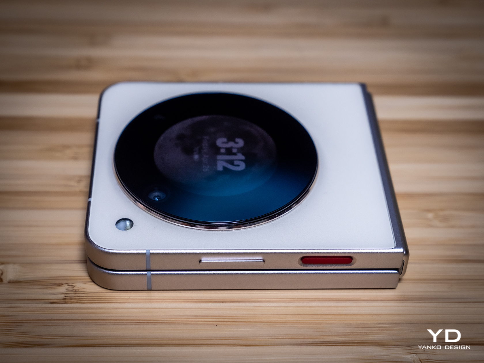
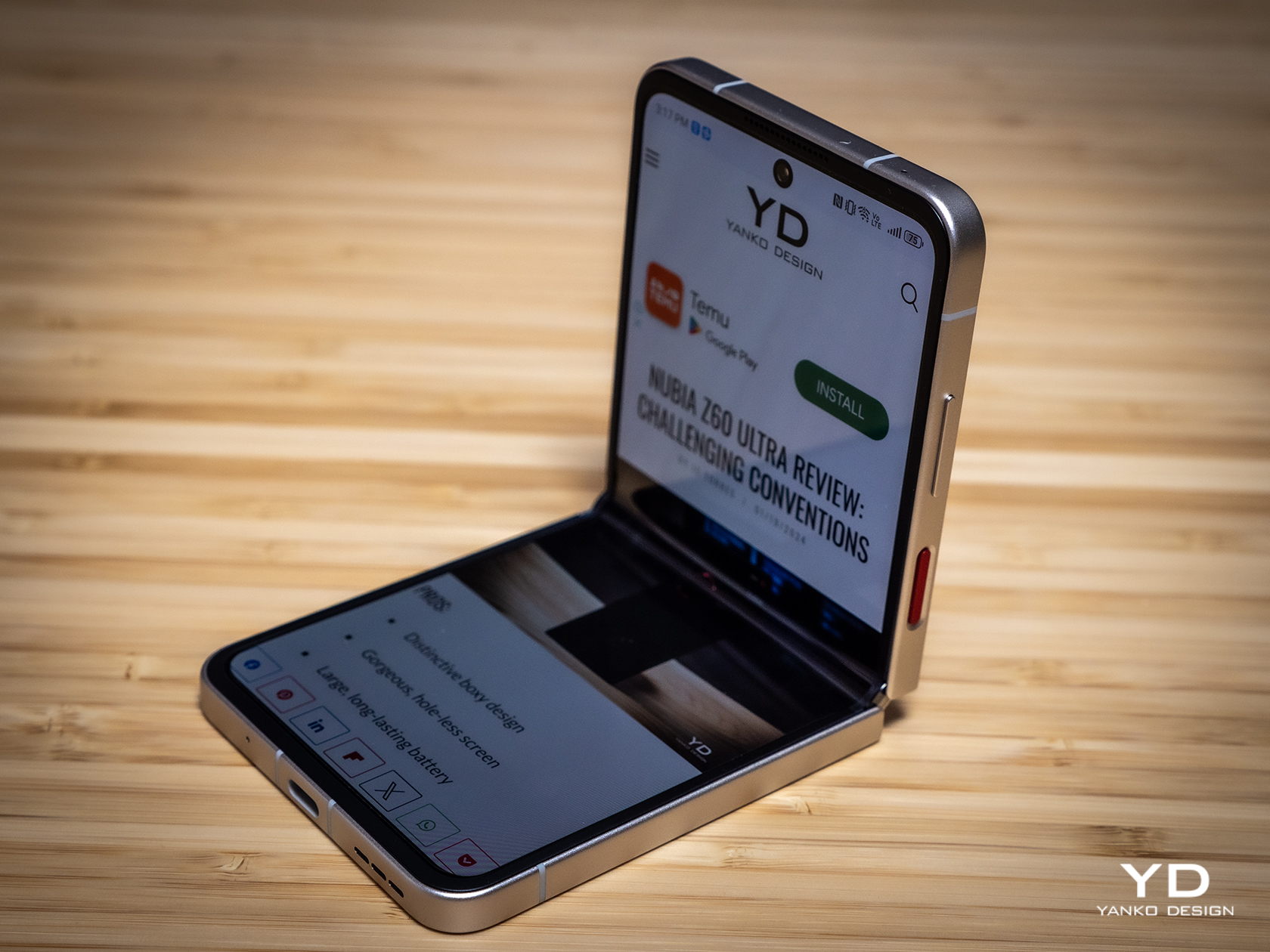
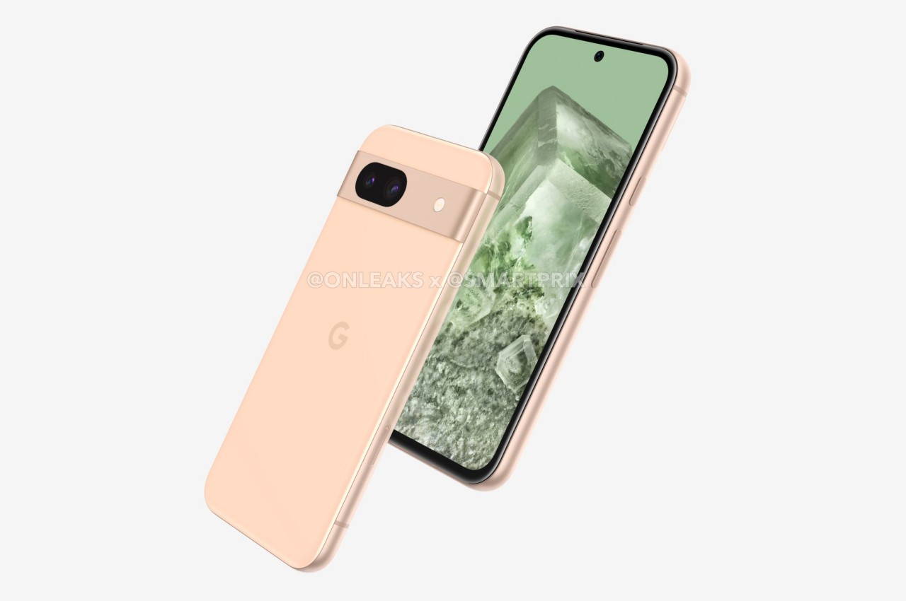
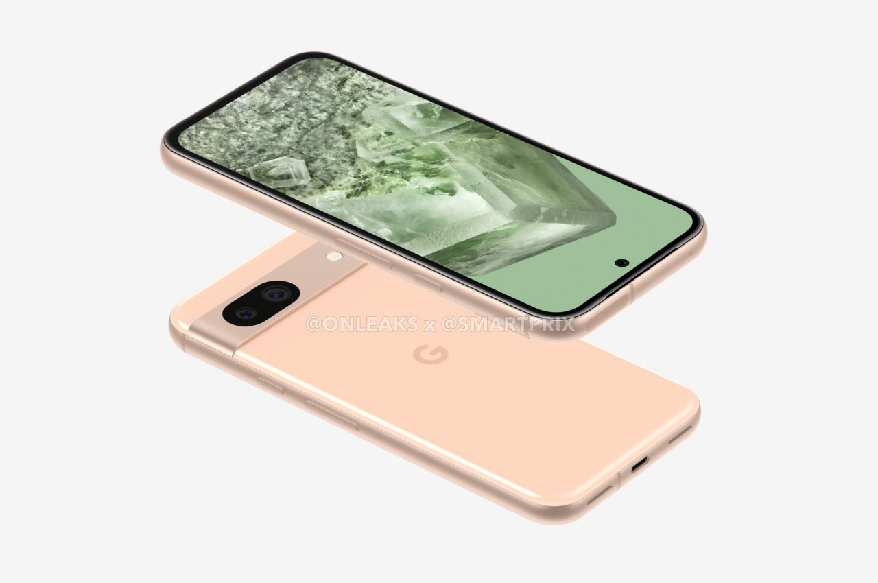
Google Pixel Fold 2 renders say goodbye to a distinctive design

The foldable phone market is still very young, which means there’s plenty of room for design improvement across the board. We can expect manufacturers to experiment with different combinations that try to cram as much hardware as possible inside super-thin bodies. Change is inevitable but not every change will be welcomed with open arms. Some are bound to be controversial, especially when they involve removing something that people have grown fond of. That might be the case with Google’s second foldable phone, which will trade its somewhat iconic “visor” camera design for a rather unusual spin on the common camera bump that might prove to be quite unappealing if these unofficial renders are correct.

Designer: Google (via Smartprix, @OnLeaks)

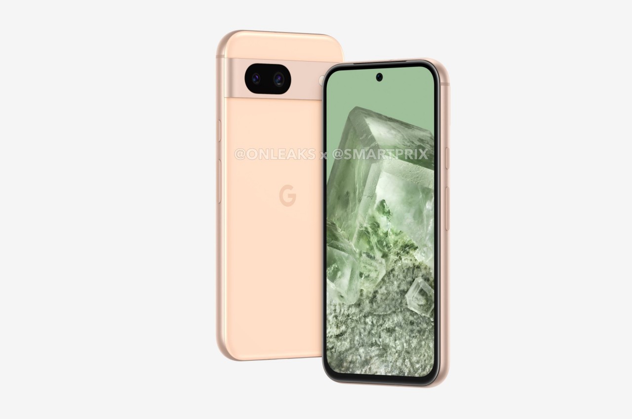
Granted, the Google Pixel’s rear camera bar isn’t exactly loved by everyone, but it still gives the smartphones a distinctive appearance that can be considered Google’s signature design. That’s not exactly easy to pull off on a foldable phone like the Pixel Fold, so Google had to modify it to be less elegant but still shouted “Pixel” nonetheless. Whether you liked that design or not, it might not be sticking around on Google’s foldable for long, and maybe not even on its future smartphones.

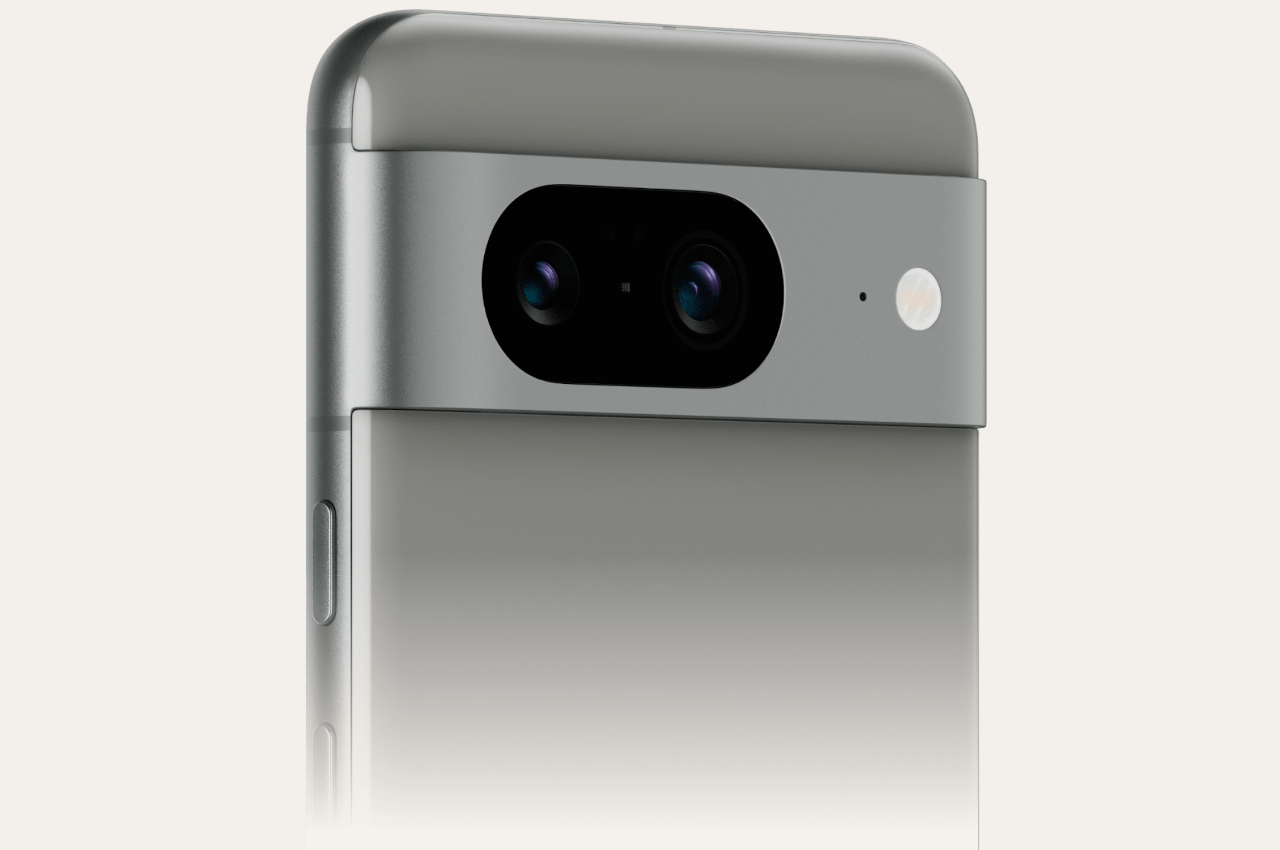
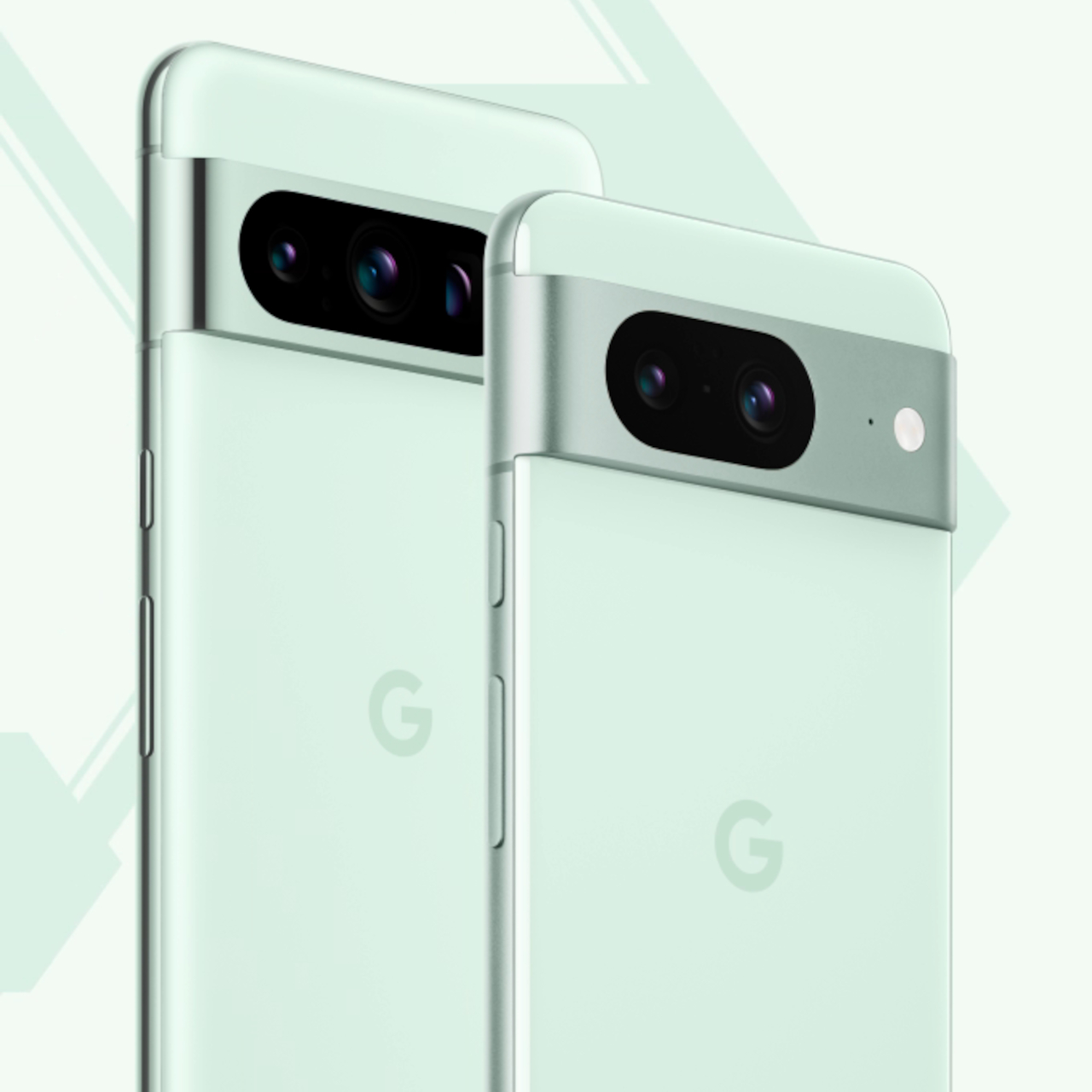
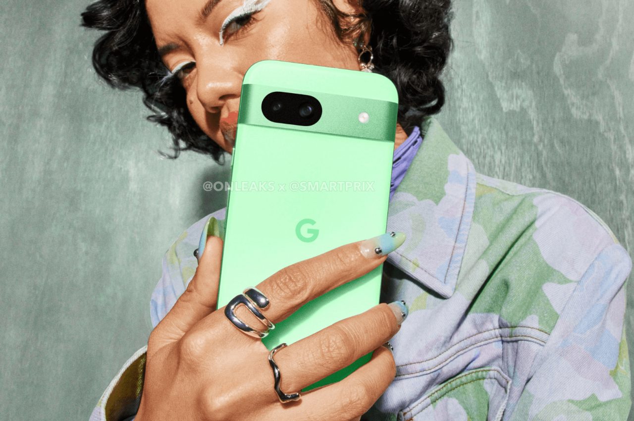
Renders based on leaked information reveal the alleged Pixel Fold 2 design that is so different from the first-gen foldable. Gone is the horizontal bar, replaced by what almost looks like a more conventional rounded square in the corner. That illusion quickly breaks down, however, when you notice the two horizontal pill-shaped cutouts for the camera lenses. In addition to possibly being very thick, this could easily be one of the least attractive camera designs today.

The more subtle changes can be found in the sizes of the two screens. Not only are they larger, they also have different aspect ratios. The external Cover screen, for example, is a bit narrower and taller, resulting in an unfolded shape that is more square than the first Pixel Fold. The bezels around the internal display are also much thinner, which leaves no room for a camera. Apparently, this could also be Google’s first phone to use an under-display camera as well.

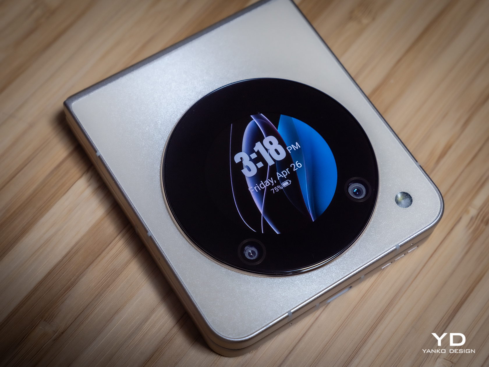
None of these details are guaranteed, of course, and Google might surprise us with a Pixel Fold 2 that looks almost exactly like the Pixel Fold 1, except more refined. It is definitely within Google’s right to change its designs as it sees fit, but there are also times when you’re just left scratching your head at the oddity of it all. Fortunately, the Pixel Fold is hardly the only foldable phone available, especially with OPPO confirming it’s still in the race.

The post Google Pixel Fold 2 renders say goodbye to a distinctive design first appeared on Yanko Design.
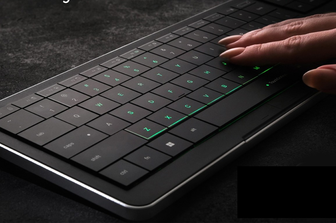
DIY macro keyboard gives designers customizable shortcuts for any app

Content creation is a big thing these days, whether you’re producing video for live streaming, making graphic art, or even digitally carving 3D models for virtual spaces. Unsurprisingly, there’s a wide variety of software tools available to creators as well, ranging from simple ones you can run directly on your phone to the more sophisticated suites that require a laptop or even a desktop. The variety of features in apps that people use on a daily basis can become mentally exhausting, especially when it comes to memorizing keyboard combos that should help speed up workflows. Our fingers can only do so much, and the number of shortcuts we have to remember across multiple apps can actually do more harm than good. This DIY project tries to make designers’ and creators’ lives a bit easier by offering a mini keyboard that can adapt its icons and actions to match the app you’re using.

Designer: Maximilian Kern

So-called macro keyboards like the Elgato Stream Deck are becoming more popular not just among streamers but also among computer power users. They provide a dedicated set of buttons separate from your keyboard that you can map to almost any function in an app to make them easier to use. As popular as these gadgets might be, they’re still considered niche and, therefore, expensive, out of reach of budding creators.

If you’re anything of a tinkerer or maker, however, you can also just make your own, like what this Keybon project aims to accomplish. It’s a small box with nine tactile buttons buttons that you can assign to a specific function or keyboard shortcut. And just like those pricey commercial macro keyboards, it can switch to a different layout depending on what software you’re running at the time.

1

What makes Keybon extra special is that each of those nine buttons actually has small 0.66-inch screens on top, and you can select an icon to match the action that the button represents at that time. While it might be faster with muscle memory, visual cues like this will help your brain adjust when switching between apps and layouts. At the same time, you also don’t have to force yourself to actually memorize the actions and buttons and simply take a quick glance at the keyboard to know which one to press.

That said, this kind of project does require a bit of electronics and software know-how to create Keybon, but that also opens the door to more freedom in the design of the device. Fortunately, all the needed pieces are available for free, so it can also become a springboard for makers and creators to customize their own personal macro keyboard to their hearts’ content.

The post DIY macro keyboard gives designers customizable shortcuts for any app first appeared on Yanko Design.
Transparent skin patches promise psoriasis patients better human-centered treatment

Given how much of it is exposed for everyone to see, skin conditions can easily become a source of embarrassment or even depression for anyone. This is especially true for diseases that require prolonged treatment where afflicted people have to endure not only physical but also mental and emotional suffering during that period. Those with chronic conditions such as psoriasis might feel forced to cover up those blemishes, which might not be good for treatment. Those treatment options often revolve around the technical aspects of the medicine or the physiological condition of the patient, disregarding psychological effects. This wearable medical patch, in contrast, offers a solution that isn’t just innovative but, more importantly, human-centric as well.

Designer: 3M x Feathm Design Studio

Psoriasis patients often feel more than just the discomfort or pain brought about by their long-lasting condition. They also feel some level of hopelessness and anxiety from living with the disease. Treatments for psoriasis do exist, ranging from ointments to injections, but patients still have to endure the sight of their disfigured skin while that treatment is still ongoing. Worse, they can’t cover up those affected patches of skin, at least not without unfavorable consequences in the long run.

The 3M Psoriasis Prescription Patch design tries to alleviate patients’ suffering by hitting two birds with one stone. For one it’s a medical-grade skin wearable that easily lets people apply the patches in affected places, and although the prototype is shown to have a transparent or translucent surface, it’s not hard to imagine 3M applying its technologies and patents to make the patch seemingly blend with the skin or cover up those areas with more aesthetic designs.

More importantly, the patches can actually administer medicine to the skin, making it trivial to apply the right amount of dosage needed for treatment. In other words, these are patches you will actually have to wear to get better, which will hopefully help increase the patient’s confidence while undergoing treatment. The patches also employ a perforated honeycomb design that makes it easier to tear off sections to match the specific shape of the area that needs to be covered. Perhaps it can even be used to create interesting patterns that call attention to the patch in a more favorable way.

On the surface, it doesn’t seem like a medical patch is something ground-breaking, but it’s an innovation that puts a paradigm shift in dermatological treatment. Rather than just the application of medicine, it focuses on the effects the processes have on the mental and emotional well-being of the patients. And with a disease that everyone will be able to see, it’s even more important to take a human-centered design approach that will not only heal people’s skins but also their spirits.

The post Transparent skin patches promise psoriasis patients better human-centered treatment first appeared on Yanko Design.

Stone light sculptures use shadow play to create a more dramatic effect

Lamps are designed to bring light to a space, but that doesn’t mean they need to be dazzling or blinding. In fact, some lamps emit more subdued and diffused illumination to create a specific atmosphere and enhance the ambiance of an area. Some lighting fixtures even go beyond just the light they shine, putting just as much emphasis on the form they come in or, in some cases, the effects they have on the environment around them. This collection of light sculptures, for example, are more pieces of art than just lamps, but the way it casts shadows inside and around it delivers more impact that, in turn, further enhances the effect that the warm light produces.

Designer: Alex and Henri (Frero)

It’s almost too easy to take for granted the effect that shadows have on our surroundings. Given their dark nature, they’re often regarded as “bad” or even “ugly” elements, especially when they do obscure other more important objects in a composition. That said, shadows actually create a more impactful composition, especially when they contrast with light and create interesting forms thanks to the shapes that stand between the light source and the surface the shadows are projected on.

Fuca

Fuca

Suma

Suma

The Tala Asa collection of light sculptures embraces this kind of shadow play, putting equal importance on both light and darkness to generate a more striking overall visual. Just like in art, negative space provides not only breathing room but a canvas for these contrasting elements to draw on, casting shadows inside holes while also shining light through them. The earthen aesthetic of sculptures provides additional contrast to the unearthly glow of the light shining from inside.

Coco

Coco

Anta

Anta

Each of the five sculptures has a story to tell through their different forms. Fuca’s simple frame pays homage to the beauty of square elements you might find around you, while the arching Suma is inspired by the geological wonder that is the Ring of Fire. Two squares on top of each other make Coco represent balance and equilibrium, while the interplay of Anta’s three stripes embodies both unity and individuality. Lastly, Sunda’s more complicated pairing is meant to convey the intricate structures and complex relationships of tectonic plates, cutting a powerful and imposing figure in any space it stands on.

Sunda

Sunda

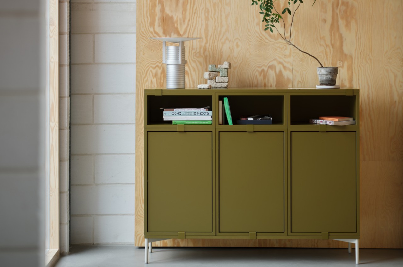
Regardless of their design or inspiration, all five sculptures draw from the earth in more ways than one. They’re available in natural tone finishes, including bone, sienna, terra, olive, and lava, but they’re also made from reclaimed stone and minerals bound with resin and coated with natural plaster paint. And just like how the sun and the earth create an interesting play of light and shadow, the Tala Asa light sculptures bring that interesting dynamic to a smaller degree in your home, office, or any space that needs just a little bit of natural inspiration to bring it to life.

The post Stone light sculptures use shadow play to create a more dramatic effect first appeared on Yanko Design.
Mixed reality headset bucks design trends for a complete audiovisual experience

Thanks to the Apple Vision Pro, mixed reality is back in the news along with the hardware that will enable people to experience them. We have yet to hit the Holy Grail of headset design that will allow people to wear these devices on their heads for long periods, but brands like Apple and Meta definitely have that goal in their sights. MR headsets are getting lighter and slimmer, but that will always come at the cost of sacrificing some functionality that has to be offloaded to some other product you will have to buy and use separately. This concept design, however, goes in the other direction and tries to actually include everything you need for a more believable mixed reality experience, including the oft-neglected audio for your ears.

Designer: Dohyuk Joo

It’s harder to fool the eyes, which is why most of the focus in developing these mixed reality headsets is on the optics. But we don’t experience the real world with just our eyes, and a more immersive virtual world will also need to do more than just feed us visual data. Just like in the real world, audio is either taken for granted or at least takes second place only, but this headset design tries to balance the scales, even if it means going back to the days of bulky headsets.

WavVision, whose name tries to embody the combination of sound and sight, attempts to be an all-in-one mixed reality solution for our eyes and our ears. In a nutshell, the headset includes over-ear headphones to deliver audio, particularly spatial audio, that would complete the immersion of existing in a virtual space. This wouldn’t be the first headset to attempt that combination, but it is definitely one of the few that make it painfully obvious. The Meta Quest 3, for example, does have built-in speakers but uses an open-ear design that simply directs the audio waves toward your ear.

In addition to having over-ear cups built into the design, the very form and construction of WavVision go against the dominant trend in this niche market. The frame is made from thick steel plates bent to loosely follow the shape of the head. It’s a material that suggests quite a bit of weight and sharpness, which is the opposite of what headsets today are aiming for. It gives the design a distinct industrial aesthetic, which is intentional but also questionable.

One of the reasons why headsets don’t include dedicated headphones is because the audio experience could probably be delivered by more dedicated hardware that’s specially designed for performance as well as comfort. Building that part into the headset only weighs the product down, both literally as well as in terms of costs. Conversely, an integrated design ensures a unified appearance and, at least theoretically, a more complete experience. Admittedly, few of the mixed reality brands today seem to be paying that much attention to the audio aspect, but if Apple will be playing this game for long, it will undoubtedly dip its toes in that area sooner or later.

The post Mixed reality headset bucks design trends for a complete audiovisual experience first appeared on Yanko Design.