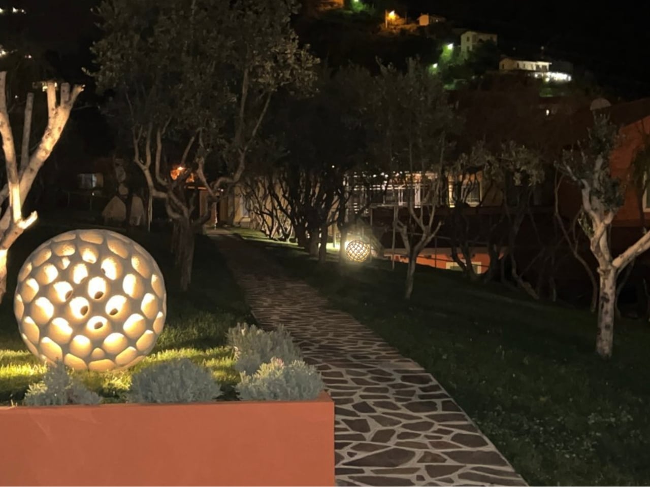
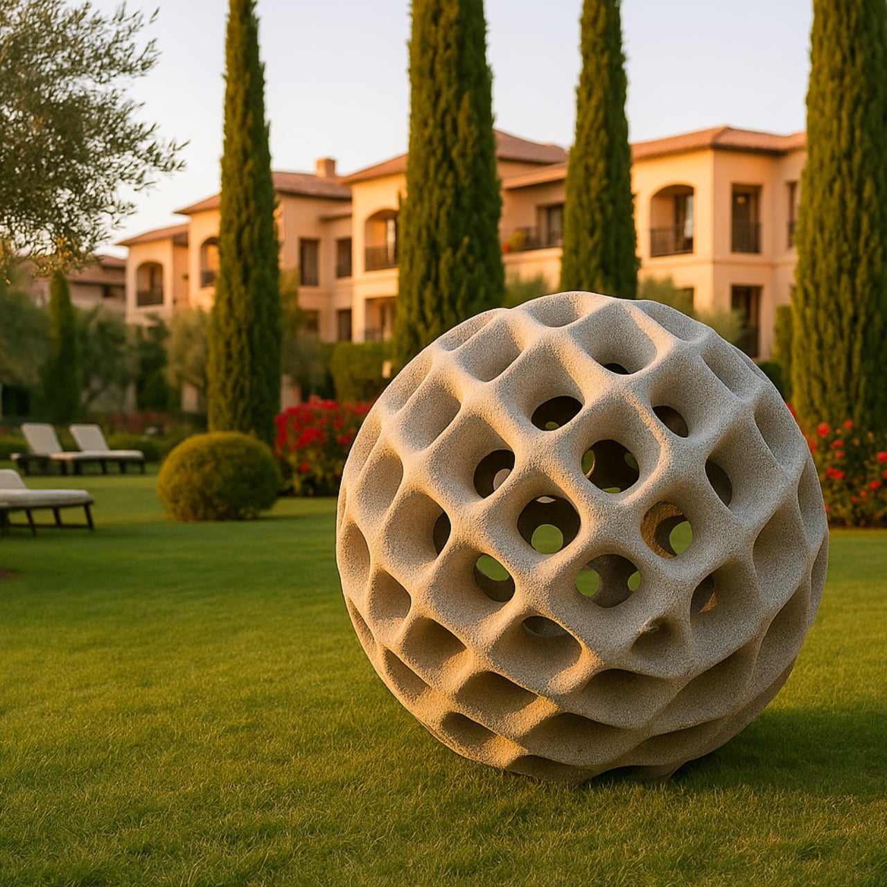
The first time I came across the Oberhauser Balloon, I genuinely thought I was looking at a sea creature. That rough, porous sphere covered in glowing craters looks less like a lamp and more like a bioluminescent organism that washed in from a very stylish ocean floor. It’s the kind of design that stops you mid-scroll and makes you question what you thought you knew about materials, about form, and about what outdoor lighting is even allowed to be.
The Balloon is the work of studiooberhauser, an outdoor luminaire available in three sizes: 30 cm, 70 cm, and 100 cm in diameter. That largest version, by the way, currently holds the distinction of being the largest known 3D-printed lamp made from cement. I’m not usually one to get swept up in record-breaking superlatives, but that one genuinely deserves a pause. A one-meter sphere of printed concrete that glows through dozens of organic apertures? That’s not just a lamp. That’s a landmark.
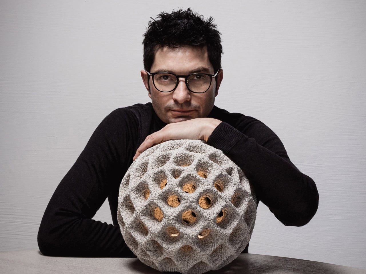
Designer: studiooberhauser
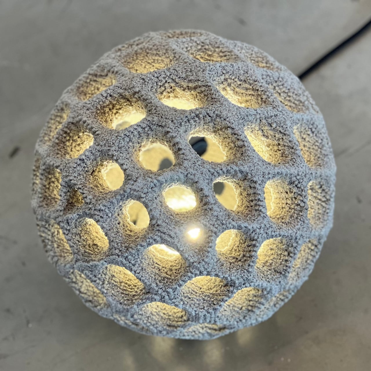
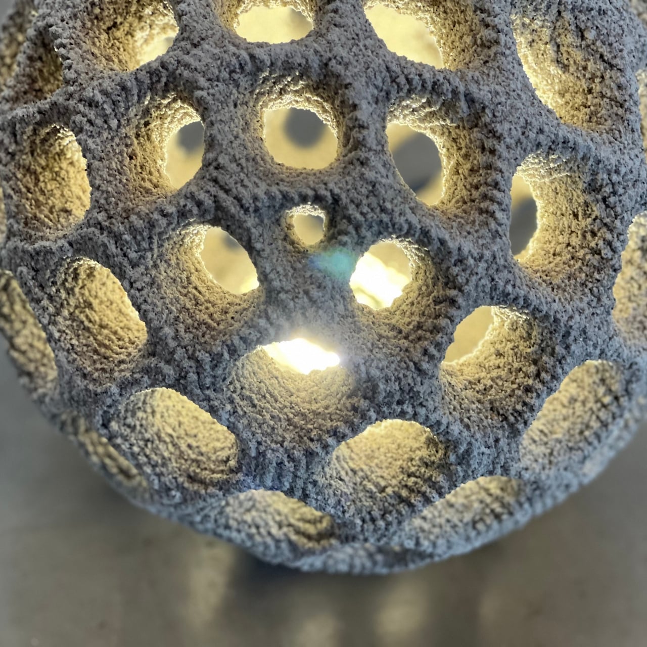
What makes this piece genuinely fascinating beyond its striking appearance is how it’s actually made. The Balloon is produced using a process called Selective Cement Activation, or SCA, also known as powder bed concrete 3D printing. In accessible terms, cement paste is selectively injected into a powder bed, building the form layer by layer without traditional formwork or molds. The result is that those complex, organic-looking cavities and curves covering its surface aren’t decorative appliqués or hand-carved afterthoughts. They’re structural possibilities that only exist because of this technology. Traditional concrete manufacturing simply wouldn’t allow it.
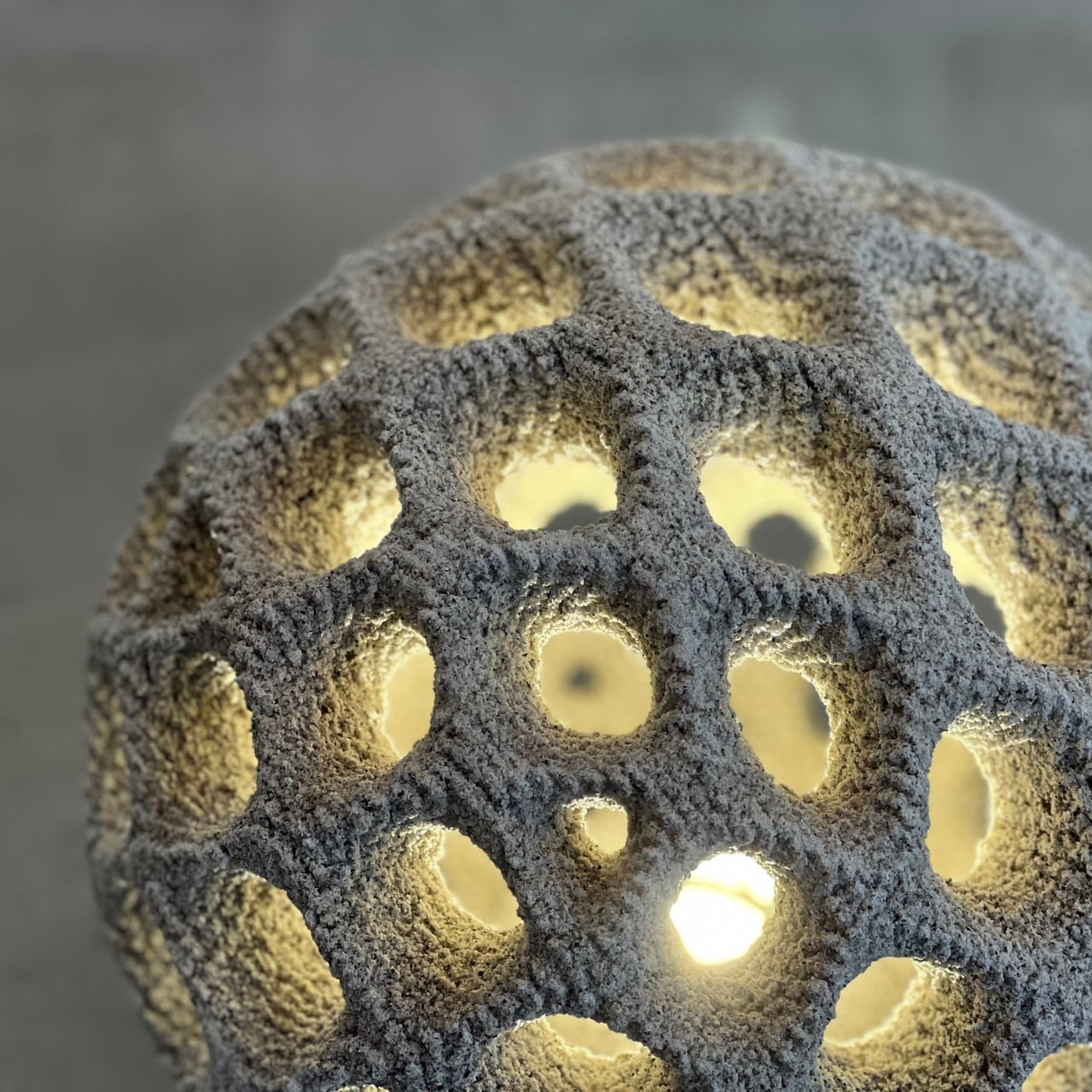
I think that distinction matters more than it might initially seem. The Balloon’s aesthetic doesn’t sit on top of its process like a skin. The process is the aesthetic. The granular, almost velvety texture visible across its surface is a direct physical record of how the material was constructed, layer by microscopic layer. You can’t fake that kind of authenticity, and it’s becoming rarer to find in objects that have been designed with both genuine rigor and intention. It gives the piece a raw, tactile quality that polished or lacquered surfaces can’t replicate, and it’s the reason the Balloon looks genuinely alive in a way that most contemporary lighting simply doesn’t.
The sustainability piece is also worth unpacking, not as a marketing checkbox but as a real material advantage. 3D concrete printing is inherently resource-efficient because material is deposited precisely where it’s needed, and nowhere else. No excess formwork, no significant waste, no bulky industrial molds destined for disposal. For an outdoor product built to weather years of sun, rain, and temperature swings, that kind of considered production feels right for this moment. We’re at a point in design culture where how something is made carries as much weight as how it looks, and the Balloon holds up on both counts.
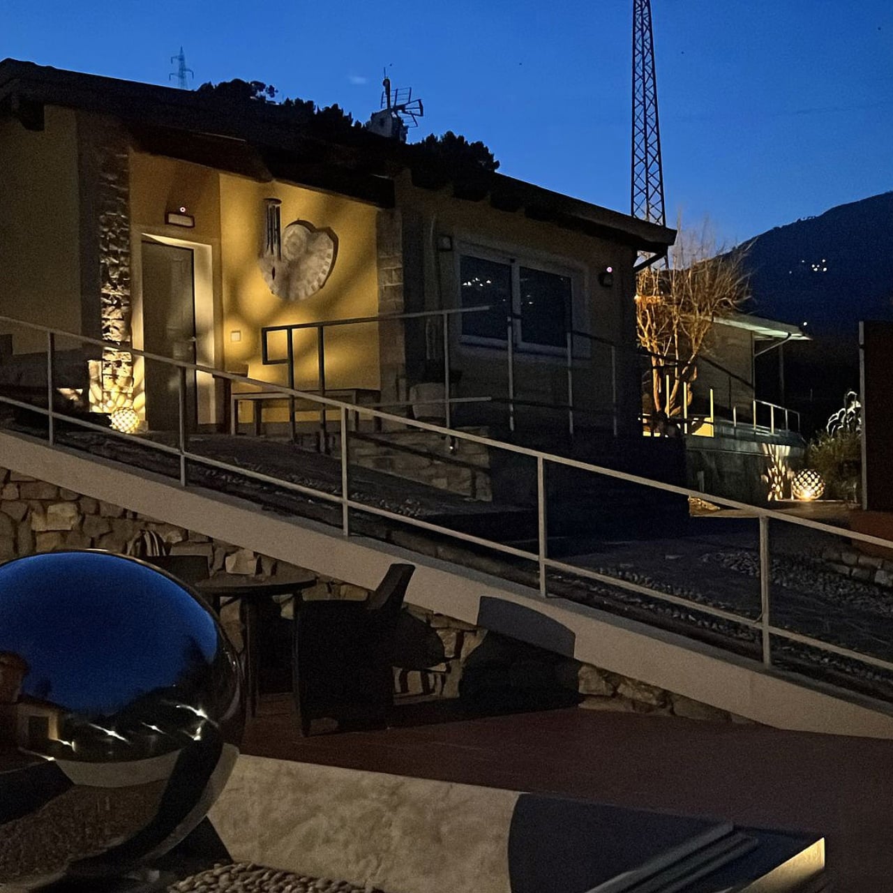
The sizing range also gives it unexpected versatility. The 30 cm version reads as intimate and considered, the kind of piece you’d set along a garden path or beside a water feature on a small terrace. The 70 cm has enough presence to anchor a courtyard or frame an outdoor dining area. And the 100 cm version operates on an entirely different level. Looking at the photos of it glowing against an evening garden setting, it calls to mind the grounds of a boutique resort on the Amalfi Coast or a sculpture garden somewhere in the French countryside. It functions equally as a practical light source and as something you’d deliberately design an entire landscape around.
Concrete has been threading through design conversations for years, mostly as a signifier of industrial cool or minimalist restraint. The Balloon feels like the point where that material story evolves into something far more ambitious. It’s not concrete deployed for mood or aesthetic shorthand. It’s concrete pushed to do something it has never done before, shaped by a process that leaves its fingerprints all over the final form. And to me, that’s the clearest signal of where design is heading: not just making beautiful objects, but fundamentally rethinking what familiar materials are capable of from the ground up.
The post Oberhauser’s Balloon Is the Most Beautiful Lamp Made of Concrete first appeared on Yanko Design.